Blog
 Making of The Naturalist’s Library
- July 7, 2026
A big project is something special. The excitement of the unknown, watching it evolve, and trying new ideas are things I look forward to in every project. Recreating The Naturalist’s Library was no different and presented unique challenges, from an overabundance of source material to creating my first book.
 Making of Printing Types
- September 20, 2025
Researching is like treasure hunting—following clue after clue in the hopes of finding something amazing. When I set out to create a digital edition of Daniel Updike’s Printing Types, I had no idea that I was going to spend months hunting down more than 1,200 books spanning more than 450 years but I’m glad I did. This project involved more research than I’ve ever done.
 Making of Clavis Cælestis: A Synopsis of the Universe
- May 24, 2025
I’ve long loved astronomy. Spending even a few seconds thinking about the wonders in the universe gives me a sense of joy. I marvel at what the scientific community has been able to learn about its inner workings from our tiny blue marble. When I stumbled upon Thomas Wright’s grand poster of his astronomical illustrations from 1742, I was immediately drawn in and thought recreating them would be a fun project.
 Making of the New York and Erie Railroad organizational diagram
- March 29, 2025
Org charts tend to be a rather boring affair—with their lists of names and who reports to whom—but they didn’t start out that way. One of the first in American business, is a stunning portrait of a classic institution—the New York and Erie Railroad. Drawn in 1855 and only rediscovered in recent decades, this diagram captured my attention and I finally took the time to recreate it from scratch as a fun technical exercise. What was unexpected was the depths I ended up going to in order to learn about its fascinating history.
 Making of The Natural System of Colours
- February 18, 2025
Recreating Mose Harris’ color wheels from the eighteenth century seemed straightforward until it wasn’t. I’ve long admired his “prismatic” and “compound” wheels and set a small design challenge for myself to recreate them digitally. As with most projects, it took an unexpected turn, but ultimately a good one.
 Living with Nausea: My story in six charts
- January 12, 2025
I used to have boring health. I never had more than the flu, been admitted to the hospital, and I could eat whatever I wanted, whenever I wanted. In late 2023, that changed when I developed chronic nausea.
 Making of Lilies & Roses of P.J. Redouté
- November 3, 2024
“Patience” was this project’s theme. Breathing new life into Les Liliacées and Les Roses—two of Pierre-Joseph Redouté’s most well known collections—taught me a lot about it during the year I spent on this project.
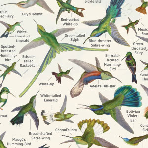 Making of Humming-Birds
- October 1, 2023
Hummingbirds are the closest living descendants of dinosaurs like the T. rex—one of many fascinating facts I learned while working on the digital edition of A Monograph of the Trochilidæ, or Family of Humming-Birds. Gaining unexpected knowledge has to be one of the best parts about working on a project.
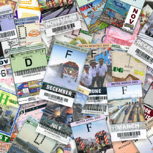 Metra ticket gallery updates
- August 27, 2023
Fifteen years have passed since the last official update on my Metra Ticket Gallery. An update is long overdue considering the number of tickets has grown dramatically to nearly 1,400. It’s about time I gave a new one about the latest additions and improvements.
 Making of The Color Printer
- March 13, 2023
Unlike previous projects, I designed the poster based on Earhart’s 1892 treatise, The Color Printer before giving much thought to the design of the website. In fact, I wasn’t going to make a full digital edition but completing the poster made it so much more approachable and enjoyable.
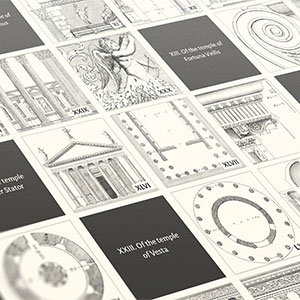 Making of The Four Books of Architecture
- January 8, 2023
Architecture has grabbed my attention repeatedly since I was young—from studying it in high school and making buildings in video games to designing websites for firms winning architectural awards. It’s fitting that my interest is piqued once again for a digital edition of one of the oldest and most well known architectural publications: Palladio’s treatise, The Four Books of Architecture.
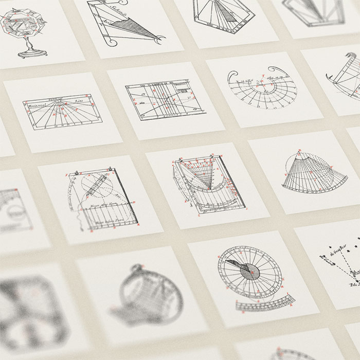 Making of Mathematical Instruments
- September 18, 2022
I work best with existing material—whether that be images, ideas, spreadsheets, documentation, books, etc. That existing material defines the boundaries I need to create something more. When I stumble across a nice chunk of material that has those boundaries (like an old unique book), excitement really sets in. This is what I felt when I found Nicolas Bion’s treatise on mathematical instruments from 1709.
 Making of 17th Century Watercolors
- June 18, 2022
Way back in 2014, a Dutch manuscript from about mixing watercolors from 1692 made a splash in the blogosphere, because while it was centuries old, few had given it much attention and it was such a beautifully preserved thorough account of how watercolors were mixed back then. Ever since then, I thought it had potential as a fun project but avoided creating one due to language barriers and other reasons that turned out to be unfounded.
 Making of Iconographic Encylopædia
- February 6, 2022
The digital edition of Iconographic Encyclopædia from 1851 was by far, the largest and longest project I’ve undertaken. Comprising 500 plates, more than 13,000 illustrations, 1.6 million words, and spanning 13 months, it was a wonderful exercise in creativity and patience.
 Making of A Brief Visual Exploration of A Dictionary of Typography
- December 16, 2020
Not many people read a dictionary cover to cover, let alone analyze every word, but I did and found it fascinating. During research phases for my past restoration projects, I often came across a surprising number of antique dictionaries and always overlooked them. For this project, I actively sought out an interesting one to explore and ended up finding two to create A Brief Visual Exploration of A Dictionary of Typography.
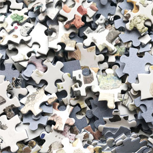 Announcing jigsaw puzzles
- October 29, 2020
I’m excited to announce that 1,000-piece jigsaw puzzles are now available for three of my projects with more to come. Puzzles are available for British & Exotic Mineralogy, Illustrations of the Natural Orders of Plants, and Byrne’s Euclid. The idea to offer puzzles was sparked by some recent comments that the mineralogy poster could be a good fit but they started me down an intriguing path of researching what it would take to get these puzzles manufactured.
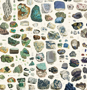 Making of British & Exotic Mineralogy
- July 25, 2020
Have you ever had an idea that sticks with you? One popped into my head when I stumbled across James Sowerby’s massive collection of mineral illustrations from the nineteenth century. I naively wondered how they would look arranged by color in a big collage and spent the next three and a half months making it happen with British & Exotic Mineralogy…and learning new levels of patience along the way.
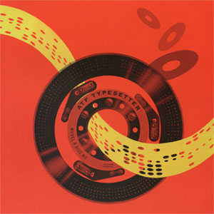 Making of ATF Typesetter Model B
- February 12, 2020
If you’ve ever found a tiny piece of obscure history and had it strike something in you that made you obsess over it for weeks, that’s how I felt when I found the brochure for the ATF Typesetter Model B. This small 16-page brochure from 1963 for an obsolete piece of typographical machinery piqued my interest so much that I wound up converting it into a one-page website as an exercise in design and technology. Plus, it was just plain fun.
 Making of Goethe’s Colours
- January 12, 2020
Figuring out how to put a new face on something old is never easy and devising a new way to look at Goethe’s Theory of Colours was no exception. What started as a relatively simple idea turned out to be more complex that I expected but the process was a good learning experience. The final result is fun too.
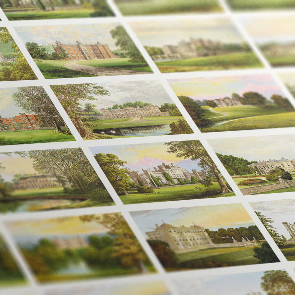 Making of Picturesque Views of Seats of Great Britain and Ireland
- October 13, 2019
Castles and mansions and manors, oh my! The minute I saw Alexander Lydon’s illustrations in A Series of Picturesque Views of Seats of Noblemen and Gentlemen of Great Britain and Ireland, I wanted to create something based on them. Picturesque Views of Seats of Great Britain and Ireland (or simply “Seats” for short) is the result.