Google's Chrome needs polishing but is off to a good start
By Nicholas Rougeux, posted on September 2, 2008 in Browsers, Software, Web
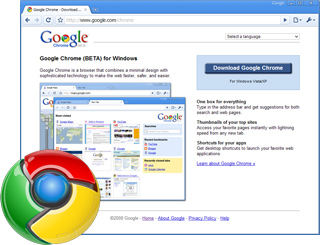
In case you haven't already heard, Google released Chrome today—its new browser built based on how the web is used today compared to several years ago. Considering its been in development for two years, it's amazing that knowledge about it has been limited to rumors until yesterday. After using it as my primary browser for an afternoon, I found several awesome and not-so-awesome parts.
Awesome
- Aesthetics—This is a big one for me. The simple but appealing visual elements make it pleasing and to use despite almost completely deviating from the standard UI elements of the OS. It's still mostly intuitive and almost fun to use without feeling childlike. Love the look.
- Speed—Google built it to be fast from the start and it is. A cold launch after a reboot takes about six seconds an subsequent launches take less than a second. JavaScript and page rendering are speedy too since they built it to work with the rapidly increasng demands of web apps.
- Webkit—It's built on the rapidly advancing Webkit engine used by Apple in Safari and Mac OS X which means it supports Web standards out of the box and does it well.
- Tabs—Having the tabs above the omnibox and buttons makes so much more sense. Sure, it'll take a little while to get used to it, but since almost everything in the browser is tab-specific, it makes sense to have it appear /in/ the tabs instead of above them. (Although some space above the tabs when the browser is maximized would be welcomed.) Rearranging them is much clearer than other browsers too because they move as you drag them instead of just showing placeholders.
Not-so-awesome
(I realize Chrome is in beta so some of these may be fixed very soon)
- Bookmarks—I know searching for everything is becoming the norm and they can be accessed through the address bar but I still like to browse and organize my bookmarks. They're hidden in a collapsed toolbar and I still haven't found a nice way to organize them like in Firefox without having to open the strange "Other bookmarks" menu.
- Printing—There doesn't seem to be a print preview anywhere and no way to easily print. You need to open the strange "Control the current page" button way on the right to find the print command. (Note to Google: please don't follow in Microsoft's footsteps by putting important features in the least-intuitive places.)
- Status bar—There's a reason the
blinkelement is one of the most hated features of the old web. Unnecessary blinking is gets downright annoying and fast. Seeing the status bar fade in and out each time something on a page changes makes me search for a way to turn it off every time. If it was always visible, and it had a progress bar, that would be much more useful.
These are just a few of my first impressions after an afternoon of toying around. Overall, it's pretty great for an 0.2 beta release. (Although I find it amazing that after two years of development, they couldn't stick in an obvious print button). It should be fun to watch how the browser landscape advances over the next few years.
Download Chrome for yourself and try it out.