Metra's new site: a review
By Nicholas Rougeux, posted on September 10, 2009 in Travel, Web
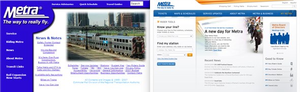
Metra launched a new website this week and since I'm a commuter, designer, and collector, I felt compelled to share my reaction. Any change would have been an improvement to their old site, but while there were welcomed enhancements, not everything lived up to the hype.
The new site was designed by Chicago-based Acquity Group, who was given a 3½-year, $3.9 million contract to also help them with the adoption of online credit card payments. It was unveiled on Tuesday at a press conference and launched the next day on the popular media blitz day, 9/9/09.
After hearing about it for a few months, I was anxious to try it out. Here are my reactions to key areas:
Refreshed visuals
The new visuals breathe life into an aging site from 1995. A modern, welcoming design focusing on key tasks replaces the dated results of Make My Logo Bigger Cream. Hints of train-themed visuals like maps and angled stripes reminiscent of those seen on barricades are nice touches without being too gimmicky. The orange and red stripes at the top, which are seen on some engines, is a nice way to add a sense of motion and activity.
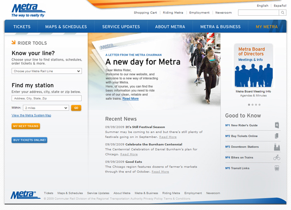
Metra's home page
The "Know your line" tool in the sidebar is a nice idea but might be more effective if the wording was changed to "Maps & schedules" and the full list of lines were shown instead of burying them in a drop-down.
The home page features one of my pet peeves—a welcome message and a letter from the chairman linking to the leadership page. Who cares about that, really? That's the last thing I want to see. Wouldn't it be more useful to show the "Know your line" tool there? According to the latest issue of On the Bi-Level, service updates will appear where the news is or above it.
Metra's tiny text is hard on the eyes.
The typography could use several improvements. Cufón was implemented to use the Interstate typeface on navigation and headings but the result is somewhat blurry compared to other text. The default text size is much too small and light at 9–11 pixels for anyone to read without straining. Increasing the size to 13 pixels and adding more leading would be much appreciated. Such small type makes me wonder if they considered their audience when designing it.
Buying tickets online
The most touted new feature is the ability to purchase tickets online with a credit card and it's a welcomed one. I don't have a need for it but many have been asking for it for years. Metra was holding back on accepting credit cards because of the processing fees involved. They will now pay $3–5 million per year in those fees. I'm guessing the money from the national stimulus package is helping with some of that.
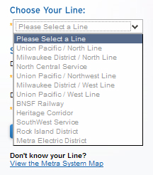
Geographically sorted lines are hard to scan.
The form for buying tickets suffers from a few usability issues which some have complained prevents them from completing orders. I tried it out and found it to be a bit messy. The warning at the top cautioning purchasers that doing anything but completing the form will abandon the order process is also off-putting.
Selecting a line and stations is surprisingly difficult because they sort them geographically with lines sorted north to south and stations sorted by the distance they are from Chicago. I understand their reasoning but this makes finding anything very frustrating because I scan the list looking for the first letter of my line, not picturing it's location.
My Metra
Following credit card purchases, My Metra has been another hot topic. Riders using My Metra can save custom train schedules, schedule service update notifications, and recurring ticket orders.
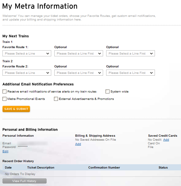
My Metra dashboard
Finding out if a train is delayed before getting to the platform is very handy. Service update notifications can only be emailed now but the ability to use text messages is coming in the near future. I was surprised that they didn't mention Tony Zale's efforts to provide updates via Twitter. Unfortunately, they're broken now because they relied on scraping the old site. Hopefully he'll find a workaround soon.
Managing recurring orders and billing information are definitely pluses but custom schedules seem fairly useless. Regular riders already know their route so they don't need create one. Signing in to see a custom schedule takes too much time. Plus, it doesn't seem to work intuitively. Saving a schedule after choosing it doesn't provide any feedback about what it does, where it appears, or how to use it. (I didn't realize until after several visits that custom schedules appear on the lower left portion of the home page because it blended in with everything else.) Browsing a full schedule is much easier anyway.
After all the hype, I expected a lot more from My Metra, despite the cliché name. Maybe the new features they're working on will be more useful.
Schedules
Finding and using schedules is one of the most important aspects of any travel site, however Metra seems to have taken a couple steps back in this area. Schedules used to be monospaced text lined up so it resembled the hard copy schedules that are available. This may not have been technologically elegant, but they were easy to read and fast.
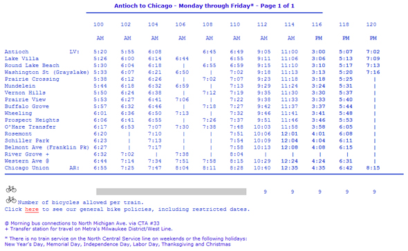
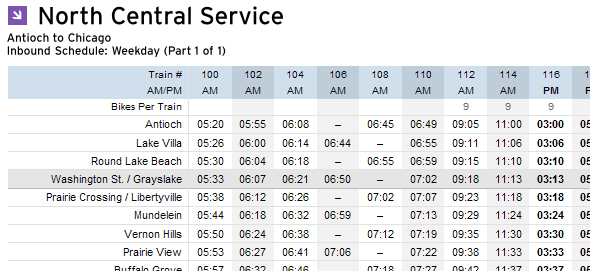
Old schedule grid for the North Central Service
Now, they've provided two less-optimal options. Riders must download a PDF of the hard copy or fill out the form for the station finder to see a tiny table that requires horizontal scrolling. Not good.
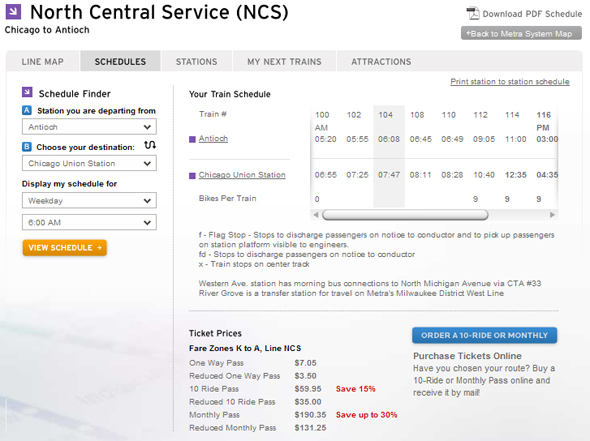
New schedule grid for the North Central Service
Scanning the old schedule to find times was much easier. Instead of forcing riders to use two unpleasant options, why not include the full schedules on the landing page? There's plenty of room and it's relatively easy to make them even easier to read than the old schedules. There are a couple articles on Smashing Magazine with excellent examples of how to design effective tables:
Showing the full schedule right away would be easier to use.
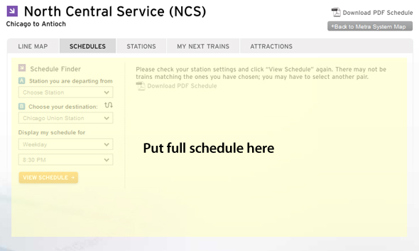
Update (Nov 6, 2009): Thanks to the vocal feedback from its riders, Metra has made the timetables available for all lines—a welcomed update. They even improved the original tables to highlight rows while hovering over them and used proper semantic HTML. Kudos for the update.
New time table for the North Central line.
Station finder
The station finder is great for out-of-towners trying to find a station. The search is powered by Google Maps (as are all other maps) and the results are clear. My only recommendation would be to number the stations so they match the numbers in the text-based results so riders can make the correlation between the two.
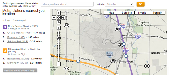
Stations around O'Hare airport
The old site had crudely-drawn but excellent diagrams that indicated available parking for each station. They're still available behind a "Parking & Accessibility" link but I'm surprised they didn't also enlarge the Google Map present on every page and add create outlines for the parking. Maybe they're working on it since it's so time consuming and they wanted to get the new site launched.
Migration
With every new site comes an inevitable transition period. Now that the new site has launched, all the old URLs are broken. This means that search results, referring links, and personal bookmarks to schedules (like the ones I frequently use) are dead and result in errors. It's a lot to ask to have all URLs from an old site continue to work on the new one but it sure would have been nice to keep the critical ones like schedules, service updates, etc. Now I need to redo my bookmarks and wait for Google to recrawl the site for URLs to work again.
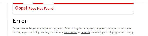
Time to redo my bookmarks…
Final thoughts
As a regular rider, two aspects of the Metra site are crucial to me: schedules and service updates. There haven't been any major service updates yet so I can't judge their usefulness, but I feel Metra dropped the ball on improving the schedules. Their hearts were in the right place but there's much room for improvement. Aside from those issues, the new site is ultimately a welcomed update. I look forward to seeing how it continues to evolve and I welcome any chance to discuss my feedback with Metra.