Anatomy of Sanctuary
By Nicholas Rougeux, posted on April 16, 2005 in Art, Fractals
I had a fun time analyzing and documenting how I made Confidence in my previous article so I figured I'd do it again but this time with Sanctuary.
Once again, I'll be revealing which formulas I used and techniques that helped me achieve the final image but not exact settings so as to protect the original image. After all, it's more fun to explore on your own with this type of thing, right? Right. Remember, exploration and experimentation are key. Let's dive in.
At the heart of this image is one base formula called AltMan from the jam.ufm file. This formula is used on every layer with the only change being the OCAs and gradients.
Incidentally, a helpful parameter to set for your core formulas is the bailout value. This value can often "reveal" more of a fractal. Sometimes, when you open a fresh formula, elements may seem like they've been chopped off sudenly. Increasing the bailout value essentially lets you see more of the fractal by moving that hard edge further "out." Think of it this way: if a bailout value is set at something like 4, it's like looking at the world through a narrow cardboard tube. Increasing that value to something like 40 is like looking through a cardboard tube 10 times wider. You're able to see more. This is called escaping to infinity.
I like to set the bailout value to a high value so I don't see any areas chopped off. A value of "1e20" (1020 or 100,000,000,000,000,000,000). This is often far more than needed but it's nice to play it safe. Such a high value can also cause black splotches to appear on the fractal though depending on the OCA you're using. Reducing the value will usually elimiate this.
Anyway, on with the show. On the right are each of the layers that make up the final image shown at the bottom.
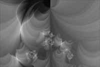
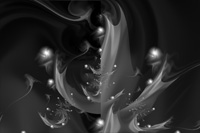
Layer 1
Layer 2
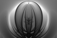
Layer 3
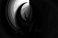
Layer 4
Layer 5
Layer 6
Layer 7
Layer 8
Layer 9
Layer 10
Layer 11
Layer 12
Layer 13
Layer 14
Layer 15
Layer 16
Layer 17
Layer 18
Layer 19
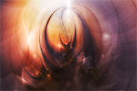
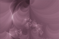
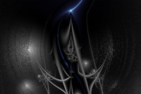
Final result
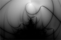
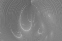
Layer 1
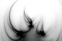
Dark and ominous isn't it? This is often how I start my images. Not dark and ominous, but in greyscale. I like to focus on finding interesting shapes first and applying color after I've found something appealing. Playing around with Thin Orbit Traps in sam.ucl is a great way to start and that's just what I did here. Adjusting the Shape parameter is a good way of cycling through settings to see what you can start out with. I ended up using Parabola.
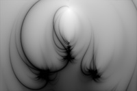
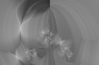
Layer 2
Same as layer 1 except the Center (Im) value is changed so the centers of the shapes are offset a bit. A small change but a very different image. Setting the layer's merge mode to lighten and rotating the gradient a tad brings out a faint ghostly effecton the left that ends up being barely visible in the final product. It was fun to work with at least!
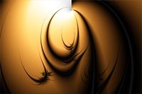
Layer 3
The first color layer that defines the main shapes for the image and creates half of the warmth. The shapes were added with Simple Traps Enhanced from reb.ucl and with the merge mode set to screen, things get lightened up a bit giving it a nice soft satin-like feel.
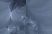
Layer 4
The blue in this layer is what makes the purple in the final result really stand out. Thin Orbit Traps II in tma.ucl is what gives this image its first layer of textures and the insect-like shapes. This OCA has a plethora of parameter settings and can suck up a lot of your time just looking through them all. You can almost always find something good with this formula.
Layer 5
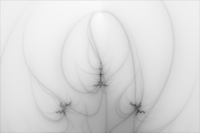
Thin Orbit Traps revisited. Once again, I've used the same formula but only slightly adjusted a few parameters like center, rotation, size and the ratio of hight/width. The shapes in here create the dark thin curved threads at the top of the final image.
Layers 6 and 13
These two layers are identical and used as masks for each of the layers above them. They are actually duplicates of layer two with a small adjustment to gradient and a center value.
Layer 7
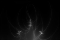
Combined with its mask, layer six, only the outer edges are shown. This layer is very similar to layer five except the colors are inverted and the rotation parameter has been changed. Since it's so similar to layer five, the same shapes are visible in the final result but this time they're white and offset just a bit to make both types of shapes stand out. It also gives the top center of the image a little dimension too since both white and black lines are so close to each other.
Layer 8
The wonderful textures created in this layer were done with Chips Are Us with fBm in reb.ucl. Since the image is already pretty dark at this point, the opacity was dropped when overlay was chosen as the merge mode. The textures are barely visible in the final result but looking at the image with and without this one layer, one can see that it's actually quite useful. At larger sizes, it's more apparent. It helps break up the smooth sweeping lines in the upper left and right corners of the final image. While I like my share of smooth sweeping lines, I like to add character to them as well. This does the job nicely.
An interesting thing to note if you work with this formula is that it changes whenever you rotate, zoom, or move the fractal which is unlike most of the other coloring algorithms. Usually you can do those things and it's like moving a static image whereas with this one, the textures and colors shift so it's a bit tricky to work with.
Layer 9
Here is where the final colors start becoming visible. When the soft dark pink in this layer is combined with the orange and blue from previous layers, it produces a combination of colors that ranks right up there with some of the best I've seen. When I chose this pink color I knew this fractal was a keeper. This layer is a duplicate of layer four with only the color and an increased opacity as the differences. The rest of the layers from here on out with the exception of the last have the merge mode set to overlay to help enhance the colors and shapes of the exisitng layers.
Layer 10
The trap type, a few adjusted parameters, lack of color, and opacity are what changed from layer nine to this one. Other than those, everything's the same. The lines in this layer help break up those smooth lines a little bit more by running perpendicularly to them.
Layer 11
This is simply a duplicate of layer nine with reduced opacity. Keeping the merge mode to overlay makes this act as a simple enhancement layer to make the colors more vibrant.
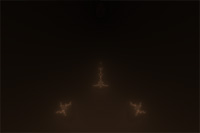
Layer 12
I know the screenshot of this layer is virtually entirely black but there is a small bit of color in there if you can make it out. I didn't enhance it for the purposes of this article becuase it wouldn't be a true shot of what the layer is really like—so you'll have to squint a bit at it.
This layer ends up actually brigtening the entire image. Without it, it's just a little too dark and washed out. The small bits of light pink and a very tiny bit of dark brown add a barely-visible amount of lightness to the darker areas of the image so they're not pure black. Again, it's more apparent in larger sizes. There's nothing special about the formula used for shapes. It's just a smoothing formula called Smoothing Iterations (Mandelbrot) in dmj.ucl. It can be a very useful formula if you want a smooth shading in certain areas of your image.
Layer 14
Thanks to the mask of layer thirteen (duplicate of layer 6), only the outer ediges of this layer are shown including the splash of blue at the top. The blue isn't really visible in the final image as it looks more like a lighter grey. The shapes were produced with the Joker formula in mt.ucl. Plenty of the formulas in there are worth trying out.
Layer 15
This is another simple enhancement layer like layer eleven but with a tighter gradient to help bring out those smooth sweeping lines.
Layer 16
The symmetry in this layer created with Thin Orbit Traps II again helps balance out the shapes a little bit and adding a few more closer to the edge. This helps increase the size of the overal centeral shape to fill the canvas.
Layer 17
Since the area a little left of center up top is becoming the focal point, this layer helps enhance that area a little bit more. The textures help break up some of the smoothness but are ultimately almost invisible in the final result.
Layer 18
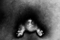
As if the image wasn't dark enough by now, this layer makes it even darker but in doing so, enhances all of the existing colors to their final level. The faint orbs are also added with this layer thanks to quite a few parameter adjustments in the fomula M Gnarly Orbit Trap, Dist. Method in akl-m-mt.ucl.
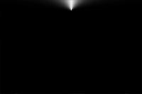
Layer 19
This final layer serves a very simple purpose and that's to get rid of the harsh vertical cut-off most visible in layer three. A little experimenting with Parabola Trap 2 in jam.ucl and a simple black and white gradient with merge mode set to screen fixes that. The cut-off is now a nice bright white line that looks like a beam of light shooting out of the top.
Sanctuary ended up being one of my more complex fractals because I ended up putting so many types of textures in it. Keeping the same base formula the same for all of the layers helped ensure that almost any coloring algorithm I applied would flow with the rest of the layers. I often do this because the final image ends up looking more like a definite object instead of some mish-mash abstract shape with no focal point.
Hopefully this provided a little more insight to my methods for creating fractals and given you some new ideas to try with your own.