Who uses fly-up menus?
By Nicholas Rougeux, posted on August 9, 2009 in Web
The Weather Channel apparently does. I've only seen "fly-up" menus used on one other site that would have easily qualified for Worst Website Ever years ago and was amazed when I discovered they're now being used for the navigation on The Weather Channel's site.
I'll bet the conversation went something like this:
"No one's seeing the drop-down menus? What can we do to fix that?"
"Pop-ups?"
"No, those are annoying."
"Bigger drop-downs?"
"Hmm. Maybe."
"How about fly-up menus?"
"Perfect! Now everyone will have to use them!"
Now I know The Weather Channel's site far from the greatest site in the world. After all, they put the weather map—the most useful thing on the site—at the bottom of the local weather page; but that's a topic for another day. However, these fly-up menus really take the cake. Not only do they suffer from the usual problems with any kind of drop-down or flyout menuing, but they obscure the search box as well.
This means that you can wind up reading about alerts, severe weather, flight status, honeymoon spots, auto advice, aches and pains, or air quality depending on which menu you accidentally open when trying to do a search.
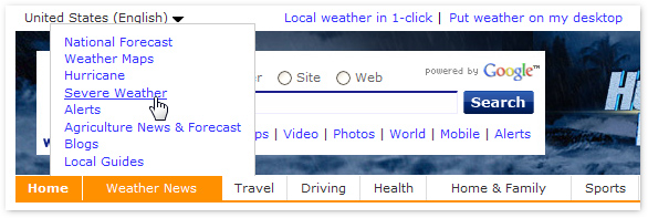
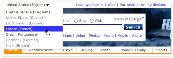
If you move your cursor too high to escape the menuing, you'll often open the drop-down right above the search box to change languages—thus requiring you to carefully maneuver your cursor to the search from only the left or the right.
Fewer clicks ≠ easier to use.
When will we get over this obsession with drop-down/fly-out/fly-up menus? It's far more important to make crucial features easy to use and focus on what visitors need rather than making sure everything is just three clicks away. What's next? Putting the search in a menu too? It's still far too easy to use despite their best efforts. Surely they can "improve" the navigation some more.
Further reading
- Architectural Digest vs. This Old House (A List Apart No. 184)—Jeffrey Zeldman's thoughts on drop-down menus
- Users Decide First; Move Second