Visualizing Metra
By Nicholas Rougeux, posted on August 14, 2011 in Art, Data, Web
When I heard that Metra was planning to cut 46 trains from its service in 2012 to make up for high operating costs, I wanted to see just how much of an impact that would have on their schedules—using a technique from 1885. How the final result came about was a mixture of curiosity and fun with a pinch of obsession.
Inspiration
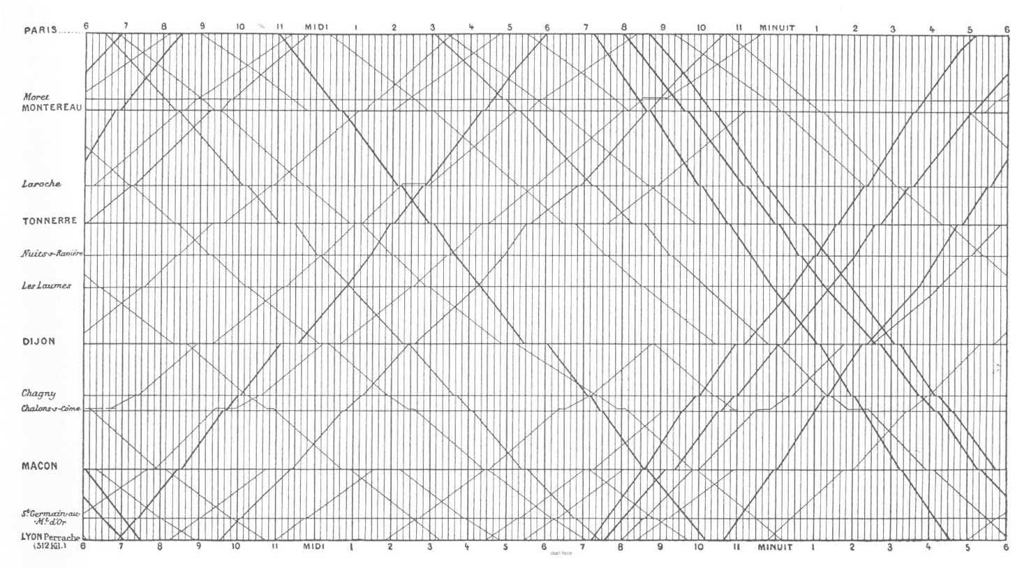
E.J. Marey's train schedule from for Paris to Lyon, 1885
Anyone who's read Edward Tufte's books is probably familiar with the chart by E.J. Marey on the cover of The Visual Display of Quantitative Information showing the train schedule from Paris to Lyon in the 1880s. Tufte describes it best:
Arrivals and departures from a station are located along the horizontal; length of stop at a station is indicated by the length of the horizontal line. The stations are separated in proportion to their actual distance apart. The slope of the line reflects the speed of the train: the more nearly vertical the line, the faster the train. The intersection of two lines locates the time and place that trains going in opposite directions pass each other.
Edward Tufte, The Visual Display of Quantitative Information
The rich amount of data in this chart has captivated me for some time and I wanted to see how it could be applied to other train schedules. Being a Metra rider for 7 years, their schedule was a natural choice.
Construction
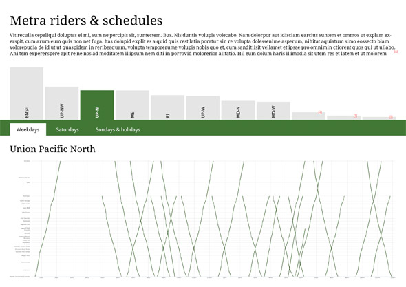
I wanted to update the technique and make the chart interactive so I could easily explore it in more detail so a web interface made the most sense. I chose the excellent Highcharts charting library for the chart itself—primarily because I wanted to become more familiar with it for use in future projects, but also because its flexibility couldn't be matched by other similar libraries.
Collecting the data was next. I started with my train, the North Central Service (NCS), to get an idea of how it would look and if this project was even worth pursuing. After plotting just a few trains, I knew it was going to be interesting.
The time tables were carefully copied from Metra's site into separate JSON files for each schedule to keep the data consistent. This process took the longest and was spread out over the course of two weeks—copying a little here and there when I had the time and between design adjustments. Storing the data in JSON files had an unexpected benefit when I decided to show the proposed cuts and rescheduled trains because adding the extra data was a breeze. All I needed to do was update a few properties.
The times when trains stopped at each station were kept in the order shown on Metra's site mostly because this made the process of copying them into JSON files much faster. The name of each train contains the word "inbound" or "outbound" which is evaluated by the code to determine if times should be plotted as in the order shown in the JSON file (inbound trains) or in reverse order (outbound trains). There are probably more efficient methods or organizing the data.
Design
My original intent was to just plot train schedules and see the interesting patterns they take. After plotting the NCS, Union Pacific NorthWest, and Union Pacific North lines, I started seeing, clumps of lines indicating morning and evening rush hours. I intended to stay true to Marey's technique and space the labels on the vertical axis proportionate to their distance from their respective Chicago stations, however this resulted in overlapping labels for many lines and was not easily preventable within Highcharts. Evenly-spaced labels were used to maximize readability.
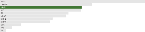
I also experimented with different methods of selecting train lines to view their charts including using colors of the lines from Metra's site and ridership reports. These proved to be more distracting than helpful and had several readability problems.
Early mockup showing navigation based on a column chart of ridership for each line and proportionally-spaced vertical axis labels

Early mockup showing navigation based on a stacked bar chart of ridership for each line
Early mockup showing navigation based on a bar chart of ridership for each line
Experimenting with these various navigation techniques made revealed three problems:
- Colors were distracting and meant nothing except maybe a little to seasoned riders.
- While mildly interesting, ridership data added little value.
- It wasn't obvious that any of the navigation techniques were clickable.
Soon after these experiments, I discovered the details of the proposed cuts and adjusted schedules on Metra's site and shifted the focus from simply exploring schedules to showing the impact of these cuts. The final design really started to take shape.
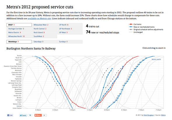
Final design showing Burlington Northern Santa Fe line and zoomed in on inbound and outbound changes
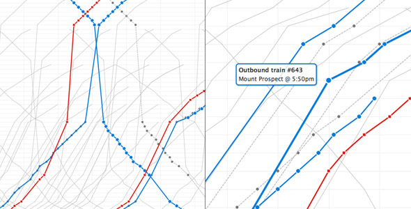
Closeups of evening rush hour schedule on the Metra Electric line (left) and station details on the Union Pacific Northwest line (right)
I removed the bright colors entirely, highlighted the modified trains, and simplified the navigation. A few design notes:
- Highlighted important information—cut trains are the most important aspect of the project so they are visible in the navigation in addition to the chart to to make the total number of cut trains per line visible without any interaction and to entice viewers to explore farther.
- Simplified color palette
- Red indicates how many trains have been cut at a glance. Red is also typically connected with negative actions so it was a natural choice. Its boldness stands out throughout the entire page. Squares on the chart are for those who may not be able to distinguish between the two colors. They are also similar "stop" icons on media players.
- Blue indicates new or rescheduled trains. It's not as bold as red, but is still easily noticeable. Circles are used to differentiate the trains those that are cut.
- Grey indicates original versions of trains that have been rescheduled and a lighter version is for unchanged trains. Dotted lines reinforce the concept of rescheduling and circles are used to relate them to the new or rescheduled blue lines.
- Zooming—Viewers can zoom in on any portion of the chart by clicking and dragging to select the desired area, letting them get a closer look at the fine details of some changes.
- Stats—Key stats at the top change with each selected line to show how many trains are cut and how many stops have been added or rescheduled.
More train schedule visualizations
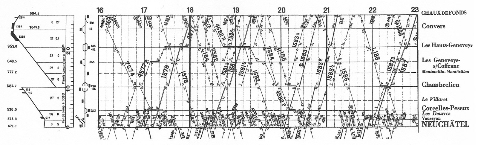
Daily Swiss Federal Railroad chart from Chaux de Fonds, 1932, Envisioning Information by Edward Tufte
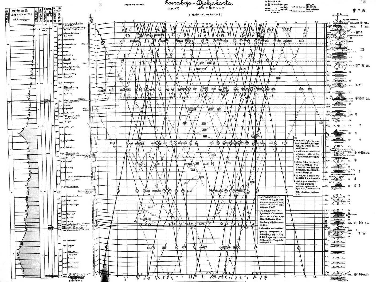
Java railroad line, Soerabaja-Djokjakarta, 1937
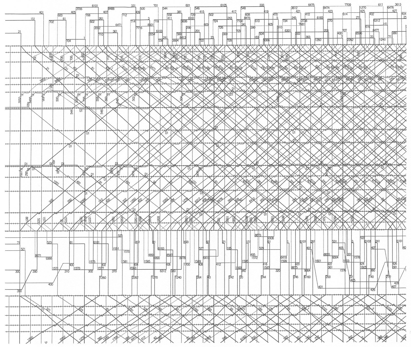
Tokaido and Sanyo bullet trains from the Japanese National Railroad control room, 1985, Envisioning Information by Edward Tufte
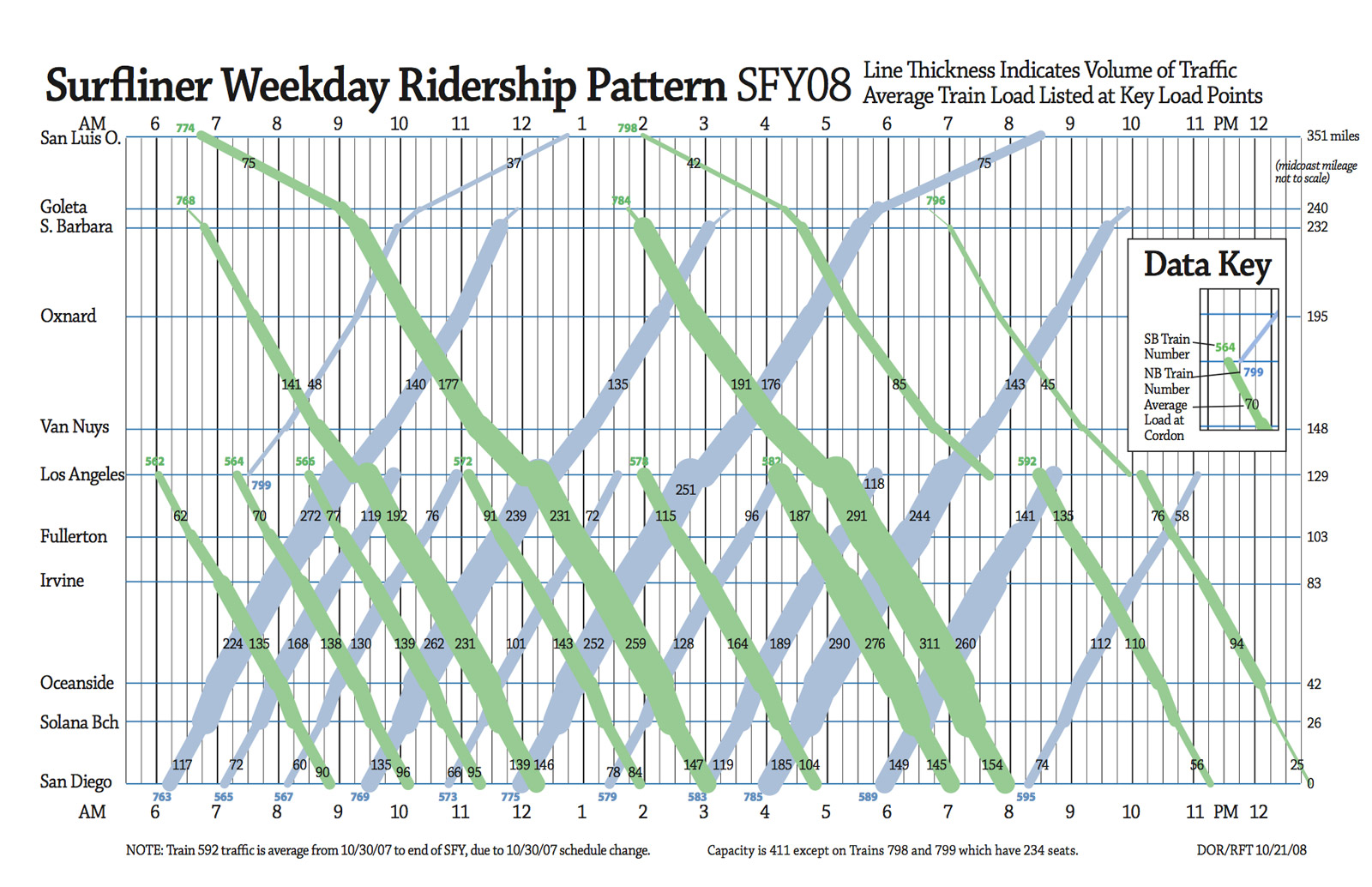
Ridership analysis of Surfliner weekday ridership from California Department of Transportation, 2009. Additional charts are included in a 2009 analysis of passenger loads (PDF) conducted by the California Department of Transportation depicting schedules and ridership, giving them a new dimension of meaning. I hope to add similar data to the Metra visualization if Metra makes the information available.
Wrap-up
What started out as a simple exercise in data visualization quickly turned into an interesting way to examine major proposed change to Chicago's public transit system. The technique I employed was far from new but updating it for today's expectations was a fun challenge. I plan on updating the visualization if Metra formally decides to cut trains to reflect the new schedules.
Updates
- August 14, 2011: After a board meeting on August 12, 2011, the Chicago Tribune reports that board members don't see cutting trains as an effective way to reduce their operating costs.
- August 21, 2011: Metra posted an announcement on August 19, 2011 about an upcoming meeting of the Citizens Advisory Board to discuss the 2012 budget, fare increases, and service cuts.
- August 21, 2011: Metra posted slides (PDF, slides 78–82) from its board meeting on August 12, 2011 containing options and recommendations for service reductions in addition to other topics on the board's agenda.
- September 6, 2011: Metra proposed revised schedule changes to just four lines instead of ten lines.
- September 8, 2011: Charts updated to allow comparing new and original proposed schedules.