Fractal Philosophizing
By Nicholas Rougeux, posted on January 7, 2005 in Art, Fractals
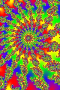
Figure 1: A common rainbow fractal
If you asked the person sitting next to you what fractal art was, there's a fairly good chance that they would cock their head to one side and look at you quizzically. It is this response with which I am greeted when I answer the often-asked question of the hobbies I enjoy. Most have some recollection of fractals from a very colorful poster they remember seeing in a math class, looking something like Figure 1. This was a typical sight in the early days of fractal art. Thanks to advances in technology and fractal generators, fractal art has blossomed into a more respected art form. Unfortunately, few people still know very much about it.
Let me make something clear before you read further. The philosophy outlined in the rest of this article is one that I've developed for myself and one that I've found works best for me. It is not meant to be taken as the official way of creating fractal art but rather a recommendation.
The goal I strive to achieve with my art is to show others that fractal art can be so much more than the old brightly colored spiral rainbow posters hanging in math classes. Figure 1 displays three of the four themes that, while not necessarily "bad," ones I usually try to avoid using. This type of fractal is one that can generally be made in a very short period with little or no effort if one is familiar with the fractal software they have chosen to use. I spent a whopping minute and a half on it and that included the render time.
Colors
As with any form of art, colors are a crucial part of the overall image. The use of all the colors that make up a rainbow in a single fractal image is a thing of the past and should probably stay there. Not only is it painful to view, but it furthers the mindset I previously mentioned. I could launch into a discussion on color theory but I find it unnecessary and trite at this point because it's been discussed ad nauseam whenever the subject of color in art is brought up. It's still a valid concept, but we don't need to go into it here.
What colors should you use then? I would recommend staring out with two in addition to white and black. Using just one and filling the image with it leaves the image feeling too monochromatic and flat. If the image is mostly grayscale with a splash of color, then one color can actually bring a lot of life to it. A wonderful example of a splash of color can be seen in Watch Out by Paul DeCelle. Two colors can add an amazing amount of variety because the combinations are virtually endless. More examples of this can be seen in the following images:
Often, desaturated or less vibrant colors can make a fractal appear to be more "real," by which I mean more sophisticated or sometimes three-dimensional depending on what shapes are present in the image. Tucani illustrates this beautifully. The rich dark colors combined with the vibrant but not overly bright splash of oranges gives this image a warm feel and strong emotion. Darker colors aren't the only way to achieve this real look, though. Pastel colors can just as easily bring an image to life and give it an airy yet loving feel, as displayed in Emily's Birthday by Linda Allison. Textures play a large part in these emotions but that's a topic for another article.
Spirals and infinity points
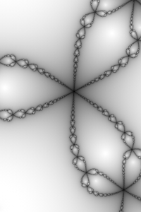
Figure 2: Infinity points
Two of the most common elements in fractals are spirals and what I call "infinity points." Spirals are rather self-explanatory but infinity points are how I've come to refer to areas in a fractal where elements are drawn to a single tiny point, as shown multiple times in Figure 2. Now, spirals can also be referred to as infinity points but the reverse is not always true.
It is because of this frequency that I like to try and avoid these two elements or disguise them in my images. Doing so is nearly impossible, though, considering they are the core elements of almost every fractal. The fun lies in the challenge and the skill is creating new from the old.
More often than not, a spiral is the focal point of a fractal when shown in a publication. I've sometimes wondered if this is due either to the ease of finding one or their hypnotic nature. As I said with color, spirals aren't bad, just overused. There are many other shapes in fractals that can provide just as much enjoyment for the viewer.

Figure 3: A possible outcome from working with OCAs.
There are formulas that can be applied to existing fractal formulas and those who are familiar with Ultra Fractal will know them as "outside coloring algorithms" or OCAs. These formulas can create exciting shapes and effects by modifying how the basic fractal handles color. The effects from these can be seen in Figure 3. Thanks to these, spirals and infinity points have taken on a richer life but more often than not, it's easy to still see them in an image. I like to try to hide the spirals and infinity points that are so prominent in an image with OCAs or different focal points to draw the attention away from them. It's a wonderful creative challenge.
Symmetry
Why create an entire image when you can create half in a fraction of the time? Symmetry is great for a quick fix to make a fractal all kinds of dramatic. This excitement lasts for about a minute with me. Symmetrical images can be fun to make but don't hold the same artistic value with me as those that are asymmetrical. All it takes is something as subtle as a swoosh here or an orb there but only on one half to give a fractal character. The symmetry rut can be very easy to slip into as well. I've found myself getting stuck many times and getting out of it is a challenge that often brings great rewards.
Final words
Now before you write your comments and send me emails calling me a hypocrite for telling you to stay away from all of these themes while they're all clearly visible in some of my images, remember that the key to fractal art, or any other art for that matter, is to explore and experiment. Each and every image in my portfolio is an experiment in exploration and challenges with various themes including those mentioned here. The philosophy discussed here is based on what I've created and seen in the world of fractal art. It may not be the right one and that's just fine. It's mine and it's worked for me. I encourage you to develop your own.