Making of the Illustrations of the Natural Orders of Plants
By Nicholas Rougeux, posted on July 9, 2019 in Art, Web
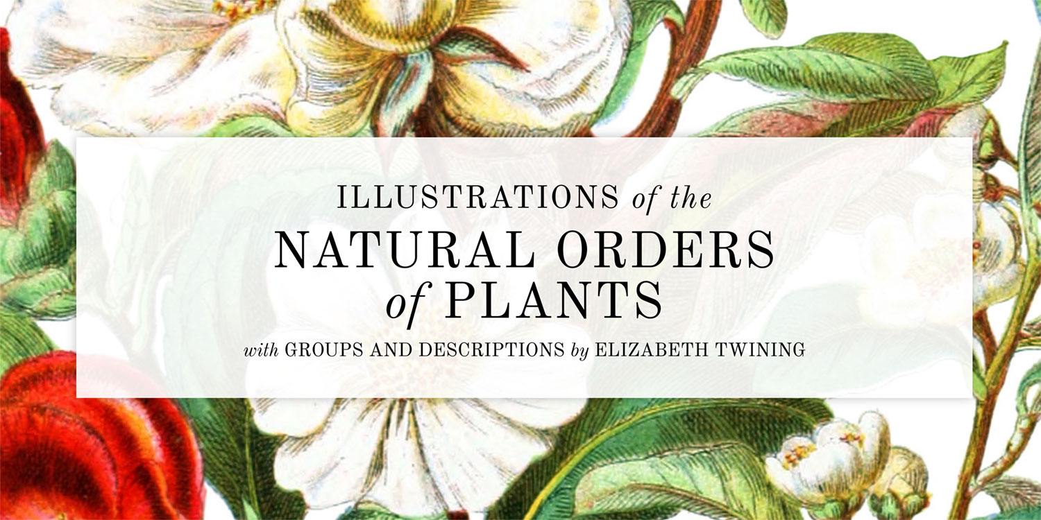
If someone told me when I was young that I would spend three months of my time tracing nineteenth century botanical illustrations and enjoy it, I would have scoffed, but that’s what I did to reproduce Elizabeth Twining’s Illustrations of the Natural Orders of Plants and I loved every minute.
After the unexpected successes of my Byrne’s Euclid and Werner’s Nomenclature of Colours projects (for which I’m very grateful) I got the itch to follow them up with another reproduction of an obscure catalog from the 1800s. However, finding interesting obscure catalogs want an easy task when I didn’t know what would pique my interest. Anything was fair game but I had an inkling that something based on the sciences would be most interesting. Scientific catalogs are organized, structured, and data can be extracted from them with some elbow grease.
Finding the right material
The collections from the Public Domain Review were an excellent start because they’re curated eclectic selections of books, images, and audio covering a wide range of topics. I spent hours going through them. Despite that, I found the vast collection from the Internet Archive more fruitful. It wasn’t as nicely curated as the Public Domain Review but the volume of content allowed me find more of what I needed. Among the hundreds of fascinating books I looked at, the botanical illustrations piqued my interest the most—many of them including precise details about measurements, geography, affinities, and more.
Before this project, my level of knowledge about botanical illustration was minimal at best. Even the term “botanical illustration” was relatively new to me. Acknowledging how little I know about a topic is exciting—especially when learning of its existence reveals an entire community, culture, and history. I didn’t know botanical illustration was “a thing” but now that I do, I’m amazed by it and the talent its artists possess. I gave myself a crash course by first visiting Wikipedia and Botanical Art & Artists for a fascinating in-depth compendium of artists, history, and more. Resources like the latter made me wonder how this topic hadn’t been on my radar earlier.
After a brief education, I understood more about the collections I found and found several more that proved interesting. However, each one had a different drawback like missing pages, coloring inconsistencies, and low resolution to name a few. No one collection met all my criteria but several were close.
I ended up cataloging the pros and cons for each one to compare:
- The Botanic Garden by Benjamin Maund (13 volumes, 1825–1850): Complete and high-resolution. Each set of four illustrations is accompanied by clearly organized details including, classification, geography, measurements, and more. This stayed at the top of my list for a long time but was ultimately eliminated because Maund wasn’t the original artist but the patron who printed the works from other artists. There’s nothing wrong with this but I wanted to focus on the artists.
- Familiar Wild Flowers by Frederick Edward Hulme (9 volumes, 1878–1905): Impressively detailed illustrations accompanied by beautiful grayscale smaller illustrations next to the initials of each description and at the end. However, the most complete set at the HathiTrust Digital Library only includes volumes one through eight with the ninth nowhere to be found online. Upon checking for completion, I also found one illustration missing from the first volume (small knapweed). The Internet Archive has volumes one through five (1, 2, 3, 4, 5) but the scans are of a different quality than HaithiTrust’s.
- A Curious Herbal (vols 1, 2) by Elizabeth Blackwell (2 volumes, 1737–1739): This famous set appears complete but the scans on the Internet Archive are low-quality and wouldn’t reproduce well online.
- Plantae Selectae by George Dionysius Ehret (1 volume, 1750): A complete set of some of the oldest and most beautiful most detailed illustrations I found but was written in Latin.
- Les Roses (vols 1, 2, 3) by Pierre-Joseph Redouté (3 volumes, 1817–1824): One of the most famous sets of botanical illustrations by one of the most famous botanical illustrators. This is a complete, high-resolution, color set that checked all the right boxes except it was written in French. I took french in school but not enough to reproduce hundreds of descriptions.
- The Herball by John Gerard (1 volume, 1636): The most prevalent botany book of its time and a true tome at more than 1,600 pages—mostly black and white. I’m not averse to reproducing large bodies of work but this was more than I was willing to take on. However, the beautiful old typography alone made it hard to not dive into.
- A Second Century of Orchidaceous Plants by Walter Hood Fitch (1 volume, 1867): A good-sized complete selection of color illustrations but not as detailed as the style of some others that grabbed my attention.
- Ladies’ Flower-Garden of Ornamental Annuals by Jane C. Loudon (1 volume, 1840): A beautiful, complete set of full color illustrations with amazing details. I only discovered this collection after I was halfway through reproducing Twining’s and had I found it earlier, I may have chosen it to reproduce.
All of these collections are amazing and I encourage everyone to take time to look through them and appreciate what the artists created.
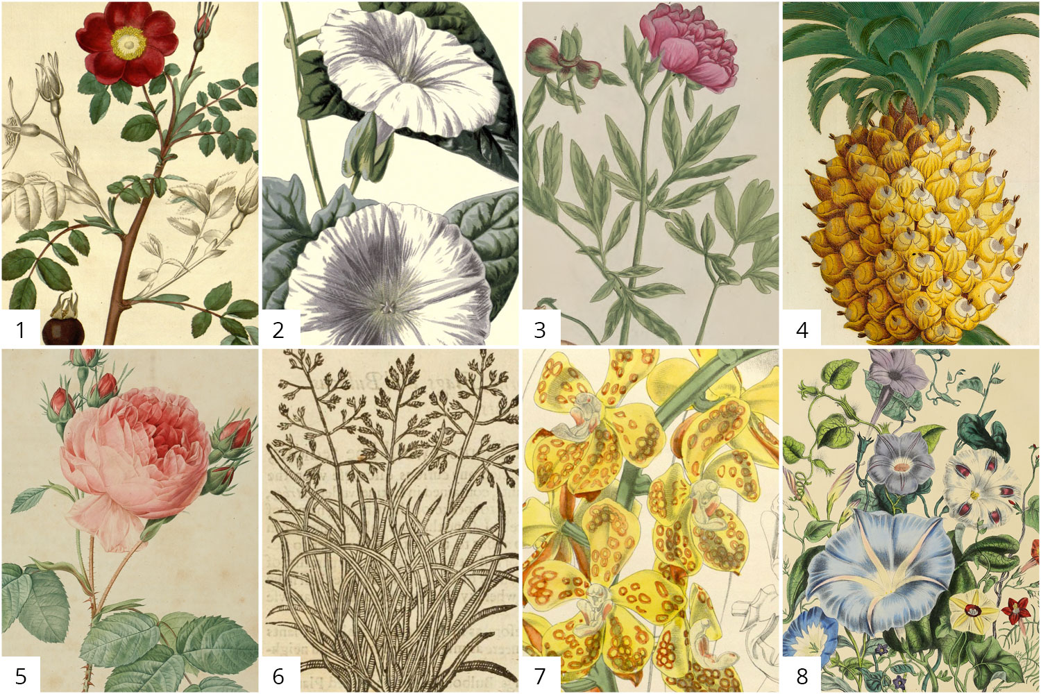
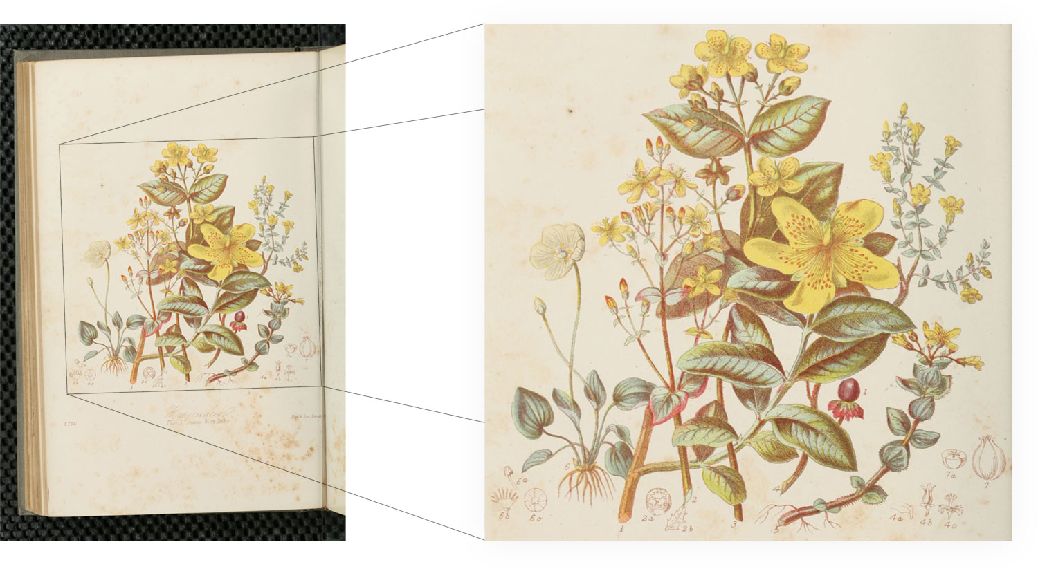
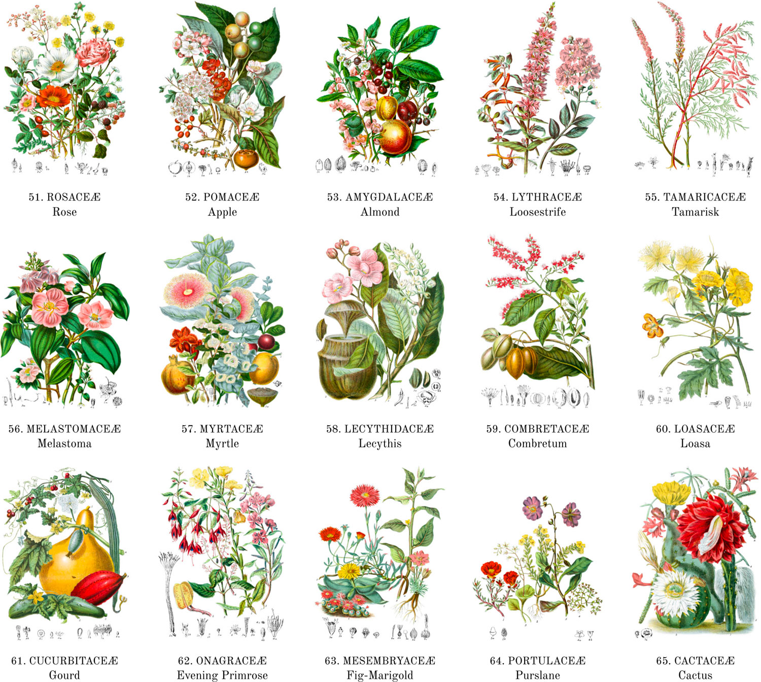
Ultimately, I ended up choosing Illustrations of the Natural Orders of Plants (vols 1, 2) by Elizabeth Twining (2 volumes, 1868) because Twining’s work stood out from the others for its uniqueness in style and combinations of plants. She was also not as well known as other artists. She illustrated 160 orders of plants with vignettes of British plants alongside those from other countries, creating pairings that aren’t often seen in nature. From her introduction:
“By thus placing our native plants in groups with foreigners, we acquire a more correct idea of the nature of our Flora, and the character it has when compared with that of other countries. This is the first work which has thus done due honour to our British plants by connecting with others, and placing them whenever possible at the head of the Order to be illustrated.”
—Elizabeth Twining, 1868
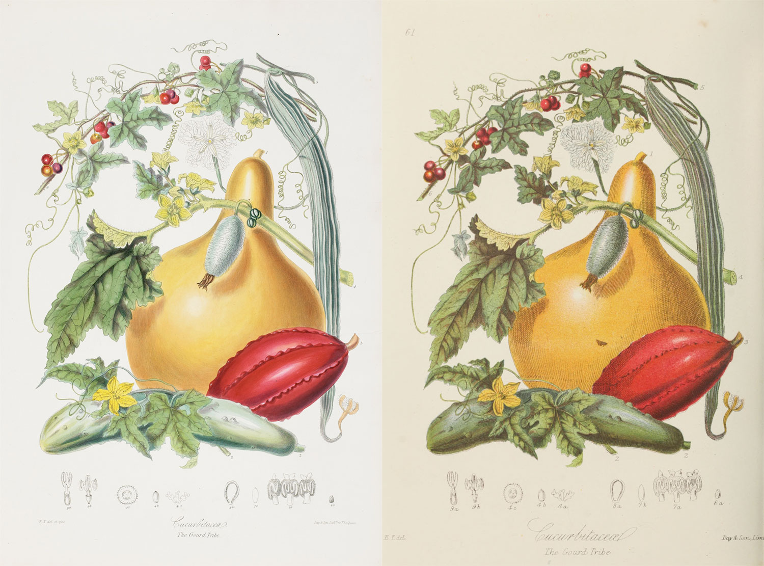
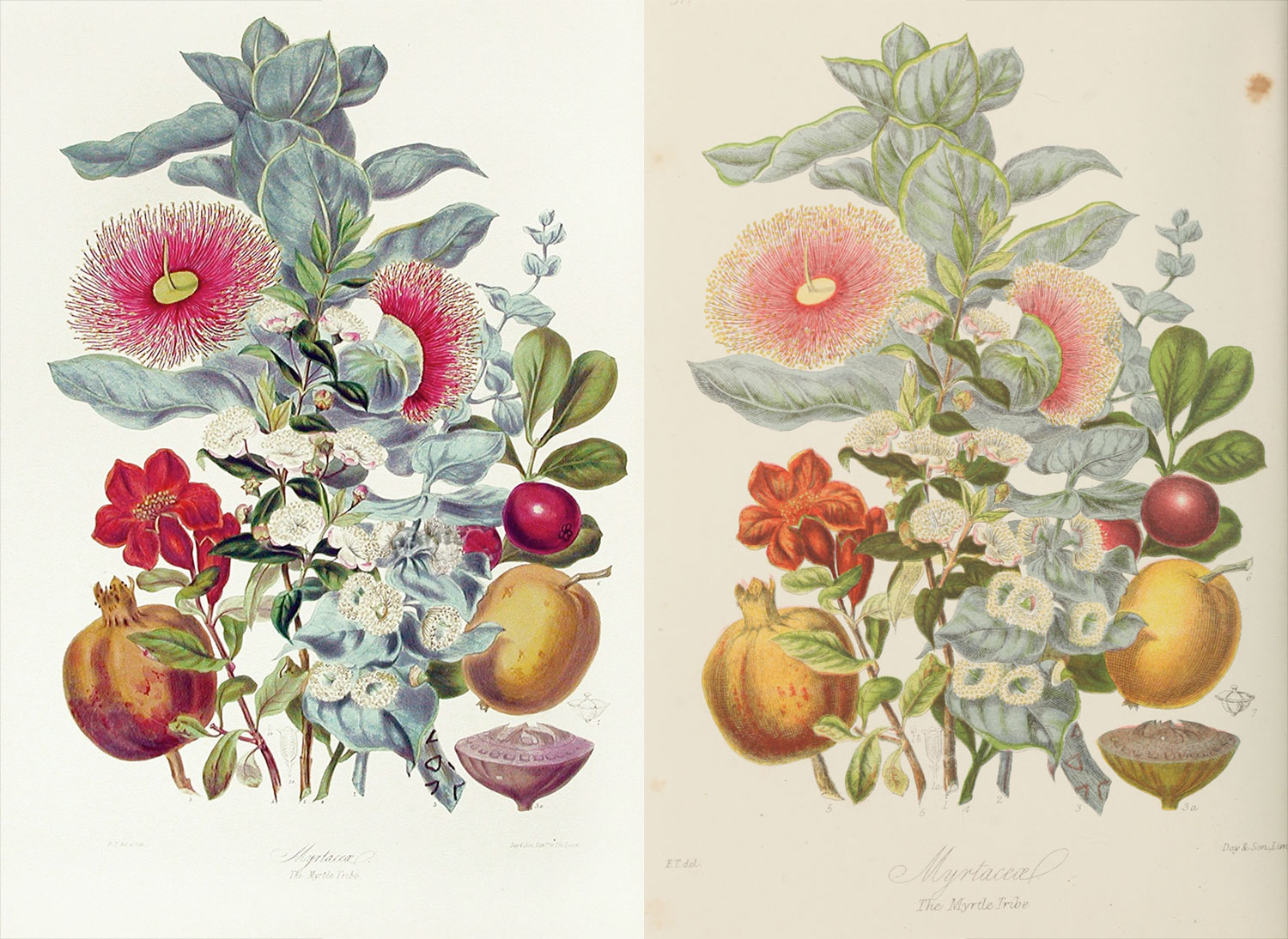
The two volumes available from the Internet Archive are mostly complete. Only one illustration is missing of the potato tribe as well as the first page of descriptions for the banana, blood root, amaryllis, iris, and screw-pine tribes. Fortunately, these were all available from the HathiTrust Digital Library.
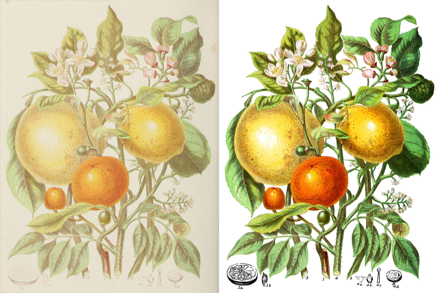
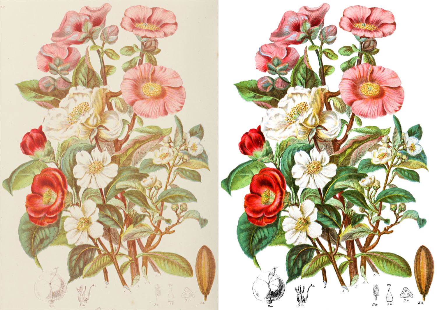
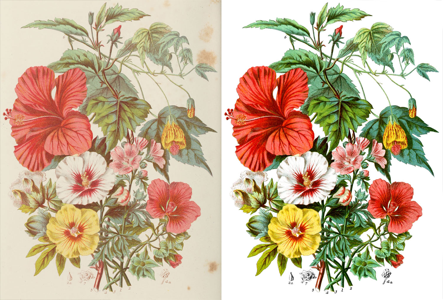
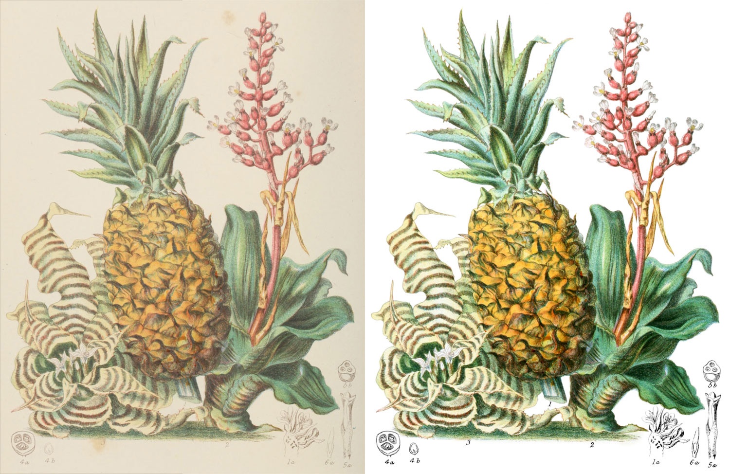
Interestingly, the 1868 edition was not the original. The original lithographs were published in 1849 (volume 1) and 1855 (volume 2). The 1868 edition was a reproduction from her using less-expensive colour-printed plates with re-drawn illustrations based on her originals. As far as I’m aware from my research, they were also drawn by her. Complete scans of the first edition aren’t available online anywhere. The originals are housed at the Natural History Museum in London and are available for purchase from some rare book shops like Donald A. Heald Rare Books. Select prints of each illustration are available for purchase from print shops like Panteek. I reached out to the museum and rare book shops about acquiring scans of the original lithographs but with cost estimates of nearly $40,000, they were well outside of my price range. Instead, I chose to stay with the 1868 edition which is in the public domain, readily available, and and impressive collection on its own. As is shown below, the illustrations from the two editions are very similar but they’re drawn with different techniques and subtly different styles. In many cases, I prefer the style 1868 reproductions.
Devising a plan
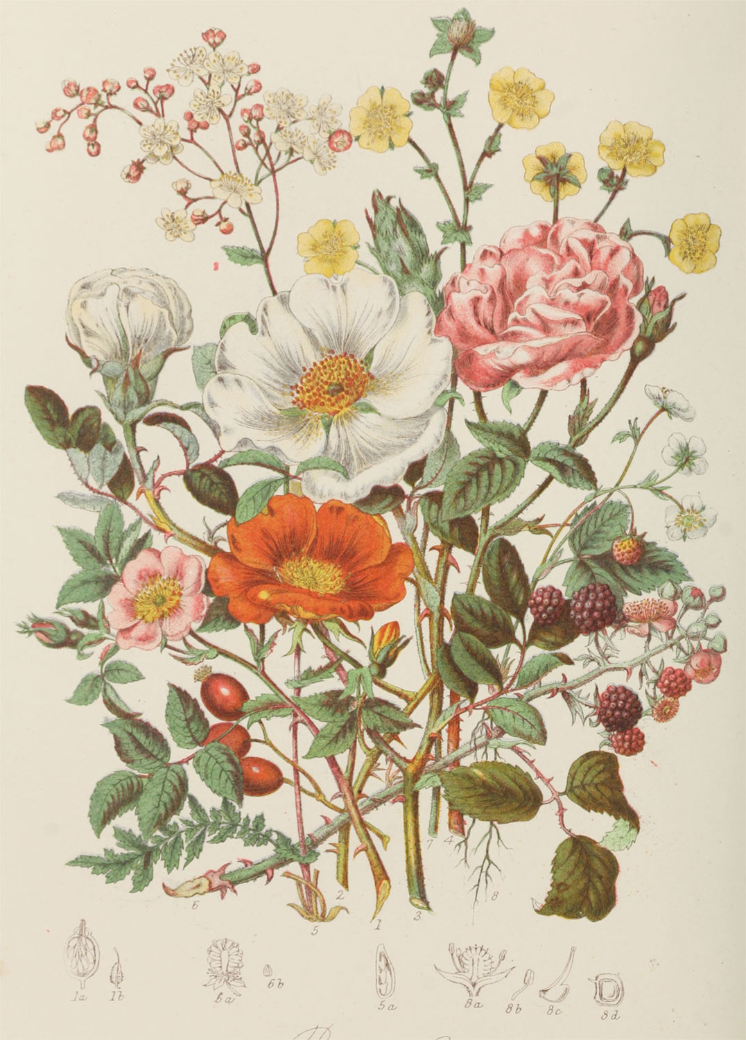
After settling on Twining’s illustrations and reading through the many descriptions, I found it challenging to distinguish between some of the plants. The vignettes included anywhere from 1 to 13 plants—often overlapping or intertwined with each other. For example, there are eight plants illustrated in the Rose tribe, each numbered at the base of their stems and trying to figure out which stem goes with which blossom to match them up with their descriptions is not a simple task.
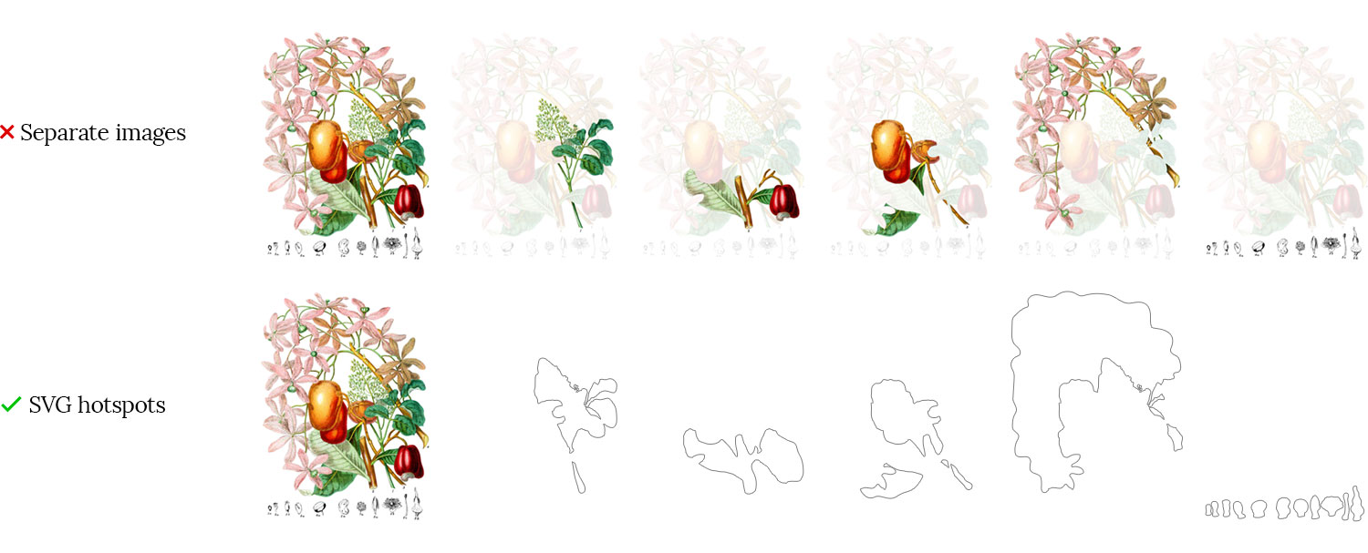
I decided that in addition to reproducing all of Twining’s illustrations online with revitalized colors and their full descriptions, I also wanted to make them interactive so anyone could easily see which plant was which. This meant carefully examining each flower in each illustration and isolating it so it could be turned on or off when reading the description.
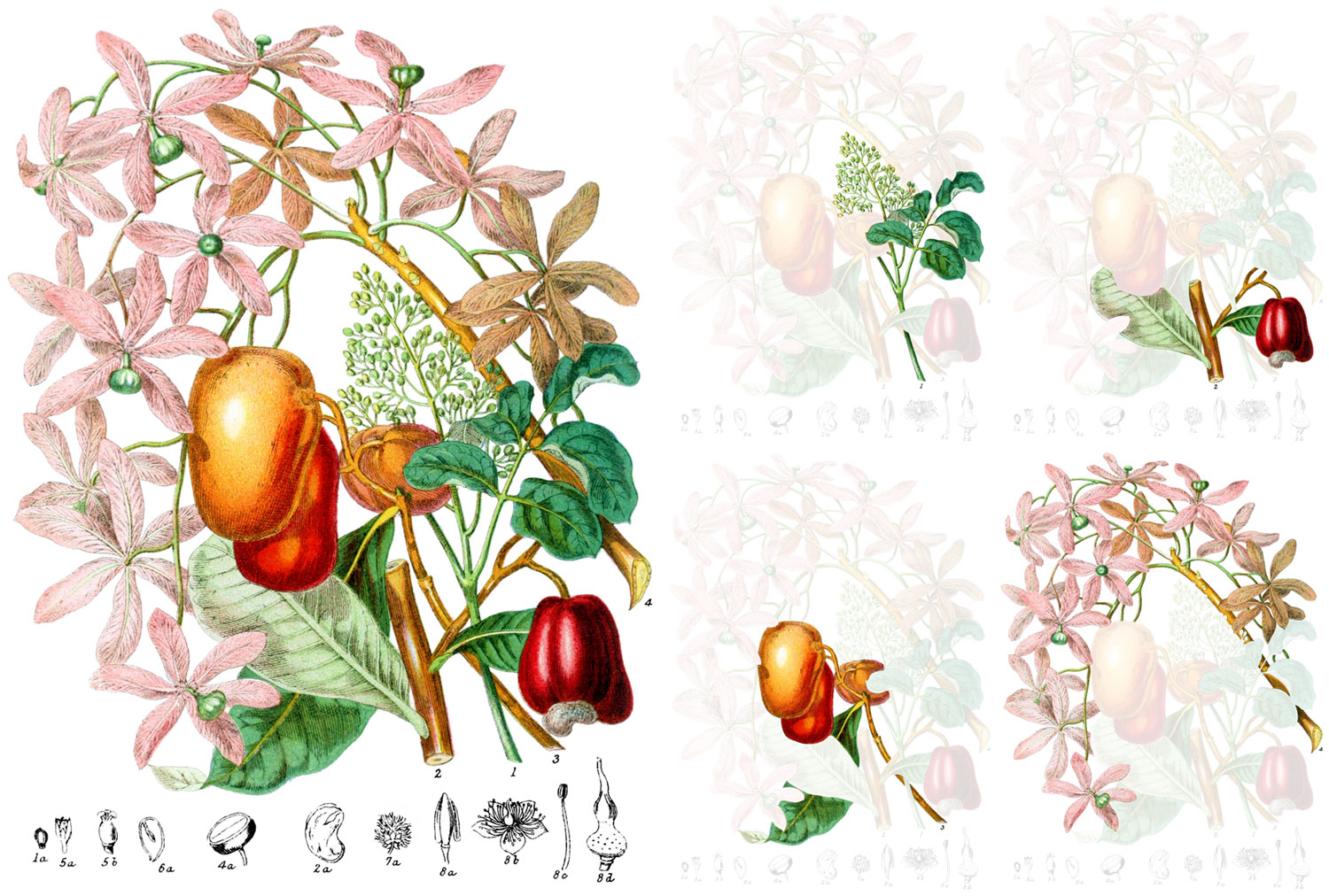
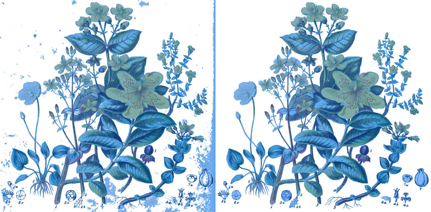
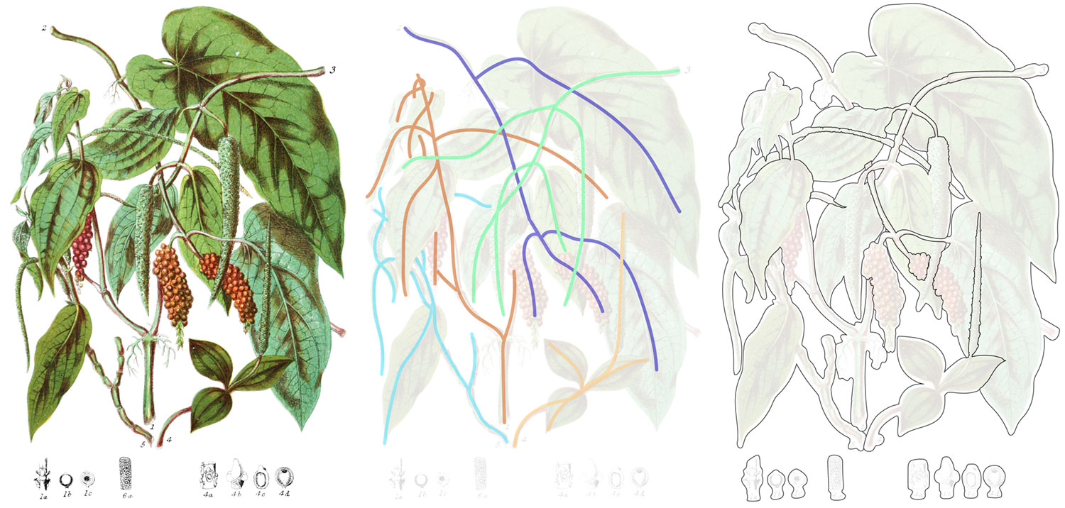
I started with a proof of concept using the turpentine tribe (shown above) which only included four plants. Each of the smaller sketches of the various parts of each plant were also isolated but for the sake of demonstration, only the four main plants are shown isolated here.
The result not only immediately makes clear which flower is which when paired with the description but also emphasizes Twining’s skill in creating such intricate illustrations.
To create interactive diagrams, I initially thought of creating multiple versions of each image—one where everything was visible and one for each isolated view. However, this would have required creating many large images which is not only seemed like a lot of unnecessary work but would be a lot for visitors to the site to download for each illustration. Plus, if I needed to make adjustments to an image, I would have to recreate each one.
Instead, I decided to only create one image for each illustration and overlay “hotspots” using custom shapes I would draw that would become semi-transparent when interacting with them. This required a lot of careful tracing as I describe below but was still more efficient than creating separate images.
The process
The process for adding each illustration to an online catalog boiled down to three steps:
- Restore the original image.
- Create hotspots by tracing the plants.
- Recreate the description.
Restoring images
Each of the 160 illustrations was restored from the original scans to be as colorful as they depict, which involved carefully adjusting the colors and cleaning up spotting and other other markings on the scans to produce clean images without altering the underlying original illustrations.
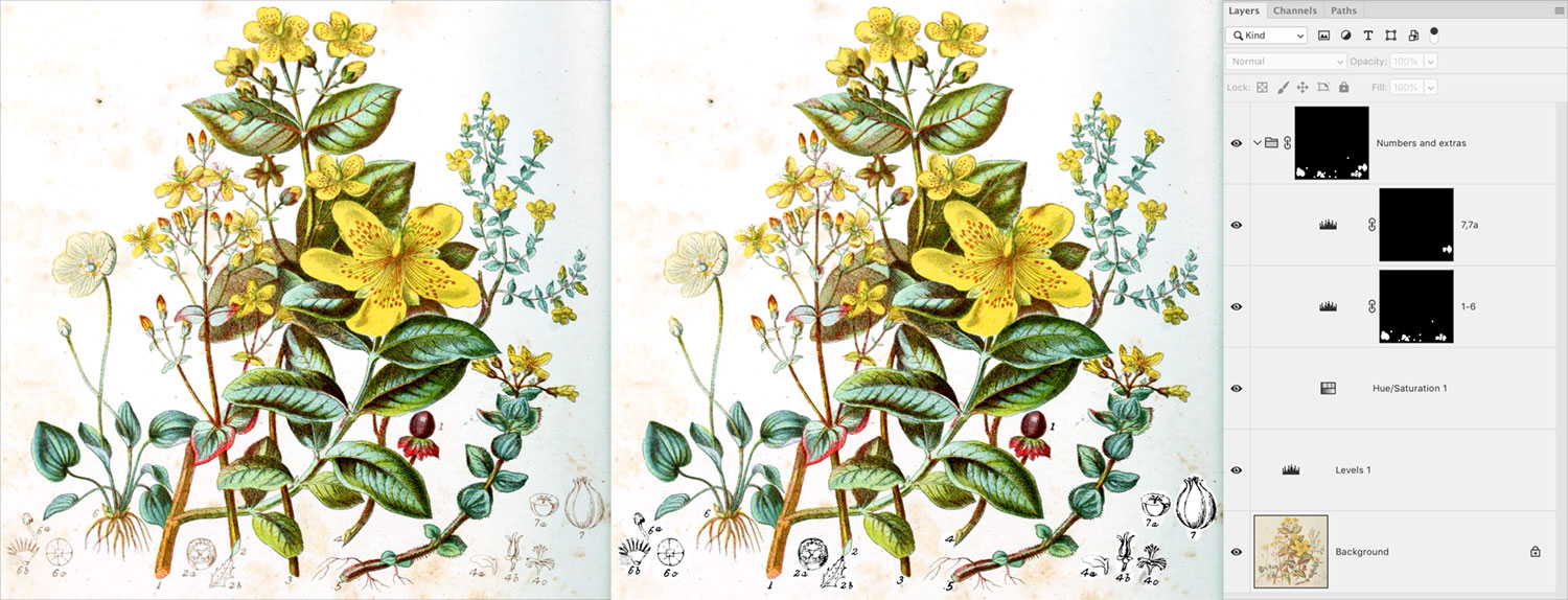
I prefer to practice non-destructive editing when working in Photoshop so I can make adjustments to any point of the process without undoing and redoing any hard work I’ve already done. To achieve this, I used a combination of adjustment layers with careful masking.
I developed a workflow and combination of layers that worked for each image:
1. Cropping
I downloaded the original high-resolution scan from the Internet Archive and cropped it tightly to the edges of the vignette including the smaller grayscale sketches around them. This was the only destructive part of the editing process because I didn’t need any part of the image beyond the boundaries of the illustration.
2. Color adjustment
I added a levels adjustment layer and set the white point using the eyedropper to the brightest part of the image which automatically adjusts the white balance to remove most of the yellowing. It’s not perfect but is a big step in the right direction
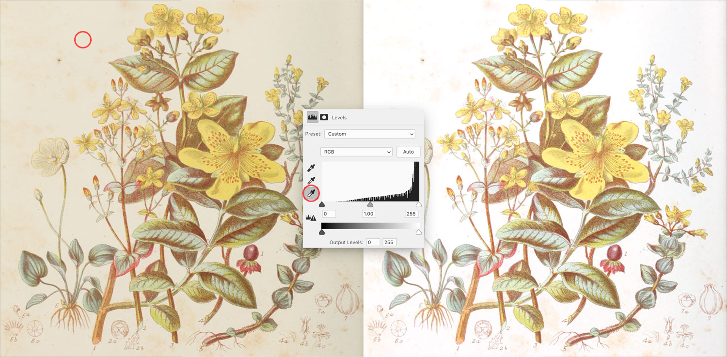
Using the other two eyedroppers to set the black and gray points never produced results I was pleased with so I just used the black point slider to set the black point manually—giving me the control to find a good balance.
Often after setting the levels, the image still had a red or blue hue so I adjusted black point of the red or blue levels to even out the colors.
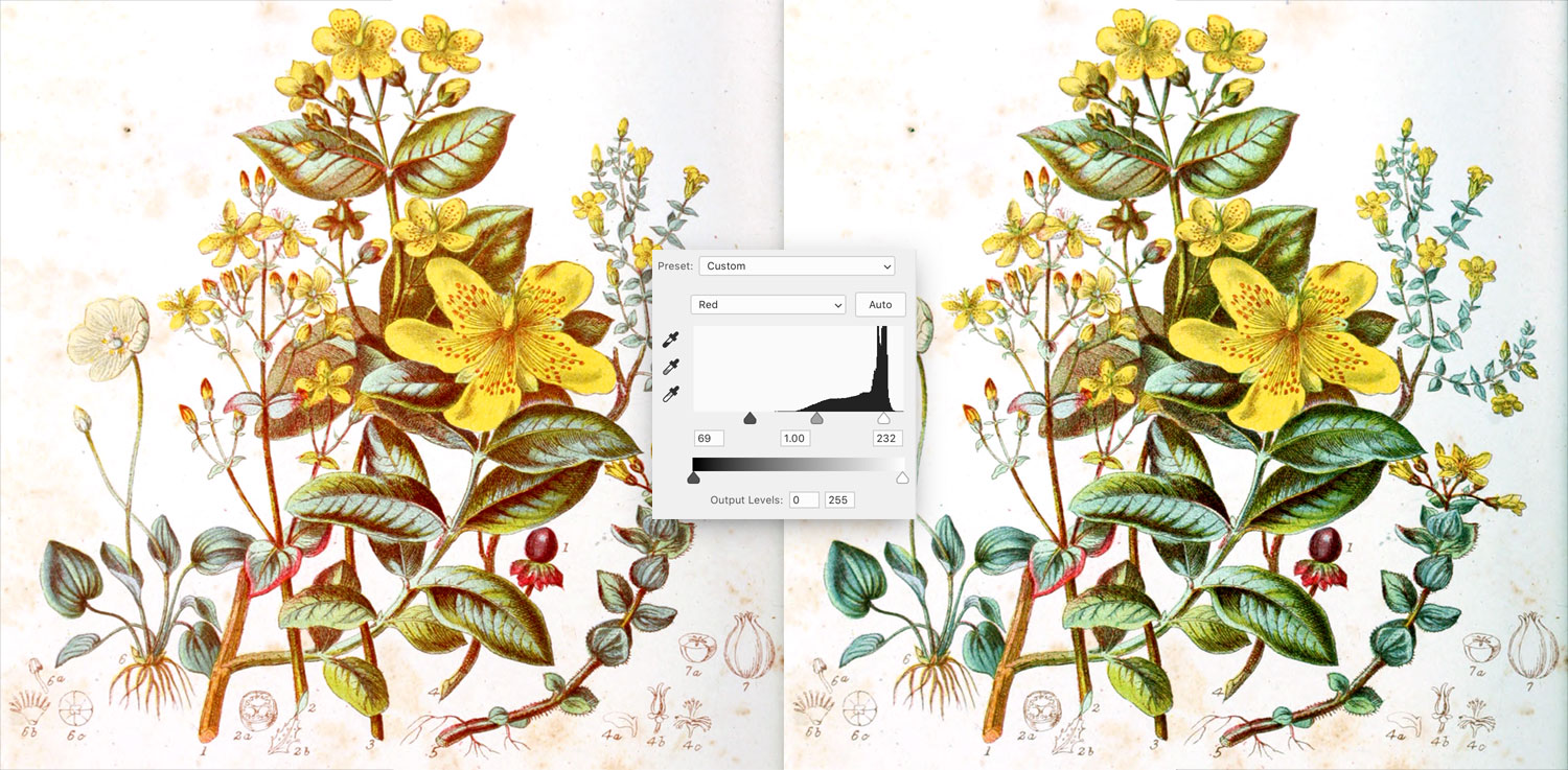
Sometimes additional adjustments layers like curves or vibrance were needed to improve the overall contrast or make the image pop a little more.
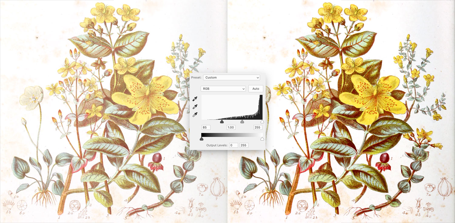
Once the color was set, I turned my attention to the small grayscale sketches at the bottom. They were often much lighter than the main illustration and needed to be darkened. I did this by using a hue/saturation adjustment layer to convert the image to grayscale including the background and then using levels and/or curves adjustment layers—sometimes one for each—to adjust the contrast so the background was white and the lines were darker. Each layer had its own mask so as to not interfere with the rest of the image and were all put in a group with an overall mask comprising the masks of each layer. The result was a somewhat messy image but ready for the next lengthy step of removing the background.
3. Cleaning up the background
Since the illustrations were done in 1868, the paper on which they were drawn had turned yellow and developed foxing. I’ve used Photoshop a long time and it has a lot of tools that seem to work like magic but it doesn’t have a perfect way of removing the background from images like these illustrations so I embraced my childhood and took up coloring once again in the form of carefully masking out the background. Thankfully, Photoshop has a few tools that make this easier than it sounds but the process is still time-consuming.
To create a clean white white background I used a solid color adjustment layer with a mask. The premise behind masking is that when a mask is applied to a layer, the white parts show the layer and the black parts hide it.
By using a white solid color adjustment I used an inverted black mask (making it invisible) it to start, and then filled in all the background areas with white. As a shortcut for doing this, I used the magic wand tool to select the lightest colors from the original scan with a tolerance of 16 and filled the solid color mask with that.
I found that a tolerance of 16 let me select most of what I needed. Any more and the outlines of some plants would have been selected. Any lower and too little of the background would be selected. This filled in most of the background but usually left small spots throughout that needed to be filled in. Adding a threshold adjustment layer set to the maximum setting and lowering the opacity to 50% made anything that wasn’t pure white stand out nicely so I could fill them in by hand. The threshold layer was strictly a helper layer and wasn’t part of the final image.
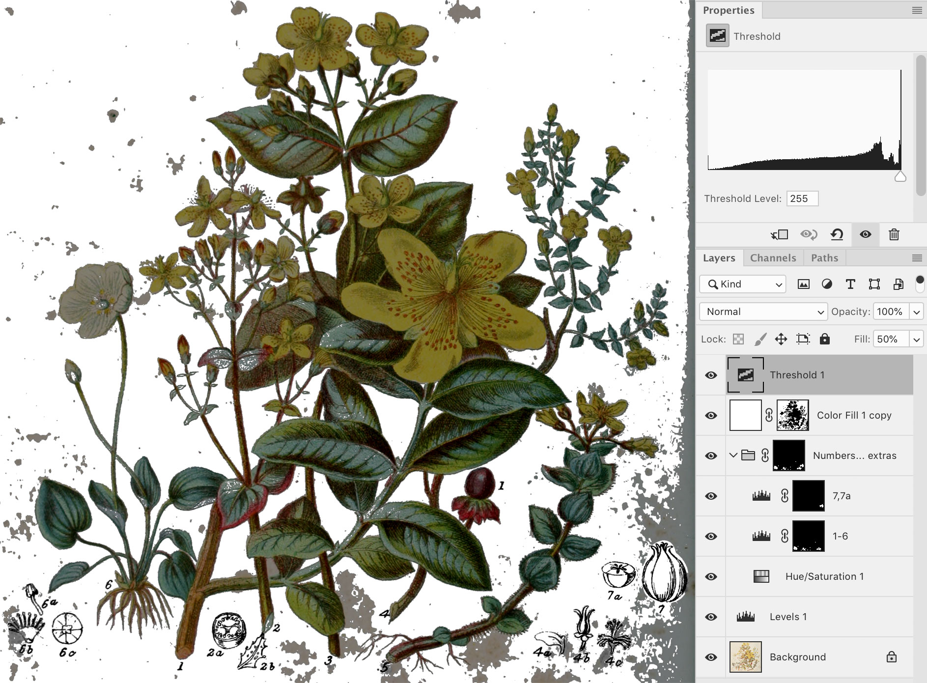
Enabling the contiguous option for the magic wand tool would have required clicking each area of the background to them in with white. Disabling meant colors that were part of plants were also selected but I wanted to keep those visible. I found erasing the mask of the white color manually would be faster, tedious, and more enjoyable than trying to select all the areas of the background. Plus, many edges around plants often needed cleaning.
Highlighting the layer mask using the keyboard shortcut \ helped with this tremendously. I also dropped the opacity of the white fill and primarily used the highlighted layer mask as my guide for what was visible and what wasn’t. This allowed me to see what was behind the white background I was creating and what wasn’t so I could use the brush tool to fine-tune everything. Finally, I repeated the process with the small sketches below the main illustration. This process was often the longest taking anywhere from 20 minutes to a couple hours per image depending on how much needed to be done.
Since I spent most of my time adding or erasing parts of the background mask, I ended up remapping the keyboard shortcut to switch my foreground and background colors to the right side of my keyboard. My dominant left hand could stay on the mouse while my right hand used the keyboard cuts for resizing brushes ([ and ]), switching colors (remapped from X to /) and toggling the layer mask highlight (\). I didn’t own a stylus so I honed my skills for using a mouse to paint in Photoshop.
Below is a time lapse screen recording of the entire process for restoring the image for the rue tribe. The process took about 30 minutes.
The results of all this were clean, vibrant versions of each illustration. Plus, since all the modifications were done with masked adjustment layers, they could continue to be tweaked as I worked on the project without redoing everything.
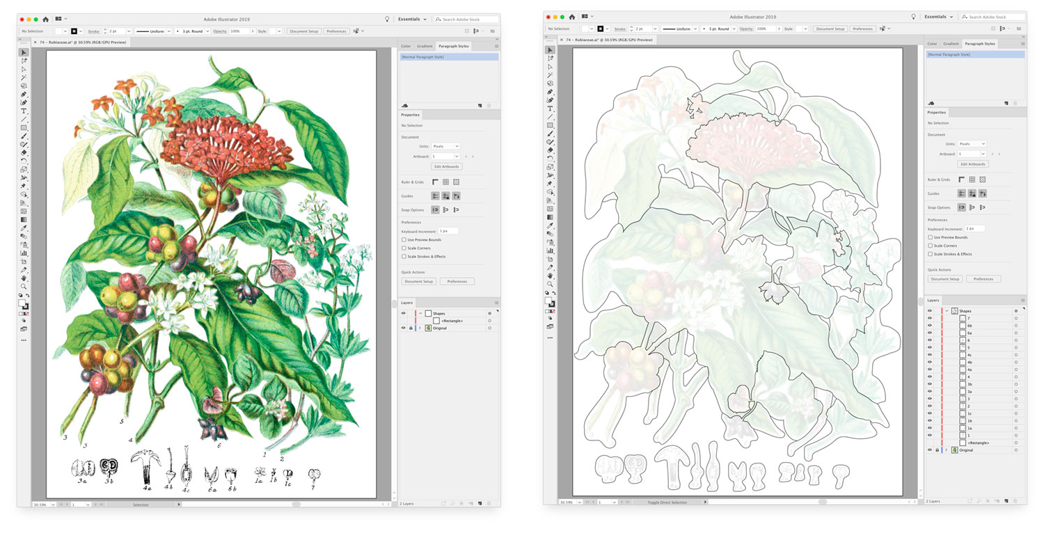
Creating hotspots
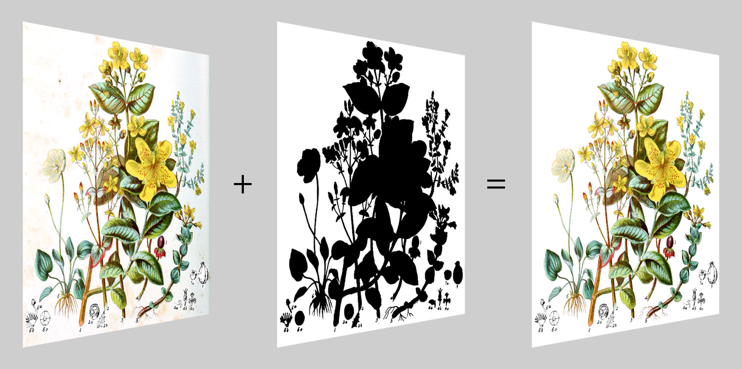
Once an illustration was restored in Photoshop, hotspots needed to be made from it. I used Illustrator to place a linked Photoshop file and create a layer above it do draw the shapes. Placing a linked file allowed me to make adjustments in Photoshop if necessary like fixing where the mask edges are and see the effects updated automatically in Illustrator.
After importing, I always drew a rectangle the full size of the illustration in the shapes layer because it would allow me to subtract the shapes I drew from it to preview how the isolated view would look for any given plant.
Using the paintbrush tool, I carefully outlined every plant one at a time, naming each shape as I created it and previewing how it looked. However, I didn’t need to trace the exact edge of every plant—just the edges that weren’t next to a white background. Edges that were next to a white background could be more loose because the hotspots were going to be white in the final interactive illustration.
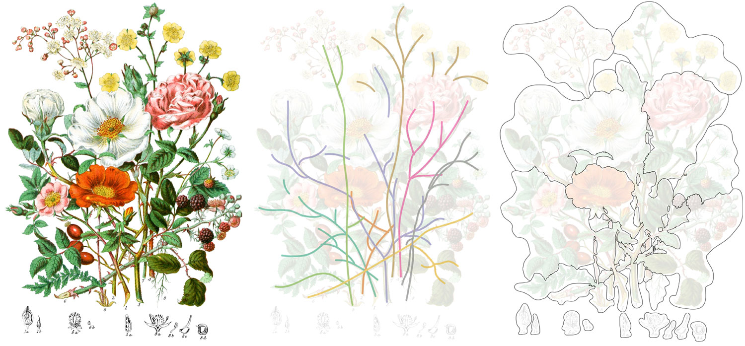
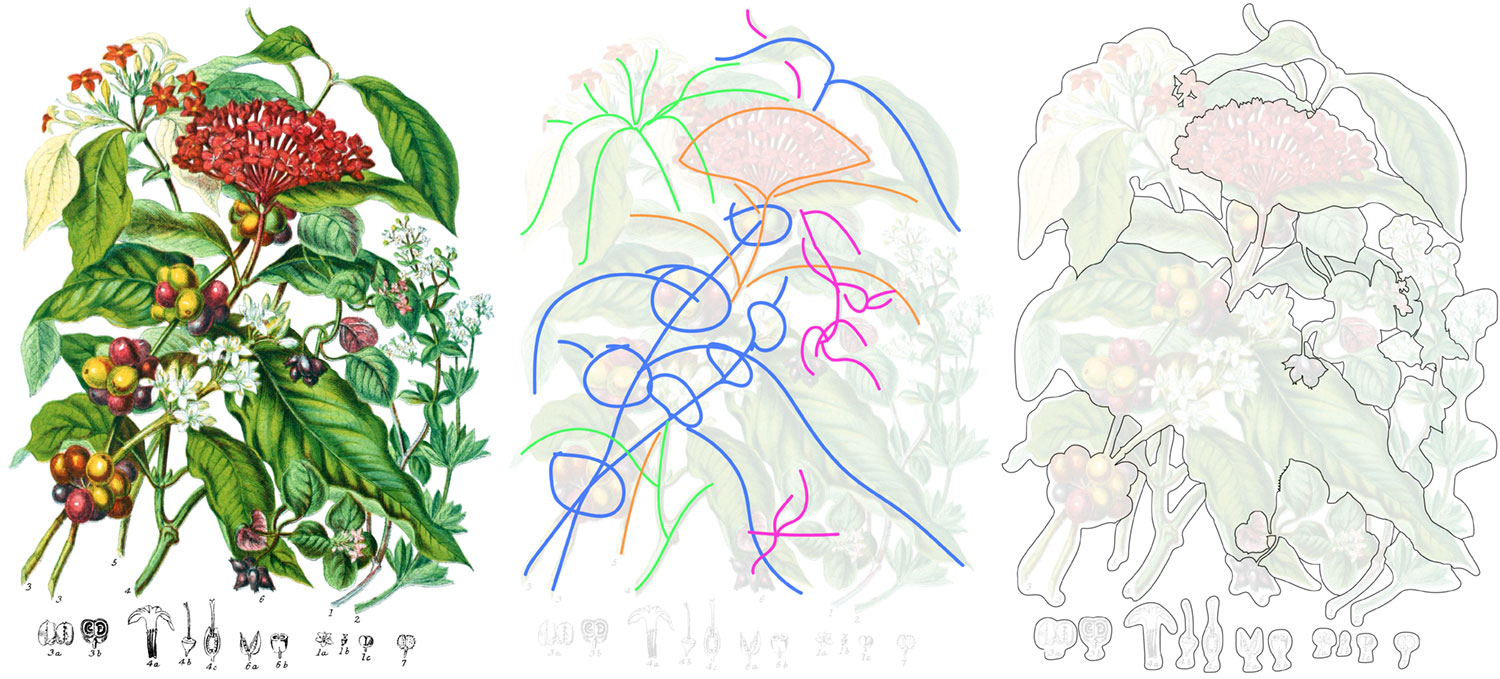
This was the most time-consuming part of the entire project. Some illustrations like the moss and liverwort tribes were simple to outline because the plants didn’t overlap or only overlapped a little. Others like the rose, pea, mallow, and Indian cress/nasturtium tribes included so many overlapping plants that I spent a great deal of time just figuring out which parts when with what. Occasionally, I had to draw temporary reference lines so I could keep the different parts of each plant straight.
Below is another timelapse screen recording of the entire process for tracing the illustration for the rue tribe. The process for this one took about three hours and took between 30 minutes and four hours each for the others.
Once a shapes of the hotspots were completed, I exported them as an SVG file, keeping the markup as simple as possible so I could add attributes that would eventually appear in popups when clicked.
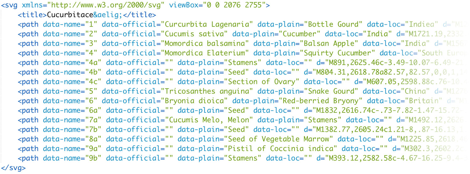
Each set of hotspots comprised a title and a path for each shape. Each path had three attributes that I added manually when they were exported:
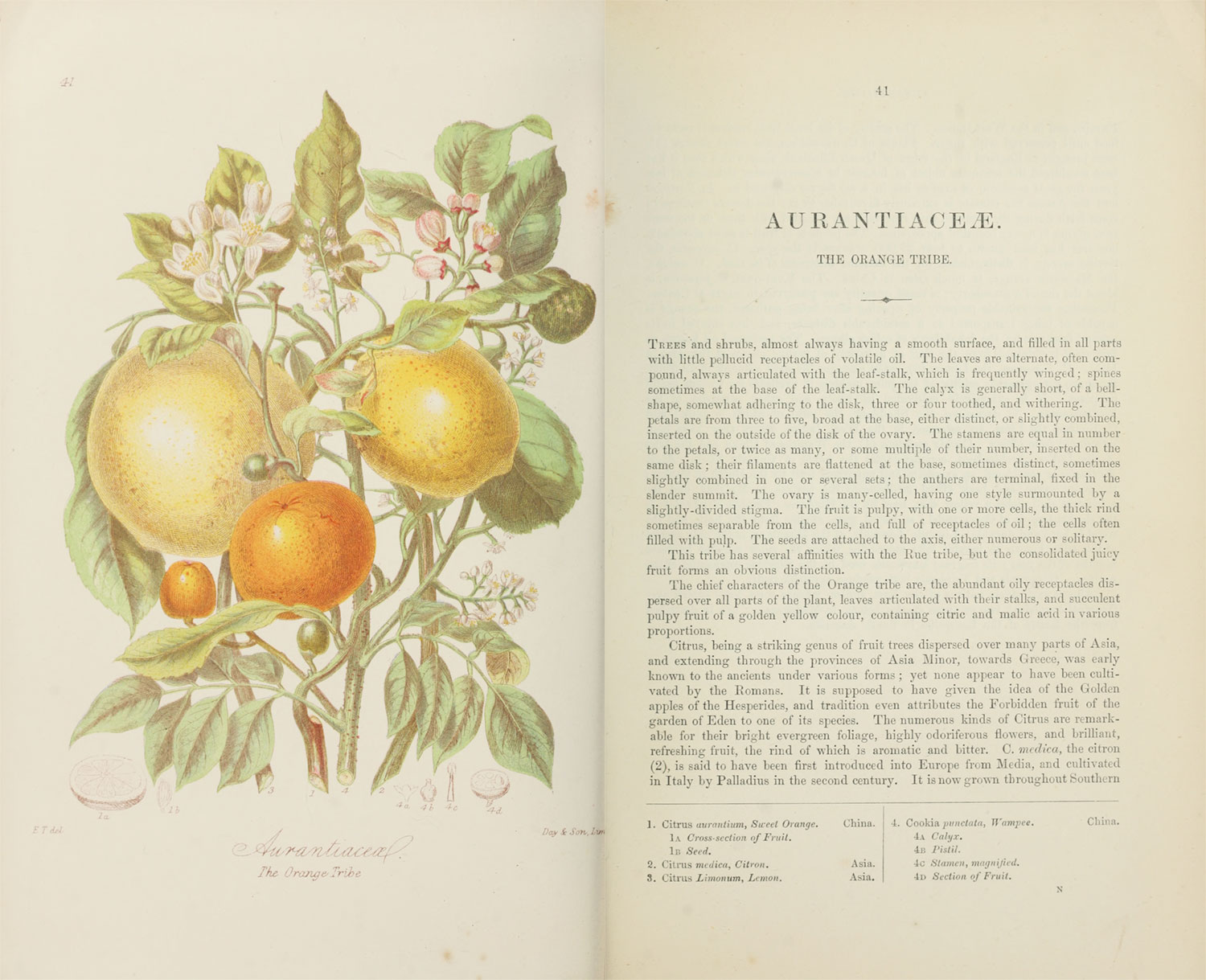
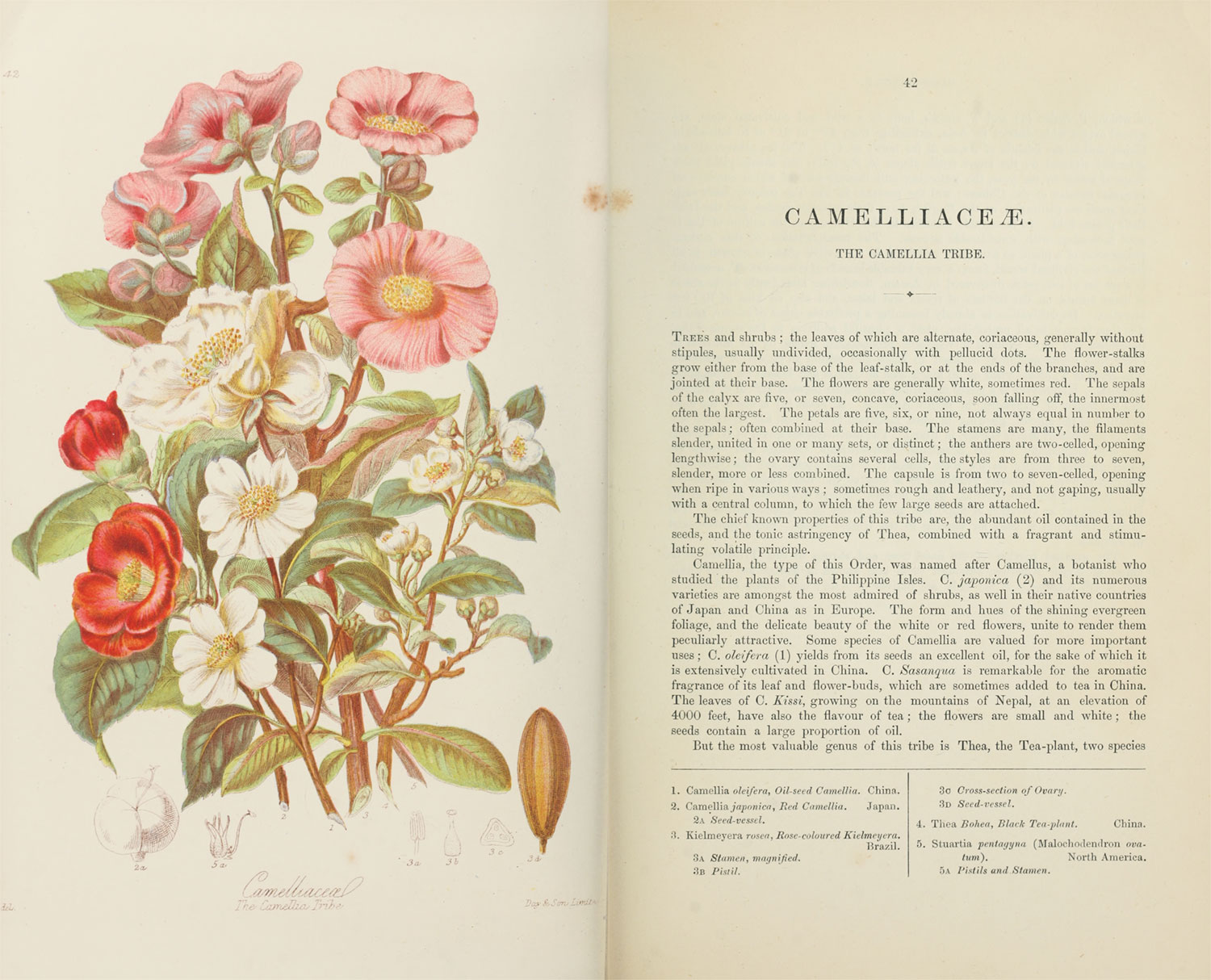
data-name: The reference number that appeared in the illustrationdata-official: The scientific name of the plant from the legend in the descriptiondata-plain: The common name of the plan from the legend in the descriptiondata-loc: The location where the plant normally grows from the legend in the description
<div class="plant-illustration">
<img alt="Cucurbitaceæ" class="plant-illustration-image" src="/images/twining/large/cucurbitaceae.jpg">
<div class="plant-illustration">
<svg xmlns="http://www.w3.org/2000/svg" viewBox="0 0 2076 2755" preserveAspectRatio="xMidYMid meet">...</svg>
</div>
</div>
.plant-illustration {
display: flex;
height: 80vh;
justify-content: center;
margin: 0 auto 1em;
max-width: 1000px;
position: relative;
}
.plant-illustration-image {
height: 100%;
object-fit: contain;
object-position: 50% 50%;
width: 100%;
}
.plant-illustration-masks {
height: 100%;
left: 0;
position: absolute;
top: 0;
width: 100%;
}
The most complex hotspots I drew were those with fine hairs along the stem as in the blood-root and fern tribes, roots of the frog-bit and arum tribes, or other fine details like the orchis and composite tribes. Click Outlines under any illustration to see the hotspots.
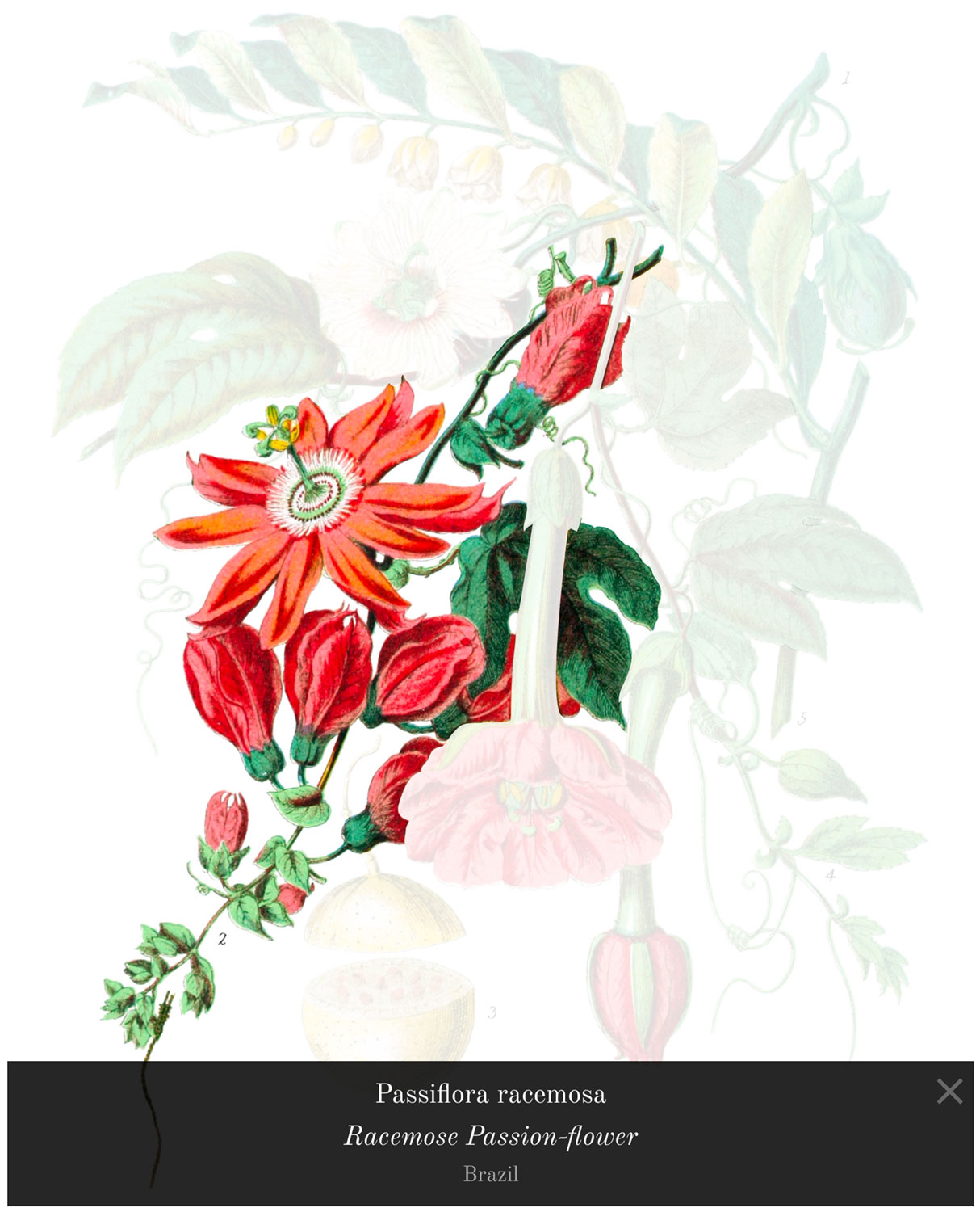
With a little extra work, I added popups that appear when clicking any of the shapes, which allow readers to better understand what they’re looking at.
After all the illustrations were completed, I ended up tracing 772 plants and 1,417 small sketches across 160 illustrations over 3 months.
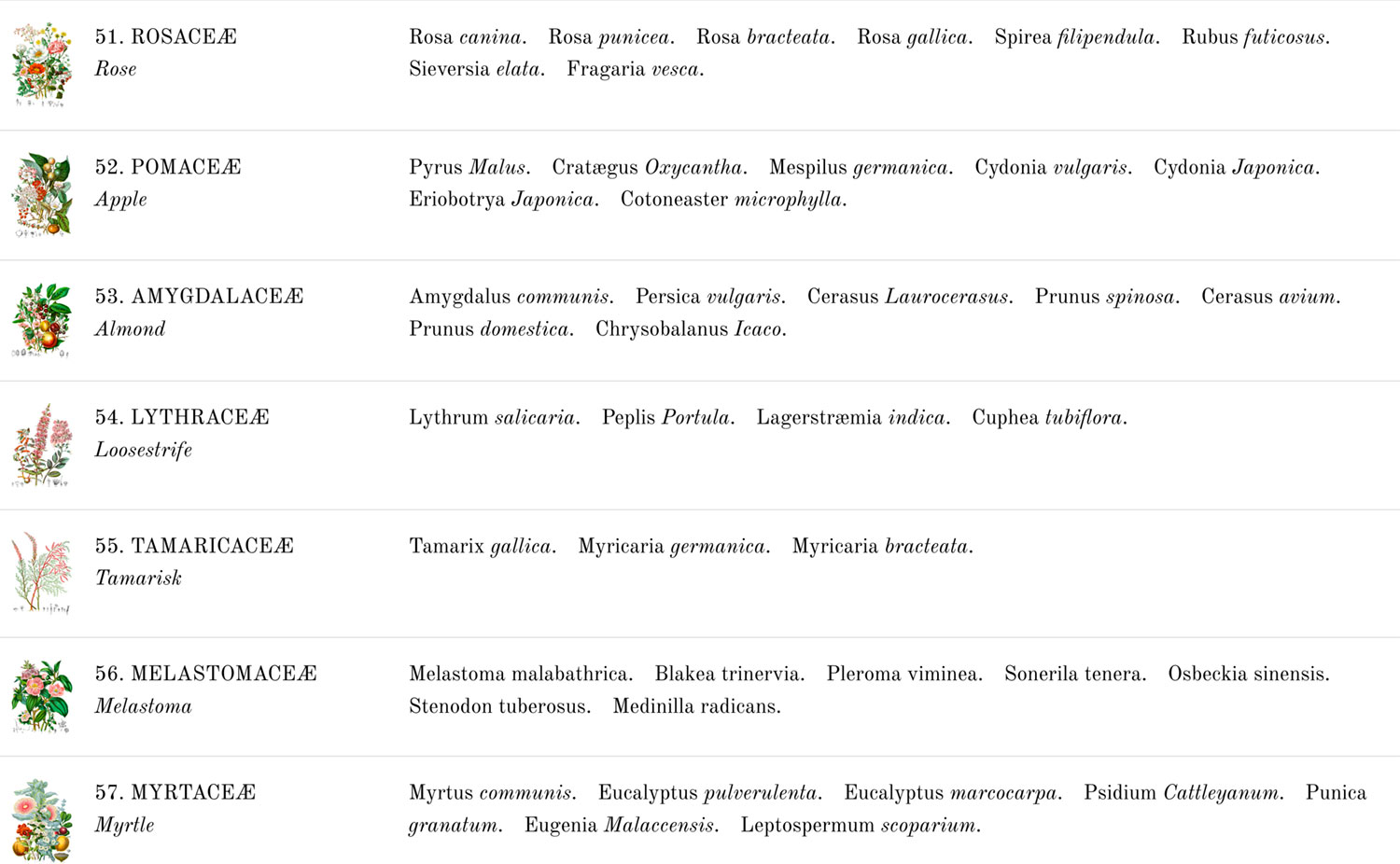
Recreating descriptions
The last step in bringing each illustration online was copying the description that accompanied it. These descriptions were usually about one and a half to two pages long and came in five parts:
- Descriptions of the general characteristics of the plants in the tribe
- Affinities with others
- Details about select plants in the tribe
- Locations where plants typically grew
- A legend of the illustrated plants
These sections weren’t labeled in the original publications but I added headings and combined a few for added clarity. The longest section was typically the third with details about select plants in the tribe but as was common in older publications, the information was presented a single long “wall of text” with no indentations or line breaks making the process of reading it. I believe this was done partly as as a cost-saving measure to reduce the amount of printing that needed to be done. One major change to the original that I made was changing that third section to a simple bulleted list with one bullet for each genus or species mentioned. I didn’t change the wording or any of the punctuation—just the formatting so it would be easier to read.
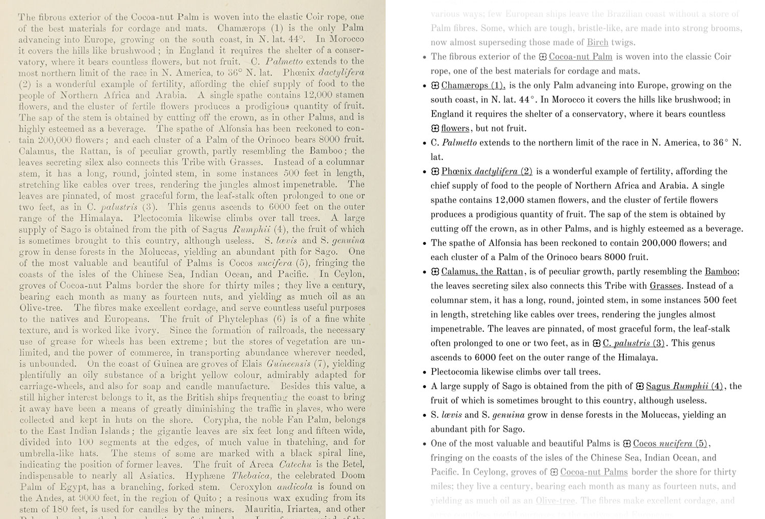
The other major change was the addition of clickable names for the plants that were illustrated. A small flower icon appears next to the name of each plant or part of a plant that was illustrated. Clicking it highlights it in the text and in the illustration, aiding the reader in understanding what is being described.
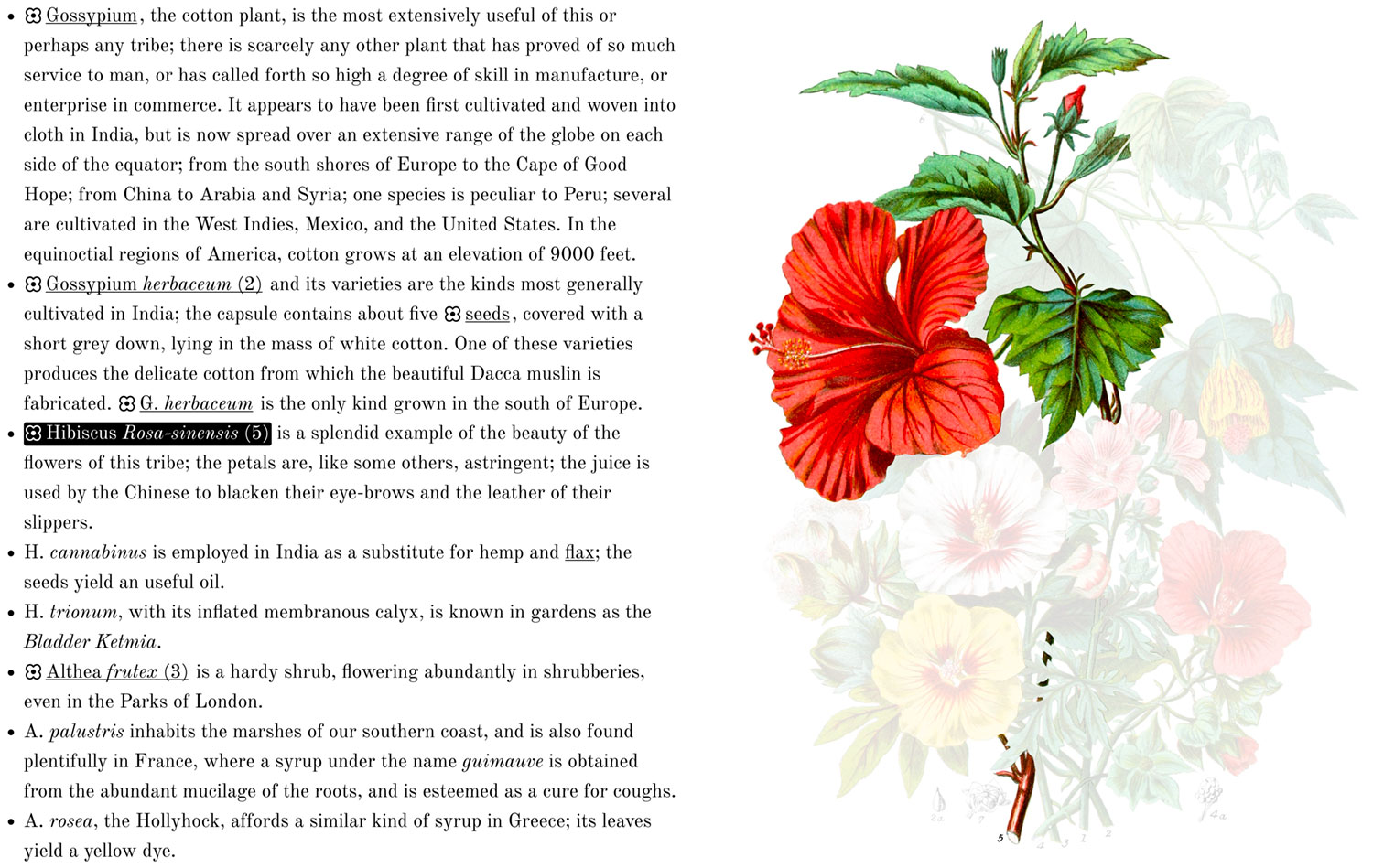
To create these clickable names, I originally planned on using regular anchor links or buttons but opted for the non-semantic <span> tag with a data attribute and non-semantic <i> tags to italicize the species for a couple reasons: anchor links would have implied navigating away from the page (which didn’t happen) and there was no semantic reason for italicizing text, only a stylistic one. The data attribute allowed me to target the related shapes on top of the illustration.
<span data-targets="5">Hibiscus <i>Rosa-sinensis</i> (5)</span>
I also made sure to customize the numbering in the legend to use a combination of numbers and small caps lettering. This took some creative CSS but after some trial and error I achieved it:
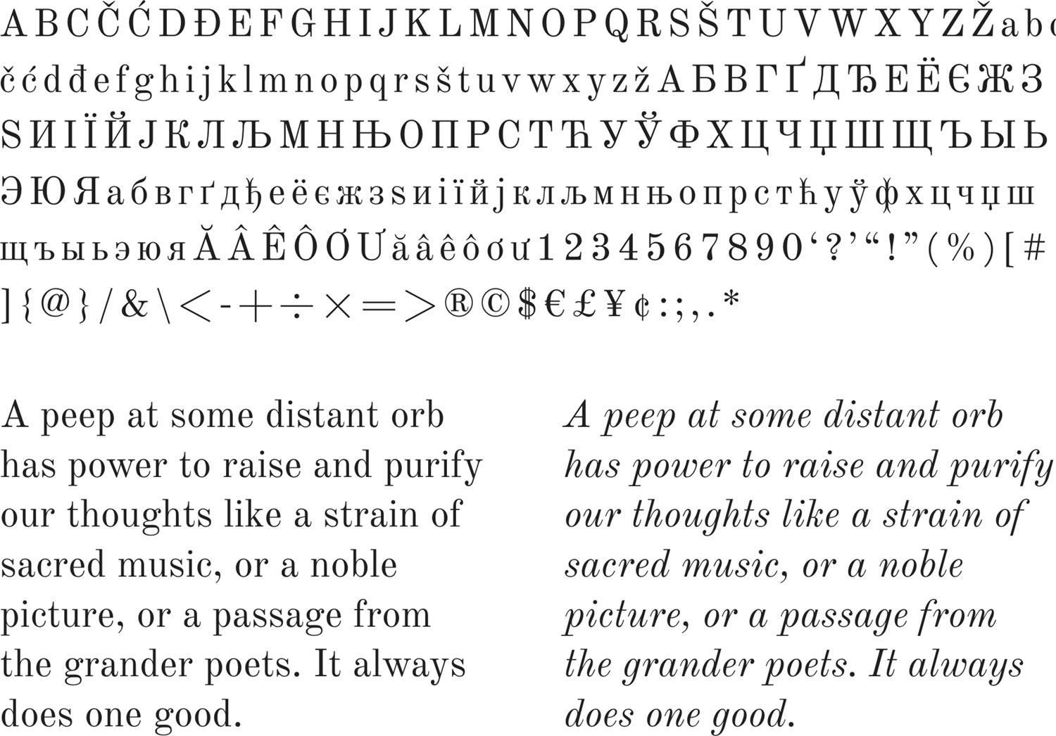
For the font, I chose Old Standard TT from Google Fonts because it had the most similar feel to the typeface used in the original and was even designed to be similar to the typefaces used in the late nineteenth and late twentieth centuries. I particularly like the italicized text.
Some interesting things I noticed in the text:
- The first and fourth pages used an upside down lowercase “i” for the letter “l” in the first and fourth pages of the original listing of the contensts of plates.
- Some plants that were described as most “extraordinary,” “valuable,” “celebrated,” or other superlatives that elevated them above the others in the tribe, yet they weren’t illustrated and were often at the end of the description (see Vellozia from Blood-Root, Aloe from Amaryllis, Potato, Yam, Colchicum, and Papyrus from Sedge).
- Many descriptions had long run-on sentences and several like teasel (see the original text) used colons as a way to break up different sections rather than periods or semicolons.
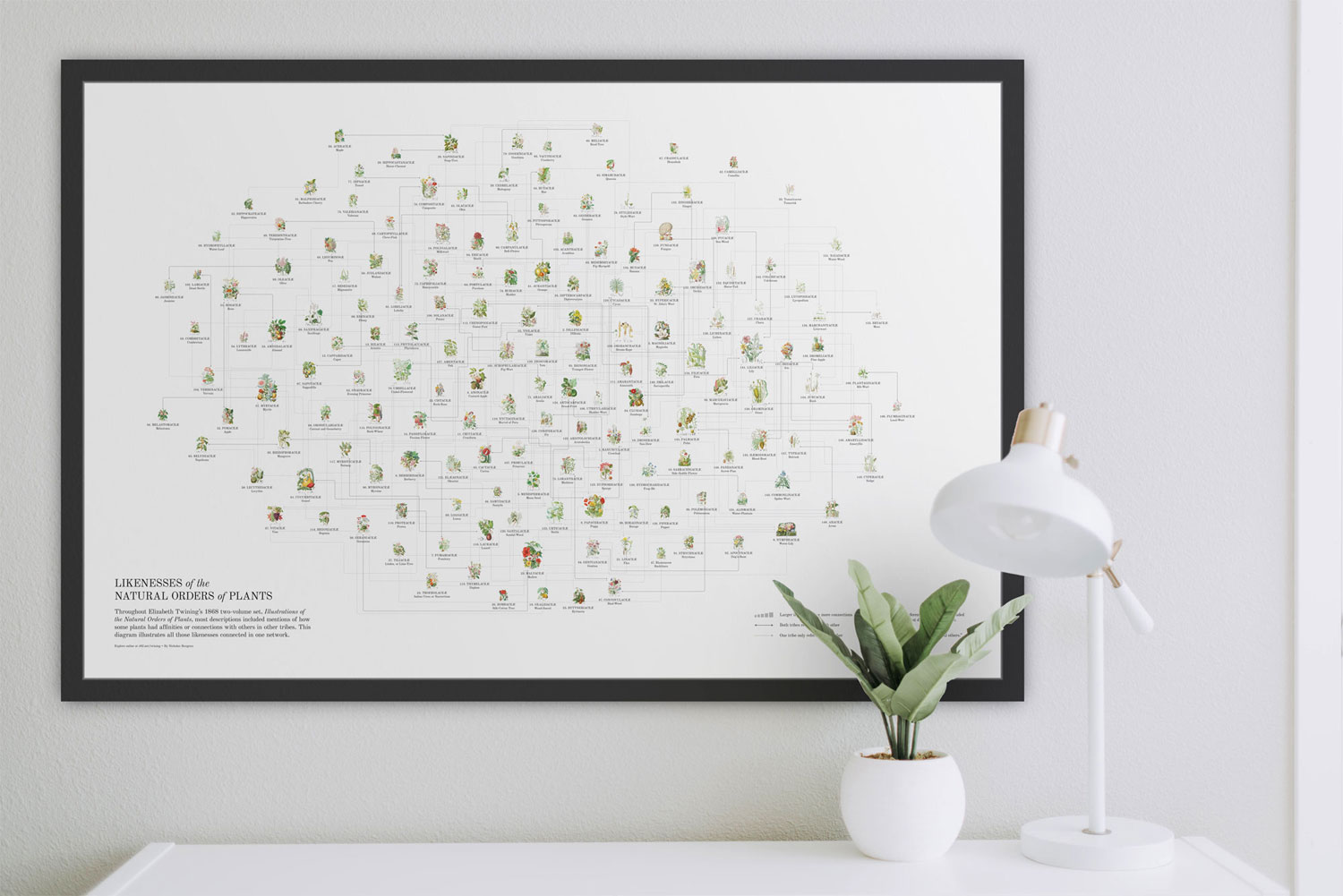
Likenesses
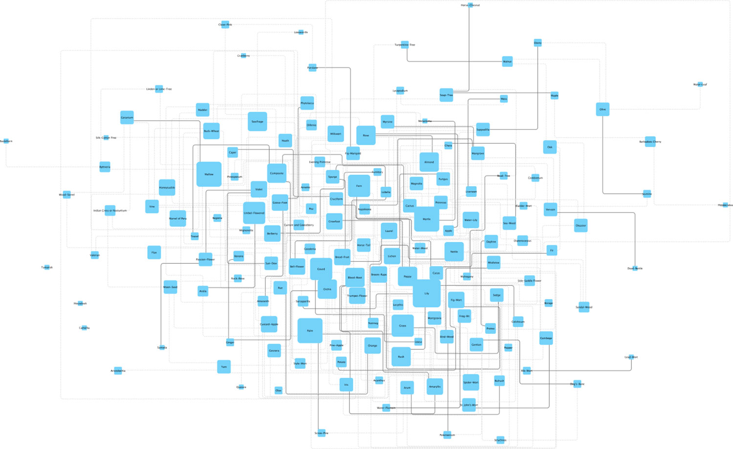
An interesting aspect of each illustration’s description were the similarities to other tribes. These were nothing more than a few words but their presence got me thinking what the relationships were look like if they were graphed. As I worked on each illustration, I kept track of the similarities that were mentioned.
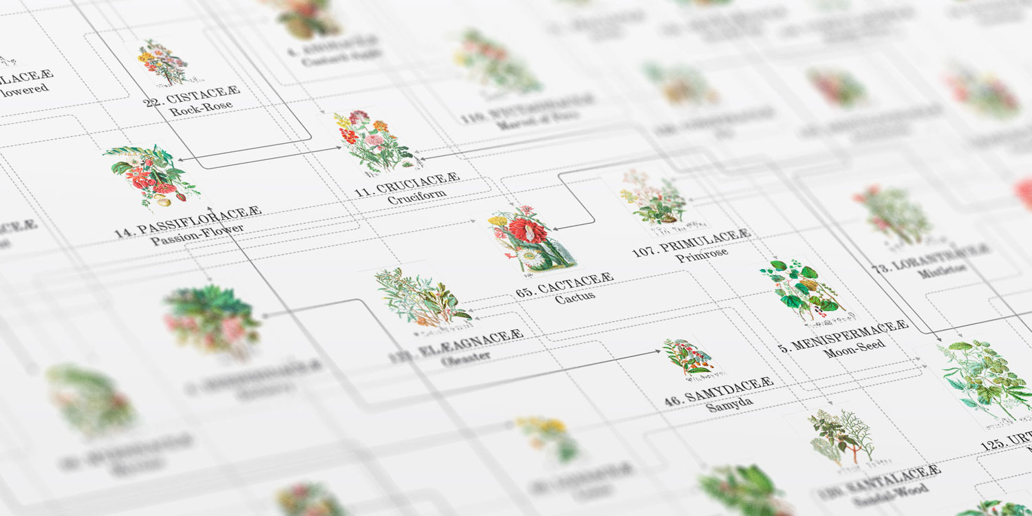
Interestingly, not all plants referenced each other. For example, the description for lilies mentions a link with rushes and vice versa but the orange tribe mentions a link with the rue tribe but the rue tribe doesn’t mention one. Some tribes also don’t mention any affinities, likenesses, similarities, or links with other tribes like the tamaraisk tribe and others only mention non-specific likenesses like the houseleek tribe. I didn’t want to incorrectly infer likenesses so I only kept track of specific mentions of other tribes.
For example:
✓ “This Tribe has affinity with Amaryllidaceæ and Hæmodoraceæ…” as in the pine-apple tribe
✗ “The succulent nature of this tribe connects it with several others.” as in the houseleek tribe
I only collected the data as I finished working on each illustration so I didn’t know what the final set of data would look like for months. After about completing about two-thirds of them, I created a few sample graphs using Highcharts, Cytoscape.js because I knew of them and had dabbled with them in previous projects.
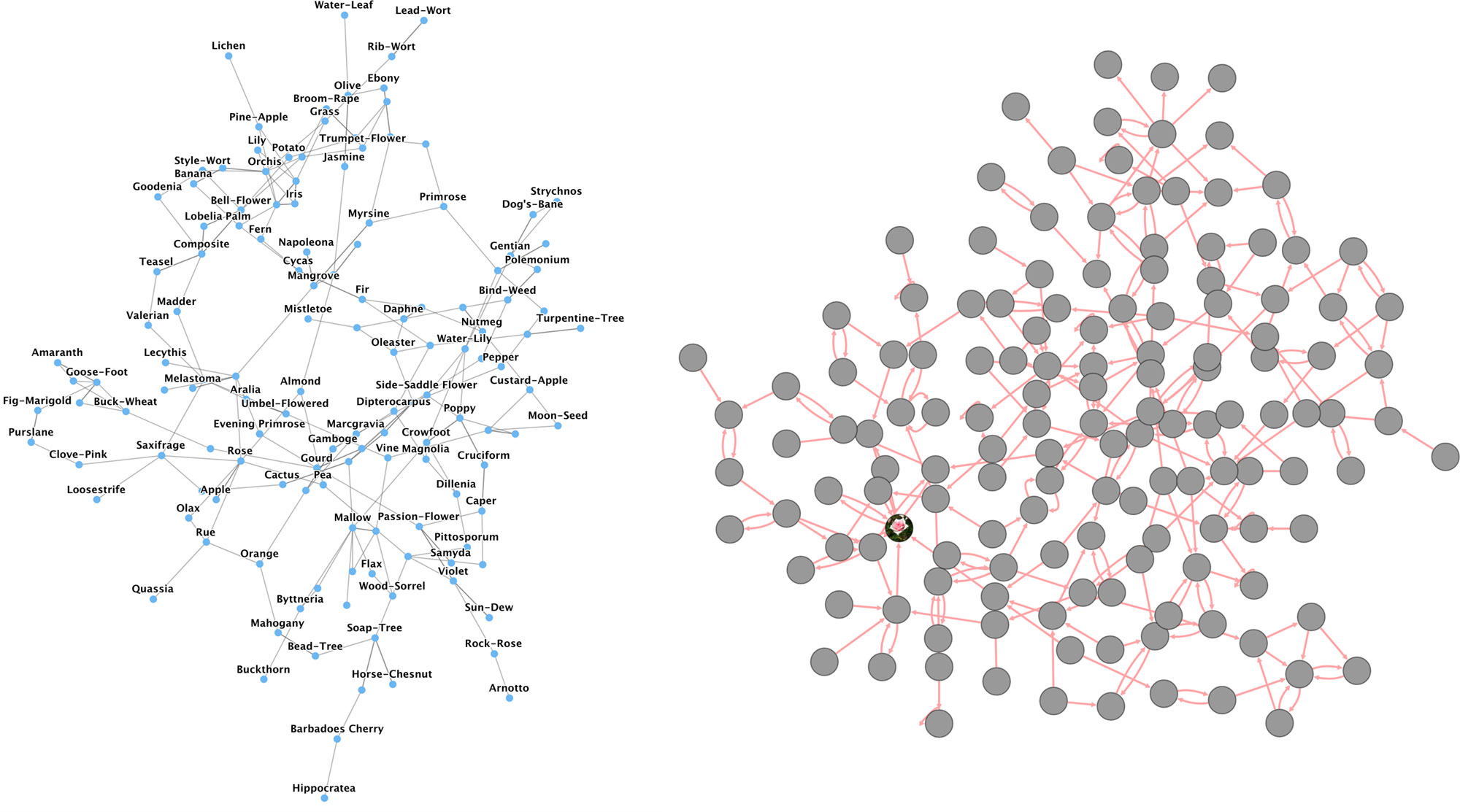
I wasn’t impressed with the results because they suffered the same problem as most network graphs: looking like indecipherable hairballs. I wanted to see if creating a readable network diagram was possible and by “readable” I mean I can easily see what’s connected with what.
Cytoscape (the app, not the code library) popped up on my radar a year or two ago but I didn’t have a need to learn it beyond basic exploration so I wasn’t very familiar with its workflows. After playing around with it for a different project, things started to click and I saw how it could be used to visualize the similarities between tribes. Is has features that let support customizing node and edge styles depending on available data. I just needed to have data in a spreadsheet as a list of edges to get started. An edge consists simply as a pair of nodes: source and target.
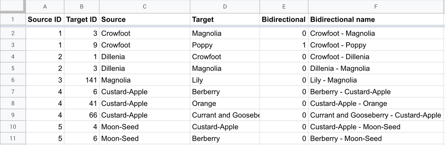
Once I had collected all the likenesses data, I fed that into Cytoscape and played with the layout options. The first result was still hairball like but the layout algorithms it offered showed some more interesting results—particularly the hierarchical, orthogonal, and organic ones from the yFiles plugin.
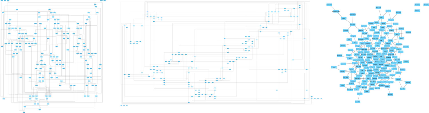
I liked some of these layouts because I could follow a connection from one node to another. The orthogonal layout especially piqued my interest because its purpose is to avoid overlapping lines. The result is a lot of long straight lines and it’s intriguing to explore. However, the nodes were far apart and the groupings didn’t bear much meaning. The algorithms from yFiles don’t support any additional customization either.
The compound spring embedder (CoSE) layout produced the most interesting results with limited node overlaps, had customizable settings, and could be applied repeatedly to see different results.
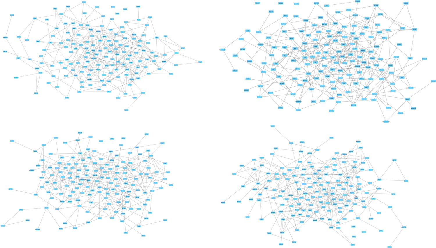
I wasn’t a fan of the angled lines connecting each node but combining a CoSE layout with the yFiles orthogonal edge router tool which comes with their other layouts in their plugin produced results that really intrigued me. I really found the 90-degree angles with rounded corners aesthetically pleasing and they made me want to explore the relationships more.
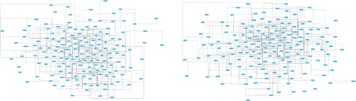
For a few more touch-ups, I added data for each node about how many likenesses and whether or not a likenesses between tribes referenced each other and based the styles of nodes and edges on them: larger nodes had more connections, dotted lines were for one-way references, and solid lines were for tribes that referenced each other.
I started out wanting to simply explore what these likenesses looked like in a diagram and had no real intention of creating an online visualization but I found the results so intriguing that I wanted to share them with others. So started the next set of challenges: fine-tuning and finding a way to put it online.
My first thought was to use a coding library made specifically for reproducing network graphs online. Cytoscape It offers a way to export the graph to an interactive widget but not with the options I wanted. Cytoscape.js combined with Cola.js seemed promising but the learning curve was too steep for me and I could never get something promising to work. yFiles has its own library but was far too expensive for my small project. I looked into more tools but couldn’t find one that allowed me to create the effects I wanted.
I ended up taking the manual route and doing most of the work by hand. There are probably more efficient methods that people more experienced than me could have devised but I don’t mind a little elbow grease—especially after spending three months restoring 160 illustrations and tracing each plant.
The results from Cytoscape were great but needed a lot adjustments if I wanted to polish them up and I couldn’t do them from within the app. Cytoscape was useful for placing the nodes and edges but I wanted to do more. The most I could do was create placeholders for all the thumbnails of illustrations to appear and update the formatting of the node labels (font, size, color, width). What it did do was export to an SVG file, which I could then manipulate on my own.
The export from Cytoscape was simpler than the initial polished example for several reasons:
- Not all the rounded corners turned out nicely. Some were uneven.
- Cytoscape exports arrowheads as separate shapes
- Cytoscape draws lines with arrowheads oddly in tight spaces
- The edges needed adjusting so they didn’t interfere too much with the node labels
- Thumbnails of illustrations had to be added manually. (Cytoscape does support doing this but it’s slow for the volume I needed and not as precise.)
I addressed these by manually editing most edges, nodes, and all the text in Illustrator. I recreated rounded corners using the rounded corners effect which produced more reliable and adjustable results than Cytoscape. The really “fun” part of this step was that I had to do this all twice. After completing the first version, I noticed I left out many edges and had typos in others. These manual adjustments took several days for each version.
However, I still needed to get the diagram online in some interactive format. Exporting an SVG from Illustrator cleaned up the messiness from Cytoscape but still required some TLC and I wanted to use the illustration images stored online rather than being embedded from Illustrator. By naming each shape in Illustrator, IDs and names were generated in the SVG which were useful for reference. That meant, despite the work to add all the illustrations in Illustrator, I had to find a way to use them in a browser.
I cleaned up the SVG code to have three main sections:
- Lines: the edges connecting nodes
- Text: the text under each node
- Containers: the boxes for illustration thumbnails
- Patterns: pattern definitions for each illustration thumbnail applied to containers.
Creating the arrowheads worried me because didn’t think SVG files supported them and required that a separate shape be drawn for each one. I’m glad I searched for an answer because markers did exactly what I wanted with only a couple more lines of code
The code ended up looking like this:
<svg version="1.1" xmlns="http://www.w3.org/2000/svg" viewBox="0 0 3525.5 2351">
<defs>
<pattern id="thumb-1" patternContentUnits="objectBoundingBox" width="100%" height="100%">
<image href="/images/twining/small/ranunculaceae.jpg" preserveAspectRatio="none" width="1" height="1" />
</pattern>
<pattern id="thumb-2" patternContentUnits="objectBoundingBox" width="100%" height="100%">
<image href="/images/twining/small/dilleniaceae.jpg" preserveAspectRatio="none" width="1" height="1" />
</pattern>
<pattern id="thumb-3" patternContentUnits="objectBoundingBox" width="100%" height="100%">
<image href="/images/twining/small/magnoliaceae.jpg" preserveAspectRatio="none" width="1" height="1" />
</pattern>
...
<marker id="arrow-light" viewBox="0 0 10 10" refX="9" refY="5" markerWidth="6" markerHeight="6" orient="auto-start-reverse">
<path class="link-arrow-mono" d="M 0 0 L 10 5 L 0 10 z" />
</marker>
<marker id="arrow-dark" viewBox="0 0 10 10" refX="9" refY="5" markerWidth="6" markerHeight="6" orient="auto-start-reverse">
<path class="link-arrow-bi" d="M 0 0 L 10 5 L 0 10 z" />
</marker>
</defs>
<g id="scene">
<g id="Lines">
<path data-source="1" data-target="3" class="link link-mono" d="M2474.6,1022.2V751.9c0-2.8,2.2-5,5-5h14.4" marker-end="url(#arrow-light)"></path>
<line data-source="2" data-target="3" class="link link-mono" x1="2242.6" y1="712.3" x2="2493.9" y2="712.3" marker-end="url(#arrow-light)"></line>
<path data-source="2" data-target="1" class="link link-mono" d="M2242.6,774.1h237.7c2.8,0,5,2.2,5,5v243.8" marker-end="url(#arrow-light)"></path>
...
</g>
<g id="Text">
<text data-name="1" transform="matrix(1 0 0 1 2465.6973 1199.2053)">
<tspan x="0" y="0" class="order">1. Ranunculaceæ</tspan>
<tspan x="34.8" y="13.6"class="tribe">Crowfoot</tspan>
</text>
<text data-name="2" transform="matrix(1 0 0 1 2150.9492 815.2053)">
<tspan x="0" y="0" class="order">2. Dilleniaceæ</tspan>
<tspan x="29.8" y="13.6"class="tribe">Dillenia</tspan>
</text>
<text data-name="3" transform="matrix(1 0 0 1 2499.917 774.0549)">
<tspan x="0" y="0" class="order">3. Magnoliaceæ</tspan>
<tspan x="29.3" y="13.6"class="tribe">Magnolia</tspan>
</text>
...
</g>
<g id="Containers">
<a href="/twining/plants?id=1"><path data-name="1" fill="url(#thumb-1)" class="thumb" d="M2468,1022.2h110.6v161.4H2468V1022.2z"/></a>
<a href="/twining/plants?id=2"><path data-name="2" fill="url(#thumb-2)" class="thumb" d="M2156.9,693.3h85.6v106.4h-85.6V693.3z"/></a>
<a href="/twining/plants?id=3"><path data-name="3" fill="url(#thumb-3)" class="thumb" d="M2493.9,624.6h115v133.9h-115V624.6z"/></a>
...
</g>
</g>
</svg>
This appeared great in a browser and I used SVG Pan & Zoom to enable zooming and panning features. Figuring out the proper combination of attributes to get the pattern elements to display properly drove me a little crazy but the final result was worth it.
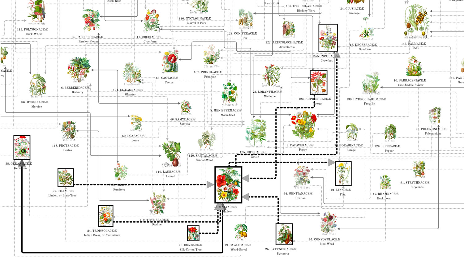
As a final touch, I added the ability to hover over each illustration and see which others it referenced. Each one is clickable too.
I’m really pleased with the final result.
Posters
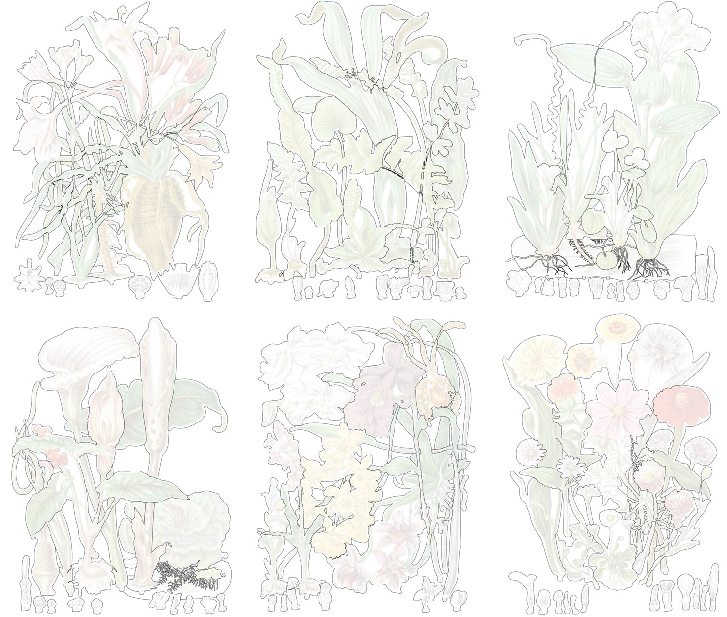
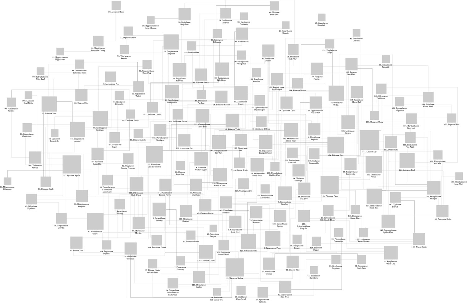
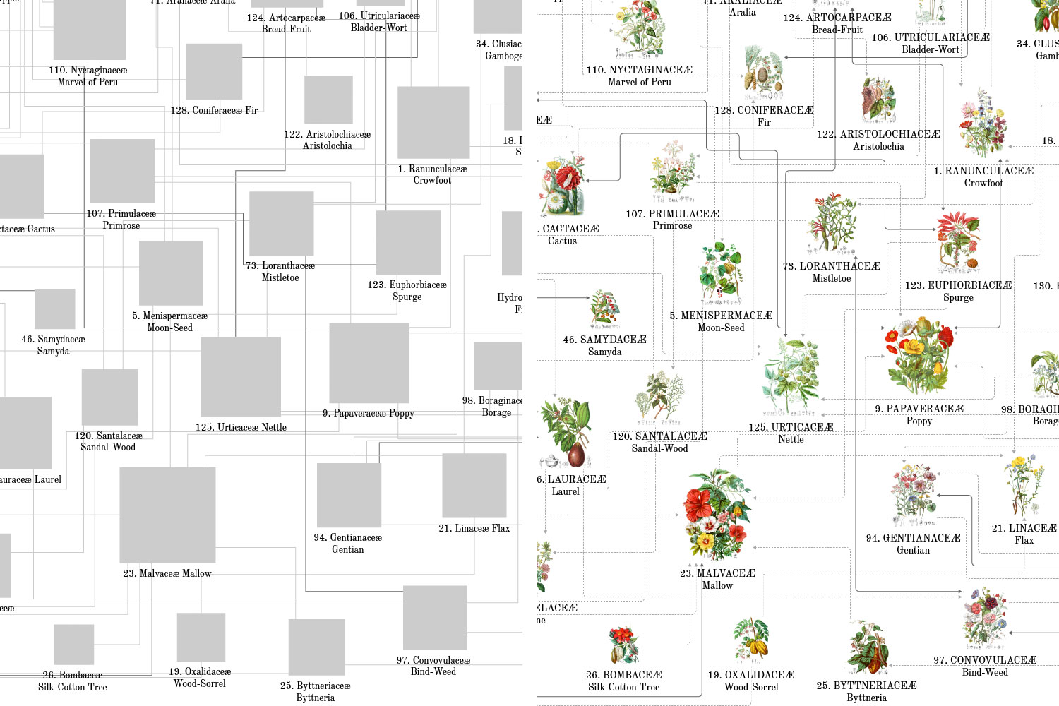
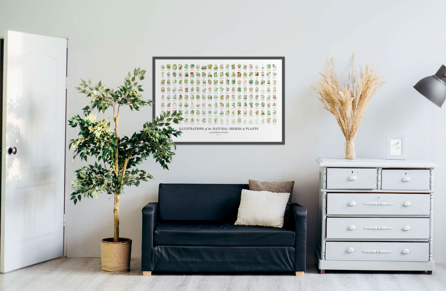
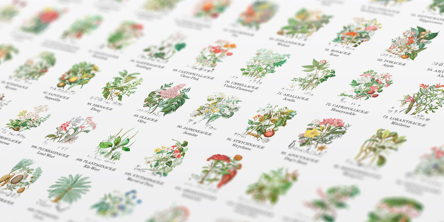
Of course there are posters. I couldn’t spend months making a project with beautiful data and not create a few posters so others can enjoy the material in their own home. I created two posters: one of all 160 illustrations arranged in the order they appear in the original two-volume publication and another of the likenesses network graph.
Putting it all together
When I put together a proof of concept with a restored illustration, clickable shapes, and reformatted description, is when everything really felt like it came alive.
Over the course of four months, I designed a website around Twining’s beautiful illustrations and one by one, restored them, put them online, and learned more about botanical illustration and plants in general than I ever expected.
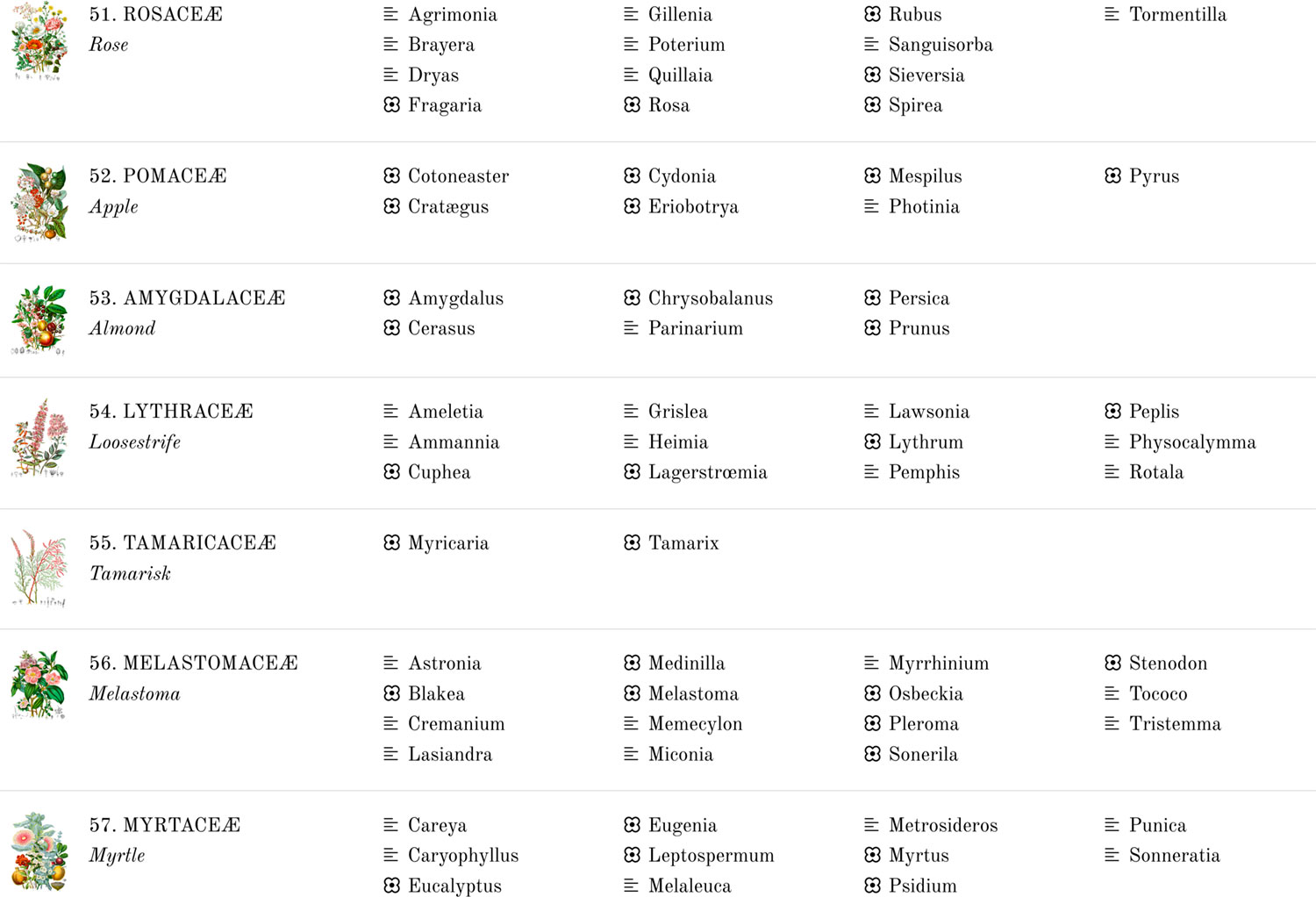
The final site is a simple one showcasing the entire contents of Twining’s original books, including her original introduction and conclusion with minor enhancements, the plant list which lists all the plants in each illustration, and even a genus index which lists every genus mentioned in the two volumes and slightly enhanced with indicators of which ones are illustrated versus just described.
Twining’s illustrations were so varied and individually so intriguing that I ended up using them as background images on the home page when a visitor arrives on the site. Each time the home page is loaded, a different illustration is chosen at random to fill in the background of the title area. Try it out and reload the home page a few times.
Final thoughts
I had no idea what I was getting into when I started this project. I figured I would put a few interesting illustrations online and maybe make something small and interesting with data I could extract them. I never expected to spend four months learning about Elizabeth Twining, botanical illustration, and gaining a whole host of new skills along the way but I’m glad I did and I’d be lying if I didn’t say I’m a little sad that it’s done.
As with most big projects, this became a big part of my life during most waking moments on the commute to and from my day job, during vacations, and even in some dreams. I spent so much of my free time focused on restoring images, tracing plants, coding, and learning about so many new things that not doing so leaves an empty space. Finishing a project like this is bittersweet in that I’m pleased to have completed such a large project and I’m not sure if it will appeal to others beyond me. I’m often left wondering what will grab my attention next. If my past efforts have taught me anything, it’s that someone out there is bound to find something interesting about this topic just as I did. The best thing to do is to create things that I find interesting and put them out there for the people to enjoy—whether it be thousands or just one other person who stumbles upon it.
I continue to be amazed by the beautiful illustrations Elizabeth created and encourage everyone else to not just check out her work but the many other botanical artists.