Making of Goethe’s Colours
By Nicholas Rougeux, posted on January 12, 2020 in Art, Web
Figuring out how to put a new face on something old is never easy and devising a new way to look at Goethe’s Theory of Colours was no exception. What started as a relatively simple idea turned out to be more complex that I expected but the process was a good learning experience. The final result is fun too.
I’ve analyzed my fair share of antique texts and each time I find a new one to explore, I find it both daunting and exciting to explore looking at it in new ways. I tried dozens of ideas for Goethe’s Colours before finally settling on one. As is often the case, it’s I don’t know what works until I see it so a lot of experimenting is needed.
In 1810, the German statesman and and writer Johann Wolfgang von Goethe explored the psychology of colors and how they’re perceived by humans in Theory of Colours. While mostly rejected by the scientific community, it was embraced by and influenced philosophers and artists.
The book had come across my radar several times in doing research for other projects and this time around, it piqued my interest enough to explore ways of visualizing its contents. Considering the book is all about colors, I chose to focus on the colors themselves—specifically, which ones were mentioned and when. My assumption was that the book would discuss many colors and visualizing this could prove interesting. I don’t speak German so I chose to use the 1840 English translation available on both the Internet Archive and Project Gutenberg.
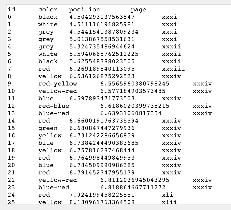
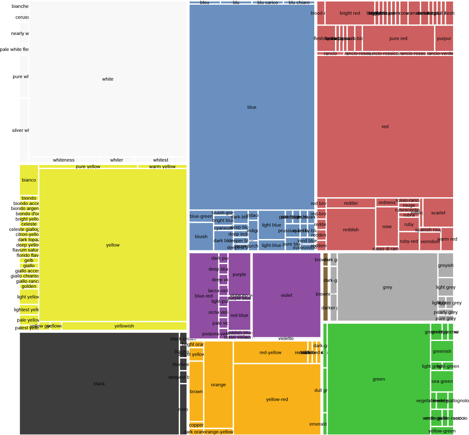
I was surprised to learn that while this was ultimately true, not as many colors were mentioned as I expected. Of the 95,000+ words spanning 471 pages, there were only 1,851 mentions of colors by name (e.g. “red,” “yellow,” etc.) and only 191 unique names used to reference these colors (e.g. “red,” “yellow-green,” “gold,” etc).
Finding colors
One of the first tasks for any data-driven project is to look at the raw data. Like many of my projects, I needed to generate these data myself. I used the text on Project Gutenberg as my primary source of data and since it was marked up in HTML my goal was to do the parsing in JavaScript to avoid reshaping the original data into another format.
I skimmed through the book and I saw that the most common names of colors like “red,” “orange,” “yellow,” etc. were used most frequently so I started by simply doing a search for how often each occurred using a very basic regular expression in JavaScript:
red[\. ]|orange|yellow|green|blue|purple|brown|black|white|grey
The red[\. ] was an initial attempt at catching variations on its usage such as, “redder,” “reddish,” or anything else with the word “red” in it. This had its own issues but this first test was a good glimpse into the volume and variety of data available.
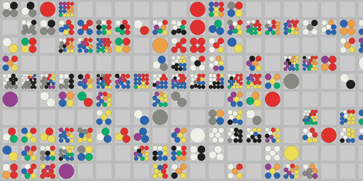
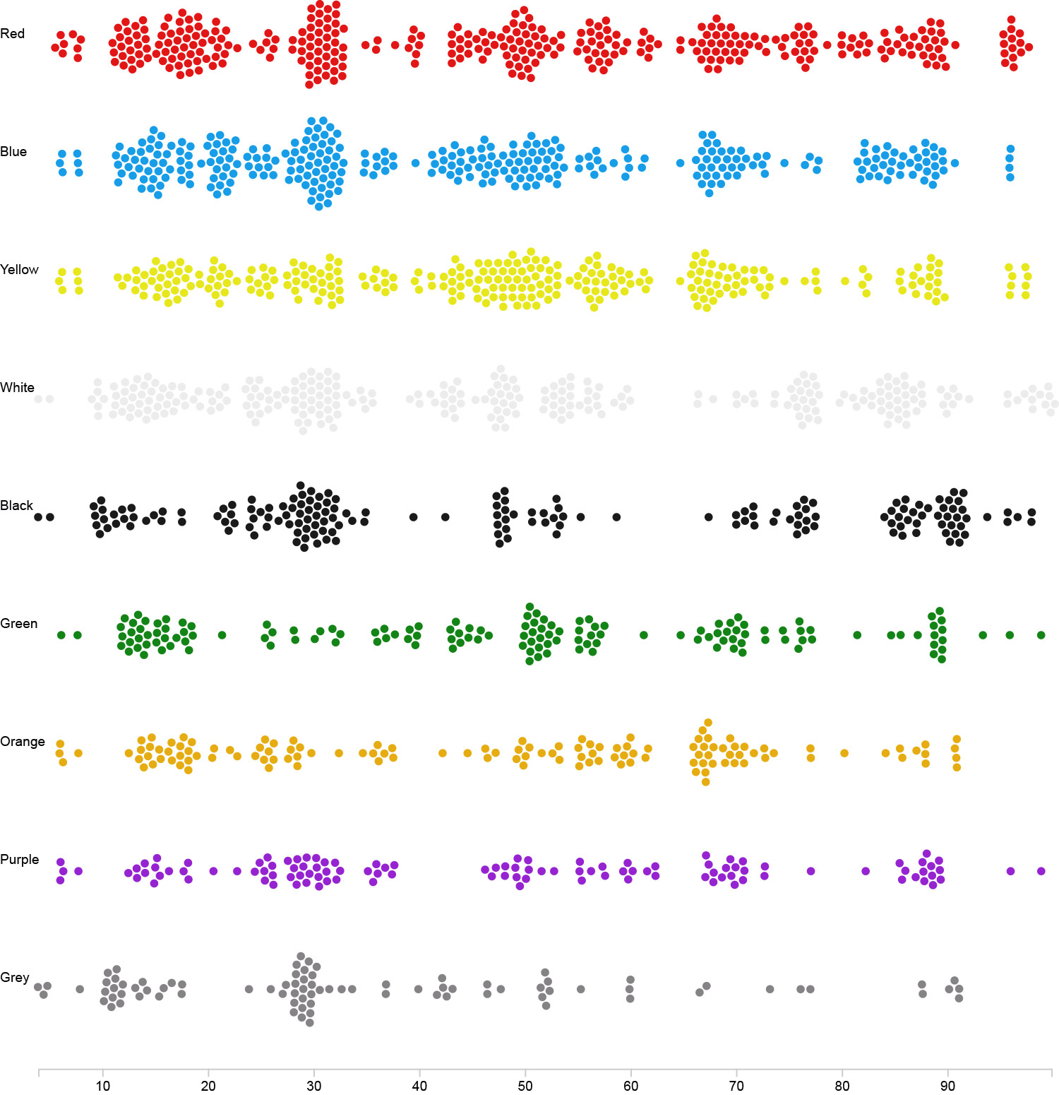
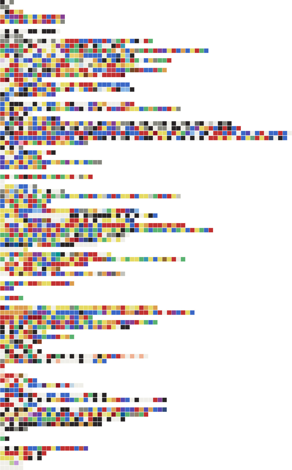
An early picture of the data using circles to represent the sequence of basic color names as they appeared in the book
Determined to find all the colors with a regular expression rather than manually finding each one, I started trying out other names for colors and variations on names to see what else appeared. I found many others but there was no getting around the need for a manual review. I couldn’t help but think that some text analysis and machine learning would have made the process more efficient and interesting but in lacking the knowledge of how to get that working, I forged ahead with the manual approach. I eventually settled on the following long-winded regular expression. It could probably have been streamlined more but it did the job for what I needed.
(
    (
        (
            blood
            |bright
            |burnt
            |citron
            |dark
            |deep
            |dull
            |emerald
            |hyacinth
            |light
            |nearly
            |pale(st)?
            |pearly
            |prussian
            |pure
            |quiet
            |sea
            |spanish
            |silver
            |subdued
            |(?&lgt;![a-z])sky
            |vegetable
            |vivid
            |warm
        )
        (e(r|st))?+
        (<span class=\"pagenum\">.*<\/span>)?
        ( |-|\n|\r)?
    )?
    (
        bianchezza
        |bianco
        |black(er|ish|ness)?
        |bleu
        |blue
        |bluer
        |bluish
        |brown(er|ish)?
        |carmine
        |copper
        |coral
        |cramoisi
        |crimson
        |cyaneum
        |(flavum( |-|\n|\r)saturum)
        |flesh-colour
        |(florido( |-|\n|\r)flavo)
        |gelb(en)?
        |(?<![a-z])gold(en)?
        |green(er|ish)?
        |indigo
        |nero
        |orange(ish|r)?
        |peach-blossom
        |purple(ish|r)?
        |purpur(?![a-z])
        |(?<![a-z])red(d(er|ish|en(ed|ing)?)|ness)?(?!uc(e(s|d)|ction)?)
        |(?<![a-z])rose(?![a-z])
        |rouge
        |rubescentem
        |rubra
        |ruby
        |scarlet
        |topaz
        |vermilion
        |violet(er|ish)?
        |white(ish|ness|r|st)?
        |yellow(er|ish)?
        |grey(er|ish)?
    )
    (( |-|\n|\r)?
        (
            bianchezza
            |bianco
            |black(er|ish|ness)?
            |bleu
            |blue
            |bluer
            |bluish
            |brown(er|ish)?
            |carmine
            |copper
            |coral
            |cramoisi
            |crimson
            |cyaneum
            |(flavum( |-|\n|\r)saturum)
            |flesh-colour
            |(florido( |-|\n|\r)flavo)
            |gelb(en)?
            |(?<![a-z])gold(en)?
            |green(er|ish)?
            |indigo
            |nero
            |orange(ish|r)?
            |peach-blossom
            |purple(ish|r)?
            |purpur(?![a-z])
            |(?<![a-z])red(d(er|ish|en(ed|ing)?)|ness)?(?!uc(e(s|d)|ction)?)
            |(?<![a-z])rose(?![a-z])
            |rouge
            |rubescentem
            |rubra
            |ruby
            |scarlet
            |topaz
            |vermilion
            |violet(er|ish)?
            |white(ish|ness|r|st)?
            |yellow(er|ish)?
            |grey(er|ish)?
        )
    )?
)
This complicated mess allowed me to find all the names and their variations like “whiter” and “whiteness” and if they were hyphenated like “yellow-green” or “red-orange” even if they were interrupted by page markers or included a modifier like “light” or “dark.”
In developing the way to detect “red” but not words containing “red” like “inferred” or “coloured,” I used a negative lookbehind but learned that it didn’t work in Firefox which is my primary browser. I found this thread on Stack Overflow from April 2018 that mentions it only works in the latest versions of Chrome.
Despite all my efforts to develop a comprehensive regular expression, I still had to flag a handful of words to ignore when doing the final parsing because even though they matched the expression, they weren’t used as a way to name a color. For example, take the following passage from page 47:
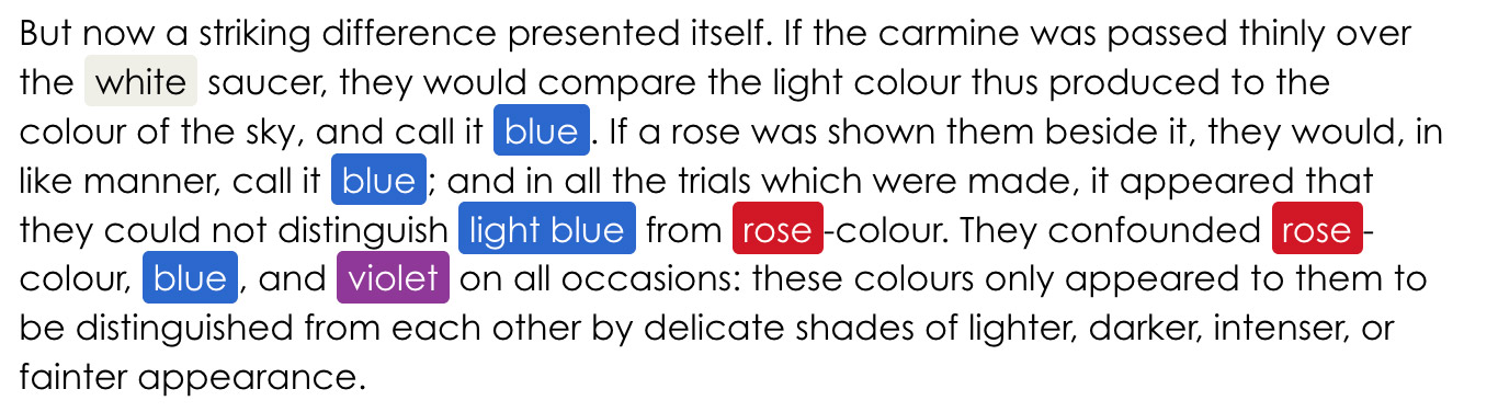
In this example, “carmine” is used as the name of a pigment material and the first instance of “rose” references a flower—neither are as color names and were therefore ignored. All other colors are used as adjectives or nouns as color names.
In addition to finding the colors, I also calculated their exact position in the text which I used in many of the early design iterations but not in the final result. A handful of names were also not translated from the original German text and remained in either German, Italian, or Latin. Google Translate was used to approximate a best guess for the English equivalent.
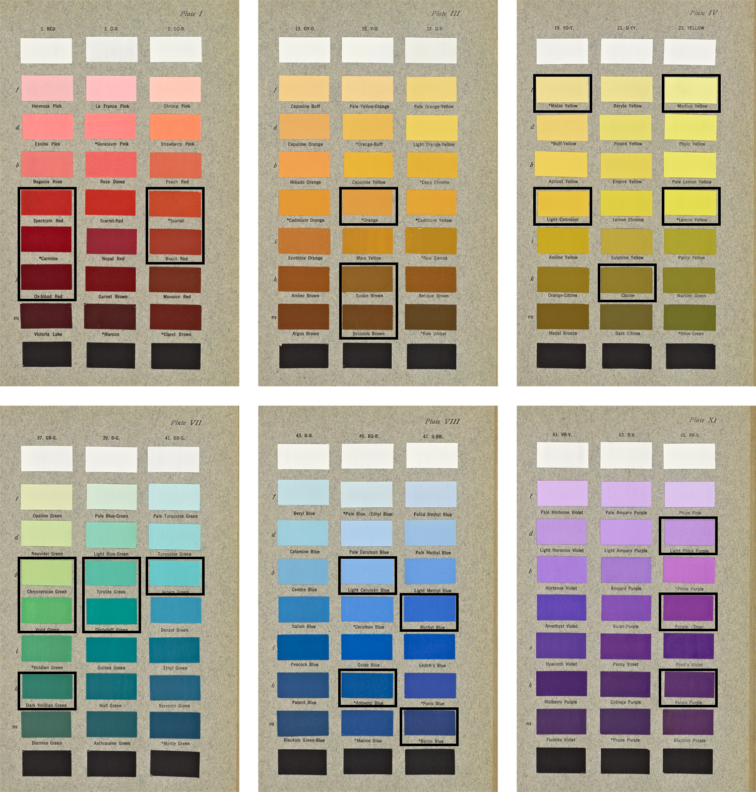
Once the raw data were collected, the final preparation task involved assigning actual colors to the text. Since Goethe did not provide visual examples of each, some creative license was taken to devise a palette. Robert Ridgway’s, Color Standards and Color Nomenclature from 1912 was used as a basis for this palette.
Whenever possible, I matched the language used by Goethe to the names developed by Ridgway and sampled hex values based on the match. Not all names matched so I used some creative license to determine the rest by what I thought was a close match.
With all the data collected, next came the visuals.
Designing iterations
My goal with this project was to design something that showcased all the colors Goethe mentioned at a glance in a colorful way to serve as a new way of looking at Goethe’s work. Many ideas that sounded good in theory but ended falling flat because the final result diminished the vibrancy of the colors in several ways.
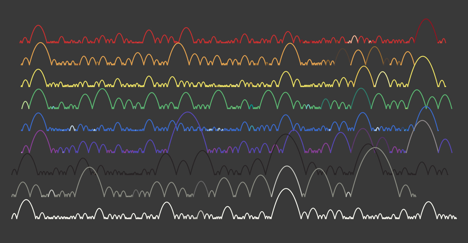
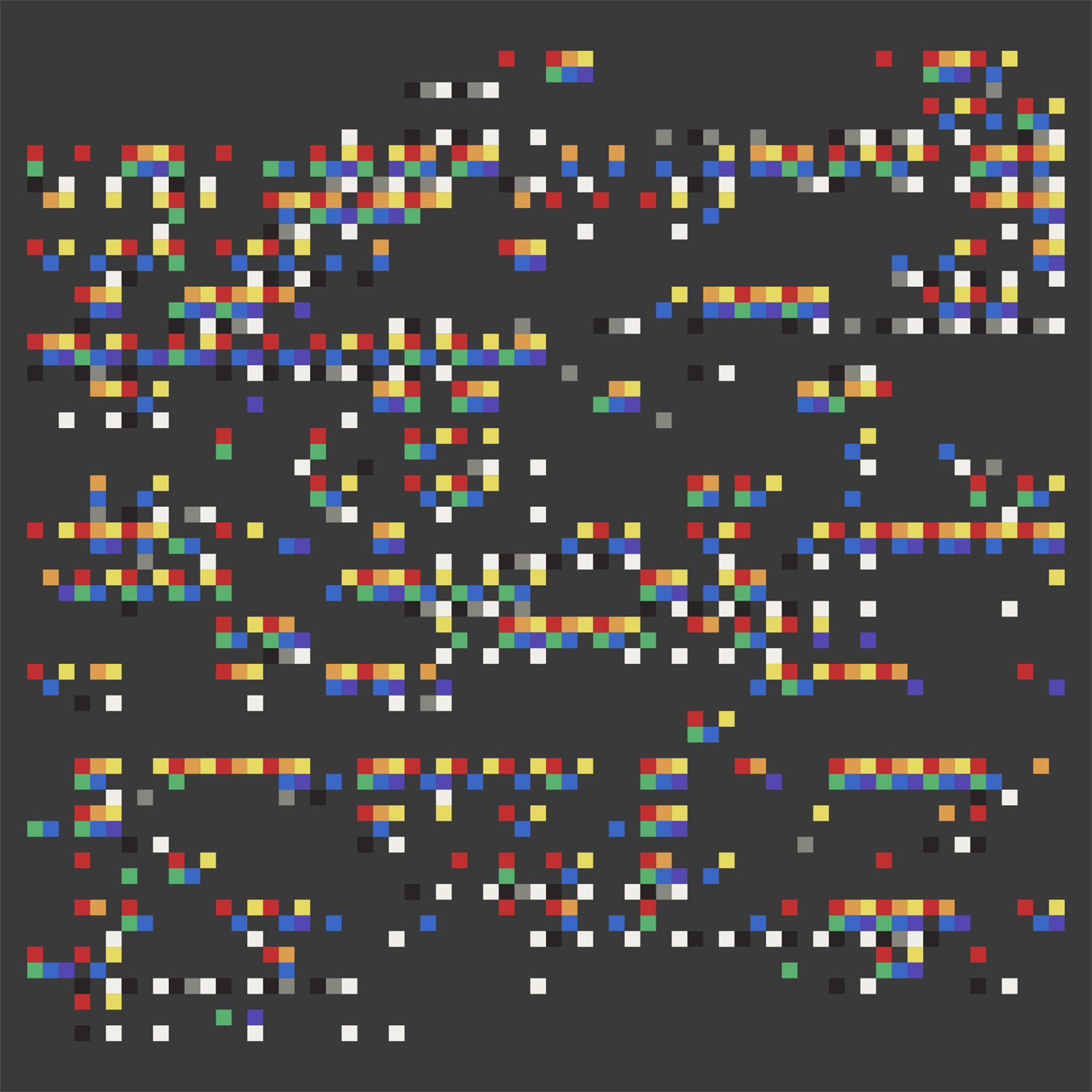
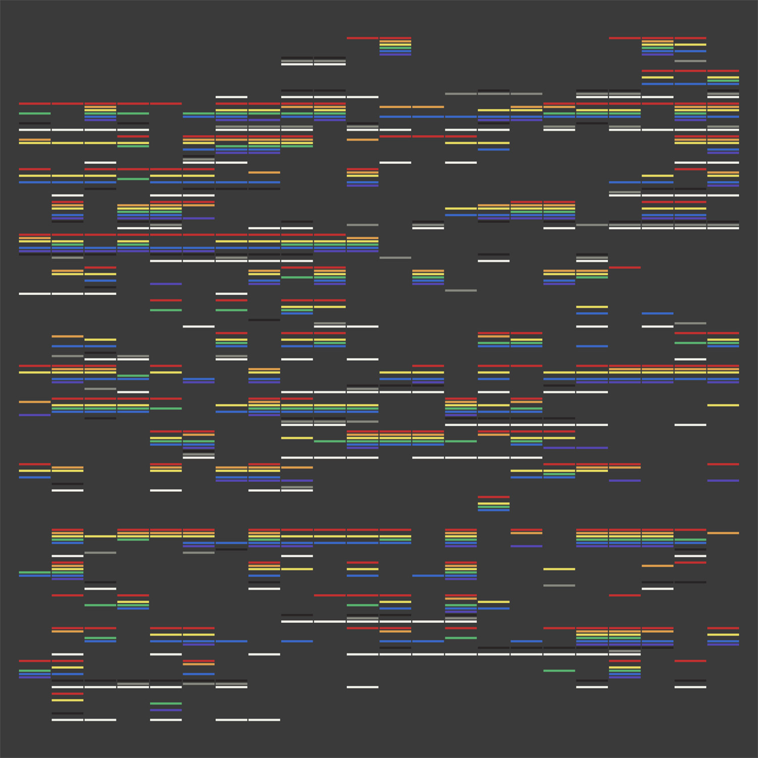
Presented here are several of the dozens of iterations in the order that I developed them as a kind of timeline of my experimentation. They’re rough and not polished but saving and reviewing them can be a useful way to know what doesn’t work or get inspiration for future projects.
NodeBox was my tool of choice to create all of these.
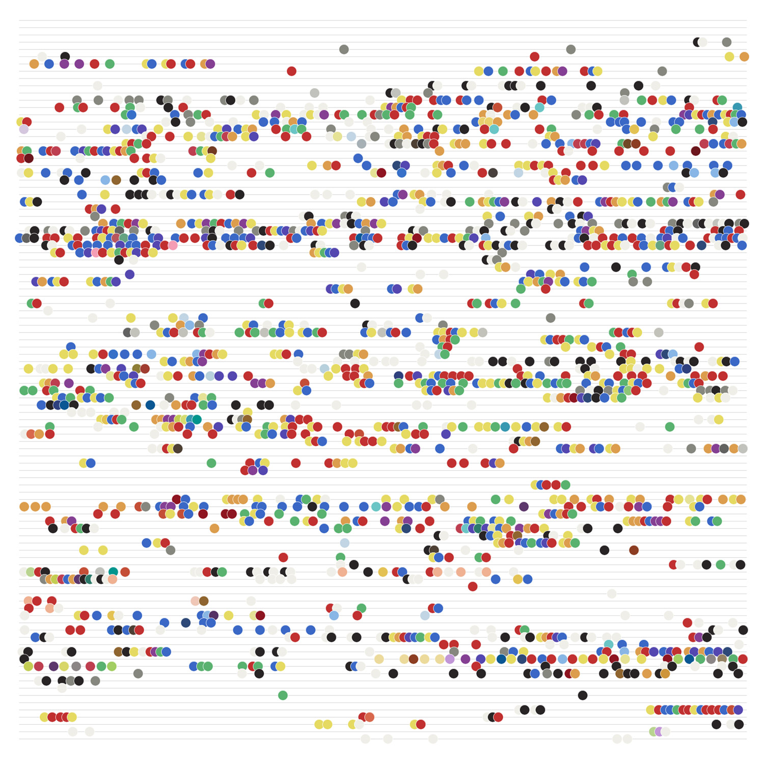
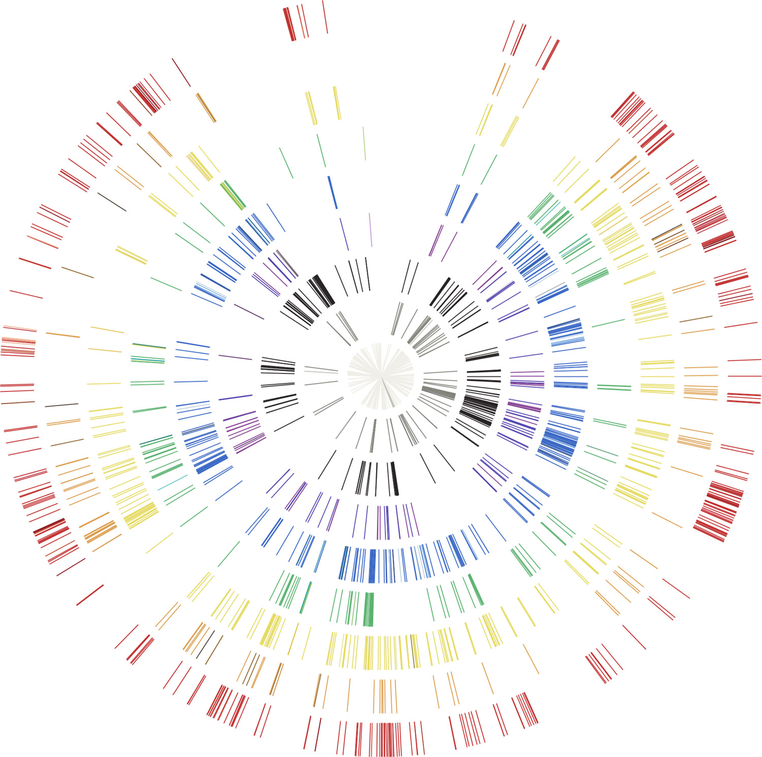

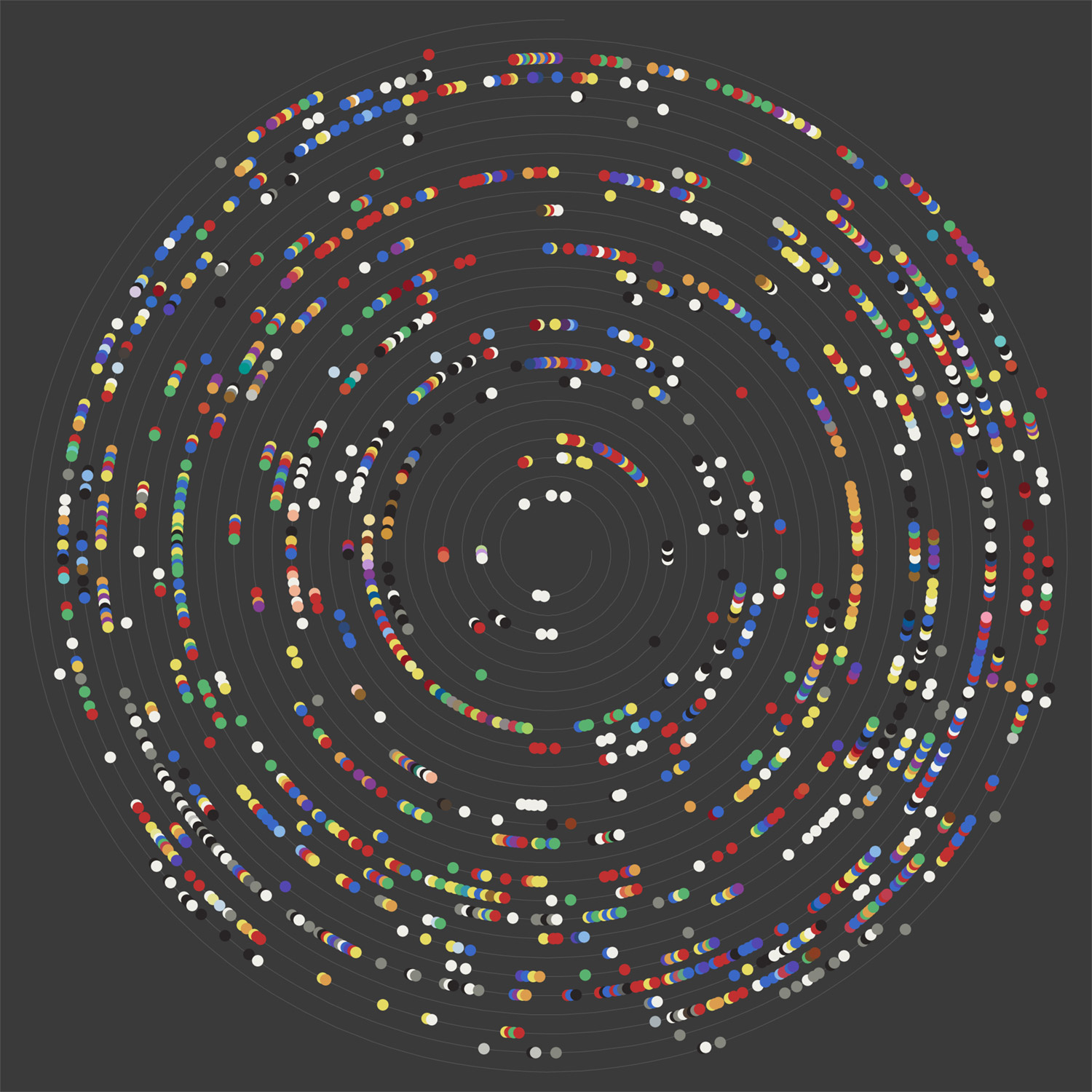
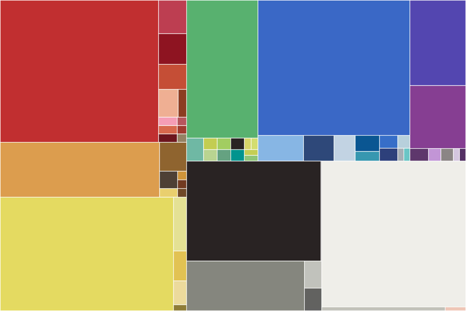
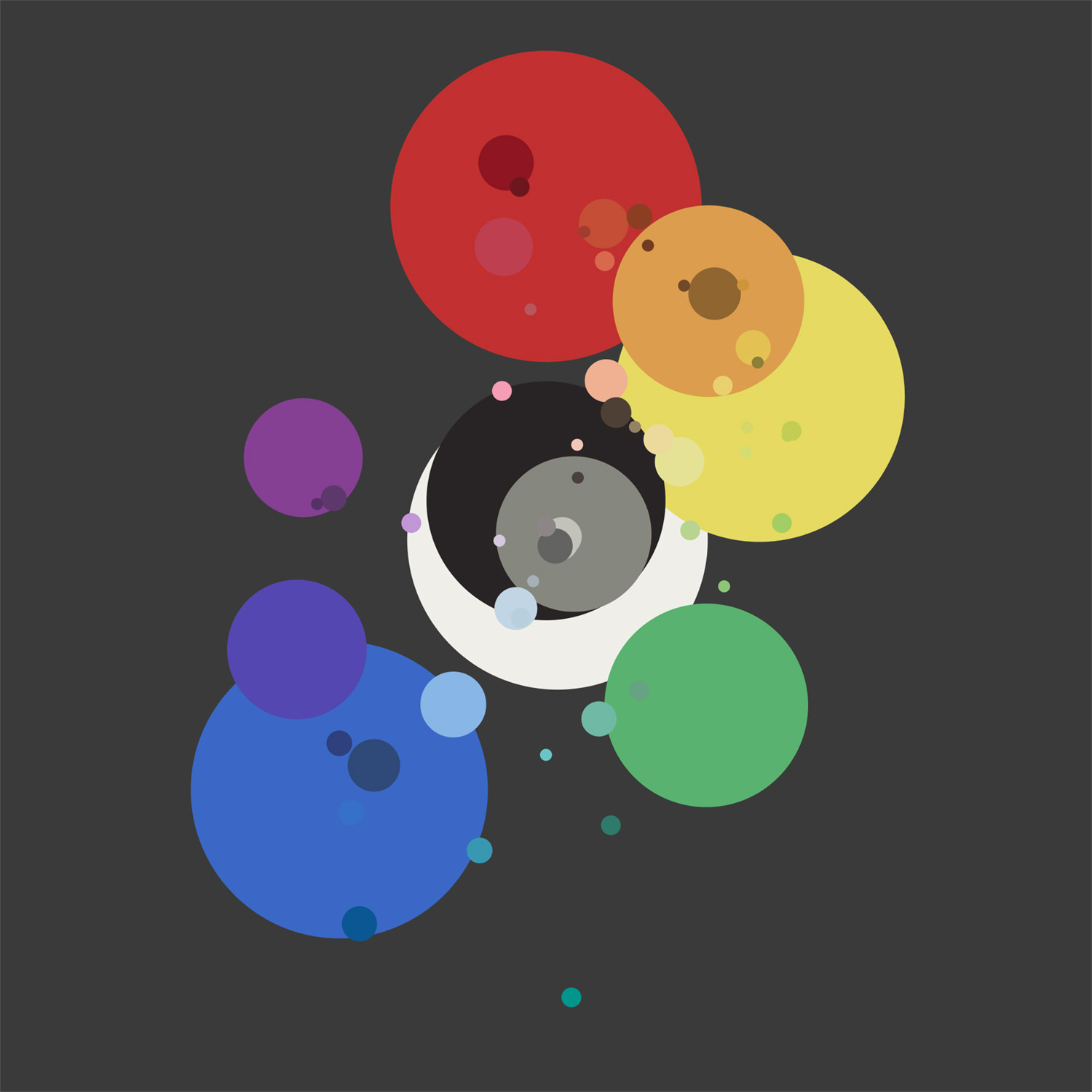
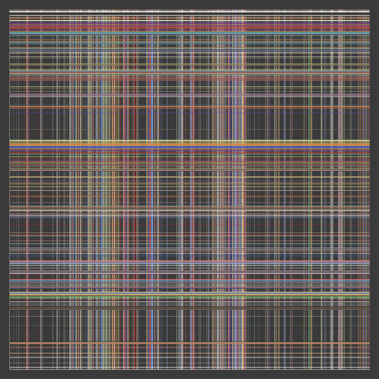
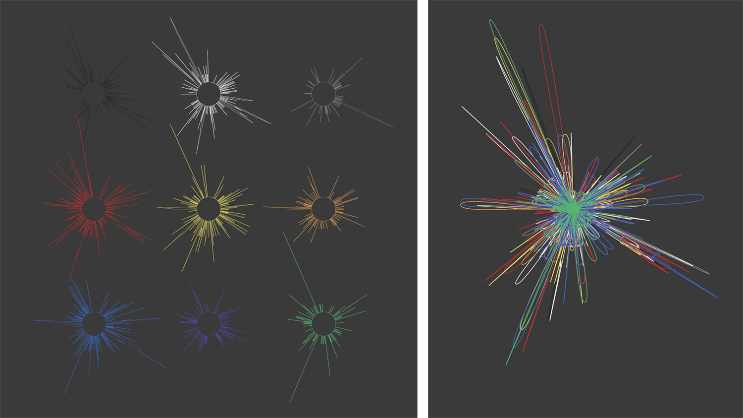
Up to this point, I had focused mostly on data for each color as it related to the book as a whole. The results were always messy and none piqued my interest to explore as a final design. However, the radar scatter plot did prove somewhat interesting and I considered making a poster from it. I shifted focus to examine color usage per page, which lead to the following iterations and eventually the final result.
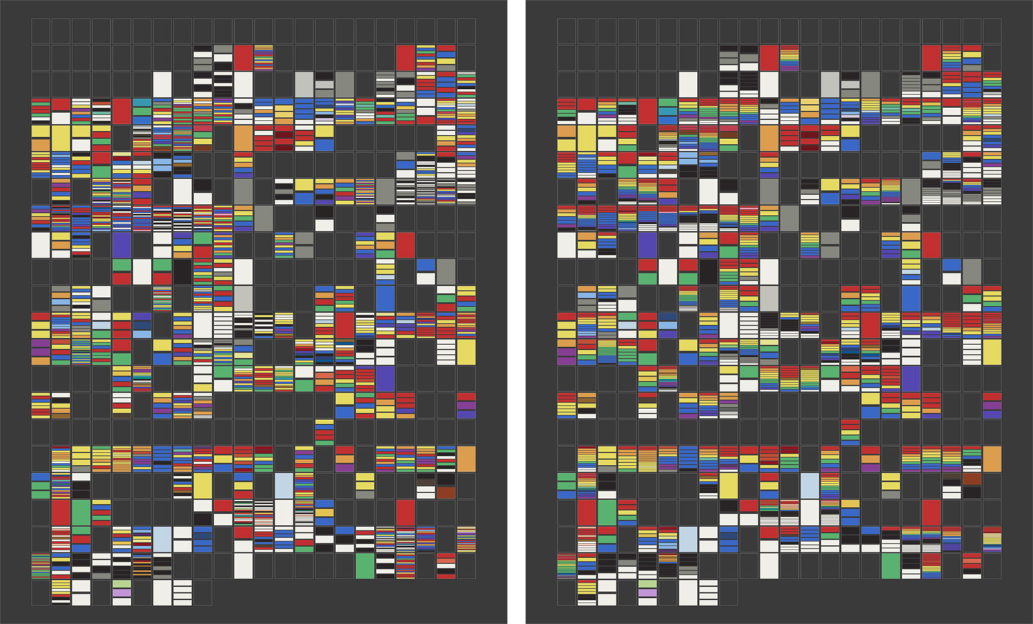
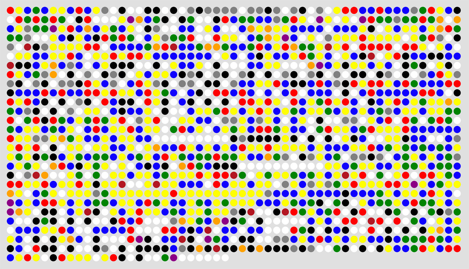
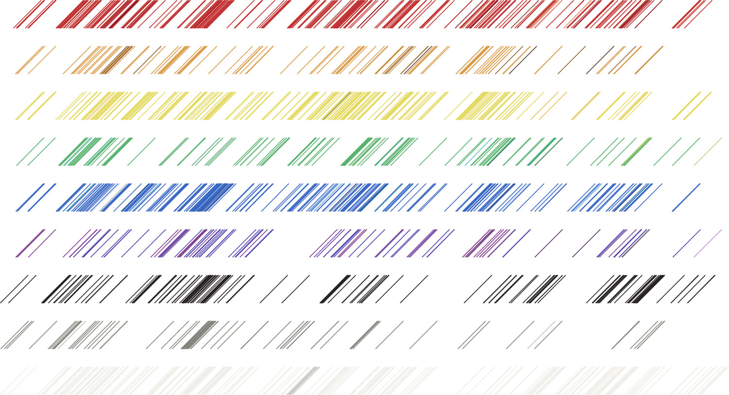
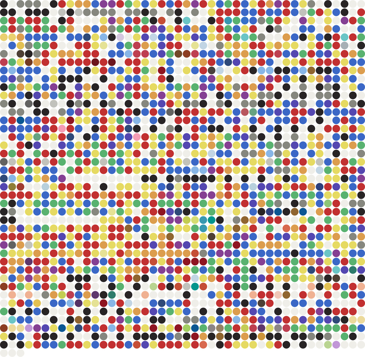
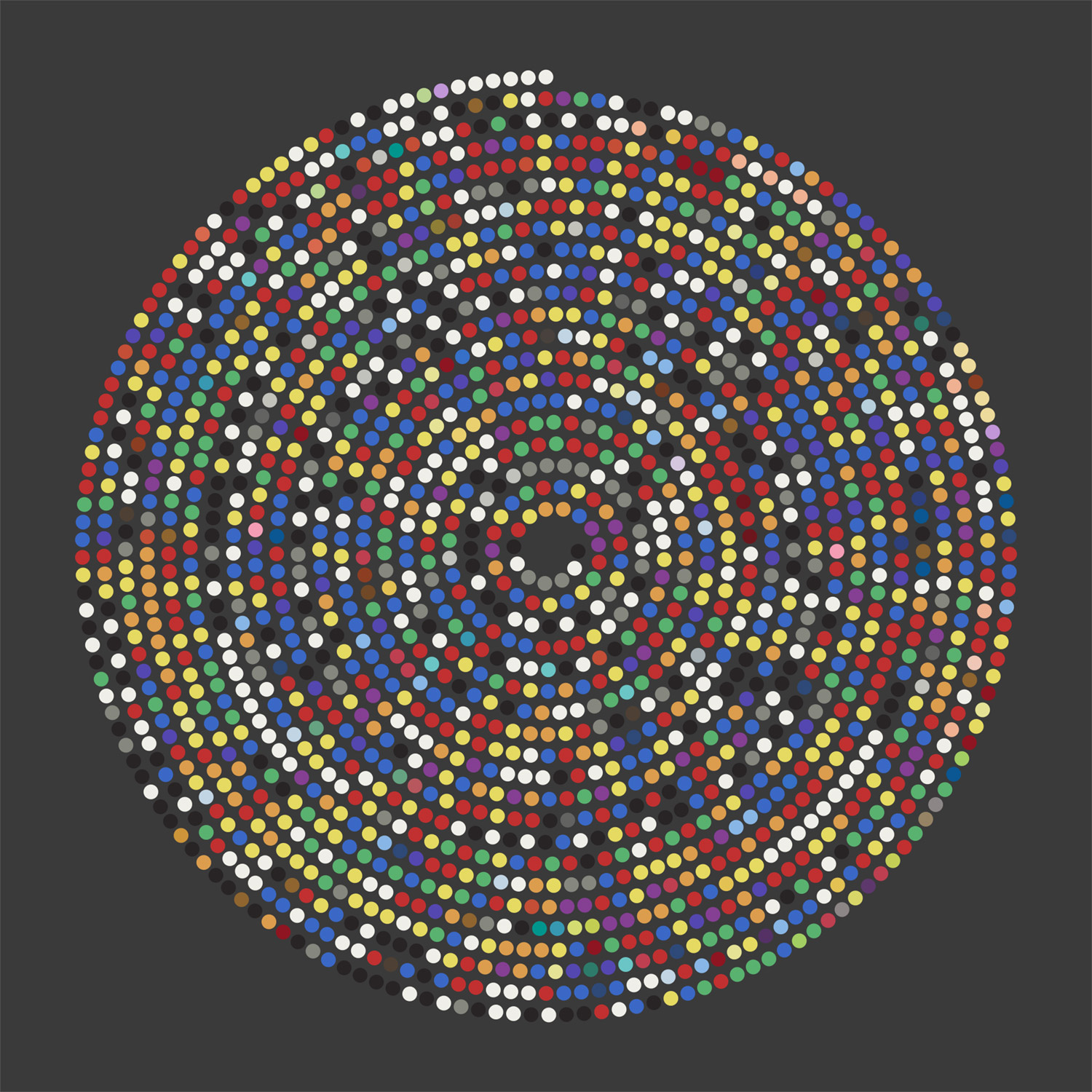
This design concept would eventually be the basis for the final result but using circles instead of stripes. Comparing these two iterations is a good example of intent versus appeal. When viewing the stripes in the order they appear on each page from a distance, the colors appear muddy as they blend together. Reordering them by spectrum order (red, orange, yellow, etc.) improves their vibrancy. The former may have the added layer of meaning but the latter is more appealing.
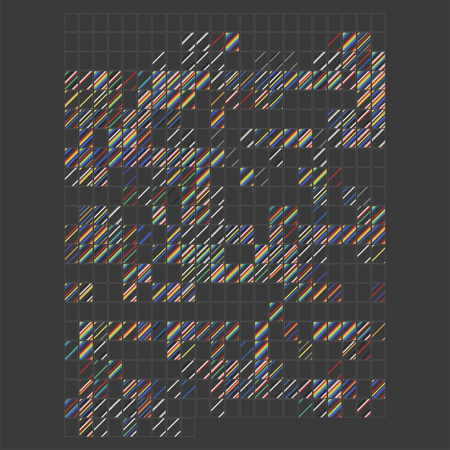
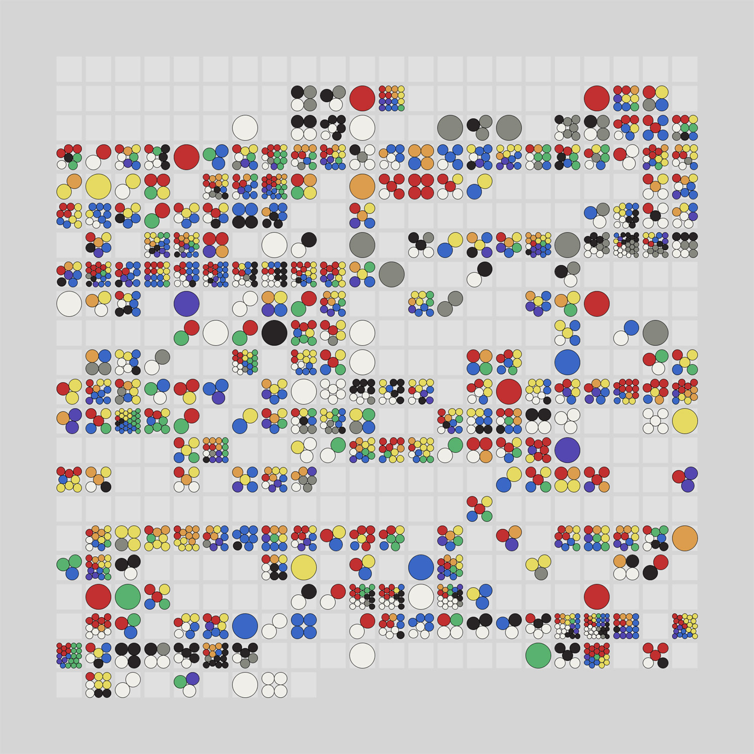
The first time I saw this last design, I knew it was worth exploring. All the colors were visible and vibrant and the layout was varied enough that made me want to explore everything.
I used white and black backgrounds for all the iterations up to this point but both colors presented issues with seeing all the colors clearly. With a white background, the lighter colors were difficult to see and vice versa with a black background. By switching to a grey background, and adding a subtle border around each circle, I was able to find a sweet spot that didn’t interfere with the grey circles or other colors like yellow.
The position of the circles was based on a packing algorithm to pack as many circles of equal size in a square depending on the number of circles in the square. Years ago, I discovered Packomania, which has tons of packing diagrams available for download as PDFs including circles packed in squares, rectangles of varying ratios, triangles, and more. I used these diagrams rather than developing my own algorithm. The total number of colors on any given page was 33 so I only needed the first 33 diagrams.
However, just importing these diagrams as-is still resulted in some muddy colors from a distance. Fortunately, NodeBox has a useful option to sort shapes by angle so by using that and sorting color data per page in spectrum order resulted in pleasantly colorful results without looking muddy.
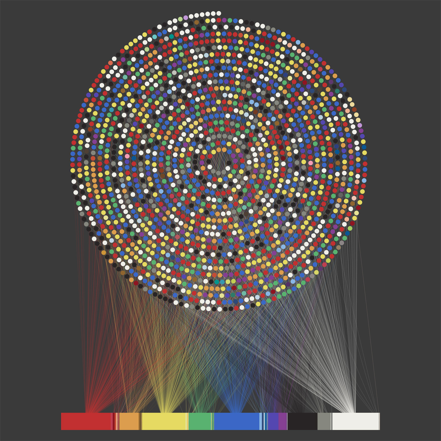
While I polished this design, I found myself repeatedly wondering what colors were mentioned on any given page because the pattern of circles was interesting. I initially only intended to make a data-driven poster and not an interactive version but this lead to me wanting to make one because I knew I wouldn’t be the only one wondering this.
Building experiences
Since I already had color data in a structured format to create the visuals, using that to build out an interactive version seemed straightforward and for the most part, it was—except for a few challenges that popped up.
I opted for a simple approach using plain HTML/CSS to create the visuals but one catch was that I needed to position the circles to match the diagrams from Packomania and I didn’t feel like generating these myself using something like d3. To do this, I needed three parts for each circle: coordinates (x and y) and a radius. NodeBox wasn’t designed for raw data manipulation but it has a useful feature to export to a CSV so I used it to create a dataset of what I needed by detecting the coordinates of each SVG circle and combining that with a list of radii from Packomania for the first 33 packing diagrams.
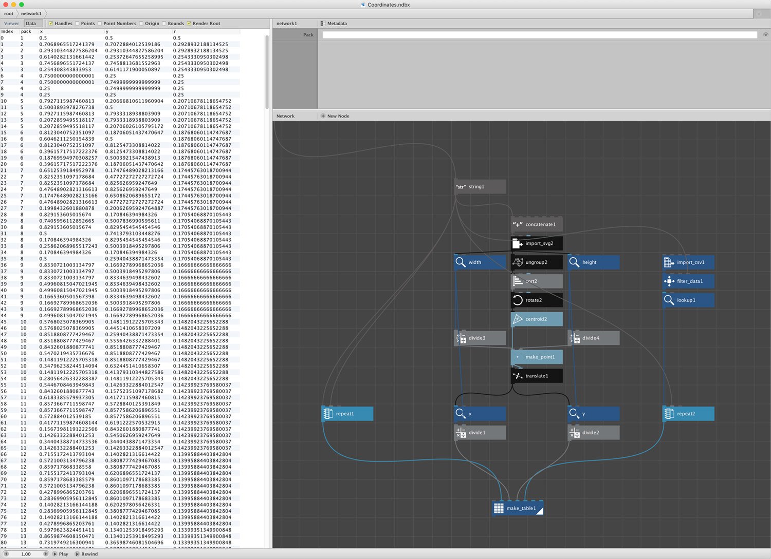
The interactive experience is powered by four sets of data:
- Colors: Every mention of colors in the book
- Packs: Packing coordinates for positioning circles on each page
- Pages: Roman numerals for the first 48 pages
- Sections: Titles of each section of the book (introduction, parts, etc.)
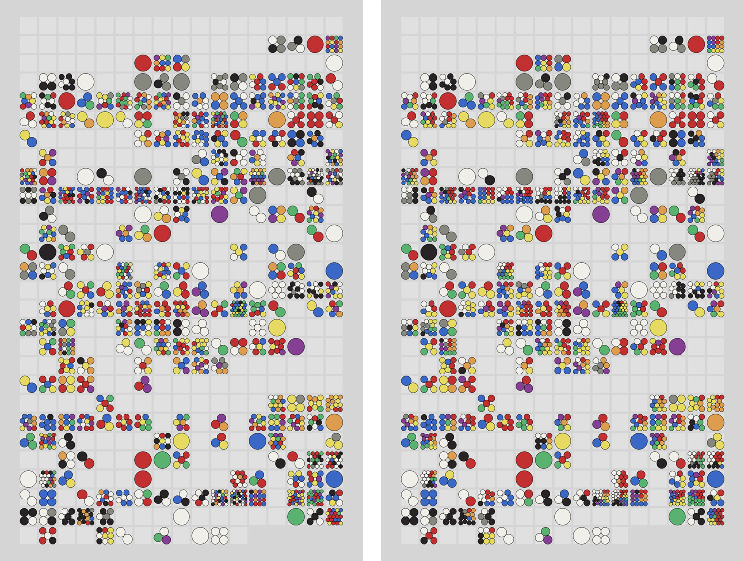
Using these datasets, I was able to replicate what I had created in NodeBox for the poster and enhance it with the ability to click a page to see the colors mentioned in context.
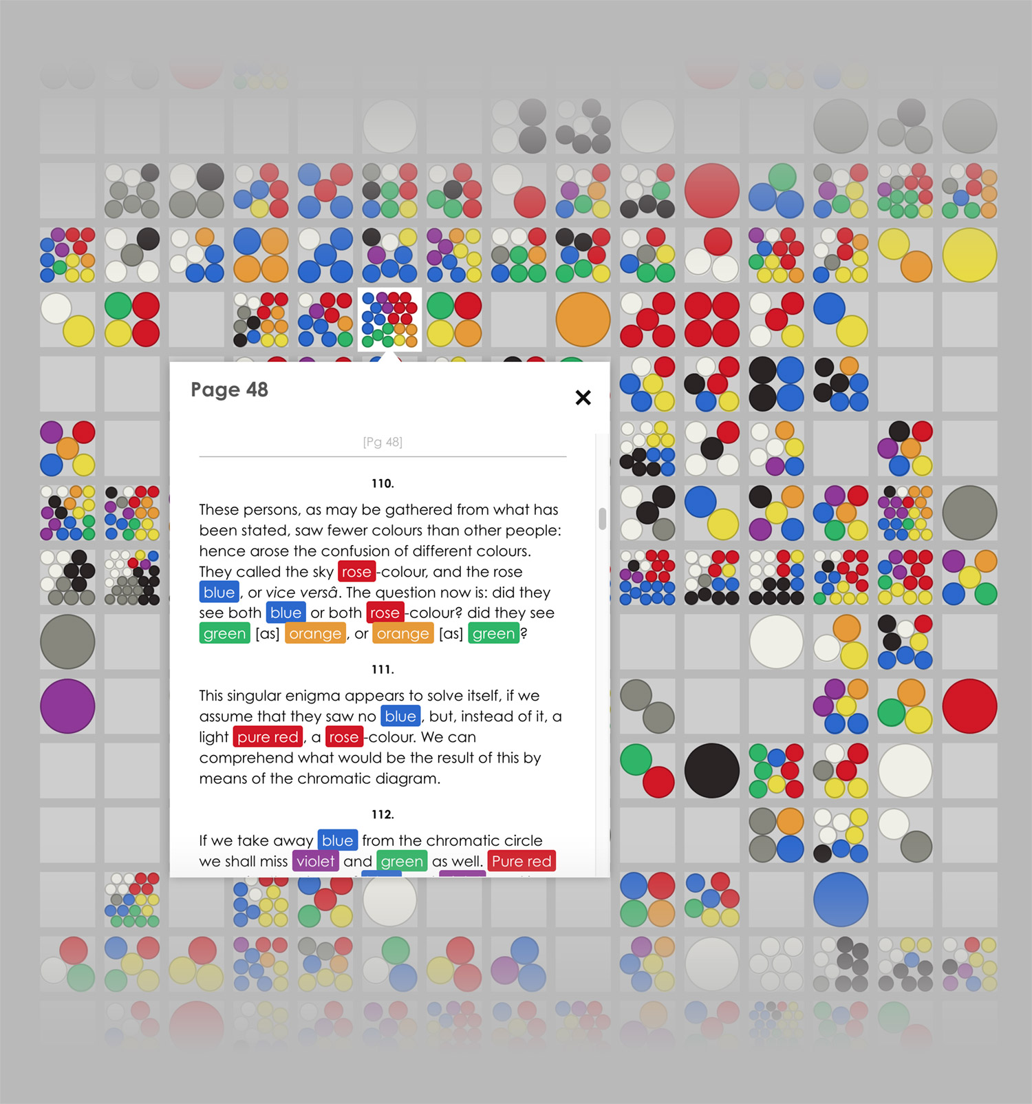
Clicking on a page to show the colors in context loads the full text from Project Gutenberg with all the colors highlighted. The process of highlighting the colors was a little slow due to the initial detection process and since that process used regular expressions that only worked in Chrome, I chose to regenerate the HTML with the highlighted colors so they weren’t detected each time the popup opened.
I ran into an interesting quirk I ran into with this popup in Safari and mobile Safari. The popup contains an iframe which loads a static HTML file. My initial idea was to load the file with a hash to jump to a page anchor that already existed:
<iframe src=”theory-of-colours.html#Page_50”></iframe>
However, each time the iframe’s source changed, Safari and mobile Safari scrolled the parent window down seemingly random amounts, thereby causing the page that was clicked to scroll out of frame. After a few headaches and unsuccessful searches, I found that using a querystring and then some extra code on the page loaded into the iframe to parse that and scroll to the desired position worked without affecting the parent window.
<iframe src=”theory-of-colours.html?Page_50”></iframe>
This extra code also had to hijack the other anchor links on the page that linked to other parts like footnotes and other sections. I admit it’s a strange workaround but it works.
$("a").on("click touch", function(){
    newScroll($(this).attr("href"));
    return false;
});
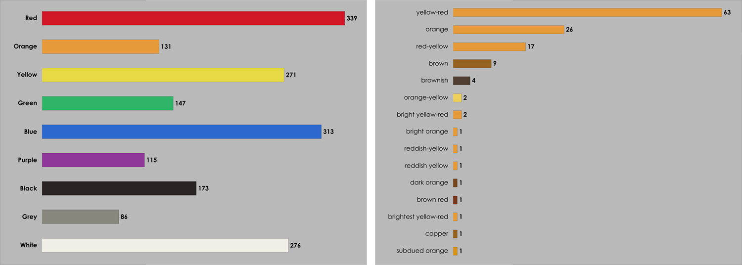
Finally, I added a simple chart at the bottom of the page showing the total times each color was mentioned with the ability to drill down to see which names were used.
Final thoughts
I began this project thinking it would be fun simple project to see how often colors were referenced in a book all about them. As usual, it became much more involved with many design ideas and programming challenges. A few headaches were encountered along the way but I’m pleased with the final result and hope others are as well.