Making of 17th Century Watercolors
By Nicholas Rougeux, posted on June 18, 2022 in Art, Data
Way back in 2014, a Dutch manuscript about mixing watercolors from 1692 made a splash in the blogosphere, because while it was centuries old, few had given it much attention and it was such a beautifully preserved thorough account of how watercolors were mixed back then. Ever since then, I thought it had potential as a fun project but avoided creating one due to language barriers and other reasons that turned out to be unfounded.
Source material
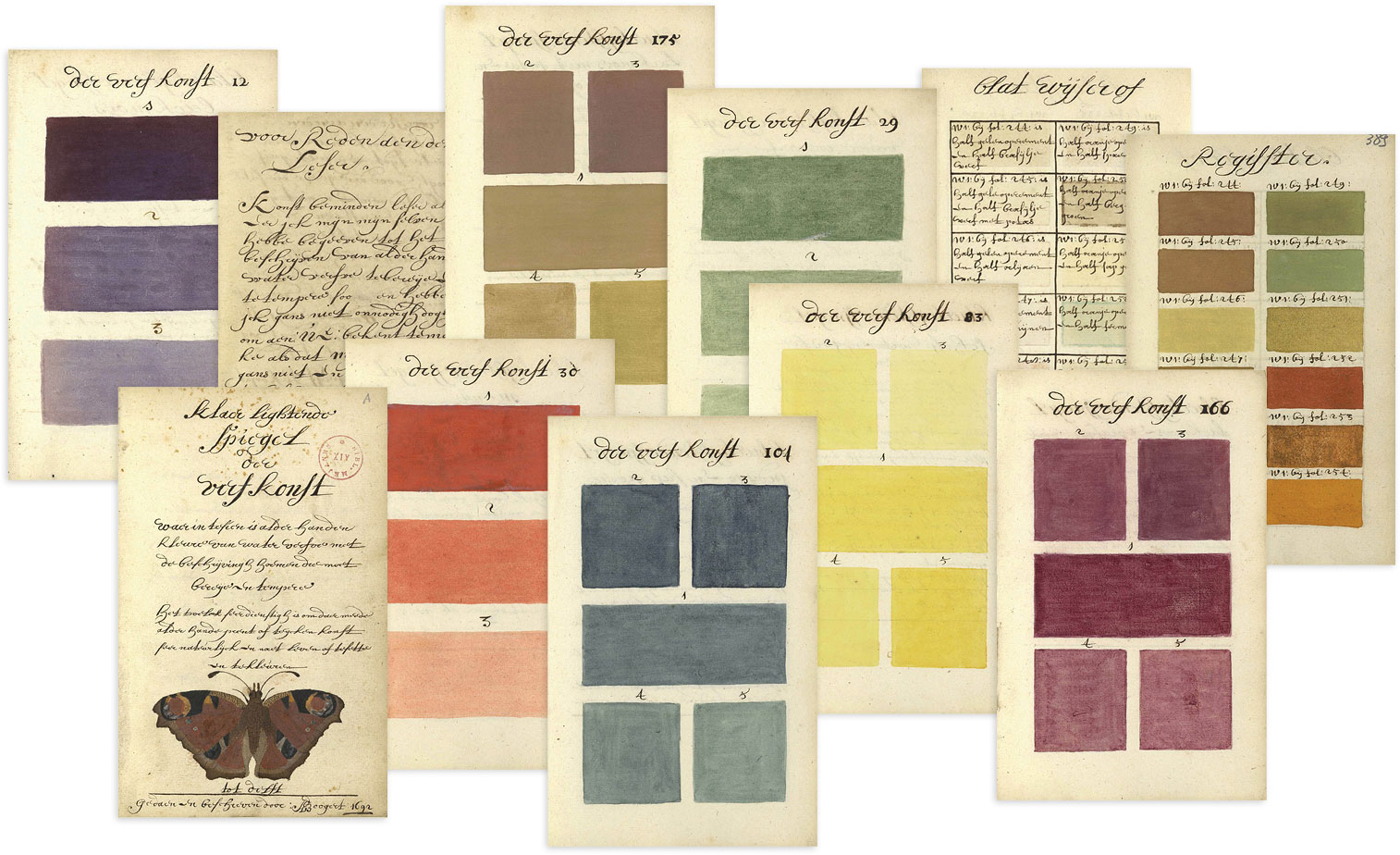
The manuscript, titled Klaer Lightende Spiegel der Verfkonst, was written by Dutch artist A. Boogert and contains details about mixing (tempering) “pure” colors to create many others for painting. It’s impressive not only because its nearly 900 pages are handwritten but also because of its thorough systematic nature of mixing colors in specific ratios and providing details on how to create them.
Following a 2-page poem written for and about Boogert’s intended audience, the manuscript contains a 73-page introduction about the colors to be mixed and two “books” that make up the main body of its content.
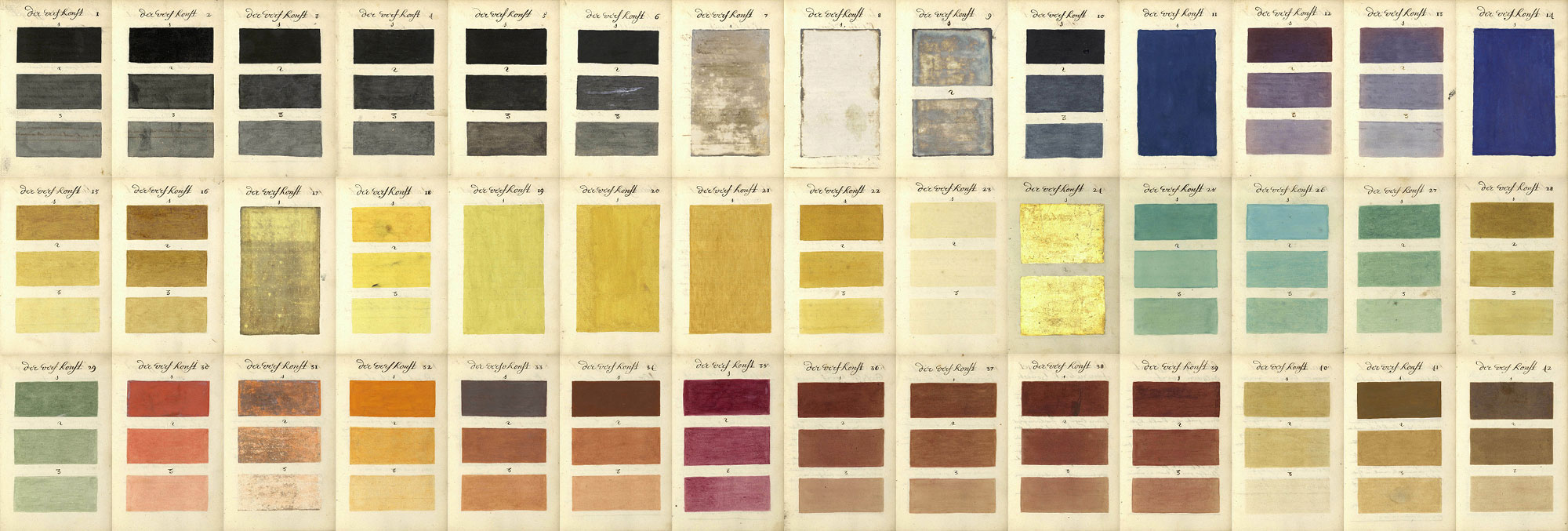
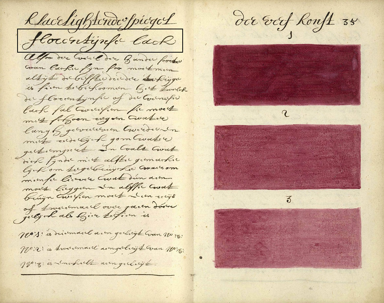
The first book illustrates the effects of diluting 42 “pure” colors with varying amounts of water. Results were painted on numbered plates, each containing three samples of each color with the same amounts of dilution and paired with a description of the mixing process. Among the 108 total samples, are a few plates of blue, yellow, silver, and gold shown with only 1 or 2 swatches because there was little to no effect of dilution.
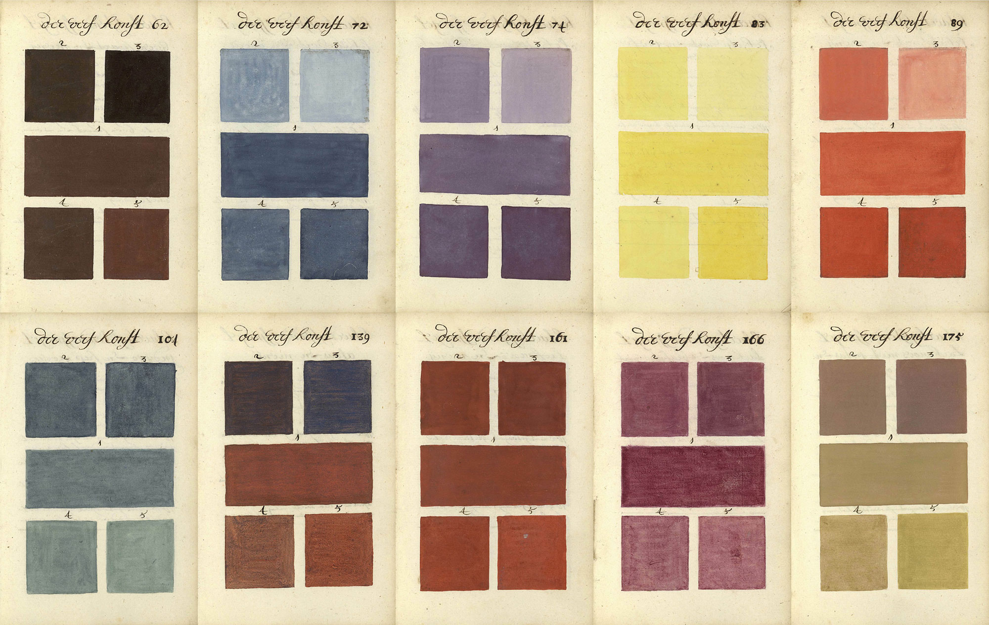
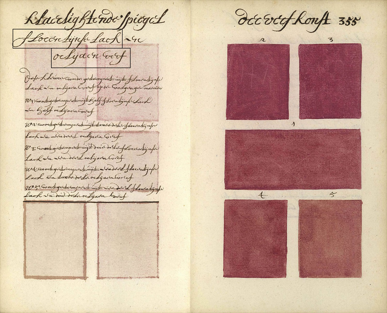
The second book is the heart of the manuscript, which contains a thorough account of mixing pure colors with each other according five specific ratios, which were represented on each plate showing the results of mixing two of the pure colors in five ratios (1:1, 2:1, 3:1, 1:2, and 1:3). Not all pure colors were suitable to be mixed but Boogert meticulously detailed the effects of mixing 31 pure colors in nearly every combination, resulting in an impressive 323 plates and 1,615 total samples. Additionally an index of 365 repeat samples referring to each of the numbered plates was created.
The only known copy of the manuscript is held at the Bibliothèque Méjanes in Aix-en-Provence. High resolution scans of it are available on their site, Bibliothèque numérique and at the Internet Archive with the title, Traité des couleurs servant à la peinture à l’eau.
Erik Kwakkel, a medieval book historian at The University of British Columbia in Vancouver first posted about the manuscript in 2014, describing it as “an unusual peek into the workshop of 17th-century painters and illustrators” and “a feast to look at.” Thanks to his post and likely due to the manuscript’s beautiful colors, it quickly gained popularity, being featured on sites like Open Culture, Gizmodo, and Colossal, which is where I first noticed it.
Deciphering the manuscript
My interest in antique books was in its infancy back in 2014 and my first digital edition wouldn’t be created until four years later but the book lingered in the back of my mind as something interesting to investigate later. Eight years and many projects later, with a healthy interest in antique books, I looked at Boogert’s manuscript with new eyes. I considered creating a project based on it shortly after completing the digital edition of Werner’s Nomenclature of Colours, but originally decided against it because I didn’t speak Dutch and at nearly 900 pages, it felt too large and daunting. The latter became moot by comparison after completing Iconographic Encyclopædia, which took 13 months and weighed in at a hefty 3,000 pages. Language was the remaining barrier.
To date, I’ve only used source material written in English simply because it was the only language I spoke. Boogert’s manuscript intrigued me to the point of wanting to see how much I could decipher on my own and with the help of others. The hand painted colors were also so beautiful that I felt compelled to create something based on them.
Erik’s blog post and others’ were a helpful start in understanding the basics of the manuscript but didn’t dig deep enough for what I need when I take on a new project. I like to absorb everything I can about source material, its author, and anything else that has been written about it so I have a deeper understanding about its purpose when it was created. Unfortunately, very little came up in searches for it.
My initial plan was to transcribe the text and use Google Translate to get a basic sense of what was written but even getting to that point proved challenging because the handwriting was difficult to read and I wasn’t familiar with any Dutch linguistic nuances, especially from the 17th century. I was constantly wondering if the words I transcribed were even accurate.
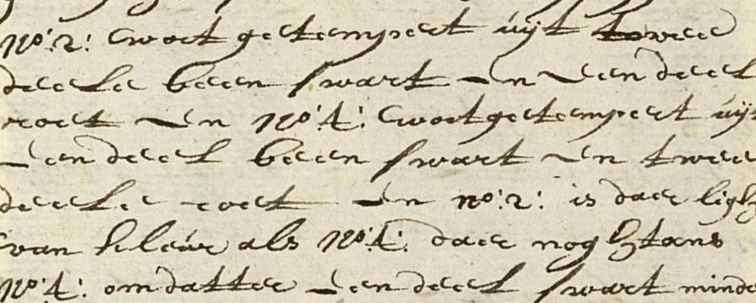
For example, it took me a while to figure out that what I thought was the letter “c” was really the letter “e” in most words. The long s was also regularly used and while I’ve become used to it from other projects, it’s similarity to “f” in handwriting and even “l” still took effort to understand. Other challenging letters included “h,” “n,” and “r,” which all looked similar. Words would also often be broken to a second line without hyphens or run together with others inconsistently. The handwriting was beautiful but quite challenging!
Getting nowhere, I reached out to anyone who might be able to provide more info or help with the translation. I emailed Erik because he mentioned the manuscript was to be the subject of a PhD study, contacted a few Dutch translators on Fiverr and publicly asked for help on Twitter. The responses lead to some interesting results. On Twitter, Elmine Wijnia pointed me toward Transkribus, which specializes in handwriting recognition from old texts. It had a hard time with the manuscript but it will definitely be a useful tool for future projects. Ian Johnson was kind enough to offer his father’s services who is a medievalist specializing in old and middle English and middle Dutch.
Most importantly, he found an article by Truusje Goedings that provided a wonderful detailed analysis of Boogert’s manuscript (Dutch, English translation). This proved to be a lightbulb moment because even though it was in Dutch, running it through an online translator was enough to provide me with the insight I needed to understand the manuscript’s purpose, structure, linguistics, and even a bit about Boogert. After absorbing this information, Erik informed me that the author of the PhD study he mentioned was Truusje Goedings, the same author of the article. This led me to assume the article was a precursor to the study or the study itself. Either way, it was just what I needed to take the next steps.
Key among the insights was the part where the article described the names of the colors in the manuscript:
Dat waren volgens hem 39 kleuren: zes soorten zwart, drie soorten wit waaronder zilver, vier soorten blauw, tien soorten geel (inclusief goud), vijf soorten groen, negen soorten rood en twee soorten bruin. Ter vergelijking: Goeree noemde in zijn Verlichterie-kunde 37 kleuren.
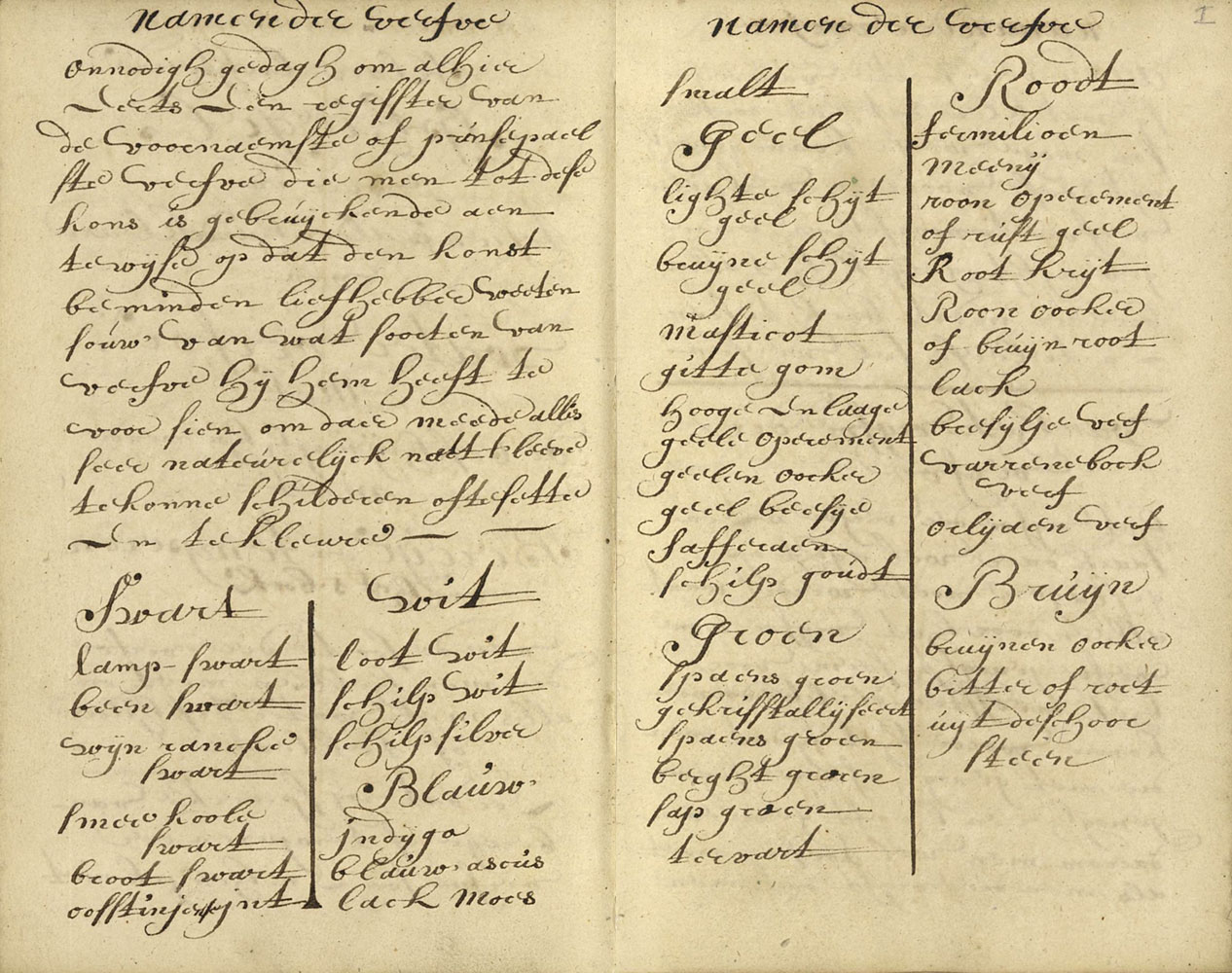
Omdat zij de structuur van Boogerts boek bepalen, volgen hier de rond 1690 in Delft gangbare ‘Namen der kleuren’, nodig om ‘alles seer natuerelijck naert leeve te konnen schilderen, af te sette en te kleure’. Dat waren ‘Swart: lamp swart, been swart, wyn rancke swart, smeekoole swart, broot swart, oosstinjen int; Wit: loot wit, schilp wit, schilp silver; Blauw: indijgo, blauw ascus, lack moes, smalt; Geel: lighte schijt geel, bruijne schijt geel, masticot, gitte gom, hooge en laage geele operement [2], geelen oocker, geel beesije, safferaen, schilp goudt; Groen: spaens groen, gekrisstallijseert spaens groen, berght groen, sapgroen, tervart; Roodt: fermilioen, meenij, roon operement of rust geel, Root krijt, Roon oocker of bruijn root, lack, bresijlje verf, varrembock verf (pernambuco), orlijaen verf; Bruijn: bruijnen oocker, bitter of roet uijt de schoorsteen.
This states that Boogert organized 39 colors into seven groups (blacks, whites, blues, yellows, greens, reds, and browns) and lists the names of each. However, the colors listed in the article vary a little from the manuscript and even there, they were written in slightly different ways in some parts. For example two pages in the introduction list all the colors to be mixed:
These colors are also repeated with some slight variations at the top of each page facing a set of painted swatches where they describe how a pure color was diluted or they were mixed with other colors.
I cataloged these and came up with 42 colors in the order they appeared in both books:
- Blacks: lamp swart, been swart, wijn ranke swart, broot swart, smeekoole swart, oosstinjensen jnt
- Whites: loot wit, schilp wit, schilp silver
- Blues: indijgo, ascús, lack moes, lack moes met potas, smalt
- Yellows: lighte schijtgeel, bruijne schijtgeel, masstijcot, gitte gom, geele oprement, hooge geele of oranje operement, geelen of lighten oocker, beesij geel, saffraan, schilp goudt
- Greens: spaens groen, gekrisstallijseert spaens groen, berght groen, sap-groen, tervart
- Reds: fermilioen, menij, roo operement of rúst geel, root krijt or roo daerden, roon oocker of brúijn root, florentijnse lack, bresijlje oúdts verf, bresijlje verf met potas, farrenebock hoúdst verf, farrenebock hoúdst verf met potas, orlijaen verf
- Browns: brúijne oocker, bitter of roet úijt de schoorsteen
Feeding these into online translators didn’t produce great results. Fortunately, one of the translators on Fiverr, Wessel Vink, took a personal interest in my project and while he wasn’t able to decipher the challenging text himself, pointed me to the Dutch translation service, Bureau glossarum, which provided the translations I needed. Both Wes and the team at Bureau glossarum were wonderful to talk with, affordable, and incredibly helpful. The translated results are:
- Blacks: carbon black (soot black), bone char black, vine black, bread char black blacksmith’s char black, East Indies ink (carbon black)
- Whites: white lead, white shell, silver shell
- Blues: indigo, sky blue, litmus, litmus with potash, smalt or cobalt glass
- Yellows: light stil de grain yellow, brown stil de grain yellow, massicot, gum resin, yellow orpiment, high and low yellow orpiment, yellow ochre, stil de grain yellow, saffron, gold shell
- Greens: verdigris, crystallized verdigris, malachite green, sap green, green earth (terre verte)
- Reds: vermillion, minium, red orpiment or rust yellow, red chalk, red ochre or brown red, shellac, brazilin paint, brazilin paint with potash, maverick (young bull) paint (ox blood), maverick (young bull) paint (ox blood) with potash, annatto paint
- Browns: brown ochre (umber), creosote or chimney soot
I would have loved to translate the entire manuscript into English but it would have been prohibitively expensive and like many of my projects, this was a passion project which means there’s no funding beyond my own wallet. It would be fantastic if someone eventually had the resources to translate it in its entirety.
Data and design
While seeking out translations, I started thinking about what kind of data could be extracted from the manuscript. The colors themselves were an obvious choice but after learning about the book’s structure, I wanted to know more about the mixtures. The second book was structured as listing a list of all the mixtures but for one color at a time. For example, all the colors mixed with bone char black, then all the colors mixed with white shell, etc. but never mixing the same two colors twice. Essentially, it was listing the values in from a matrix diagram as if all the colors are listed on the horizontal and vertical axes, so that’s what I made to start.
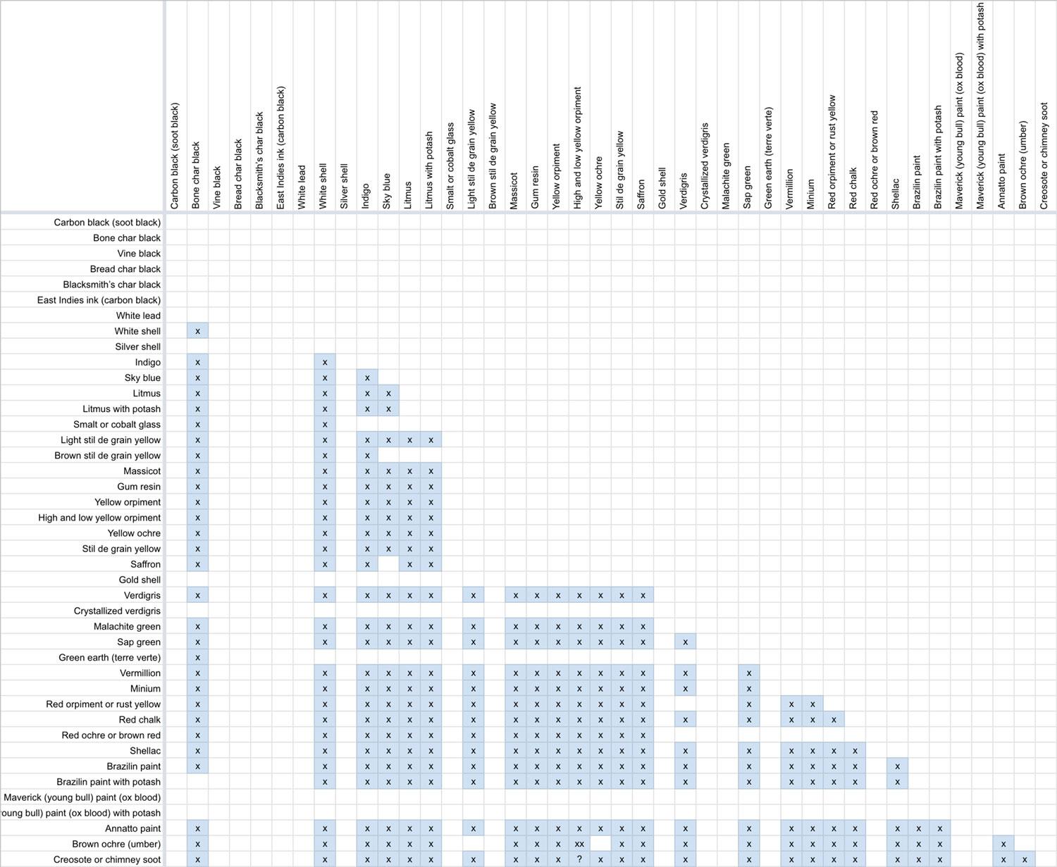
Before I began this process, I was under the impression that all colors were mixed with all others but this was not the case. Only 31 were mixed and not all with each other. Working on the matrix inspired me to turn that into the focal point of the project and make it interactive as well as turn it into a colorful poster. To my knowledge, no one had taken the time to list all the colors that were combined in the manuscript, let alone visualize them.
I noticed two curiosities during this process:
- There was no plate numbered 113 and no indication that it was skipped or removed from the scans. The register/index at the end of the book supports this because the numbering goes from 112 to 114.
- Plates 261 and 262 are listed with the same color combination (oranje operement and brúijne oocker) but have different results. For this reason, I assumed that plate 262 was supposed to be labeled as a combination of oranje operement and bitter of roet úijt de schoorsteen which is consistent with the systematic organization of the rest of the mixtures.
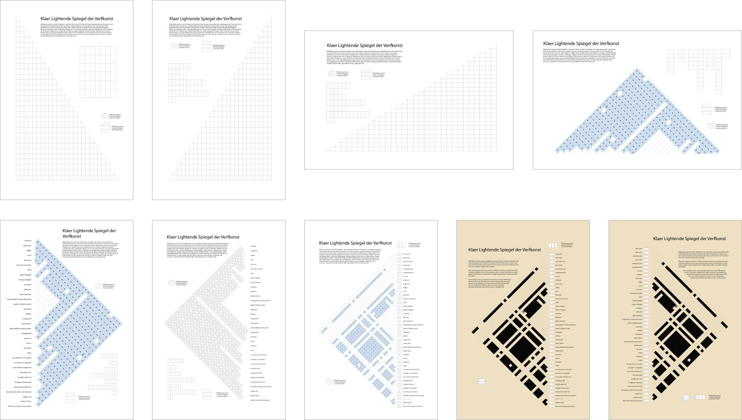
I started designing the poster by playing with rough ideas about how to include a large matrix on it. Early attempts were uninteresting but after stumbling upon the idea of a roof-shaped matrix diagram from the Data Viz Project, I found that rotating it 45° proved to be the most intriguing. I also tried to remove rows and columns for pure colors that weren’t used in mixtures but that lead to an inaccurate diagram so I opted to keep them in to represent the entire book more fully and accurately.
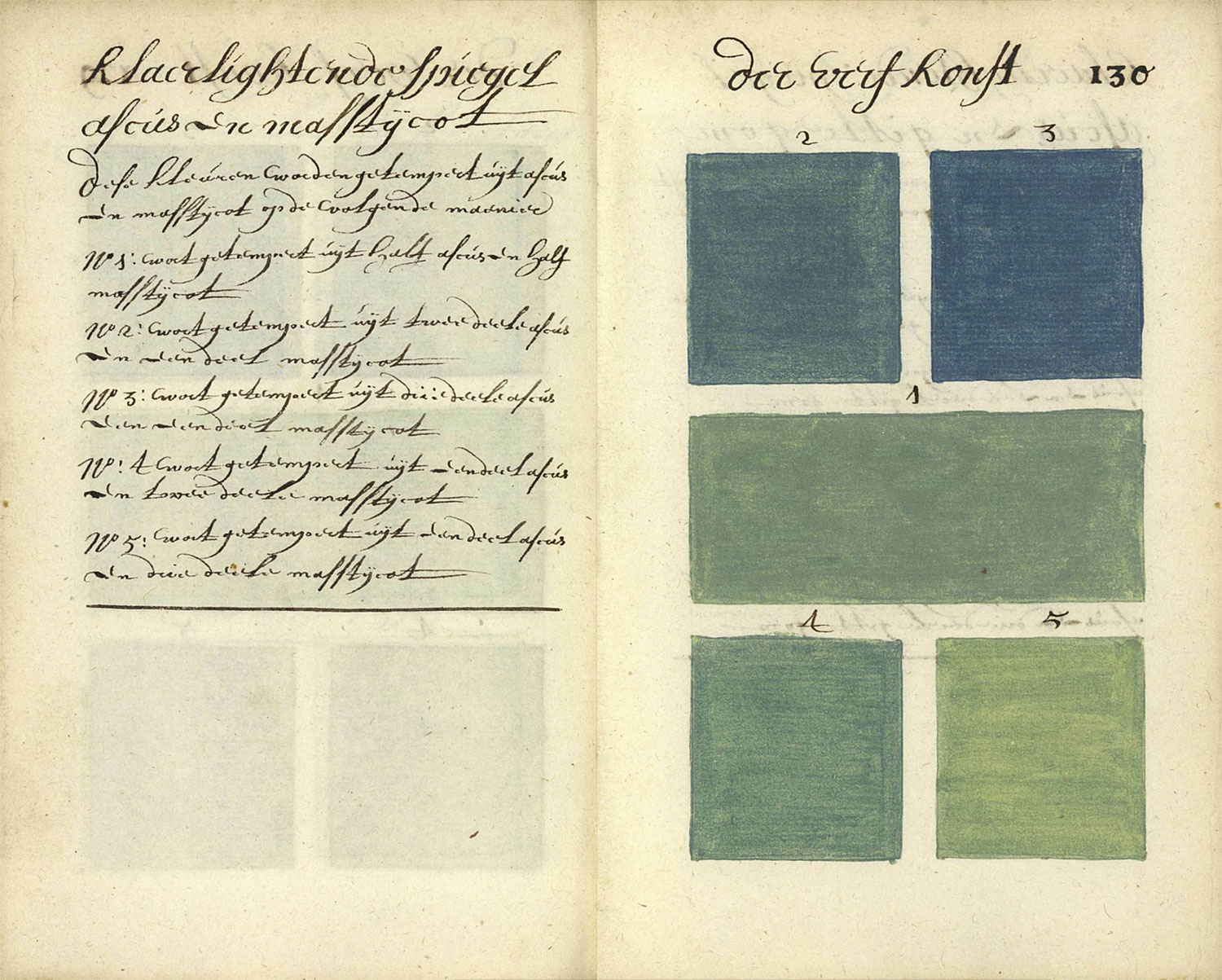
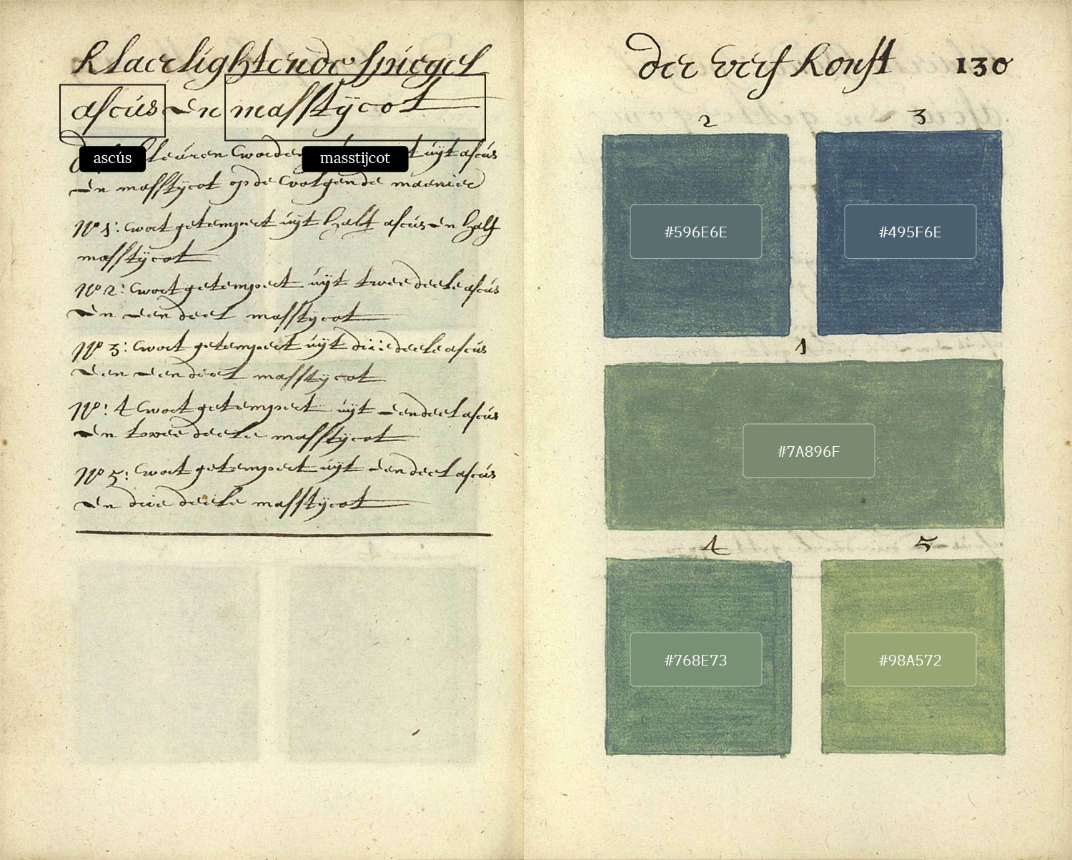
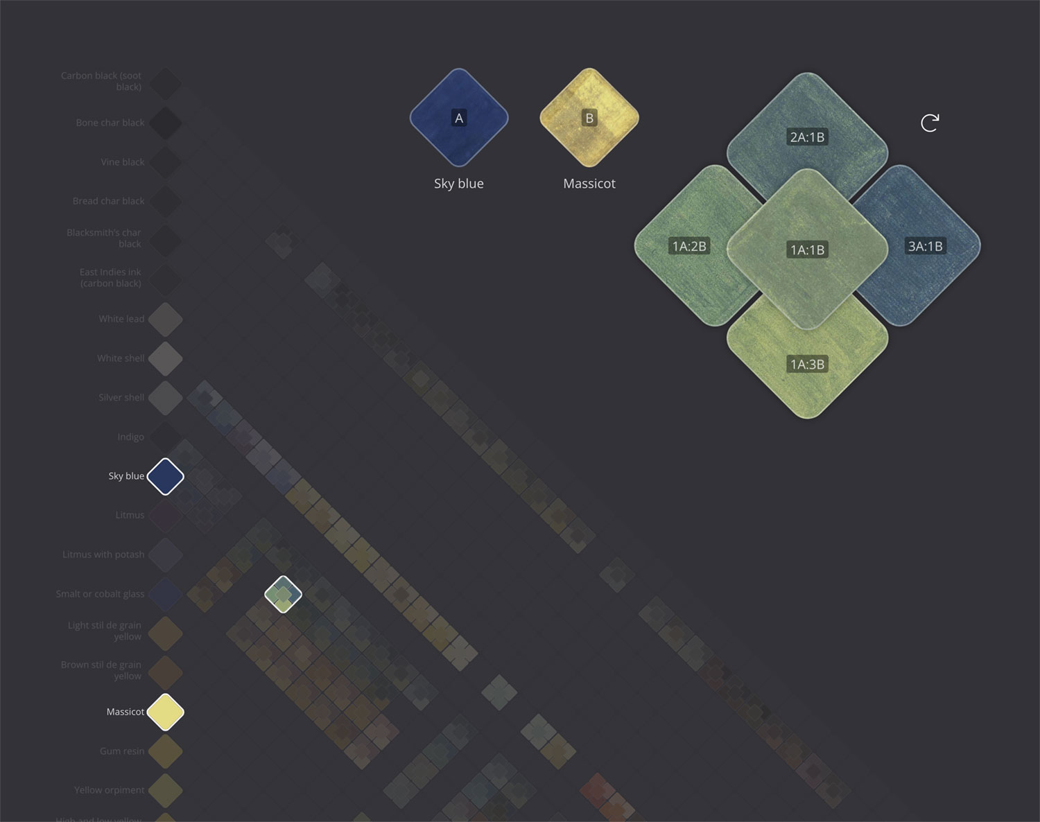
Each cell with an “x” on the matrix diagram represented one combination of two colors but also five mixtures in specific ratios, which were listed on the page facing each mixture. For example, plate 130 and its accompanying description shows the mixtures of sky blue and massicot (a type of lead oxide) and swatches numbered 1 through 5 representing the mixing ratios:
- One part sky blue with one part massicot
- Two parts sky blue with one part massicot
- Three parts sky blue with one part massicot
- One part sky blue with two parts massicot
- One part sky blue with three parts massicot
To represent these colors, I used a simple stack of rounded rectangles in a similar layout to the original plates, but with added overlap. My hope was that by doing this for each cell, the result would be a very colorful diagram that blended from one color into the next.

Thus began a lengthy process of extracting all the swatches and generating a hex code for each. I decided to select the hex code manually rather than taking an average of all its colors because many swatches had variations in coloring due to aging and I wanted to find the best representative value. Cropping all 2,088 swatches into individual images and extracting the hex codes took about 4–5 days of work.
While collecting the data, I used NodeBox to generate the initial version of the matrix diagram to experiment with its nuances like sizing and spacing. My process was to crop images and generate hex values for 10 plates at a time and feed them into NodeBox and watch the diagram get filled out. This felt magical in a sense because I felt like I was painting a picture with centuries-old data that had never been seen before in this way. During this process, I also found that they were difficult to distinguish on a lighter background so I opted to use a darker background to help them stand out more.
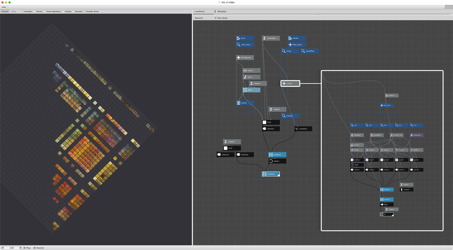
The result was really intriguing, satisfying, and begged to be made interactive. I wanted to be able to select any cell and see the original painted swatches. The SVG from NodeBox would have required a lot of manual editing to make it manageable in a browser and generating my own SVG felt like it would have been more complicated than it was worth so I kept things “simple” and recreated the diagram using plain HTML and CSS. The diagram is ultimately just a grid of cells rotated 45° but in order to get it to align and behave as I wanted, I built it using nested unordered lists and flexboxes rather than using grids. The basic structure is:
<ul class="wc-matrix">
    ...
    <li class="wc-row">
        <ul>
            <li class="wc-cell wc-pure" data-color="Bone char black" style="background: #090906;" data-plate="2">
                <span class="wc-cell-title">Bone char black</span>
            </li>
            ...
            <li class="wc-cell wc-mix" data-color1="Bone char black" data-color2="White shell" data-plate="43">
                <span class="wc-swatch" style="background: #2f2f2f;"></span>
                <span class="wc-swatch" style="background: #323232;"></span>
                <span class="wc-swatch" style="background: #575757;"></span>
                <span class="wc-swatch" style="background: #636262;"></span>
                <span class="wc-swatch" style="background: #4f4f4f;"></span>
            </li>
            ...
        </ul>
    </li>
    ...
</ul>
Everything was also based on relative values so it’s fully responsive. For example, just two variables control the all the sizing:
--gap: 2px;
--cell: calc((100% / 42) - var(--gap));
When these were combined with aspect-ratio: 1 / 1 set on the main container to ensure a square layout, the rest of the CSS for alignment, positioning, color, etc. fell together fairly nicely. One line of CSS with three transforms rotated and positioned the matrix: transform: scale(72%) translateX(-32%) rotate(45deg). Interestingly, more CSS was needed to create the legend than the matrix diagram.
Data that powers the diagram comes from two JSON files: one for the pure colors listed along the left side and another for the mixtures.
The final result is a fun diagram that allows for each mixture to be clicked to see the original painted swatches.
Posters
While working on the visualization, I was also thinking about what kinds of posters could showcase the beautiful colors Boogert created. I knew I wanted to showcase all the colors in several ways and each presented its own interesting challenges.
I used InDesign for all three posters because it allowed me to link images rather than embedding them (thus keeping the file size down) and still perform admirably with so many images on one page—something I discovered when creating my British and Exotic Mineralogy poster.
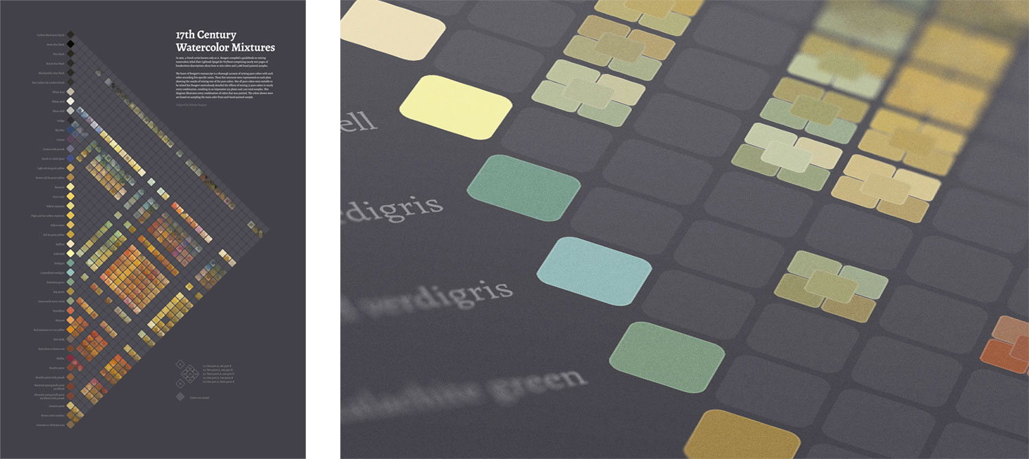
My original plan for a poster of the matrix diagram was to show the same diagram but include images of the actual swatches for each color rather than a flat color like the legend on the interactive diagram. This proved problematic because trying to import so many shapes into InDesign at once triggered some safety measure that prevented it. However, it let me paste them piecemeal. Even so, the shapes would have been so small that using the textures on the swatches would have been too small to be worth the effort so I kept the poster simpler by using the hex values and focusing on the overall picture made from all the mixtures.
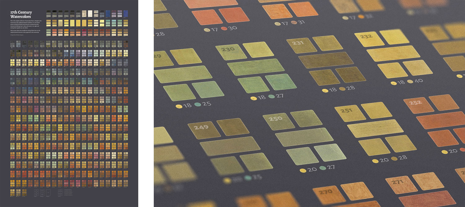
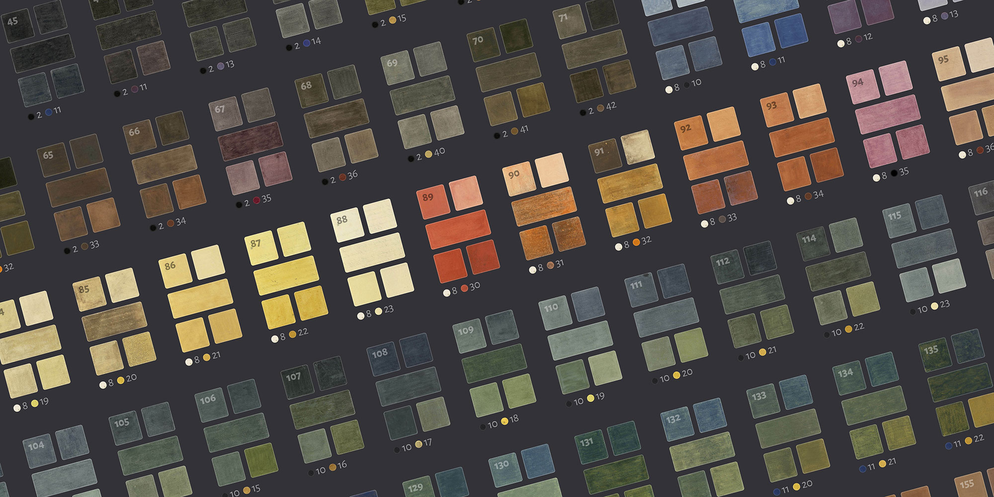
Determined to create a poster with images of all the swatches, I chose a simpler design for the second poster that replicated the design of the original plates and displayed them in the order they appeared in the manuscript. The top portion shows plates of the pure colors and their dilutions when available. Below each mixture of colors is a pair of swatches and numbers indicating the pure colors that were blended to make them. Creating this poster was a very manual process, requiring each image to be placed by hand but also relied heavily on object styles for efficient minor global adjustments.
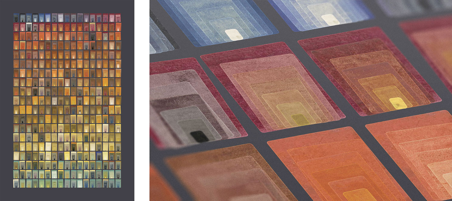
In addition to posters focused on being informative, I was very interested in creating one that was more decorative but still based on the underlying data. I had been following many generative artists on Twitter for a while and they inspired me to try creating more abstract images with no words to explain them. I was no stranger to creating abstract images after having cut my teeth on fractals years ago. After a first few unimpressive attempts showcasing various arrangements of colors and mixtures, I stumbled upon one that proved simple yet intriguing, representing all the mixtures as “doorways” and organized by color. Each box includes the image of the real color painted in the manuscript and each set of boxes represents the mixing from one pure color (largest) to another (smallest) and the ratios of mixtures in between.
To make this poster, I created the first concept in NodeBox but that only used hex colors. When I extracted the original swatches as images, I named them with their plate numbers (e.g., 001-1.jpg for the first swatch on the first plate). Next, I used a small bit of JavaScript to parse my spreadsheets of extracted data to generate the list of images needed to import into InDesign. Finally, I wrote a custom InDesign script that took that list of images and arranged them on the poster. Having only written one other InDesign script before, this was especially challenging because I had to recreate the entire design in InDesign that I first created in NodeBox but with images instead of hex colors. The documentation for scripting in InDesign has never been the best but I was able to finagle a working script with the help of the InDesign ExtendScript API reference.
Final thoughts
I’m glad to have finally created a project based on Boogert’s impressive manuscript. One day, I hope someone is able to put a full English translation online. This was a short project—taking only two weeks—but as with my other projects, I had fun learning new things about something old and new techniques to create visualizations.