Making of A Brief Visual Exploration of A Dictionary of Typography
By Nicholas Rougeux, posted on December 16, 2020 in Art, Data, Web
Not many people read a dictionary cover to cover, let alone analyze every word, but I did and found it fascinating. During research phases for my past restoration projects, I often came across a surprising number of antique dictionaries and always overlooked them. For this project, I actively sought out an interesting one to explore and ended up finding two to create A Brief Visual Exploration of A Dictionary of Typography.
I came across so many dictionaries—most for translating one language into another—that I ended up creating a tailored search bookmark that excluded them from searches on the Internet Archive. When I decided to seek out dictionaries, I wanted to find something relatively small and different from the usual dictionaries that were all-encompassing or focused on translations. I've long had more than a passing affinity for typography and early printing so when I came across A Dictionary of Typography published in the 1870s, it was the perfect fit.
Source material
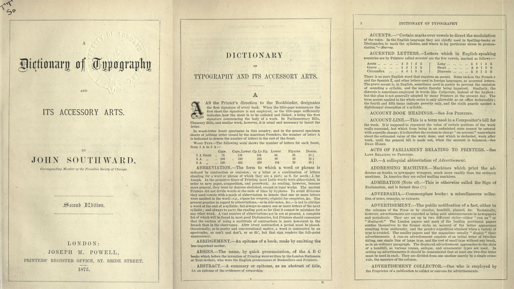
From 1870 to 1871, John Southward, a printer from Liverpool, wrote A Dictionary of Typography and its Accessory Arts and published it in the Printers’ Register in monthly installments and later published as a standalone book in 1872. Three years later, a second edition was published in 1875 due to its popularity. Both editions are available as scans on the Internet Archive.
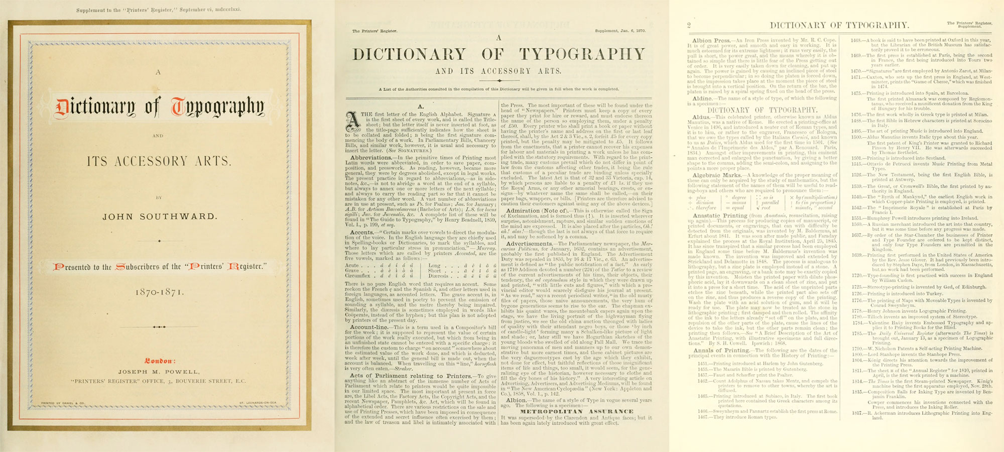
Southward collected a wide vocabulary of terms to include in his dictionaries—ranging from the tiniest parts of a letter to a brief history of printing. He often covered mechanical processes in great detail, even to the point of how to hold paper or how far to tighten screws during the printing process. Without illustrations, picturing how these processes work was a challenging exercise that more than once sent me to search for video explainers. He did include a handful of beautiful illustrations of some machines in the first edition. While much of what is included in the dictionaries has been made obsolete from technological advancements, it remains a fascinating look into an earlier era of typography and printing.
Planning and data collection
When I found the first edition of A Dictionary of Typography, I wanted to explore its structure but during my research, I discovered the second edition and my focus shifted to how it evolved from the first. As an added bonus, I couldn't find much that anyone wrote about them beyond the general descriptions on rare book sites so I didn't have to worry about replicating what someone had already done.
This project was a visual exploration exercise more emphasis on the visuals and less on gaining informative insights. I had a couple thoughts on what to explore but couldn't do much without the actual data so I decided to explore as I generated the data. Doing this involved creating structured data from every term in the original scans. The scans on the Internet Archive were run through an OCR process which was helpful but far from perfect and they still needed a lot of manual correction.
As a first step, I created a basic spreadsheet of just the terms and noted whether they appeared in just the first edition, second edition, or both.
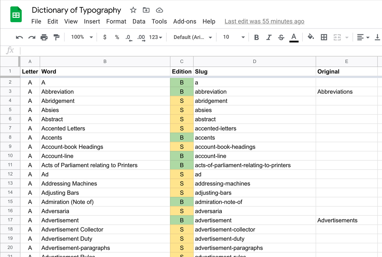
Filling in the spreadsheet took about a day and while it was rough, it allowed me to get a first look at the data to shape future decisions. While flipping through both editions, I saw a few differences but couldn't tell where they occurred until the spreadsheet indicated that most changes were near the first and last thirds of the list. I also discovered that the wording of the terms themselves changed somewhat—adding or removing hyphens or entire words. I also found that the bulk of the terms were in both editions but there were enough terms in only one or the other to make for an interesting visualization. I was also surprised to discover that not all words were in alphabetical order. For example, the entry for Seventy-twos comes after the entries for Shank, Shears, Sheet, and Sheet the roller. This occurred several times throughout both editions without a clear pattern.
After becoming familiar with the initial data, I began the process of transferring the terms and their full definitions into a database. This process took about a month and during that time I pieced together the website design and wrote the code for the visualizations so I could see how they evolved while I added terms.
Visualizations
Exploring words
My initial thought for the project as a whole was to make a poster of all the terms color-coded by whether it was in the first, second, or both editions to serve as an interesting view of both editions at a glance. Early experiments showed that all the terms could fit on a large poster but there was something missing.
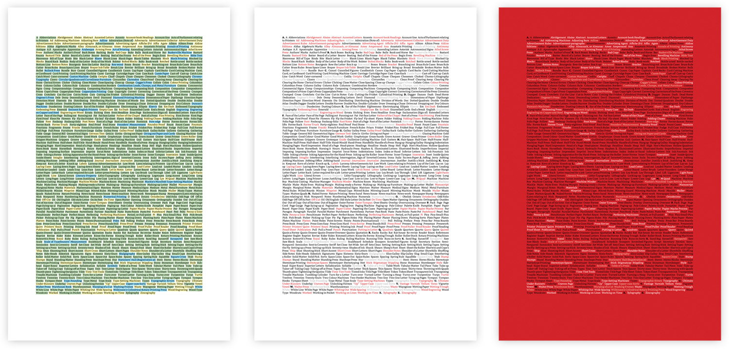
I toyed with the idea of including a small visual after each term with a variety of different shapes including lines, docs, and tiny squares.
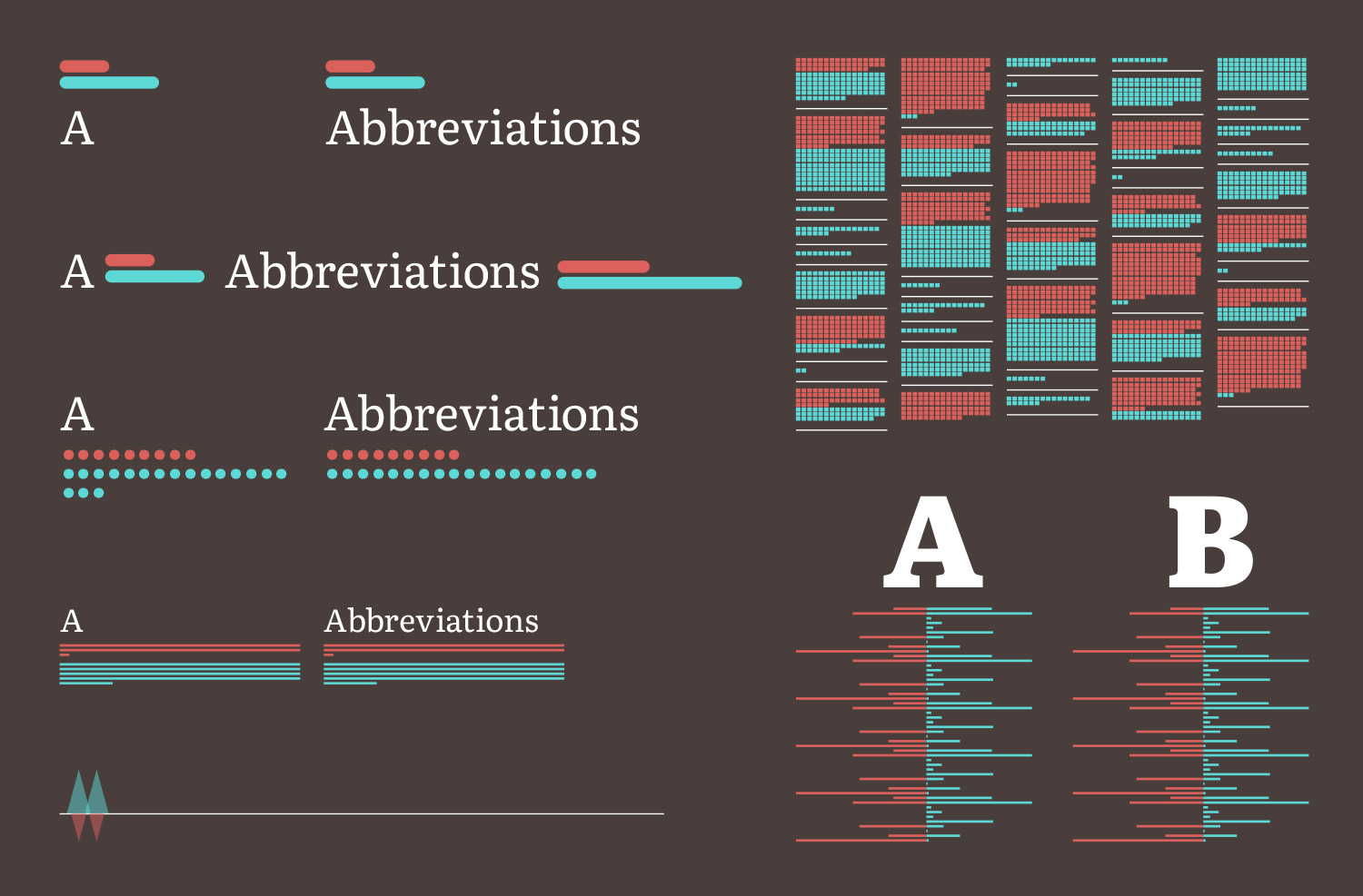
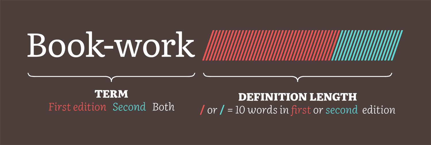
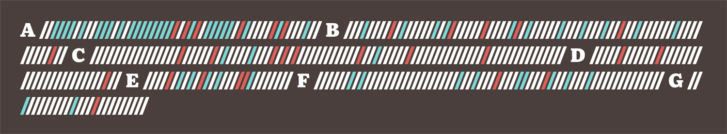
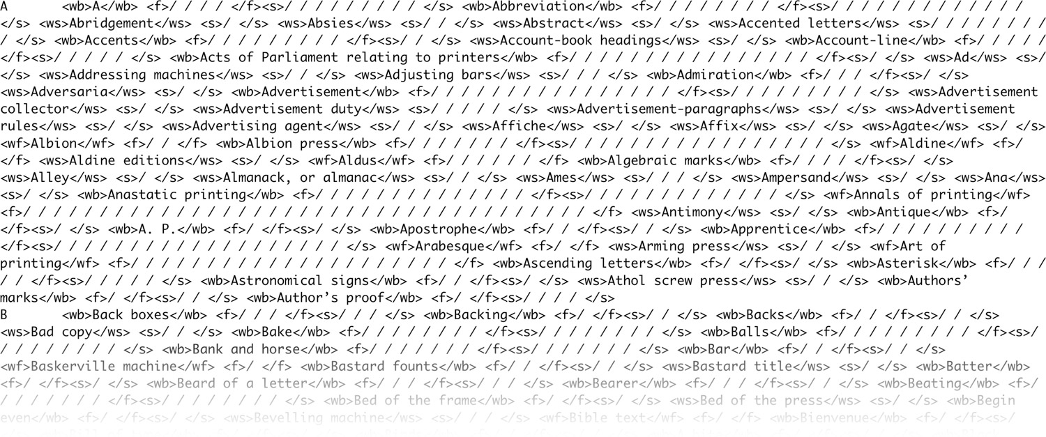
Eventually, I settled on a simple series of slashes following each based on the number of words in its definitions from both editions. After entering a few definitions in the database, I saw that there was enough variety in their lengths that this would make for an interesting visualization. I enjoyed this approach because the slashes served as separators between terms and a visual to indicate how long each definition was in each edition.
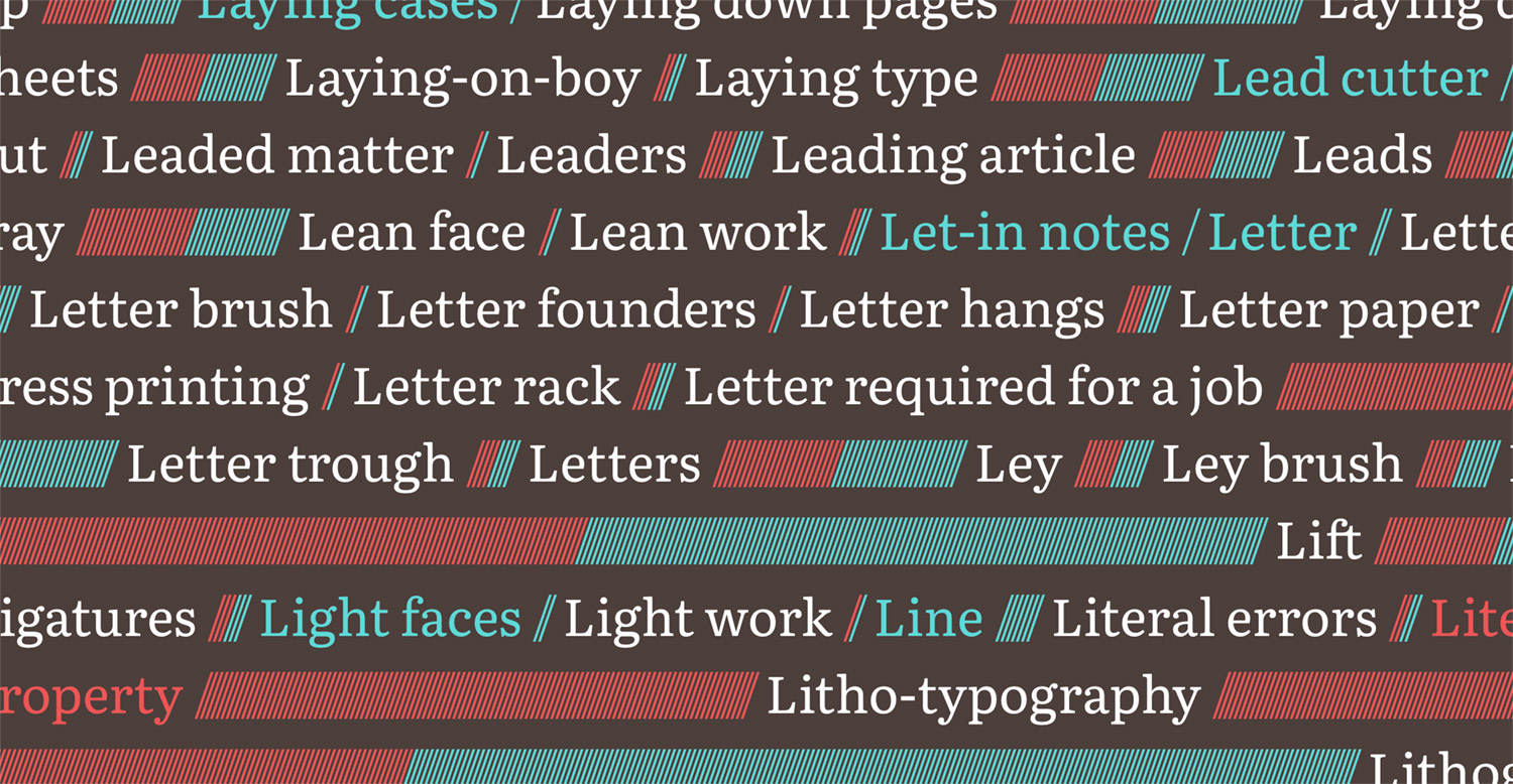
Running the terms and visuals together in a long list punctuated by the letter groupings Illustrates just how much information is packed into the small dictionaries. Plus, letting the text flow naturally offers the same experience on all devices without adjusting the layout. Exposing all of the color-coded terms at once with the visuals also invites exploration to discover the differences between the editions. A long list of slashes seems more intriguing than a wall of words like the original definition. It’s also fun to scroll through.
Taking inventory
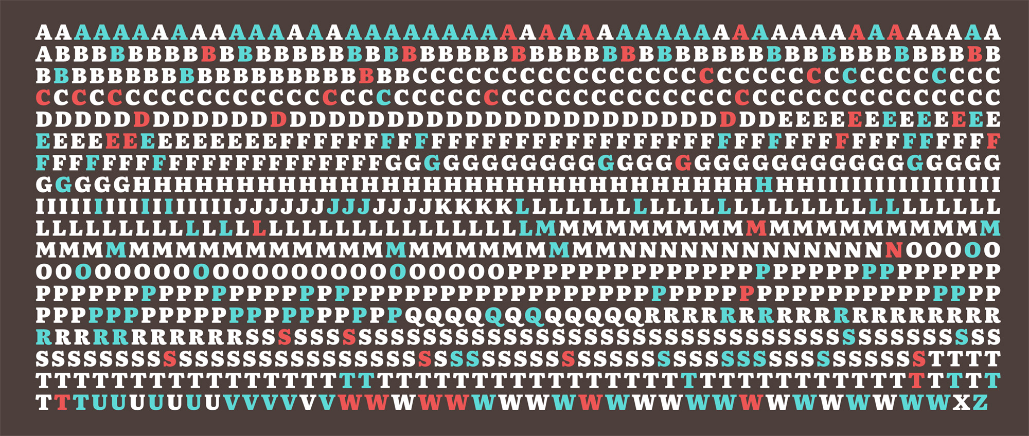
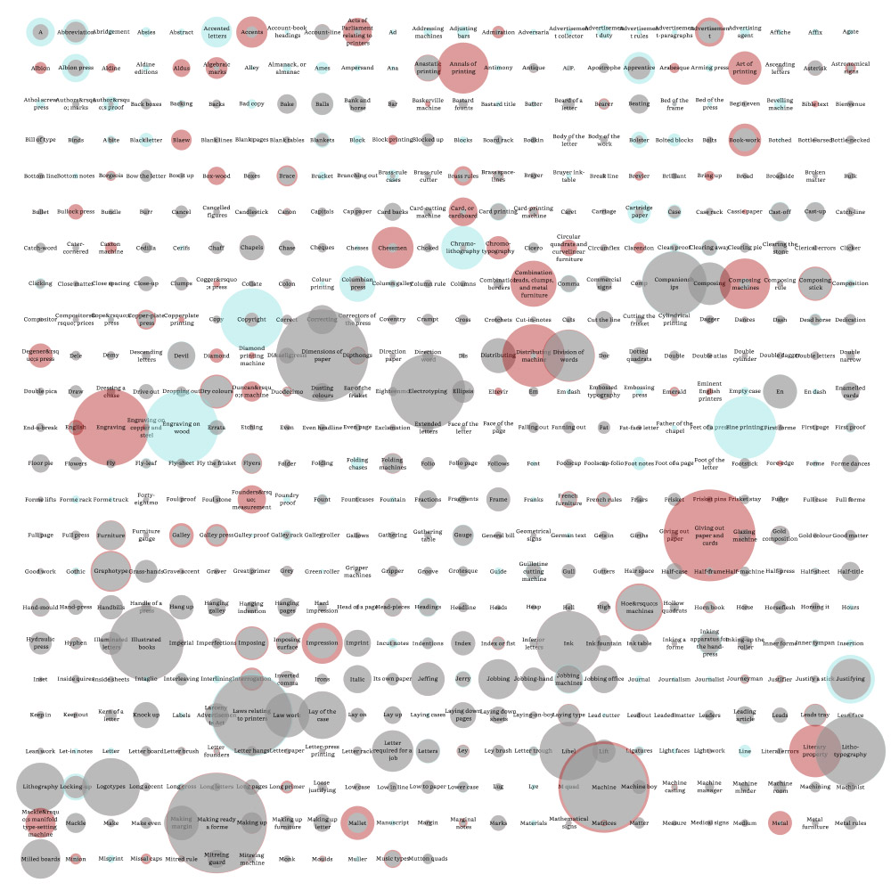
The first version of the inventory section was a “rolled-up” view of the big list with color coded slashes appearing after each letter of the alphabet indicating where the word appeared and in which edition.
I liked this but it suffers from three main problems: Chrome and Safari had issues displaying the slashes correctly so they didn't wrap as intended, the tight spacing made seeing the different coloring difficult, and clicking on any one slash to see the term it represented was too difficult. I changed the slashes to the first letters of each term which solved all of these problems, better emphasized how many terms there were starting with each letter, made the list more inviting, and created a more interesting visual.
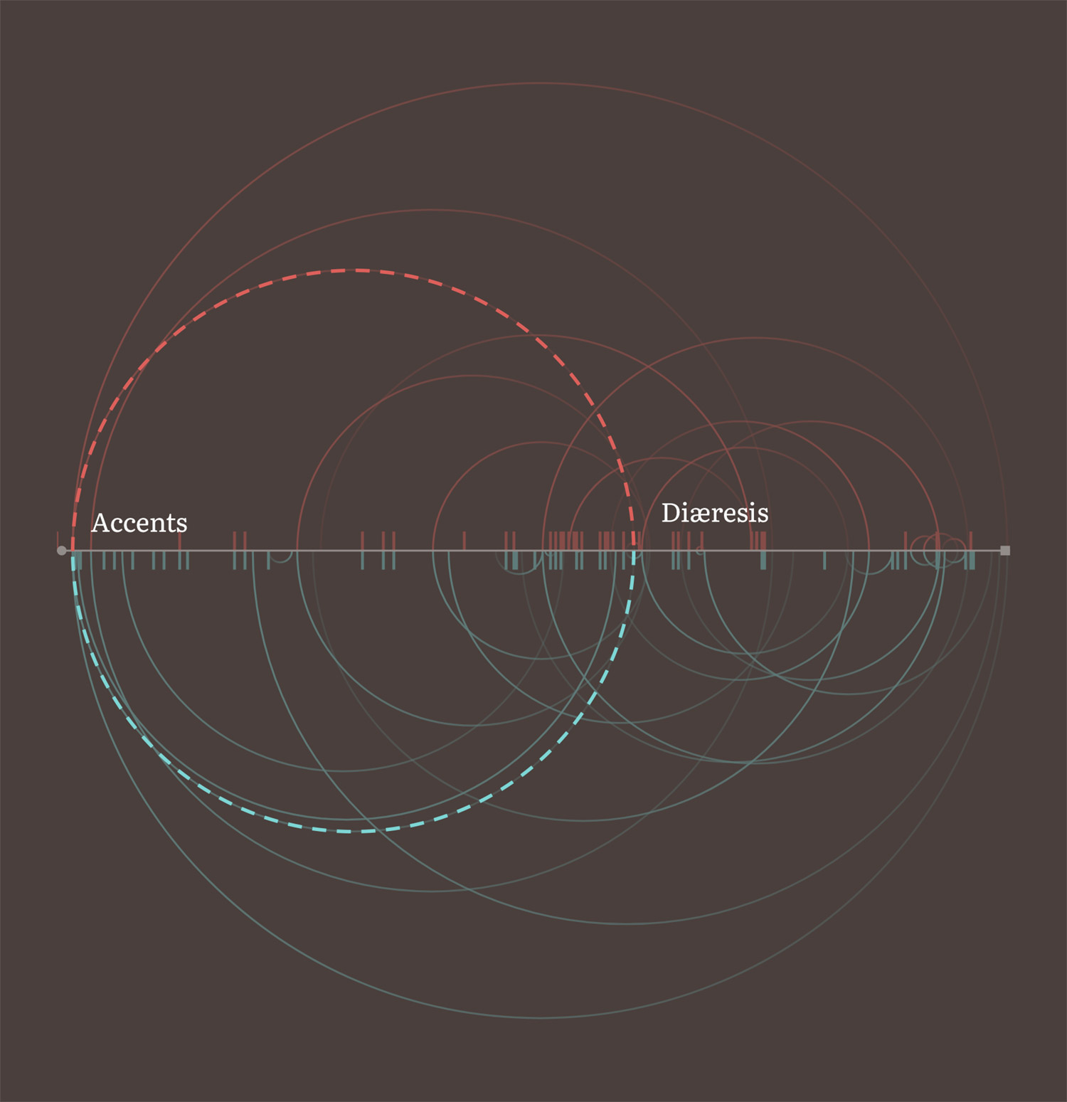
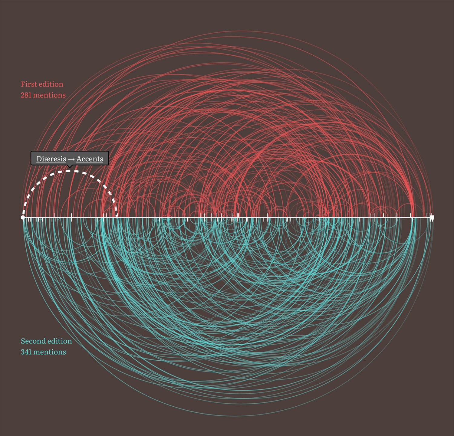
Connecting mentions
As I entered dictionary entries into my database, I saw more than a few mentions of other terms as references. For example, the definition for Short accent was simply, “See Accents.” I modified my database to keep track of these not knowing how I was going to visualize them. By the time I made my way through about a third of the terms, I figured I had enough to create a chart of arcs showing how they were connected. I plotted the all the terms alphabetically along a single line running from left to right and drew arcs connecting the terms and their mentions.
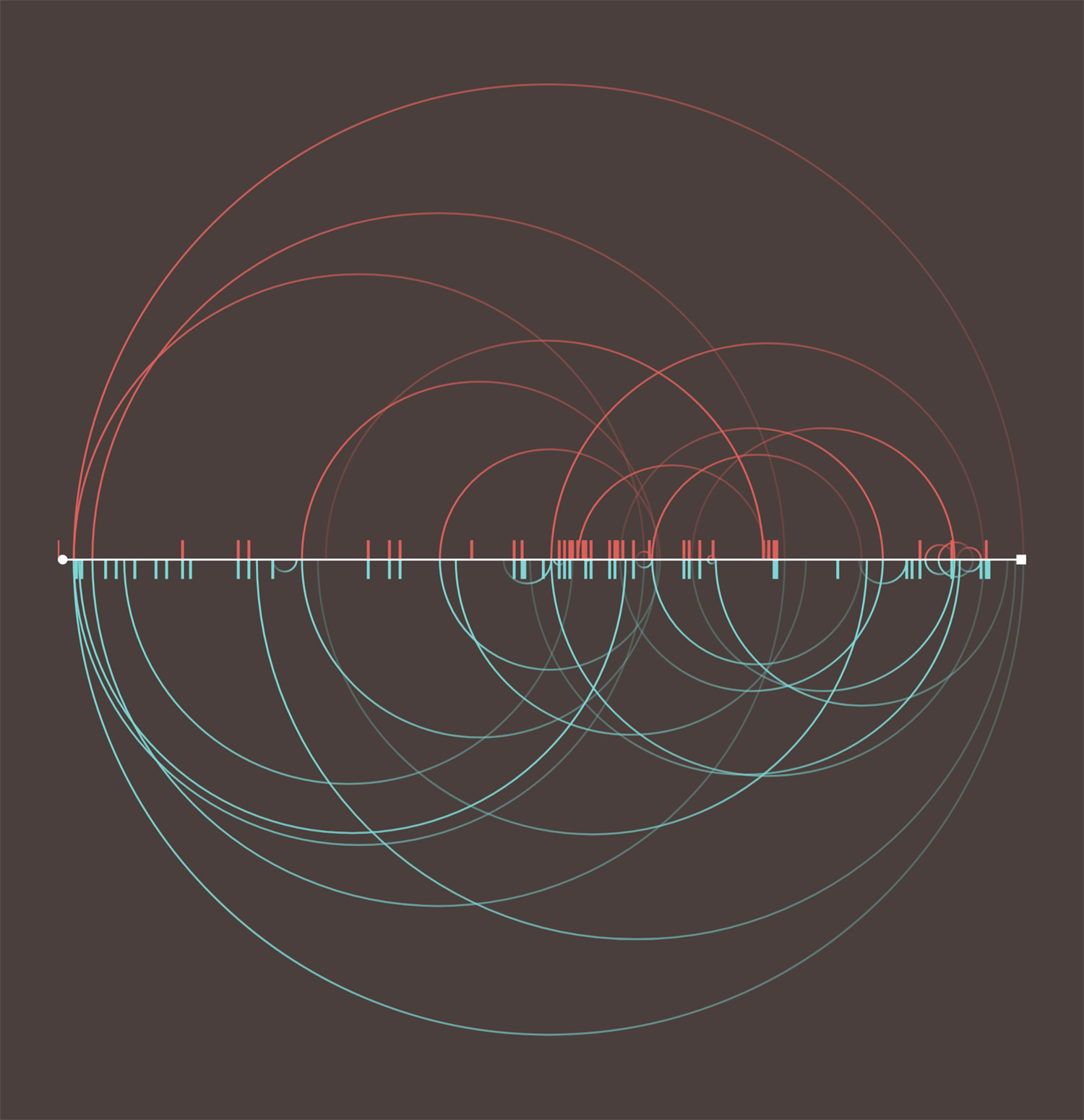
Since the terms and mentions were different between both editions, I split the chart into two halves with arcs for mentions in the first edition on the top and those for the second on the bottom. I also adjusted the coloring so an arc’s starting point was faded and the term it referenced was more visible to indicate whether the term mentioned came before or after the starting point.
For example, in the early screenshot above, Diæresis mentions Accents so an arc was drawn from around the middle where Diæresis appears alphabetically to the far left where Accents appears. This mention appears in both mentions so an arc is on the top and bottom halves.
Similarly, the screenshot above shows an arc drawn between Direction paper and Book-work but since this mention only occurs in the second edition, the arc is only drawn on the bottom half.
Interestingly, more than a few terms mentioned others that didn’t exist in one or both editions. Most notably, Type founding was explicitly mentioned several times despite being left out of the second edition. These mentions of nonexistent terms were are indicated as ticks on the chart positioned where the terms mention them.
At first, I tried making this chart with HTML and CSS but that proved problematic to consistently scale for smaller screens. I tried using SVG shapes to achieve the same result and was pleasantly surprised at how much easier it was. The structure was fairly simple:
<svg aria-hidden="true" preserveAspectRatio="xMidYMid meet" viewBox="0 0 1000 1000" xmlns="http://www.w3.org/2000/svg">
<defs>
<!-- Clipping paths -->
<clipPath id="first"><rect x="0" y="0" width="100%" height="50%" /></clipPath>
<clipPath id="second"><rect x="0" y="50%" width="100%" height="50%" /></clipPath>
<!-- Gradients -->
<linearGradient id="first-forward" x1="0%" y1="0%" x2="100%" y2="0%">
<stop offset="0%" stop-color="rgba(221, 96, 91, 0.2)"/>
<stop offset="100%" stop-color="rgba(221, 96, 91, 0.7)"/>
</linearGradient>
<linearGradient id="first-backward" x1="0%" y1="0%" x2="100%" y2="0%">
<stop offset="0%" stop-color="rgba(221, 96, 91, 0.7)"/>
<stop offset="100%" stop-color="rgba(221, 96, 91, 0.2)"/>
</linearGradient>
<linearGradient id="second-forward" x1="0%" y1="0%" x2="100%" y2="0%">
<stop offset="0%" stop-color="rgba(125, 214, 213, 0.2)"/>
<stop offset="100%" stop-color="rgba(125, 214, 213, 0.7)"/>
</linearGradient>
<linearGradient id="second-backward" x1="0%" y1="0%" x2="100%" y2="0%">
<stop offset="0%" stop-color="rgba(125, 214, 213, 0.7)"/>
<stop offset="100%" stop-color="rgba(125, 214, 213, 0.2)"/>
</linearGradient>
</defs>
<!-- Arcs -->
<g class="ref-edition first" clip-path="url(#first)">
...
<circle class='ref backward tooltip' cx='11.922268907563%' cy='50%' r='11.292016806723%' data-source='Diæresis' data-source-slug='diaeresis' data-target='Accents' data-target-slug='accents' />
...
</g>
<g class="ref-edition second" clip-path="url(#second)">
...
<circle class='ref backward tooltip' cx='16.701680672269%' cy='50%' r='7.0378151260504%' data-source='Direction paper' data-source-slug='direction-paper' data-target='Book-work' data-target-slug='book-work' />
...
</g>
<!-- Axis -->
<circle class="ref-axis-start" cx="0" cy="50%" r="5" />
<rect class="ref-axis-end" height="10" width="10" x="100%" y="50%" />
<line class="ref-axis" x1="0" y1="50%" x2="100%" y2="50%" />
</svg>
The arcs weren’t arc-shaped paths but full circles masked by clipping paths positioned to only show the top or bottom halves of them. The gradients were set up so that they could be defined once and instead of applying them on each circle, I could use a line of styles to apply them such as .ref-edition.first .ref.backward { stroke: url(#first-backward); }. The extra data attributes on each circle were for the tooltips. The arcs were also made clickable so selecting one would show the terms connected by a dashed arc rotating in the direction of the mention
Making the arcs clickable presented an interesting challenge because they were all stacked on top of each other so smaller arcs were often overlapped by larger ones. To solve this, the arcs are output based on how large they are with the largest appearing first in the HTML and the smallest appearing last, thereby naturally letting the browser stack them from largest to smallest. Their size is based on the difference between where the terms they connect appear in the list alphabetically. For example, the arc connecting Zincography to Anastatic printing appears near the beginning of the HTML because it connects terms farther apart while the arc connecting Ink to Dry colours appears near the end because the terms are closer together. Using this technique, some part of every arc is clickable.
As I made my way through both dictionaries, I found that these mentions were conveyed via three methods:
- explicit references (e.g. “See Accents”),
- the abbreviation “q.v.”—short for the Latin “quod vide,” telling the reader to “see elsewhere,” or
- indirectly, where the reader was instructed to seek out several terms listed in the definition
Plotting mentions from all three methods creates a complex chart that can best be described as a “hairball” and is so busy that gaining any deep understanding of the mentions is nearly impossible but I felt it was an interesting visual to include nonetheless as it shows just how interconnected the small dictionaries were.
Highlighting differences
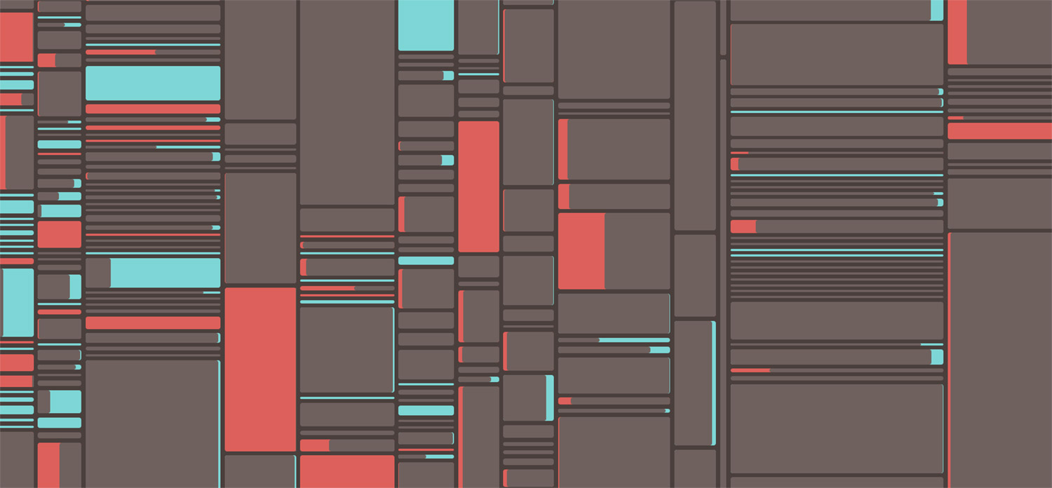
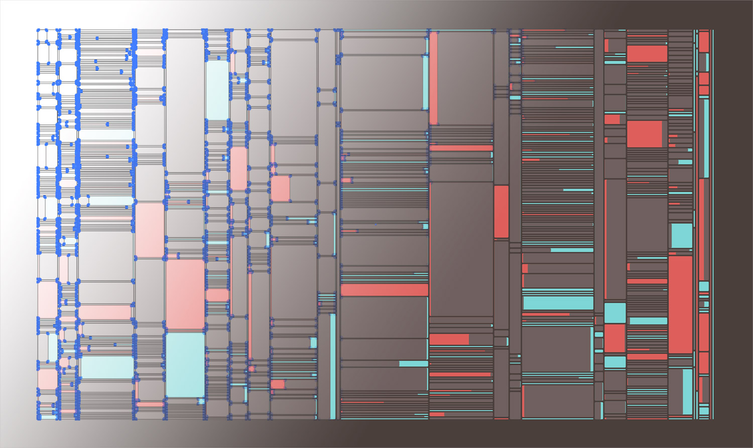
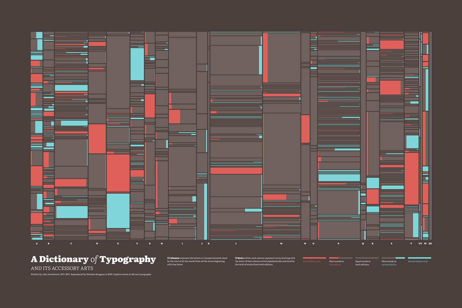
It wasn’t until I was about two-thirds through entering terms into my database that I got the idea for the final visualization. Up until this point, I had felt some aspect of the project was missing—some interesting way to see the length of all the definitions in both editions at a glance.
I liked the idea of showing this difference with overlapping shapes of different colors and created a simple early test with circles in a grid where each circle’s size was based on the length of the definition. This wasn’t meant to be a final design but instead to give me a sense of the variety available in the data.
Even though this early test only contained about half the terms, it highlighted the fact that more than a few definitions were quite long and most were fairly short so the final visualization needed to accommodate that wide variation. Most terms appeared in both editions with minor to moderate changes so the final visualization needed to be able to highlight those changes clearly. I also really wanted to keep the terms in alphabetical order to add a sense of apparent randomness rather than sorting them by length.
I eventually came up with a version of a treemap that I would later discover is called a slice-and-dice ordered treemap layout. I didn’t know it had a name when I came up with it but perhaps I subconsciously knew about it from past research. Either way, it did exactly what I needed with an added twist.
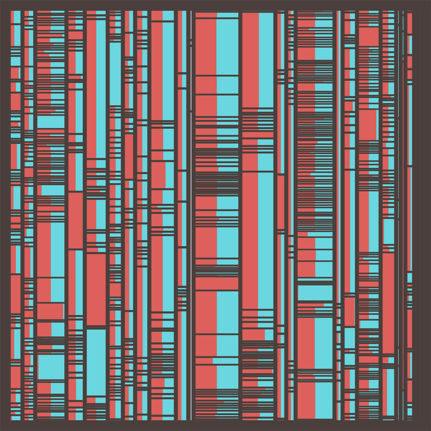
The layout is relatively simple:
- Columns are the letters A–Z proportionately sized by the total of all the words from all the terms beginning with that letter.
- Rows are terms starting with the letter of that column sorted alphabetically and sized by the total of words from both editions.
- Blocks within each row are divided into one or two parts depending on how many words are in each definition.
I really liked the first result but it had a few problems. Many terms had very similar definitions between the two editions so it was difficult to see the different block sizes within each row because they often took up equal space. This layout also created too many extra stripes. Most of the short definitions disappeared because they were so tiny. All the spacing also appeared uneven because the red and teal colors vibrated when next to each other. After more tinkering, I found a setup that worked:
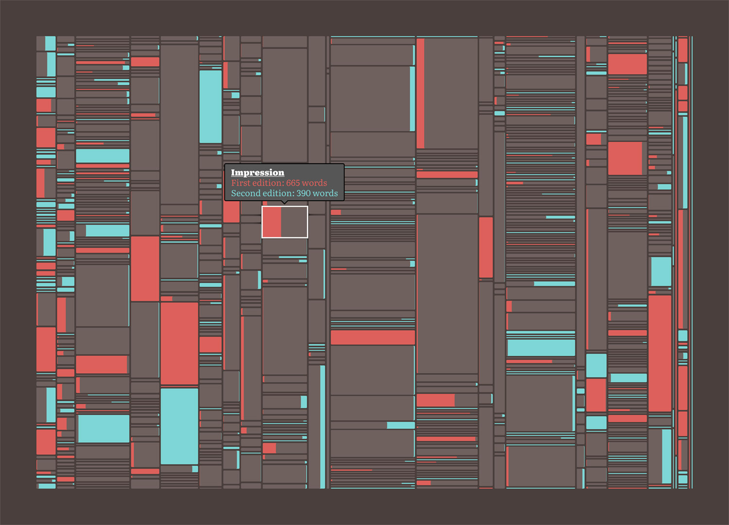
The biggest change from the first attempt was changing how the blocks within each row were structured. Rather than putting them next to each other, I overlapped them so only the larger of the two “stuck out” and showed the color of that edition. The legend explains it better:
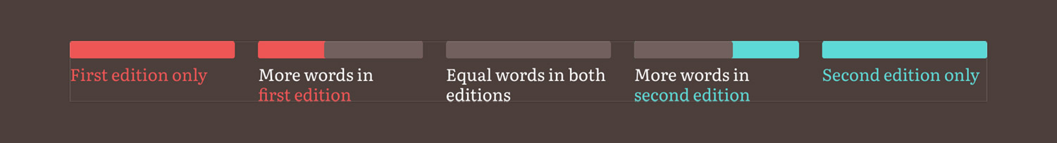
I also rounded the corners slightly to better distinguish the divisions between rows and columns. The sizes of tiniest definitions was also capped a minimum of a few pixels so they were always visible. The final diagram takes on an almost futuristic look which is a fun outcome considering it depicts information written in the nineteenth century.
What I found most interesting was how I made the final diagram. I made the first attempt in NodeBox but that required me to generate a separate file for my data, import it into NodeBox, and then export. Making that interactive seemed unnecessarily complex. I also contemplated using a charting library or building my own with SVG but that also seemed like overkill (and I didn’t want to calculate the positioning). Instead, I used a standard HTML list and a lot of CSS flexboxes that did all the heavy lifting with minimal calculations on my part.
The structure of the diagram is a nested ordered list:
<ol class="tree">
    <li class="tree-letter" style="--size: 0.031027032068521; --total: 51;">
        <ol>
            <li aria-label="Abbreviation: 143 words in first edition, 254 words in second" class="tree-term tooltip" data-first="143" data-second="254" data-slug="abbreviation" data-term="Abbreviation" style="--size: 0.066299265197061;">
                <div class="tree-edition second"></div>
                <div class="tree-edition both" style="width: 56.299212598425%;"></div>
            </li>
        </ol>
        ...
    </li>
    ...
</ol>
With this markup, I could easily create a set of nested flexboxes (columns, then rows, then columns again) and make them clickable by adding a few extra attributes to power the tooltip. The tricky part was creating the spacing between the columns and rows and ensuring everything lined up. To get this to work, I used two CSS variables as inline styles in the tree because their values were generated dynamically: --total and --size on each letter and --size on each term. I then used these variables in width and height calculations in the CSS. The basic layout styles were:
.tree {
    display: flex;
    height: 80vh;
    list-style: none;
    margin: 2rem 0;
    justify-content: space-between;
}

.tree-letter {
    display: flex;
    flex-direction: column;
    flex: 0 0 auto;
    min-width: 2px;
    width: calc(var(--size) * (100% - (4px * 24)));
}

.tree-term {
    display: flex;
    flex: 0 0 auto;
    height: calc(var(--size) * (100% - (4px * (var(--total) - 1))));
    min-height: 2px;
    transition: all 0.05s ease-in-out;
    position: relative;
}
For each letter (the columns), the width had to be a percentage of the total width after moving the four-pixel gutters between each letter. Since there were 25 columns (no terms started with the letter Y), I multiplied 4px * 24 and then subtracted that from 100%. Then I multiplied that by the variable stored in --size to get the actual width percentage. The height of each term (the rows) was similarly calculated except for height and the number of rows varied in each column so I had to store the total number of rows in --total and use that in the calculation. Setting the height over the overall chart to 80vh kept the entirety of it in view regardless of screen size.
Definitions
I’d be remiss if I didn’t talk about the definitions from both dictionaries. Every term is clickable and shows the full definitions from both editions if available. Reproducing these from the original dictionaries was a must, not only because seeing them is a natural expectation but also because they were simply fun to create.
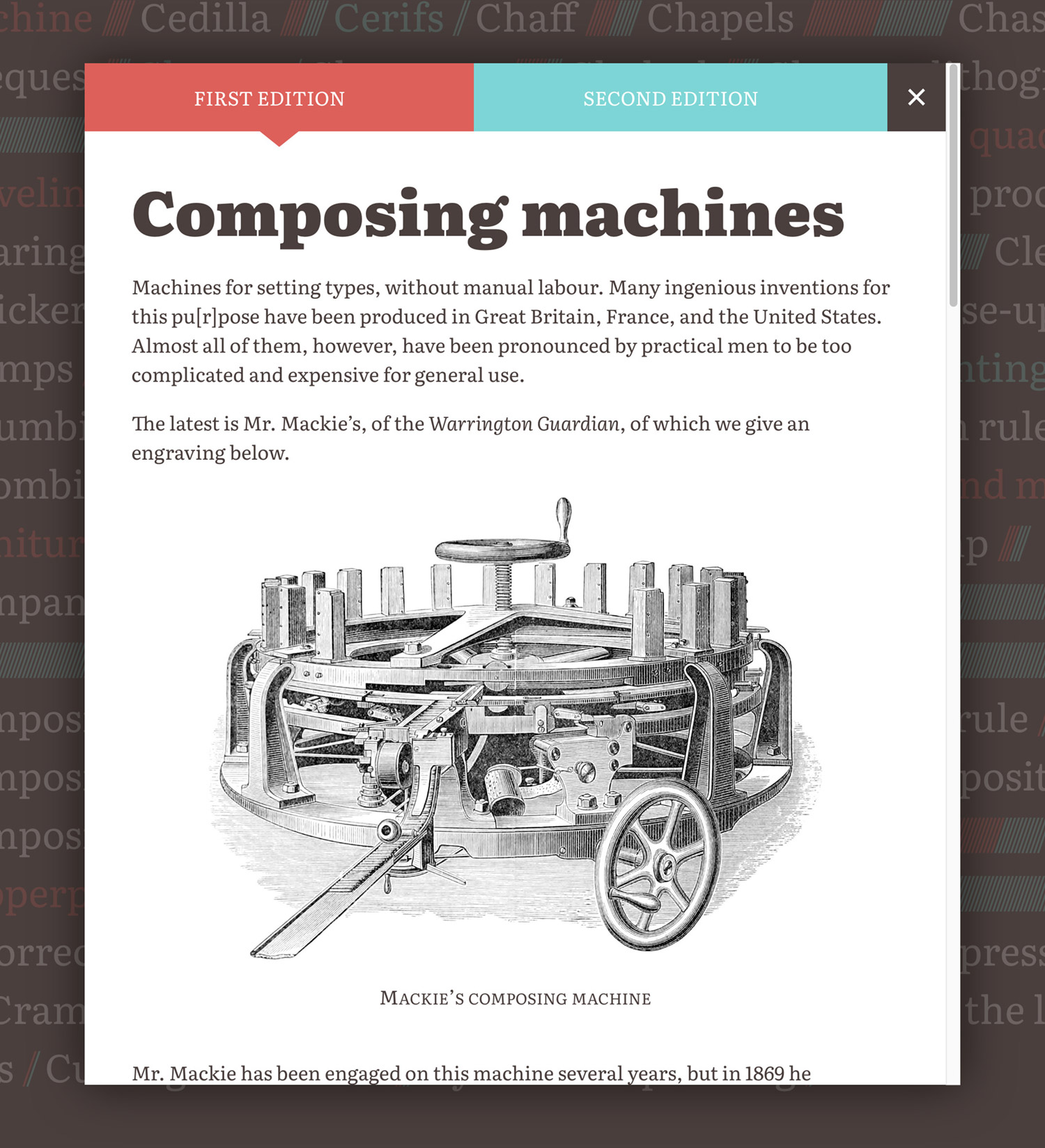
Each popup shows two tabs for switching between the versions that appeared in both editions to compare the differences—some as small as just extra comma. Many of the longer definitions didn’t have line breaks so I added my own to improve their legibility. Otherwise, the definitions were faithfully reproduced.
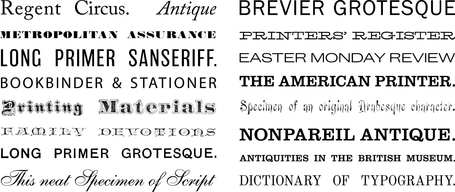
A handful of entries in the first edition contained beautiful intricate illustrations of printing equipment and font specimens. The second edition only contained specimens and the occasional simple line drawing. The biggest illustrative addition to the second edition was a full page example of proof reading marks added to Proof reading.
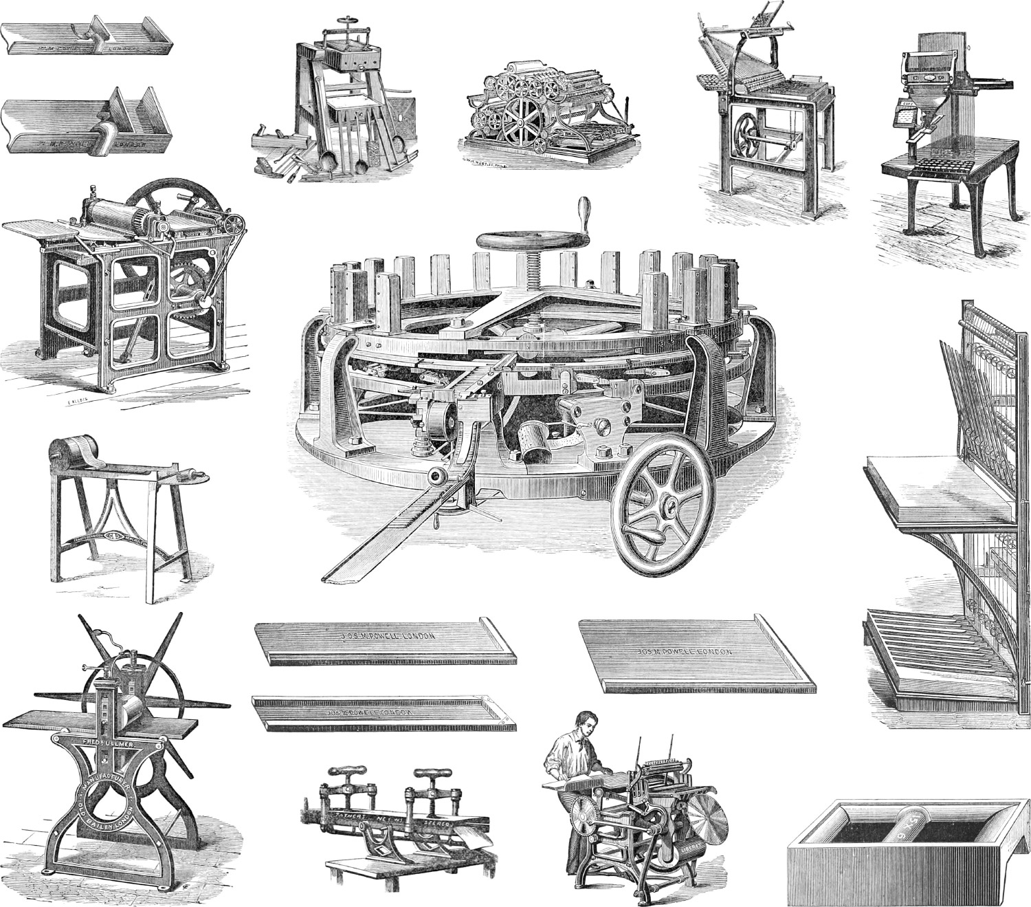
When possible, I cleaned up the illustrations in Photoshop or reproduced them as SVG shapes. The one exception that was the chess board in the definition of Chessmen, which I recreated from scratch.
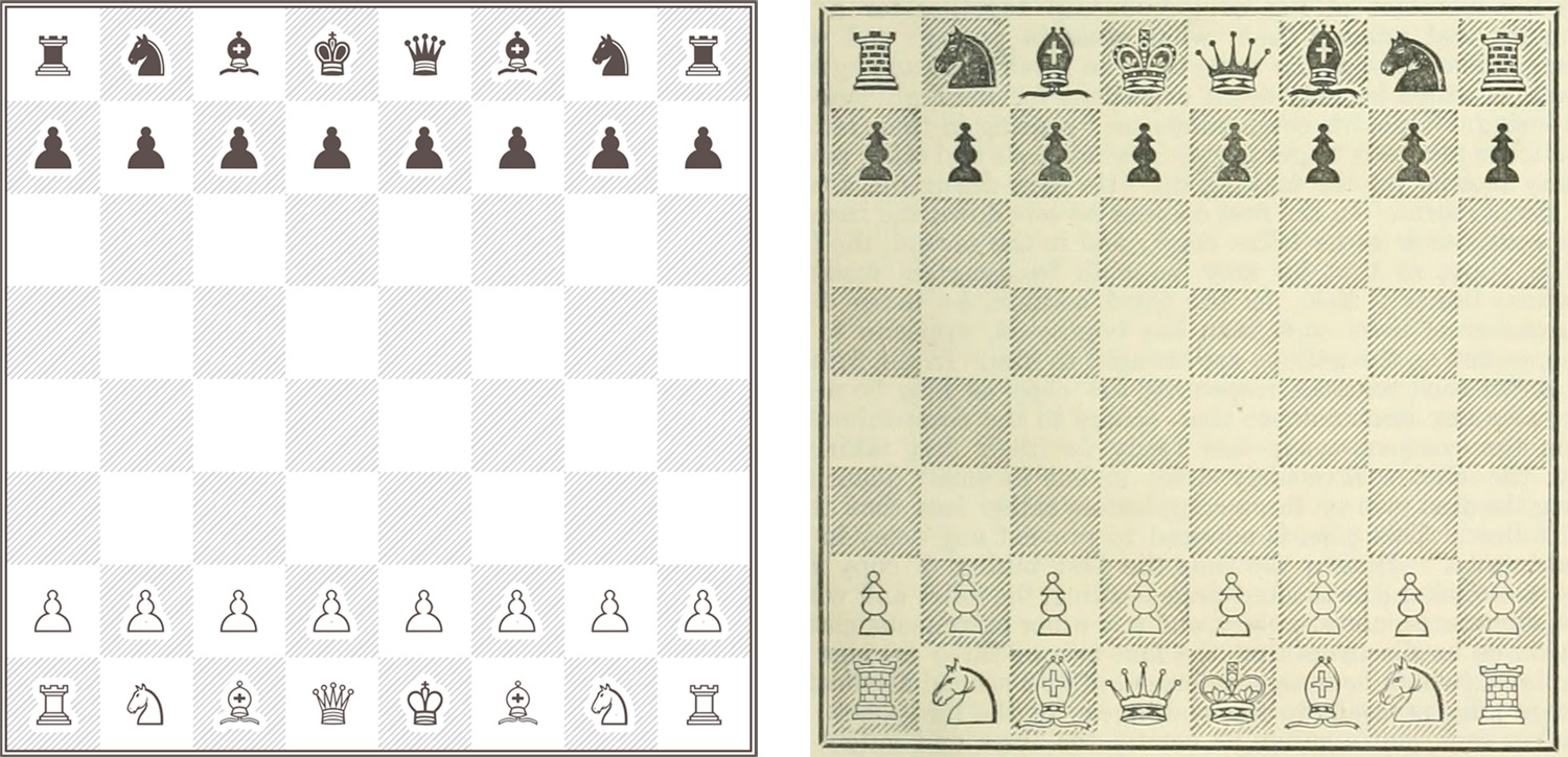
I could have easily cleaned up the original illustration image like the others but decided to have fun reproducing it with HTML and CSS because a full set of unicode characters for chess pieces exists and I wanted to use them. Those combined with some creative CSS allowed me to create the chess board true to the original illustration. One unexpected outcome is that the character for the black pawn appears as a black pawn emoji on iOS devices—something I couldn’t figure out how to avoid.
There were a few other tiny typographical curiosities that were fun to reproduce:
- The original definition of Cedilla illustrated using a rotated 5 as a cedilla (ç) if no more cedillas were available so I did the same.
- The original definition of Asterisk used a cluster of three asterisks to indicate a break in text. This most closely resembled an asterism so I used one and flipped it.
- A few entries such as Types and Ink used special characters pound (℔) and per (⅌). I was stumped on how to reproduce them because I hadn’t seen them nor did I know how to look for them but I found them with some digging on the letterlike symbols Wikipedia page. Amp What is also useful for looking up character codes for symbols.
The wording Southward used in his definitions was interesting in how official or meticulous it sounded—as one might expect from a publication called a dictionary—but some entries were notable because of the more opinionated stance on topics. One such entry that illustrates this is Composing which describes the process of selecting type for a line of text. In this description, he decidedly against any form of extra movement beyond what is absolutely necessary:
“Having taken notice of the state of the copy, he begins his work. His chief endeavour should be to compose with ease, accuracy, and expedition. An ill-habit, once acquired, is with difficulty shaken off. The variety of motions exhibited by some Compositors are truly ludicrous, such as nodding the head, agitating the body, throwing out the arm, ticking the letter against the case or the setting-rule, with many other false movements, which not only waste time, but fatigue the mind and exhaust the body. The swift action of the hand is not the criterion of a quick Compositor.”
Putting it all together
Being a project about typography, the typeface was one of the most important choices to consider and one that I typically think about at the beginning of any project. The typeface sets the underlying tone for an entire project. Rather than choosing one as close as possible to the source material as I’ve done with past projects, I already had one in mind: Literata. Free from Google Fonts, Literata was designed by TypeFoundry and caught my attention when its latest release was highlighted in a tweet from Google Fonts. It piqued my interest immediately with its beautiful heavy weights and I knew I wanted to incorporate that into some project when the right one came along and A Dictionary of Typography fit the bill.
My past reproduction projects have had similar antique themes but for this project, I wanted to try something different. Whereas the colors in past projects came from the content itself (geometric diagrams, mineral illustrations, botanic illustrations, etc.), there were no colorful illustrations in the dictionaries which allowed me to play with colors more. I wanted to use bolder colors that stood out and to try using a dark background for a change.
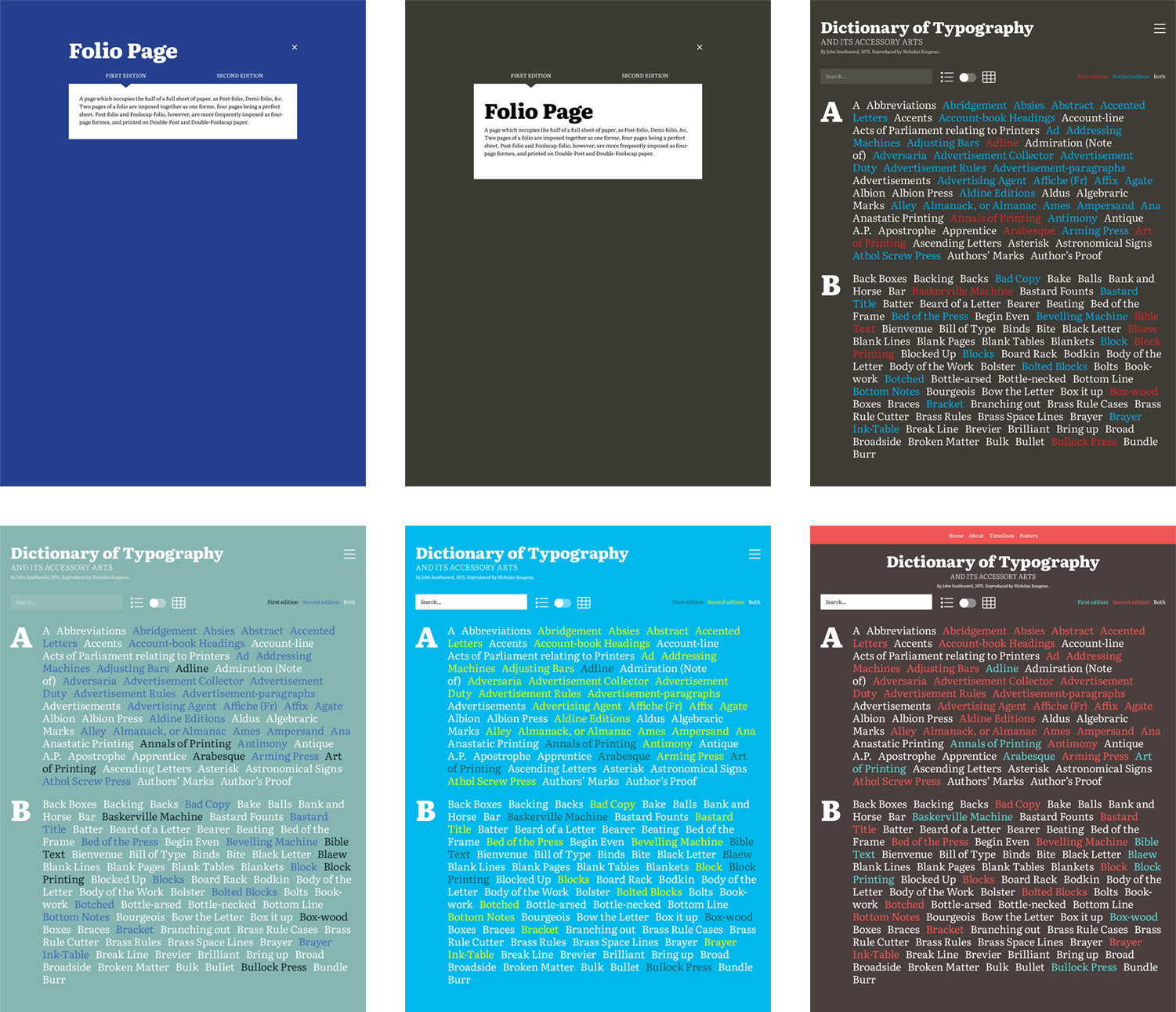
As the mockups show, I also was planning on a simpler design showcasing just the list of color coded terms with no visuals or having visuals hidden behind a click. I also thought about adding a search box but that seemed unnecessary for a project focused on visually exploring the structure.
I ended up choosing a brown that happened to remind me a of dark chocolate (a favorite treat) as a base color along with red and teal to represent the first and second editions respectively.
Stacking the sections on one long page rather than having separate pages felt like a more natural way to explore the data. Doing this made for a larger page but it works as scrolling tends to be more natural than clicking for projects like this. However, a separate page was created for the posters because they’re more of an extra feature compared to the rest of the project.
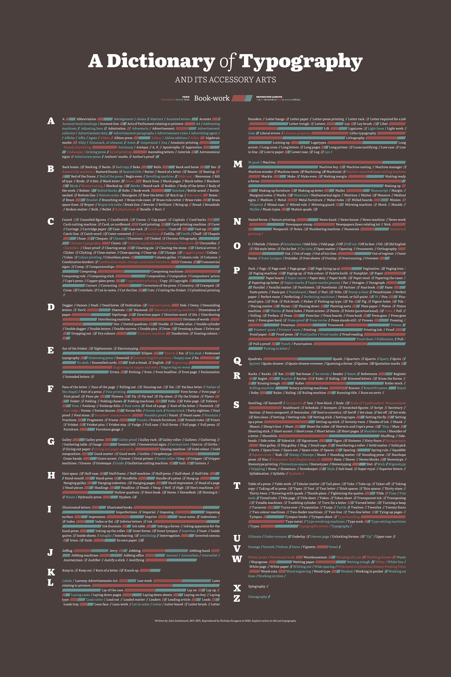
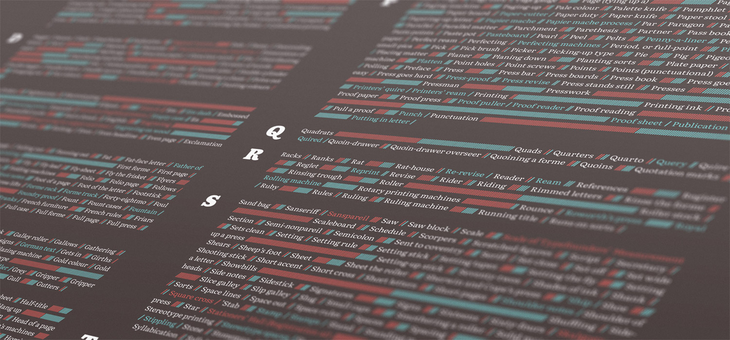
Posters
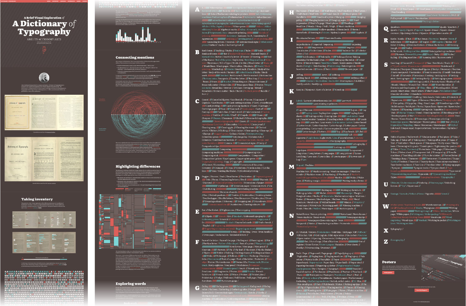
Since the inception of this project, I wanted to create posters illustrating the entire structure of both dictionaries. I used some interesting methods to create them too.
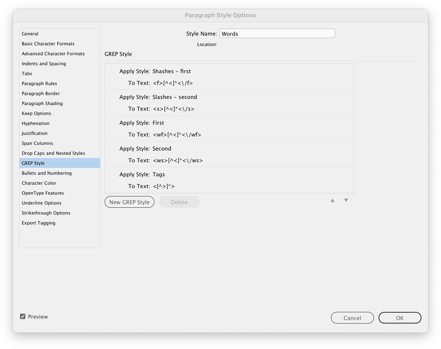
The first idea was to showcase all the terms on one poster in the same style as “the big list” of words. The challenge was that formatting all the text would have been a huge task to do manually so I developed my own style of markup to make use of InDesign’s GREP styles which let me format text based on regular expressions.
I generated my data using my own markup that was similar to HTML but with custom tags that I used as targets for my regular expressions. Using these, I created a paragraph style with multiple GREP styles to target words that appeared in the first edition (<wf>...</wf>), second edition (<ws>...</ws>), or both editions (<wb>...</wb>) as well as the slashes that appear after them representing the length of their definitions color coded for the first (<f>...</f>) or second (<s>...</s>) editions. A final style was added to target all the extra markup and make it invisible by shrinking it and removing the color.
The second poster I created showcased the intriguing differences treemap. I had carefully worked out the logic in HTML and CSS to get it looking just right and I felt that replicating that logic in another tool to generate the vector shapes for the poster wouldn’t be a good use of time. Fortunately, printing to a PDF from a webpage retains divs in the HTML as rectangles so the process was straightforward:
- Remove all extraneous elements from the page except for the treemap.
- Set the size to the aspect ratio needed (52:27) with some CSS.
- Print to a PDF.
- Open the PDF in Illustrator
- Remove extra elements except for just the shapes and save as an AI file.
- Place the AI file in InDesign and add annotations.
Final thoughts
I never thought I’d intentionally read an entire dictionary—let alone two of them—but I’m glad I did. I learned a great deal about typography and printing in the nineteenth century. I also learned a few new techniques for visualizing data and getting those visualizations from one tool to another. I’ve always felt that if I learned at least one new thing during a project, it was a good use of time, no matter how long it took.
This project was another labor of love. No one asked for it and it’s entirely unnecessary but I found it fascinating and had a lot of fun creating it.