TV cheat sheet: a design exercise
By Nicholas Rougeux, posted on July 5, 2010 in Art
After some recent back-and-forth with Comcast, I upgraded my TV subscription and with it came a raft of new channels with numbers far higher than I ever imagined as a kid. I don't watch TV a lot but I watch it enough to know my favorite channels but with these new options, I needed a cheat sheet. During a recent visit with my parents, my father presented me with a cheat sheet of his own and inspired me to take up the challenge myself.
Digital alternative
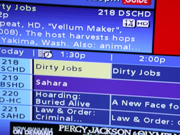
Digital TV Guide with truncated and stretched text, plus banner ads on every screen.
The digital TV Guide that came with the upgrade would have been fine except:
- four channels are shown at once and paging through hundreds of channels is tedious,
- text is frequently truncated to fit on the screen so I never get the full picture,
- text is stretched so much that it's difficult to read, and
- banner ads eat up valuable screen real estate at the bottom of every page.
The challenge
Now that all my favorites were in HD, which is more fun to watch than the alternative, I needed to learn a new list of 3-digit numbers and remember others as I discovered all the new options available to me. I decided to make this an exercise and spent some time over the long weekend making a convenient cheat sheet that listed all the channels. Fitting the huge list of 406 channels on one sheet isn't easy.
(Interestingly enough, Comcast used to offer cheat sheets a few years ago but stopped in favor of the digital version.)
I needed two lists to find channels:
- sorted by name to when I didn't know what number to type in and
- sorted by number when I didn't know what channel I was on.
I also wanted to fit both lists on the front and back of a regular 8.5×11” piece of paper.
First attempt: too much chartjunk
I started by copying the Comcast channel lineup into InDesign and dropped the font size down to six points. After adding some lines, columns, and condensing some ranges, I thought it was perfect—until I printed it.
First attempt at a channel cheat sheet—too busy.
Not a bad first attempt but too much chartjunk. The lines looked good on the screen but far too thick when printed on an inkjet, the reversed-out type in the title was impossible to scan quickly, and everything blended together. I tried making the lines thinner, lighter, dotted, etc. but little helped.
Second attempt: white space love
Then I wised up and took the lines out entirely and after right-aligning the numbers, saw that the white space created by the text was enough division between the channels.
Second attempt at a channel cheat sheet—getting closer
It was close but not there yet. The numbers and names blended together too much and I still didn't like that black title bar at the top. I tried making the numbers bold but that made things worse.
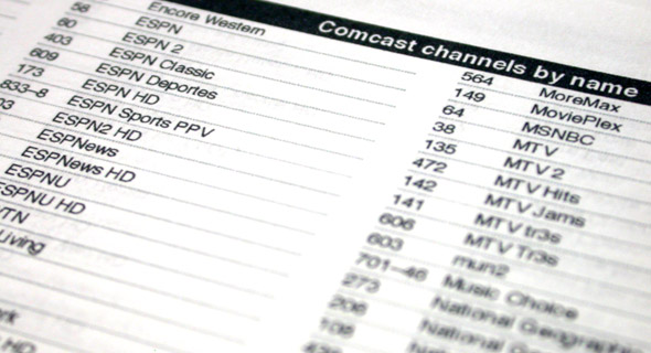
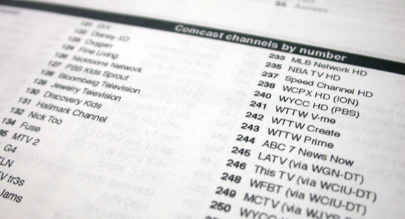
Final: less is more
Finally, I removed even more chartjunk by lightening the secondary text. For example, when browsing by number, the number is primary and name secondary and vice versa for browsing by name. Making the secondary text 40% lighter made the primary text stand out a lot more without impeding legibility. Plus, I tightened up the spacing even more creating more room to bump up the font size to seven. I also finally fixed the title bar.
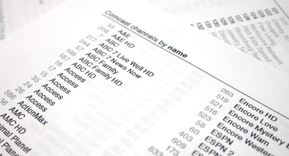
Final channel cheat sheet (Download full version)
I'm very pleased with the final result. There are probably other improvements I could have made like highlighting my favorite channels, color coding different genres, or removing channels I don't get, but I made this for me and a simple list is all I needed. Creating this was also a fun exercise in the idea of removing all you can until only the essential information remains.
I've included a PDF of the final result for those who want to get a better view than my cheap photos above.