Making of Mathematical Instruments
By Nicholas Rougeux, posted on September 18, 2022 in Web
I work best with existing material—whether that be images, ideas, spreadsheets, documentation, books, etc. That material defines the boundaries I need to create something more. When I stumble across a nice chunk of material (like a unique old book), excitement really sets in. This is what I felt when I found Nicolas Bion’s treatise on mathematical instruments from 1709.
During my usual perusal through antique book dealer websites (doesn’t everyone do this?), Bion’s book caught my eye because it was short compared to my past projects and integrating its illustrations presented an interesting design challenge.
Research
As I’ve done for every project, I conducted research to learn more about the original treatise. This first step can be a roller coaster of emotions as questions get answered and more are raised. Is the book important? What’s known about it? Who’s the author? Is it one of a kind of part of a series? Which edition is best? Has anyone else done anything with it?
The edition that caught my eye was the first English translation for sale on Biblio, titled The construction and principal uses of mathematical instruments. The description revealed that its author, Nicolas Bion, was an engineer and tool-maker, it had some significance, and that there were other editions. However, not much was revealed about its translator, Edmund Stone, or the other editions. A quick search for more info led me to Stone’s Wikipedia page, detailing that that he likely lived in poverty—unfortunate considering his talent. I also came across the personal website of Gordon Bell, a former Microsoft researcher, that lists books that he owns—including the first English translation of Bion’s treatise. His description gives a little more insight into Bion and Stone. Interestingly, Bell states that, “Bion interpreted ‘mathematical’ broadly for the work contains information on devices used in a variety of scientific and engineering fields.”
After reaching the authors, I was hunted down scans of each edition. I like to know how many editions have been published to get as sense of how a book has evolved and which one is the best to use. The treatise’s Wikipedia page was of little help beyond confirming some dates and titles but after digging, I found scans for each on the Internet Archive and Google Books.
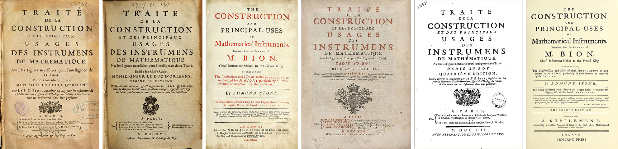
Pictured above from left to right are the title pages from each edition:
- 1709: French, 1st edition
- 1716: French, 2nd edition
- 1723: English, 1st edition
- 1725: French, 3rd edition (alternate scan)
- 1752: French, 4th edition
- 1758: English, 2nd edition 1972 reprint
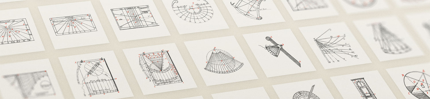
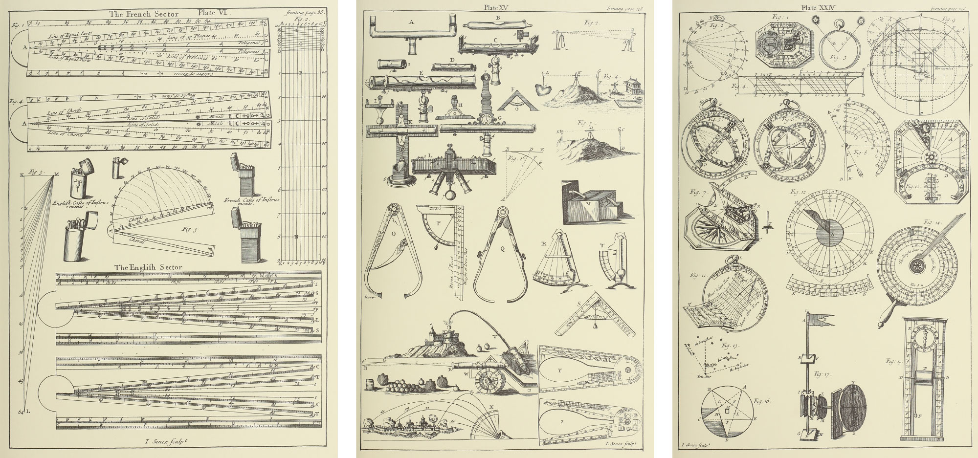
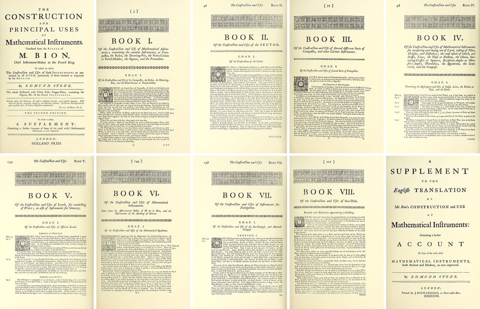
The final edition comprised nearly 500 figures of mathematical and scientific instruments and their uses across 30 plates. References to them were sprinkled throughout eight main topics called “books” and a supplement—each containing several chapters.
During this research, I learned that Stone added additional chapters that detailed additional English instruments to books one, four, and six in the first English translation. He also wrote an extensive supplement for the translation’s second edition detailing modern instruments which included four additional plates of supporting illustrations. This second edition was also seen as the most complete and authoritative among the others so I chose to use it as the basis of my project.
Design
Unlike my previous digital editions, which were designed have a more antique feel, I wanted this one too be more modern, but still a few nods to its antiquity.
Typography
As is evidenced in my past projects, I’m partial to serif typefaces so choosing the right sans-serif typeface was a bit of a challenge, but one I forced myself to undertake to try something different. After trying a few, I found that DM Sans available from Google Fonts was very legible for large blocks of text and had both modern and old feeling to it that worked well—modern because it was much newer than Bion’s treatise but old because it’s reminiscent of older geometric typefaces like Gill Sans.
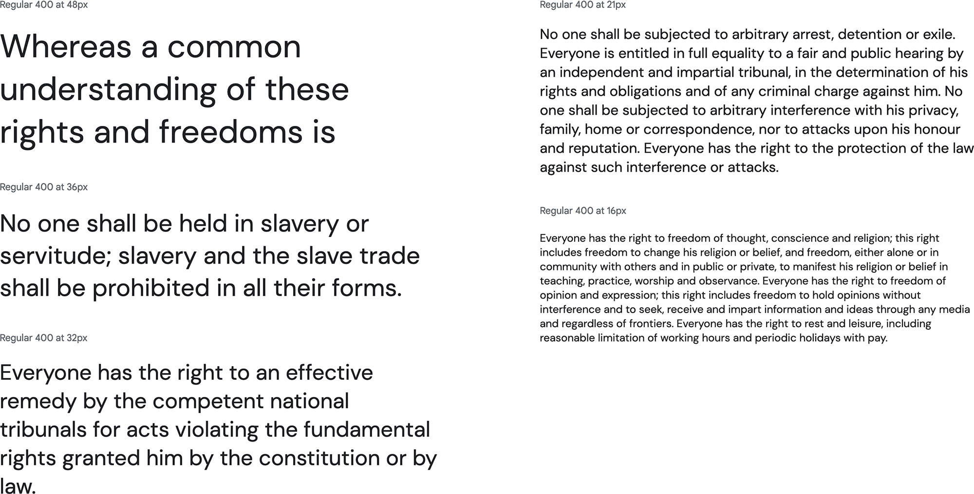
DM Sans worked well for body copy and headings but I needed another to highlight the figure labels referenced throughout the text. Later on, I would slightly regret making this decision because of the amount of time needed to format these labels one a time by hand. Initially, I used Source Serif Pro but felt its combination with DM Sans was difficult to read and hurt more than it helped. I ended up switching to Zilla Slab, a slab serif typeface, because its modern feel blended well with DM Sans. The italic style also had a bit more character, which helped lower case letters stand out more. Using a red accent color also helped the labels stand out without being distracting and connected with the same color used in the figures.
Color
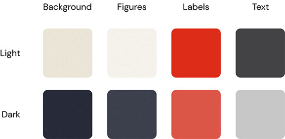
Bion and Stone didn’t use any colors in their original books beyond a little on the title pages, but I opted for a single vibrant accent color combined with a very soft and subdued background similar to the 1723 and 1725 editions. Just for fun, I also added a faint texture to the background to soften the colors even more. It’s nothing more than a simple random noise texture made in Photoshop with about 10% opacity.
It wasn’t until I was about halfway through creating this digital edition that I decided to include a dark mode as an additional experiment. Instead of using a standard greyscale palette, I chose a rich dark blue that I refer to as “midnight.” The red accent also had to be brightened a bit to offer sufficient contrast. I wasn’t sure if I’d like the dark mode since I’m not usually a fan of them in general, but found that I really enjoyed using it.
Layout
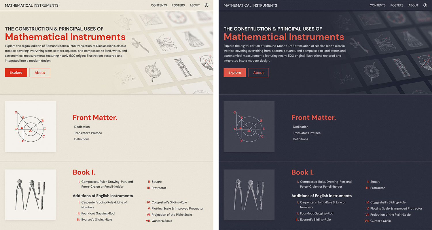
For a while, I’ve wanted to experiment with a layout that makes heavy use of an underlying grid, including visible gridlines as borders. This seemed like the good project for experimenting with that idea. The layout pattern I chose to go with was faintly visible borders around key areas and within each was an underlying 6+8 compound grid with some padding around it. It’s not the same as adhering to a strict grid for the entire layout but the main “blocks” of the layout use this underlying grid.
I also needed to find a way to integrate the figures into the text rather than relying on readers referencing plates. I encountered the same challenge for my Iconographic Encylopædia project but because the plates were so rich and beautiful, I chose to keep the plates and only integrate tiny versions of each figure that expanded when clicked. The plates in Mathematical Instruments weren’t as decorative and it was organized with distinct passages for every figure so I didn’t want to use the same approach.
Early experiments were focused on the first chapter of the first book. Of the variations I tried, I preferred the ones that spaced out the text when figures were referenced in the text rather than treating the figures as secondary by having the text always wrap around them. The figures also appeared frequently enough in spots that it didn’t make sense to try to force this to work.
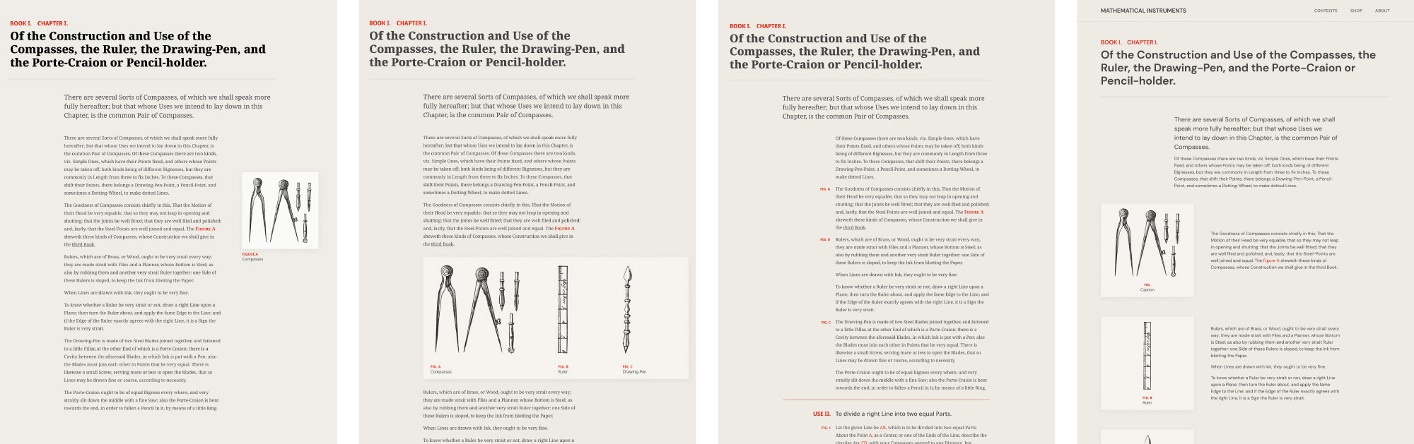
I took a block-based approach where I designed several layout templates for each scenario the content required based on whether the figure was square, wide, or tall; whether the text was long or short; and how many figures were referenced. Occasionally, two or three figures are referenced at once so blocks were needed for those as well. In total, 10 layouts were created to accommodate all the references to figures and headings in the treatise.
Added focus was put on the figures by making them extend beyond the boundaries of their surrounding text while still adhering to the grid and giving them a subtle shadow. This, combined with the headings to separate sections, created a nice visual cadence to pages, regardless of how many figures they contained.
Transformation
As always, the most time-consuming portion of a project like this was the process of transforming the original materials into their online form beyond just scans. Fortunately, after spending 13 months going through this process for my Iconographic Encylopædia project, which clocked in at around 3,000 pages and 13,000 figures, the Mathematical Instruments treatise paled in comparison with around 300 pages and 500 figures and only took a month. Still, it had its own nuances that could not be easily automated.
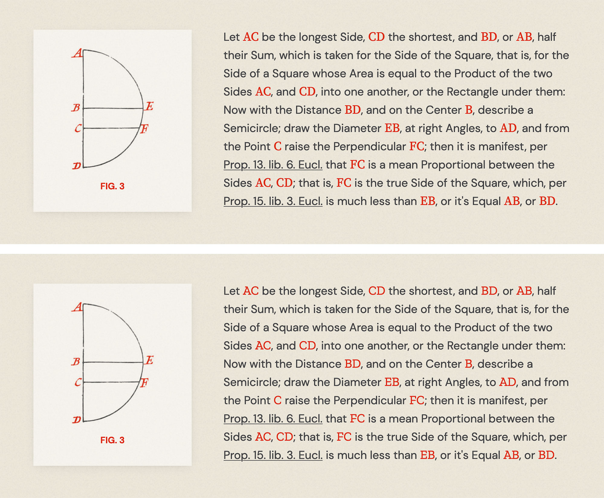
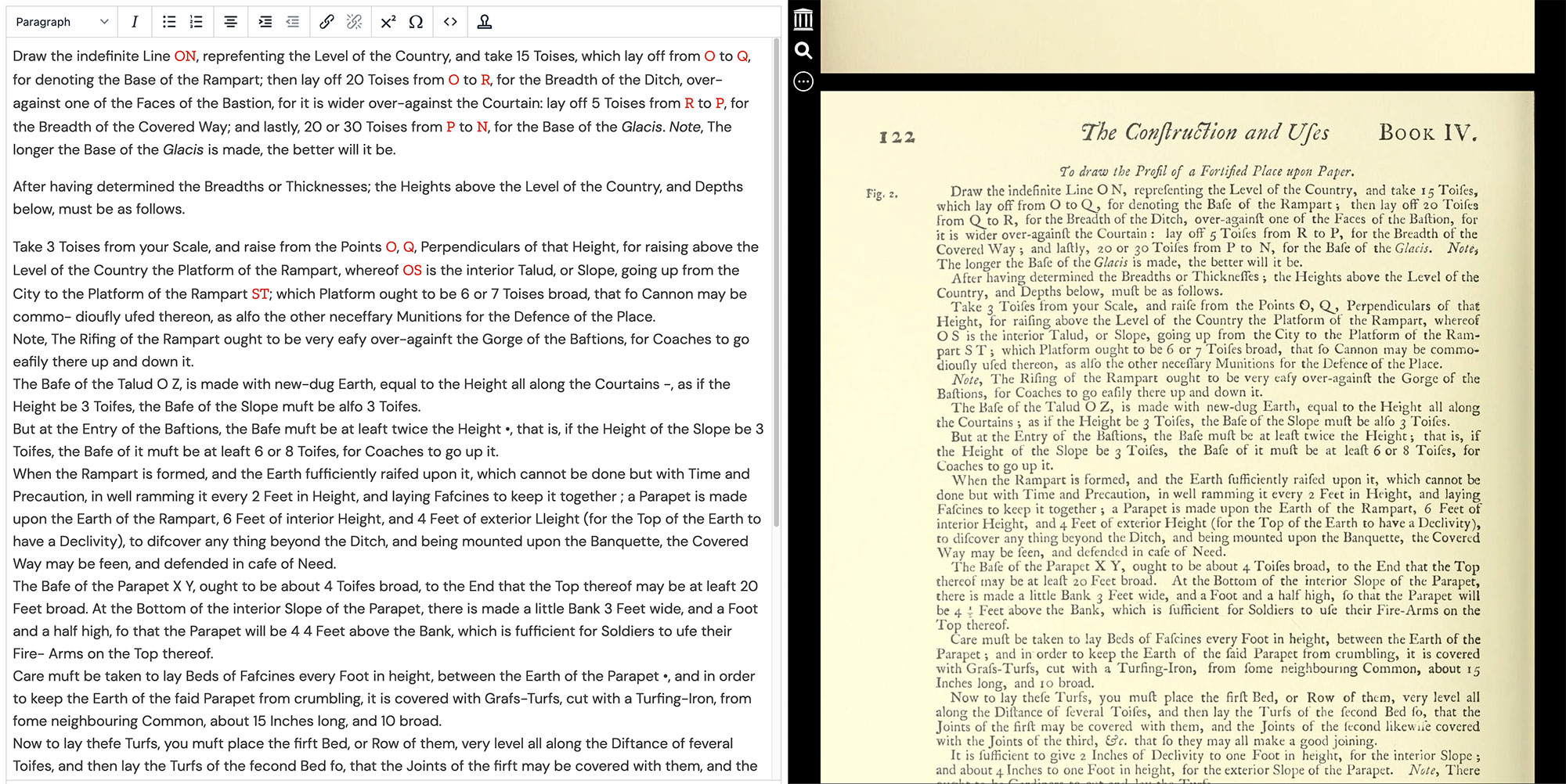
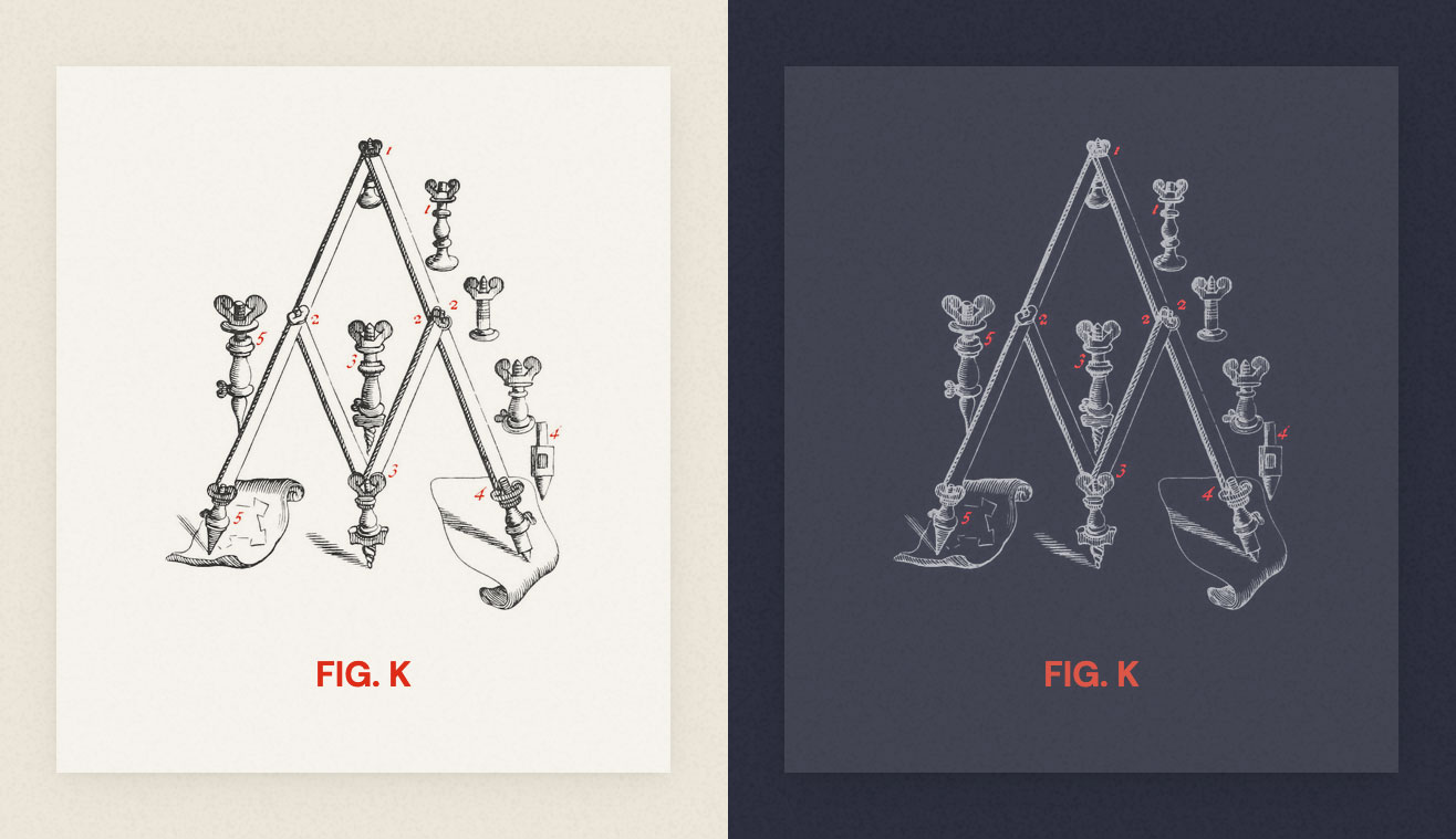
Extracting the figures was relatively simple and was done using the same process used on those from the Iconographic Encylopædia, the details of which are outlined in its making-of blog post. The only modifications I made to them was changing the letter labels to red to match the accent color and a connection could be made to their mentions in the text.
Cleaning and formatting text ate up the most time but I still found it enjoyable. The scanned text was initially converted by the Internet Archive as part of the scanning process and was integrated into its viewer so text that appeared on the scan was selectable so I could copy it instead of manually typing it—a very helpful start. As I’ve done for previous projects, I customized an instance of the TinyMCE editor with some formatting options and keyboard shortcuts. Using the editor allowed me to quickly apply formatting without manually typing HTML.
The process for formatting the text one chapter at a time was:
- Copy the chapter’s text from the Internet Archive into the editor.
- Correct any obvious misspellings.
- Replace instances where the long s ( ſ ) was incorrectly interpreted as an f, l, etc.
- Apply formatting to figure labels, which are the red letters referencing notes in the figures
- Add special symbols
- Typographical: curly quotes (‘ ’ “ ”) and accented characters (é, á, etc.)
- Mathematical: equations, prime symbols (′, ″), and arithmetic (×, − etc.)
- Astronomical: celestial bodies (♃, ♄, ☉︎ etc.) and signs (♐︎, ♋︎, etc.)
- Italicize text to match the original (proper names, publication titles, emphasis)
- Add links to other chapters or publications when referenced
- Fix spacing around punctuation
- Review the generated HTML source from the editor to correct any additional misspellings I missed on the first pass
During this process, several interesting patterns in the writing style emerged—likely because the treatise was published in the eighteenth century:
- Nearly every noun was capitalized. Example: “On the first Face of this Rod are placed two Diagonal Lines…”
- The word “it’s” was used as possessive form rather than a contraction. Example: “…divide each of the four Sides of it’s Faces into two equal Parts…”
- Periods were not included after honorifics. Example: “Mr Picart, and other Frenchmen of the…”
- Conversely, periods were used liberally at the end of headings, dates, and table labels. Example: “…in a Treatise published at London, in the Year 1702. called the Sea-Man’s Practice…”
- In addition to emphasis, italicized text was used for most proper nouns including people’s names, cities, buildings, and planets. Example: “…long ago by Sir Isaac Newton, as appears in…”
- Several common words were abbreviated with apostrophes like “thro’” instead of “through” and “fix’d” instead of “fixed.” Example: “…these will all pass thro’ the Poles of the World…”
- The long s ( ſ ) was regularly used. Example: “This to me is a ſufficient Proof of the Exactneſs of that old Inſtrument.”
- The word “et cetera” was written as “&c.” Example: “A Line of Numbers of but one Radius, which is numbered 1, 2, 3, &c. to 10…”
Over the years, the long s and &c. abbreviation have become two of my favorite antique stylistic trends. They used to make older text difficult to read but I’ve seen them so much that they’ve become second nature. A while back, I tweeted that “&c.” should be brought back because it’s delightfully cumbersome and I still believe this. I thoroughly enjoy the long s because it looks great in italics and it’s fun to use.
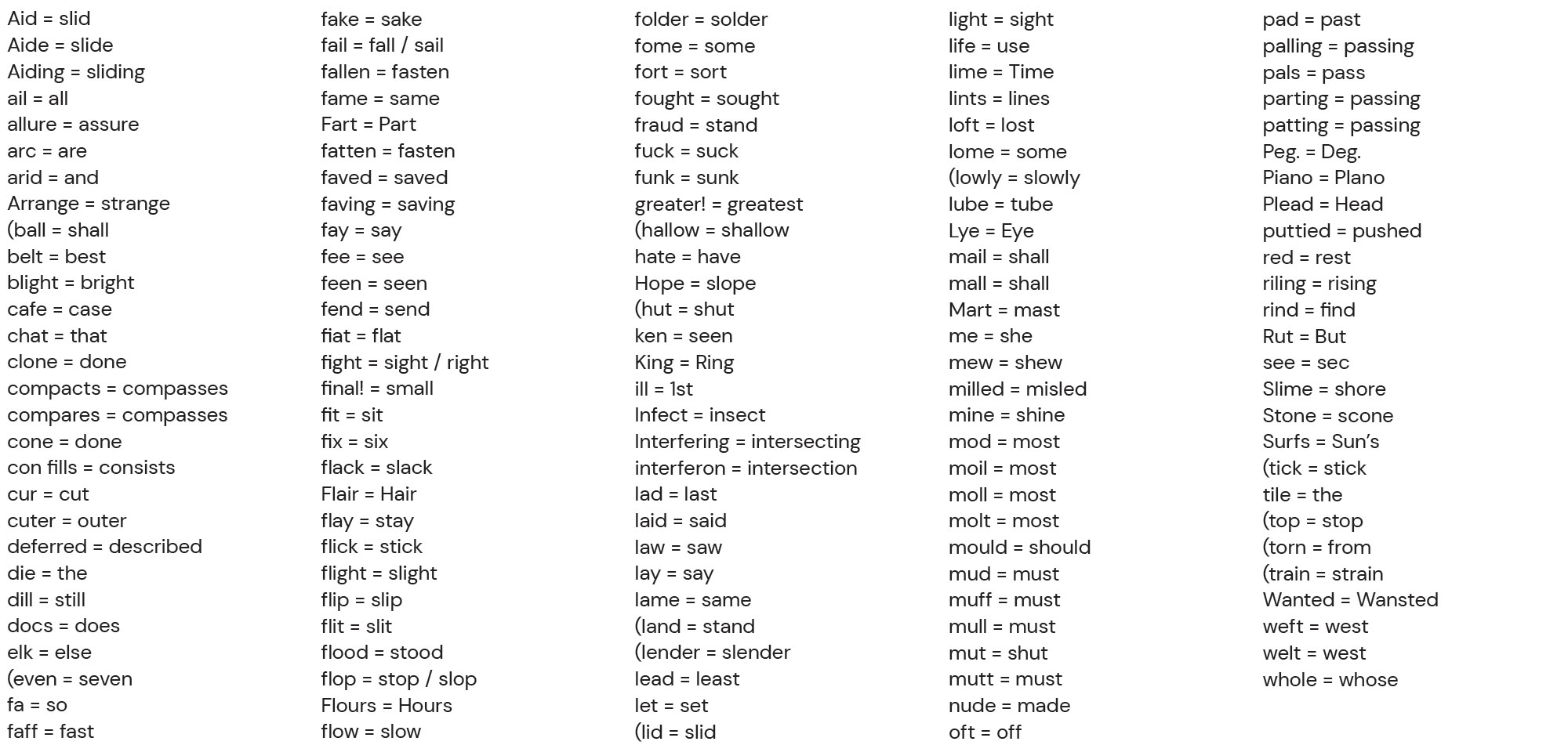
After all the text for the treatise was formatted, the penultimate step was to correct the remaining misspelled and non-misspelled words. As I made my way through each chapter, I kept a running list of words that were incorrectly digitized from the scans into other words but were spelled correctly (e.g., “flood” instead of “stood” and “mail” instead of “shall”). This mistakes occurred due to the normal imperfect nature of digitizing text but also because the long s looked so much like an “f” or “l” and other common ligatures were misinterpreted. A standard spellchecker wouldn’t find these but I could search through all my code and review them manually to make the necessary corrections. I identified about 140 of these words.
The final step was to run spellcheck on each chapter. The simplest way to do this was to copy the text on each page, and paste it into Word as unformatted text, and change it to light grey so the red lines under misspelled words stood out. I then searched through all my code to correct each misspelling so that by the time I got to the final chapters, few corrections needed to be made. To my surprise, after all the manual editing preceding this step, very few corrections needed to be made.
Assembly
Even though I did some initial design early on, it was only enough to get the ball rolling. I didn’t create mockups of every screen—just key parts to get my vision “down on paper.” A good portion of the design was developed while I formatted the text and populated the content. I’ve done this for most of my projects because it allows me to see how everything feels with real content and use it like others would.
For example, the home page underwent several revisions because the more I used it, the more I realized a reader’s needs were different from my ideas. For example, I thought a creative layout with representative figures for each chapter would be fun to browse. The reality was that it was tedious and made the structure difficult to understand. Plus, some chapters didn’t have figures. For another design, I tried to embrace the fact that chapters’ lengths and figures varied with an adventurous grid-based layout but it looked far too cumbersome and was even more difficult to understand than the earlier attempt. I ultimately settled on a much simpler layout with one representative figure per book and a simple text listing of each book’s chapters. This subtly showcased the variety of content while keeping it easy to understand.
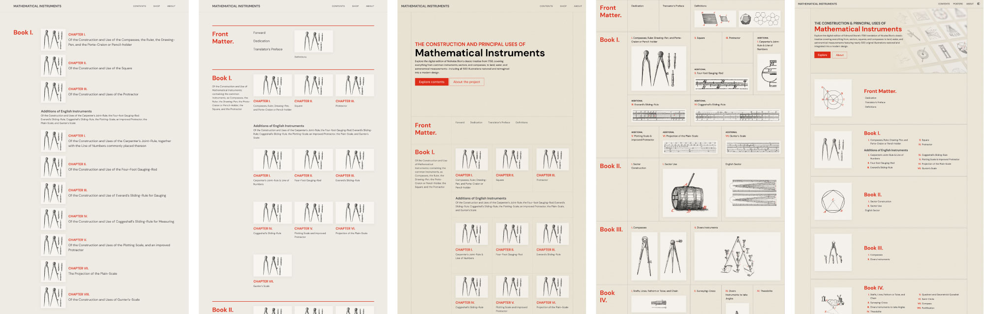
The layout and typography was also constantly tweaked as each chapter was added. I built my own little module for handling the aforementioned block-based sections so making changes was efficient and didn’t necessitate editing every page manually.
Creating the dark mode was a fun extra project because I hadn’t coded one myself before. I’ve designed and used them but never implemented one. I built upon a basic example from CSS Tricks that also taught me how to base mine on a reader’s system preferences. This way, the site loads light or dark mode based on a reader’s preference but lets them override it using the button in the upper right if they prefer.
Since the figures were in greyscale, I was able use the same image files for both light and dark modes by using CSS filters to invert them and adjust their hue to maintain the red accent. It was a fun trick that only works in some situations like this where the content is known and controlled.
:root {
    /* Light mode */
    --img-blend: multiply;
    --img-filter: none;
    --img-opacity: 1;

    /* Dark mode */
    --img-dark: screen;
    --img-dark: invert(100%) hue-rotate(-172deg) saturate(540%);
    --img-dark: 0.8;
}

.fig-thumb img {
    filter: var(--img-filter);
    mix-blend-mode: var(--img-blend);
    opacity: var(--img-opacity);
}
Posters
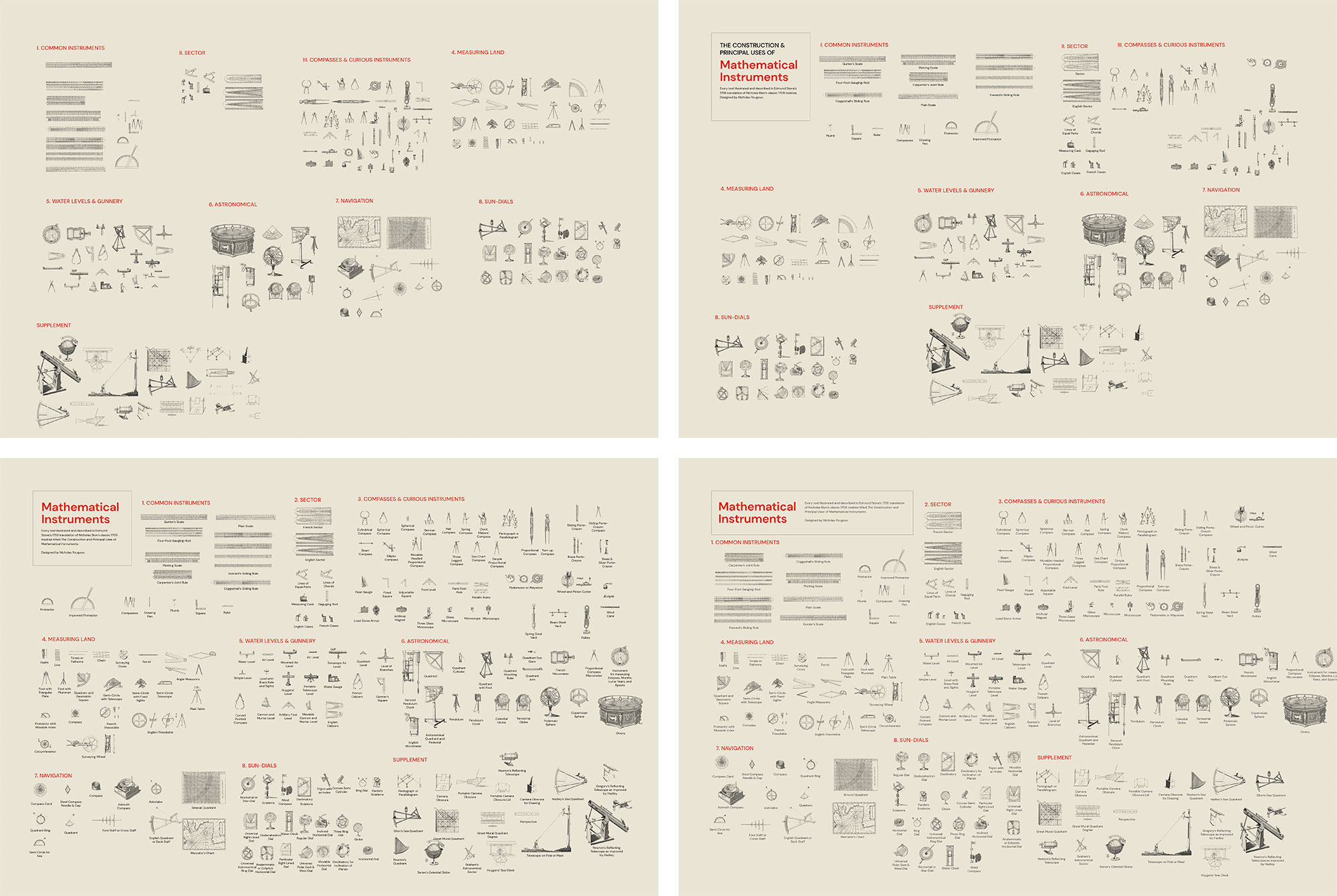
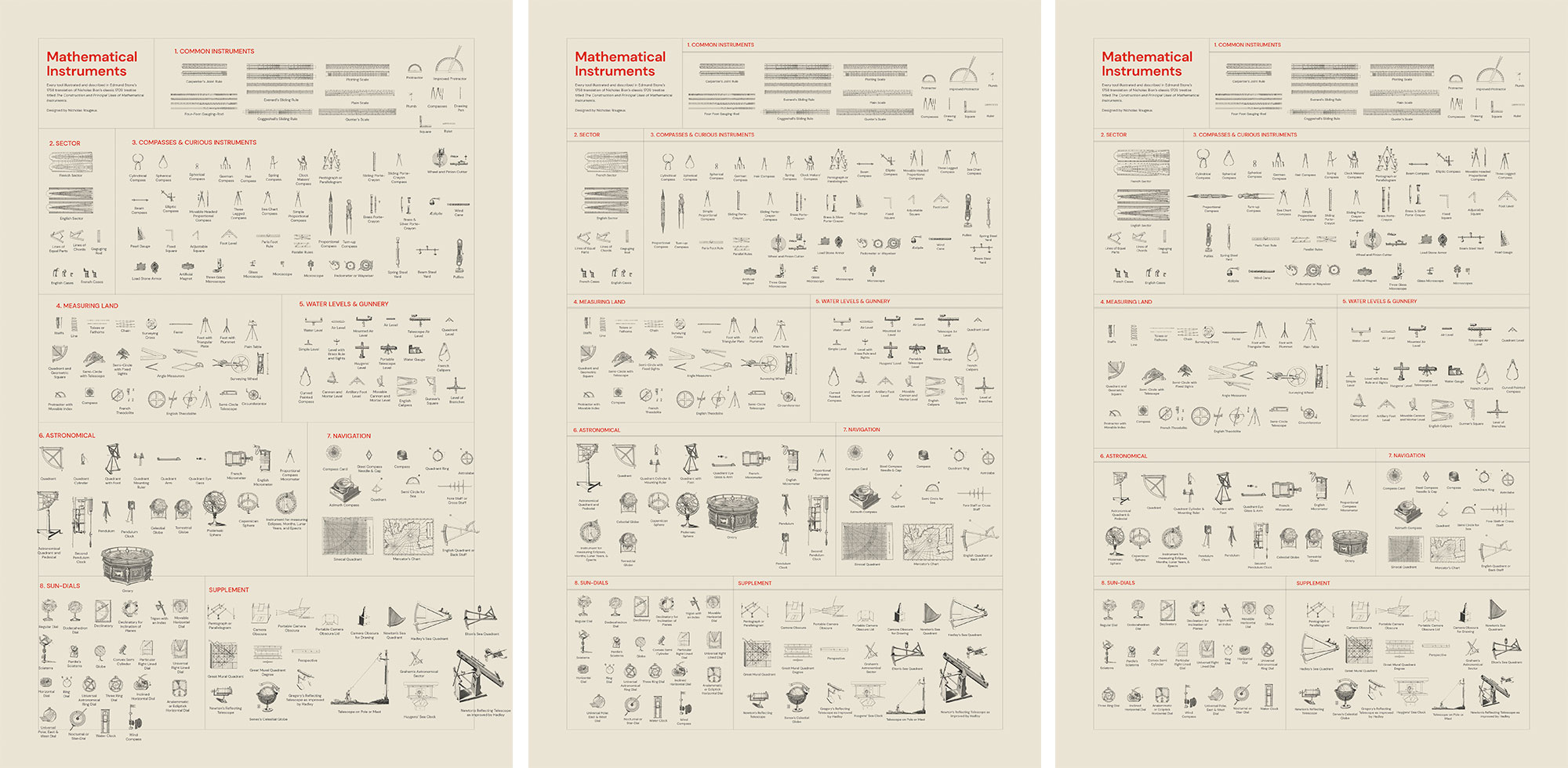
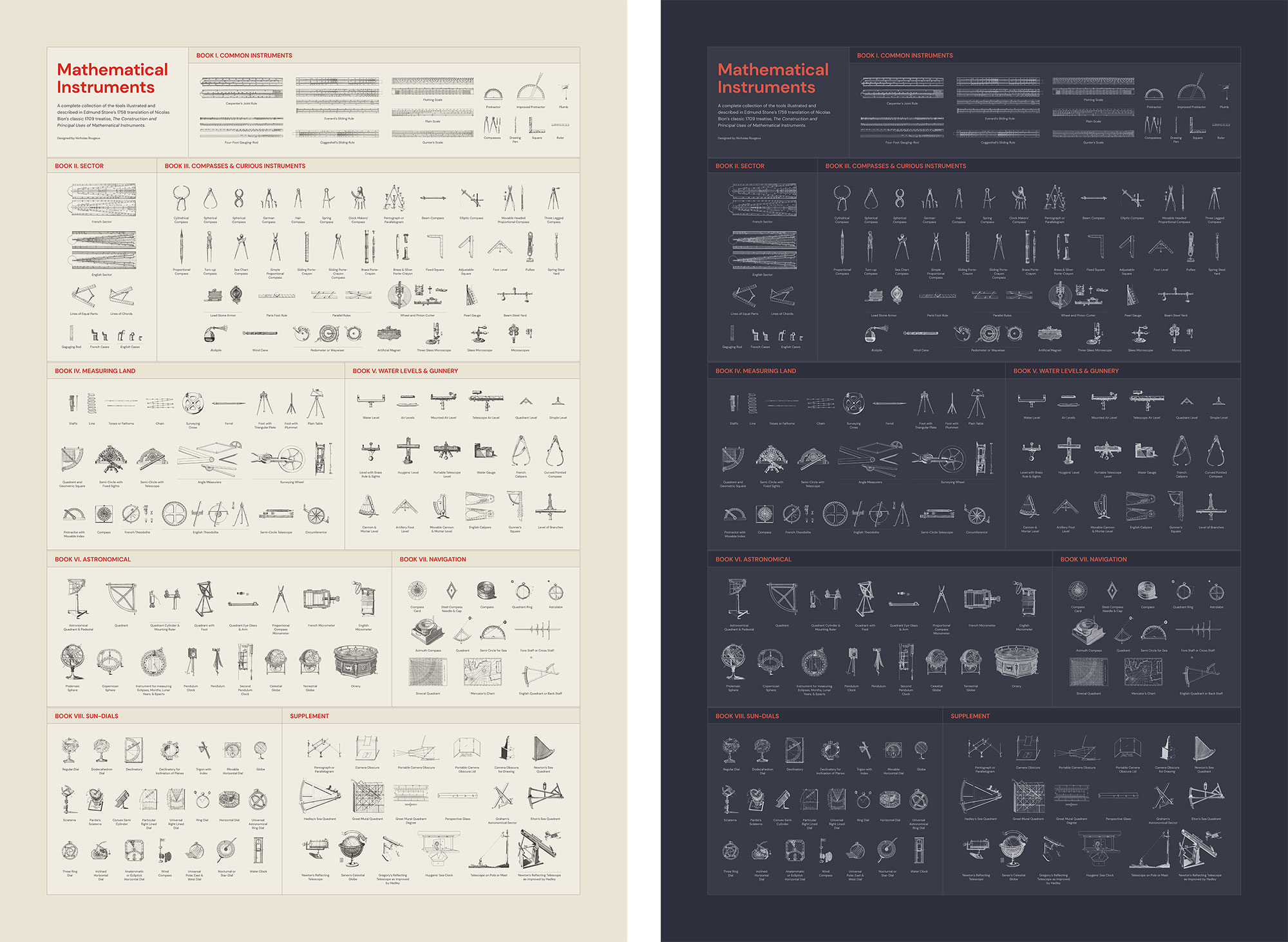
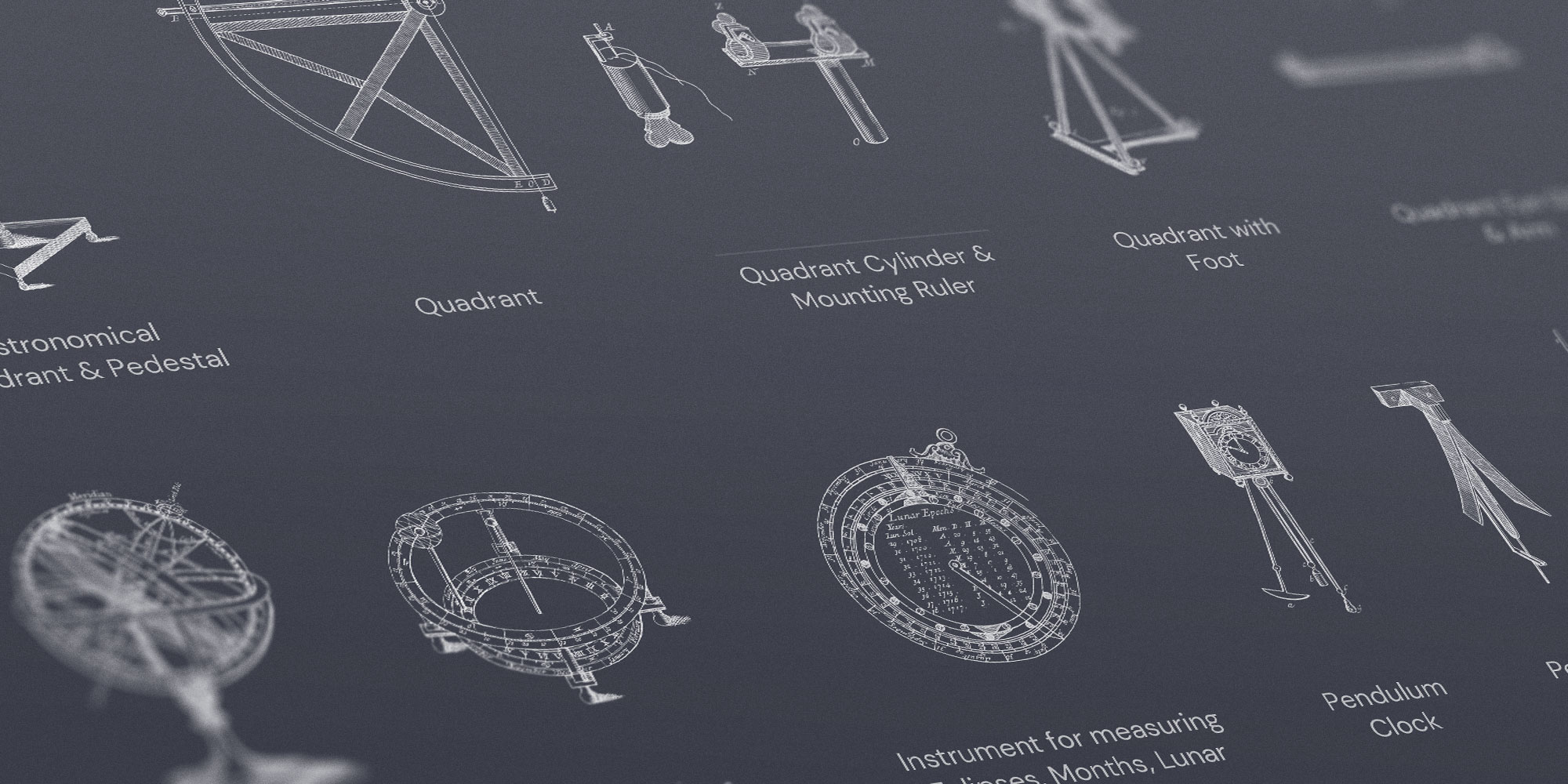
Since the beginning of this project, I wanted to make a poster of the figures from the original treatise but my plans changed about halfway through. The initial idea was to include every figure on one poster with labeling but that wasn’t feasible due in part because there wouldn’t have been enough room for everything to be legible and because the majority of them weren’t useful or interesting without context.
There were two types of figures illustrated in the treatise: instruments and diagrams. The instruments were more elaborate and an interesting view on centuries-old tools. The diagrams were annotated guides on how to use them that were most useful when read alongside the written descriptions. I chose to only include the instruments in the poster to keep it manageable, legible, and interesting.
The biggest challenge was finding a way to arrange all the figures comfortably. There are only 208 physical instruments but arranging them with their names and grouped by the books in which they are referenced required a lot of experimenting. I started with a horizontal orientation but couldn’t find an arrangement that sat well with me. A vertical orientation felt more natural and came together more easily. The style closely mimiced that of the digital edition—including a dark variation.
Reflections
This was another labor of love. The entire project took about a month and I had a great time working on it. No one asked for it but I wanted a fun design experiment and it did not disappoint. I forced myself to go a bit out of my comfort zone to design something more modern than previous projects and was very happy with the results. I hope others enjoy it as well.