Making of Off the Staff
By Nicholas Rougeux, posted on September 6, 2016 in Art, Data
Update: A follow up to this post showing newer, more efficient methods of creating these images is available.
I can’t read music but I can parse it. The talent of reading music has always escaped me which is a little ironic considering I grew up in a musical family. However, I’ve always enjoyed how sheet music looks so I took a shot at visualizing the notes from musical scores and the result is a series of posters called Off the Staff.
The beautiful complexity of sheet music begs for experimental notation and I’m hardly the first but I wanted to take my own shot at it. Included here is the process for how my images were made including links to the tools used and early iterations.
Goal
I wanted to find a way to represent an entire musical score in a single image—not necessarily as an infographic but something fans of the music would enjoy having on their wall because they're familiar with the music. Representing a score as a circle seemed like a good way to do this. I also wanted to break away from the short efficient five-bar staff representation of notes and show all notes on the same scale.
Process
![]()
The process for creating these images involves mostly free software and no coding (unless a few simple spreadsheet formulas count as coding). It can also probably be streamlined with some simple scripts to manipulate the data but I’m more inclined to use tools that require little or no programming more enjoyable when exploring data visually.
MuseScore
Music was downloaded from MuseScore and converted to MusicXML format using the MuseScore app. Before I found MuseScore, I gave myself a crash course in how to read sheet music and attempted to convert sheet music to data in a spreadsheet by hand. After countless errors, I was relieved to discover MuseScore, which does an great job of making sheet music approachable and manageable. Plus it’s free. The nuances are still above my head but I can fumble around enough to examine the music, learn from it, and and export it to the format I need.
All of the music I used on posters I’m selling is in the public domain and the scores are marked for commercial use on MuseScore. Sources are linked from the Off the Staff project page.
Luxon Software
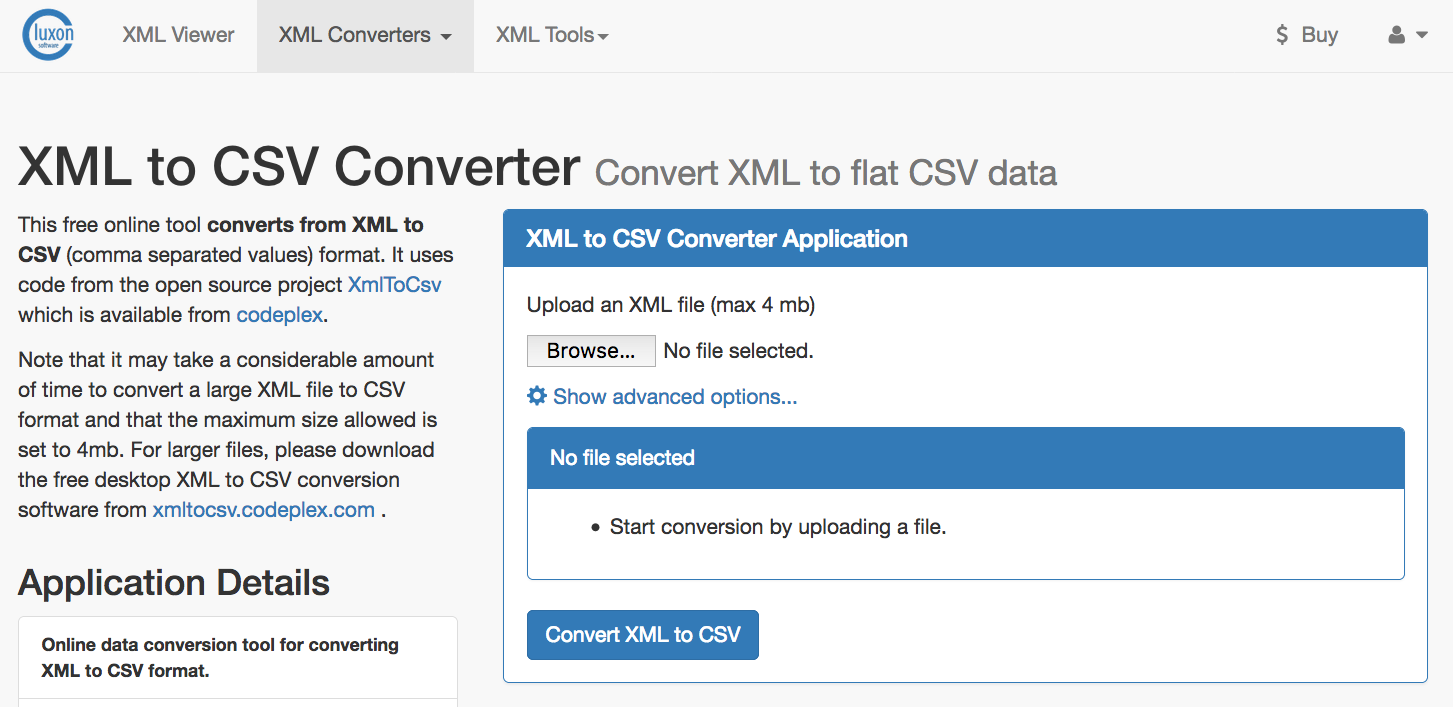
MusicXML files were then uploaded to Luxon Software’s XML to CSV converter which does just what the name implies and does it well. A CSV was created for every group of properties in an XML file but the ones needed were note.csv, measure.csv, and pitch.csv.
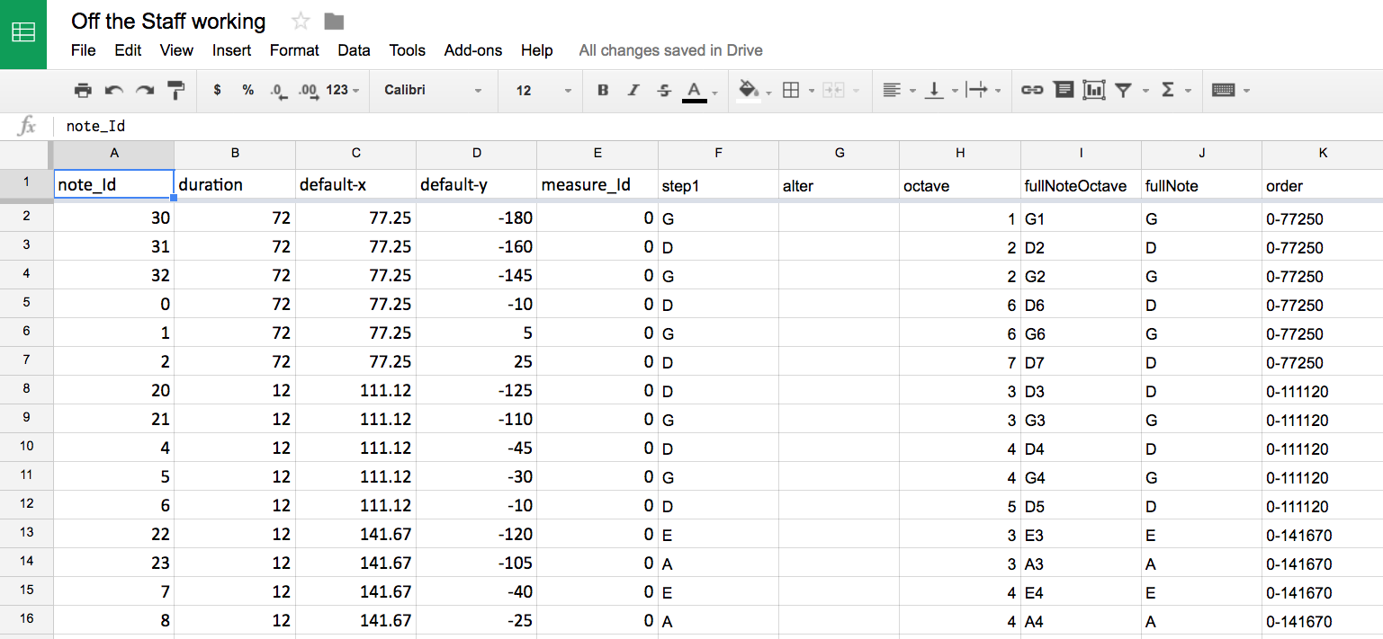
Google Sheets
Data from the note, measure, and pitch CSV files were added to a worksheet that had a few vlookup formulas to combine them into a single file which was redownloaded. Generating this CSV was necessary because NodeBox doesn’t support reading data from an XML file but rather a CSV.
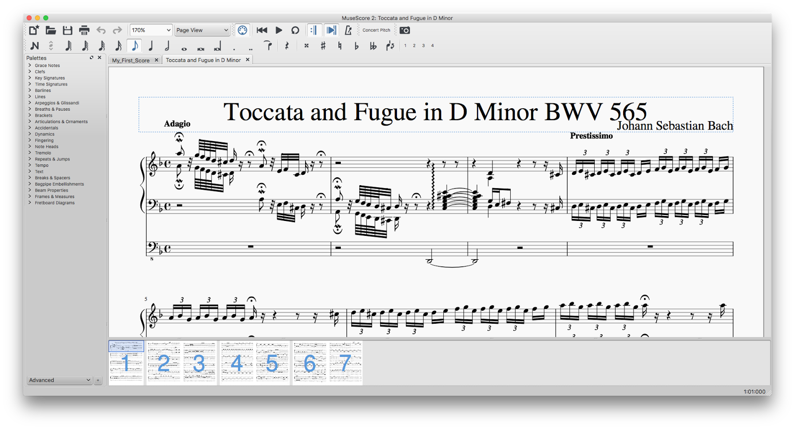
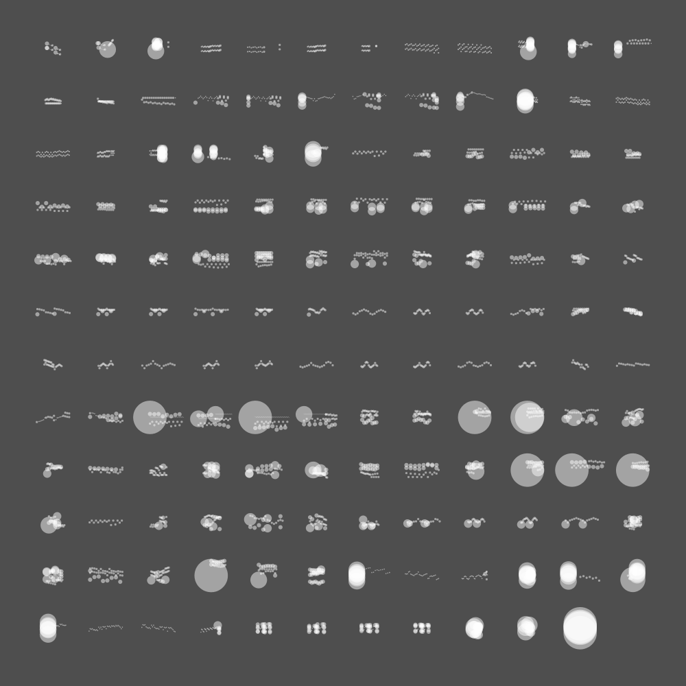
NodeBox
NodeBox is where the music came to life—visually. I’ve written about NodeBox before when I made Weather Portraits and Colors of World Flags and used it in many other recent projects. I can’t sing its praises enough. A lot of power is packed into a small free app.
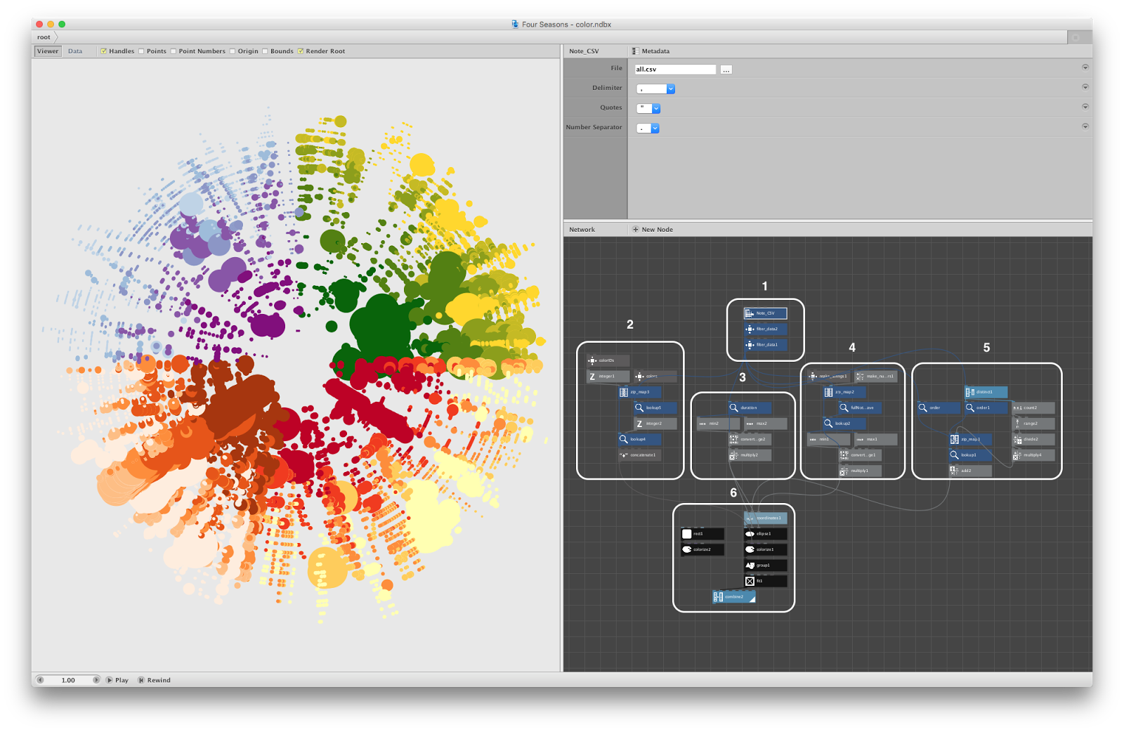
In the screenshot above, the six groups of boxes do roughly the following:
- Import the CSV and filter out notation marks that aren’t notes.
- Calculate color based on instrument (only for scores with multiple instruments)
- Calculate circle size based on duration.
- Calculate distance from center based on pitch and octave.
- Calculate angle based on position in score.
- Assign calculations to each circle and resize the entire image for high-res printing.
The screenshot below shows a similar structure but for the black and white score for one instrument.
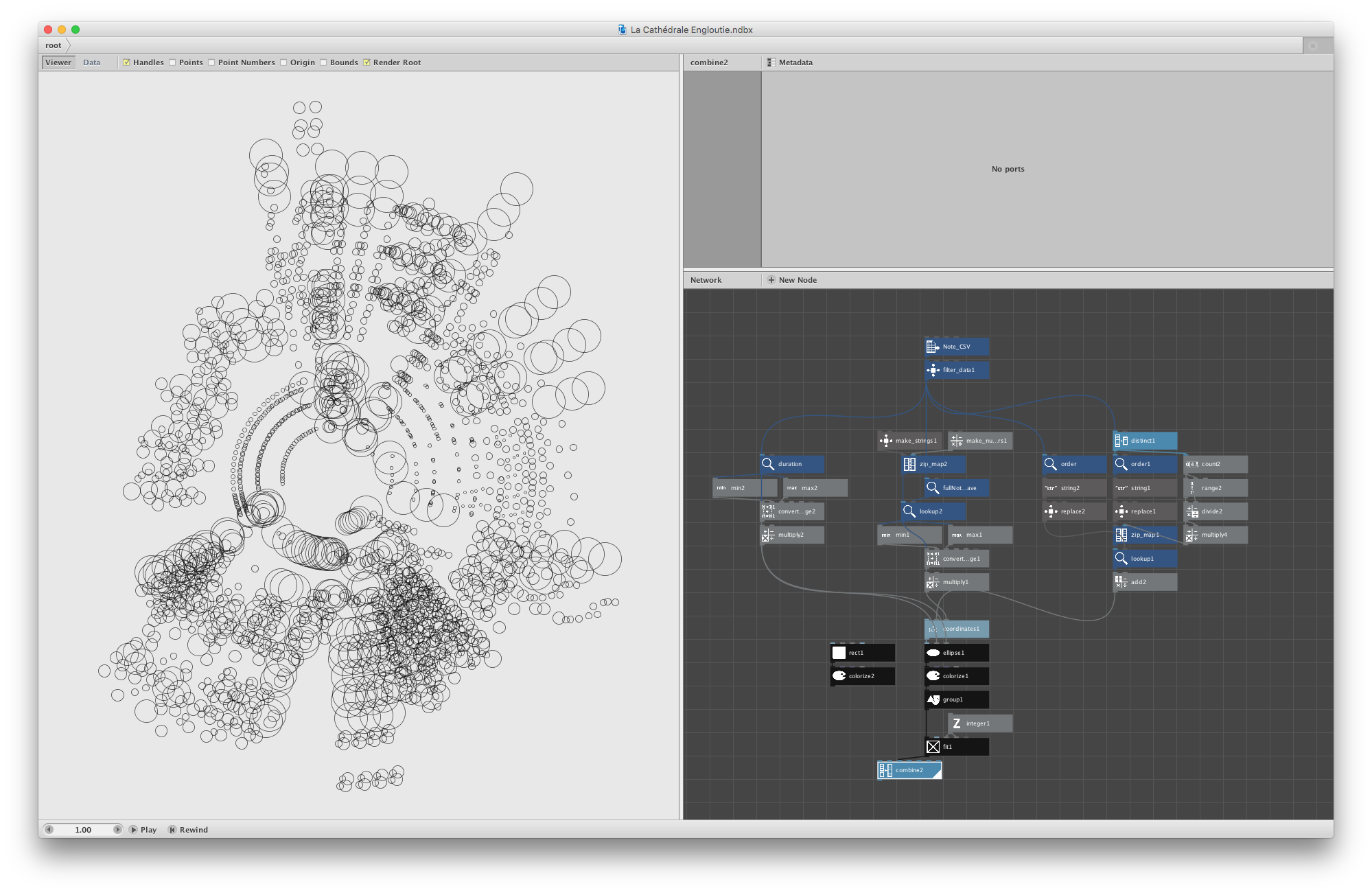
La Cathédrale Engloutie by Debussy
Scores for single instruments were exported as PNGs and those for multiple were exported as SVGs.
Illustrator and InDesign
PNGs for scores for single instruments were imported directly into InDesign. SVGs for scores for multiple instruments imported in Illustrator to for final color adjustment since NodeBox didn’t have the ability to apply blending modes beyond basic transparency.
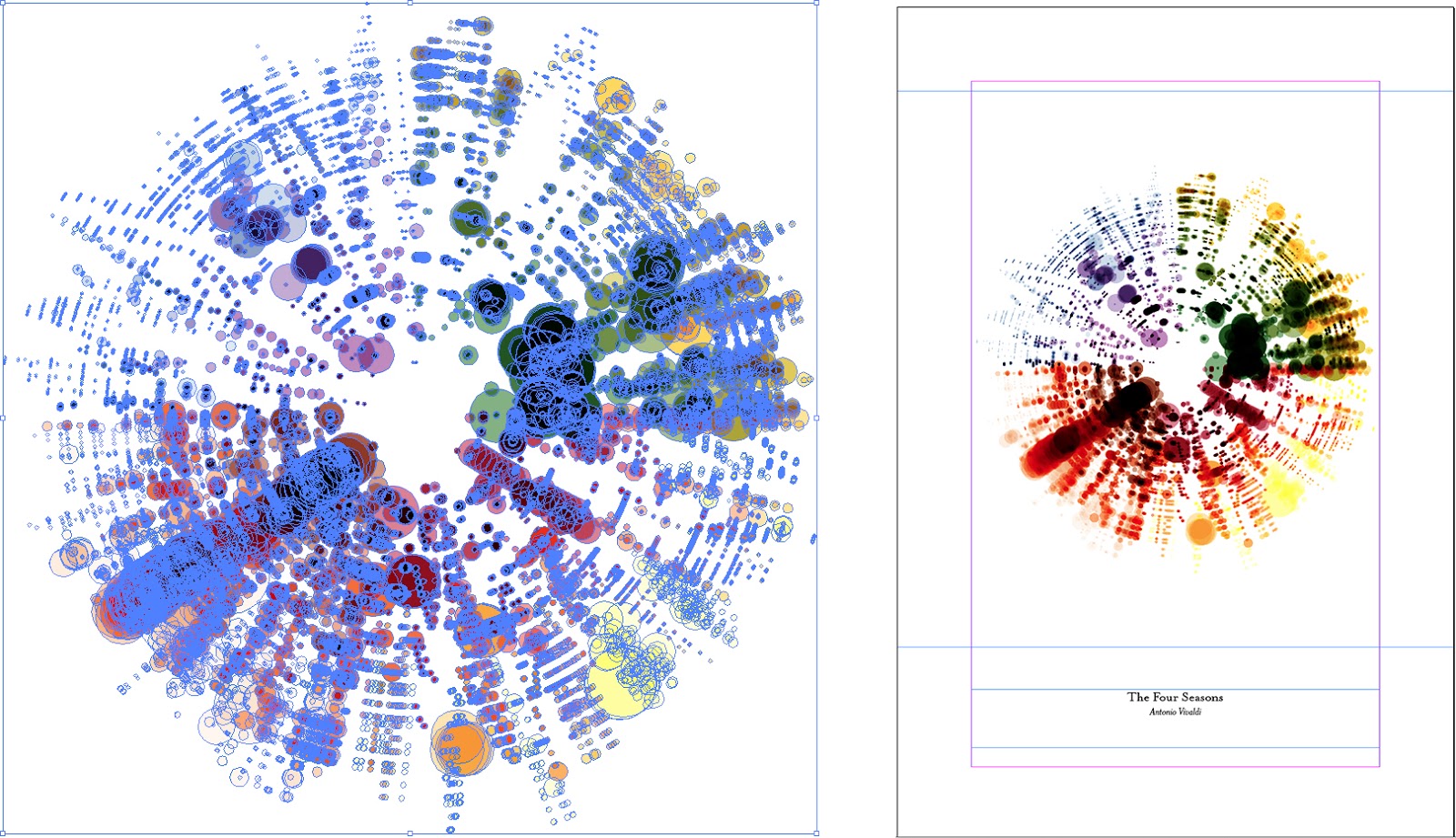
Illustrator (left) and InDesign (right)
Early ideas
The following is a selection of early experiments with Moonlight Sonata and Toccata and Fugue.
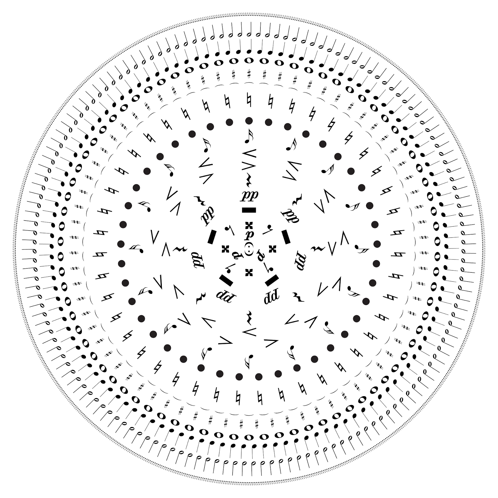
All the markings from a PDF of Moonlight Sonata with the least frequently used in the center to most frequently used in the outer ring.

All the markings from a PDF of Moonlight Sonata sized based on how often they were used. There are a lot of eighth notes in the score.
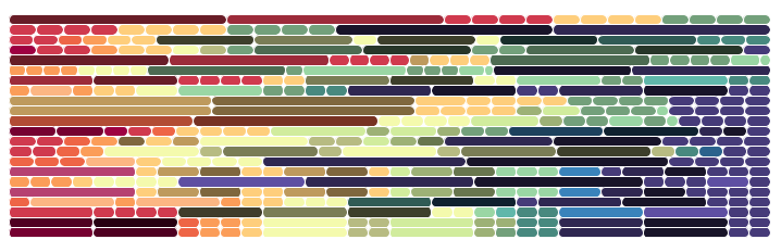
First few measures of Moonlight Sonata. Each row is a measure and each rounded line in a row is a note sized based on duration and colored based on pitch and octave.
First few measures of Moonlight Sonata grouped by measure. Circles are sized based on duration, placed horizontally based on when they are played, and placed vertically based on pitch/octave. Colors are based on pitch/octave using Google’s Material Design palette.

First few measures of Moonlight Sonata in a similar design to the final result but with colors based on pitch/octave.
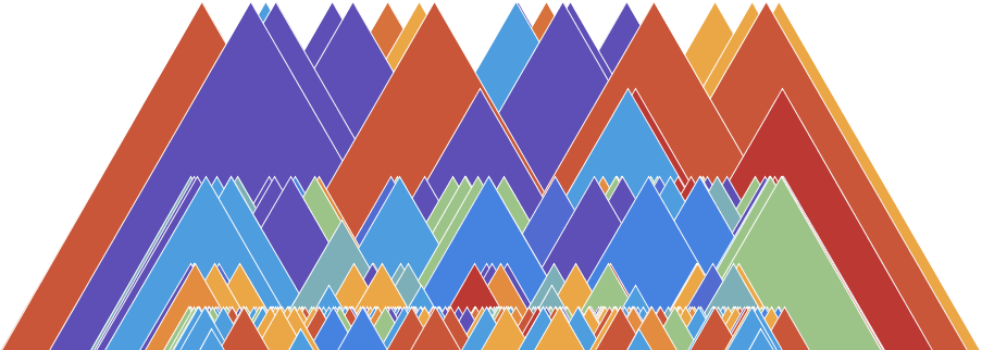
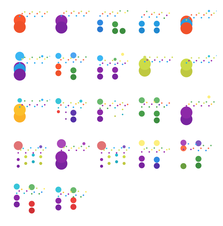
First few measures of Moonlight Sonata as triangles colored by pitch/octave and grouped by duration (height). Horizontal placement is random.

Every note in Moonlight Sonata spelled out. Duration is represented as font thickness.
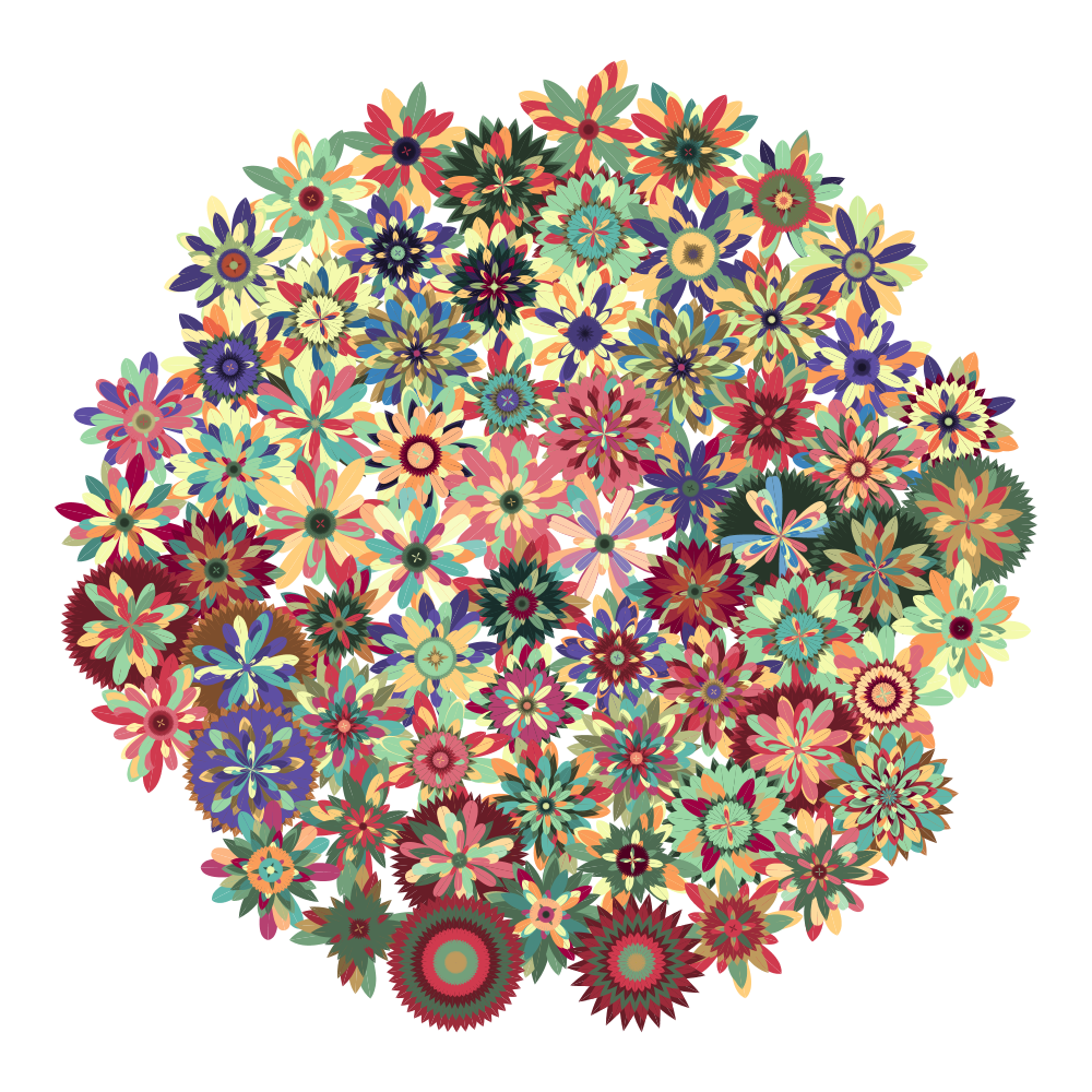
Every measure in Moonlight Sonata represented by a “flower.” Petals were arranged based on when notes occur—first note in the center, then send as a larger ring, and so on. Petal color was based on pitch/octave and the number of petals was based on duration (longer note = more petals in a ring). This got some positive reaction on Twitter along with an alternate view of just the first few measures.
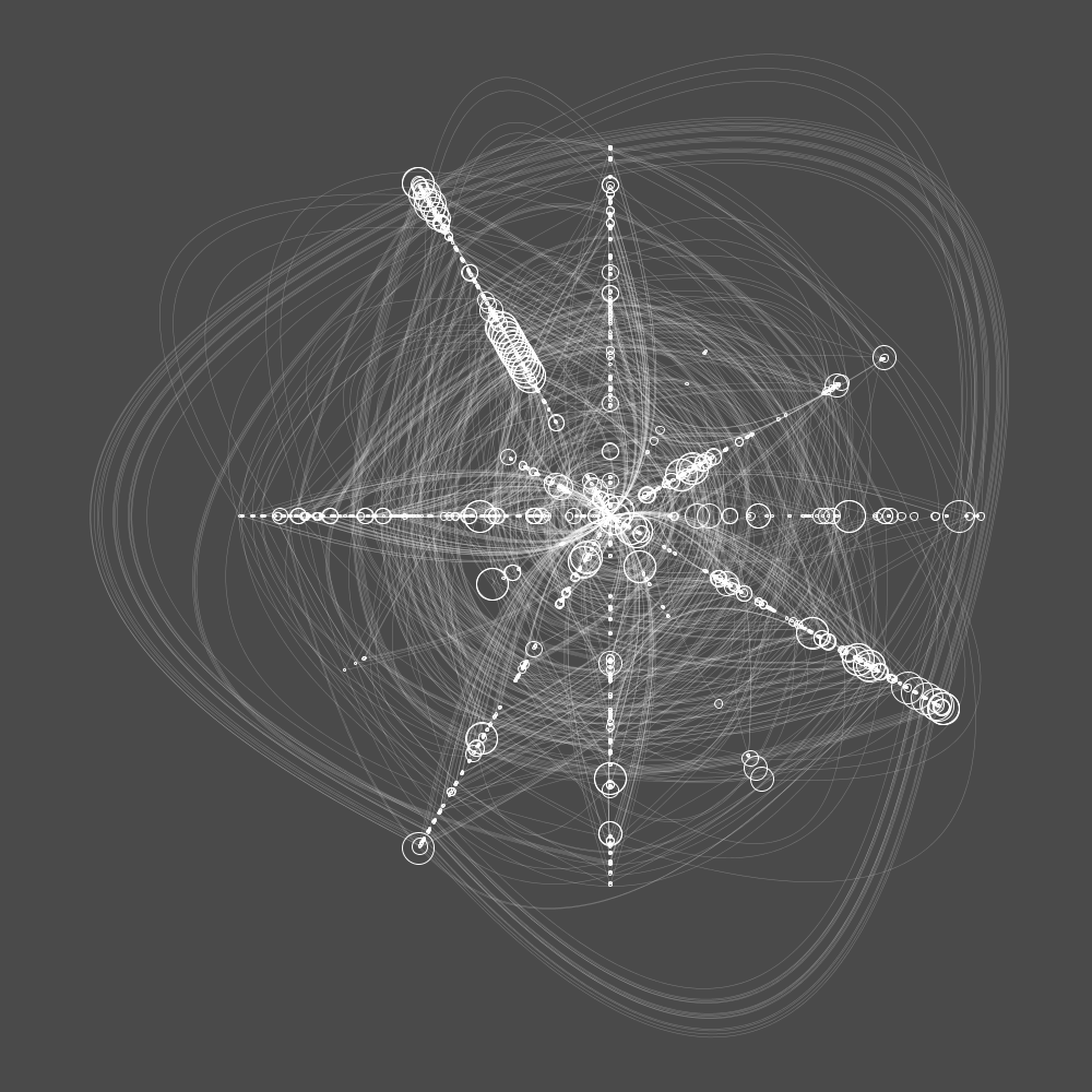
Moonlight Sonata as a type of radial chart. Each note was assigned an angle based on the chromatic circle and size based on duration. Curved lines were then drawn connecting each note from beginning to end in sequence. This got some positive reaction on Twitter.
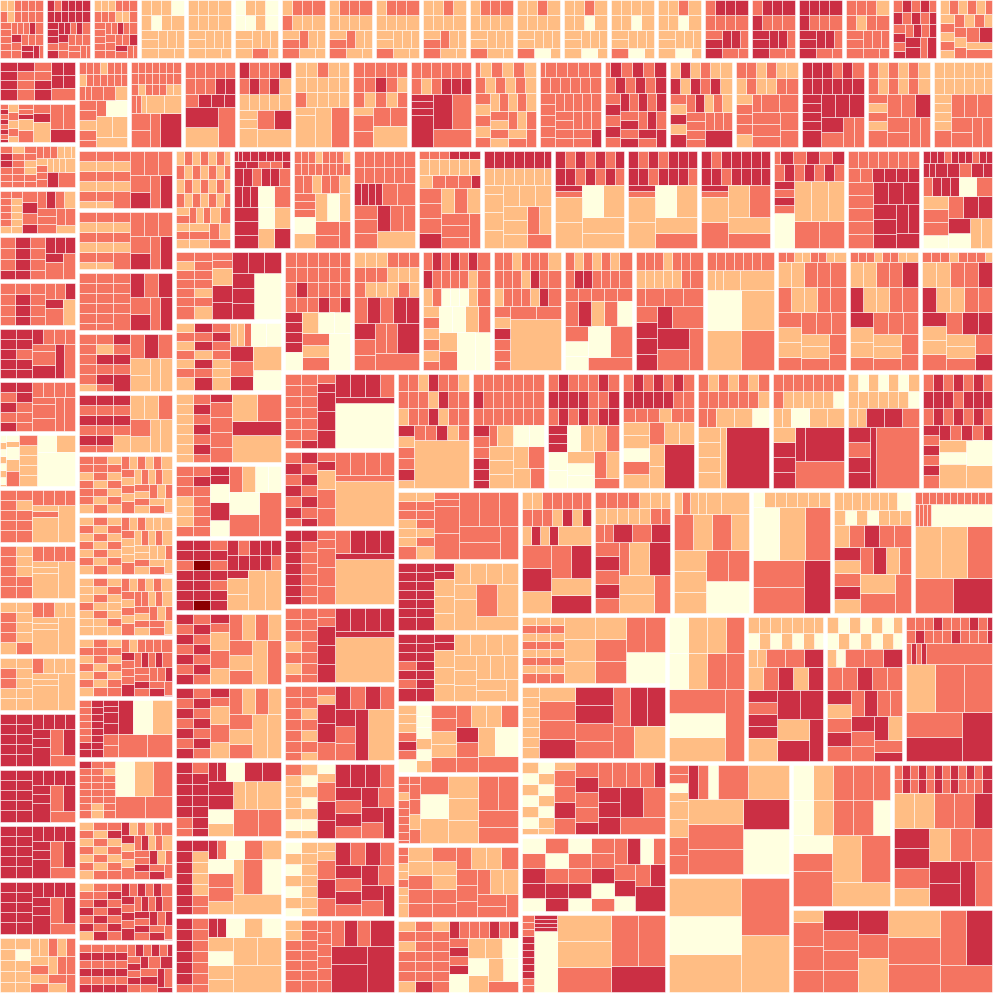
Toccata and Fugue as a treemap grouped by measure with size based on duration and color based on octave.
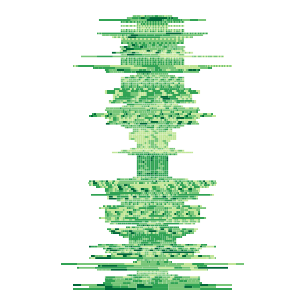
Toccata and Fugue grouped by measure in rows. Each square in a row is a note with size based on duration and color based on octave.
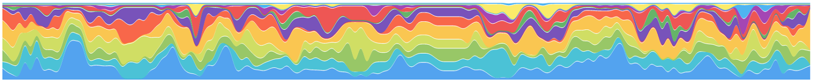
A timeline of the amount of notes occurring in measures of Toccata and Fugue.
Toccata and Fugue grouped by measure similar to an earlier design for Moonlight Sonata. I was pleased with this and considered making it into a poster series.
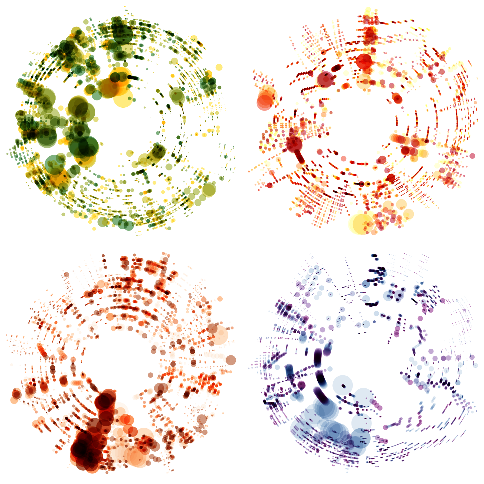
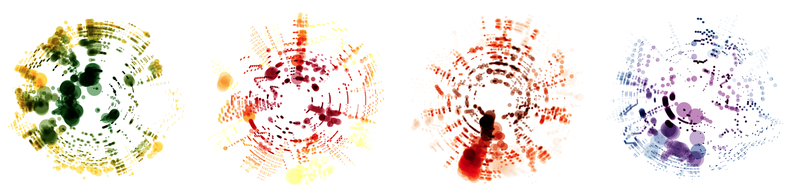
An early attempt at Vivaldi’s Four Seasons resulted in great images but I found that there were flaws in parsing the data so the images don’t show the correct results. I originally posted this to Twitter and it quickly became my most popular tweet ever. The correct images are at the top of this post.
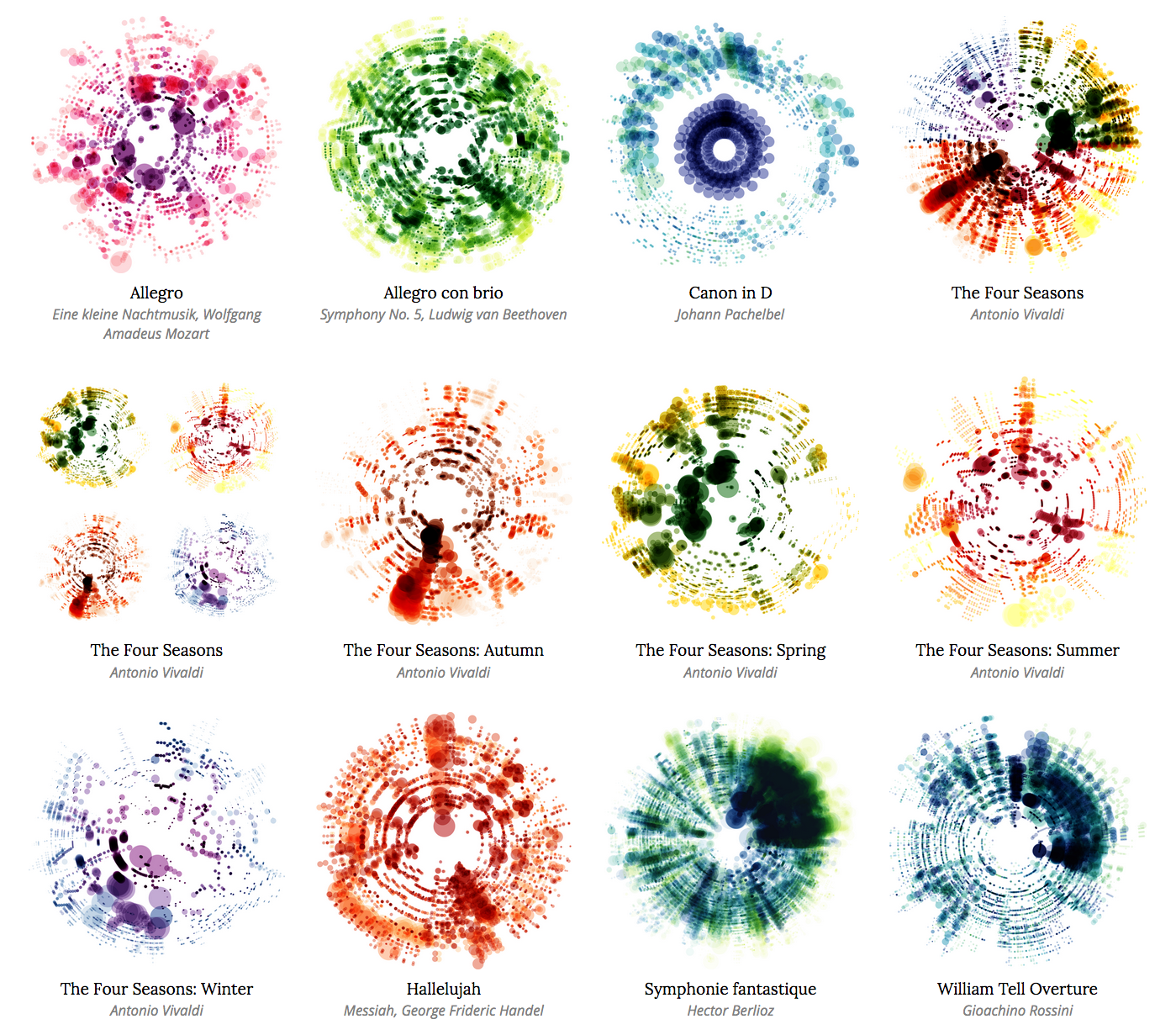
Final result
After such positive reaction to Vivaldi’s Four Seasons on Twitter, I fixed the bugs in the data parsing, polished the design, and created posters of more well known scores by Handel, Pachelbel, Debussy, Mozart, Beethoven, and more.
I plan to create more images as scores become available. Not all scores are available in the public domain and for commercial use. Those that aren’t, won’t be sold and I'll give credit to the original authors.
Update: A follow up to this post showing newer, more efficient methods of creating these images is available.