Making of Lunar Conversations
By Nicholas Rougeux, posted on March 18, 2018 in Art, Web
Finding a new set of data to play with is exciting. Figuring out what to do with it is a roller coaster ride of emotions ranging from amazement and intrigue to frustration and head-scratching. The transcript from the Apollo 11 mission was all of these and more for me.
Data
NASA and JSC has full transcripts online for all the original missions including Mercury, Gemini, Apollo, and more—each with varying levels of information like technical transcripts, commentary, and more. The Apollo 11 transcripts are available as PDFs but NASA also has text generated from the original document as a web page.
The format is a little raw and but it’s consistent enough that I was able to write some basic regular expressions to extract the data I needed. Using RegExr, I copied extracted a day’s worth of text at a time into a tabbed-delimited list. This gave me the mission time of when each person spoke, who spoke, and what they said.
Regex to match
(.{2}) (.{2}) (.{2}) (.{2}) (.*)\n(.*)
Regex to output results
$1\t$2\t$3\t$4\t$5\t$6\n
Some manual editing of the data were necessary because one page of the original PDF was missing from the web version and some labels weren’t generated correctly.
This was enough to let me start doing some experiments as detailed below but eventually, I wanted to also know the date and time of when each person spoke. After cross-referencing sources like Spacelog, I found when specific major events happened and used that to convert mission time to time and date.
Interesting findings
I originally thought that the transcript would be all technical with a few famous remarks and while it was mostly technical the conversations were very casual, including talk of munching on sandwiches, transmitting the daily news, and laughing about jokes. That such a serious task as flying to the moon would be so casual and lighthearted in spots but levity is a great stress-reducer.
Reading through even parts of the transcript makes you feel as if you’re there on the ground in mission control or up in the module with Neil, Michael, and Buzz.
Design
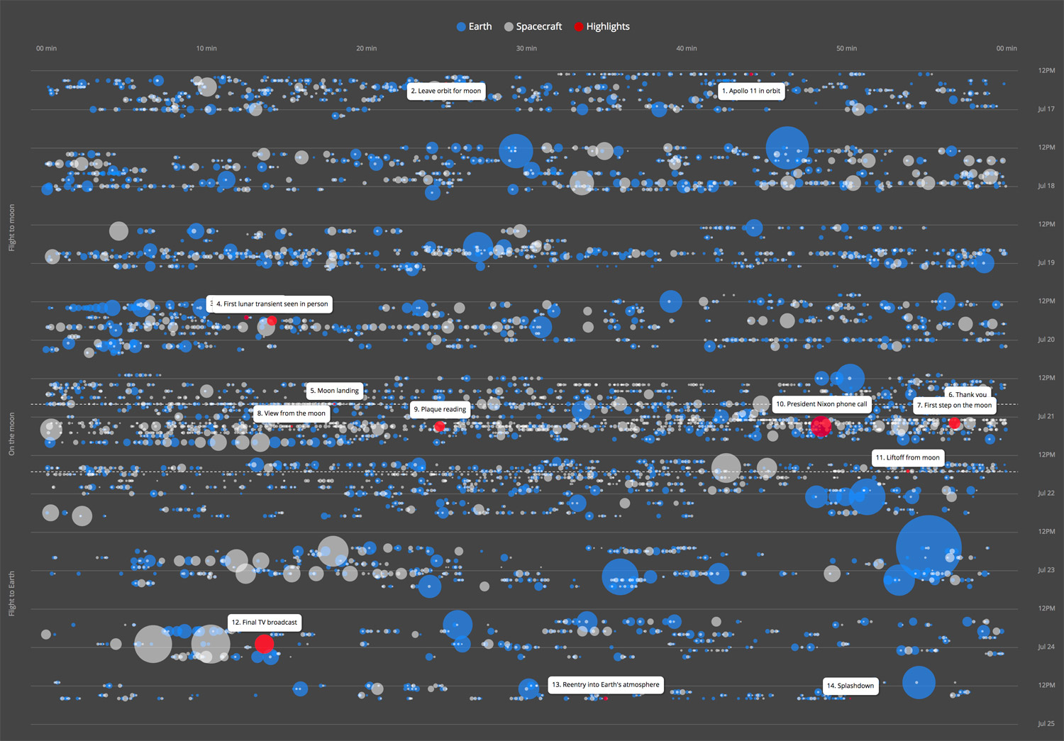
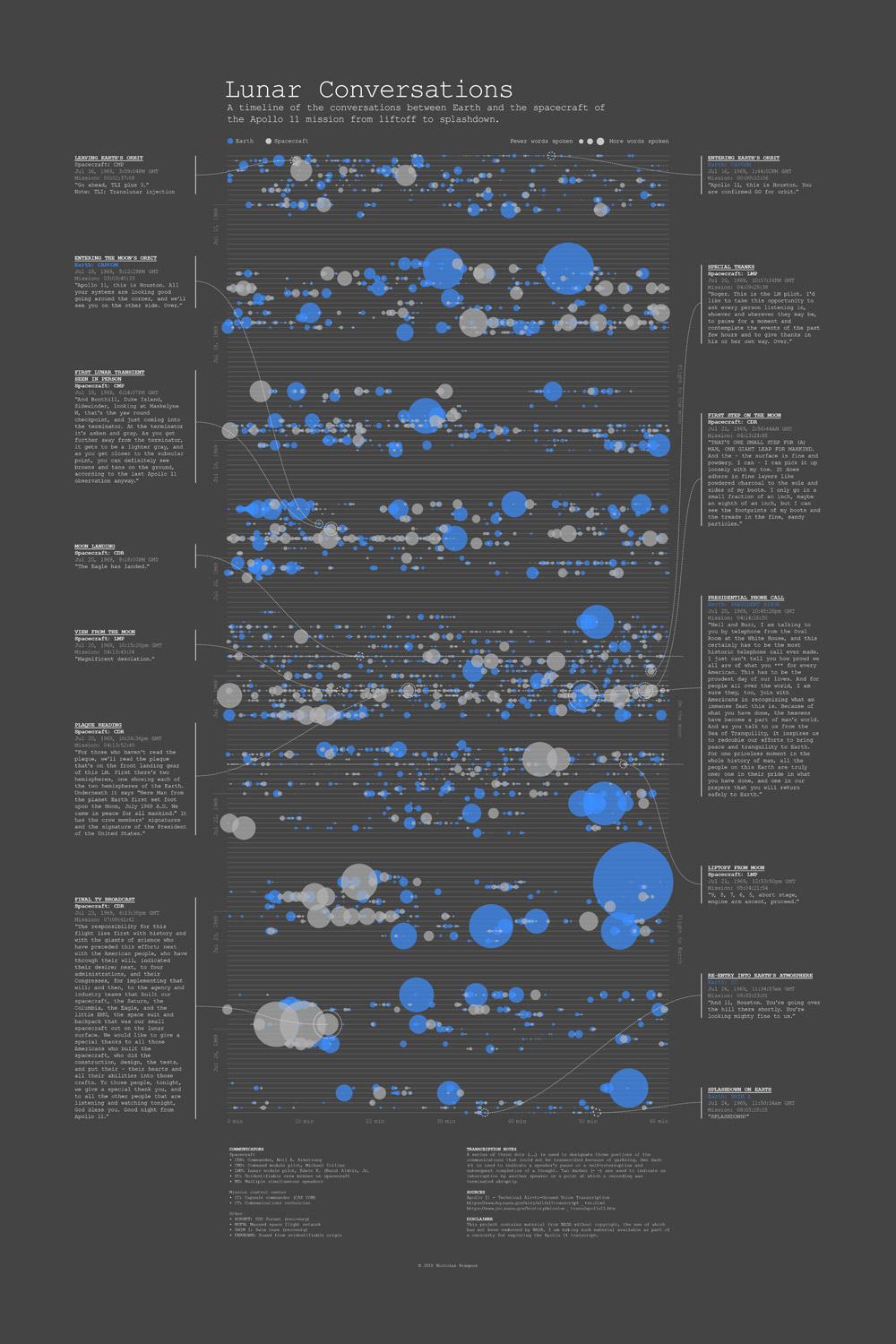
The goal with of this project was to find some way of giving context to the most iconic phrases in history. I knew when they were said in a broad sense and I knew who said them but never knew when they were said in the course of the mission. How would they look in the context of everything that was said?
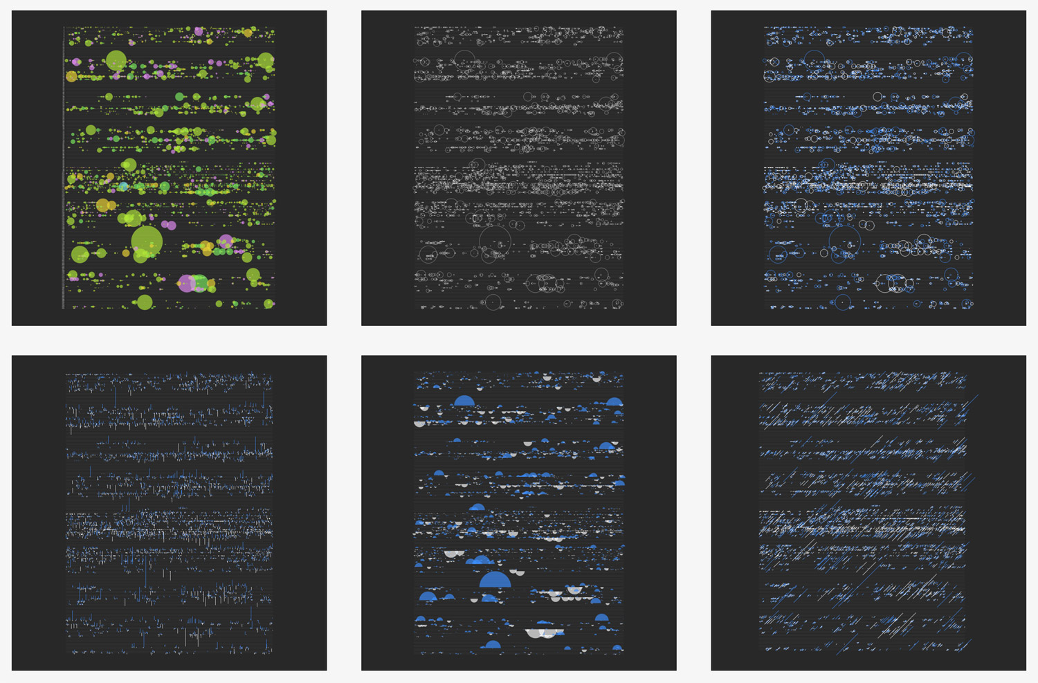
Over the course of 10 days, I experimented with a handful of different types of visuals going back and forth between variations of each. I used NodeBox to create all of these iterations.
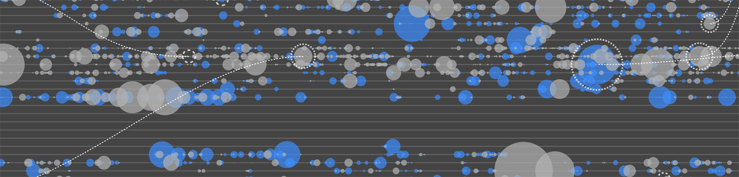
The first type of visual I made based on the data turned out to be the one I ultimately used in the final result where each hour of the mission was a line in a chart and shapes were drawn where words were spoken at the exact second during that hour. It felt a little plain a first but I really liked this approach because it caused me to think of the iconic phrases in an entirely different way—not just as standalone moments but part of the greater historic mission. This type of visual also highlighted large gaps between activity which I learned were rest and sleep periods.
Initially, I used a color for each person who spoke but with 13 different people but only a few dominated the entire design, which made seeing others impossible. I tried a using a single color but felt the impact of who was speaking was lost. A good compromise was to limit myself to two colors: blue for those speaking from Earth and white for those speaking from the spacecraft or moon.
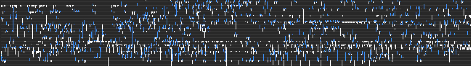
I played around with different shapes to indicate how much was spoken. Lines indicated the direction people were speaking: lines from Earth pointed up (metaphorically up toward spacecraft) and lines from the spacecraft pointed down (metaphorically down toward earth). I liked this idea but it limited the color that was visible. Semicircles added more color but felt unfinished.
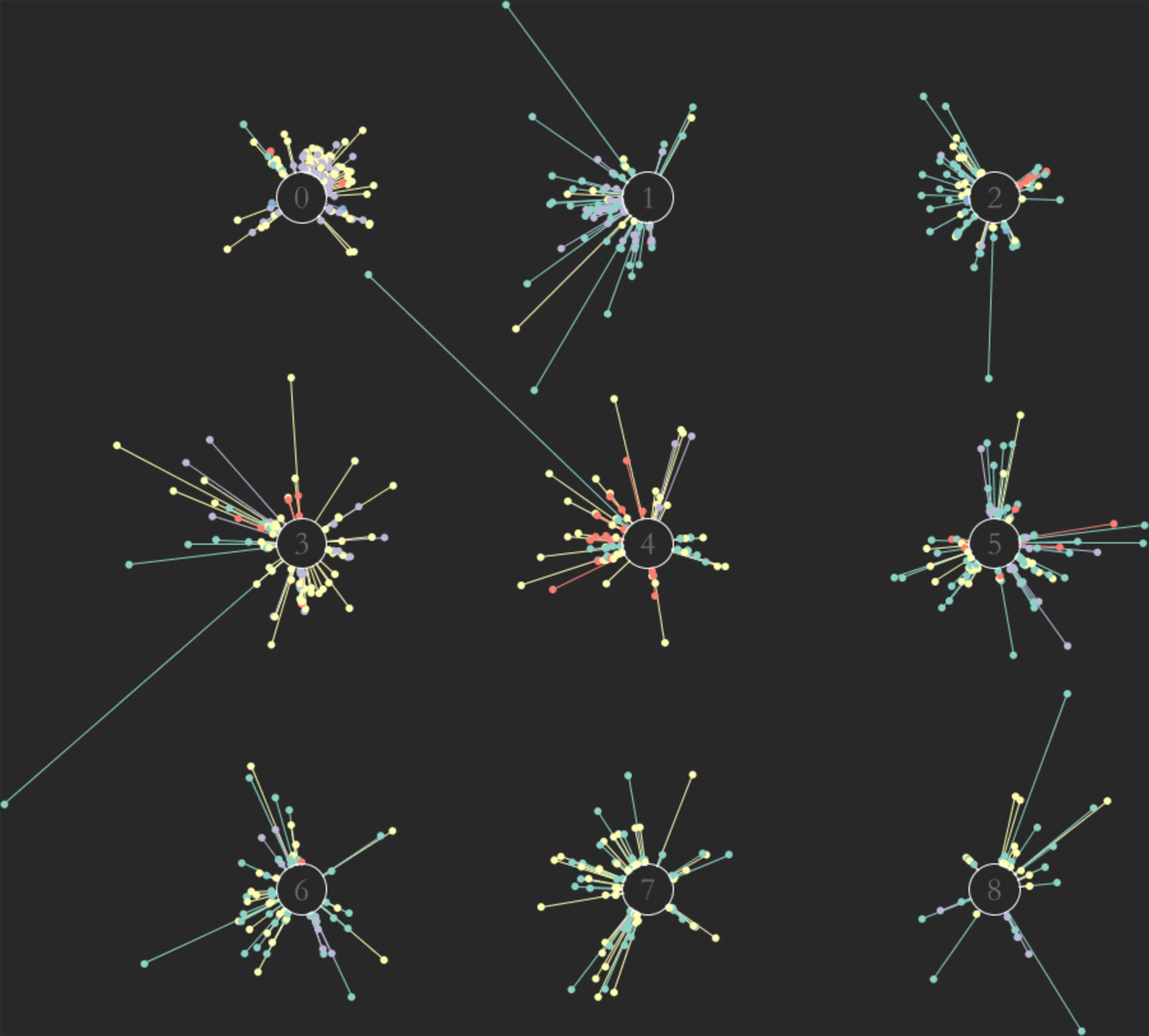
A fleeting idea was to isolate each hour as its own “star” with points coming off of it based on who spoke during it in a clockwise manner.
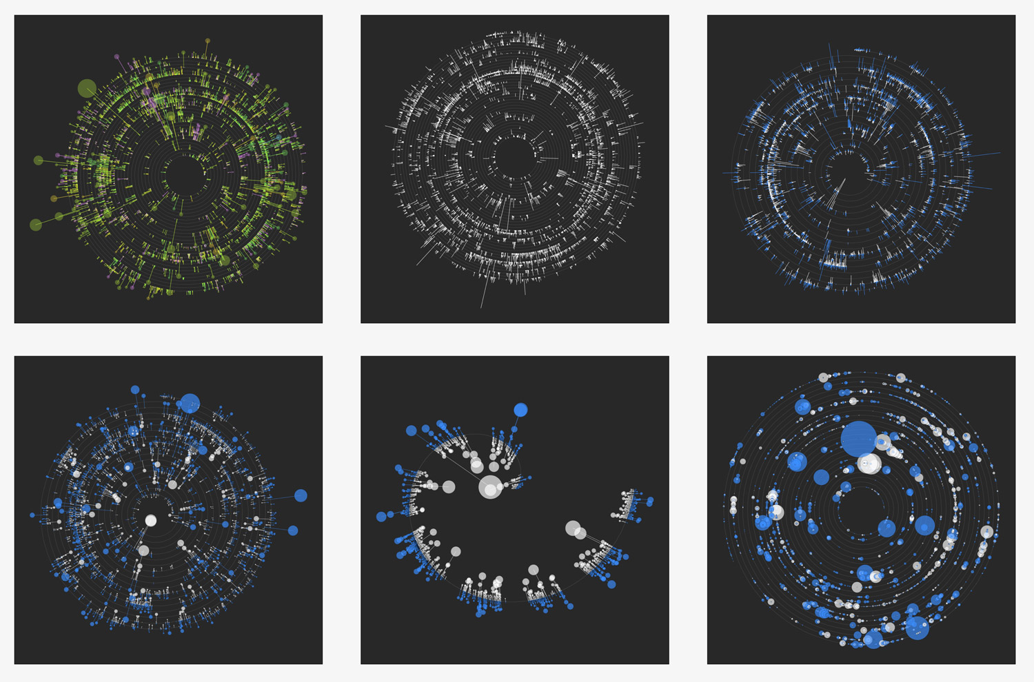
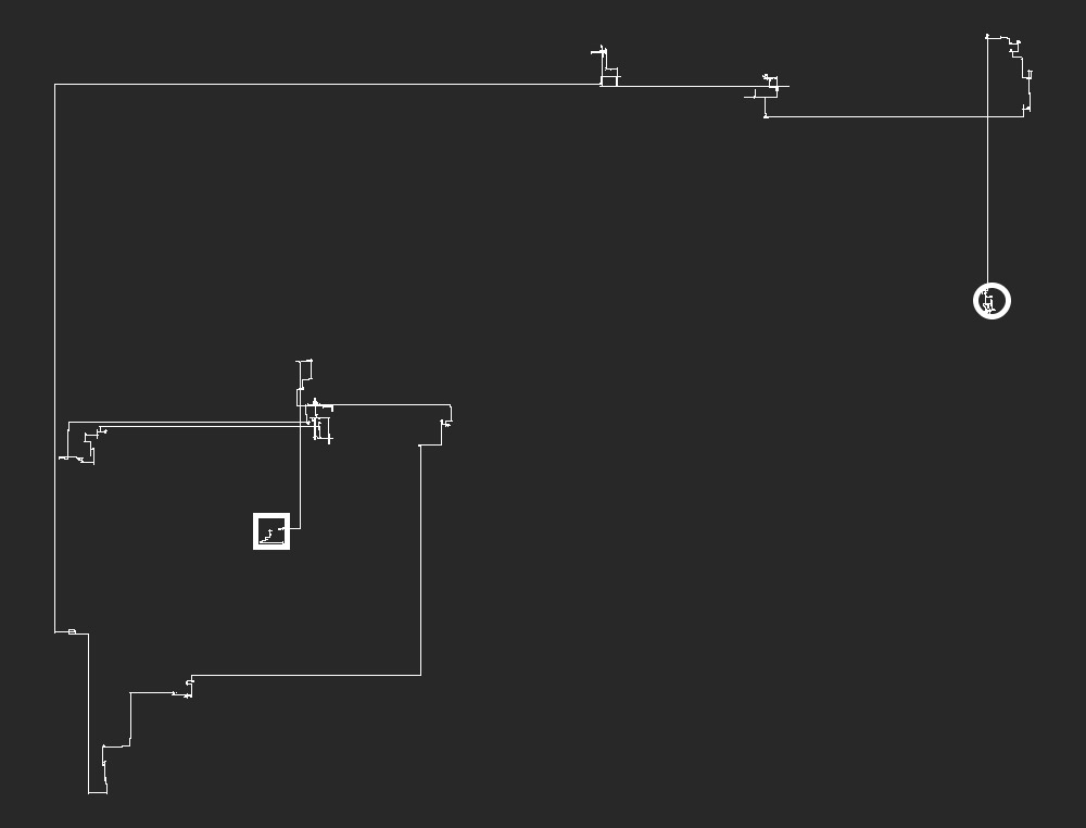
Spirals were the next type of visual I tried in an attempt to show one continuous timeline of the transcript. I tried the same methods of lines along with lines combined with circles but while the results were a little more interesting visually, they were more difficult to understand. I was okay with this initially because at this point, I was still open to creating more of an artistic poster than a full interactive data visualization.
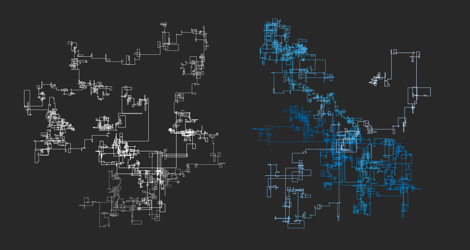
After creating Number Walks, I often attempt to create walk graphs based on almost any new data just to see what there is to see. I created to separate walks based on words spoken from the spacecraft (left) and earth (right). They were generated by drawing a line with length based on the number of words spoken, turning right, drawing the next one, and so on—making right turns after each one.
The results were surprisingly well contained with each one staying contained within mostly square boundaries. A little coloring adjustment in Illustrator made for a pleasing result. I chose not to go with this because it was too similar to my previous Number Walks project and I wanted to do something new.
I also created a variation of the previous version taking into account the silences between each person talking. I thought this would be very interesting because the gaps during rest periods could show little clusters of activity. The end result did have these clusters but their scale was so small compared to the hours-long gaps of silences during rest periods that they were impossible to see, let alone explore.
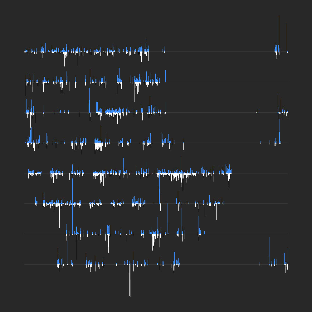
Going back to my first idea, I tried a variation where each line was a day’s worth of activity rather than an hour. Again, I tried the approach with lines pointing in different directions for who spoke. This variation really highlighted the gaps for rest periods but still felt less lacking.
I tried a few other iterations but didn’t get anywhere with them but the previous variation lead me to experiment more with the first idea and start thinking about building an interactive version.
Construction
When I started this project, I wanted to create a poster of the Apollo 11 transcript, highlighting key moments in an interesting and possibly artistic way. I never set out to build an interactive version but when doing so seemed possible, I wanted to explore if it was worth trying.
I’m not a coder. I’m a designer who knows HTML, CSS, and enough JavaScript to cobble things together so when I want to create an interactive data visualization, I tend to focus on libraries and plugins to do the heavy lifting.
The first design I created was essentially a bubble chart so I figured I would create it with Highcharts. After about a week of tweaking options, I got very close to what I thought was a final result.
I love Highcharts because it’s flexible, free, and I’m familiar enough with it to make it do almost anything by just playing with configuration options. However, I felt limited by it this time around—not by its features but by what I wanted to do with the whole project. This version was a good attempt but had several drawbacks:
- The highlighted moments got in the way of each other with overlapping labels that I couldn’t get to not overlap.
- The popups for each bubble behaved oddly by staying open longer than they should and getting in the way of more exploration.
- I wanted to give the major moments more prominence than small boxes littered throughout the chart.
- The zooming feature was great but didn’t scale the bubbles, which negated the use of being able to zoom. I tried forcing bubbles to scale using a few methods but they were either too slow or didn’t work as intended and felt hacky.
- I had to manipulate the data in a convoluted way so the bubbles displayed where they should—generating fake placeholder data just for the sake of positioning.
- Configuring the chart to behave well on small screens for tablets and phones resulted in a messy chart.
After about a week of playing with more visuals and attempting to configure Highcharts just the way I wanted it, I decided to shelve the idea of making an interactive version and focus on the poster.
While working on the poster, I realized that I could still make an interactive version and do much more by making my own custom chart from scratch using what are essentially basic concepts. In fact, much to my surprise, I ended up creating the poster after I finished creating the interactive version because the interactive version helped me iron out the design more efficiently.
Most chart libraries use SVG or canvas to generate charts of all shapes and sizes. I didn’t need something that flexible. I just needed one chart that had a basic structure that I new how to manipulate so I built it with regular HTML elements and some CSS.
Disclaimer: as I mentioned, I’m not a coder so what’s outlined below should not be considered the most efficient method of creating a visualization like this. This method worked for me and produced a decent result.
I broke down the interactive version into a handful of components. I won’t go into too much technical detail here but feel free to view the source of the project page and explore.
Clean data
I only wanted the data to include real data—not data for positioning or anything else—and in a single JSON string. Given dates and times in a proper format, that should be enough to calculate any positioning.
...
{
missiontime: "04:06:46:04",
d: Date.UTC(1969, 6, 20, 20, 18, 0),
group: "Spacecraft",
person: "CDR",
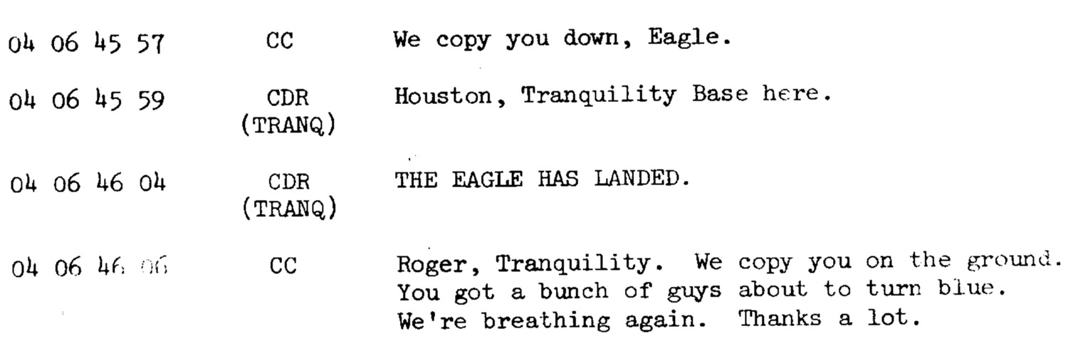
highlight: "Moon landing",
text: "THE EAGLE HAS LANDED.",
words: 4
},
...
Performance testing
With 8,400+ rows of data, I needed to be sure browsers could at least render object for each one without much delay. Initial tests proved this wouldn’t be a problem. The final project is a little slow but is still within an acceptable threshold.
Hourly lines with bubbles
Rather than relying on a chart library to generate SVG shapes for gridlines and circles, I just used a div for each hour and a div for each bubble occurring during that hour. Each bubble div had data attributes that I could use for popups later on.
The number of hours was calculated by calculating the hours between the first and last lines in the transcript. Bubbles were absolutely positioned with top set to zero and left set to the percentage of seconds past the beginning of the hour. All time calculation was with Moment.js. Size of circles was calculated based on how many words were spoken and set to viewport height units (vh) so they look nice on all screen sizes.
<div class="hour" id="hour-14184000000">
    ...
    <div
    class="marker marker-highlight"
    data-date="-14182920000"
    data-group="Spacecraft"
    data-missiontime="04:06:46:04"
    data-person="CDR"
    id="marker-14182920000"
    style="
        height: 0.34963235294117645vh;
        left: 30%;
        width: 0.34963235294117645vh;"
    title="THE EAGLE HAS LANDED."
    ></div>
    ...
</div>
One line of CSS is all that was needed to center bubbles on the point where they occur by offsetting them with transforms:
transform: translateX(-50%) translateY(-50%);
For bubbles with annotations, a pseudo element was created to create the dotted outline highlighting it. No need for fake data to create a duplicate marker or to generate an extra element with JavaScript:
.marker-highlight:after {
    border: 3px dotted #fff;
    border-radius: 1000px;
    content: "";
    display: block;
    height: 120%;
    left: 50%;
    min-height: 20px;
    min-width: 20px;
    position: absolute;
    top: 50%;
    transform: translateX(-50%) translateY(-50%);
    width: 120%;
}
Prior to adding bubbles, they were also sorted largest to smallest (most words spoken to fewest words) so the largest bubbles were added to the chart first while looping through them. This ensures that smaller bubbles are always "on top" and therefore visible and interactive interactive—a technique I discovered while experimenting with NodeBox on past projects.
data.sort(function(a, b) { return b.words - a.words; });
Annotations
Annotations (the highlighted major moments during the mission in the sidebars) were tricky. At first, I had the idea of positioning them right next to the corresponding bubbles but this proved problematic because they would overlap each other. I tried to devise a way to detect overlaps and reposition them but after realizing I was essentially trying to solve the packing problem, I switched gears.
Instead, I split them into two groups. If the corresponding bubble appeared on the left half of the chart (determined by the left position of the bubble), an annotation would appear in the left sidebar. If the bubble appeared on the right, it was placed in the right sidebar.
Once they were split, I made the sidebars and the main chart area flexbox containers which meant they would always stretch to be equal height, their children would be spaced equally, and they would never overlap. This had the added benefit of ensuring they look good on varying screen sizes when the text wraps.
.quote-container {
    display: flex;
    flex-direction: column;
    justify-content: space-between;
    width: 21%;
}
Connector lines
I had anticipated the connector lines would be the biggest challenge because I wasn’t familiar with generating my own SVG elements but I was willing to give it a try. However, after an initial search to save time, I found the jsPlumb Toolkit, which did exactly what I wanted with little effort and better than I likely would have. With a few adjustments, I was able to tell it what to connect with what and it took care of the rest—an example of a library being better than a custom solution.
jsPlumb.ready(function() {
    $(".quote").each(function(){
        var q = $(this);
        var m = $("#marker" + moment($(this).data("date")));

        mOffset = (m.height() / 2) * -1; // Center anchor on marker

        // Set anchor positions on quotes
        if (q.parent().attr("id") == "quote-container-left"){
            // Left quotes connect on right side
            var anchors = ["Right", [0, 0.5, -1, 0, 0, mOffset]];
        } else {
            // Right quotes connect on left side
            var anchors = ["Left", [0, 0.5, 1, 0, 0, mOffset]];
        }

        jsPlumb.connect({
            anchors: anchors,
            detachable: false,
            endpointStyle: { fill: "transparent" },
            paintStyle:{ "dashstyle": "3 3", stroke: "#fff", strokeWidth:1 },
            source: q,
            target: m
        });
    });
});
Everything else
Once everything was in place, I added the rest of the elements like popups using qTip2, a list of communicators, notes, disclaimer, sources, and wrote an introduction. I also used the classic Courier New font on the interactive visualization and poster as an homage to the monospace typewriter font used in the original Apollo 11 transcript.
Final result
What started as a plan to create an interesting poster evolved into a great learning experience about limitations and building something from scratch. I never intended to build an interactive visualization, let alone one that was so true to my original design but I’m glad I explored the possibility and I’m very happy with the final result.
Bonus
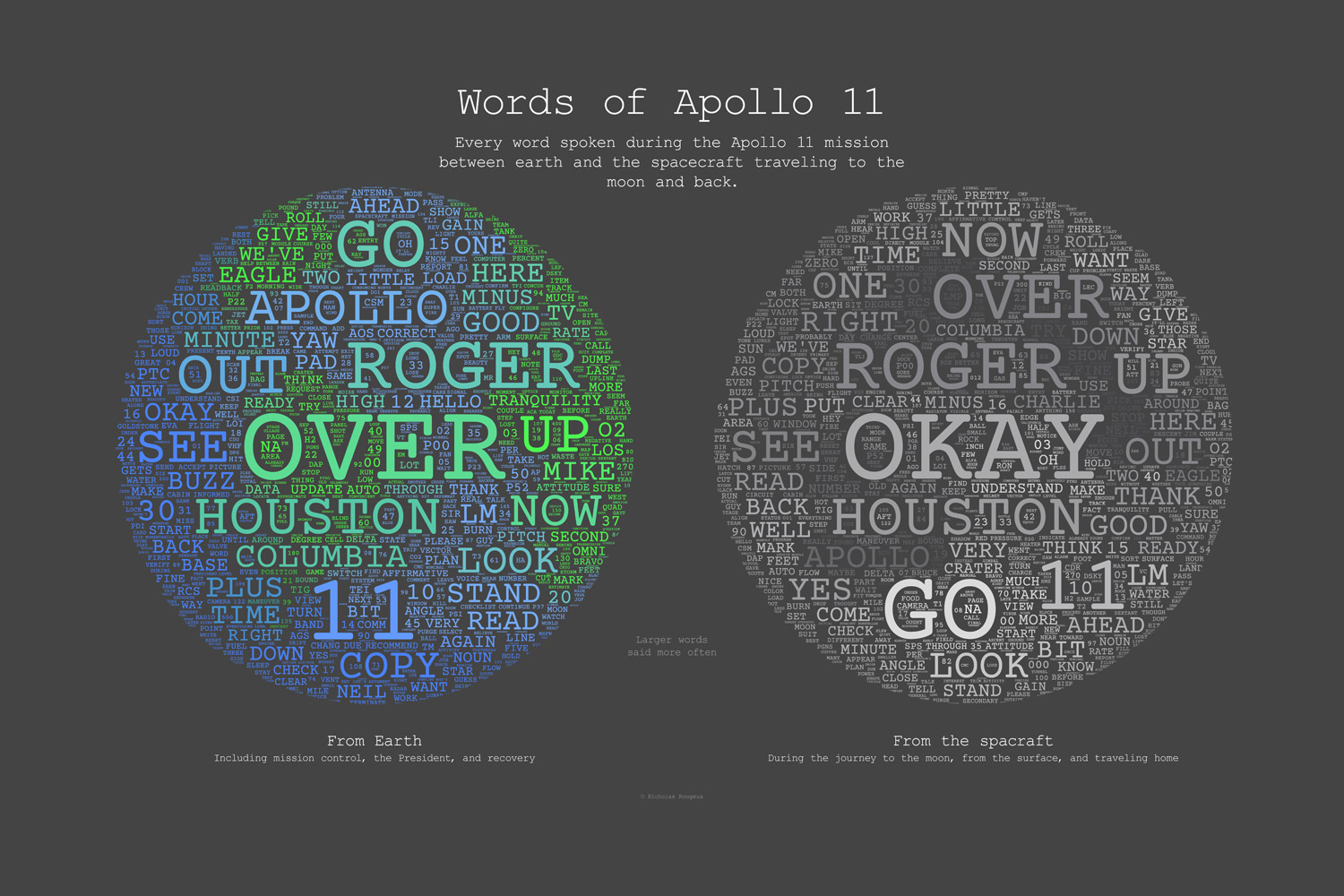
Just for fun, I wondered which words were spoken most often during the entire mission. Ignoring common words (the, and, or, etc), they are (in order):
- From Earth: Over, Roger, Houston, 11, Apollo
- From the spacecraft: Okay, Roger, Houston, Go, Over
After doing this, I remembered a tool I found years ago called WordArt (formerly Tagul) that generated decorative tag clouds based on words pasted into it where larger words occur more frequently. It also lets you base the arrangement on a custom graphic.
On a whim, I split the Apollo 11 transcript into two sets of data—words spoken from Earth, and words spoken by the spacecraft—and generated images of the earth and the moon comprising only words spoken by those on each. The results looked really fun so I made a second poster called Words of Apollo 11: