Making of The Four Books of Architecture
By Nicholas Rougeux, posted on January 8, 2023 in Web
Architecture has repeatedly grabbed my attention since I was young—from studying it in high school and creating buildings in video games to designing websites for firms winning architectural awards. It’s fitting that my interest is piqued once again for a digital edition of one of the oldest and most well known architectural publications: Palladio’s treatise, The Four Books of Architecture.
Palladio’s treatise must have come up dozens of times during my research for other projects but it never caught my eye. For reasons that escape me, it finally did and I had a great time learning about its long history while creating its first digital edition.
Finding source material
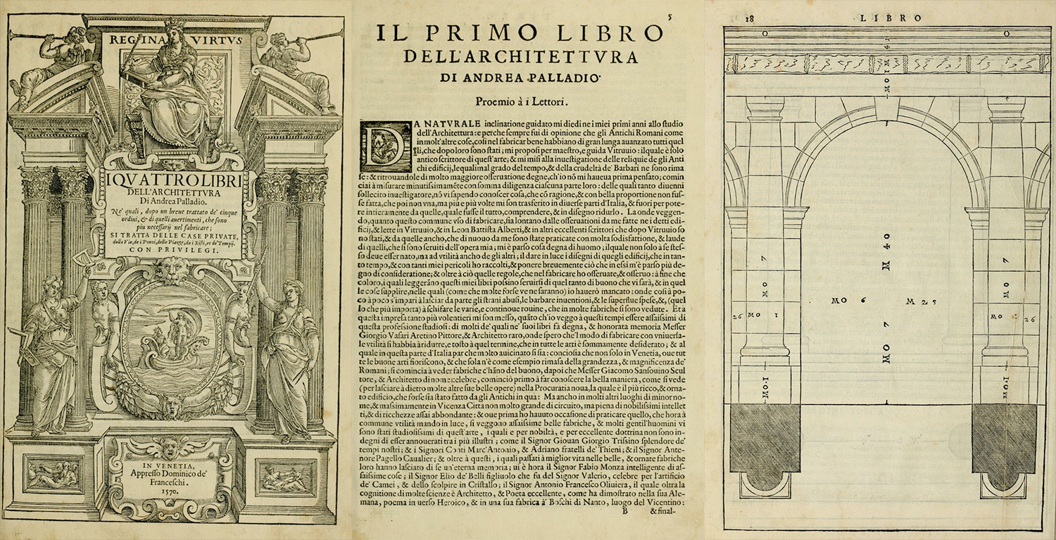
First published in 1570 as four volumes (“books”) The Four Books of Architecture was an architectural treatise written and illustrated by Italian architect Andrea Palladio covering a broad range of topics influenced by the Greeks and Romans. It is often regarded as one of the most important, influential, and most studied architectural publications. Subsequent editions were often released as one publication containing all books but occasionally only featured parts of a single book. Apart from a brief preface, the treatise’s books contain succinct explanations and guidance on architectural design complemented by more than 200 plates of engravings illustrating the concepts and structures described.
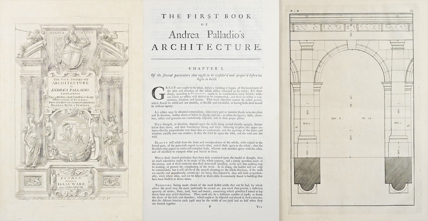
The first edition I found on the Internet Archive was the 1738 English edition by Isaac Ware, hailed by its own author and others as the first most faithful translation from the original Italian version with engraved plates truest to the original.
Of note are Ware’s remarks in his preface, which include strong opinions about two of the English editions that preceded his:
The first, and in all respects the best of the two, was done in the year 1721 by Mr. Leoni; who has thought fit not only to vary from the scale of the originals, but also in many places to alter even the graceful proportions prescribed by this great master, by diminishing some of his measures, enlarging others, and putting in fanciful decorations of his own: and indeed his drawings are likewise very incorrect; which makes this performance, according to his own account in the preface, seem rather to be itself an original, than an improvement on Palladio.
The other work (published in the year 1735) is done with so little understanding, and so much negligence, that it cannot but give great offense to the judicious, and be of very bad consequence in misleading the unskillful, into whose hands it may happen to fall.
—1738 Edition by Ware
I can’t help but enjoy the sharp-tongued eloquence of these two criticisms. They both set the stage for the author’s promise of his own efforts:
To do justice therefore to Palladio, and to perpetuate his most valuable remains amongst us, are the principal inducements to my undertaking so great and laborious a work; in executing of which, I have strictly kept to his proportions and measures, by exactly tracing all the plates from his originals, and engraved them with my own hands: so that the reader may depend upon having an exact copy of what our author published, without diminution or increase; nor have I taken upon me to alter, much less to correct, any thing that came from the hands of that excellent artist.
From the same motive I have chosen to give a strict and literal translation, that the sense of our author might be delivered from his own words.
—1738 Edition by Ware
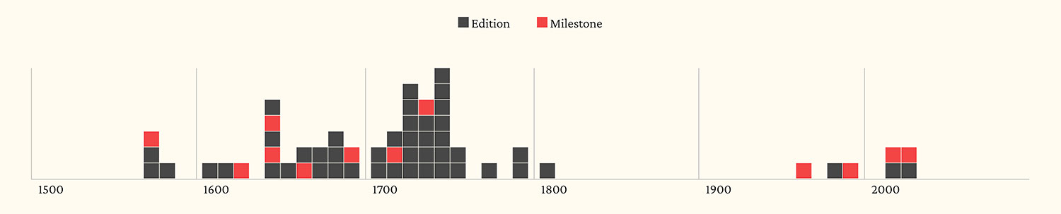
These three translations were just a few of the dozens that were published. During my research, I found a few useful lists of all the editions that were published. The lists include mostly editions of The Four Books of Architecture but they also include others.
- Internet Archive: List of available scans of Palladio’s works
- Architectura: Bibliography of most editions, some with links to scans
- Center for Palladian Studies in America: Archived page listing Palladio’s works
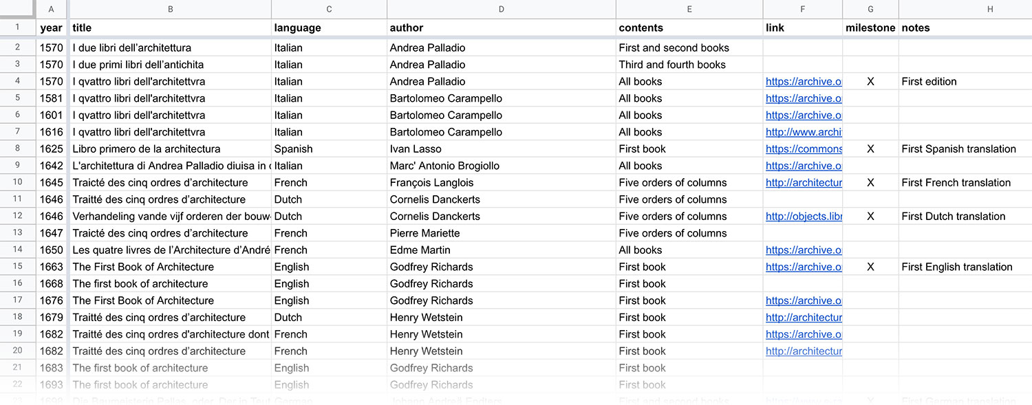
I compiled my own combined list of the entries and included it on the About page of the digital edition to supplement highlighting what I considered milestone editions.
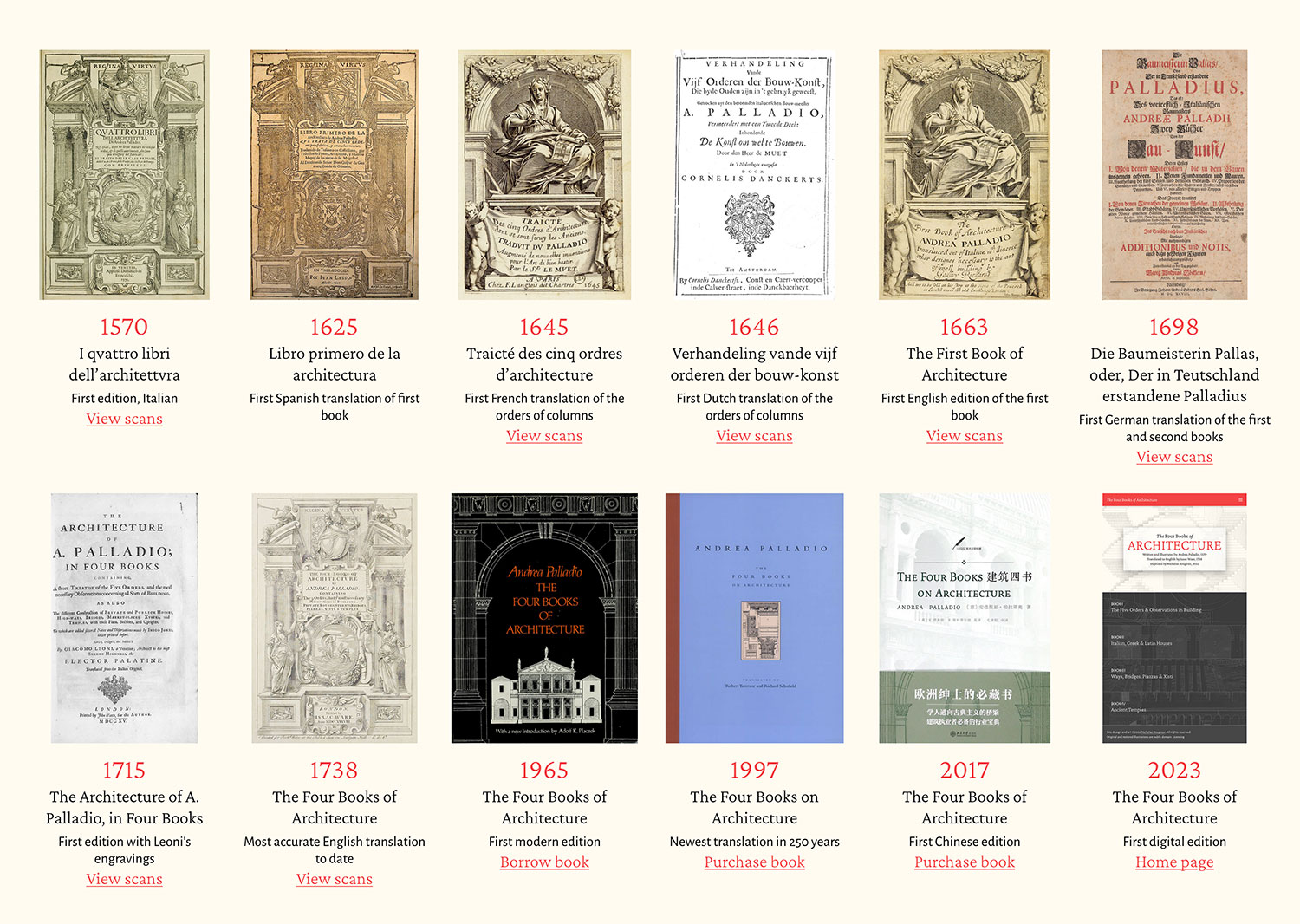
Choosing an edition to use as the basis for my digital edition was influenced by Ware’s comments and the introduction to the first modern printed edition by Dover Publishing in 1965. Dover’s introduction supports Ware’s claims of being the most faithful. With these comments in mind, I chose to base mine on Ware’s 1738 English edition, which was also the basis for the 1965 modern printed edition.
…remedied by a faithful and accurate reproduction of the original plates, and an exact translation of the text. The man to accomplish this was Isaac Ware.…The edition came out in 1738 and can certainly be considered a successful accomplishment. Indeed the accuracy of the reproductions is amazing.
—1965 Dover Edition
Interestingly, based on the lists above, there’s a large gap in publication for the 1800s. There were dozens published between 1570 and 1800 but I wasn’t able to find any after that until the modern editions started with Dover’s in 1965. I wasn’t able to find a reason for this or determine if I missed them somehow.
Setting goals
With the source material chosen, the next step was to decide on an approach to the digital edition that provided an improved experience to the printed editions. The goal was to make exploring the plates easier while reading the accompanying text.
One of the challenges with most previous editions is the order in which plates and text are placed. Plates always appeared after their text but not immediately, so keeping track of plates and their correspond text was difficult. For example, Book 4 starts of with 10 pages of text comprising chapters through part of chapter 8, followed by the 10 plates they referenced. Chapters 8 and 9 follow, but the latter is again interrupted by more plates. Plenty of page-turning is required to see a plate and its description at the same time.
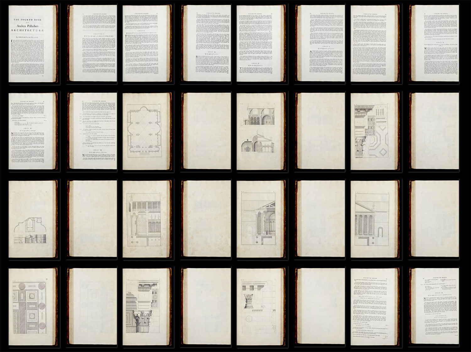
Source: Internet Archive
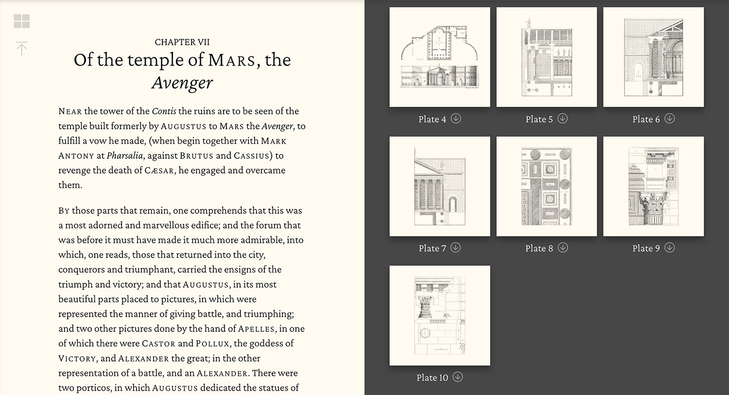
The digital edition ensures that all plates for a chapter are visible at all times (on larger screens) and accessible via in-context links available on all screen sizes.
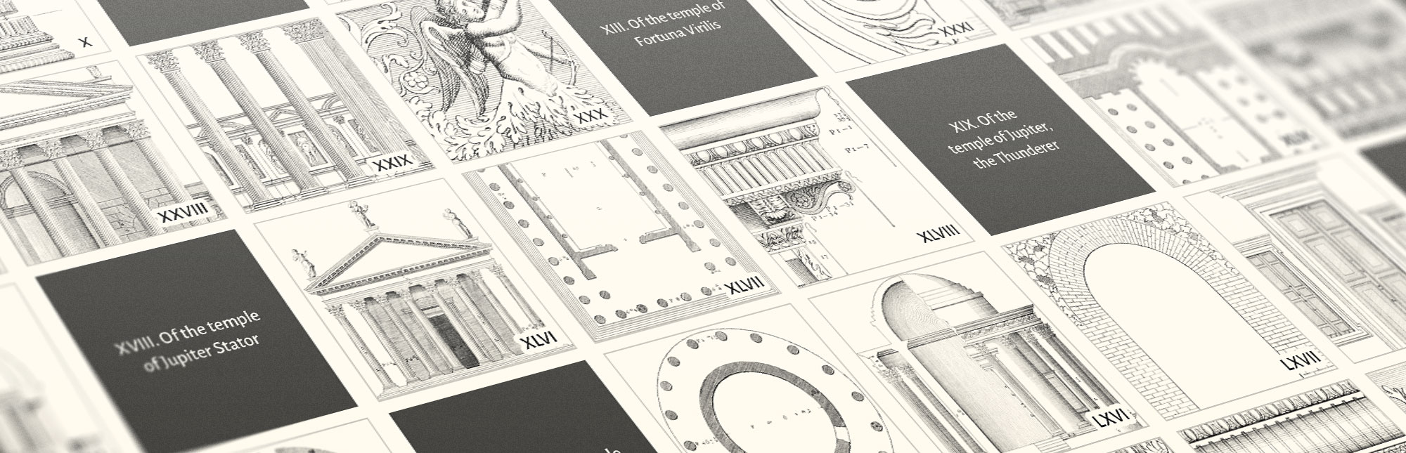
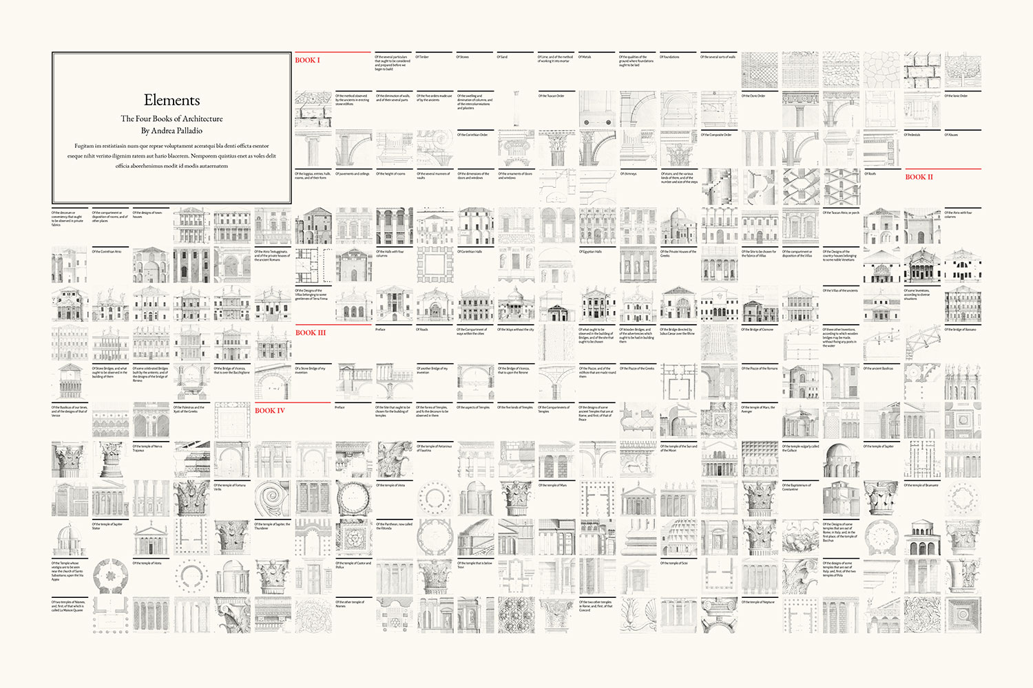
As with my other digital editions, a secondary goal was to create posters based on Palladio’s work for those that might like a souvenir after exploring it. I designed five posters—one for each book that included a collection of illustrations it contained and a fifth as a comprehensive visual outline of the entire four books. I’ll go into more detail about them later in this post.
Creating the design
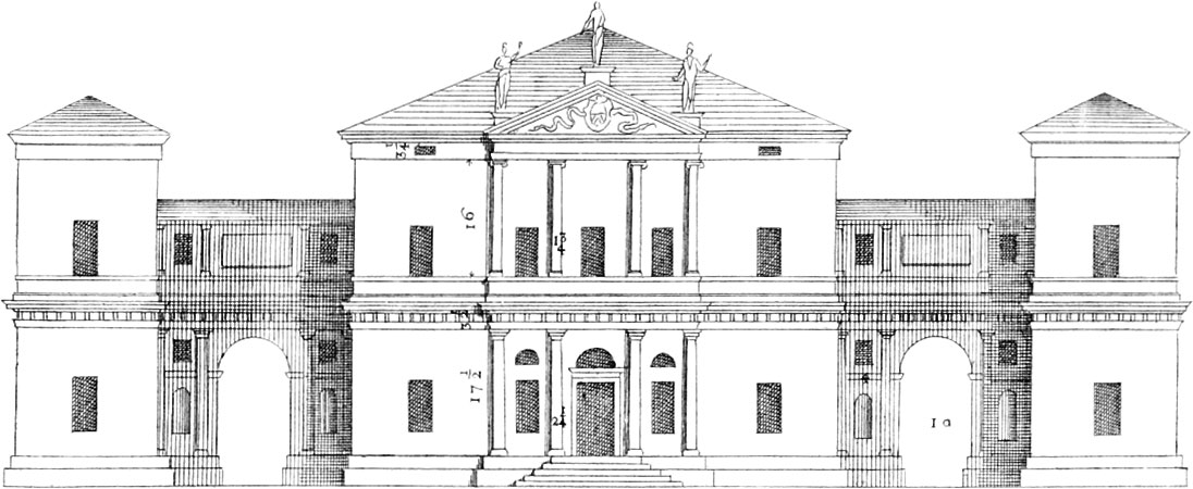
Symmetry and proportion play a big part in Palladio’s work (Palladianism) so I attempted to pay homage to that in my design of the digital edition. The most prominent example of this is the home page design, which showcases a simple title flanked by links to the four books, akin to how Palladio designed his villas with a large central structure connected by hallways to smaller structures on either side. The title takes up half the width and the columns of the links are a fourth. The site’s navigation also has a connection to this concept with its title in the middle of two navigation lists.
These design concepts are only showcased on larger screens because of the available screen real estate. Proportions are still a large part of the site’s design on all pages.
Palladio’s books comprise chapters—many of which reference accompanying plates. As stated in my goals, I wanted to keep these plates visible when reading on larger screens, so those chapters with plates are split in half with text on the left and plates on the right. The plates stay visible while scrolling through each chapter and only scroll out of view when moving to another chapter. I used a similar technique on my Byrne’s Euclid and Illustrations of the Natural Orders of Plants digital editions.
Since the number of plates vary for each chapter, they’re scaled to fit on the screen based on how many can fit in a square grid. For example, if there are two to four plates in a chapter, they’re shown in a 2×2 grid, if there are five to nine plates in a chapter they’re shown in a 3×3 grid, and so on. The most plates in a chapters is 16 so the grid only needed to grow to 4×4.
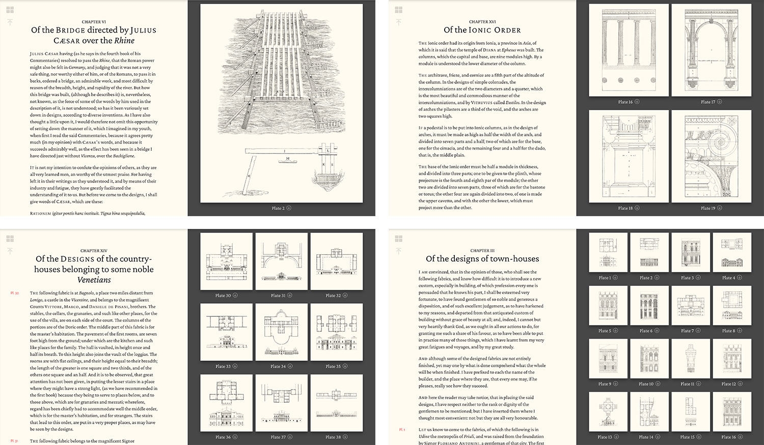
Exploring the detail of the plates is key so they’re clickable to launch larger versions for zooming in. The original 1738 edition included plate references in the margins where they were described and I kept these as part of the design but made them links to also launch the larger versions so readers can use either method for exploring them.
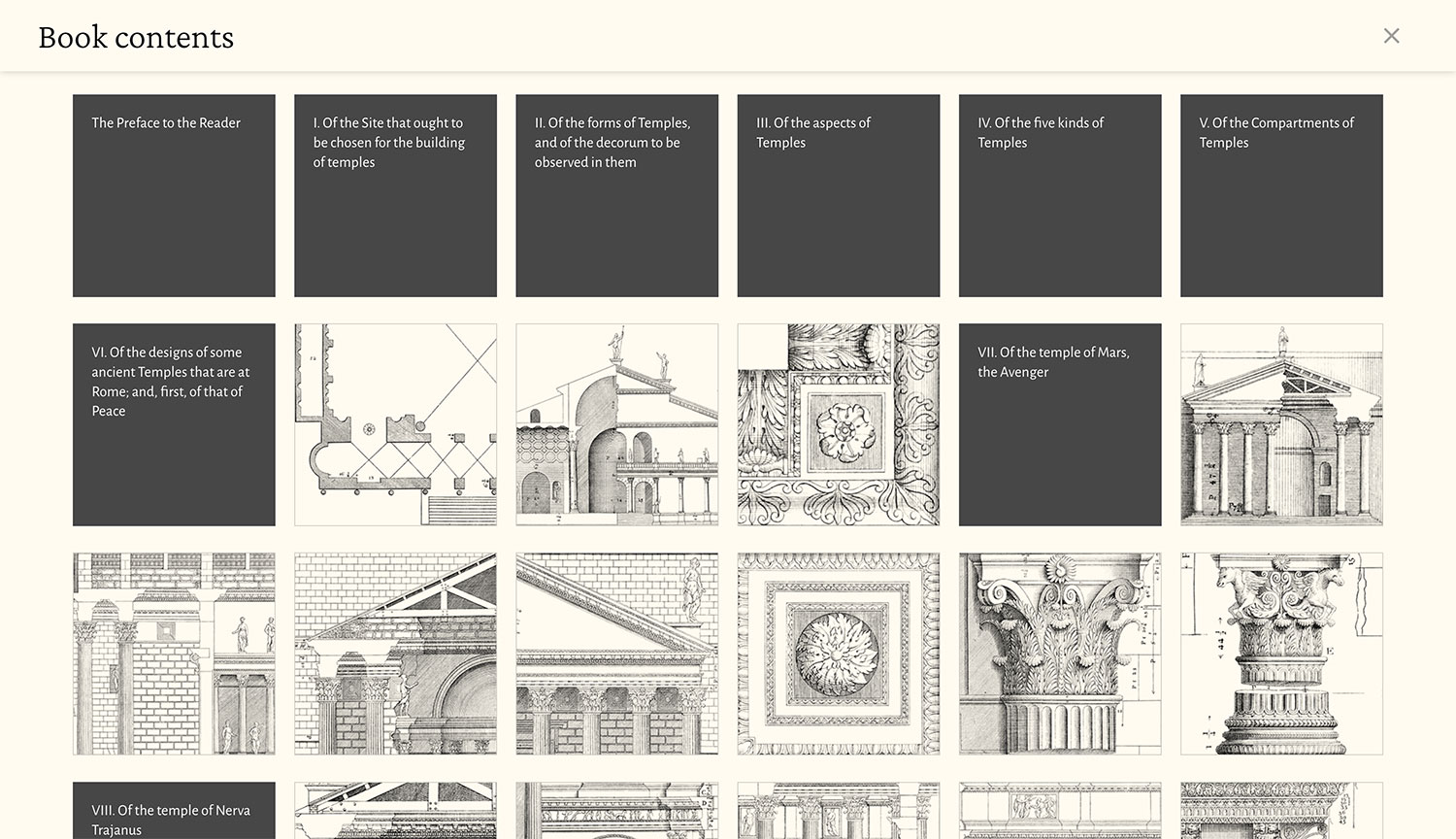
Each book is quite long so a table of contents was necessary to jump around on a page and serve as another method of exploration. I chose to implement a design similar that used on my Iconographic Encylopædia digital edition which uses a block-based approach to show the outline. This design was also influenced by the poster that showcases the entire outline of the four books.
Restoring illustrations
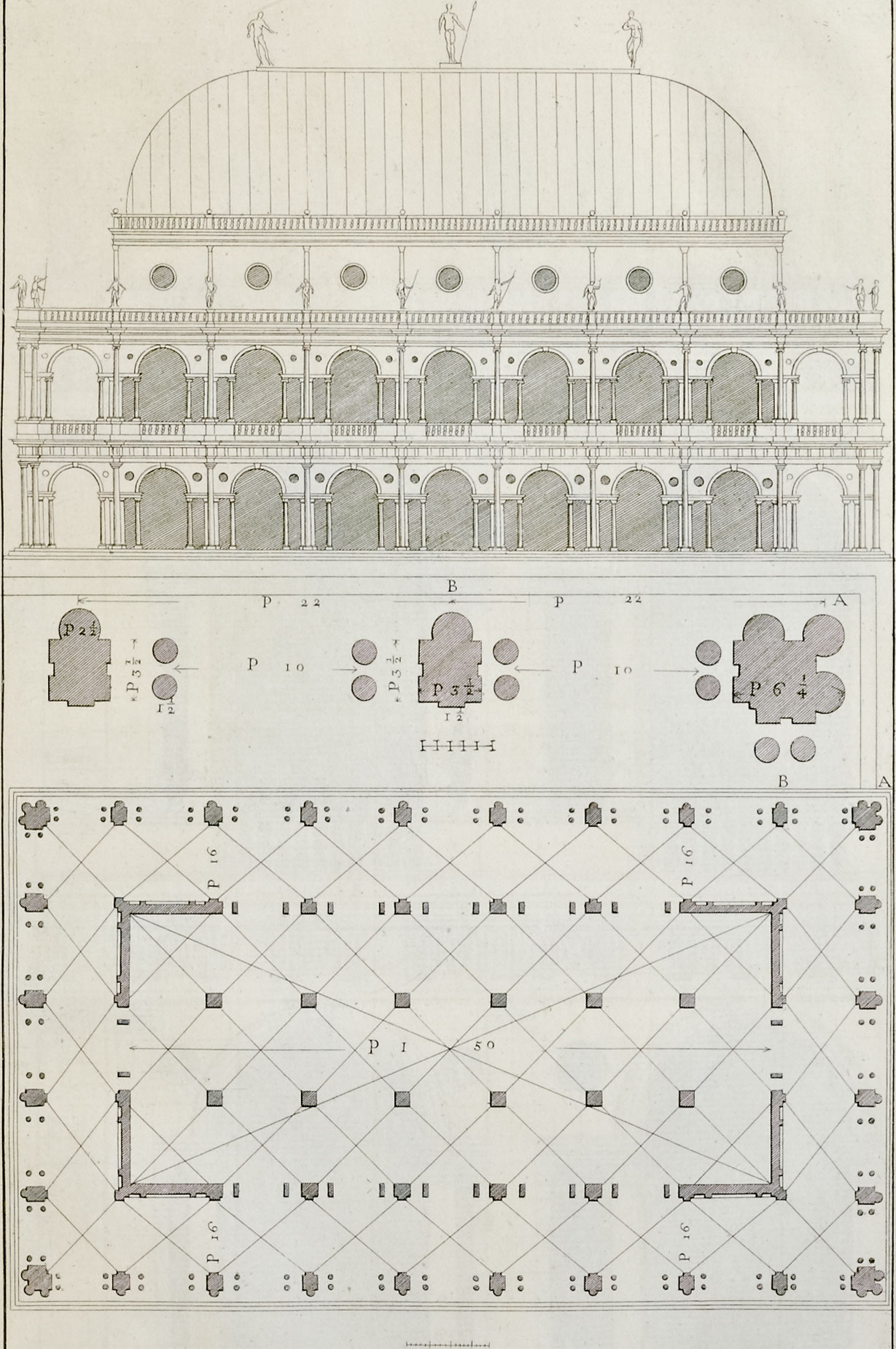
Palladio made his 213 engravings on wood and Ware later reproduced these as engravings on copper plates. The amount of detail included in both is impressive, especially considering they were created by hand without the aid of modern technology. Ware’s plates were also mirror images of Palladio’s. I wasn’t able to find a definitive explanation for this but assume it’s because his method of engraving involved tracing the original, which when printed from an engraving, would create a mirrored image.
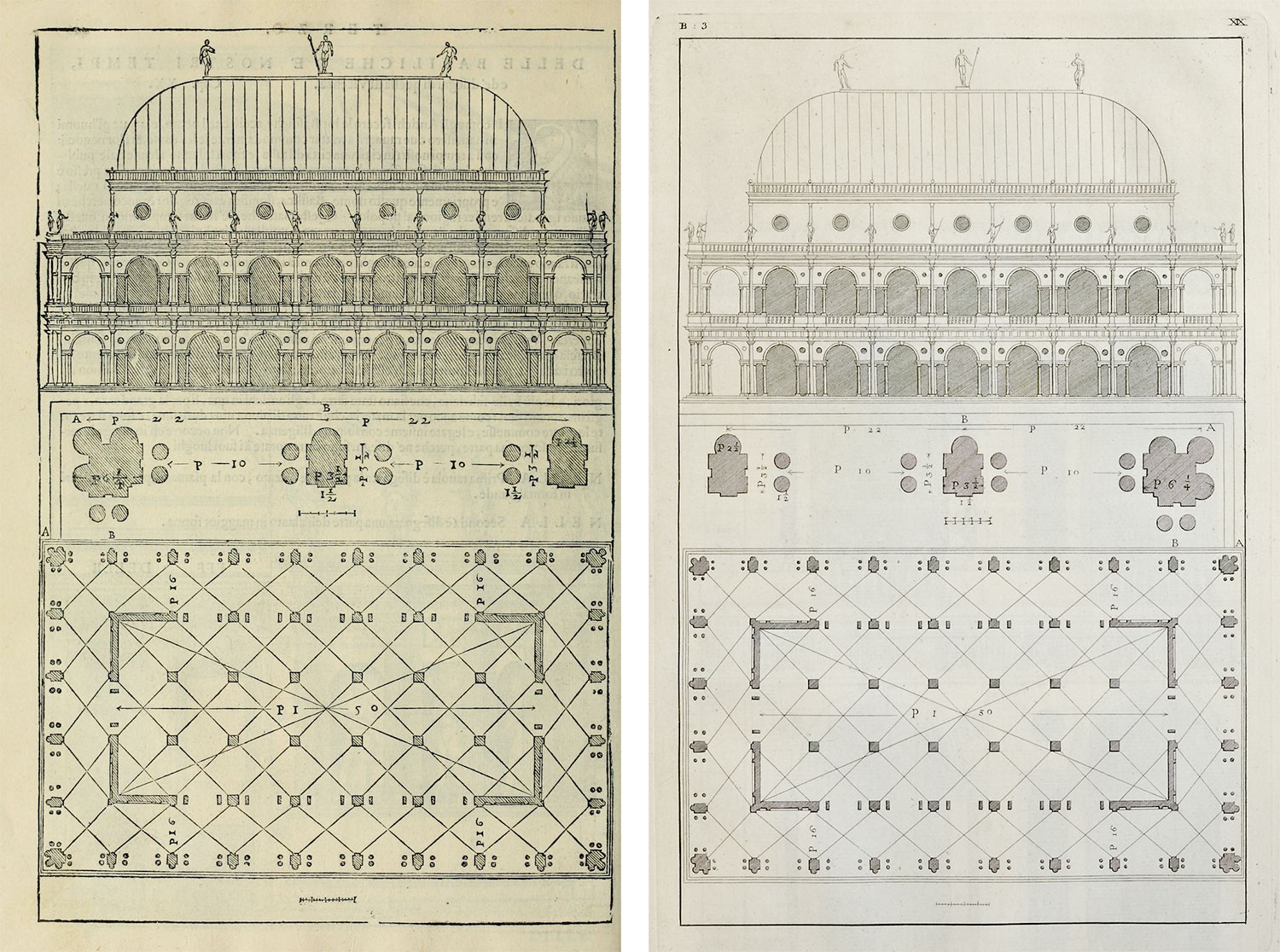
The largest scans of Ware’s engravings I could find on the Internet Archive were a decent size (1879×3000) but I would have preferred them to be larger to see more of the fine detail.
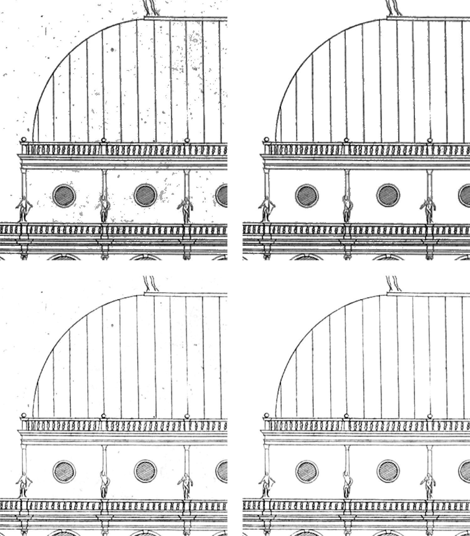
The restoration process was a nondestructive one that I’ve refined in several past projects. While some automation helped, plenty of manual work was still required to prepare the scans for the way that I wanted to use them. The goal was to remove the background so all that remained were the lines of the illustration itself.
 Drag slider to see the progress from start to finish.
The steps involved were:
- Straightened and cropped roughly
- Added hue/saturation adjustment layer to convert to greyscale
- Added levels adjustment layer to set the white point based on the lightest area
- Added threshold adjustment layer with 30% opacity as a guide for which pixels are pure white
- Added levels adjustment layer and lower the highlights point of the slider just enough to turn the lightest pixels pure white. This couldn’t be moved too far to avoid washing out the whole image. Repeated for the next lightest areas with masks they only affected the desired pixels.
- Added curves adjustment layer to darken the whole image. Repeated for specific lines that needed darkening.
- Added a white color fill layer with a mask and used the paintbrush to hide out all the remaining unwanted pixels of the background that couldn’t be removed with adjustment layers.
- Turn off threshold layer and crop to edges
The penultimate step of using the white color fill layer to hide remaining unwanted pixels was the most time-consuming because adjustment layers can only do so much without negatively affecting the image. It was necessary because without it, the images would have appeared to have spots or dirt when displayed on the site.
Images were saved in greyscale so I could set their blend mode to multiply in CSS with mix-blend-mode: multiply to make them appear yellowed without changing the colors of the images themselves. I prefer this approach for greyscale images because it allows for adjusting the background color and lets me offer images for download in a neutral palette without creating new files.
I briefly entertained the idea of redrawing each illustration as vector graphics in Illustrator (digitally “re-engraving” if you will)—naïvely thinking that it would be an entertaining task with great results. However, after completing only half of one plate, I decided against it because the process wasn’t enjoyable and the plates weren’t in high enough resolution for me to make out some of the finest details. I also felt that restoring the original plates would be more appropriate.
Formatting text
Typically, I’ve been able to avoid retyping text for digital editions but this time, that wasn’t the case. Retyping everything by hand was the most efficient. The Internet Archive had the full text available, but it was run through OCR which, apart from the usual tradeoffs, added many extra spaces and incorrectly converted the long s’s ( ſ ) to f’s. The time it would have taken to clean up the generated text would have been much more than simply retyping everything. Plus, chapters were fairly short and by completing one chapter at a time (retype chapter 1, restore its plates, retype chapter 2, restore plates, etc.) the process was broken into small enough chunks to avoid being onerous.
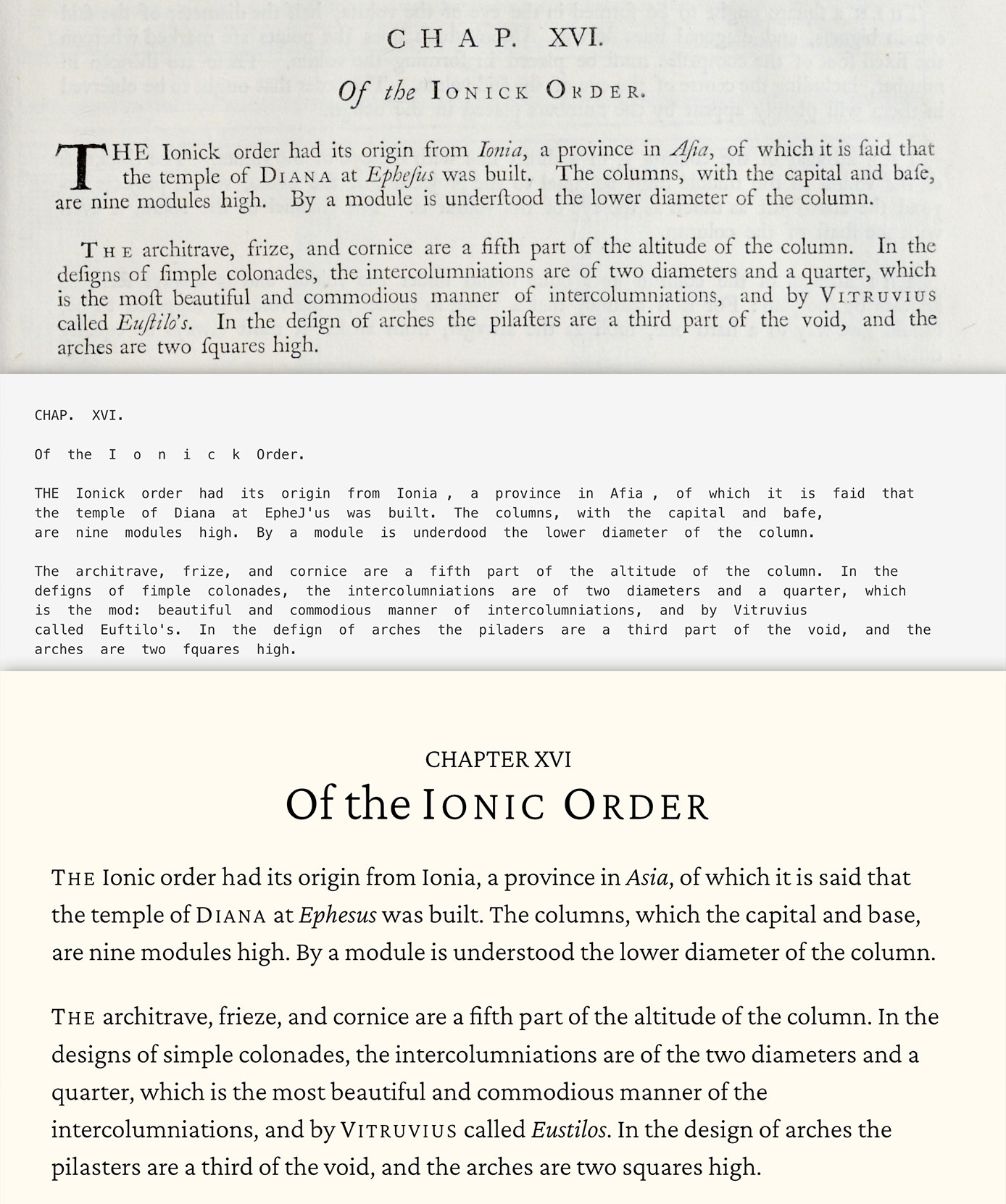
I decided to make a few minor changes to the text to make it more legible for its modern format—namely updating the old style spelling. For example:
- Replaced each long s ( ſ ) with a lower case s
- Used modern spellings (e.g., chuse → choose, expence → expense, fabrick → fabric)
- Removed unnecessary abbreviations (e.g., finish’d → finished, fell’d → felled, shelter’d → sheltered)
- Removed apostrophes from pluralized words ending in vowels (e.g., loggia’s → loggias, portico’s → porticos, palestra’s → palestras). There were a few spots where both versions of a word were used such as in book 4, chapter 16 where both “cavettoes” and “cavetto’s” were used in the same paragraph.
For the typefaces, I chose Crimson Pro for body and display text and Alegreya Sans for smaller text. Both felt easy on the eyes and Crimson Pro had just enough character in its italics to stand out without being too showy. The light weight worked best rather than the regular weight. Names were written in small caps in the original text and while Crimson Pro didn’t have a small caps variant, I decided to keep this part of the typography because it still worked without appearing too garish. Both were also designed for longer texts and stayed readable at most sizes.
Designing posters
Designing the posters was a bit of an adventure. When I first found The Four Books of Architecture during research for other projects, I assumed that no part of it would work well as a poster. There were too many detailed images that couldn’t be organized in interesting ways.
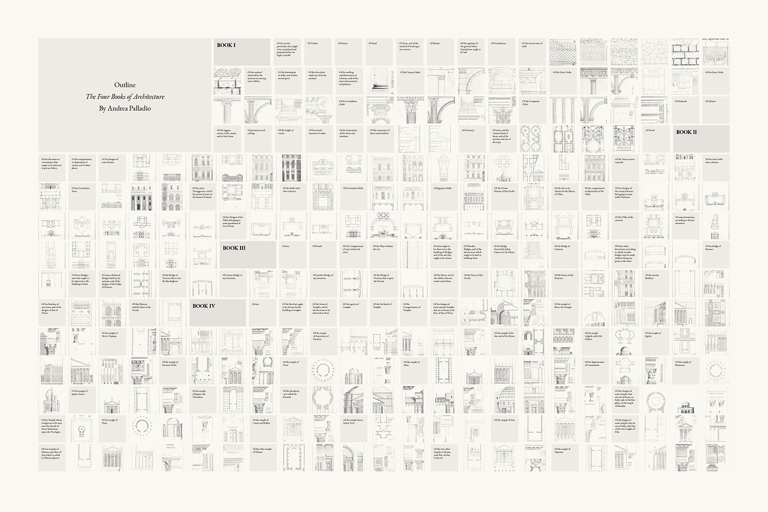
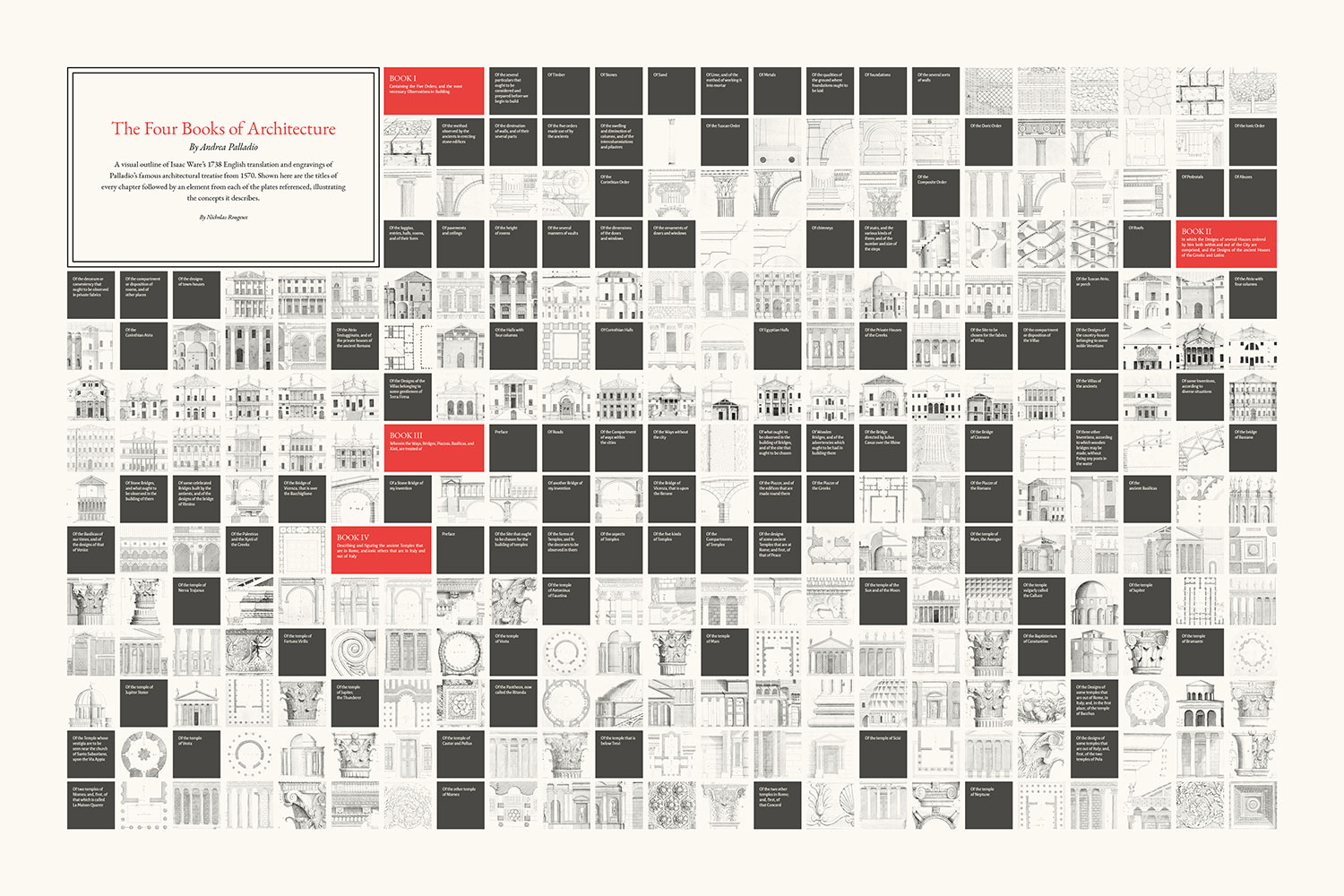
However, after working on the table of contents design for Iconographic Encyclopædia, I thought a similar grid-based approach could work as a poster for Palladio’s work, where an entire outline could be shown including every book, chapter, and part of a plate. Trying to fit the entire plate for every illustration on one poster simply wouldn’t work because the dimensions of each plate vary and there’s too much detail but I thought it would be interesting to focus on a key identifiable aspect of each one. Before I restored all the illustrations, I spent a little time putting together a first rough draft and the results were promising.
The first draft was a start but lacked a focus and blocks blended together too much. A particular challenge was finding a way to comfortably display the title box while keeping it aligned with the grid. There were only a handful of sizes that would work with the number of boxes in the entire poster. To help with this, the grid of blocks is made using one large text box in InDesign and wrapping its contents around the title box. This let me resize the grid, change styles, and reposition the title box while the blocks would reflow around it instead of moving them one by one manually. This method was temporary for finding a layout that worked. The final result would be arranged manually to ensure a precise layout.
For the second draft, I tried a vertical orientation and more prominent blocks for books, chapters, and its title. Both the orientation and grey colors felt off but the red colors for the books worked.
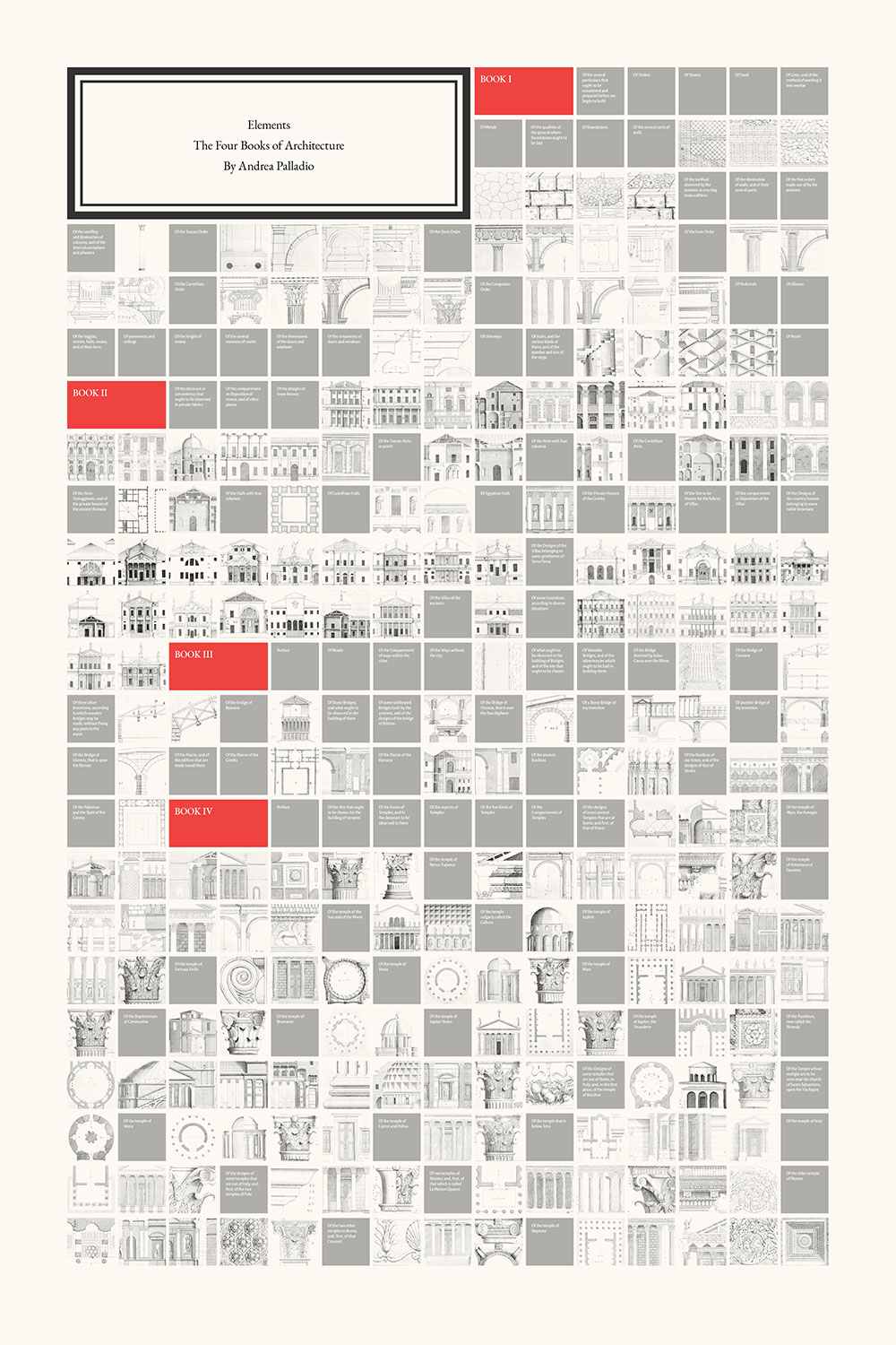
The third draft was the first time that I felt I had zeroed in on a format that worked with bold, dark blocks for the chapters.
I briefly thought the dark colors overshadowed the illustrations and tried a version with them but felt it was a step backwards to the problems with the first version.
A problem with these early versions was the placement of the red book blocks, particularly the one for the second book. The blocks were ordered left to right, top to bottom, and the second book’s block always ended up near the right edge, which felt strange. I tried a few more variations including a vertical flow with the title at the bottom, which felt disorienting.
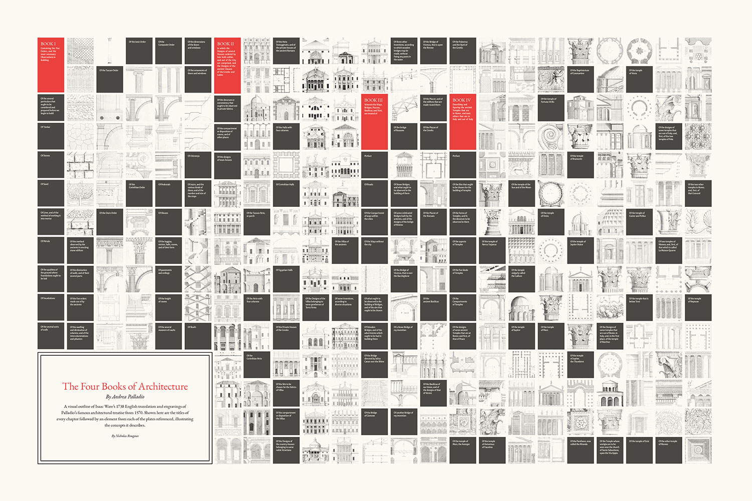
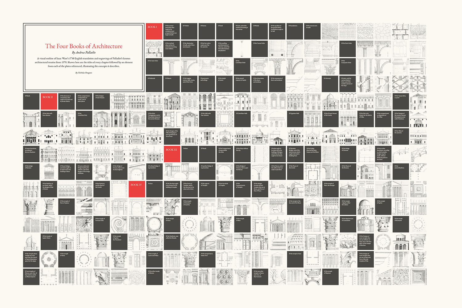
It wasn’t until towards the end of the project that I tried something more radical and entered the title and all the text in each block—trying once again to pay homage to Palladio’s love of symmetry. To my pleasant surprise, it worked well.
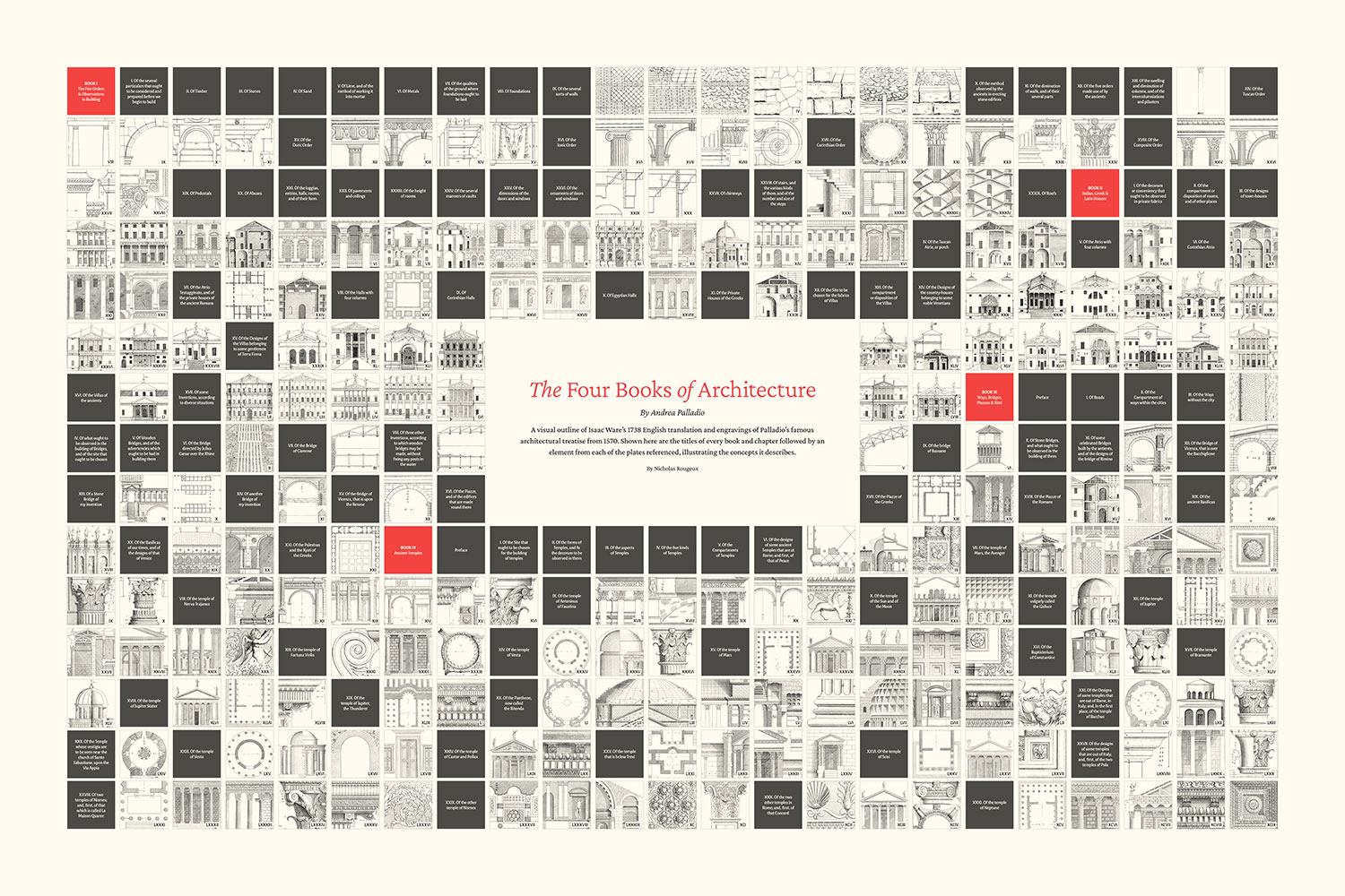
I started working on the visual outline poster very early on in the project and filled it in as I completed restoring each image. Working on it this long allowed me to fine tune many aspects and try new ideas, which paid off. It was also the only poster I was planning to make until I became familiar with the contents of each of Palladio’s books.
As I built out the digital edition, I thought that it would be fun to create posters for each of the primary collections discussed in each book: orders of columns from the first book, houses from the second, bridges from the third and ancient temples from the fourth.
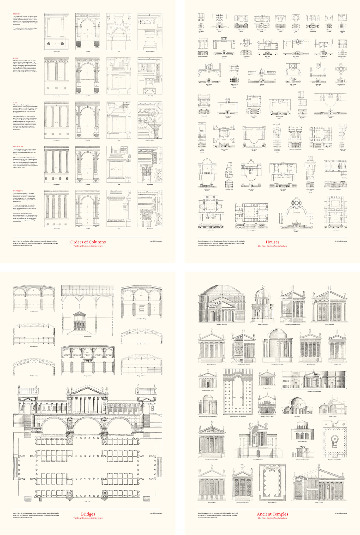
Each one presented its own challenge. I wasn’t any real order to how the houses, bridges, and temples were discussed in the books so I chose to arrange them in a simple aesthetically pleasing way.
The first one I created was for the second book, showcasing houses or villas designed by Palladio around Italy. The images for these were so varied that finding an arrangement that worked was the big challenge. I opted for arranging them roughly by scale—using the size of the doorways as a rudimentary guide.
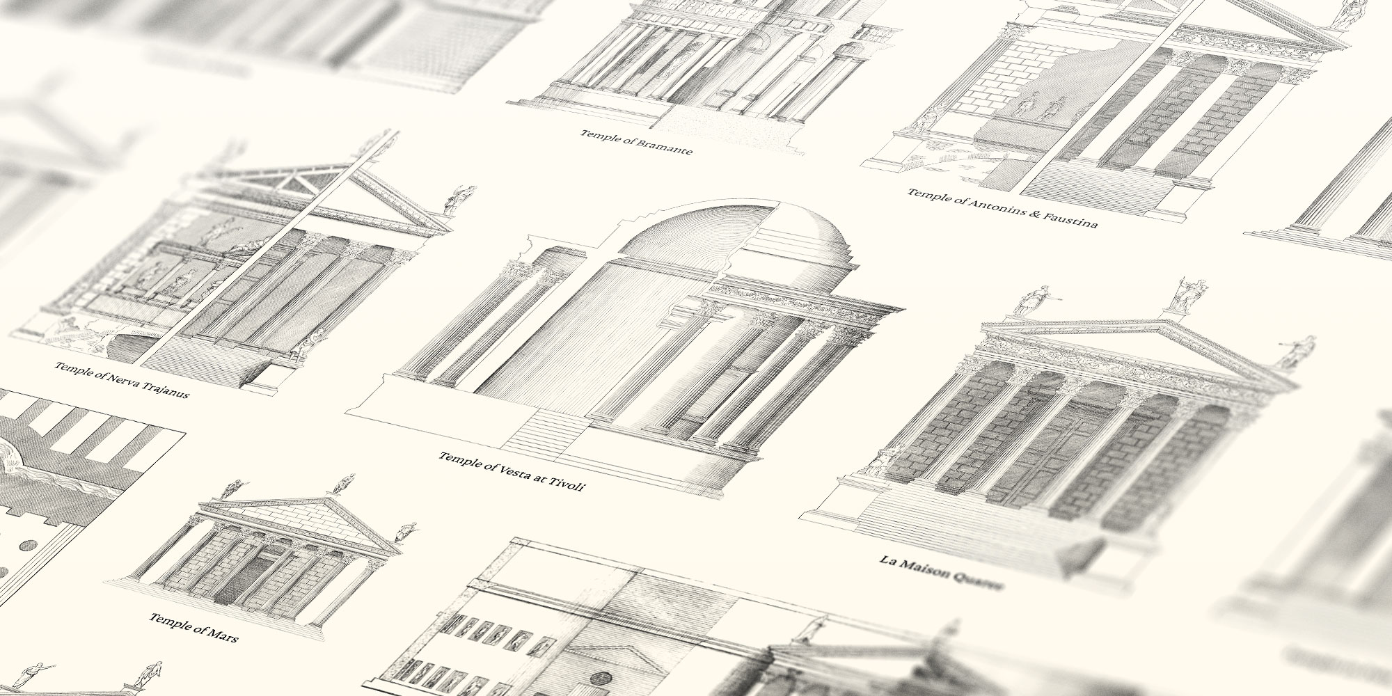
Second came the ancient temples. Several of these were created by combining two illustrations into one—one half being an external view and the other being some level of an internal view showing its structure. A floorplan was included for when an elevation or two halves weren’t illustrated.
Third was the poster for bridges. There were only nine bridges illustrated but the proposed design for the Rialto bridge (which was never built) spanned two plates, which I combined into one. This large plate served as a great anchor for the poster.
The final poster I created was the one for the five orders of columns: tuscan, doric, ionic, corinthian, and composite. It’s different from the others in that includes the brief descriptions for each order and full plates as they were engraved. These are Palladio’s own words as translated by Ware with no edits. Four plates were created for each order except for corinthian, which had an extra one. I chose to only show the four that matched the style of the others.
Final thoughts
I’m very pleased with this digital edition and the final collection of posters. They’re a great way to explore Palladio’s amazing work and Ware’s impressive efforts to reproduce and translate them. The entire project took about six weeks to complete. I was surprised to find that a digital edition of Palladio’s work didn’t exist beyond scans and was excited to have the opportunity to create this one.