

In 1892, Cincinnati printer John Earhart, published The Color Printer: A Treatise on the Use of Colors in Typographic Printing, in which he detailed his methods for creating hundreds of color mixtures and thousands of color combinations as well as advice for complementary colors, using harmonious colors, and printing.
This is a digital edition of Earhart’s work created by Nicholas Rougeux with enhanced reproductions.
Introduction
For the purpose of avoiding confusion, and that the reader may more clearly understand the text, this work is based upon the old theory that there are three primary colors— red, yellow, and blue. Some writers contend that red, green, and blue, are the primary color sensations, and others that red, green, and violet are the primaries. We think that [the experiments], tend to prove that the red, yellow, and blue theory is correct. It is certainly the most practical when applied to pigments, and is, therefore, the most suitable for this work.
To simplify the book as much as possible, we have selected as a foundation for it the twelve colors shown on Plate 1, including white. These colors were adopted because the writer believes that a greater variety of mixed colors can be produced from this selection than from any other containing the same number; besides, these colors are not only the most useful, but also, the most common, and best known among printers.
We could have added several other useful colors, such as umber, sienna, etc., but concluded that it was best to not make the work too complicated, and so have adhered to the original idea. Very nearly the same result could have been accomplished by leaving out the orange, lemon yellow, vermilion, and gray; but in that case, we would have been obliged to resort to a great many three-color mixtures. As it is, we obtain nearly all of the colors desired by simple two-color mixtures. This fact makes it much easier for the printer to produce any of the mixed colors shown in this book.
-
1Red
-
2Yellow
-
3Blue
-
4Orange
-
5Green
-
6Purple
-
7Navy Blue
-
8Rose Lake
-
9Lemon Yellow
-
10Vermilion
-
11Gray
-
12Black
Plate I.—By reference to this Plate, the reader will notice that the colors are numbered from 1 to 12, and on all of the different plates upon which they appear, are referred to by number, except in a few instances where the name serves the purpose better. In producing the half-tone colors and tints we necessarily used white, which is not shown on Plate 1, but is always referred to by name.
The first three colors are the primaries red, yellow, and blue. Then follows the three secondaries— orange, green, and purple. Then follows deep blue, rose lake, lemon yellow, vermilion, gray, and black. Purple was selected instead of violet, as one of the secondary colors, because it lies about half way between the red and blue, while the violet is a little too near the blue. One of the main objects in making this selection of colors, was to have them as far removed from one another as possible, so that we could get a greater variety of mixed colors.
After having decided to adopt the twelve colors just named, as a key, or foundation for the work, we had a small quantity of each color made, and then tested them thoroughly. Those that were not satisfactory were re-made until they were just as wanted. Then we had a large quantity of each color made, in fact, enough to print the entire work. A few of these colors were returned for slight changes, which were easily made.
After the colors were all satisfactory, we proceeded to find how many different colors we could get by two-color mixtures. We first mixed Nos. 1 and 2, that is, red and yellow, in different proportions; then 1 and 3, 1 and 4, 1 and 5, 1 and 6, etc., until we had run to the end of the twelve. Then we mixed Nos. 2 and 3, 2 and 4, 2 and 5, the end of the list. We did the same with 3 and 4, 3 and 5, etc., to 3 and 6, etc., until all of the twelve colors had been tried. The result was about one thousand different colors. Then we proceeded to select the colors which we desired to show in this book.
The different colors produced by the mixture of two colors would in some instances exceed one dozen. In such cases we would select three or four which were as far removed from one another and the two colors used to produce them, as possible. For instance, Figures 33, 34, 35, and 36, on Plate 4, were made of red and black; 33 being the nearest to black, and 36 the nearest to red. In some instances we selected only one color from the different mixtures of two colors; for example, Fig. 28, Plate 3, which is composed of equal parts of red and rose lake.
Two-Color Mixtures
We will now proceed to show a variety of colors produced by two-color mixtures, and explain the manner in which the proper proportions of each color were obtained. The reader will please note that in speaking of a combination of two or more colors to produce another color, we always refer to it as a mixture—a two-color mixture, three-color mixture, etc. When rising the word combination, as two-color combination, we mean an impression of two different colors in one figure or design.
Plates 2 to 15, inclusive.—These plates show 112 colors produced by two-color mixtures, from the colors on Plate 1.
In printing these colors the cut represented above was used. It was engraved specially to show the effect of each color in solids, half-tone lines, quarter-tone lines, and tint lines.
As this book is intended specially for printers who use comparatively small quantities of ink, we decided to obtain the different proportions by measure instead of by weight. In accordance with this idea, we obtained a lot of brass circles of different sizes, and by careful tests and filing them down until they were right, finally got a dozen which bore the proper proportions to one another, as represented by the numbers in the following cut:
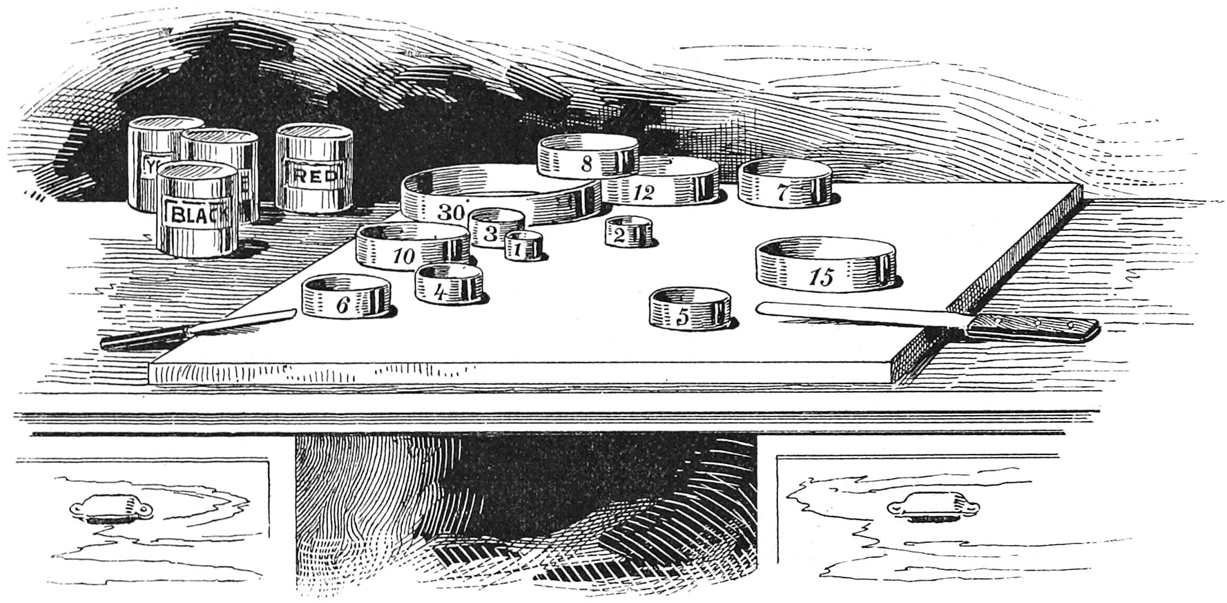
Then with the addition of a fine marble slab, a half dozen small ink knives, and about two hundred quarter-pound cans, we were ready to commence mixing the colors. Fig. 13 on Plate 2 was the first color made. The reader will please notice that the proportions are as 1 to 3 in this color. We first laid circles Nos. 5 and 15 on the slab; then took color No. 1 and filled circle No. 5 even with the top; then color No. 2 and filled circle No. 15 even with the top. Then we took a small ink knife in one hand and lifting circle No. 5 with the other, very quickly got all its contents on to the slab ready for mixing, and repeated the operation with circle No. 15. This would have been extremely difficult if the measures had bottoms to them, but in this case the marble slab was the bottom, and when the circles were raised a great part of the ink stuck to the slab. The two inks were then very thoroughly manipulated with a heavy knife until they were perfectly united, and the mixture was then put into a can which was numbered, and the color registered in a sample book made for that purpose. The greatest precautions were taken to avoid mistakes, which, of course, would seriously mislead the reader.
In mixing two or more colors it is of the utmost importance that everything should be clean. The stone or whatever is used to mix the inks upon, should be covered with boiled linseed oil, and then thoroughly cleaned with manilla tissue paper. The brass circles and the ink knives should be cleaned in the same manner. Then, when it comes to the mixing, the operator should not stop after he has rubbed the inks together for only a few minutes, but should keep at it, working lively until the inks are thoroughly united. Then, if the mixed color does not work well and lay smooth on the paper, it will not be on account of neglecting one of the most important essentials necessary to obtain that result.
All of the colors represented on Plate 1 were made as full bodied as they could be, to work well and print smoothly on the plate paper used. All of the proportions given for producing different colors by mixture, are based upon the use of full bodied or medium thick inks, and not upon very thin inks.
The different plates in this work are numbered consecutively from 1 to 90. The different figures shown upon the plates are numbered consecutively from 1 to 403. Every mixed color used in this book was made by the writer from the twelve colors shown on Plate 1. Of course, the special colors on Plate 86, and the bronzes and gold ink, are not included.
Three-Color Mixtures
Plate 16.—This plate shows eight colors produced by three-color mixtures from the colors on Plate 1. The object of this plate is to show some deep colors, which could not be obtained by two-color mixtures.
Below we give a list of some of the colors shown on the preceding plates:
The Reds are represented by Figs. 13, 19, 20, 28, 29, 30, 76, and 95. Fig. 19 is a good orange red, and Fig. 30 a deep vermilion. Fig. 95 is a purple-red.
Figs. 37, 60, 63, 93, 125, and 126 represent Blues. Fig. 37 is a greenish blue; Fig. 60 is an excellent blue; Fig. 63 is a green blue; Figs. 93, 125, and 126 are violet blues.
Orange is represented by Figs. 14, 39, 48, and 56. The best orange color is made by a mixture of the primaries red and yellow, or any red and yellow lying between them. A mixture of rose-lake and lemon-yellow will produce a dull orange color, due to the fact that rose-lake leans a little to purple, and lemon-yellow to green.
Green is represented by Figs. 38, 40, 45, 46, 47, 57, 58, 74, 75, 83, 85, 86, 101, 102, 103, and 104. Fig. 45 is a fine deep green, and Fig. 46 is a light yellow-green. Figs. 57 and 58 are blue-greens. Fig. 74 is a deep olive, and Fig. 75 is a medium olive. Fig. 83 is a fine color which is about half way between blue and green, and which can properly be called a sea-green. Fig. 85 is a strong light green. The best green is made by a mixture of the primaries yellow and blue, or any yellow and blue lying between them. A mixture of orange-yellow and violet-blue will produce an olive-green.
Purple is represented by Figs. 62 and 94. These two colors are reddish purples.
Violet is shown by Figs. 59 and 61, the former being the best of the two. It is very hard to produce a good purple or violet by mixture of red and blue inks. To obtain the best result, a carmine or rose-lake must be mixed with a pure ultramarine blue.
Brown is represented by Figs. 23, 27, 35, 36, 42, 43, 66, 72, 73, 88, 89, 107, 120, and 124. Figs. 35 and 36 are fine deep browns; Fig. 73 is a leather brown, and Fig. 81 is a sepia brown. Out of this list of browns the printer can surely find what is desired.
The next is a list of fine Grays, represented by Figs. 31, 32, 49, 67, 68, 77, 90, 96, 108, 113, 117, and 121. Figs. 31 and 32 are red-grays; Fig. 49 is a yellow-gray; Figs. 67 and 68 are blue-grays; Fig. 77 is an orange-gray; Fig. 90 is a green-gray; Fig. 96 is a purple-gray; Fig. 108 is a blue-gray; Fig. 113 is a purplish gray made of rose lake and gray; Fig. 117 is a greenish gray made of lemon yellow and gray. Fig. 121 is a soft gray made of vermilion and gray. Without some of these grays it would be simply impossible to obtain the most pleasing and artistic results in color printing. These colors not only serve to bring out and strengthen the positive colors used in combination with them, but also to neutralize the bad influence of some colors upon others. Colored grays are generally most effective in ornamental printing when used as backgrounds for panels, bands, etc.
Blue-black is represented by Figs. 24, 69, 70, 109, 110, and 132. The best of these are Figs. 109 and 110, which are made of deep blue (Fig. 7) and black (Fig. 12).
Photo-black is shown by Figs. 33, 114, 122, 127, and 131. These colors all lean a little to either red, yellow, or purple.
Green-black is represented by Figs. 50, 91, 118, 128, and 129.
Fig. 79 is a good sepia-black. Figs. 97 and 130 are violet-blacks. Figs. 16 and 116 are maroons, the latter being the best of the two. Fig. 44 is citron. Figs. 26, 34, and 115 are photo-browns; the latter is shown in Fig. 343, Plate 60. Fig. 123 is sepia-brown. Figs. 87 and 119 are sage-greens. Figs. 17 and 18 are maroon-reds.
Half-Tone Mixtures
Plate 17.—This plate shows eight half-tone colors produced by two-color mixtures of the colors on Plate 1, with white. The white ink used in this work, with only one exception, is an opaque ink known as zinc white. The only case in which it was not used is the specimen of map work shown on Plate 90; the three tints used in this specimen were made by mixing the colors with magnesia, and were printed over the black. Magnesia makes a transparent tint, which for purposes of this kind is most useful.
Plate 18.—This plate shows eight half-tone colors produced by two-color mixtures of different mixed colors with white. Some of the best effects in the combination of colors can be obtained with half-tone colors, as illustrated on Plates 33 to 37, inclusive. Figs. 133, 140, and 145 are half-tone reds. Figs. 135 and 139 are half-tone blues. Fig. 138 is a half-tone purple. Fig. 143 is a half-tone violet. Fig. 142 is a half-tone blue-green, and Fig. 148 is a half-tone green-blue. Fig. 144 is a half-tone olive.
Tints
Plates 19 to 21, inclusive. These plates show a variety of beautiful tints. Plate 19 shows ten tints produced by mixtures of the colors on Plate 1 with white. Plates 20 and 21 show twenty different tints produced by mixtures of different mixed colors with white. All of these tints were printed with the cut shown below.
We tried to produce as great a variety of useful tints as possible, and think that the reader will surely be able to get what is desired out of this selection. The value of these tints is illustrated in many of the combinations of colors shown in this work.
Overprinted Colors
Plates 22 to 28, inclusive.—These plates show a variety of colors, hues, etc., produced by the lapping of different colors of Plate 1 over one another in lines and solids. In printing these illustrations two different cuts were used. Fig A was printed first, and then Fig. B was printed on top of Fig. A, but shifted half an inch to the right.
The reader will notice that the cuts are engraved to show the result of printing solids over solids; half-tone lines over half-tone lines; tint lines over tint lines; solids over quarter-tone lines, and quarter-tone lines over solids. These seven pages will certainly prove to be of special value to all printers who employ engravers or who do label work. For example, Fig.200 clearly illustrates what a label printer can accomplish with two good colors.
Overprinted Tints
Plates 29 and 30.—These two plates show a variety of tints produced by the lapping of different tints over one another in lines and solids. Two different cuts were used in printing these illustrations. Fig. C was printed first, and then Fig. D was printed on top of it, but shifted one-quarter of an inch to the right. These cuts were engraved to show the result of printing solids over solids; half-tone lines over half-tone lines, and tint lines over tint lines. Good use of these effects can be made, not only in fine label work, but also in elegant card work, or ornamental printing of any description. For example we refer the reader to the specimen cards on Plates 49 and 67.