
Making of The Naturalist’s Library
By Nicholas Rougeux, posted on July 7, 2026 in
A big project is something special. The excitement of the unknown, watching it evolve, and trying new ideas are things I look forward to in every project. Recreating The Naturalist’s Library was no different and presented unique challenges, from an overabundance of source material to creating my first book.
Background and source material
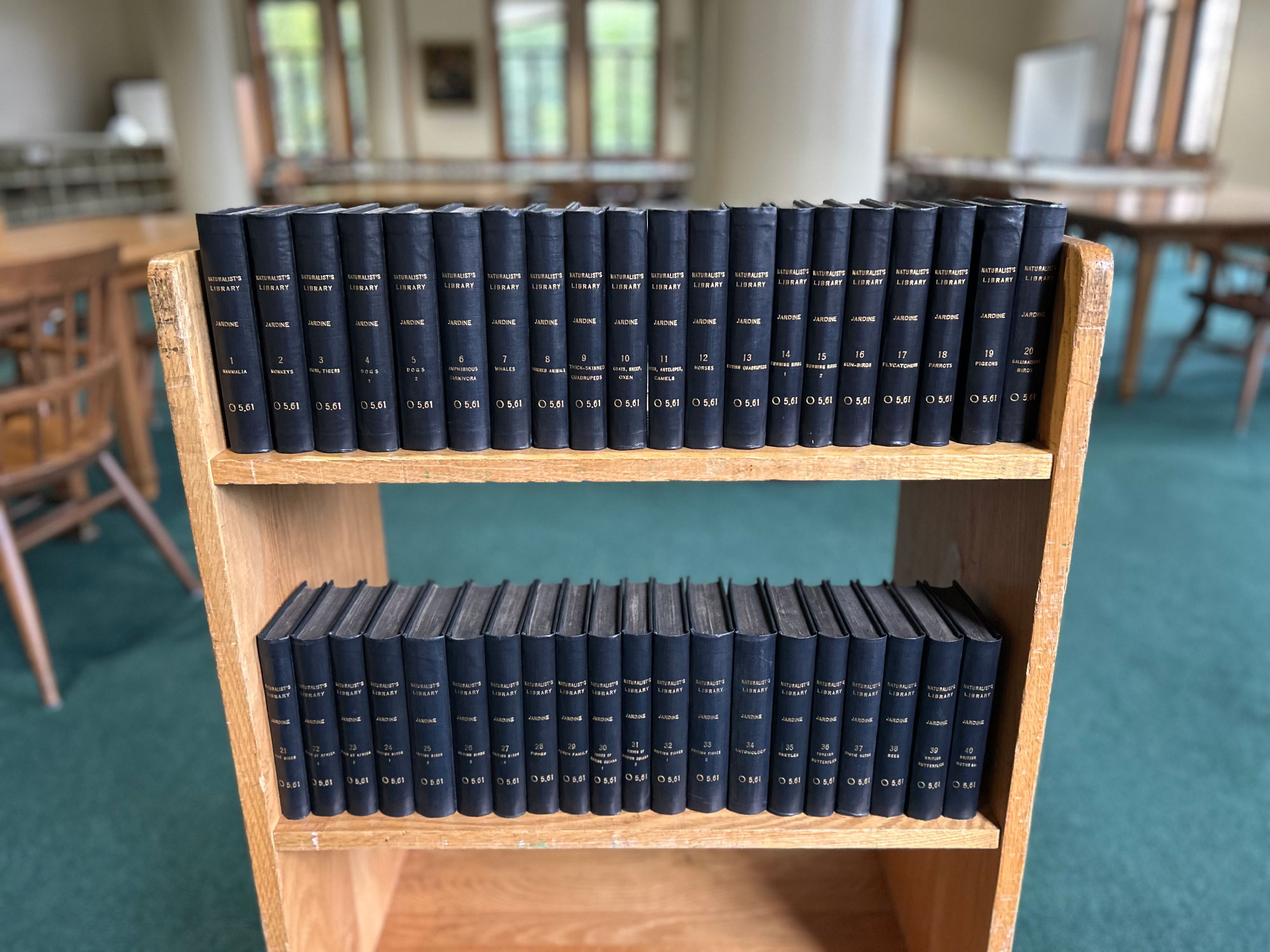
William Jardine’s Library, was a series of books created to bring the natural world into the homes of the Victorian middle class. It was originally published in 40 volumes in Edinburgh, Scotland by his brother-in-law, W. H. Lizars, between 1833 and 1843 and later divided into four main sections: Ornithology (14 volumes), Mammalia (13 volumes), Entomology (7 volumes), and Ichthyology (6 volumes). Each volume contained 30–37 plates of illustrations depicting wildlife paired with detailed descriptions as well as a memoir of a leading naturalist.
The Library is credited with having a significant democratizing effect on the study of natural history because Jardine and Lizars prioritized affordability and portability. Each book was only 4 by 6 inches and priced at six shillings, making them a much more accessible alternative to the “unwieldy folios” from other naturalists. This led to a tremendous demand for each one, resulting in tens of thousands of copies being printed overall. Just two years into publication, a notice appears at the beginning of one volume stating, “we have sold upwards of 60,000 volumes, in which there have been nearly 2,400,000 coloured plates given as Illustration.” Exact sales numbers are difficult to come by but history has shown that the series was very popular with estimates of 10,000 copies sold for each volume, totaling at least 400,000.
The large collection of wildlife plates is the centerpiece of the entire series. Traditionally, copper was used to print fine illustrations but typically wore out after several thousand printings, so to achieve the volume needed, Lizars used engraved steel plates which didn’t wear down as quickly. The illustrations were printed in intaglio where after the etchings were made, ink was spread over them and wiped off so only the ink inside the etchings remained for printing. The colors were added afterward by hand, mostly by women because they were seen at the time as more cost-effective. Despite my best efforts in emailing institutions around Scotland and England, I could not track down any surviving steel plates as they were likely melted down for other uses. Please contact me if any still exist.
The vast majority of plates follow the same style with a central colored figure surrounded by an ornate landscape of their natural environment. This design kept costs down by limiting colors to a central figure and allowed it to stand out from its surrounding environment. A handful of illustrations didn’t include a landscape and the entire volume on beetles didn’t include any. Below each figure was the English or scientific name of the species. The detail is a treat to examine. In total, there were 1,347 plates of wildlife published across 40 volumes, including the redesign of one set of plates for the volume on monkeys published in a later edition (see below).
Each volume was structured in the same manner, beginning with a memoir of a well known naturalist followed by an introduction to the volume’s topic and then descriptions of wildlife interleaved with plates. Two volumes included an extra memoir at the end and in a few later editions, the plates were collected at the end of some volumes.
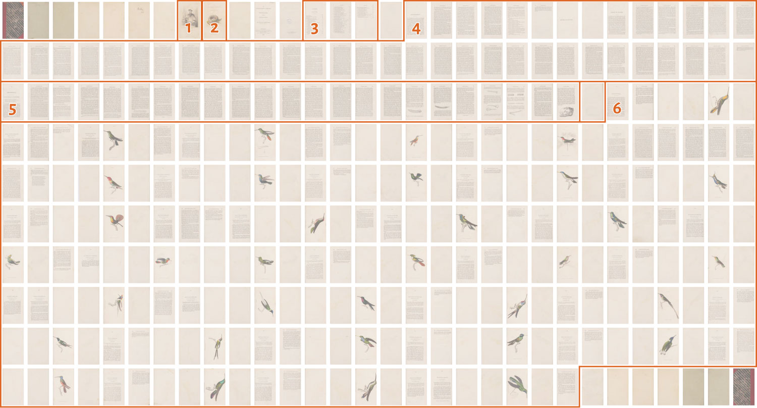
- a portrait of naturalist featured in the memoir
- the title page with a vignette of one or more animals or scene related to them
- table of contents
- memoir of the naturalist
- introduction to the volume’s topic
- descriptions of wildlife interleaved with plates
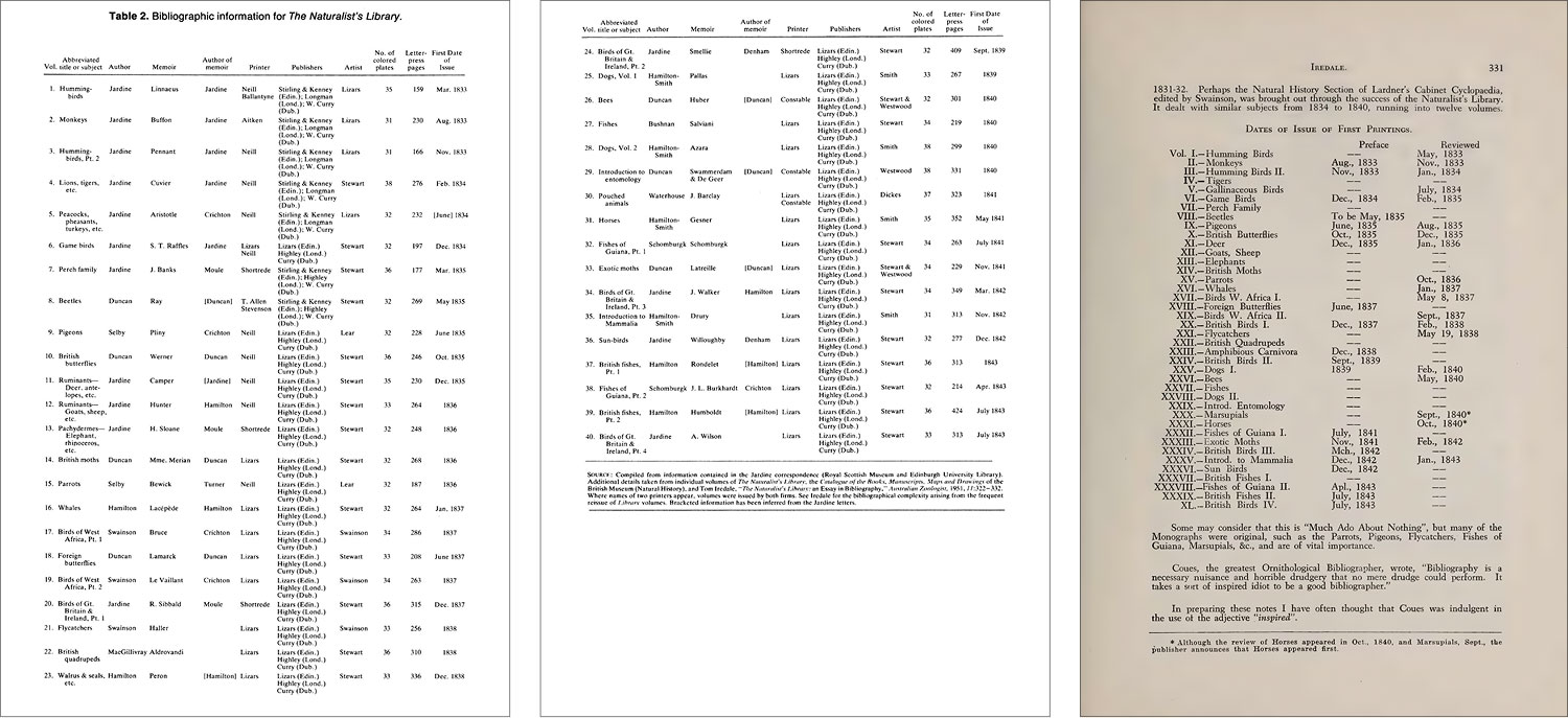
Determining the “correct” order in which these volumes were published was my first real puzzle because my research turned up several conflicting lists. Most grouped them by the four main divisions—ornithology, mammalia, entomology, and ichthyology (in that order) like the Biodiversity Heritage Library, Doull Books, Finarte, Swann Auction Galleries, and Biblio. However Jardine’s Wikipedia page lists them without divisions in a different order and with publishing years beyond the initial 10-year run (1833–1843). I naïvely assumed the later years were just reprints and that the division grouping was the “correct” order for the first two months of the project until I dug deeper and found excellent research papers that shed new light on the subject.
My first discovery was Sarah Finn’s college thesis from 2022, Thesis on the publishing history of The Naturalist’s Library, which she mentioned in one of her posts on Instagram. This was a great read and very enlightening. On page 10, she mentions an earlier paper from 1981 by Susan Sheets-Pyneson, War and Peace in Natural History Publishing: The Naturalist’s Library, 1833–1843, as being the source for her information on the original publishing order. Sheets-Pyneson’s paper is also an excellent read and very useful because the last two pages include a complete list of the original publishing order of all forty volumes. According to the footnote on the last page, her sources include Jardine’s own correspondence, the various publication lists included in some volumes, and a 1951 essay in the Australian Zoologist, which also lists the same order. Armed with this knowledge, I was confident that I had found the correct original publishing order. (Always read the footnotes.)
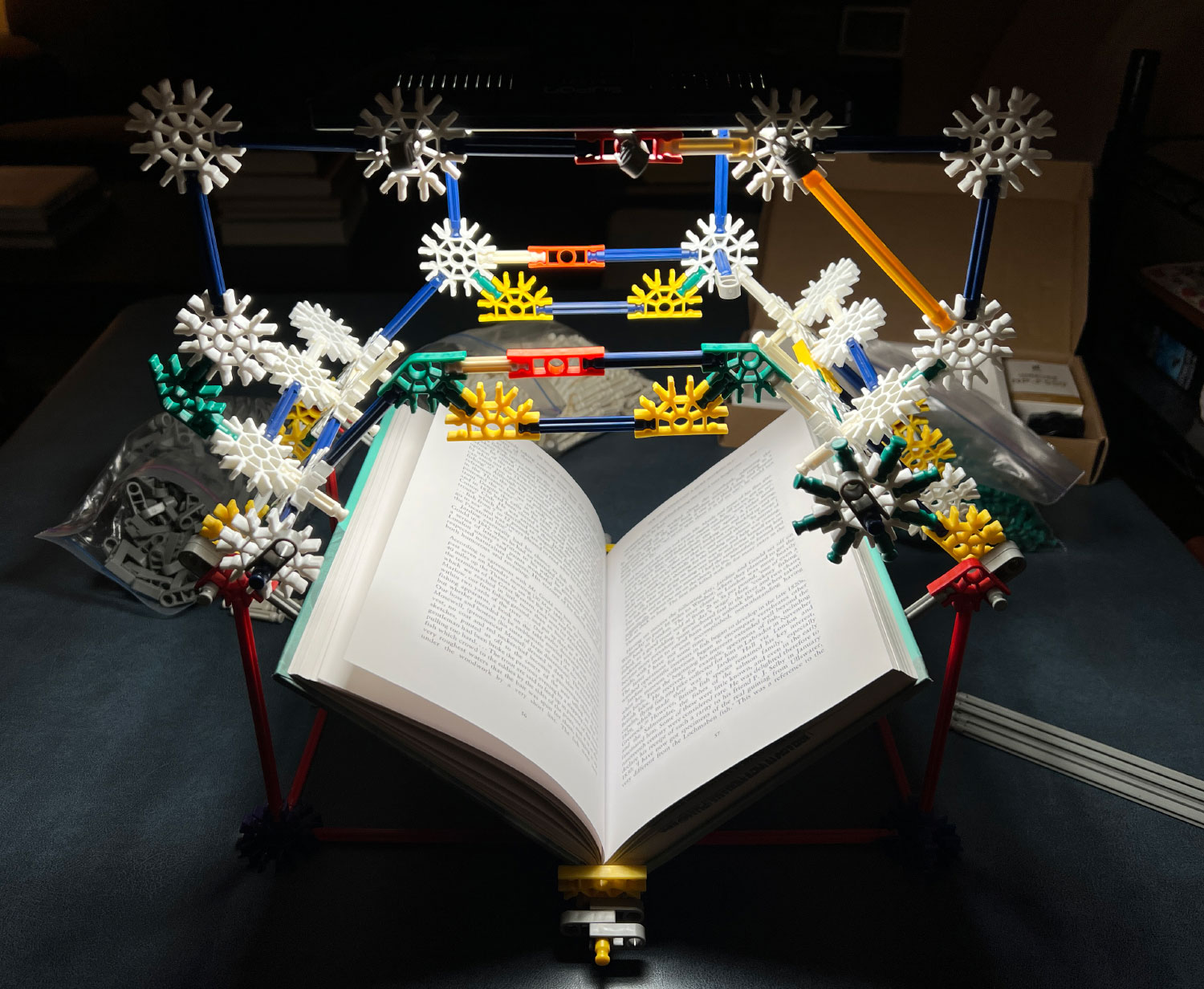
About a month later, I discovered a 2001 biography about Jardine, Sir William Jardine: A Life in Natural History, which only existed as a physical copy. I emailed the publisher to ask for a digital copy but had no luck. So I did what any self-respecting researcher would do and borrowed it on an inter-library loan and made my own digital copy by building a very janky custom rig out of old K’nex parts to take pictures of each page with my phone that I later combined into a searchable PDF. The OCR on it could be improved but having it available digitally allowed me to consult it in my research. It’s available upon request.
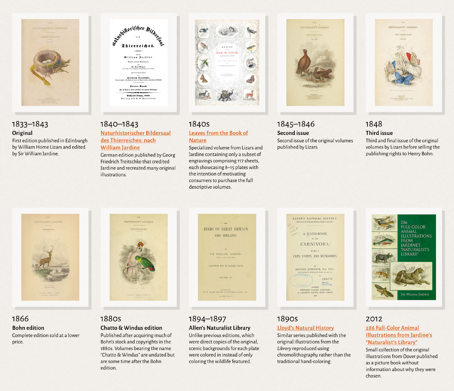
Jardine’s series remained popular throughout the nineteenth century and underwent reissues and rearrangements from multiple publishers. The initial run was not published in a logical order but intermixed “to give that variety which is essential towards keeping up the interest of such a work” (see advertisement to volume 1).
Developing a clear timeline of these editions was time-consuming but I was able to piece one together and included it on the about page. When Lizars first reissued the series in 1845–1846, they published a prospectus outlining the plan for grouping volumes into the four broad divisions in a more logical order, which was followed for subsequent editions. Apart from rearranging the volumes and plates, the text appears to have gone unchanged so I was able to consult any edition in my reproduction. In the end, I identified 10 distinct editions prior to my own.
I came across two books that were interesting for different reasons. The first was Leaves from the Book of Nature, a large elephant folio and specialized volume containing a subset of engravings comprising 117 sheets, each showcasing 8–15 plates. No descriptions were included. It was created to motivate consumers to purchase the full descriptive volumes. The only images of it I could find were low resolution versions on the Internet Archive, some select images on Philip J. Pirages’ store, and Picture Box Blue (Mammals, Entomology, Ichthyology). Fortunately, a few more images and a full video flip-through were posted by the Wilson55 auction group:
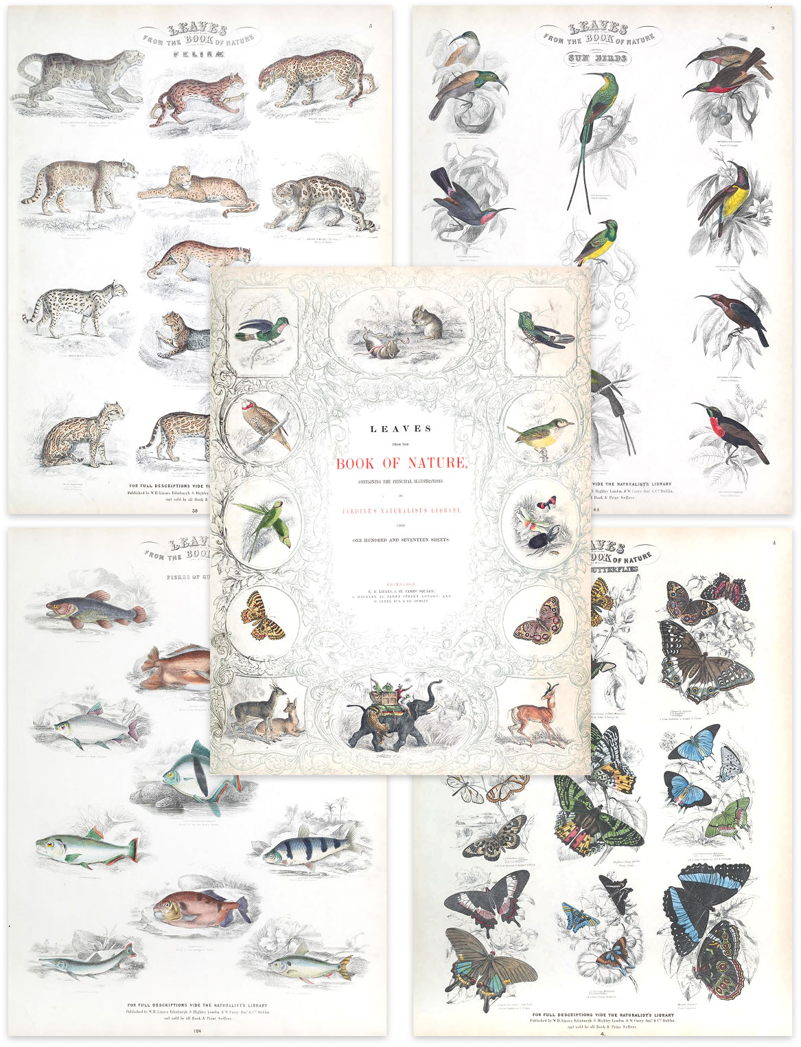
It’s a beautiful collection and the only version that shows multiple plates printed on each page. The vast majority of The Library’s plates were included (1,223), which begs the question of why the rest weren’t. Presumably, only the “best” were. Curiously, 15 plates seem to have been erased from the copy that was scanned for the Internet Archive but I couldn’t uncover a reason why.
The second interesting edition was 286 Full-Color Illustrations from Jardine’s “Naturalist’s Library,” published by Dover in 2012. It’s interesting because of the lack of explanation for why it was created. The description claims it “features 286 of the finest color illustrations from Jardine’s work,” but the scans on Google Books don’t do them any favors and I’d argue there are many more beautiful illustrations that could have been included. Why only 286 were selected and not a rounder number is also a mystery.
Despite thousands of copies having been published, finding high-quality, complete scans required a lot of elbow grease. I started by making sure that there was at least one of each volume available as a gut check to see if the project was viable. During this first pass, I found multiple scans of each volume on the Internet Archive, HathiTrust, and Google Books. Before restoring each volume, I conducted a more thorough search for every scan available to be sure I could use the best images. The quality varied quite a lot but the best scans could always be found on the Internet Archive.
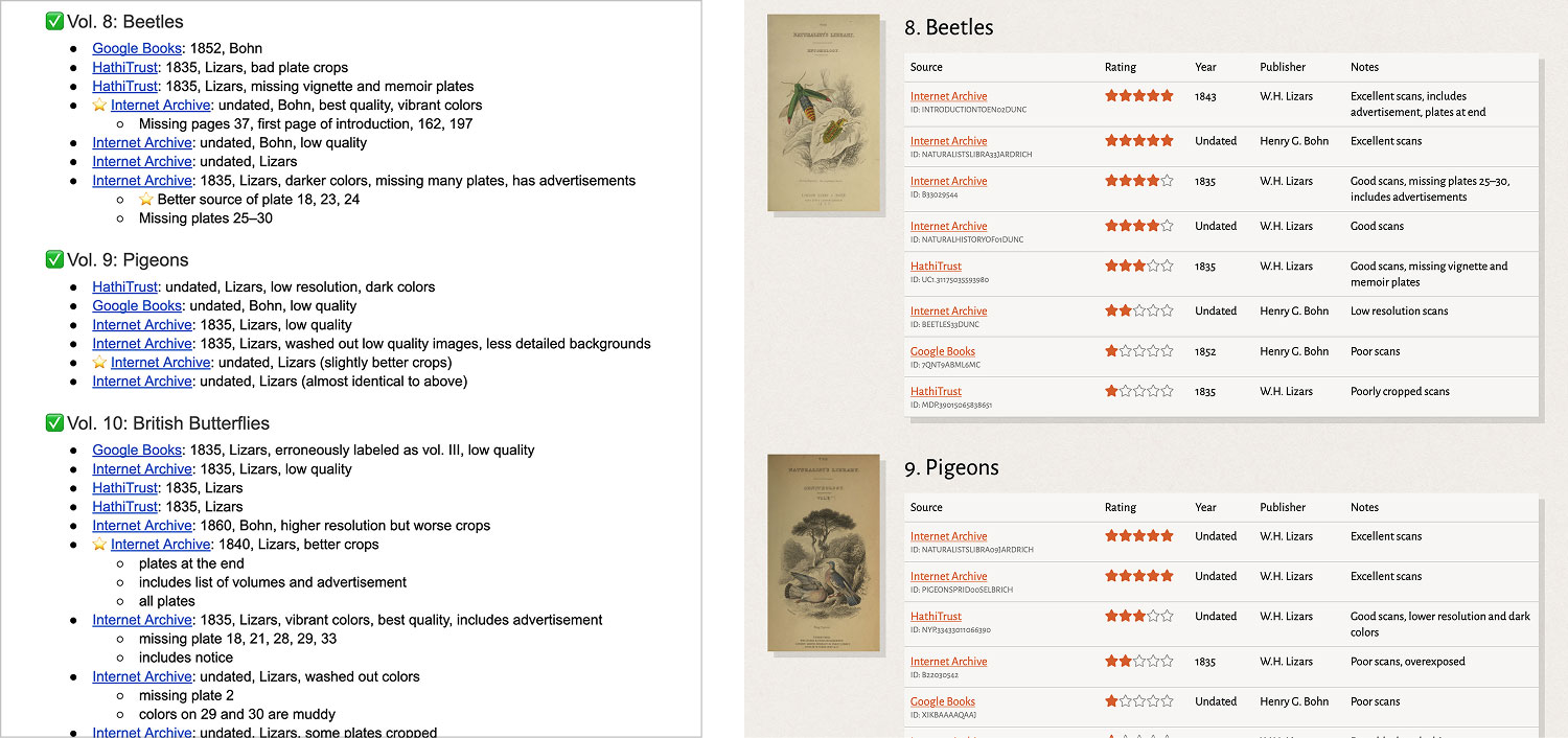
Depending on the publisher, there subtle changes were made to each volume’s contents, such as advertisements or lists of volumes published to date added at the beginning or end of a volume. Depending on the organization that uploaded the scans, there was also variance in the resolution and cropping. As I noticed these differences, I kept track of my own notes, which were eventually compiled into a comprehensive list with rankings for others that might find it useful in their own research. I can’t guarantee I found every copy, but I do think it’s the most comprehensive list of online scans available.
Two supplemental volumes were also published, A Natural History of the Human Species and A General History of Humming-Birds, or the Trochilidæ. The terminology and imagery used in the former was too offensive to reproduce and the latter felt unnecessary considering there were two volumes on hummingbirds already included in the main series. I opted to focus on the original 40 volumes.
Restoration
The restoration process was split into two parts: plates and text.
Plates
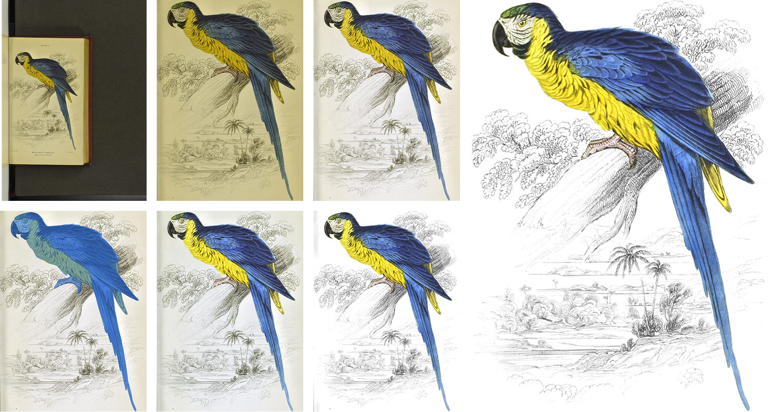
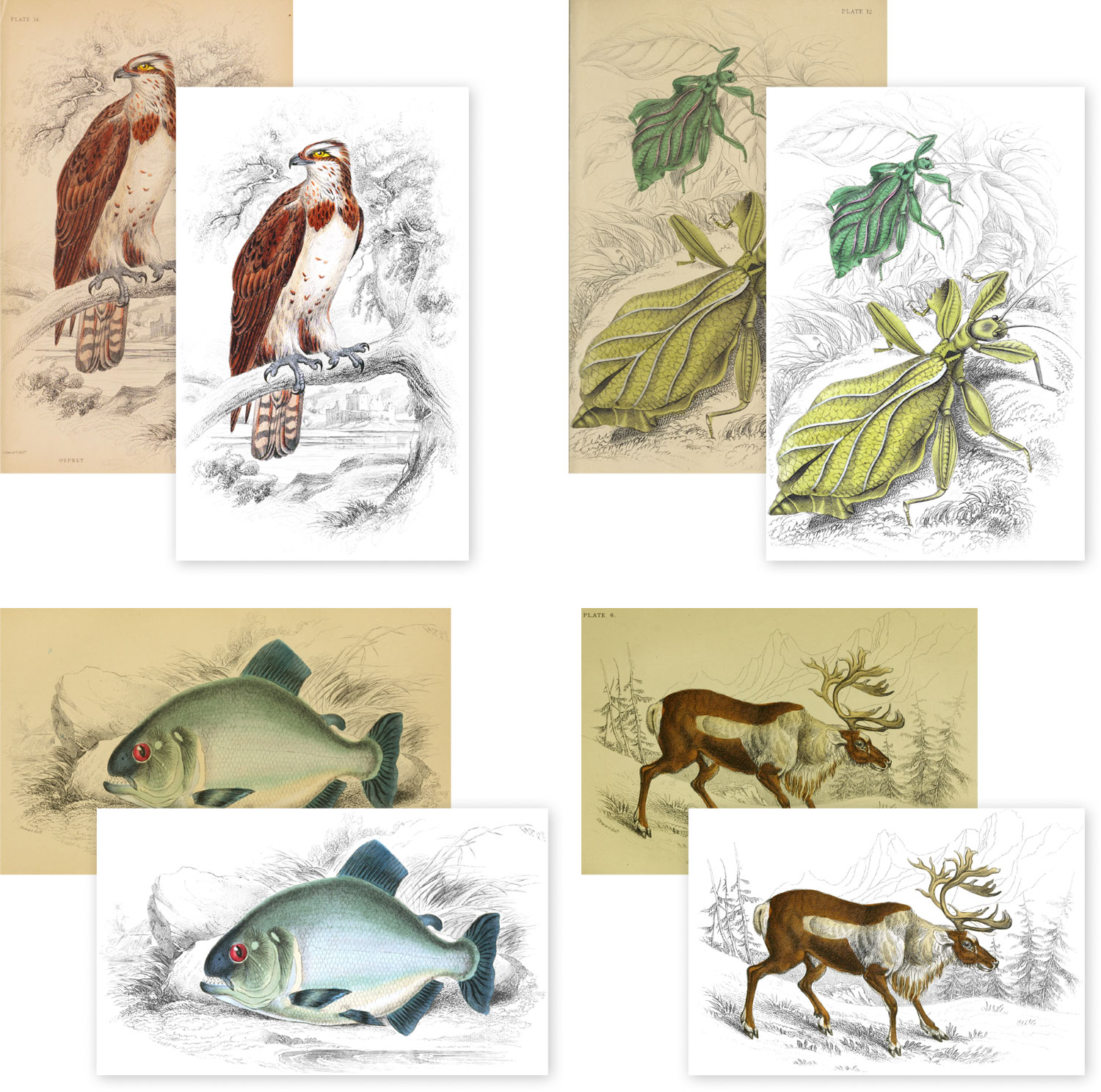
Each plate underwent the same multi-step, non-destructive restoration process I’ve used in other projects. After downloading the highest resolution version available with the best quality and colors, it was cropped and straightened. I used my tried-and-true method of using a semi-transparent threshold adjustment layer to find the brightest color and set the white balance. Depending on the results, additional color adjustments were added to brighten areas, make them more vibrant, or fix colors that didn’t age well.
Then came the time-consuming part. I wanted to make the central colored figure stand out ever so slightly more than the landscape behind it so I carefully created a layer mask by outlining so I could adjust its colors separately. The images from Leaves from the Book of Nature served as a good guide for how colors should look. This outlining process didn’t take too long for each one but required careful attention and when done for more than 1,300 plates, it added up (and took up a good chunk of hard drive space).
After creating the mask, the landscape backgrounds needed their own clean-up so the background was clean and white, minus any shadows from scanning, foxing marks, or other decay typical for old books. I converted the backgrounds to greyscale to start. Scans rarely had uniform brightness due to different scanners so I had to use several levels adjustment layers and selective making to make them so. Finally, I added a solid white color layer with a mask that I manually colored in to overwrite any non-white areas, preserving as much of the original illustrations as possible. Plates without color like those for memoirs and several title page vignettes, I only needed to do this latter part.
The final images were cleaner and more vibrant, reminiscent of what they may have looked like when they were originally printed.
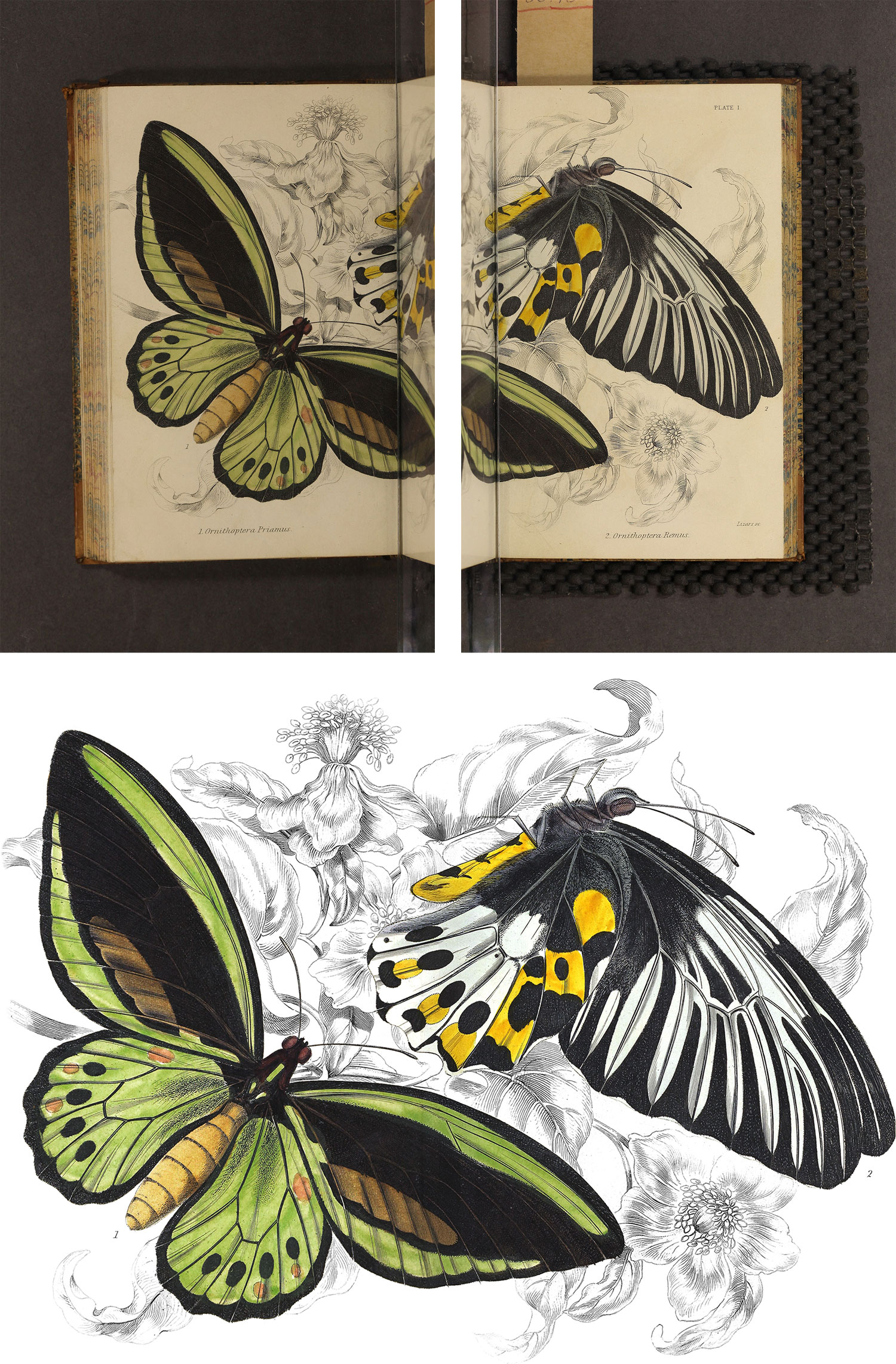
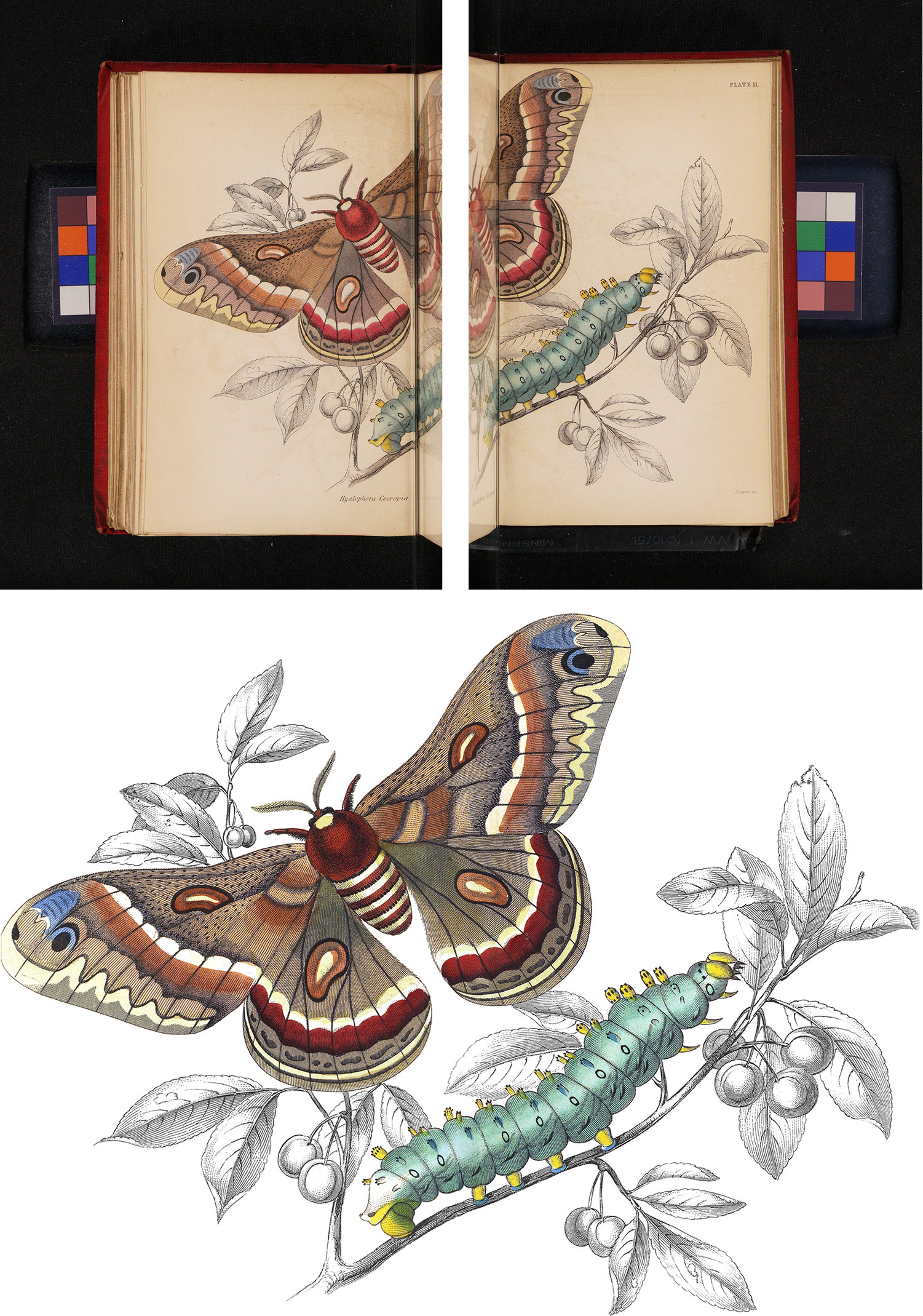
Two plates needed extra care and attention because they were too large to fit on one page and so were split across two scans. The plates needed to be combined into one image using a combination of careful manual cleanup and Photoshop’s AI tools to fill in gaps. The result is very close to the original.
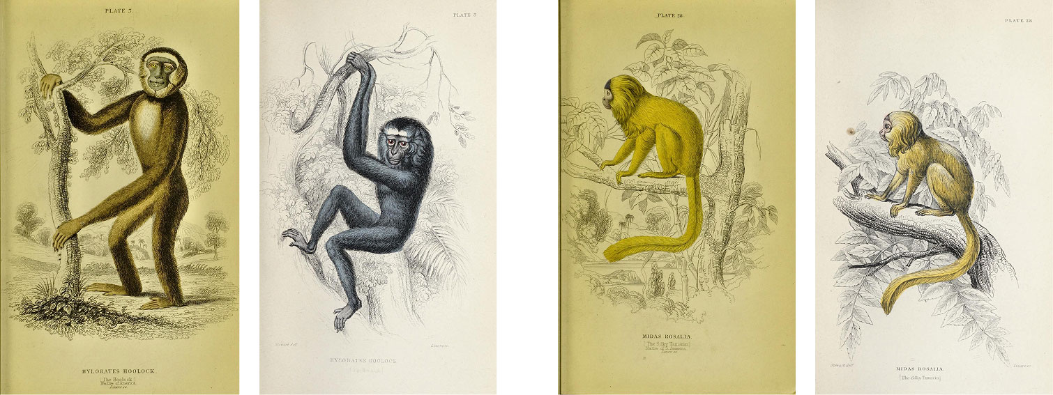
One mystery that remains unsolved is the set of revised plates for the volume on monkeys. When Chatto & Windus published their edition, their plates depicted the same monkeys in the same positions on the same scenery but they were clearly redrawn. I could not find a reason why but did find a comment criticizing them in a separate book about primates published by W.H. Allen (another publisher of a letter edition):
“It has been found impossible to reproduce any of the plates in the old ‘Naturalist’s Library’ of Jardine. They would have formed, with appropriate inscriptions, a very good instalment of a series of ‘Comic Natural History’ volumes, as they were, in fact, nothing but a set of extraordinary caricatures of Monkeys”
Whether or not the perceived low quality was the true reason for the revisions, I’m not sure, but many do look much better than their originals.
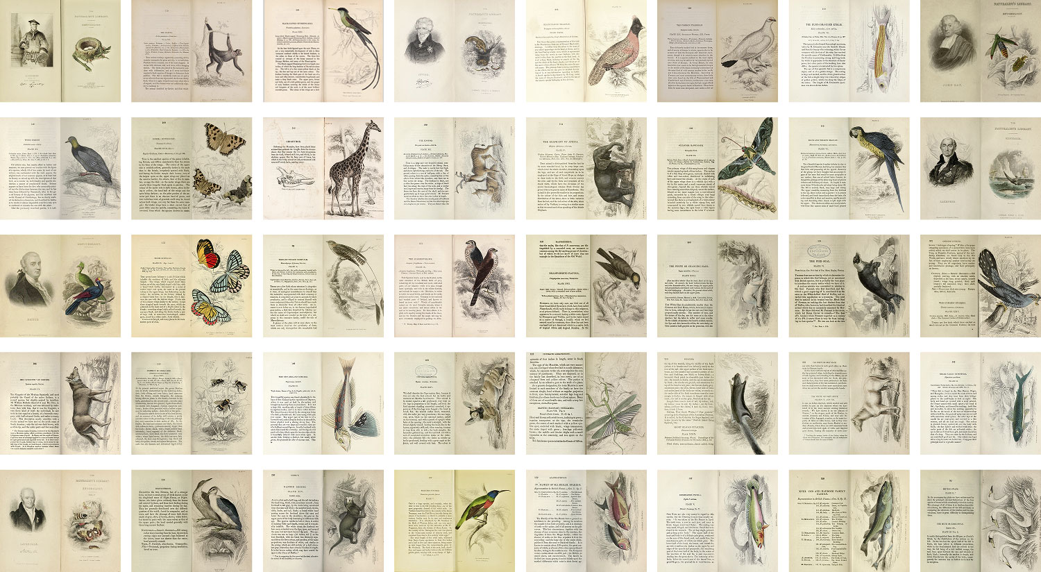
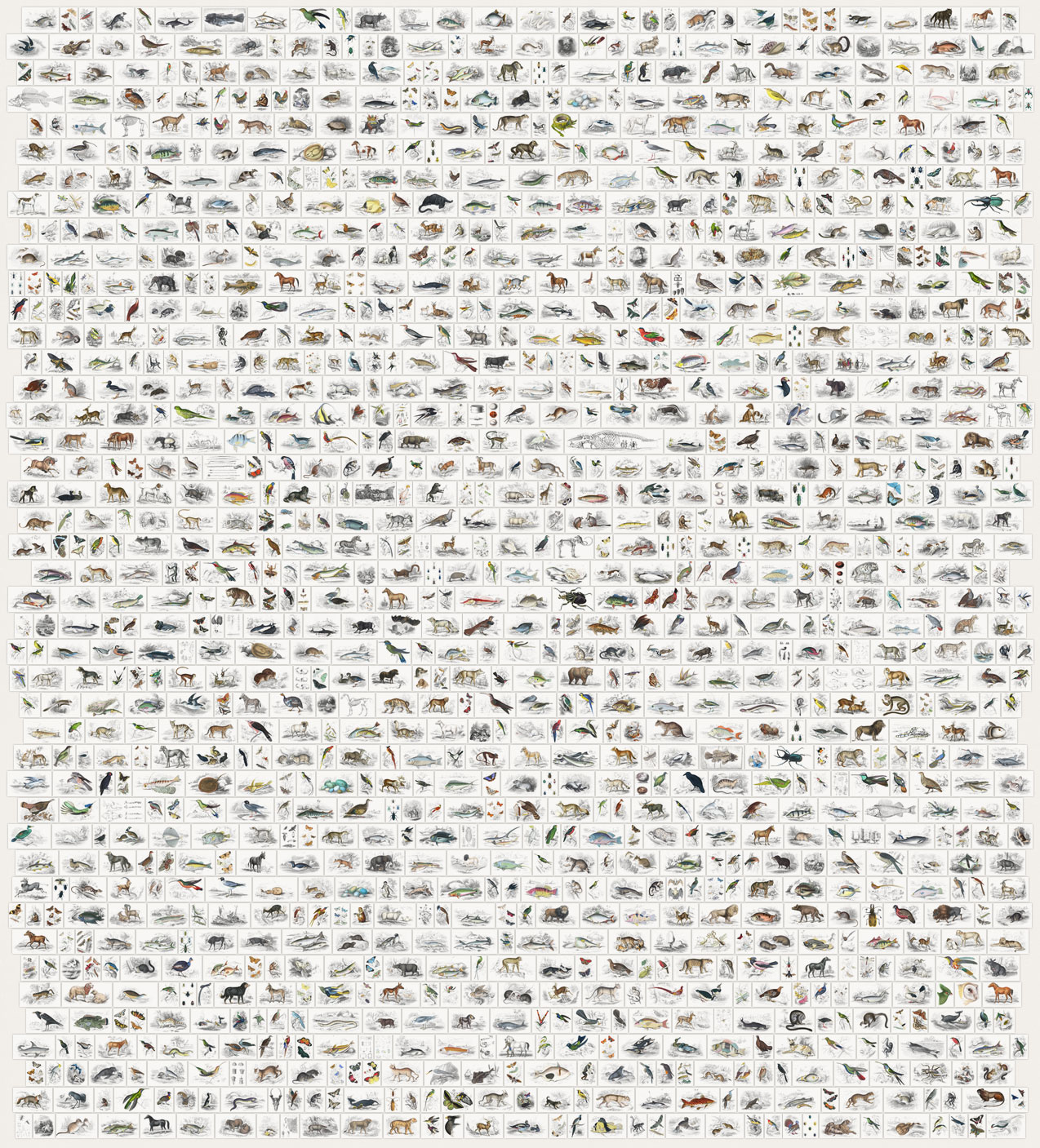
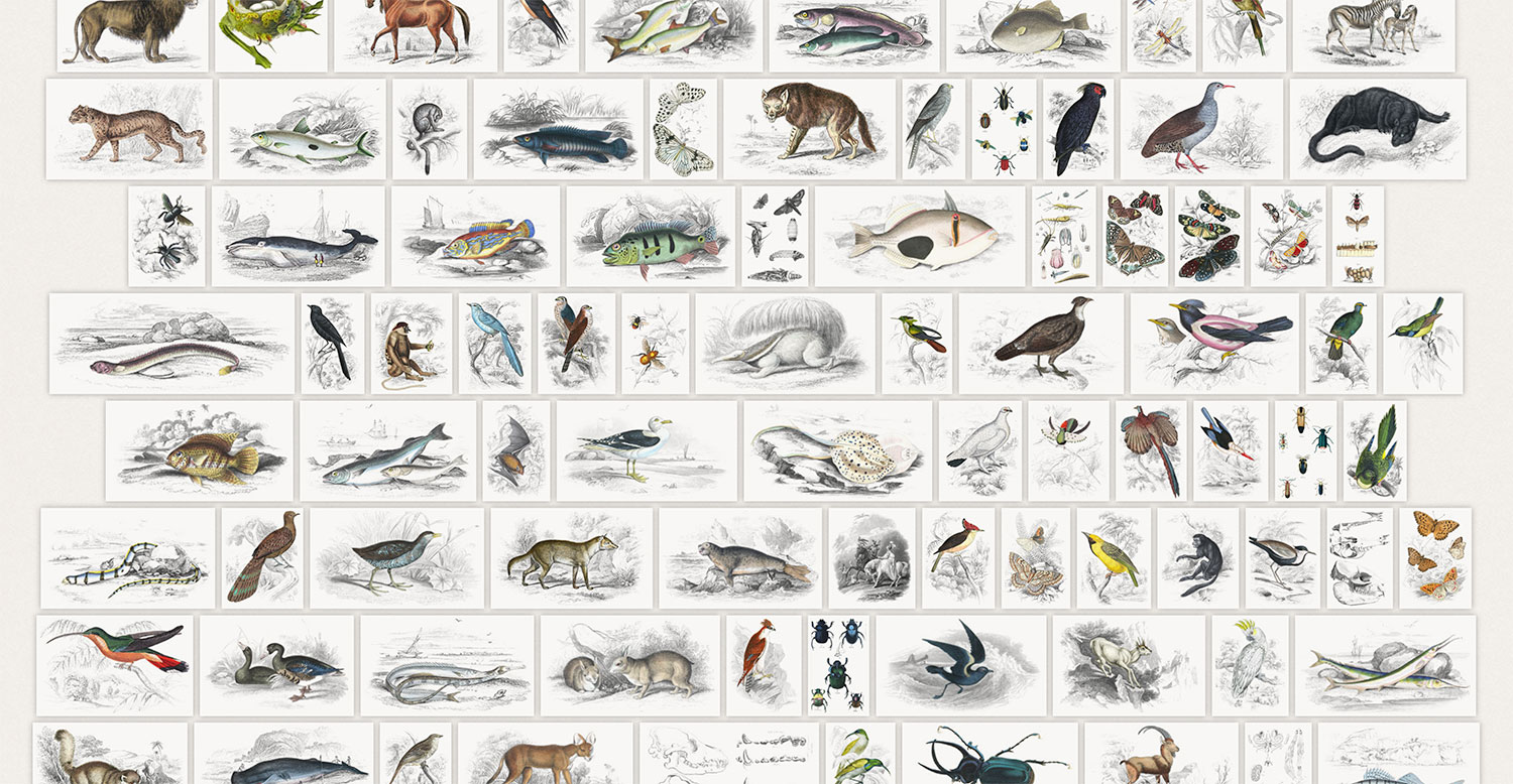
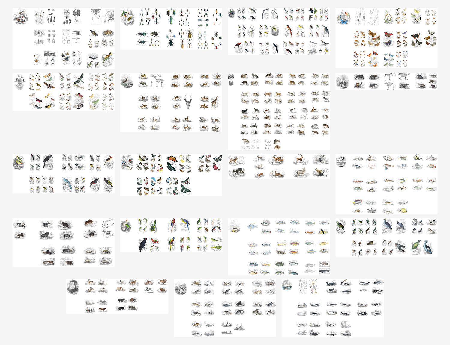
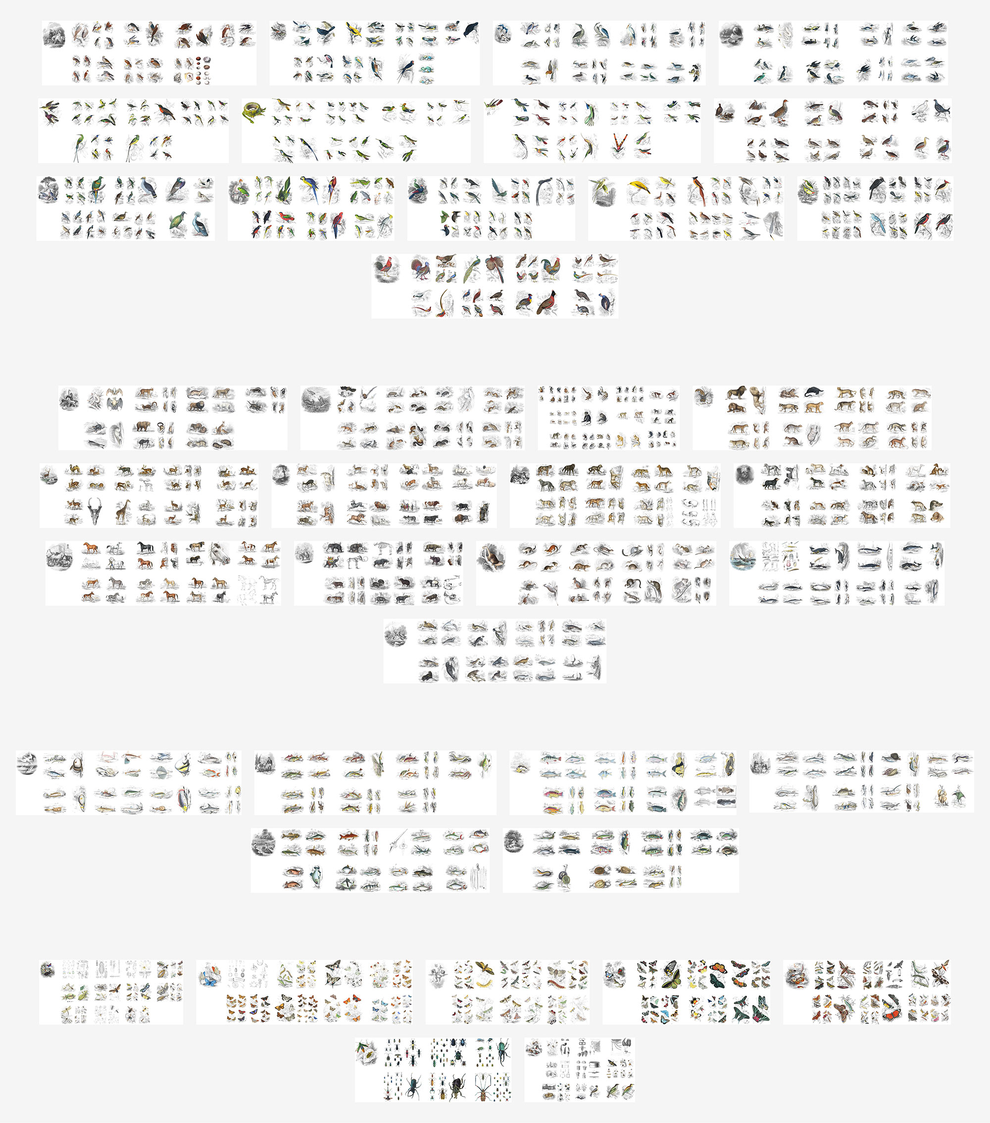
In total, 1,387 plates were restored, including the 40 memoir portraits. Below is a large collage of the vast collection.
Text
Restoring the text of each volume also required its own process. The OCR capabilities from the Internet Archive are good and served as the basis but still needed a lot of clean-up. I downloaded a PDF of each volume and copied a section at a time into a local copy of TinyMCE configured with the formatting options needed for the site and cleaned up the text there before adding it to the site. I kept the PDF visible while formatting text as a reference point.
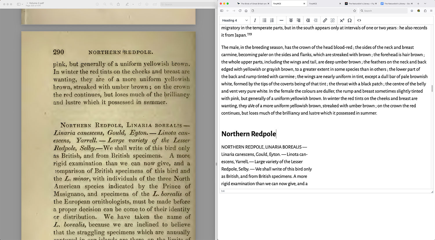
I’ve used this process for name projects and it works well for me because it allows me to get the HTML just the way I want it. There are ways this could probably have been automated but not in a way that would catch all the nuances that come with old books like this (e.g. fixing line breaks while preserving others, the occasional switches to other languages, obscured text from page creases, italicized text, etc). I also simply enjoyed doing it.
There were dozens of errors common among all OCR’d text so I skipped them during this initial pass and corrected them later when I finished each volume. Common punctuation errors included extra spaces (typically before semicolons and colons), converting straight quotes/apostrophes to their curly equivalents, extra hyphens next to em dashes, etc. Common misspellings included changing “bv” to “by,” “tlie” to “the,” “to he” to “to be,” etc. as well as adding ligatures like “æ” and “œ” where appropriate. Some could be done with a simple find-and-replace but most had to be checked one at a time to avoid fixing something that didn’t need fixing. Doing this cleanup saved time from doing it on the next step because I could fix errors en masse or very quickly.
The step of spellchecking was the least fun. The problem with spellchecking old scientific books is four-fold:
- archaic spellings were used that are considered incorrect in modern dictionaries,
- scientific names are typically not in dictionaries,
- multiple languages are used for quotes and book titles, and
- OCR’d text is never perfect.
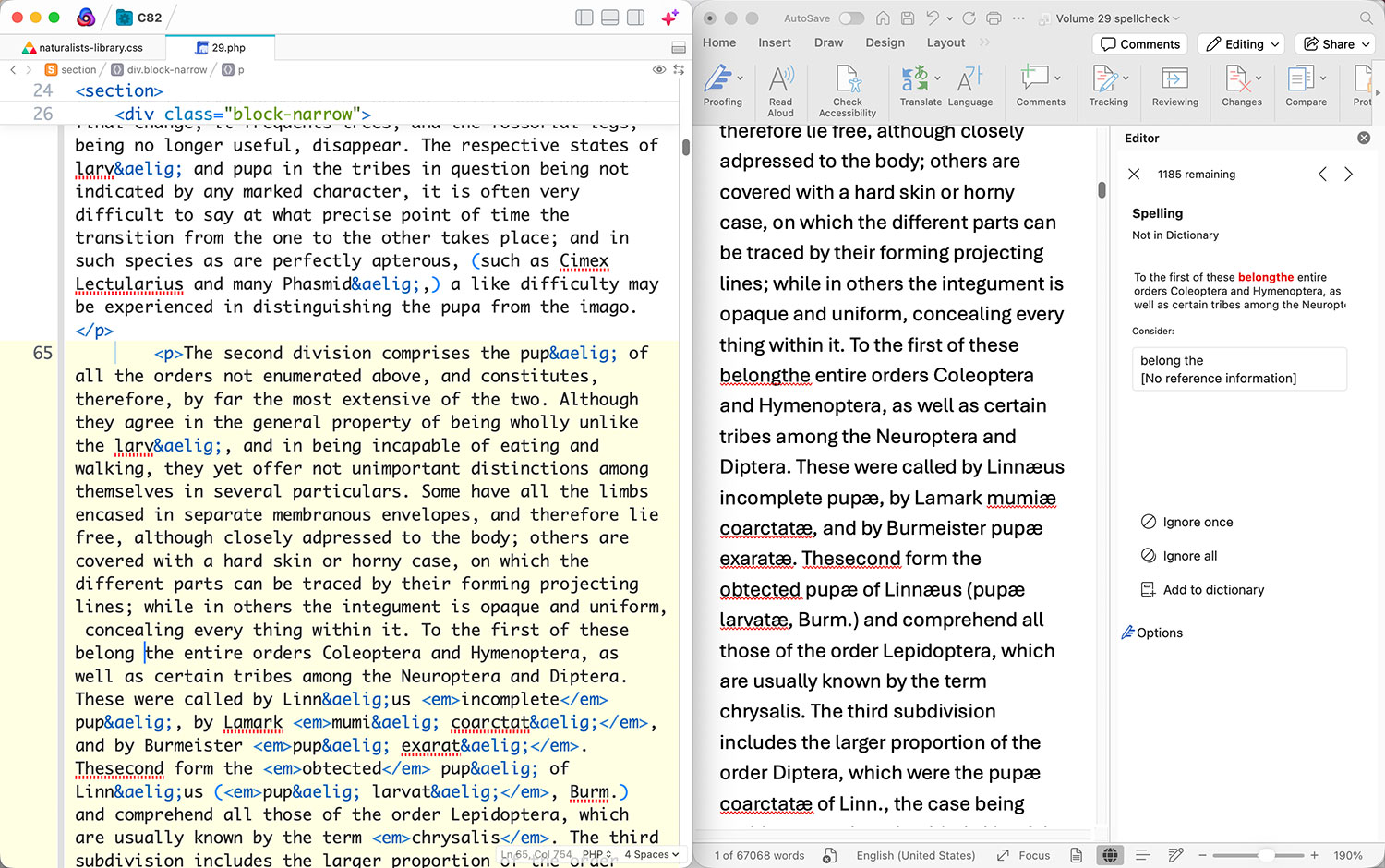
Despite all these problems, spellchecking was still a must but it was daunting to see hundreds or thousands of errors that needed to be reviewed…one at a time. The catch was that all the text was written in HTML and the code didn’t need to be spellchecked—just the actual text, but corrections need to be made in HTML. I worked around this by loading a volume in the browser, copying that to TextEdit to convert it to plain text, and then copying the resulting text into Word. From there, I put the HTML on one half of the screen, Word on the other half and stepped through every error, correcting each in both places so the HTML was correct and the text in Word acted as a checklist for what remained. The tricky part was going through them quickly—making the necessary corrections and skipping the many, many unnecessary ones. I often had to consult the scan is the original to confirm if errors were truly errors. This process resulted in digital versions that were very true to the original. It’s likely some errors slipped through but far fewer than if I had skipped these steps.
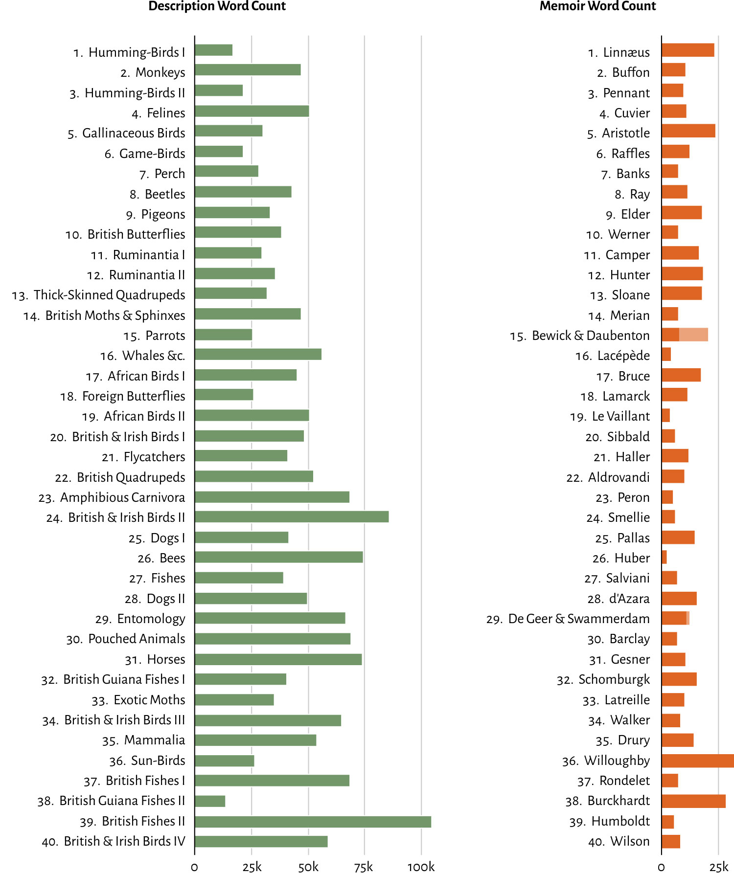
I kept track of the word count for each volume and found a few items of note. As the series was published, volumes generally became longer, topping out at more than 100,000 words in the penultimate one covering British fishes, primarily due to the 77-page synopsis at the end of it covering both volumes on the subject. Differentiating between length of the main descriptive text and memoirs highlighted how in two volumes—the second volume on fishes of British Guiana and the first volume on humming-birds—the memoirs were longer than descriptive text (Burkhardt and Linnæus). John Swammerdam has the shortest memoir at just over 1,800 words (likely due to being appended at the end of a volume as its second memoir) while Francis Willoughby’s was the longest at nearly 32,000. The shortest volume overall was the second volume on humming-birds with about 31,000 words but the shortest descriptive text was the second volume on fishes of British Guiana with 14,000. In total, there were 2.35 million words across all volumes.
Words were counted by first removing text I added to the digital edition such as alt text, plate captions, etc. and then copying all remaining text on a volume’s or memoir’s page into TextEdit to convert it to plain text. That text was then copied into Word to get a word count.
Digital edition design
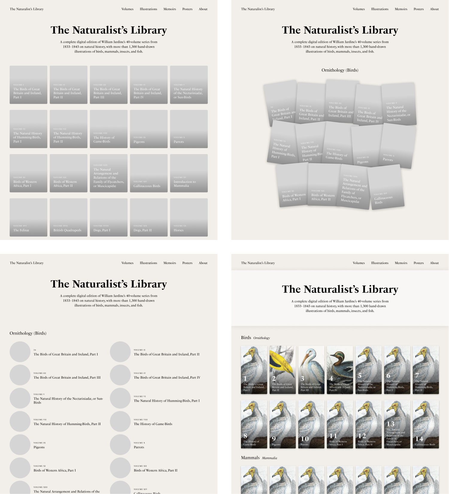
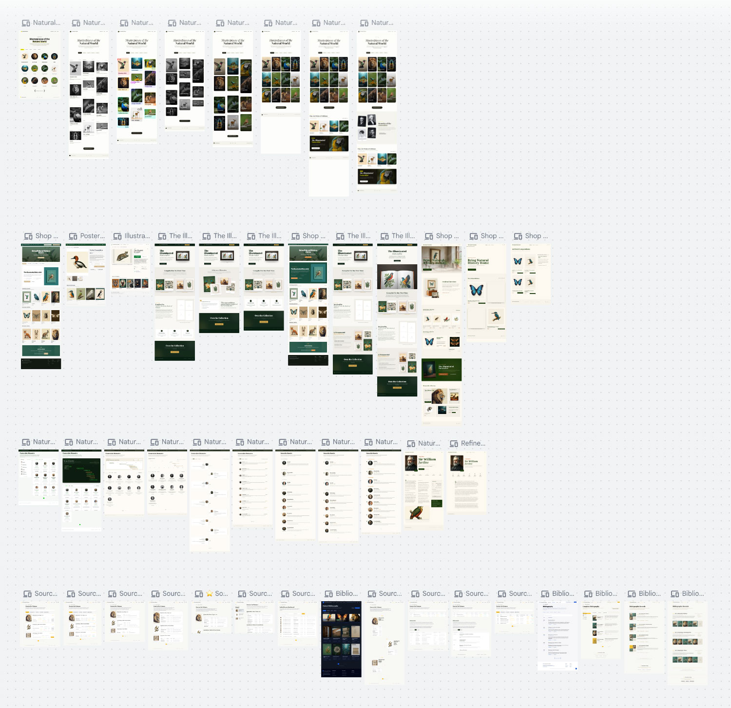
When I design my own projects I rarely create comprehensive mockups of every page because the rough picture in my head is enough to guide me. Iterating on the real website is far more efficient than polishing mockups only to remake them later and find that my ideas needed to be reimagined. I still do a fair amount of experimentation in Figma to plan out basic structure but only just enough to get a starting point to build. The design for this digital edition started very plainly. I knew that I wanted a homepage showcasing all 40 volumes with representative thumbnails and each volume would get its own long page with plates and text. Given how beautiful and detailed the plates were, they deserved to stand out while the other design elements were more subdued.
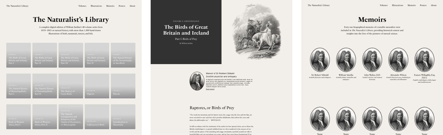
I tried a few variations of the homepage, volume template, and memoirs but the design was too plain and lifeless. Considering the topic was natural history, it needed to feel more alive and down to earth. It needed character. As I slowly worked my way through each volume, I continued to experiment with colors, layout, typography, etc.—focusing mostly on the volume template since that was where all the content was.
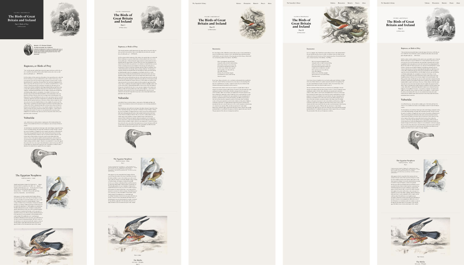
Typography sets the tone for a project so I turned my focus to finding a good set of typefaces to add more life to this one. I used PS Fournier in early designs and while it was a perfectly nice typeface, it felt too stuffy. I tried many great serif fonts that were used in my previous projects before finally realizing that a sans-serif style might work better. A few years prior, I used the Alegreya family on a reproduction of Iconographic Encyclopædia, and really enjoyed working with it. The serif style was primarily used on that project and sans-serif was used for smaller, ancillary text. The sans-serif style proved to be a great choice for the primary body text of The Naturalist’s Library because it was easy to read and had just enough character to make it feel more alive than more traditional typefaces.
While Alegreya Sans worked for body type, it was still too plain for headings. The decorative headings in Leaves from the Book of Nature and on the title page of each volume were an excellent source of inspiration with their blend of decoration and utility. I wanted to mimic these somehow and after hunting around for similar decorative lettering, I found a few that were close in spirit including Alta Mesa, which I used in my reconstruction of the organizational diagram of the New York and Erie Railroad and even considered converting an old ornamental specimen from 1815 into a custom font but they just didn’t sit right. However, they were too decorative and difficult to read beyond a few words and nearly illegible at smaller sizes. I tried mimicking the outlined style of the title page headings with some standard fonts like Literata or Roboto but again, they were missing something. I stumbled across a short article featuring Rig Solid and had an “aha moment” when I saw how its different styles could be combined. It was bold, had just enough character, and was legible at all sizes. I felt it complemented Alegreya Sans very nicely.
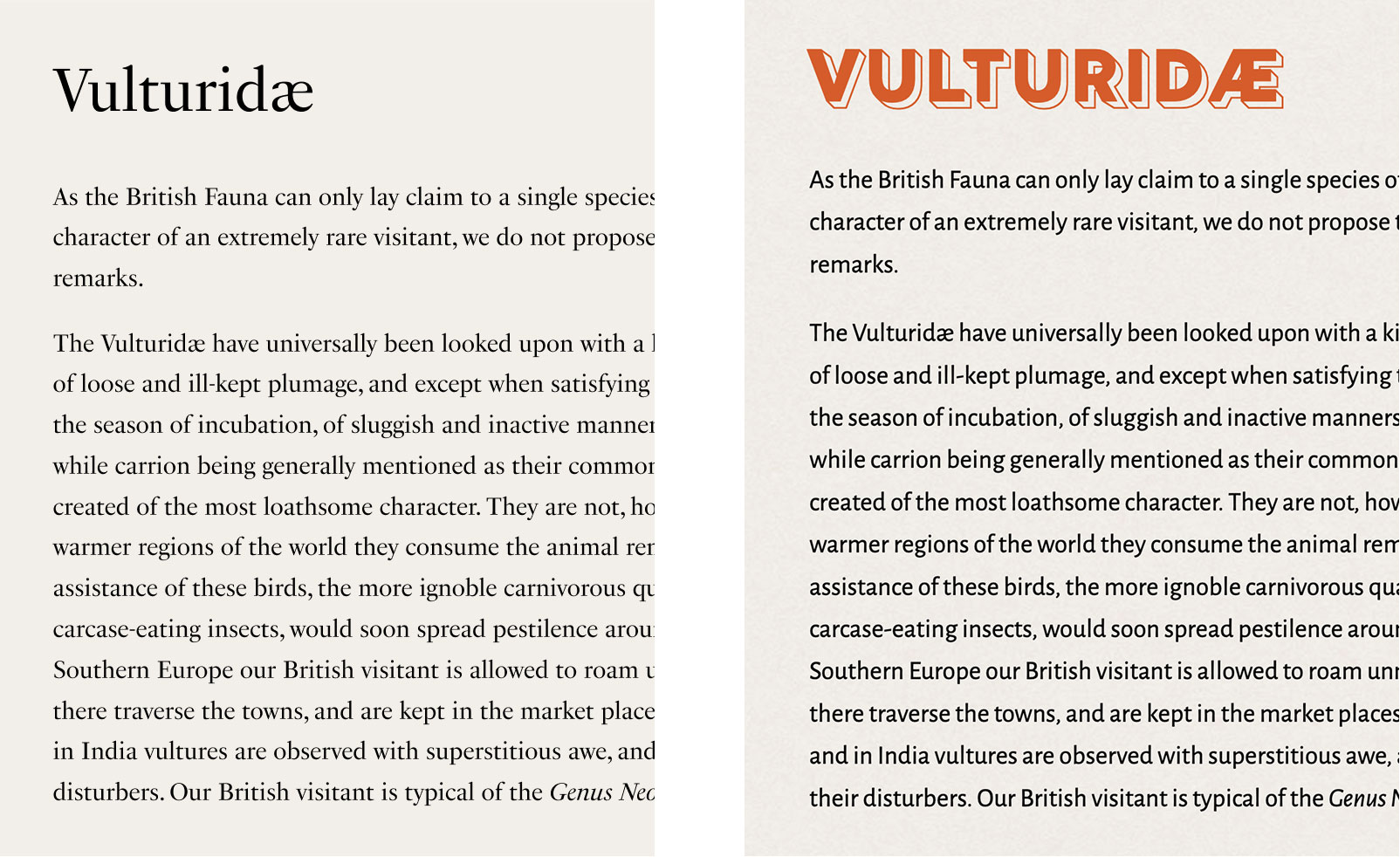
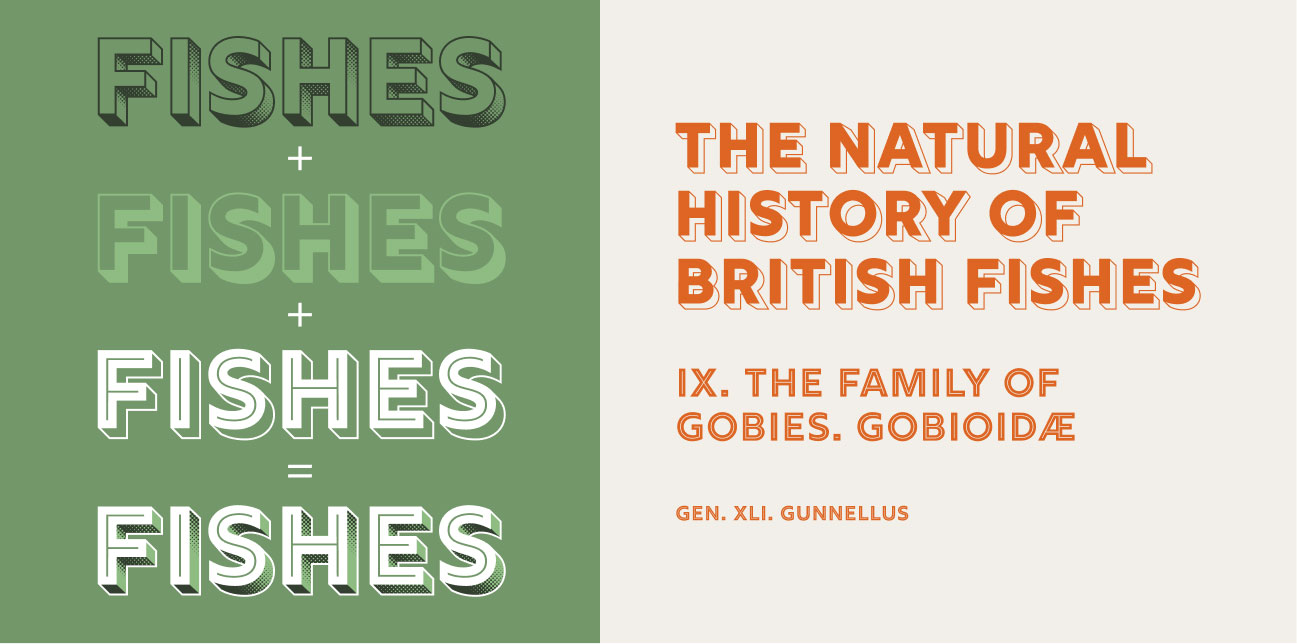
When I started experimenting with splashes of colors found in nature like green for the navigation and title areas, and orange for accents like headings and links, the design finally started coming together. I liked the example shown in the article of how multiple styles of Rig Solid could be layered so much that I deconstructed it and designed my own variation comprising three weights for volume and page titles. Less decorative styles were used for secondary headings, tertiary headings, etc. This created a clear visual hierarchy while scrolling through long pages while adding a bit of texture to long-running sections.
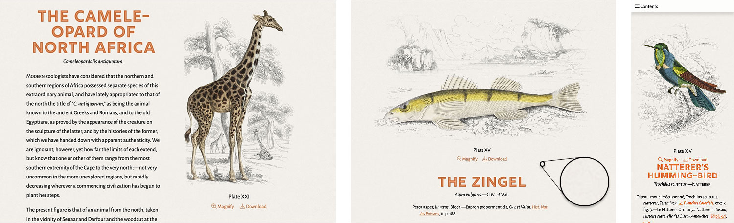
I felt it was important that when a plate was scrolled into view, it was always framed well so the entirety of it and its title were visible so I spent a great deal of time fine-tuning a design framework to handle both orientations. Landscape-oriented plates always leave just enough space below them so their titles are visible and are shown wider than their descriptions. If screen space allows, portrait plates are displayed alongside their name and description and stay visible while scrolling through the description. On smaller screens, the display is uniform across all plates with the plates centered above their descriptions. To make the plates feel more integrated, I also set their blend-mode to multiply so the pure white background blends seamlessly into the light tan used as a background color. I also added an extremely subtle paper texture from Unsplash throughout the digital edition so the plates appear as if they were drawn right on the page. All plates are shown in their original high resolution for maximum detail, they can be magnified, and are available for download for any use under the CC0 1.0 Universal (CC0 1.0) license.
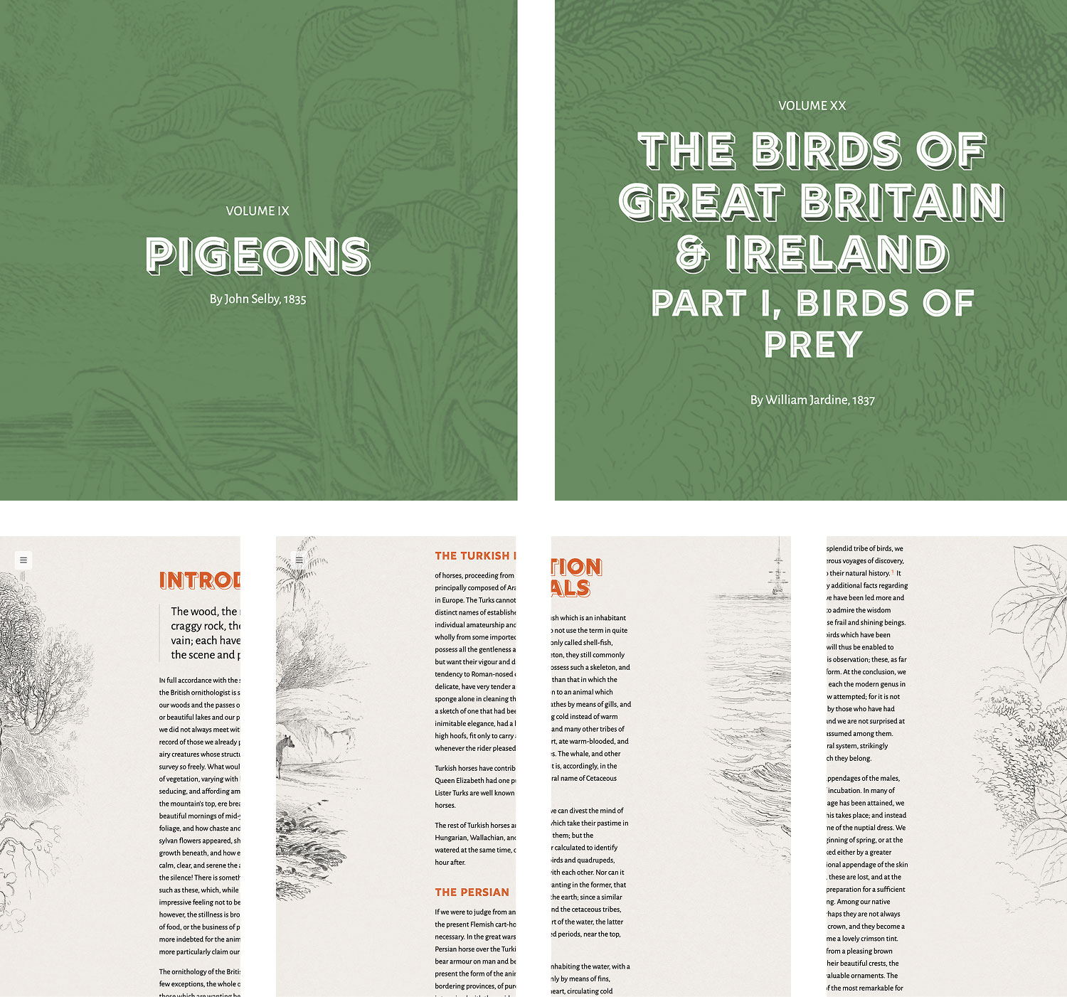
The landscapes behind the colorful figures are easy to overlook. As I restored each plate, I enjoyed examining them and when I was looking for a way to add more variety to the volume template, they were the perfect fit. A landscape from one of the plates in each volume was used as the background behind the volume’s title—subtly setting the stage for the topic. To break up the longer “walls of text” where there were no plates to display, I also included long vertical slices of the left or right edges of plates from that volume decorating the edges of the page. The images are only displayed on larger screens like laptops and desktops and not on smaller screens. They alternate from appearing on the right or left sides to keep the page feeling fresh while scrolling. The one exception is the volume on Beetles, which didn’t include any landscapes so I used the impressive illustration of a Goliath magnus beetle as the background. Apart from its introduction, the beetles volume didn’t contain any lengthy sections of text. Using the landscapes this way presents a subtle unique brand for each volume while maintaining consistency with the overall design. A couple select background images were also used behind the main title on the home page and the callout at the bottom of every page.
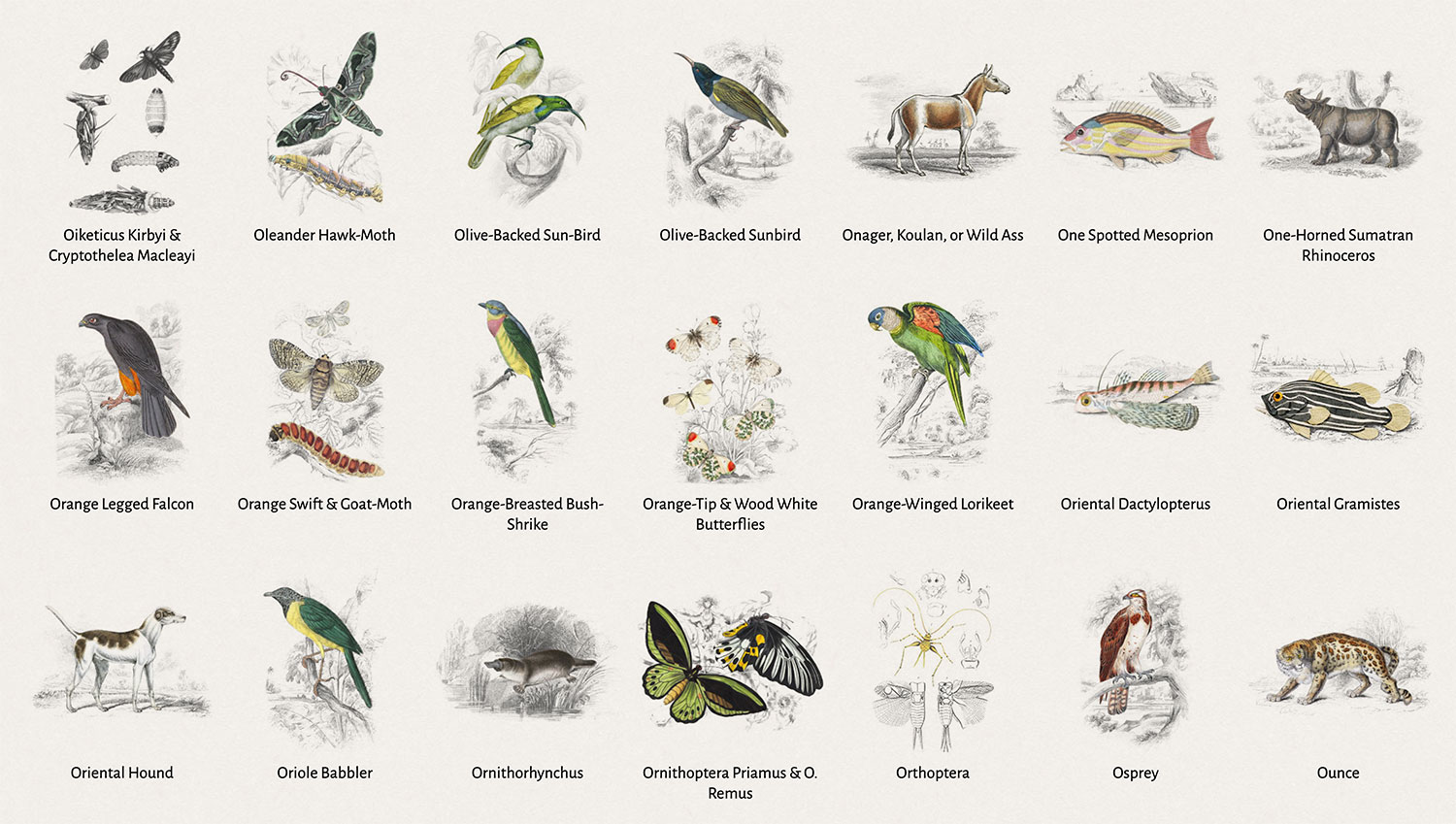
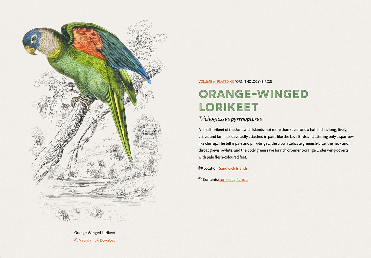
I also created a dedicated Illustrations area to explore all the wonderful illustrations without scrolling through each volume. This area includes a feature to filter illustrations by volume number, division (mammals, birds, insects, fish), the contents depicted (e.g., dogs, butterflies, etc.), and locations that were mentioned in their descriptions. Each plate also has its own page to view all the details including a summary of its description and a link back to the volume where it appeared. I intentionally avoided paginating the list of illustrations because I wanted to be able to explore any list of them all at once. This makes for a long page but it was simpler to build than pagination or any kind of virtualization. As an added bonus, I added a collage feature that presents the current illustrations in a randomized compact list without any labels. Its usefulness is debatable but I thought it was fun way to explore plates and create some nice graphics for other uses.
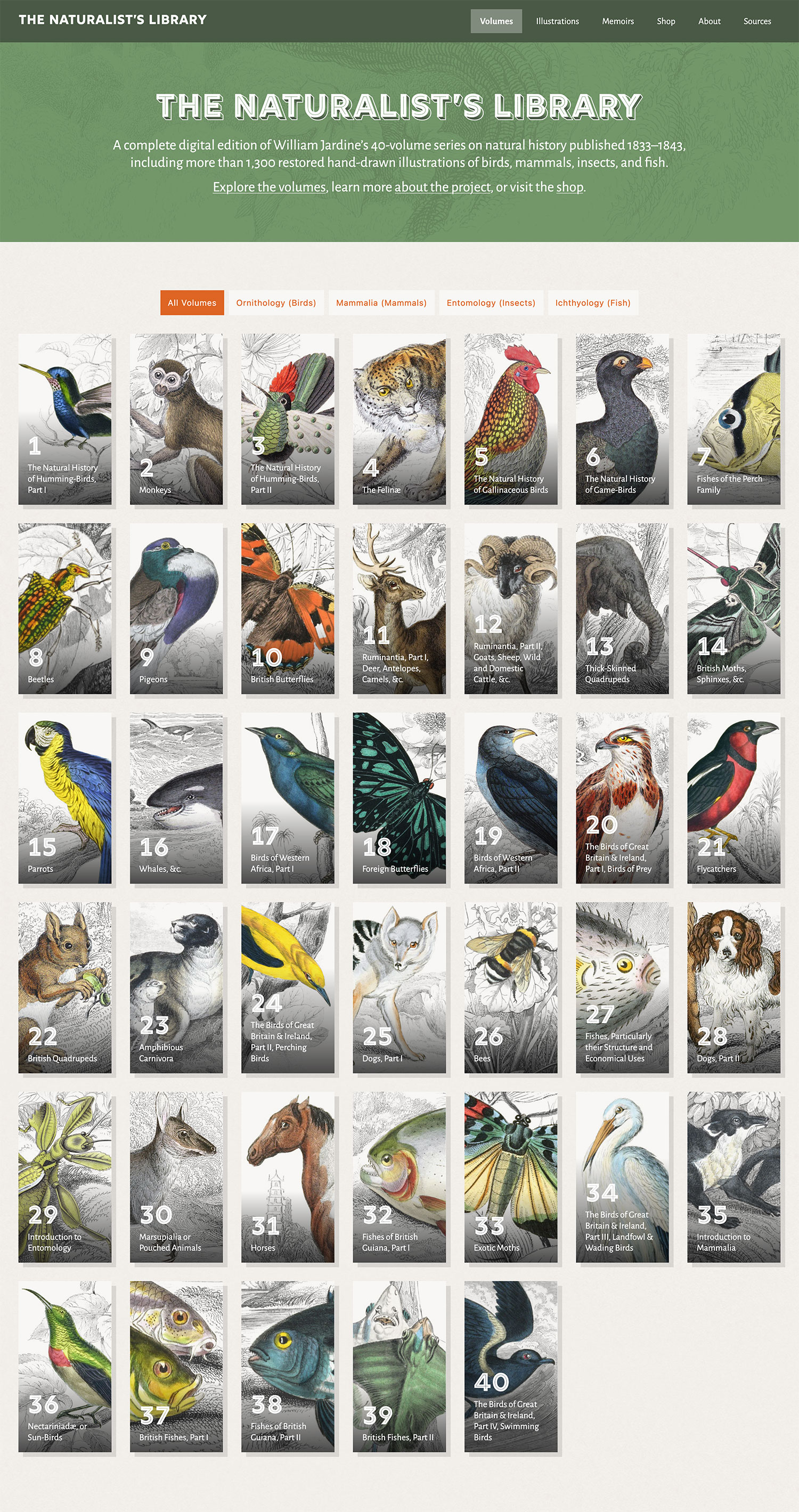
The home page underwent several revisions and felt like the most difficult to get right. From the beginning, I knew it needed links to all 40 volumes, ideally featuring a plate from each. The challenge was finding a comfortable way to feature them while keeping the titles legible. I tried a lot of variations of the main grid, groupings, widths, etc. and settled on a simple grid reminiscent of a bookshelf with tall narrow images.
Despite settling on a design, I didn’t know what the final arrangement would look like until the end of the project. I didn’t know what plate should be featured for each volume until after all the plates for it had been restored and I had a chance to evaluate them. It was great fun seeing the homepage menagerie come to life as each volume was completed.
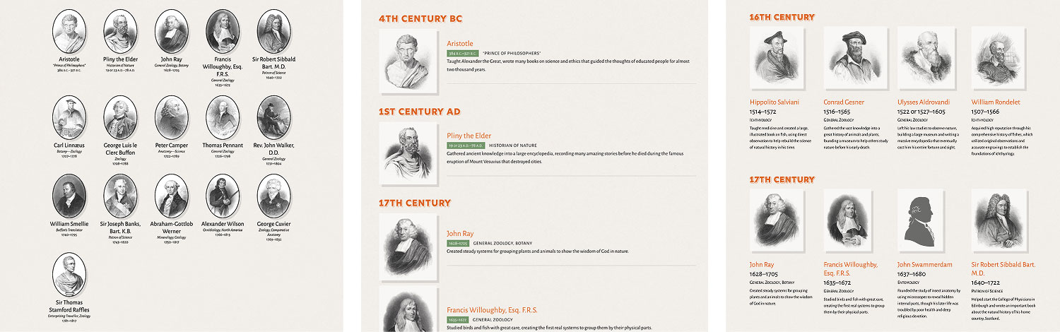
As mentioned earlier, accompanying each volume was a memoir of a well known naturalist. Not all of these memoirs were directly related to their volume’s topic and many were quite long. Clicking a volume expecting to read about one topic and seeing a memoir about someone unrelated to it wouldn’t have been a great experience so I separated them into their own Memoirs section.
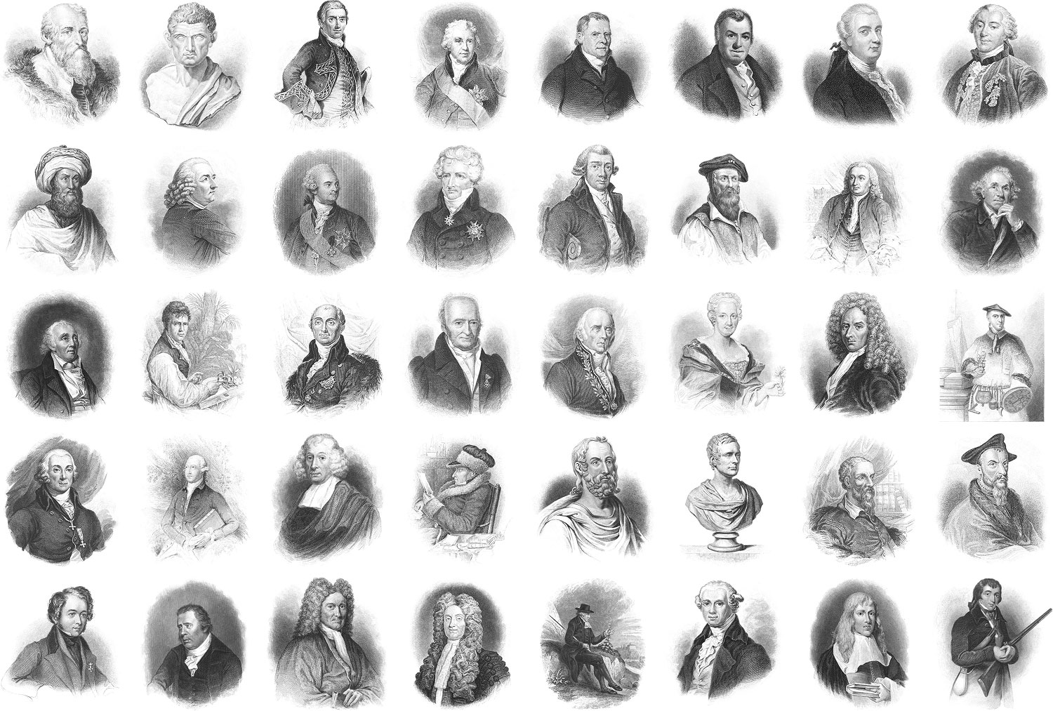
The design of the memoirs themselves was fairly straightforward but the list of them also went through several revisions. Except for two, each memoir featured a detailed portrait engraving that I wanted to feature somehow. Jardine was kind enough to include an excellent chronological list of memoirs, including each naturalist’s area of expertise. A timeline visualization of naturalists seemed like an interesting idea at first but was problematic given two of them were from ancient times. After a few iterations, I settled on a simple list with headings for each century, grouping the two ancient ones into a general category.
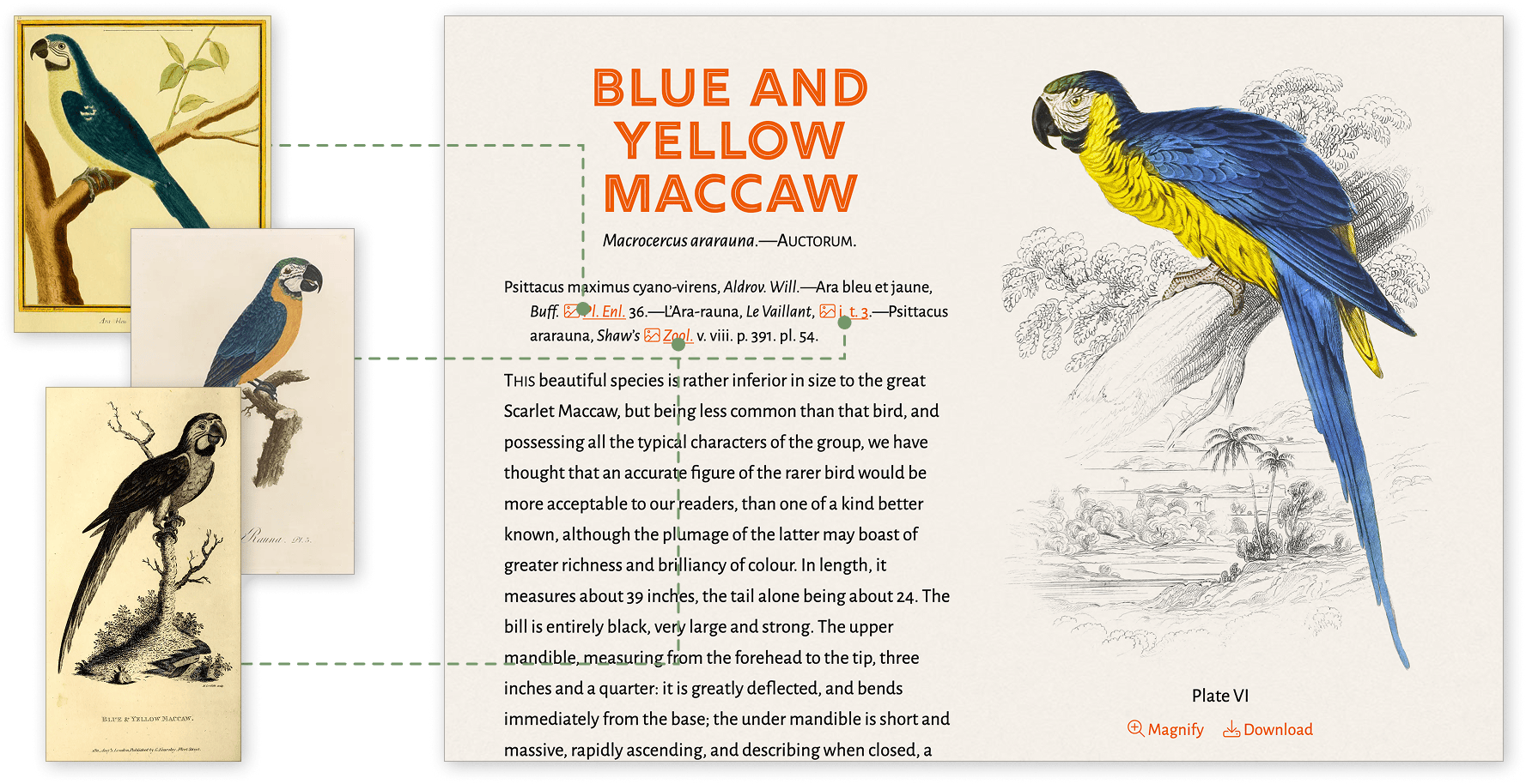
Littered throughout every volume were references to other natural history books as sources for other illustrations, quotes, and more information. These references are typically found in the synonymy at the beginning of a plate’s description or in a synopsis at the end of some volumes but also in footnotes or in the body of a description.
On many occasions, I wondered what was being referenced and was pleasantly surprised to find many of them pointed to other artists’ beautiful renditions of wildlife. About halfway through the project, I decided to create more work for myself and find as many original books for these references as possible. I spent about an extra month going back though the volumes restored to date and added links to every reference. Afterward, I made it part of my process after finishing each volume.
This effort wasn’t necessary but after undertaking a similar task for my digital edition of Printing Types, it appealed to me from a completionist standpoint. I also added an extra layer of tracking which book referenced which plate so each book’s entry includes a list of plates that referenced it. A handful of ancient books were referenced that proved challenging to track down so I limited my list to those from the sixteenth century onward. Each link points directly to the page or plate referenced. Each entry in the sources list points to the book or series as a while that was referenced. I was able to find nearly 1,000 books referenced more than 6,500 times across all 40 volumes.
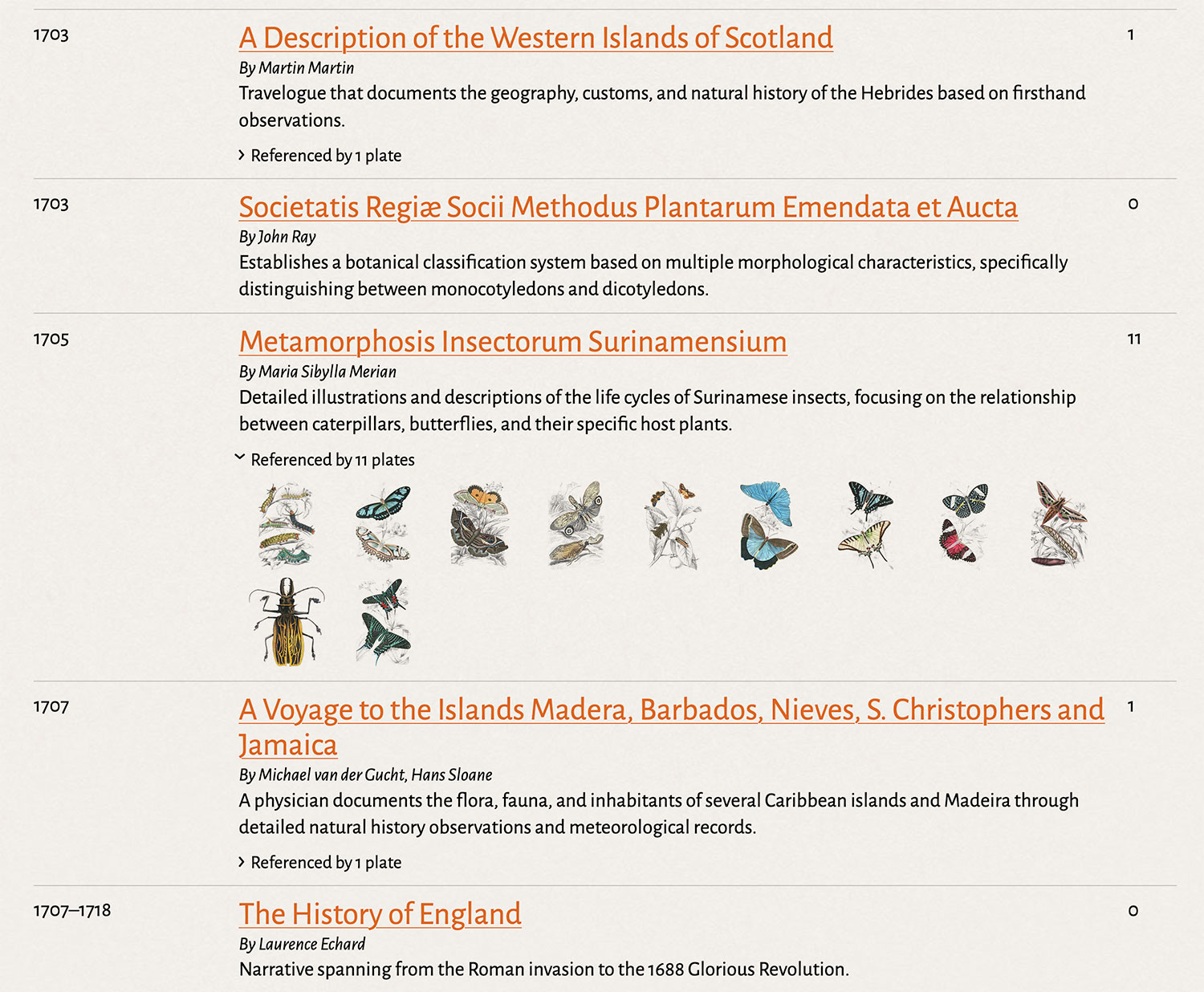
Posters
I often make posters that include entire collections of images but with more than 1,300 plates, that clearly wasn’t a viable option for this project. Trying to fit them all on one poster would have required them to be far too small to be legible. However, creating posters of smaller collections like cats, butterflies, hummingbirds, etc. was much more reasonable. Once again, I was inspired by Leaves from the Book of Nature and the way plates were laid out on each page. Many were arranged in offset columns—a simple technique to fit more in a page. This made them feel more organic—appropriate, given the subject matter. I used a similar technique in my poster designs. Below each plate is a label with its common and scientific name as used in The Naturalist’s Library. In total, I created 27 posters featuring most plates from across all volumes.
Not all plates are represented across all posters since they didn’t all lend themselves to major groups but all relevant plates are included in their respective posters. For example, all butterfly plates are included in one poster while birds are split across nine subgroups like sun birds, hummingbirds, birds of prey, etc. Some posters use slight variations on the layout based on its plates like the one for monkeys, which includes both the original and revised versions of each plate next to each other. Offset horizontal rows for these pairs worked better than columns. The most challenging posters were those of the fish that spanned six volumes. I am no ichthyologist and rather than relying on my uneducated guesses, I enlisted some AI tools to help devise five groups based on their habitats.
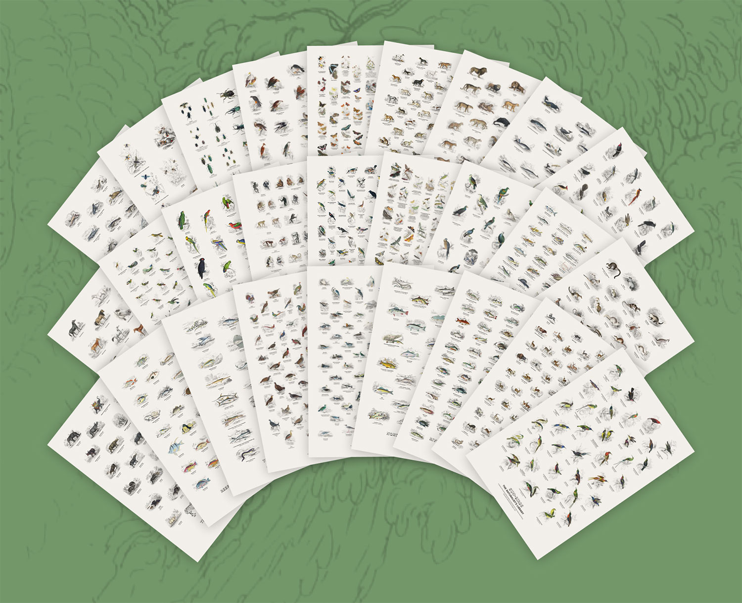
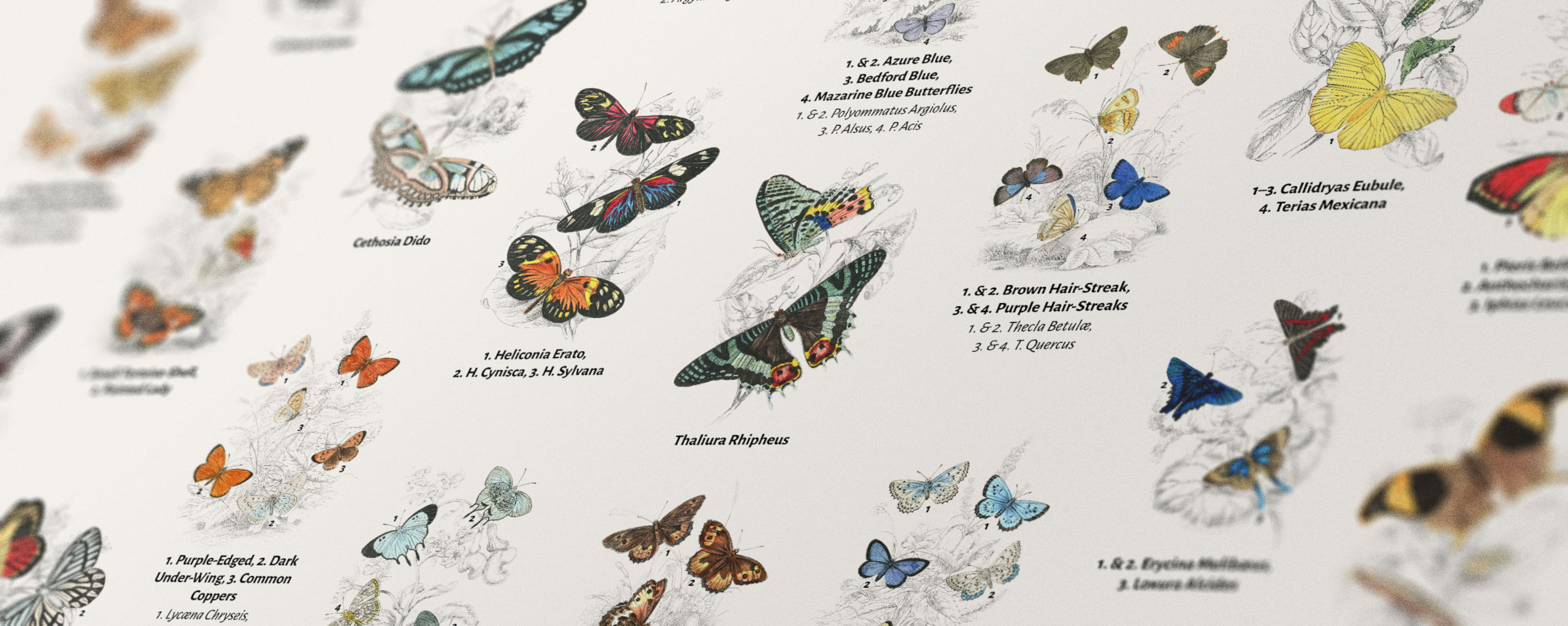
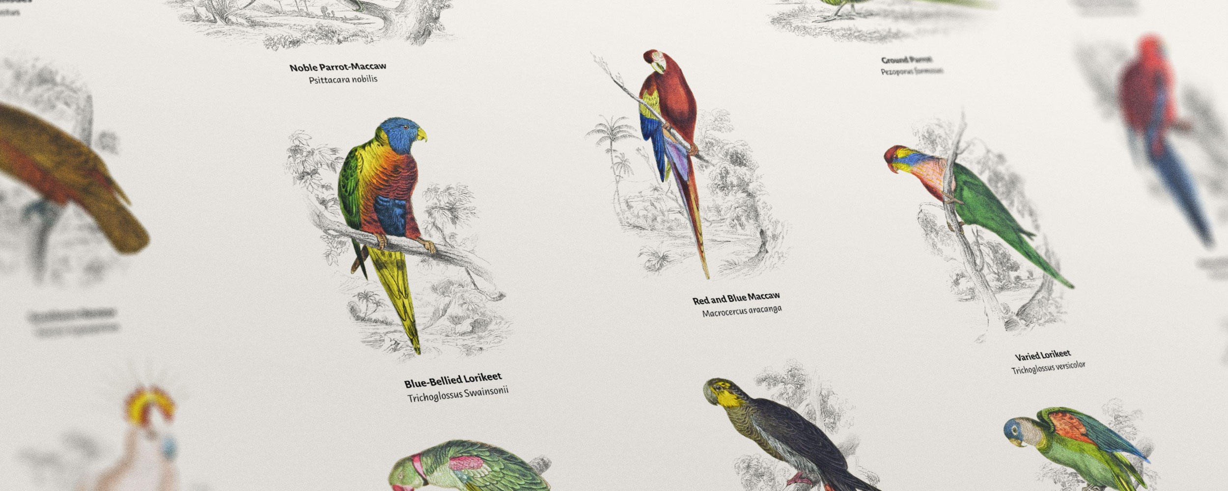
In what has become an increasingly common practice for me, all posters were created in Figma. The vast majority of my previous posters have been created in InDesign or Illustrator but these apps have become cumbersome to use and lack the quality-of-life features that Figma has had for so long. Intuitive features like auto layout, components, and object selection make Figma indispensable. I don’t hold any loyalty to any one platform but after using Adobe’s tools for so long, seeing them continue to fall farther behind is disappointing. I’ve also been lucky enough to do everything I need with a free Figma account.
Book
I didn’t start this project to make a book but a couple months into it, a book seemed like a fun experiment. I figured if I couldn’t fit all the illustrations on one poster, I could try to fit them in one book. To my knowledge, no one had done this before with The Naturalist’s Library and I was excited to think that I would be the first. The closest parallel was the aforementioned book from Dover which compiled only a small fraction of them into a short book more than 20 years prior. My goal was to include all 1300+ plates, restored to vibrant modern renditions in one big book.
Before starting any kind of design, I needed to figure out how it would be printed. Finding a traditional publisher interested in taking on such an obscure project was daunting and I had been wanting to explore several print-on-demand services so I decided early on that I would go that route. The quality of the book was paramount to me. A large book like this had to be printed well to be worth the time I was going to spend on it and what I was going to ask others to pay for it. In my research for print-on-demand services, four kept coming up as the ones to consider: Lulu and Blurb, both of which had been on my radar for many years, and Amazon Kindle Direct Publishing (KDP), and IngramSpark, both of which were new to me.
I considered several factors:
- Page size: The maximum page size across all services was about the same at 8.5″x11″ landscape or portrait so there was no real winner in that category.
- Page count is where two winners stood out: Lulu (800) and IngramSpark (840). KDP and Blurb maxed out at roughly 500 each, which just wasn’t enough.
- File size: File size limits for all services were large enough—ranging from ~500 MB to 2GB—to where I didn’t feel like it was a deciding factor.
- Cost: A lot factors into cost but in general, KDP was the least expensive to produce while Lulu and Blurb were more expensive. Pricing significantly increased if I wanted to publish on one platform and sell through others.
- Quality: Having never received a book from any of these services, I watched every video I could find that analyzed their printing quality. The general consensus was that while they all produced very nice books, Lulu had the best quality on the best paper with the most vibrant colors, even if it was at a higher production cost.
Considering all that and anecdotal reviews of each service, Lulu came out on top. Their pricing calculator along with their guides and templates made their experience very approachable for someone like me who was familiar with tools but not their service. I am not affiliated with Lulu. I just like telling others about my good experiences with good services.
I had never designed a book but I was very familiar with InDesign after using it for decades for my own projects and for designing websites back in the early 2000s—a very helpful jumpstart. Despite that, this was the first time I planned to use it for its intended use: a printed book. Parent pages, styles, margins, gutters, image frames, etc. were all familiar but book-centric features like tables of contents, indexes, etc. were new. Fortunately, tutorial videos, templates, and a lot of trial-and-error helped me get past those hurdles. I can’t imagine what it would have been like without going into this without that prior knowledge.
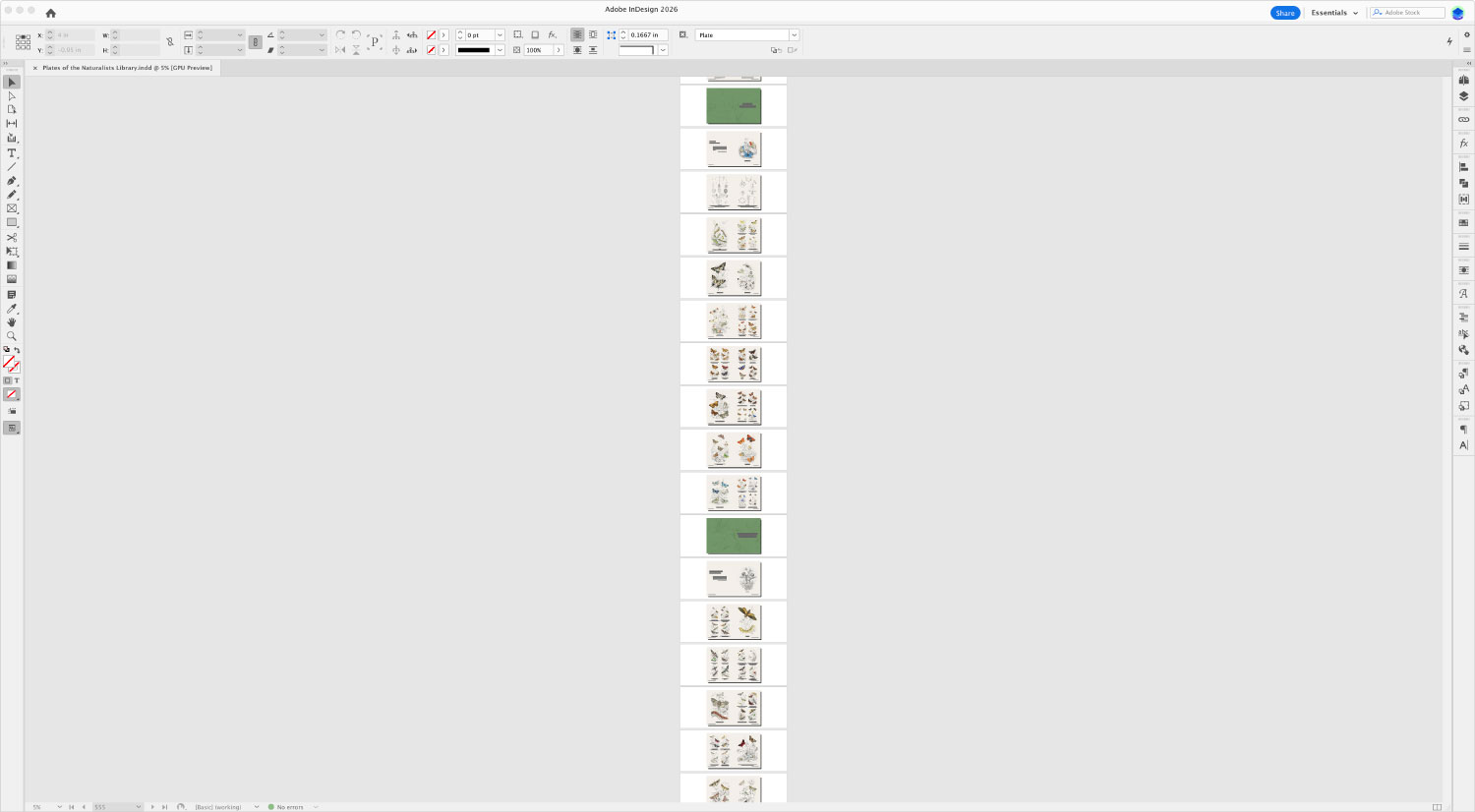
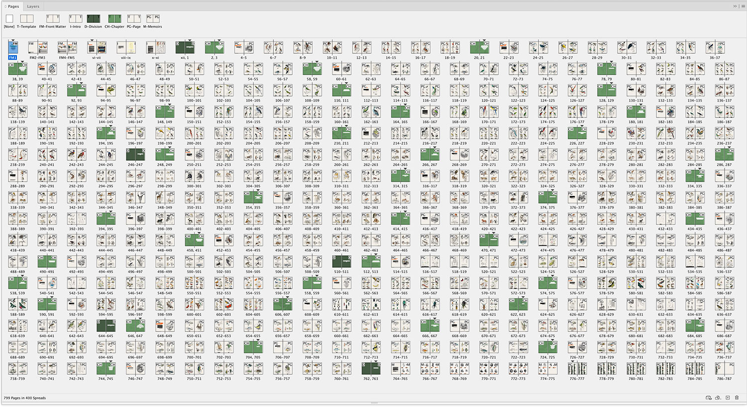
I kept the design of the book relatively simple and consistent with the digital edition, using the same typography, colors, and visual themes. It’s first and foremost a picture book but has a few extras like a brief introduction, a complete cross-referenced index, and a list of memoirs at the end. The bulk of the book is all the plates, which had to be arranged efficiently. Since one plate per page would have resulted in a book well beyond publishing limits, several had to be combined on most pages. I needed a way to experiment with laying out many images across many pages but doing so in InDesign was very cumbersome because of its inability to view pages in something other than one long scrolling list. At most, only a few spreads can be seen at once taking up a thin list in the center of the screen. As a workaround, I first laid out images very roughly in Figma using low-resolution thumbnails and grouping them visually by page. Once I was happy with how images were arranged, I then arranged them properly in InDesign. This process meant I had to lay out images twice but it was much faster to play with them in Figma instead of trying to play in InDesign. If InDesign ever introduced a way to see spreads in a grid on an infinite canvas like Figma, that would be so much more efficient.
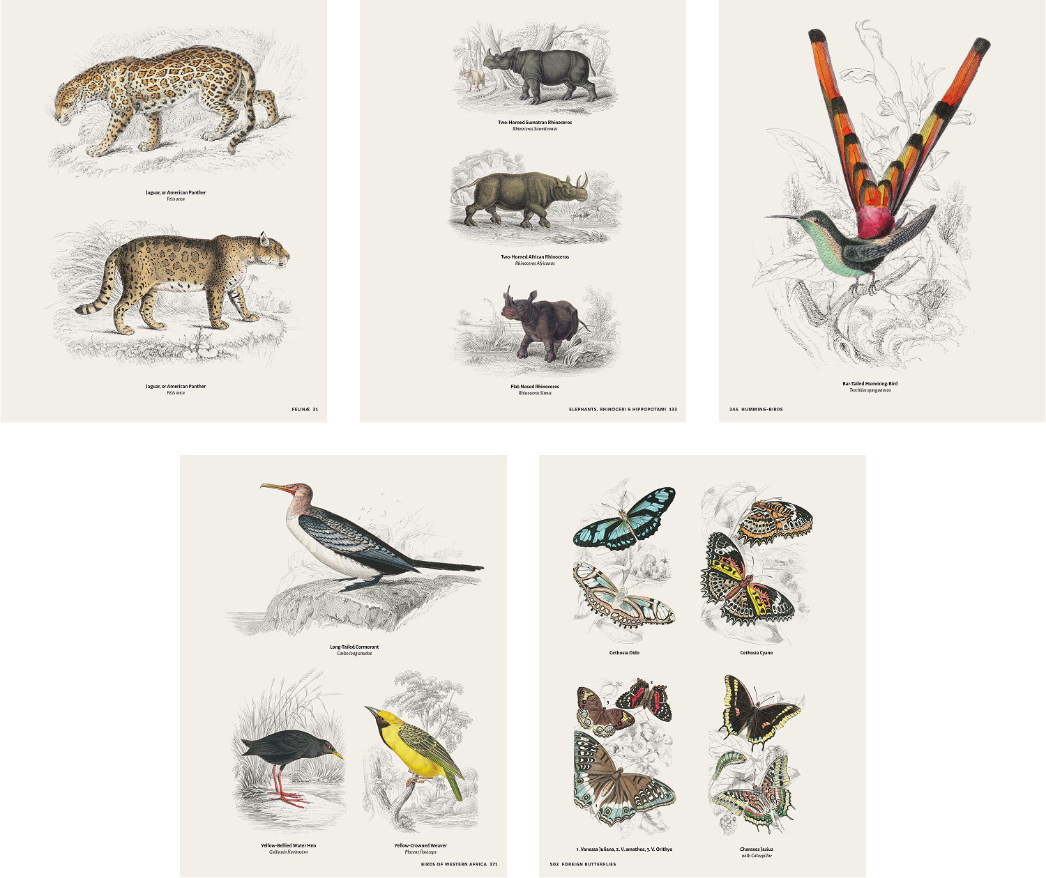
The layout for any given page followed one of five layouts showing one to four images depending on orientation. This meant that volumes with many portrait images could be condensed more because one page could fit up to four portrait images at most but only two landscape images, which became a problem because some back-of-the napkin math indicated that the final number of pages would be well beyond Lulu’s limit of 800.
Separate from the page layout issues, I ran into trouble with how to organize groups of pages. Again, I was originally inspired by Leaves from the Book of Nature, not for its layout but for its organization. Its table of contents listed plates grouped by the four main divisions and smaller subcategories, which I considered “chapters,” sometimes spanning several pages. For the first five months, while I slowly worked through each volume and added its plates to the book, I followed that table of contents as a guide. Occasionally, I found a plate or two that wasn’t included but added them where I thought they fit best. When I came across entire volumes that weren’t included like the one on bees, I struggled with where to put it so it felt natural. Several of the groups in Leaves were also so generic as to not be useful such as “Miscellaneous Animals” at the end of the mammalia division. I also had the idea of starting each chapter with a brief summary from the introduction to that topic but that idea had its own issues: I tried to have AI generate the summaries, which rang hollow, and not every chapter had a clear introduction from which to draw.
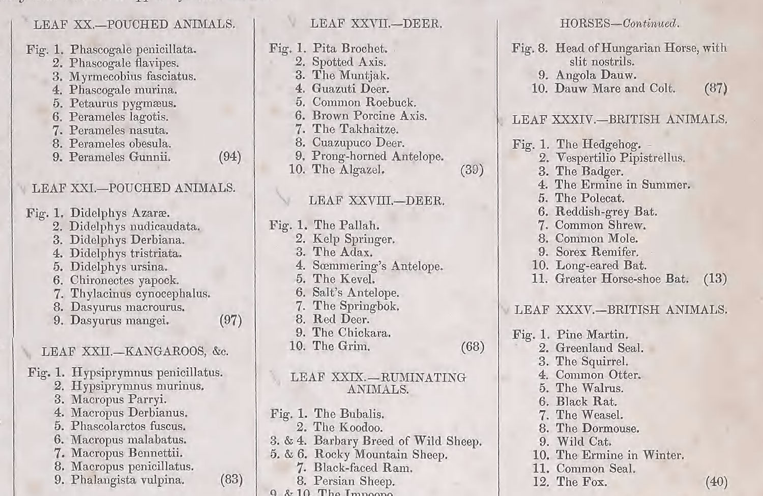
After months of work and a growing sense of dread, I acknowledged the reality that I needed at start over. I thought about arranging them simply by their original publishing order but, it felt too disorganized for the book. Fortunately, I came across the aforementioned prospectus published in the 20th volume describing the People’s Edition where volumes were ordered more logically within the four main divisions and that was what inspired me to organize my book in the same way.
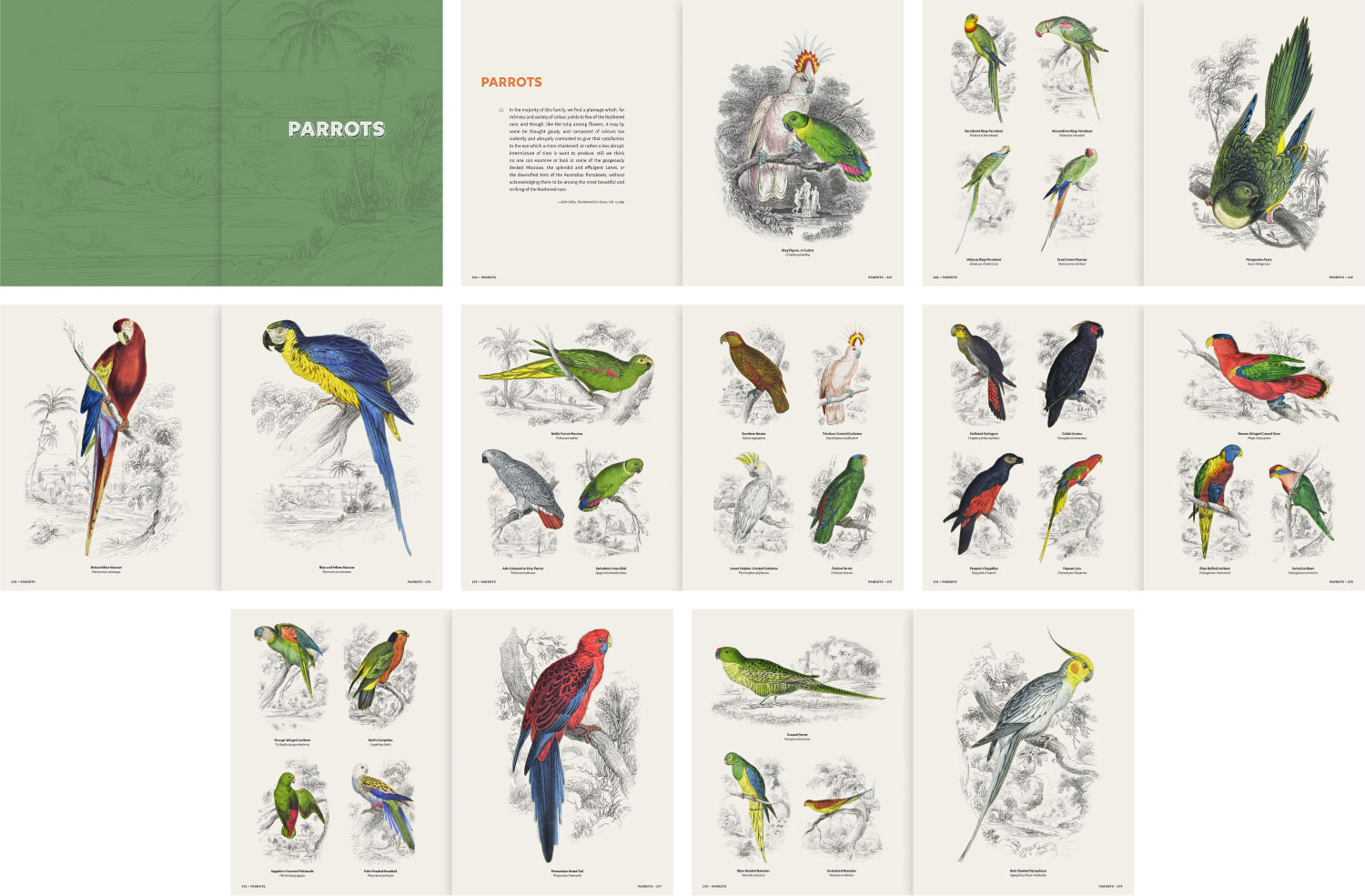
Armed with that guidance, I set about reorganizing the book but more intentionally than the haphazard first try. Each volume/chapter comprised three parts:
- Title spread: A full-page spread showing the chapter title on a vibrant green background with a subtle enlarged version of the same landscape image from the digital edition. Each landscape image comes from one of the plates in that volume so it sets the tone for the chapter.
- Introduction: The title is repeated followed by a direct quote from that volume’s text highlighting the wonders of the animals illustrated on the pages that followed, which felt a lot more earnest than an AI-generated summary. On the facing page is a full-page vignette from the title page of that volume.
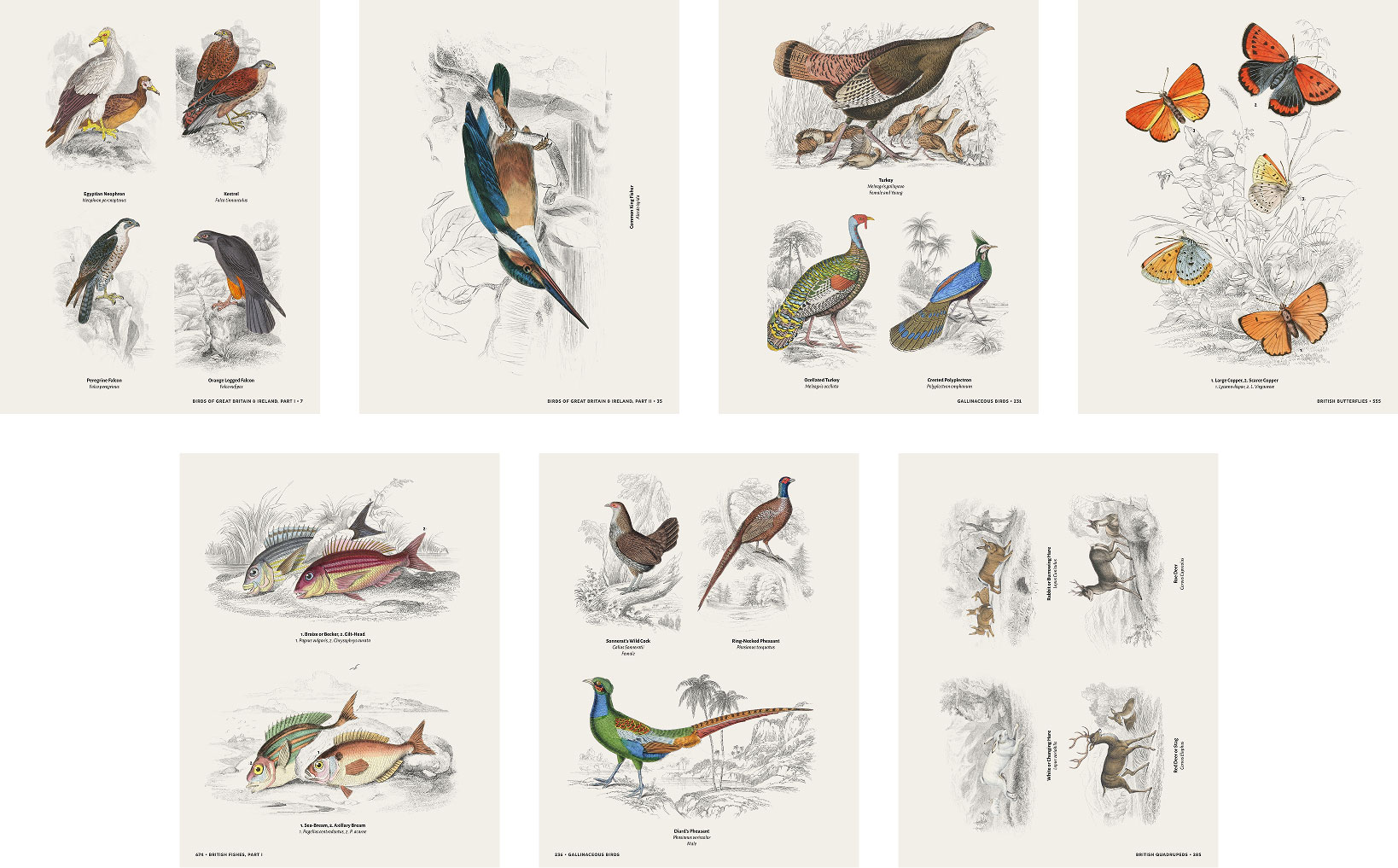
- Plates: Plates arranged in no more than eight two-page spreads (except for one volume) and always filling each spread with no blank pages. Every plate has a caption including the label given to it by the author of the original volume and the scientific name (if available). Plates including multiple figures are numbered and the caption corresponds to the numbers. While the original illustrations included numbers, they were too faint to see so I re-numbered each one. To accommodate many landscape-oriented plates, I allowed myself to rotate plates shown on the right page of many spreads by 90° so more page layouts were available. This was also reminiscent of Jardine’s original books where landscape-oriented plates also rotated 90°.
Redesigning the book took an extra week but it was worth it because the new structure kept it under the 800-page limit and allowed for a few more pages to be added for an introduction, index, and memoirs.
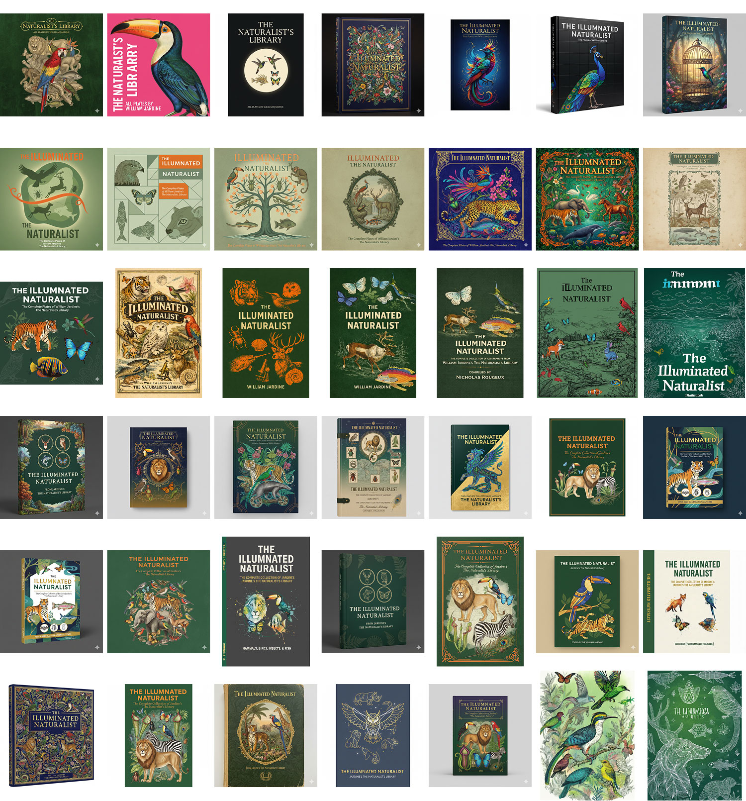
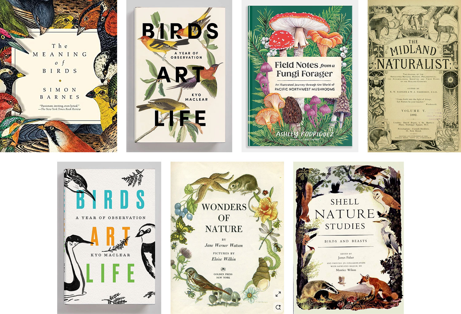
The cover was another design adventure. Early on, I played a lot with Gemini, Firefly, and ChatGPT to brainstorm ideas—not with the intention of actually using any of them, but more as a way to spark my own ideas. One title that I liked was “The Illuminated Naturalist” and used it in a lot of mockups, including some early versions of the final cover. The prompts I used included variations of telling the image generators to include one or more animals from each main division (mammals, birds, insects, and fish) and various nature motifs. There was a healthy mix of good and bad results over the course of about a month. I also browsed around Pinterest for a while looking for real nature books to get inspiration.
Two motifs struck a chord with me:
- The only one from the AI-generated covers where I used real images as part of the prompt (third row, fourth column of the collage above). It had a dark green background paired with a white sketched landscape and full-color animals felt like a nice way to highlight the animals and the great landscapes they were paired with.
- Framing the title with elements from nature like shown in the covers I found on Pinterest. I liked how the title was integrated with the surrounding elements, appearing behind them in spots.
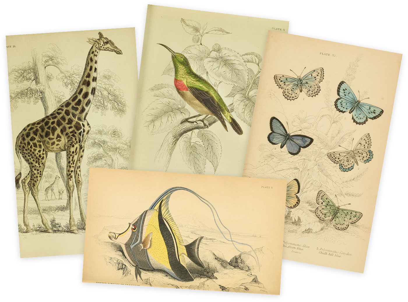
Using these ideas as a basis, I designed my own that matched the style of the digital edition and experimented with various animals to feature. With so many to choose from, it was hard to decide but I wanted to include some of my personal favorites (the giraffe and the horned zanclus fish) and ones that included a lot of landscape to fill in most of the background. Reversing out the landscapes and adding a subtle drop shadow to the animals made them pop nicely.
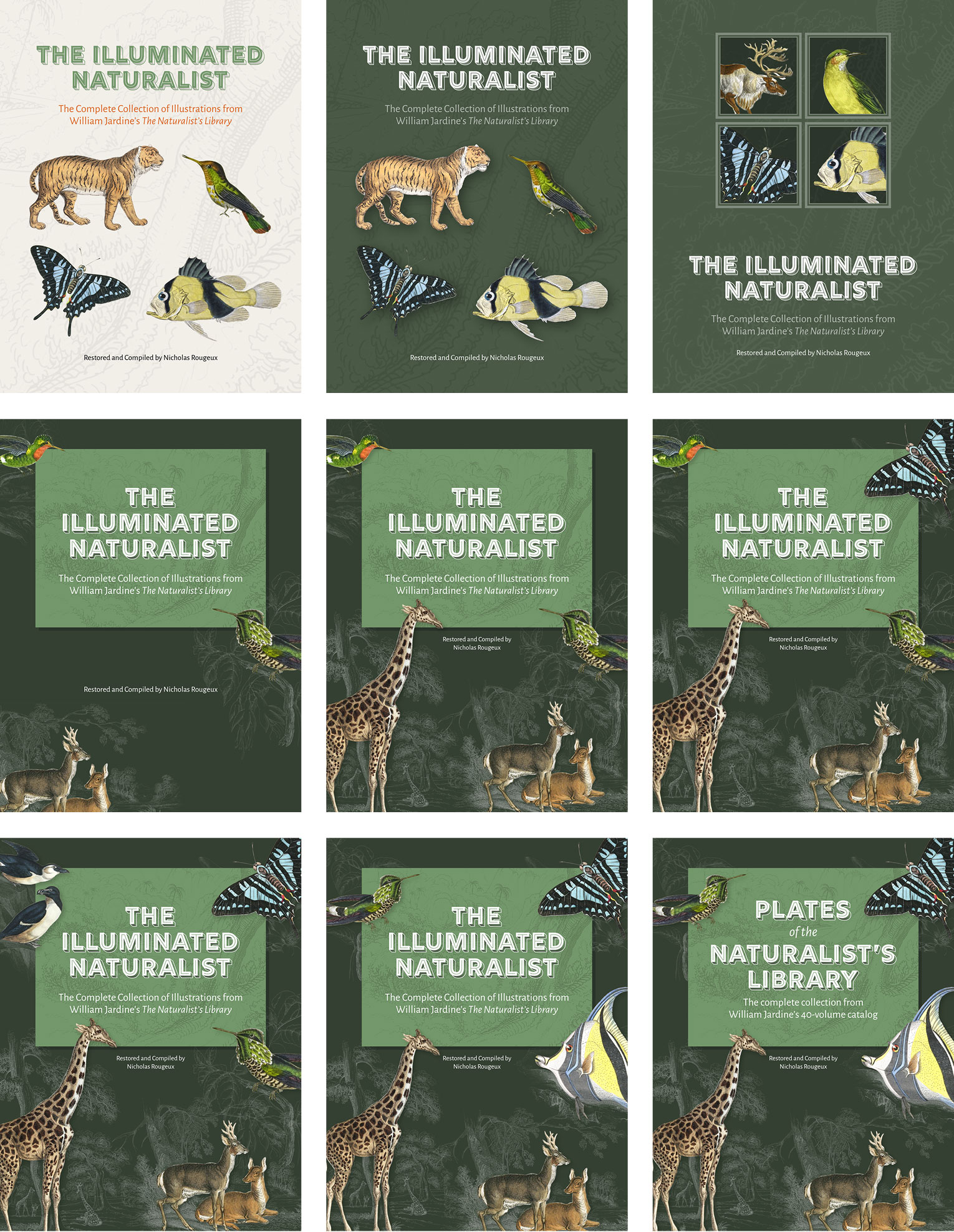
Near the end of the book’s completion, I changed the title to Plates of the Naturalist’s Library to more clearly describe its contents and because the earlier draft left too much open to interpretation. Once I had the first draft of the book complete, I discovered that the exported PDF was nearly 1 GB, which was about double Lulu’s file size limit. A couple months prior, I inquired about the limit and they said that while they didn’t have a strict limit, files over 500 MB usually cause their wizard to stop working. With more than 1,300 high-resolution images in it, the PDF could only be compressed so much. To get around this, I tweaked the compression settings in InDesign to reduce the image quality to medium and shrunk the original image files linked in InDesign by 15%. There was no visible loss in quality and the file size was more manageable at about 570 MB, which was uploaded to Lulu without any problems.
I chose the best options for everything: largest size, hard cover, premium color paper, 80# coated paper, the works. I figured if I was going to spend all this time creating the book, I wanted it to be as good as it could be, even if that made it expensive. After ordering my own copy from Lulu to check the quality, the two weeks it took to arrive were nerve-wracking. I had never designed a book, never ordered from Lulu, and had no idea if the plates were going to look as nice as I hoped, and it was an expensive gamble. I was also very curious to know how much the book was going to weigh with so many pages on nice paper.
The result exceeded all my expectations. To say I was pleased would be an understatement. The quality is amazing, the colors are vibrant, and the text is crisp. All the details in every illustration are clear and excellent. I couldn’t ask for a better result. There were a handful of corrections that needed fixing but that was on me and had nothing to do with Lulu’s printing.
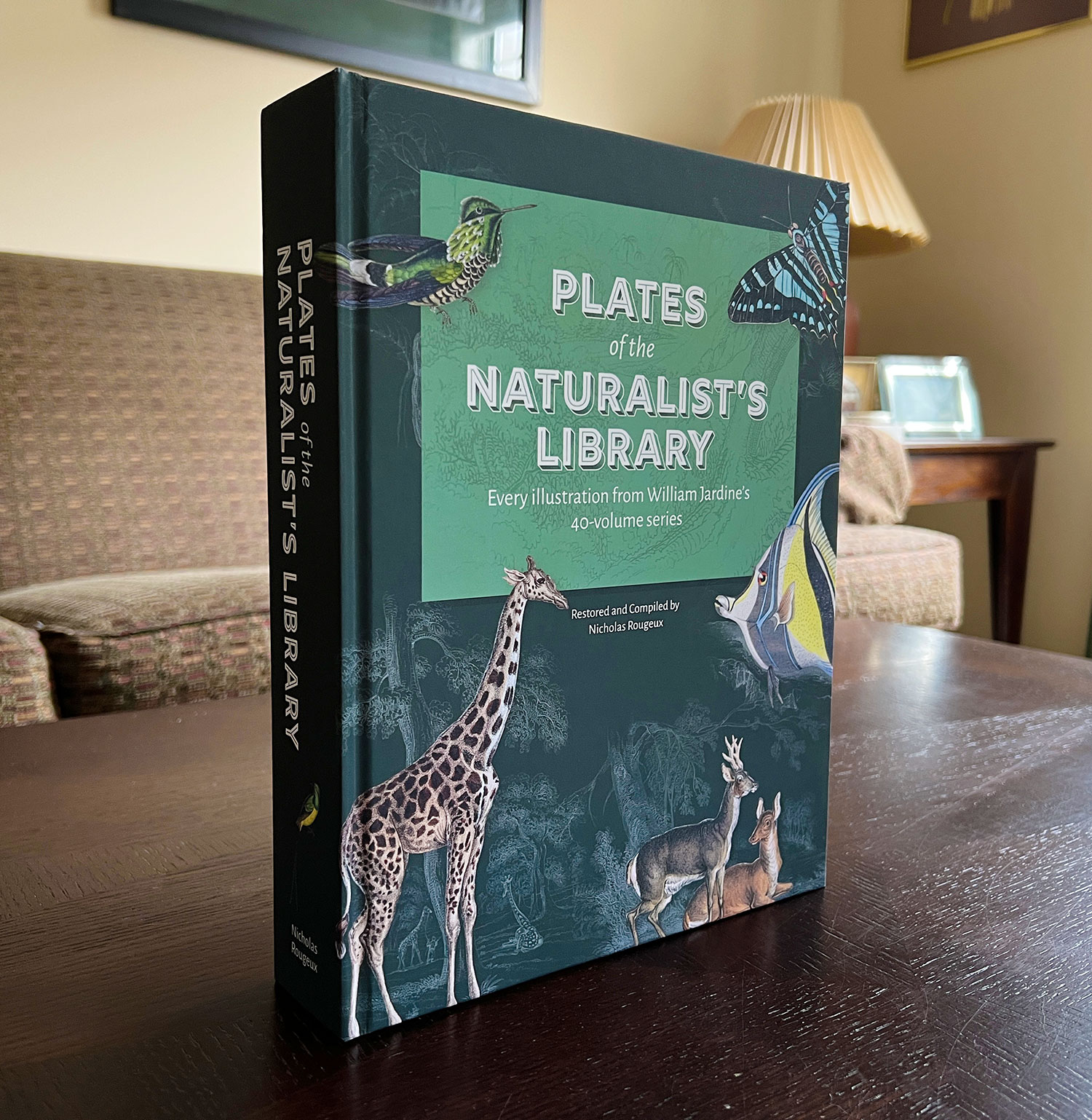
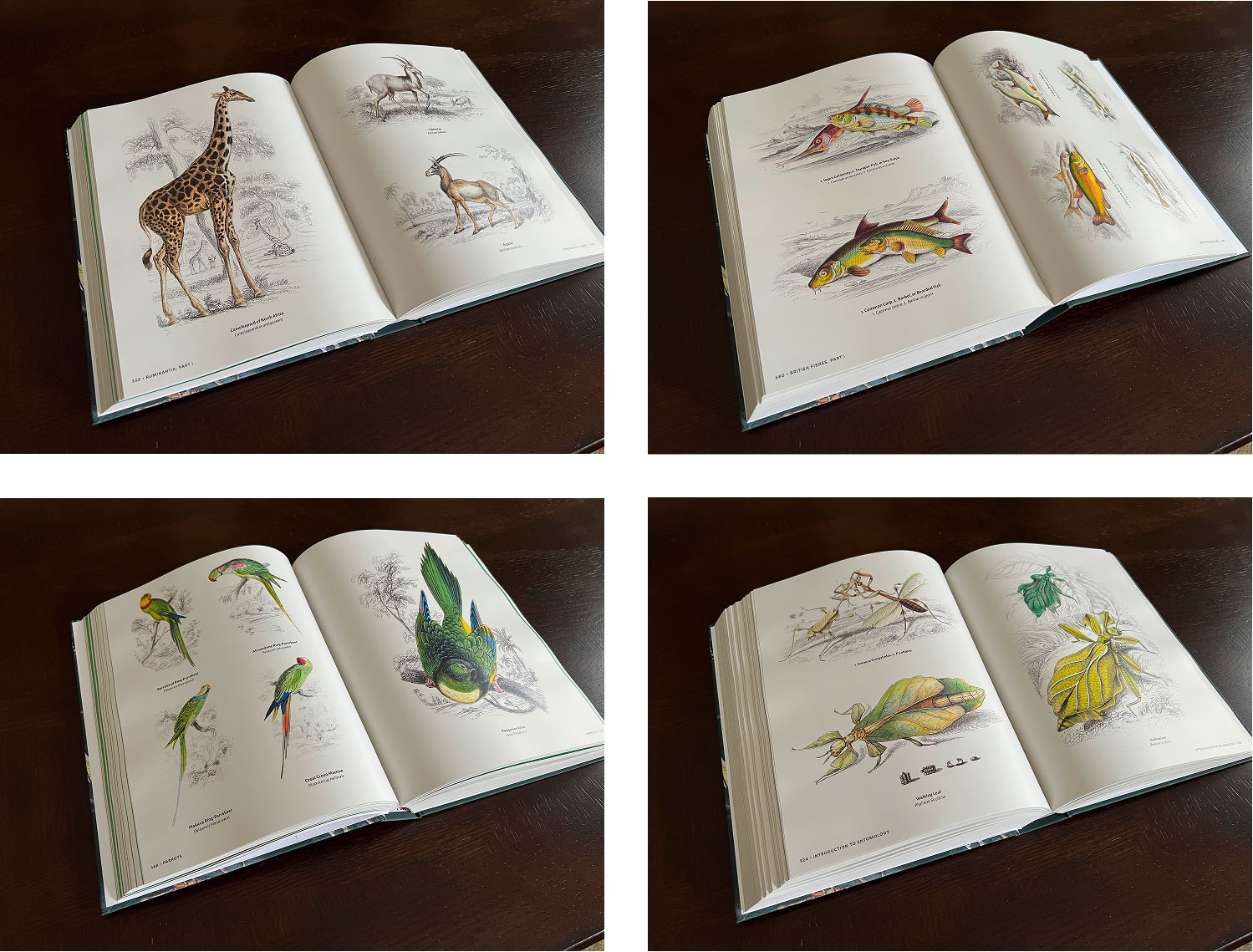
The final book measures 8.75″ (22.22 cm) x 11.25″ (28.58 cm) x 2″ (5.08 cm) and weighs a whopping 7 lbs. (3.2 kg). I wanted a massive book and I got one. Because of this, it is expensive, listed at $295.11 USD. That’s a lot, partially because of the premium printing options but also because it is printed on demand. It’s not a book I expect many people to buy due to its cost and its niche appeal and that’s okay. I didn’t make it to make money. I created it as a design experiment, a tribute to one of the great natural history series, and for those who want to have a unique item in their collection of natural history books. Jardine originally created The Naturalist’s Library as an affordable option to the large and expensive folios that were common during his time and I recognize that there is some irony in selling a book that isn’t as affordable as the originals on which it’s based, which is why the entire book is also available to flip through for free as a preview.
Timeline
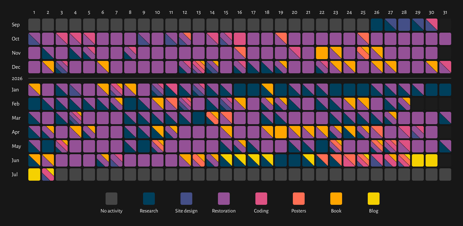
This project was completed in about nine months between September 2025 and July 2026. I kept track of my activities in a log and created the fun timeline above, which I updated at the end of each day. Each row is a month and each square is a day split into the different types of activities I did on that day:
- Research Learning about The Library, looking for scans, or looking for references in other books
- Site design Designing the digital edition website and making revisions
- Restoration Restoring plate images and formatting text in the digital edition
- Coding Writing any code for the digital edition’s front or back end
- Posters designing and creating the posters featuring collections of wildlife
- Book designing (and redesigning) the book
- Blog post Writing this blog post
The size of the activities don’t represent how much of each activity was done, only whether or not I did any of them. A good chunk of time was spent on the project everyday. Not surprisingly, the most prevalent activity was restoration. Restoring more than 1,300 plates and formatting 2.4 million words takes a long time. Unlike previous projects, I only spent a little time researching it up front before driving into the design as indicated by the dark blue days at the end of September at the start of the timeline. With so much to do, I wanted to start right away and let the project evolve as I learned more. I even brainstormed some poster ideas early on. In the second half of November, I started working on the book and added to it as I completed each volume, which can be seen by the golden colors punctuating the timeline.
The month-long string research activities starting in mid-January is when I decided to go back through all the volumes completed to date and add reference links to other publications. I could only do this research with a stable internet connection so I split my time between restoring plates and formatting text during my commute to and from work, during lunch hours at work, at home during the mornings, evenings, and weekends. I developed a nice cadence of working through all 40 volumes, following the same process for each:
- Find the best scans: Found as many scans as I could for a volume keeping track of any nuances like quality variations, missing plates, etc. so I could find the best images
- Format the memoir: Restored the portrait of the naturalist, format the text (fix common OCR errors, spellcheck, etc.), and add links to all publications mentioned in it. Most memoirs were straightforward but some included complete bibliographies like the one for Linnæus, Pallas, and Latreille, so extra time was needed to find all of them.
- Restore the volume: Formatted the text for each volume and restored plate images in the order they appeared. As each plate was restored with its description, I added an entry to the database so it would appear in the list of all illustrations. Common OCR errors were fixed and spellchecked. Adding links to all the publications mentioned in the synonymies, descriptions, and footnotes was always the last step.
- Add plates to book: Added a new chapter to the book with all plates from the volume.
- Create posters: Created posters for each group of animals featuring all relevant plates.
Repeating this process for each volume instead of waiting to do the same task all at once for all 40 volumes allowed me to constantly refine it and watch the project evolve as I discovered new ideas.
Before I discovered the original publishing order, I finished the four volumes of birds from Great Britain and Ireland (volumes 20, 24, 34, and 40) so volume 39, the second volume covering British fishes was the last one I completed and it ended with an intense span of research. That volume has a 77-page synopsis summarizing all 253 species of fish mentioned in it and the first volume (37) and nearly every species included multiple reference links. Those, plus the 78 footnotes and even more links in the main descriptions took 9 days to add.
A handful of days were spent doing a variety of things as I thought of new features or design updates. These are indicated by the bright multi-colored days like December 13, with five different activities. That was when I finished the volume on beetles, added them to the book, created the poster, and did a lot of work on the book page of the shop. On February 12, I researched a lot of the publication history, added that to the digital edition, built out the shop more, and finished the cetaceans poster.
A lot of bright yellow appears toward the end, representing the time spent working on this blog post. I usually spend about a full weekend drafting blog posts but started this one even before I finished the project, mainly because I needed something to do when I didn’t have a stable internet connection to research the remaining links for volume 39. The last few days are a jumble of many colors because of last-minute refinements to many areas.
AI
AI has become a more prevalent part of my daily life, including playing several important roles in this project. After finishing Printing Types, I was looking for ideas for a new project and asked AI for suggestions based on loose parameters. I’ve done this before and the results are rarely actionable. However, among the suggestions was Jardine’s Library, and after doing some initial research on it, my interest was sufficiently piqued. Sometimes a spark like this is all it takes to get me going on a new project.
From a research standpoint, AI was invaluable. I primarily used it to find hundreds of obscure references to other publications. Without it, I probably couldn’t have found half of them or they would have taken substantially longer to find. Even when I knew the publication, finding the right page was often a challenge because a reference wouldn’t include a page number or even a volume. Often, by simply pasting in the reference verbatim was enough for it to decipher. Asking what volume an article or species was in and what page it was on was hit-or-miss but got me close more often than not. Gemini was used for most of the simpler searches and because I never hit a usage limit and Claude for more in-depth searching where Gemini fell short.
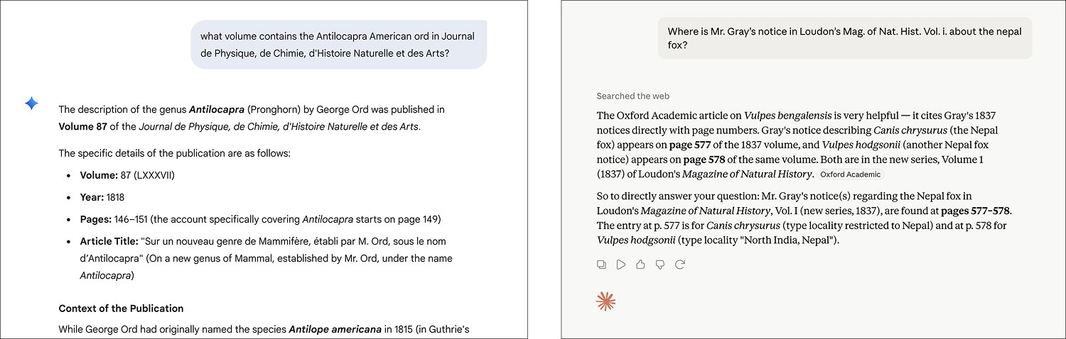
Google’s Stitch was an interesting tool for ideation on early layout designs. I liked that I could give it general guidance and it would come up with several viable variations. Unfortunately, its interface is very clunky, slow, and recent updates have only made it worse. One of its suggestions for the layout of the list of original scans inspired my final design. I never paid much attention to the details it suggested like typography, colors, images, etc. since those rarely aligned with what I wanted but it was great for general layout ideation.
As previously described, Gemini, Firefly, and ChatGPT to brainstorm cover ideas, using part of one as the basis for the final design. Photoshop’s generative AI was also used to stitch together multiple scans for two plates (Ornithoptera butterflies and a Hyalophora Cecropia moth).
The summaries shown next to plates in the illustrations page and those shown next to each bibliographic source were generated with Gemini. I did this because the summaries were far better than anything I could have devised and I simply could not have summarized so many sources. The bibliographic summaries also provide good context instead of just showing their titles.
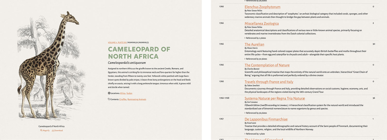
Claude was a lifesaver when I accidentally deleted all the illustration summaries in my database before I made a backup of the data. While they were generated with AI, I did them individually as the plates were restored over nine months. Fortunately, thanks to consistently structured HTML, I was able to point Claude to the files with the original descriptions and with some careful instructions, had it regenerate and compile them all into a spreadsheet. I still manually reviewed them while copying them into the database because I didn’t feel comfortable giving Claude direct access to it. What would have taken me days or weeks to recompile manually only took about an hour to regenerate and the better part of a day to repopulate. I even corrected a few of my own mistakes along the way. A backup was made shortly afterward.
While the vast majority of this project was hand-coded, I did use AI to help me code two small utilities that were beyond my skill set.
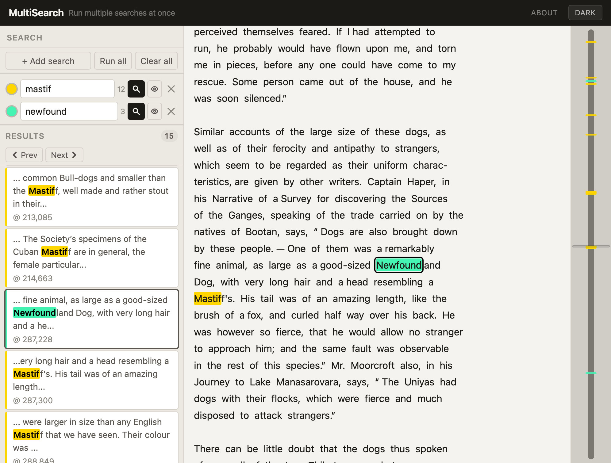
The first, MultiSearch, isn’t directly part of the project but was helpful in completing it. It was born out of the need to perform multiple simultaneous searches on large texts like those of entire books to see where terms appeared near each other, which was most helpful when searching in other languages or when I had only some vague terms to go on, looking for an obscure story. I couldn’t find a tool that let me easily do this so I used Claude to vibe code one entirely. It worked so well for me that I made it available as a public standalone tool.
Just paste some text and run some searches. Results colors can be customized and toggled. Multiple lines can be pasted in a search box at once and will be converted to separate searches. Results appear in context and visualization of all the result positions appears on the right in a bar that magnifies on hover. There’s no tracking and all activity takes place in the browser without communicating with a server in a single self-contained HTML file that can be saved locally and run offline. It’s offered free for any use. Credit appreciated but not required.
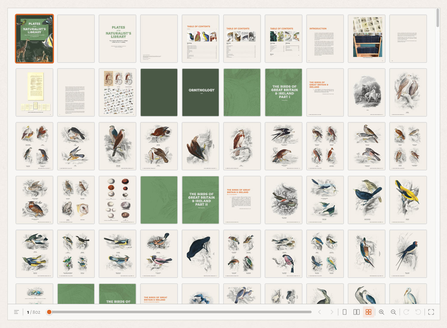
The second utility was a viewer for the book preview. This was a last-minute addition because I wasn’t planning on making a full preview available but I wanted to let everyone enjoy the book even if they didn’t buy it. Rather than offering a download, I thought it would be nice to make it viewable in the browser. After some research for simple book viewers, I couldn’t find one that did everything I wanted and one that was simple for a non-developer like me to implement. At Claude’s suggestion, I let it create its own. Its first attempt was pretty good but it took dozens of iterations to fine tune all the nuances. Getting the page flip animation to display the right pages was surprisingly difficult and I had to spell out the sequence of events before it finally understood what I wanted. I’m pleased with the result. It’s a simple viewer that allows for viewing pages one at a time, two at a time, or by thumbnails. Pages can be magnified and rotated (a feature that’s curiously missing from other viewers). A table of contents is available in a toggleable sidebar. It even has virtualization to stay performant since my book was about 800 pages long. I didn’t make it available on GitHub because I made some design and behavioral choices specific to my needs but the code is readily available by viewing the source and downloading the files prefixed with “bookreader” (one main JavaScript file, one config, and a stylesheet). It’s freely available for anyone to use.
Overall, AI played a critical role in many aspects of this project for things I couldn’t do myself but the vast majority of the work was done manually the “old fashioned way” from creating the design and writing the code to restoring each plate and formatting all the text to designing the book and posters. I have no doubt that a lot more could have been done with AI but I still enjoy putting in the elbow grease to create something just the way I want.
Final thoughts
Looking back, the nine months this project took to create felt like no time at all. The end of any project is bittersweet for me. I enjoy the process far more than the outcome but I love sharing something big and new with everyone. It was a roller coaster of emotions, especially around the book. It was my first and I didn’t know if it was going to turn out well until I held it in my hands. That was a big gamble and I’m so glad it worked out. There were times when it felt endless and I questioned whether or not it was worth continuing (1,300 plates, 2.4 million words, and 6,500 links is a lot) but there’s something oddly satisfying about sticking with it and slowly building something big.
Check out The Naturalist’s Library in a new light: