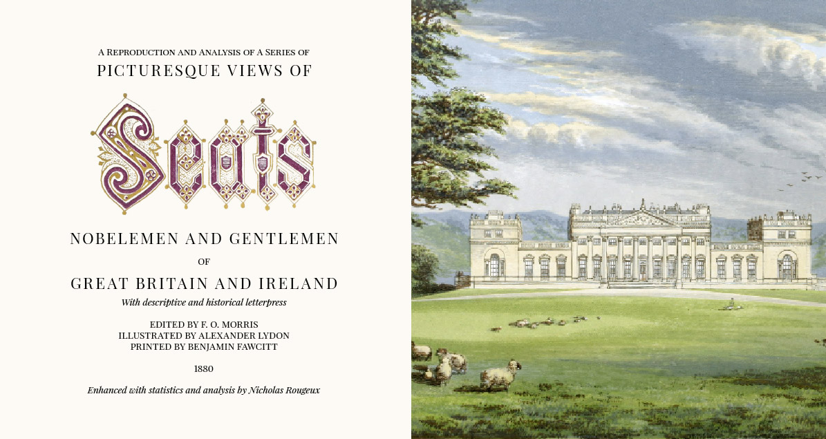
Making of Picturesque Views of Seats of Great Britain and Ireland
By Nicholas Rougeux, posted on October 13, 2019 in Art, Web
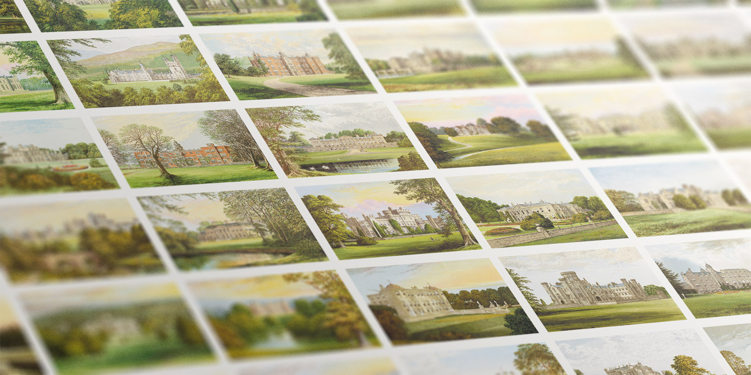
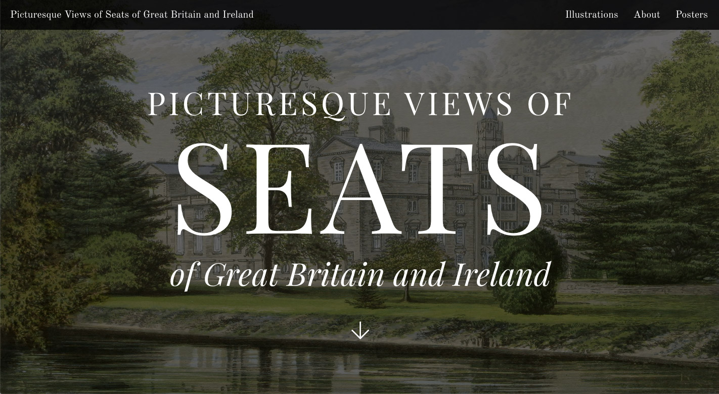
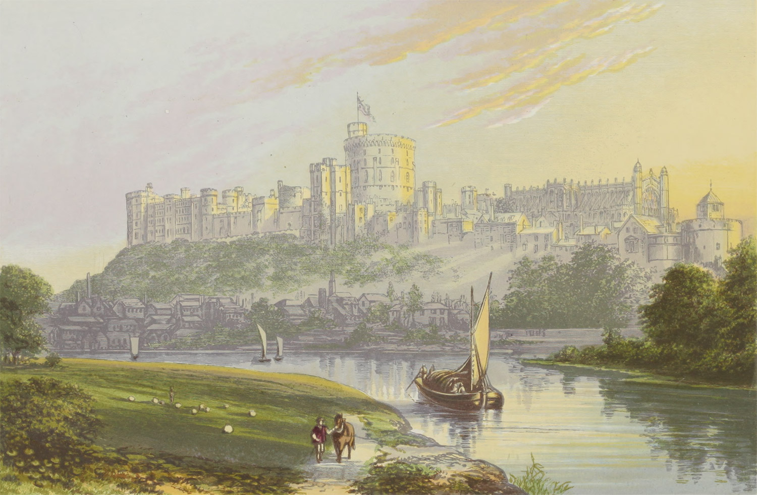
Castles and mansions and manors, oh my! The minute I saw Alexander Lydon’s illustrations in A Series of Picturesque Views of Seats of Noblemen and Gentlemen of Great Britain and Ireland, I wanted to create something based on them. Picturesque Views of Seats of Great Britain and Ireland (or simply “Seats” for short) is the result.
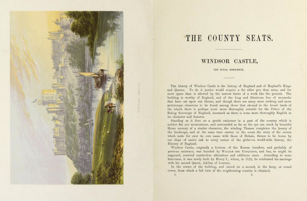
In 1880, author F.O. Morris partnered with illustrator Alexander Lydon and printer Benjamin Fawcett to compile the illustrations in a six-volume set that comprised beautifully detailed illustrations of country mansions in idyllic surrounding landscapes accompanied by descriptions of their architecture, artworks adorning the interior, owners’ lineage, and geography.
These illustrations have been so well preserved for over 100 years and invite close exploration. The only way to explore them was to look at aging scans on a handful of websites and no site had every image readily available. My goal was to restore them, make them more accessible, and add my own spin with a few posters for others to enjoy.
Source material
There are several places to find some or all the illustrations. As one would expect, the Internet Archive has the best version (volumes 1, 2, 3, 4, 5, 6) but also another of slightly lesser quality (1, 2, 3, 4, 5, 6). Google Books has all but volume five (1, 2, 3, 4, 6 but the colors are very washed out. A partial Flickr album exists but the images are in no particular order and they’re not rotated. Rare Old Prints has a very comprehensive gallery but not entirely complete or high resolution.
During early research, I like to ensure all pages of all volumes are available before going too far with the reproduction to avoid the unexpected realization that pages aren’t available. This happened with this project with one illustration and a few pages of descriptions so I was glad to have multiple galleries as backups to get the missing materials.
Best-laid plans
Simply putting all the illustrations online didn’t seem like enough. I wanted to do more but struggled to develop interesting ideas. Several ideas that did come to mind ended up not panning out due to the resources involved to achieve them. What follows is a few of the failed plans. These were important to work through because they helped me solidify what I wanted the project to become.
Image analysis
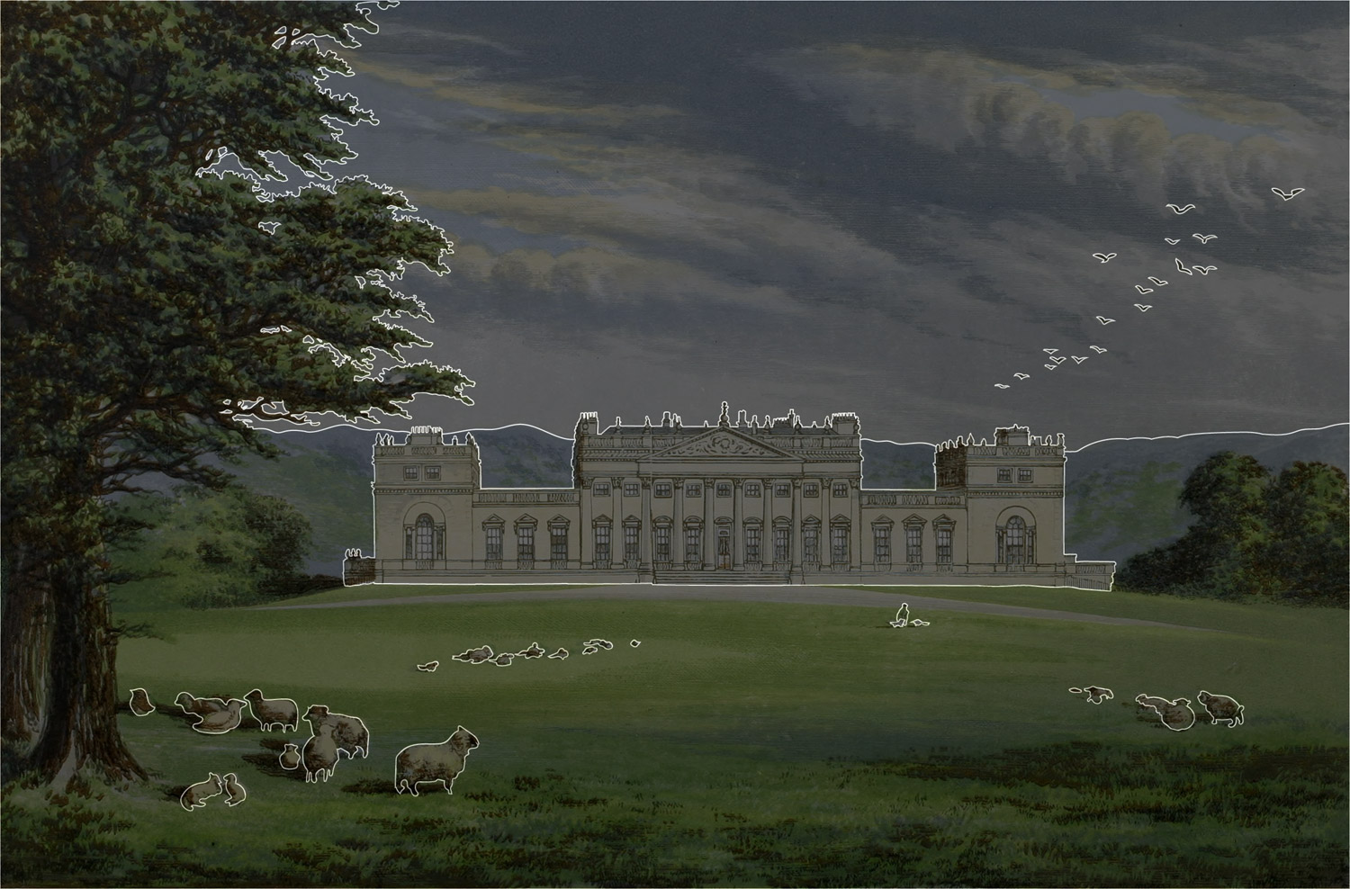
An early idea was to examine how much of each image depicted different elements like the main building being illustrated, surrounding landscape, sky, people, etc. This would have involved tracing each part of the illustration and creating SVG shapes to overlay the illustration. I thought seeing the shapes draw themselves would be an interesting effect and the data would allow me to see which illustrations had the most castle/landscape/people/etc. Visible compared to others.
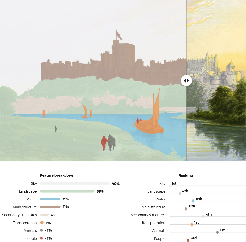
After finishing Illustrations of the Natural Orders of Plants wherein I outlined hundreds of plants, I thought this would be relatively easy and only somewhat time consuming. Some only took about an hour to outline but others took days. Howsham Hall took an entire weekend and the resulting SVG was slow to render in even the fastest browsers. I outlined the first 16 of them before deciding this the effort wasn’t worth the outcome.
Description analysis
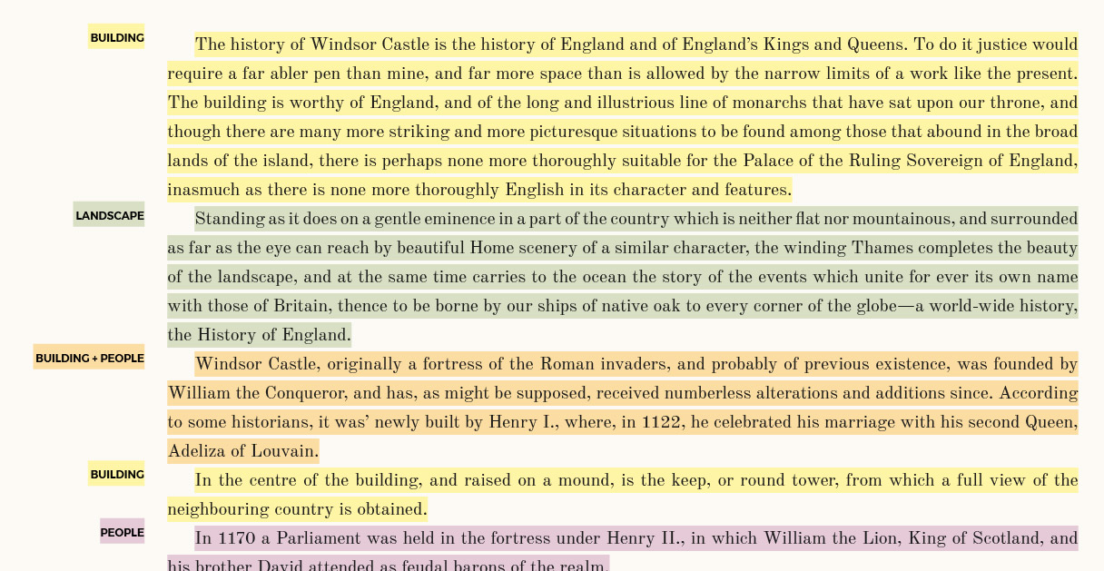
In a similar vein, tagging each paragraph of the written descriptions based on what it was about (the main building, people living in it, surrounding landscape, its contents, etc.) sounded like an interesting way to examine what was written about most frequently throughout the entire collection. This too proved to be more work than it was worth.
Photos
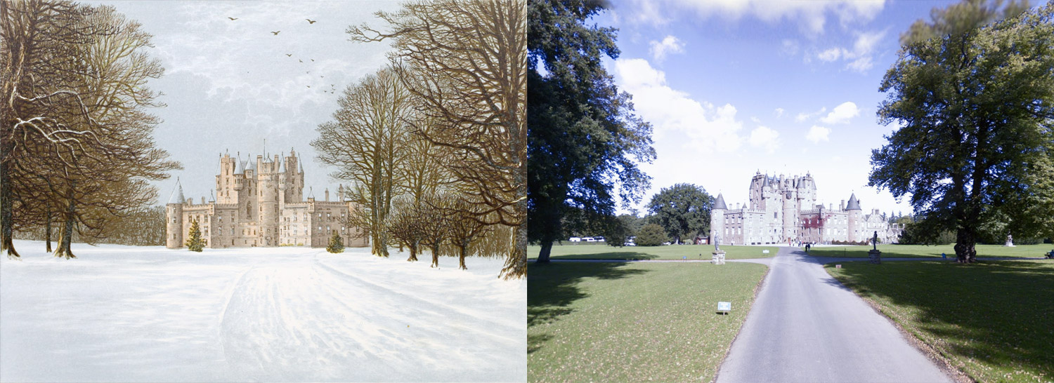
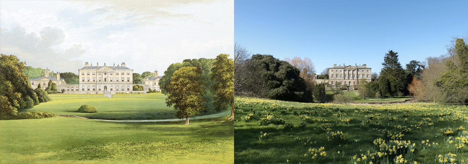
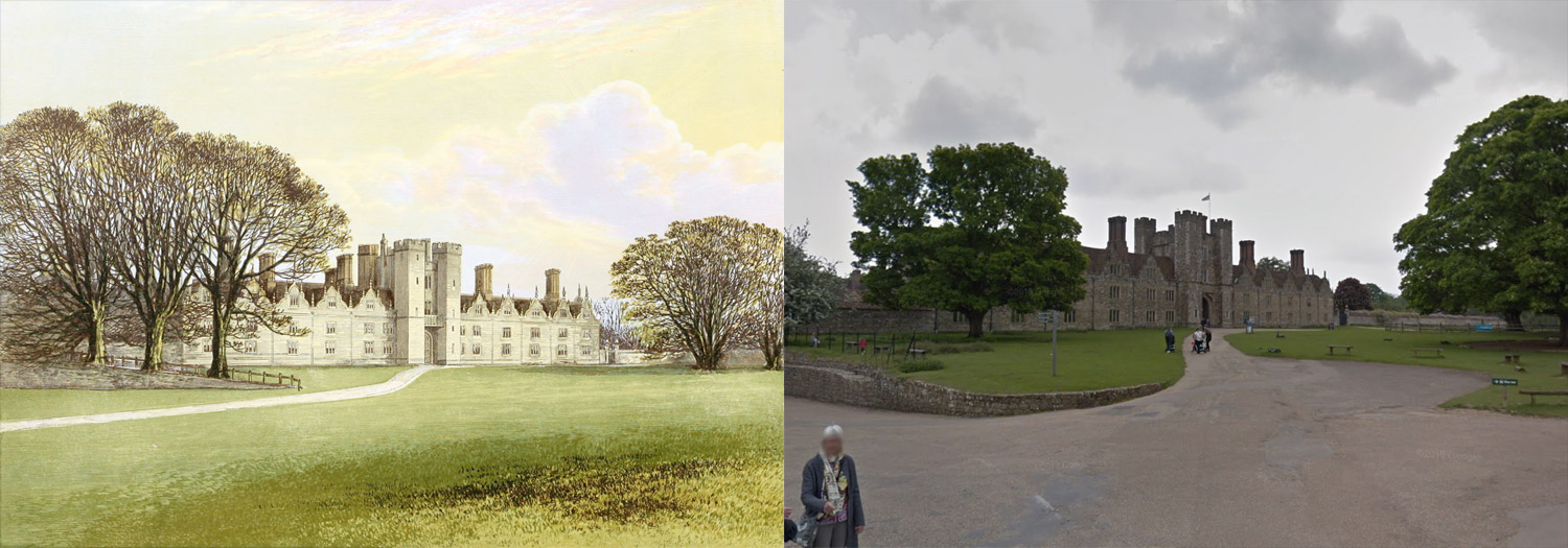
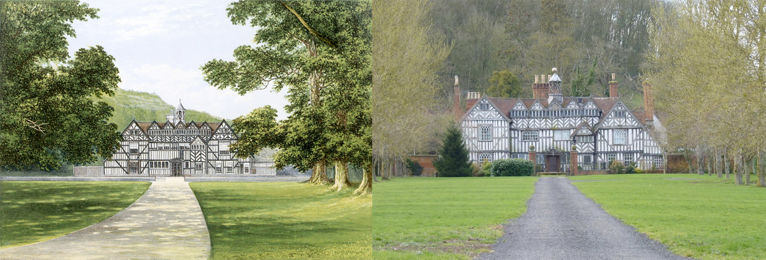
Another idea that sounded promising in theory but turned out less so in reality was finding photos of every building—ideally from the same perspective as the illustration. If time and money weren’t relevant, I would have gladly visited every spot to take a picture myself but obviously, that isn’t viable. My efforts to find photos matching the illustrations weren’t very fruitful, which wasn’t surprising considering the illustrations are nearly a century and a half old and quite a few buildings simply don’t exist anymore. After thinking it about it more, I decided the photos ultimately wouldn’t have been a good addition because the project was about reproducing the illustrations—not a recounting of their status today. However, I did find a few images on Google Street View that aligned very closely with the illustrations.
Designing as I go
Like my other restoration projects, designing Seats didn’t happen by simply creating a mockup and then building it. The process is ongoing throughout the life of the project. I knew at a basic level that I wanted to restore the illustrations and put them online so I developed a rough mockup and built a framework to facilitate this as quickly as possible. This let me start getting them online in a browsable format and see how browsing through them felt. With each illustration I put online, the gallery grew and I made many adjustments to it as needed: image sizes, spacing between images, text size, how much text to display, etc. Playing around with the design using real content is a lot easier then doing so in a mockup.
During this process, I was also interested in seeing how the illustrations could be organized based on a little bit of data so I added features to allow for browsing through the different tags I assigned to them, where they are on a map, and different methods of sorting.

I also went through a couple iterations of the top of the home page with the first being a more direct replica of the cover page from each volume. However, I liked the idea of a bolder approach with a larger, shorter title layered on top of an image. The image also changes each time someone lands on the site. Try refreshing the home page a few times to see new illustration each time.
Hunting for castles
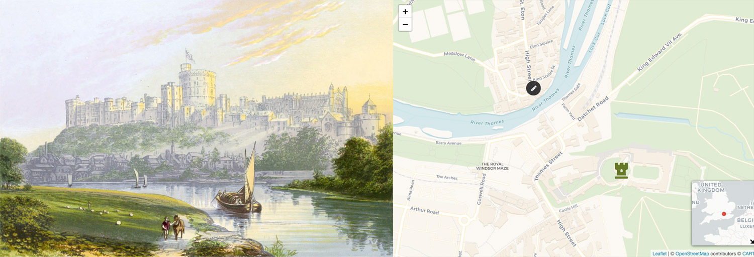
One of the first ideas I had was to find out where all the buildings in the illustrations were geographically and the vantage points from which they were drawn. I naively thought this would be quick and easy and while some were, many required a fair bit of research.
For each image, I did a search and often landed on a Wikipedia page with latitude and longitude coordinates that allowed me to easily pinpoint it on Google Maps. Then, I used the perspective and landmarks from the original illustration to approximate the vantage point. Since there was some artistic license taken in the original drawings and landscape has changed in the past hundred or so years, pinpointing the vantage points was challenging but very fun.
The most common hurdle in finding buildings was that more than few had been demolished, abandoned, or remodeled since the illustration was created. In situations like this, I ended up digging through websites dedicated to forgotten castles in England, land plats, and looking at hand drawn maps from the nineteenth century.
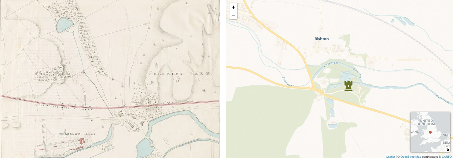
One of the more challenging to find was Wolseley Hall, which suffered a fire in the 1950s and was demolished in 1966. This house didn’t have a dedicated Wikipedia page like others so an initial search landed me at a Lost Heritage page which had a small hand drawn map at the bottom but it was a broken link to Staffordshire Past Track, a site dedicated to historical archives of Staffordshire. Searching on that site for Wolseley Hall, resulted in the same hand drawn map in higher resolution which had the hall labeled. The hand drawn map was also drawn with north pointing down which added an extra challenge. Then it was a matter of finding that location on Google Maps to get the latitude and longitude coordinates. A visitor center now sits on the site of the original hall.
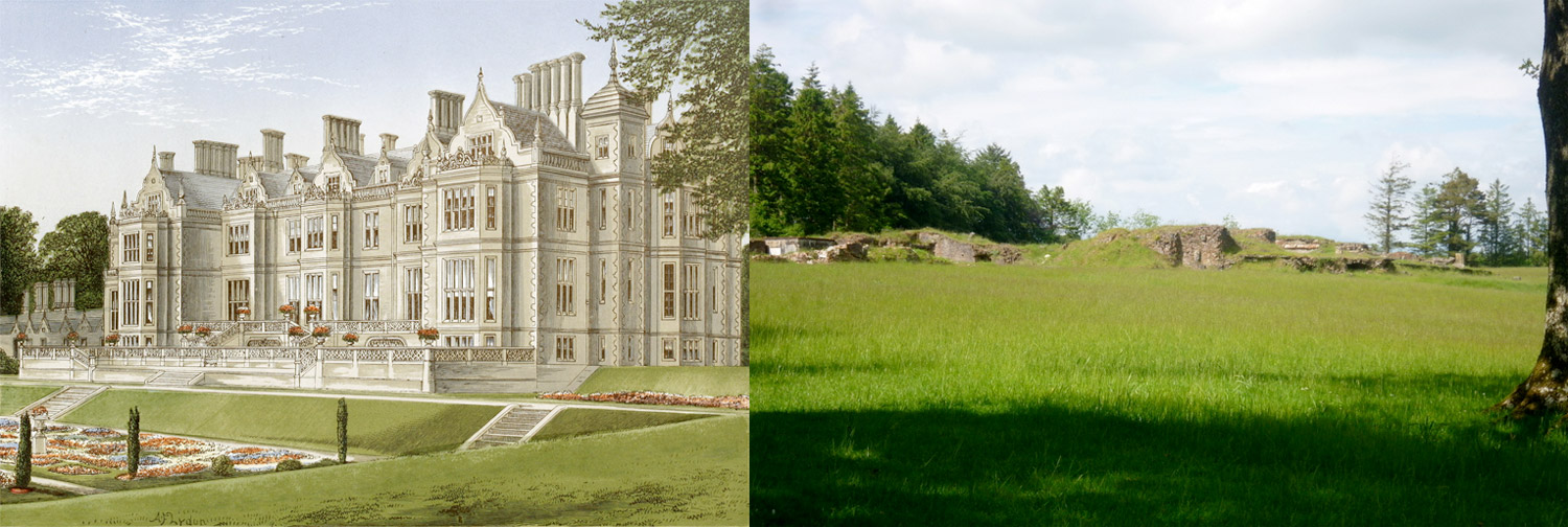
Datrey was challenging to find because little information provided about its location on the Wikipedia page other than it was demolished and was in the center of the “once vast” Dartrey estate. I ended up searching for “Dartrey Castle” on Google Images and came across a photo of the ruis on Geograph which had a map showing the exact location.
Meer Hall was surprisingly difficult to pinpoint in part because it’s now named “Mere Hall.” Many names of the places pictured in the illustrations have changed and I was hesitant to assume Mere Hall was the same Meer Hall I wanted until I gathered enough proof by finding photos of it on Google Images. The building is still standing but I had to hunt for its exact location. I found it by browsing the related images to another photo on Google Images which finally lead me to Geograph with a map.
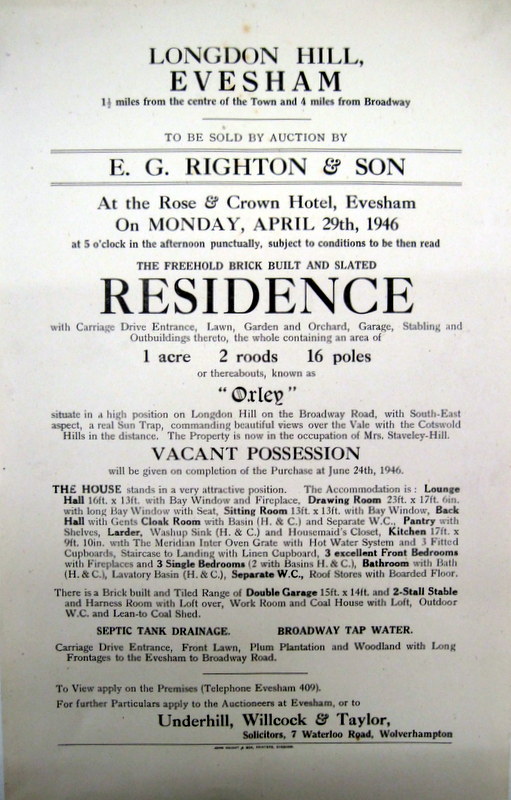
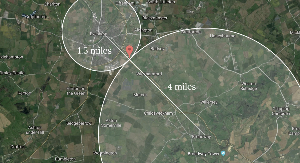
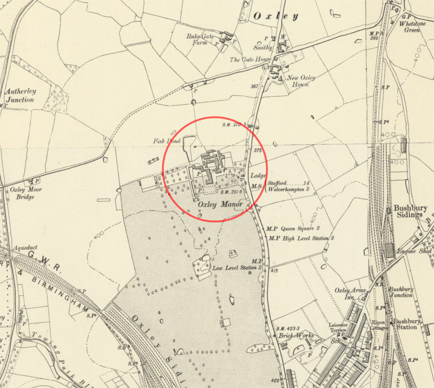
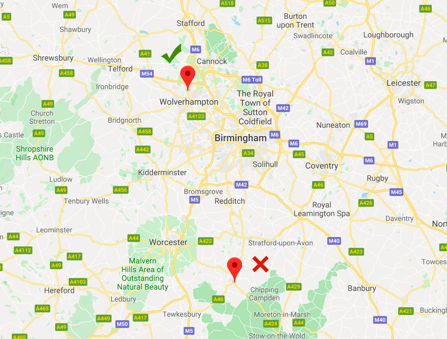
Oxley Manor (aka Oxley House) was the only one that left me the most uncertain since it’s no longer standing, there are no ruins, and so little information is available about its location. I tracked down a page on the Badsey Society’s site that included an auction notice which states at the top that it’s situated “1 ½ miles from the centre of Town and 4 miles from Broadway” (“Town” meaning Evesham). That was the most I could find anywhere. Armed with that wealth of knowledge, I took my best guess at measuring 1.5 miles from the rough centers of Evesham and Broadway and picked a spot that looked like it could have had a structure there at one time.
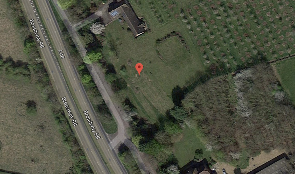
Shortly after publishing the project, Marcheterre Fluet—a keen-eyed reader—contacted me to let me know that the location I had found was likely the for the house Oxley’s son and wife owned after they went bankrupt. The actual location of Oxley Manor was 38 miles north in Wolverhampton. Indeed, after checking out the map Marcheterre recommended on Archi UK, I spotted Oxley Manor and Oxley House was easy to spot. A big thanks to Marcheterre for the assistance!
Tracking down Carnanton House was fun because the coordinates listed on Wikipedia were in the middle of the Firth of Clyde, about 350 miles north of its actual location. I wasn’t sure why but after double-checking, I updated the Wikipedia page with the correct coordinates.
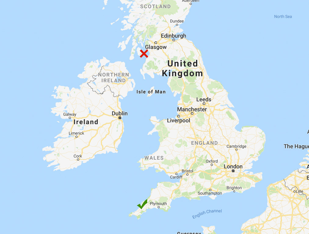
✓ Actual location in southern England
Hunting for the exact locations of each illustration was like a scavenger hunt. I had fun scouring maps new and old, reading through histories, and looking for landmarks to match up to photos. I was pleased that I was able to find coordinates for every illustration.
Restoration and categorization
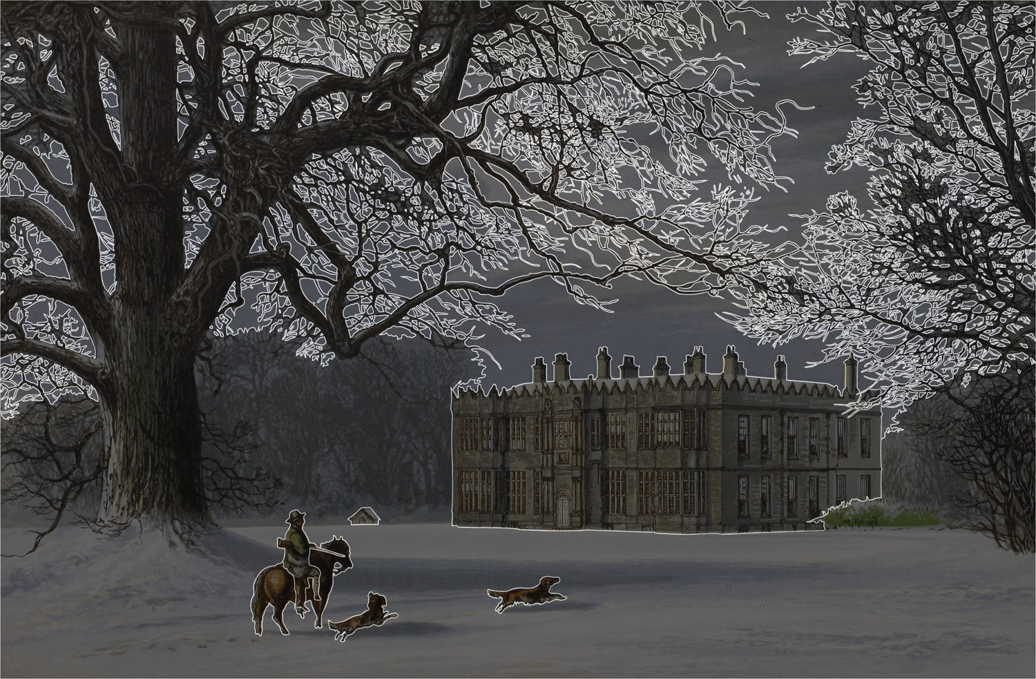
The process of restoring each image was similar to the process that I went through Illustrations of the Natural Orders of Plants but much shorter because I didn’t need to clean up the background for each one. The colors definitely needed adjusting so a few adjustment layers in Photoshop and simple cropping did the trick.
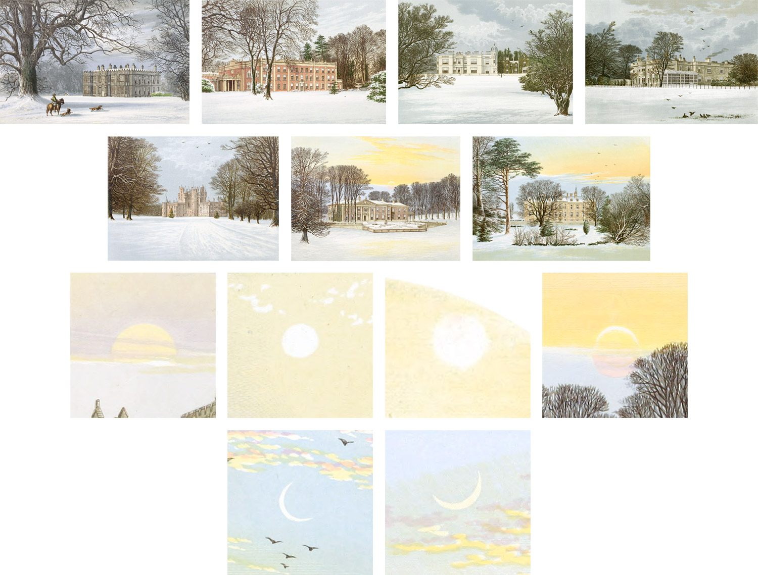
As I restored each image, I noticed that while there are many similarities between them, there are a handful of subjects that only appear in some like people, animals, water features, or the sun. As far as I could tell, there isn’t a pattern to why these subjects were added to some images and not others but I thought cataloguing them would be interesting so I added a way to browse by tag based on these subjects.
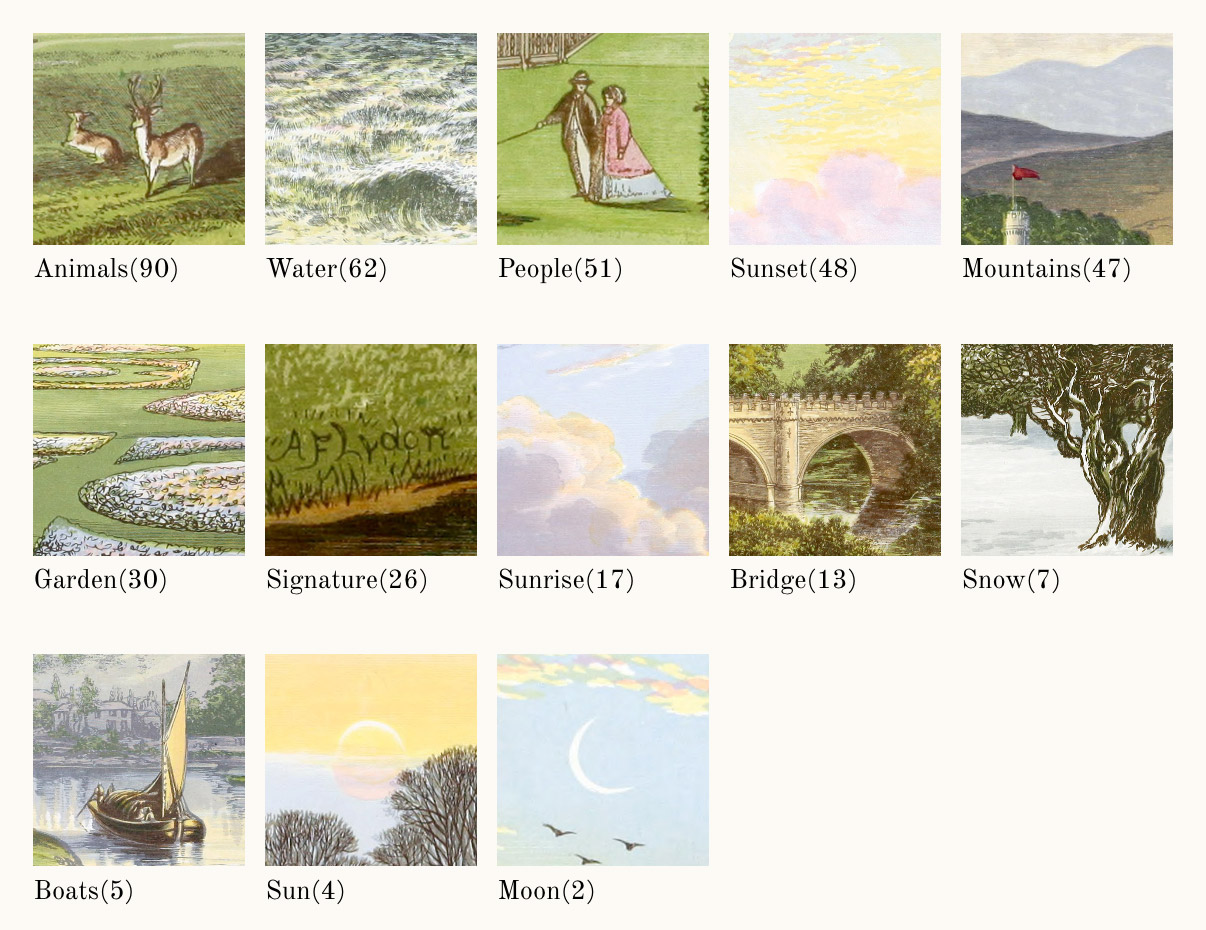
The most common subject was some form of animal (dogs, sheep, birds) which appeared in 90 illustrations. People appeared in 50 illustrations—some as very tiny silhouettes. Finding them was like looking in a Where’s Waldo book. In cataloguing the unique landscape features, I found that some kind of water feature was the most common, appearing in 62 illustrations with a sunset appearing in 48. I did my best to determine if a colorful sky indicated a sunset or sunrise based on the orientation of the building and shadows but it wasn’t an exact science. My best guess is that there were 17 sunrises depicted.
The most interesting subjects were the ones that appeared the least like snow which only appeared in seven illustrations drawn with a winter theme or the sun (four illustrations) and moon (two illustrations). These were such a rarity that coming across them was a nice surprise after all the greenery in the rest of the images.
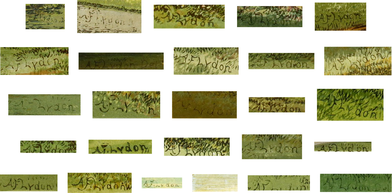
Of particular interest was illustrator Lydon’s own signature which appeared in only 26 illustrations—usually tucked away in a corner blended in with the blades of grass. His signatures do not appear consistently either. No signatures appear in the first volume, only one appears in the second, and only three in the fourth. The remaining 22 all appear in the third volume—most in a short string of illustrations one after another. Most signatures appear as “A.F. Lydon” but two appear as “A.F. Lydon Del.” I wasn’t able to determine who “Del” was—perhaps an illustrator helping with production. Whether or not this was intended or was standard practice for collections like this at the time is unknown to me but I thought it seemed unusual. I would think that all illustrations would have a signature or there would be some discernible pattern. If there is one, I haven’t found it.
Update (November 26, 2020): Richad Taylor was kind enough to shed some light on the meaning of “Del” in the signatures:
As a matter of interest, you mention “Del” with one of A F Lydon’s signatures. It’s short for the Latin, Delineavit, which means “drawn by.” It’s usage is mainly on engravings where the artist is not the engraver. In County Seats it also means that Lydon had drawn the outlines on the wood blocks. By the 1860s Fawcett and Lydon generally left the engraving in the hands of his other staff.
—Richard Taylor
Check out Richard’s site for more information about County Seats and its history.
Subscribers
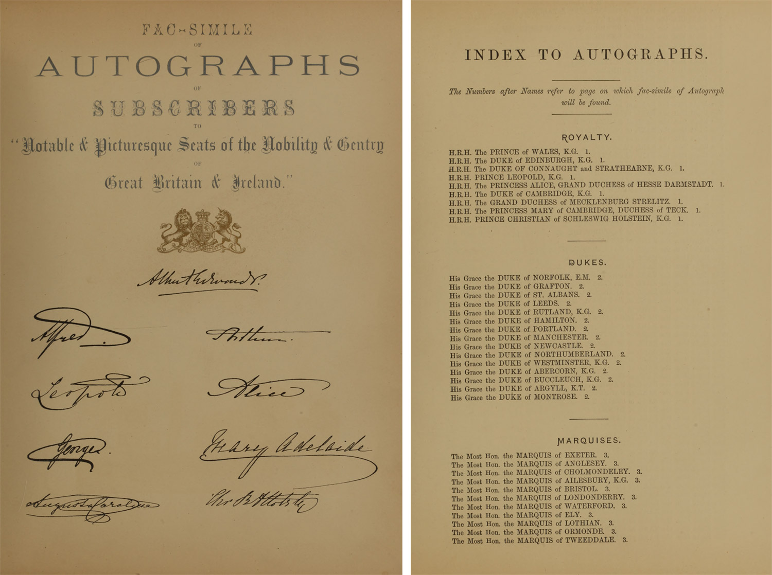
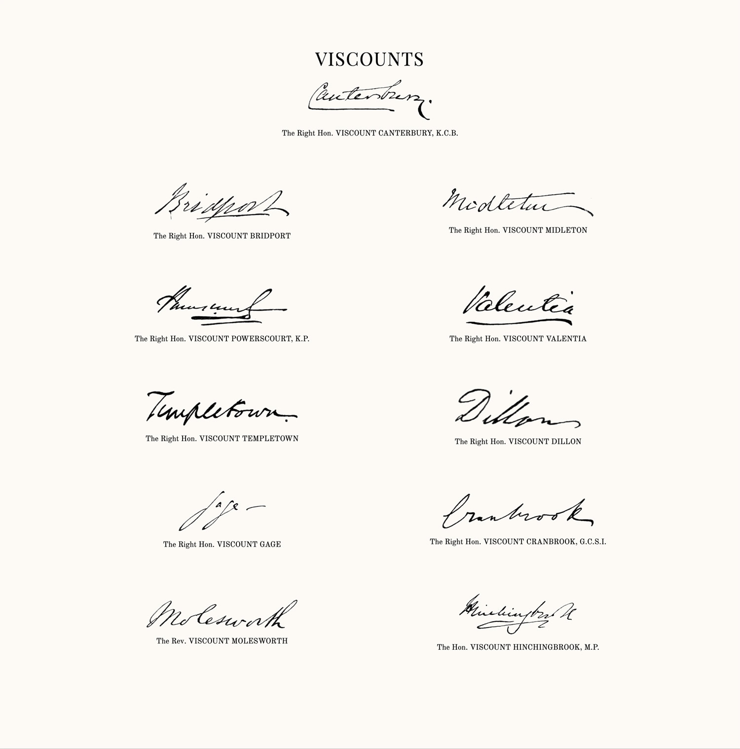
Speaking of signatures, there was one final section I debated over including in the site—the subscribers. After publishing the original six volumes, a seventh book titled Fac-simile of autographs of subscribers to the Picturesque views of seats of noblemen and gentlemen of Great Britain and Ireland was produced that contained names, addresses, and signatures of the subscribers who paid in advance for the illustrations to be published as an acknowledgement of their contributions.
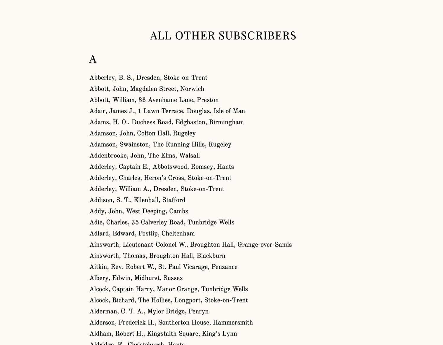
The list of subscribers was separated into two sections: signatures and an index. Both were also broken down by notable groups (royalty, dukes, marquises, etc.) and full lists of all other subscribers that weren’t categorized by those groups.
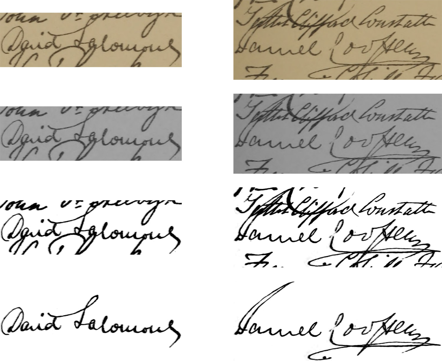
The earlier signatures like those for royalty were relatively easy to extract with some minor color adjustment in Photoshop but others required more careful extraction. The page with signatures of baronets and knights had them packed in tightly to fit on one page. Most didn’t require too much extra work but those for Sir David Salomons and Sir Daniel Cooper took some care. Each signature is available in its original high resolution from the scan as a transparent PNG.
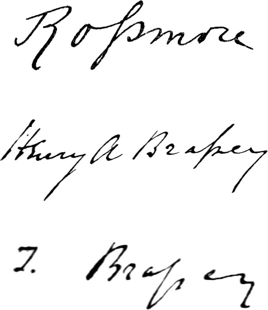
Exploring the different handwriting styles of the nineteenth century was fun but three in particular caught my eye: The Right Hon. Lord Rossmore; Henry A. Brassey, Esq., M.P.; and Thomas Brassey, Esq., M.P. Their signatures were the only ones I found that used a long s (ſ). By the nineteenth century, usage of the long s had fallen out of style so seeing it used was an fun surprise.
I initially wasn’t going to reproduce these because there were so many but the completionist in me kept nagging me to do it, so over the course of two weeks, I extracted the 314 signatures of the notable groups listed (royalty, dukes, marquises, etc.), matched them with their names listed in the index, and typed the names of the nearly 3,000 subscribers listed. I opted to limit the extracted signatures to those in the notable groups and not every subscriber to avoid working this for many, many months.
Why did I type all the names instead of copying and pasting? I wanted clean data. In the original text, names and titles of those in notable groups were in all caps and I wanted to control that through CSS rather than typing all caps in the code. This way, if someone copied names from my site, they would get them with correct capitalization rather than all caps. The capitalization also varied a little from group to group and wasn’t used for the ungrouped subscribers. I made more work for myself than was necessary but the result was cleaner data that I had more freedom to format as I wanted.
With the clean data, I was able to format all the names similar to the original scans but I chose to pair the signatures with the full names from the index for the notable groups and add headings to denote different sections of the alphabet for the rest of the subscribers.

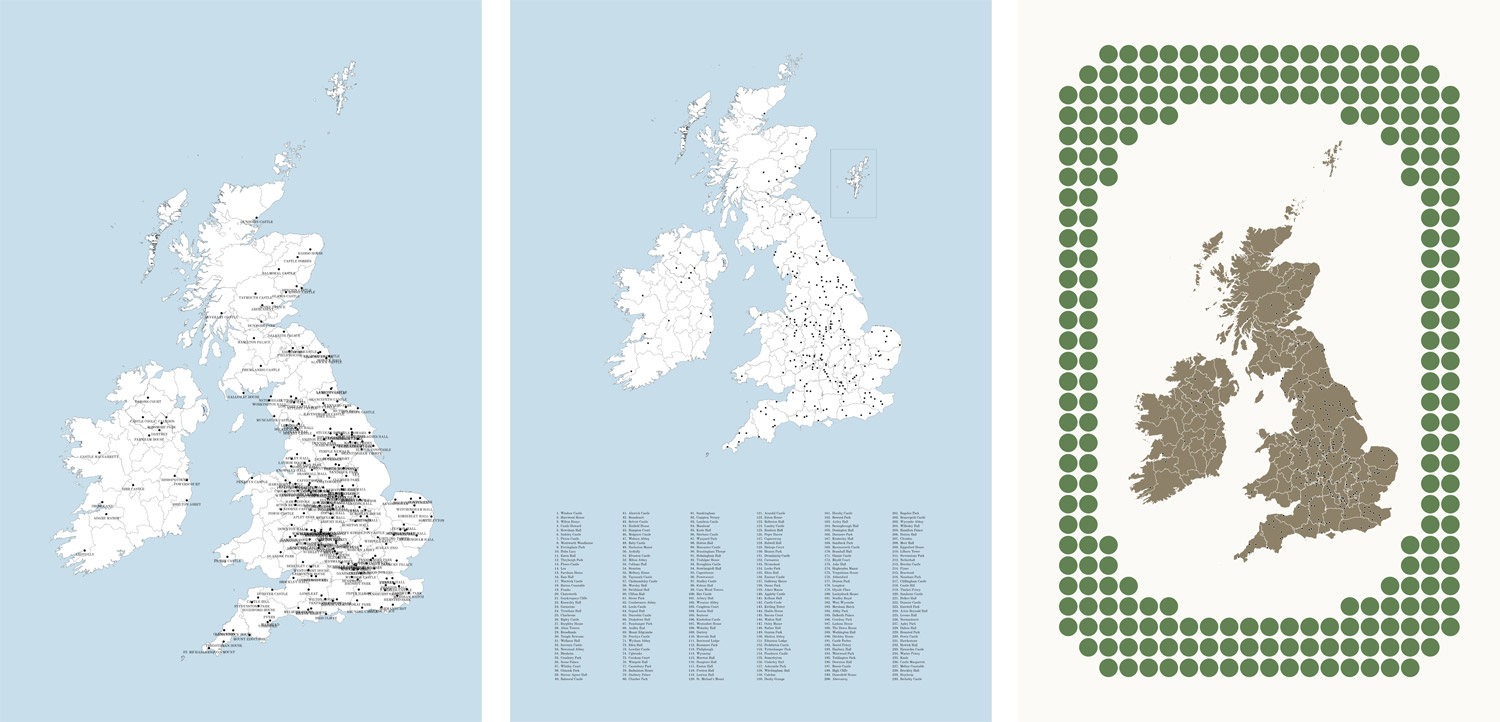
Posters
I’ll admit, creating the posters was a driving force behind this project. There’s something very satisfying about creating posters from beautiful data. My initial goal was to find some way to create poster or several posters of all illustrations. With 240 incredibly detailed illustrations, I knew there was going to be a limit to how much could fit comfortably.
Volumes
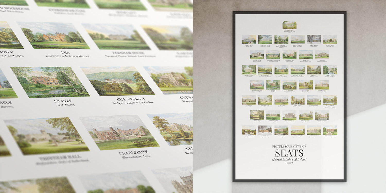
Considering the original collection was split equally into six volumes, creating a poster for each containing 40 illustrations seemed the most logical. With only 40 per poster, I could easily fit some text with each as well so I included the names, locations, and residences—the same as what appears in the website. Each volume has an illustration on the title page with rounded corners and cropping them to square didn’t look great so I arranged the images on the poster so it’s at the top with the original rounded corners.
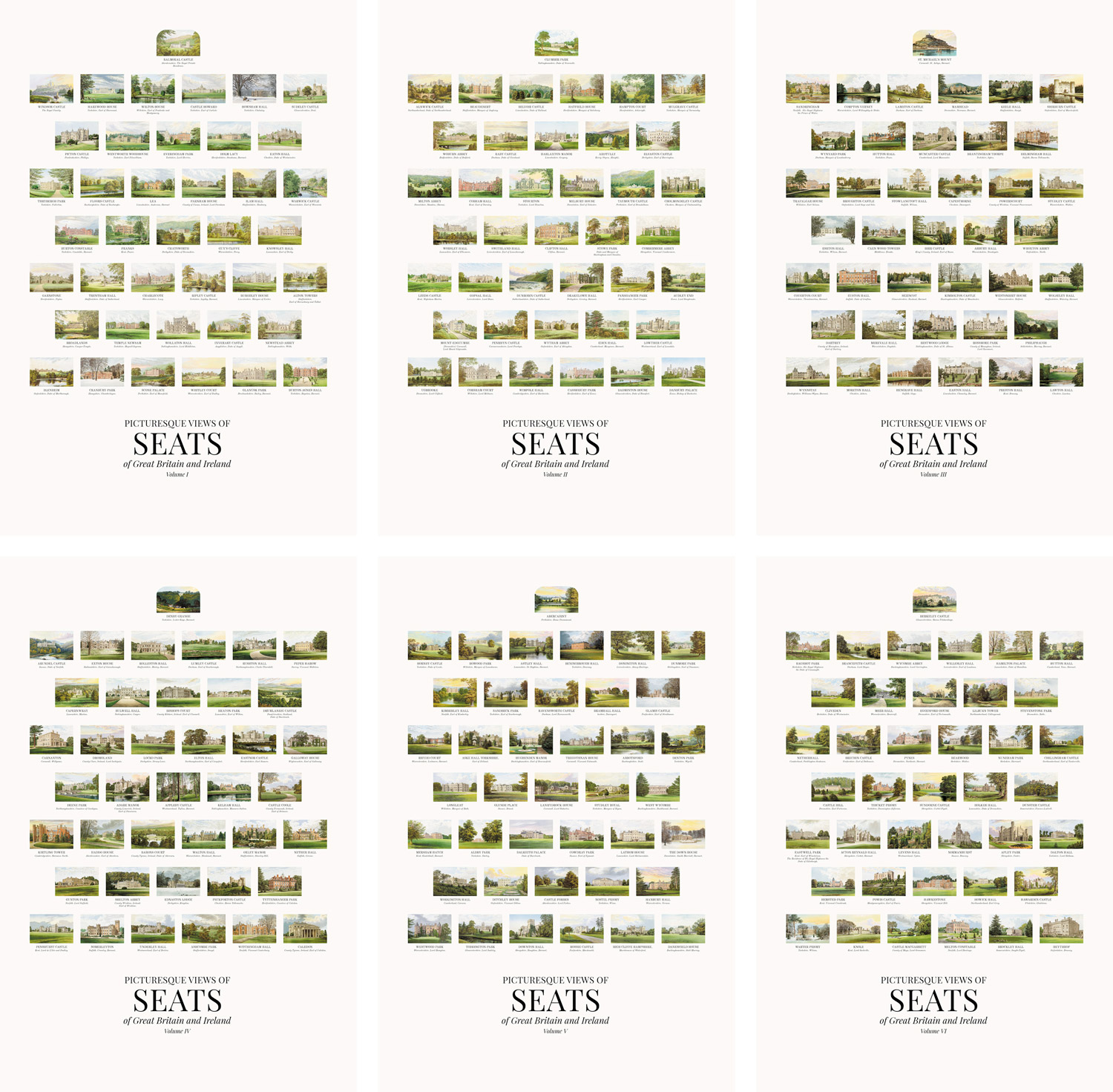
Seeing the images grouped by volume like this highlights some color trends in the illustrations. The first two volumes are brighter than others while the third and fourth volumes have a much darker palette for the landscape with dark foliage. The fifth and sixth volumes have much more colorful skies with their sunrises and sunsets.
Similarity
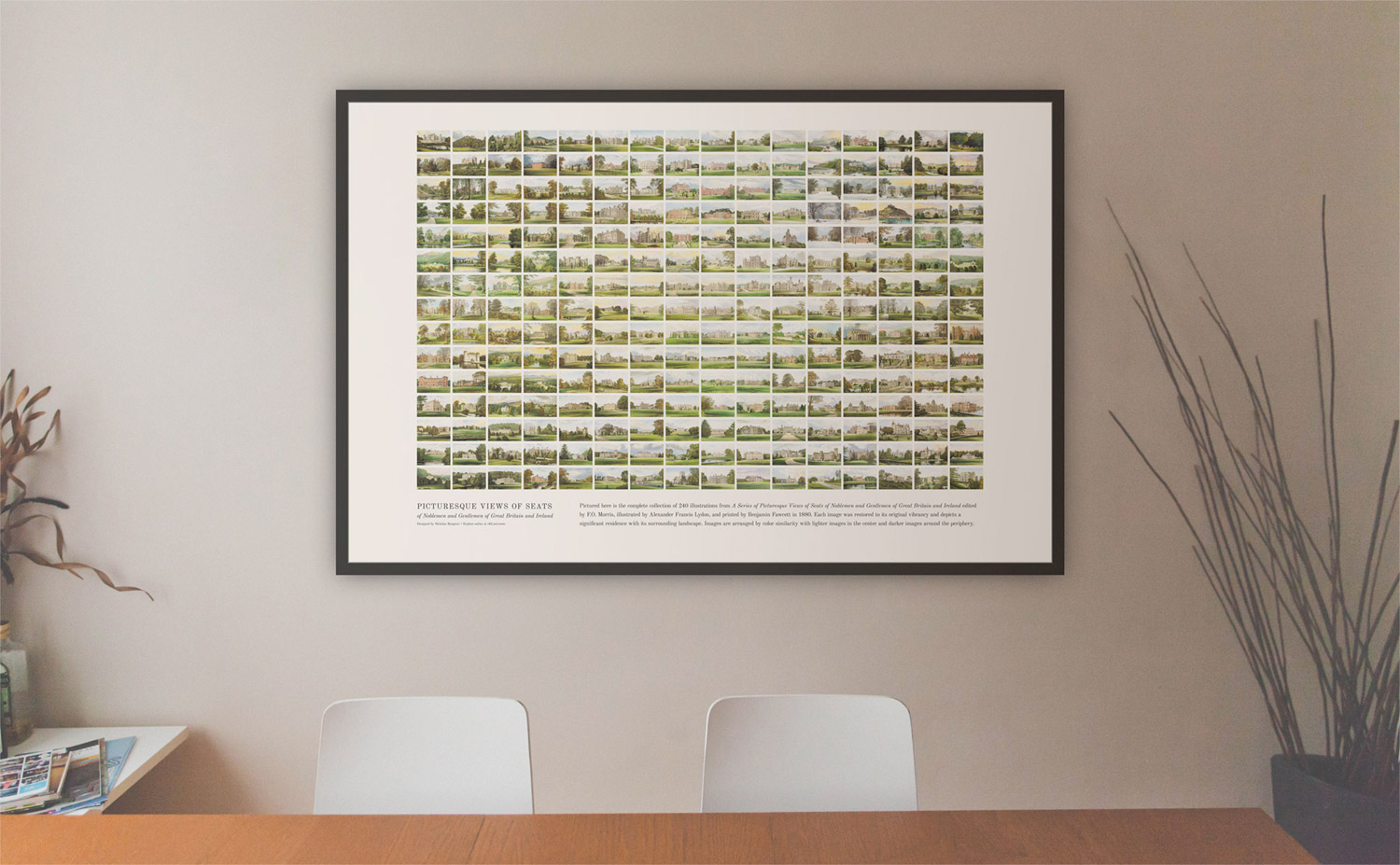
I’ve had an app installed for some time called ImageSorter which arranges images in a given folder by color similarity and often when I have a set of images, I like to run them through the app to see what it produces just for fun. Sorting these illustrations proved very interesting. However, the first pass shows lots of gaps between images.
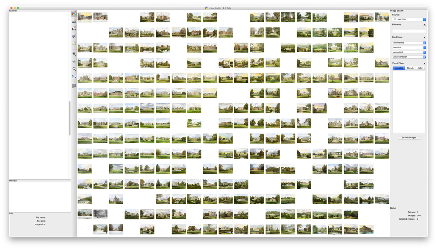
ImageSorter is no longer developed and isn’t without its quirks—one of which is the inability to easily re-run the sorting and at different sizes. The number of gaps and images per row and column vary depending on the size of the app window and I noticed by chance that my laptop screen was the perfect resolution to produce a result without any gaps.
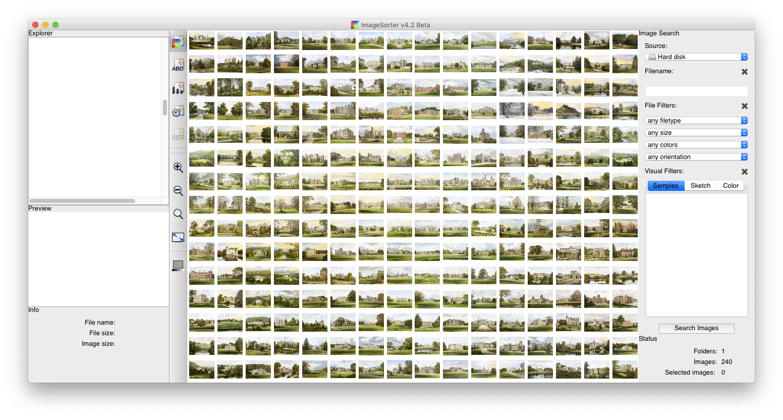
Another quirk is the inability to export the resulting composite image. However, it’s interactive so I was able to get the file names of each by hovering over each one. Not being one to shy away from tedious work, I ended up importing each of the 240 images into InDesign one at a time to arrange them in the same way as the composite image. This poster didn’t have room for the names like the others so I left them out. The result is a poster that showcases every illustration sorted by similarity with a small explanation below it.
Layered
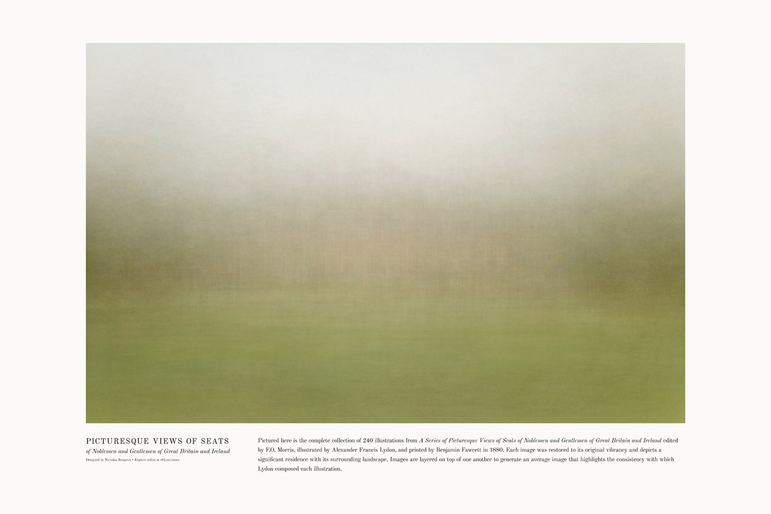
All of Lydon’s illustrations have similarities in a broad sense by showcasing a main structure surrounded by an idyllic landscape. This stands out by taking the average of all the images. As I completed each volume, I used Photoshop’s image stacking feature to create an average image. These six averages also showcase some of the color trends as I previously mentioned volumes three and four having darket palettes.
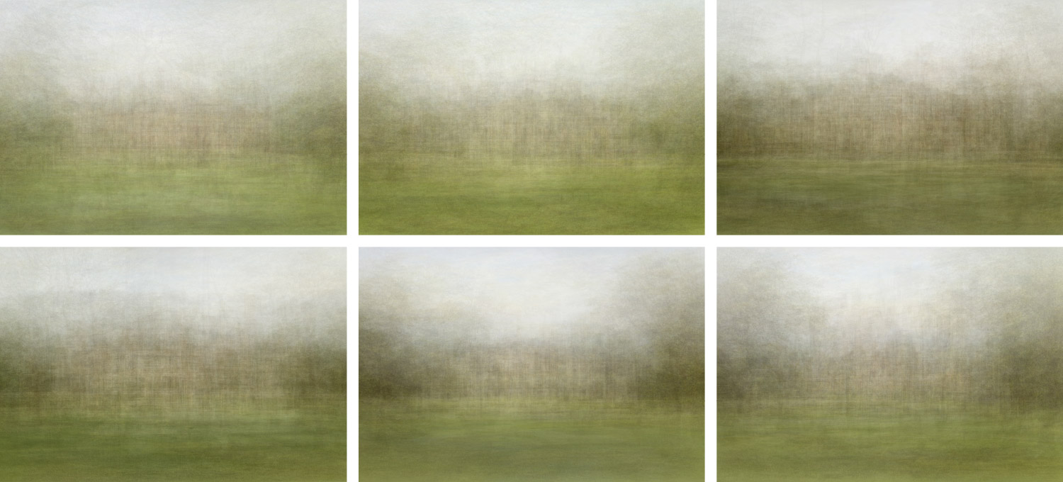
Perhaps the most interesting aspect was the average of all 240 illustrations. The result is a very soft image that showcases the overall composition of the collection very clearly: main structure in the middle with a green lawn in front, grey sky above, flanked on both sides by trees. This looked intriguing enough that I thought it would make for an interesting poster.
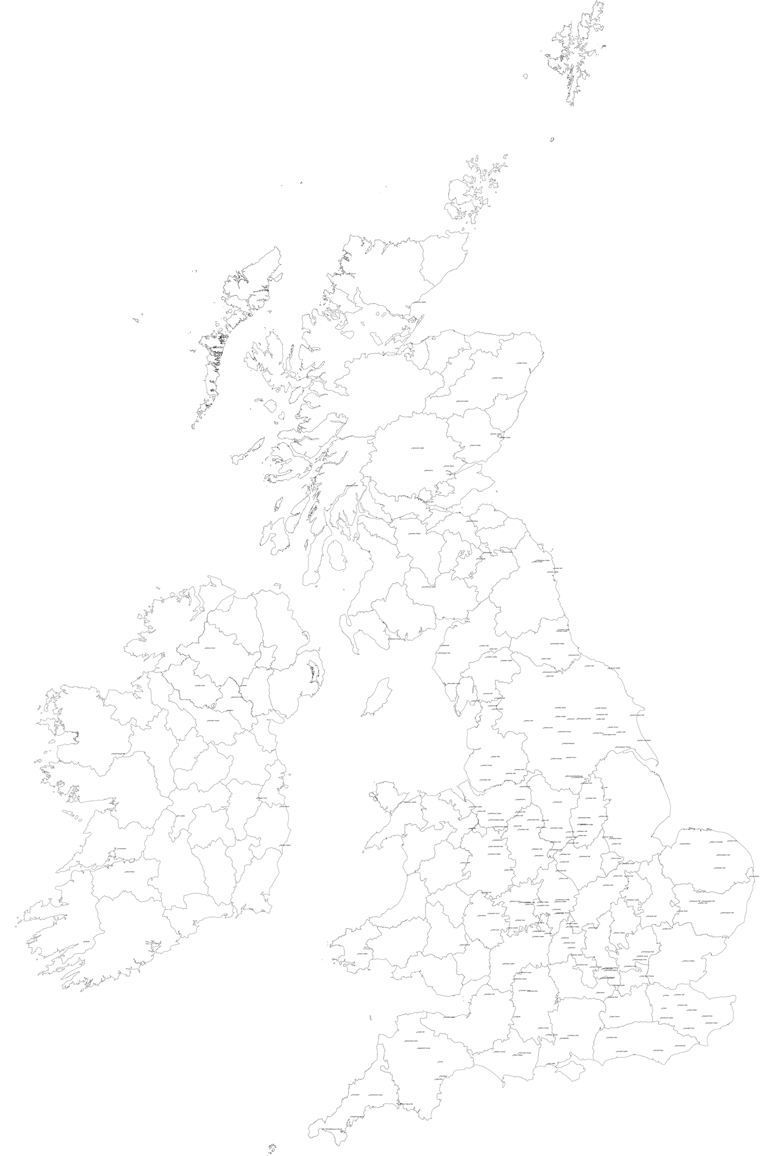
Map
I knew early on that I wanted to try to create a map poster of some kind. Little did I know just how much work it would be and the challenges I would face.
In during my hunt for all the locations, I learned that the internal boundaries of Great Britain and Ireland changed in the last couple centuries and The Historic Counties Trust created The Historic County Borders Project with digital maps of how boundaries used to be shaped before these changes took place and made them freely available for download. For example, North, East, and West Yorkshire used to be simply Yorkshire. These digital maps are available as shapefiles and KMZ files.
With digital files of these historical counties so readily available, I decided to make the map specific to the 1800s. This also meant showing Ireland as one country since Northern Ireland didn’t officially form until 1921. The historical maps included England, Wales, Scotland, and the counties that would eventually be Northern Ireland but not the rest of Ireland so after some hunting, I found those and extracted the Isle of Man and Calf of Man from OpenStreetMap using Overpass Turbo. Once I had all my files, I combined them with GPS Visualizer to generate a single SVG.
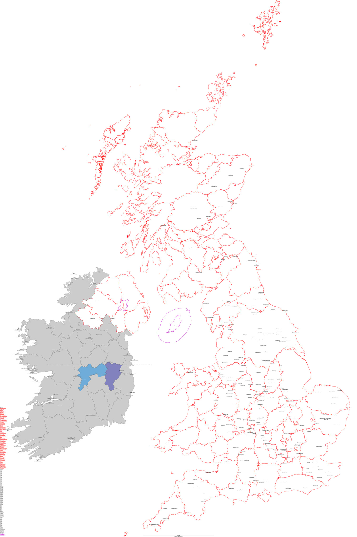
Then I began the long cleanup process. The SVGs that GPS Visualizer generates by default include many disconnected paths. There’s an option to connect them but I found it easier to work with them separate because the layers are named for each county. However, joining the paths in Illustrator joins all paths in a selection which meant islands had many lines drawn between them which needed removal. For example, the Shetland Islands had many little shapes that needed to be disconnected from each other.
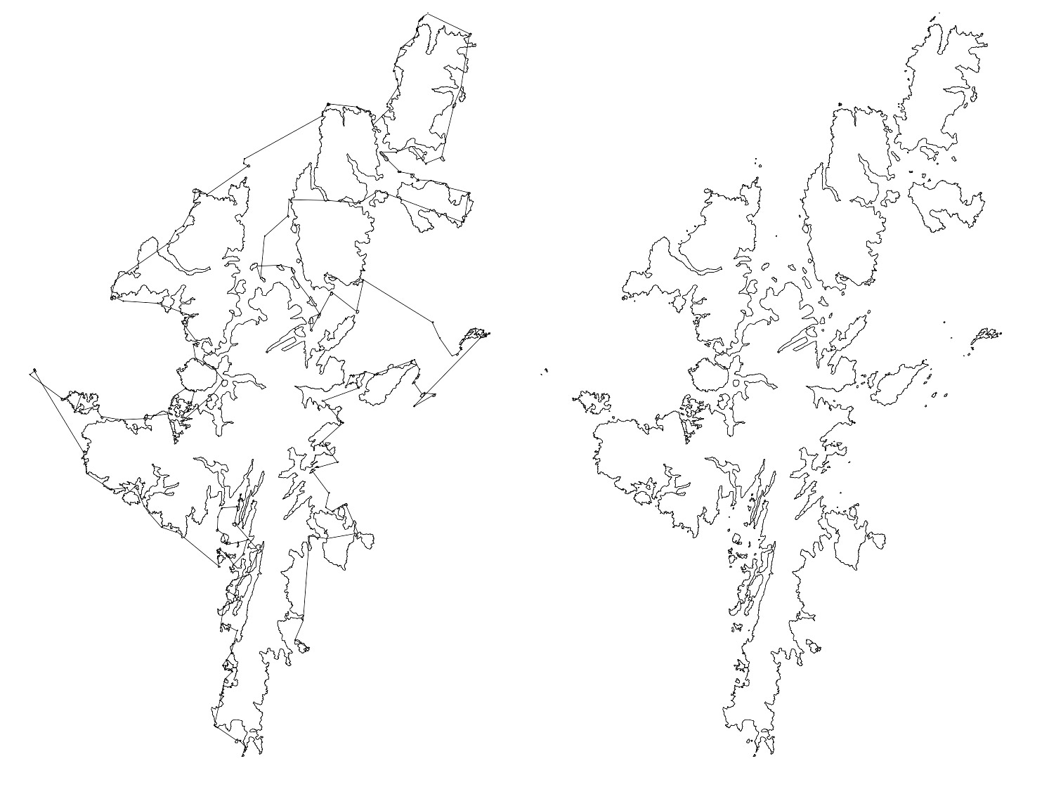
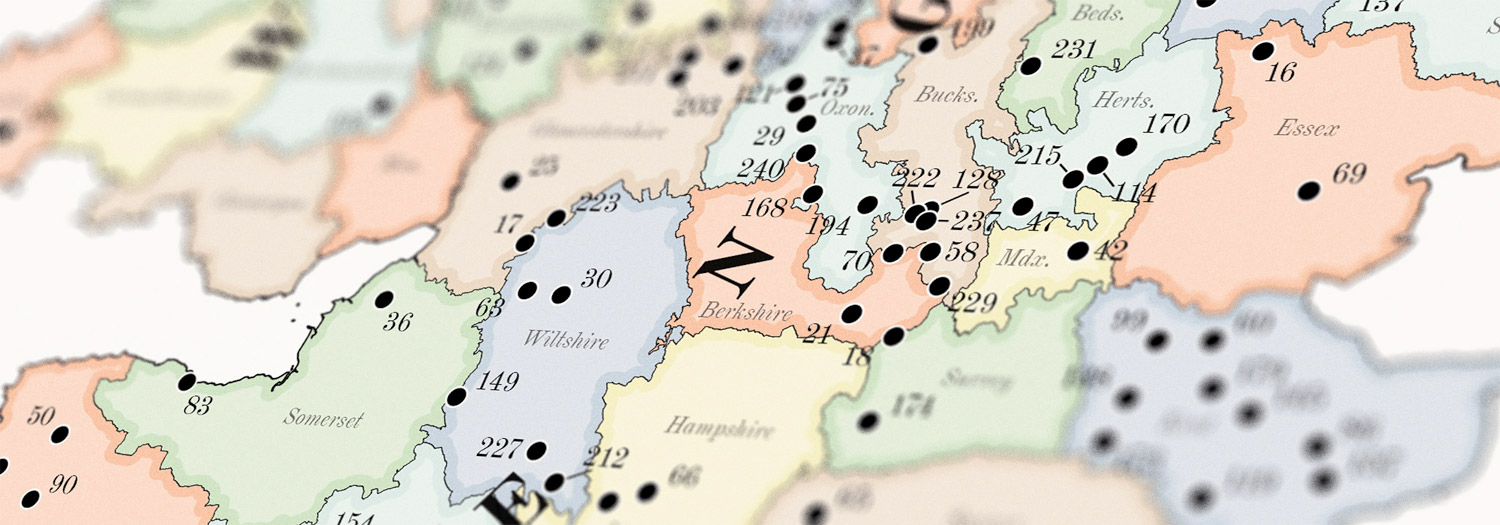
After many hours I had a clean map with county shapes joined and organized by country and markers for each castle.
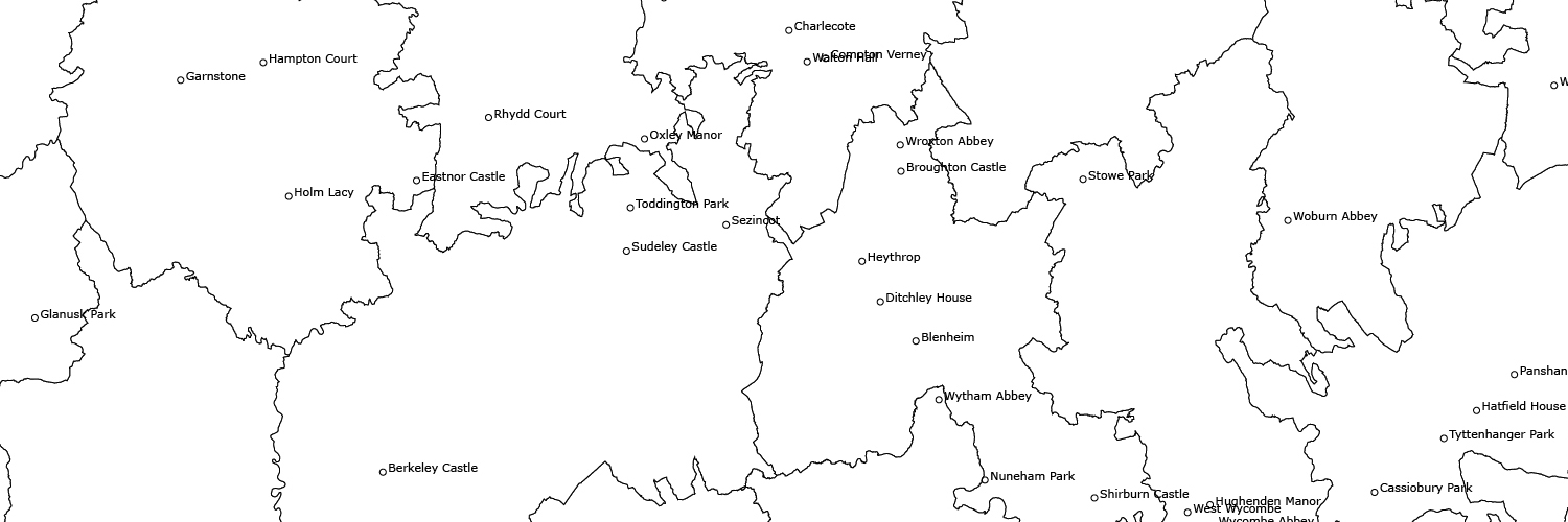
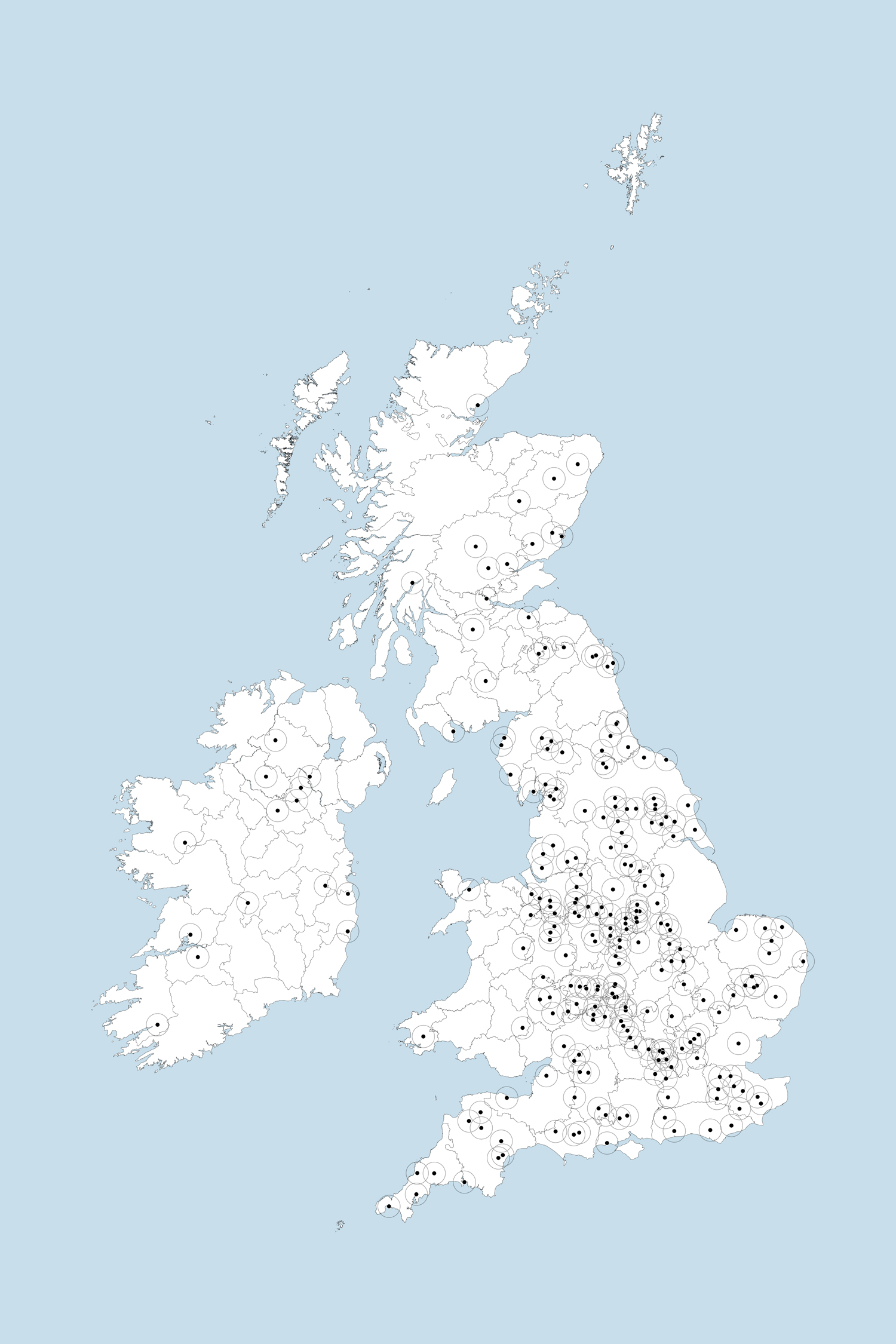
The original goal with the map was to include thumbnails of each illustration near their location on the map but this proved more trouble than it was worth because the circles would need to be too large to fit all of them comfortably on the map and very challenging to arrange in dense areas
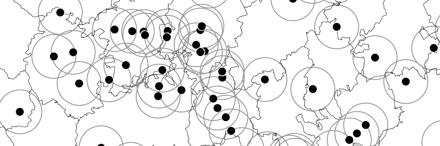
I made a few proof-of-concept attempts at making all the labels visible, arranging them in a list below the map, and foregoing the names altogether in favor of showing a frame of thumbnails. All were good to try but none was a good option.
I eventually decided to abandon the idea of including thumbnails in favor of showing a full list of names corresponding to numbered markers on an alphanumeric grid.
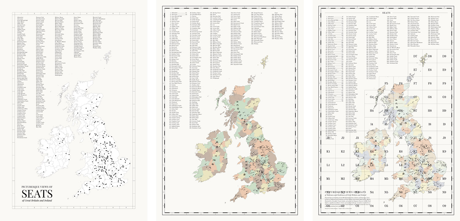
Once I settled on that approach, the next biggest challenge was to arrange all the text numbers on the map so they didn’t overlap. This was especially challenging with the denser groupings in central England but after a lot of manual adjustment, I found an arrangement that works.
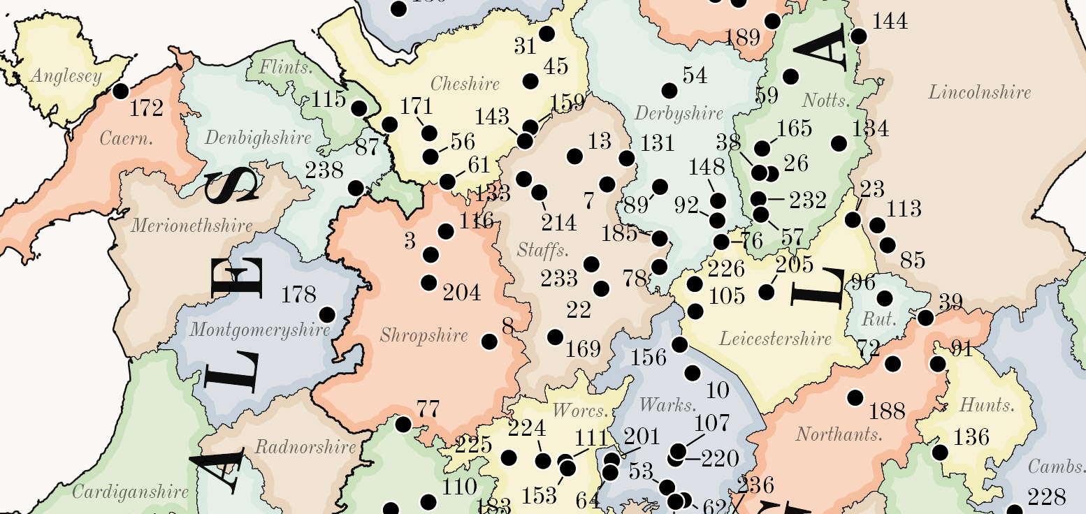
Finally, I polished the colors and added some shading around the shapes similar to nineteenth century maps with darker shading around the borders to create a detailed period-specific map of all the locations.
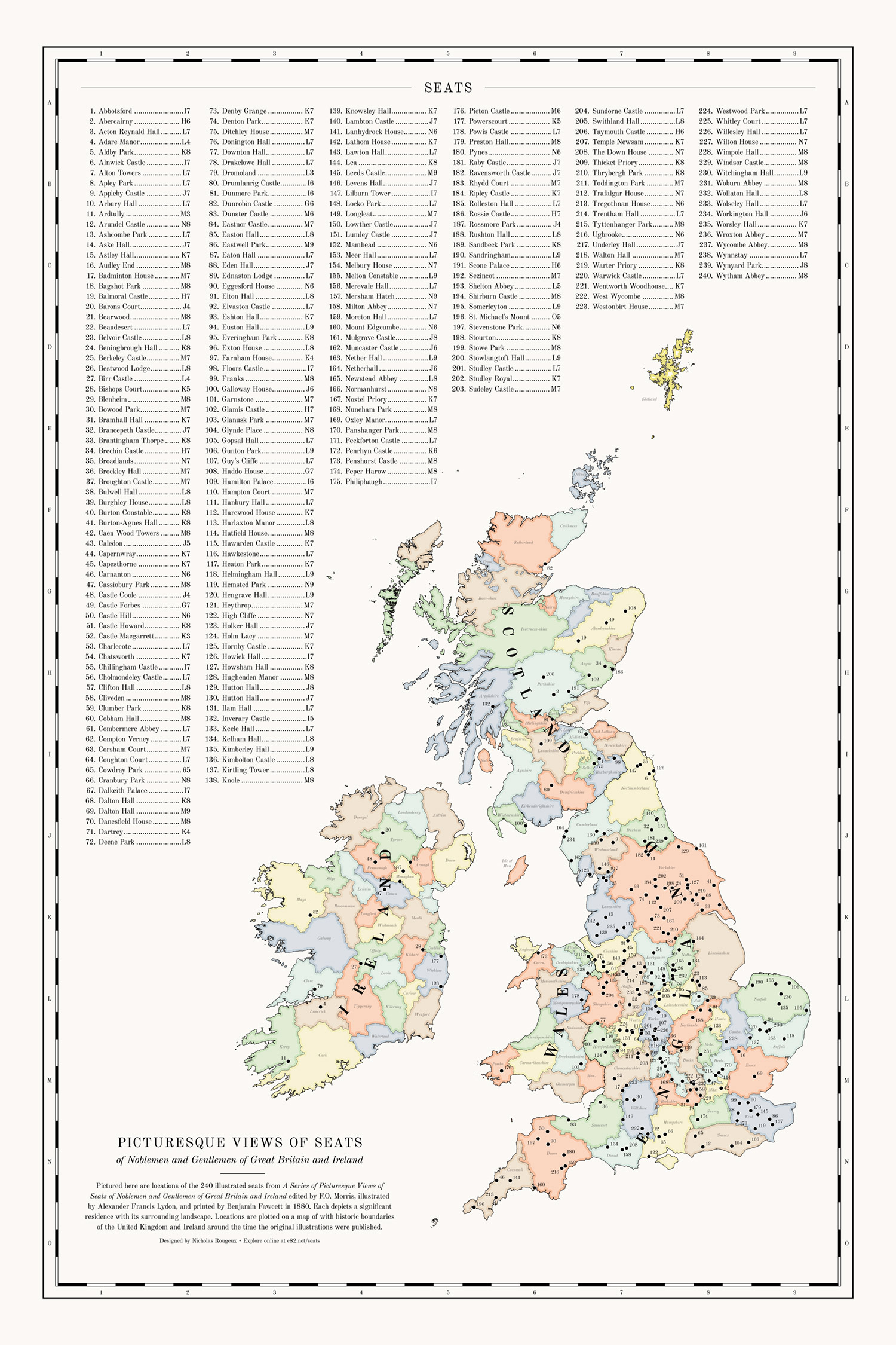
I would have loved to put an interactive version of the same map online but ran into several issues that prevented me from doing so ranging from limitations of SVGs online to the volume of data that I wanted to display (the county shape data was too large for downloading), and my general lack of knowledge in producing a fully interactive online map. I dabbled with Google Maps, Mapbox, and OpenLayers but ultimately decided on a simple Leaflet map with basic markers.
Final thoughts
What started as a relatively simple project to restore a nice collection of beautiful illustrations turned in to a great learning experience in researching historical architecture. Reading through the histories about each illustration both from the original books and from newer online sources was a fascinating virtual trip across Great Britain and Ireland. I had a lot of fun working on this project and hope others enjoy it along with this write up.