Making of Printing Types
By Nicholas Rougeux, posted on September 20, 2025 in Web
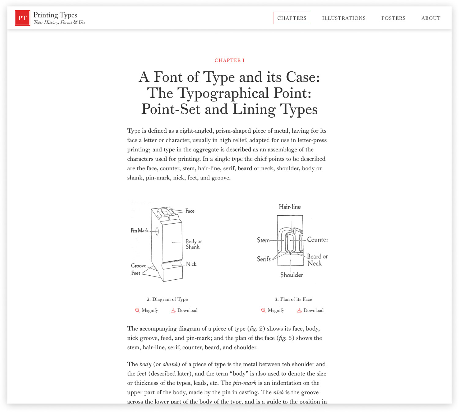
Researching is like treasure hunting—following clue after clue in the hopes of finding something amazing. When I set out to create a digital edition of Daniel Updike’s Printing Types, I had no idea that I was going to spend months hunting down more than 1,200 books spanning more than 450 years but I’m glad I did. This project involved more research than I’ve ever done.
I’ve always had an affinity for typography, even before I knew what it was. When I was young, I enjoyed playing with fonts, endlessly scrolling through those that came with CorelDRAW installed on the family computer. As I grew up, I became interested in design and naturally, so did my appreciation for good typography when I got into designing websites. I was fortunate enough to have a boss who started out as a typographer to instill in me a deeper appreciation for the art.
During the waning days of my previous job, old books in the office were being cleared out due to various business decisions, and one set of books caught my eye with its unassuming brown cover and gilded edges. They were the two volumes of a first edition printing of Daniel Updike’s Printing Types from 1922 and I’m a little ashamed I hadn’t heard of them until then, given my penchant for the topics they covered. I didn’t pay them much attention beyond a cursory glance and just when they were about to be discarded with other unwanted materials, I felt an unexplained need to save them for myself. I took them home, glanced at them occasionally, and put them on a shelf where they sat for years. As I started making more digital editions, their presence nagged at me and I could help but think that I could do something interesting with them but could never figure out what until this past summer when inspiration finally struck.
Printing Types: Their History, Forms & Use
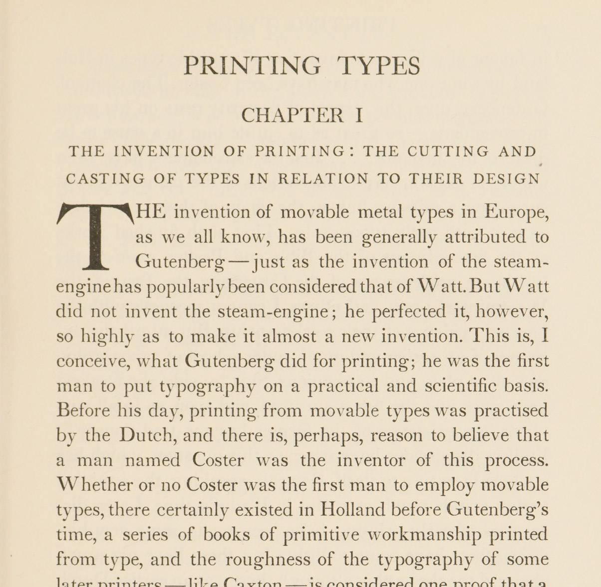
Daniel Berkeley Updike (1860–1941) was a distinguished American printer, typographer, historian, and professor. During his tenure at Harvard University, he taught a course on Technique of Printing in the Graduate School of Business Administration for five years—the lectures of which served as the basis for Printing Types, published in 1922 in two volumes. After a couple reprints with minor corrections, an official second edition was published in 1937 with a healthy addition of supplemental notes.
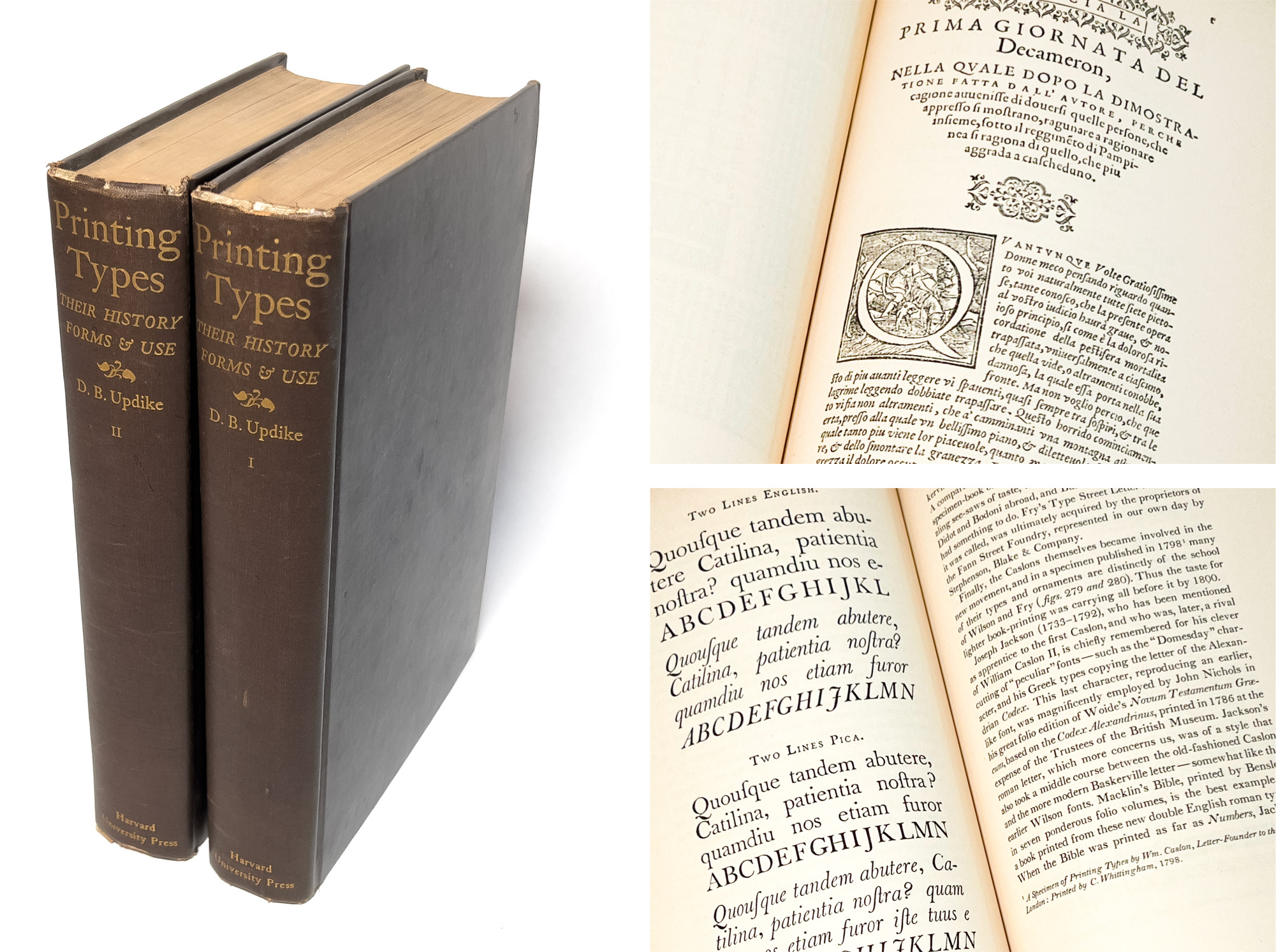
This two-volume work became known as the standard work on the subject and a basic book for all who were interested in the graphic arts. Updike explored the art of typography from the dawn of Western printing in the fifteenth century to the beginning of the twentieth—focusing primarily on European printing in Germany, France, Italy, the Netherlands, Spain, and England as well as the United States. In it, he traced the development of type design and discussed the importance of each historic period and the lessons they contain for contemporary designers. His study provided to be one of the first systematic historical analyses of typeface development, establishing typography as a serious academic discipline.
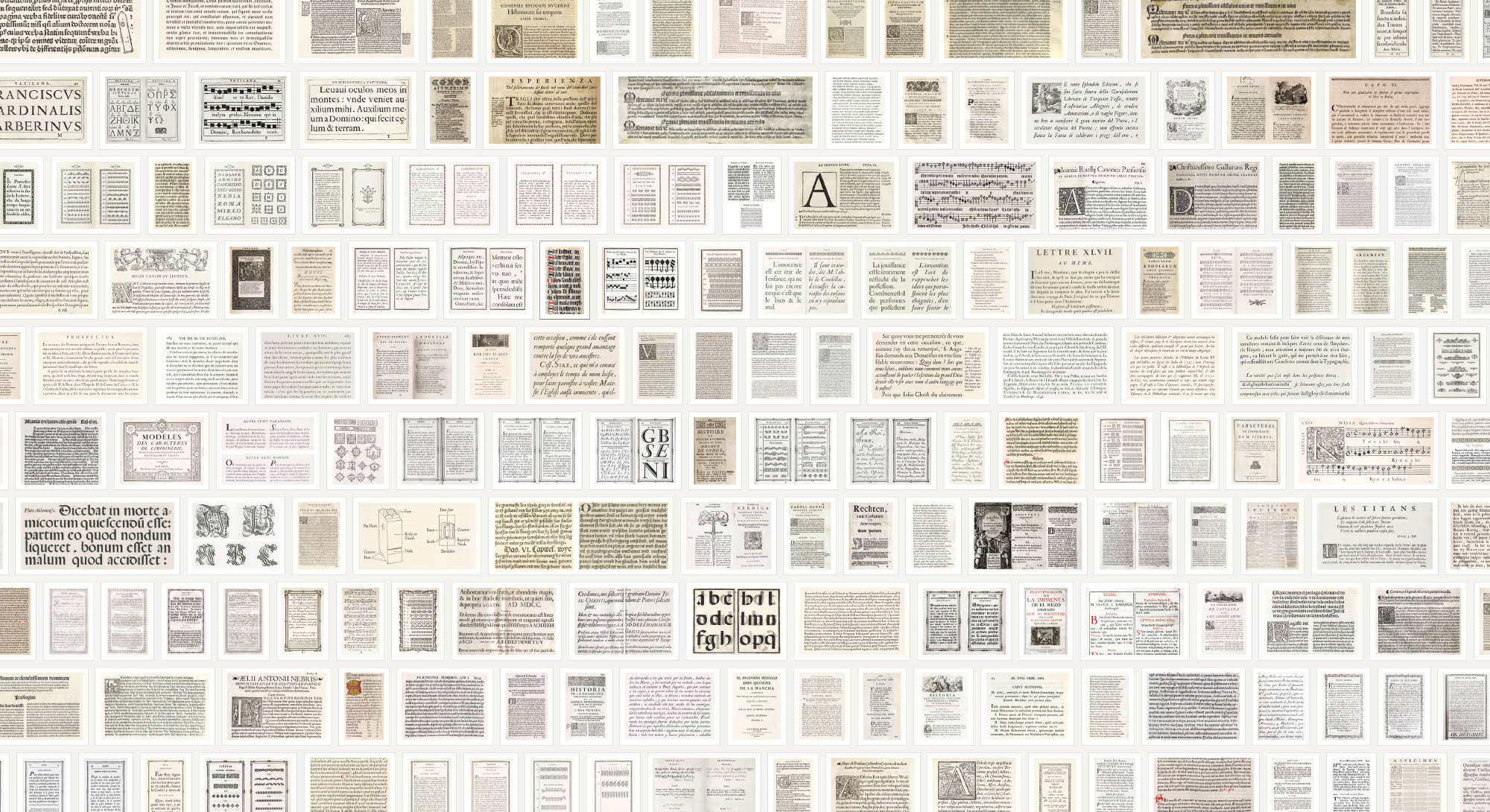
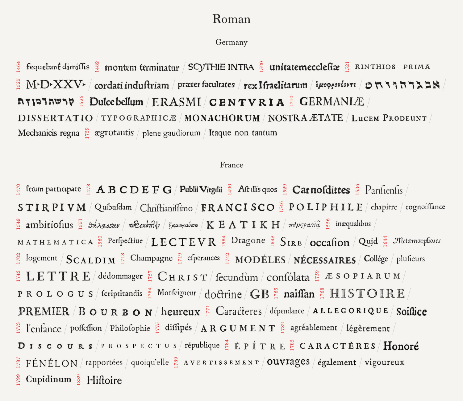
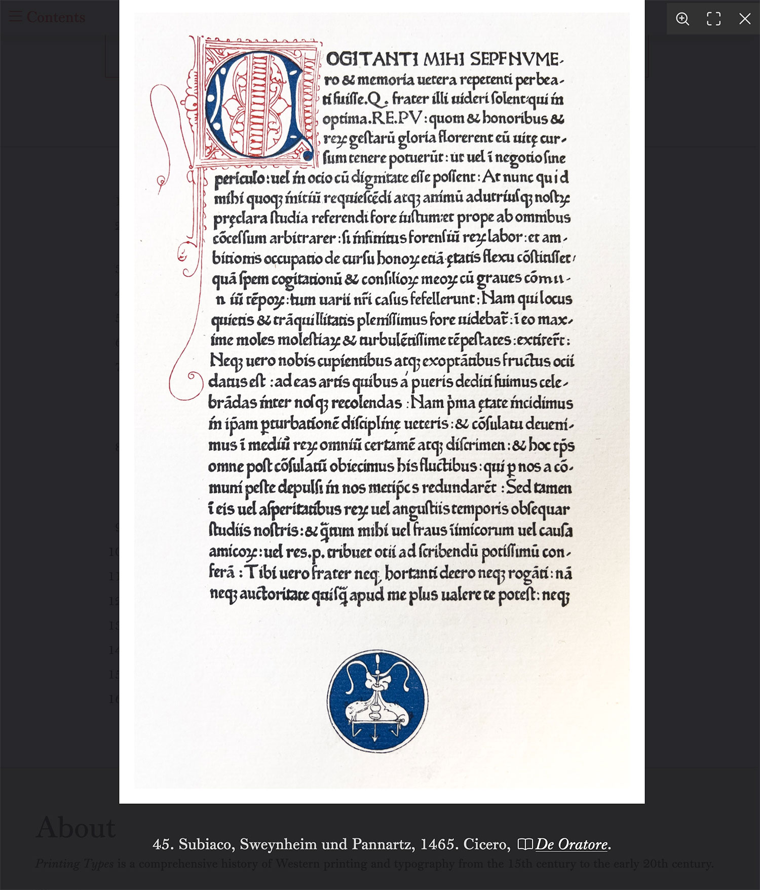
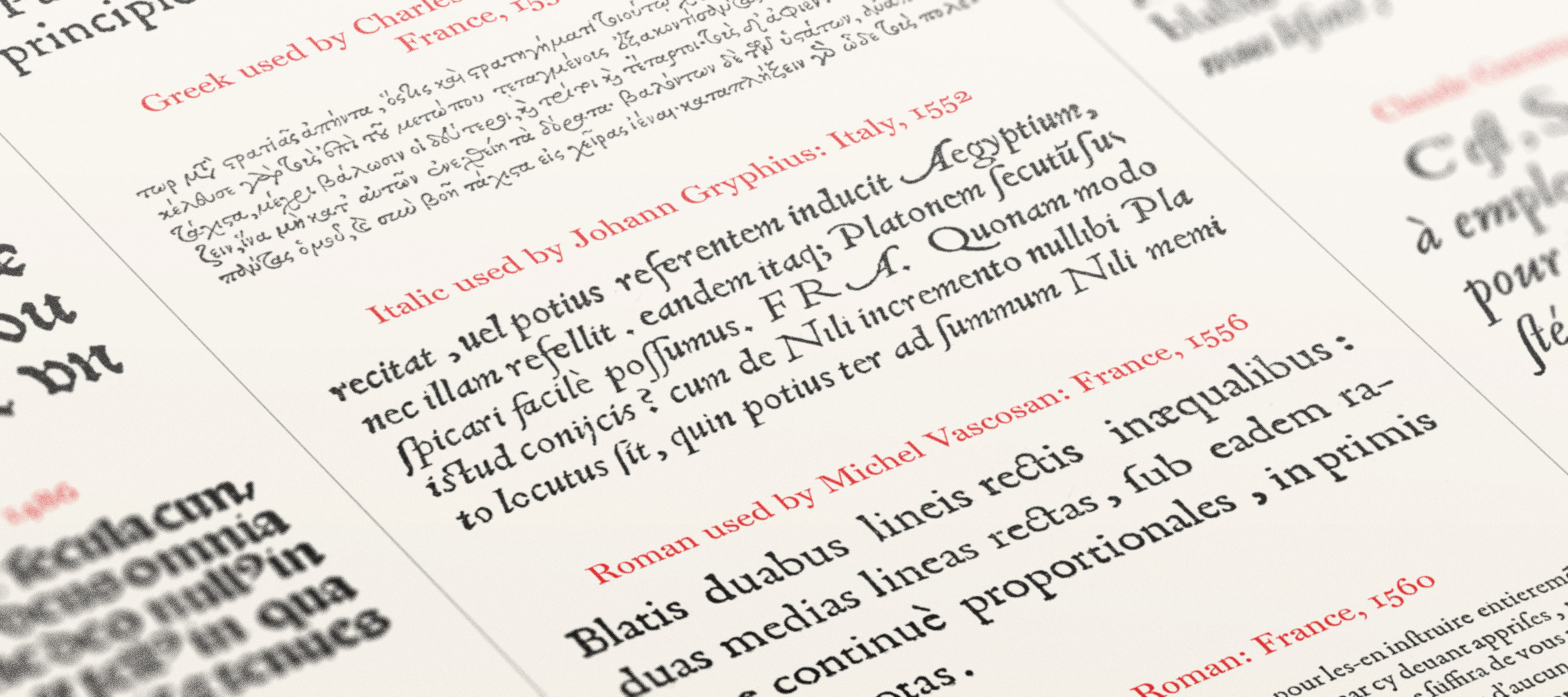
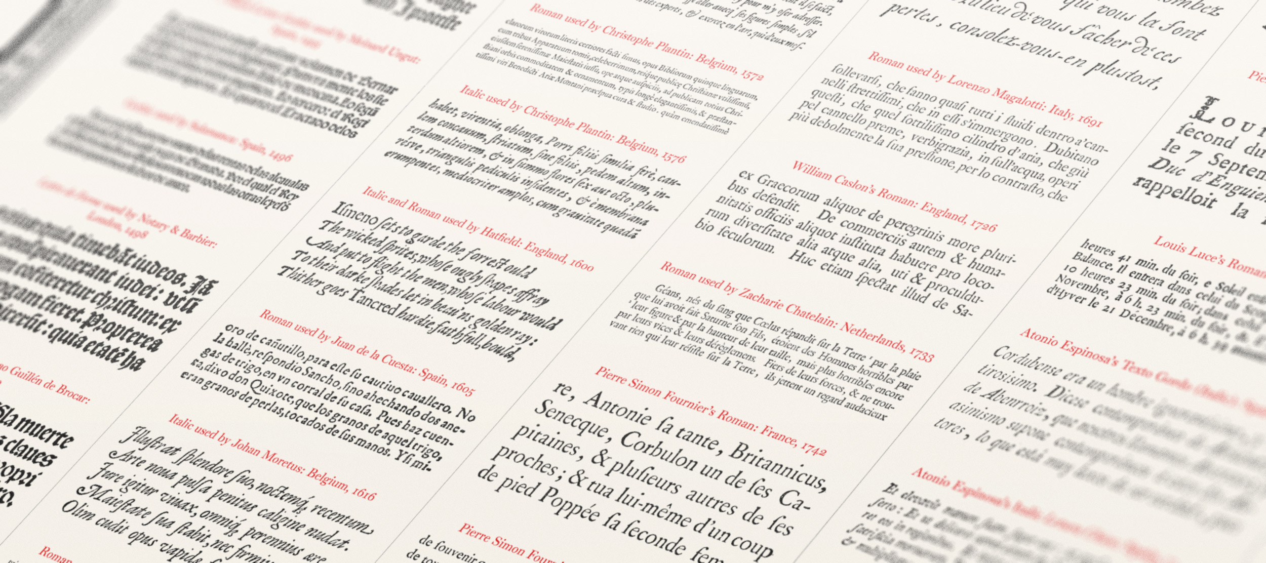
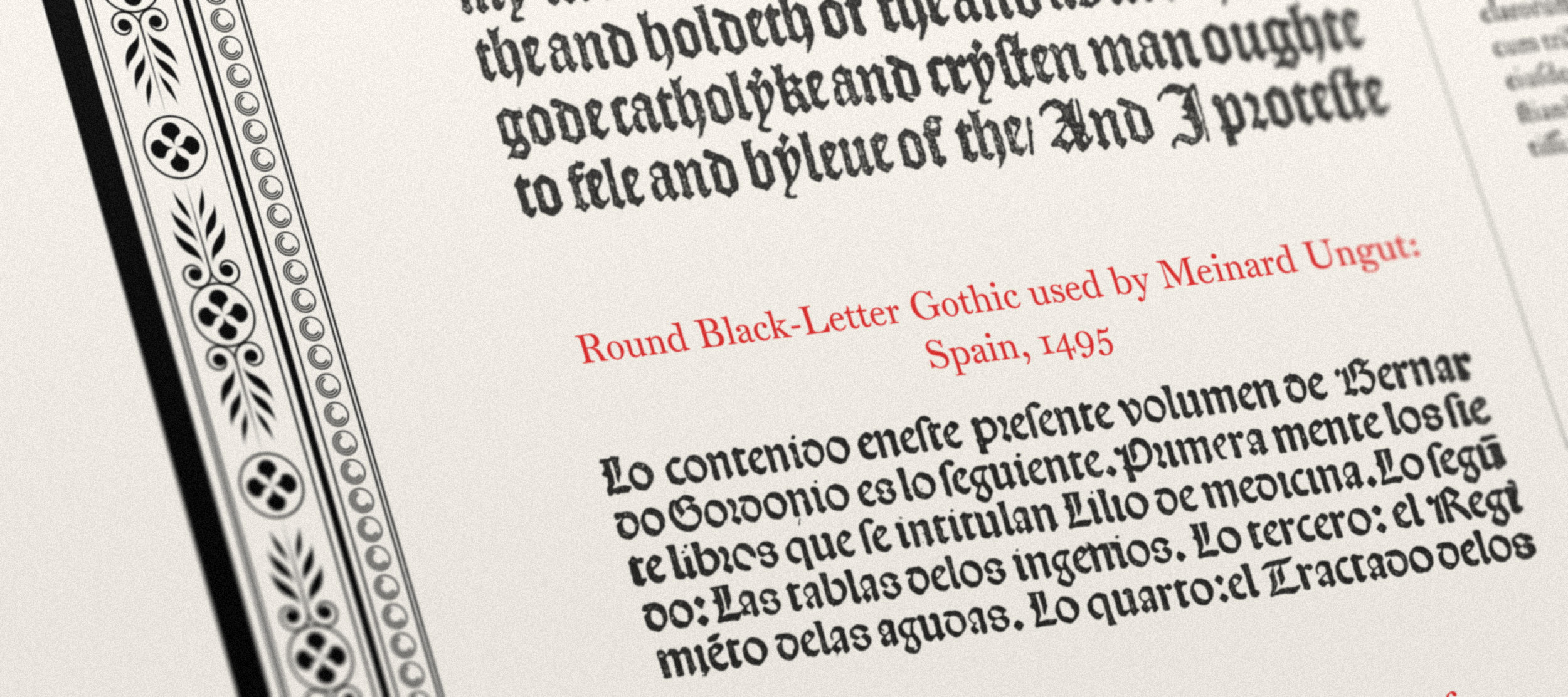
Updike included more than 360 figures, showcasing examples of typography, borders, flowers, and pages pulled from other seminal books from across the centuries. They were crucial to understanding the topics he covered due to the fundamentally visual nature of typography. These figures were facsimiles of books from his own collection, libraries, and others’ from around the world—many of which had not been reproduced until their inclusion in his work.
The first edition was hand-set and so could not be easily adjusted for the second edition. Instead, apart from a handful of careful corrections, the second edition is identical to the first except for the addition of supplemental notes added to the end of each volume—120 notes in total covering 36 pages. These notes include corrections and valuable additions from later research.
Updike had strong opinions and didn’t mince words when he voiced both his praise or distaste for the examples he cited. At times, his displeasure was almost poetic as in his description of French books of the seventeenth century:
The best of these books were perhaps printed from types in the Impimerie Royale; and were imposing rather than tasteful—grandiose, and as uncomfortable as grandiose things have a habit of being.
…and very matter-of-fact as in his comments about some Spanish books of the eighteenth century:
All its prefatory matter is composed in various sizes of good, but rough, old style roman and italic, and the Dictionary itself is set in a smaller font which is pleasant in feeling. In the main, it is a sober, solid piece of work; but the woodcut head-pieces and common, ornamented initials employed are ugly, and the presswork is of varying degrees of badness.
However, he offered well-deserved praise as in his comments about Joaquín Ibarra’s work:
Now this all sounds very simple—and it is; but as we turn page after page of this distinguished, lively, easily read italic and massive roman, we see how magnificent pure typography was made at an unexpected moment and place. It is really the beauty of these two fonts of type that, above all, makes such a wonderfully beautiful book.
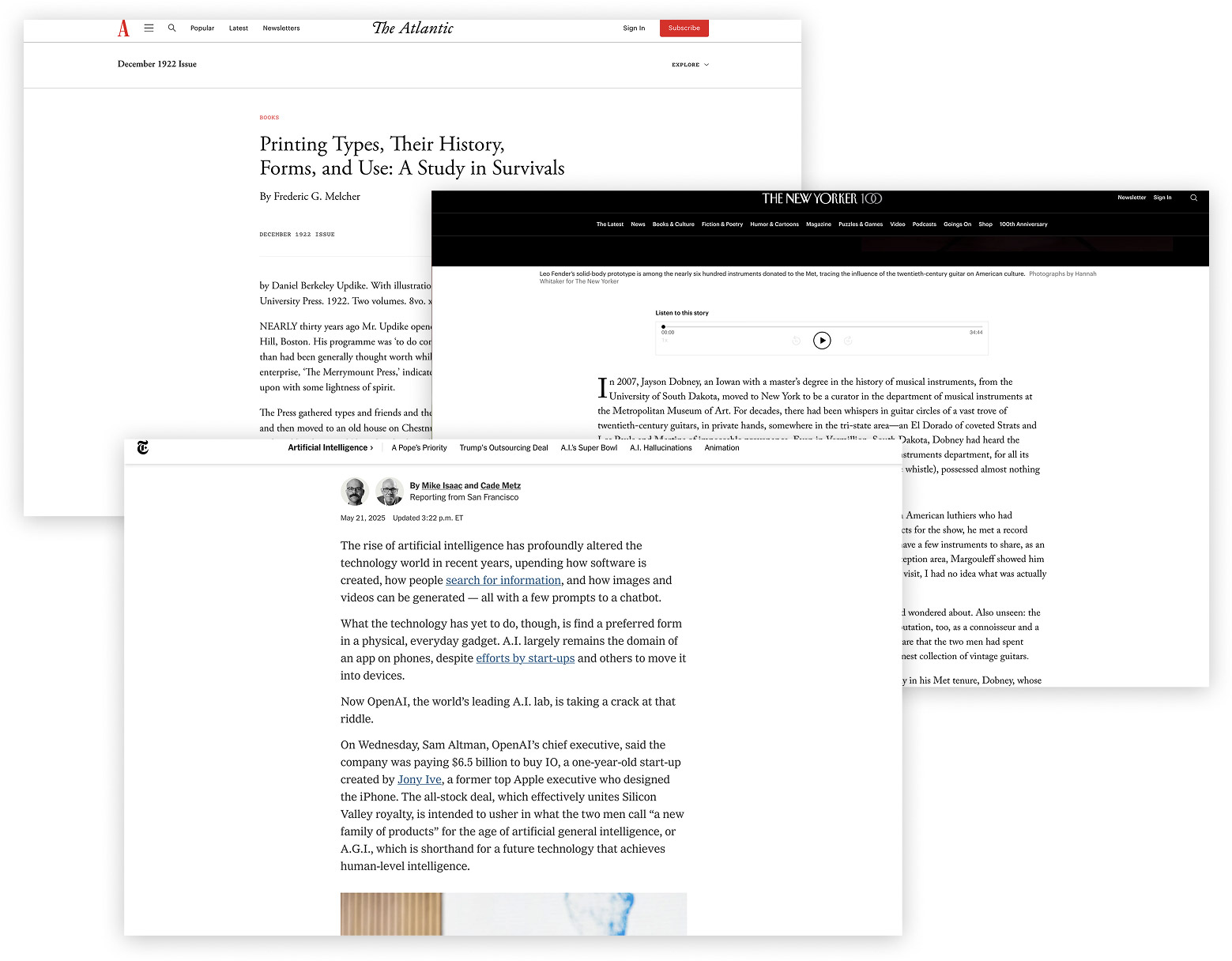
During my initial research, I was fortunate enough to stumble upon an original review of Printing Types from The Atlantic in 1922 as well as two obituaries of Updike, again from The Atlantic from 1942 and also The New York Times in 1948. It’s not often that I get to read these types of timely articles for antique books either because they’re far too old or they simply don’t exist. They all provided some great background and are worth a read.
To say these books are impressive would be a vast understatement. At a glance, they are unassuming and in Updike’s own words, cover a “subject generally considered dull,” but upon deeper examination paint a fascinating picture of typography’s evolution, which is why I wanted to create a digital edition for everyone to enjoy.
Source material
Printing Types was published in 1922 and has since entered the public domain. Fortunately, because it is so well known, scans of it are freely available online, though not all are equal. During my initial research, I found four and a half sets of scans on the Internet Archive with varying levels of completeness and quality:
-
First edition (1923)
-
Second edition (1980 reprint)
I used a combination of several sets to start my digital edition with much, much more material added later on.
Digital edition
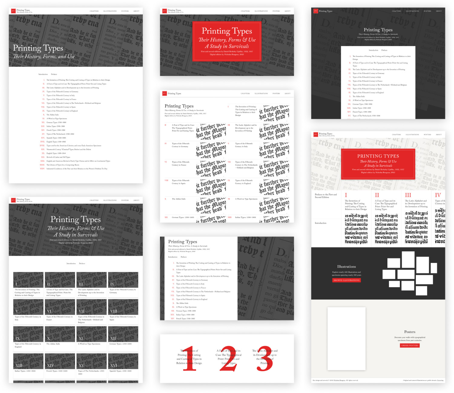
The digital edition started humbly with the simple goal of creating a nice, legible site that combined both editions with high resolution images of the facsimiles and some kind of visual timeline. Considering Updike’s work was all about typography, I wanted it to have a strong typographic focus with as few extraneous distractions. I drew inspiration from sites like The Atlantic, The New Yorker, and the The New York Times—particularly their article pages—for their sparse layout and focus on readability.
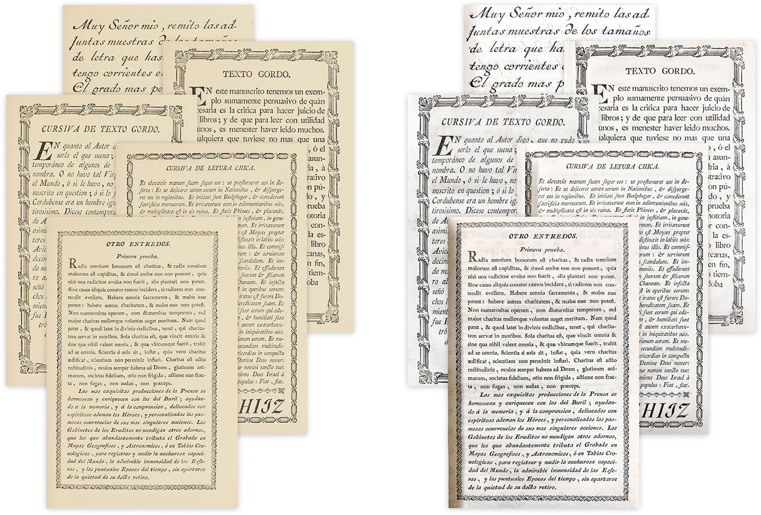
Before considering anything else, I had to figure out the right typeface to use. Finding just the right one was an intriguing challenge. Updike states that he used the Oxford type from Binny & Ronaldson for Printing Types—a transitional style between old style and modern face and “a type of real distinction.”
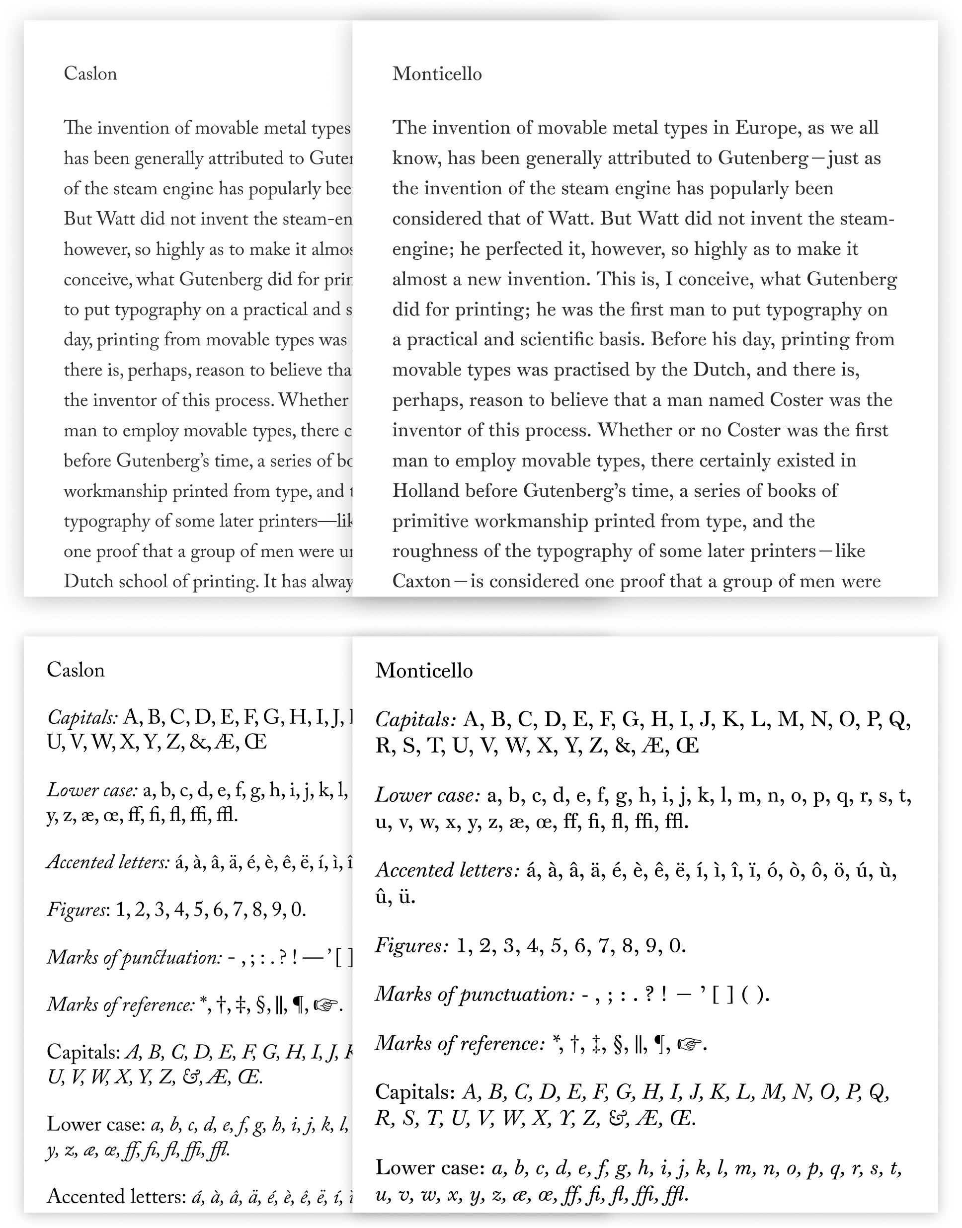
Unfortunately, my initial hope of using the same one was dashed when I couldn’t find a modern font of the same name. I tried a number of other classic serif types named for their creators including Garamond, Baskerville, Fournier, and Plantin (all of which happened to be discussed by Updike), as well as a few decent fonts from Google and Adobe like Noto Serif, and IBM Plex Serif, but settled on Adobe Caslon as a compromise because I was familiar with its versatility from using in on Byrne’s Euclid. While not a transitional type face, and indeed, designed based on the namesake of the “old style” he mentioned, it worked well for my needs. I used text from the first and second chapters as a test for these types.
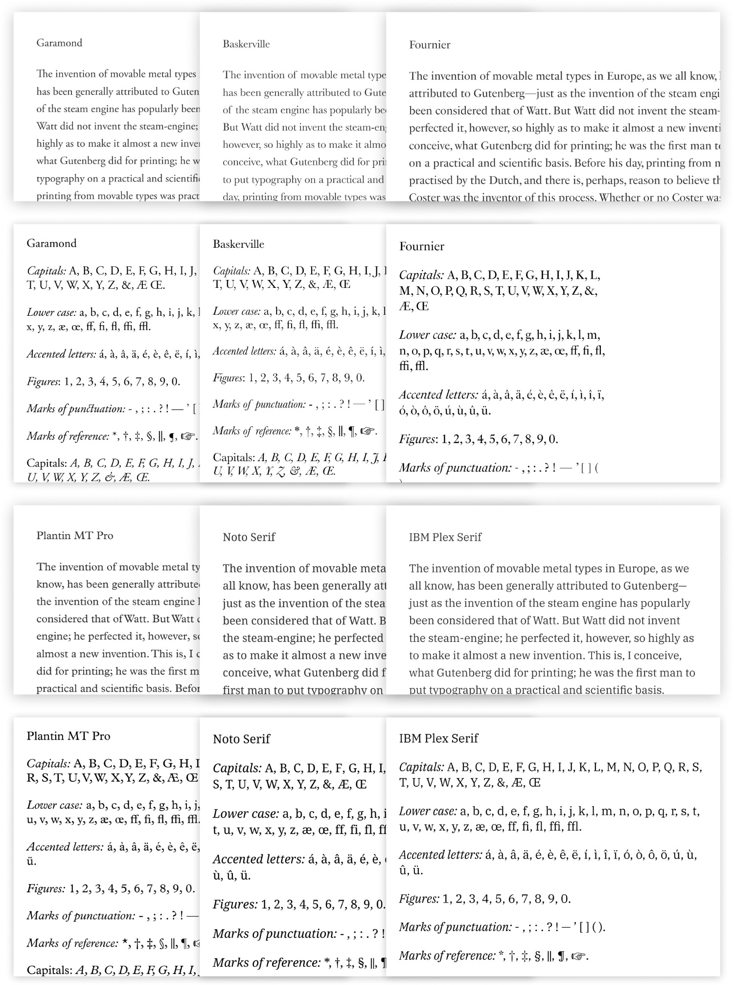
I liked Caslon and it was a fine substitute. I continued to try others as I built out other pages but always came back to Caslon. It wasn’t until I was about 70% complete when I dug deeper and stumbled across a specimen of the Monticello type designed by Matthew Carter in 2003 based on Oxford. A little more research turned up a page about the history of the Monticello typeface, which reiterated much of the history used in the copy of the specimen and confirmed that it was the modern equivalent of Oxford. The current font is available through MyFonts. Once I implemented it on my digital edition, the project felt more whole and true to the original.
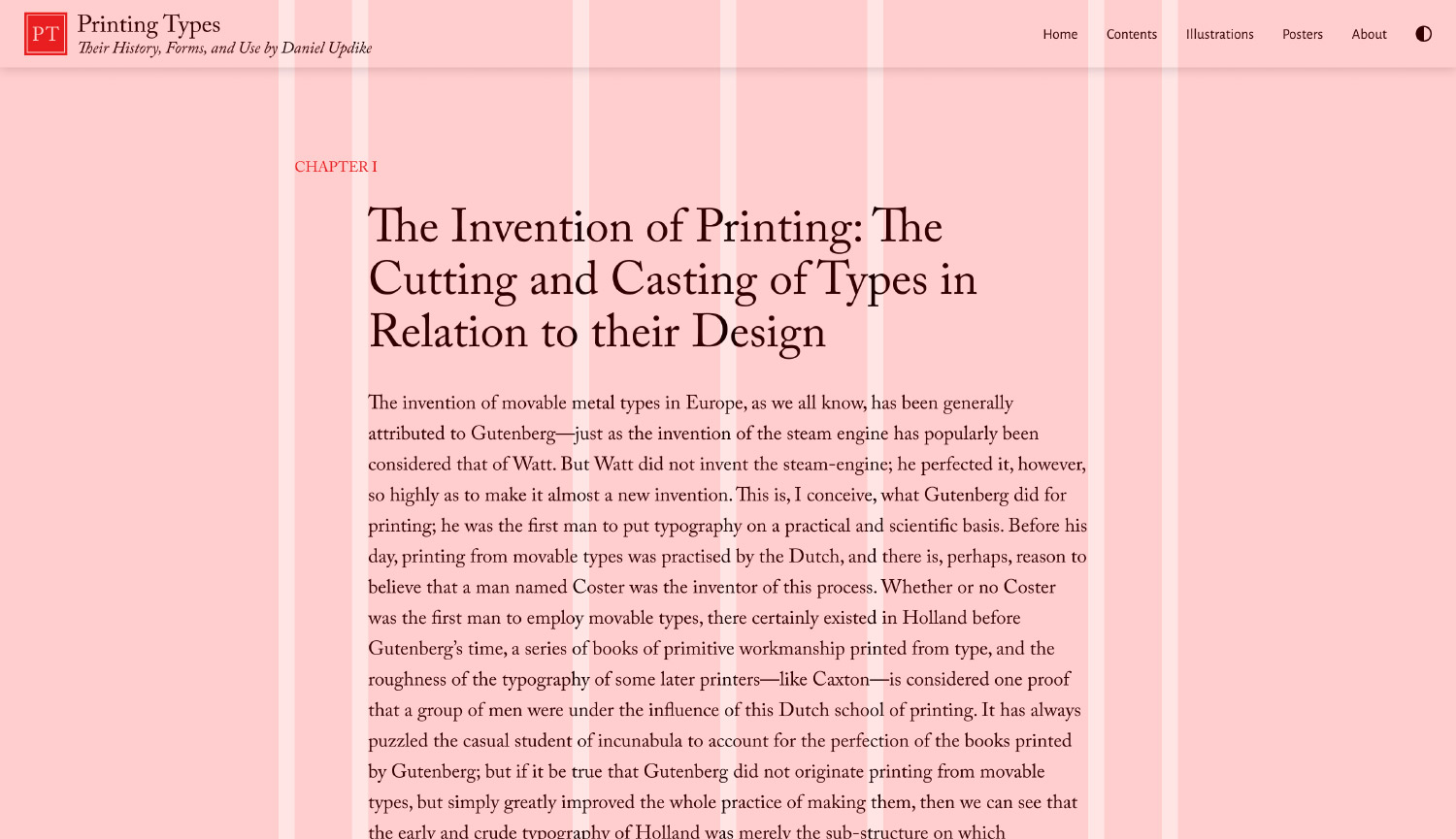
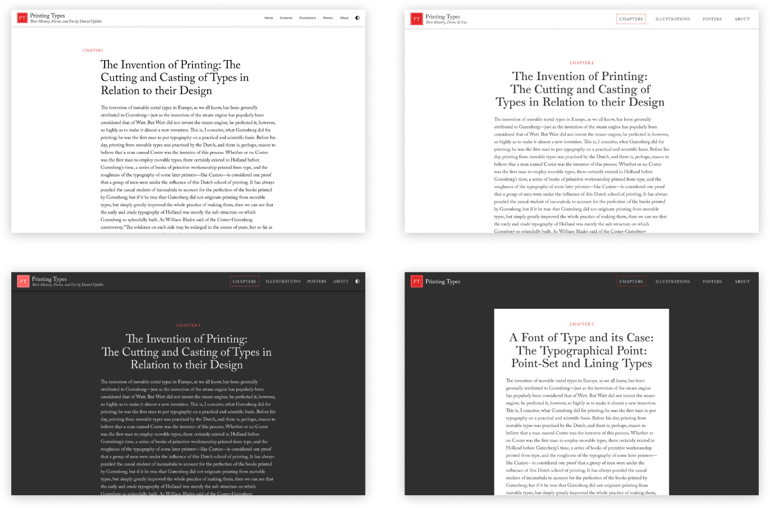
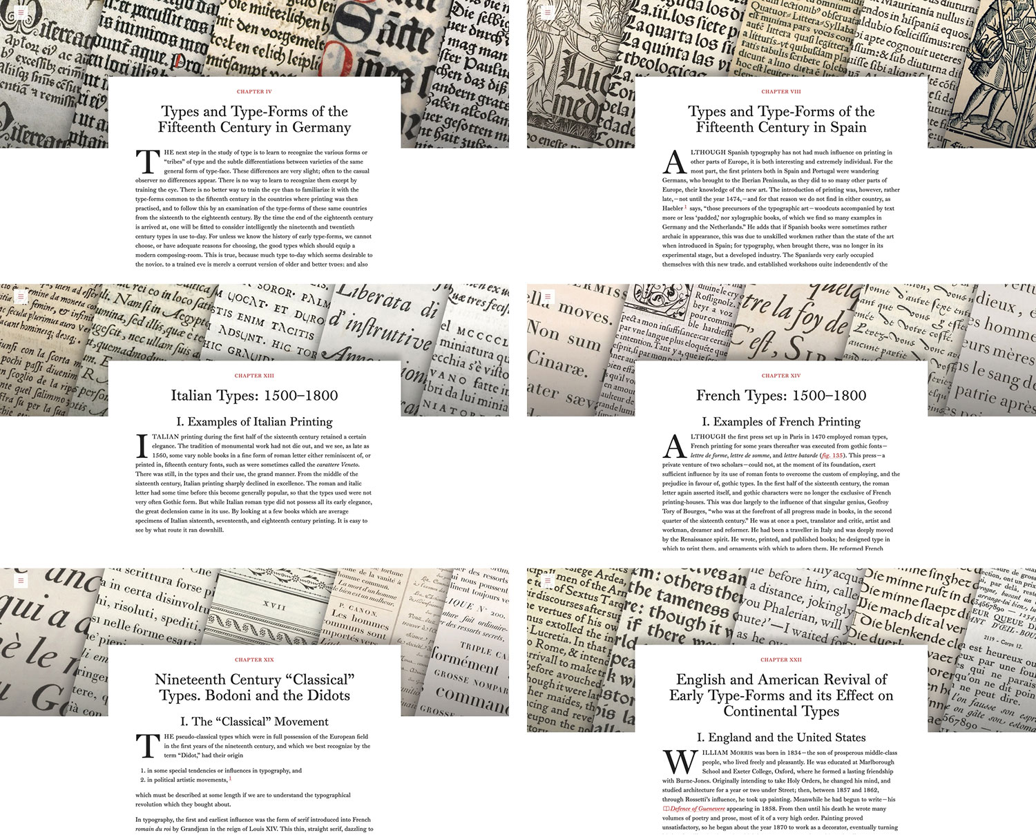
The first page designed was the chapter template. A compound layout comprising four- and five-column grids was used with text spanning the center four columns. I planned on treating each figure as its own full-screen section that interrupted the flow of text so they would stand on their own. I went through several iterations of this template, even trying a dark mode as a quick test. This layout worked well, capped with large text for the chapter name and a small red accent for the chapter number. Just seeing these first few rough iterations was enough to get me excited. They felt proper in some way and a worthy edition of the material they contained.
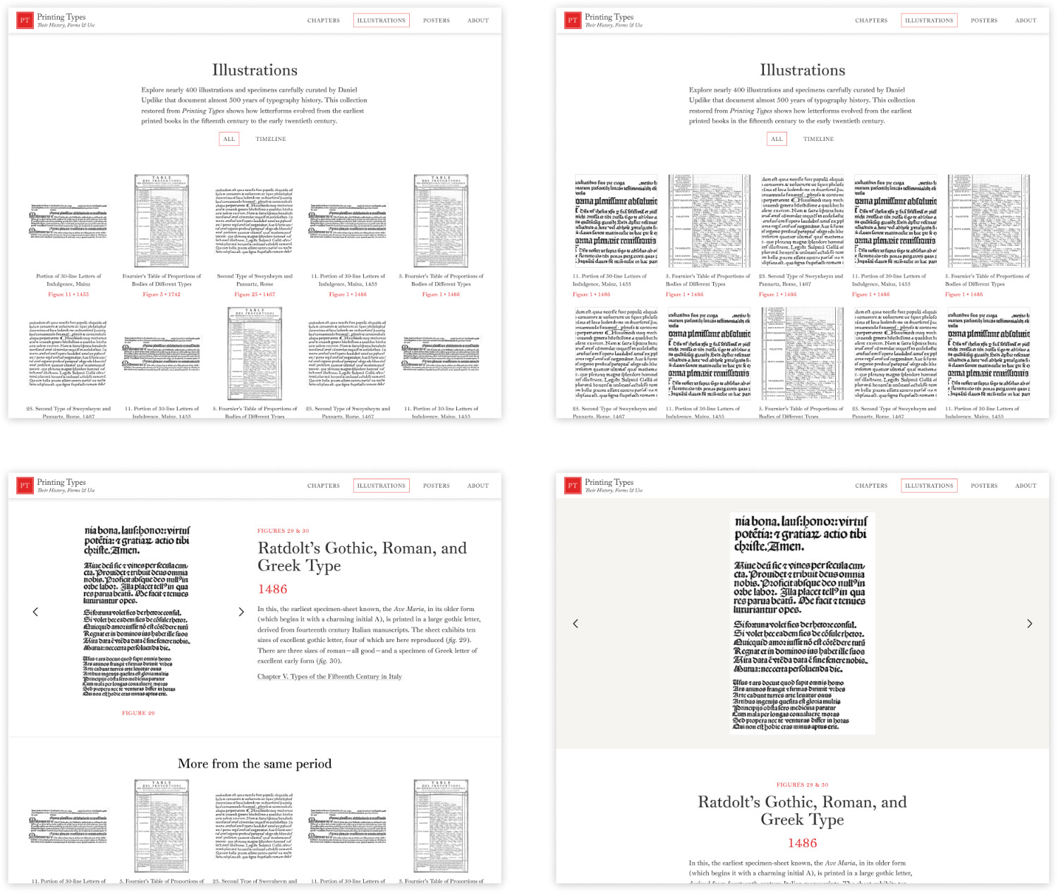
Printing Types’ more than 360 figures (also referred to as illustrations) are the real stars of the show. Without them, Updike’s descriptions would be too open to interpretation. They deserved to be highlighted as fun-screen displays just as they were in the original. I initially designed several layouts to be used based on each one’s size: one for tall figures, one for square, and another for the wide ones. The wide ones turned out to be too wide so I only used the first two. Each figure takes up the full height of the viewport and can be magnified or downloaded in its highest resolution.
Additionally, I created a separate catalog of just the illustrations and categorized them based on country of origin, style of type, and contents. The descriptions for each were direct excerpts of Updike’s own words. My early mockups used only a few images as a test to settle on the general approach of the list and detail views.
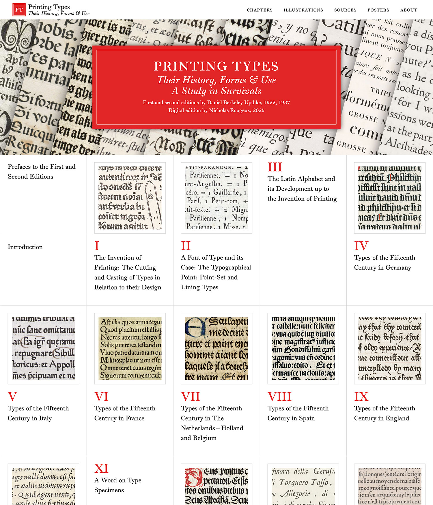
The home page was the final major piece of the design and went through more iterations than other pages. I started with a very sparse design comprising a large title graphic and a simple list of links to each chapter. However, that hid all the wonderful facsimiles so I experimented with some layouts that used a thumbnail for each chapter. Not all chapters included facsimiles so I went back and forth between variations of text and image and settled on a design with thumbnails for the chapters that had them and simple text for those that didn’t.
I use mockups for my own projects primarily to get rough ideas out of my head to see how they look. I don’t plan out every detail because I like to start using them as soon as possible so I can see how they feel and make adjustments along the way. Planning out every detail in a mockup is great for other projects but for my own, they create a false impression of what the end result will be. The sooner I can see how a project feels to navigate with real content and the sooner I can start adding that content, the better. Plus, in many cases, making changes in code is a lot easier than making changes in the mockups, even with the niceties afforded by Figma. These initial mockups were enough for me to start building the site so I built the templates and started adding content.
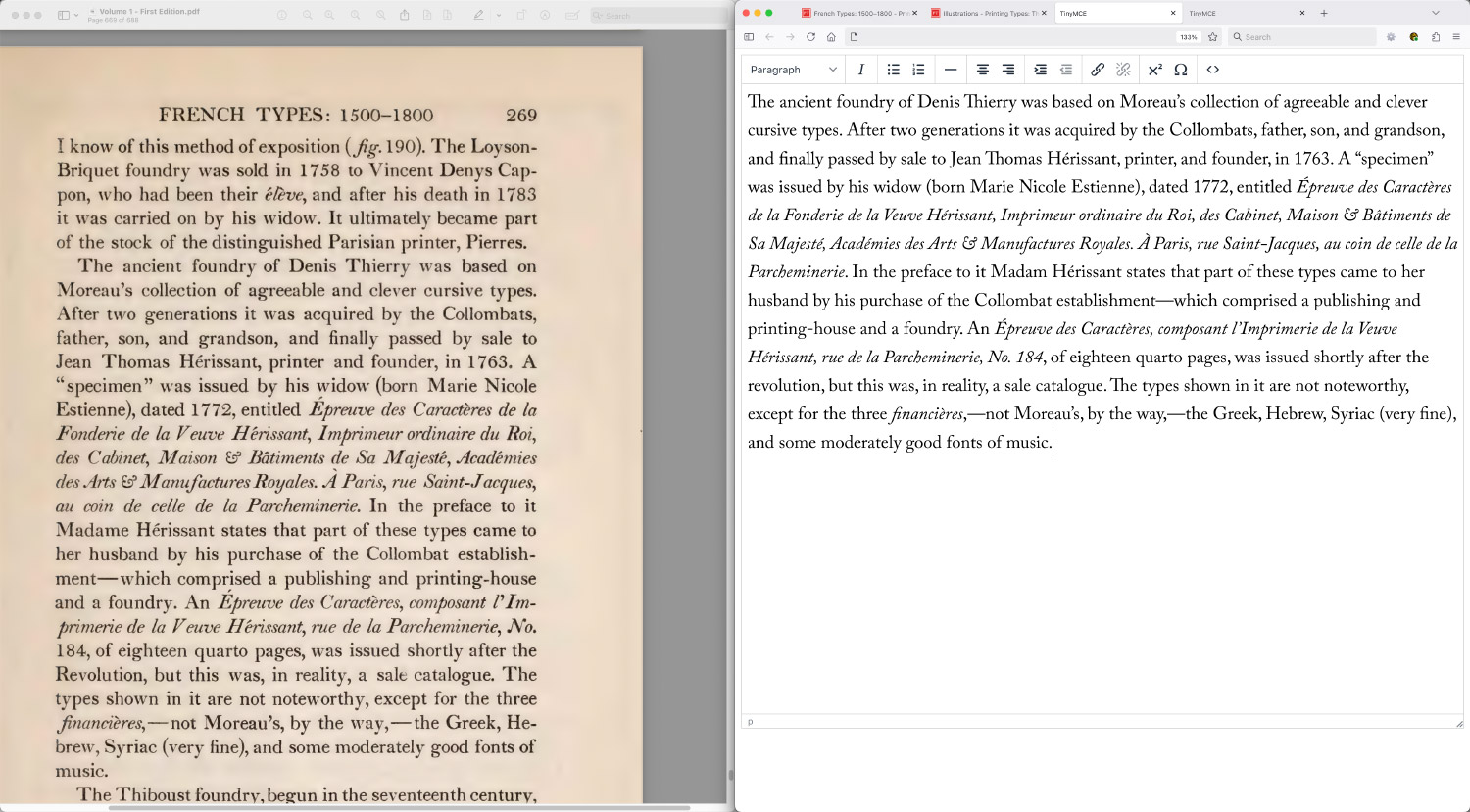
The prefaces and introduction were a great place to start because they were short, didn’t include any figures, and allowed me to iron out a lot of the formatting nuances. In typing these, I made the decision to forego any kind of OCR assistance and instead, manually retype all 550+ pages for a few reasons:
- OCR isn’t perfect. I’ve used OCR for other projects and while it’s great, I’ve often felt like correcting its mistakes took longer than simply retyping the text myself. The use of italics for book titles and accented characters also caused OCR to get more wrong than it got right.
- Retyping allowed me to connect with the material. Instead of approaching each page as simply a wall of text that needed to be converted, retyping allowed me to connect with Updike’s words much more. I understood what he was describing more clearly.
- I enjoyed it. It’s hard to articulate, but I simply enjoyed retyping everything—giving structure to his words using simple HTML where there was none when they were trapped in scanned images.
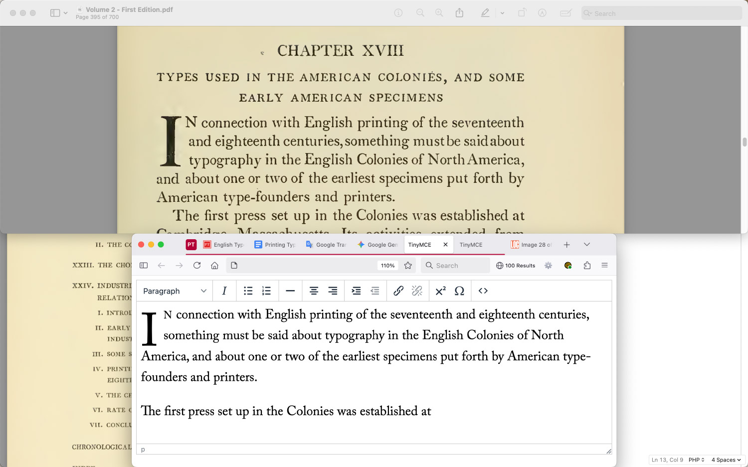
My process was relatively simple: I methodically went through the first volume by typing until I reached a figure reference. Then, I paused typing and converted the scan for that figure into a black and white version, added it with its caption, and went back to typing. It wasn’t a glamorous process but it worked well and I found comfort in the repetition. I used a local version of the Tiny editor configured with formatting presets for all the typing which saved time hand-writing the HTML—a common practice I’ve done for meant projects. The figures were cleaned up in Photoshop with minimal editing because the images from the Internet Archive were high quality, which was a nice change of pace from previous projects.
A section in the second chapter concerning miscellaneous and occasional characters caught my attention and was one of the first of many treasure hunts because I wanted to replicate the unusual characters.
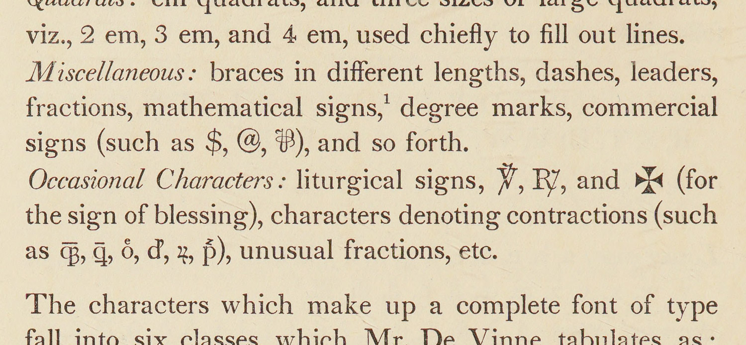
I knew of ℞, (prescription), and learned about ⅌ (per) during another project. Seeing the latter again brought a little smile to my face. I found ℣, (preces) by simply searching for a “v with a line through it” as a liturgical symbol and found ᛭ (runic cross) by searching for crosses on AmpWhat, an excellent resource for finding character codes. The other occasional characters are some I had never seen before and thus, were a real challenge to research.
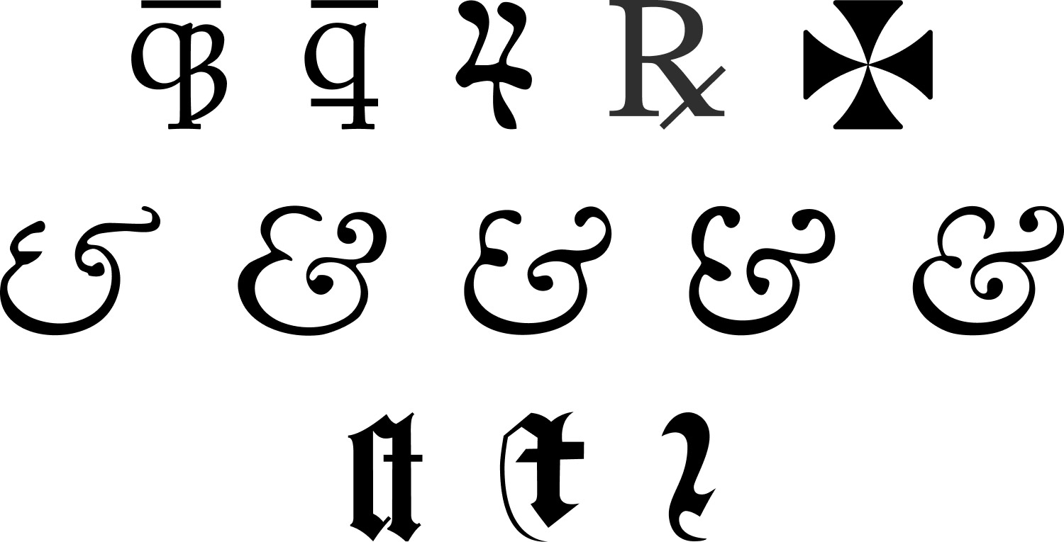
I started by trying to decipher the symbol that looked like “q3” and searching for “q and 3” but coming up empty. It appeared in figure 79, showing German typography from the sixteenth century so I searched for that and found the German Orthography Wikipedia page, which included the ʒ. That at least gave me a character to search for, which indicates a voiced postalveolar fricative relating to speech. Searching for “qʒ” led to a Reddit thread from someone asking about it and some other characters. One response mentioned that it was an abbreviation for the enclitic “-que” and searching for that finally led me to a Wiktionary page for -que confirming it.
The character that looked like a “wavy 4” was even more challenging. At one point, I resorted to doing an image lookup of it using Google Images but that didn’t produce anything helpful. As luck would have it, searching for “4 symbol” led me to a page on the Library of Congress’ site about deciphering scribal abbreviations, describing it as the “rum” symbol and introduced me to the term “scribal abbreviations.” Once I learned that, everything fell into place because I found the scribal abbreviation Wikipedia page, which contained a wealth of knowledge. The “rum” symbol wasn’t a 4, but a ꝛ (r rotunda) with a line through it—a common practice for abbreviating portions of words to save space on expensive paper. Scribal abbreviations are fascinating and while learning about them, I also learned about the q with a stroke through it (ꝗ ꝙ), which was also an abbreviation for “que.”
I’m still not entirely sure what the lines above the qʒ and ꝗ indicate but I assumed they were another form of abbreviation. Similarly, the letters with smaller letters on top of them are likely a form of abbreviation. The Combining Diacritical Marks Wikipedia page has only some examples.
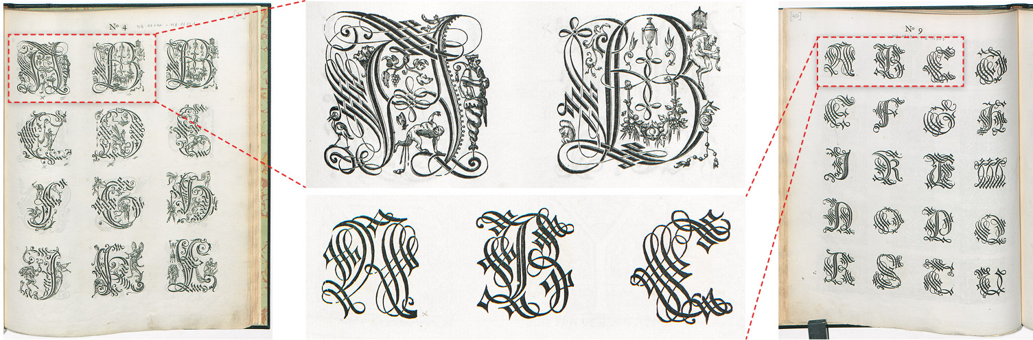
Unfortunately, due to the obscurity of these unusual characters, reproducing them in using HTML entities made them stick out like a sore thumb because they weren’t in the Monticello font so they defaulted to a sans serif font. In an effort to get as close as possible to Updike’s original text, I recreated some as small SVG shapes and others with a little extra HTML and CSS. I also created SVG shapes for the varying styles of ampersands on the following page and some other gothic shapes in later chapters.
After learning about scribal abbreviations, I recognized them everywhere, especially in older books and had a much easier time deciphering them. Other helpful pages I found for reading old texts were Old Latin abbreviation examples, How to read ancient manuscripts, and even a children’s book from 1568 about the ABCs, which included these abbreviations (“abbreuiatures”) and more. I found it amusing that a children’s book was still educational more than 450 years later.
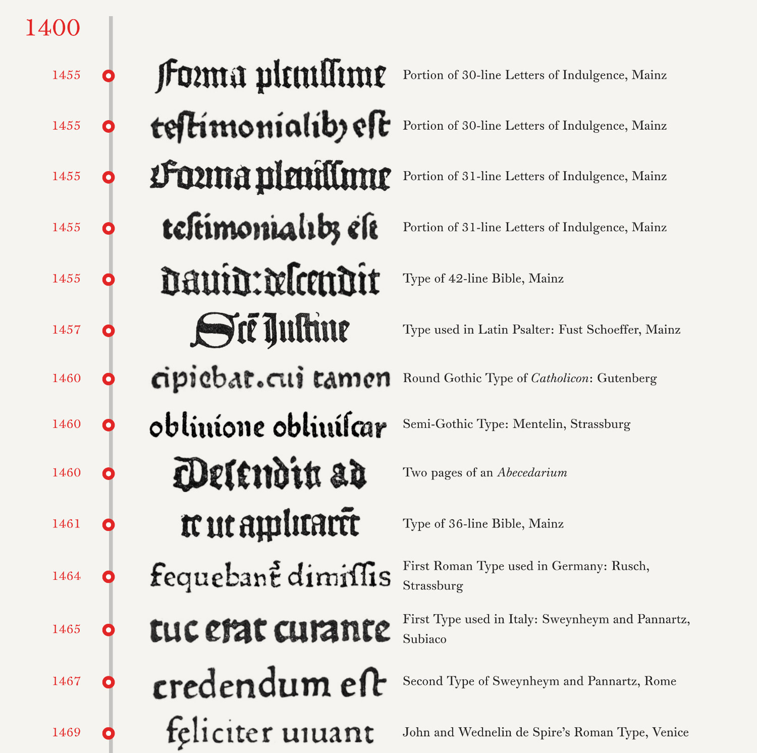
An early idea I had for visualizing the types Updike included was some kind of timeline to see the evolution of type styles over the centuries. This idea was even bolstered by a passage in the fifth chapter about fifteenth century Italian types (emphasis mine):
It is not fair, however, to take the finest of these and think of it as representative of Italian fifteenth century type. Only by seeing many examples can one get a general idea of that. And for this purpose, the publications of the Type Facsimile Society, issued in England through the influence of Robert Proctor between 1902 and 1909, are admirable. If the reader can divide a set of loose plates into groups of roman and gothic types, and then sort them into groups under each country, in chronological arrangement, he will obtain a conspectus of national type-forms which is invaluable. He has, in fact, but to glance through the gothic and roman Italian types shown in facsimiles thus arranged, to comprehend the general tendency of type-forms in either class of character; and will realize how high an average of excellence, especially in the roman letters, the fifteenth century Italian printers attained. This publication is rare, and this use of it diverts it from the bibliographical purposes for which libraries cherish it—though it does not divert the librarian! But for the student I do not know a more valuable work, nor a more valuable way to use it.
I extracted words from each one in every style (gothic, roman, italic, etc) and designed two timelines to showcase them—a linear timeline from oldest to newest, and another grouped by country and style. The early results were somewhat interesting but as the screenshots show, they didn’t get better. Since all the words weren’t the same original size, unifying their sizes looked sloppy and looked like a jumble of nonsensical words with little value. I kept up the process for the first volume but abandoned the idea after starting the second.
As I made my way through the first volume, figure by figure, chapter by chapter, something felt lacking. The project was coming together nicely but it felt somehow less than its potential. The figures looked too sterile in black and white and I was constantly curious about the sources from which the facsimiles were made. My curiosity was piqued even more with all the references to another books for which facsimiles weren’t included. On many occasions, I looked up scans of the originals and loved looking through the other pages to get a better sense of their typography.
Shortly after beginning the second volume, I decided to track down online scans of all the original sources—a much larger feat than I anticipated.
Treasure hunting
My naïve goal was to find original scans to replace all of Updike’s facsimiles and add links to scans for all other books mentioned. This was truly a grand treasure hunt because finding each set of scans was like finding buried treasure in the depths of the internet.
I’m no stranger to hunting down old books. It’s one of the first things I do for any digital edition but it’s usually a brief process. Finding all sources that Updike mentioned took things to a whole new level. There were 367 numbered figures in Printing Types (369, counting the updates in the second edition, 376 counting multiple parts) and at first, I thought finding original sources for just those would suffice, but that wasn’t enough because Updike cited so many other books to support his critiques and without them, readers would be left wanting more as I did.
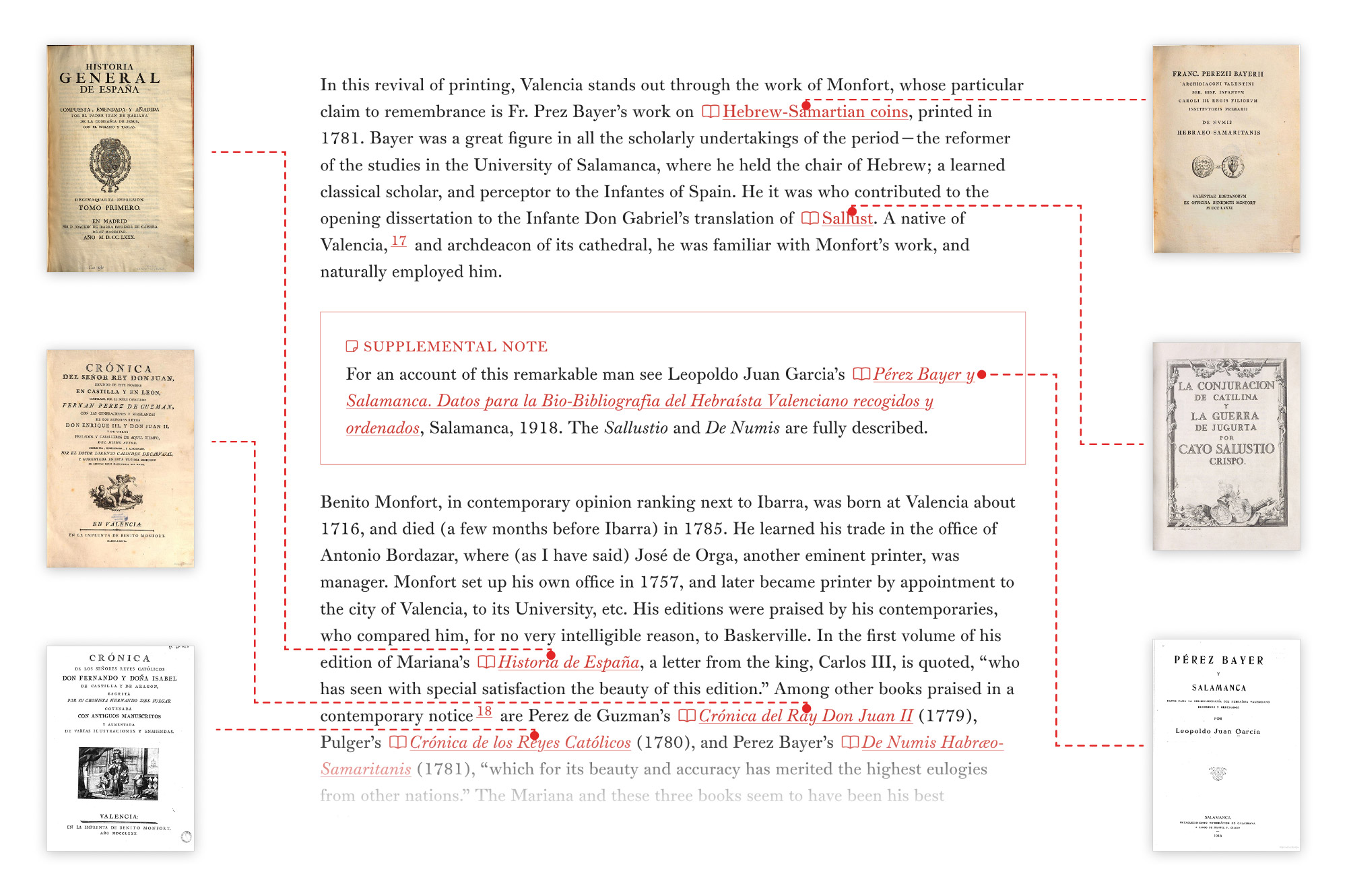
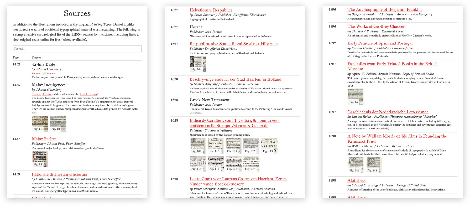
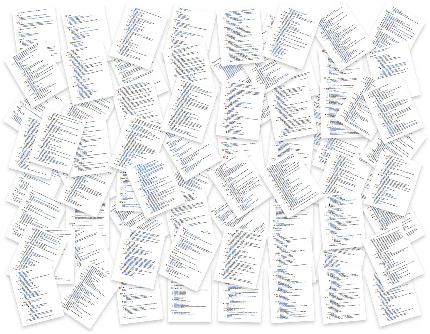
I chose to use a small book icon was used any time a link pointed to an original source to differentiate them from other links and I kept track of all sources on a separate page as a kind of chronological bibliography. For each entry, I included its original title, the date it was published, one or more links to view it or each volume, and a brief description (including its typographical interest when possible), and the figures that came from it.
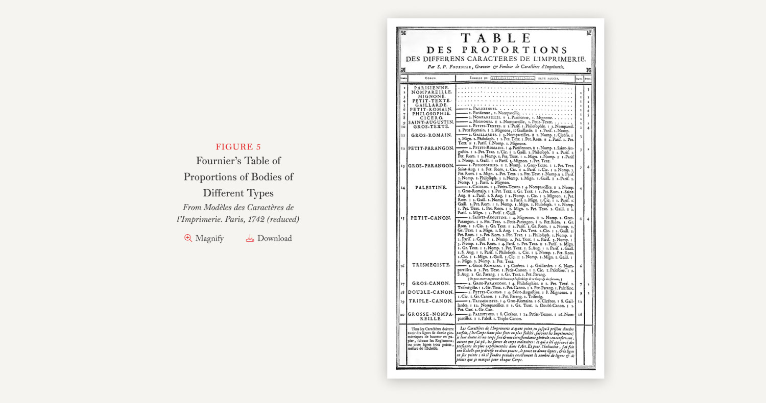
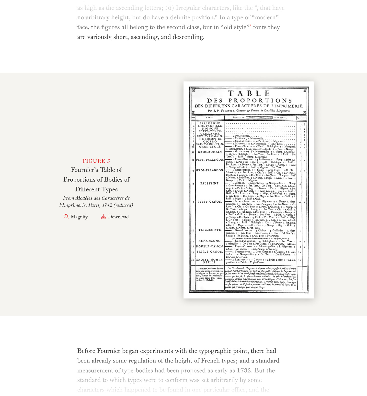
Many scans were easy to find by doing a simple search for the title like Fournier’s table of proportions for his point system in his Manual Typographique from 1764 on the Internet Archive but others required a lot more digging.
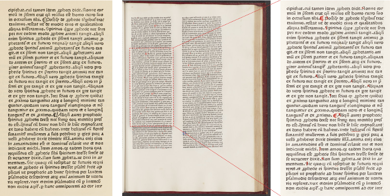
An early example that tested my patience was the Gutenberg Bible or the 42-line Bible, published in Germany in 1455. Initial scans were easy to find because its Wikipedia page links to them on Gutenberg Digital but I wanted to find the specific page in those scans, so I carefully looked at every page until I finally found a match on page 149v but the resolution was too small to replace the facsimile. Finding the correct page was made even more challenging because the page I was looking for was a portion and not the entire page. After more digging, I was able to find higher quality scans on Göttinger Digitalisierungszentrum, including the matching page.
Another example was the Catholicon, also published in Germany in 1460. Scans were readily available on both the Library of Congress and Princeton University Library—the latter having better scans. This was a tome of more than 750 pages of fine print. Page numbers weren’t in common use yet and neither site had searching capabilities so I resorted to downloading the PDF and relied on the automatic OCR capabilities built into Preview on macOS. Even then, I had to find words that resembled words that OCR might detect like “align” or “tamen.” After a lot of trial and error, I managed to find the matching text by searching for “prop” which appeared on the left column of page 583.
A common challenge was having limited information beyond a few words such as the Satires of Juvenal published in France in 1490. All I had to go on was a mention of Jean du Pré employing roman characters in his edition of it in 1490. After some trial and error, I found a page dedicated to editions of the Satires of Juvenal printed up to 1600 which had a record for the 1490 edition and on that page was a link to the digitized copy on Friedrich-Alexander-Universität Universitätsbibliothek under the title, Juuenalis cum commento Domitii Calderini with a match on page 201. In this case, the title wasn’t even close to my original searches.
Plenty of facsimiles were obvious composites of multiple pages like Bodoni’s ornaments, Zatta’s Gerusalemme Liberata, or slightly less obvious ones like Plantin’s calligraphic initials, which combined two sets of letters from different pages into one image or Fournier’s roman and italic types, in which the original ornamentation was omitted.
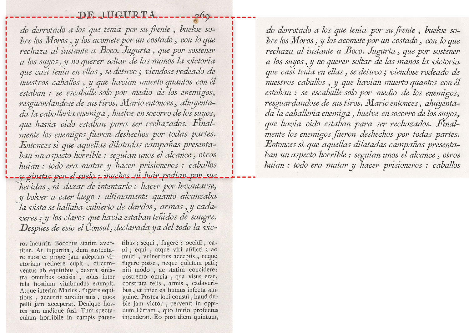
Two other composites were real head-scratchers. The first was from Plantin’s 1567 specimen, which looked like a single page but was actually parts of three separate pages seamlessly combined: roman type at the top and borders from one page, small heading from another, and italic type from a third. A full set of scans was available at DAMS Antwerpen but the smaller roman type in the middle wasn’t. It should have been on scan 13 because that scan only contained half the page and the bottom half still showed part of the previous page. It was the only page in the whole set missing its bottom half and of course, the one page I needed. Other original scans were nowhere to be found so I combined the scans I could find with Updike’s facsimile. It’s not the prettiest figure but it’s better than nothing.
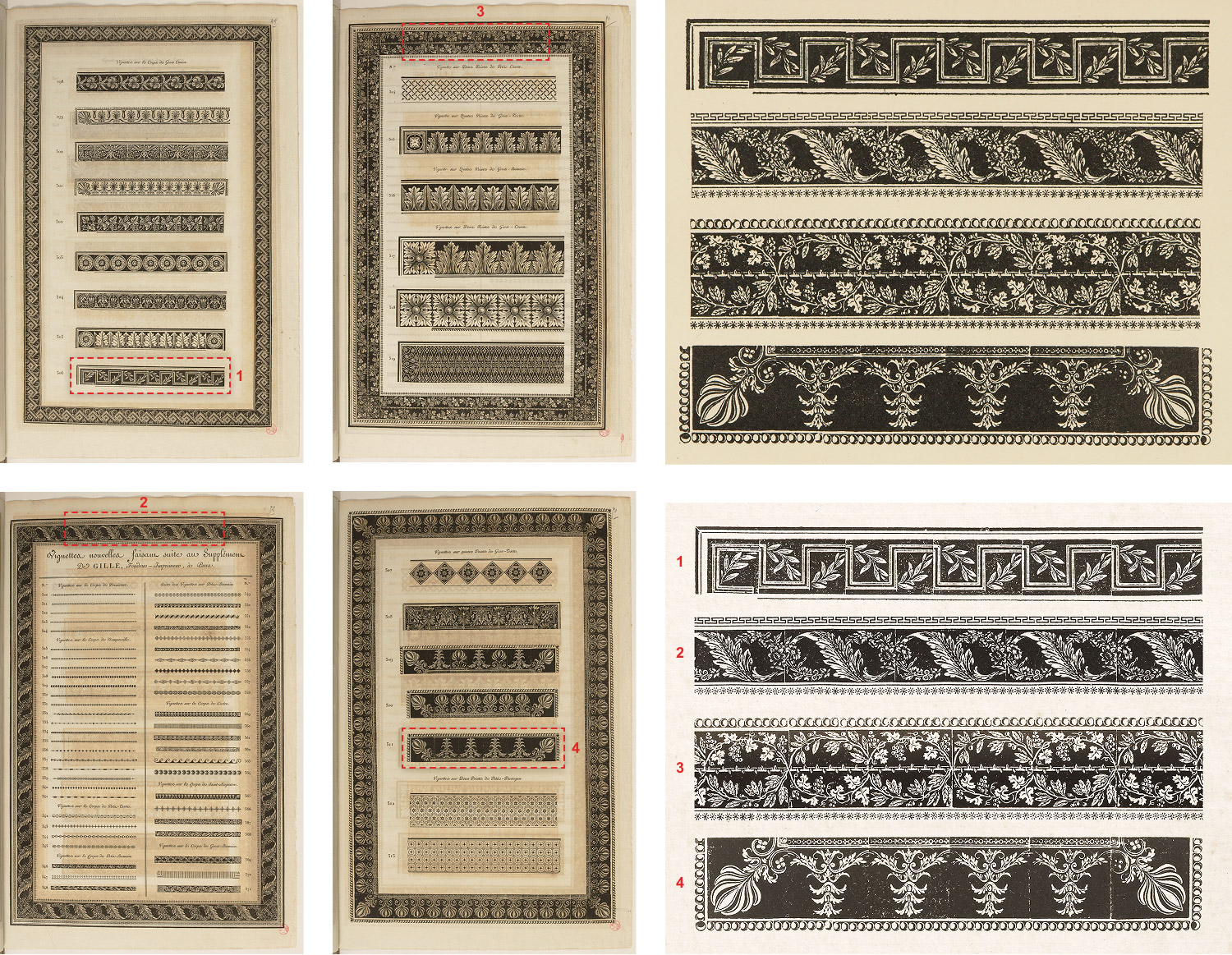
The other composite was a set of four ornamental borders from Gillé’s 1808 specimen. Beautiful scans of the entire specimen were on Gallica, including the fold-outs which weren’t available at other places I found. The top border was #306 and the bottom one was #511 but the middle two had stumped me at first. I went through every scan multiple times and found some that were close but none that matched…that is, until I realized that I was ignoring the borders surrounding each page. Once I paid attention to those, I found the remaining borders on pages 51 and 52. One could almost hear my eyes rolling when I figured those out.
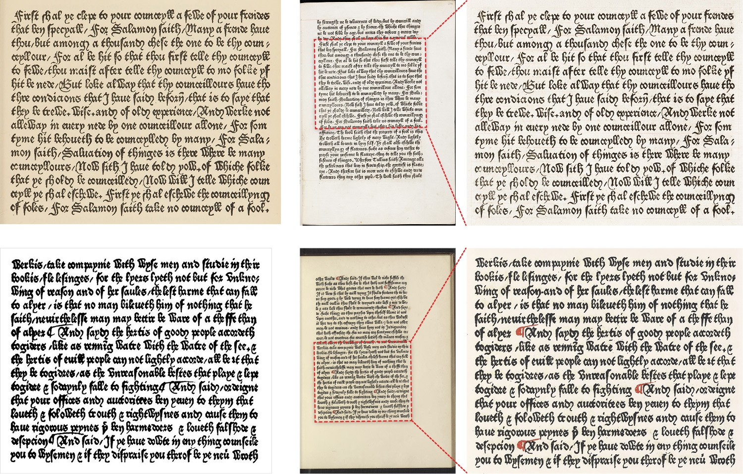
One of the most challenging images was an example of William Caxton’s Type 2 from 1477. Its caption stated that it was from The Dictes or Sayengis of the Philosophres. I found an 1877 facsimile of that book at the Library of Congress which looked very similar but after carefully looking through every page and doing various searches through OCR’d versions, I couldn’t find any pages matching that matched Updike’s facsimile. Convinced that the text had to be in it because it looked so similar to the facsimile, I resorted to searching for phrases within it hoping that I would find some matching transcription that would lead me to a set of scans. The last sentence, “For Salamon saith take no counceyll of a fool” turned up a passage in the PhiloLogic ECCO-TCP database from Chaucer’s General Prologue to The Canterbury Tales printed by Caxton in 1477—not the book Updike mentioned. This struck me as very odd considering none of the scans I found up until this point were from completely different books than what Updike mentioned.
Still, the text was unmistakable so I then sought out scans of The Canterbury Tales from 1477, which presented its own challenges. Searching for the first sentence from the PhiloLogic database, “A Yong man that called was Mellebeus the which,” led to a 1491 edition printed by Pynson with the same passage appearing on pages 507–508 (starting in the lower right of 507), which confirmed that was the correct book, but the wrong year. Searching for the title of the 1491 edition, The boke of the tales of Canterburie and including Caxton’s name came up with a page from Merton College in Oxford about the book and had a banner at the top with a picture of a page from it that matched the facsimile so I knew I was getting close. After more digging, I found a news article from the same college promoting the newly digitized version of it with a link to scans on the Digital Bodleian and finally the page matching Updike’s facsimile (page 274r [2L8r] or 551 of 768). This effort took an entire evening and part of the following morning to complete.
However, there was still more do because the very last note in the tiny errata section at the end of the second volume of the second edition of Printing Types stated that the figure was replaced with a different facsimile—one that actually was from The Dictes or Sayengis of the Philosophres in 1477. So I resumed my original search for that and while I couldn’t find a 1477 edition, I did find the page matching the facsimile from the second edition in the 1877 reprint at the Library of Congress and used that. I included both versions of the fiture with clarifying edits in the chapter containing them and in a note on the figure’s page in the illustrations section. An inordinate amount of effort was needed for this figure but I was glad I stuck with it and figured it out.
Auction and rare book shops often appeared in searches and at first, they were annoying because they cluttered up the results, making it more difficult to find complete scans. However, they quickly became a great resource once I realized that most of their listings included a few pictures of title pages and books’ original names—two helpful types of clues for the tough searches.
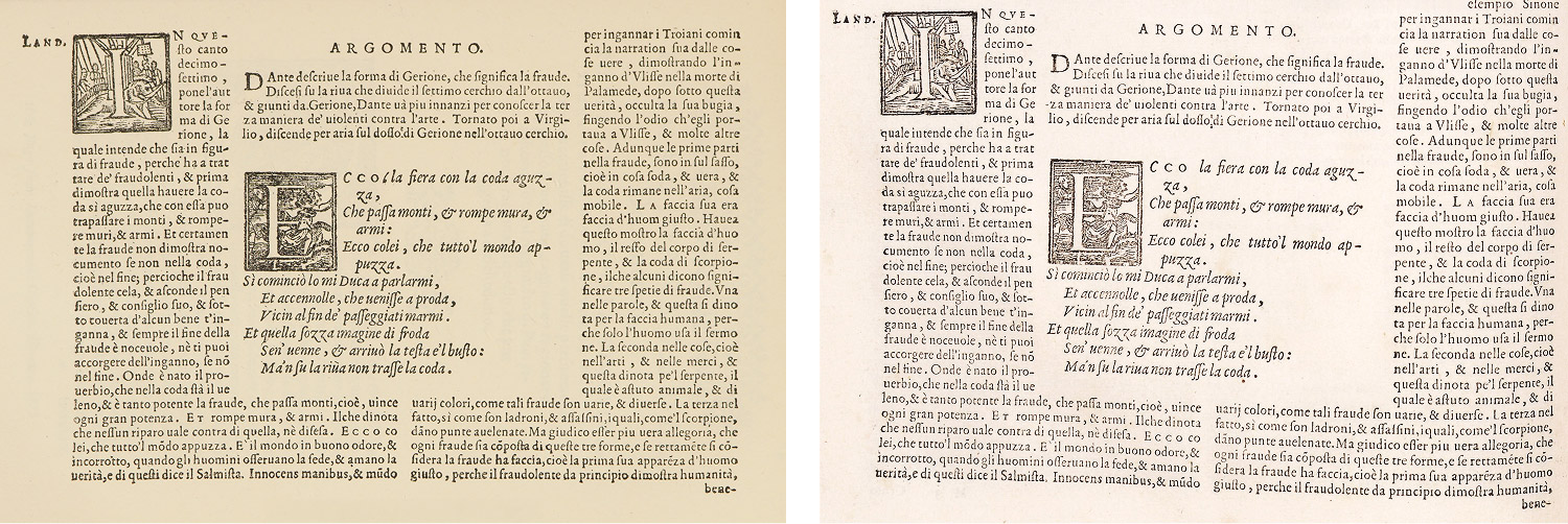
For example, to find the 1564 edition of Dante’s Divine Comedy published in Venice, all I had to start my search was the sentence, “An edition of Dante with notes by Landino and Vellutello, edited by Sansovino, issued in Venice by the Sessas in 1564.” Not even a portion of the title was mentioned. Some searching with a few keywords came up with a product listing on PRPH Books and AbeBooks, the former of which had some beautiful pictures and both had varying titles. Searching for the exact titles resulted in a 1578 edition on Bibliothèques numériques de l’Institut de France, which was the wrong year but very close in style. Including the year with the full title turned up with the exact match on Biblioteca Digitale Fondazione Marco Besso (page 91v). Without the help of the booksellers’ sites, I may not have found it.
Updike also mentioned more than 200 specimens that showcased the variety of types and ornaments available from printers and type designers. These were some of the most interesting items to browse and the most challenging to find due to their obscurity. The more well known specimens such as those from the Vatican Press in 1628, Fournier in 1742, and Bodoni in 1818 were easy to find and a joy to examine. I struggled finding others from lesser-known printers. Fortunately, I came across several invaluable resources that specialized in cataloguing type specimens. If it wasn’t mentioned on one of these sites, chances are, it didn’t exist online:
- Paul Shaw Letter Design: Personal site of Paul Shaw, designer and design historian. His Blue Pencil posts that catalogued type specimens (1486–1704, 1700–1769, 1770–1799, 1800–1836, 1803–1899) was possibly the single most valuable resource in finding specimens. The rest of his site is wonderful too.
- Typenrepertorium der Wiegendrucke: A database of printing types used in fifteenth century books (incunabula) based on the five-volume Typenrepertorium der Wiegendrucke, published by Konrad Haebler between 1905 and 1924. It’s a little challenging to use because of the language barrier and overall design but searching for last names often returned results (in the far right column) that contained links to online scans I couldn’t otherwise find.
- Bibliothèque Virtuelle de Typographie: An extensive catalogue of specimens and other typographical materials from 1452 onward organized by date and name.
- Digitale Sammlungen: A digital collections portal for Goethe University that has a large collection of historical material related to printing.
- Letter Library: A large catalog of links to specimens from around the world
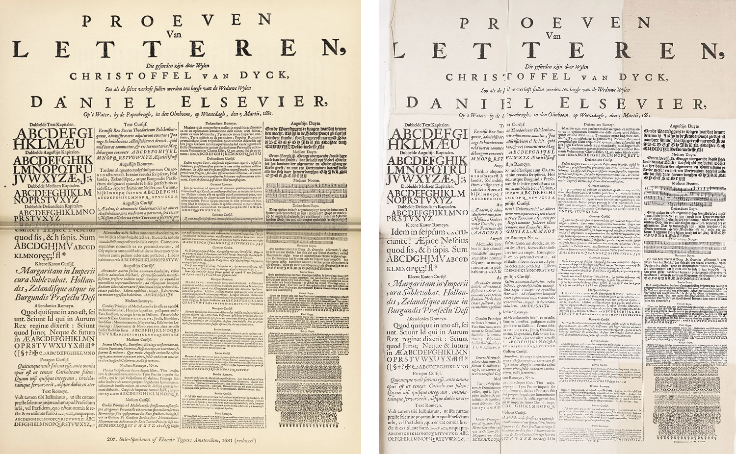
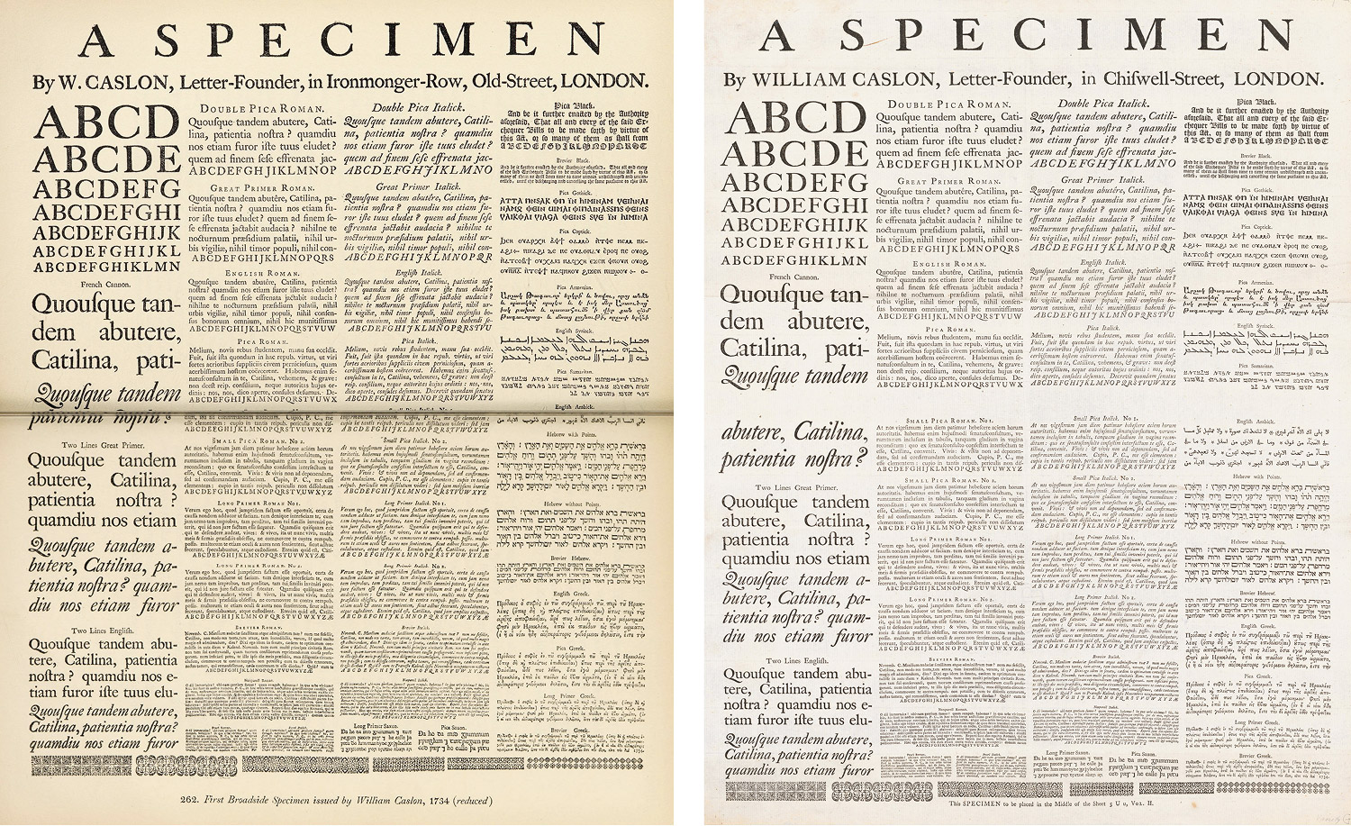
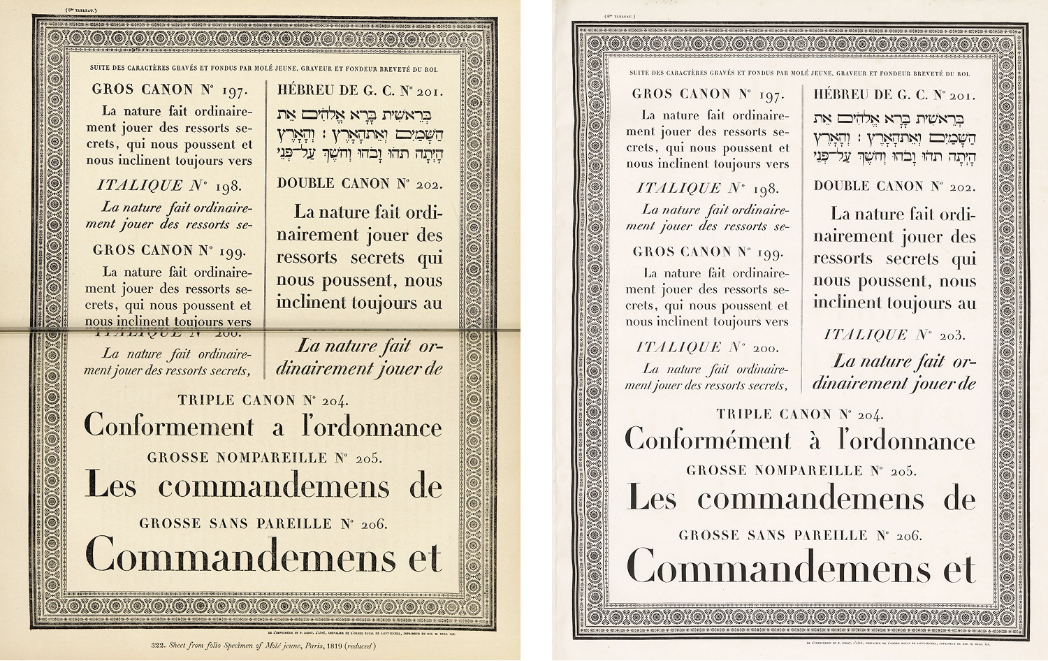
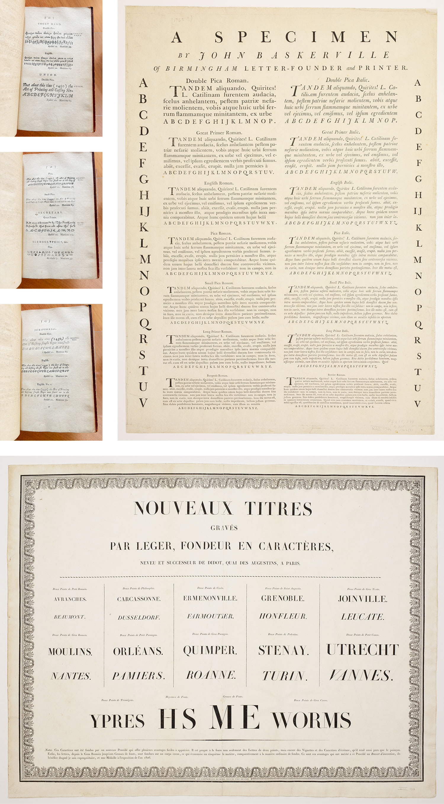
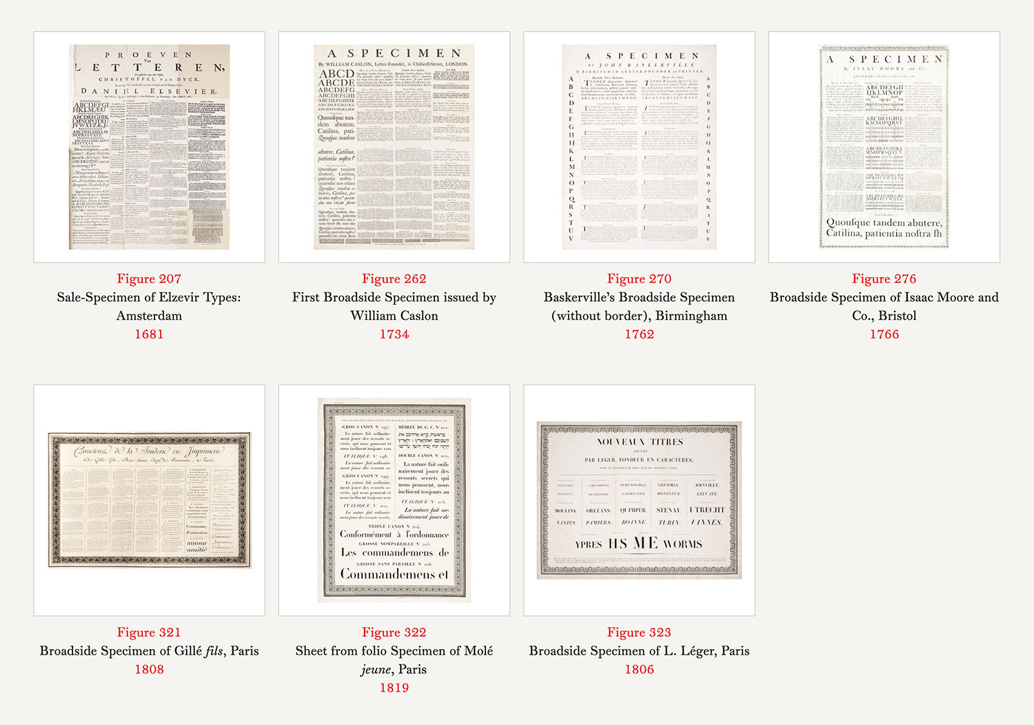
Broadside specimens quickly became some of my favorite ephemera. Updike included facsimiles of seven broadsides, all in the second volume. However, considering their size, he printed them spanning two pages, which meant that the middle was interrupted by the book’s binding. The Elzevir specimen from 1681 was the tipping point that convinced me to start finding original scans. While I couldn’t find the original, I was able to find a more complete, albeit somewhat damaged reprint from 1880. Still, it was better than the reduced facsimile split across two pages. William Caslon’s specimen from 1734 was a rare find in that not only was it easy to find and in high resolution, but there were scans of three copies on the Internet Archive. Examining the details is truly a treat. The specimen from Molé brought out in 1819 at the Paris exhibition is considered “one of the most magnificent type specimens known.” The facsimile in Printing Types was one of 14 broadsides and the original is so much better.
A supplemental note to the chapter on type specimens included a long list of specimens that was worth consulting. Most were only mentioned with a name and a date. I was able to find quite a few but with little to go on beyond a name and year, I couldn’t find them all.
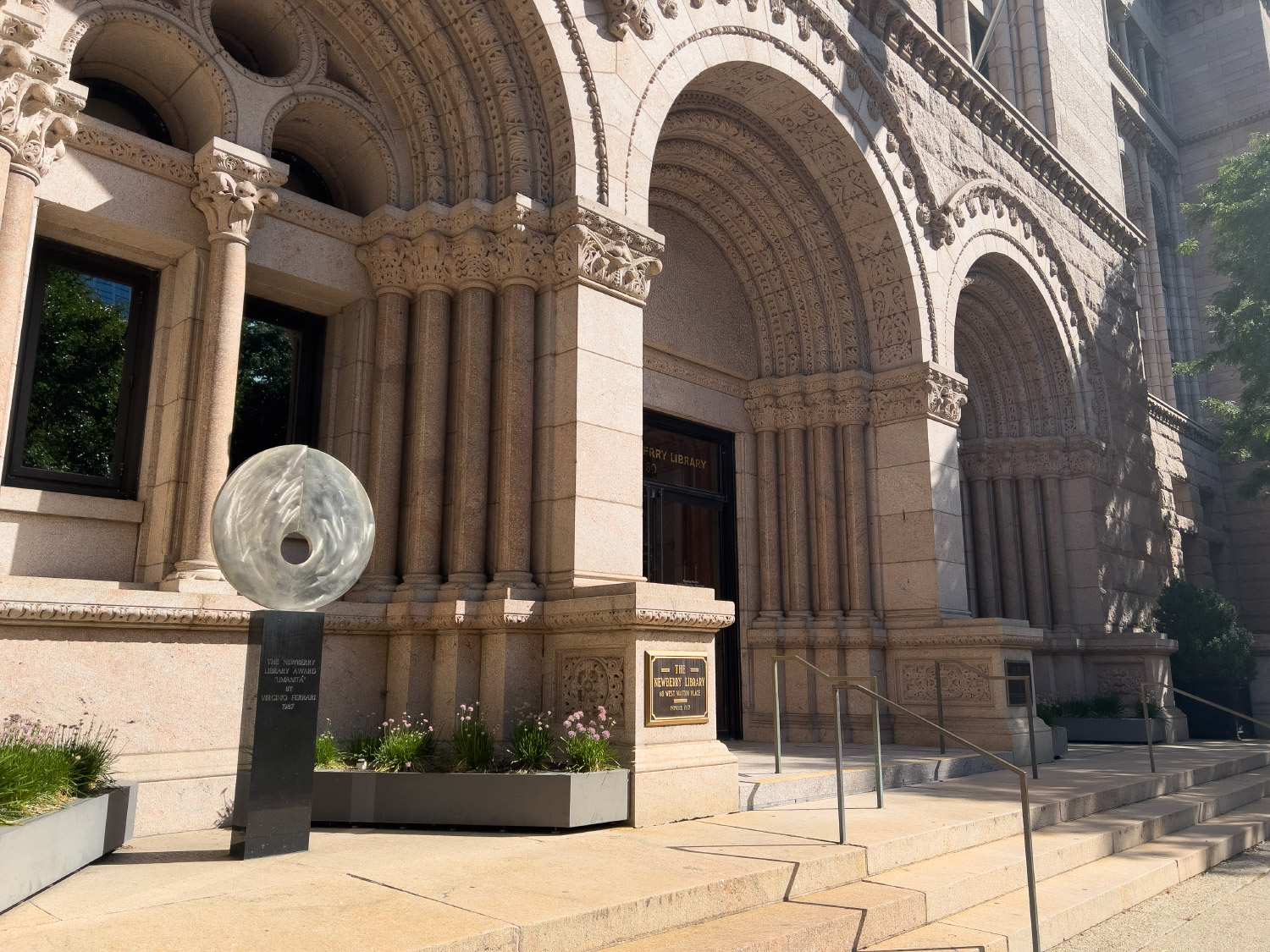
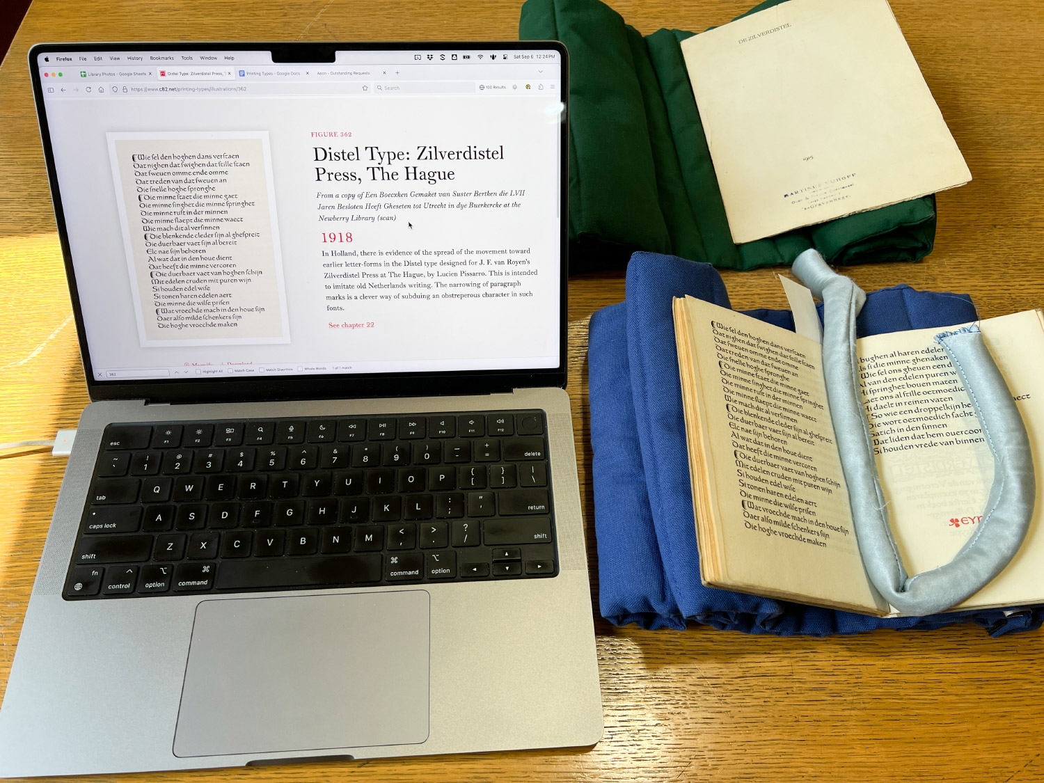
Not every scan could be found online so I turned to the generosity of public libraries. The Newberry Library in Chicago was most instrumental and the staff was incredibly helpful. Despite being around for nearly 140 years and essentially in my back yard, it wasn’t on my radar as a resource until this project. Plus, as luck would have it, they have an extensive collection of books related to printing and typographical history, including thousands of type specimens. After coming up empty on some of my early searches, I searched for public libraries with rare and antique books and learned of its extensive collection.
I bookended the research phase with trips to the Newberry to see several books in person and take my own photos. On my first trip, I received my reading room card, learned about the rules, and met the very kind staff. I only planned a short visit but before I knew it, five hours had flown by and I had dozens of photos. In a way, it felt like being at a restaurant where I could request anything I wanted but I never had to pay. I had to take photos with my phone, and I couldn’t use a tripod but it was sufficient for what I needed. After my first visit, I made nearly a hundred requests using their online form for scans since I couldn’t visit as often as I wanted. Once I finished the research phase, I visited a second time to take the remaining photos myself. The staff was incredibly kind and very willing to help me find the images I needed for this project.
The special collections arm of the Providence Public Library (PPL) in Rhode Island was another amazing partner. I first stumbled across them when looking for a 1771 specimen from Antonio Espinosa—several figures of which are in the chapter on Spanish types from 1500 to 1800. The most I could find was a bio and a few rough scans. After clicking on nearly every link I could find, the last one was a post from more than 10 years prior on the Special Collections at PPL blog which had a screenshot of a browsable version of the specimen. Unfortunately, the specimen was no longer available, (not even available at the Wayback Machine) but I figured that the files might still be available at the library’s offices. As a last resort, I emailed the staff inquiring about them. To my pleasant surprise, I heard back from Jordan, their director, who found a bunch of files of some other specimens and only a few of the original but none matching Updike’s facsimiles. When I asked if the book was still in their collection, I was told that not only was it still available, but they were willing to take some photos of the pages I needed as well as make the full set of scans available at some point in the near future. This was a wonderful and unexpected outcome to a last resort.
This wasn’t the only time the PPL came through in a pinch. As luck would have it, they had a direct connection to Updike in that he helped them get their book collection started in 1910 and upon his death, his entire collection of books on printing was bequeathed to them. To say this was a stroke of luck would be an understatement. They were able to send me scans of three more items that were impossible to find anywhere else:
- A 1782 sale catalog from the James Foundry in London appeared in Printing Types as a single figure but was actually a composite of parts of four separate pages of the original specimen, the entirety of which was printed in a 1961 facsimile of A dissertation upon English typographical founders and founderies (1778): with a catalogue and specimen of the type-foundry of John James (1782) (pages 16–18). Updike mentioned in a lengthy supplemental note from the second edition that only two copies of the sale catalog existed—one of which belonged to him. Knowing that the PPL had Updike’s collection, I asked if they still had it. Not only did they have it but they were kind enough to send me beautiful pictures and later scans of those pages from the original. I did my best to combine them into a single image using some Photoshop magic so the figure matched Updike’s facsimile.
- Baskerville’s 1762 broadside specimen was available online but only in its bordered style at Small Performances as a low-quality photo and at the Internet Archive as part of a microfilm digitization effort. Paul Shaw’s blog gave a link to an mediocre version on Flickr and another on Harvard Digital Collections but the latter was no longer working. After finding a record of it in PPL’s Updike collection, I inquired about it and paid a little extra to get a high quality scan and was not disappointed.
- An 1806 broadside specimen from L. Léger was almost nonexistent online apart from a listing on a rare bookseller’s site. Despite having the facsimile as a reference and searching far and wide, I could only find a single line in a PDF listing the contents of the PPL’s Updike collection. I must have found it at just the right moment because as of this writing, the PDF is no longer available. In inquired about it and was thrilled that they had I was able to purchase a high quality scan. It’s a beautiful specimen and I borrowed some elements of its ornamentation for my own poster.
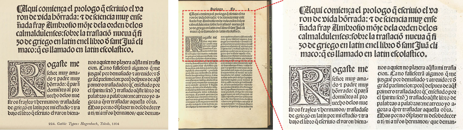
The final library that was a big help was the Boston Public Library. I only needed one item from their catalog but the request was hail mary and I didn’t expect to get the image, let alone a response. The page I needed was from a 1504 Spanish translation of the Latin work of St. Juan Climaco printed in Toledo by Peter Hagenbach. I was only able to find minimal details about it and no scans. In the list of figures at the beginning of the first volume of Printing Types, its facsimile was listed as being from a copy in the Boston Public Library. With that one line to go on, I contacted the rare books and manuscripts department asking about it. To my great surprise, they not only had it but were happy to send me a beautiful scan of the page I needed.
The staff at these libraries were some of the kindest people who were genuinely interested in helping me with my obscure project. I couldn’t be more thankful for the time they spent digging through centuries-old books looking for very specific pages that must have seemed very random. This was a valuable lesson in never being afraid to ask because sometimes (though not always), the results may unexpectedly be just what is needed.
In addition to finding original scans to replace Updike’s facsimiles, I was also determined to find scans for all the books that were mentioned by name. These were valuable because he often used them as examples for where to see various styles of printing (good or bad) and they make up such a large portion of what was being discussed.
For the most part, these took the form of italicized titles but were also referenced in shorthand such as “Lactantius of 1468,” “Miscomini’s Florentine Horace,” or “Virgil by Gering.” Each one needed its own research just to determine the original title so I could then use that to find the scans. There were also often multiple volumes of books such as the 10 volumes of a 1790 edition of the Bible, the 4 volumes of Histoire de Louis II, Prince de Condé, and the 8 volumes of S. Ioannis Chrysostomi Opera graecé. Being the completionist that I am, I didn’t want to simply find one volume but all volumes. When multiple volumes were needed, I would sometimes get lucky and they would all be available at a single link such as the five volumes of the 1797/1798 edition of Don Quixote on HathiTrust or the two volumes of The Historie of the World, the latter of which could be seen by crafting a very specific search for identifiers on the Internet Archive. I included links to all the volumes in the description when a single link wasn’t possible (as with most links to Google Books), which made the text a little busier than it needed to be but I felt it wasn’t too distracting.
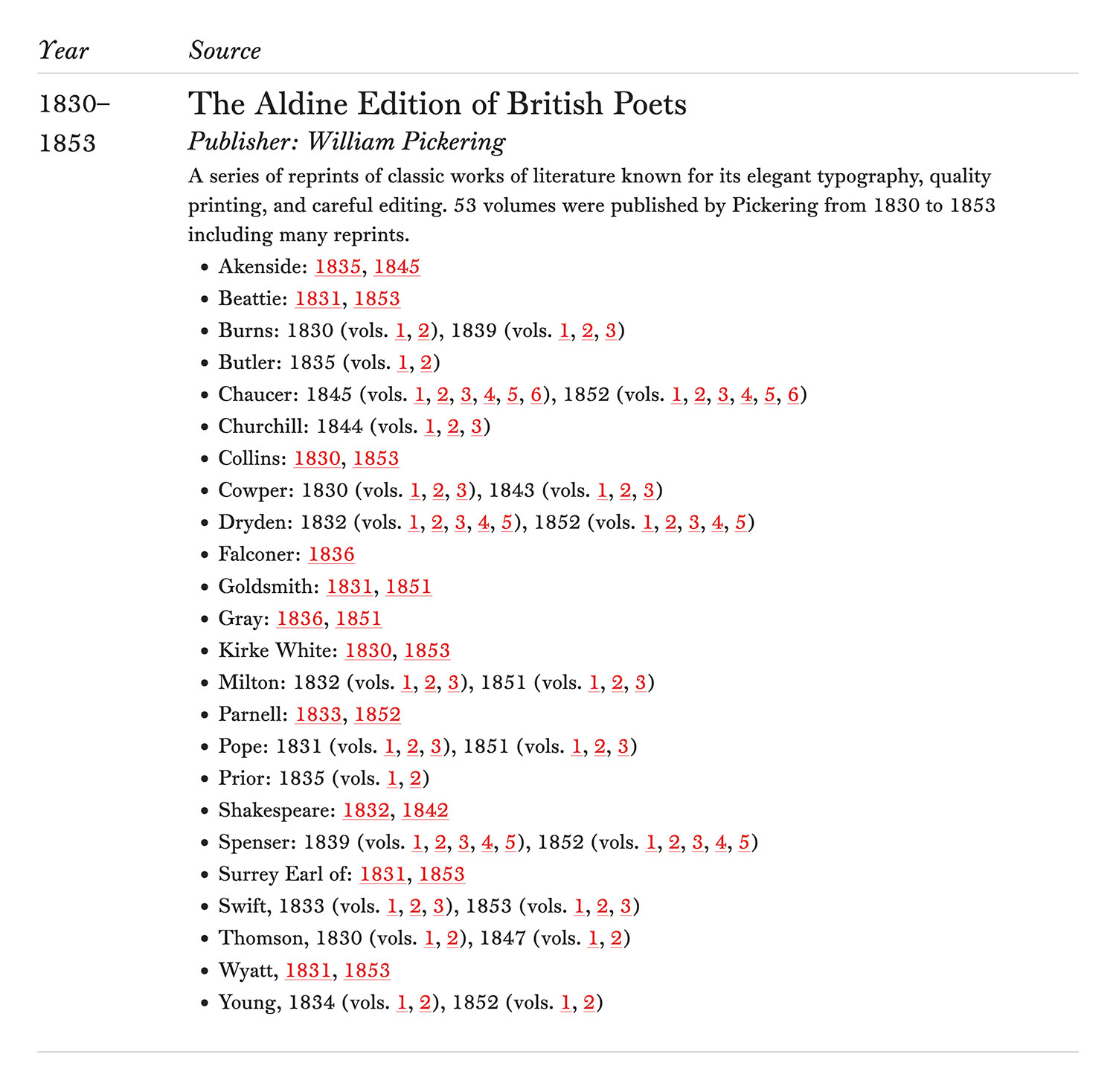
An extreme example of this was sparked by the two words, “Aldine Poets” in the chapter discussing the revivals of Caslon and Fell types as one of William Pickering’s best publications. It was another vague reference that took me down another rabbit hole. Those words referred to the Aldine Edition of the British Poets, a series of 53 reprints of classic literature issued 1814–1839. Two pages on Publishing History included partial lists for volumes 1–46 and volumes published after Pickering’s death. I found sources of both lists to confirm their accuracy (vols. 1–38, vols. 39–46, later volumes). A mention in a biography of Pickering stated that many volumes were reissued in later years and that same book contained what I considered the definitive list of all the books—originals and reissues. With that list finally in hand, I set out to find them all, which was the second part of this little adventure.
Finding the books wasn’t as simple as searching for “Aldine Edition of British Poets,” though that did result in a few. Most were under the formulaic title of “The Poetical Works of X” where X was the name of the poet such as The Poetical Works of Thomas Parnell. Most were published in multiple volumes and republished in later years so including the year and volume usually led me to the right result with a little digging. As luck would have it, all but two were available on Google Books, though there were plenty of duplicates and records without any scans available. In total, there were 97 books in the “Aldine Poets” published between 1830 and 1853 including all the reprints. Links to all of them are in the sources list. Did I need to find all of them? Absolutely not. One would have sufficed to see how Pickering printed these books. However, since Updike didn’t specify which one, I considered it a fun mini-project for others who might find them useful in the future.
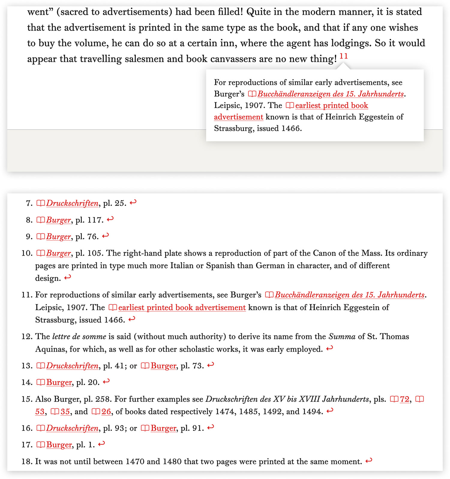
Updike used footnotes liberally and they were a rich source of supporting information in every chapter—often referencing additional books, interesting typographical tidbits, and the occasional anecdote. They were present in every chapter, ranging from 2 to 89 for a total of 539 footnotes. I exercised a little editorial freedom in how they were formatted so they were more accessible in my digital edition by replacing all the “ibid” abbreviations with the repeated name of the book or author mentioned. I used littlefoot.js to make the footnotes and references interactive so clicking on a numbered reference in the text shows a small popup with the corresponding footnote. Keeping the “ibid” abbreviations would have made reading those popups more difficult without the preceding references for context. Most of the footnotes included page or plate numbers for what was being referenced so I included direct links whenever possible.
In earlier chapters, many footnotes referenced a handful of books that weren’t available online. Several of these books were compilations of excerpts from older books. They were available at the Newberry Library so I made it a point to get pictures of each page referenced so readers could click on the plate numbers and at least see them. As an added bonus, I was able to track down most of the original scans of those plates and link to them in their captions. I thought about including the original scans instead but that wouldn’t have been accurate to what Updike published. I figured by using pictures from the compilations and including links to their sources, that was enough to let readers see what Updike intended and give them a path to see more if they wanted. For compilations that were available online, I simply linked directly to the pages referenced.
Despite my best efforts, not every source could be found and in those cases, I kept Updike’s facsimiles and simply omitted links, though they were still included in the sources page minus their links. There were plenty of times that Updike’s facsimiles were the only version of a book that was available such as an example of Grandjean’s romain du roi from 1889 used in Cuivres de Cochin destinés à l’Histoire de Louis XV par Médailles. Updike states that the original book was never published and indeed, I could not find any scans of it online—even by searching for phrases from the facsimile. Other times, the facsimiles were better than the scans as in the lettre batarde used in The Fall of Pinces from 1480. The only copy I could find was a very low quality scan of microfilm at the Internet Archive. Most of the time, when I couldn’t find any scans, I could find copies on rare book shops’ sites and plenty of catalogue records at various university libraries but those weren’t good enough sources to include links.
The preceding examples are just a small set of treasure hunts that I went on but this blog post would be magnitudes longer if I detailed all of them.
In total, I identified 1,229 sources in Printing Types and found online scans for 1,035 of them (84%). Of the 367 numbered figures, I found scans of 315 (86%). Considering their obscurity, that was a much better outcome than I was expecting. This doesn’t mean that scans don’t exist. I just may not have been able to find them. I hope that by making this digital edition, others may let me know where to find them or send me pictures of their own copies if they’re out there.
I acknowledge that I am fortunate to live in a time with luxuries that Updike didn’t have such as online repositories with millions of digital scans at my fingertips like the Internet Archive, HathiTrust, Google Books, universities, and more. My efforts in tracking down sources pales in comparison to Updike’s. Nonetheless, a tremendous amount of research was needed to find as many sources as I did including a few that he couldn’t.
I couldn’t help but wonder why Updike chose the facsimiles that he did—not so much the subject matter but the specific pages or portions of pages. Title pages, broadsides, and other specimens made sense because they highlighted unique material but so many facsimiles were from pages buried deep within much older books with hundreds of others that looked identical to them. Why choose page 91 of Dante’s Divine Comedy? Why page 274 of The Canterbury Tales? Why only a portion of page 290 of the Latin Psalter? They seemed like peculiar choices.
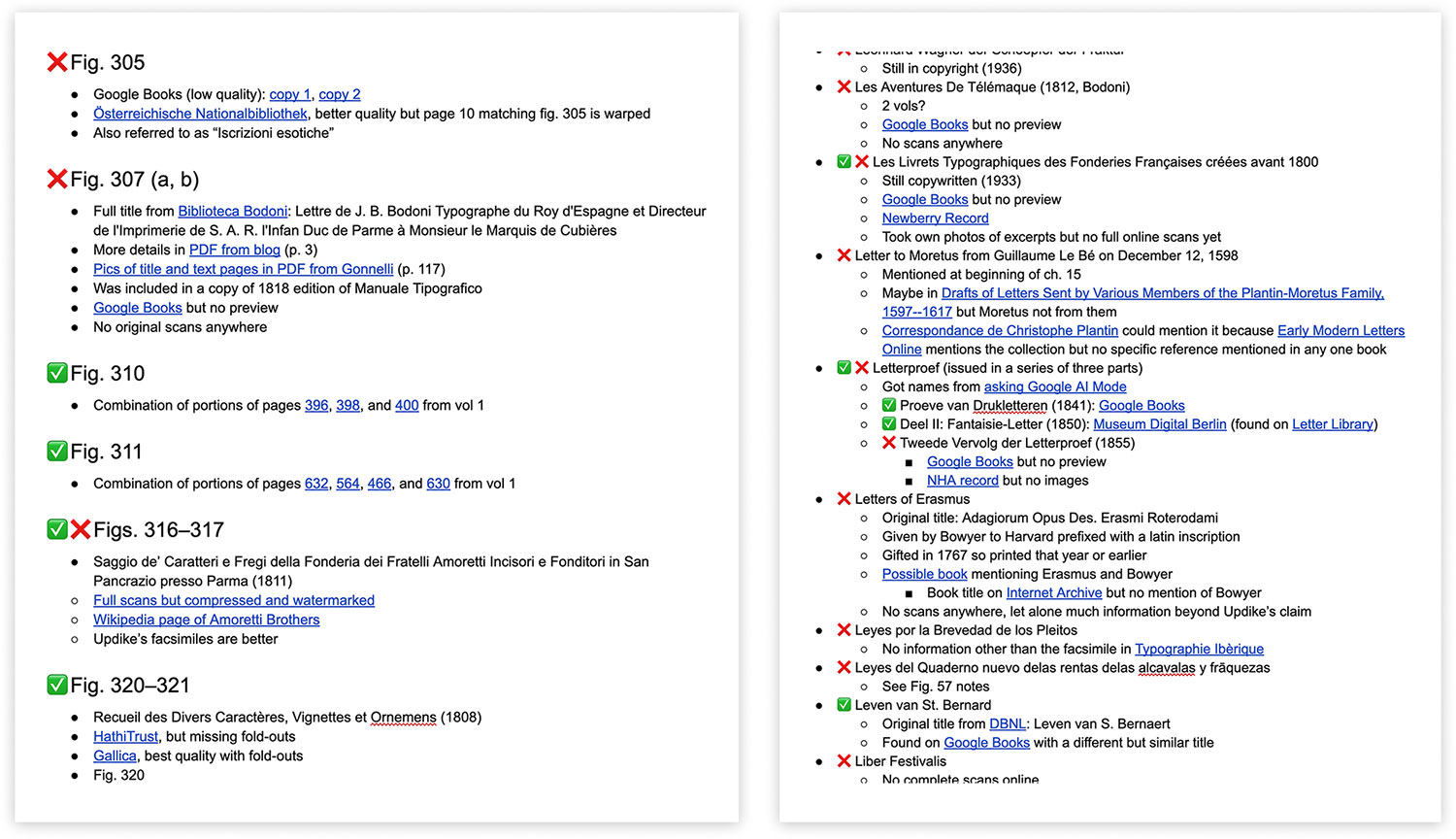
As I worked my way through all the sources, I found that I needed to keep notes on the more difficult ones and the steps I took to find others as a point of reference. My notes were organized into two long pages in Google Docs—one organized by figure number and the other by title. I used emoji icons to indicate if I found the source successfully (✅) if I couldn’t find it (❌), or I found a partial match (✅ ❌) and they were littered with hundreds of links to leads, dead ends, and other info. It was a very low-tech approach but afforded me the flexibility in notetaking. I ended up compiling nearly 80 pages of notes.
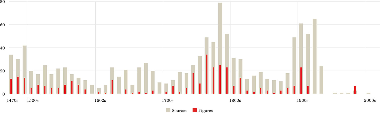
I included a small chart on the About page that showed a breakdown of how many sources and facsimiles were included grouped by decade. The chart extends into the 2000s due to some books only being available as reprints in later years.
Design updates
With all the great scans I was finding, I wanted to find a way to increase their visibility so I updated the design of the chapter template to include a banner collage of the figures within each one. These collages set the tone for the chapter by giving a preview of the images that would be discussed and gave each chapter its own identity beyond the initial minimalist design. No facsimiles were included in chapters 3, 11, and 24 so those chapters were kept as originally designed without banners. A few chapters only had one or a handful of images so simpler banners were used. I enjoyed seeing these banners come to life after finishing each chapter. As a final touch, the home page hero image was also updated to use 10 different images as a rough timeline showing the evolution of typography over the centuries with the oldest on the left and most recent on the right. I also updated the home page to use thumbnails of an image for each chapter instead of the black and white versions of the facsimiles.
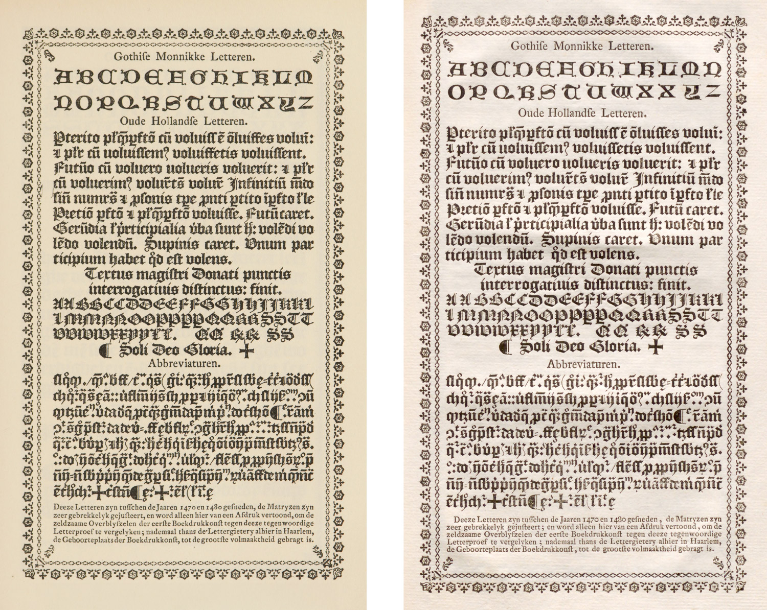
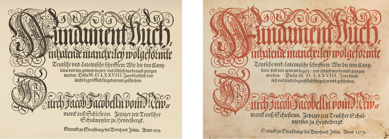
When facsimiles were the only option because better scans couldn’t be found elsewhere, I changed the images I already put online from the stark black-and-white look to be more like they appear in the physical world with the light tan background so they fit in better with the other images and didn’t look so sterile.
A specimen of specimens
As with every project, I like to make posters inspired by data I collected during it. I didn’t have a clear idea of what I wanted to do from the outset but my initial thoughts were to create some kind of timeline showcasing typography’s evolution across the centuries. I experimented with this by building timelines in the digital edition with the intent of using that as a basis for a poster but they ended up looking messy and not good enough for a wall poster.
As previously mentioned, broadside specimens were some of my favorite scans. There was something about them that appealed to me—with the dense amount of information shown and their elegance in how they were designed. I enjoyed them so much that I ended up using them as inspiration for my own version.
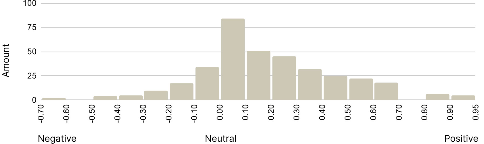
I thought it would be interesting to create a specimen of Updike’s facsimiles but there were too many to include to be legible. A characteristic aspect of Printing Types was his many opinionated critiques and toward the end of the research phase, it dawned on me that I could perform sentiment analysis to evaluate how favorably he spoke of the types included. I had also inadvertently prepared for this because for every entry in the list of illustrations, I included a copy of Updike’s critique.
I took a very low tech approach to this analysis and asked Claude for instructions on how I could use data within Google Sheets since it was easy for me to upload a copy of my data there. It gave me a snippet of code and helpful instructions on how to run it using Google Cloud Natural Language API and within a few minutes, I had a sentiment score for each one ranging from -1 (negative) to 1 (positive). The distribution of scores was about what I expected with the majority of them being mostly neutral but surprisingly, they trended more positive than negative. As I retyped Printing Types, I felt that Updike was a little more critical than complimentary but that could have been due to how sharp his words were when they were the former.
I did some spot checking and the results were accurate. For example, some of most positive descriptions were of Bodoni’s Epithalamia Exoticis Linguis Reddita from 1775:
Such a book…issued in honour of the marriage of Marie Adelaide Clotilde, sister of Louis XVI, printed in Bodoni’s “first manner” from old style types, is a masterpiece; really magnificent in its types, their arrangement, and the superb engraved decorations which, for once, enhance the effect of the page. I think it one of his finest volumes.
…and William Martin’s Chase from 1796:
Martin’s types…are charming transitional roman fonts, both delicate and spirited—and so thoroughly English that Bewick’s engravings seem in a complete harmony with them.
Some of the most negative descriptions were of Enschedé’s Proef van Letteren from 1768:
The smaller types are extremely dull in colour, through here and there we find fonts with a good deal of movement, cut by Van Dyck. Fleischman’s black-letter is tortured and fanciful, and does not stand comparison with Van Dyck’s simpler and finder black-letter, still less with early Flemish gothic fonts.
…and Unger’s Wilhelm Meister from 1795:
We see how little was put on the title-page, how poorly that little was placed there, and in what dejected looking characters it was printed…
Using this scoring method, I used a cropped portion of the top 100 facsimiles that Updike described favorably. At first, I arranged them from most to least favorable and used rough crops just from the original scans to get a sense of how they would fit and how much I could include. They were arranged in a multi-column design like other broadsides, with a large title and a bit of explanation at the bottom.
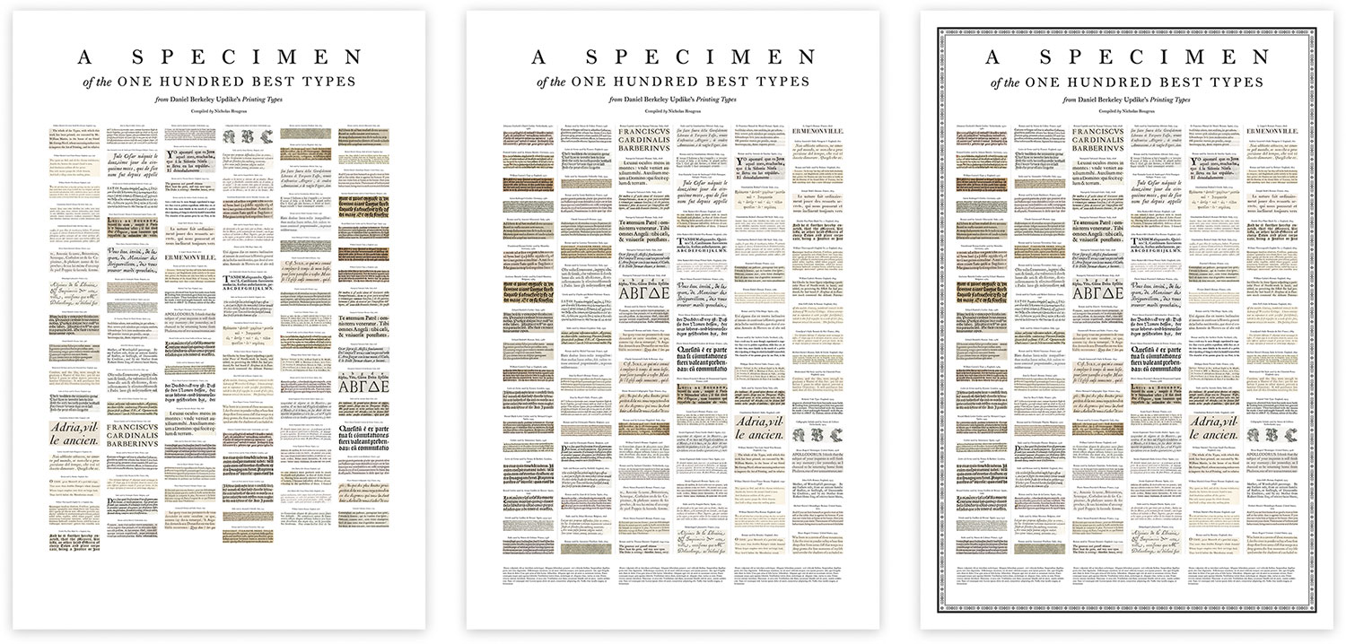
I tried to include a consistent amount of text for each image, showing a maximum of five lines of text or just a few if the type was large. Once I knew they would fit, I replaced the scans with the facsimiles to ensure a uniform look regardless of the specimen. I found it a bit ironic that I ended up replacing the facsimiles with originals in the digital edition and vice versa for the poster. I also arranged them chronologically show how types evolved over the centuries. Above each one is a label with its style, the name of its creator or printer, country of origin, and the year it was printed. For some added flair, I added some ornamentation that I borrowed from two of my (and Updike’s) favorite specimens: Léger’s and Molé’s.
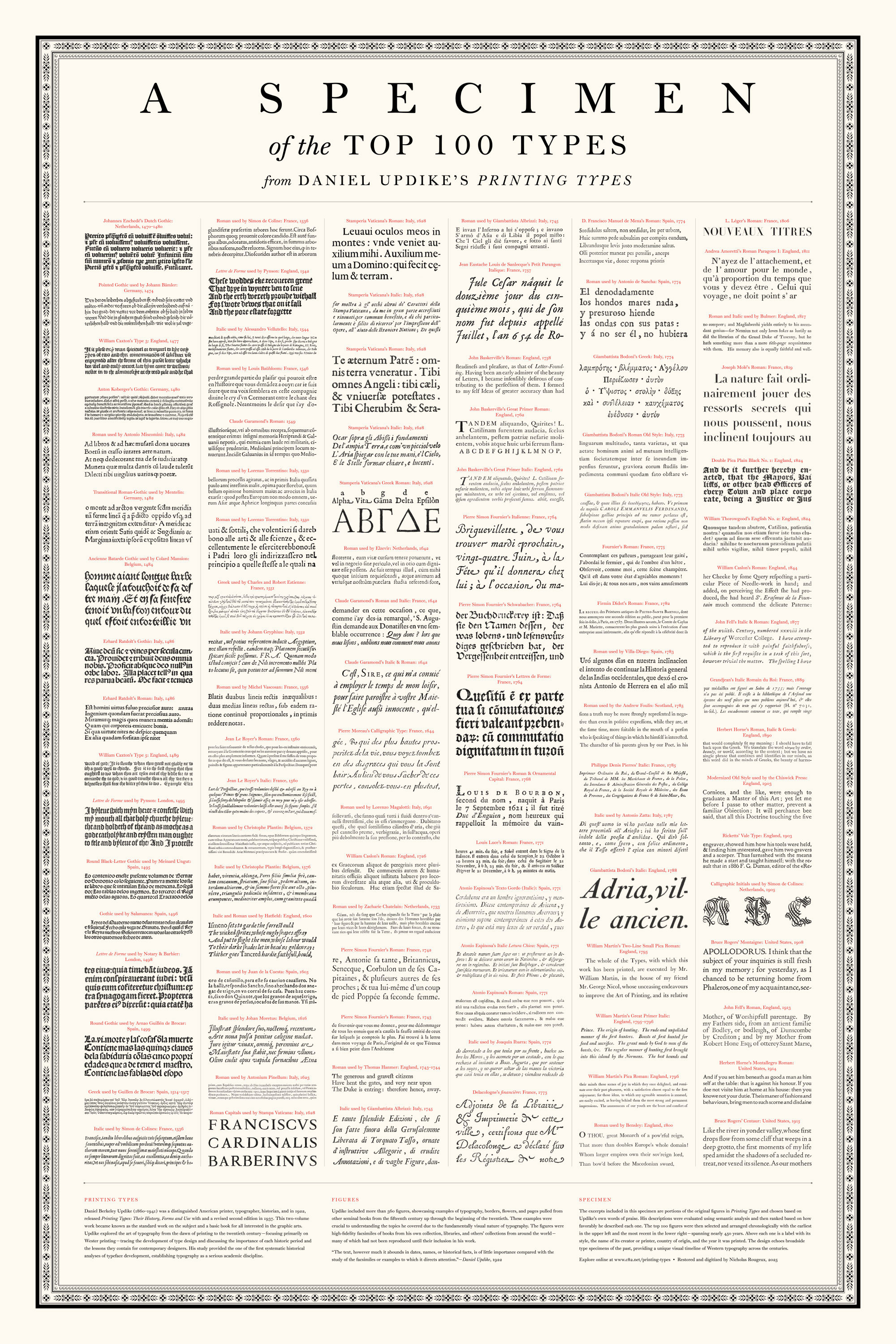
The final result turned out better than I expected and paints an interesting picture of the “top” fonts spanning nearly 450 years.
AI
I would be remiss if I didn’t describe how AI helped in this project because I used it more than in any other. I have plenty of reservations about the use of AI but it did prove useful in a few ways: research, summarization, image cleanup, and semantic analysis, the latter of which has already been discussed.
Finding original titles of books, let alone the books themselves, was an ongoing challenge so I often turned to Google’s to give me leads and direct links. The results were very hit-or-miss—helpful only about 50% of the time. When it worked, it was great, as in when it helped me find the Caxton edition of The Canterbury Tales for figure 60 or finding the 1769 Pastorale referenced in the chapter about Bodoni and the Didots. With little to go on for the latter, I asked AI Mode for simply “pastorale 1769 duke of parma” and it gave me the full title of, Descrizione delle Feste Celebrate in Parma l’Anno MDCCLXIX which allowed me to find a full set of scans for it at the Institut National d’Histoire de l’Art—something I probably wouldn’t have been able to easily find otherwise. In general, when it worked, I was able to get what I wanted by asking things like “Where can I see scans of X.”
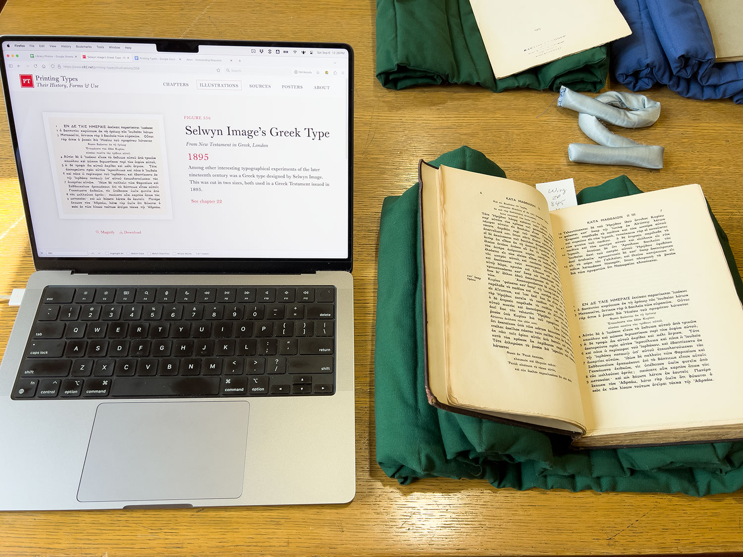
However, It frequently told me incorrect information or insisted that I was wrong and it was right (albeit politely). After failing with direct questions, sometimes I had to start broad and progressively narrow down my line of questioning to get what I wanted. A good example was a sample of Greek type from Selwyn Image in 1895. Updike’s caption described it as being from a Greek New Testament published in London. A bit of searching turned up another sample of the type on From Old Books dot Org, which said it was created for the Macmillan Company by Image. When I asked Google’s AI Mode about Greek New Testaments printed in 1895 using the type from Macmillan, it suggested an excerpt appearing in A short history of English printing from 1900, Homer’s Iliad from 1895, and a set of commentaries on the Greek New Testament. It vehemently argued that the Macmillan never published a Greek edition of the New Testament itself in 1895. After a lot of dead ends, I was able to get it to finally admit that one was reissued, titled The New Testament in the Original Greek and edited by Brooke Foss Westcott and Fenton John Anthony Hort. Armed with the title, I was able to find a copy on Google Books with the page in question, albeit in low quality. Fortunately, the same book was at the Newberry library so I was able to hold it in my hands and get my own picture.
I also used Google Gemini to help with the summaries of all the sources. Google Gemini was a great help for the vast majority. I used the prompt “one-sentence summary of [title]” and did my best to also include a mention of any typographical importance. I never ran into any limits on the number of requests I could make so it was a great tool to have at my disposal.
I kept image cleanup to a minimum but did use Photoshop’s generative fill to make the excerpts from original scans match the facsimiles by erasing text that would have been cut off by cropping. For example, the excerpts from De Stad Haarlem en haare Geschiedenissen and Ibarra’s Spanish Sallust, only included part of the bottom half of the page so I used generative fill to remove the lines before and after the excerpt that would have been cut off with the crop. These updates were essentially the modern version of what Updike did when he created his original facsimiles.
Timeline
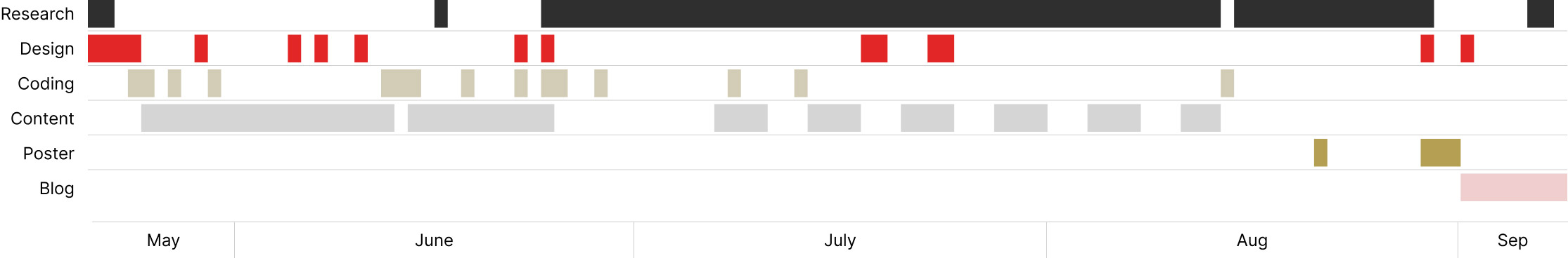
The digital edition of Printing Types was completed over about four months, though it was brewing in the back of my mind for years. I’ve gotten into the habit of keeping a log of my progress for most projects, partly as a reference for blog posts like this but also because it’s another artifact of my efforts.
This project started out like most others with early research and design explorations, followed by building a proof of concept, and settling into the routine work of filling in content. However, once I started the big treasure hunt for original scans, I went back to the beginning and replaced facsimiles with scans and added links to sources. When that started, I took a parallel approach—dividing my time between typing chapters and researching. Researching required a steady internet connection and unlimited data so I did that in the mornings before my day job, during breaks, in the evenings, and on weekends. Simply retyping and formatting chapters’ text didn’t require an internet connection so I did that during my commute to and from work (about 3 hours a day). Researching during my commute ate up my data plan way too quickly so splitting my time made the most sense. Eventually, I finished typing and focused solely on research, which ended up taking just as long as the typing. Finally, I polished up the overall design, created the poster, and wrote this blog post.
Final thoughts
On more than one occasion, Updike spoke of books or specimens that he had never seen. I am glad that modern technology and numerous digitization initiatives have made it possible for me to not only find them from the comfort of my own home but share them with others. However, nothing beats viewing the books in person.
This project was truly a grand treasure hunt and worth every minute. What started out as a simple design exercise evolved into a typographic adventure through the centuries. I thoroughly enjoyed digging through archives and leafing through antique books, both digital and physical to find treasures. The satisfaction of connecting the dots and following the trail to find that one page again and again was addictive and very rewarding. My sincerest thanks goes out to all the library staff who put up with my many obscure requests.
Updike’s final paragraph struck a chord with me as an artist and designer but could certainly apply to anyone else passionate about what they do:
The practice of typography, if it be followed faithfully, is hard work—full of detail, full of petty restrictions, full of drudgery, and not greatly rewarded as men now count rewards. There are times when we need to bring to it all the history and art and feeling that we can, to make it bearable. But in the light of history, and of art, and of knowledge and of man’s achievement, it is as interesting a work as exists—a broad and humanizing employment which can indeed be followed merely as a trade, but which if perfected into an art, or even broadened into a profession, will perpetually open new horizons to our eyes and new opportunities to our hands.