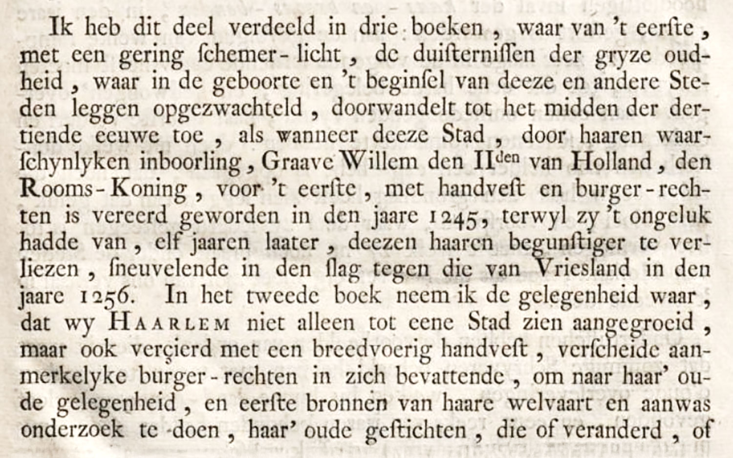
Figure 209
Type used in De Stad Haarlem en haare Geschiedenissen: Enschedé and Bosch, Haarlem
From a copy in Harvard College Library (facsimile), Google Books (scan)
1765
…very appropriately printed. It is not much of a performance. The dull, light, roman and italic types have lost all colour and spirit. Some black-letter (possibly Fleischman’s) is here and there used for verse. Then, too, the composition of displayed and prefatory matter is tasteless and pretentious. As a whole, the book,—a folio,—weak as it is in its types, is yet interesting, because showing new tendencies in printing.
