Chapter XIX
Nineteenth Century “Classical” Types. Bodoni and the Didots
I. The “Classical” Movement
The pseudo-classical types which were in full possession of the European field in the first years of the nineteenth century, and which we best recognize by the term “Didot,” had their origin
- in some special tendencies or influences in typography, and
- in political artistic movements,1
which must be described at some length if we are to understand the typographical revolution which they bought about.
In typography, the first and earliest influence was the form of serif introduced into French romain du roi by Grandjean in the reign of Louis XIV. This thin, straight serif, dazzling to the eye, rendered the romain du roi letterform quite unlike anything that preceded it. Grandjean’s serif was discarded by Luce in the types cut by him in the time of Louis XV; but it was revived in types cut after Luce’s period, notably by the Didots.
The second influence was the fashion for more modelled types, with light strokes in greater contrast to heavy strokes, introduced in England by Baskerville. This style, although it never took root deeply in England, was greatly admired on the Continent, especially in France and Italy. For, as Baskerville said when he offered his fonts to the Académie des Sciences,
I have never sold my Types, nor do I intend to sell any to London printers, as my Labours have always been treated with more Honour abroad than in my native country.
To France Baskerville’s types ultimately went, and his influence on both Bodoni and Didot is undeniable.
A third influence was the condensation of type-forms—as exhibited by Luce in his caractère poétique, and by other founders in the fonts called serré or approché—by which letters appeared taller and narrower.
And finally, all these tendencies were accentuated by the taste throughout Europe for a lighter and more delicate style of typography; sometimes arrived at by actually cutting a lighter letter, sometimes by greater leading of the type.
Chief among the artistic and political movements which affected type-forms was the revival of appreciation of the antique, which by 1800 dominated every phase of art. This revival was the result of something over a hundred years of unconscious preparation. Long before the discovery of Herculaneum and Pompeii, excavations had been made in the neighbourhood of Rome, and the “grand tour” had made Roman antiquities familiar to travellers. Although the first discoveries at Pompeii were made as early as 1713, it was not until 1745 that the greater part of Pompeiian antiquities were found.2 Even before the latter date public interest was considerably aroused, and these discoveries were discussed in learned publications—Cochin, who visited Italy with Marigny and Soufflot, writing on Herculaneum in 1751, and Carlos III in 1757 promoting Baiardi’s Antichità de Ercolano. The vogue of antique art was heightened by Panini’s paintings, Piransesi’s engravings, and the sketches of Hubert Robert; encouraged by the French Academy at Rome and the new Academies in Naples, London, Madrid, Parma, and elsewhere; and further stimulated by the sale of Sir William Hamilton’s Etruscan vases to the British Museum, the installation of Roman collections of sculpture, etc., and the journeyings of the erudite to Naples, Pæstum, and Sicily. The popularization of all these wonders by publications illustrating and describing them—by Caylus, St. Non, Visconti, Winckelmann, Mengs, and others—led people to consider Rome, in the language of the day, “the unique Emporium of the Beautiful and the Temple of Taste.”
In architecture, painting, and sculpture men soon formulated what was supposed to be the underlying theory of antique art. Artists searched Plutarch for subjects; sculptors chose living models on account of their likeness to antique statues; and the Beau Idéal was to be attained by studying antiquity rather than life. In painting, these ideas are exemplified by such pictures as Le Serment des Horaces of David, by Flaxman’s illustrations for the Iliad, and by Angelica Kauffmann’s pictures of antiquity à la mode. In sculpture, Canova held first place in this revival, and made his reputation by work which, because it was thought the last work in classicism then, makes us smile now.
And in the minor arts all the forms of antique ornament were pressed into the service of decoration. In furniture, marble or mahogany was encumbered or enriched by classical ornaments in metal. In porcelain, Etruscan motifs were used at Sèvres; Wedgwood named his potteries Etruria, and for him Flaxman made classical designs. Ruins became ink-stands, tripods turned into flower stands, porticoes formed clocks, and sphinxes, andirons. Pliny’s Doves in mosaic became table-tops, paper-weights, or brooches, buttons were à l’antique, and even fabrics were printed from Huet’s designs of Roman ruins.
By the year 1790, Greek and Roman antique art had completely captured public taste—social and political events and ways of thinking in France being particularly favourable to such a development; though French students and artists resident in Rome became so unpopular because of their revolutionary opinions and license of expression that they were driven out.3 But by 1796, the Pontifical States were invaded by France, and the rage for antiquity showed itself in French demands. Paris must be a new Rome; and so it was needful to make Paris what Rome had been—the artistic centre of Europe. To effect this worthily we must, said the French, possess Roman monuments; and they proceeded to possess them. The Laocoön, the Dyling Gladiator, the Faun of Praxiteles, all set all for Paris, accompanied by Raphael’s Transfiguration, Domenichino’s St. Jerome, and a mixed company of goddesses, saints, nymphs, martyrs, and emperors. There was even a plan to carry off Trajan’s Column, which proved, on investigation, so much too heavy that a lighter obelisk was sent instead. The greatest works of Italian art arrived in Paris by 1801, where they were received with public rejoicing. For by that time, politics, literature, art, all recalled the antique world. Government was confided to senators, tribunes, and consuls—and, more Romano, a victorious general was made Emperor.
To us nowadays the antique seems something very hackneyed, but it was to the men of those days brilliantly and thrillingly new—a resurrection from the dead; and, by an association of ideas, antique art—and even sterile and frigid imitations of it—symbolized that private virtue and public wisdom which was then hopefully supposed to have made its home on earth. The pseudo-classical tendency in painting and sculpture made itself felt also in oratory and literature. And thus it seemed necessary, in typography, to clothe new modes of expression in a new way, and new type-forms were demanded to do it.4 It required only a “man of the hour” to accomplish this—in France Didot, in Italy Bodoni. Thus artistic movements, political reforms, and dynastic changes, together with certain tendencies in design, contributed to the popularization of a kind of type which however far from classicism it seems to use now, represented to the bibliophile of that epoch a return to “antique virtue”!
II. Giambattista Bodoni
In bringing about this change in typographic practice, Bodoni showed great originality in his new type-forms, and in this respect was the man most to be reckoned with. The scholarly prestige of the Didots (in the long run a far greater force) was influential in popularizing these new styles of type.
Giambattista Bodoni, the son of a printer, was born at Saluzzo in Piedmont in 1740. Leaving home as a lad, he made his way to Rome, where he served as apprentice in the press of the Propaganda Fide—la felice scuola, as he called it—for which he always retained his early affection. Its director, Ruggeri, a learned man, was kind to Bodoni, and encouraged him in trying to improve himself—even at the early date we find Bodoni cutting types for the establishment. His stay there was not long. Ruggeri committed suicide, and Bodoni, unable to endure further employment at Rome, left the Press with the idea of seeking his fortune in England. On his way there, stopping at his parents’ house at Saluzzo, he fell ill; and before he had a chance to continue his journey he was asked, in behalf of Ferdinand, Duke of Parma, to take charge of the Stamperia Reale at Parma. This was in 1768. Bodoni’s work there was that of a private printer; he produced either such things as were needed at court, or interested the Duke; or such work as he, on his own initiative, proposed.
His first stock of types came from the Parisian foundry of Fournier, and he also cut type based on Fournier’s models. What this stock of type was in 1771 is shown in Bodoni’s specimen of that year, and to this period belong his Essai de caractères Russes (1782), a Manuale Tipografico in quarto, a folio Manuale [parts 1, 2], and a Greek specimen—Serie de’caratteri greci de Giambatista [sic] Bodoni—all three produced in 1788. By this time Bodoni had designed a great number of types, which, beginning his old style, by degrees took on a more modern appearance. His press became one of the sights of Europe, and was visited by the dilettanti and cognoscenti on the “grand tour;”5 his editions were admired and collected by bibliophiles everywhere. After 1790, his situation—vis-à-vis the Duke of Parma—was improved. This came about through an offer which Bodoni received from De Azara, Spanish Minister to the Papal Court, who conceived the idea of starting a press there (to bring out editions of the classics), of which he invited Bodoni to take charge. This plan coming to the Duke’s ears, he made a counter proposal, with the result that Bodoni remained at Parma with a larger press and a more independent position, which permitted him liberty to print for any one who wished to employ him. So, besides Italian, Greek, and Latin books, Bodoni enlarged his field by printing French, Russian, German, and English books—Walpole, Gray, and Thomson being among the English authors for whom he produced editions. He was appointed printer to Carlos III of Spain; he received a pension from his son, Carlos IV; he corresponded with Franklin; he was complimented by the Pope; the city of Parma struck a medal in his honour; he obtained a medal for his work at Paris; he received a pension from the Viceroy of Italy; Napoleon gave him another and a larger one, and in short he was a great personage. He was one of those fortunate mortals, who, appearing at just the right moment, knew exactly what he wanted to do, attempted it, succeeded in it, was praised for it, and deserved (and highly enjoyed) the praise. What more could one ask? He departed this life at Parma in 1813, and even his funeral ceremonies appear to have been precisely what he would have wished them to be!
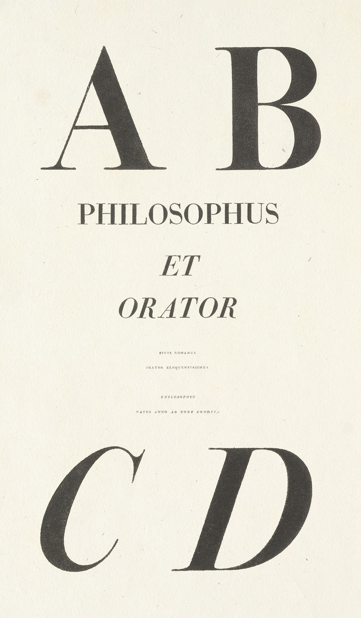
As to Bodoni’s specimen-books (apart from the charming little specimen of 1771, Fregi e Majuscole, described in a former chapter), the inscriptions in exotic types,—Iscrizioni Esotici a Caratteri novellamenti incisi e fusi, 1774,—printed to commemorate the baptism of the Prince of Parma, may be considered his first attempt to display his exotic characters. It is an interesting book—of 50 pages, quarto—and shows twenty of Bodoni’s “learned” fonts (fig. 305). The magnificent Epithalamia in folio, printed in 1775 and later to be described, also falls into this class. Bodoni’s Manuale Tipografico of 1788 I have never seen. It was apparently a quarto book of 360 pages, containing one hundred specimens of roman and fifty of cursive types, displayed in French and Italian on one side of the leaf. In it were also included twenty-eight sizes of Greek character, which were issued separately as well. This edition of the Manuale seems also to have been printed in octavo form on various special papers and on vellum.
305. Greek from Iscrizioni Esotici: Bodoni, Parma, 1774
In the same year, 1788, Bodoni issued the finest and most imposing of his specimens—a folio collection of roman, italic, Russian, Greek, and Cancellereschi types. The book opens, unfortunately, with the last named, in fifteen sizes of a detestable form of script capital; but the twenty-eight alphabets of roman and twenty-seven or italic capitals which follow are perhaps the most significant of their kind ever displayed. The roman capital letters in larger sizes (from 1 to 5) are specially fine—brilliant in cut and splendidly printed in ink of a wonderfully rich black. Then, too, unlike Bodoni’s later works, the paper has a pleasant surface from which all the life has not been smoothed out. Nine alphabets of Greek capital letters follow, both in upright and cursive forms—though how legitimate Greek “italic capitals” are is a question. The sizes from 1 to 4, or 5, are superb, especially number 1, in both italic and roman. Next come Russian capital letters in twelve sizes of roman and italic, and here again the cutting is brilliant and the impression effective to the last degree. From that point on, the types are upper and lower-case, beginning with roman and italic papale, imperiale, reale, ducale, in three weights of letter down to tresmégiste, below which roman and italic are shown in ten sizes of each; followed by similar Russian fonts of great magnificence. Fonts of Greek follow in descending sizes, and a few specimens of roman and italic (fig. 306), which are much more old style than Bodoni’s later equivalent fonts.
306. Roman and Italic from Bodoni’s Specimen, Parma, 1788
From Serie di Majuscole e Caratteri Cancellereschi (scan)
The splendour of this book depends upon pure typography. There is not an ornament in it—not even the little tablets by which Bodoni sometimes gave a dash of salt to his books, but with which less skilful printers have peppered their reproductions! From a passing allusion in Bodoni’s preface to his Manuale of 1818, it appears that only a few copies of this specimen were printed.6
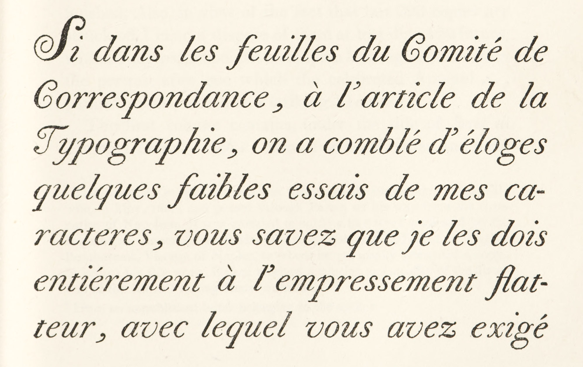
To this period also belongs Bodoni’s “Letter” to the Marquis de Cubières7 in French and Italian, printed in 1785. Concerning it Franklin wrote the following letter to Bodoni, dated Philadelphia, October 14, 1787:
I have had the very great pleasure of receiving and perusing your excellent Essai des Charactères [sic] de l’Imprimerie. It is one of the most beautiful that Art has hitherto produc’d. I should be glad to see a specimen of your other Founts besides this Italic & roman of the Letter to the Marq.s de Cubières; and to be inform’d of the price of each kind.—I do not presume to criticize your Italic Capitals; they are generally perfect: I would only beg leave to say, that to me the form of the T in the word LETTRE of the Title Page [fig. 307a] seems preferable to that of the T in the word Typographie in the next Page [fig. 307b], as the downward stroke of T, P, R, F, B, D, H, K, L, I, and some others, which in writing we begin at the top, naturally swells as the pen descends; and is only in the A and the M and N that those strokes are fine, because the pen begins them at the bottom.
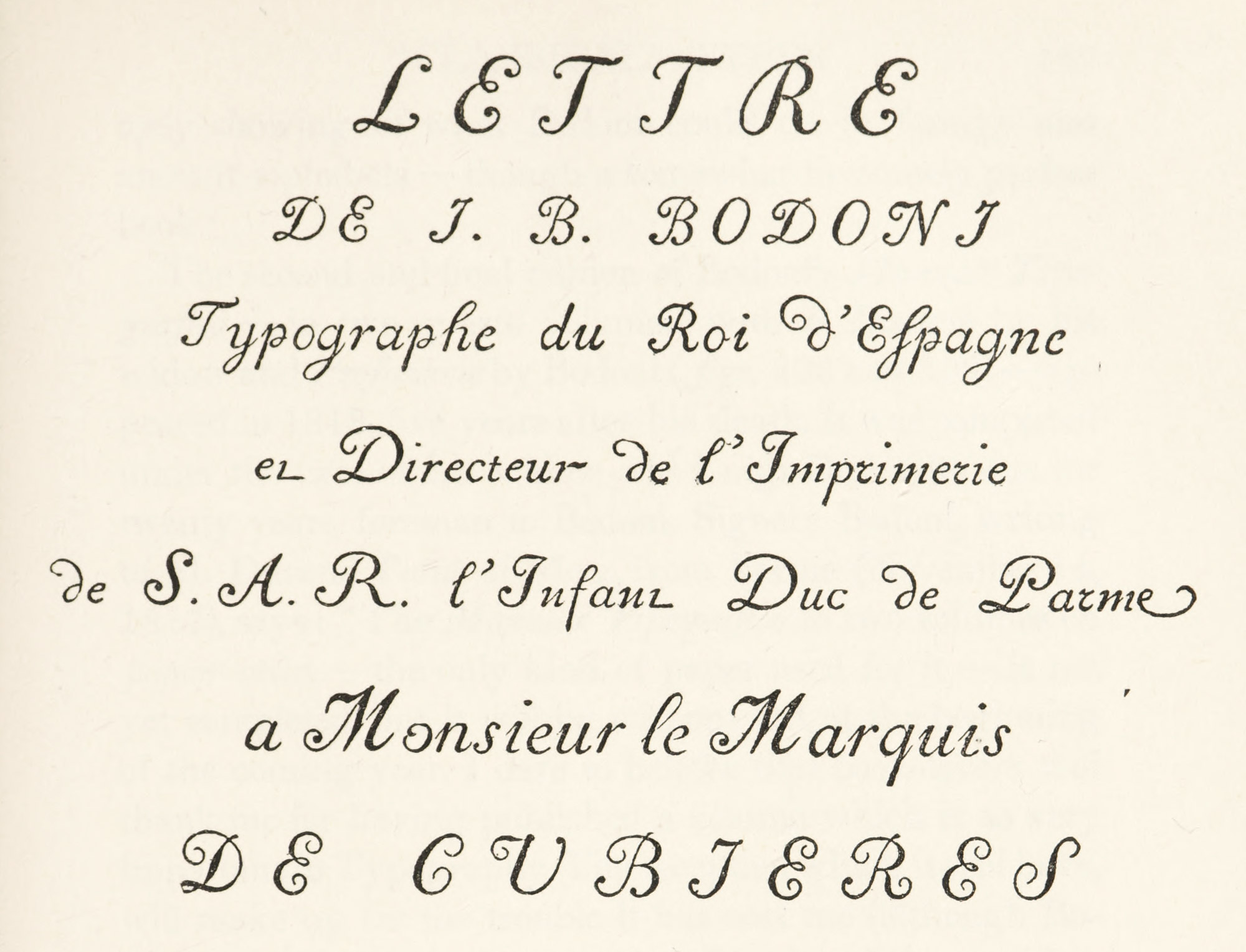
307 (a). Title of Lettre à De Cubières: Bodoni, Parma, 1785
307 (b). Text of Lettre à De Cubières: Bodoni, Parma, 1785
De Lama says that Bodoni was overcome with joy to have from the President of the United States of America this flattering letter, which he considered a title to glory and preserved with religious care. Bodoni and De Lama, although a little mixed about the office which Franklin held in America, were quite right in being pleased; and this compliment so flattered Ferdinand, Duke of Parma, that he had the letter translated into Spanish, and sent it to his uncle, Carlos III, at Madrid, to whom Bodoni was honorary printer by appointment.8
In 1806, the Oratio Dominica in CLV Linguas Versa et Exoticis Characteribus Plerumque Expressa is another masterly showing of what Bodoni could do in foreign and ancient alphabets—though a somewhat tiresomely perfect book.9
The second and final edition of Bodoni’s Manuale Tipografico—in two quarto volumes, with a Discorso by his widow and Prefazione by Bodoni (figs. 308 and 309)—appeared in 1818, five years after his death. It was completed under the care of his widow and Luigi Orsi, who was for twenty years foreman to Bodoni. Signora Bodoni, writing to M. Durand l’aîné of Metz, from Parma (November 14, 1817), says:
The Manuale Tipografico in two volumes on papier-vélin—the only kind of paper used for it—is not yet completed, but it will be, without fail, at the beginning of the coming year. I dare to believe that book-lovers will thank me for having published a volume which is so very important to Typography. The reception which it will have, will make up for the trouble it has cost me (although Bodoni has left the blocks or models for it) and considerable expense which I shall have had to incur before it is finished. Also, in view of the fact that but 290 copies are struck off, I cannot dispose of them at less than 120 francs, without any reduction. M. Rosaspina has engraved au burin the portrait after one which the celebrated Appiana…painted in oils, which is a striking likeness.10
308. Page of Signora Bodoni’s Discorso: Manuale Tipografico, Parma, 1818
From Library of Congress (scan)
309. Page of Signora Bodoni’s Prefazione: Manuale Tipografico, Parma, 1818
From Library of Congress (scan)
The first volume contains, under the title of Serie di Caratteri Latini, Tondi e Corsivi, a series of roman and italic types which cover 144 pages. These run from parmigianina to papale. Sometimes there are as many as fourteen varieties of the same body in different designs and weights of line. It is almost impossible to conceive why it was necessary to have so many kinds which, even to a trained eye, appear much alike: though it is perhaps justifiable in the larger sizes—as in the three weights of ducale (fig. 310)—where differences can be clearly detected. The number of sizes of type, so nicely graduated that one almost merges in another, is more explicable. This great series enabled Bodoni to place on his pages, not approximately, but exactly, the size of type he wished to employ (fig. 311).
310. Specimen of Bodoni’s Ducale in three weights: Manuale Tipografico, Parma, 1818
311. Largest, medium, and smallest Roman and Italic Capitals shown in Bodoni’s Manuale Tipografico, Parma, 1818
Succeeding pages (145–169) show Serie di Caratteri Cancellereschi, etc., in smaller sizes ugly, gray forms of script. Here and there an interesting one appears—like number 13, or the large sizes, 16 and 17. The English scripts are imitations of the “fine Italian hand” then fashionable in England, and have little to recommend them. Volume I closes with an enormous array of capital letters, both roman and italic, followed by a few pages of hideous scripts capitals unworthy of the collection.
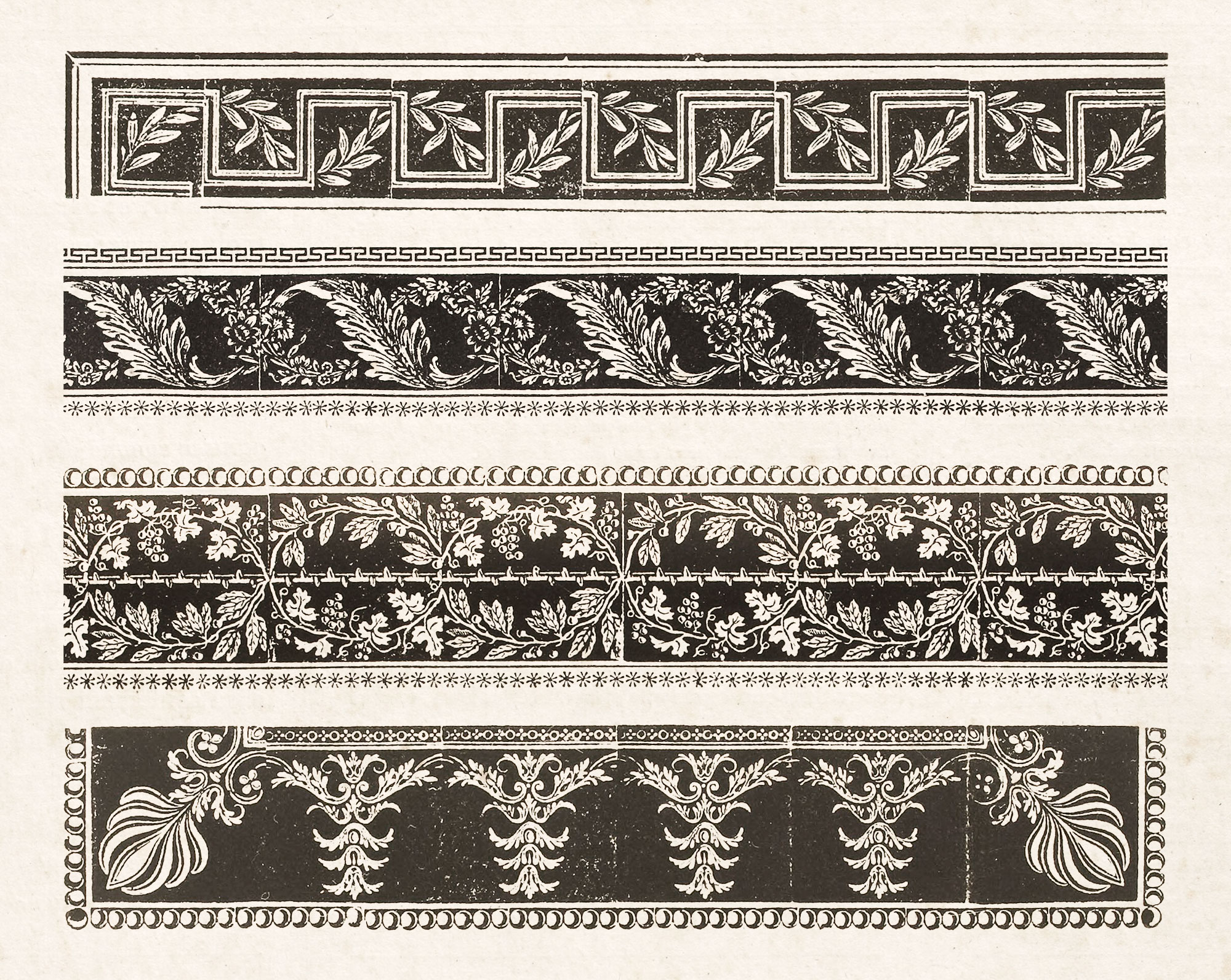
The second volume contains an assemblage of roman and “italic” Greek capitals, covering sixty-two pages; and exotic types, beginning with Hebrew, run on to the ninety-seventh pages. These are followed by German and Russian types, many of great splendour. The book closes with series of borders, mathematical, astronomical, and other signs, musical notation, etc. Some few ornaments (fregi) are attractive (fig. 312), but most of them, while very perfect, are chilly, sterile, and uninteresting. The borders (contorni) confined in rules—a form of decoration which Bodoni affected for his broadsides—are, however, quite charming (fig. 313). The arabic figures displayed are distinguished, and deserve mention. The music type is uninteresting, the plain-song notation in particular being too modern in effect. The work is probably the most elaborate specimen that the world has ever seen—an imposing tour de force—and the acme of Bodoni’s late, chilly, dry manner.
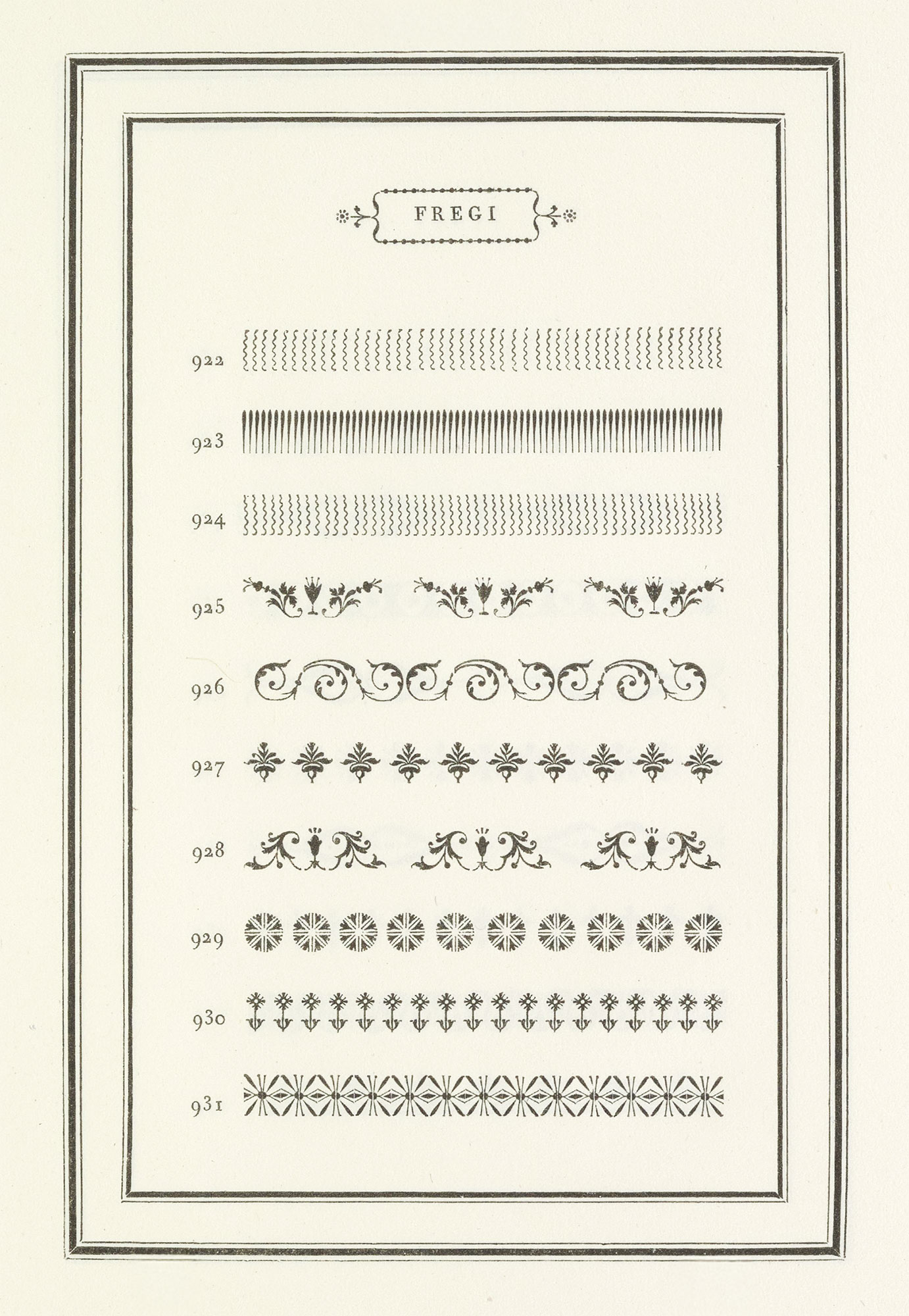
312. Ornaments: Bodoni’s Manuale Tipografico, Parma, 1818
From Library of Congress (scan)
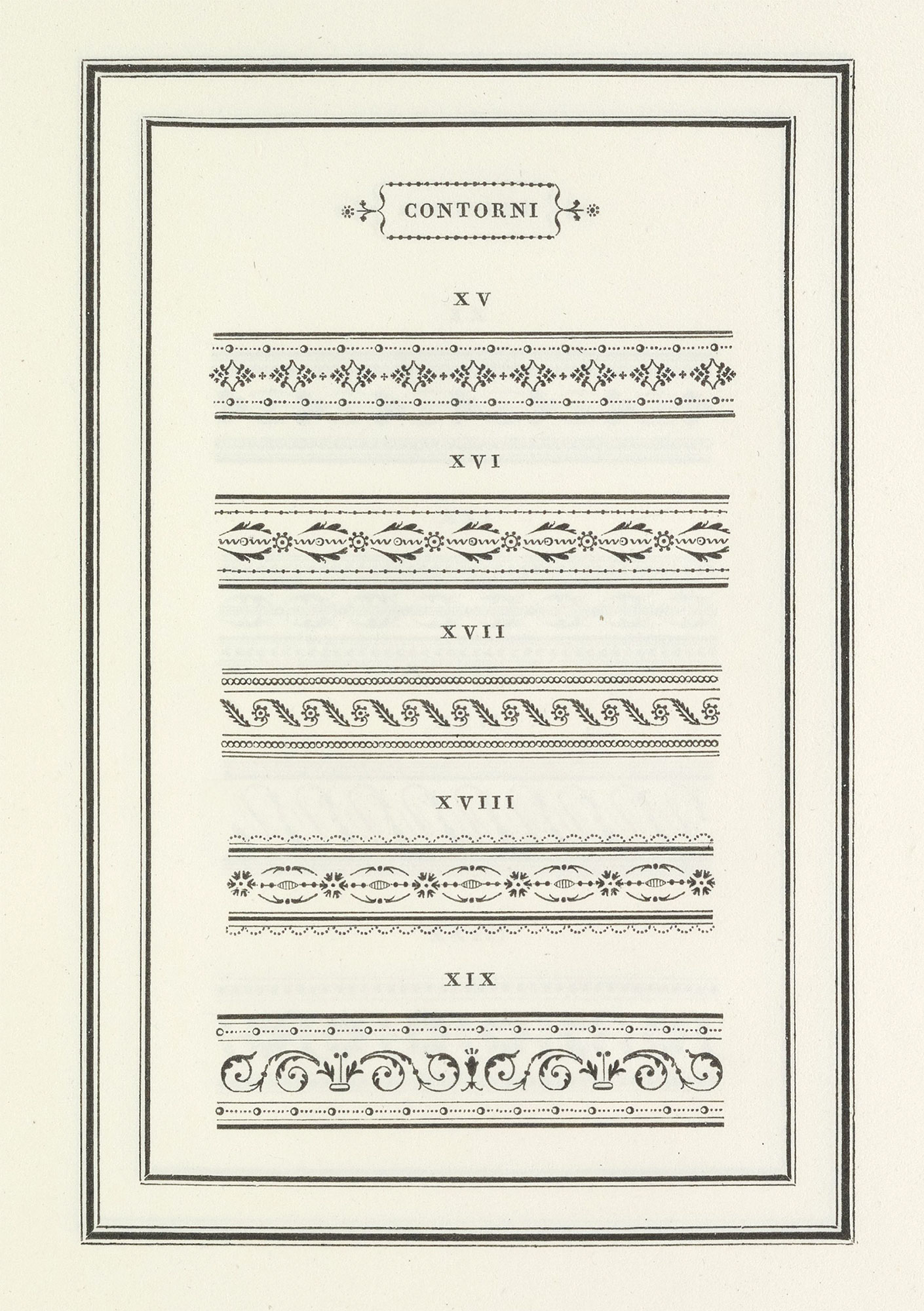
313. Borders: Bodoni’s Manuale Tipografico, Parma, 1818
From Library of Congress (scan)
Bodoni’s work may be divided into two periods:
- when he employed old style or transitional types and used decorations somewhat profusely, and
- when he depended on his own type-designs and unadorned typography for his effects.
His early printing shows French influence very distinctly , and the specimen of 1771—Fregi e Majuscole—the border of Bodoni’s title-page is almost a copy of that of the second volume of Fournier’s Manuel Typographique.
But earlier than that, the French fashion of printing appears in such books as Le Feste d’Apollo and the Pastorale of 1769—which commemorate gala performances in honour of the marriage of the Duke of Parma. Some other early books of the Stamperia Reale—such as Alberti’s Saggio de Poesie Italiane (1773) or Trenta’s tragedy L’Auge, issued about 1774—are so far from Bodoni’s later style that it is at first sight difficult to believe that he printed them. Such a book as the Epithalamia Exoticis Linguis Reddita of 1775, issued in honour of the marriage of Marie Adelaide Clotilde, sister of Louis XVI, printed in Bodoni’s “first manner” from old style types, is a masterpiece; really magnificent in its types, their arrangement, and the superb engraved decorations which, for once, enhance the effect of the page (figs. 314 and 315). I think it one of his finest volumes.
314. Roman in Epithalamia Exoticis Linguis Reddita: Bodoni, Parma, 1775
From Library of Congress (scan)
315. Italic in Epithalamia Exoticis Linguis Reddita: Bodoni, Parma, 1775
From Library of Congress (scan)
In 1784, Bodoni printed another very charming book in this early manner—Prose e Versi per onorare la Memoria di Livia Doria Caraffa, a collection of poetry, prose, and inscriptions which is probably one of the most beautiful memorial volumes ever produced. The fonts of delicate roman and italic type are distinctly old style. In 1785, Bodoni’s edition of Anacreon’s Odes, in quarto, was published—a most beautiful book (printed entirely in capital letters) in Greek and Latin. The volume In Funere Caroli III, of 1789, and the Orazione Funebre of Botteri (for the same occasion) are also good specimens of his earlier taste. The Greek and Italian Callimachus of 1792 retains a great deal of his early style; and his Tavola di Cebete Tebano of 1793 is another delightful piece of printing—simple, and very characteristic. The Brief of Pius VI of 1792, of which there were but twelve copies printed in folio, may well have caused the pope to exclaim that he must issue a second brief to praise the way in which Bodoni had printed the first one! Of all this work, a little 32mo Anacreon in Greek of 1791 is my favourite—one of his most exquisite bits of printing. Meanwhile, the increasing number of books prefiguring his later way of working—like the Horace and Imitation of 1791 and 1793—show that he was feeling his way into the refrigerated manner of his last days. But his first period—less known, and when known, less considered—is his best.
Of Bodoni’s second manner—which, roughly speaking, may be called his nineteenth century style—there are innumerable examples, and in all these later books the area of unprinted space on his pages is great. Bodoni lightened the solidity of close-set composition by exaggerating his ascenders and descenders, and also by ingeniously placing small faces of type on large bodies, which effectually prevented such fonts form being set solid. His quarto Tacitus of 1804 is a fine book—transitional in style, perhaps. Il Bardo della Selva Nera of 1806 is a full-blown example of his favourite and typical way of working. The Oratio Dominica of the same year, Tasso’s Gerusalemme Liberata of 1807, the Greek Iliad in three volumes folio of 1808, La Rochefoucauld’s Maximes in French of 1811, and the French Télémaque of 1812, which Bodoni thought perhaps his best work—all of these are books showing originality of conception, even though the conception may not be of a very endearing kind.
One of the last and most typical of his editions is La Giuditta of 1813—begun but not finished by Bodoni—a book absolutely without ornament, and very fine in its way. Some smaller volumes of poems in 16mo, delicately printed from delicate types, on paper which is much like vellum in quality, are delightful of their kind. Such as Parini’s Odi of 1799; Versi di Giordani, in four volumes [1, 2, 3, 4], of 1809; and Versi del Conte Aurelio Bernieri, 1811, in four three volumes [1, 2, 3].
Finally, Bodoni’s broadsides—inscriptions in capitals, framed in borders made up of ornaments—are among his most interesting performances. These are rare; and while no reproduction gives much idea of them, I refer to the reader to their facsimiles at the end of Bertieri’s admirable book.11
Bodoni’s larger volumes were certainly often magnificent. They were planned on a great scale. It has been very well said of him that those who came after might choose to do something else; but that what he chose to do could never be done better. His first manner, in one way less characteristic of him, is, as I have said, much the more agreeable and sympathetic. He was then under the influence of French styles, although perhaps he had given up employing French types; but there was about the books of his period—as in those of his rival Didot—real charm. The distinction of old style type was retained, but it was slightly refined. But while it was in his first period that he produced his most beautiful books, he himself did not think so. It may be said that this is self-evident, because he soon changed his style for one which he must have considered an improvement. But it was not Bodoni, but the spirit of the art round about him, that made his later types more and more rigid, their heavy lines thicker, and their light lines thinner and more wiry. Wonderfully perfect as these types were in detail, they contributed to a style of printing that made these later books as official as a coronation, and as cold as the neighbouring Alps! His volumes were to other printing what Canova’s statuary was to earlier sculpture.
Many of Bodoni’s books lacked intimacy and charm, too, because of his conception of the function of the press. He cared nothing about printings as means to popular instruction. He did not despise the masses—he forgot all about them! He was a court printer, existing by the patronage of the Lucky Few. His editions were intended to be livres d’apparat.12 He not alone saw now harm in making them so, but the bigger and more pretentious they were, the better he liked them. In face, he openly said so, and told Renouard, the French publisher, “Je ne veux que du magnifique, et je ne travaille pas pour le vulgaire des lecteurs.” I am afraid, too, that he always retained and eighteenth century Italian carelessness about detail, which often gave Italian architecture and painting of that period such delightful brio. But “broad effects,” when applied to scholarship and proofreading, lead to disaster. Thus the texts of Bodoni’s classical editions have never been considered very correct, and his books, apart from their appearance, are not valuable to the scholar. Didot, who published much better editions, but did not print so well, justly enough said that Bodoni’s books would figure on these shelves of collectors, but not in the libraries of savants—adding, “Comme littérateur je condame ses éditions, comme typographe je les admire.” There were other eminent critics who took the same tone. Apparently it was not only in the classics that he sinned; for Horace Walpole, writing in 1790 to Mary Berry, who was then in Italy says,
I am glad you did not get a Parmesan Otranto. A copy is come so full of faults that it is not fit to be sold here.
But whatever Bodoni’s faults were, he was perfectly characteristic of his period, and expressed it in his work. Because he was to characteristic of his time is perhaps the chief reason that he is a great printer.
Andrea Amoretti, a learned Italian priest, who, renouncing his calling, engraved some of Bodoni’s types, and who printed some pretty books himself, issued a delightful little specimen, Saggio de’ Caratteri e Fregi della Fonderia dei Fratelli Amoretti Incisori e Fonditori in San Pancrazio presso Parma (1811), and this book shows how the Italian output had been influenced by Bodoni and Didot13 (fig. 316). The clear-cut ornaments which are to earlier ornaments what the Amoretti types of 1811 are to earlier types, are very perfect, very brilliant, and extremely characteristic of the fashionable style in printing at that period (fig. 317). Indeed, Bodoni’s work was much copied by such presses as that of the Vicenzi at Modena and in other parts of Italy. The luxurious books of the Tipografia della Società Letterária at Pisa (now almost forgotten) which employed Amoretti’s fonts, were important and collected by amateurs of printing. The effect of Amoretti’s fonts is shown in the folio Poesie di Catullo, in Italian and Latin, issued at Pisa in 1815. This book recalls Bodoni’s manner, but just misses its excellence; somehow the types seem commonplace, and their arrangement lacks Bodoni’s clever touch. Amoretti’s types are also used in Tasso’s Aminta, printed in Pisa in 1804 at the same press; but here the types are too much spaced and look weak, not only on that account, but because they are so.
316. Roman and Italic: Amoretti’s Saggio de’ Caratteri, Parma, 1811
317. Ornaments: Amoretti’s Saggio de’ Caratteri, Parma, 1811
III. The Didot Family
Some account of the manifold activities of the Didot family is given in a previous chapter, but we must now consider their important part in the development of nineteenth century type-forms.
Their eighteenth century influence in the movement toward lighter types is shown by François Ambroise Didot’s fonts cut by Waflard about 1775,14 in that interesting book already spoken of, Épître sur les Progrès de l’Imprimerie, written and put forth by Didot l’aîné in 1784, and in the delightful Essai de Fables Nouvelles, in which the Épître was reprinted in 1786. It is but fair to say that the mid-eighteen century French specimens were full of very light fonts, in what was then called the goût nouveau, and it was these that the Didots somewhat refined upon. On the other hand, some of the graceful and spirited but attenuated old style types used by the Didots about 1780 were very beautiful, and have not been sufficiently noticed—types just on the turn of the tide—foreshadowing the coming change in style, but by no means disfigured by it. None of these characters (save possibly Waflard’s) prepare us for the fonts cut by Firmin Didot about 1800 for the Racine and also used in the composition of the Constitution de la République.
The famous édition du Louvre of Racine (1801–5) was printed by Pierre Didot in three folio volumes, and considered his chef d’œvre. Bouchet says,
The splendid execution of this book was a true typographical revolution. Never in any country had scrupulous perfection of detail been joined to so masterly a knowledge of arrangement and form of characters. The great artists of the Davidian school were anxious of the honour of seeing their drawing reproduced as illustrations, and…designed the fifty-seven plates with which the edition was adorned.
Two hundred and fifty copies were printed, one hundred of which had proofs of the plates before the letters. It was published by subscription at 1200 francs for the ordinary edition, and with proofs at 1800 francs.
The series of typical “Didot” characters used in it is distinguished by the violent contrast of their thick and thin lines. The heavy strokes of the letters are very strong, the thin lines and the serifs are exaggerated and lightened to a mere hair-line. The italic is almost as if engraved. The effect as a whole is perfect, but dazzling; it sticks into, rather than strikes, the eye. All the agreeable mellow feeling of the letter of Jenson and Garamond is gone. Thibaudeau says,
Didot incontestably realized a pompous roman alphabet instinct with majestic grandeur, but of extreme dryness and absolutely glacial rigidity of line.
He adds that a whole school of typography sprang up around this Didot “formula-type.” There existed, however, a minority who did not accept Didot’s fonts without criticism and protest.
We can understand the enthusiasm excited by such books as Didot’s Horace and Racine only when we realize that the men chosen to illustrate them were part and parcel of the movement in Art that I have already outlined, and that printing was itself but a tiny current in the far-reaching sweep of this tide. Lifeless and pretentious as such work seems to us now, to the public of that day it appeared the quintessence of the antique spirit. For it must be observed—and this observation has a moral for the printer—that what the contemporaries of Didot saw and admired in his printing is not what we see and admire now. Men of that day saw, or thought they saw, in Didot’s great folios, antiquity; to us the only interesting thing about them is that they exhibit Didot’s idea of it. And since the Didot idea was not particularly interesting, or his manner charming, neither his types nor the books he printed with them much interest us. The only “period” a printer can work in so as to give pleasure at subsequent periods appears to be his own.
The development of this Didot letter is shown in the Spécimen des Nouveaux Caractères…de P. Didot l’ainé of 1819 (fig. 318). Here we see a new style of French type in full swing. Pierre Didot says these fonts were engraved under his personal supervision by the type-cutter Vibert, whom he assisted (and probably inordinately tormented) for three hours a day for ten years to get things to his mind. François Ambroise Didot, it should be remembered, had reformulated a system of type-measurement—one reason why his style of type became so popular with printers. His son applied this mathematical sense to type-design, with a resultant rigidity which is a mark of early nineteenth century “classic” French fonts. Almost every trace of pen-quality vanishes in these types. It is an alphabet “regularized” to a painful degree; though very perfect and very brilliant. There are marked and disagreeable peculiarities in some letters (fig. 319), and its disabled g and wounded y warn us of the danger of too much fussing over details.
318. Italic in P. Didot l’aîné’s Spécimen des Nouveaux Caractères, Paris, 1819
From Library of Congress (scan)
319. Roman in P. Didot’s Spécimen etc., Paris, 1819
From Library of Congress (scan)
Some very horrid characters engraved for the Imprimerie in 1818 by Jacquemin were a reflection of those heavier types introduced by Thorne in England; for after the downfall of Napoleon, English fashions were popular. They had a counterpart in those of Henri Didot’s nephew, Marcellin Legrand, whose fonts of 1825—a sort of mechanical version of Didot’s 1819 fonts—were followed by the same engraver’s unpleasantly condensed types of 1847.
The effect of types of the Didot school may be seen in books published in France by different members of the Didot family, by Renouard, and other progressive publishers, between 1800 and 1850. The following volumes, selected at random, show a certain progression in style of type as the century advanced.
In the Bucoliques of Virgil and the Idylles of Theocritus, translated and printed by Firmin Didot, his caractères d’écriture were first used in 1806. In 1811, Renouard published, in two volumes 12mo, an illustrated edition of the Fables [vols. 1, 2] of La Fontaine, which was an important book in its time and a characteristic piece of early nineteenth century typography. The fonts used in the 1817 edition of Molière’s works—in octavo, printed by Pierre Didot l’aîné—show further progression toward modern face types, as we now understand them. Baour-Lormian’s translation of Tasso’s Jérusalem Delivrée [vols. 1, 2, 3], published by Delaunay and printed by Didot le jeune in 1819, though virile compared with later type effects, is a very frigid and tiresome performance.
Poésies et Traductions en Vers de Firmin Didot. Paris, de La Typographie de l’Auteur, 1822, shows Didot’s own views as to what a book should look like; and Napoléon et ses Contemporains, a series of engravings with text by A. P. de Chambure (1824), published by Bossange and printed by Lachevardière fils, is a good example of fashionable typography of a little later time. Lettres de Napoléon à Joséphine, etc. (1796–1814), published and printed by Firmin Didot Frères in 1833, in two volumes octavo, is also an example of what the Didot house at that period thought fit to present to the public. Paulin’s edition of Lesage’s Gil Blas (1835), with its hundreds of vignettes by Gigoux, and Curmer’s edition of St. Pierre’s Paul et Virginie (1838) were considered delightful novelties in book-making. In the latter, besides many full-page wood-engravings by Tony Johannot, the text was smothered with innumerable woodcuts designed and executed by the best hands—French and English—in the “romantic” manner of the day. These two books interest us: first as endeavours to make what we were then considered (and, in a sense still are) remarkable editions; second, because in them all unity of illustration and typography was thrown overboard. This style in the making of gift-books persisted in all countries for many years.
Finally, Horace’s Opera, printed by Firmin Didot in 1855 from very tiny types, is worth examination. Ambroise Firmin Didot’s address Au Lecteur gives some typographical details about the edition. The smallest type in the book (cast by Laurent & De Berny) is used in the notes to Didot’s address—not so small, however, as Henri Didot’s microscopic types used in 1827 in a minute edition of La Rochefoucauld’s Maximes.
Except for the reconstitution of books of that period, types of the Didot school have little practical value to us now.
IV. Nineteenth Century French Foundries and Specimens
Of early nineteenth century French specimens to be considered, the first is that of J. G. Gillé fils, who in 1808 issued a folio specimen entitled Recueil des Divers Caractères Vignettes et Ornemens de la Fonderie et Imprimerie de J. G. Gillé.15
The series of book-types shown are just on the verge of modern face. The titling-letters are of the extreme “Didot” form. The best fonts in the book are the beautiful series of caractères d’écriture in ronde, batarde, and coulé, which (especially in larger sizes) have much movement and style. These were used with great success for administrative and commercial printing. The vignettes or type-borders are distinctive, particularly those with black backgrounds, which are among the handsomest of their kind (fig. 320). The collection of decorations cut on wood and reproduced in polytype is an important feature. All kinds of interesting ornaments are displayed. Many of them are in the pseudo-classic taste of the period, which was taken uncommonly seriously by Gillé. In a prospectus about his designs for printers, he alludes slightingly to the borders and tail-pieces in Louis XV style, holding Luce up to ridicule, who, he says,
did not consult the immortal and enchanting cartons of Raphael.… But in our day, Percier, Fontaine, and other great architects have appeared. They have opened our eyes, and iron, marble, steel, wood, all should breathe the spirit of Raphael
—though I do not think Raphael would easily recognize his “spirit” in Gillé’s type ornaments! An idea of the collection may be had from our reproduction of a broadside specimen of his types, probably issued also about 1808 (fig. 321). In this, examples are shown of the roman and italic types and the caractères d’écriture just spoken of, and the sheet is surrounded with one of Gillé’s fine borders.
320. Borders: Specimen of Gillé fils, Paris, 1808
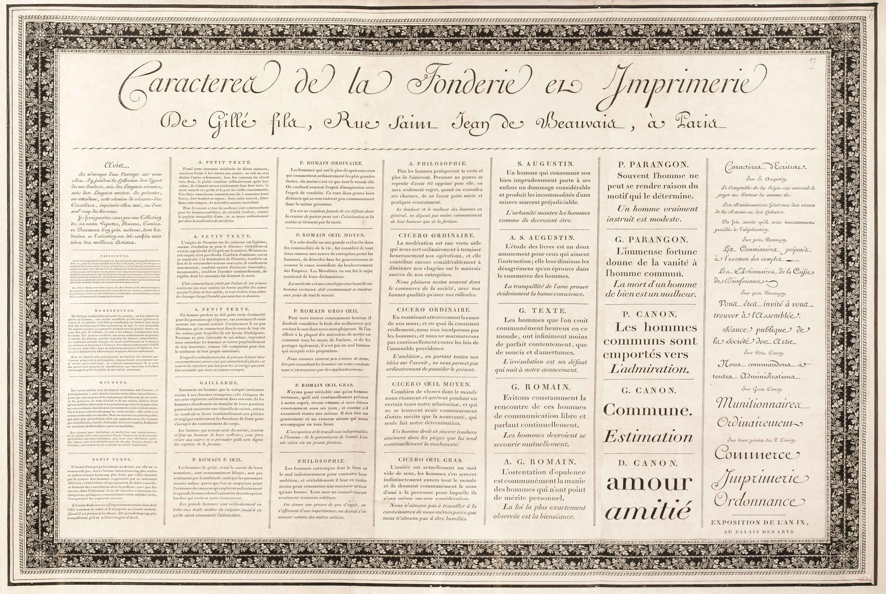
321. Broadside Specimen of Gillé fils, Paris, c. 1808
From Gallica (scan)
A less important specimen of about this period is the folio book of Vignettes et Fleurons engraved by Besnard and published by him in 1812, printed by Mame, and interesting for its pretty ornaments designed in light style.
At the Exposition du Louvre of 1819, the Parisian type-founder Molé jeune, who began life as a painter and designer, exhibited a series of fourteen great broadsides, surrounded with wide borders, which is one of the most magnificent type-specimens known. These sheets exhibit the result of twenty-seven years of personal labour—206 varieties of roman, italic, civilité, Greek, Hebrew, Rabbinical Hebrew, Arabic, Smaritan, Syraic, and also a fine series of roman titling-letters. In addition there are 468 borders (very varied in design and many of great beauty), rules, etc. The roman and italic are of the Didot style, and (except for the titling-letters) are less mechanical than is usual in such fonts. They show this kind of type at its best, though owing much to the splendid presswork of Pierre Didot l’aîné. We reproduce the sixth plate of the series (fig. 322). The Jury of the Exposition commended
this immense and magnificent collection as the work of an artist who greatly merits notice, not merely for his admirable work, but for the labour, paints, and immense sacrifices he has made to arrive at so high a degree of perfection.
As a conspectus of the best French type of its day, Molé’s fourteen Tableaux are classic.
322. Sheet from folio Specimen of Molé jeune, Paris, 1819
From Collection Typographique Gravée sur Acier par Molé Jeune, Breveté du Roi (scan)
French typographic ornament of this period, like type-form, was much influenced by England, and an English engraver, Charles Thompson,—brother of the better known John Thompson,—contributed to this. Settling in Paris in 1816, his engraved decorations were very much the mode, and their multiplication by the process known as polytypage put them at the disposal of the ordinary printer. Thompson published, in 1826, the first of a quarterly series of collections of his ornaments, entitled Recueil de Vignettes gravées sur bois et polytypées par Thompson. This thin quarto, printed by J. Pinard, shows his work, with prices for the cuts affixed to each. They were not very charming productions, for though well engraved, they were somewhat dry both in design and in line. But Thompson set a style which was much followed in France.
Many of the cuts in the Gillé fils specimen of 1808 are repeated in Épreuves des Divers Caractères, Vignettes et Ornamens de la Fonderie de J. A. Pasteur, Paris, 1823; a fuller and in some ways more interesting collection. Though Pasteur appears to have succeeded to some of Gillé’s collection, probably the largest part went to Laurent, Balzac, and Barbier. After the failure and death of Gillé fils, Laurent, a former employee, had charge of the sale of his material in 1827. Later, he became a partner in the firm of Laurent & De Berny.16
The type-founder L. Léger issued a brilliant broadside which shows the persistence of those extreme “classic” type-forms which the Didots made fashionable (fig. 323). He brought out, some time between 1831 and 1844, a quarto volume of types and ornaments, entitled Spécimen des Divers Caractères Vignettes et Fleurons des Fonderie et Stéréotypie de L. Léger, Graveur, neveu et successur de P. F. Didot, which, according to its compiler, represented the results of twenty-five years’ labour. The ornaments and borders are distinctly light in effect, black backgrounds having mostly disappeared (fig. 324). The types, less excellent than the ornaments, are still in the Didot style.
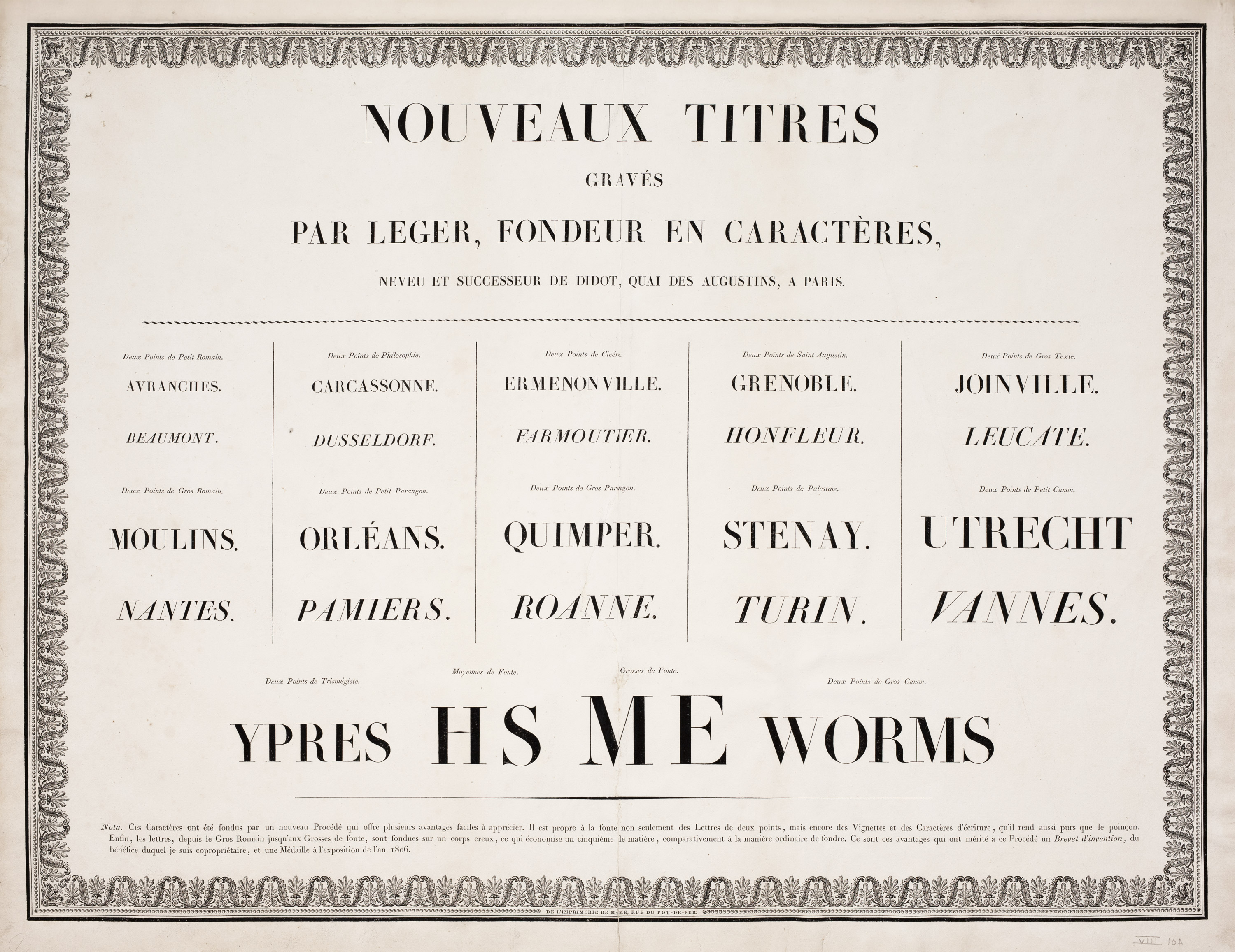
323. Broadside Specimen of L. Léger, Paris, after 1806
From a copy in the Providence Public Library
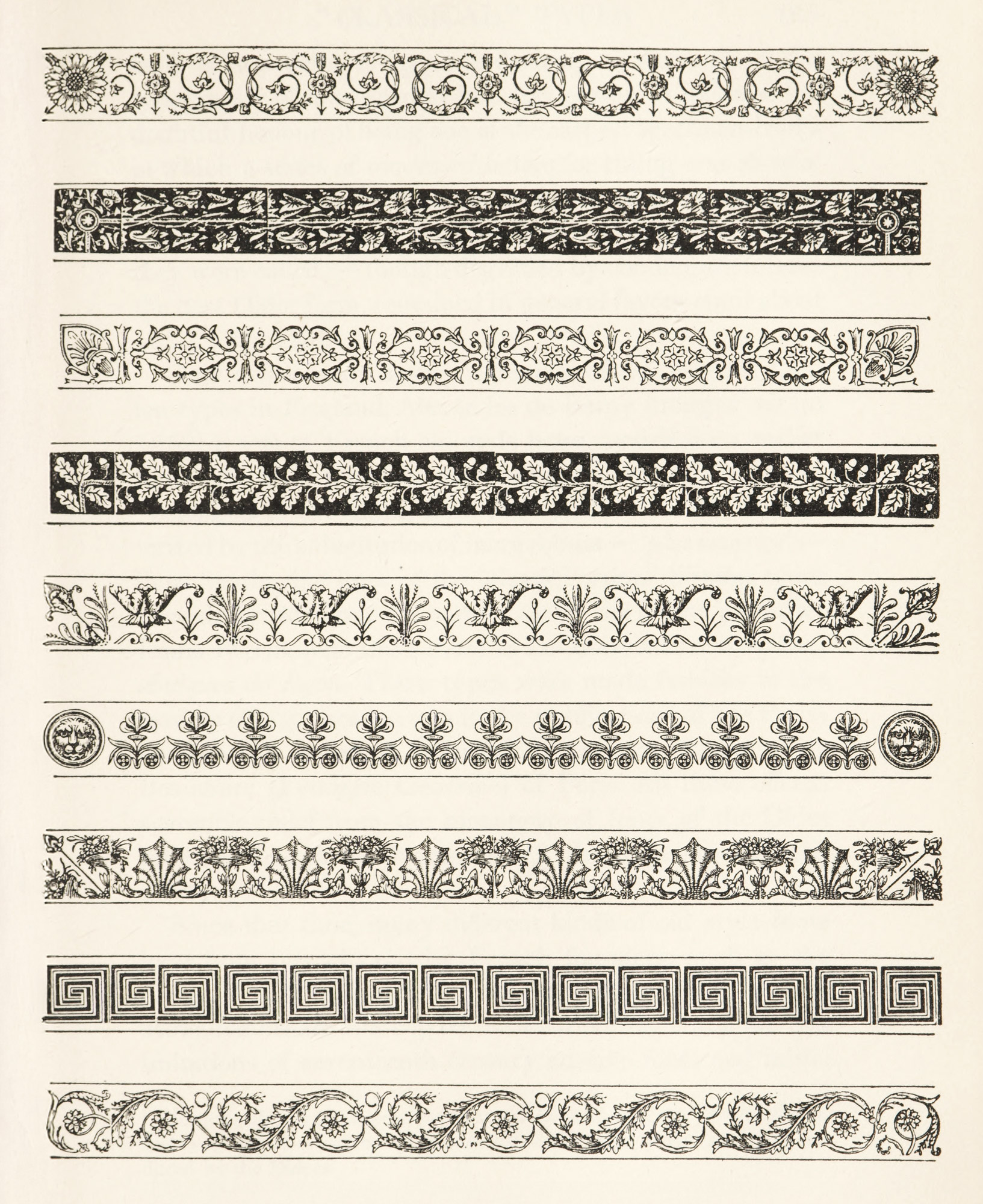
324. Borders: Léger’s Spécimen des Divers Caractères, Paris
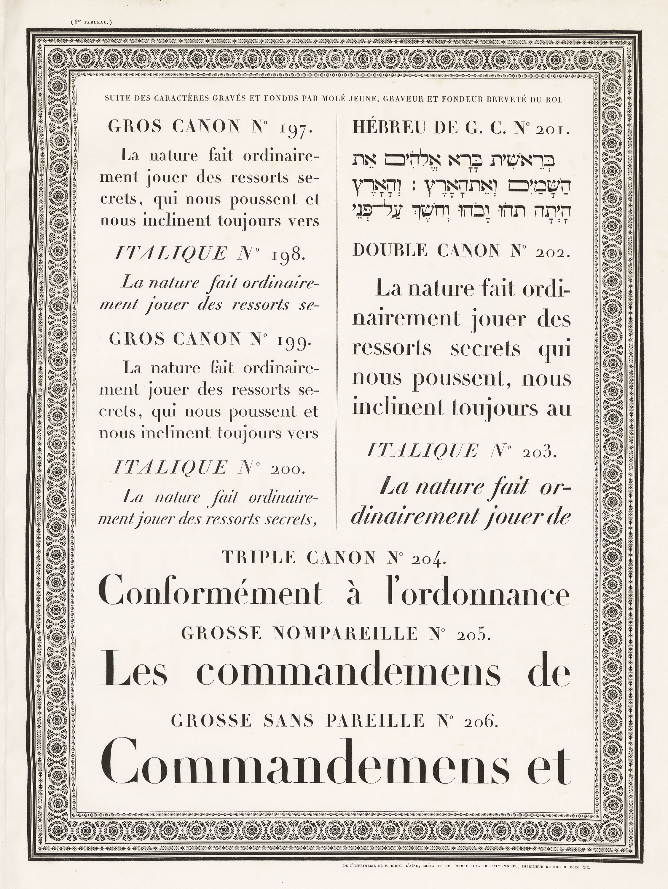
An extremely characteristic showing of types in popular use in the first fifty years of the nineteenth century is made in the Specimen Typographique de l’Imprimerie Royale. These two folio volumes (I, 1845; II, 1851), display a number of fonts modelled on the Didot plan, and also make a distinguished showing of exotic fonts by Jacquemin. An index at the end of the first volume tells who cut the various types displayed—Firmin Didot, Marcellin Legrand, and Léger Didot figuring among the designers; while among ancient fonts are those from Garamond, the Propaganda and Medici offices, and Savary de Brèves.
The Didot foundry remained in the possession of the family until sold by Ambroise Firmin Didot, when its types became part of the Fonderie Générale of Paris. In this house were consolidated the establishments of Firmin Didot, Molé, Crosnier, and Éverat. The 1839 specimen of Fonderie Générale, issued by E. Tarbé, who presided over it, shows text types in the “classic” Didot style, and many of the ornaments designed to accompany them—as well as vignettes in the “romantic manner” which are very characteristic of that time and very amusing in this. Another important specimen of the Fonderie Générale, then managed by Biesta, Laboulave & Cie, issued in 1843 1853, showed, in addition to the collections mentioned, those of Lion, Tarbé, and Laboulaye Frères. The preliminary Avis supplies references by which the types cut by different designers may be identified. The book is important to any one desiring to reconstitute the typography of a somewhat hopeless period. It has also the doubtful honour of being one of the earliest specimen-books in which a series of condensed letters for titling was shown though the Didots used them in their own printing much earlier. Types of the Didot variety,—“classic” types, as they were called,—though degraded by condensation from the best Didot form, remained in general favour until about 185017 (fig. 325).
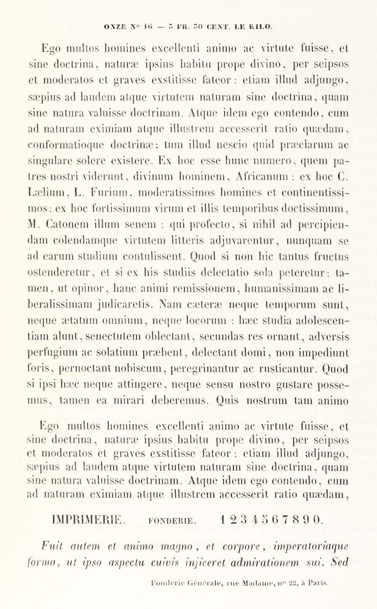
325. “Classic” Types: Épreuves de Caractères, Fonderie Générale, Paris, 1843 1853
From Gallica (scan)
Only a few years after the revival of the original Caslon types in England, Alexandre de Berny brought out (in 1852) a sort of French old style letter modelled on earlier fonts (fig. 326), which, to quote an associate of De Berney’s,
belonged to the Latin family of letters—letters characterized by the substitution of more robust—“plus nourries”—lines for the fine lines of the “classic” types.
Similar types were designed about the same time by the Lyons publisher Louis Perrin, who used them in De Boissieu’s Inscriptions Antiques de Lyon.
These types were made familiar to the readers of a generation ago in the publications of the Parisian house of Lemerre. “Elzevir” types were also issued by Beaudoire (Fonderie Générale) of Paris. All these offered agreeable relief from the monotony of fonts of the Didot school—though much resented by the adherents of “Didotery.”
326. French Old Style revived by De Berny, Paris, in 1852
Since that time, many different kinds of old style fonts have been brought out by French founders; such as the Série XVIIe Siècle Elzévier, a useful series of types with attractive ornaments copied from Elzevir decorations; and imitations of seventeenth century cursive fonts and initial letters, produced by the Fonderie Mayeur. The utilization of fonts of older style was later helped by such men as Jules Claye (predecessor of A. Quantin et Cie.), who published in 1875 Types de Caractères et d’Ornements Anciens, an interesting showing of “special” types employed by him. These were cast from the original matrices of ancient fonts which he called Elzevirien, and for them he produced some excellent ornaments and initials—those in the Lyons style being particularly successful. M. Audin says,
Modern designers have wisely reacted against the tendency introduced by Grandjean in his types, a tendency that Baskerville and Bodoni did not know how to escape and that Didot carried to its extreme. A better balance between the thin and thick strokes, a little fancifulness also in line, has changed entirely the physiognomy of modern typography.18
While types showing Didot influence are still much used in France, the most carefully printed books are now often set in French old style fonts. During the present century, the “historical types” of the Imprimerie Nationale have been increasingly employed and appreciated—in works like Claudin’s Histoire de l’Imprimerie en France, and in the agreeable editions of Balzac, Flaubert, and De Maupassant printed by the Imprimerie for the Paris publisher Conard. And some modern Parisian type-founders have resuscitated eighteenth century styles in fonts and ornaments, with most charming results.
To see how early nineteenth century fonts compare with historical fonts with preceded them, look at the comparative table of roman and italic types employed by the French National Printing-House from 1640 to 1825 (fig. 327).
It is one of the most enlightening documents about French typefaces in existence.19 The letters of the Garamond fonts of 1540 1640 attributed to Garamond are most irregular, and this is true of the characters cut by Grandjean in 1693 and finished by Alexandre, and those of Luce of 1740—when compared with the greater mechanical perfection of roman letters in Didot’s font of 1811. The older types make elegant, easy, readable pages, but pages set from Didot types appear rigid, formal, and tiresome. This is still truer of the fonts of Jacquemin and of Marcellin Legrand, who cut a more condensed version of his type in 1847—which by no means bettered its design. Compare the Garamond types of 1540 so-called Garamond types with the Legrand types of 1825, and it is plain enough that mechanical perfection does not necessarily make a fine font. And yet these types were intended to supersede the splendid romain du roi of earlier days. All this came about in French typography through Grandjean’s mischievous serif, Baskerville’s influence, the later printing of Bodoni and the Didots—and some English fashions, which must now be considered.
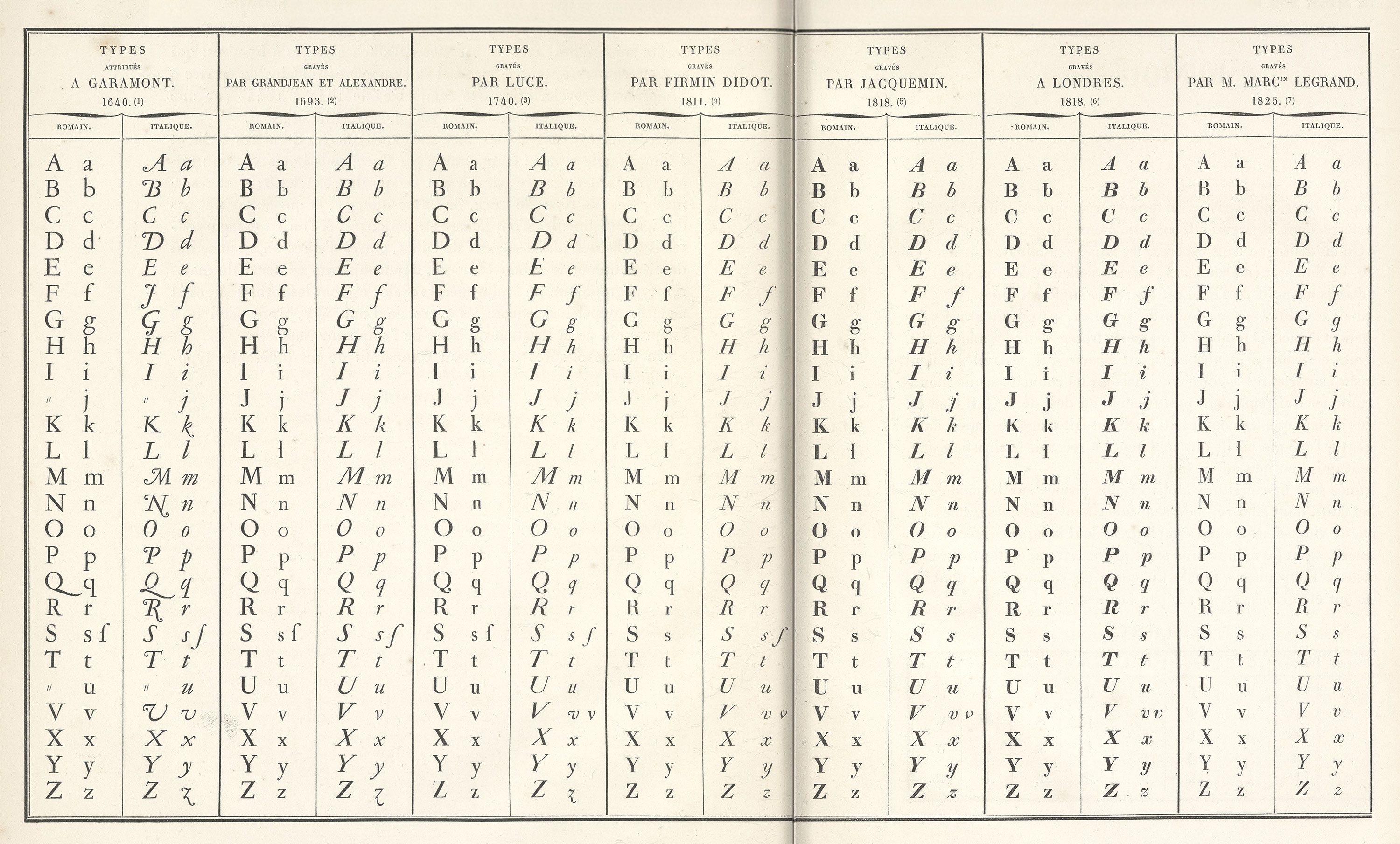
327. Comparative Table of Types used by the French National Printing House from its foundation to 1825
From Notice sur les Types Étrangers du Spécimen de l’Imprimerie Royale, Paris, 1847 (scan 1, scan 2)
- For a full discussion of the latter, see Louis Hautecœur’s Rome et la Renaissance de l’Antiquté à la fin du XVIIIe Siècle. Paris, 1912.
- The decoration which marked the reign of Louis XVI, known as style Louis Seize outside France, was, owing to the classic motifs that inspired it, called in France à la grecque—the decorative work discovered at Herculaneum and Pompeii being often more Greek than Roman in quality.
- To the Pontifical authorities the “last straw” was an unfortunate work of art (somehow made into candelabra) showing Jupiter striking Aristocracy with Thunderbolts and Apollo trampling under foot Superstition.
- As formal types called for a formal style of illustration, old decorations of the book had to change their manner. The beautiful Italian (1754) edition of Lucretius,—Della Natura delle Cose [vols. 1, 2],—translated by Marchetti, edited by F. Gerbault, and dedicated to the Marquis de Vandières, brother to Madame de Pompadour, or Le Monnier’s Fêtes des Bonnes-Gens de Canon, etc., published by Prault and others at Paris in 1778, with frontispiece by Moreau, are both printed in easy old style eighteenth century French types, with which the decorations admirably accord. On the other hand, the embellishments made for Didot’s folio of Horace of 1799 by the architect Percier meet “Empire” requirements, and Moreau’s illustrations to Legouvé’s Le Mérite des Femmes et autres Poésies, brought out in Paris by A. A. Renouard in 1809, show a painful endeavour to do so. Both these books are printed in Didot’s “classical” fonts.
-
Arthur Young, in his Travels in Italy, writing from Parma, December 9, 1789, says:
In the afternoon…to the celebrated reale typografia of Signore Bodoni, who shewed me many works of singular beauty. The types, I think, exceed those of Didot of Paris, who likewise often crowds the letters close, as if to save paper. The Daphne and Chloe, and the Amynta, are beautifully executed; I bought the latter, as a specimen of this celebrated press, which really does honour to Italy. Signore Bodoni had the title of the printer to the king of Spain, but never received any salary, or even gratification, as I learned in Parma from another quarter; where I was also informed, that the salary he has from the duke is only 150 zechins. His merit is great and distinguished, and his exertions are uncommon. He has 30,000 matrices of type. I was not a little pleased to find, that he has met with the best sort of patron, in Mr. Edwards, the bookseller, at London, who has made a contract with him for an impression of two hundred and fifty of four Greek poets, four Laton, and four Italian ones—Pindar, Sophocles, Homer, and Theocritus; Horace, Virgil, Lucretius, and Plautus; Dante, Petrarcha, Ariosto, and Tasso.
- An example is in the Boston Public Library.
- Lettre de J. B. Bodoni, Typographe du Roi d’Espagne et Directeur de l’Imprimerie de S. A. R. l’Infant Duc de Parme, à Monsieur le Marquis de Cubières. Parma, 1785.
- Bodoni was often called “the King of Typographers and the Typographer of Kings”—a phrase suggested by the epitaph on Plantin’s tomb at Antwerp. He was also styled “the Baskerville of Italy”—just as Didot was called “the Bodoni of France,” the Foulis brothers “the Elzevirs of Glasgow,” and Thomas “the Baskerville of America.” This rather ridiculous habit of calling somebody the something of somewhere has always attracted a certain class of mind in this country. A worthy gentleman who lived in Rhode Island in the eighteenth century and collected pictures was styled “the Lorenzo de’ Medici of Newport,” and a Boston schoolboy described Demosthenes as “the Edward Everett of Athens.” It was reserved, however, for Mrs. Piozzi to call Switzerland “the Derbyshire of Europe.”
- The polyglot Oratio Dominica was printed at the suggestion of Pius VII, who, in May, 1805, had passed through Parma on his way from the coronation of Napoleon. It was intended to outdo a like work published by the Imprimerie Imperiale at Paris. Bodoni’s book was dedicated to Eugène Beauharnais, Viceroy of Naples, to whom he personally presented a copy. In return for this work, Bodoni received a pension and an offer of the direction of the Royal Printing House at Milan.
- From an unpublished letter belonging to the author.
- For these and other interesting facsimiles see Bertieri and Fumagalli’s L’Arte di Giambattista Bodoni. Milan, 1913. The series of plates at the end show a glance at the difference between his early and late manner of printing. A chronological table of Bodoni’s editions forms Vol. II of De Lama’s Vita de Bodoni. Parma, 1816.
- A collection of Bodoni’s books in all their different editions, on large paper, “special” paper, vellum, etc., is preserved in the Ducal Library at Parma, where the matrices of Bodoni’s types are also exhibited.
- The Amoretteis also issued in 1830 another specimen—Nuovo Saggio de’ Caratteri e Fregi della Fonderia de Fratelli Amoretti Incisori e Fonditori in Parma. It is inferior to the first one and shows some types in the English manner of Thorne.
- I have not been able to examine any volumes showing large sizes of the Waflard types, which were quickly superseded by Vibert’s fonts, for which Pierre Didot was responsible. Alphabets of Waflard’s characters are shown in Thibaudeau’s La Lettre d’Imprimerie, Vol. I, pls. 15 and 16. The date of their appearance there given (1757) would appear to be open to question.
-
This foundry existed in the eighteenth century, when it was presided over by a certain J. Gillé, who published an interesting octavo specimen in 1773, and another of 16mo form in 1778, entitled Caractères de la Fonderie de J. Gillé, Graveur et Fondeur du Roi, etc. About 1790, his son acquired the foundry.
-
The De Berny foundry had an interesting history. With Laurent, and a printer named Barbier, the novelist Honoré de Balzac formed an historic but disastrous association in 1827, in a scheme to erect a foundry, printing-office, and publishing-house all in one. In 1828, the firm broke up, leaving Laurent in possession of the foundry, who was joined by Alexandre de Berny (placed there by his mother, whose sentimental relations with Balzac greatly influenced the novelist’s career). This form—Laurent & De Berny—existed until 1848, when the business was continued by De Berny alone.
- Werdet’s Études Bibliographiques sur la Famille des Didot (Paris, Dentu, 1864) should be consulted for an account of the chief books and types produced by the Didots.
- Audin’s Le Livre, p. 50.
- From
NotesNotice sur les Types Étrangers du Specimen de l’Imprimerie Royale (Paris, 1847). There is a similar table in Duprat’s Histoire de l’Imprimerie Impériale de France (Paris, 1861).