Chapter VII
Types and Type-Forms of the Fifteenth Century in the Netherlands—Holland and Belgium
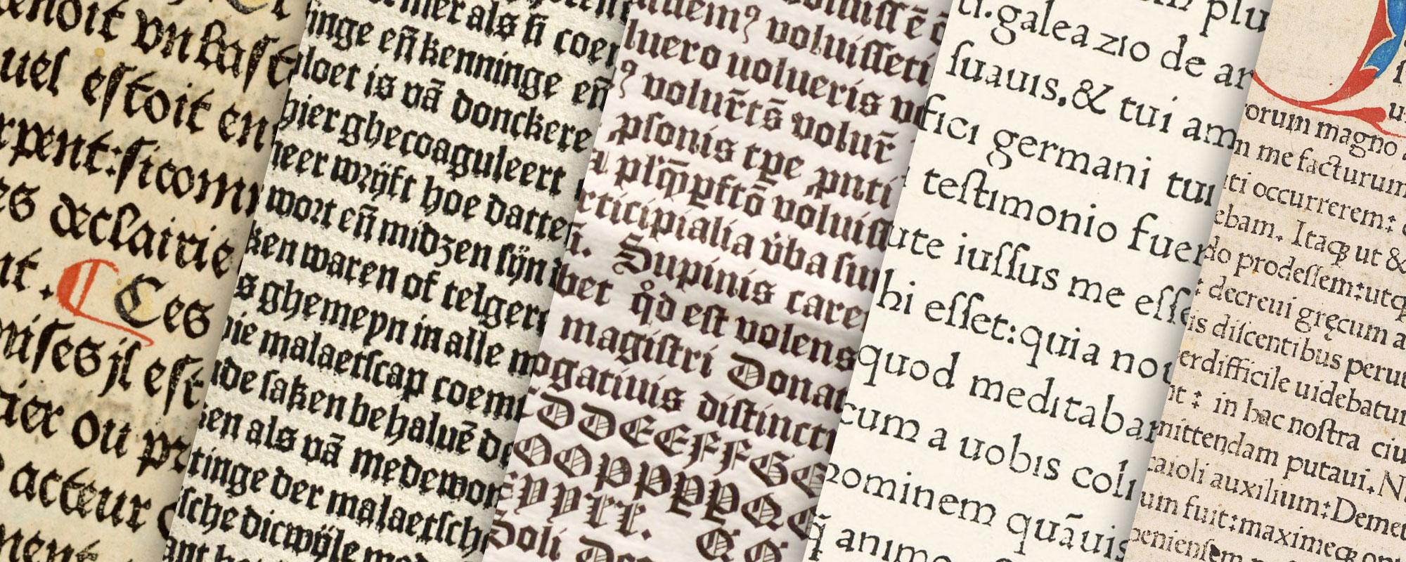
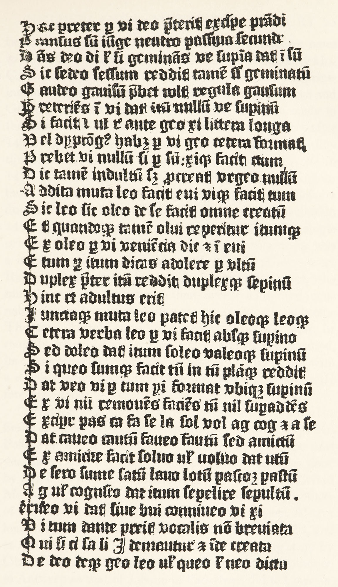
The year from which Dutch printing is usually officially dated is 1473, but some sort of printing was done in Holland before that time. The name of the printer of the Speculum Salvationis, which is probably the work of the earliest Dutch press, is not known. The first Dutch books of which we have any knowledge, which may be called “Costeriana” (i.e., the editions of Coster and his successors), or which may be attributed to the printer of the Speculum, were executed from rough gothic types of the kind known as lettres de forme. There is in Holtrop’s Monuments Typographiques a series of plates1 of type-pages which throw a great deal of light, not alone on printing in the Low Countries, but on the whole subject of its beginnings. These show that the first books were roughly executed in a heavy, black, and awkward lettre de forme. On glancing through these plates—for it is impossible, owing to their rarity, to look at the originals—one realizes what Blades meant in his allusions to the crude school of printing which preceded that of Gutenberg. If we examine the facsimile of a Donatus printed with the types of the Abecedarium,2 is it conceivable that the printer of this book could have known anything about the exact methods of making type, or of printing with it, which Mainz printers so well understood? The Abecedarium formerly in the possession of the Enchedés at Haarlem (fig. 40)—what a wretched little book it is! how primary in every sense! While the fragments of other Donatuses are considerably better, the uneven ending of lines, which indicates that no composing-rule was used at the time, is obvious in the facsimiles of the Donatus of 28 lines,3 and in the Voyage de Jean de Mandaville.4 As to the four editions of the Speculum,5 these books, rather ambitious from a decorative point of view, call for better typography than that which accompanies their illustrations.6 Although some impressions are better than others, these plates show printing as an art in its infancy, and hold out very little prospect of its ever growing up! The Speculum may have been executed at Utrecht some time between 1471 and 1473. The other fragments of which Holtrop shows facsimiles are those of books or editions brought out before the latter year, perhaps all from one printing-office, perhaps from different printers.7 In these early fragments and a few complete books, about eight different fonts of type are found; and with these types perhaps eighty different editions were printed. The gothic types used in these books were the first models of the style of black-letter which we recognize as characteristic of the country (fig. 41).
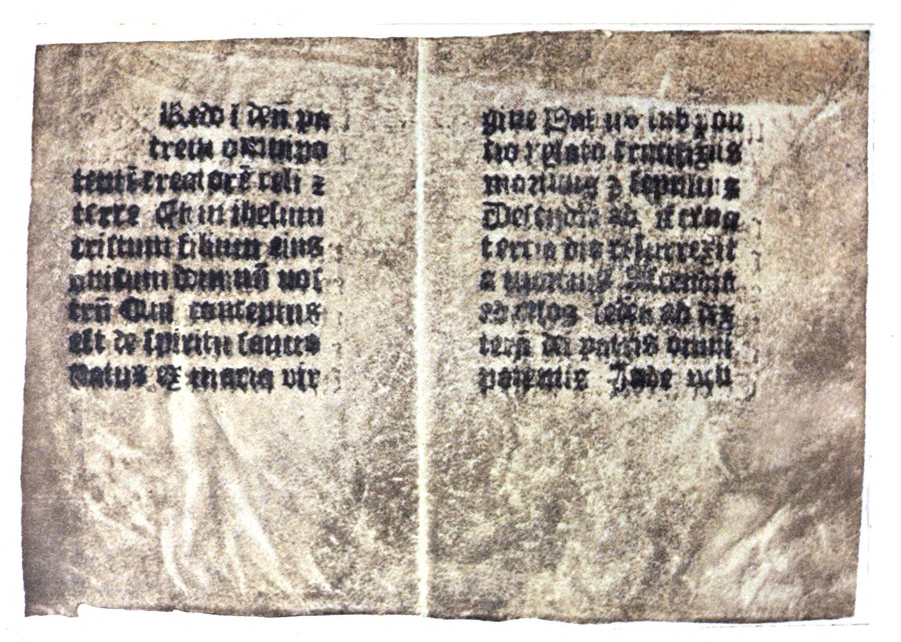
40. Two pages of an Abecedarium
From Holtrop’s Monuments Typographiques des Pays-Bas au Quinzième Siècle (facsimile), Fonderies de Caractères et leur Matériel dans les Pays-bas du XVe au XIXe Siècle (scan)
41. Gothic Type used by Printer of the Speculum, c. 1471
From a vellum leaf of Doctrinale of Alexander Gallus in the Library of Mr. J. Pierpont Morgan, New York
But the Speculum and its mysterious companions are not the books from which Dutch printing is scientifically dated. Ketelaer and Leempt, who printed two books in Utrecht in 1473, were the first printers in Holland who dated their books. Pollard, in his series of valuable introductory notes to the national divisions of his Catalogue of the Hawkins Collection, says:
From 1473 onwards, the history of printing in Holland is normal and straightforward, native and German printers being found working simultaneously in the usual way. Presses were set up in thirteen places after 1473,— in Deventer, Delft, and Gouda in 1477, in S. Martijndsijk in Zeeland in 1478, in Nijmegen and Zwolle in 1479, in Hallet in Overijssel in 1480, in Leiden, Kuilenburg, and Haarlem in 1488, in ’s Hertogenbosch (Bois-le-duc) in 1484, in Schoonhoven in 1485, and in Scheidam in 1498. Seven of those towns were only visited by a single printer. At Utrecht, Delft, Gouda, and Zwolle there was a moderate output. The only really prolific printers were Richard Praffraet and Jacobus de Breda at Deventer, who must have produced between them over five hundred incunabula, though most of these were small educational books. The total Dutch output at present registered may be roughly estimated at between eleven and twelve hundred, and its characteristics being akin to those of Germany, but with a much great proportion of schoolbooks, and strikingly few large folios.
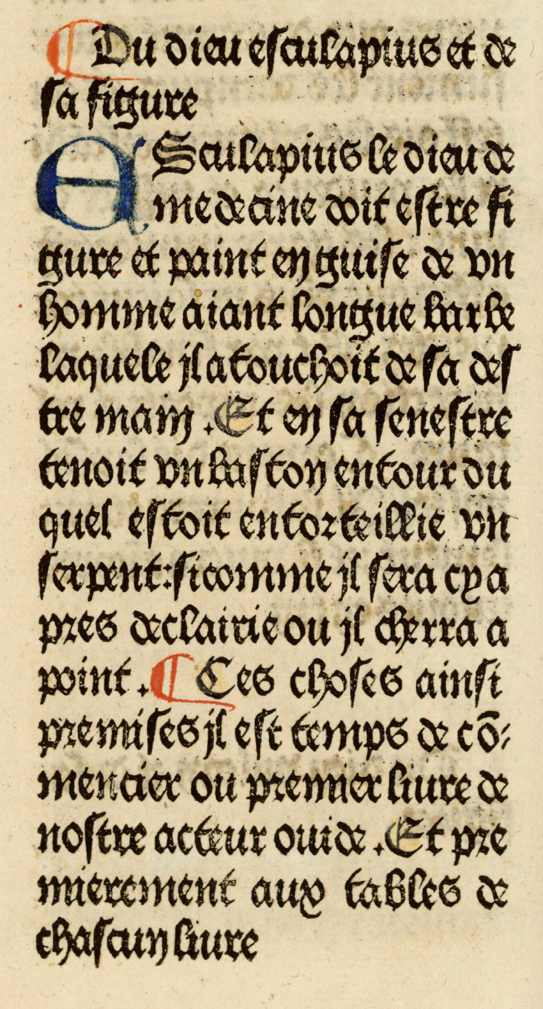
Printing was introduced into seven towns within the limits of modern Belgium in the fifteenth century into Alost in 1473; the next year into Louvain, where much excellent work was done by Johann of Paderborn; into Bruges, by Caxton and Colard Mansion, probably in 1475; into Brussels, by the Brothers of the Common Life, in March of the same year. After a long interval printing began at Audenarde in 1480, and at Antwerp a year later still, the rear being brought up by Ghent in April, 1483. Gerard Leeu’s work gave distinction to Antwerp as that of Johann of Paderborn did to Louvain, and these two cities between them account for over two-thirds of the registered output of “Belgian” incunabula, the total of which is probably somewhat under a thousand. Belgium in the fifteenth century had, of course, no separate existence, nor were the boundaries of Holland those of the modern kingdom. It may be noted, however, that in the “Belgian” books there is a much greater preponderance of Latin than in the Dutch, though a few printers were trilingual, printing Flemish, French, and Latin.
The Netherlands fifteenth century types were chiefly, as has been said, crude lettres de forme,8 but later they became more refined. A few types showed the influence of the roman letter, but pure roman letter was as yet rare. The lettre batarde of France appears in Holland, uncouth, irregular, badly aligned, badly fitted on its body, awkward in cut,9 almost though employed in 1480 by Veldener, who was one of the most distinguished printers of the Netherlands. Thierry Martens of Alost and Antwerp, the first Belgian printer, employed that fine familiar type, the round Italian gothic.10
Three black-letter types used in the Netherlands are interesting. The first is the bold, coarse batarde character used by Colard Mansion at Bruges (fig. 42). Mansion employed two kinds of type, a batarde and a sort of very rough transitional lettre de forme (though sometimes called lettre de somme), which he used in 1477.11 His batarde was merely an imitation of the Burgundian writing of the period. It was to Dutch printing just what a lettre batarde was merely an imitation of the Burgundian writing of the period. It was to Dutch printing just what a lettre batarde was to French printing—a sort of vernacular type, dependent for its form upon the locality in which it was found, and found there simply because based on the writing which preceded it in that neighbourhood. The earliest of Mansion’s impressions show lines which are not spaced out to the full width of the page. This is one argument for the independence of the Netherlands and Bruges school of typography from that of Mainz; for it cannot be believed that if a man like Mansion knew how to use a composing rule (as he must have known, had he ever been in touch with Mainz printers), he would have abandoned it. He began to print before 1476, and it was only in 1478 that properly spaced lines appear.
42. Mansion’s Ancienne Batarde, Bruges, 1484
From Druckschriften des XV bis XVIII Jahrhunderts (facsimile), Ovide moralisé (scan)
The second type to which attention should be paid is that used by Brito at Bruges, and perhaps cast by him, and later by William de Machlinia at London. This type-form somewhat resembles the types used by Caxton. It is another rough form of the batarde letter, but without the charm of the French lettre batarde (fig. 43).
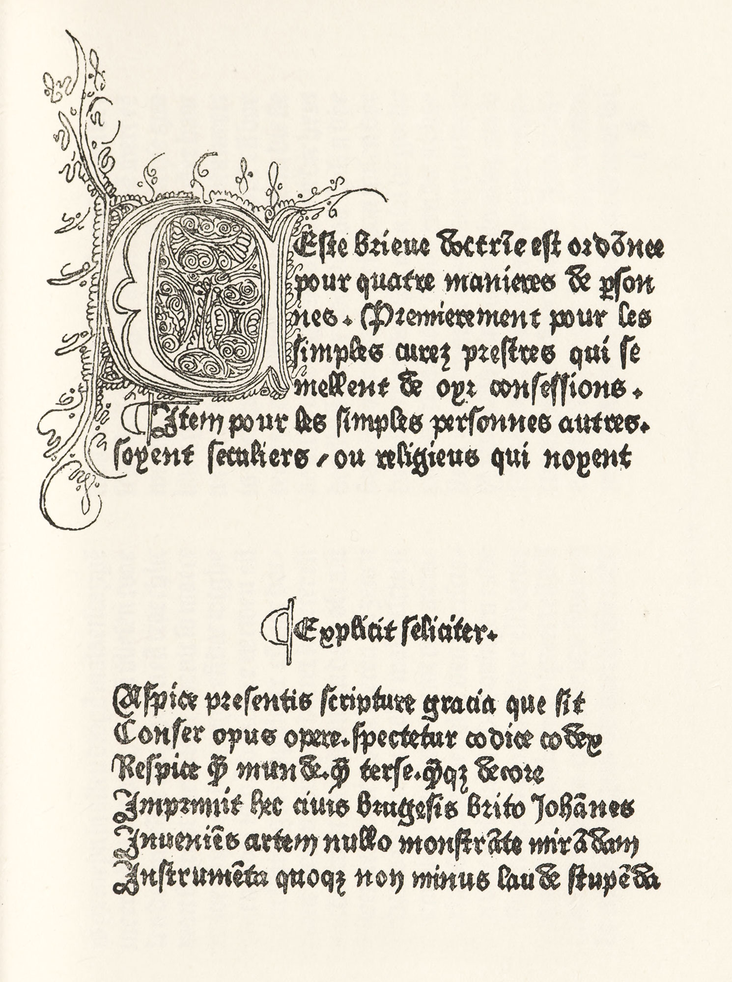
43. Lettre Batarde used by Brito, Bruges
From Holtrop’s Monuments Typographiques des Pay-Bas au Quinzième Siècle
A third type to be remembered is the font used by Bellaert, to which the English black-letter types, which later became the national English face and size of letter, bear a close resemblance (fig. 44).
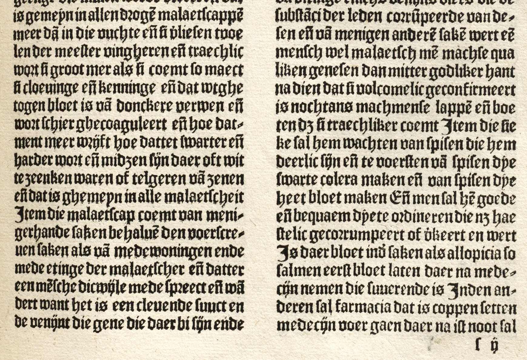
44. Black-letter used by Bellaert, Haarlem, 1485
From a copy of Bartholomæus Anglicus, Van den Proprieteyten der Dinghen, in the Library of Mr. J. Pierpont Morgan, New York (facsimile), Bartholomaeus, Anglicus: Van den proprieteyten der dinghen (scan)
There is a very interesting Dutch gothic type shown in the specimen-book of 1768 issued by Enschedé, the celebrated Dutch founder, which it is believed was engraved about the end of the fifteenth century—between 1470 and 1480—a St. Augustin flamand (fig. 45). It was probably cut by a Dutch printer and type-cutter, Henric of Delft, who called himself, in the colophons to his works, letter-snider, or graver of characters, and who furnished types to several printers. We have records of this font being employed in Paris printing-offices. A letter much the same in cut, of gros-romain size, may also be seen on the last page of Enschedé’s specimen of 1768 (fig. 46).
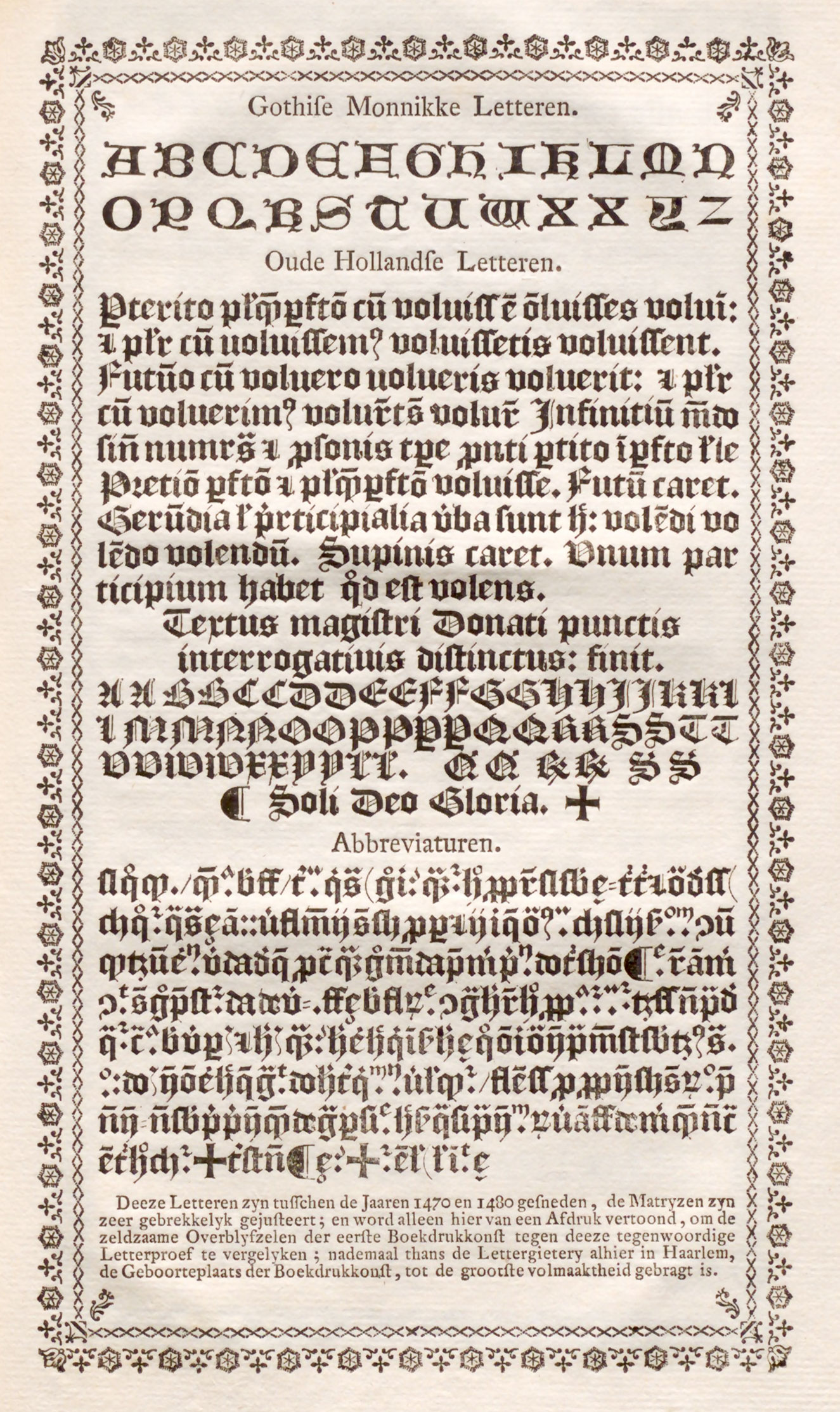
45. Fifteenth Century Saint Augustin Flamad: Enschedé’s Proef van Letteren, Haarlem, 1768
From Enschedé’s Fonderies de Caractères et leur Matériel dans les Pays-bas du XVe au XIXe Siècle (facsimile), Proef van letteren, welke gegooten worden in de nieuwe Haerlemsche lettergieterij van J. Enschedé (scan)
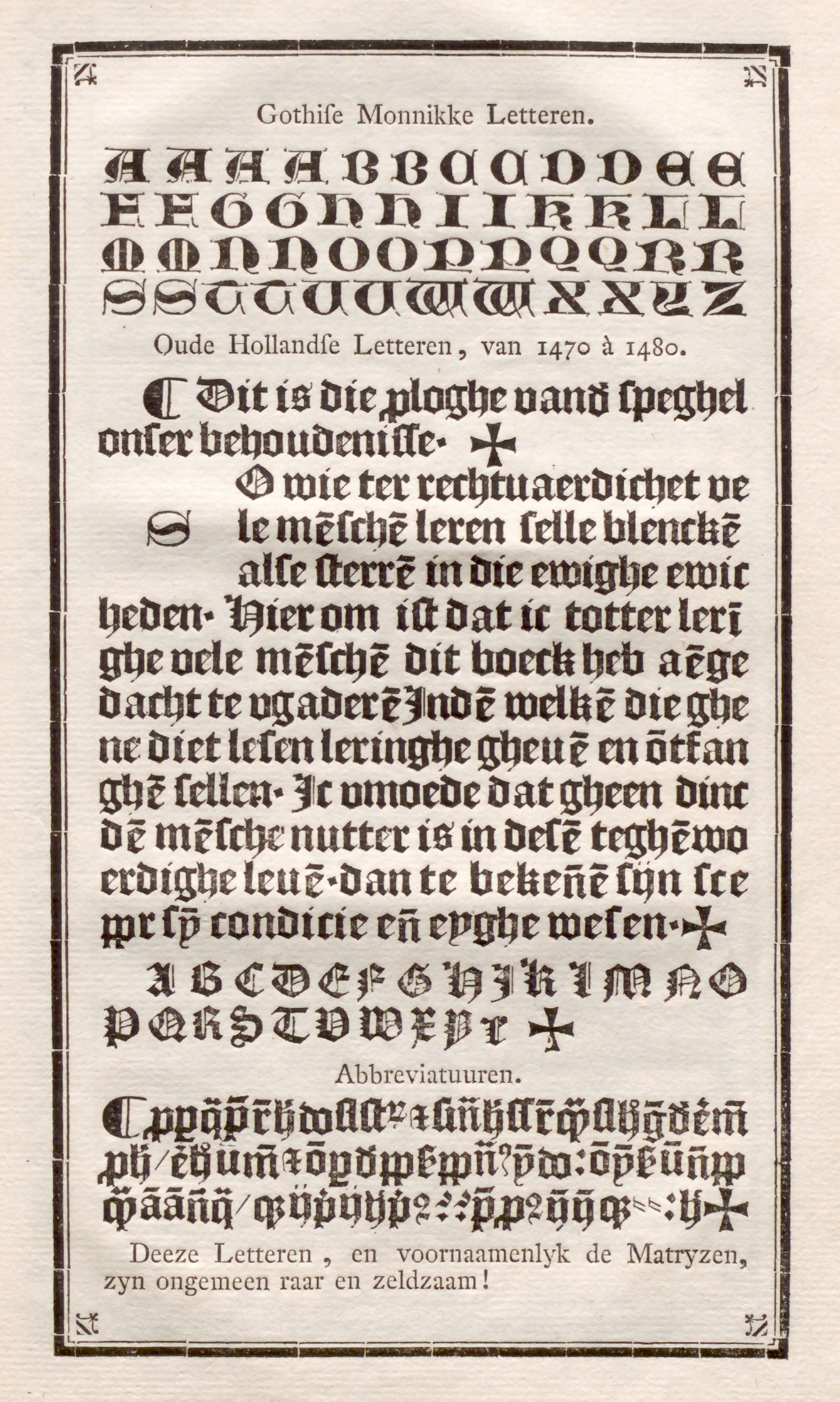
46. Fifteenth Century Gros-Romain Flamand: Enschedé’s Proef van Letteren, Haarlem, 1768
From Enschedé’s Fonderies de Caractères et leur Matériel dans les Pays-bas du XVe au XIXe Siècle (facsimile), Proef van letteren, welke gegooten worden in de nieuwe Haerlemsche lettergieterij van J. Enschedé (scan)
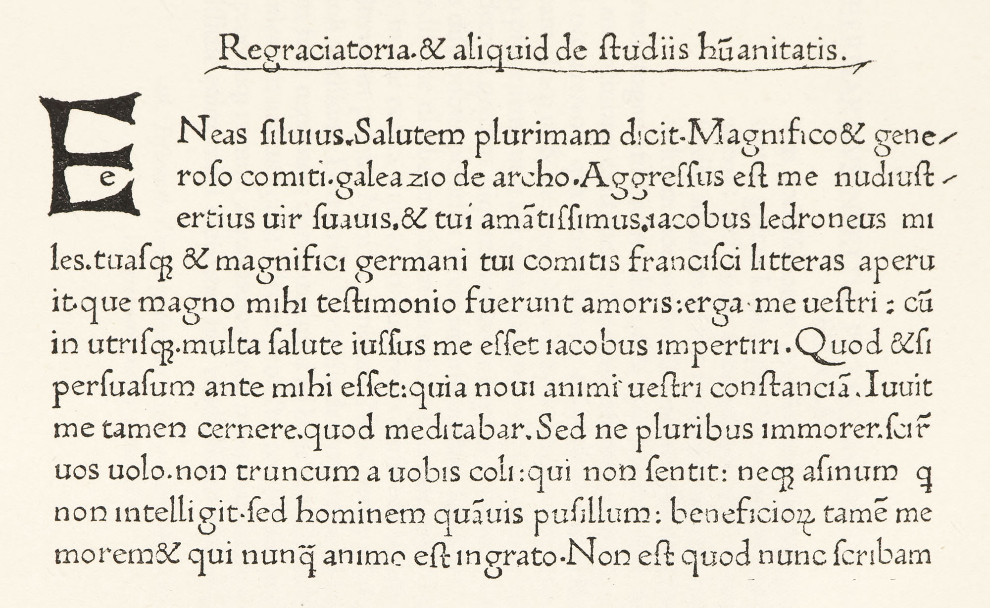
As for fifteenth century roman fonts in the Low Countries, John of Westphalia, at Louvain, employed a very distinguished roman letter, Italian in effect, and evidently derived from an Italian source (fig. 47). Another roman font which is of interest, with a charming quality of pen-work about it, is the St. Augustin romain, considered by Enschedé as older even than the Flemish character cut by Henric the letter-snider. The man from whom Enschedé bought it in 1768, Jacques Scheffers (a printer at Bois-le-Duc, where his ancestors and practised their trade for a long time), was, according to tradition, a descendant of Peter Schoeffer of Gernsheim. Enschedé, when he bought sixty matrices from Scheffers, purchased a copy of a book printed Schoeffer himself; and believed that these punches actually came from Peter Schoeffer. This point cannot be decided; but the types have great charm. In recent years the Messers. Enschedé completed the defective font, some missing letters being obtained by adding to or subtracting from existing characters, and when this was not feasible, a few letters being cut in the style of the old ones.12 Our plate shows this reconstitution of the font (fig. 48).
47. John of Westphalia’s Roman Type, used at Louvain
From a copy of Æneas Sylvius, Epistulæ Familiares, in Harvard College Library (facsimile), Universität Bielefeld (scan)
48. Fifteenth Century Roman Type attributed to Schoeffer (as reconstituted by Enschedé)
From Enschedé’s Fonderies de Caractères et leur Matériel dans les Pays-Bas du XVe au XIXe Siècle (facsimile), Homērou poiēsis hapasa, Hē tou Homērou poiēsis hapasa (scan, image 9)
The output of the fifteenth century Netherlands press is historically interesting, but artistically monotonous. It is difficult to be enthusiastic over these fonts, which contrast infavourably with better types of similar style in other countries. But their historical interest is indubitable. They form a link between the Continent and England, and are the starting point of English typography.
- Holtrop’s Monuments Typographiques des Pays-Bas au Quinzième Siècle. La Haye, 1868. Twelve plates beginning 11 [3]; i.e., plate 11 in sequence in the bound book, but plate 3 in sequence of original issue. The references are confusing unless this is remembered, for the plates as bound have no consecutive folios.
- Holtrop, pl. 11 [3].
- Holtrop, pl. 13 [49].
- Holtrop, pl. 121 [4].
- Holtrop, pls. 17 [19]–22 [1].
- The pictures were printed in brown ink, in one impression, and the type, which was of uneven height and indented the paper badly, at another printing. Two of the four copies are in Dutch prose, two in Latin verse. Some turned letters in the text show that it is printed from movable types, and is not a block-book.
- Holtrop, pls. 24 [37]–33 [97].
- Holtrop, pl. 125 [30].
- Holtrop, pl. 40 [24].
- Holtrop, pl. 46 [6].
- Holtrop, pl. 60, c [131].
- See Ch. Enschedé’s Fonderies de Caractères et leur Matérial dans les Pays-Bas du XVe au XIXe siècle, Haarlem, 1908, pp. 30, 31, and 32. For a survey of fifteenth century Dutch types this work will be found of great value.