Chapter XXIII
The Choice of Types for a Composing-Room
In suggesting types for the equipment of a composing-room, I take for granted that the owner of the ideal printing-house1 of which it is to form a part is a man who adopts the professional rather than the trade view of his occupation. This means that the workmanship in all departments of his establishment will be of the best, and that the types will be chosen with an educated taste and from a scholarly point of view. The product of such a printing-house cannot, from the necessity of things, be termed either “commercial” or “artistic,” as these words are usually employed; since artistic printing is merely printing so exactly and agreeably suited to its object as to charm us, which work called commercial may certainly do. For
charm is nothing but the kind of light that shines out from the fittingness of things which are well put together and well devised one with another and all together. Without this measure even the good is not beautiful; and beauty is not pleasing.
Such a press as that of which I speak should have the aims which so often exist in the mind of the amateur without technical ability to execute them, combined with the execution of the skilled technician who may not possess the point of view of the lover or student of fine printing. Furthermore, if a press is to do the work of to-day in a satisfactory manner, the class of equipment analogous to that of the first printers—which consisted of a few fonts of type, generally employed in a somewhat rigid and inelastic manner—will not serve its purpose. In making a choice of types for a composing-room, while some types of early form may be desirable, we shall find more material among those designed by Baskerville, Caslon, Didot, Bodoni, Wilson, and other eighteenth century founders, and their derivatives; to which must be added the best types of to-day.
There are two preliminary statements which apply to the purchase of all types. First, that in buying a series of type, every size obtainable should be procured, so that the range shall be as great, and the gradations as slight, as possible: good typography demanding that the sizes of type used must be, not approximately, but precisely, those that suit the eye. Second, that each size must be bought in sufficient quantity to meet all probable needs; for a few complete series in large fonts are far more valuable than thrice the amount broken up into small fonts of many different series. If a printer knows how to use type, the variety of the accent he can obtain from one series is almost unlimited. For instance, in a 12-point type he has roman capitals, italic capitals, roman capitals in combination with small capitals, small capitals alone, and roman and italic lower case—six variation in size, colour, or effect, which should be, and indeed are, enough for the requirements of an entire book.
- Cambridge
- Cambridge
- Cambridge
- Cambridge
- cambridge
- Cambridge
Multiply these six variations by the number of body-sizes in a series of type, and you have an enormous keyboard on which the typographer may play. If, with this great repertoire to choose from, a printer is obliged to resort to fanciful display letters or heavy-faced type for accent, it proves that he lacks understanding of the use of normal types.
I. Type Classification
In discussing the selection of types and decorate material I have made the following classification:
- Types that seem indisputably standard, on which there is no possibility of going astray; or, if I may so call them, “types of obligation.”
- Types which, while standard, are not of universal utility, as they can be used appropriately only for books of a particular character.
- Types that are based on some historic fonts or show that their designer was a student of early type-forms; and fonts adapted for “publicity,” though not usually suitable for the printing of books.
- Types of approved utility for decorative use.
- Initial letters and type ornaments.
§ 1. Standard Types
In the class of types which appear to be beyond criticism from the point of view of beauty and utility, the original Caslon type stands first. This is a letter identified with old English work, and as we follow the traditions of English printing rather than those of Continental countries, Caslon’s types are ours by inheritance. Enough has been said about their history to make further words here unnecessary. Caslon type should be had from the Caslon foundry; for the versions offered in various other quarters are not in all respects as good. Fonts should be as closely fitted as possible—not always the case, even in types put out by the Caslons themselves. No Caslon font—or for that matter any other—is desirable if adapted to the standard lining system by shortened descenders.
The variant letters which are supplied with Caslon and with many other types in the nature of old style are characteristic and useful—such as swash italic capitals, the italic lower-case v and w used to begin words, and the k for use at the ends of words. These swash letters, as employed by thoughtless compositors or designers, have sometimes produced very absurd effects. Only certain of the swash italic capitals can be successfully placed in the middle of a word, the design of the rest suggesting their position either as initial or final letters. Used “discreetly, advisedly, soberly,” swash letters give variety and movement to pages of type. Furthermore, both in roman and italic, long s and its combinations with ascending letters are interesting letter-forms.2 Some tied letters lately supplied in the reproduction of an historical font are: as, is, us, ct, fr, ll, sp, st, tt. It is to be wished that terminal a’s, e’s, m’s, and n’s, with tails intended to fill out lines, were available. Apart from the agreeable appearance of these specially old-fashioned characters, they are useful in reprints of old books. And so, too, are superior letters, which are desirable for reprints of old work, or for modern books printed in antique style. In old style fonts, signs to indicate notes—star, dagger, double dagger, etc.—are more interesting and picturesque, typographically, than superior figures, which I prefer not to use with an old style type. They are particularly appropriate to books of an historical or genealogical nature. For liturgical books the common liturgical signs must also be supplied, and of these peculiar sorts I suggest each of them to allow work to go on unimpeded by an inadequate supply of a kind of material that at short notice it is hard to get.
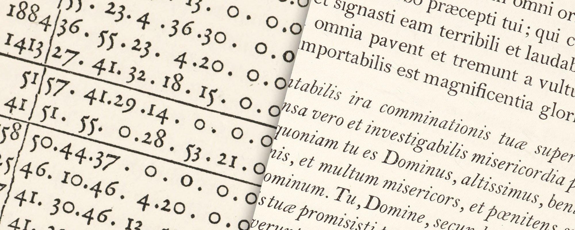
Finally, the original old style arabic figures—nowadays called “non-ranging”—should be used with all old style fonts. Such as figures as those in the Dutch types given by Dr. John Fell to the Oxford University printing-house are among the best of their kind; and Caslon’s old style arabic numerals are lively and agreeable type-forms.3 Of these, the numbers 1, 2, and 0 cover only the middle of the body; 6 and 8 are the ascending, and 3, 4, 5, 7, and 9 the descending figures (fig. 366). Mr. Morris said,
In no characters is the contrast between the ugly and vulgar illegibility of the modern type and the elegance and legibility of the ancient more striking than in the arabic numerals. In the old print each figure has its definite individuality, and one cannot be mistaken for the other; in reading the modern figures the eyes must be strained before the reader can have any reasonable assurance that he as a 5, an 8, or a 3 before him, unless the press-work is of the best.
366. Arabic Figures used by Simon de Colines in 1536 (top) with Arabic Figures, Non-Ranging and Ranging (bottom)
Second in the first class of types stands the modern face known in America as “Scotch.” In this type the letters are more regular in design than in old style fonts. Perhaps the most beautiful form of it ever brought out was that cut by William Martin; and a very close copy if not actually the same face was produced in Scotland in the last century—notable in the “Series of Old Founts” by Messrs. Miller & Richard of Edinburgh. The Wayside Series of the American Type Founders Company—if in its original form, with long descenders—is a fairly satisfactory equivalent.
Modern face types appear, at first sight, clearer to the eye and more easily read than old style, but they are really less so in the long run. Our newspapers are printed in various poor forms of “modern face,” which is, therefore, familiar to the public; so that old style types seem a little archaic to most persons. Modern face type is admirable for books of a scientific or technical character, and, as it is likely to be used for such work, the mathematical, geometric, algebraic, botanical, astronomical, and other special signs should be fully supplied with it. Very beautiful books have been made from larger sizes of this type—such as the pica—generously leaded, but smaller sizes appear monotonous if set solid, and if leaded, weak; and any size, if unskilfully used, may become very commonplace in effect. To make a distinguished use of a modern face is more difficult, it appears to me, than with old style type. None the less, it is excellently adapted for certain sorts of work which could not be executed so appropriately in an old style letter.
A third type (which originated with Binny & Ronaldson of Philadelphia over a hundred years ago) is in design transitional between old style and modern face. For books where the old-fashioned air of Caslon would be too obtrusive, and yet which call for a letter more interesting in design than the somewhat bald Scotch face, there is nothing better. I should not advise the purchase of this transitional series at the expense of the first two types chosen, but it will frequently do the work of either. Some of its italic has a certain naïve quality, though that for the 11-point (No. 1)—superior to the rest—was the work of an accomplished type-cutter. This type is not obtainable above 12-point or below 9-point, though Binny & Ronaldson’s specimen of 1812 shows also brevier and minion.4 It is called “Oxford” by the American Type Founders Company, from whom it may be had. I have used it for this book. It seems to me a type of real distinction.
§ 2. Types for Books of a Particular Character
Types of our second class, while standard, are limited in utility, because only to be used appropriately for certain kinds of printing.
The type which stands first in value in this category is called in English specimen-books “revived old style face,” and in this country “modernized old style.” It was an intentional attempt on the part of English letter-founders to modify the rather irregular character of Caslon’s letter design without copying the rigidity of the modern face. It has, in certain ways, an affinity with some of the types which were put out by Wilson, in which he modified the Caslon irregularities; and this type in turn is a modification of the more spirited designs of Wilson’s fonts. It is rather a broader letter than Caslon’s, with a body notably high in relation to its ascenders. This type is useful only in its best form, which appears to be that cut in England about 1850. If this best form is well composed and well printed, fine books have been and can be made from it; but it requires care in setting and printing because, like some of its precursors, its effect may be spoiled by uneven type-setting and poor presswork. While not a necessary type for an office, it is a good one. It has the advantage of giving to the repertoire of a printing-house a certain variety; for printers often become weary of using the same kind of type, even though their customers may appear to desire no change.
Another type for which one has a high respect, but which can only be used for even more special occasions, is that commonly called “French Old Style” or “Elzévier.” The best form of this type appears to be that brought out by Mayeur of Paris, about 1878. Although styled “Elzévier,” it has a greater resemblance to the types poétiques cut by Luce in the eighteenth century. Its italic is more useful than its roman, because it has an interesting series of swash capitals and some unusual tied lower-case letters. Extensively copied, I do not think that versions produced in this country—of which the best is called “Cadmus Old Style”—are as good as the French original. I should therefore suggest that the type be procured from French foundries. If used with a nice sense of taste, such a type is suitable for entire books and is excellent for ephemeral printing.
§ 3. Historic Types
The last fifteen years have witnessed, in architecture and decoration, an increasingly careful study of the art of historical periods, and this has had an effect upon book-making. At first, such types as were available were utilized to reconstitute books in the styles of different ties and countries. Naturally enough, this soon led to the production of types inspired by certain historical type-forms, the earliest of which were privately owned fonts specially designed for a given purpose or a particular press. Later, similar fonts were put on sale by founders for whatever use a printer chose to make of them; the success of their use depending on the printer’s skill. In the first of these, type-founders “improved” what they said they set out to copy, with the inevitable result of impairing the original design; but several later fonts of this class indicate a growing appreciation of the necessity of a stricter adherence to the originals.
The Cloister Old Style roman was based on a study of Nicolas Jenson’s long-suffering and as yet unrivalled font, and its italic is of an interesting early form. It is a practical type; not very inspired, perhaps, yet quiet and satisfactory because not attempting too much; and, just because of its unobtrusive quality, lending itself better to a good deal of work than the more distinguished so-called Garamond series, based on the Caractères de l’Université cut by Claude Garamond Jean Jannon in the seventeenth century. In the latter, the italic is better than the roman; for in its roman the height of capitals as compared with short lower-case letters is much greater than the original, and they are also more condensed. Less free than the type which Garamond cut, it is yet so much freer than most modern fonts that it may be recommended as a picturesque and useful letter.
While the Cloister or the Garamond—both brought out by the American Type Founders Company—may not be absolutely necessary to an office, a type of this historic class should be selected because occasionally useful in books dealing with artistic subjects where slightly archaic types are suitable; or for announcements and other ephemeral printing which permit a certain latitude of treatment. I doubt if such fonts make comfortable reading editions of standard works.
The Kennerley type, cut by Frederick Goudy, whose work has a distinct influence on recent American type-forms, is a freely designed letter which has been much praised in many quarters.5 Its capitals are excellent, but the lower-case roman, except perhaps in 10-point, seems to “roll” a little; and, as was said of another of Mr. Goudy’s types,
when composed in a body, the curves the letters—individually graceful—set up a circular, whirling sensation that detracts somewhat from legibility. That is to say, the curves are perhaps too round and soft, and lack a certain snap and acidity.
The italic lower-case—less successful—is a letter of approximately uniform line, recalling (to its disadvantage) those used by some early French printers. The Kennerly appears to me a little consciously modelled on early types—more “precious” than valuable. It is a question whether it is merely an ennobled form of publicity type or a book face the value of which has yet to be proved. According to Leonardo, “Truth was the daughter of Time.” So it will be more polite—and safer—to let the Lady decide.
Cheltenham Old Style, designed by Mr. Goodhue, is among those types that Time and his Daughter have definitively devoted to publicity, although it has been occasionally used for books. Owing to certain eccentricities of form, it cannot be read comfortably for any length of time. Its capitals are better than its lower-case, which is too “perpendicular” in effect—a fault appropriate to so distinguished an architect of Gothic buildings! It is, however, an exceedingly handsome letter for ephemeral printing.
A second type that seems to me to have found its place in the same class is Bodoni. Some people might call it an historical font; but the “Bodoni” type of commerce is a composite picture of many of Bodoni’s fonts, rather than a reproduction to any one of them. None the less, it is in effect somewhat foreign, and that is its disadvantage; for a volume set in it suggests a Continental reprint of an English book—an impression by which one is perpetually, though perhaps subconsciously, teased. It can be utilized for short addresses, circulars, and advertising, with great success—as in the charming use of it by Mr. T. M. Cleland. To printer-designers as skilful as Cleland it may be recommended.
§ 4. Decorative Types
Black-letter, though nowadays rarely used, as it originally was, for the text of entire books, has survived for ornamental purposes; especially in liturgical printing. This type is unreadable to some people and puzzling (in mass) to most, so it must be used cautiously. It can be combined most successfully with old style types. With more “modern” faces it is out of accord. The best form of this English national letter is that cut by William Caslon of 1734. Most of the variants of Caslon’s black-letter have been unsatisfactory because too thick or too thin, too modelled or not enough so.
The gothic paragraph-marks that sometimes accompany black-letter types are interesting and should be had; as well as the “peculiar sorts” of these fonts—the round r (), the old ampersand (), ligatured letters, liturgical signs, etc. The so-called black-letter arabic figures, the dollar mark, and modern ampersand may be rejected. Roman forms of enumeration—by letters—should be used in printing numbers in black-letter type, and the word “dollars” printed in full. In many gothic fonts, the same letter-form is still used—as it should be—for both capital I and J. But the capital U—anciently used for V as well—is generally supplemented by a V of modern design, which is seldom satisfactory.
Other black-letters that are sometimes useful and always interesting are the Old Flemish Black, based on one of Caxton’s old types, cut by Vincent Figgens; and a round gothic letter called Old Tudor Black, cut by F. Tarrant and E. P. Prince for Messrs. Miller & Richard, recalling round Italian gothic types. Beautiful French batarde and civilité fonts may be secured from French foundries.
A type based on eighteenth century engraved lettering, although of an entirely different kind from black-letter, may be employed in a similar way—to give here and there an ornamental touch to pages set in old style types. Its peculiarly French character limits its use, which must be sparing in any case. It is called in this country French Script, but the series brought by Mayeur of Paris is styled Les Batardes Coulées.
For lines in capital letters on covers and title-pages, the Goudy Old Style roman capitals are good. In design they have an agreeable freedom, and they compose into strong lines of dignified letter. Where a more unconventional letter-design is not unsuitable, Goudy’s Forum capitals are to be recommended.
§ 5. Initial letters and type ornaments
For “free” initial letters—to cover two, three, or more lines of text—fonts of capitals cast without shoulders are desirable. Complete series of these “titling-letters”6 in both old style and modern face should be procured. With transitional types, old style initials will serve satisfactorily.
French Old Style roman capitals make a distinguished initial letter, and Goudy Old Style roman capitals are also effective for this purpose. For use with black-letter, a few good alphabets of free gothic capitals—notably the series called “Missal”—are available. These plain roman or gothic letters are, as a rule, preferable to ornamented initials.
For occasional use in printing of a more fanciful kind, the four sizes of Moreau-le-jeune outline roman capitals and the three sizes of Fournier-le-jeune ornamented italic capitals brought out by the Peignot foundry of Paris are very good indeed.
Of decorative alphabets there are three classes:
- old alphabets used by famous printers such as Tory, Radoldt, Estienne, Plantin, and others, which are handsome but somewhat hackneyed;
- alphabets of a much later style, some of them versions of those used by Wittingham at the Chiswick Press;
- and a few modern series.
No rule can be laid down in selecting such alphabets, because it depends so much on personal taste. Nor can we tell where to find them, for they must be gathered from many different foundries. Initials of large size are comparatively rarely used; so alphabets of small-sized letter are usually the most practical, and, it may be added, are somewhat harder to get. Furthermore, if one can secure a capable designer who thoroughly understands the line required in decorations to be used with types, he may be employed to draw a special alphabet; for this is a valuable asset to a printing-office. Some volumes printed by T. & A. Constable employ an alphabet designed by Laurence Housman, intended to accompany a modified old face type, which is a good example of a fine specially drawn series of decorative letters.
In some of the best old and modern printing, the only typographical ornaments used are solid black florets or “ivy leaves.” These are a very early form of type ornament, and fifteenth and sixteenth century books, in which they constantly appear, show most of the best varieties. Froben’s books are full of such ornaments. Those still used by the Oxford University Press were part of Dr. Fell’s gift. Florets give life to a large or solid page of type, where other less sedate forms of ornament would not be appropriate. Most of them accord best with sturdy old style types. Some more sharply cut designs of later date harmonize better with modern face types.7
As early types became lighter, ornaments became more open and complicated in design, and in combination formed definite patterns. Examples have come down to us from the earliest foundries, and are seen in their specimen-sheets—e.g., that of the sale of the Van Dyck types.
Rowe Mores (in his Dissertation) says,
Metal-flowers were the first ornaments used in printed books to be set at the head of the first page and the tail of the last page, as well as the head and tail of any separate part of the whole work. And they were sometimes used as an edging to the matter according to the taste of the author or printer. They were used but sparingly and with small variety, but in time they became more numerous, and were cut in several shapes, forms and devices, and continued in reputation till Cutters in Wood supplanted them. When Mr. Moxon wrote they were accounted old-fashioned. But the use of them was revived by the French and Germans and the variety of them considerably increased by the Two Mr. James’s in England.
The older English “flowers,” he continues, often
expressed some meaning and were adapted to other purposes than barely to dress and decorate a page. They were formed from real objects, natural and artificial, civil and military—as from weeds and flowers of the field and garden, leaves, branches, fruits, flower-baskets, flower-pots, urns, crosses, banners, launches, swords, and tilting spears, and other simples culled from fields of nature and of heraldry; yet germane to the subject matter of the work. They were frequently emblematical and monitory; as cherubs’ faces for the hymns of charity girls, hour-glasses for lugubrious orators, and mort-heads for the parish-clerks. They were symbolical of nations; as the crown and rose, the crown and lyz, the crown and harp;—of dignities and orders; as diadems, crowns, mitres and cornets; the red hat called at Camb. the Cardinal’s cap, where too the mitre is called the golden night-cap; the courtelass; the arms of Ulster, and the anchor of hope; the Scotch thistle and sprigs of rue;…of states and conditions; as the myrtle, the weeping willow, and the bugle-horn.
Equivalents of many of the “flowers” described by Mores are to be found in Caslon’s early specimen-sheets, which show those he designed for use with his own types, and which are carefully adapted to harmonize in colour with letter-press. Solid black masses are usually avoided, and in some designs cross-hatching is employed to give variety of effect and help the presswork. Of their kind there is nothing superior to Caslon’s “flowers,” and the larger assortment of them one has,8 the better.
With the ebb and flow of colour and strength in types, the weight of ornaments changed. As, toward the end of the eighteenth century, type-faces became lighter, “flowers” became more delicate—or, as Mores, writing in 1778, says,
more figures of fancy, made up of circular oval and angular turns, contrived to look light airy and unmeaning, and to try the genius or patience of a compositor.
With modelled types of the early nineteenth century, ornaments became still thinner and more wiry in effect. During the reign of fat-faced types the ornaments also waxed fat. In short, there was a distinct difference between the type ornaments of 1750, 1790, and 1820, and accordingly they cannot be used interchangeably. The French ornaments, flowers, and borders of Fournier’s Manuel of 1764 show that they were designed to decorate pages set in types of that time and in those only. Employed with the types of Didot, used forty years later, they took coarse and inharmonious. We can use these “ivy leaves” or “flowers” properly, only by remembering that typographic ornament must harmonize in line and treatment with its accompanying letter-press.
The supply of good florets is not as great as one would expect. To obtain them, specimen-books of different foundries must be consulted, and those selected that are modelled on the best old ones. Deficiencies may be supplied by specially designed florets, copied from those in old books.
Before making a choice of “flowers,” it is a good plan to study the specimen-books of Caslon, Fry, Fournier, Didot, and Bodoni, which will reveal many good designs and give hints for employing what might otherwise seem useless material. Many of the best “flowers” can still be had in their original forms, and fair equivalents of others can be picked up here and there. Good ornaments, which have been laid aside by their founders as old-fashioned, can sometimes be cast to order.
In making such selections as this, if a man has knowledge and trained taste, it will show itself in a repertory of ornaments distinguished, individual, and peculiar to his own office.
II. Choosing Types
Our composing-room has, therefore, only about seven series of standard types for book work, and in all about a score of varieties: “For what, then,” the reader may ask, “are all the other types in founders’ specimen-books?” My answer would be, “Chiefly to avoid.” We are told that if we know the truth, it will make us free; and it will. If we know the truth typographically we shall be freed from using the many poor types that are offered us. There are hundreds of pages in founders’ specimen-books; and yet examples of almost every type that the world ought ever to have seen could be shown in a thin pamphlet.9 If we know anything about the history of type-forms, or have learned to distinguish what pure type-forms are, most of the types offered appear absolutely negligible. If printers had been better educated in their own trade, many of these wretched letters could never have been sold at all. Horace Walpole—who printed none too well at Strawberry Hill—said about people, that nine-tenths of them “were created to make you want to be with the other tenth.” This is true of types.
The types I have recommended—all of which may be had from existing foundries—are mostly standard, and all of them appear to me good. It is not, however, my purpose to choose types for a printer, but to show him how to choose types for himself. He may therefore make quite a different selection, and this is as it should be. If only the types suggested—no matter how excellent—were invariably chosen, all printing-houses would be as like as the proverbial two peas, with products as monotonous as Sahara. This can be obviated only by exercising individual taste—wisely; and on the basis on which individual taste can be wisely exercised has been already pointed out. It is applicable both to old types that we may come upon, and new ones that may be offered us.
There is, for instance, that large and interesting class of types transitional between old style fonts and modern face characters, shown in the late eighteenth century English and French specimen-books—types like Martin’s in England or Didot’s early fonts in France. Such a fine transitional letter will do all the work of an old style type, and has sometimes, as I have said, a distinction and delicacy which old style fonts do not posses; while it is more interesting—less bleak and commonplace—than a modern face type. The two upper sections of our plate (fig. 367) are set in a transitional font, which is, both in roman and italic, a fine and workable letter. The smaller roman beneath has certain interesting peculiarities that render it unlike Caslon’s ordinary fonts—or Baskerville’s either—but its accompanying italic came from the Caslons when under the Baskerville influence, and is for all intents and purposes a characteristic “Baskerville” type. A man must be thoroughly grounded in his knowledge of type-forms to select these fonts; for an untrained eye may be easily deceived by some mongrel type which is not transitional at all, but merely a bad type for any period. But an eye trained to be sensitive to type-forms will be able to “spot” good types amid masses of worthless material. There is no need to limit ourselves to American or English products in searching for such types. Continental type foundries must have any agreeable types hidden away among their material, which might well be resuscitated.
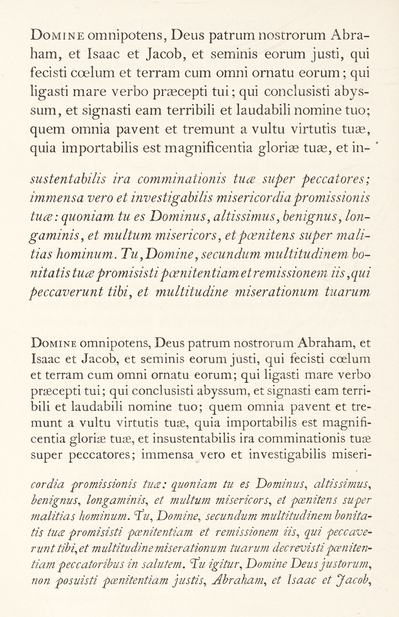
367. Examples of Transitional Types
And what are the types we ought not to want—which have no place in any artistically respectable composing-room? They are (in my opinion) practically all types on “standard line,” all condensed or expanded types, all “sans-serif” or (as they are absurdly miscalled) “gothic” types, all fat-faced black-letter and fat-faced roman, all hair-line types, almost all “ornamented” types and types which imitate engraving, and, with one or two exceptions, all shaded types. To this list I would add the variant forms of many standard series of types, which make up their “families.” These are principally condensations, distortions, or exaggerations of the original letter—the disreputable offspring of honest parents.
To the printer the moral of all this is the studies in type-forms teach us not only how to choose, but give us courage to eliminate. There are many ways of being wrong, but only one way of being right, and it is surely better to know the one way of being right, and purchase types few but fit, than to follow the many ways of being wrong, and expand much time, labour, and money in the experience! I have called this book a study in survivals, because in it I have tried to show not only what types have survived, but what should survive through their fitness for the best typography, and in so doing to lay down those general principles which may help “the survival of the fittest” in days to come. Each year that passes, we shall be called on to judge the design of types, both old and new. We must have a trained taste and eye to make a rewarding choice. for if we do not judge types rightly, they will judge us—the penalty of foolish choice being the penalty we pay for choosing foolishly in life. We are punished by getting what we want!
It is a simple matter to make lists of good types—though not as simple as it seems. It is still simpler—and much less trouble—lazily to accept other people’s conclusions and think no more about it. But the ideal composing-room will never be equipped in this way. It will be made what it ought to be only by those adventurers who add to those types accepted as “standard” other interesting fonts selected from sources to which study will have furnished a clue. The field for fruitful research is still great; and the printer who seeks will find himself the possessor, not merely of delightful, individual, and rare types, but of the ideal composing-room.
- “Printing-house” was the old term for what is sometimes erroneously called a print-shop—the latter, properly speaking, being a shop where engravings or prints are for sale.
- The abolition of the long s, it is popularly thought, we owe to the London publisher John Bell, who in his British Theatre, issued about 1775, discarded it. Franklin, writing in 1786, says that “the Round s begins to be the Mode and in nice printing the Long ſ is rejected entirely.”
- The old-fashioned figures were employed until about 1785, when Hunter introduced into his logarithmic tables the new form called “ranging.” In them a larger size was needful for legibility. About 1843, both the Royal Astronomical Society and the Superintendent of the (English) Nautical Almanac decided to restore the none-ranging figures.
- The nonpareil and pearl do not appear to be of the same series.
- This and other fonts produced by Mr. Goudy on his own account are interestingly displayed on a broadside entitled, A Specimen of Types designed and sold by Frederic W. Goudy, The Village Letter-Foundery, Forest Hill Gardens, New York.
- So called because often used for titles requiring several lines of capitals where the shoulder of regular capitals would introduce too much space between lines.
- Maltese crosses—still employed as florets in country printing-offices and by countrified printers in towns—are not ornaments at all, but a definite liturgical sign indicating blessing. Except where one is placed at the head of a religious inscription as a symbol, they should not be used for decoration. Oddly enough, they are most frequently employed by printers for non-liturgical Protestant bodies, which, if they knew what they meant, would not want them!
- About twenty years ago, these old ornaments fell on evil days, a few of them being redrawn for several American foundries in “chap-book” style. This heavy rendering accorded in weight with the massive black type then in fashion—a style with which they were out of keeping. The original forms are the only ones worth considering.
- Out of 146 types classified by M. Thibaudeau in La Lettre d’Imprimerie [vols. 1, 2], I find but four types that seem “possible”; and De Vinne’s Plain Printing Types displays only a very few.