Chapter VIII
Types and Type-Forms of the Fifteenth Century in Spain
Although Spanish typography has not had much influence on printing in other parts of Europe, it is both interesting and extremely individual. For the most part, the first printers both in Spain and Portugal were wandering Germans, who brought to the Iberian Peninsula, as they did to so many other parts of Europe, their knowledge of the new art. The introduction of printing was, however, rather late,—not until the year 1474,—and for that reason we do not find in either country, as Haebler1 says, “those precursors of the typographic art—woodcuts accompanied by text more or less ‘padded,’ nor xylographic books, of which we find so many examples in Germany and the Netherlands.” He adds that if Spanish books were sometimes rather archaic in appearance, this was due to unskilled workmen rather than the state of the art when introduced in Spain; for typography, when brought there, was no longer in its experimental stage, but a developed industry. The Spaniards very early occupied themselves with this new trade, and established workshops quite independently of the German printers; but the first printer who came to Spain was of German or Flemish origin, and the printing-hours most distinguished for the excellence of their work were either actually directed by Germans or else inaugurated under a German master.
The chief output of the Spanish press was, as one might guess, theological, and the clergy played an important part in the propagation of typography. Besides missals and breviaries, of which no copies are extant, and which are known only from existing records, there were a very large number of liturgical books printed in Spain up to 1500, and an enormous production of forms for indulgences. Even so, in addition to these, similar books and documents were constantly procured from abroad—and for a long time continued to be—because there were not enough printing-houses in the Peninsula to produce them in sufficient quantities. As in other parts of the world, monasteries established printing-offices in their precincts, and some of the secular clergy were themselves printers; while among higher ecclesiastics there were many who bore the expense of printing their own works, or who paid the cost of printing the works of others. Haebler believes that more books were published by the aid of the clergy in Spain than in any other country where printing existed prior to the Reformation.
It has just been said that printing was introduced in Spain as a developed art; and it is for that reason that almost all Spanish books have “signatures”—a feature which appeared rather late in English typography. Initials engraved on wood are to be found in Spain almost as early as anywhere else. And, too, as did the Venetians, Spanish printers enjoyed “privileges” which protected their work. Indeed, Spanish printing-houses profited from almost all the advances made in typography in other lands. In the commerce of legal forms, multiplied by the help of printing, Spain was ahead of other nations.
In spite of the fact that the masters [in printing] were all Germans…it cannot be said that the style of their production showed their national origin. On the contrary, the productions of Spanish presses, from a very remote period, have something special about them. At a very early date a Spanish style was developed which is readily recognizable even in the production of men who were newcomers to Spain. For this reason, as we have said, the influence of a particular school of printing cannot be recognized in books printed in Spain. One finds types imitated from those employed by the printers of Venice, Basle, and Lyons, and other types which seem to have been used elsewhere. But it is very rare to find a Spanish book which one would suppose to have been printed anywhere else. I know of but one printer who worked in Spain with an outfit which was decidedly French, namely, Jean de Francour at Valladolid. But even he appears soon to have changed his fonts of type, and to have adopted others of a kind more in accord with Spanish taste.
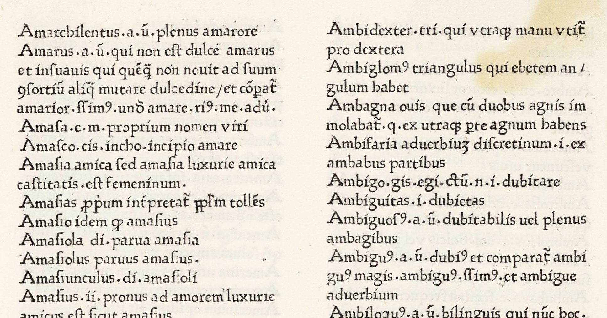
The Spanish had a marked predilection for gothic characters. The first books printed in Spain, it is true, are in roman characters, but the very master who executed them procured gothic fonts some years later, and employed them to the end of his career. If we were to count up the books printed in gothic characters and compare them with those in roman types, we should find that the majority printed in gothic is enormous. Nevertheless, it should be remembered that the number of roman fonts which, one by one, have been discovered in books printed in Spain, is quite considerable. It is of course true that only one of all the printing-houses in Spain produced books in quantity printed in roman types. This was the anonymous printer of Salamanca, and it is easy to explain this peculiarity: for that establishment was under the influence, perhaps actually under the direction, of Aelius Antonious Nebrissensis, who printed classical texts and his own commentaries on the writers of antiquity, following the lead of the Humanists of Italy. The books of the latter were commonly printed in roman characters (which were, on that account, called Italian), which accounts for the isolated fact that so many books in roman characters were printed in this particular city. In the rest of Spain books in Italian characters were uncommon. Almost all printing-houses of importance had one or two fonts of roman. But the number of books printed in those types was exceedingly small; and such fonts were rarely renewed; while gothic fonts (from the very beginning stocked in greater quantities) were renewed and revamped very frequently.2
This statement brings up an interesting point, i.e., that in spite of the German origin of printers who came to work in Spain, their style soon became something characteristically Spanish. In looking through Spanish incunabula, one feels that it is a very special school of typography; rugged yet effective, and reminiscent, to one who knows Spain, of its rough, careless splendour, its grave, sad magnificence. The finest productions of the Spanish press before 1500 are scarcely second to the best contemporary work done in Germany and Italy, and this Spanish quality existed particularly, perhaps, in these incunabula. But it is also extremely apparent at the end of the eighteenth century in the production of the first modern Spanish type-cutters, who somehow, even when copying the ornaments of Baskerville and Caslon, and the types and decorations of Fournier, put into them a Spanish flavour which makes it quite clear that they are Spanish and can be nothing else.
Pollard, in his Early Printed Books in the British Museum, takes up the cities in Spain in which printing was established from the date of its introduction at Valencia in 1474, to the last year of the fifteenth century; and in the notes describing the types of Spanish printers, he constantly alludes to the material of presses in other countries which these Spanish types recall. It is plain that many of the types were from foreign sources; and yet there are some which do not resemble any foreign types and seem to be of Spanish workmanship. These, it is to be supposed, were cut by the early printers, who were, as elsewhere at the period, type-cutters too. But even this does not wholly account for that particularly Spanish quality which crept into so much of the work of men from other nations, often using types derived from other countries. One can explain it only by the influence of Spanish manuscripts and the national school of writing in which they were executed, which were—as was printing—governed by the subtle influences emanating from the soil and skies of Spain itself—the ethos of a country to the last degree individual, which therefore showed itself very markedly even in work which would not appear capable of such impregnation. Many of these early German printers married Spanish women, and in a generation became completely merged in the land of their adoption. This was not an isolated instance of such Spanish assimilation. In the third quarter of the eighteenth century large agricultural colonies of Bavarians—six thousand of them, grouped in thirteen villages (the chief of which was called La Carolina) in the Sierra Morena—were brought to Spain by ministers of Carlos III. In a comparatively short period these absolutely disappeared from a “national” point of view, and became merged in the Spanish population. Later in the same reign, a great many English, Scotch, and Irish were established in Seville and Madrid to direct or take part in the new manufactories or industries which the Government was establishing. In Madrid these families practically died out, or else were assimilated by the Spanish: for the spirit of the country seems always to have become too strong for the foreigner.
The decorative features of Spanish incunabula, too, show, like their types, certain marked Spanish peculiarities.
The fifteenth century title-pages are often very magnificent; and this magnificence of effect is usually arrived at by large and splendid decorations placed above very meagre titles. On the title-page of Vagad’s Cronica de Aragon, printed by Pablo Hurus, at Saragossa (1499), an enormous decorative woodcut appears above a title in black-letter, consisting of but three words! This was entirely in consonance with the huge decorations and heraldic bearings commonly used in all departments of Spanish art–churches with their entire fronts covered by a coat of arms, the door of the church being as subsidiary to the decoration above it as was a title to the decoration on a title-page. These heraldic emblems were characteristic—cosas de España—for, as Ford says, “few countries can vie with Spanish heraldic pride and heraldic literature.” What Spaniards did in books was only what they did in architecture—they printed as they built—another instance of the interlocking of the artistic side of printing with the art of a given period. Then, too, in some of the borders to printed pages, we see ornament which is reminiscent of Saracenic or Arabesque design; and this again seems to reflect
—sad stories of the death of kings.
In other words, the characteristic of Spanish printing was that it was so essentially Spanish—more obviously “Spanish,” it seems to me than Italian printing was “Italian,” or French printing was “French,” perhaps because the nationality of Spain is more intense than that of any other country (or Latin country) of Europe. A friend who read these lines said to me, “What is meant by ‘essentially Spanish’?” But like the flavour of olives, “Spanish” cannot be described!
During the latter part of the fifteenth century, Valencia was a great seat of foreign commerce, and, like Lyons, a meeting-place for foreigners; it was therefore natural that, printing have been brought to Spain by foreigners, the first Spanish press should be set up in Valencia. It was established by Lambert Palmart, who was probably of Flemish origin, and who produced at this press some fifteen books. What is generally thought to be the first book printed in Spain—Fenollar’s Obres e trobes—a collection of poems in honour of the Blessed Virgin, though undated, was probably issued in 1474. It was printed in a rough roman type. Five books were printed in this roman font by Palmart, of which the earliest with a date was the Comprehensorium, issued in 1475 (fig. 49). He then procured gothic types, in which he continued to print until the end of his career. One characteristic of his work is the extreme leading of the type in some of his books, which gives them an effect not at all consonant with ordinary ideas of fifteenth century printing. When printing his Biblia Valenciana in 1477–78, a Spanish printer was in association with him, Alonso Fernandez de Cordoba, who also printed on his own account. Fernandez de Cordoba was a silversmith by trade, and probably cut the punches of the gothic types employed in the Bible. Palmart died in 1490.
49. First Roman Type used in Spain: Palmart, Valencia, 1475
From a copy of Johannes, Comprehensorium, in the Library of Mr. J. Pierpot Morgan, New York (facsimile), Biblioteca Digital Hispánica (scan)
The second press in Spain was set up at Saragossa in the autumn of 1475, by a certain Matthaeus of Flanders, who printed the first book in Spain in which its printer’s name is given—an edition of Manipulus Curatorum—Palmar’s books before 1477 being without an imprint. Very little is known of Matthæus, who henceforth vanishes from view.
The other chief cities out of the twenty-four in which printing was introduced between 1474 (the probable date of its introduction) and the end of the century, were Seville, Barcelona, Salamanca, Burgos, Toledo, Valladolid, and Granada—Madrid having no printing-press until the Court had its permanent seat there in 1565. The most famous of these Spanish printing-houses were the Burgos press of Fadrique de Basilea (Friedrich Biel of Basle); the Saragossa press of Juan and Pablo Hurus of Constance; that at Seville belonging to Ungut and Sanislaus, and the establishment of the Unknown Printer of Salamanca. Arnald Guillen de Brocar of Pamplona should be mentioned, although his fame came to him in the next century as printer of the Complutensian Polyglot; for which he was called to Alcalá. Of these presses, those at Seville and Valencia were among the most productive. That of Salamanca is interesting for its classical books issued in roman type. Some of the best work was done in the office of Pablo Hurus at Saragossa, where illustrated volumes were brought out; the Officia Quotidiana issued in the year 1500 1499 by his successor, Coci, Haebler calls one of the finest specimens of work executed at any time and at any place in the world.
The first book printed in Spain was from a font of coarse roman letter, but the rank and file of Spanish work was executed in a round, massive black-letter. This was something like the Italian black-letter of the same period, but had a peculiar Spanish twist to it. It was based on a round Spanish book-hand. The larger sizes of this type were exceedingly fine, especially in Hurus’s work; and on title-pages and for head-lines of chapters, large sizes were used with very imposing effect. There were also many somewhat condensed pointed gothic fonts of great richness of colour, almost like the handwriting of a manuscript as contrasted with rounder and more typically Spanish forms. Except for a few quartos, most of the books were sent in double-column. By referring to the plates in Haebler’s Typographie Ibérique one can get a very clear idea of what fifteenth century Spanish types and composition were. Many of the columns to be referred to came from the well-known presses just mentioned.
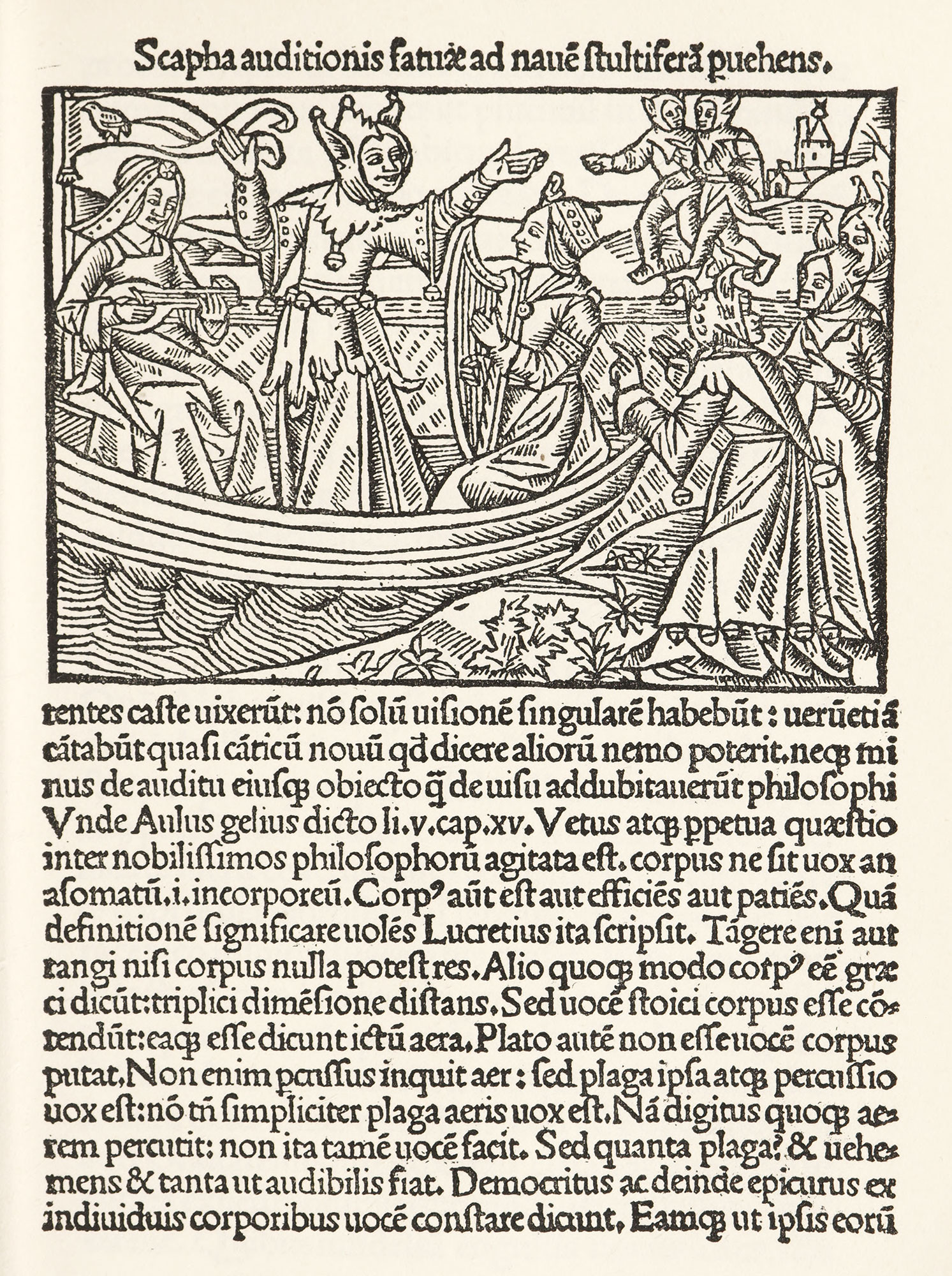
As roman characters were the first used in Spain, though less interesting than gothic types, we will consider them first. The roman type used by the prototypographer Palmart at Valencia, in 1475, in the Comprehensorium was, as our plate shows, of a very rough sort; and another roman font used in the Commentum Ethicorum of Saint Thomas Aquinas, printed by Spindeler and Brun at Barcelona in 1478, also is of an extremely primitive style.3 In Villanova’s Rudimenta Grammaticæ, printed by Spindeler at Valencia in 1500, we have a more regular type, better fitted, but of a heavy cut—this heaviness being a mark of many Spanish roman fonts (fig. 50). The Unknown Printer of Salamanca employed a roman font with a certain condensed quality, which points to derivation from Gothic characters. This he used in the Grammatica of Fliscus about 1485.4 The very virile roman font employed at Burgos about 1497 by Fadrique de Basilea in the De Hispaniæ Laudibus of Marineus Siculus shows a distinct advance in its type-cutting and fitting; but in effect it is almost as heavy as black-letter.5 This is true of a font used in the same printer’s Latin edition of Brant’s Stultiferæ Naves, though the massive appearance of such close-set type certainly accords well with the woodcut above it (fig. 51). These very heavy roman fonts are evidently Spanish renderings of Italian type of that epoch, but renderings “with a difference.” In the Ungut and Stanislaus edition of Alfonso de Palencia’s Epistula de Bello Granatensi (Seville, no date), we have a fine roman font which is even more Italian in effect (fig. 52). In many of these pages, gothic types, for head-lines, etc., are mixed with roman; the excessive colour of the roman fonts making this less discordant than would be expected.
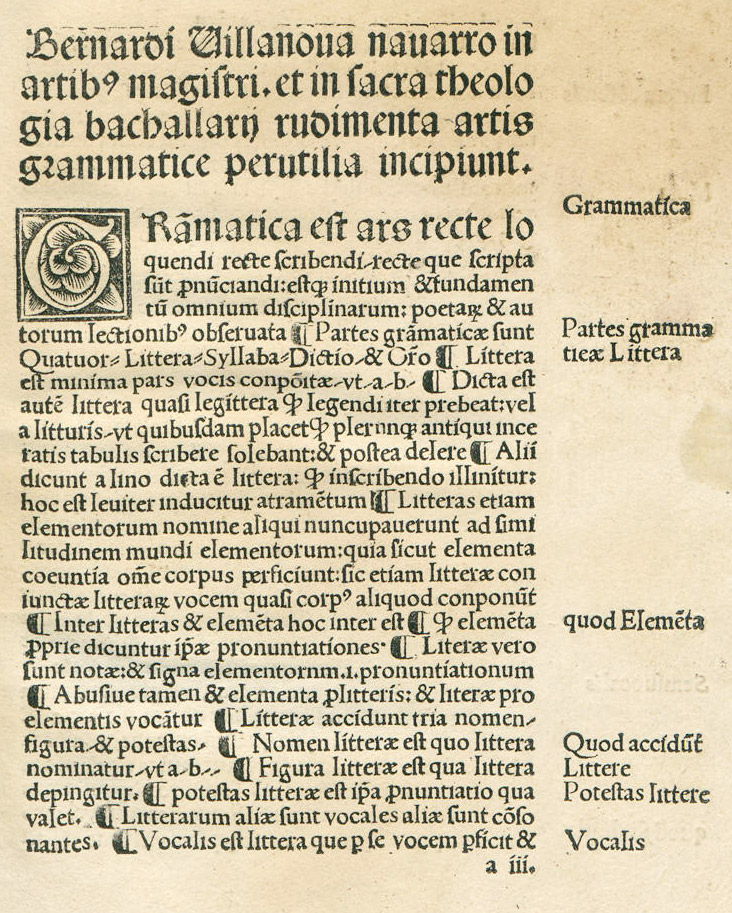
50. Spindeler’s Roman Type, Valencia, 1500
From Haebler’s Typographie Ibérique due Quinzième Siècle (facsimile), Rudimenta grammatices (scan)
51. Fadrique de Basilea’s Roman Type, Burgos, 1499
From Haebler’s Typographie Ibérique due Quinzième Siècle
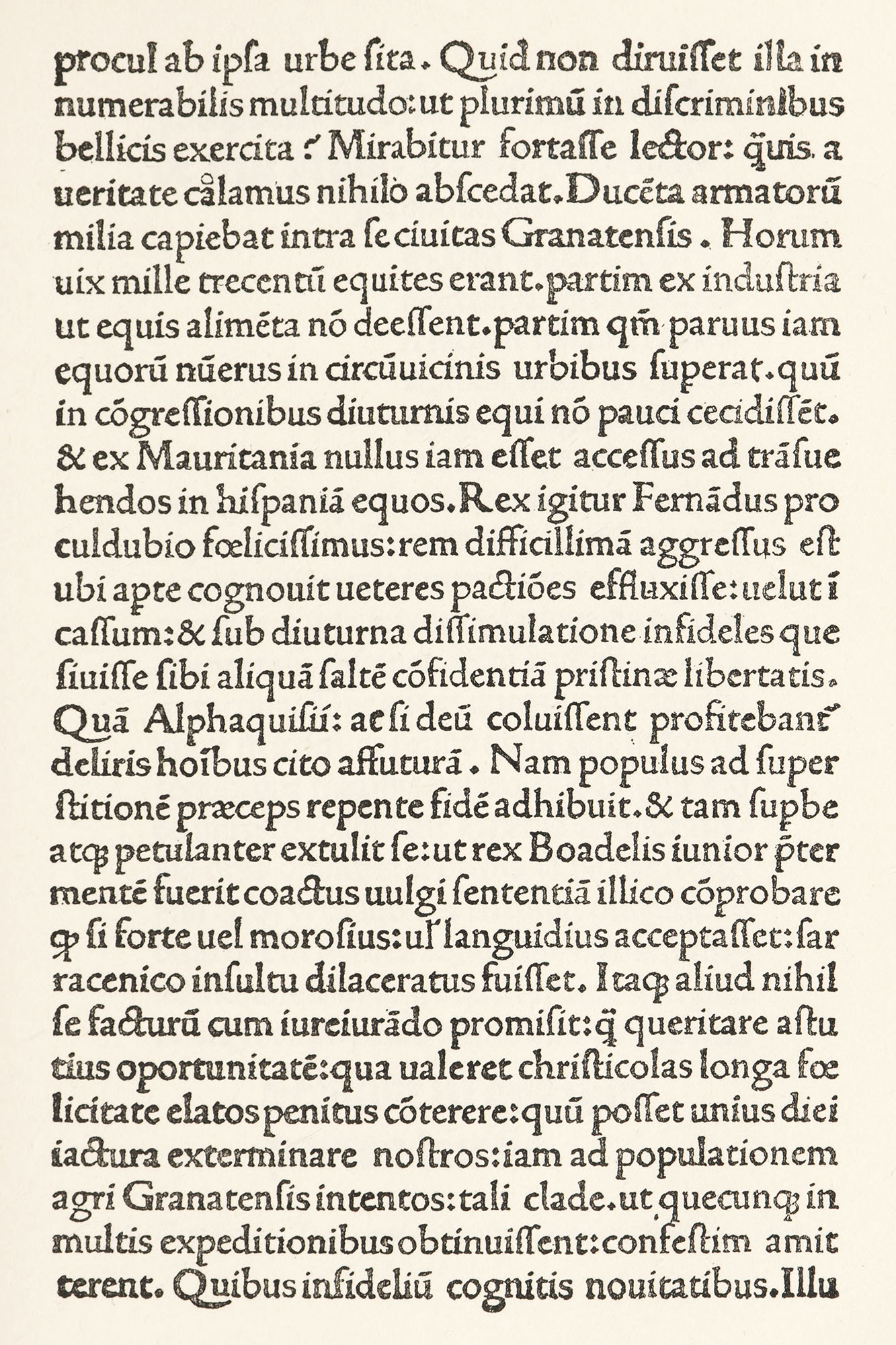
52. Roman Type used by Ungut and Stanislaus, Seville, n.d.
From Haebler’s Typographie Ibérique due Quinzième Siècle (facsimile), Epistola ad Johannem Episcopum Astoricensem de bello Granatensi (scan, p. 6)
The gothic types used by Palmart were a somewhat round yet slightly condensed black-letter—but by no means as round as some other Spanish gothic fonts. A page from the Cosmographia of Pomponius Mela, printed by Palmart in 1482, is composed in two sizes of this type (fig. 53). By comparing this with such type as was used in the Espejo de la Cruz by Cavalca, printed by Martinez at Seville in 1486, we see what this gothic type so much used in Spain was in rounder form.6 A splendid example of it appears in the Manuale Burgense,7 printed at Saragossa in 1497 by Hurus, whose books are among the most workmanlike and interesting of the early Spanish press. An even finer font of round gothic was that employed by Brocar at Pamplona in the Libros Menores of 1499, shown in our illustration (fig. 54). Small sizes of this character were used in the Carcel de Amor of San Pedro, printed at Burgos by Fadrique de Basilea in 1496.8
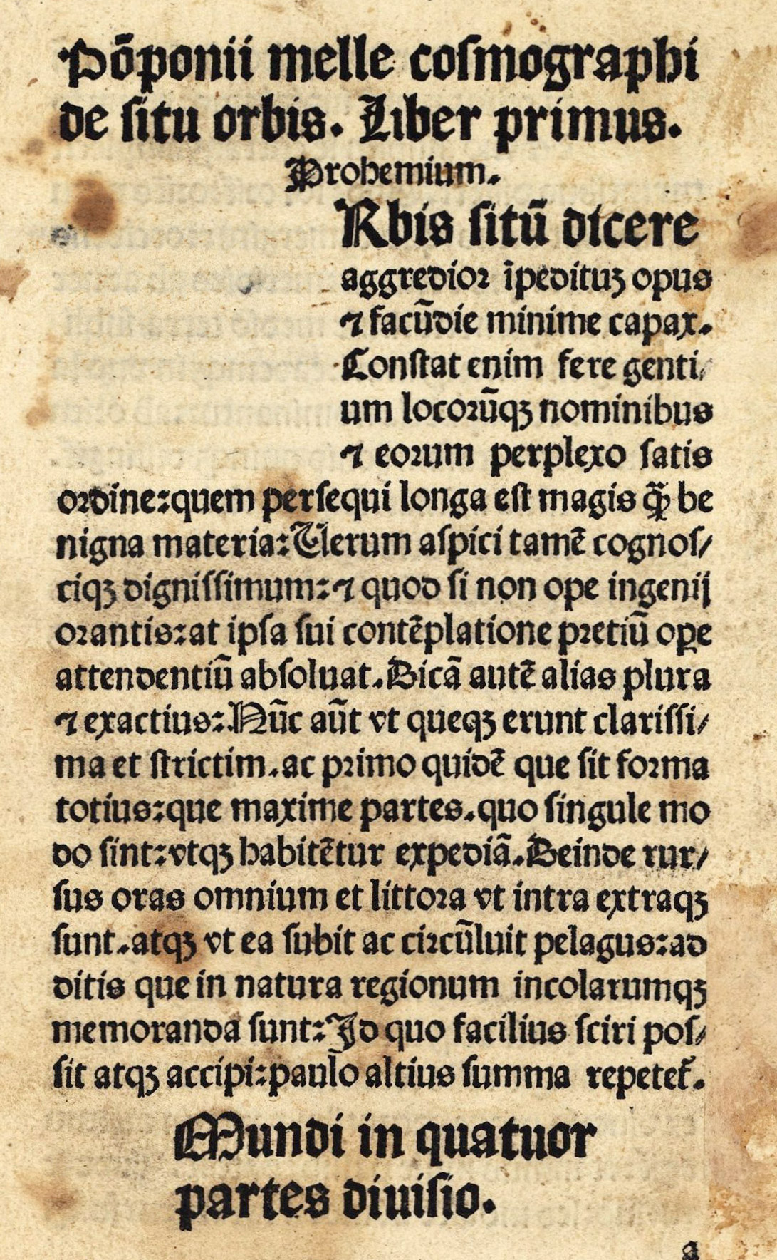
53. First Gothic Type used in Spain: Palmart, Valencia, 1482
From Haebler’s Typographie Ibérique due Quinzième Siècle (facsimile), Cosmographia (scan)
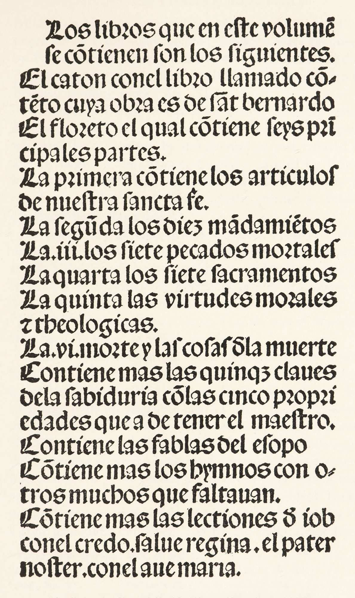
54. Brocar’s Round Gothic Type, Pamplona, 1499
From Haebler’s Typographie Ibérique due Quinzième Siècle (facsimile), El Caton, el libro Ilamado Contento, cuya obra es de sant Bernardo, el Floreto, las quinque claves de la sabiduria, las fablas del Esopo (scan)
More condensed kinds of black-letter (like the French lettre de forme) were also employed by the same printer in 1493, in the Introductionum Latinarum, Secunda Editio, of Antonio de Nebrija—very elegant in the smaller size.9 Fine pages set in a still more pointed character were produced by Pablo Hurus at Saragossa in 1496. The latter has that peculiar quality of penwork which keeps cropping up in Spanish printing fonts (fig. 55).
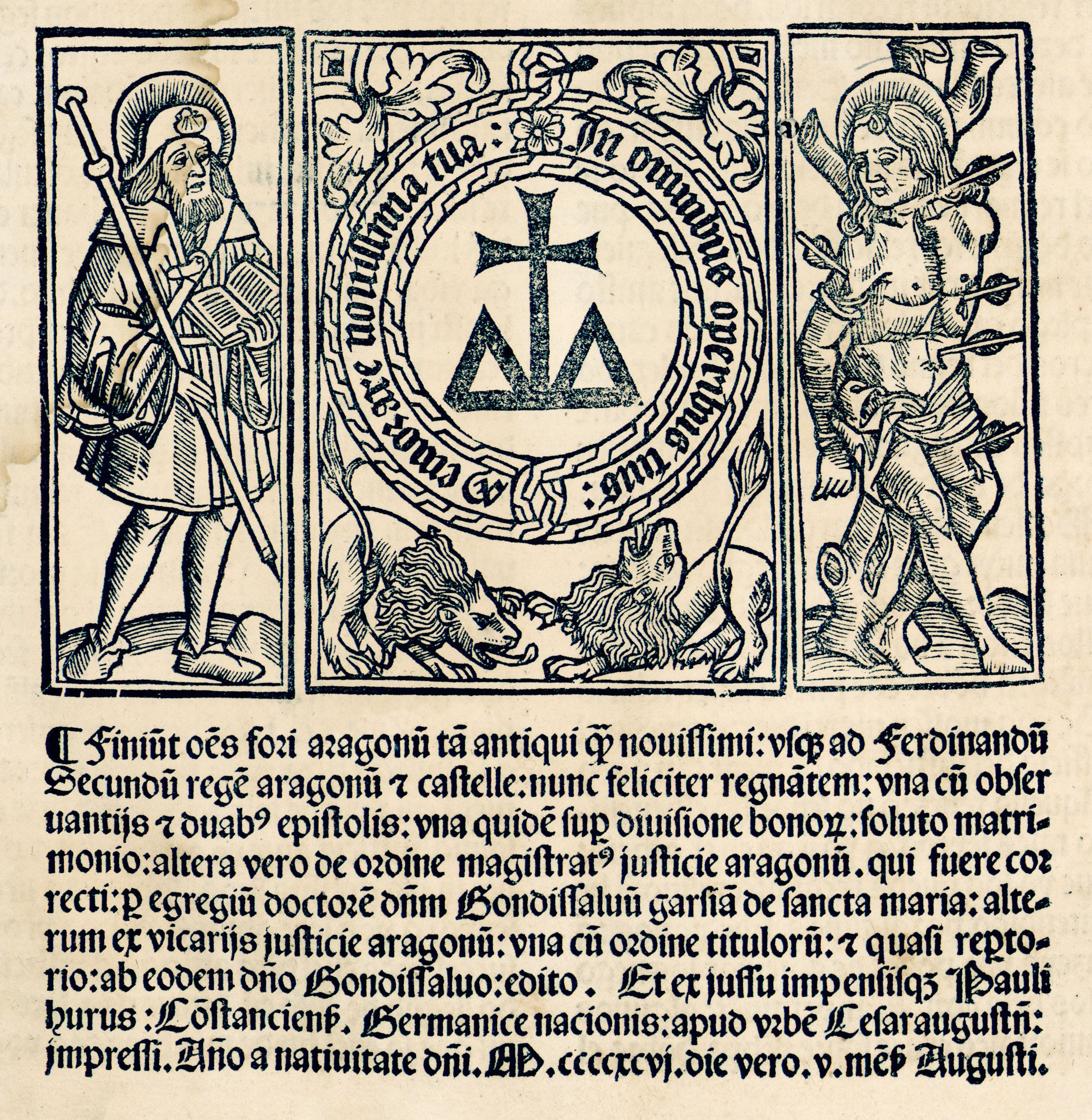
55. Gothic Type used by Pablo Hurus, Saragossa, 1496
From Haebler’s Typographie Ibérique due Quinzième Siècle (facsimile), Fori regni Aragonum (scan)
Condensation, and this pointed quality in type, varied in degree. An idea of the rich, massive quality of Spanish black-letter is given by the illustration just referred to and by pages of the Suma de Confesion printed by Hurus in 1499;10 in Hagenbach’s Toledan Missal of 1500;11 or in the Leyes por la Brevedad de los Pleitos, printed at Toledo by Hagenbach about 1499.12
A peculiarity of composition in some Spanish books, namely, the excessive leading of gothic types, may be seen in the Valencia edition of the Epistolæ of Phalaris, printed in 1496;13 or the Ecloga of Teodulus, printed at Zamora in 1492.14 This was sometimes done to allow annotations or “glosses” to be interlined; hence a small size of Spanish type used for notes is called glosilla.
In early Spanish illustrated books, Pollard says that “pictorial tile-cuts are not so common as in those of other countries, because of the Spanish fondness for filling the tile-page with an elaborate coat of arms;” adding, however, that “nearly all their early bookwork is strong and effective, and the printer who placed a cut on a title-page nearly always secured a good one.”15 Spanish title-pages are interesting, and show certain peculiarities in ornament and arrangement. For instance, white letters on a black background was a very Spanish style of decorative writing—a style splendidly employed later by the calligrapher Juan de Iciar.16 Ungut and Stanislaus, at Seville, in 1494, cleverly took advantage of it, in a wood-block for the title-page of Columna’s Regimento de los Principes.17 There is a similar instance of white lettering on a black background in the well-known title-page of Obra Allaors de S. Cristofol, printed at Valencia by Pedro Trincher in 1498.18 Another book printed at Ungut at Seville in 1495—Lilio de Medicina—has a magnificent title-page which is distinctly Spanish in effect—a very important decoration bearing the words of the title, with a block of massive round black-letter beneath it (fig. 56). The Salamanca edition of Leyes del Quaderno nuevo delas rentas delas alcavalas y frāquezas, etc., printed about 1496, with its four lines of gothic text beneath an immense and brilliant heraldic shield, is reminiscent of the huge armorial bearings used in decoration in other branches of Spanish art (fig. 57). Another title-page in the same style is that of Vagad’s Cronica de Aragon, printed by Pablo Hurus at Saragossa in 1499.19 Then there was a good deal of work in small format treated in the same way, such as the extraordinary xylographic title-page of Lucena’s Repeticion de Amores, e arte de axedres (Salamanca, 1496), by Hutz and Sanz.20
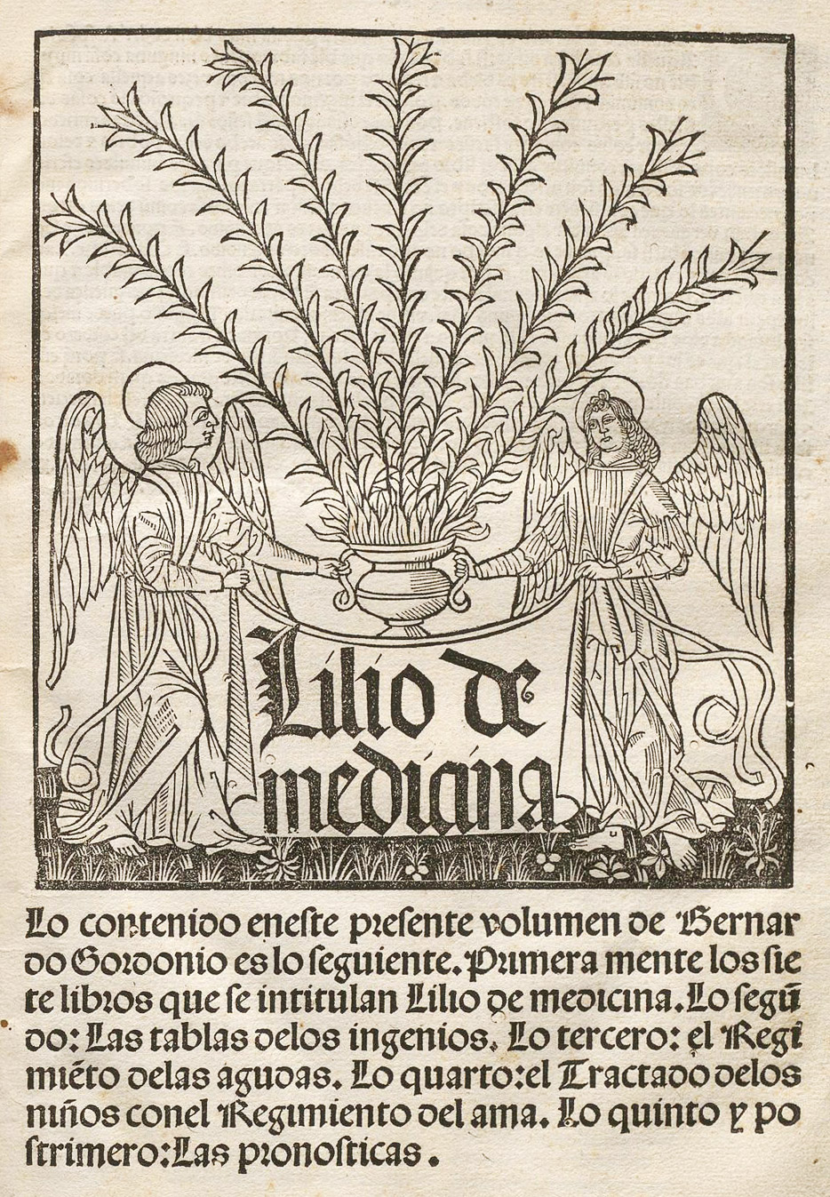
56. Title-page of Gordonio’s Lilio de Medicina: Ungut and Stanislaus, Seville, 1495
From Haebler’s Early Printers of Spain and Portugal (facsimile), Lilio de Medicina (scan)
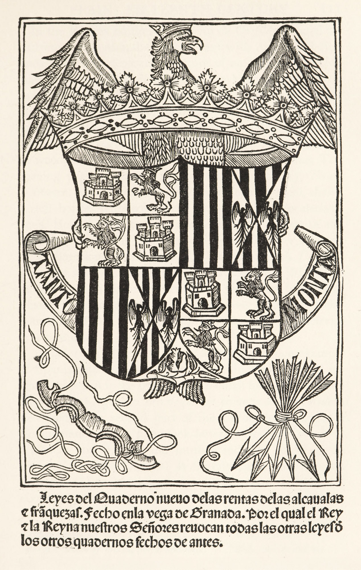
57. Title-page of Leyes del Quaderno, etc., Salamanca, c. 1496
From a copy in the Annmary Brown Memorial Library, Providence
In the Burgos edition of Oliveros de Castilla, printed by Fadrique de Basilea, the page of text with its mass of rich black-letter and decorative picture of an archbishop wedding the hero to the daughter of the king of England, is an example of an illustrated edition of a popular romance—the kind over which Don Quixote lost his wits.21 The calligraphic initial, and title in large, round gothic letters, are reminiscent of early French printing. These title-pages, but on wood, are common in Spanish books of the time. The opening page of another famous story of chivalry, Tirant lo Blanch, printed at Valencia by Spindeler in 1490, shows a rich border with something Oriental about its decorations.22 How the illustrations appeared when placed in the text may be seen in San Pedro’s Carcel de Amor (Rosenbach, Barcelona, 1493) and G. G. de Novarra’s Contemplaciones sobre el Rosario, etc. (Ungut, Seville, 1495).23 The initials used in Spanish incunabula were very brilliant in effect. Those employed by the Unknown Printer of Salamanca in 1498, 1499, and 150024 are fine and characteristic examples.
Although of later date than 1500, there is one example of Spanish decoration so remarkable in design that I include it here. It is the title-page of a small folio book entitled Aureum opus regalium privilegiorum civitatis et regni Valentie—being the second part of the Chronicle of Jayme el Conquistador. This fine black-letter book was issued at Valencia “by the art and humble industry of Diego de Gumiel” in 1515 (fig. 58). It exhibits three very Spanish features:
- heraldic design
- in white on black
- above very little text;
and shows what is meant by “Spanish” better than any words can do. It is a very romantic courageous, and effective style of decoration.25
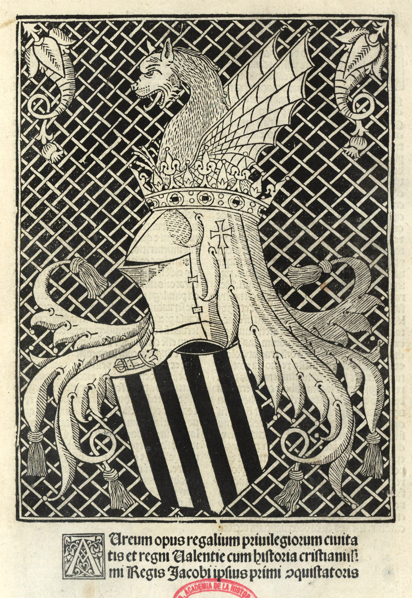
58. Title-page of Aurem Opus: Diego de Gumiel, Valencia, 1515
From a copy in the Boston Public Library (facsimile), Biblioteca Virtual del Partrimonio Bibliográfico (scan)
Facsimiles, however well reproduced, give very little idea of the splendour of Spanish incunabula. The books themselves must be seen. Then only a true idea of their effect is gained. The typography of these books was comparatively simple, the sizes of type were few, the decorations were strong and masculine, and the composition, as a rule, so compact that a page of it looks like some dark weave laid upon a sheet of paper. I am not saying that these books are the finest that were ever printed, but they were in one way among the finest. For if entire unity with the life about it makes great printing, these books were great.
- Typographie Ibérique, p. 1.
- Typographie Ibérique due Quinzième Siècle, 1902, p. 2. Haebler’s books on Spanish printing are the works most valuable to the European and English student. His Typographie Ibérique due Quinzième Siècle (in Spanish and French)—a work specially valuable for its facsimiles of almost all the types at present known to have been used in Spain and Portugal up to the year 1500—has a delightfully clear and complete, though brief, prefatory notice of the introduction of typography in the Peninsula. The same author’s Early Printers of Spain and Portugal (Bibliographical Society’s Monographs, No. IV, London, 1897) was written in English five years earlier. It is excellent, though not so comprehensive.
- Typographie Ibérique, No. 12.
- Typographie Ibérique, No. 34.
- Typographie Ibérique, No. 51.
- Typographie Ibérique, No. 9.
- Typographie Ibérique, No. 75.
- Typographie Ibérique, No. 50.
- Typographie Ibérique, Nos. 48 and 49.
- Typographie Ibérique, No. 77.
- Typographie Ibérique, No. 132.
- Typographie Ibérique, No. 130.
- Typographie Ibérique, No. 19.
- Typographie Ibérique, No. 37.
- Pollard’s Fine Books, pp.163, 164.
- Juan de Iciar, Spanish Calligrapher, and the designer of one of the finest writing-books ever printed. It is entitled Recopilacion subtilissima: intitulada Orthographia practica. The first edition was published in 1548, at Saragossa. Some of the plates are copies of those in Italian books, but many of them are original with Iciar. Mr. Strange believes that the running hands in the book show certain Moorish influences. The original volume is rare, but plates from it are reproduced in most books on calligraphy. There is a short account of Iciar in Sir William Sterling Maxwell’s Annals of the Artists of Spain, and Mr. Strange’s paper, Writing-Books of the Sixteenth Century (Transactions of the Bibliographical Society, Vol. III, p. 41), may also be referred to.
- Early Printers of Spain and Portugal, pl. xxiii.
- Typographie Ibérique, No. 155.
- Early Printers of Spain and Portugal, pl. xviii.
- Early Printers of Spain and Portugal, pl. x.
- Typographie Ibérique, Nos. 52 and 53.
- Typographie Ibérique, No. 17.
- Early Printers of Spain and Portugal, pls. ii and xxiv.
- Early Printers of Spain and Portugal, pls. xi and xii.
- All the facsimiles in Haebler’s two books—Early Printers of Spain and Portugal, and Typographie Ibérique du Quinzième Siècle—should be looked through. For a guide to the rarest and most important productions of the Spanish press, the reader may consult the Salvá catalogue, Catálogo de la Biblioteca de Salvá, escrito por D. Pedro Salvá y Mallen. Valencia, 1872. 2 vols. It is illustrated and also contains many typographical reproductions (not very well done) of title-pages of the more famous works. For facsimiles without bibliographical descriptions the student may consult Bilbiographía Grafica, Reproducción en facsímil de portadas, retratos, colofones y otras curiosidades, Vol. 2, etc. Pedro Vindel, Madrid, 1910. 2 vols. The work contains upwards of 1200 facsimiles of Spanish printing and engraving from the introduction of printing to the early years of the nineteenth century. It is rich in reproductions of the early work touched on in the foregoing chapter. A guide to some titles of fifteenth century Spanish books is supplied by Henry Thomas’s Short-title Catalogue of Books printed in Spain and of Spanish Books bequeathed by George Ticknor to the Boston Public Library, together with the Collection of Spanish and Portuguese Literature in the General Library may be consulted for titles of books to be examined. This was published in 1879, and since that date many volumes have been added to the collection. It contains a number of books interesting to the student of Spanish printing. The Library of the Hispano-American Society, New York, is the best collection of Spanish typography which exists in this country. It numbers over 100,000 volumes, and the incunabula (splendidly displayed) include many rare and beautiful books. No printed catalogue has been published. The society has issued a number of the rarest Spanish books in facsimile.