Chapter XXII
English and American Revival of Early Type-Forms and its Effect on Continental Types
I. England and the United States
William Morris was born in 1834—the son of prosperous middle-class people, who lived freely and pleasantly. He was educated at Marlborough School and Exeter College, Oxford, where he formed a lasting friendship with Burne-Jones. Originally intending to take Holy Orders, he changed his mind, and studied architecture for a year or two under Street; then, between 1857 and 1862, through Rossetti’s influence, he took up painting. Meanwhile he had begun to write—his Defence of Guenevere appearing in 1858. From then until his death he wrote many volumes of poetry and prose, most of it of a very high order. Painting proved unsatisfactory, so he began about the year 1870 to work as a decorator, eventually turning his hand to illumination,—in which he was expert,—to the making of wall-papers, rugs, hangings, and stained glass, and to house decoration. It was an era of pattern, and though in Morris’s hands the pattern was often magnificent, houses decorated or furnished by him would now appear rather tiresome and affected.
In socialism Morris was seriously interested. It was the somewhat romantic socialism of a well-to-do, fastidious man, which had the added attraction of placing him in the opposition; for he somewhat enjoyed “otherwise-mindedness.” Morris never went to the slums and lived with the people—indeed, he gave scant attention to the particular individual in his large and roomy movements—it was not the manner of his time. He desired with great desire to see the life of workmen improved by being made more like his own, rather than to get nearer the workman’s point of view by making his life more like theirs. Yet he was thoroughly in earnest about his socialism. That the workman’s life was so sordid made him miserable. He loved mediaevalism because it appeared to him—I think rather unhistorically—a close approach to the life he wished to see commonly lived in the world. None the less, he had sometimes impossible manner, often a furious temper, always short patience with fools, and there was a bit of pose and “bow-wow” about his daily walk and conversation. In his character, as in his wall-papers, one was a little too conscious of the pattern, but the pattern was fine, and there was lots of it! Over and above all this he was an educated, cultivated man, tremendously observant and shrewd, and his driving power was enormous. Like Bodoni (whose work Morris detested), no man knew better what he wanted to do. Morris’s motto was “If I can,” and by hard work, enthusiasm, and—we must admit—a fixed income and a good deal of incidental prosperity, he usually “could.”
Morris’s style of printing, therefore, may be partly explained by the interiors of his own houses or those he decorated; and its motive by his idea of socialism, which, through a kind of Religion of Beauty, was to produce the regeneration of a work-a-day world. It was to be a wonderful world, and it was, potentially, very real to him. His printing was for it, or was to help to its realization by others. If his decorations now appear a bit mannered and excessive, and his socialism somewhat romantic and unreal, it is because Morris was very much of his period. Thus (again like Bodoni, though from diametrically opposite theories) Morris made magnificent books, but not for ordinary readers—nor, for the matter of that, for ordinary purses—but only for a certain fortunate group of his own time.
To understand the work of Kelmscott Press we must understand this much of the environment and ways of thinking of a man as forcible and sincere as he was many-sided.
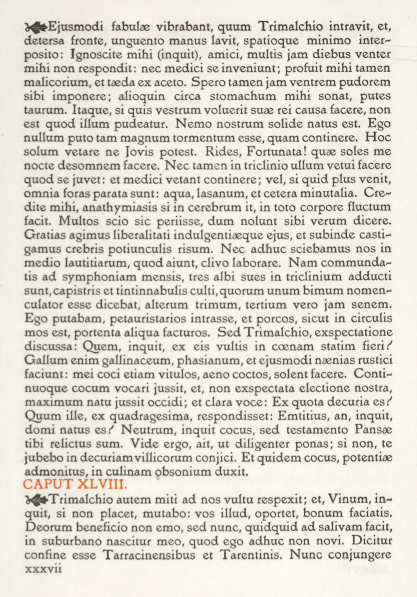
Some years before Mr. Morris set up any press of his own, he had made a few essays in printing. The Roots of the Mountains, which was issued in 1889, was printed for him at the Chiswick Press in a character cut some fifty years earlier, belonging to the Whittinghams, and modelled on an old Basle font; and in 1890, the Gunnalaug Saga was printed in a type copied from one of Caxton’s fonts. In 1891, almost fifty years after the Whittingham’s revival of Caslon’s types, and some fifteen after the Fell types were resuscitated, Morris established the Kelmscott Press, named after Kelmscott Manner House (on the upper Thames, about thirty miles from Oxford), which Morris acquired in 1871. The first “Kelmscott” book that he issued was The Story of the Glittering Plain, and its effect upon lovers of fine books was instantaneous. Opinion was at once divided about Morris’s printing. To a limited public, the Kelmscott editions opened the millennium in book-making. Others were irritated at what they considered their affectation and faddishness, and condemned them utterly, as unreadable—which was only a half-truth. The effect on printing in general that Morris was to have through his type and type-setting entirely escaped most printers, as did the sources from which he derived his methods. Because they knew very little about early manuscripts or early books, about the characters of the one or the types of the other. The Kelmscott books appeared to them to have fallen from the sky—either very new and wonderful or else very freakish and senseless—just as they would to anybody who knew nothing whatever about it! On the great English public, or the majority of English printers, Morris’s books had—at that time—scarcely any effect at all. Indeed, Mr. Morris was a much more widespread popular force in America and Germany than in England, where his work was known only to a comparatively small artistic group.
Mr. Morris said,
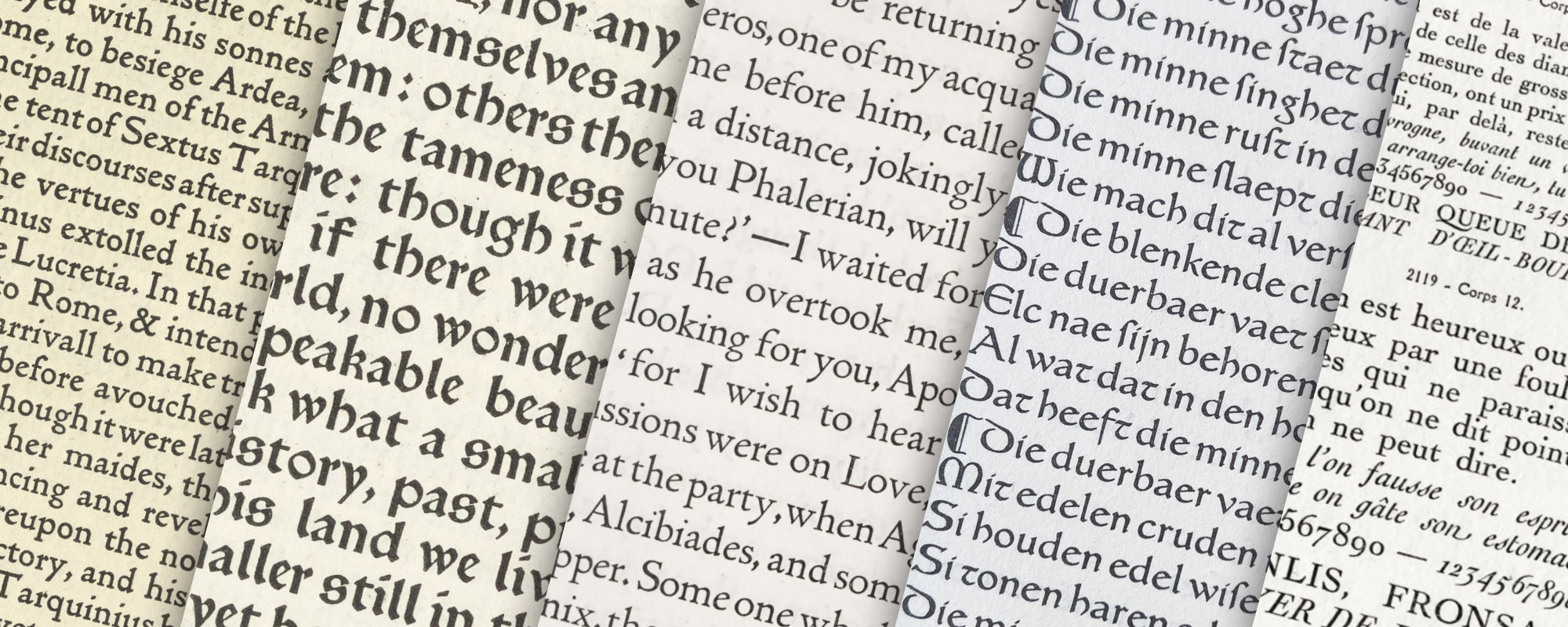
I began printing books with the hope of producing some which would have a definite claim to beauty, while at the same time they should be easy to read and should not dazzle the eye, or trouble the intellect of the reader by eccentricity of form in the letters. I have always been a great admirer of the calligraphy of the Middle Ages, and of the earlier printing which took its place. As to the fifteenth century books, I had noticed that they were always beautiful by force of the mere typography, even without the added ornament, with which many of them are so lavishly supplied. And it was the essence of my undertaking to produce books which it would be a pleasure to look upon as pieces of printing and arrangement of type. Looking at my adventure from this point of view then, I found I had to consider chiefly the following things: the paper, the form of type, the relative spacing of the letters, the words, and the lines; and lastly the position of the printed matter on the page…
Next as to type. By instinct rather than by conscious thinking it over, I began by getting myself a fount of Roman type. And there what I wanted was letter pure in form; severe, without needless excrescences; solid, without the thickening and thinning of the line, which is the essential fault of the ordinary modern type, which makes it difficult to read; and not compressed laterally, as all later type has grown to be owing to commercial exigencies. There was only one source from which to take examples of this perfect Roman type, to wit, the works of the great Venetian printers of the fifteenth century, of whom Nicholas Jenson produced the completest and most Roman characters from 1470 to 1476. This type I studied with much care, getting it photographed to a big scale, and drawing it over many times before I began designing my own letter; so that though I think I mastered the essence of it, I did not copy it servilely; in fact, my Roman type, especially in the lower case, tends rather more to the Gothic than does Jenson’s.
After a while I felt I must have a Gothic as well as a Roman fount; and therein the task I set myself was to redeem the Gothic character from the charge of unreadableness which is commonly brought against it. And I felt that this charge could not be reasonably brough against the types of the first two decades of printing; that Schoeffer at Mainz, Mentelin at Strasburg, and Gunther Zainer at Augsburg, avoided the spiky ends and undue compression which lay some o the later type open to the above charge.… Keeping my end steadily in view, I designed a black-letter type which I think I may claim to be as readable as a Roman one, and to say the truth I prefer it to the Roman.
It was only natural that I, a decorator by profession, should attempt to ornament my books suitably: about this matter, I will only say that I have always tried to keep in mind the necessity for making my decoration a part of the page of type.1
Morris’s three types (two black-letter and one roman) were as follows:
A roman letter, called the Golden Type, cut in English size, finished in 1890, and first used in his Golden Legend, issued in 1892 (fig. 346).

346. Morris’s Golden Type: Kelmscott Press
From Poems of William Shakespeare, 1893 (scan)
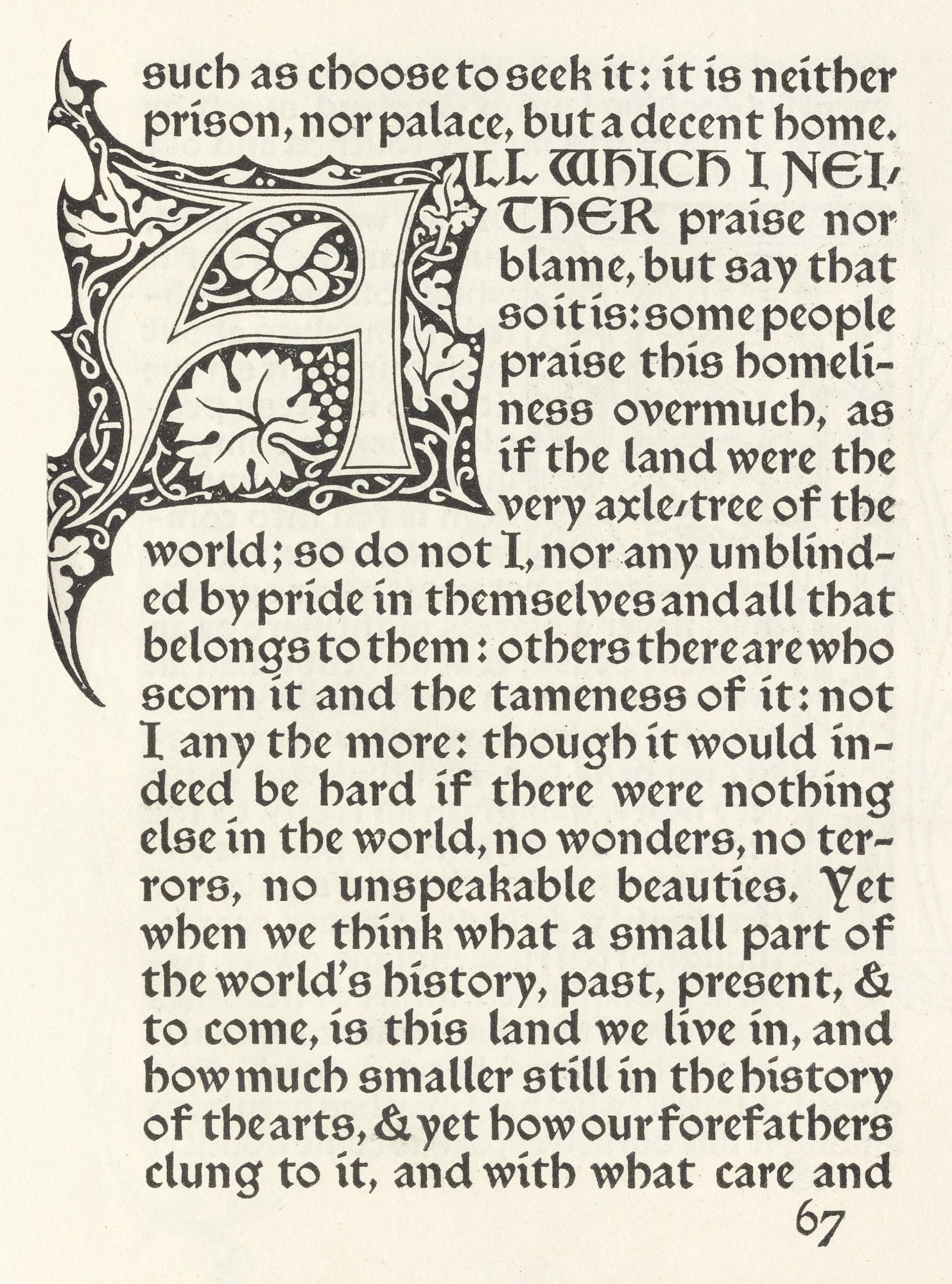
A black-letter great primer font, called the Troy Type, showing the influence of Shoeffer of Mainz, Zainer of Augburg, and Koburger of Nuremberg, although different from any of these, and first used in the Historyes of Troye, issued the same year (fig. 347).
347. Morris’s Troy Type: Kelmscott Press
From Morris’s Note on Kelmscott Press, 1898 (scan)
A black-letter, called Chaucer Type, differing from the Troy type only in size, being pica instead of great primer. This was used in some parts of the Historyes of Troye, but was first employed for an entire book in The Order of Chivalry, published in 1893 (fig. 348).
348. Morris’s Chaucer Type: Kelmscott Press
From Morris’s Note on Kelmscott Press, 1898 (scan)
Morris also designed a fourth type, based on the fonts used by Sweynheym and Pannartz in St. Augustine’s De Civitate Dei, but it was never cut. All Morris’s types were finally left to trustees, and their use is occasionally permitted for special books. The wood-blocks of illustrations to his editions have been placed in the British Museum.
As we look at Morris’s typographical achievements in perspective, they seem to be more those of a decorator applying his decorative talents to printing, than the work of a printer. His books are not always what he said books should be—easy to read, not dazzling to the eye, or troublesome to the reader by eccentricities of letter-form. He says he admired fifteenth century books because they were beautiful “by the force of the mere typography, even without the added ornament, with which many of them are so lavishly supplied.” But what is true of those books is only partly true about his own. He did make books which it was a pleasure to look at—as arrangements of type and fine pieces of printing—but he did not make books that it was a pleasure to read. If Morris admired Jenson’s fonts, it is hard to see why he did not copy their best points more closely. One has only to take a Kelmscott book and compare it with a good specimen of Jenson’s printing to see how far away one is from the other.
On the other hand, many people did not at all understand Morris’s greatness—for great he was. As he was both visionary and practical, his visions bothered the practical man, while his practicality somewhat disturbed the visionary. Mr. Clutton-Brock says,
Perhaps this kind of character is rare in our time only because craftsmen are rare: for the craftsman, if he is to excel, must be both industrious and a visionary, as Morris was. He must have honesty and common sense as well as invention; and his work develops and harmonizes both sets of qualities. We shall understand Morris best if we think of him as a craftsman,…as one who could never see raw material without wishing to make something out of it, and who at last saw society itself as a very raw material which set his fingers itching.2
I doubt Morris himself realized the enormous effect his work would have upon typography. Neither did he know that, while his types were not particularly good types, and his decorations were often unduly heavy, by this very overstatement in the colour of the type on its paper, in making characters which loudly called attention to earlier ones, and in designing somewhat over-splendid decorations (which, nevertheless, were in harmony with his type), he led the printer of his particular moment to see how imposing, and even magnificent, masses of strong type, closely set and well inked, combined with fine decorations, may be. And Morris taught a lesson in the unity of effect in books for which the modern printer is deeply in his debt—a unity now influencing volumes very far removed from those rather precious productions in which it was first exemplified. Nowadays, the old-fashioned method of using various fonts of type on a title-page, or an unnecessary number of sizes of type in a volume, has been given up—even in the commonest commercial work. And, too, Morris’s reforms have extended to illustrations, which are at present almost always by one hand, and not, as in old-fashioned illustrated books, by half a dozen different designers and drawn without any relation to the type-page. These newer and better fashions in book-making may be directly traced to sounder conceptions of what a book aught to be; and Morris—as with the weapon of the Viking heroes he loved so well—hammered this conception into the consciousness of gentlemen who will even use the Truth, if it appears to be an “asset”! For no man ever had the courage of his convictions more than Morris, or a heartier contempt for foolish opponents. When asked to hear the other side, he replied (like Garrison on the slavery question), “There is n’t any!” This very intolerance made Morris a tremendous force in typography; for, in spite of certain conscious overstatements, it was a sincere intolerance, and was aimed not at people, but as their shallow views of things. In the last year of his live, when in failing health, he attended a public meeting, and returning from it with a friend, showed signs of weakness. The friend, more amiable than discreet, suggested that this was the worst time of the year. “Not it ain’t,” said Morris, “it’s a very fine time of the year indeed. I’m getting old, that’s what it is.” In short, Morris hated humbug, though he sometimes mistook for humbug, opinions with which he disagreed—as ’t is human to do. He was a great printer because he was a great man who printed greatly, as he did much else.
When Morris began to work with types of his own in his own way, other people (most of whom knew rather less about it) began to design their own types and print with them too. Charles Ricketts of London, who was already interested in making fine books, instituted at the Vale Press. Mr. Ricketts’ books were actually printed at the Ballantyne Press, but the types were designed by him and arranged under his direction, and some very charming decorations for the Vale Press books were by his hand. In a paper issued in 1899, called A Defence of the Revival of Printing (which no one had seriously attacked), he contrasted the work of the great Venetian printers and of Wiliam Morris, with his own. Morris, as well known, hated the Renaissance,3 but Mr. Ricketts called it “a charmed time in the development of man.” Admitting himself “utterly won over and fascinated by the sunny pages of the Venetian printers,” he defined the pages of a fine Kelmscott book as “full of wine” and those of an Italian book as “full of light.” This being Mr. Ricketts’ point of view, it is surprising that his type appeared so much like Mr. Morris’s! For it is fair to suppose that the types which he designed looked precisely as he meant that they should. Apparently the Vale Press intended to deal not in “wine” but in “light,” and it must be terribly uncomfortable when you want light to get wine! But in spite of this rather affected Defence, the Vale books had style and distinction—being more classical in feeling than the Kelmscott books, and less so than those of the Doves Press.
The Bibliography (the last book issued by the Vale Press, in 1904) is printed in the Vale type, and at the end a page of Latin text is shown in the Vale Fount (fig. 349); another in the Avon Fount—a smaller roman type more successful, to my eye, than the Vale (fig. 350); and a third in the King’s Fount, which is less happy through the introduction in its lower-case of some capital letter-forms (fig. 351). The first Vale Press book was Milton’s Early Poems, issued in 1896. The Avon seems to have been first used in 1902. Unfortunately, most of the wood-blocks of the ornaments were lost in a fire at the Ballantyne Press; and the punches, matrices, and type were destroyed on the issue of the last of the Vale publications. The tendency in these books was certainly toward Italian models, but so much influenced were Messrs. Hacon and Ricketts—like every one else at that moment—by Morris’s work, that they did not get as far from it as they either thought or intended.
349. The Vale Fount: Vale Press
From Bibliography of the Vale Press, 1904 (scan)
350. The Avon Fount: Vale Press
From Bibliography of the Vale Press, 1904 (scan)
351. The King’s Fount: Vale Press
From Bibliography of the Vale Press, 1904 (scan)
Four years after Morris’s death in 1896, T. J. Cobden-Sanderson, with Emery Walker, Morris’s learned associate in the work of the Kelmscott Press and a man who (as every one but himself would admit) has been the moving spirit in most of the good and scholarly ventures in modern English typography, founded the Doves Press. It owes its odd name to an old riverside inn at Hammersmith on the Thames, familiar to rowing men, which in turn gave its name to a cottage which Mr. Cobden-Sanderson (who had already setup a bindery) used as a work-shop. The Doves Press was founded, says Mr. Cobden-Sanderson, in his Catalogue published in 1908,
to attack the problem of pure Typography, as presented by ordinary books in the various forms of prose, verse, and dialogue, and keeping always in view the principle…that “The whole duty of Typography is to communicate to the imagination, without loss by the way, the thought or image intended to be conveyed by the Author,” to attempt its solution rather by the arrangement of the whole book, as a whole, with due regard to its parts and the emphasis of its divisions, than by the splendour of ornament, intermittent, page after page.
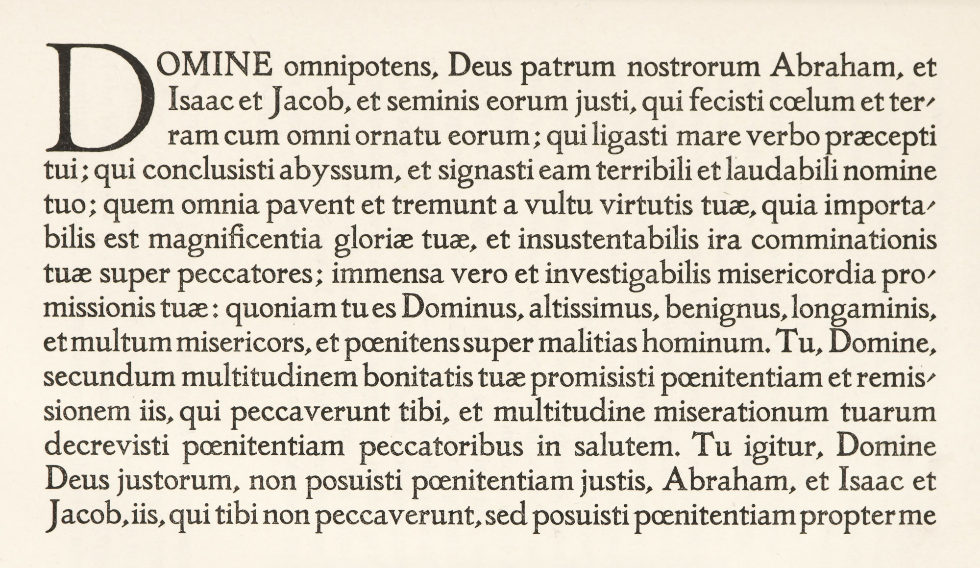
For this press, a single roman font was cut, and the first book produced in it (in 1891) was the Agricola of Tacitus. This Doves type discarded the extreme blackness of Morris’s fonts, and was more Italian in character than any which had hitherto appeared in England. It is based on Jenson’s roman font, “freed from the accidental irregularities due to imperfect cutting and casting,”—perhaps a fault rather than a virtue,—“and the serifs altered in some cases.” It is a very beautiful type, although its regularity, and the rigidity of the descender in the y,4 make it thin and spiky in appearance, and thus a little difficult to read; nor has it the agreeable “opulence” of the best Italian fonts (fig. 352). The Doves Press books have been, however, among the very best of those printed under the influence of the Morris revival. The Doves Bible (1903) is a masterpiece of restrained style; and although in one or two later volumes a commonplace italic is introduced into the fine roman text, the Doves books have delightful consistency and simplicity. All ornament is eschewed in them, but fine, free initials give a decorative note to the pages here and there. Mr. Walker withdrew from the undertaking in 1909. Mr. Cobden-Sanderson, with considerable elegiac ceremony, brought its work to a close a few years later. He died in 1922.
352. Doves Type: Doves Press
From a copy of Catalogue Raisonné of Doves Press Books in the Newberry Library, 1908
A private venture which has produced comparatively few books, but among them some of the greatest beauty, is the Ashendene Press, established in 1895, and directed by C. H. St. John Hornby of London. Its first books employed the Caslon and Fell characters—up to 1902. Later, an Italian semi-gothic character, closely resembling the Subiaco type of Sweynheym and Pannartz, was designed for this press by Mr. Walker and Mr. Cockerell (fig. 353). This type was first used in Dante’s Inferno, issued in 1902. The splendid Dante of 1909—the works entire, with illustrations by C. M. Gere; Le Morte Darthur (1913); and the beautiful Boccaccio (1913–20), with rubrication, and initials designed by Graily Hewitt, are among its greatest achievements. The Dante ranks with the Doves Bible and the Kelmscott Chaucer—described as the “three ideal books of modern typography,” from the three ideal presses of the Revival.5 In many books the initials are in colour, and sometimes in gold.
353. Type used by the Ashendene Press
From Horace’s Carminia Alcaica, 1903
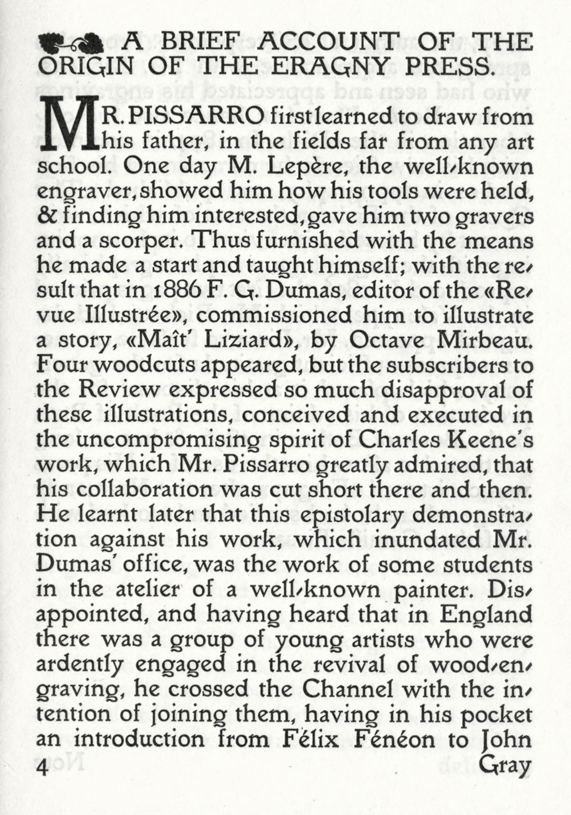
Lucien Pissarro’s Eragny Press (like the Kelmscott and the Doves Press, placed at Hammersmith) took its name from Eragny, the Normandy village where Mr. Pissarro was born, and where he studied and worked with his father. His earlier books were printed in the Vale type designed by Ricketts. The Brook type, in which an account of the Eragny Press was printed in 1903, is an agreeable roman letter designed by Pissarro on the lines of the Vale type, with a pleasant movement and admirable legibility (fig. 354). The superiority of its appearance to that of the Vale fonts is due partly to the paper generally used, which is most delightful. Wood-blocks printed in colours are a favourite feature of the Eragny Press books, and the text is their accompaniment. The designing, wood-engraving, and printing are all the work of Pissarro and his wife, though sometimes the illustrations are by other hands.
354. Book Type: Eragny Press
From Brief Account of Eragny Press, 1903 (scan)
The Essex House Press, although its first issues were brought out in the Caslon types, produced, in 1903, a font called the Prayer Book type—ambitious, but not entirely successful. It was designed by C. R. Ashbee, the director of this press. There are some curiously unfortunate characters in its lower-case letters—the g and f, e and n, for instance—which resemble pen-work, and not very pleasant pen-work at that. His Endeavour type, which in 1901 preceded the Prayer Book font—a letter smaller in size, but with many of the same eccentricities—is obscure and dazzling. And set in these types, it is not surprising that the Essex House books have no great merit. Its work in Caslon types was much the best—and was (as when combined with Edmund New’s delightful illustrations in Wren’s Parentalia) harmonious and simple. As for the Cambridge type of the University Press, Cambridge, it is an unattractive letter, which combines many of the defects of the fonts we owe to the modern revival. It is difficult to see why it was ever cut at all.
Herbert P. Horne designed three types of importance—the Montallegro, the Florence, and the Riccardi. These may be called sister types, for they show a certain progression of idea, and all attack the problem of what a fine type for commercial printing should be—elegant, yet readable from a present day standpoint.
The Montallegro type came first. This type was modelled, as were the others, on an early Florentine font, and was intended to be a good “reading type,” which should have rather more flexibility and grace than the fonts based on older Italian forms. It was first used in Condivi’s Life of Michelagnolo Buonarroti by the Merrymout Press, Boston, in 1905 1904, and since in the volumes of The Humanists’ Library (fig. 355a). This type was cut under Mr. Horne’s direction by E. P. Prince of London, an English craftsman of great ability and experience, and—within a narrow circle—of great reputation. The types of the Kelmscott, Doves, and other English private presses were from his hand, as well as the Florence and Medici fonts.
The Florence type of 1909 came next. It is somewhat smaller in face and simpler in form that the Montallegro; and is perhaps the most successful of the three. It was cut for Messrs Chatto & Windus of London (fig. 355b).
The last was the Riccardi type, also cut in 1909, based on fonts cut by Miscomini. It has been used in the “Riccardi Press” editions published by the Medici Society of London. A little monotonous in effect and gathering too much colour in printing unless carefully managed, it is so practical that it loses the elegance of the other two fonts (fig. 355c). A smaller size of the type (11-point) has been cut for the same series of volumes.6
355 (a). Herbert Horne’s Montallegro Type
From A Renaissance Courtesy-Book by Giovanni Della Casa, 1914 (scan)
355 (b). Herbert Horne’s Florence Type
From a copy of Memoriale di molte statue et picture sono nella inclyta cipta di Florentia per mano di sculptori et pictori excellenti moderni et antiqui in the Newberry Library (scan)
355 (c). Herbert Horne’s Riccardi Type
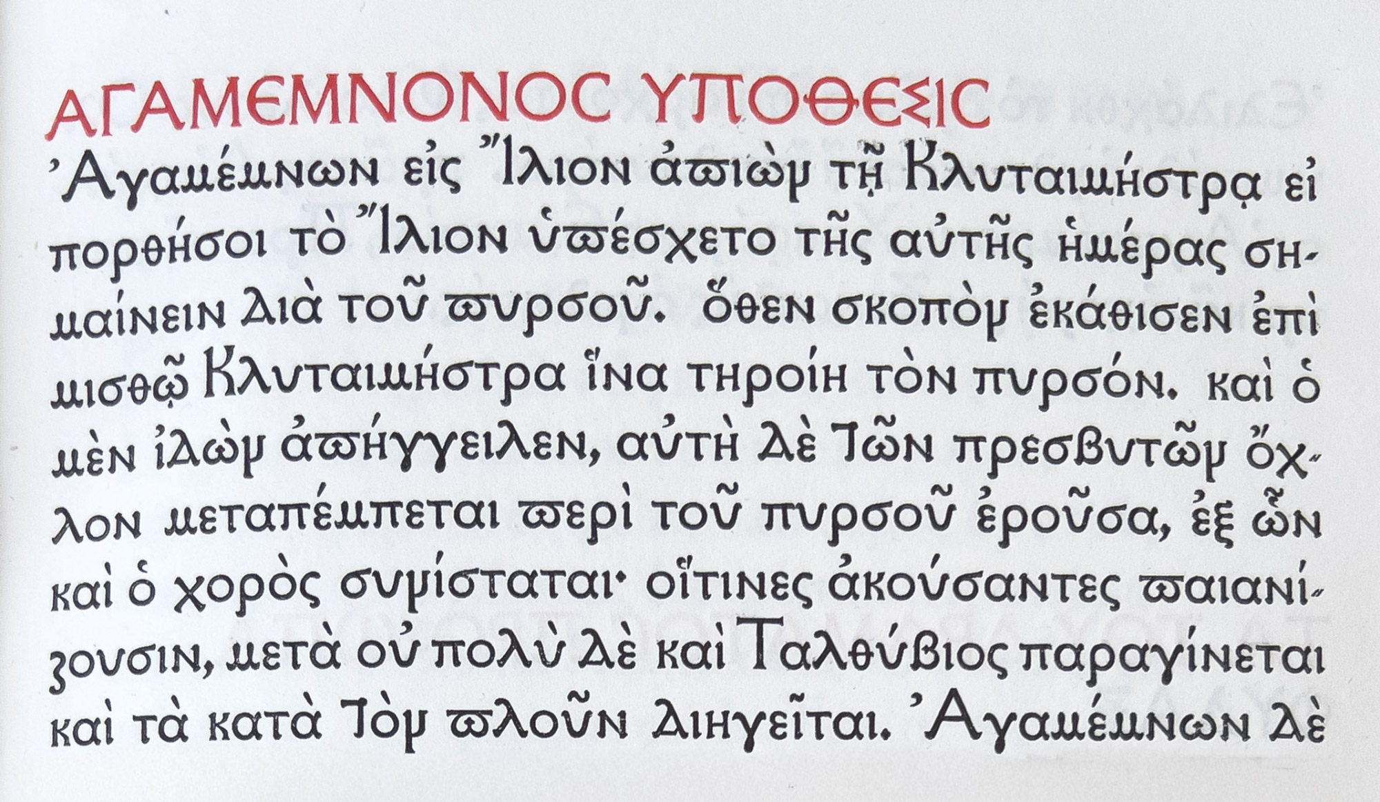
Among other interesting typographical experiments of the later nineteenth century was a Greek type designed by Selwyn Image. This was cut in two sizes, both used in a Greek Testament issued in 1895 (fig. 356). It was based on the letter-forms of Greek manuscripts, modified as little as might be by concessions to the familiar cursive Greek characters of Aldus, which have so unhappily influenced Greek typography. These types are not particularly successful. Robert Proctor’s very fine Greek type—the “Otter”—used in Oresteia of Aeschylus, printed in 1904, was another important essay in Greek type-forms (fig. 357). It was based on the noble Greek characters employed in the New Testament in the Complutensian Polyglot Bible, printed at Alcalá in 1514. For this type Proctor designed the capital letters—except the ∏.7 It is fully described by Proctor in a note at the end of the volume; which was produced at the Chiswick Press, for Emery Walker, S. C. Cockerell, and A. W. Pollard.8

356. Selwyn Image’s Greek Type
From New Testament in Greek, London, 1895 at the Newberry Library
357. Proctor’s “Otter” Greek Type
From Oresteia of Æschylus: Chiswick Press, London, 1904 at the Newberry Library
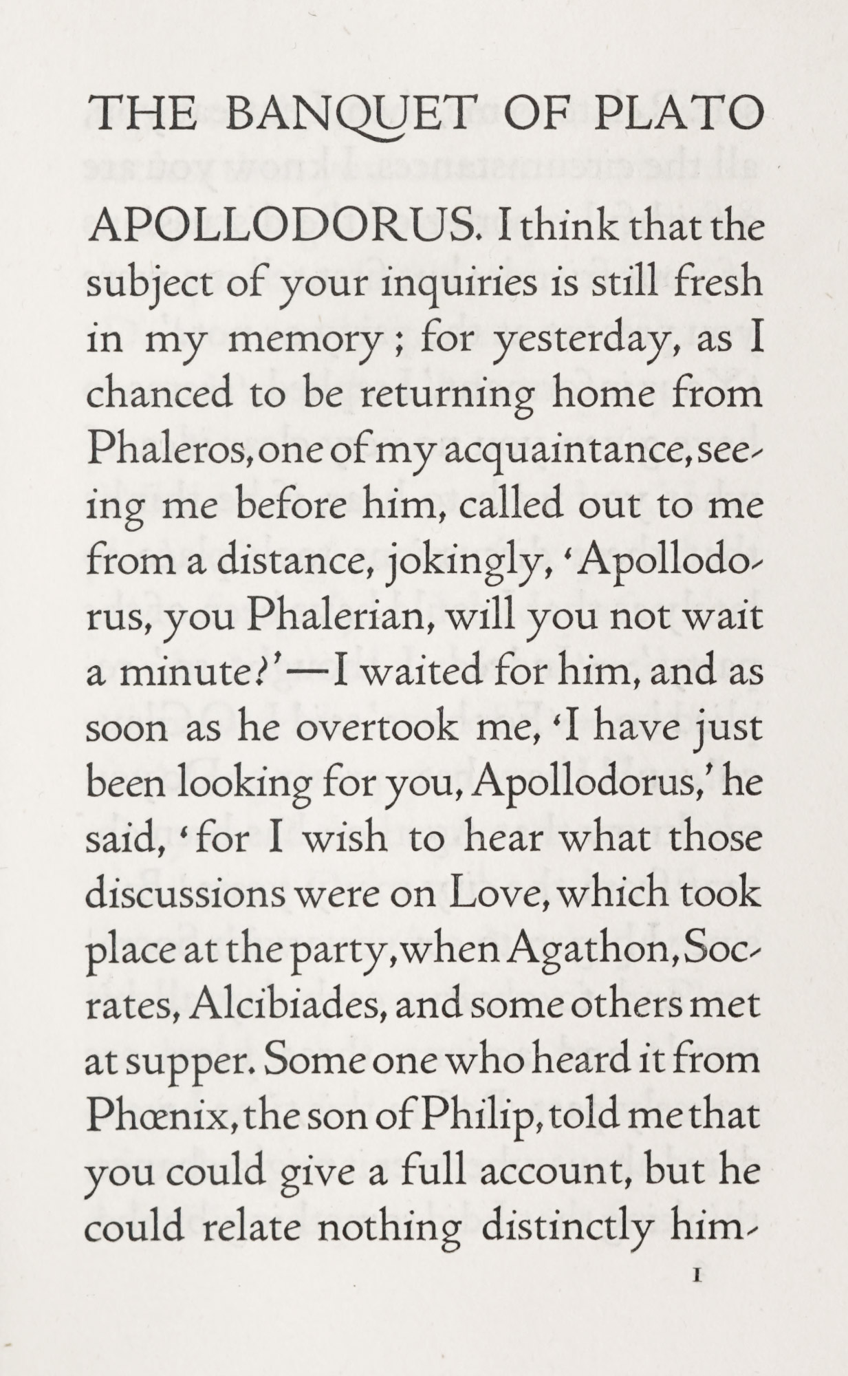
Next to English special types, similar American fonts are perhaps the most interesting. The fine Montaigne font designed by Bruce Rogers for the Riverside Press, Cambridge, was cut in 1901 for a monumental edition of the Essays of Montaigne, published in 1903. This, Mr. Rogers said,
was an attempt to meet a want that was felt for a large type-face that should avoid, on the one hand, the extreme blackness of the types which Morris’s work had made popular, and, on the other, the somewhat thin effect of the ordinary book-faces when used in the larger sizes. It was modelled as closely as possible upon photographs of a page of Jenson’s “Eusebius,” but partly by reason of the designing, and partly through the conventional training of the punch-cutter (who was nevertheless a most admirable and skilful workman), the desired quality was only partially attained. The upper-case letters were fairly successful from the first, and required little modification; but the majority of the lower-case characters were recut several times—and were allowed to pas when the expense and the delay became prohibitive. This type is on the 16-point body.
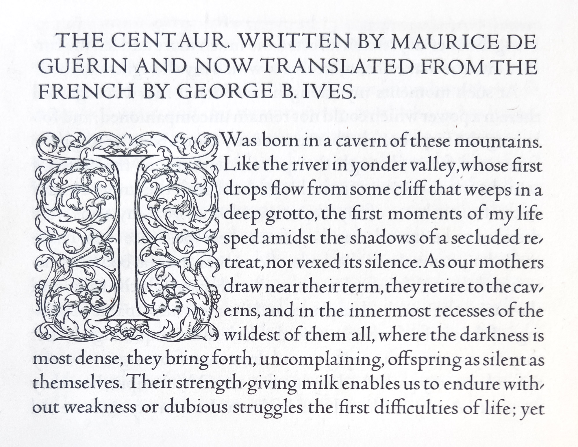
It has been delightfully used by Mr. Rogers in the Montaigne and in some other beautiful books designed by him (fig. 358). Since that time Mr. Rogers has designed another and, to my mind, finer font—the Centaur. The upper-case letters of this font have been, since 1914, in use for the work of the Metropolitan Museum of Art in New York, and in 1916 1915 the complete font in 14-point size was shown in Maurice de Guérin’s Centaur. Mr. Rogers describes the letter as a refinement on his Montaigne type, and though—as is his wont—he sees ways in which this font could be bettered, it appears to me one of the best roman fonts yet designed in America—and of its kind, the best anywhere (fig. 359).
358. Bruce Rogers’ Montaigne Type
From The Banquet of Plato: Riverside Press, Cambridge, 1908 (scan)
359. Bruce Rogers’ Centaur Type
From Maurice de Guérin’s Centaur, Montague Press, in the Newberry Library, 1915
The type known as Merrymount was designed for the Merrymount Press about 1895 by Bertram Grosvenor Goodhue, the architect, who designed the well-known Cheltenham fonts. He, too, based the Merrymount font on the Jenson letter, but instead of having the courage of our rather waving convictions and making a type as light as Jenson’s, both he and I were seduced by Morris’s unduly black types. So we merely modified the heaviness of the Morris fonts, although adopting an early form of roman letter. The result is that the type is took black unless used on large pages, as in The Altar Book (1896) and an edition of the Agricola of Tacitus (1904), both in folio (fig. 360).
360. Bertram Grosvenor Goodhue’s Merrymount Type
The Humanistic type was designed in Italy, and was based on a manuscript Virgil in the Laurentian Library at Florence. It was cut for the University Press, Cambridge, Massachusetts. Extremely ingenious in its clever rendering of a written letter, it is not, as type, easy to read, and the excessive length of the descenders compels a somewhat leaded composition. It is an interesting letter-form and shows research, but it was not a wholly fortunate experiment, because more calligraphic in effect than is comfortable to the eye. it just lacks the charm of fine writing, and yet is too like it to make a fine type; and so falls between two stools.
What value have these especially designed and privately cut fonts of type? And the answer is: In themselves, very little. They are only in the nature of interesting experiments; and there is scarcely one of them that is absolutely practical. If they have failed, the causes are not far to seek. One minor reason is that most of them were not cut by the man who designed them, and the type-cutter cannot put into them as he works the touches which the designer would instinctively give, if he were a type-cutter too. Another reason is, that when a book becomes decorative at the expense of its readability, it ceases to be a book and becomes a decoration, and has then no raison d’être as a book. Again: being unaccustomed nowadays to the purer letter-forms to which these types usually approximate, fonts of the kinds we have been considering are for continuous reading almost always consciously trying to the eye. Last and chiefly, such types do not readily lend themselves to the literary and typographical needs of to-day; and indeed there is a great deal of printing that must to-day be done and done well, to which these fonts are not suited at all. The convention which is properly required in their employ restricts their use. For in “artistic” types, as in so much else, art to the Anglo-Saxon is thought out, not felt—conscious rather than instinctive. So-called æsthetic printing,—be it English, American, or German,—taken en bloc, is, in the long run, a bit tiresome. It is so much in earnest that it charms too wisely rather than too well, and fails in the purpose for which all types and books exist.
These fonts have not, I think, directly accomplished all that the designers in their enthusiasm expected. But they are indirectly of value in making us think about earlier and purer type-forms. Students of typography must be familiar with them; and it is only the student who can place them in their proper perspective, and, because he does so, appraise them at their relative and therefore true value. And if type-founders who produce new fonts will continue to study as (as they are at last beginning to do) the originals which usually inspired these modern essays, they will recognize how such men have to hark back for good models to the older types, after all. So in spite of some faults and impractical qualities, such essays stimulate the eye and remind printers of standards set by the past. It is from this point of view that they are one of the important contributions of late years to the appreciation and practice of good book-making.
II. The Continent
Outside of England, Germany was most influenced by the English revival of twenty years ago; more “popularly” influenced than England itself. Up to the time of the War there was a sort of renaissance in German type-founding and printing. The German books of the early nineteenth century were not well printed,—neither type nor paper was good,—but they were simple in their poverty, “poor but honest.” From 1850 to 1880, the ordinary German book was very bad indeed, because it was at once so cheap and so pretentious. But a new “secession” movement began about 1890, not only in painting but in other fields pertaining to the arts. As far as printing was concerned, the first important note of this revival was struck by George’s Blätter für die Kunst; followed in 1894 by the appearance of the secessionist periodical Pan, which introduced Morris’s books to the German public, and the typographical style of which greatly influenced contemporary German printers. This was followed in 1899 by Insel [vols. 1, 2, 3], a similar review, from which grew the Insel-Verlac, Leipsic, whose entire product took on a fine and thoughtful typographical form. Some of its books were printed in modified German gothic types. Books printed in roman type show the influence of English models. Its ventures were effectively supported by the public. Private presses were also set up, and some fine special types were cut for them. Great attention was paid to good calligraphic lettering,9 for which instructors were brought over from England by the German Government. The volumes brought out by the Hyperion-Verlag and Century Press of Munich (Hans von Weber), by the Tempel-Verlag, the Insel-Verlag, and the Janus Press at Leipsic, the “special editions” of the Ernst Rowohlt (Drugulin-Drucke) of Leipsic, the books of Diederichs of Jena, and of Georg Müller of Munich show the best book-making of this modern German revival.
As to types besides the current German and roman types obtainable, fonts in both were specially designed and cut for the work of these houses—notably the modified gothic character designed by E. R. Weiss. This Weiss-Fraktur was highly considered in Germany, and was an attempt to solve the problem of a “book face” of German script which should be agreeable and readable. The types designed by König, Hölzl, and Ehmcke, are characteristic of the merits and defects of this school of type-design.
Of the results of all this effort, it is less easy to speak. While the cheap, popular books were admirable, the more ambitious German volumes were mannered and intentional. Like most modern German work in other forms of artistic endeavour, they produce a certain sensation, but not that of pleasure; they astonish rather than charm. To one who possessed a modern “secession” house, with a classic-hygienic-penal looking library, I suppose such books would be the only kind to have.10 For these determined volumes, as we view them in perspective, seem to have run true to form and to have been characteristic of the life about them—but alas, that is another story!
For us, German book-making closed memorably with the beautiful exhibition held in Leipsic in the summer of 1914.
No doubt a certain northern quality in Morris’s work commended itself more to Teutonic than to Latin taste. So in Italy the “revival” showed itself chiefly in a return to old forms of roman letter. A type closely modelled on Morris’s Golden type was used by the Fratelli Treves of Milan in an edition of D’Annunzio’s Francesa da Rimini issued in 1902. Since that time there have been many similar books, but the tendency has been toward lighter types and free and sometimes startling unconventionality in decoration. The Milanese magazine Risorgimento Grafico employs a roman type of free design based on a font of Ratdolt’s. It was brought out in 1911 by the Società Augusta of Turin. While agreeable to the eye, there is too much space between individual letters to make it wholly successful (fig. 361).
361. “Inkunabula” type, as used in Risorgimento Grafico: Bertieri and Vanzetti, Milan, 1921
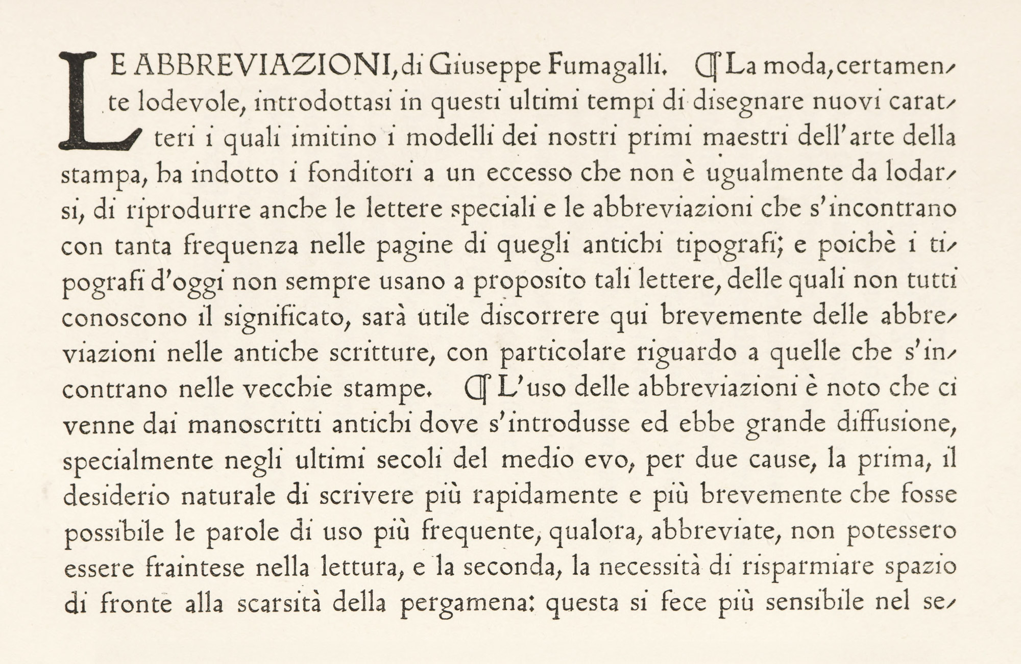
In Holland, there is evidence of the spread of the movement toward earlier letter-forms in the Distel type designed for J. F. van Royen’s Zilverdistel Press at The Hague, by Lucien Pissarro. This is intended to imitate old Netherlands writing (fig. 362). The narrowing of paragraph marks is a clever way of subduing an obstreperous character in such fonts. The Zilver type (fig. 363), on the order of the Doves Press font, was cut for the Zilverdistel, and the historic Enschedé types have been employed for some of its work. Interest in typography is also evidenced by the existence of the Typografische Bibliotheek at Amsterdam.
In Belgium, the Musée du Livre at Brussels is a somewhat similar establishment. The latter lately issued Sept Études publiées à l’occasion du Quatrième Centenaire de Christophe Plantin, printed from old types—more curious than beautiful—in the Musée Plantin at Antwerp.
362. Distel Type: Zilverdistel Press, The Hague, 1918
From a copy of Een Boecxken Gemaket van Suster Bertken die LVII Jaren Besloten Heeft Gheseten tot Utrecht in dye Buerkercke at the Newberry Library
363. Zilver Type: Zilverdistel Press, The Hague, 1915
From a copy of Prospectus De Zilverdistel at the Newberry Library
Although in France the Morris revival never had much vogue, it is interesting to recall that a year or two before the founding of the Kelmscott Press some delightful gothic types—a clever rendering of the best form of lettre batarde—were cut by E. Mouchon for a reproduction of Simon Vostre’s Heures à l’Usage de Rome of 1498, of which a page is reproduced (fig. 364). The book was printed by O. Jouaust and published in 1890 by L. Gauthier, who was, by the way, élève and successor to Curmor of Paul et Virginie celebrity. Save for this and a few similar examples of reproduction of old types, the old-fashioned formulæ for fine book-making still survive.
364. French Lettre Batarde, Paris, 1890
From reproduction of Simon Vostre’s Heures à l’Usage de Rome
Entirely outside any influence of Mr. Morris, and for that reason scarcely within the limits of this chapter, some recent developments in French type-founding may be mentioned here. Of modern French foundries, that of G. Peignot & Fils, Paris, has contributed most to interesting and unusual typography. Founded by Gustave Peignot (who died in 1899), in the hands of his second son, Georges Peignot, it issued several series of type which strike a new note in French printing. The first—which appeared in 1897—was the Grasset type, followed in 1902 by the Auriol type, designed by Georges Auriol. Both of these had considerable vogue in France, but were too distinctly Gallic in flavour to commend themselves to the public of other countries. A contribution of more general application is the series called Les Cochins, based on eighteenth century engraved and typographic material, but by no means slavishly following it. About 1914, a brochure was issued describing and showing these fonts, entitled Les Cochins, Caractères & Vignettes renouvelés du XVIIIe Siècle. Of the type-designs, the first Le Cochin, is based on engraved characters, especially in its delightful italic (fig. 365), and may be used for entire books; Le Nicolas-Cochin, much less good, is an exaggerated form of letter with extremely tall ascenders, more obviously based on engraving, which it recalls in its sharpness of outline. It is effective for title-pages or ephemeral printing, though too eccentric to have lasting value. Both types are admirably adapted for what are called in France travaux de ville. They have been used with charming effect in the Gazette du Bon Ton, in Christmas numbers of L’Illustration, and in similar ephemeral publications. To them were added as equipment Le Fournier-le-jeune, a series of ornamental italic capitals à la Fournier, which he in turn had adapted from engraved originals; and Le Moreau-le-jeune, an imitation of engraved open lettering—wrong in theory, but so well done as to be harming. The Vignettes Fournier supplied to accompany these types are more or less faithful renderings of ornaments shown in Fournier’s Manuel. The other ornaments by Pierre Roy and by Marty are not good.
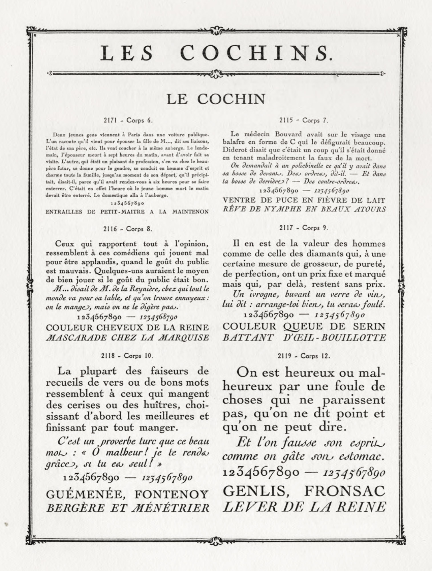
365. Le Cochin: G. Peignot & Files, Paris, 1914
From Immaterielles (archived scan, p. 43)
The Giraldon type cast by De Berny is an essay in aesthetic characters which is scarcely successful, though used by Jules Meynial, who has employed the Cochin types with such exquisite results.
But to my mind, the healthiest sign in modern French printing has been the popularity of a revived used of Garamond’s and Grandjean’s types and other ancient fonts in editions printed by the Imprimerie Nationale. The monumental Histoire de l’Imprimeri en France au XVe et au XVIe siècle, by Anatole Claudin,11 begun in 1900, is the classical example of the modern use of such types. The prefatory matter is composed in Garamond’s characters, and the text of the work in Grandjean’s romain du roi, from fonts newly cast for this purpose. It is probably the finest book on printing that has ever been published.
- A Note by William Morris on his Aims in Founding the Kelmscott Press. Together with a Short Description of the Press by S. C. Cockerell, & an Annotated List of the Books Printed Thereat. Hammersmith, London,
19081898. - William Morris: His Work and Influence, by A. Clutton-Brock, London, 1914, p. 208.
-
Mr. Mackail says, in his life of Morris:
With the noble Italian art of the earlier Renaissance he had but little sympathy: for that of the later Renaissance and the academic traditions he had nothing but unmixed detestation. Some time in these years [c. 1873], his old fellow-pupil, Mr. Bliss, then engaged on researches among the arches of the Vatican, met him in the Bodleian Library at Oxford, and pressed him to come with him to Rome. His reply was too characteristic to be forgotten. “Do you suppose,” he said, “that I should see anything in Rome that I can’t see in Whitechapel?” Even the earlier and, to his mind, the far more interesting and beautiful work of the twelfth and thirteenth centuries in Italy did not appeal to hi in the same way as the contemporary art of England or Northern France.
Mackail adds;
He much preferred Iceland to Italy.
- A test of the excellence of any type is this—that whatever the combination of letters, no individual character stands out from the rest—a severe requirement to which all permanently successful types conform.
- See Peddie’s Cantor Lectures on Printing. London, 1915.
-
There are other modern private fonts on which I have not touched. For facsimiles of some of them, see Steele’s Revival of Printing, London, 1912, and The Art of the Book (a Special Number of The Studio), London, 1914. Also The Saturday Review, London, November, 1919.
- Proctor says that with this exception the original font had no capital letters; but according to other authorities it actually had nine. See J. P. R. Lyell’s Cardinal Ximenes, London, 1917, p. 47.
-
It would be an injustice to think that all the best energies of modern English printing (which for books I think at present the “soundest” in the world) were exhausted in the work of special presses or the use of specially designed types. All along there has been a steady flow of admirably printed English books of a more normal kind, printed from old style, modern face, and other fonts commonly obtainable. In these types the best English printers have consistently produced a certain class of memoir and many books on architecture, painting, and the fine arts, which are delightful—agreeable to look at, to handle, and to read. The Oxford University Press, the Chiswick Press, the Arden Press, the houses of Constable and Ballantyne have printed many such books, and there are other less famous presses which almost, and sometimes quite, qual them. Work like this is what the student must look to for some of the best and most characteristic English typography of to-day. Though American ephemeral printing has generally been superior to English, of late some English presses have turned out such work most successfully. The circulars, placards, etc., of the Pelican, Cloister, and Curwen presses are most agreeable in feeling, and their striking effects have been arrived at with commendable simplicity of attack and economy of means.
- For Austrian work in calligraphy see Rudolph von Larisch’s Unterricht in Ornamentaler Schrift. K. K. Hof- und Staats druckerei, Vienna, 1913—an important and interesting study. In this connection a roman type designed by C. O. Czeschka—the Czescha Antiqua—should be looked at.
-
For illustrative material I refer the reader to the Times Printing Number, London, 1912 (Fine Printing in Germany, pp. 58 et seq.), and The Art of the Book, Special Number of The Studio, 1914 (The Art of the Book in Germany, by L. Deubner, with specimens of types described).
-
Monsieur Claudin had his Paris book-shop in a series of somewhat forbidding rooes on the rive gauche, not far from the Institute, and there I once or twice met him. Like most French bibliophiles, he was full of enthusiasm for his favourite subject, took rare books most seriously, and—like most Frenchmen—did not much enjoy travel. A friend of mine, a great collector of fine books, met Claudin in Paris many years ago, and Claudin told him that he was making some investigations about the Horæ of Vérard and others. “Monsieur,” said my friend, “I have in America several of Vérard’s Books of Hours which are entirely at your disposal.” Monsieur Claudin thanked him politely, and the conversation turned to other things. The next summer, my friend, being again in France, paid another visit to Claudin. “I have so often thought of those books you spoke about,” said Claudin, “and wished I could see two or three of them.” “Oh,” was the reply, “had I known that, I could have brought them over with me.” Monseiur Claudin looked very serious. “Sir,” he said, “is it not enough to entrust your own life to the terrible sea, without also offering to imperil the existence of les vrais chefs d’œuvre?”
A much less famous bookseller on the rive droit, to whom I once applied for a book, shook his head, saying wearily, “No, I have not that work. It can only be obtained across the water.” After some questioning I discovered that by “the water” he meant the Siene!