Chapter I
The Invention of Printing: The Cutting and Casting of Types in Relation to their Design
The invention of movable metal types in Europe, as we all known, has been generally attributed to Gutenberg—just as the invention of the steam-engine has popularly been considered that of Watt. But Watt did not invent the steam-engine; he perfected it, however, so highly as to make it almost a new invention. This is, I conceive, what Gutenberg did for printing; he was the first man to put typography on a practical and scientific basis. Before his day, printing from movable types was practised by the Dutch, and there is, perhaps, reason to believe that a man named Coster was the inventor of this process. Whether or no Coster was the first man to employ movable types, there certainly existed in Holland before Gutenberg’s time, a series of books of primitive workmanship printed from type, and the roughness of the typography of some later printers—like Caxton—is considered one proof that such a group of men were under the influence of this Dutch school of printing. It has always puzzled the casual student of incunabula to account for the perfection of the books printed by Gutenberg; but if it be true that Gutenberg did not originate printing from movable types, but simply greatly improved the whole practice of making them, then we can see that the early and crude typography of Holland was merely the sub-structure on which the Gutenberg so splendidly built. As William Blades said of the Coster-Gutenberg controversy,
The evidence on each side may be enlarged in the course of years, but so far as it goes at present it is strongly in favour of a first rude invention of movable types in Holland by some one who may have been Coster. The claim of Gutenberg upon the rest of posterity rests on his great improvements—so great as to entitle him in a sense to be deemed the inventor.1 … Just as astronomers have been unable to explain certain aberrations of the planets without surmising a missing link in the chain of their knowledge, so is it with early typography. That such finished works as the first editions of the Bible and Psalter could be the legitimate predecessors of the Costeriana, the Bruges, the Westminster press, and others, I cannot reconcile with the internal evidence of their workmanship. But admit the existence of an earlier and much ruder school of typography, and all is plain and harmonious. Side by side, the weakest gave place and the fittest survived, and soon, as in all survivals, the existence of the former became traditionary.”2
Endless discussions have arisen on this question, which as a whole literature to itself. Roughly speaking, the situation to-day stands much as it did in Blades’s time. Later discoveries of early printing have been made, some new historical facts have come to light; but these have not much changed the theory that although there was an earlier Dutch school of unskilful printing, it was in Germany that printing as we know it to-day was first practised.3 “We may take our stand,” says Mr. Pollard, “on the distinction drawn by the Cologne Chronicle of 1499 between the Invention made at Mainz and the Prefigurement (Vürbyldung) which he places elsewhere, or if it be preferred, on that subtler discrimination lurking in the word ‘adinuentones’ applied to the achievements of Mainz, with its possible suggestion of earlier ‘inuentiones’ of another origin. Invention or Adinvention, whether that which was not first discovered at Mainz had been discovered at Strassburg or in Holland, it was in Germany and at Mainz that the Printed Book as the ambitious rival of the Manuscript first came into being.”4
Gutenberg’s invention consisted, apparently, in making brass moulds and matrices by which type could be accurately cast in large quantities. As Mr. De Vinne reminds us, relief printing, paper, wood-engraving, printed books, even the printing-press, and perhaps the idea of movable types were not attributable to Gutenberg. These had all been thought of already. Gutenberg availed himself of the different experiments of his predecessors and made something which, however it has been improved upon in detail to-day, has not been improved upon in theory.
The first type-cutters and type-founders were merely somewhat servile imitators of the manuscript letter-forms to which they were already accustomed. We can understand little about the design of our printing types, if we are not familiar with the characters in the black-letter and Humanistic manuscripts which just preceded, or were contemporary with, the invention of printing.5 There appears to have been no thought in the minds of early printers other than to reproduce manuscripts quickly and inexpensively; and although many early printed books were very beautiful, both in type and arrangement, because modelled on fine manuscripts, I doubt if fifteenth century printers so consciously intended to make their books beautiful as is commonly supposed. What an early printer was intent upon doing was to produce a printed book which resembled a manuscript as closely as possible; and that such a man failed to recognize any great divergence in theory between a book in manuscript and printed volume is shown by his obvious endeavour to follow in type the written letter of the manuscript.6
Because of this aim, the first printers made certain errors in designing and cutting types, which have profoundly influenced typography, and not always with happy results. Intent upon imitating manuscripts, they felt obliged to reproduce the kind of letters that a reader had been accustomed to in volumes written by hand; and thus they had neither time, opportunity, nor desire to consider what types were, or to realize that they could never successfully reproduce in metal all the forms derived from the pen. In other words, to the first type-cutters printing was merely an evolution, and did not appear a new invention in the sense that it obliged them to decide what forms of letter were best adapted to the new medium they had to employ. If these craftsmen had but thought of the whole subject from a fresh standpoint, some of the calligraphic black-letter types would never have existed, and italic and Greek types, so far as imitative of handwriting, would have been corrected. Instead of a long series of endeavours which have not yet entirely adjusted type-forms to the medium in which the type-cutter has to work, we should then have had characters designed with closer relation to the material from which they were fashioned.
Ever since the sixteenth century, elaborate diagrams have been published to show how letters should be drawn, we shall learn from some accounts given of men who suggested new methods of designing them. Generally a diagram of minute squares was first made, and on this the design and dimension of each letter were determined. Jaugeon, who was appointed by the Académeie des Sciences of Paris in the last years of the seventeenth century to supply a scheme or series of directions by which type should be cut, began by stating that “the eye is the sovereign ruler of taste.” The rules which he set forth were extremely complicated—every Roman capital was to be designed on a framework of 2304 little squares. Grandjean, the first type-cutter who attempted to follow them, is said to have observed sarcastically, that he should certainly accept Jaugeon’s dictum that “the eye is the sovereign ruler of taste,” and accepting this, should throw the rest of his rules overboard!
In casing type the two schools of typography spoken of on an earlier page—one experimental and crude, the other sure and perfected—had probably different methods.7 One cast letters in moulds of clay or sand; the other understood something of the punch, the matrix, and the adjustable mould, which they slowly perfected into much the kind of appliance we have now. The roughness of either form of type-casting no doubt accounts for the variation in appearance of the same letter in old books. The result of an accidental impression of a piece of type in a book printed in the last quarter of the fifteenth century is shown in the illustration (fig. 1). This makes it clear that in appearance the earliest types much resembled those of to-day, though their heights were very irregular. While the quantity of type that was needed by any one printer was probably small, the different characters in a font were very many on account of the contractions, abbreviations, etc., then considered necessary.
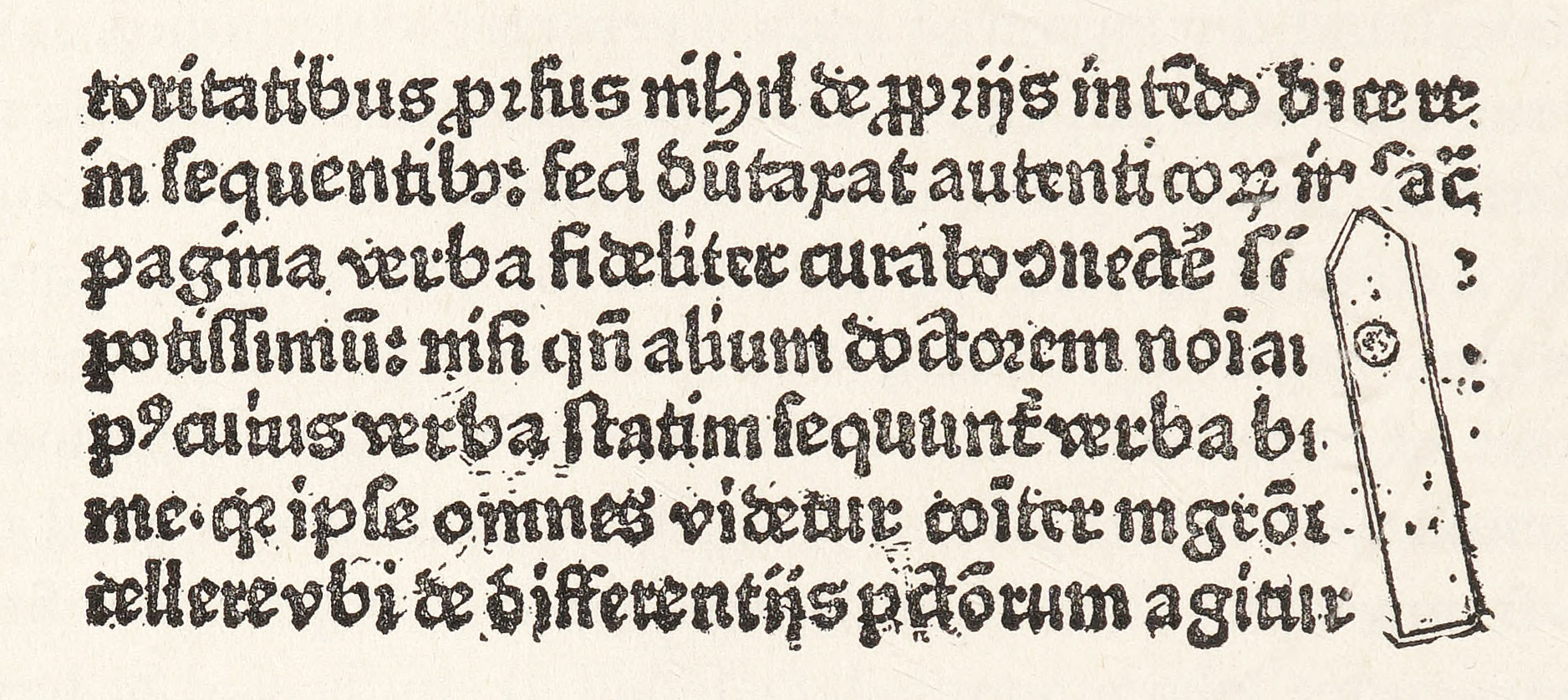
1. Impression of a piece of Fifteenth Century Type
Found on a page of Nider’s Lèpre Morale, printed at Colone about 1476
From Madden’s Lettres d’ Bibliographe
All early types were cast by hand, and even down to the first part of the last century hand type-moulds were in use. Into such a mould hot metal was poured, and the type-caster then gave it a quick shake, which forced the metal into all the crannies of the matrix. By practice it became apparent that some letters involved a different sort of motion, and were more difficult to make than others, so I suppose that the variations just spoken of between different impressions of the same letter in early fonts may also be attributable to the varying skill of the individual workman. In an account of an English foundry, where the use of ancient hand-moulds survived well into the last century, mention is made of the uncouth movements and swaying figures of a group of gray-haired type-caster, who appeared as if demented to any one who did not know what they were about. Hand-casting was a slow an tiresome process, and according to Moxon8 only about four thousand such letters could ordinarily be cast in one day.
In all probability lead, tin, and pewter were among the materials used for fifteenth century types. Where references are made in old books to the use of copper and bronze in type-casting, they may apply to the punches or matrices rather than to the types themselves. Steel, brass, copper, tin, lead, and iron wire were used as early as 1480 in Italy, as is distinctly stated in the “Cost Book” of the Ripoli Press9 at Florence—which throws a good deal of light on the conditions of the fifteenth century printing-houses. Reed thinks that steel and brass were used for the mould, steel for the punches, copper for the matrices, lead and tin for the type, and iron wire for the mould or perhaps for stringing type together. An alloy was introduced later by adding tin and iron to the lead. In the fifteenth century the discovery of the properties of antimony gave the types their required hardness. The chief ingredients of type from the earliest times have been lead and tin, and these have been hardened either with iron and bismuth, or antimony.
In cutting type by hand to-day, the first thing a type-cutter does in following his design, or that supplied him, is to make a counter-punch. This consists in cutting out the space inside of certain letters, such as O, or the upper part of an A. This counter-punch is sunk into the end of a bar of steel, and when this is done the inside of the model letter is finished. The outlines of the model letter are then cut until it assumes its proper shape, numerous “smoke-proofs” meanwhile having been examined to see that the letter follows the form which the designer intends. After the punch is completed, the steel is hardened, and it is then punched into a bar of cold rolled copper, producing what is called a “strike.” In this state it is really an unfinished matrix. It is then “fitted” so that it will cast in the proper position on its body. When this matrix is square on its sides, holds its letter in the same position as do the matrices of other letters of the new alphabet, and has the same depth throughout from the surface of the bar, it is finished. This is roughly speaking, the process by which hand-cut punches and their matrices are produced.
But all type is not cut by hand to-day; in fact, quite the contrary. The theory of the pantograph, understood as early as the seventeenth century, was adapted (in the second quarter of the nineteenth century) to producing wood type, which had hitherto been cut by hand. This invention required but one model alphabet, and from it an unskilled workman could cut on wood, on which nothing had been drawn, various sizes of letters. The principle was very naturally applied later to cutting metal punches. Benton of Milwaukee invented such a punch-cutting machine, thereby at once enormously simplifying the cutting of punches, as well as cheapening their production. At first sight it would appear that this was wholly admirable invention; and it would be, if it did not tend to mechanize the design of types. But a design for a type alphabet that may be entirely successful for the size for which it is drawn, cannot be successfully applied to all other sizes of the same series. Each size is a law unto itself, and is often bettered by modifications in the original design made by the feeling and taste of the designer. To a trained eye, looking over impressions of a series of modern machine-cut types, it is often possible to tell which was the size originally designed because it stands out as the most harmonious and successful. In this particular size the designer’s eye had most modified his rules, and in all others the necessary modifications proper to the varying sizes had not been so carefully made. An authority tells us that (ideally) a new model design should be made for every two sizes of type. It was because the punches for the older types were cut for each size by their designers with the Jaugeon’s maxim consciously or unconsciously in mind, that most old fonts were so pleasing in effect. Conversely, one reason why modern types are less mellow and agreeable to the eye is because, when cut from a model alphabet by machine, there is too much rule and too little taste. “Even with strict instructions and with best intentions,” says Mr. Bruce Rogers,10 “it is difficult for the habitual user of a very accurate machine not to insensibly smooth out what he has always been taught to consider ‘imperfections’ and to make as mechanically perfect a letter as is possible… I have come to believe that perhaps only hand-cut punches, cut by the designer of the type, can preserve the real feeling of the design;” and he adds that the design should be drawn as nearly as possible to the exact size of the desired font.
In modern practice this is exactly what is not done by machine. Sizes from 6-point to 120-point, or as large as desired, are often cut from the same model letter; although contractions and expansions in either dimension of letter design can be made when necessary to correct certain optical illusions.11 I have sometimes questioned whether a machine can be so managed that it will ever produce those fine and almost imperceptible qualities of design given to it by the hand of a clever type-cutter—which mean so much to the appearance of type in the mass, and which vary in nature and degree in different sizes of the same series of characters. In point of fact, the first types produced by punch-cutting machines did seem to show a certain rigidity from the point of view of design. That there has been an improvement of late in type cut by machine is undeniable, and yet there has been practically no change in its mechanism. This improvement, I learn, has come to pass through a more sympathetic and subtle manipulation of the machine itself, and by modifications of rules by the eye of the workman who operates it. And so, after all, it seems to be the eye and the hand that determine the excellence of the product of a machine, and it is only when a machine is as flexible as the hand that it is as good as the hand. In the final analysis we come back to the eye as the great factor for the successful operation of a punch-cutting machine. For Jaugeon was right.
Nowadays most type is cast by machine. The difference, however, between early hand-type-casting and modern mechanical type-casting is not so great as one would suppose, and is nothing more than the substitution of the movement of a machine for manual dexterity. The modern type-casting machine has the advantage of infinitely greater production; and much more care is taken in examining the types produced and discarding those with imperfections, its product is more uniform and perfect in earlier fonts cast by hand. The modern type-casting machine is not, however, employed for everything. Hand-moulds are still used for casting small and special sorts of characters. Some details in the production of kerned letters are more successfully managed by hand than by machine. Many script types cannot be cast by machine at all.
The ingredients of modern printing types are, roughly speaking, lead, tin, antimony, and sometimes a little copper; these vary in proportion, according to the size of the type being cast. the end aimed at in type-metal is to obtain a material which shall be dense, ductile, and fusible at a low temperature. Lead is too soft to be used alone; antimony is therefore introduced to give it hardness; as are copper and tin to give toughness, the last having the property of cementing metals which fuse at different temperatures. This amalgam of metal does not rust, has the advantage of shrinking less than any other alloy, and fills the mould and matrix very perfectly.
As to the wearing qualities of type, small faces of type, with lines are more delicate and closer together, wear less well than large faces, and the counters in small faces, being shallow, fill more easily. Types also wear out because of careless handling, and by constant setting, distributing, correcting, and planing down; and therefore much depends upon good workmen who handle their types carefully and, above all, keep them clean. Certain printing papers cause types to wear much more than others. Such are many of the interesting hand-made papers; especially rough-surfaced papers when printed dry. So it is not alone important that types should be made of proper ingredients and should be made well, but they should be carefully handled and thoughtfully employed.12
- Blades’s Books in Chains, London, 1892, p. 200.
- Books in Chains, pp. 157, 158.
- The paper by Heinrich Wallau, Gutenberg Techniker und Künstler, published by the Gutenberg-Gesellschaft (Vierter Jahres-Bericht, Mainz, 1905), may be consulted for study of Gutenberg types. Seymour de Ricci’s valuable Catalogue Raisonné des Premières Impressions de Mayence (1445–67), published by the same society in 1911, though primarily bibliographical, is useful to the student of types of this class.
- See Introduction to Catalogue of Books printed in the XVth Century now in the British Museum, London, 1913, Part iii, p. ix.
- This is developed in the chapter on the Latin Alphabet.
- “Almost invariably the style of the early printed book follows the contemporary ms. style of its place of production. In consequence we find strongly marked national styles, though these were soon modified by the international trade in books and especially by the influence of new classical texts distributed from Italy. In some places and in some other classes of books, local conservatism was stronger.” Syllabus of lecture on Early Printed Books, by G. H. Palmer. London, 1913.
- Reed’s Old English Letter Foundries, p. 29.
-
Joseph Moxon, the first English writer on type-founding, was born in Yorkshire, in 1627. He was a maker of mathematical instruments and dabbled in all kinds of mechanics. He himself said that he had never been properly taught the art of type-founding, but had taken it up solely through his interest in the subject—as was the case with many celebrated type-cutters before and since. He issued a specimen sheet as early as 1699, showing characters which were not particularly good. In his book on the rules for the formation of letters (“useful for writing masters, painters, carvers, machinists, and for those who were lovers of curiosity,” and dedicated to Sir Christopher Wren), he advises, as did Tory before him and Jaugeon after him, that letters should be first designed on a framework of minute squares. In 1667 he began a series of fourteen treatises in monthly numbers on the trades of the smith, jointer, carpenter, etc., and a second series, which comprised twenty-four numbers, was devoted entirely to printing, letter-cutting, and type-casting. This second volume appeared in 1683 and was inscribed to Dr. Fell (among others), benefactor of the Oxford University Press. Moxon’s Mechanick exercises, or the Doctrine of Handy-Works is the first English book on type-founding, and thus a classic in literature of printing—though a very dull book.
- The Ripoli Press was in a Dominican monastery, originally founded at Piano de Ripoli and later moved into the neighbouring city of Florence. This press is interesting to the student of typography because it furnishes an early instance of the employment of women in composing-rooms; but specially because its treasurer kept very careful accounts of its expenses, which give valuable information about the materials employed in the work of the press, the cost of production, etc. The press had several faces of roman and black-letter type cut for it, as well as ornaments, initials, etc. It was most miscellaneous in its output. (See De Vinne’s Notable Printers of Italy in the Fifteenth Century, p. 127, with facing plate.) Portions of the Ripoli “Cost Book” were edited in 1781 by P. V. Fineschi, under the title Notizie Storche sopra la Stamperia di Ripoli, and a monograph by M. P. Bologna, entitled La Stamperia Fiorentina del Monastero di S. Jacopo di Ripoli e le sue edizioni, was published in the Giornale storico della Letter. Ital., Vols. XX, XXI.
- In a letter to the author.
- There are many optical illusions which must be guarded against in cutting an alphabet, the secrets of correcting which are still among the “mysteries and art of printing.” If you have ever seen an inscription cut on stone in capital letters, where the v’s or w’s did not descend below the base of the other capitals, you will have experienced an illusion of this sort. In very large sizes of type it is necessary to make the o’s descend below other letters as much as a sixteenth of an inch, to produce the effect of an even line. Round lower-case letters must extend above square lower-case letters as well as below, to appear to align.
-
For detailed accounts of the processes of ancient type-cutting and type-casting, see Reed’s History of Old English Letter Foundries, Introductory Chapter, and Moxon’s Mechanick Exercises. For modern type-cutting and type-casting, see De Vinne’s Plain Printing Types, and Legros and Grant’s Typographical Printing-Surfaces. The last is especially valuable for its diagrams.