Chapter XIV
French Types: 1500–1800
I. Examples of French Printing
Although the first press set up in Paris in 1470 employed roman types, French printing for some years thereafter was executed from gothic fonts—lettre de forme, lettre de somme, and lettre batarde (fig. 135). This press—a private venture of two scholars—could not, at the moment of its foundation, exert sufficient influence by its use of roman fonts to overcome the custom of employing, and the prejudice in favour of, gothic types. In the first half of the sixteenth century, the roman letter again asserted itself, and gothic characters were no longer the exclusive of French printing-houses. This was due largely to the influence of that singular genius, Geofroy Tory of Bourges, “who was at the forefront of all progress made in books, in the second quarter of the sixteenth century.” He was at once a poet, translator and critic, artist and workman, dreamer and reformer. He had been a traveller in Italy and was deeply moved by the Renaissance spirit. He wrote, printed, and published books; he designed type in which to print them, and ornaments with which to adorn them. He reformed French orthography. He was a prime mover in introducing roman types and made innovations in the arrangement of title-pages. In short, he was a kind of divine jack-of-all-trades. His famous Champfleury, begun in 1523, was published in 1529. It is one of the important books in the history of letter design; and Tory was rewarded in 1530 for its production with the title of imprimeur du roi. Almost every one of his publications was charming, and his decorations for them, and for the books of other printers, the last word in distinction. Tory is important to us because of his part in fostering fashion for roman letters, thereby displacing gothic types, and because he introduced in French printing the accent, apostrophe, and cedilla. Epitaphs are notoriously untrustworthy, but even making due allowance for that, we may well stand abashed at a person who was recorded as an
accomplished Scholar in both Latin and Greek, most devoted Lover of Letters, very expert Printer and learned Author, inasmuch as he wrote elegant Distichs on the Parts of the House, composed some humorous Epitaphs in Latin in very ancient Style, translated Treatises of Xenophon, Lucian, and Plutarch from Greek into French, taught Philosophy at Paris in the College of Burgundy, was the first Man to discuss seriously the Art of Printing, described the Forms of the Letters, or Characters, of the Alphabet, taught Garamond, Chief of Engravers, and always performed the Duties of a good man.
Tory was born about 1480, and died in 1533.1
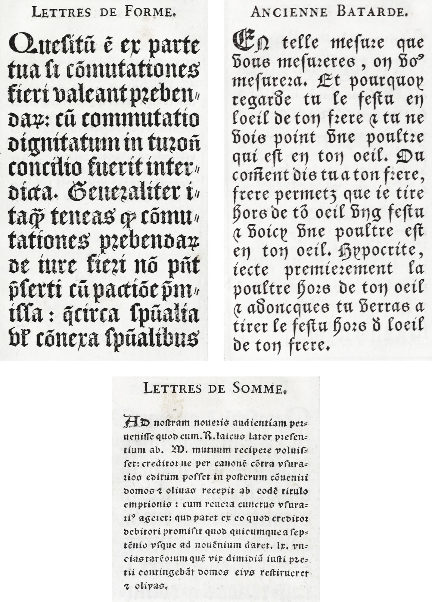
135. Lettres de Forme, Lettres de Somme, and Ancienne Batarde shown by Fournier le jeune
From Manuel Typographique (scans)
The first sixty years of the sixteenth century may be considered the Golden Age of French typography.
The reign of François I—from 1515 to 1547—contributed to the quickening of intellectual progress and brought greater refinement into daily life. The Italian campaigns of his reign, and of previous reigns, had much to do with this. For though the military operations of France in Italy between 1494 and 1525 were of slight political and territorial value, the influence of Italy on the Gallic mind—the impression of its beauty and art and science on the one hand, and the conviction of its spiritual and social rottenness on the morals and stimulating the artistic faculties of the French. Like some of his predecessors, François loved Italian art, and imported Fontainebleau. Things Italian were fashionable at court, and the court in turn set fashions for the cultivated world of France. It was natural enough that books should reflect the prevailing mode—and this is one reason why French books of the earlier sixteenth century show so much Italian feeling. They were more decorative than Italian work, and more delicate and elegant in effect; and in this they showed themselves French. But the Italian influence was there; and “this invasion of foreign germs produced a marvellous blossoming of native genius.”
Henri Estienne, head of the famous Estienne family,—“the Eternal Honour of French Typography,”—who worked in the last years of the fifteenth century (but who between 1502 and his death in 1520 produced over a hundred books) and his son, the great scholar-printer Robert Estienne, husband of Perette Badius, carried over into the sixteenth century the great tradition in typography. After Henri Estienne’s death, his widow (like widows of many French printers, for reasons perhaps economic as well as sentimental) speedily married Simon de Colines, who had been associated with her husband Simon de Colines, who had been associated with her husband. De Colines’ beautiful books also show Italian feeling, but always tempered by a delicacy of execution and netteté of effect characteristic of the French artist. They were less direct, tolerant, and ample than Italian books of the same period, and “tighter”—more consciously workmanlike.
Another printer, to-day less remembered, who did beautiful work, was Michel Vascosan. He, too, was a son-in-law of Badius. It is to De Colines, to Robert Estienne, and to Vascosan that the Parisian press of that period owed the introduction of the chief reforms which the Aldine press had already adopted, namely, disuse of gothic types, adoption of handy formats, and cheap books for students. To De Colines in particular is attributed the use of italic types for entire books, and the execution of the first really good Greek font with accents, a decade before the appearance of the grecs du roi. Both the italic and Greek fonts appeared in 1528, and tradition has it that De Colines was himself their designer. At first the best printers were often type-founders too, although Garamond merely cut and cast type for the use of others.
Roman and italic fonts were increasingly employed for all parts of a book by progressive French printers of this epoch; as in Geofroy Tory’s Champfleury of 1529;2 Charles Estienne’s work, De Dissectione Partium Corporis Humani, printed at Paris by Simon de Colines in 1545;3 and Kerver’s Hypnerotomachie ou Songe de Poliphile of 1546.4 Of course, black-letter books modelled on Gothic manuscripts were still produced in France in the early sixteenth century—such Gothic volumes as the Horæ Beatæ Virginis ad usum Parisiensem, printed at Paris by Gering and Rembolt in 1502,5 or Hopyl’s magnificent Missale Diocesis Coloniensis, printed at Paris in 1514,6 being examples; though Books of Hours were printed by Kerver in roman type in the earliest years of the century. Then again, books in a style transitional between pure “Gothic” and “Roman” were common—such as a Josephus of 1514 (mentioned later)—set in roman letter, touched up with lines of bold lettre de forme. For many years vernacular romances continued to be set in a lettre batarde, and such work was not much influenced by current fashions. Limits of space compel me to speak chiefly of work by “advanced” men; but old styles of printing persisted along with it.
§1. XVI Century
Sixteenth century examples of French printing have been selected from several points of view. I have wished to show a certain chronological progression in typographic styles from the beginning to the end of the century; to mention particularly famous books like Champfleury, or the Songe de Poliphile; and to exemplify as fully as possible the beautiful printing of men like Estiennes, Badius, De Colines, Vascosan, Le Royer, and the two De tournes, although these books do not show, in a strict sense, progression so much as various ways of utilizing the same style.
The quarto Quincuplex Psalterium, printed by Henri Estienne at Paris in 1509, is an example of a sixteenth century book composed entirely in roman fonts. In it a difficult problem in typography has been cleverly solved. Three versions of the Psalms in Latin are presented side by side, printed in a roman letter, and with copious notes—the two remaining versions placed in a sort of appendix and printed in double column. It is a book somewhat Italian in effect, but has elements of delicacy which are purely French; for instance, the charming little ornaments in red, which fill out broken lines in the columns of each version, a device also employed in the Complutensian Polyglot. The Psalms are set in a very handsome old style roman font, a little more modelled than Italian characters of the same kind and period. The notes are composed in a smaller size much the same sort of roman. The work is printed in red and black throughout.
In the same year that Estienne printed this Psalter, Thielman Kerver issued at Paris, in 16mo, a Psalterium…Virginis Marie [sic], arranged by St. Bonaventura. This beautiful book is a splendid example of the manière criblée. The text is printed in lettre batarde in red and black. It has ten full-page metal cuts, and every page has borders, many “historiated.” The descriptive legends and these borders are, however, printed in lettre de forme, and some opening verses in a roman letter. Furthermore, some blocks for the outer margins of pages contain no “scenes” at all, but are piece of distinctly Renaissance decoration. At first sight the book appears Gothic; but here and there the “Roman invasion” is evident. This Gothic plan with Renaissance details was precisely analogous to that of a Parisian church of the period—St. Eustache, built in 1532; just as French Books of Hours, printed in roman type with borders of open Renaissance design (such as Tory’s), had their counterpart in Italian “classical” churches—of which, in French classical style, Paris later on had various examples.
A good instance of a book transitional between Gothic and Roman is a Latin edition of Flavius Josephus, published in quarto at Paris by François Regnault and Jean Petit in 1514. The printers employed for the text a roman type of regular cut, and marginal notes are set in this same size of roman. Displayed lines on the title-page, and titles of principal divisions and running-titles, are, however, in a bold lettre de forme. The many initials used are mostly of Gothic design, and the continuous text is broken by gothic paragraph marks. In short, all the details are Gothic in feeling. The excellent workmanship and consistent plan make this book, in spite of the mixture of types, a much handsomer volume than, theoretically, it has any right to be.
Tory’s Champfleury (a small quarto) was printed at Paris in 1529. It is divided into three books. The first is a disquisition on language; the second, illustrated with wood engravings, treats of the origin and design of roman letters, an institutes a comparison between their proportions and those of the human and figure; the third contains Tory’s magnificent roman capital letters, in alphabetical order, designed on a geometrical framework of squares and circles—on the order of similar schemes for drawing letters by Albert Dürer and others.7 At the end is a series of alphabets—Hebrew, Greek capitals, roman capitals, a “Cadeaulx” alphabet (a sort of free Gothic hand), and a free rendering of alphabets of lettre de forme and lettre batarde—with a few words in each. Of the remaining alphabets, the Lettres Tourneures and Lettres Fleuries are the only ones that need detain us. The title-page and decorations are very distinguished. The book is printed in heavy, early, unattractive roman type, rough in design and execution, and solidly set, without much attention to clearness of arrangement (fig. 136). Here and there a rather crabbed Greek letter is introduced. Champfleury is a famous volume, but it is full of learned affectations, and it is difficult to read, both as to its matter and the manner of its printing.
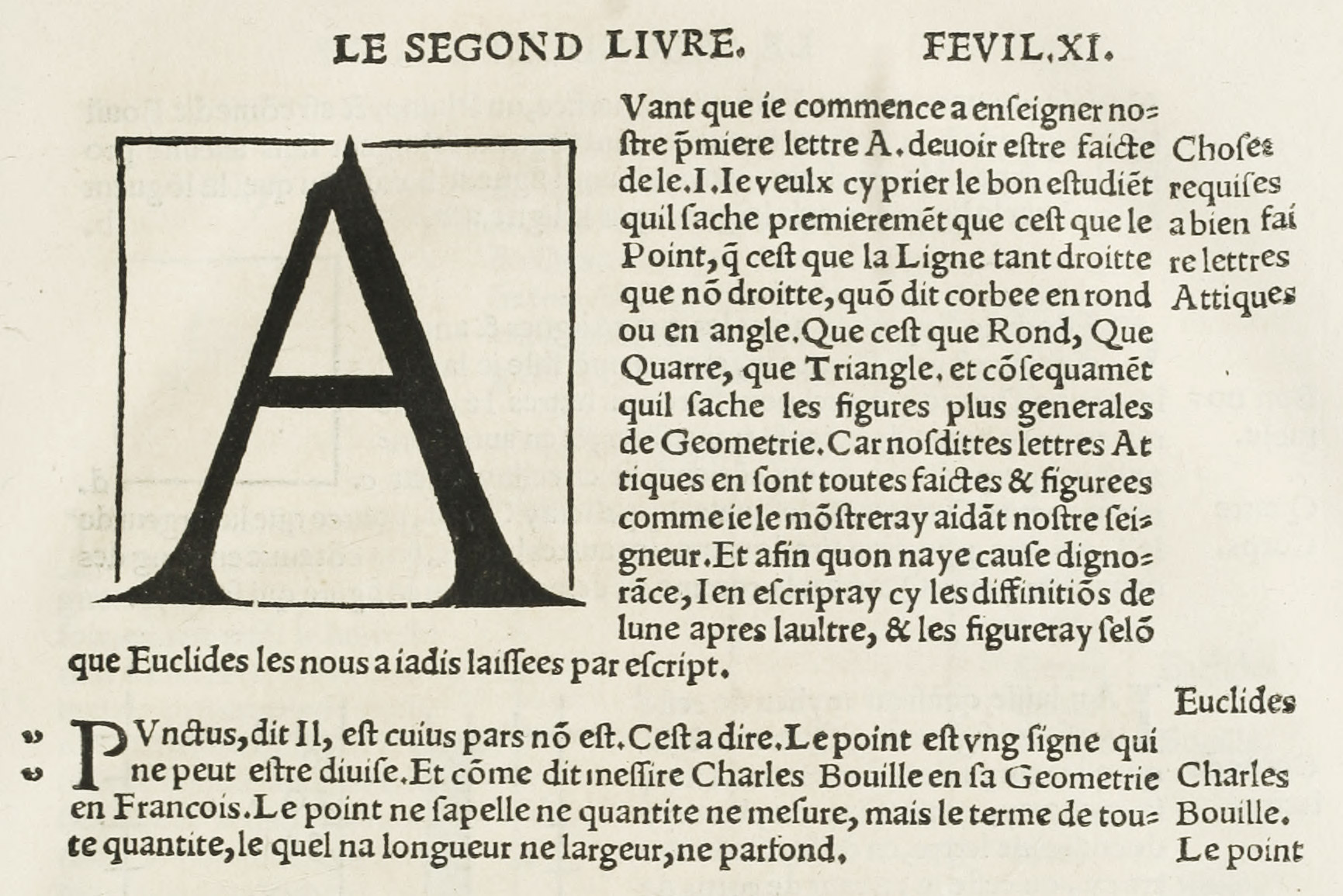
136. Portion of page from Tory’s Champfleury: Paris, 1529
From a copy in Harvard College Library (facsimile), Internet Archive (scan)
An edition of Les Commentaires de Jules César, translated into French by Estienne De Laigue and Roberg Gaguin, was printed in 1531 at Paris by “Maistre Pierre Vidoue…pour honnestes personnes Poncet le Preux,8 et Galiot du Pré,” which, though set in one font of roman type throughout, except for notes and the headings to each book of the Commentaires, is, none the less, a very archaic affair. This is because its roman type is so rough in cut, the block initials are so heavy in design, and because its text is not broken up, paragraphs being indicated by florets, which are also used at the beginning and end of display lines, running-titles, etc. Some of the illustrations are earlier in styles than the book itself, having already been used in other volumes. Apart from the pictures, the book reminds one of the Basle rather than of Paris, and in spite of the roman type the pages have an antique air.
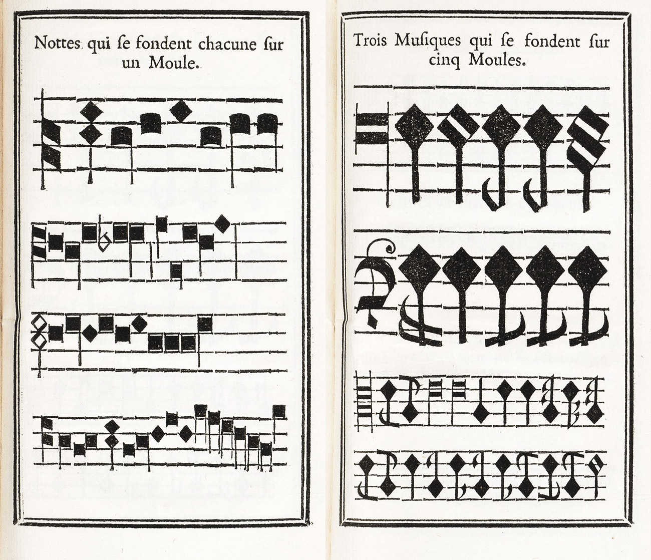
Sixteenth century music printing owes its beginnings in France to the talents of Pierre Hautin. He was able to improve upon earlier Italian music printing by doing away with a second impression, which up to that time was necessary. This invention was taken advantage of by Pierre Attaingnant, son-in-law to Philippe Pigouchet, and “printer to the King for music” from 1538 to 1552. He issued in 1532 a collection of twenty Masses, published in seven divisions, the first of which is entitled Primus Liber viginti Missarum Musicalium tres Missas continens, the music being by De Manchicourt, Claudin, and Gascoigne. Its title-page, repeated for each division, is printed in four sizes of lettre de forme beneath an elaborate representation of the celebration of High Mass, and surrounded with woodcut borders. This is followed by a dedication by Attaingnant to Cardinal de Tournon, chapel-master to François I, faced by a privilege, printed in lettre batarde, giving Attaingnant the sole right to print and sell books musically noted or in tablature, for a term of six years from Jun 18, 1531. The masses which follow are printed in one impression, with the words beneath in lettre de forme, the notes being lozenge shaped, sometimes closed, sometimes open. The music types are so large and bold that the effect of these great pages is extremely imposing. The volume is a folio of 530 pages of considerable rarity9 (fig. 137).
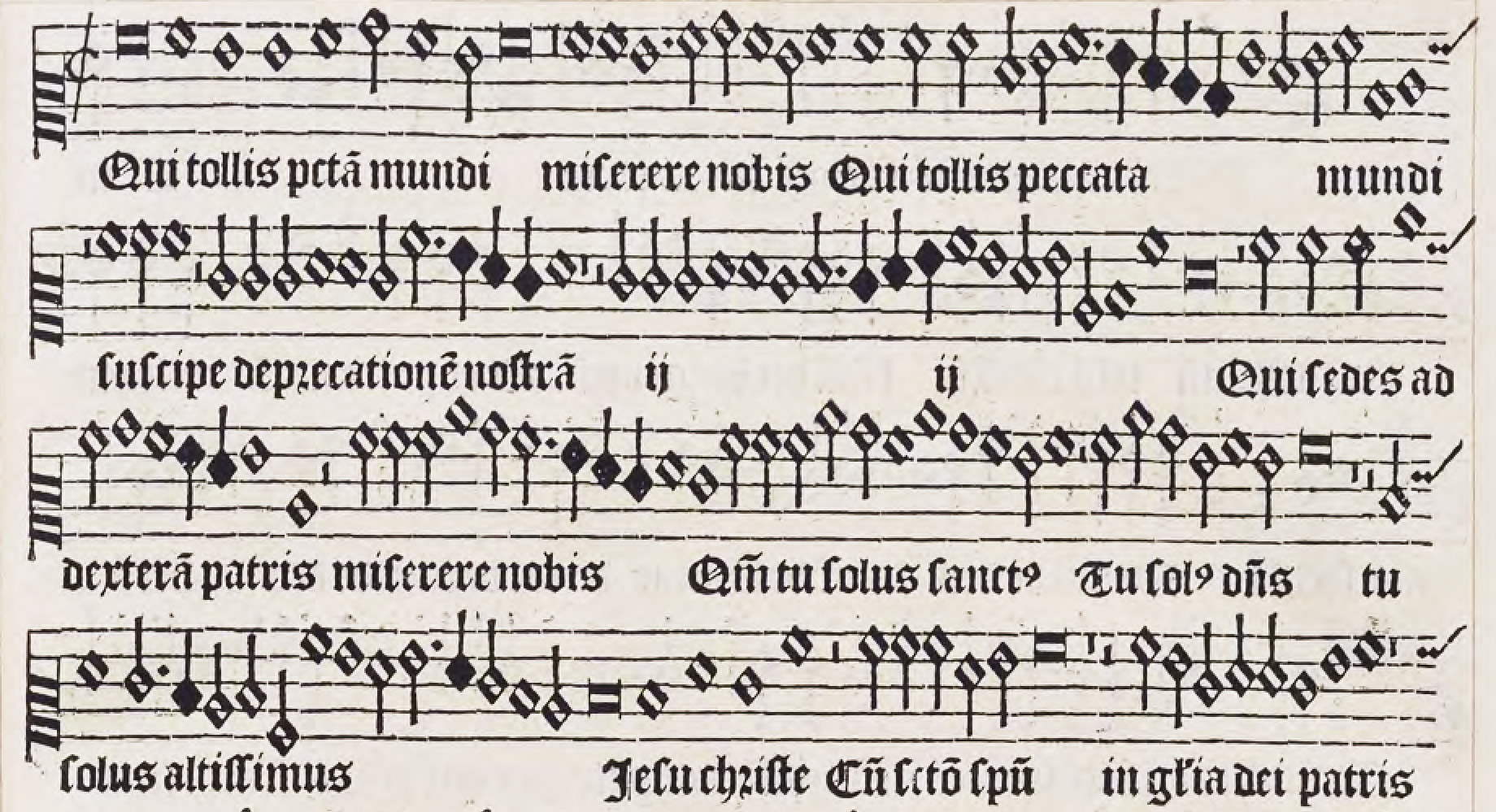
137. Music Types combined with Lettre de Forme, used by Attaingnant, Paris, 1532
From a copy in the Boston Athenæum
The De Philologia et De Studio Litterarum of Guillaume Budé is a quarto book printed in a rough roman font, and with head-lines in small capitals, the folios—in roman numerals—being capitals of the same font. The first two lines in the titles of both tractates appear to be cut on wood. The initials—or at least some of them—belong to a famous alphabet, but are coarsely cut and badly printed. It is very Italian in manner, but not a handsome book, though it was printed by Josee Bade of Asch (better known as Jodocus Badius Ascensius) at Paris in 1532. Now in 1535, Robert Estienne printed another quarto book by the same author—De Transitu Hellenismi ad Christianismum. The improvement is remarkable. The type is a suaver, more rounded font, better aligned and better set. Tory’s famous initials are used an dare very brilliantly printed. The head-lines of dedications, and of Books I, II, and III, are composed in a beautiful attenuated roman letter, in a line of capitals and two lines of lower case. The title-page is, like those of many Estienne titles, badly managed and unattractive, largely because of the sprawling Estienne device. Yet the book is much more workmanlike, and shows an immense improvement over Badius’ edition of Budé’s De Philogia. Robert Estienne printed many books in small format, sometimes in italic and sometimes in roman. In his nine-volume edition of Cicero’s Opera, published in 1543, he first makes use of the fine italic which he had cut in imitation of the Aldine character.
In the King’s Library at the British Museum, Jean Ruel’s De Natura Sitrpium Libri Tres is exhibited as typical of Simon de Colines’s work, and of the style of printing that he made popular in France. A beautiful, mellow, Italianate roman font, in a large size, is used for the table of contents and text. A clear and charming font of the same character serves for the index, in which notice the interesting shapes of arabic numerals. Tory’s fine criblé initials begin the three great divisions of the book. Each chapter, headed by its title in italic and its number in the same line (at the right), also begins with a block-initial, the letter appearing in white on a criblé background (fig. 138). Running-titles are set in spaced capitals, and the exquisite, refined lower-case roman letter, much used by De Colines, appears on the title-page at the beginning of each book. A word should be said about the italic used in the preface. Though condensed, it is very distinguished, and with it roman capitals are employed in the Aldine manner (fig. 139). I know few books more satisfying throughout than this noble folio volume—one of the finest of sixteenth century French books. It was printed at Paris in 1536.
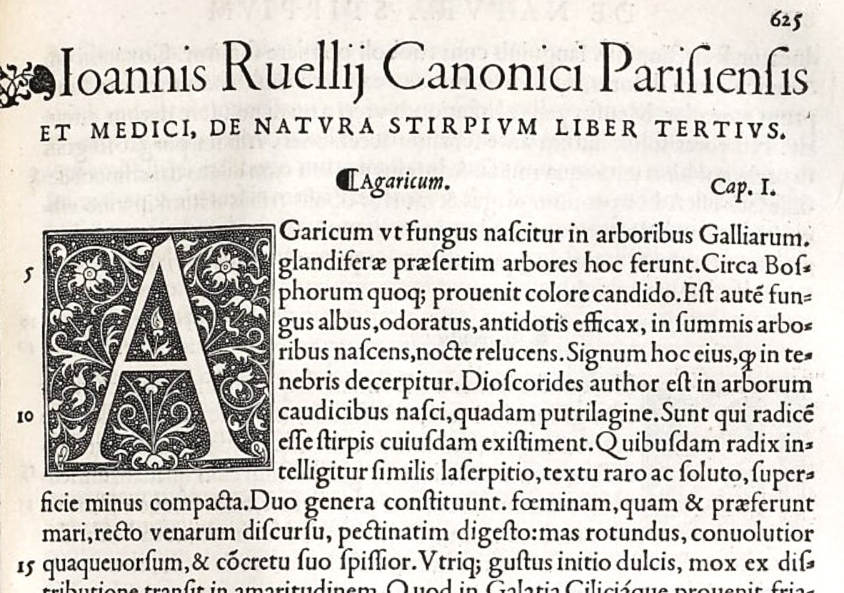
138. Roman of Ruel’s De Natura Stirpium: De Clines, Paris, 1536
From a copy in the Harvard College Library (facsimile), Google Books (scan)
139. Italic of Preface of Ruel’s De Natura Stirpium: De Clines, Paris, 1536
From a copy in the Harvard College Library (facsimile), Google Books (scan)
This italic type was used by De Colines for entire books in small format—such as his pretty 16mo editions of Odes and Epistles of Horace of 1539, and of Martial’s Epigrams of 1544. Very fine in folio pages, in small books the italic appears a much cruder character. De Coline’s editions of Jean Fernel’s Monalosphærium (1526), the same author’s Cosmo Theoria (1527), and Sacrobosco’s (Holywood’s) Textus de Sphæra (1521 or 1527), are interesting examples of his treatment of scientific books, and contain some famous decorative borders, diagrams, and initials—some of the latter by Tory.10
A fine book by Robert Estienne that recalls the Italian manner, although the title-page is disfigured by Estienne’s enormous printer’s mark, is the monumental Cicero, published in four folio volumes at Paris in 1538–39. The work has just that quality of delicacy in its running head-lines of large lower-case roman which makes it French rather than Italian, though the type is almost an Italian fifteenth century character.
Michel Vascosan, a rival to the Estiennes in perfection of work, brought out at Paris in 1543 a Latin edition of Caesar’s Commentaries—a distinct advance over Vidoue’s edition of 1531. Very Italian in composition, the types, both roman and italic, are more modelled and easier to the eye than those of De Colines—more French, in fact, and less Italian. A title-page arranged simply in roman upper-case and lower-case letters, in one or two sizes, and without the usual printer’s mark (Vascosan did not employ one); titles of various books, as well as running-titles, set in spaced capitals; marginal notes composed in a small and condensed italic;—all these details are arranged in an Italian way, but the types have a markedly French look. Some eleven-line initials designed by Oronce Fine are worth examination, as well as the prefatory matter, which, set in italic, contains interesting maps and some illustrations.
On an earlier page I contrasted Italian and French printing by describing the former as simpler, ampler, and more monumental, and the latter as more conscious, elaborate, and elegant. This difference cannot be better shown than in French and Italian editions of Colonna’s Hypnerotomachia Poliphili. The Italian edition was printed by Aldus in 1499, and is one of the finest early Italian illustrated books. A French edition was published by Jacques Kerver, and printed by Louis Baübloom (called Cyaneus), at Paris in 1546, entitled Hypnerotomachie ou Discours du Songe de Poliphile. Aldus’s edition is the better book of the two, because so much more direct and simple (fig. 28). Kerver’s edition is fine in its way—a more ambitious piece of book-making, put together with a more modern feeling (fig. 140). Not only of type and its arrangement—for instance, the management of title-pages and chapter headings—is this true; in the French version of the Italian illustrations we find the same tendency to complication and over-refinement. The initials in the French edition are exceedingly distinguished—a famous series, often reproduced.
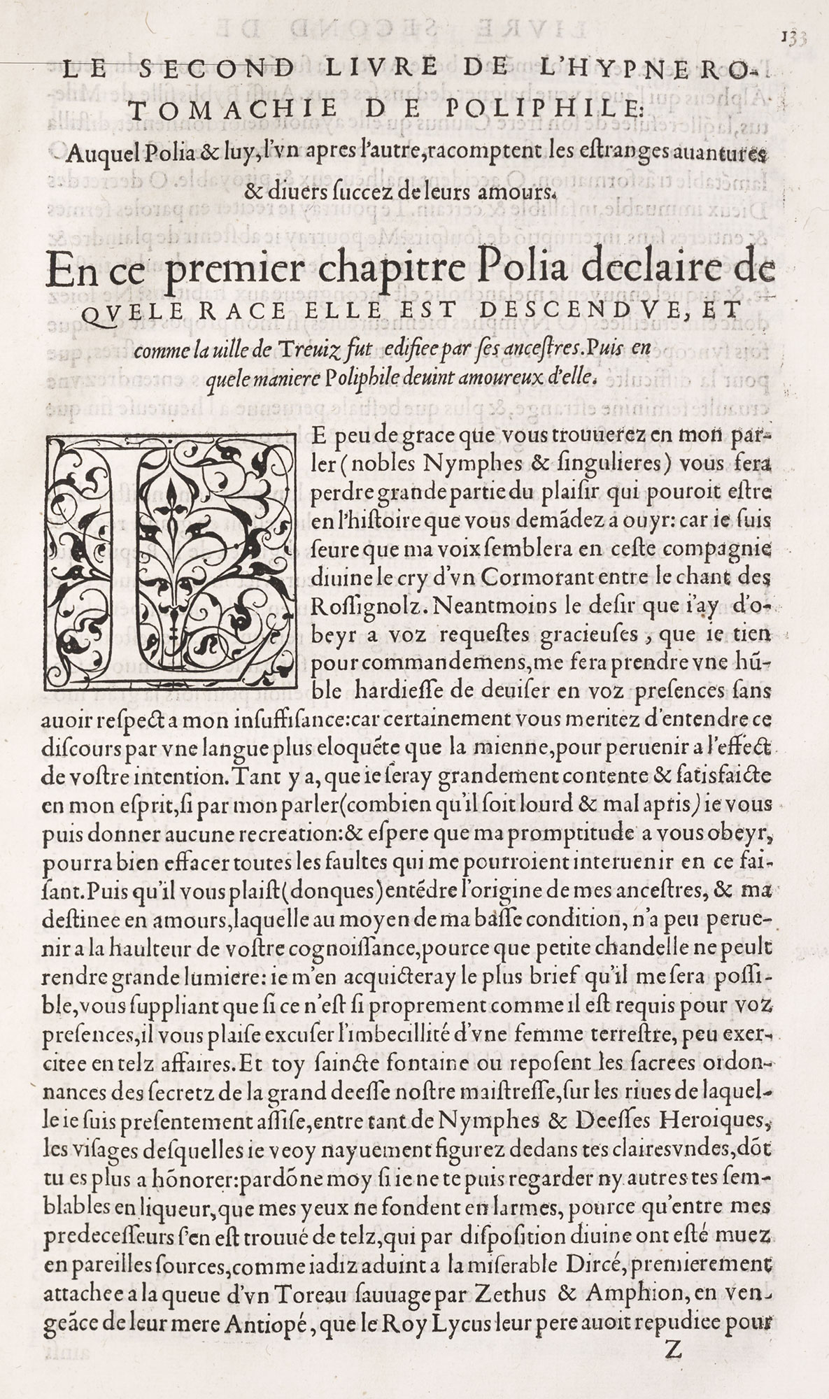
140. Page of Songe de Poliphile: Kerver, Paris, 1546
From a copy in the Harvard College Library (facsimile), University of Virginia (scan)
A French scientific book that has great charm is Jacques Focard’s Paraphrase de l’Astrolabe, printed at Lyons in 1546 by Jean de Tournes I, in a charming italic, with wide-notes in roman, and full of attractively rendered illustrative drawings and diagrams. The prefatory address is composed in a delicate roman letter. It is followed by an alphabetic table set in italic, a table of chapters, etc. Then the book proper begins with a fine initial. The subject of each chapter is displayed in roman, the text is in italic. Each definition is set in spaced small capitals, and when necessary elucidated by a marginal diagram. Elaborate and exquisite illustrations of the astrolabe and its parts are supplied. They are the work of Bernard Salomon—his earliest association with the printer De Tournes. The book is beautifully complete in plan, and the plan beautifully achieved.11
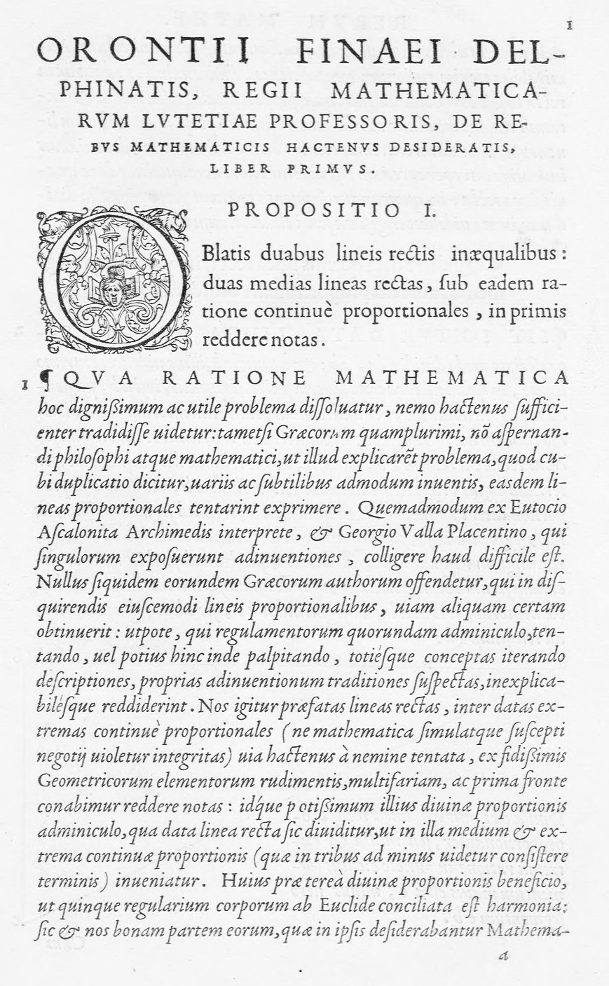
In 1556, Vascosan printed a mathematical book by Oronce Fine, De Rebus Mathematics, hactenus desideratis, in four books. The title-page shows some splendid lower-case letters. An opening address is set in a noble font of roman, followed by verses in a smaller size of the same font, and in a well-cut Greek character. The various propositions are composed in roman, with explanations set in an exquisitely clear italic. The diagrams are a charming feature of the book. They are drawn to the width of the page, and blanks within them often contain fanciful little florets of solid black, or with cross-hatched leaves—probably with the practical aim of saving the diagrams from too heavy impression. The book is a masterpiece of restrained style, through the beauty of its types and the elegance of their arrangement. The readability of its italic comes about through its evenness of line (fig. 141).
141. Types used by Vascosan, Paris, 1556
From a copy in the Harvard College Library, De Rebus Mathematics, hactenus desideratis (scan)
A Paris edition of a book on the same subject as Focard’s work, L’Usage de l’Astrolabe, by Dominicque Jacquinot (second edition), printed by Guillaume Cavellat in 1558, and Les Principes d’Astronomie et Cosmographie, translated from the Latin of Gemma Frisius, issued at Paris by the same printer in 1557, are examples, of like books in small format. The first is printed in roman, the second in italic. Both are agreeable little volumes—especially the latter—and show an attractive way of printing scientific hand-books.
Estienne Groulleau’s French edition of Les Sept Livres de Flavius Josephus de la Guerre et Captivité des Juifz, translated by D’Herberay, was printed in Paris in 1557. It is a great contrast to Regnault and Petit’s edition of Josephus, and a much more modern volume, though it falls short in style of books by De Clines and Vascosan. A roman type, less classical and more “old style” than we have seen hitherto, is used for the text, which is unbroken by paragraphs. Running head-lines are arranged in capitals, not quite enough spaced. The chapter headings, while employing the handsome, large upper and lower-case letters then the fashion, drop dizzily to a minute italic for a second line. Titles of chapters occur at the foot of pages where there is not room for a single line of text, the chapter itself beginning on the facing page or even over-leaf. The title-page decoration is attributed to Tory, and the book has many attractive illustrations within cleverly designed encadrements made of separate pieces. Ill-considered in detail, and carelessly thrown together, it is none the less a somewhat charming book.
Robert Granjon of Paris, publisher, printer, type-cutter, and founder, introduced at Lyons about 1557 his civilité types, an ingenious rendering of a Gothic cursive handwriting in vogue at the time.12 These types attracted attention, and Granjon obtained from Henri II a “privilege” of ten years’ duration for what he called lettre françoyse d’art de main. Its first use was in Dialogue de la Vie et de la Mort, a French translation by J. Louveau of an Italian book by Innocent Ringhier. Such types were commonly called caractères de civilité, because early employed in two popular books for children—Louveau’s translation from Erasmus, La Civilité Puérile distribuée par petitz chapitres et sommaires, and Gilbert de Calviac’s Civile Honesteté pour les Enfants, avec la manière d’apprendre à bien lire, prononcer et escrire, etc. This latter book was printed at Paris in 1559 by Philippe Danfrie and Richard Breton, to whom Granjon allowed the use of these fonts. An example of a book printed in civilité is Sommaire des Singularitez de Pline, a thin 16mo, printed by Richard Breton at Paris in 1559, in two sizes of this type. Though beautifully arranged in the style of a manuscript of that date, it is exceedingly hard to read (fig. 142). There were many forms of civilité types, and an interesting one is reproduced (fig. 143), though obviously of a much earlier date than the 1742 specimen of the Paris founder, Claude Lamesle, from which it is taken.
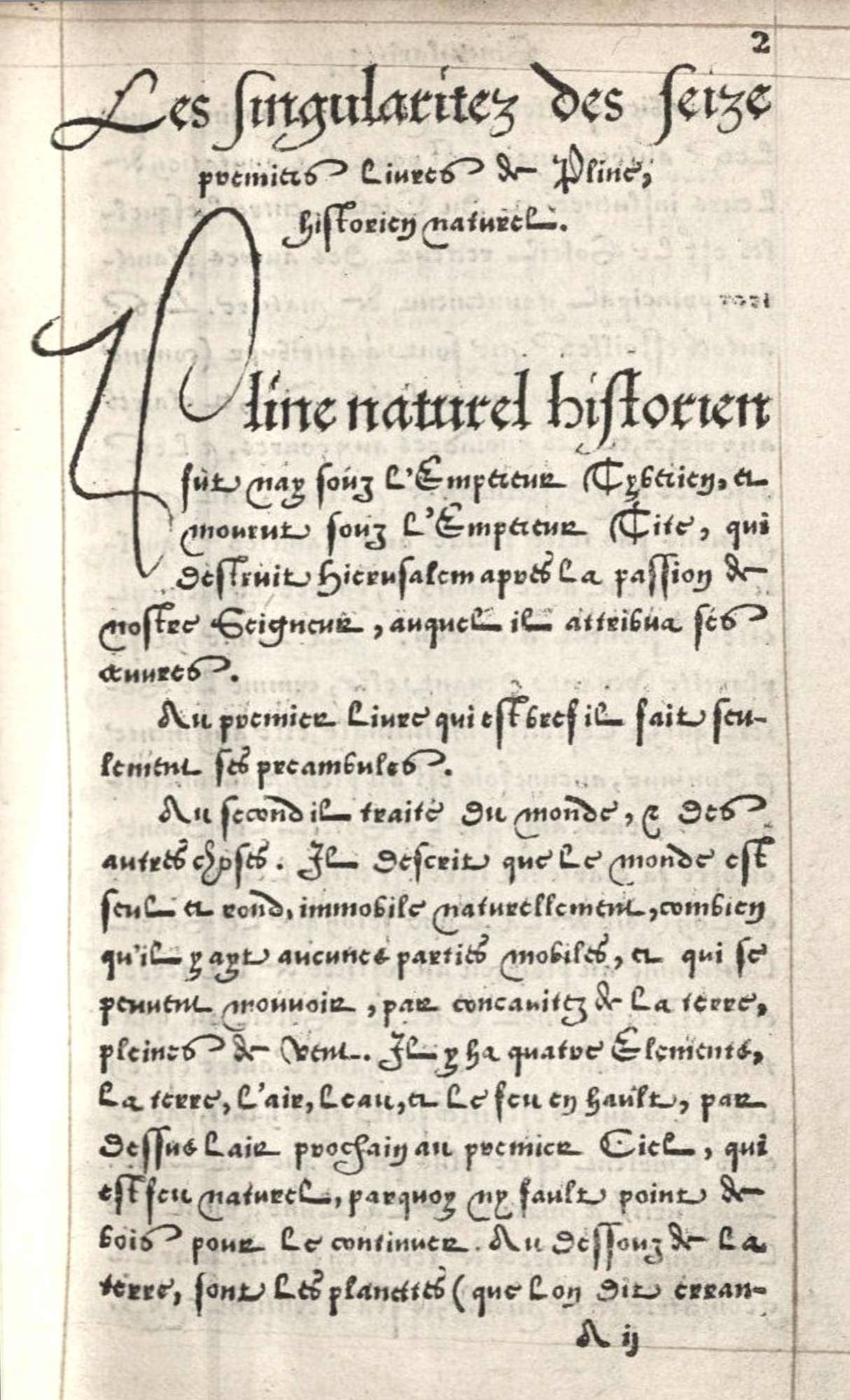
142. Granjon’s Civilité: Breton, Paris, 1559
From a copy in the Harvard College Library (facsimile), Sommaire des Singularitez de Pline (scan)
143. Old Civilité from Lamesle’s Épreuves Générales des Caractères, Paris, 1742
From Library of Congress (scan)
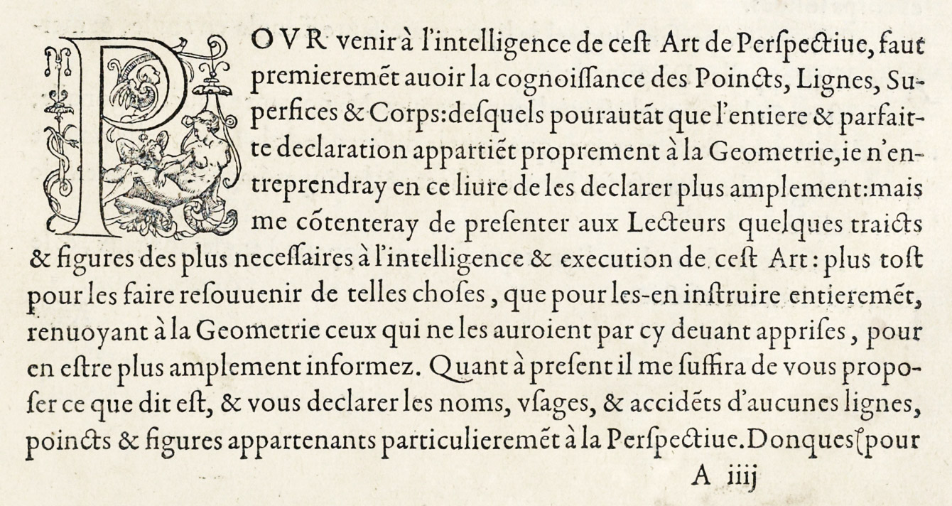
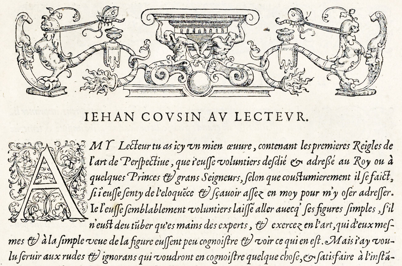
An exquisite book is the folio Livre de Perspective de Jehan Cousin Senonois, Maistre Painctre à Paris,13 printed at Paris in 1560 by Jean Le Royer, originally an engraver, but appointed by Henri II Imprimeur du Roy ès Mathématiques. Its title-page with an elaborate and sumptuous printers’s mark is followed by a great decorative engraving, presenting the five Corps Réguliers de Géométrie in a magnificent encadrement. This folio is printed chiefly from a mellow roman font, with running-titles set in a large lower-case letter (fig. 144). The preface and the author’s and printer’s addresses to the reader are composed in a beautiful, lively italic (fig. 145). Le Royer’s address indicates that this book was his first venture—which perhaps accounts for the misfit of the initial in the passage we produce. But these decorations and initials are by Cousin, and in tone blend delightfully with the type; and the diagrams of perspective, chiefly engraved by Le Royer, are exquisitely rendered. The book is beyond praise for its simplicity and elegance—one of the handsomest volumes of its time. The reader should examine, if possible, Le Royer’s edition of Ambroise Paré’s Méthode Curative des Playes et Fractures de la Teste Humaine, 1561.
144. Roman of Caousin’s Livre de Perspective: Le Royer, Paris, 1560
From a copy in the Boston Public Library (facsimile), Internet Archive (scan)
145. Italic in Cousin’s Livre de Perspective: Le Royer, Paris, 1560
From a copy in the Boston Public Library (facsimile), Internet Archive (scan)
The Lyons Press at this period did work of great distinction. Claud Paradin’s Alliances Généalogiques des Rois de France is an example—and a book where an enormously difficult problem is successfully surmounted. In this folio of over one thousand pages, every page bears a coat of arms—sometimes two and three. The text below them varies from one line to almost a full page—except where broken by half-titles separating the different Royal Houses. Unity of effect—the problem in this case—is arrived at by placing the arms always at the same point at the top of the page, immediately beneath a running-title of roman capitals, and by beginning the text always at a given point below them, leaving the lower part of the page blank or not, according to the amount of matter. The result is that a book containing a great variety of text, of unequal amount to a page, appears perfectly “natural” and harmonious because unified by this reiteration of position. Practically but one font of a robust old style roman is used for the text. The heraldic bearings, which avoid monotony by being designed with great reserve and frugality of line, are brilliantly printed from very well engraved wood-blocks. Jean de Tournes I printed this book in 1561. His work always deserves study. In 1558 he produced a beautiful little 16mo Biblia Sacra. The text is arranged in double column and employs a clear and delicate roman font; a very exquisite italic—no doubt Granjon’s—being used for the prologue to each book. Decorations and initials are brilliantly designed in arabesque, and the illustrations are delightful and distinguished.
La Vita et Metamorfosio d’Ovidio, edited by Simeoni and printed by Jean de Tournes II at Lyones in 1584, was a reimpression in Italian of a French book printed in 155714 by Jean de Tournes I, and dedicated by its author to Diane de Poitiers.
It is adorned with exquisite decorative borders. The delicate illustrations are by Bernard Salomon—le petit Bernard—one of the most distinguished designers of the French-Italian school. The type beneath its pictures is the point to notice, however—the delicate, silvery italic of Robert Granjon (designer of the civilité character), who worked at Lyons in connection with Jean de Tournes and Sebastian Gryphius, and there married Antoinette Salomon, daughter of the designer. From 1570 almost all Lyons printers used this kind of italic type.15 This volume shows the delicacy and charm of French workmanship in a fanciful kind of book—a veritable gem of book-making. Some of the decorations used by De Tournes were like goldsmith’s work, and often had a niello-like quality which was characteristic of much Lyons typographic ornament (fig. 146).
This closes our consideration of the books of an unsurpassed epoch in French printing.
146. Robert Granjon’s Italic used in La Vita et Metamorfosio d’Ovidio: De Tournes, Lyons, 1584
From Munich Digitization Center (scan)
I know of no specimen of types issued by any sixteenth century French founder,16 but a celebrated foundry—according to Fournier the oldest private foundry in France—was begun in the sixteenth century by the Le Bé family, “the first masters of which,” Fournier adds, “being of an investigating as well as intelligent turn of mind, collected and preserved many matrices of old characters which were in use since the very beginning of printing.”
The first Guillaume Le Bé I was born at Troyes in 1525. Between 1545 and 1550 he was a pupil of Robert Garamond Estienne. He, too, was under the spell of Italy, for he had been both at Rome and at Venice to perfect himself in his work. He cut Oriental fonts with ability. Hebrew was his specialty, and, but twenty-one years old when he cut his first Hebrew types, during in a period of thirty years he engraved fourteen seventeen varieties of this character. He perfected Hebrew fonts for Robert Estienne, and was engaged to cut that needed for the Plantin Polyglot Bible. Le Bé also engraved music for Leroy and Ballard, the earliest privileged Parisian music printers. Besides the accumulation of his own handiwork, Le Bé bought in 1561, the year of Garamond’s death, most of the punches, matrices, etc., of Garamond’s types, and almost all the material of his foundry, of which he was named appraiser. At his death in 1598, Le Bé was the first engraver of Oriental characters in the same world.
Le Bé had a son of the same name and business (the correspondent of Moretus), who added the collection of types through his efforts and researches; and he in turn had a son of like name and occupation, who continued the foundry with credit. The third Le Bé died in 1685, and the foundry as managed by Claude Faure until Madame Le Bé’s death in 1707, and then for her four daughters by Jean Claude Fournier, père, its director for over twenty-five years. About 1730 it was bought by his eldest son, Fournier l’aîné, who, his younger brother tells us, “sustained by his talents in the reputation of this celebrated foundry, combining the art of type-cutting with that of type-founding.”
Of the Le Bé foundry I know of no specimen; nor did Fournier l’aîné apparently issue any after he acquired it. This is surprising, for he was very proud of his ancient punches, strikes, and matrices of types by Garamond, Granjon, Le Bé, Sanlecque, and others. The list of them that he gave in 1757 showed that it was a collection in which any man would take pride.
§2. XVII Century
In the seventeenth century, French types became less Italian and more what we now call an “old style” letter—by no means so fine a character. Some of the larger volumes were splendid in their way, such as Courses de Testes et de Bague faites par le Roy…en l’année 1662, printed in 1670 by Sébastien Mabre-Cramoisy,17 or L. J. de Boullencourt’s Description Générale de l’Hostel Royal des Invalides, printed at Paris by Desprez in 1683.18 The best of these books were perhaps printed from types in the Imprimerie Royale; and were imposing rather than tasteful—grandiose, and as uncomfortable as grandiose things have a habit of being. Smaller French books of this epoch were also somewhat discouraging in effect. Many of them were copies—and not very good ones—of the compact volumes of the Elzevirs. While quite modern in make-up, there is nothing about such books of much interest to a printer. French seventeenth century printing—heavy in type and in decoration—was indeed precisely like the art of the time; in short, belonged to the pompous period of Louis XIV. As the century closed, types became more “modeled,” but were still somewhat archaic in their general effect.
An early seventeenth century folio which possesses considerable style, composed in type something like characters used by Plantin, is the Civitas Veri sive Morum of Delbene. This is printed in a large and very effective roman character. Italic of the period is employed for its prefatory verses, this italic having all the characteristic swash letters. Tail-piece and head-piece are introduced, cut on wood, but the handsome title-page and large illustrations are engraved on copper. In form of type, in type-setting, and in imposition, the book has distinction. It was printed at Paris by Ambrose and Jerome Drouart, in 1609.
Sébastien Cramoisy of Paris was a great figure among printers of his day, and his name appears on the Observatio Apologetica, etc., of Gabriel Trivorius,—royal historiographer to Louis XIII,—printed in 1631. Cramoisy was afterwards appointed first director of the Imprimeri Royale du Louvre; but he also printed his own account, and employed other men to print for him. This book is a good specimen of an early seventeenth century quarto. The rubricated title-page and prefatory Address to the King are printed in very heavy, rough cut types, and an Address to the Reader in a smaller size of unattractive italic, also used elsewhere. Chapter heads and running-titles are in spaced capitals and small capitals. The index to the contents of the chapters is set in an italic, and the text of the book is composed in roman old style—fine fonts which appear to be like those of Garamond. In spite of these types, fine paper, ample margins, many initial letters, and distinguished imposition made more attractive by red hand-ruling, the effect of the typography is antique and tasteless, owing to presswork that is very poor indeed.
In 1640 a Parisian writing-master named Pierre Moreau endeavoured to make punches and matrices of some new types, in the style of handwriting. Of these he made four kinds, grosse and petite batarde, lettres rondes, and another batarde brisée. He dedicated the first proofs of them, in 1642, to Louis XIII, who encouraged the talents of this new typographer by giving him the post of Printer in Ordinary to the King, which enjoyed for some time; and he printed several works with the aforesaid characters. The taste for this kind of printing having gone by, as it was of no general typographical utility, Moreau was obliged to give up his occupation.
Moreau’s types are cleverly shown in J. Baudoin’s Les Saintes Metamorphoes ou Les Changemens miraculeux de quelques grands Saints…À Paris, en l’Imprimeri des nouveaux Caractherses [sic] de P. Moreau, Me Escrivain Juré à Paris, & Imprimeur ordre du Roy… 1644. In this book the type (for once) really appears to be writing—a careful and lively copy of the agreeable calligraphy of the period. The ornaments used with it are reproductions of writing-masters’ scrolls and whimsical figures, and there and there heavy flourishes are added to words to produce a further illusion of penmanship (fig. 147). The clever arrangement of notes, the verse in a smaller size of type, the black-letter introduced in the dedication, and the interesting figures used for folios should be noticed. Six different fonts are used in the volume. It is a “trick book,” but so well done that one enjoys being fooled. An edition of Virgil’s Æneid of 1648 contains examples of all Moreau’s fonts. Moreau has the distinction of having designed raised letters for the use of the blind, but his plans are said to have failed through lack of money to develop them.
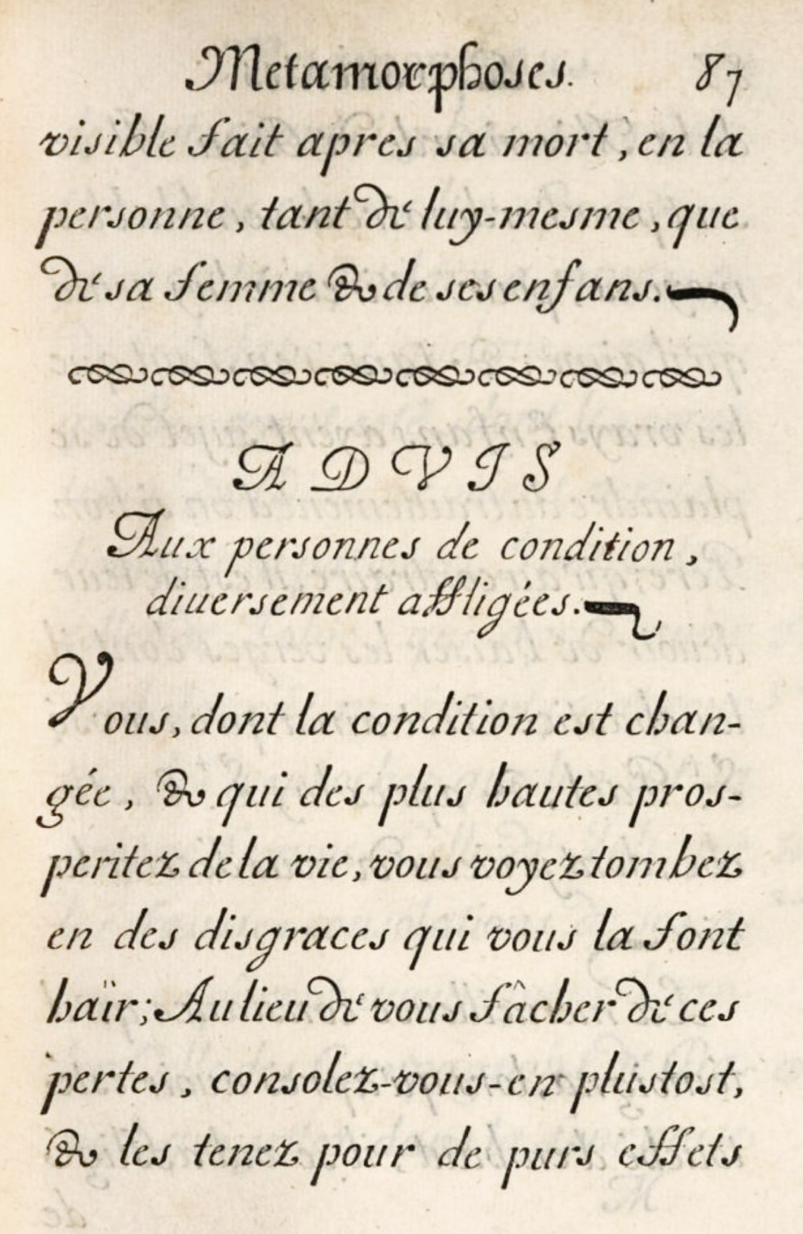
147. Moreau’s Calligraphic Types used in Les Saintes Metamorphoses, Paris, 1644
From a copy in Harvard College Library (facsimile), Google Books (scan)
The great Paris Polyglot of Gui Michel Le Jay, published in ten enormous folio volumes in 1645, falls into this period. Its chequered history and that of some of its exotic types neither belongs, nor can be told, here; but its typography should be examined as an example of what could be done then and what we should not dare to attempt now! Taking seventeen years to complete, it was nearly the ruin of Le Jay—Polyglot Bibles being an expensive business for their promoters. It was printed by Antoine Vitré,19 imprimeur du roi pour les langues orientales, and one of the most distinguished seventeenth century printers, ranking with Cramoisy and the later Estiennes. Apart from the printing of the Le Jay Polyglot, Vitré is now chiefly remembered for his purchase of the collection of Oriental types formed by Savary de Brèves, French Ambassador to Constantinople and Rome. This purchase, made for Louis XIII by Richelieu’s direction, involved Vitré in serious monetary troubles, as he was not reimbursed for twenty years. These types form the basis of the collection of Oriental types now in the Imprimerie Nationale.
Among seventeenth century architectural folios, one of the most beautiful is Roland Frérart’s Parallèle de l’Architecture Antique et de la Moderne, printed in 1650. The types used, though of a somewhat archaic design, are picturesque and full of movement; and they are arranged with great sense of style. The full pages of italic and roman are especially good, and the typography is really aided by beautifully engraved architectural and decorative copper-plates. It is a very superb book in the best manner of a poor typographical period. A later edition, published by Emery and others at Paris in 1702, is by no means well printed. It was translated into English by John Evelyn.
Pierre Le Petit, who was printer to the French Academy in 1643, and produced its first dictionary, was son-in-law to Jean Camusat, first printer to the Academy; and married his daughter Denise, the original of one of the most delightful engraved portraits in the iconography of printing. An excellent example of good mid-seventeenth century work is in Le Petit’s edition of Vies de Plusiers Saints Illustres de Divers Siècles; Choisies & traduites…par Monsieur Arnauld d’Andilly, one of the celebrated group connected with Port-Royal. It is a folio, printed from very handsome, delicate old style type, more elegant and maigre in effect than is usually found in books of this period. The title-page is set in the usual seventeenth century massive old style capitals in lines alternately red and black, and bears Le Petit’s printer’s mark, a relief engraving on metal. The ornaments and large floriated initials occurring at the beginning of each new Life are cut on wood. The type-setting of the book is very simple. The title of the Life of each saint is set in various sizes of displayed old style capital letters like those on the title-page, and chapter headings and running-titles are arranged in roman capitals, much spaced. The arguments to each chapter employ a clear and handsome italic—a very elegant font used with great effect in the Table of Chapters. This well-printed book appeared at Paris in 1664. Le Petit also printed a splendid edition of Arnauld d’Andilly’s Œuvres Diverses in three folio volumes in 1675.
All the faults—there were not many virtues—of the period are exhibited in Le Théâtre de P. Corneille, published in two folio volumes printed at Rouen, but sold in Paris by (Vol. I) T. Jolly and (Vol. II) G. de Luyne in 1664. Cumbrous in form, with ungainly decorations from wood-blocks—among which the eternal corbeille de fleurs appears in swollen shapes,—with displayed lines set in spaced capitals in all kinds of sizes, and with text in a heavy old style type, it is as awkward and archaic a work as can be conceived. There were quantities of like books, and one need not linger over them.
In 1667, Claude Barbin of Paris published Michel Le Clerc’s French metrical translation of Tasso’s Gerusalemme Liberata under the title of La Hierusalem Delivrée. It is not a beautiful book, but the italic used for the text of the translation is a characteristic lively French font of the period, though much less fine than sixteenth century italic. What appear to be marginal notes set in roman type on the outer margins of each page are really the Italian text of the poem. The introductory type matter is tasteless and heavy, and engraved plates and rough woodcut decorations, considered an embellishment, do much embellish.
Bossuet’s Discours sur l’Histoire Universelle, written for the Dauphin, and printed at Paris in 1681 by Sébastien Mabre Cramoisy, a learned man and an excellent printer, is a good specimen of luxurious seventeenth century book. It has a typographical title, but a copper-plate head-piece is introduced on the first page showing Time bearing a shield on which are the Dauphin’s arms, and the text begins with an engraved initial Q supported by a symbolic dolphin. The text-pages are set in handsome old style type, with wide margins, on which notes appear in italic (sometimes in double column). Running-titles are arranged in capitals and small capitals. The volume ends with a fine copper-plate tail-piece. Mabre Cramoisy was grandson of Cramoisy, first director of the Imprimerie Royale; was first his associate and then became sole director from 1669 to his death in 1687. Like his grandfather, he printed books on his own account, of which this is an example.20
The first edition of Racine’s Athalie was issued at Paris by Denys Thierry in quarto, in 1691. A title set in the oldest of old style capitals, an enormous woodcut of the customary vase of flowers beneath, and an imprint make up the opening page. A preface is set in handsome roman letter, and the play follows, entirely composed in a large and very irregular but spirited italic font. Names of characters are arranged in spaced capitals, and stage directions in a minute roman, also used for side-notes. “Scenes” are separated from each other by crowded rows of “flowers.” The whole performance is very antique in style, and, though imposing, tasteless.
Finally, for an example of ambitious book-making at the end of the century, look at the folio Veterum Mathematicorum—Athanæus, Apollodorus, and others—printed in 1693 at the Imprimerie Royale (then under the direction of the Jean Anisson) from manuscripts in the Bibliothèque Royale. I mention it merely to contrast it with the much finer books on similar subjects printed in the preceding century. Employing all the aids known to luxurious book-making at that day, it utterly fails in elegance and simplicity, and by the same token belongs to its epoch.
The second important foundry in France, set up in 1596 by Jacques de Sanlecque, may be accounted a seventeenth century establishment, although no specimen was issued from it until the middle of the next century. The first Sanlecque was a pupil of Le Bé, and like him made a specialty of Oriental fonts, cutting those needed for the Paris Polyglot. He was succeeded by a son, Jacques II, who died in 1659, the widow carrying on the business until it passed to their son, Jean. The foundry was inherited in the next generation by Jean’s son, Jean Eustache Louis de Sanlecque, who issued a specimen—Épreuves des Caractères du fond des Sanlecques—at Paris in 1757, printed by A. M. Lottin. The Avis au Lecteur says:
The learned and discerning have so many times stated that the greater part of the Sanlecque types were engraved by the best masters, that I do not think it necessary to add anything here to what has already been said. It suffices to tell those who are ignorant of the fact, that these characters have served in such esteemed and sought-after editions as those of Cramoisy, Vitré, Le Petit, Savreux, Leonard, the Elzevirs, and others.
The book therefore contains fonts of a much earlier period than its date would indicate. It is full of charming type, some of it no doubt special productions of the first Sanlacques, and other characters by old type-cutters. In larger sizes the italic is especially interesting; apparently very old forms being shown in the Saint Augustin, gros romain, and petit parangon italique (fig. 148). Some roman types which follow seem to have been cut for Church office-books to be used with music (fig. 149). The plates of music types are extremely curious (fig. 150). They resemble those engraved by Hautin about 1525 for Attaingnant—the first Parisian printer to use movable music types. Louis de Sanlecque died in 1778, and the subsequent history of the foundry is given on a later page.
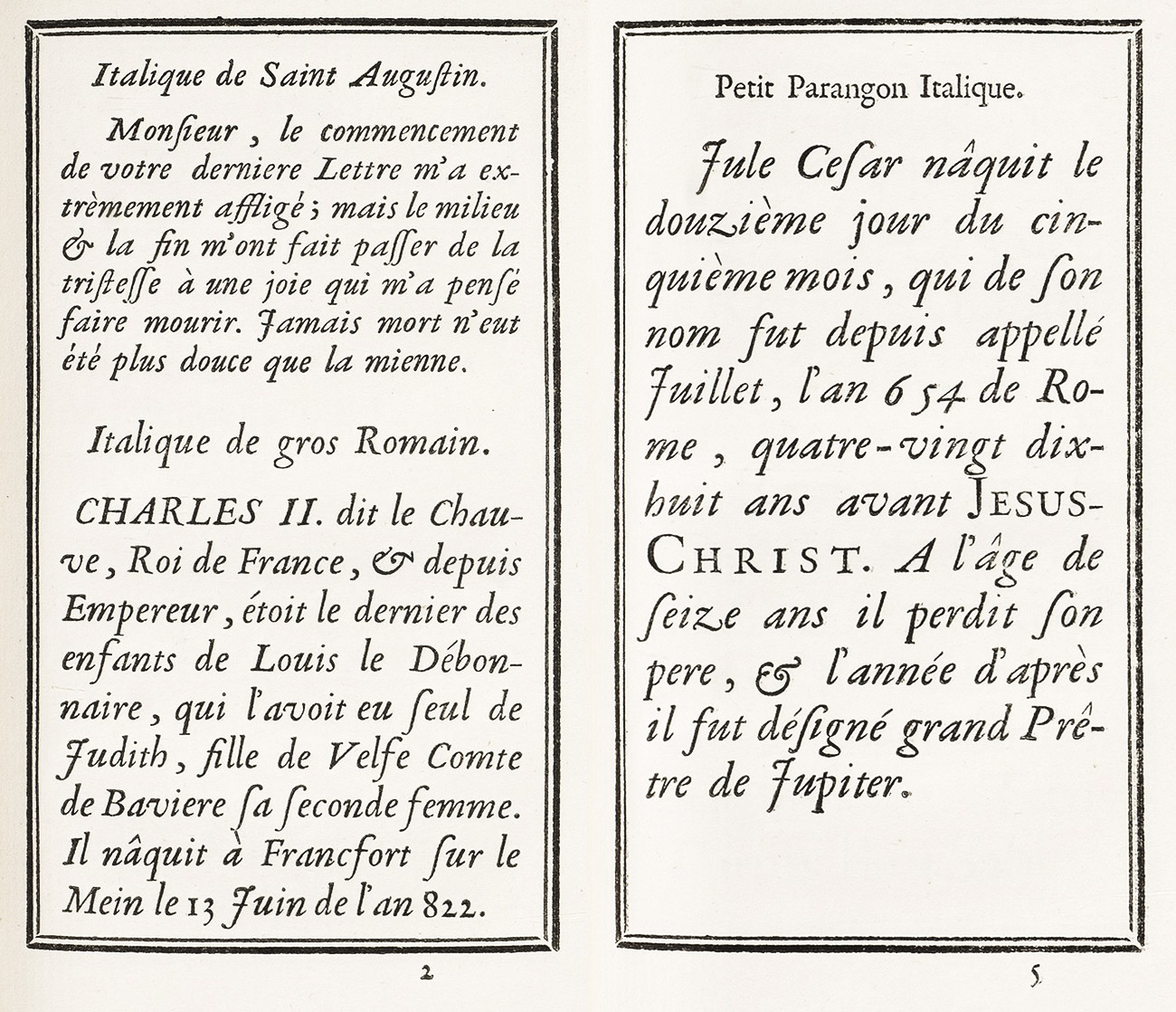
148. Old Italics from Sanlecque’s Épreuves des Caractères, Paris, 1757
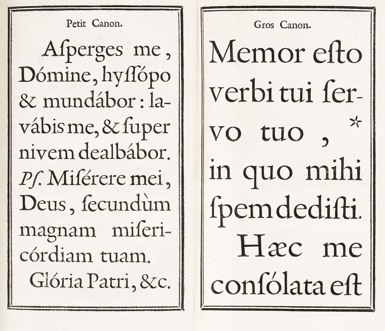
149. Seventeenth Century Types for Liturgical Books, from Sanlecque’s Épreuves des Caractères, Paris, 1757
150. Old Music Types, from Sanlecque’s Épreuves des Caractères, Paris, 1757
We also reproduce here some ornaments that appear to belong to the seventeenth century, from the eighteenth century specimen of the Parisian printer Lamesle (fig. 151); and some roman and italic types which appear to be of early date, from the 1773 specimen of the Lyons foundry of Delacolonge (figs. 152 and 153). The last are early examples of the same size of type in different weights of face.
151. Seventeenth Century Ornaments from Lamesle’s Épreuves Générales des Caractères, Paris, 1742
From Library of Congress (scan)
152. Early Types (œil maigre): Delacolonge’s Caractères et Vignettes, Lyons, 1773
153. Early Types (œil gras): Delacolonge’s Caractères et Vignettes, Lyons, 1773
§3. XVIII Century
In the eighteenth century a few classes of books stand out among the vast proportion of French printers and publishers—the official folio and livre de gala, the history of memoir in quarto, the illustrated book in octavo, 16mo, and 32 mo. There were, of course, an endless number of books in all sizes which were not illustrated, and volumes in quarto which were; but these divisions are characteristic of the century. The great official folios were very magnificent indeed, such as Description des Fêtes données par la Vilel de Paris of 1740, printed by Le Mercier.21 The Voyage Pittoresque of the Abbé de Saing-Non and the folio La Fontaine’s Fables Choisies, illustrated by Oudry, are examples of similar work, though private ventures. A few of these that are interesting from a printer’s point of view, I briefly describe. The type employed for such work in the early eighteenth century was an imposing sort of old style, except where it was specially designed “Royal” font. In later books of this class, type followed that fashion for lighter forms which came in at the end of the eighteenth century, but which is more reminiscent, to us, of nineteenth century fonts. These great books show but one aspect of the French press.
The rank and file of eighteenth century quartos and octavos were more legible than the similar seventeenth century book had been. A reader’s comfort was better looked after. Their arrangement, too, seems modern for us—they are no longer antique and unappetizing, but merely quaint or old-fashioned. A very modern page, in lightness of effect, is Watelet’s L’Art de Peindre,22 printed by the Parisian establishment of Guérin and Delatour in 1760. As elsewhere in Europe, as the century advanced, books—or the best editions—became more open in composition, and therefore far easier to the eye. Then, too, books were smaller and in consequence the types themselves became lighter, partly owing, no doubt, to improvements in paper-making which encouraged type-founders to make more delicate characters, and printers to employ them. Finally, at the end of the century, the movement culminated in fonts which were not old style at all.
Illustrated books—and there were quantities of them—depended with a few exceptions upon their copper-plate illustrations and decorations, more than upon typography, for their reputation. In some books, with plates, head-pieces, and tail-pieces by Eisen, Choffard, Marillier, or Moreau le jeune that are often superb of their kind, the typography is indescribably poor. One cannot comprehend the public could endure such meanly printed text is an accompaniment to such beautiful ornamentation. But works like La Fontaine’s Fables Choisies with Oudry’s illustrations were splendid exceptions; and there were some printers—the Praults and Barbous, for instance—whose beautifully decorated books were well executed from the typographic point of view.
As the century advanced, volume in small format became increasingly popular for luxurious editions of works of a lighter class, and in them delicately engraved plates and coquettish, fanciful head and tail-pieces could be used to better advantage than on a quarto or folio page. The celebrated édition des fermiers-généraux of La Fontaine’s Contes, published by Barbou at Paris (dated Amsterdam) in 1762, in two octavo volumes, is a famous example of such a book.
Among volumes in small 16mo, Barbou’s well-edited Collection des Auteurs Latines were from a mechanical point of view very attractive and workmanlike books. They were sought after, too, for their engraved decorations by Cochin, Eisen, and other artists à la mode, their pretty woodcut tail-pieces by J. B. Papillon, and the agreeable typographic decorations which, with the types employed, were from the foundry of Fournier le jeune. After the year 1755, many volumes of the Auteurs Latines bore the inscription, “Litteræ quibus impressus est hic liber a P. S. Fournier juniore incisæ sunt.”23 The Barbous (printers at Limoges, from the sixteenth century) founded their Paris house in 1704, which was the height of its reputation between 1750 and 1790. It was then under the direction of Joseph Gérard Barbou, the most distinguished member of the family, promoter of the Collection just spoken of, and patron of Fournier le jeune. He published all Fournier’s books—except the Modèles, which was printed by his predecessor, an uncle, Jean Joseph Barbou, in 1742.
In the last quarter of the century, the editions brought out by the Didots were often splendid productions. This family was very important in the history of French late eighteenth century printing, though it played its great part in the development of French type-forms, after 1800. The first of the Didot family was a certain Denis Didot, a printer and publisher, whose son, François Didot,—generally considered the “founder” of this family,—a printer and bookseller, was born at Paris in 1689, where he began his work in 1713. He is chiefly remembered nowadays for the publication of a collection of travels in twenty volumes by his friend the Abbé Prévost, which was issued in 1747, and was considered a good piece of printing in its time. He died in 1757.24 Two of his sons, François Ambroise (1730–1804) and Pierre François (1732–1793), were the heads of branches of the family, each of which contributed largely to the perfection of many industries connected with book-making.
François Ambroise was a clever type-founder, and the first of the family to give to types “the Didot touch,” in fonts brought out about 1775 that were cut by Waflard. Didot was the printer of a famous collection of French classic authors, published by order of Louis XVI in 1783; and a series of finely executed books brought out at the instance of the King’s brother, the Comte d’Artois, to whom he was printer by appointment. He so greatly perfected the point system inaugurated by Fournier, that the Didot point superseded its older rival and remains to-day the basis of French typographical measurement. He introduced in France in 1780 the making of papier vélin de France (a highly finished wove paper modelled on that used by Baskerville) at the Johannot mills at Annonay. It was with François Ambroise Didot that Franklin placed his grandson, Benjamin Franklin Bache, in 1785. In his diary, the lad writes:
My Grandpa has prevailed upon Mr. Didot, the best printer of this age and even the best that has ever been seen, to consent to take me into this house for some time in order to teach me his art. I take my meals at his house and sleep at the house of Mrs. Le Roy, a friend of my grandpap; I went thither today with my cousin and I became acquainted with his family and something more. He combines in his house engraving, the forge, the foundry and the printing-office; it is a very amiable family, as it seems to me; the meals are frugal.
On April 7, he adds,
Today I have engraved my first punch with Mr. Didot’s younger son. It was an o. They assert I have not succeeded badly.
This François Ambroise had two sons, Pierre l’aîné (1761–1853), who succeeded to the printing-office, and Firmin (born 1764), who took over his father’s type-foundry. Pierre is remembered as the publisher of the magnificent éditions du Louvre25 of Virgil, Horace, la Fontaine, and Racine, the latter being considered, at the beginning of the last century, one of the most splendid books ever printed. He was at the forefront of the neoclassical movement in printing, and with his brother Firmin’s chilly types and the dry designs of a chosen group of artists, produced editions of arctic frigidity. Pierre and Firmin Didot in 1784 issued jointly an Épître sur les Progrès de l’Imprimerie, later mentioned. Firmin was most eminent as a type-founder, and in his hands the type Didot crystallized into those forms familiar to us now. He was also interested in stereotyping, by which he popularized low-priced editions of standard French, English, and Italian books. He was a very cultivated and learned person—translating (among other works) Virgil’s Bucolics, printed from type that he himself designed and cast. Napoleon made him director of the foundry of the Imprimerie Impériale, and he was offered its full direction in 1830. He died full of years and honours in 1836.
Ambroise Firmin Didot (1790–1876), son of Firmin, and grandson of François Ambroise, with his brother Hyacinthe, succeeded to the publishing business of this branch of the family, since styled Firmin-Didot. They belong, however, to the nineteenth century.
Pierre François Didot (1732–1793), head of the younger branch of the Didot family, and the son of the original François, was a type-founder and publisher, and also interested himself in paper-making at Essonne. Henri Didot, (1765–1852), son of Pierre, is remembered for his “microscopic” types, a tour de force executed at an advanced age. The assignats issued by the Convention were engraved by him, and their production played a very important part in the revival of stereotyping. Another son, Léger Didot (1767–1829), invented a successful “endless roll” paper-making machine, and was also employed in type-founding. A third son, Didot le jeune, succeeded his brother Henri as a successful type-founder. A daughter, Félicie, married Bernardin de St. Pierre. These are the chief members of a learned race of printers, publishers, type-founders, paper-makers, authors, and inventors—whose family reunions must have resembled a meeting of the Royal Society!
None of the Didots had—typographically—the originality of Bodoni, but as able, industrious, and far more scholarly men, they had immense influence on French typographic usage. Familiar with the work of Baskerville, rivals and critics of Bodoni and Ibarra, they stood in France for the tendencies that were fashionable in England, Italy, and Spain; and thus all their typographic innovations were in the direction of lighter and more modelled fonts. Late eighteenth century Didot editions were very lucid, readable, elegant volumes, printed from type full of feeling, and just on the turn between “old style” and “modern face” fonts. As in Bodoni’s case, too little attention has been paid to the work of the Didots at this period; for we remember them now as chief exponents of that dubious pseudo-classical taste that brought in, with the nineteenth century, the rigid Didot letter, which (not bettered by English fashions then much copied) was, with its still worse derivations, a curse to French typography for more than half a century.
The first example of French eighteenth century printing to be discussed is a quarto volume by Antoine Houdart de la Motte, of the French Academy, entitled Fables Nouvelles,26 published in 1719 at Paris for Grégoire Dupuis, and printed by Coignad. The Discours sur la Fable is set “solid,” and this part of the book is reminiscent of the seventeenth century, as are the general make-up of preliminary matter, the rows of “flowers” separating the Fables, the heavy tail-pieces on wood, etc. But the Fables themselves are set in a delicately cut old style font, very much leaded, and thus the volume is transitional in style between seventeenth and eighteenth century French printing (fig. 154). The engravings at the head of each Fable, especially those designed and engraved by Gillot (master to Watteau), are interesting in themselves, and because they are surrounded by simple lines instead of the elaborate frameworks of a subsequent period—such as those in Dorat’s Fables, and similar books described later.
154. Old Style Types used by Coignard, Paris, 1719
From a copy in the Boston Athenæum (facsimile), Internet Archive (scan)
Montfaucon’s Monumens de la Monarchie Françoise, a great folio edition in five volumes, was printed at Paris in 1729–33 by Claude Simon for the publishers, Gandouin and Giffart. There is little of interest about it as a whole. In detail it has one or two points worth notice. The type employed for the Address to the King in volume first is one of the old Garamond italic fonts—very beautifully displayed in spite of the absurd amount of leading. The ornaments on the title-page, at the head of the preface, and beneath the “privilege” are the work of J. B. Papillon, a wood-engraver who had great reputation. The introduction of bands of type “flowers” is a poor feature of the book, and the innumerable engraved plates, though no doubt useful, are another disturbing element. The book is a good example of early eighteenth century printing—in style a little earlier than its date.
Our next example is A. M. de Ramsay’s Histoire du Vicomte de Turenne, in in two quarto volumes, printed at Paris in 1735 by the Veuve Mazières and J. B. Garnier. The imposing title-page printed from somewhat seventeenth century old style types, with lines alternately in red and black, has an engraved heraldic decoration. Its heavy capitals scarcely prepare for the delicacy of the italic fonts of the preface, or the elegant modelled roman type of the text. The wide margins bear side-notes in a smaller roman letter. Running-titles are set in space capitals of the font. Each book begins with an attractive engraving and an initial letter, also engraved. In the second volume the pièces justificatives are set in much smaller type, and both its cut and its management—it is much leaded—give these pages a modern effect. It is a good reading edition to-day, and in its time must have been accounted a very “advanced” sort of book.
The Œuvres de Jean-Baptiste Rousseau (1671–1741), printed at Paris (dated Brussels) in 1743 by Didot (probably François), in three large quarto volumes, is in its massive qualities almost a seventeenth century edition, but it has an element of taste about it that the seventeenth century did not afford. Printed entirely in a large size of masculine and nervous old style roman type, splendidly placed on ample quarto pages, and really adorned with decorations by Cochin of a delightful suavity of design, it is a superb book. The italic employed for occasional verse is an interesting font. The volumes were printed from type made by Fournier le jeune, who is here styled Simon Pierre (fig. 155).
155. Fournier le jeune’s Types: Didot, Paris, 1743
From a copy in the Harvard College Library, Œuvres de Jean-Baptiste Rousseau (1671–1741) (scan)
For a smaller format, the attractive edition of Œuvres de M. Boileau Despréaux, edited by Saint-Marc, Paris, 1747, in five 12mo volumes, is an example of a luxurious and convenient edition. Overloaded with introductions, notes, and all sorts of miscellaneous apparatus, it is in general effect advancing toward a more open style of printing. In the first two volumes, which are the ones to be looked at, the poetry is set in a letter for its time noticeably light in cut and uniform in design. Leading and spacing add to the delicate effect. Though in other parts of the volumes this manner is not kept up, none the less the typography strikes a novel note. It was printed by Jean Baptiste Coignard, imprimeur du roi, third of his name to be printer to the French Academy, and the founder of a charity for Parisian printers, which still exists.
Among eighteenth century books in such format, I have mentioned the Collection des Auteurs Latines published by Barbou, who used in them Fournier le jeune’s types and ornaments. In this connection, a three-volume edition of the Comœdiæ of Plautus (Paris, 1759) may be examined. For a very full showing of Fournier’s types and ornaments—though the engraved flowers appear to be by Papillon—see F. J. Desbillons’ Fabularum Æsopiarum Libri Quinque Priores, very agreeably printed by Barbou in the same year (fig. 156).
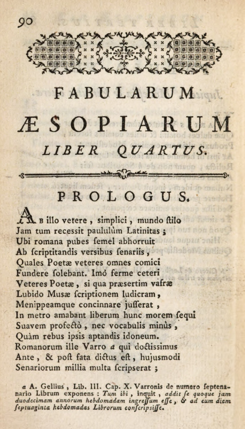
156. Fournier le jeune’s Types and Ornaments, Barbou, Paris, 1759
From a copy in the Harvard College Library (facsimile), Fabularum Æsopiarum Libri Quinque Priores (scan)
The magnificent edition (in four volumes, folio) of La Fontaine’s Fables Choisies with illustrations from paintings by Oudry, redrawn by Cochin fils, who, with others, engraved the plates, is one of the landmarks in French decorative book-making. Cochin apparently had the oversight of the whole work, which was published between 1755 and 1759 jointly by Desaint and Saillant and by Durant.27 It was printed by Jombert, who produced many fine books on military subjects. Of Oudry’s famous but frigid full-page designs I shall not speak, except to praise the work of the engravers.
The typography is magnificently adequate for the enormous pages of the work. The Fables are set in a very handsome, round, old style font, which is as readable as type can be. Half-titles and titles are finely displayed in roman and italic capitals, much spaced; the serifs of the roman capitals showing, however, a bad tendency towards hair-lines. The composition is splendid, its only weak point being the occasional use of triple rules beneath running-titles. To my mind, the glory of the great work is J. J. Bachelier’s floral tail-pieces, etc., cut on wood by J. B. Papillon and Le Sueur, which are among the most splendid woodcut decorations of their kind known. Copied and re-copied in every book on ornamental design, they must be seen on these pages to be appreciated. Great pains were taken with these decorations, which were intended to show the perfection that wood-engraving—then neglected and despised—could attain in competent hands. Bachelier, who “invented” them, was a flower painter and director of design at the Royal Porcelain Manufactory at Vincennes. He adapted them to printing on rough paper by drawings executed in a very open manner, and they were interpreted by the engravers with this in mind. A passage about them in the Avertissement to Volume I is worth reading, and the most important are described in a note at the end of Volume IV.28 I recommend their study to designers wishing to learn how to draw ornaments to be printed with letter-press.
The four 16mo volumes that make up the Anthologie Françoise, ou Chansons Choisies, depuis le 13e Siècle jusqu’à présent, edited by Jean Monnet (whose superb portrait by Cochin engraved by A. de St. Aubin faces its title-page), are thoroughly delightful pieces of printing. The preface is set in an italic—au goût nouveau (that is to say, a letter very even and monotonous in line), and the introduction by De Querlon, in a respectable old style roman font. The pleasantest part of the book begins with the Chansons and their music (printed from Fournier’s music types), most beautifully arranged, and touched up with gay little head and tail-pieces on wood, many of which are delightful. It appears to be set in Fournier’s types, and some of its typographic head-bands are to be found in his specimen-book. The work was printed at Paris in 1765 by Joseph Gérard Barbou (fig. 157).
157. Fournier le jeune’s Music Types: Barbou, Paris, 1765
From a copy in Havard College Library (facsimile), Anthologie Françoise, ou Chansons Choisies, depuis le 13e Siècle jusqu’à présent (scans)
Claude Joseph Dorat was a fashionable person who wrote as poor poetry as fashionable versifiers generally do. Dorat’s books interest a printer because they express the dernier cri in typographic modes of their time, and show the kind of printing that then satisfied a “smart” public. The editions best remembered—for nobody nowadays remembers his poems—are those of his Fables Nouvelles and Les Baisers.
The Fables Nouvelles has a Hague imprint, though really published by Delalain of Paris in 1773. Dorat alludes, in his preface to this edition, to the pompe typographique of its presentation. There was a little pomp about the volume, however, as far as types were concerned. It is composed in a clear old style font of merely respectable cut, and headings to the Fables employ decorated capitals and type ornaments to the last degree trivial. The presswork is uneven, the paper none to good, but the engraved decorations by Marillier, though too heavy for so small a page, are—the best of them—quite wonderful, and just miss being wholly charming. At any rate, they are famous.
Les Baisers, also with The Hague as its imprint, but issued at Paris by Delalain in 1770, is another typical edition. Though it was decorated by Eisen, it is very indifferently printed and (as a whole) as a much overrated book.
Jean François de Saint Lambert wrote an insipid poem, Les Saisons, somewhat in the manner of Thomson, in four parts—Spring, Summer, Autumn, and Winter. This had enormous popularity and was many times reprinted. A seventh edition (still sought after for its beautiful engravings) was published in 1775 at “Amsterdam”—really, I suppose, Paris. To the poem—which with introduction and notes fills the first half of the book—are added two or three short stories, one of which is alluded to by Madame Campan as attracting the attention of Marie Antoinette. Some fugitive verse and “Oriental Fables” complete a volume which (exquisitely illustrated by Moreau le jeune and Choffard) had a very fashionable public. The book shows every evidence of employing Fournier’s types, and the ornaments are undoubtedly from his foundry. The points about it which are typographically so important are the very modelled old style fonts used for the Discours Preliminaire and the poem itself (fig. 158), and the new style of italic in the “arguments” to each book of Les Saisons (fig. 159). This italic is midway between the old style italic previously used and that put forth later by Firmin Didot. It is very easy to read, owing to regularity of line and design; but it is as inferior in style to that which it supplanted as the Didot type was inferior to it. The typographical head-pieces for the stories should be looked at. The book is a very good example of the use of somewhat refined old style types; though it is greatly disfigured by the heavy rules on the title-page and below running-titles.
158. Roman Type in Saint Lambert’s Saisons, Paris, 1775
From Google Books (scan)
159. Italic in Saint Lambert’s Saisons, Paris, 1775
From Google Books (scan)
The celebrated Voyage Pittoresque, ou Description des Royaumes de Naples et de Sicile of the Abbé Jean Claude Richard de Saint-Non (1730–1804), is a combination of the great official folio with the illustrated édition de luxe. Its five gigantic volumes give an opportunity for the insertion of innumerable plates. Old style types of medium weight, a good deal leaded, are used throughout. The composition is a little confused, and some inadequate type decorations, needlessly introduced, are overwhelmed by the magnificent engraved decorations, unsurpassed of their kind. The Voyage has a further interest because it helped on the vogue for classical motifs in decoration, through its agreeably rendered plates of classical furniture and utensils. The designs from Greek vases in two colours are admirable pieces of copper-plate printing, and a word should be said about the sumptuous engraved Dedication to Marie Antoinette, in Volume I. Saint-Non, the most distinguished amateur of the second half of the century, was himself a passable engraver as well as an archaeologist and antiquary. A convinced idealist, he dedicated his life to producing this wonderful work, which, begun in 1778, was finished in 1786. It was printed by Clousier and—incidentally—ruined Saint-Non.
A book in small format that shows Didot l’aîné at his best as a printer, is the Abbé de Lille’s Géorgiques de Virgile, en vers François. Delightful old style types are used in this pretty little 32mo edition, which was printed for the Paris publisher, Bleuet, in 1782 (fig. 160). This should be compared with a volume already alluded to (in a way a “specimen-book”) that shows some new Didot characters—the octavo Épître sur les Progrès de l’Imprimerie (1784), written by Pierre, eldest son of François Ambroise Didot, and printed in italic types designed by Firmin Didot, his second son. It employs for the poem a very light, monotonous italic (fig. 161). The notes are set in a smaller size of it, mingled with a roman letter which is somewhat colourless in effect. The general conception of its type is still old style, but pared down to the last degree. This italic was not an invention “from a clear sky,” but merely “developed” the type au goût nouveau, of which we have seen examples in mid-eighteenth century French specimen-books. Firmin Didot’s italic types superseded those of Fournier le jeune, which until then had been popular, and allusion to this is made in the Épître. The Épître was reprinted in an exquisite little volume in 18mo—Pierre Didot’s Essai de Fables nouvelles dédiées au Roi; suivies de Poésies diverses et d’une Épître sur les progrès de l’Imrimerie…À Paris, imprimé par Franc. Ambr. Didot l’aîné avec les caractères de Firmin son 2d fils, 1786. The same series of types is used in both books, but not in the same sizes. In this small format the delicacy of type is warranted—and the composition is very tastefully managed.29
160. Roman Types used in Géorgiques de Virgile: Didot l’aîné, Paris, 1782
From a copy in Harvard College Library, Google Books (scans)
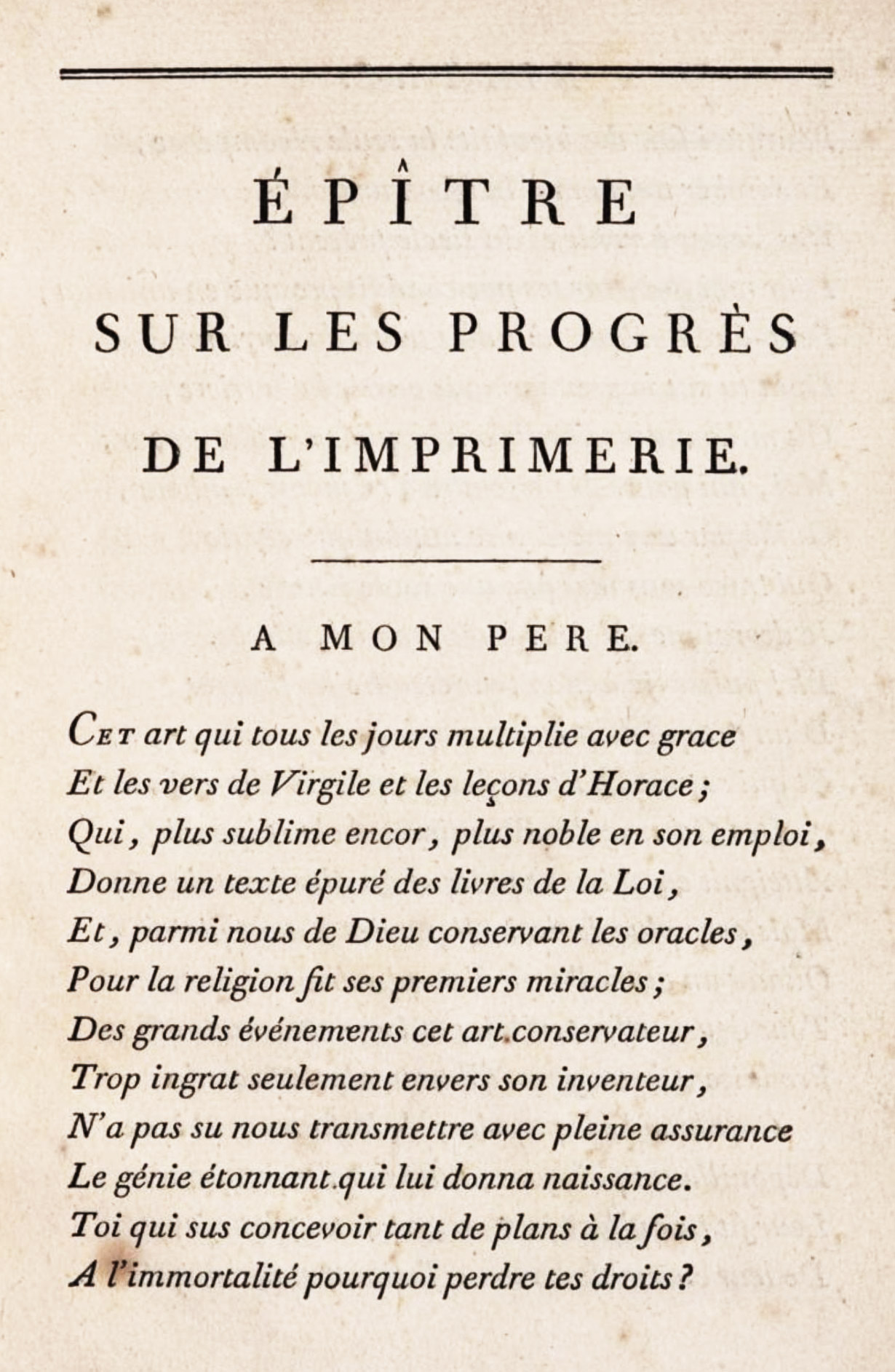
161. Page employing Firmin Didot’s Italic Type, from Didot’s Épître sur les Progrè de l’Imrimerie, printed by F. A. Didot, Paris, 1784
From Google Books (scan)
Tasso’s Gerusalemme Liberata [volume 2] was printed at Paris by François Ambroise Didot l’aîné, in 1784–88, “by order of Monsieur,”—the Comte de Provence (afterwards Louis XVIII),—who chose the subjects for Cochin’s illustrations. It is a beautiful example of Didot’s printing. The type is a delicate old style, though a little too much influenced by Bodoni in the contrasting weight of line, an effect increased by the vellum-like paper employed. The Didots no doubt believed that the papier-vélin improved their books, by enabling them to attenuate the thin strokes of the type—refinements which these highly finished papers were able to “take” only too successfully.
In 1782, the Paris publishers Molini and Lamy issued a prospectus of an edition of a work first brought out in 1757 by the Comte de Caylus and J. B. Mariette—the Peintures Antiques de Bartoli, which reproduced frescoes discovered at Herculaneum. This new edition of one hundred copies was to be all that was most distinguished, and for it some new types of Didot l’aîné were to be used. The portion of the prospectus which is reproduced (fig. 162) shows this beautiful transitional font, which retains the charm of old style letter, but has a touch of grace and delicacy which makes it very much of its period. It is one of a series of steps by which the Didots learnedly but foolishly descended to the types they used about 1800.
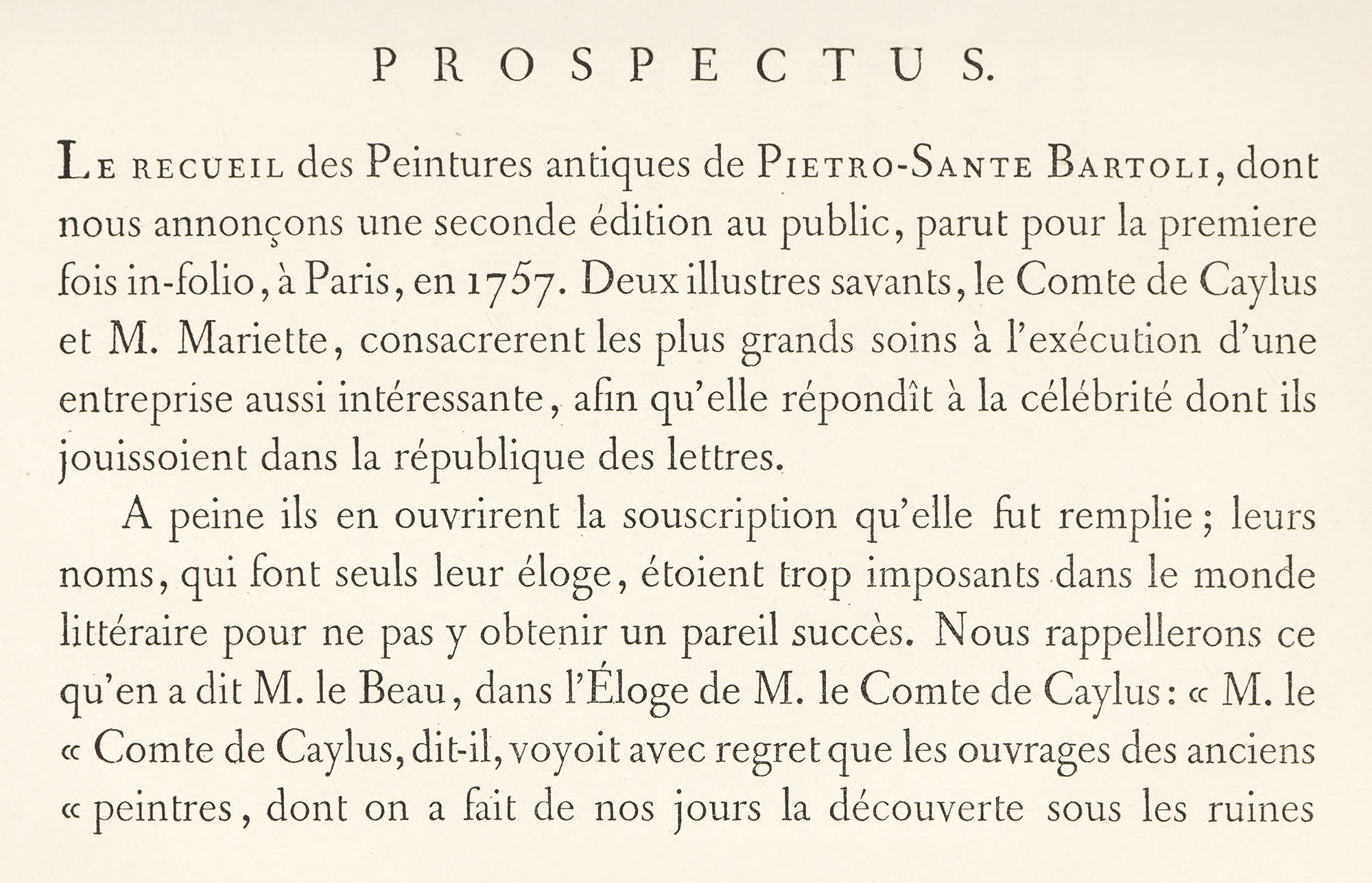
162. Types used by F. A. Didot in Prospectus of Peintures Antiques, Paris, 1782
In François Ambroise Didot’s edition of the Œuvres de Fénelon in nine quarto volumes, begun in 1787 and completed by his son, Pierre Didot, in 1792, the shape of letter used is still old style, but it is so thin and fragile that it is scarcely recognizable as old style at all. This results in faded-looking pages that are perfectly legible, but give an insecure feeling to the eye (fig. 163). This edition should be compared with Fénelon’s Aventures de Télémaque [volume 2], also printed in quarto in 1787 by Pierre François Didot, broth to François Ambroise. The preface state that it is set in “les nouveaux Caractères de sa Fonderie,” and that the subscribers, allowed to choose between a caractère gras and a caractère maigre for this edition, had given six hundred votes for the former against two for the latter. The choice seems justified, for the gras employed in Télémaque (fig. 164) is maigre enough, in all conscience! However, it is a type with some colour left in it, and it is beautifully imposed and printed on a rich papier d’Annonay, made for the book.
163. Caractè Maigre used in Œuvres de Fénelon: F. A. and P. Didot, Paris, 1787–92
From a copy in Harvard College Library (facsimle), Internet Archive (scan)
164. Caractè Gras used in Aventures de Télémaque: Pierre François Didot, Paris, 1787
From a copy in Harvard College Library (facsimile), Gallica (scan)
The Kehl editions of Voltaire (with the imprint Société Littéraire Typographique) were printed from Baskerville’s type, purchased by Beaumarchais for the purpose. Three editions were proposed; but the octavo and 12mo seem to have been the only ones completed. The octavo is the better of the two, and its pages have distinction and charm. Their marked lightness of effect is gained by very open leading and by titles set in spaced capital letters, much helped by the small sizes of the types employed, which lend themselves readily to this kind of treatment. Some of the tables of contents are particularly interesting in composition. The 12mo edition, planned on the same lines as the octavo, scarcely “arrives,” as its type seems rather a misfit for such a small format. This work—de longue haleine—was printed in seventy volumes octavo, and in ninety-two volumes 12mo, being begun in 1784 and finished in 1789. Artistically a success, it was financially a complete failure. And it is one of the sarcasms of destiny that the Revolution which Voltaire helped bring about, wrecked the “definitive edition” of his works! Pages of La Pucelle of 1789 are reproduced (fig. 165).
165. Baskerville’s Types used in Voltaire’s La Pucelle, Kehl, 1789
As an indication of changing typography the student should look at Dorat’s Lettres en Vers, et Œuvres Mêlées, published by Delalain in 1792. It is much the same kind of a book as the Fables; but by 1792 types had wholly changed, becoming feeble in colour and modern in shape. Ephemeral volumes like Dorat’s are often more “rewarding” typographically than better books, because they depended on luxurious presentation to get themselves read. They are the equivalent of a nineteenth century “gift book.” To see the best printing of a century, one must know what books were in fashion—for many volumes, forgotten now, were the ones on which the printer spent most labour.
C. M. Saugrain’s octavo edition of the New Testament [vol. 2 only] in Latin and French (translated by De Saci) was begun by Didot jeune in 1793. In plan a handsome work, it is wrecked by its chilly “modern” types, excessive leading, and a paper too rough for the fonts employed. It is illustrated by Moreau le jeune, who seems very ill at ease in designing Biblical subjects. The edition is inscribed to the Assemblée Nationale, which, though pledge to receive no dedications of books, made an exception in its favour, to show—in 1791—“its attachment and respect for the Christian Religion.”
A six-volume edition of Œuvres de Molière was printed in 1791–94 at Paris by P. Didot l’aîné, in an edition limited to two hundred and fifty copies, set from some new types cut by Firmin Didot. It was part of Pierre Didot’s quarto series of Auteurs Classiques François et Latine. To understand it typographically, compare it with the six-volume quarto edition of Molière, of 1734, which was intended to be “printed with magnificense” by Pierre Prault, with illustrations and decorations by Boucher, Oppenort, and others. Prault’s edition is from old style types, full of warmth and colour, while in the Didot Molière, though the types are not absolutely modern face, they have lost their suave quality—they are too regular and lack picturesqueness, and produce very arid pages.
A folio Latin edition of Lucan’s Pharsalia, published and edited by Antoine Auguste Renouard and printed from the types of Didot fils aîné in 1795, is an example of the use of over-modelled late Didot types, and a very hideous piece of work it is! Each letter of these fonts, perfect enough in itself, has too much light and shade, and in mass lacks solidity of effect. The type jumps at you! The arrangement too, is without much sense of style. It fails just where Bodoni and even the Foulis brothers succeeded; though none the less it is typographically a very instructive volume for the student.
In France the typographic event of the close of the century was the appearance of Pierre Didot’s éditions du Louvre of Horace and Virgil. The Opera of Virgil, in folio, was a limited edition of two hundred and fifty copies, printed in 1798 from types designed and cast by Firmin Didot. It was decorated with twenty-three engraved plates after designs by Gérard and Girodet, and was intended to surpass Bodoni’s folio Virgil of 1793. This was followed in 1799 by Pierre Didot’s folio Latin Horace with decorations by Percier—a companion limited edition. I have some of the “trial” pages of the Horace which belonged to Renouard and were probably given by him Didot. The type is clear to read, but quite without charm. Variations of light and shade are extreme, and the serifs of capital letters such as M and N are literally hair-lines at right angles to the upright strokes (fig. 166). The pages as a whole are imposing but lifeless. The decoration to the first ode, designed by Percier and engraved by Girodet, is splendid enough of its kind, but is as hard in feeling and execution as the typography beneath it (fig. 167).
166. Types of folio Horace: Pierre Didot, Paris, 1799
167. Page of folio Horace: Pierre Didot, Paris, 1799
From this survey of French books, we see that in the sixteenth century black-letter was at first used, but was slowly driven out by the fashions introduced by Tory and the Italian influence in French art; that during that century, especially in the first half—the great period of French printing—French types were a slightly more delicate form of the best Italian letters of the preceding century. In the seventeenth century, letter design became less classical and monumental in feeling and inclined more toward what we now know as heavy “old style” types, and of these (as we shall see later) some of the finest were cut only through royal subvention. In the eighteenth century, types, though still rather heavy in the earlier years, became lighter in form and method of composition as time went on, until the type-forms developed into “modern face”—the rigid uniformity of which was then mistaken for classic severity.
It is a wonderful showing that the French printer makes from 1500 to 1800.30 His best typography—like much else that is French—was all along the centuries characterized by distinction and elegance. And this was not all. Hand in hand with these went lucidity of thought and resultant lucidity of product—that inspired practicality which is the fascinating and peculiar possession of the brave sons and daughters of Gaul!
II. Royal Types and the Imprimerie Royale
Types used in the books described could almost all be purchased from foundries of their respective periods; but there were important types which could not be thus secured, that owed their existence to government subvention. The Crown had paid attention to fine types and printing in the fifteenth century, and there were royal printers as early as 1487, of whom Pierre Le Rouge was the first. Geofroy Tory was an imprimeur du roi,31 and François I, somewhere about 1539, conferred on Robert Estienne the title of Royal Printer for Hebrew and Latin, and in 1538 made Conrad Neobar King’s Printer for Greek. After Neobar’s death, Robert Estienne united in himself the functions of Latin, Greek, and Hebrew typographer, and there were in later times royal printers for music, mathematics, and Oriental tongues. These royal printers in Hebrew, Greek, and Latin probably owed their posts to the institution of five lecteurs royaux (lectores regii) by François I in 1530, appointments which were the origin of the Collège de France. This foundation, sometimes known as Collège de Trois-Langues, was to encourage studies in Greek, Hebrew, and the Latin classics, and incidentally to counterbalance the scholastic view of education to which the University of Paris, and particularly the Sorbonne, was committed. There were two readers for Greek, three for Hebrew, and another for “l’éloquence latine,” and it was natural enough that royal readers in Latin, Greek, and Hebrew should be followed by royal printers (typographi regii) in Latin, Greek, and Hebrew; just as the royal types (typi regii), such as the grecs du roi, followed in due course, and were in turn housed by the Imprimerie Royale (typographia regia).
It was at the instance of François I that Claud Garamond, a pupil of Tory, and the first and perhaps most distinguished of French letter-cutters and type-founders, produced his famous Greek fonts called grecs du roi. His roman and italic types called caractères de l’Université, were cut in four several sizes, in 1540, according to some authorities.
Garamond is said to have based his roman on Jenson’s model, but on comparing the two types, this appears untrue. Jenson, to whom more credit has been given as a type designer than is, perhaps, altogether his due, certainly cut (if we suppose he cut the roman types of the De Spires) the most successful roman letter that until then had appeared. As design, however, it was chiefly a clever transcript of a much more beautiful Humanistic manuscript hand. Garamond, in his new roman, was no longer reproducing a manuscript, but creating letters to be considered independently as types. His fonts show this. His mastery of technique, and a certain conscious elegance in design, remove them entirely from the grave simplicity of Jenson’s letter. At the time that Garamond’s types were cut, Jenson’s roman types were famous, and, Jenson being a Frenchman, of course it was natural to have him in mind when preparing new roman types. So in that sense Garamond modelled his type upon Jenson’s characters, but this does not mean that he exactly copied their design. His italic he based, he admits, on the Aldine italic, and on examination there is a certain similarity, although it is such freer in effect, owing, among other things, to its sloping capitals. Garamond is nearer to Aldus in his italic than he is to Jenson in his roman.
Garamond’s roman fonts were wonderfully beautiful—clear and open. The very small loops to the e’s and the narrow a’s are characteristic, as are the capitals that are large relatively to lower-case letters. The italic capitals slope at different angles, and when composed with the lower-case have a restless quality. On the other hand, both fonts, especially the italic, have a delightful unconventionality of design—free and spirited, yet noble; full of contrast and movement, yet with elegance and precision of line that marks them as French32 (fig. 168). In what appears to be one of these fine roman fonts, Robert Estienne in 1549 printed a most beautiful book—Paolo Giovio’s Vitæ duodecim Vicecomitum Mediolani Principum. It is composed throughout in one size of roman, except for poetry, which is set in two sizes of italic. The initials are the work of Geofroy Tory, and the ten portraits of the Counts of Milan are reduced copies by tory, of those in a manuscript in the Bibliotèque Royale (fig. 169). Although it is not stated that the book is printed from Garamond’s types, its title-page bears the celebrated mark of the basilisk and the Greek motto which was usually employed by Estienne in his books printed from Garamond’s royal Greek fonts.33
168. Garamond’s Caractères de l’Université, c. 1540, used in Richelieu’s Les Principaux Poincts de la Foy Catholique Défendus: Imprimerie royale, Paris, 1642
From Gallica (scan)
169. Roman Type (Garamond?) used in Giovio’s Vitæ: Estienne, Paris, 1549
From a copy in Harvard College Library (facsimile), HathiTrust (scan)
Garamond’s roman and italic gave the gothic character its deathblow. It was much used in Italy, England, Holland, and Germany, either in fonts which were sent there, matrices which were sold there, or by imitations. In Germany his small types became so much the fashion that the German type-body was named “Garamond”; for although Garamond died (in 1561) in poverty, after his death, says Vitré sarcastically, “he was recompensed by tributes without end”—of which this was one!
Garamond’s roman and italic gave the gothic character its deathblow. It was very much used in Italy, England, and Holland, either in fonts sent there, matrices sold there, or by imitations. In Germany his types were also sold as shown in the Egenolff-Frankfort specimen of 1592—merely the German adoption of a French design; for although Garamond died in the year 1561 in povery, after his death, says Vitré sarcastically, “he was recompensed by tributes without end.”
Garamond’s famous Greek characters, the typi regii, grecs du roi, or royal types, were cut about the same time.34
Their design was based on the handwriting of a clever calligrapher, Angelos Vergetios—“notre écrivain en grec,” as François I styled him. Garamond was employed to cut the punches of these types under the direction of Robert Estienne, and they were completed, apparently, by 1541. They were in three sizes. These fonts were intended to reproduce as closely as possible the Greek handwriting of that day as exemplified by Vergetios’ fine manuscripts; and though this was not, from a present-day point of view, an advantage, it was thought to be so then. Garamond certainly achieved exactly what he intended, for the calligraphic appearance of the type is striking enough; in fact, rather disagreeably marked in its largest size. Fournier states that no Greek characters save these possessed practically all known ligatures. One of Garamond’s reforms was the adoption of larger and more adequate Greek capitals, which replaced the small and unimportant capitals in current use. Robert Proctor said of this Greek type that,
it was, and is, by far the best type of its kind that has ever been cut…I believe, that an English type-founder of to-day would add his testimony to that of the French experts who have treated this subject, that for evenness of colour, for precision of casting, and for the exactness of alignment and justification, these founts are unsurpassable.”35
All three types are shown in the illustration (fig. 170).
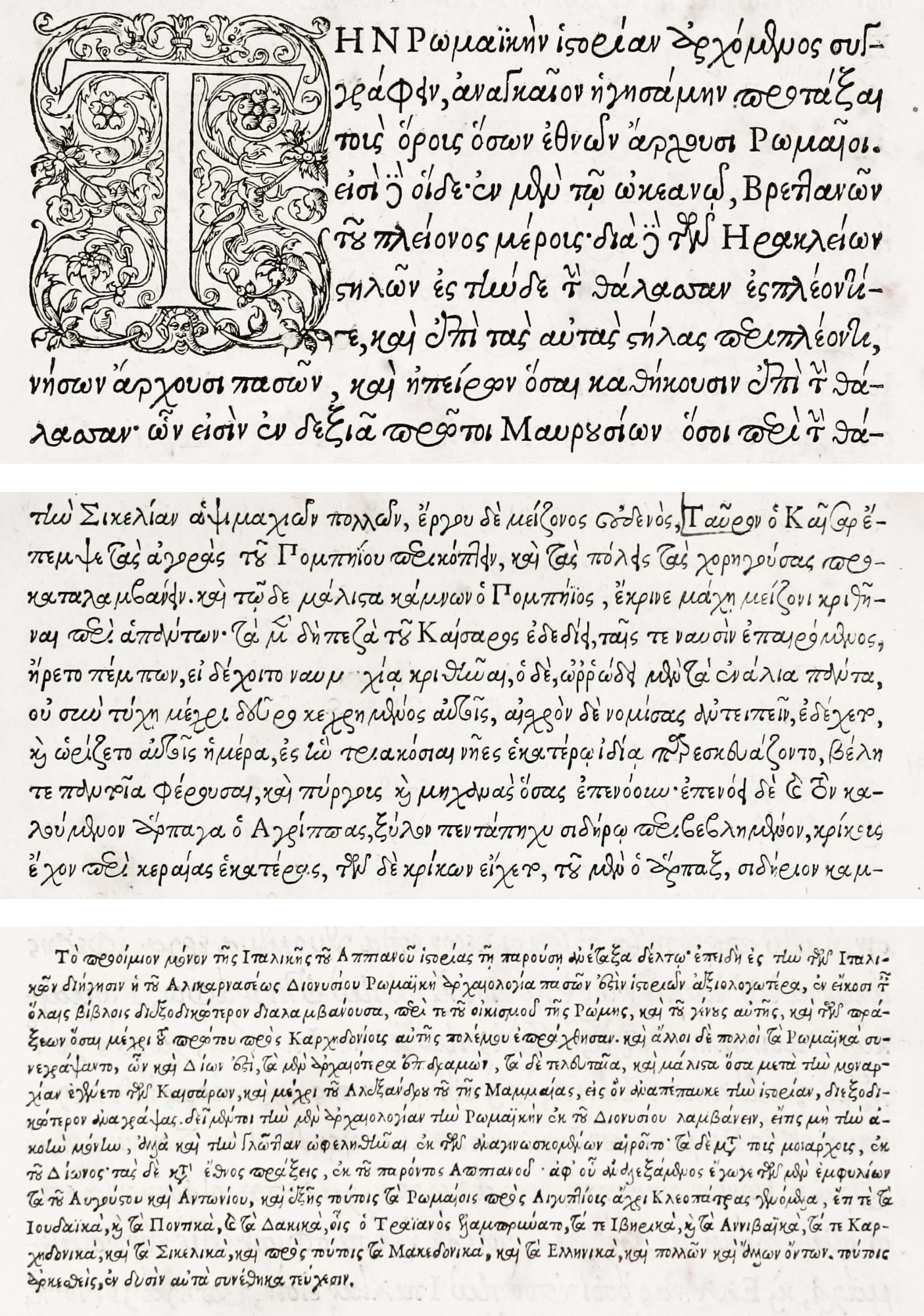
170. Garamond’s Grecs du Roi (three sizes) used in Greek edition of Appiani Alexandrini Romanarum Historiarum: Estienne, Paris, 1551
These Greek types were first employed in an edition of the Præparatio Evangelica of Eusebius, issued by Robert Estienne of 1544—a magnificent folio, printed in the second size of type (gros-romain), which was the font finished earliest, and, of the three, made the finest books.
The largest size (gros-parangon) was used in a folio edition of the New Testament issued in 1550 by Robert Estienne. The smallest of them (cicéro) had already been employed in a 16mo New Testament (known as “O Mirificam”), printed by Robert Estienne in 1546. He says in his preface:
O the marvellous liberality of our King, that most excellent and noble prince! for feeling that such were needed to bring together into a narrow compass books of large volume, he bade engrave these smaller Greek characters, which in elegance rival the former, though these were of all letters in the most beautiful. These having been delivered to e for the good of the world of letters, how could I better inaugurate their use than by a sacred text, and what text is more holy and august than Gospel?
One of the most exquisite books printed from these fonts in Charles and Robert Estienne’s Greek edition of Appiani Alexandrini Romanarum Historiarum, published in 1551. All three sizes of type are used in it. The type in mass, and the proportion and imposition of the type-page, are very splendid, and there is another reason for looking at it. The superb decorations and initials by Tory, which are employed in all the Greek editions mentioned, are wonderful, in their accord with the colour of the Greek text, in their printable qualities, and in their grace of design (fig. 171). The most brilliant impression of the is found in the Eusebius. They are among the best of the printed decorations used in the sixteenth century.
171. Page of Grec du Roi from Greek edition of Appiani Alexandrini Romanarum Historiarum: Estienne, Paris, 1551
From HathiTrust (scan)
Garamond’s Jean Jannon’s caractères de l’Université, in four sizes of roman and italic, and the and the grecs du roi in three sizes, of Claude Garamond, thus became the nucleus of the magnificent collection of types now belonging to the Imprimerie Nationale de France. Up to the date of the foundation of the Imprimerie Royale, under Richelieu and Louis XIII, there had been, as we know, King’s Printers, who had charge and use of typographical material belonging to the Crown—such as the Garamond types particular just mentioned. This material was held as a sort of deposit, confided to the care of a director, and when type was needed it was cast from the “royal” moulds and matrices by such founders as the director selected. Thus, in a sense, François I was the found of the Imprimerie Royale, for, as Bernard says, the types and not the structure where they are preserved are the essential part of a printing-house.
Attention had been directed to scholarly typography early in the seventeenth century by three incidents—the acquisition at Geneva in 1619 of the matrices of the Royal Greek types, and in 1632 of the Oriental fonts belonging to Savary de Brèves; and by the republican of the Paris Polyglot of Le Jay—on which Richelieu cast an envious eye. Then, too, about the middle of the century, the Elzevirs were at the height of their reputation, and were printing books in Holland which attracted Richelieu’s attention.36 In a letter written, apparently, at Richelieu’s instance, to Brasset, French Ambassador in Holland in 1640, by Sublet de Noyers, he said:
I have had for a long time the design of establishing a royal printing-office at the Louvre, and because I wish to execute everything in it with the greatest possible perfection, and I learn that in Dutch printing-offices they have a secret method of making ink which renders the impression of the letter much more beautiful and distinct, and that it is something which cannot be made in France, and also that there are a large number of printers in the country, at Amsterdam, Leyden, Blaen, and elsewhere, who would perhaps be very glad to come to earn their living there, I beg you will take the trouble to inform yourself if it is possible to find workmen in said printing-offices, at least four pressmen and four compositors, and among them, if possible, now who knows how to mary this printing-ink, and to arrange them in them at once for the expenses of their journey and their maintenance, as reasonably as possible and as between private persons; for it is not well to mix up, in any way whatever, the name of the King in this business, nor to disclose our plan to foreigners who may wish in some way to hinder it. You can, if you choose, say that it is Monsieur Cramoisy, the Paris publisher, who has undertaken some big piece of work, who has asked you about the matter.
Six months after this, on November 17, 1640, the Imprimerie Royale du Louvre was installed, with the required number of workmen. De Noyers had charge of its administration, but its first director was Sébastien Cramoisy—whom Richelieu originally intended to appoint as printer to the French Academy. John Evelyn, on a visit to Paris in 1644, speaks of seeing “the King’s printing-house and that famous letter so much esteemed. Here,” he adds, “I bought divers of the classic authors, poets and others.” In 1642, a volume appeared from the presses of the Imprimerie Royale in “that famous letter” of which Evelyn speaks. No doubt great paints were taken with the book, for it was written by the founder of the press—Richelieu; its title being, Les Principaux Poincts de la Foy Catholique Défendus, etc. This magnificent piece of printing employs Garamond’s splendid Jannon’s imposing roman and italic types.
The Address to the King, in very bold italic (fig. 168), is specially to be noticed. The vary narrow measure of the pages permits notes to be placed in the margin without loss of effect. Although the impression is uneven, its appearance as a whole is sumptuous and imposing. Above all, it is readable—the quality by which a book must stand or fall (fig. 172).
172. Garamond’s Jannon’s Roman and Italic Types used in Richelieu’s Les Principaux Poincts de la Foy Catholique Défendus: Imprimerie Royale, Paris, 1642
From Gallica (scan)
Publii Terentii Comœdiæ, also printed in 1642 at the Imprimerie, is, like some other classics in folio from this press, cumbrous in style. It is printed from a monotonous old style font, with a heavy impression, and so large a type is used that there are many “turn-over” lines. Its decorations—except for a truly superb engraved title-page—are not remarkable; but the management of massed capitals at the beginning of each play is clever and distinguished. It is an example of the “divers classic authors” that Eveyln bought on his visit to this press two years later.
p>The first book issued in the Imprimerie Royale (in 1640) was a folio De Imitatione Christi. Other fine books of the early period were the Introduction à la vie dévote of St. Francis de Sales of 1641; a Greek Testament and a Latin Bible, both folio, published in 1642; the acts of the General Councils, etc., in thirty-seven volumes, the first of which was printed in 1644; Tasso’s Gerusalemme Liberata (1644), a very heavy performance typographically, but with agreeable decorations; besides folio editions of Virgil, Horace, Terence, Juvenal, and other authors. During the first ten years of the existence of this press some hundred volumes were printed.In 1692, Louis XIV ordered a new series of types, to be used exclusively by the Imprimerie Royale and to be produced without any thought of expense. To decide on what this new character should be, a commission was appointed by the Académie des Sciences, of which Jaugeon37 was the most active member. Granjean,38 first accredited royal type-cutter, was chosen to engrave the punches—in which he is said to have been helped by his friend and pupil, and successor, Alexandre. The committee worked for several years to get things to its mind. The result of all this cogitation was the romain du roi—comprising twenty-one different bodies of roman and italic, and twenty bodies of roman and italic initials: in all, eighty-two complete fonts.
These types, begun in 1693, were only finished in 1745. They were marked as “royal” fonts in an odd way—by a little projection on the left shank of the lower-case l at the height of a short lower-case letter. This annoying feature of an otherwise beautiful font has been continued on the l of roman letters cut for the Imprimerie ever since. It has been said that l was selected by order of Louis XIV—who, by the way, esteemed Grandjean’s types so highly that he refused the request of Philip V of Spain for a set of the punches. In some early gothic types a similar mark, derived from manuscripts, also appeared on the left of the l. The best of Grandjean’s romain du roi fonts were employed in a magnificent folio, Médailles sur les Principaux Événements du Règne de Louis le Grand, avec des Explications Historiques. Par l’Académie Royale des Inscriptions & Médailles (fig. 173). This book was printed at the Imprimerie Royale in 1702.39 An enlarged folio edition covering the entire reign, with different explications, was issued in 1723; but as it is printed on rougher paper, it does not show the peculiarities of the characters to clearly. A good modern impression of these fonts may be seen in the work printed by the Imprimerie Nationale in 1889, entitled Cuivres de Cochin destinés à l’Histoire de Louis XV par Médailles. This book, intended to be a continuation of the similar volumes devoted to the reign of Louis XIV, was never completed, but these designs made for it by Cochin have been published. In its text Grandjean’s italic type40 is beautifully displayed (fig. 174).
173. Grandjean’s Romain du Roi used in Médailles sur les Principaux Événements du Règne de Louis le Grand: Imprimerie Royale, Paris, 1702
From a copy in the Boston Anthenæum (facsimile), Gallica (scan)
174. Grandjean’s Romain du Roi (italic) used in Cuivres de Cochin destinés à l’Histoire de Louis XV par Médailles: Imprimerie Nationale, Paris, 1889
Grandjean’s type was, Bernard says, “a type friendly to the eye”—and at first sight it seems to be. There was about it, however, something that was to prove, in its developments, very unfriendly to the eye. That was its serif,41 which took the form of an almost unbracketed line, and on the tops of b, d, h, i, j, k, and l extended on both sides of the upright stroke. A page printed from these types had, owing to the number of fine horizontal serifs, the appearance of being ruled. Jenson’s letters had very thick serifs at the bottom, and triangular serifs at the top. Garamond’s fonts had much the same kind of serif, but refined. Grandjean’s thin horizontal serif was a movement toward that lightness or effect in type that came about later, but which was then very little thought of. It is the appearance of a bad element in French type-design, and is important in the history of some types to be discussed later. This was not all. In the capitals the contrasts of thin and thick strokes are more marked. The italic lower-case—beautiful of its kind—appears engraved. It is a very decorous type, and it looks as if it had been designed in accordance with rules—many rules. It was of the lucubrations of the committee who arranged elaborate diagrams for it that Fournier le jeune exclaimed: “Must there be so many squares to make an O that is round, and so many circles to make other letters that are square!”42 Yet when all is said, Grandjean’s open, clear, wide letters, extravagant of space, almost read themselves. It is of its kind, one of the finest types extant.
Grandjean died in 1714, and the work on these fonts was carried on by his pupil, Alexandre; and Alexandre’s son-in-law, Louis Luce, completed them in 1745. All these men were royal type-cutters.
The next important type acquired for the Imprimerie Royale was that Louis Luce, third royal type-cutter, who between 1740 and 1770 designed a series of fonts of a letter of narrower proportions than the characters we have been considering. There were in this series thirty roman bodies and the same number of italic. Luce says in his advertisement to is Essai d’une Nouvelle Typographie43 of 1771 (beautifully printed by Barbou), that he has tried to make a font different from anything which the Imprimerie Royale has employed, and in the Essai he shows Grandjean’s letters and his own (fig. 175). His are taller and narrower, or, as we should say “condensed,” giving them a cramped appearance, something like a modern French type called “Elzevier.” His serifs are oblique, and on the left of ascending characters only, which was an improvement; for Grandjean’s types with their flat tops are dazzling, and their alignment is too perfect for good effect in mass. Luce’s adoption of the serif on the left only, he justified on the ground that all types originated from a written letter, and that in forming a letter with a pen, one would start from the left. He says that it is partly by the delicacy of the serif that he has differentiated these types from the caractères de l’Université and from Dutch types of his time. Of the italic, he adds that he has purposely simplified its shape; that connecting lines are lighter and there are fewer tails to the letters. In the romain du roi types, the “complimentary” projection on the lower-case l appears on the left of the shank; in Luce’s types, on the right. Luce’s elongated type, because it was compact, was adapted to poetry, where broken lines are undesirable. So he called it poétique. Although Luce was a royal type-cutter, he designed these types as an independent venture, and intended them for general use (fig. 176).
175. Luce’s Types Poétiques compared with Old Style types of Imprimerie Royale
From Luce’s Essai d’une Nouvelle Typographie, Paris, 1771
176. Luce’s Types Poétiques (roman and two versions of italic)
From Luce’s Essai d’une Nouvelle Typographie, Paris, 1771
His Essai d’une Nouvelle Typographie shows a superb collection of ornaments and borders made to accompany his types. These are designed with great skill from a decorative point of view, are wonderful in their variety, and yet harmonize with one another. No modern type-foundry has produced a more magnificent suit of appropriate and “printable” ornaments. They were made on all sorts of bodies, and were meant to take the place of engraved borders, which were then the fashion, but which were expensive, and, furthermore, involved two printings (fig. 177).
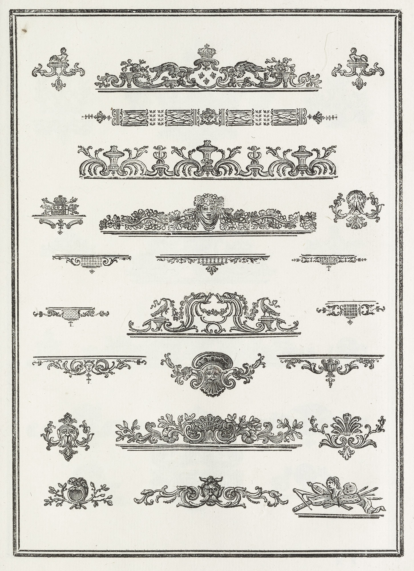
177. Luce’s Ornaments
From Luce’s Essai d’une Nouvelle Typographie, Paris, 1771
The “approbation” which Luce’s book received in 1771 politely says that his fonts “prove to amateurs that the art of Garamond is susceptible of perfection.” The Académie des Sciences in 1772 also commended especially the merit and ingenuity of his ornaments, which could be made up into head-bands, allegorical cartouches, and tail-pieces at will; could be printed with the type, and were of even colour with the typography—never the case when borders were engraved on copper, which was, moreover, much more costly (fig. 178). In 1773, by order of Louis XV, the whole collection was bought for the Imprimerie, where it is still. Its ornaments were rightly considered more important than its types,44 which, as they had been sold promiscuously before their purchase by the Crown, were never used for books printed at the Imprimerie itself.
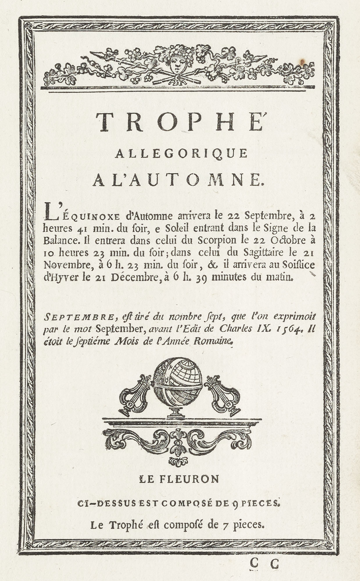
178. Luce’s Employment of his Types and Ornaments
From Luce’s Essai d’une Nouvelle Typographie, Paris, 1771
The smallest size of Luce’s new type had already been shown in a delightful little volume of eight leaves, called Épreuve du Premier Alphabeth Droit et Penché,45 issued in 1740. Up to that time the type known as la petit sédanoise was the smallest extant. But having called that, for some reason or other, alphabet second, French logic demanded that there be a first—and this was it! In the preface to the little book both these types are shown for the purpose of comparison. The sédanoise font was used in a 32mo volume printed by the Imprimerie Royale in 1729—Phædri Fabulæ, et Publii Syri Sententiæ—and the interesting Latin preface makes allusion to the types, which are clear though minute; but Luce’s Premier Alphabeth (also called perle) is almost impossible to read. I do not know if it was ever employed, except in the charmingly got up specimen. Luce, who died in 1773, was succeeded by Fagnon, the last of the royal type-cutters.
The Imprimerie Royale (which has changed its name with various changes of government, being Royale, Impériale, de la Républic, du Gouvernment, Nationale, etc.), as we have seen, was aided by royal subventions, and thereby types were produced which never would have existed for commercial reasons.46 Royalty and the Court often amused themselves with printing. In 1648, Louis XIV, then a child of ten, visited the newly established Imprimerie du Louvre and “helped” (how much, we may imagine) to produce the first page of an edition of the Mémoires of Philippe de Commines. Louis XV was taught to print by Jacques Collombat, a distinguished Parisian printer mentioned by Fournier; and a miniature printing-house was set up at the Tuileries in 1718, where the little boy—who was then eight years old—printed some lessons in geography entitled Cours de principaux Fleuves et Rivières de l’Europe. Composé & imprimé par Louis XV Roy de France & de Navarre en 1718. À Paris, dans l’Imprimerie du Cabinet de S. M. (fig. 179). Some forty or more bits of printing came from this office, which existed up to 1730. The mother of Louis XVI had a printing-office at Versailles in 1758, where she set up and printed a book of devotions, and the Duc de Bourgogne also dabbled in typography. Madame de Pompadour occupied herself at Versailles in 1760 with a little press.47 Louis XVI, as Dauphin, was taught the trade by Augustin Martin Lottin (a name familiar to students of the history of French printing), and in 1766, when he was twelve, produced twenty-five copies of a book—“all himself,” as children say—Maximes Morales et Politiques tirées de Télémaque, imprimées par Louis Auguste, Dauphin. At court and a little presses set up in country chateaux, many fashionable and idle people played with printing, much as in our time “unemployed” persons of fortune and leisure have played with book-binding and metal-work—which they abandoned after discovering that to be successful demanded more work than play! No doubt, then, as now, professionals concealed from amateurs—who “adored” printing, or were “fascinated” by types—that profound weariness of spirit which the unlearned enthusiast has always produced in “the man who knows how” ever since antediluvian idlers pestered Noah while building the Arc. I can fancy the sigh of relief with which Collombat saw the “Principal Rivers” trickle safely and expensively to the sea—for it was quite an expensive operation! To all these people (as Crapelet says) “the press was only a plaything which they handled, as children do weapons, without foreseeing the misery it would some day cause them.”48 But many of the rulers of France were seriously interested in printing, and particularly in the achievements of the Imprimerie Royale.49
179. Page of Course de principaux Fleuves et Rivières de l’Europe, composed and printed by Louis XV when a Child: Paris, 1718
From Gallica (scan)
III. The Fournier Family
Fournier l’aîné and Fournier le jeune, so often mentioned in the history of French type-founding, were the sons of Jean Clean Fournier, who received his training in the Parisian foundry of Jean Cot. He later became connected with Le Bé foundry, which he managed for the daughters of Le Bé for nearly thirty years. By his marriage with Anne Catherine Guyou he had nine children, six boys and three girls. Of the boys, three died in childhood, and the remaining brothers, who lived to mature age, were Jean Pierre Fournier, usually styled l’aîné; a second son, possibly named François,50 who was a printer at Auxerre, his father’s birthplace; and Pierre Simon (who occasionally transposed his Christian names), commonly called Fournier le jeune.
The eldest of the three, Jean Pierre Fournier, was born in Paris in 1706. By the purchase of 1730 of the Le Bé establishment, which is father had superintended until his death in 1729, he became possessor of a really splendid foundry. In his hands it had a great reputation, and justly enough—for it was a noble collection of beautiful old types, cut by masters of French type design. In two scholarly letters addressed to the editor of the Mercure de France,51 Fournier l’aîné describes its treasures in a way that shows how much he appreciated them. He specifies such an assemblage of punches and matrices by Garamond, Le Bé, Granjon, and Sanlecque, as make it from our point of view nowadays—as it was held by the discriminating then—the most interesting foundry in France.
Fournier l’aîné who was himself both an engraver and founder of types, lived at one time in the Rue St. Jean de Beauvais—a street much affected by his craft. He married Charlotte Madeleine Pichault, who died in 1764. By this marriage he had a son, Jean François Fournier, and three daughters. The son—sometimes styled Fournier fils—married Marie Elizabeth, daughter of the type-founder François Gando le jeune. A daughter by this marriage (apparently named Sophie) became the wife of the notorious revolutionary printer, Momoro.52 They had a son, who later assumed the name of Fournier.
Fournier l’aîné died in 1783, at the age of seventy-seven, in the village of Mongé, and after his death the foundry remained in the hands of his three daughters, who managed it successfully for a long time. According to Capelle, who wrote in 1826,53 on the death of the sister who had taken upon herself the chief direction of its affairs—which must have been later than 1811—the foundry was dispersed, its punches, matrices, and moulds being sold to different type-founders. It is likely that at least a part of the material of Fournier l’aîné’s establishment went to his son, Fournier fils.
I know of no specimen issued by book of Fournier l’aîné, but he supplied types to illustrate an article on printing that appeared in the Encyclopédie (Vol. II, p. 662).
He also lent many of the types shown in his younger brother’s Manuel, and fonts from his foundry appear in Pierres’ specimen of 1785. His son, Fournier fils, however, issued an interesting Greek specimen54 in 1767, which comprised the work of Granjon, Hautin, Deviliers, and Picart—the first two known to us as ancient and distinguished type-cutters. In the same year he issued a specimen of a more general nature,55 and in 1769 an advertisement of his material in the Mercure de France56 supports the theory that he inherited some of his father’s famous old characters. About 1787, part of his foundry was sold to Henri Haener of Nancy.
I think that Fournier l’aîné’s remarkable collection caused some heart-burning on the part of his younger and more famous brother. Yet it was to him that Fournier le jeune entrusted the completion of his son Simon Pierre’s technical education, and to whom on this account he left a bequest; also making him his executor. For he seems to have been, in the words of Lottin, Homo Antiquæ Fidei.
Pierre Simon Fournier le jeune was born in Paris, September 15, 1712. Although the education of his older brothers had been carefully looked after by their father, he appears to have been the spoilt child of the family: living with his mother in the country until she died, and only returning to Paris shortly before his father’s death. He studied drawing under J. B. G. Colson, miniaturist and water-colour painter, and member of the Académie de Saint-Luc. This probably helped him in type-designing. He was at first employed by his elder brother in cutting wood-blocks (possibly head-pieces, etc.), and later on he engraved punches for capital letters, of the kind then known as grosses et moyennes de fonte, a size hitherto supplied only in type cut on wood. He continued his work by producing several fonts of type and some tasteful “flowers” or vignettes de fonte,57 as they were called in France. His italic, a modernized form of the handsomer, more irregular early letter, met with success at once.
Fournier le jeune began to formulate his point system in 1737; he amplified it in 1742, and in the Manuel of 1764 gave it its final form—as has been said in a former chapter. His earliest specimen (in oblong folio) is entitled Modèles des Caractères de l’Imprimerie et des autres choses nécessaires audit Art. Nouvellement Gravés par Simon-Pierre [sic] Fournier le jeune, Graveur & Fondeur de Caractères. À Paris, Rue des Sept Voyes, vis-à-vis le Collège de Reims, 174258 (fig. 180). This was printed for Fournier by Jean Joseph Barbou, and is one of the most effective and elegant books of its kind ever issued in France. The preface is set in Fournier’s brilliant modelled italic, and then follows a beautiful collection of types, beautifully presented (fig. 181). On folding plates at the end of the book is a series of head and tail-pieces made up of vignettes most skilfully contrasted in light and shade (fig. 182)—nothing more ingenious and charming of this sort has ever been produced! A feature of this book is the display of large, plain letters for initials, which printers of his day, he says, almost entirely lacked—“with the exception of the Imprimerie Royale, which is furnished abundantly with everything which produces perfect printing, and the types belonging to which contribute so much to the glory of printing and the honour of those who made them.”
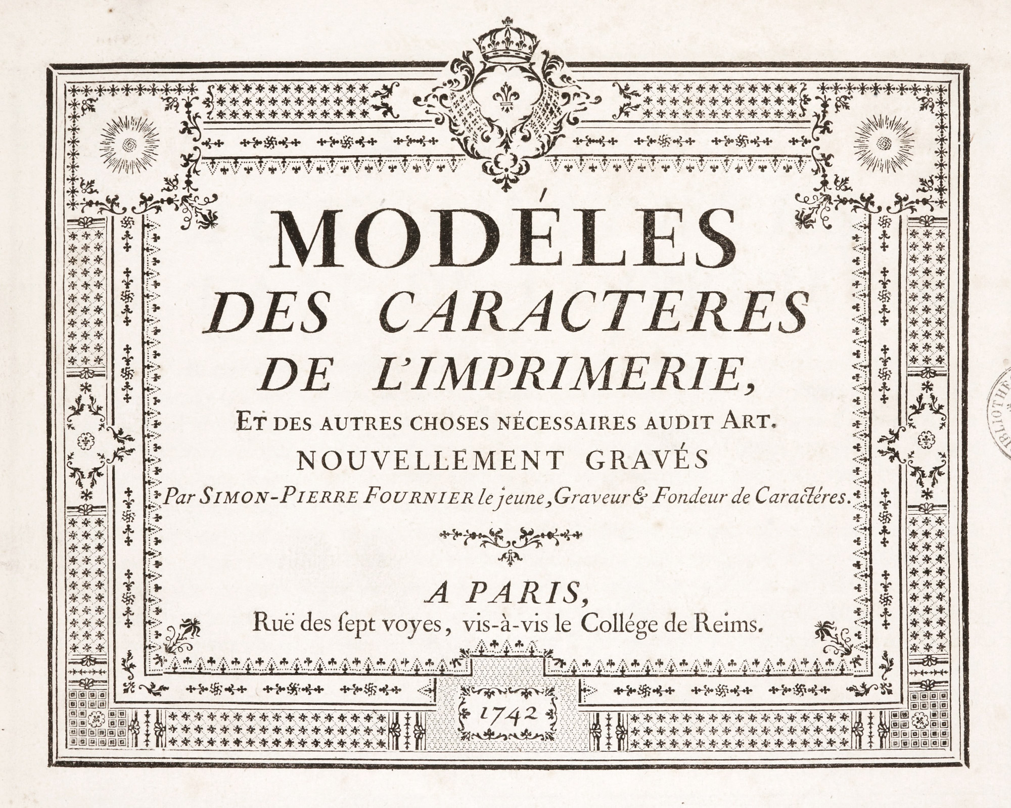
180. Title-page of Fournier le jeune’s Modèles des Caractères, Paris, 1742
From Gallica (scan)
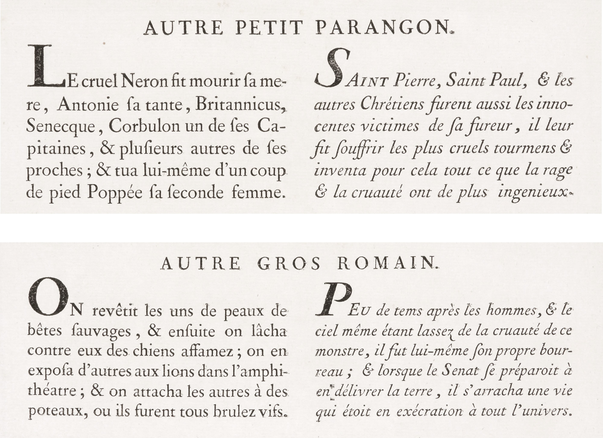
181. Roman and Italic from Fournier le jeune’s Modèles des Caractères, Paris, 1742
From Gallica (scan)
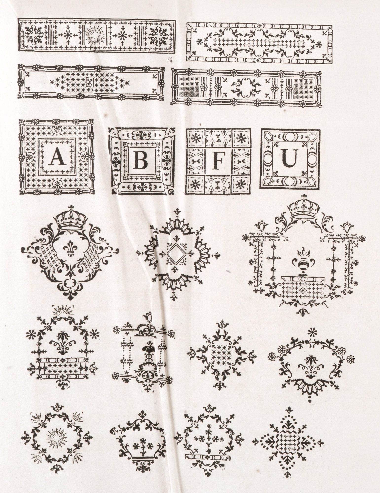
182. Use of Typographical Ornaments in Fournier le jeune’s Modèles des Caractères, Paris, 1742
From Gallica (scan)
In addition to the well-known Manuel Typographique of 1764, described on a later page, Fournier le jeune was the author of a series of papers, written between 1758 and 1763, and collected in his Traités Historiques et Critiques sur l’Origine et les Progrès de l’Imprimerie, a 16mo volume charmingly printed by Barbou. Fournier issued in 1756 a specimen entitled Essai d’un nouveau Caractère de fonte pour l’Impression de la Musique, inventé par Fournier le jeune. His part in the improvement of music types (which I do not touch upon), in which composers like Rameau supported him, was very considerable, and in spite of bitter opposition by the Ballard family, who held a sort of monopoly as music-printers, the King named him, in 1762, his supernumerary printer for music. His Traité Historique et Critique sur l’Origine et les Progrès des Caractères de la fonte pour l’Impression de la Musique, appeared about 1763.
Fournier le jeune married, in 1747,59 Marie Madeleine Couret de Villeneuve and Marie Madeleine Borde, and sister to a certain Martin Couret de Villeneuve, a printer of reputation at Orléans—as was his son. The Fourniers lived on the rive gauche, in that old-world quarter of Paris near the Lycée Henri IV and the picturesque old church of St. Étienne du Mont—to which parish Fournier belonged. In the year of his marriage he dwelt in the Rue des Sept Voies, where his house stood opposite the Collège de Reims—in the quartier de l’Université, within the bounds of which printers were then obliged to live.60
We think of the Paris of those days as a mass of old houses, deprived of light, air, and verdure. But the houses of that time were only a border to the streets. Behind them, between one street and the next, were great open spaces which afforded the sunlight, silence, and greenery which their fronts were denied; and in Fournier’s day, one-third of the city was open land. Indeed, until Louis Philippe’s reign, the rive gauche was full of trees and gardens; and the dramatist Sardou, who in his early years lived near the Place de l’Estrapade, speaks of the view lost in greenery that his windows commended. It was amid “these gardens, these silent streets so propitious to labour, perfurmed by lilacs, and flowering with pink and white chestnuts,” that Fournier had his latest habitation. His dwelling stood at that part of the Rue des Postes which formed a side of the Place de l’Estrapade, in a house said to have been formerly occupied by Philippe Grandjean, type-cutter for the Imprimerie Royale, who kept there the matrices of the royal fonts, and cast type from them—and who died there in 1714. Fournier’s specimen, issued in 1764, bears the imprint “Place de l’Estrapade, Rue des Postes,” and his Manuel, “Rue des Posts.” The place and Rue de l’Estrapade exist to-day, though what was the Rue de Postes is now the Rue l’Homond.61
There Fournier died on October 8, 1768. He was survived by his wife and two sons, Simon Pierre and Antoine. An éloge by a certain François that appeared in 1775 (from material furnished, apparently, by one of the family and Fournier’s friend Bejot, of the Bibliothèque Royale), says:
Fournier’s private life was happy, proving that routine is not always the mother of ennui. His calm spirit diffused about him unruffled and gentle contentment. He fled the noise of society, to enjoy retirement and friendship, perhaps giving himself up to this too much during his last years. Refusing suggested amusements, he devoted himself wholly to work and research. Such obstinate application was really the source of his illness, and finally rendered the advice or help of physicians useless.62
And other authorities imply that he ruined his health by overwork. Two years before his death he wrote of his own foundry:
I began it in 1736, and it is scarcely finished in the present year, 1766; which is to say that by assiduous and almost continuous work, it has taken me twenty-nine years to bring it to its present condition. I may state that it is entirely the work of my own hands, I myself having cut the punches, struck and justified the matrices, and manufactured a number of moulds—among others all those of which are my own invention; there being not other instance since the invention of printing, of a complete foundry which has been the work of a single artist.
It was Fournier’s lifework, and it cost him his life!
After Fournier’s death his widow carried on his foundry with the help of the older son, Simon Pierre Fournier,—then about eighteen,—and the following letter was sent by her to persons with whom her husband had held business relations:
I have the honour to inform you that after a long and most cruel malady, God has taken from me my Husband: my only consolation is to have left to me a son, who for several years past has worked under the eye of his father, who spared no pains to instruct him in his calling: on my part I shall make every effort to continue to give satisfaction and to merit the confidence with which you honour your very humble servant.
Madame Fournier survived her husband some seven years, dying in the Rue des Postes, April 3, 1775. A year later, Simone Pierre Fournier married Marguerite Anne, daughter of a certain M. De Beaulieu of Chartres, by whom he had a son and a daughter. His only brother, Antoine, was nine years younger than he. This disparity of age, and no training or liking for his father’s trade,—but, we are told, a taste for une éducation recherchée,—led, in 1778, to litigation between S. P. Fournier and a certain Barbou de Champourt, who acted in Antoine Fournier’s behalf—he being still a minor.63 What the outcome was of their dispute as to the disposition of the property, I do not know.
The ultimate fate of Fournier le jeune’s collection of types was that of his brother’s foundry: for the son is said to have added little to its reputation, and by the beginning of the last century the collection appears to have been broken up.64
Franklin had dealings with various Fourniers during his life at Passy, and alludes, among others, to Fournier l’aîné and Fournier le jeune, who were respectively uncle and nephew; the latter being the Simon Pierre (son of Fournier le jeune) just spoken of65 and who also styled himself le jeune. The genealogical table of the Fournier family will aid in disentangling their puzzling relationships.

Table of the Fournier Family in the Eighteenth Century
Jean Claude Fournier’s three Sons who died in childhood, and his three Daughters, of whom we have no record, are omitted from this Table
- *Possibly named Franç. Jean Claude Fournier, printing at St. Dizier 1775–1791, may have been his son.
- †Sometimes called “le jeune.”
I have devoted several pages to the Fourniers, and in particular to the career of Fournier le jeune, because they were of such great importance in the history of type-founding in France in the mid-century. The elder may be described as a man of integrity who was the owner, and very intelligent owner, of a wonderful collection of ancient types, and as one who walked worthy the vocation wherewith he was called. The younger brother was much more in the public eye, and he was so because, having had some artistic education, possessing the enthusiasm of youth, and being unhampered by convention, he saw possibilities unsuspected by others; and thus he made a concrete contribution to French type-founding by his type, his ornaments, and the books he wrote to describe and popularize his methods.
- The types designed by Fournier le jeune do not now seem to us very novel. His roman was an old style character sharper in cut than that commonly in use at his period, and of variations in its design which made fonts then known as ordinaire, approché or serré, goût Hollandois, poétique, etc. The ordinaire is that which was most clearly shows the changes he made from the “old style” of other foundries. Personally, I do not care much for it. The public of that day were not of my way of thinking, for it had about it a slightly accentuated sharpness which was welcomed. It resembled the types of Garamond more than those of Grandjean. In his italic Fournier abandoned the whimsicalities so agreeable in old style fonts, and made practically a sloping roman with a trimmed, mechanical line. In his Hollandois types he shortened the descenders, and thus these types and the “rotund” and over-fed appearance that such deformation always gives. His poétiques, Luce thought, it appears, were adapted from his—for persons of reputation adopt, adapt, appropriate, and annex, but never—! And to all these fonts he added series of varied ornamental letters and shaded letters (lettres grises), and very delightful they were. Even the rules or filets used to separate sections, under Fournier’s hand blossomed into something new. Of his ornaments and ornamented initials one may say that he touched nothing that he did not adorn. But these belong to our review of the vignettes or ornements de fonte, for they were derived from the same sources.
-
The emblems, ornamental letters, and be-garlanded borders which Fournier made popular in printing were inspired chiefly by the work of men like Cochin, Eisen, St. Aubin, and other French vignettists of the eighteenth century. Seeing what had been done for the book by the engraver and etcher, he attempted to transmute their designs into material for printers. such typographic ornaments were not new—an immense repertoire of them already existed. Fournier merely adapted them to the fashion of his day, but he did so with great taste and unity of effect. Thus, to quote Thibaudeau, we have in his vignettes
pieces susceptible of forming varied decorative arrangements, of a definite note and style, conceived with such foresight as to their use, that they lent themselves as well to the irregular curves of escutcheons, rosettes, and culs-de-lampe, as to form and decorate initials and framework: capable, in a word, of being substituted for the corresponding employments of copper-plate engraving, while presenting the very appreciable advantage, for semi-luxurious editions, of economy of impression.66
- The remaining work that Fournier did was to popularize the knowledge of his art in a delightful way by his writings—chiefly through the publication of his Manuel Typographique67—“useful to men of letters and to those who are practitioners in the different branches of the Art of Printing.” It contains the most useful information about type68 and type-founding which could be got together when he wrote. It appeared at Paris in two 16mo volumes, printed by the author in very tasteful fashion and sold by Barbou—the first part in 1764, the second in 1768, though dated 1766.69
In the Avertissement Préliminaire to Volume I, Fournier records in brief what had already been written in France about the history of printing and types, outlines the scheme of his book, and devotes some pages to his new music fonts. “The art of engraving types,” he says (forgetful or ignorant of Moxon), “has never been described. Masters of the art have been so rare, that a considerable time has often elapsed without a single one in France, and not one of them has described in writing the processes of his art. It is that fact which obliged me, when i desired to exercise my calling, to define for myself those principles, and to establish those rules, of which I have given an account in the rest of this work.” In the text he considers, from a technical point of view, punch-cutting, matrix-making, and type-founding, including under this last head the treatise on his point system quoted in a previous chapter. Then follow polices—a series of tables indicating the respective number of each character to be supplied in making up fonts of roman, Hebrew, Greek, music types, etc. A group of plates (preceded by explanatory notes), which show the tools, etc., employed in the various processes described in the text, closes the volume.
In Volume II, in the Avertissement Préliminaire, Fournier points out the importance of a more exact knowledge of the kinds and sizes of type in various weights of line, if an intelligent choice is to be made for a given purpose. This is followed by a summary of the books he has consulted and an account of the principal type-foundries of Europe, most of which I have quoted.
The specimens of types are the most important part of the book. Some of them were lent him by Fournier l’aîné, by the Paris founders Cappon and Hérissant, and by Breitkopf of Leipsic. They are grouped under six heads:
- Types in ordinary use.
- Ornaments, lettres de deux points (simple and ornamented), rules, etc.
- Types peculiar to particular countries or of special forms.
- Oriental types.
- Music and plain-song.
- Types of ancient and modern languages, with explanatory notes.70
Fournier’s types, in common with those shown in most contemporary French specimens, display varying nuances in type-faces of the same body, usually described—to adopt Fournier’s enumeration—as petit œil, œil ordinaire, œil moyen, gros œil, œil Hollandois, œil serré, and œil poétique.
The petit œil leaves more space between liens of type, which gives a lighter and more graceful air; but it is more fatiguing to persons of delicate eyesight; œil ordinaire holds the middle course between charm and utility; œil moyen is a shade stronger in character, which makes it more legible, an advantage still marked in the gros œil; but the lines of this being closer to each other, the pages take on “un air trop matériel.” To diminish this weight, the Dutch have thought of making these kinds of gros œil types of a thinner face and more elongated shape.
Fournier himself added to the variety of faces the œil serré, a slightly condensed type that allowed more letters to a line; and his version of poétique—smaller and less colourful—has tall capitals, ascenders, etc., that “let in the light” between lines of poetry; and its condensation permitted a long line of poetry to be printed on a comparatively small page, without what is called a “turn-over.”
All these variants are shown by Fournier. As I have said, the roman types of the ordinaire class became, under Fournier’s graver, a trifle sharper and more open in cut than the current old style. In these faces, particularly in italic, one sees the sure advance of a lighter fashion in printing types. The condensed poétique types are of the same general character as those of Luce (fig. 183), and the series of fonts in goût Hollandois (fig. 184), a condensed types of large face with short ascenders and descenders, is perhaps modelled on the plan of the serviceable Elzevir types. As the letters grow larger, however, they seem to become disproportionately heavy. Both poétique and Hollandois types had considerable vogue for books where the printer wished to get as much matter on a page as possible. Of the two, the poétique is much more attractive; but the goût Hollandois was more used. Its monotonous evenness of line introduced a bad fashion in roman fonts, and its italic71 was a slanting version of roman rather than a true italic. Fournier had begun to polish the life out of italic letters twenty years earlier, and in his Modèles des Caractères of 1742 speaks of a certain air of antiquity in older (or, as he called them, “superannuated”) styles of italic that unfortunately he thought it desirable to reform; all the more so, perhaps, because his elder brother had such a wonderful stock of them! In italic characters, he tells us, his improvement was to make type more closely resembling the writing of his day, and to show greater contrast between the thick and thin lines of the letters; but to my eye his italic has a rigid and monotonous air that is extremely disagreeable (fig. 185a). It was to be finally superseded by the much worse italic fonts of Didot. But the mischievous influence began, I fear, with Grandjean’s types, which marvellous as they were, had in them elements that later played havoc with roman as well as with italic characters.
183. Fournier le jeune’s Types Poétiques (cicéro, romain and italic)
From Manuel Typographique (scans), 1764
184. Fournier le jeune’s Types dans le goût Hollandois (cicéro, romain and italic)
From Manuel Typographique (scans), 1764
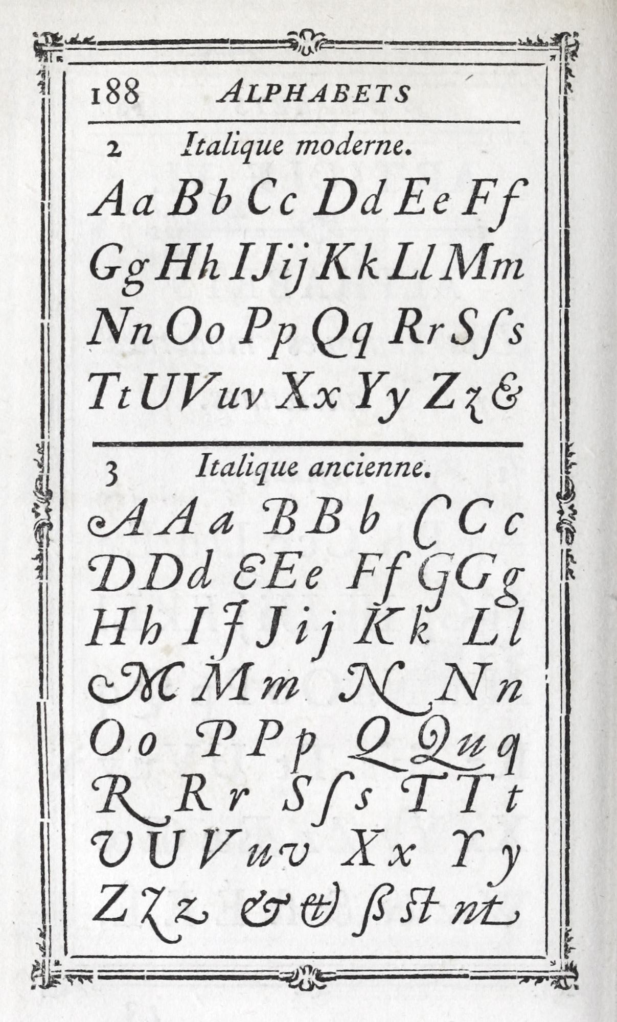
185 (a). Fournier le jeune’s Italique moderne and Italique ancienne
From Manuel Typographique (scan), Paris, 1764
The agreeable shaded letters72 produced by Fournier may be looked at for the amusing and ingenious manner in which serifs on the shaded italic and roman capitals in large sizes have, by a few strokes of the graver, have been made to end in a kind of “spray.” This is an example of a delightful effect achieved by the simplest means (fig. 185b). They are not to be confounded with his decorated capital letters,73 which are, as ornamental type-letters go, simple, and, if sparingly used, most attractive (fig. 186). Both had considerable vogue at that day and have been revived in ours. They were inspired by the lettering of engraved title-pages.
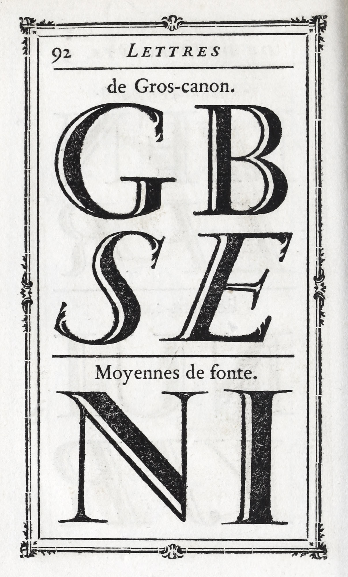
185 (b). Fournier le jeune’s Shaded Letters
From Manuel Typographique (scan), Paris, 1764
186. Fournier le jeune’s Ornamental Capitals used in Desormeaux’s Histoire de Louis II, Prince de Condé: Lottin, Paris, 1768
From Munich Digitization Center (scan)
Fournier’s typographical ornaments are charming little designs (fig. 187) rendered for typographic use just as such things should be. Only close examination reveals their variety and cleverness. At first glance, the larger, more obvious decorations, such as those of gros-romain size,74 are the ones that strike us—frameworks with festoons, broken by bunches of flowers or knots. These are not more remarkable than the smallest ornaments—numbers 1 to 93—from which most charming effects were derived. Numbers 4, 5, 6, 7, and 23, 24, when used in mass, gave a field upon which blacker, bolder figures could be built up, with wonderful richness of contrast. Then, again, the bracketed numbers 138–147, 188–190, and 191–201 show the varieties of breaks and endings to rules that could be had.75 Some characteristic designs are the sunbursts in honour of le roi Soleil (339), the medallions (359, 360), the hanging garlands (365), the escutcheons (375), and seven varieties of black butterflies.
Even the braces76 (crotchets) are decorated, and the double and triple rules are made interesting. These ornaments became in Fournier’s hands something almost as delightful as engraving, and yet wholly new.
187. Fournier le jeune’s Vignettes de Fonte, Paris, 1764
The division of the Manuel devoted to special characters contains much interesting material77—for instance, the batarde types (fig. 188), the cursive françoise or civilité, the ancienne batarde,78 and some fine lettre de forme and lettre de somme which follow.79 The Flemish and German types are also interesting; and Fournier’s much discussed music types80 should be examined. A final section of the book is given up to alphabets of ancient and modern languages—some of them appear rather apocryphal—gathered from various sources, and to these Fournier has appended little notes full of information. Of these the first sixteen are only of much practical value to the reader of this book.
188. Batarde Types shown by Fournier, Paris, 1764
The Manuel Typographique is a work which no student of French typography can afford to be without. The simplicity of the author’s style, his naïve pride in his own performances, and its mass of information make a book which will become a favourite with any one who reads it. It is not the work of a scholar, but of an observing, experienced, quick-witted master of his art, who in cultivating that art had cultivated himself. And when we think about the other work that Fournier did—of the types he cut, of the ornaments he designed, of the point system he invented, of the music he improved—we begin to realize the part he played in what has been happily called “the renovation of French typographic material in the eighteenth century.” Fournier was a man typical of a certain class in France, who treat their work with a respect which dignifies both it and them. For he was neither a bad workman, a bad pastry-cook, nor a bad Frenchman, who, being taxed with thinking that ornamental pastry was the one Fine Art in the world, modestly replied, “No: there are three Fine Arts—Sculpture, Painting, and Ornamental Pastry-Making—of which Architecture is a Branch!”
IV. French Foundries and Specimens
In the examination of French specimen-books, which concludes this chapter, I shall take Fournier, supplemented by Lottin,81 as a guide, and describe them when possible the specimens of the founders they name.
The oldest establishment was the Le Bé foundry, which remained in that family until 1730, and was then purchased by Jean Pierre Fournier l’aîné. It has already been sufficiently treated under the work of the sixteenth century, and in the notice of the Fourniers.
The second great French foundry was that of Sanlecque. A specimen of its types was issued in 1757, but so wholly devoted to seventeenth century fonts, that it appears under the account of that period. In a letter written to Franklin by Marie, widow of Jean Eustache Louis Sanlecque, in 1779, she says,
I am proprietress of a foundry which I dare assure you is the finest in Europe; I add, herewith, a little book which contains different impressions of type which will put you in a position to judge the merit of my foundry by seeing the beauty of its characters.82
Madame Sanlecque died in 1785, and her daughters sold the foundry to Maurice Prosper Joly, who in turn sold it to Henri Haener of Nancy, the purchaser of some of the material of Fournier fils.
The Delacologne foundry of Lyons is mentioned by Fournier as an ancient and respectable establishment, and its productions up to the year 1773 may be seen in a rare little specimen entitled Les Caractères et les Vignettes de la Fonderie du Sieur Delacologne. À Lyon, Montée & près les Carmelites, 1773. The types in this collection seem to date from so many periods that I hesitate to identify them chronologically. Many in the large sizes are extremely distinguished, especially the gros canon œil maigre and œil gras, both in roman and italic, which appear to me seventeenth century types, and which are reproduced, therefore, on an earlier page (figs. 152 and 153). The four civilité types83 are delightful, and the financière (fig. 189) is a common type-form in French eighteenth century printing. The Greek and Hebrew types are good. A point to be noticed in this book is the difference between the old-fashioned and agreeable italic, such as the Saint-Augustin,84 and the wiry italic in the Dutch taste.85 The head-pieces are ingenious and interesting and are made up of vignettes de fonte. The collection of these vignettes is as miscellaneous as the types, and many of them are, I think, very old.86
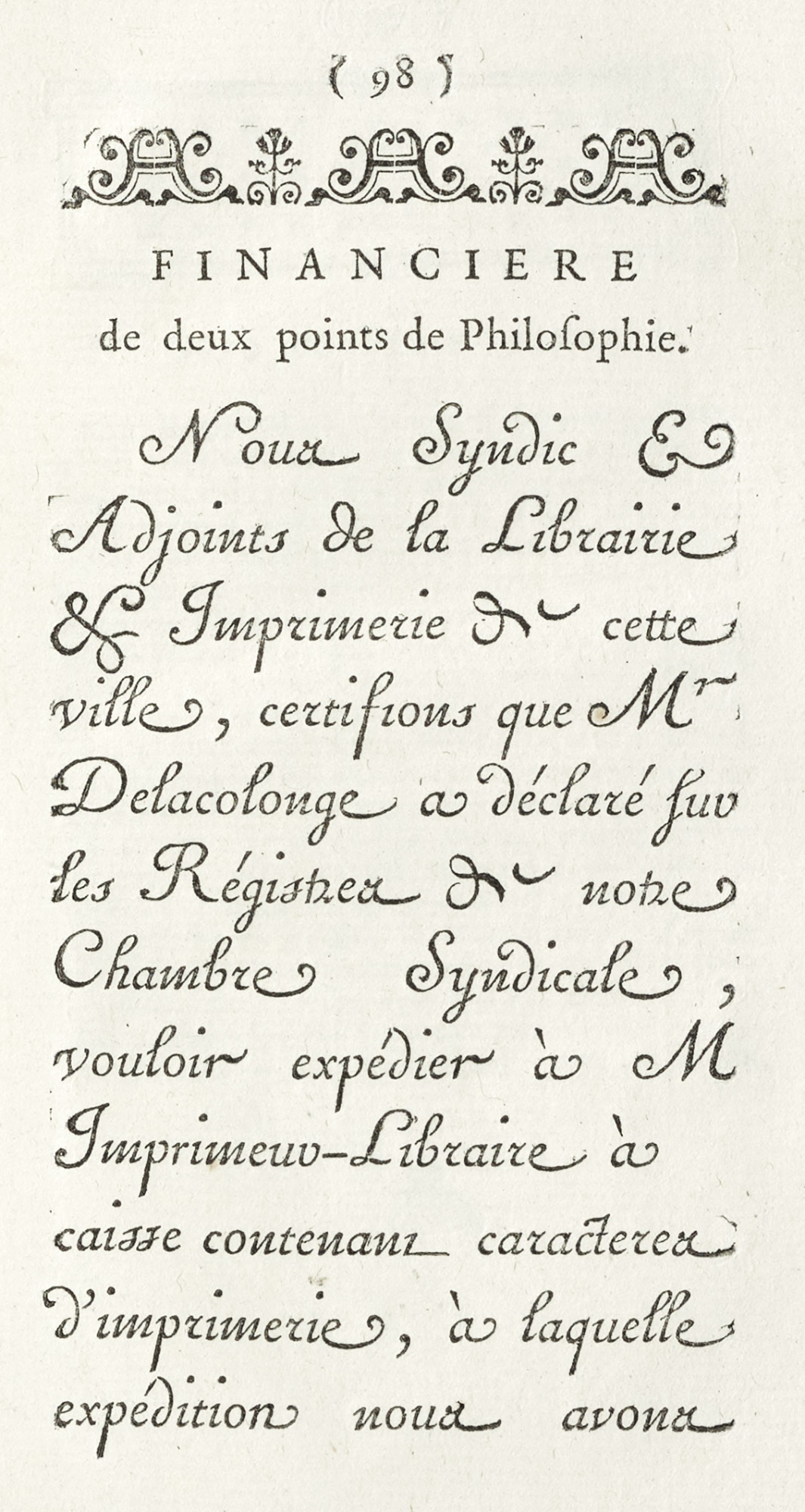
189. Financière: Delacologne’s Caractères et Vignettes, Lyons, 1773
From Library of Congress (scan)
The type-founder Mozet issued a specimen in 1736, but I have never seen it: although I am familiar with the issue of 1743, entitled Épreuves des Caractères de la Fonderie de Claude Mozet, Fondeur et Graveur de Caractères d’Imprimerie. À Paris, rue de la Parcheminerie, au coin de la rue des Prêtres Saint Séverin. Mozet’s foundry passed to J. F. Hémery, who for thirty years had been director of the Fournier foundries, and who lived in the Place de l’Estrapade.
In 1720, a certain Briquet started a foundry, which on his death he left to his widow. He had as an associate and pupil a Monsieur Loyson, who married the widow, and in 1728 issued a specimen, mentioned by Loggin. Madame Loyson’s son by her first marriage—Briquet—associated himself with his stepfather, and with him brought out in 1751 Épreuve des Caractères de la Fonderie de Loyson & Briquet (4to), which I have never seen. After Loyson’s death, Briquet continued the foundry alone, and produced in 1757 a specimen called Épreuve de Caractères de la Fonderie de Briquet. À Paris, Cloître Saint Benoît. This may be properly considered an eighteenth century specimen-book, though not a very good one. The names of the type-cutters who supplied fonts for the collection are given in the preface, and some of the types were imported from Holland. The fonts—except, possibly, those attributed to Garamond—are uninteresting variants of styles found in other specimens. The ornaments are better, and some combinations of them at the end of the book are very beautiful indeed. The way in which they are shown—as units and in various combinations—is useful and clever; the first instance that I know of this method of exposition (fig. 190). The Loyson Briquet foundry was sold in 1758 to Vincent Denys Capon, who had been their élève, and after his death in 1783 it was carried on by his widow. It ultimately became part of the stock of the distinguished Parisian printer, Pierres.
190. Method of Displaying Ornaments: Briquet’s Épreuve de Caractères, Paris, 1757
From Gallica (scan)
The ancient foundry of Denis Thierry was based on Moreau’s collection of agreeable and clever cursive types. After two generations it was acquired by the Collombats, father, son, and grandson, and finally passed by sale to Jean Thomas Hérissant, printer, and founder, in 1763. A “specimen” was issued by his widow (born Marie Nicole Estienne), dated 1772, entitled Épreuve des Caractères de la Fonderie de la Veuve Hérissant, Imprimeur ordinaire du Roi, des Cabinet, Maison & Bâtiments de Sa Majesté, Académies des Arts & Manufactures Royales. À Paris, rue Saint-Jacques, au coin de celle de la Parcheminerie. In the preface to it Madam Hérissant states that part of these types came to her husband by his purchase of the Collombat establishment—which comprised a publishing and printing-house and a foundry. An Épreuve des Caractères, composant l’Imprimerie de la Veuve Hérissant, rue de la Parcheminerie, No. 184, of eighteen quarto pages, was issued shortly after the revolution, but this was, in reality, a sale catalogue. The types shown in it are not noteworthy, except for the three financières,—not Moreau’s, by the way,—the Greek, Hebrew, Syriac (very fine), and some moderately good fonts of music.
The Thiboust foundry, begun in the seventeenth century, descended from father to son in the Thiboust family—a race of Parisian printers, booksellers, and type-founders—until 1787. I do not know of any specimen issued by it.
The foundry of Jean Cot was assembled by his purchase of a number of small foundries in 1670, and its material passed to a son, Pierre Cot, who, under the title of Essais de Caractères d’Imprimerie, À Paris, 1707, issued a 16mo specimen of ornamental characters and announced one to follow with exotic alphabets, ordinary types, music, ornaments, et autres enjolivements.
He appears to have been a scholarly man, and was the author of a history of letter-founding and printing, which remained unpublished. On his death the establishment reverted to his mother, and finally, through two of her daughters, it came to Claude Lamesle by purchase in 1737. Lamesle issued in 1742 an extremely handsome and dignified specimen called Épreuves Générales des Caractères que se trouvent chez Claude Lamesle…À Paris, Rue Galande (au milieu) près la Place Maubert. This book, both in type and ornaments, I think, presents better than any other the output of French foundries during the last quarter of the seventeenth and first half of the eighteenth century. The collection of types is remarkably fine. They are purely old style, and after each size the initials and ornaments belonging to that size are introduced. Here and there one finds the characters reminiscent of Dutch fonts of the period, and old style fonts which, on account of their leading and light cut, show the approach of a more open style of typography. Tilting-letters (in roman, italic, and Greek) and some beautiful civilité are worth looking at. The ornaments are, many of them, of thoroughly seventeenth century style. The plates to be consulted (toward the end of the book) are the lettres de deux points de petit canon, allemande de deux points de gros romain, and gros canon maigre ordinaire in roman and italic87—both of them beautiful letters. For the student of French type-forms of the earlier part of the eighteenth century there is scarcely a better book. A second edition with some variations was brought out in 1758, on the occasion of the sale of Lamesle’s foundry to Nicolas Gando l’aîné, who in 1736 had exchanged his foundry at Geneva for the Parisian foundry of his uncle, Jean Louis Gando—a native of Basle, who came to Paris on the invitation of Grandjean, about 1705.
Nicolas Gando issued a specimen in 1745, and after the purchase of the Lamesle establishment, he and his son, Pierre François, published, in 1760, Épreuves de Caractères de la Fonderie de Gando père et fils. À Paris, Cloître Saint Julien le Pauvre, près la rue Galande, printed by Guérin and Delatour. They were adroit copyists, and very unscrupulous rivals, of Fournier le jeune, with whom they had a bitter controversy on the subject of music types. And another Gando, François (a brother of Nicolas), first of Lille, later of Paris, also tormented Fournier le jeune by his imitations and trickeries—though after François Gando’s death his daughter married Fournier le jeune’s nephew! The Gando specimen of 1760 contains most of the material which appeared in Lamesle’s book, with some rearrangements and additions. The order of the type is reversed, the largest sizes being displayed first. The second type shown is a gros canon italique nouveau goût. What this goût was, one begins to see in the gros parangon italique numéro viii, petit parangon italique numéro xi, or the cicéro italique engraved by Gando le jeune in 1754 (fig. 191). These wiry, vulgar types were a new and bad yet popular element in a printer’s stock. The Recueil d’Ornements [sic] is dated 1745, and was issued by Nicolas Gando—probably a reprint of part of the Épreuves of the same date. This Recueil, with its rather overcharged head-bands, etc., made up of ornaments, introduces one to a surprising and terrible portico of a temple some ten inches square, constructed entirely of typographical ornaments—a structure which it is hoped will remain unique!—though it is run close by some Austrian and Spanish type-edifices and Italian naval constructions, the whereabouts of which will ever remain (as far as I am concerned) a profound secret.
191. François Gando’s Italique, goût nouveau, cut in 1754: Épreuves de Caractères, Gando, Paris, 1760
From original at the Newberry Library (scan)
In all these later eighteenth century French specimen books three styles of types stand out:
- The lively, interesting old style roman of earlier periods with its irregular italic. This older italic was less and less shown as the century advanced and the new italic was substituted for it, while the original old style roman was retained.
- Poétique, condensed fonts with tall ascenders, or fonts modelled on or suggested by poétique type, sometimes called approché or serré.
- Fonts in the goût Hollandois—a letter of larger body in proportion to its ascenders and descenders, more uniform in colour and monotonous in design.
The “specimens” named hitherto (with the exception perhaps of Fournier’s Manuel) were practically all put out by type-founders for the use of printers. We now come to the first specimen-book (that I have seen) which appears to be intended by a printer for the use of his customers—an innovation which was to work to the detriment of good typography. The volume has another novel feature, i.e., that with each specimen of type shown, the name of the foundry from which it comes is given.88 It displays the stock of types that a Paris printer had in 1785.
Philippe Denis Pierres, who issued it, was a man distinguished in his day. Born in Paris in 1741, he was the son of a bookseller, and nephew of Auguste Martin Lottin, whose remarkable book on Parisian printers and booksellers is still an authority, and who was instructor in printing to the Dauphin, afterwards Louis XVI. The first steps in Pierres’ career were taken in Lottin’s printing-house; but later he assumed charge of the office of his great-uncle, Pierre Gilles Lemercier (of that eminent family of typographers), who retired in Pierres’ favour in 1765. Very well educated, a good Latinist, inventor of a press approved by the Académie des Sciences and examined and praised by the King, his work-rooms were a resort of men prominent in the government or belonging to the great learned societies. Baskerville corresponded with him; Franklin was both friend and correspondent; Clement XIV sent him proofs of all types in the Vatican printing-office; the King of Poland gave him a medal for suggestions and help in forming a Royal Public Library; and, in short, Monsieur Pierres was a Very Important Person.
The title of the volume is—Caractères de l’Imprimerie M. Pierres, Imprimeur Ordinaire du Roi, due Grand-Conseil de Sa Majesté, du Tribunal de MM. les Maréchaux de France, de la Police, des Intendance & Administration Générales des Postes, du Collège Royal de France, de la Société Royale de Médicine, des États de Pravence, des Congrégations de France & de Saint-Maur, &c.,—merely that! (fig. 192). It opens with a dedication dated Paris, New Year’s Day, 1785, signed by Honoré Théodore De Hansy, who arranged the book, and who seems to have been employed in Pierres’ establishment. The types, printed on one side of the page only, begin with very large sizes of old style roman from Caslon, and as they become smaller, roman and italic of the same size appear on one page. The fonts represented came from Fournier l’aîné; Fournier le jeune; Cappon, Gando, successor to Lamesle; Joseph Gillé père, a distinguished founder (who issued an interesting little specimen in 1778 containing some cursive types, four of which Pierres possessed); and from the old Sanlecque collection. Hebrew and Arabic were supplied by the elder Fournier, and “exotic” types are shown from the office of the Propaganda—sent to Pierres through Cardinal de Bernis in 1779. Then follow letters for initials; some shaded letters; music, both with round and square notes; and a great number of typographical ornaments. These last show a good many old forms but few novelties, and as the paper of the book is very coarse, they do not seem particularly attractive. At the end of the book are twenty-five sheets preceded by a title reading Vignettes, Fleurons, Chiffres, Armes, Passe-Partous [sic], Cadres, et Autres Ornaments. Gravés en Bois, etc.,—an enormous collection of every sort and size of ornament; together with the arms of France and the heraldic bearings employed by the various societies and persons to whom Pierres was accredited printer. The last six sheets are devoted to scenes from the life of our Lord and the saints, intended for calendars. These cuts, from very poor and thin designs by Leclerc, were engraved on wood by “the celebrated Jean Baptiste Michel Papillon.”
192. Title-page of Caractères de l’Imprimerie de M. Pierres, Paris, 1785
From original at the Newberry Library (scan)
Pierres’ specimen gives an admirable idea of the types and ornaments generally used in France up to the Revolution. It would appear that this collection later went to the printer Pasteur, whose specimen of 1823 displays the seal of the United States of America which Pierres procured for Franklin’s use, and which appeared in the specimen-sheet issued by Benjamin Franklin Bache about 1790. Franklin’s script types, engraved for him by S. P. Fournier le jeune in 1780 and 1781, were displayed on specimen-sheets, at least one of which was printed for him by Pierres.
The official emblems of different régimes shown in many French specimen-books—such as that of Pierres—are a pictorial history of social and political changes in France.89 The earliest and best of these designs were heraldic, representing the arms of France crowned, surrounded by the collar of the Ordre du Saint Esprit. Rendered in line without shading, they were very decorative in quality. In Louis XIV’s reign, such head-pieces and emblems became more elaborate in execution; and as the military operations of the period increased, to the royal arms were added drums, flags, laurels, and palms. Toward the end of the reign a sun (emblematic of the glory of Louis XIV—le roi Soleil—to protect themselves from which the courtiers, it has been said, carried parasols!) is made use of. In the next reign, armorial bearings reflect the rocaille decoration of Louix XV. After the battle of Fontenoy, flags and military ornaments were introduced; and when naval successes were in the public mind, head-pieces became nautical, and sails, ship-lanterns, etc., appeared. In the early part of Louix XVI’s reign, the emblems of preceding reigns were used, but at the end of the monarchy we begin to see on shields three fleurs-de-lis and between them the motto La Loi et le Roi. Below were attributes of the monarchy and three orders of the body politic—flags, sceptres, shields, roman fasces, as mixed up decoratively as were the antagonistic ideas which they represented in the minds of the people! Later, an ominous Phrygian cap and a sword with the motto La Liberté ou la Mort indicates a period when there was a great deal of death and very little liberty! After the storm come more peaceful figures—Minerva between olive branches, Mercury seated on bales of merchandise, or Commerce with cornucopia, anchor, and ships—designs something in the style of Prud’hon’s pretty designs for toiles de Jouy. In the time of Napoleon I, everything turns to eagles (the best of them designed by Besnard), then to crowned eagles, and finally to eagles on a cartouche against the imperial ermine. Sometimes the eagle is quite an amiable bird and is obligingly holding an olive wreath. The papal arms and tiara in head-pieces of that date are an allusion to Napoleon’s coronation by Pious VII. At the restoration of the Bourbons (not a particularly good period artistically), there was a return to the ancient royal arms—three fleurs-de-lis on a shield, surrounded by flags and sometimes by olive branches and oak leaves. After the overthrow of Charles X, fleurs-de-lis were replaced by a tablet (like the “tables of the Law” in eighteenth century English churches), with the legend “Charte de 1830”; and in the latter part of Louis Philippe’s reign, a Gallic cock sometimes takes the place of a crown. One head-piece, a vignette of the cocked hat of “the little Corporal,” with sword, field glasses and gloves, laurel and palm leaves, and a glory beyond them, was an emblem introduced when Louis Philippe so unwisely revived Napoleonic traditions by bringing back the ashes of the Emperor from Saint Helena. At the fall of the monarchy, the government suppressed the word Charte and replaced it by République Française. On the accession of Napoleon III, a revival of the designs used by Napoleon I naturally took place. The eagle, however, became less free in drawing, and was made to look like Russian and Austrian eagles. Sometimes the Bonaparte bees and the Code Napoleon were added to the imperial arms. Thus even ornaments in type-specimens reveal their significance in the light of history—another proof of the intimate relation of typography to social and political movements.
-
Tory’s Champfleury
iswas not readily accessible, but the translation of Auguste Bernard’s Geofroy Tory, issued by Houghton Mifflin Company, in 1909, has delightful reproductions of Tory’s designs and initials, redrawn by Mr. Bruce Rogers. A charming series of borders to Books of Hours on pp. 101–117, two sets of magnificent decorative initials (pp. 186, 187, 188, 190, and 191), and the Greek and roman alphabets (shown on pp. 194 and 195) should be noted. While not a complete collection of Tory’s designs, the book gives a good idea of the scope of his work.The original French edition of Bernard’s book—Geofroy Tory, Peintre et Graveur, Premier Imprimeur Royal, Réformateur de l’Orthographe et de la Typographie sous François 1er—was published in Paris in 1857. Its author was formerly an employee of the Didots, and the expense of its publication was borne by Ambroise Firmin Didot. An excellent notice of Tory is given in Lepreux’s Gallia Typographica, Série Parisienne I, Imprimeurs du Roi, Pt. 1, pp. 505 et seq.
- Druckschriften, pl. 19.
- Druckschriften, pl. 98.
- Druckschriften, pl. 90.
- Druckschriften, pl. 68.
- Druckschriften, pl. 4.
- As in Dürer’s Vnderweysung der Messung (1525) and Pacioli’s De Divina Proportione (1509), both of which Tory criticizes. For an analysis of Renaissance roman capital letters, see the publication of the K. K. Österreichisches Museum für Kunst und Industrie—Die Initialen der Renaissance. Nach den Constructionen von Albrecht Dürer herausgegeben von Comillo Sitte…Unter Mitwirkung von Joseph Salb. Vienna, 1882. It is illustrated with examples of lettering described.
- Ancester of George Lepreux, author of Gallia Typographica.
- A copy of this book is in the Boston Athenaeum.
- De Coline’s printing is always worth study, and M. Ph. Renouard’s Bibliographie des Editions de Simon de Colines (Paris, 1894) is an excellent guide for this purpose.
- A copy is in the Bowditch Collection, Boston Public Library
- Steffens’s Paléographie Latine, pl. 119a.
- There is a copy in the Boston Public Library. Cousin was a painter, sculptor, and painter of glass, besides being the author of two books on design.
- I have been unable to see a copy of this edition.
- Delacologne specimen, pp. 108, 109, and 111.
- Many Greek and Hebrew “Alphabets” were published at Paris in the sixteenth century; but these were not “specimens” of Greek and Hebrew types, as might appear, but little elementary grammars for students.
- Druckschriften, pl. 39.
- Druckschriften, pl. 40.
- The magnificent engraving, by Morin, of Philippe de Champaigne’s portrait of Vitré is familiar to lovers of fine prints. Vitré died in 1674.
- Reproductions of the characteristic title-pages of Bossuet’s celebrated funeral orations, most of which Mabre-Cramoisy published, are shown in Le Petit’s Bibliographie des Principales Éditions Originales d’Écrivains Français, etc., pp. 401–415.
- Druckschriften, pl. 99.
- Druckschriften, pl. 80.
- The Collection was completed in 1780, by which time it comprised thirty-four works in sixty-eight volumes. For list of these, see Paul Ducourtieux: Les Barbou, Imprimeurs, Lyon-Limoges-Paris, 1524–1820, Limoges, 1896, pp. 77 et seq.
- Or according to some authorities in 1759.
- Called so because the Government, in tribute to his abilities, gave his printing-office the rooms in the Louvre formerly tenanted by the Imprimerie Royale, which in 1795 removed to the Hôtel de Penthièvre.
- There is a copy in the Boston Athenaeum.
- This edition created considerable noise at the time of its appearance, and the first volume was the subject of an elaborate attack, defence, and rejoinder, in the Journal des Sçavans for September, 1756. The critic, from internal evidence, may have been a type-founder.
- They are the designs on the title-page, at the head of the dedication, and in Vol. I, pp. 10, 14, 34, 44; Vol. II, pp. 26, 48, 54, 64. The comparatively recent so-called “reproduction” of this edition is beneath contempt.
- For title-pages of the books in small format, printed in light Didot types much spaced, consult the facsimiles, in Le Petit’s Éditions Originales, of Paul et Virginie of 1789 and La Chaumière Indienne of 1791, both by Bernardin de St. Pierre.
-
A good list of examples of French printing of various periods is contained in the Catalogue of the Cercle de la Librarie. Première Exposition…Partie Rétrospective (Histoire de la Typographie Française par les Livres, depuis l’origine jusqu’ à la fin du XVIIIe siècle). Paris, 1880. Another volume to be consulted for titles of books typographically interesting, printed in France up to the end of the eighteenth century (especially those that were printed in the Imprimerie Royale until the Revolution), is Rapport du Comité d’Installation: Musée Rétrospectif de la Classe 11, Typographie—Impressions Diverses (Matériel, procédés et produits) À l’Exposition Universelle Internationale de 1900. Paris. The successive changes in the types and arrangement of title-pages of representative French books of the period we are treating can be seen from the facsimiles in Jules le Petit’s Bibliographie des Principales Éditions Originales d’Écrivains Français du XVe au XVIIIe siècle. Paris, 1888. The work of the seventeenth century is particularly well represented under Corneille, Racine, and Molière.
M. F. Thibaudeau’s La Lettre d’Imprimerie—Origine, Développment, Classification; et 12 Notices illustrées sur les Arts du Livre ([vols. 1, 2], Paris, 1921) is a study of French printing-types, their development and use. It is valuable for its notices of French type-founding, printing, etc., from the Gothic period to the end of the last century. As the author writes from the historical rather than the critical point of view, the book is not intended to be a guide to the choice of types. It is elaborately illustrated, though many of the examples have been already utilized by Bouchot and Le Petit. M. Marius Audin’s Le Livre: sa Technique, son Architecture (Lyons, 1921) takes up the different styles of type in vogue since the introduction of printing in France. A line or two of each type—or the nearest equivalent available—begins these notices. An excellent feature is the citation of titles of books that are printed from the types described.
- Defined by Lepreux as an officer of the crown, in principle compensated, exclusively entrusted with the printing either of decrees of authority or certain specified works, and therefore enjoying, in order to guarantee authentic and pure texts, as well as rapidity of publication, certain immunities and advantages, we well as special and personal privileges. The term imprimeur du roi furthermore particularly denoted marked artistic ability in the practice of typography.
- In the Avant-Propos to the first volume of Claudin’s Histoire de l’mprimerie en France, it is stated that a modern impression of Garamond’s types appears in the Foreword of Volume I, Preface, and pages A, B, C, D, and ii to xxiv.
On comparison with early books printed from these types, some slight modifications appear to have been made. The Garamond types are said to have been “retouched” by Luce in the eighteenth century.They were, indeed, based on the caractères de l’Université, but these were not cut by Garamond in the sixteenth century, but by Jannon in the seventeenth century. - The device is composed of a spear around which are twined olive branches and a basilisk with a salamander’s head—emblems of wisdom in piece and war. Beneath it appears the punning motto: Βασιλεῖ τ᾽ ἀγαθῷ κρατέ τ᾽ αἰχμήτῃ, “To the wise King and the valiant Warrior,” generally accompanied by the words Typis Regiis.
- Greek typography was introduced into France by the Parisian printer Gilles de Gourmont as early as 1507, but his types were superseded by Garamond’s grecs du roi.
- Transactions of the Bibliographical Society, Vol. VII, p. 57.
- Richelieu took some personal interest in printing, for he set up a private press at the Chateau de Richelieu. The editions produced there had considerable excellence both as to type and presswork. The types imitated in size, style, and compactness the Elzevir fonts, and are said to have some from the Jannon foundry at Sedan, which produced a small type much in vogue in the seventeenth century, called petite sédanoise.
- It was in this connection, no doubt, that Jaugeon, in collaboration with Truchet (a Carmelite and a versatile mechanician), and M. Filleau des Billetes, of Poitou, prepared for the Académie a treatise on typography, which was to be part of a collection entitled Description et Perfection des Arts et Métiers. This covered the art of designing letters, of cutting their punches, of letter-press printing, and of book-binding. Though some of the plates illustrating the book were engraved—among them the celebrated diagram of 2023 squares on which letters were to be designed—the manuscript was never published and is now in the Bibliothèque Nationale. Jaugeon’s elaborate theory of designing types was, after years of neglect, put into practice, and a series of types called Caractères Jaugeon was cut in Hénaffe for the Imprimerie Nationale in 1904.
-
According to De Fontenai, Philippe Grandjean de Fouchy, of an old family of Mâcon, was born in 1666. When in Paris, early in life, a friend took him to see a printing-office. In examining its types he thought he saw ways of bettering them. Designing some capital letters for amusement, he succeeded so well that his essays were shown to M. De Ponchartrain, who mentioned Grandjean’s work to Louis XIV. In consequence, Grandjean was ordered to enter the royal service to occupy himself with printing. Through the influence of the Abbé Bignon, the well-known bibliophile, Grandjean made new models for punches and matrices for the Imprimerie made his reputation. Fournier says,
M. Grandjean, who assisted the progress of this new foundry, also had charge of it; he maintained it always in the different localities in which he lived, the last place being his house near the Estrapade at the entrance to the Rue des Postes, from which it was transported to the Louvre in 1725, to be joined with the offices there, thus forming a complete printing-house.
- A quarto volume, with much the same title, also published in 1702, does not employ these types, and is not to be confused with the folio edition.
- They were retouched, it is said, by Luce in the eighteenth century.
- A “serif,” it must be remembered, is a short cross-line which occurs at the ends of unconnected lines of a letter. It probably originated in a difficulty felt by cutters of inscriptions on stone, who found that if strokes of letters terminated without some curve or line, they appeared unfinished. To correct this, they made serifs.
- Manuel Typographique, Vol. I, p. xvii.
- Essai d’une Nouvelle Typographie, ornée de Vignettes, Fleurons, Trophées, Filets, Cadres & Cartels, inventés, dessinés, & exécutés par L. Luce, Graveur du Roi, pour son Imprimerie Royale. Dediée au Roi. À Paris. De l’Imprimerie de J. Barbou, rue des Mathurins. 1771.
- The types were recently employed for Chapter VI of Christian’s Débuts de l’Imprimerie en France.
- Épreuve du Premier Alphabeth Droit et Penché, ornée de Quadres et de Cartouches, gravés par ordre du Roy pour l’Imprimerie Royale par Louis Luce & finis en 1740.
- Up to the Revolution, the punches, matrices, and a certain number of presses and amount of material belonged to the State; the remainder to the director, who managed them for his own profit.
- The Song of Songs and a Précis of Ecclesiastes by Voltaire were produced under her supervision; and the King summoned a detachment of workmen from the Imprimerie Royale, who printed for her Corneille’s Rhodogune, Princesse des Parthes, with the imprint Au Nord—as Madame de Pompadour’s apartment was situated at the north of the palace.
- The Louis XIV romain du roi was used in 1790 to print Marat’s revolutionary pamphlets.
- For productions of the Imprimerie Royale up to the end of the eighteenth century, see Catalogue Chronologique des Éditions in Bernard’s Histoire de l’Imprimerie Royale du Louvre. Paris, 1867.
- In 1754 there was but one printer in Auxerre: this was François Fournier, established there in 1742: Rapport Sartine. In the Anisson collection, there are letters written from Auxerre by a Fournier, printer, in 1765 and 1771.
- See Mercure de France, May, 1756, and January, 1757, for his letters giving a list of the types by these ancient type-cutters.
- Antoine François Momoro, a turbulent, visionary, unbalanced sort of person, an adherent of the Revolutionary Hébert, and at the end of his life mixed up in the promulgation of the Culte de la Raison (1793–94), being at the period a member of the Commune and Département of Paris. A specimen called Épreuve d’une partie des caractères de la fonderie de Ant. Franç. Momoro was issued at Paris in 1787, and he was the author of a carelessly compiled Traité Élémentaire de l’Imprimerie (printed after 1785) and a wretched little Manuel des Impositions Typographiques, reprinted in 1789. Momoro, who seems to have lost his head more than once, lost it definitively on the scaffold in 1794, in the tyranny inaugurated by Robespierre. madame Momoro (née Fournier) has sometimes been identified with the woman impersonating the Goddess of Reason in the fête held at Notre Dame on November 10, 1793. But the fact seems to be that Madame Momoro merely took part in a similar fête at Saint-André-des-Arts, which then stood not far from the Rue de la Harpe, where her husband lived between 1789 and 1792. These fêtes, generally considered orgies, appear usually to have been frigid, classical affairs of exceeding propriety and dulness.
- Manuel de la Typographie Française, Paris, 1826.
- Épreuve de Caractères Grecs de la Taille de quatre Graveurs, 1767. [Caractères Grecs de la Taille de Robert Granjon, Nicolas Deviliers, Pierre Hautin & Jean Picart.]
- Épreuves des Caractères à l’usage de l’Imprimerie. Avec differentes sortes de Vignettes. À Paris: Chez Fournier Fils, Graveur & Fondeur en Caractères d’Imprimerie, rue du Foin St. Jacques à côté de la Chambre Syndicale des Libraires. 1767.
- Avis in Mercure de France, March, 1769, p. 208.
- The oldest type ornaments usually considered of a simple feuille de vigne=vine-leaf=floret—from which in France the term vignette de fonte came to be applied to all decorative designs cast by founders for use with letter-press. In England, they were called flowers; in Germany, röselein; in Spain, viñeta.
- Fournier also issued, with the same date and imprint, a 16mo specimen: Caractères de l’Imprimerie nouvellement gravés par Simon Pierre [sic] Fournier le jeune, Graveur & Fondeur de Caractères. Other specimens were: Nouveau Caractère de Finance (probably by Fournier le jeune, 1757?); and Épreuves de deux petits Caractères nouvellement gravés par Fournier le jeune, et exécutés dans toutes les parties typographiques. Paris, 1757 or 1758. Also Tableau des Vingt Corps du Caractères, d’usage ordinaire dans l’Imprimerie…fournis par M. Fournier le jeune in Bibliothèque des Artistes, etc., by De Petity, Tome II, Part II, Paris, 1766 (4to).
- About this time Fournier was painted by Bichu—a picture delightfully reproduced by Gaucher, one of the best eighteenth century engravers.
- For a practical reason, i.e., to facilitate inspection of their output by the authorities or censors of the University, to which they were attached. This would have been inconvenient if they had been allowed to live in remote parts of Paris.
- The Fournier family seem to have retained a house or houses there for many years. In 1804, Rue des Posts No. 908, in 1806, No. 45, were occupied by Fournier’s grandson, the founder Beaulieu-Fournier; and his nieces, the Desmoiselles Fournier, also lived in the Place de l’Estrapade in 1811. The locality seems to have been long consecrated to type-founders and their industry. Besides Grandjean, Hémery, who was for thirty years manager of the foundry of Fournier l’aîné and le jeune, lived in the Place de l’Estrapade, as did Joseph Gillé, another important Parisian founder, and the type-founder L. Léger, nephew and successor to Pierre François Didot.
- See Le Nécrologe des Hommes Célèbres de France, Tome Troisième, 1770, p. 231. Also L’Année Littéraire, 1768, Tome VII. Éloge de M. Fournier père, etc., p. 265, which was used for the text of a specimen of a Nouveau caractère d’Écriture dans le goût Anglais. Gravé à Paris en 1781 par S. P. Fournier le jeune, and printed by Pierres. See also Lottin’s Catalogue Chronologique des Libraires, etc., Paris, 1789 (pp. 233–244, devoted to type-founders). There is also a notice of Fournier in De Fontenai’s Dictionnaire des Artistes, Paris, 1776. The accounts of printers in it were prepared with the help of les personnes les plus consommées dans l’art de l’imprimerie—M. Ph. D. Pierres having been specially interested in this part of the work.
- See Mémoire pour le Sieur Simon-Pierre Fournier, Graveur & Fondeur de Caractères d’Imprimerie, Majeur. Contre le sieur Antoine Frournier, Mineur émancipé d’âge, procédant sous l’autorité & assistance du sieur Barbou de Champourt, son Tuteur ad hoc, & contre ledit sieur Barbou audit nom. Paris, 1778.
- Capelle, who wrote in 1826, is my authority for this statement.
- It was he who, in 1780, wrote to Franklin asking him to allow an artist of his acquaintance to paint Franklin’s portrait. Franklin replied that he would do so, though much against his custom; but added, characteristically, that he was neither rich enough nor vain enough to be at any expense in the matter. Fournier answered that he would feel honoured by being at all charges, and would send to Franklin the painter whom he had selected. We are not told whether the picture was painted or not.
- La Lettre d’Imprimerie, Vol. I, p. 294.
- Manuel Typographique utile aux gens de lettres & à ceux qui exercent les différentes parties de l’Art de l’Imprimerie. Par Fournier, le jeune. À Paris, Imprimé par l’Auteur, rue des Postes & se vend chez Barbou, rue S. Jacques, 1764–66 (2 vols.). The work was to have comprised two more volumes devoted to the mechanics of printing and biographies of printers, but the author did not live to finish it.
- I say “about type” rather than “about printing” advisedly. For Martin Dominique Fertel’s Science Pratique de l’Imprimerie (St. Omer, 1723) is in some ways a more useful book for a printer who wants to know how to use type. It is the first treatise written in French, the aim of which was to show how to arrange a book clearly and attractively. It is admirably done, and should be consulted by any one wishing to reconstitute French typography of the early eighteenth century. Fournier rated Fertel’s work very high.
- Fournier was by special decree printer supernumerary to the thirty-six Parisian printers established by law, and this allowed him to print the Manuel in a little office set up for the purpose in his house in the Rue des Postes. On his death the press was immediately dismantled by the authorities of the printing-trade.
- Under the title Les Caractères de l’Imprimerie par Fournier le jeune. À Paris, Place de l’Estrapade, Rue des Postes, 1764, a specimen similar to that which forms part of the Manuel was published separately, but did not contain all the types shown in that work.
- This italic was used interchangeably with “old style” and “Hollandois” roman.
- Manuel Typographique, Vol. II, pp. 88–93.
- Manuel Typographique, pp. 88, 89.
- Manuel Typographique, p. 113.
- All the bracketed numbers are full of interesting suggestions. Notice the combination of 203 and 205 with 207, and also the “possibilities” in vignettes 210–215, 234–236, 253–268, 283–288, 296–306, 331–338, 349–355.
- Manuel Typographique, Vol. II, p. 127.
- Manuel Typographique, pp. 135–150.
- Manuel Typographique, p. 142.
- Manuel Typographique, pp. 143, 144.
- Manuel Typographique, pp. 172–179.
- See Notice Chronologique des Librarires, Imprimeurs & Artists qui se sont occupés de la Gravure & de la Fonte des Caractères Typographiques, contained in Auguste Martin Lottin’s Catalogue Chronologique des Libraires et des Libraires-Imprimeurs de Paris. Paris, 1789. It represents the labour of forty-two years—thirty-six years of preparation and six of revision and printing.
- Livingston’s Franklin and his Press at Passy, Grolier Club, New York, 1914, pp. 118, 119.
- Delacolonge Specimen, pp. 94 and 98.
- Delacolonge Specimen, pp. 32 and 37.
- Delacolonge Specimen, pp. 33 and 38.
- Delacolonge Specimen, pp. 66–70, Nos. 210, 211, 223, 233, 236, 240, and 249.
- Lamesle Specimen, Nos. lviii and lix.
- This was also done in the specimen issued by Pierres in 1770.
- See Forestie’s Vignettes Typographiques d’une Imprimerie Montalbanaise. Montauban, 1900, on which much of the following is based.
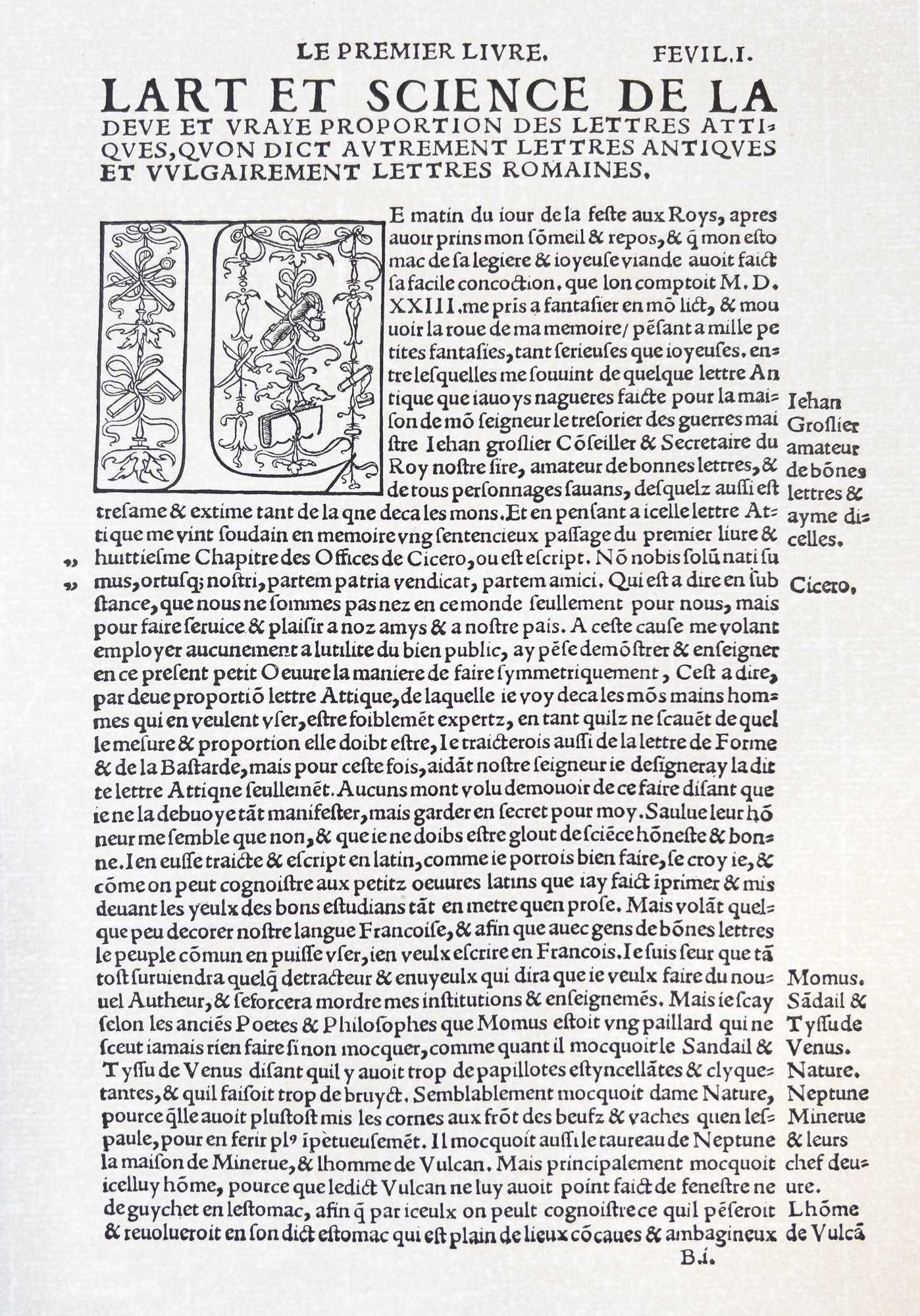
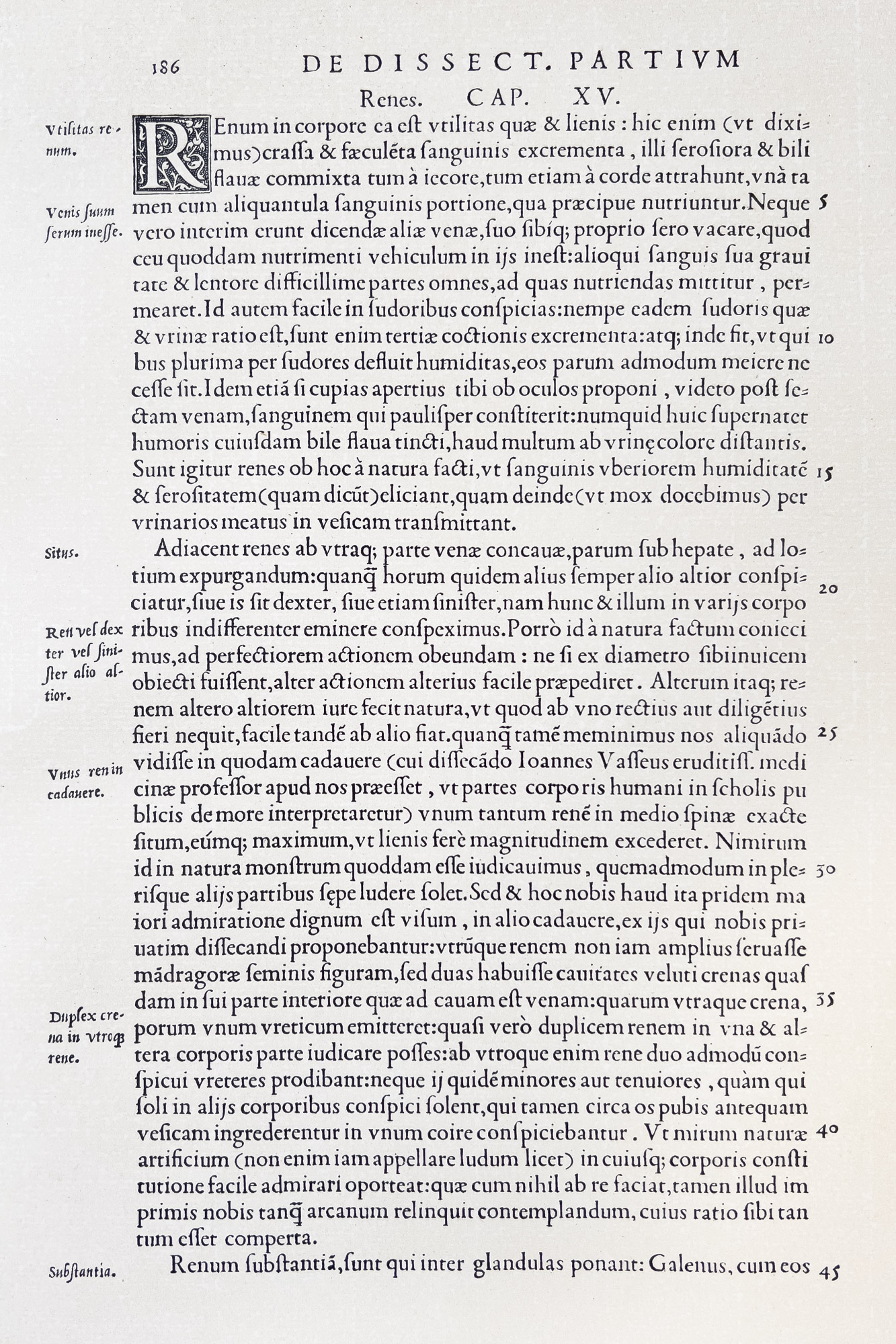
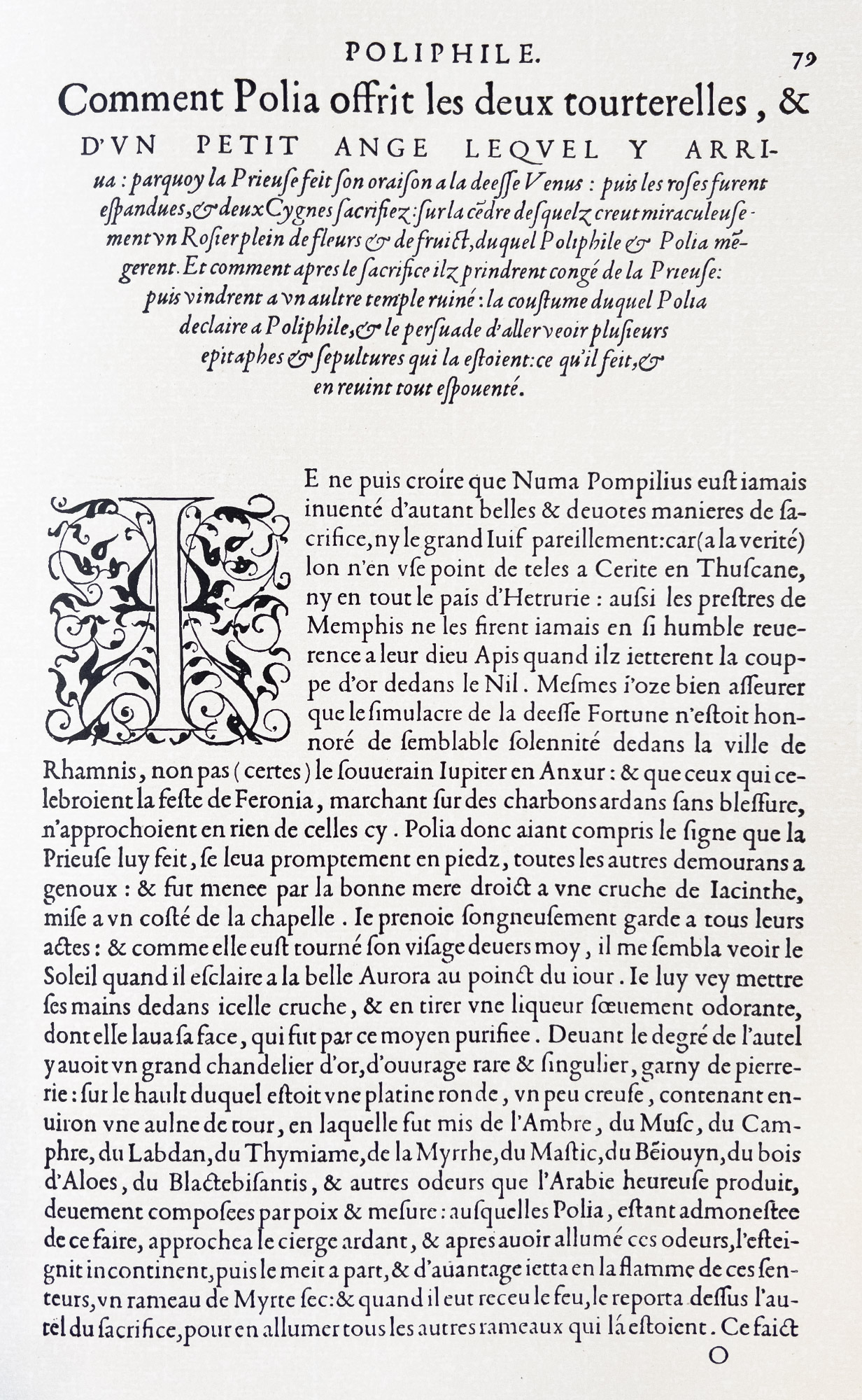
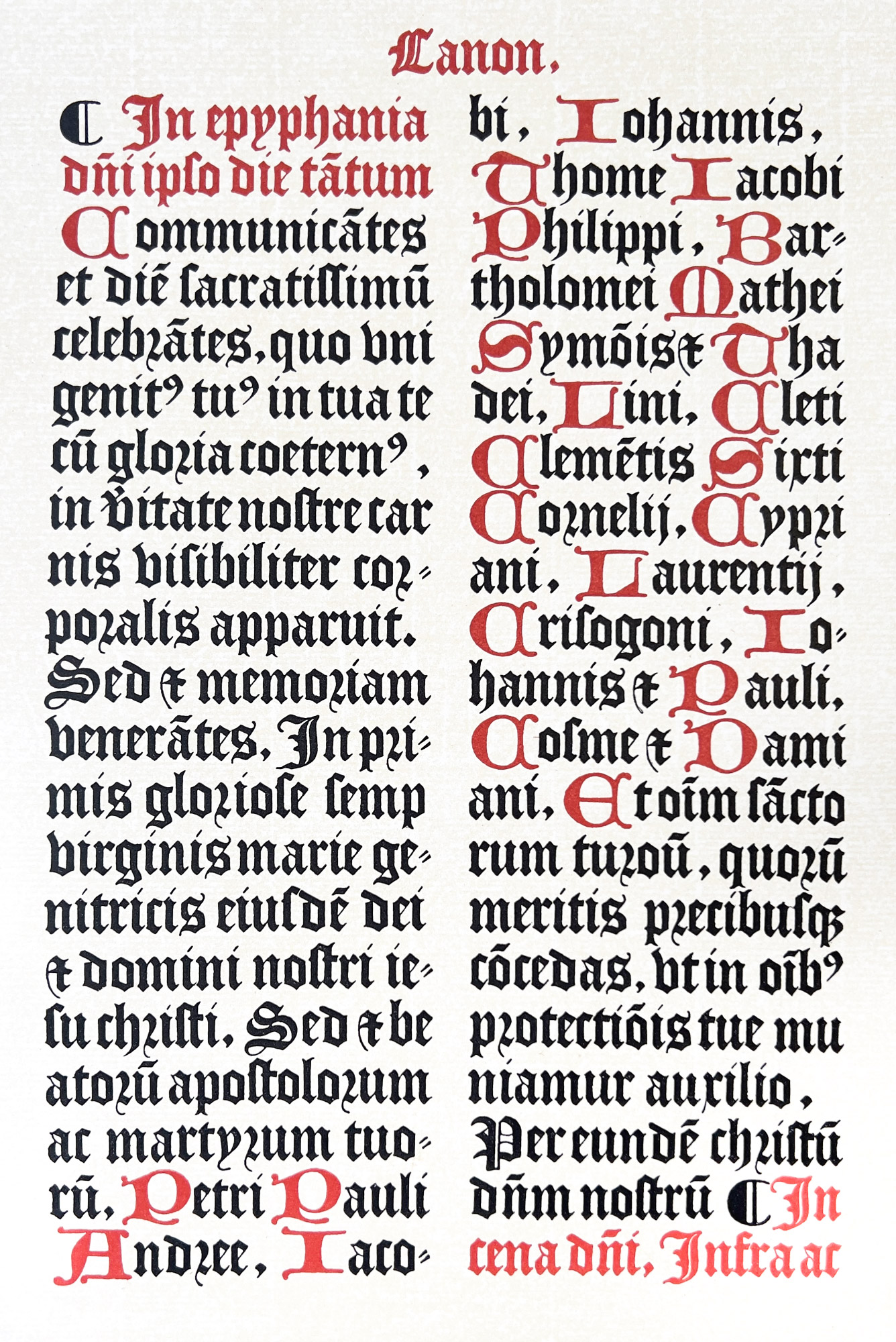