Chapter XIII
Italian Types: 1500–1800
I. Examples of Italian Printing
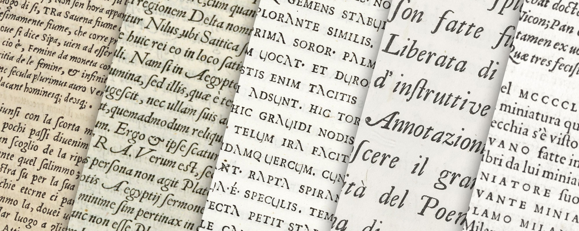
Italian printing during the first half of the sixteenth century retained a certain elegance. The tradition of monumental work had not die out, and we see, as late as 1560, some vary noble books in a fine form of roman letter either reminiscent of, or printed in, fifteenth century fonts, such as were sometimes called the carattere Veneto. There was still, in the types and their use, the grand manner. From the middle of the sixteenth century, Italian printing sharply declined in excellence. The roman and italic letter had some time before this become generally popular, so that the types used were not very often Gothic form. But while Italian roman type did not possess all its early elegance, the great declension came in its use. By looking at a few books which are average specimens of Italian sixteenth, seventeenth, and eighteenth century printing. It is easy to see by what route it ran downhill.
§1. XVI Century
Ovid’s Metamorphoses with commentary by R. Regi, published at Milan in 1509 by Nicolas Gorgonzola, is a book which at first sight might have been printed in the fifteenth rather than the sixteenth century. The text, in large roman type, runs at the right of left-hand pages and left of right-hand pages, and the outside of the page is filled (as in manuscripts) by wide columns of notes, set in smaller roman characters. These columns of notes, much infested by a family of very black paragraph marks, are allowed to come just as they will—sometimes extending to the bottom of the page, sometimes not, and here and there surrounding three sides of the text. At the beginning of each Book, an unattractive initial is usually inserted, to take the place of those before painted in by hand; for spaces were still sometimes left for an illuminator’s work. This detail indicates a beginning of the decline in Italian book-making; but this book maintains something of the grand manner (fig. 99).
99. Page of Ovid: Gorgonzola, Milan, 1509
From Ovidii metamorphoses
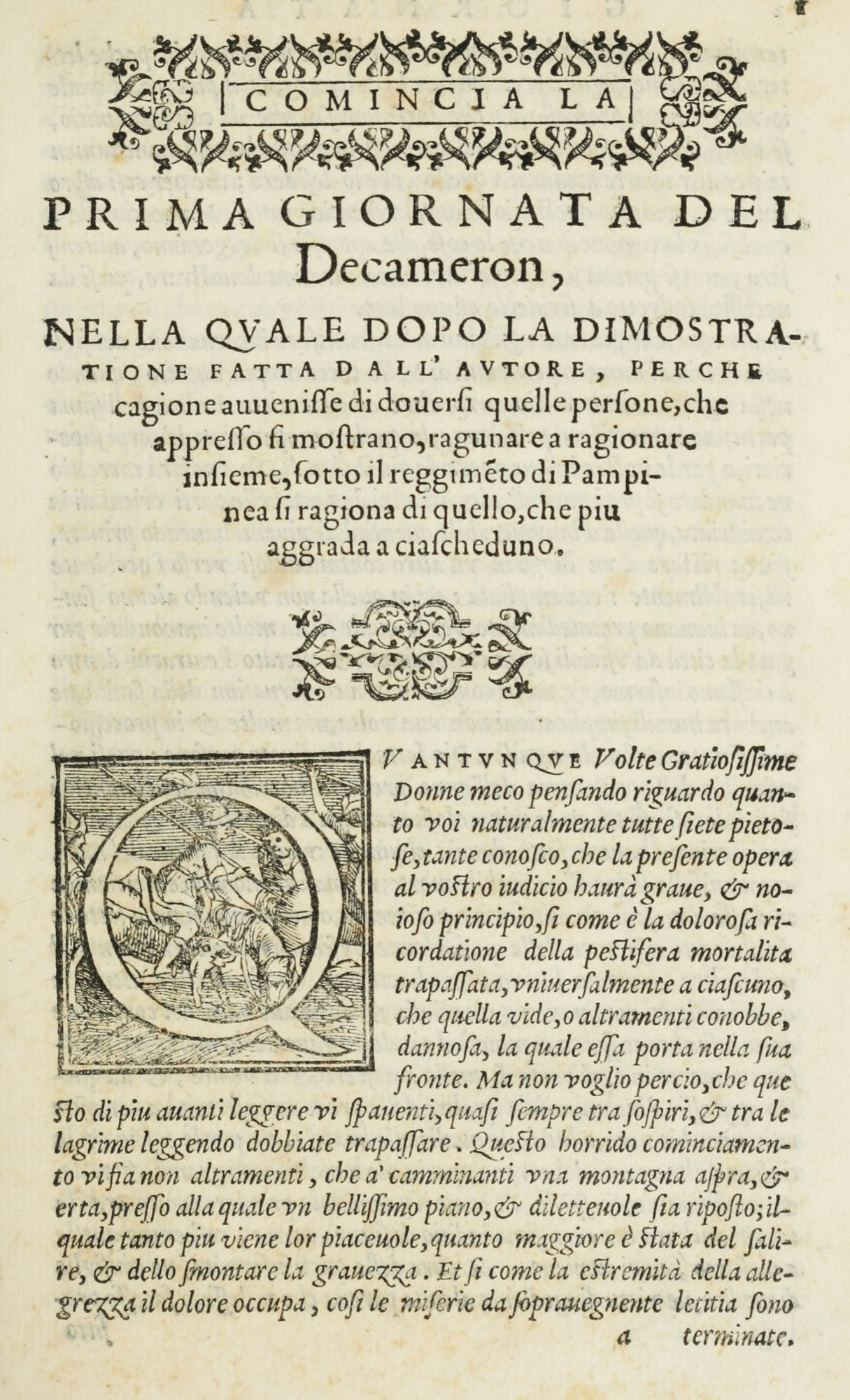
Boccaccio’s Decamerone, issued in the name of the heirs of Filippo di Giunta at Florence in 1527, like so many Giunta books, very closely imitates the Aldine style. It is printed entirely on one font of italic type, with the exception of its title-page, headings, and running-titles, which are in roman capitals. Small roman capitals are used with the italic letter, and spaces are left for initials to be filled in by hand. Its use of italic makes it a sixteenth century book, but it would be a very credible and beautiful volume for any century. An imitation of this edition was made at Venice in 1729, which may be consulted if the edition of 1527 is not available.
Books were still printed in gothic types, and a Venice edition of the Opera of Boethius, printed by Luc Antonio Giunta in 1536, is, in its arrangement and its black-letter type, completely Gothic, and, in its way, very handsome. It is chiefly in two sizes of Italian gothic characters, arranged in double column. The running-titles are in a large size of much the same letter. Marginal notes set in small black-letter and arabic numerals for folios are perhaps not quite in the style; nor is the title-page, which shows signs of “display” lines. Yet the book is a reminder of the persistence of black-letter volumes in the home of the roman letter (fig. 100).
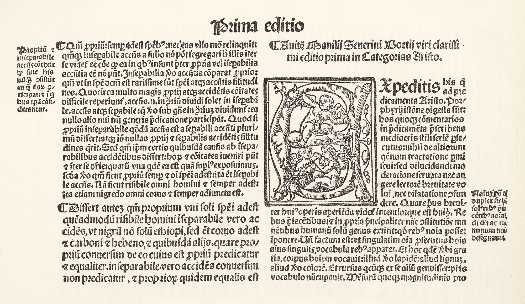
100. Gothic Type in Opera of Boethius: Giunta, Venice, 1536
From a copy in Harvard College Library
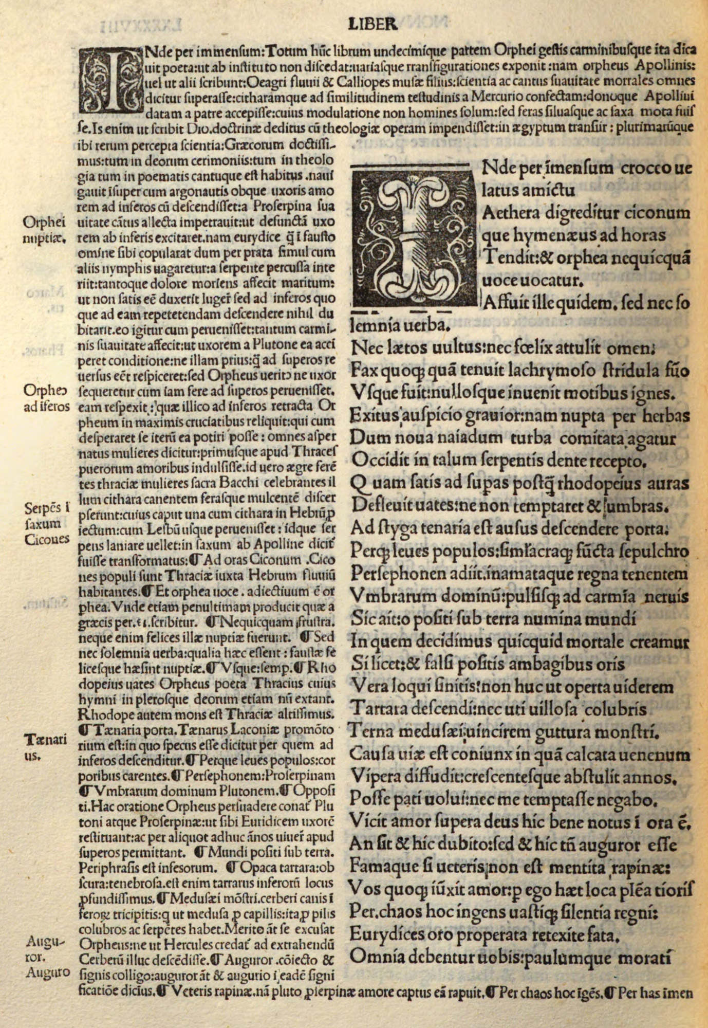
Alessandro Vellutello’s edition of Dante’s Commedia,1 printed by F. Marcolini at Venice in 1544, shows the Aldine manner sill surviving. The book, it is true, is printed in two sizes of italic, the larger for the verse, the smaller for the notes; still these notes surround the text in very fifteenth century style (fig. 101). Spaces are, in a few instances, left for painted initials. The first page bears a title in large spaced capitals, but otherwise it remains pretty faithful to an earlier typographic model. The illustrations from wood-blocks are vivid and effective—and famous. In this edition the rectification of an omission in the second canto of the Purgatorio, of lines 64–66, seems to have been made by stamping the needed matter on the margin with a wood-block.
101. Italic in Dante’s Commedia: Marcolini, Venice, 1544
From a copy in Harvard College Library (facsimile), Library of Congress (scan)
A folio edition of Paolo Giovio’s Historiarum sui Temporis in two volumes, printed at Florence in 1550–52 by Lorenzo Torrentino, Ducal Typographer (to Cosimo de’ Medici), is a very different and very imposing work. Its great pages of roman types are splendid, and the type-setting (although not so solid as in earlier volumes) is still careful. We notice, however, that the dedication to Cosimo de’Medici is printed in larger type than the opening address or the text of the book itself, and on the first page, too, we find a large block initial. The title-page is arranged in six sizes of roman capitals combined with some striking lower-case roman, and also italic, letters. The composition of chapter headings in three sizes of capitals, with a woodcut initial below, also shows the beginning of that mixture of different sizes of letter which was soon to end in typography which is very debased indeed (fig. 102).
The prefatory and final matter shows the beginnings of the arrangement of a book as we know it now—and is very well managed; though these were the parts which gave opportunity for great abuses in the unskilful hands into which printing later fell.
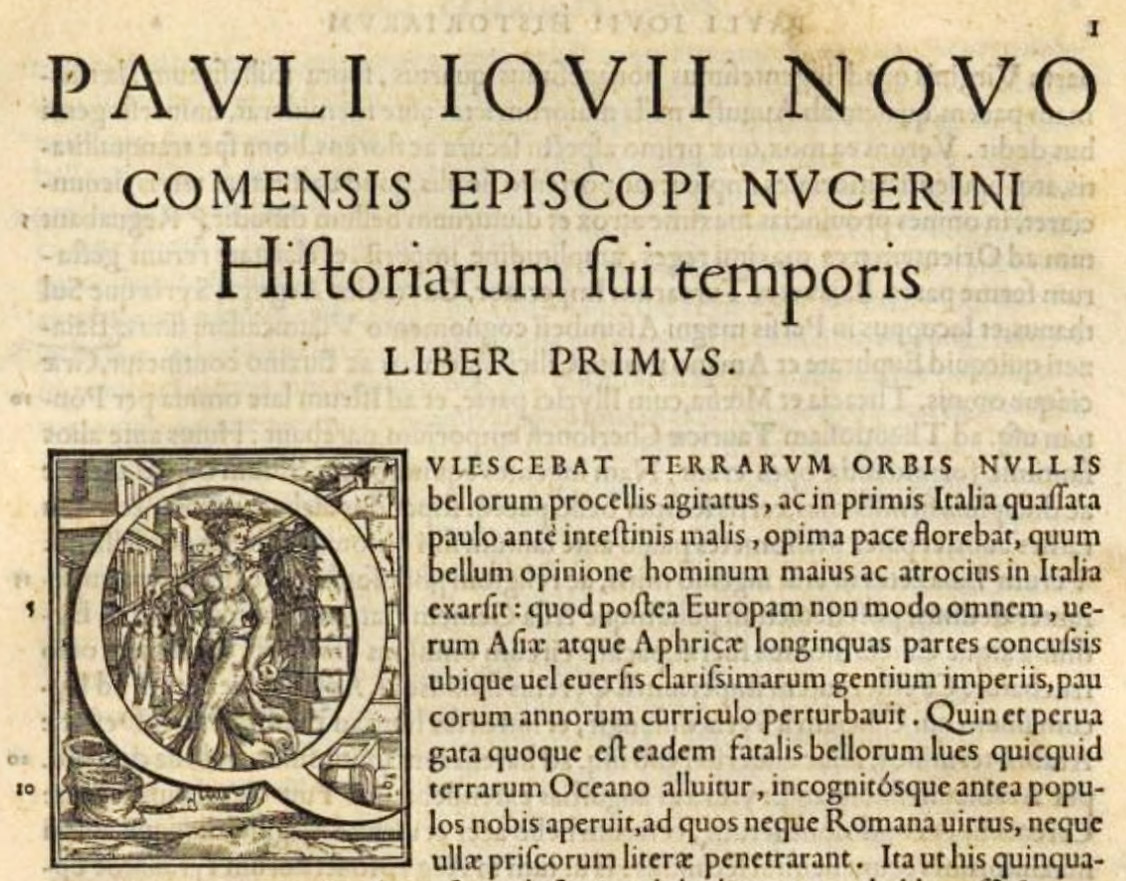
102. Opening of Paolo Giovio’s Historiarum sui Temporis: Torrentino, Florence, 1550
From a copy in Harvard College Library (facsimile), Internet Archive (scan)
That famous work Giorgio Vasari’s “Lives”—Le Vite de’ più Eccellenti Architetti, Pittori, et Scultori Italiani—published at Florence in 1550, is also very well printed for this period, and its octavo volumes show a remarkably good handling, typographically, of rather a complicated text, in a manner perfectly practical and readable to-day. In this respect it is very modern in arrangement. Chiefly composed in a handsome, solid, roman old style font, each notice begins with a title in spaced roman capitals, and a seven-line decorative initial. The chapter headings of the opening discourses on Architecture, Sculpture, etc., appear in a beautiful and masculine italic, and their text begins with plain but distinguished two-line initials. Poetry is set in italic, and inscriptions in small capitals, spaced. This editio princeps was also printed by Lorenzo Torrentino (fig. 103), though the revised and enlarged work on which subsequent editions were based, was printed by the Giunti and issued in three volumes in 1568.
103. Types of Vasari’s Vite: Torrentino, Florence, 1550
From a copy in Harvard College Library (facsimile), Internet Archive (scan)
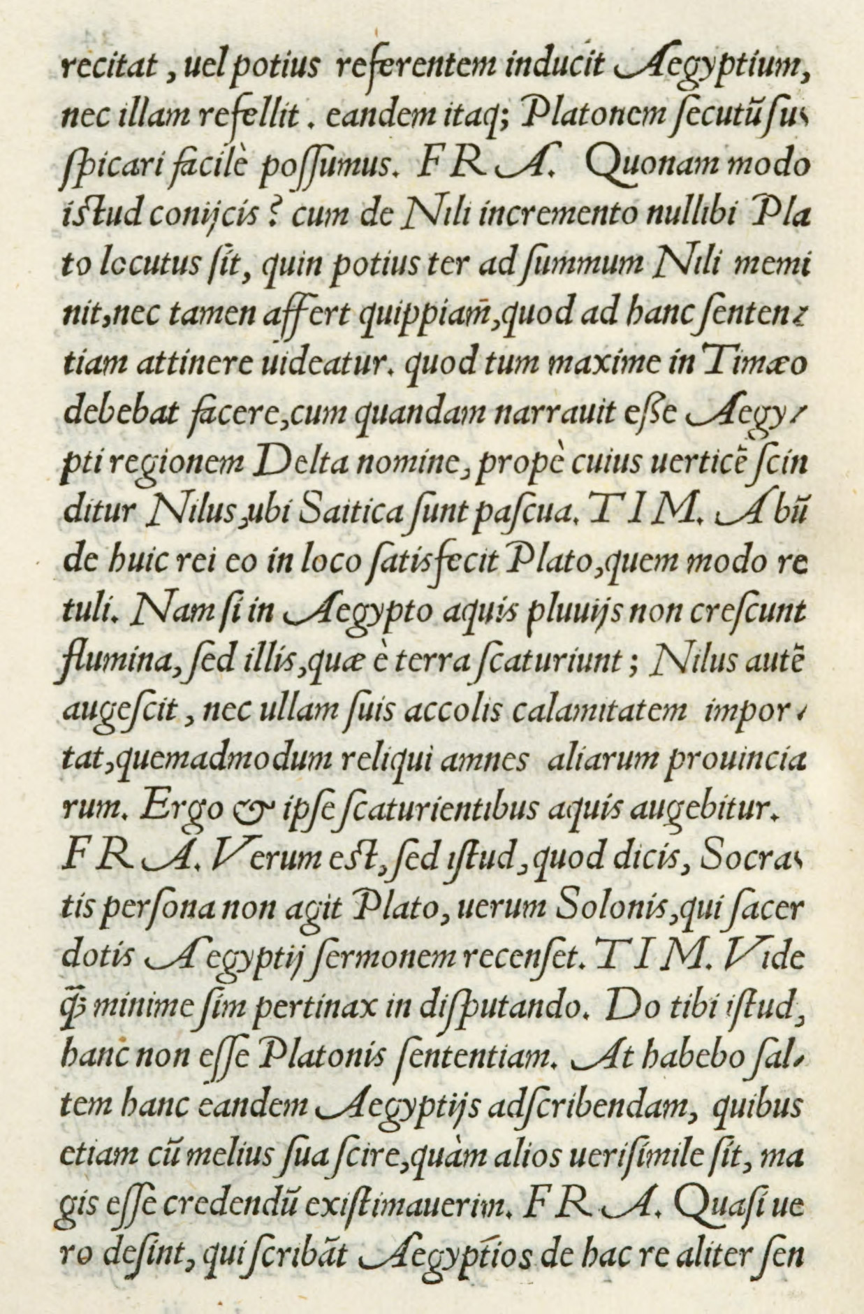
Some Venetian books of the middle of the sixteenth century were printed entirely in an interesting form of italic, a page of which is reproduced (fig. 104) from L. Nogarola’s Dialogus qui inscribitur Timotheus, sive de Nilo, printed by J. Gryphius for Vicenzo Valgrisi at Venice in 1552. Its calligraphic quality is remarkable, and it is also interesting because it employs italic capitals, and shows how far type-founders had departed from the Aldine character.
The roman type used in the introductory address is neither better nor worse than most current old style roman fonts.
104. Italic used in Nogarola’s Dialogus, Gryphius, Venice, 1552
From HathiTrust (scan)
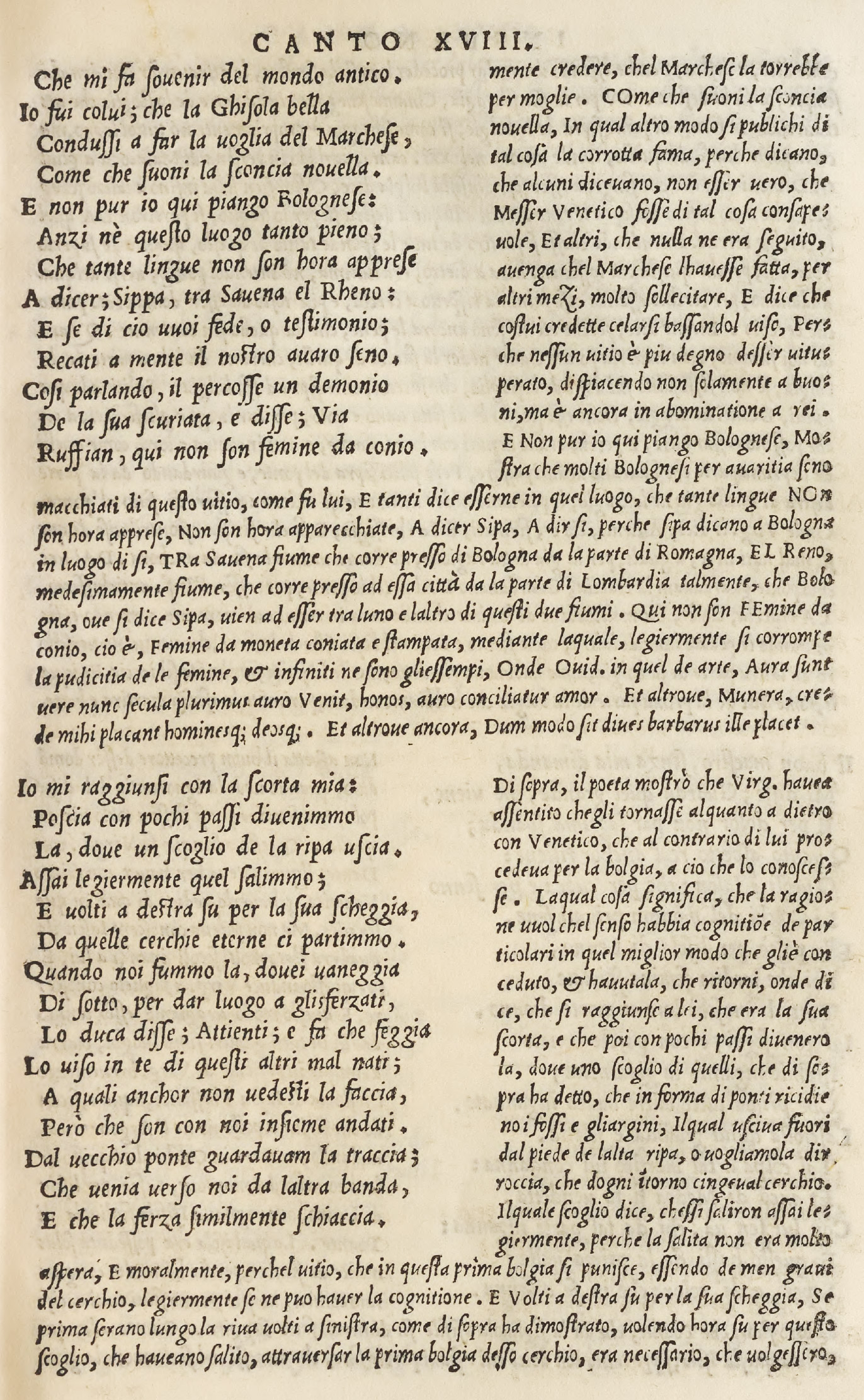
An edition of Dante with notes by Landino and Vellutello, edited by Sansovino, issued in Venice by the Sessas in 1564, is an example of what next came to pass in Italian printing. The text is set in italic surrounded by masses of notes in roman type. The beginning of the book, with its miscellaneous introductory paraphernalia, shows all the “prefatory confusion” of Italian editing and printing in the last half of the sixteenth century. Initials are introduced (sometimes “block” and sometimes “free” both text and notes, so that the eye is constantly distracted by spots in unexpected places. In spite of remarkable woodcuts reprinted from earlier editions, the book is discouraging to the reader through the typographical mismanagement of its text, which is overpowered by the notes (fig. 105). The title-page is execrable—turgid and vulgar.
105. Types in Dante: Sessa, Venice, 1564
From a copy in Harvard College Library (facsimile), Bilioteca Digitale Fondazione Marco Besso (scan, p. 91v)
What Italian printers, who could copy great pieces of printing, did when left more to themselves, is shown in a Florence Decamerone of 1573, brought out by the Giunti. This is still printed wholly in italic like earlier editions—or at least its text is—but—and it is such a big But—the title-pages is set in capitals of three sizes, capitals and small capitals of three sizes, lower-case roman of two sizes, and to this are added two sizes of italic, and a woodcut of Boccaccio! The publisher’s preface follows in a large and very handsome spirited italic,—notice the double z’s and the &’s,—and then follow four “licenses,” set respectively in three sizes of roman and one of italic type. Nor is this all. There is a list of the stories, an address to the reader, these set in italic; and then comes the proem in roman. And after all this interminable muddle of types, we arrive at the First Day. Furthermore, a good deal of “displayed matter” in various sizes of roman and italic characters is used to start these latter divisions, and ornamental initials, large and small, begin each of them. In the Decamerone type ornaments head each Day, which begins with an eleven-line initial (fig. 106). Now without counting the annotation at the end,—which form a little book by themselves,—we have an object lesson in the decay of Italian composition, and we can see just how it declined and from what it declined. This edition was published, corrected, and emended according to the regulations of the Holy Council of Trent, and when a Pope, a King, a Grand Duke and a Duke less grand, and the Inquisition too, say an edition of Boccaccio is “purged”—well it ought to be!2
106. Page from Decamerone: Giunta, Florence, 1573
From a copy in Harvard College Library (facsimile), Internet Archive (scan)
Such loosely constructed little volumes as Bocchi’s Symbolicarum Quæstionum, issued at Bologna in 1574 with copper-plates by Bonasone of Bologna, a pupil of Raimondi; or Nannini’s Considerationi Civili on Guicciardini’s Istoria, published in Venice in 1582 (a very congested piece of work), also show how tasteless a book printed in italic had become when compared with similar early Italian books (fig. 107). The italic capitals introduced in these later editions with italic lower-case by no means helped their effect, though those used in the Bocchi, as well as the lower-case italic, are interesting, lively letter-forms.
Thus while the type effects in Italian books of the sixteenth century—for its first fifty years—retained more or less the manner of the fifteenth century, even the best of them showed a decline by their mixture of varying sizes of type. These tendencies became more marked as the century went on—partly because the actual literary arrangement had become much more complicated, and also because printers did not know (and it was difficult to know) how to manage a superabundance of new literary features and still maintain the former severity of style. They took refuge, as second-rate typographers have always done, in using more sizes and kinds of type. This, together with a lack of the restraining influence of older models, made books less simple and therefore less good.
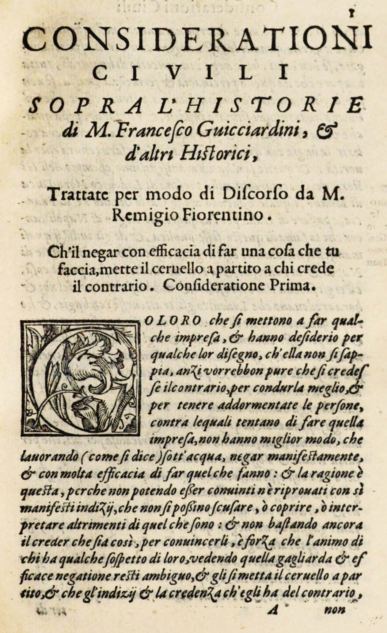
107. Italic in Nannini’s Considerationi Civili, Venice, 1582
From a copy in Harvard College Library (facsimile), HathiTrust (scan)
§2. XVII Century
In the seventeenth century, the type, and still more the composition and presswork of Italian books, often became a very fearful thing! Take, for instance, a small folio Tasso—Gerusalemme Liberata—printed by Giuseppe Pavoni at Genoa in 1617. In this very badly planned volume, the poem is set entirely in a nervous old style italic printed in double column; but poorly designed italic in larger sizes is utilized for its prefatory matter, which is most confused in arrangement. Each canto starts with overloaded, tasteless headings and ornaments, and, as if this were not enough, is burdened by a block-letter initial. Opposite each canto a full-page copper-plate illustration is introduced. The dedication and title-page are also engraved. These copper-plate title-pages were common in Europe during the seventeenth century, and, as before suggested, had a wretched effect on printing. It was the short and easy method of making a book beautiful. And as they were generally over-elaborate in design, they made the slovenly typography all the more ridiculous. Furthermore, as Walter Crane writes,3
while the surface-printed block, whether woodcut or metal engraving (by which method many of the early book illustrations were rendered), accorded well with the conditions of the letter-press printing, as they were set up with the type and printed by the same pressure in the same press, with copper-plate quite other conditions came in, as the paper has to be pressed into the etched or engraved lines of plate, instead of being impressed by the lines in relief of the wood or the metal. Thus, with the use of copper plate illustrations in printed books, that mechanical relation which exists between a surface-printed block and the letter-press was at once broken, as a different method of printing had to be used.
Although the first book decorated with copper-plates was printed as early as 1477, they did not come into general use before the middle or end of the sixteenth century.
Here and there a fine seventeenth century book appears, like Morosini’s Historia Veneta—an imposing folio of seven hundred pages, reminiscent in style of the early sixteenth century. The types are, in general effect, handsome—that of the preface being an irregular old style of course cut, while the text is set in a somewhat thin roman letter. As here employed they make massive pages, very solidly and well set (fig. 108). Notes in small italic appear in the margin. Running-titles are arranged in a large, old style lower-case letter. The engraved title-page and overloaded head-pieces which, with several sizes of roman capitals, begin each Book, are very much “of the period.” This volume was printed by Antonio Pinelli, “Ducal Printer,” at Venice in 1623.
108. Roman types of Morosoini’s Historia Veneta: Pinelli, Venice, 1623
From a copy in Harvard College Library (facsimile), Google Books (scan)
Another seventeenth century work, on navigation, etc., which is a fine piece of typography and a still more wonderful piece of book-making, is Dell’Arcano del Mare di D. Roberto Dudleo—that romantic figure Robert Dudley, son of Elizabeth’s favourite, Dudley, Earl of Leicester. These enormous folios were printed at Florence, where Dudley then lived, in three volumes, in 1646 and 1647, and dedicated to Ferdinand II, Grand Duke of Tuscany. The typographical decorations are ingenious and the typography most effective, the engraved plates magnificent; and, as a whole, it is a superb production, showing great vigour of conception and style in execution.
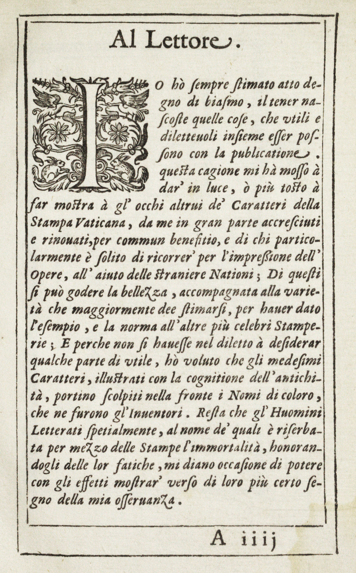
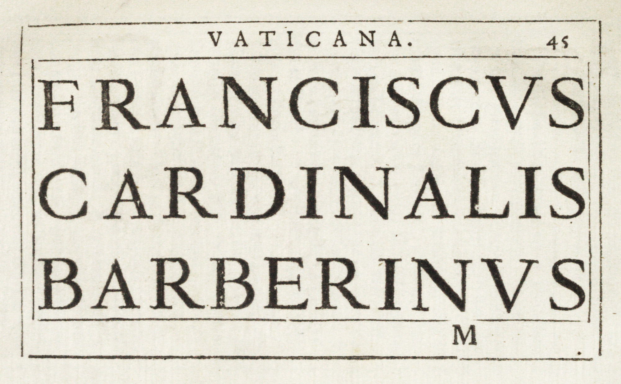
For late sixteenth century and early seventeenth century types we have a valuable source-book in the 1628 specimen of the Stamperia Vaticana and Camerale, founded at Rome in 1587.4 It is entitled Indice de Caratteri, con l’Inventori, & nomi di essi, esistenti nella Stampa Vaticana, & Camerale, issued at Rome and dedicated to Francesco, Cardinal Barberini, whose symbolic bees figure on the title-page, beneath an enormous red cardinal’s hat.
The dedicatory epistle is printed in a fine old style roman font, and the address Al Lettore (in which Brogiotti says that he has been the chief agent in collecting and renovating these fonts) is set in an italic which has a few striking characters—the z and final e, for example (fig. 109). Then follows a collection of exotic types with astonishing attributions—in which Adam is called the first inventor of science and letters; Moses is made to father the Hebrew alphabet; Abraham obligingly devises letters for the Syrians and Chaldeans; Esdras is found improving the Hebrew alphabet; and Phœnix gives letters to the Phœnicians! St. Jerome and St. Cyril also had a hand in alphabet-making; and Pythagoras added to the joy of life by presenting the world with a Y. There are a good many more curious inscriptions. The serious part of the work begins on leaf 27, where some heavy roman capitals of the oldest form of old style are shown. The character called canon grosso (fig. 110) is a fine letter, with exceedingly long ascenders and descenders, resembling types cut by Garamond G. Le Bé and some roman types used in Spain. This is followed by descending sizes of old style fonts—such as the ascendonica (fig. 111). The italic corsivo grosso (fig. 112) is an interesting and varied character, full of movement and style, and was probably cut by Robert Granjon for this printing house, and may be the font which the Pope of that day desired to restrict to its private use. In this corsivo, the lower-case z’s and final e’s, the double s and the “swash” C and D, are to be looked at. The smaller sizes of roman, and especially the italic—varied by series of capital letters for titles, etc. (fig. 113)—show a fine, even collection of old style fonts of which any printing-house might be proud. Specimens of Hebrew, of some distinguished Greek capitals (fig. 114) and Greek lower-case (which accord very nicely with roman fonts), and four extraordinarily interesting specimens of plain-song music types, marked Ex Bibliotheca Vaticana (figs. 115 and 116), follow, and the book closes with two sizes of a large old style letter, used no doubt with music for the Canon of the Mass (fig. 117). Restricted to such fine, severe types, it would be difficult to go wrong. The Indice is among the most interesting “specimens” in the history of printing, and shows the material of a seventeenth century Italian printing-office at its simplest and best.
109. Address to the Reader: Stamperia Vaticana Specimen, Rome, 1628
From a copy in Harvard College Library (facsimile), Wellcome Collection (scan)
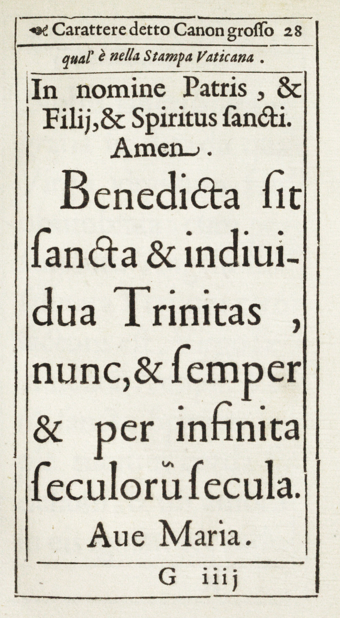
110. Canon Grosso: Stamperia Vaticana Specimen, Rome, 1628
From a copy in Harvard College Library (facsimile), Wellcome Collection (scan)
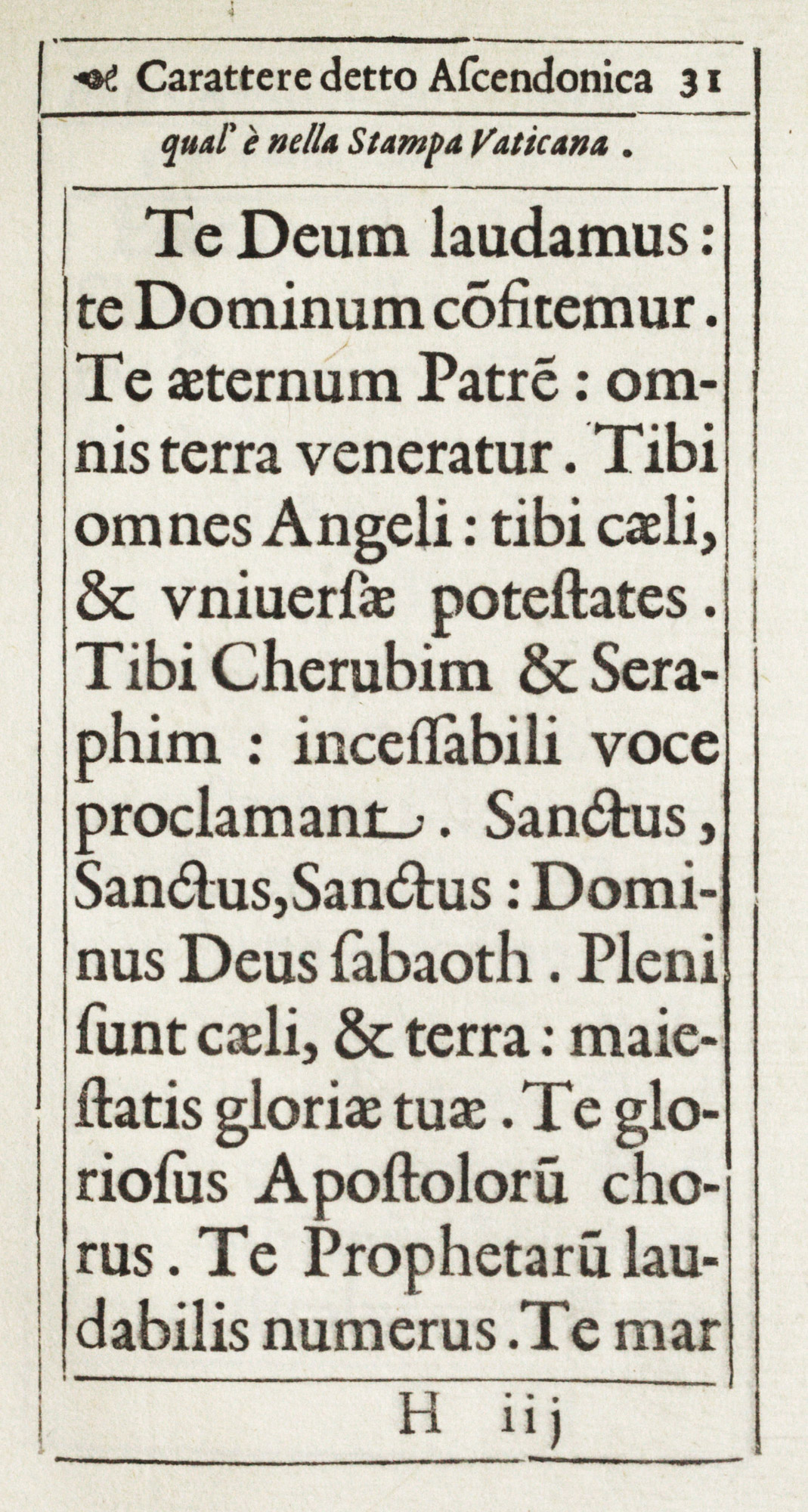
111. Ascendonica: Stamperia Vaticana Specimen, Rome, 1628
From a copy in Harvard College Library (facsimile), Wellcome Collection (scan)
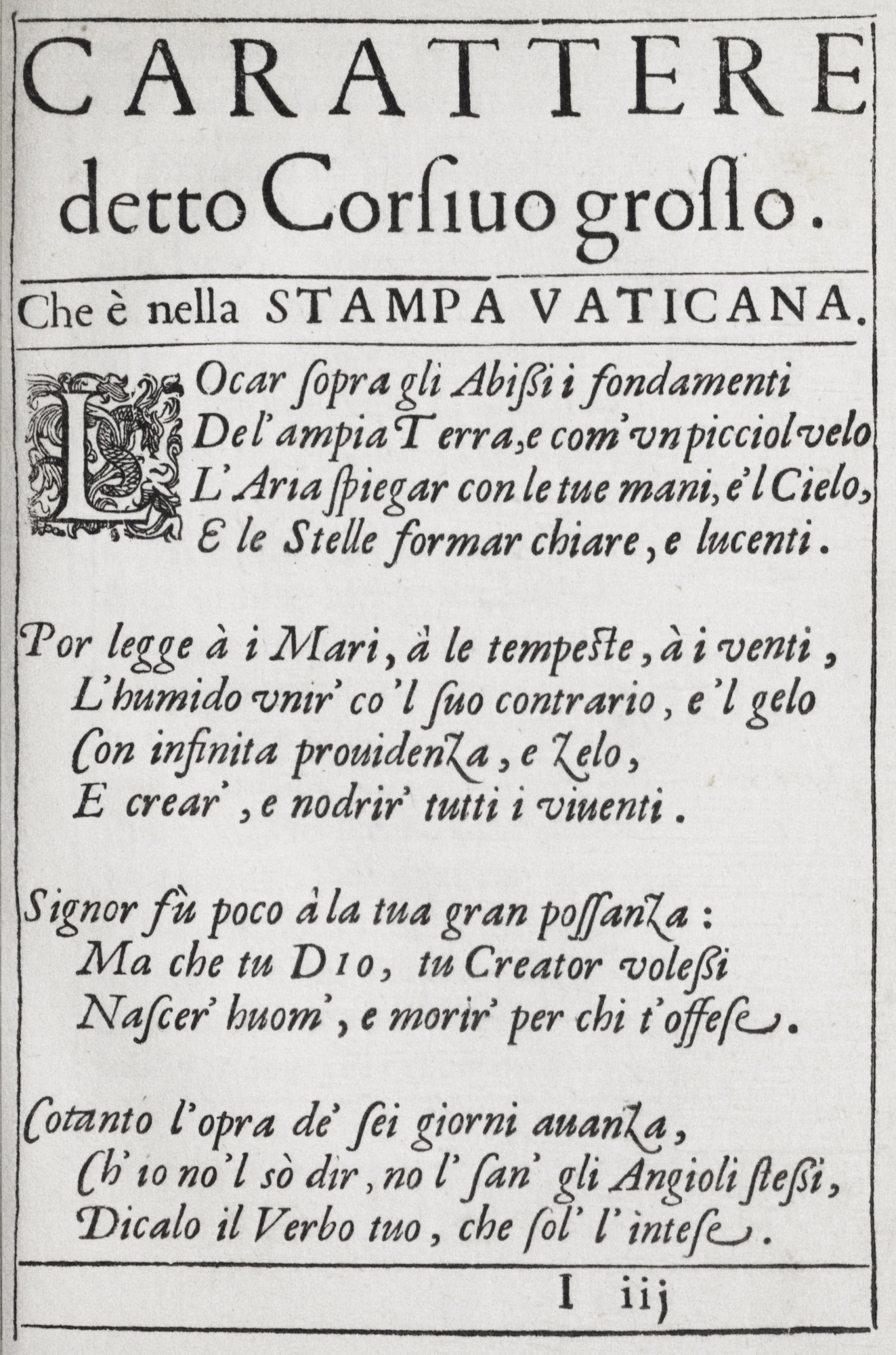
112. Corsivo Grosso: Stamperia Vaticana Specimen, Rome, 1628
From a copy in Harvard College Library (facsimile), Wellcome Collection (scan)
113. Roman Capitals: Stamperia Vaticana Specimen, Rome, 1628
From a copy in Harvard College Library (facsimile), Wellcome Collection (scan)
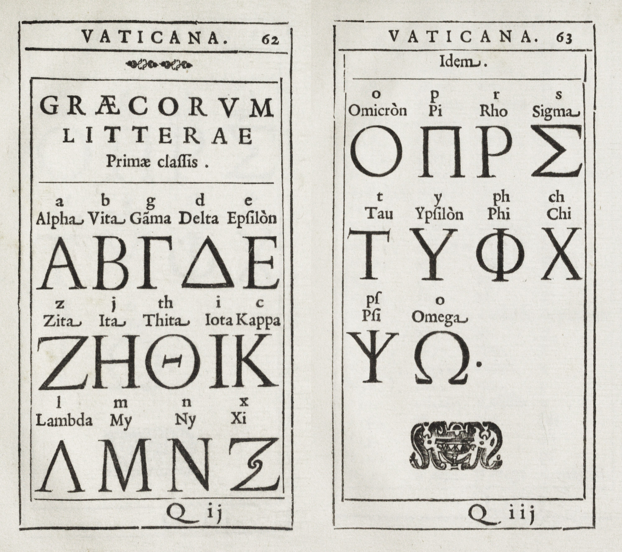
114. Alphabet of Greek Capitals: Stamperia Vaticana Specimen, Rome, 1628
From a copy in Harvard College Library (facsimile), Wellcome Collection (scan 1, scan 2)
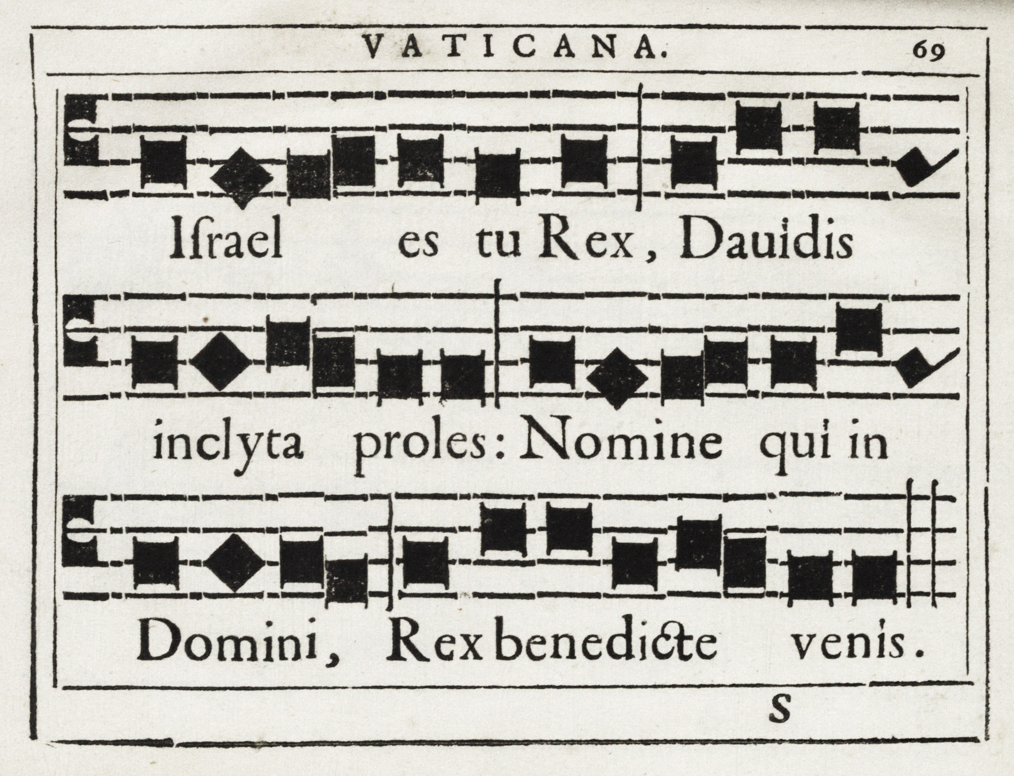
115. Plain-Song: Stamperia Vaticana Specimen, Rome, 1628
From a copy in Harvard College Library (facsimile), Wellcome Collection (scan)
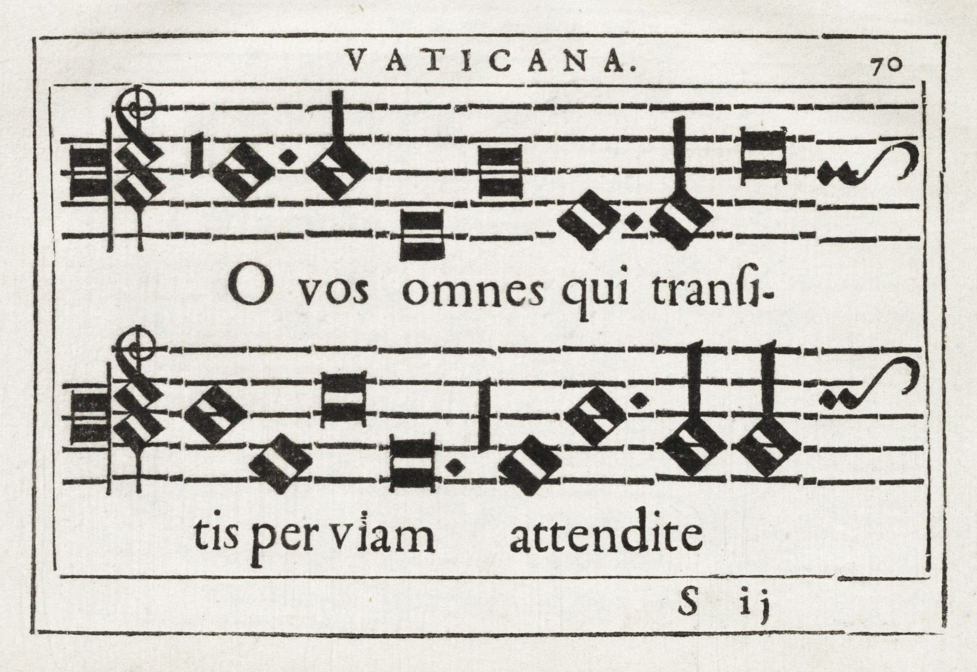
116. Plain-Song: Stamperia Vaticana Specimen, Rome, 1628
From a copy in Harvard College Library (facsimile), Wellcome Collection (scan)
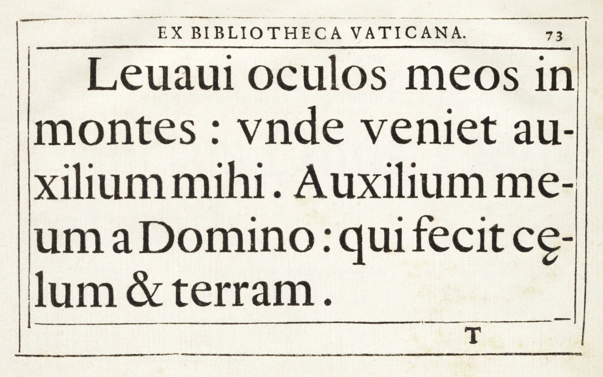
117. Type used for Missals: Stamperia Vaticana Specimen, Rome, 1628
From a copy in Harvard College Library (facsimile), Wellcome Collection (scan)
When poorer types were poorly used at this epoch, we have such wretched little affairs as La Clori, a pastoral tragi-comedy, by Camillow Lenzoni, issued at Florence by Z. Pignoni in 1626 (fig. 118). Its text is set entirely in italic, but in different sizes and with some roman head-lines. Furthermore, its prefatory matter is adorned with badly printed typographical ornaments, which add to its woeful appearance. The size of italic used for the text, and the roman capitals used in running head-lines, are too large for the page—a common fault in Italian printing as the seventeenth century went on. In a similar, loosely built volume of the period—Allessandro Adimari’s La Clio, Florence, 1639—the publishers, Massi and Landi, lazily observe: “Errors in printing are confided to the discretion of the kind and careful reader”—so it appears that the scholarly part of such books was not looked after any better than was their typography!
118. Page from La Clori: Pignoni, Florence, 1626
From a copy in Harvard College Library (facsimile), Google Books (scan)
The edition of Vittorio Zonca’s Novo Teatro di Machine et Edificii, published by F. Bertelli at Padua in 1656, well known for its interesting plates,5 is extraordinarily careless in execution, though simple in composition. Here, rough old style fonts, closely set and very, very badly printed, are used. For so ambitious a folio and such careful illustrations, its technique is inconceivably slovenly; yet this book had already gone though three editions. Another work of a more scientific character was the second edition of Magalotti’s Saggi di Naturali Esperienze fatte nell’Accademia del Cimento, Florence, a folio printed at the end of the seventeenth century (1691), and a fine example of its kind. The type shows a distinctly modern note (fig. 119). As for decoration, effective initials and tail-pieces coarsely engraved on wood are mixed with a series of grotesque headings and scientific plates cut on copper. It was really an important book, and was also intended to be a handsome piece of typography. It came from the Florentine printing-house of Giovanni Filippo Cecchi.
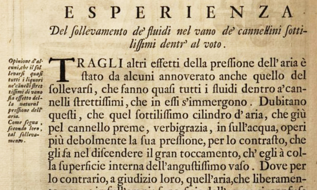
119. Roman and Italic Types showing “modern” tendency, used in Magalotti’s Saggi di Naturali Esperienze, etc.: Cecchi, Florence, 1691
From Internet Archive
By this time an entire change in Italian book-making is evident. The elements of the old fifteenth century volumes have almost wholly disappeared, and the pretentious, overladen styles of the seventeenth century are in full swing. Neither very careful in detail nor delicate in execution, these more elaborate volumes of the seventeenth and early eighteenth century became like stage properties; the folios seemed as if they were meant to “carry across the foot-lights.” Just as, in a sober Italian palace of the Renaissance, the earliest Italian books looked their part, so these big folios seemed to be at home in the tormented architecture of Bibiena, or amid the audacious magnificences of Bernini. The true grand manner of Italian printing, like much else in Italy at that time, had turned into the false grand manner in which everything was exaggerated. And as typography reflected the state of the Fine Arts, we have the pompous seventeenth century folios of the Italian press. Books began with Thrones, Principalities, and Powers, displayed and praised in types and terms equally grandiose. In great Italian houses of that period, filled with gigantic furniture, pictures, and folios, the only object that must have appeared inadequate in scale was Man!
This overblown effect was true of the details of types. The late Italian italic, for instance, developed into a much more generous, opulent, and careless sort of letter than the demure little character introduced by Aldus. It had an exuberant “kick” about it that belonged very much to the art of the day. it was at this time that the italic letter, used through the sixteenth and sometimes in the seventeenth century for the text of entire books, began to be employed for preliminary matter only, or for poetry.
Roman types also were coarse in form. They, like the italic, were what we should now call “old style.” They were often disagreeable in effect because, as we have seen, sizes too large for a page were employed; and this, and poor, rough paper, made these roman characters look coarser than they were, though the simple capitals were often good letters. Still, such type had “a way with it.” As to composition, it was a little to rakish, too—nothing was very correct. Yet it was almost forgivable because taking its place so well in the picture.
§3. XVIII Century
In an eighteenth century edition of Tasso’s Gerusalemme Liberata, edited by Gentili and Gustavini, and printed at Urbino in 1735 (at the Samperia della Cappilla del SS. Sacramento, a famous eighteenth century office which still survives), we have much less excellent type, but the poetry is printed in roman instead of italic. There are, happily, no decorations except the inevitable copper-plates, which in this case are even relied on for initial letters. The title-page is printed in red and black, in all sorts of sizes of italic capitals and lower-case characters; the prefatory matter is exaggerated in composition; the final notes are unattractive. The edition is interesting only in comparison with a Tasso already referred to.6
A curious piece of Italian typography, very characteristic of eighteenth century, is an edition of Virgil (P. Vergilii Maronis, Codex Antiquissimus, A Rufio Turcio Aproniano V. C. Distinctus et Emendatus…Florentiæ. Typis Mannianis), published in 1741 at Florence, and printed by Joseph Manni, a person of scholarly tastes. It is set entirely in old style capitals with a few characters imitating those of an ancient and famous manuscript Virgil in rustic characters, in the Laurentian Library, Florence. The preface exhibits a fairly accurate engraved reproduction of a few lines of the modal on which the book was based, and in the text the ingenious introduction of but three specially cut letters gives the general effect of a font of “rustic” type (fig. 120). Thus the work displays that amazing audacity in arriving at a striking effect, notwithstanding inaccurate details and economy of method, which was typical of Italian printing at that time. Issued at a place and period which appears unfavourable to such a venture, and dedicated to Lovers of the Fine Arts, it also indicates there has always been a public sufficiently sympathetic to encourage such publications. The volume is enlivened by occasional rubrication, which gives it a distinguished air.
120. Type imitating ancient Manuscript, used in Virgil: Manni, Florence, 1741
From a copy in the Boston Public Library (facsimile), Internet Archive (scan)
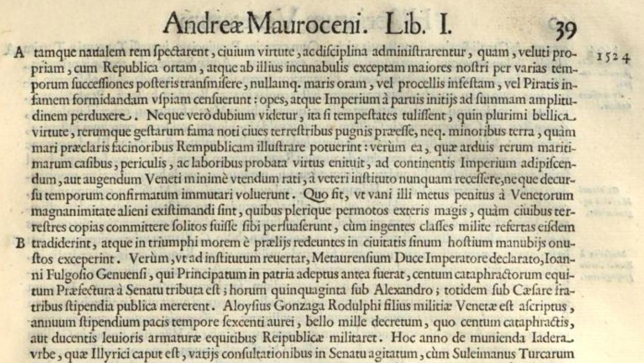
Besides the press just mentioned, the Italian printing-houses of reputation outside of Venice at that period were those of Volpi-Comino at Padua, Della Volpe at Bologna, Soliani at Modena, and a few others. To rightly place the work of the Venetian press, or to understand the reputation of Bodoni, we ought to be familiar with the current work of these presses. Space is lacking for this here, but we may say a word about the Padua edition of Arrighi’s Latin life of Francisco Morosini (De Vita et Rebus Gestis Francisci Mauroceni), a volume brought out by Comino in 1749 (fig. 121). It is set in a rather handsome old style character, a good deal leaded. Each book begins with a tasteless wood-cut head-band, with several lines of capitals in various sizes and variously spaced beneath it, and a large woodcut initial. The italic introduced in the text is unduly small in proportion to the roman letter and far too much spaced. The typesetting is irregular, the presswork very uneven. The imposition is, however, fine, the margins ample, and the paper in texture charming. The prefatory matter is neither attractive in its separate types nor harmonious in relation to the rest of the book. The title-page, with a copper-plate embellishment, is chiefly set in handsome roman capitals of various sizes, with some lines or words rubricated. It is not a bad piece of work, nor yet a good one: but it has a certain modern air.
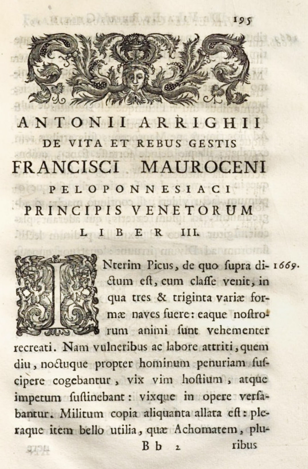
121. Types of Arrighi’s Life of Morosini: Comino, Padua, 1749
From a copy in Harvard College Library (facsimile), Google Books (scan)
Many luxurious Italian books of this period, while versions of eighteenth century French work, were freer and more interesting, and they were “embellished” (and really embellished) with many attractive copper-plates which pictured eighteenth century Italian—and especially Venetian—life, with great truth, gaiety, and char. A volume quite in the French manner is the Versi Sciolti di Tre Eccellenti Moderni Autori. This is set in a delicate old style character, very much leaded, and though the presswork as careless, the light effect of its type and the use of fanciful copper-plate decorations make it quite attractive—if it be not too critically examined. This open style of composition foreshadowed the coming fashion for lighter types; but the book was printed at Venice by Modesto Fenzo as early as 1758 (fig. 122).
122. Page showing light types, openly set, in Versi Sciolti di Tre Eccellenti Moderni Autori: Fenzo, Venice, 1758
From a copy in Harvard College Library (facsimile), Google Books (scan)
Venetian typography always had a certain individuality. In the fifteenth century—the period of Aldus Ratdolt, the De Spires, and Jenson—this was surely so; Venetian books in the sixteenth century were rather in a class by themselves, and had a delicate and tasteful quality which was interesting. In some instances an Aldine italic with roman capitals was employed for the text, and spaced capitals for head-lines, in loyalty to the Aldine fashion. An early irregular and very characteristic italic (fig. 104) was now and then introduced for prefaces and chapter-headings, and this, too, gave Venetian work a distinguished note. Two-line initial letters were used at the beginnings of new sections, and large capital pictorial initials, cut on wood, sometimes marked chief divisions. Although such typography clearly showed the general decline, it was sufficiently reminiscent of earlier and better work to command respect,7 and sixteenth century Venetian books had (as in the eighteenth century) an element of taste about them, which made them somewhat charming and more individual than printing of the period in other parts of Italy.
The eighteenth century illustrated books printed in Venice are comparatively little known. The chief Venetian publishers of this class of volume were J. B. Pasquali, the Albrizzi, and Zatta. In 1745 a most imposing edition of Tasso’s Gerusalemme Liberata, in folio, was printed at Venice by Albrizzi (figs. 123 and 124). This edition—dedicated to Maria Theresa—owes its chief splendour to Piazzetta’s illustrations and ornaments, which are delightful. But it is, too, an effective piece of printing. In spite of employing types which, on examination, are terribly coarse, they “play up” manfully to the gorgeous designs! In spite of presswork at times careless and muddy, the pages have a great air! We may pull the book to pieces and condemn every detail; but it lives—insolently careless of what one thinks of it! And another illustrated edition of the same poem, in two quarter volumes printed by Antonio Groppo at Venice in 1760, though a somewhat heavy example of this style, is also a spirited and pleasure-giving performance. It was no doubt meant for a luxurious edition,—a gift-book, perhaps—for its critical apparatus by Gentili is given so little importance, and its innumerable illustrations so much, and the latter were apparently its “feature.” As such books go, it is a fine edition, rough and slipshod in execution, but telling and full-blooded. The types are a series of rough old style fonts, displayed lines of capitals being much spaced.
123. Italic in Dedication of Gerusalemme Liberata: Albrizzi, Venice, 1745
From a copy in Harvard College Library (facsimile), Library of Congress (scan)
124. Page of Gerusalemme Liberata: Albrizzi, Venice, 1745 (much reduced)
From a copy in Harvard College Library (facsimile), Library of Congress (scan)
An annotated Dante was published by Zatta in 1757 in a similarly lively style—the title-page to Volume I being printed in red and black, with a delightful copper-plate vignette in bright blue! This, too, is printed on agreeable paper (but not well printed) from light old style roman types. The book is decorated with rather futile copper-plate illustrations and ornaments; the prettiest feature of the latter being the engraved framework at the beginning of cantos, around the arguments, themselves engraved. This was a very common ornamental treatment of similar matter in all these books. The remaining volumes are treated in a more sober style. But it is a very Venetian performance—perfectly irrelevant to Dante—and one cares as little about that as the publisher did! This edition, in five quarter volumes, was dedicated to the Empress Elizabeth of Russia.
Zatta’s 1772–73 edition of Ariosto’s Orlando Furioso is a typical late eighteenth century Venetian quarto. It is in four volumes, carelessly printed from rough old style types—the Life in italic, the text and notes in roman. But it is such a large, easy, gay book!—ample margins, attractive, thin paper, full of engraved illustrations and fanciful, lively encadrements. It is a very good specimen of the Venetian printing of its time, and perfectly readable.
Another characteristic work which shows the arrival of the fashion for lighter type effect is Carlo Goldoni’s Opere Teatrale in forty-four 16mo volumes, brought out between 1788 and 1795 in a delightful little format, and adorned with amusing copper-plates of scenes by the publishers; though in his letter to the printer (dated Paris, 1788), Goldoni says that he desires no decorations for this edition, but depends on Zatta’s reputation for exactness. The type is old style, but very light in cut and very openly set—quite modern in effect, through the composition rather than the type. Another fascinating little book, printed by Zatta in 1787, is a two-volume edition of Tasso’s Gerusalemme Liberata in 16mo—an example of his more intimate style, and much better printed than the Goldoni. It is set in a workmanlike eighteenth century roman face, slightly leaded, with three verses to a page, and each canto begins with a clever little vignette (fig. 125). The presswork, though careless, is respectable for its period. The Tasso appears to have been part of a collection of Opere of Italian poets, and was a sort of decorated Italian “Pickering edition,” to be read in the grotto of an eighteenth century Italian garden.
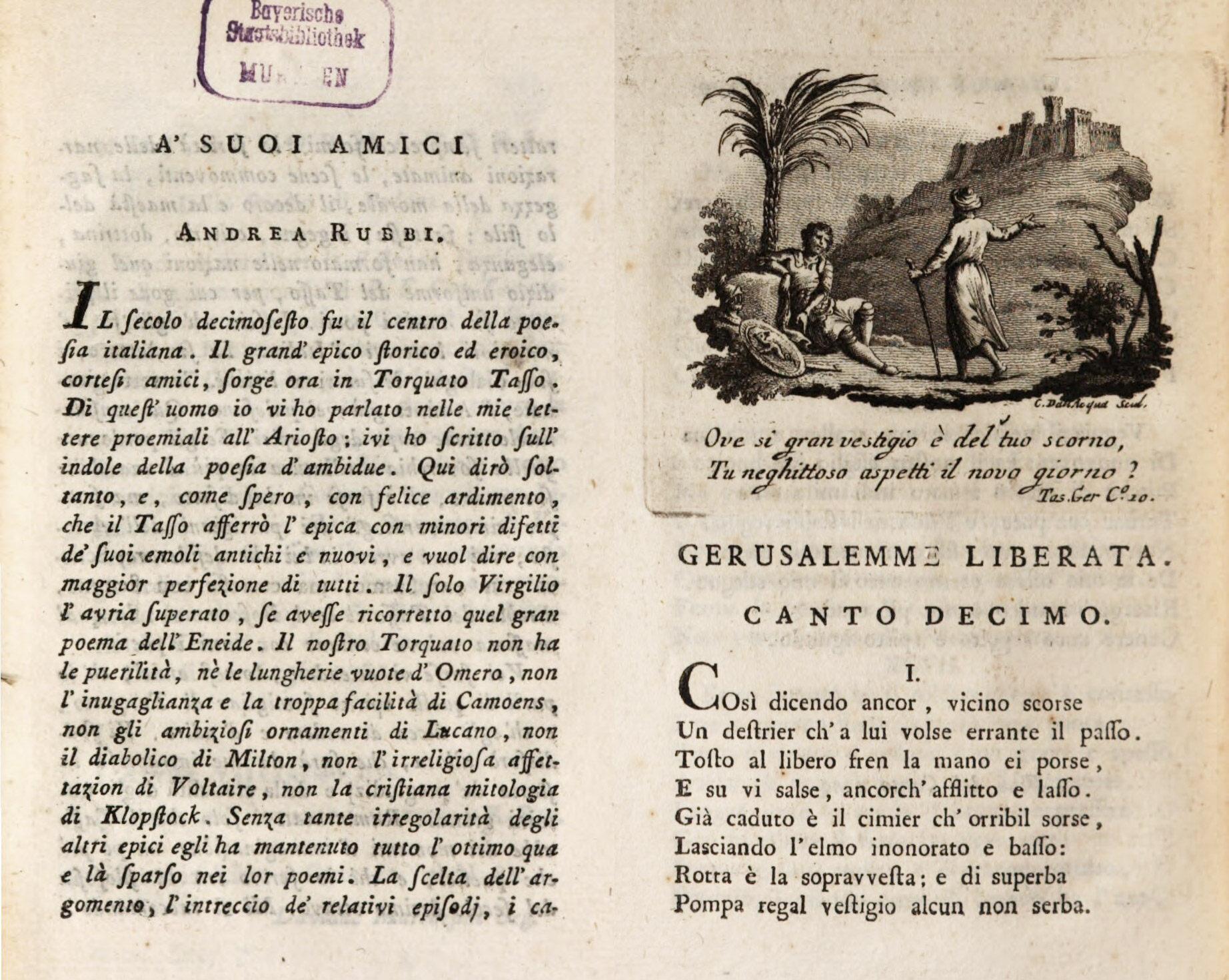
125. Pages from Gerusalemme Liberata: Zatta, Venice, 1787
From a copy in Harvard College Library (facsimiles), Munich Digitization Center (scan 1, scan 2)
Such books—particularly editions like Zatta’s Dante or Albrizzi’s Tasso—were often entirely inappropriate to their subject in treatment, and just as often wholly delightful! The reason we like them so much—or that I do—is that they reflect so perfectly the Venetian life of which they were accessories—that vie galante, painted by Guardi, described by President de Brosses, and mirrored in the theatre of Goldoni;8 and we cannot judge such pieces of printing, or any printing, justly, unless we know something about the life in which they played a part. Of course one cannot imagine wanting much to read these Venetian eighteenth century editions now; but then one would not now read Sabbath Bells chimed by the Poets, illustrated by Birket Foster, and published in the ’sixties. Our parents, however, did. And that was a very good book, too, no doubt, for it belonged not merely with black walnut furniture and Landseer’s engravings, but with the gentle manners, decent reticences, and old loyalties that were matters of course then!
In the last quarter of the eighteenth century the great figure in Italian printing was Giambattista Bodoni, Court printer to the Duke of Parma. Although the change in type-fashions at the end of the eighteenth century was fostered by Bodoni (who with the Didots had more to do in bringing it about than any one else), it must be remembered that he was at work at Parma as early as 1770. At first he used Fourier’s old style types, and later he made copies of Fournier’s fonts. The splendour of his early decorated work has not been praised enough; for his later work (done between 1800 and 1813), which is “nineteenth century” in feeling, is that by which he is best remembered. Didot of Paris and Ibarra of Madrid both worked in a style akin to that of Bodoni in the early part of his career. It is because both the Didots and Bodoni later adopted the rather academic and frigid style by which we now remember them, that we forget that they worked earlier just as successfully (perhaps more so) with old style types in an eighteenth century manner. In any case, Bodoni had a very special sort of press, and his editions were too luxurious and individual to be representative of Italian printing;9 but one cannot appreciate what he was trying to do, or understand his success, unless one sees the rank and file of books in his time.
Finally, for two very late eighteenth century books, which are of the file if not of the rank, we may look, first, at Sardini’s Storia Critica di Nicolao Jenson, printed at Lucca between 1796 and 1798. In this the roman and italic type, though still old style, shows a distinct tendency toward what we now call a “modern face,” and also a certain narrowing of the character in the interests of condensation—a bad feature, but one increasingly followed in the next century (fig. 126); secondly, we may examine Cristoforo Poggiali’s Memorie par la Storia Letteraria di Piacenza—printed at Piacenza in two quarto volumes by Niccolò Orcesi in 1789. This work is set in type of an even more “modern” cut, much more spaced and leaded than any we have hitherto seen. It is not an attractive type; still less the italic, which is mean and poor in cut; and the effect of the book is frigid and mechanical. Yet such type is a forecast of the later manner of much Italian printing (fig. 127). Not only the types themselves became lighter and lighter, but they were set in a more open way; and some of the late eighteenth century Italian books were almost as anaemic as German work of the same period. By the end of the eighteenth century, Italian typography was following those fashions which influenced printers throughout Europe.
126. Types showing “modern” feeling, used in Sardini’s Storia Critia di Nicolao Jenson: Bonsignori, Lucca, c. 1796
From Google Books (scan)
127. Types showing “modern” feeling, used in Poggiali’s Storia Letteraria di Piacenza: Orcesi, Piacenza, 1789
From a copy in Harvard College Library (facsimile), HathiTrust (scan)
In looking back over this three hundred years of Italian printing,10 it appears that, for the first fifty or sixty years of the sixteenth century, books retained something of the “noble manner,” though in details they showed a lack of simplicity of older work; that this survival of an earlier style slowly disappeared because
- the generation had passed to whom the style of manuscript books acted as a restraining influence;
- more complicated literary apparatus came into use for which there was no early precedent; and
- the class of men interested or employed in printing were neither as educated nor skilful as formerly.
Gothic type was soon driven out by roman; and this roman type, which was all of old style cut, as time went on was used in a larger variety of sizes and employed with less care. The popularity of copper-plate engraving for illustration increased confusion, while it did not improve typography; and the pompous architecture and decoration of the seventeenth century was reflected in the use of types and even in the types themselves. Toward the end of the seventeenth century, books were printed in a slightly more modern style of letter, and all through the eighteenth century types became lighter and sometimes more modelled, until both through cut of character and open composition, the ground was prepared for that entire change of style in type-forms which in the nineteenth century took place.
II. Italian Foundries and Specimens
Fournier in his account of Italian foundries says:
This country, which aided the initial steps of printing by the establishment of the celebrated Venetian foundries, preserves scarcely anything of its first renown in this respect. There are still some foundries at Venice, but they are not much esteemed. In the last century one existed which was very valuable on account of the beauty of its Latin and Greek characters by French masters. It belonged to Deucheni
The City of Rome, formerly the centre of the fine arts, has only one foundry which is worth knowing about, namely, that of the Vatican. It was commenced about 1578 by the celebrated French type-cutter Robert Granjon, who was called to Rome by Gregory XIII. He worked under the orders of Cardinal de’ Medici on different Latin, Arabic, Syrian, Armenian, Illyrian, and Muscovite types.11 This foundry, which has been since somewhat neglected, forms part of the typographical establishment of the Vatican.
Piedmont, like Savoy, is not rich in foundries. One alone, established towards 1742 at Turin, and for which I have furnished some sets of matrices of my types, suffices for both these territories. It belongs to a society of individuals attached to the Royal Printing House.
At Milan there is only one foundry and that a poor one, established in 1719 by a printer named Bellagata, who bought the punches and matrices belonging to Ignace Antoine Keblin, a wandering type-cutter and founder who travelled from city to city. This foundry has passed to three brothers named Sangiusti, of whom one is an ecclesiastic and the other two clock-makers. These last being dead, it now remains in the hands of the ecclesiastic.
About twenty years since, an individual named Legrand, a type-founder and very poor type-cutter, established his foundry at Avignon. It has passed into the hands of M. Mernot, who has added to its collection some matrices of other types.
A few Italian specimen-books may be examined as documents on Italian type-forms. As two of them came from printing-houses of a particular character, something must first be said about the printer “by special appointment,” and of the press which was founded for some particular purpose.
The first privileged printing-house in Rome or elsewhere was that of the printer-publisher, Antonio Blado, who worked there between 1515 and 1567. He was given, in 1549, the title of Tipografo Camerale, or printer to the Apostolic Chamber. Blado had some good fonts of type—gothic, semi-gothic, and roman—and was one of the first printers to follow the Aldine office in its use of italic. He also, by the way, printed the first Index Expurgatorius, in 1557. His work was continued by his heirs until 1593.
A special printing-house for the use of the Holy See was the idea of Pius IV, in 1560—the year of the assembling of the Council of Trent. Paul Manutius was chosen to take charge of it, and the first book it issued, in 1562, was a work on the council—De Concilio—by the English cardinal, Reginald Pole, to which Manutius contributed a preface. Its output was very largely devoted to the affairs and decrees of the Council. Because its expenses were in part defrayed by a wine-tax levied on the citizens of Rome, it was called Tipografia del Popolo Romano. Its work came to an end not many years after the retirement of Manutius to Venice in 1570.
Meanwhile, the Stamperia Vaticana had been founded by Sixtus V in 1587, and, as its name implies, it was housed in the Vatican, next to the Vatican Library, looking out upon the Cortile di Belvidere. Domenico Basa of Venice was its director, and Aldus Manutius the younger was associated with him in its affairs for some ten years, until his death in 1597. A magnificent example of Basa’s work is the folio Della Transportazione dell’ Obelisco Vaticano, etc. (recording Fontana’s feat in setting up the obelisk in the Piazza of St. Peter’s), printed at Rome in 1590. Apart from the splendid architectural plates, the beautiful roman and italic (corsivo grosso) fonts, and Basa’s bold, clever management of them, produce a volume very sumptuous in its effect.
In connection with this printing-house a foundry was set up—the only one at Rome which Fournier thought worth consideration. A good deal of its material was the handiwork of Granjon, whose italic letter was particularly admired, and who also cut many fonts on Oriental alphabets. In 1610 the Tipografia Camerale and the Stamperia Vaticana were united.
The specimen-book of this office was published in 1628, and was compiled by its director, Brogiotti. An account of its types and some reproductions of them have been given under Italian seventeenth century printing.
We now come to the press and foundry of the Congregation of the Propagonda, also at Rome, which was established in 1626 in a “polyglot” printing-office for missionary purposes. It was started through the gift, by Ferdinand II, of Illyrian types for a Missal, and the exotic types of the Vatican printing-office were added to its stock. Some of the Medici Oriental types were also in use there; others were engraved for it by Stefano Paolini. In a year or two it possessed punches and matrices for the alphabets of twenty-three languages. The best period of this office was during the last half of the eighteenth century under the directorship of Ruggeri and Amaduzzi. Bodoni received his early training from Ruggeri, cut some of the types for this office, and always retained an attachment for it. Under Ruggeri’s successor, Amaduzzi, the establishment had fonts for forty-four languages. Specimens of these, accompanied by learned tractates on their composition—generally found nowadays bound together—are important documents for the history of the founding and use of “exotic” fonts. What the office accomplished is recorded in the tasteful little Catalogus Librorum qui ex Typographio Sacræ Congreg. de Propaganda Fide variis linguis prodierunt, published in each language. Since the publication of this catalogue, other alphabets have occasionally appeared up to the present day.
An interesting use of some of these exotic types is shown in an effective folio volume, printed from fonts in this office, and issued at Rome in 1736, in commemoration of the death of Maria Clementina Sobieski, wife of the Old Pretender—entitled Parentalia in Anniversario Funere Mariæ Clementinæ Magnæ Britanniæ &c. Reginæ. Hebrew, Greek, Arabic, Syriac, Armenian, Chaldaic, Coptic, Ruthenian, German, and even the tongue of Malabar—every language except English—celebrates the virtues of the unfortunate titular Queen of England!
Toward the end of the eighteenth century the printing-house of the Propaganda was despoiled unmercifully. Under the French Directory, “the government commissioners being charged with selecting in Italy the monuments of art with which it is important to enrich France, proceeded to take the necessary steps to procure for the Republic’s printing-office a set of matrices of all the foreign characters in the Propaganda office in Rome.” This was in 1798. In the next year, the “necessary steps” were taken and the French commissioners confiscated much of its material—not merely punches and types, but almost everything else they could lay their hands on.
Although beyond the limits of the eighteenth century, its later history may be recorded here. After 1800 the office began to recover; but presently Napoleon took a hand in its affairs. Pius VII, when in France for Napoleon’s coronation in 1805, was taken by the Emperor to visit the Imprimerie Imperiale; where were printed, in honour of the Pope, a Latin address12 and also a volume containing the Lord’s Prayer in one hundred and fifty languages13—the Imprimerie being filled with fonts which, though styled typis imperialibus, were stolen from the Propaganda printing-office! However, Bodoni in 1808 made it a present of types; but in July, 1812, the office was suppressed, and in November the Prefect of Rome ordered that all matrices stored there should be sent to Paris. Some of Bodoni’s characters were hidden and some other material was kept back. Nevertheless, by this and former pillage, the greater part of the punches, matrices, and types were lost to it.
On the return of the Bourbons to France, the Imprimerie Royale was confided to one of the Anissons, a family which had held control of the French national printing-house for a hundred years before the Revolution, when the last director, Anisson du Perron, “périt révolutionnairement” in 1794. Pius VII demanded the return of the confiscated material, which was essential for use in books for Catholic missions. Anisson replied that it was at the Pope’s disposal, but nothing was done. Apparently there were “reasons,” and they were such forcible ones that the types remain in the Impimerie National to-day. The propaganda Office has been revived under later Popes, and still exists, though its glories are decayed and it has to-day mainly an historical interest.
Our next Italian specimen is Bodoni’s Fregi e Majuscole of 1771.14 In this we are able to see what types and ornaments Bodoni used in the earlier part of his career. They are (as he says in his very “worth-while” preface) a derivation from Fournier, but lack that precision which Bodoni embodied so characteristically in his nineteenth century types (fig. 131a). They exhibit, however, his admiration for Fournier, whom he copied in a flattering but barefaced manner. Granted that the most agreeable features of the book are copied, this “specimen” of 1771 is one of the most tasteful and charming volumes of its kind in existence. Each page is surrounded with borders, of which scarcely one is bad, or scarcely two alike. The types are old style, but their delicacy shows current tendencies; and this is specially true of the italic (fig. 128). The Greek character is condensed and very ugly, but one font is shown as against the twenty-eight varieties exhibited in Bodoni’s Greek specimen of 1788.15 Bodoni’s ornamented letters (fig. 130a) are modelled on those of Fournier. The 377 vignettes or ornaments (exactly the number shown in the Manuel) are mostly recut after Fournier’s designs, but Bodoni’s versions have less colour and warmth and a certain Italian twist to them—of those shown (fig. 129), all but two (305 and 325) are copies or adaptations. Their arrangement as borders for initials (fig. 130b) and as head-pieces, etc., is ingenious. Bodoni’s title-page, half-title to the specimen of types, and some minor decorations—for instance, the type “bees” surrounding type “flowers,” to which he has added the familiar motto from Virgil (fig. 131b)—are neatly “lifted” from Fournier’s Manuel. All the same, the book is enormously instructive to compare with Bodoni’s great, chilly masterpieces, the Oratio Dominica and the Manuale Tipografico of 1818. And there are two other books of Bodoni’s early period which appeal specially to students of types—his Iscrizioni esotiche, composed by J. B. Rossi and issued in 1774, and his folio Epithalamia Exoticis Linguis Reddita of 1775, employed alphabets of some twenty-five languages and exquisitely decorated. These, with his Manuale Tipografico of 1788, and his less known folio collection of Latin, Greek, and Russian types of the same year, show Bodoni’s original material and incidentally his first way of working, and are discussed in another chapter in connection with his later work.
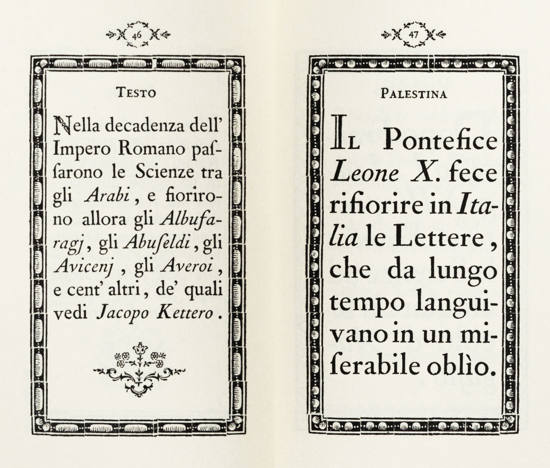
128. Testo and Palestina from Bodoni’s Fregi e Majuscole, Parma, 1771
From HathiTrust (facsimile scans)
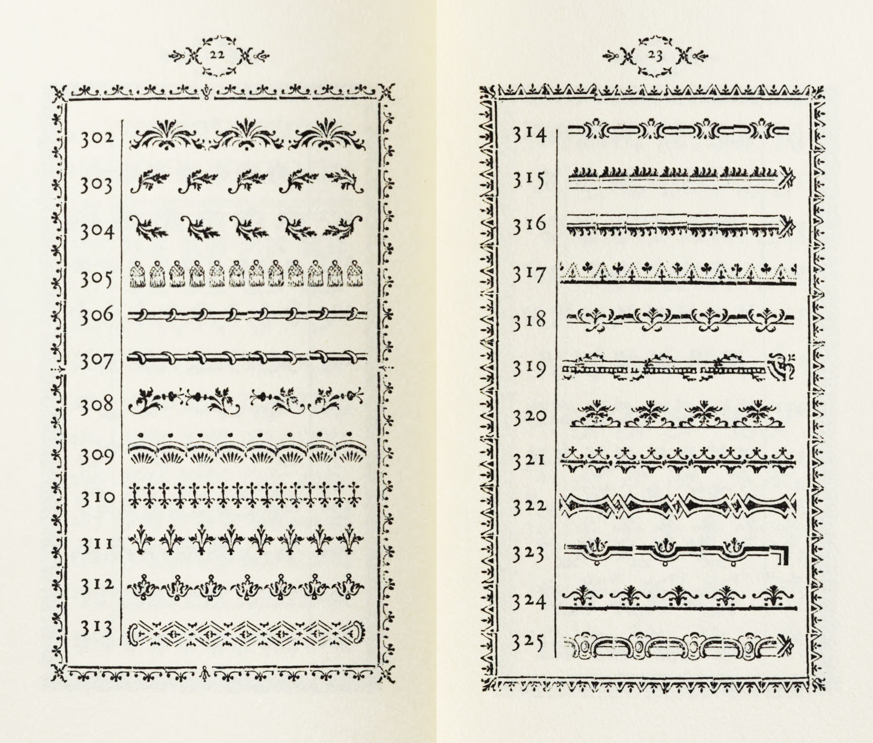
129. Ornaments from Bodoni’s Fregi e Majuscole, Parma, 1771
From HathiTrust (facsimile scans)
130a. Ornamented Letters from Bodoni’s Fregi e Majuscole, Parma, 1771
From HathiTrust (facsimile scan)
130b. Ornamented Initials from Bodoni’s Fregi e Majuscole, Parma, 1771
From HathiTrust (facsimile scan)
131a. Page from Saggio Tipografico. Bodoni’s Fregi e Majuscole, Parma, 1771
From HathiTrust (facsimile scan)
131b. Reverse of half-title of Fregi. Bodoni’s Fregi e Majuscole, Parma, 1771
From HathiTrust (facsimile scan)
Our last type-specimen book is that of Zatta of Venice of 1794,16 apparently a second and enlarged edition of an earlier book.
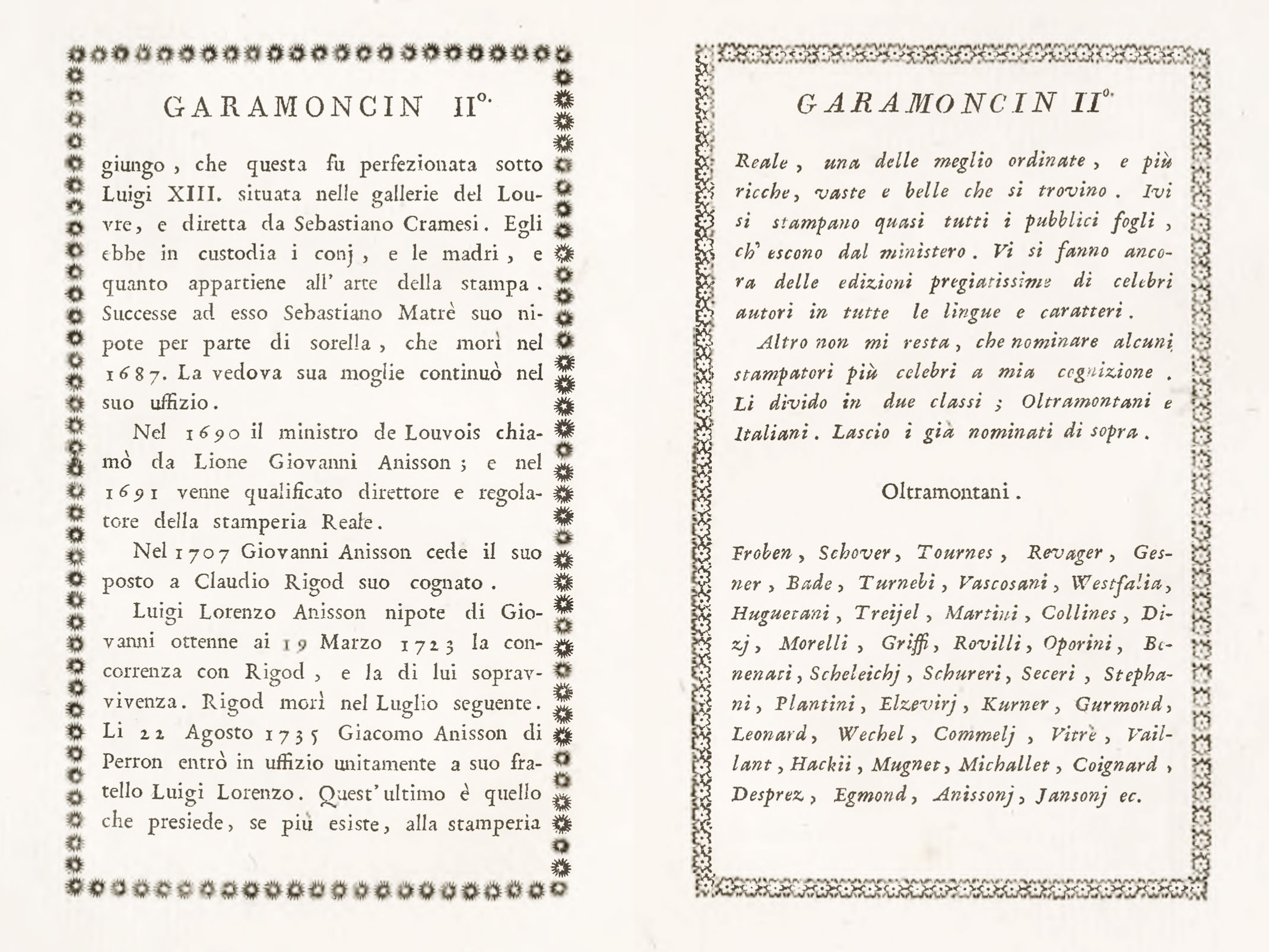
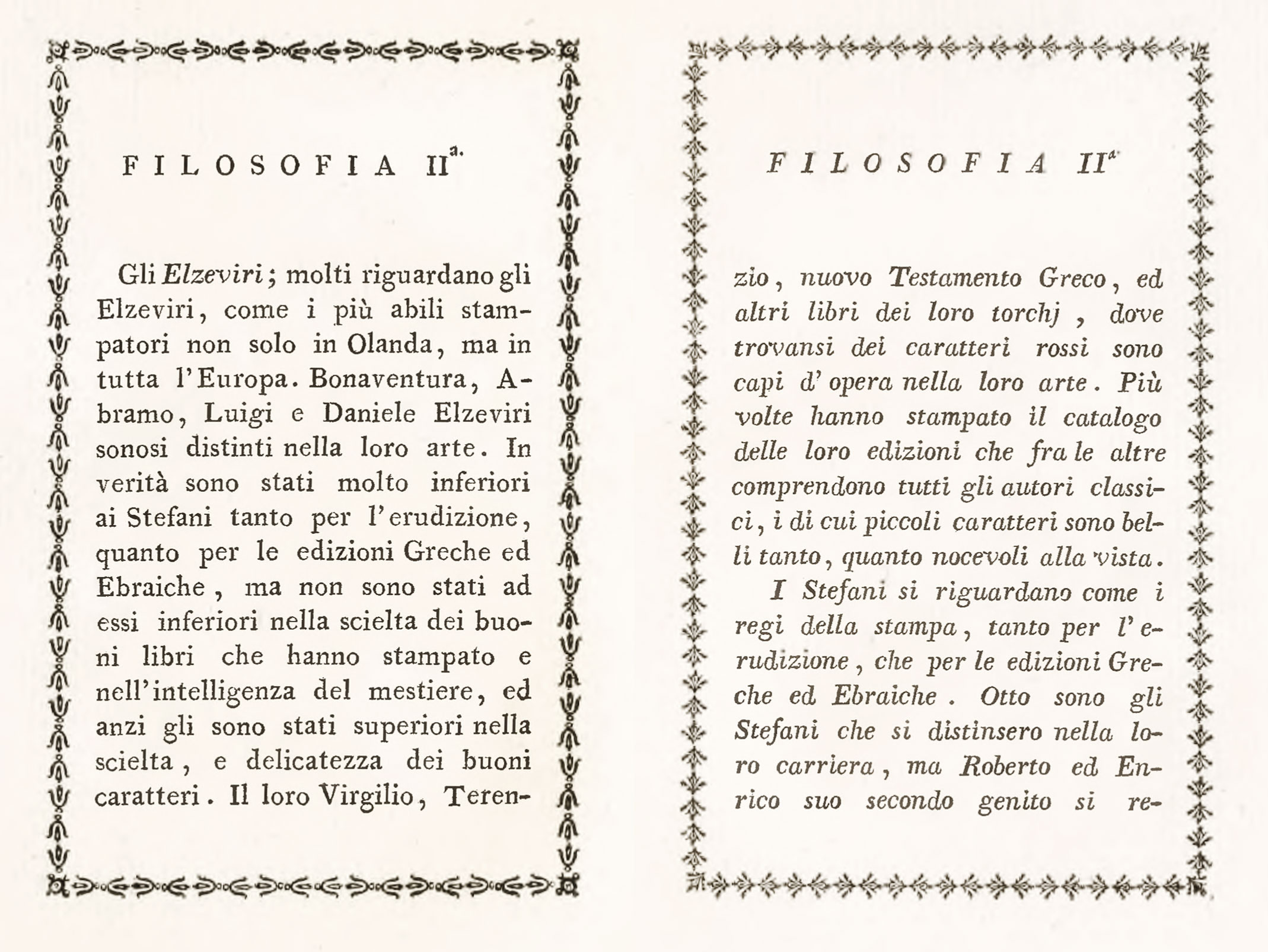
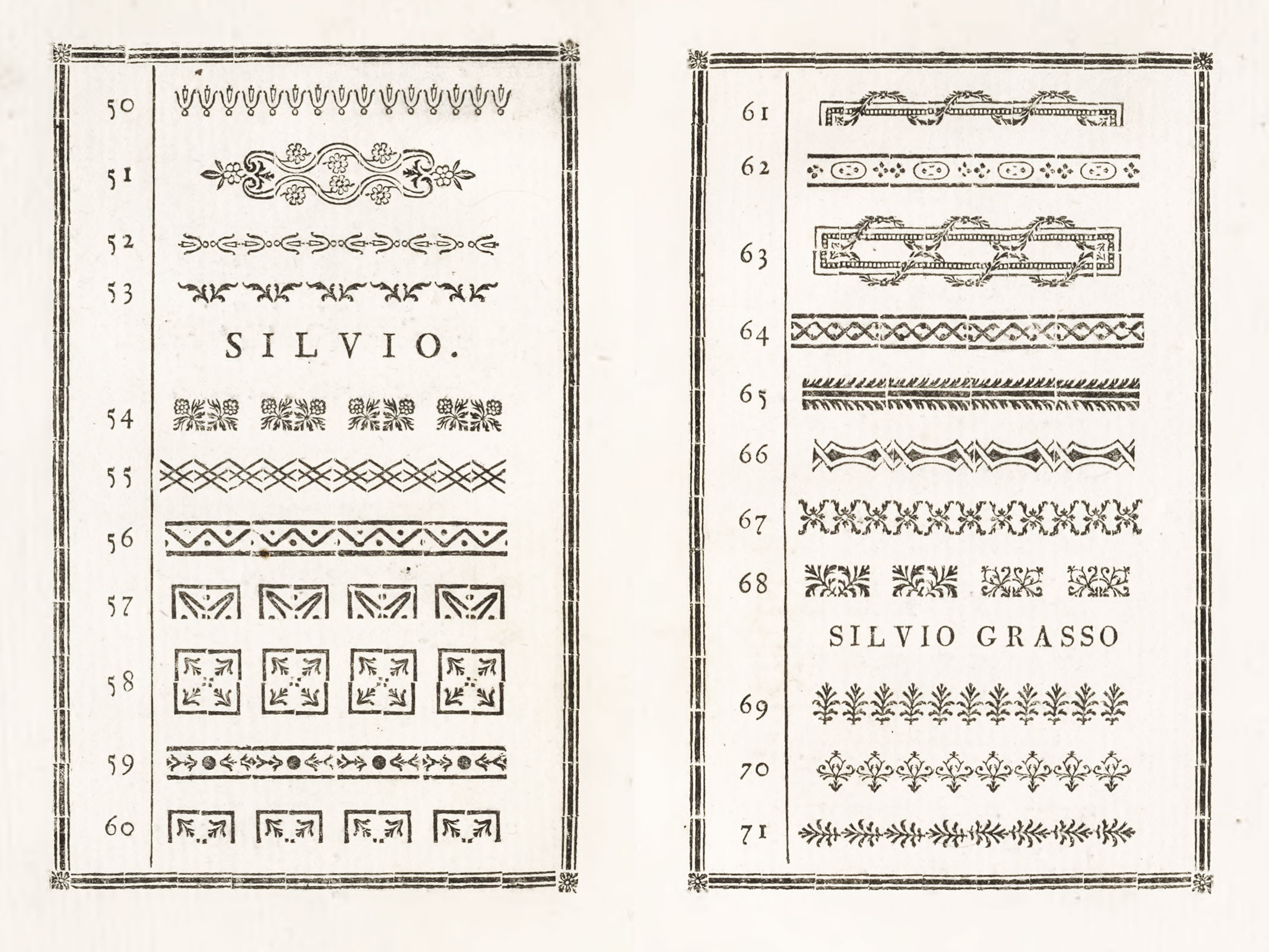
The Zattas were printers, publishers, and type-founders—Tipografi, Calcografi e Libraj Veneti—and their establishment was the largest and among the most esteemed in Venice. Their specimen opens with a résumé of the history of typography, and among contemporary printers mentioned are Comino of Padua, the brothers Foulis of Glasgow, Baskerville of Birmingham, Ibarra of Madrid, Didot of Paris, and Bodoni. The definition of a typographer shows that they had read Fournier’s Manuel to advantage. A statement about the knowledge necessary to proper cutting and casting of type, with occasional details as to their own practice, is followed by a table of types in stock, weight per page, etc. In the types shown, smaller sizes have the prevailing tendency to lightness which was coming into fashion; as in the Garamoncin IIo (fig. 132). These fonts are not very well cut, and the italic, especially in mass, is gray and uninteresting. Testo d’ Aldo Io is, however, a fine letter, and appears to be a survival of an earlier period—as does Canoncin Io and Canoncin IIo, and Canon in both its sizes. The reproduction of the Filosofia IIa shows in the roman, but particularly in the italic, that an approach to a modern face type had been made in Italy (fig. 133). The borders—in some cases interesting as showing Italianized derivations from Fournier (fig. 134)—are effective but coarse. The specimen is (naturally enough) to French specimens, what Italian eighteenth century volumes are to the more finished French books then current.
132. Types from Zatta’s Saggi dei Caratteri, Venice, 1794
From Internet Archive (scan)
133. “Modern” Types from Zatta’s Saggi dei Caratteri, Venice, 1794
From Internet Archive (scan)
134. Borders from Zatta’s Saggi dei Caratteri, Venice, 1794
From Internet Archive (scan)
Besides describing a few specimen-books, I have devoted some space to the history of the offices themselves, because it is one more evidence of the antiquity of much that we think of as modern. The “privileged press,” which had certain rights (analogous to those of the King’s Printers in English Bibles and Prayer-Books), and the “special press,” founded to promote the needs of some particular department of knowledge, are neither of them new projects. Many types in the two or three great presses and foundries of the world came originally from old offices of this second class, which did not survive, either because the motive power which carried them on ceased with the death of the founder; or a special work which they were intended to do was accomplished; or because they lacked that fundamental necessity to the foundation of all great presses—a certain vision backed by permanent endowment. A large number of private presses existed in Italy at the time of which I am writing. Indeed, the earliest of them was founded in 1491. There were, in the sixteenth century, fifteen private presses in different parts of the Italian peninsula; and in the seventeenth and eighteenth centuries a dozen different private ventures of this sort, sometimes presided over by authors or book-lovers, sometimes by religious communities. And they exist to-day. For neither the privileged press, the institutional press, nor the private press are things new under the sun!
- Students of Italian printing may consult the Dante collections at Harvard and Cornell Universities, which furnish a great number of editions interesting for purposes of comparison.
- The “purgation” did not concern itself with the freedom of the stories, but chiefly consisted in transforming the clergy figuring in them to lay persons!
- Decorative Illustration of Books, p. 116.
- A further account of it is given on a later page.
- Those at pages 64 and
7776 represent presses for printing books and engravings. - See [section 2].
- Two books taken at random—both printed in 1554—embody these features; namely, Ovid’s Heroides with commentaries printed by Francesco Bindoni, and Mattioli’s commentaries on the Materia Medica of Dioscorides—a famous Italian herbal, with excellent woodcuts of plants, etc., published by Valgrisi.
- For and account of decorated Venetian books the reader by consult Bertarelli’s I libri illustrati a Venezia nei secoli XVII e XVIII, in Revista della Biblioteche e degli Archivi, March–April, 1903.
- Bodoni’s books are described in the [chapter] devoted to early nineteenth century Italian types.
- Le Livre en Italie à Siècles, an illustrated catalogue of a collection of books exhibited by Leo S. Olschi of Florence at the Leipsic Book Exhibition of 1914, may be consulted for titles of some remarkable Italian books printed from the fifteenth to the eighteenth century. For illustrated Italian books, many of which are interesting specimens of printing, see Pollard’s Italian Book-Illustration and Early Printing. A Catalogue of Early Italian Books in the Library of C. W. Dyson Perrins. London, 1914. The earliest work described is dated 1467—the latest, 1645.
- Oriental typography was developed at Rome under the protection of Cardinal de’ Medici. Some Greek, roman, and Oriental types cut by Robert Granjon for Basa were bought for the Medici establishment; and Granjon was employed there to engrave others. The first book published by the Stamperia Medicea was an Arabic edition of the Gospels in 1590. Its tractate on the use of Arabic types, brought out in 1592 under the title Alphabetum Arabicum, has already been mentioned.
- Adlocutio et Encomia Variis Linguis Expressa, quæ Summo Pontifici Pio VII, Typographiæ Imperiale Musæum Invisenti, Obtulit Joannes Josephus Marcel, Typographæi Imperialis Administer generalis, Lutetiæ Parisorum, Typis Imperialibus. Anno Reparatæ Salutis 1805, Imperiique Napoleonis Primo—in which Napoleon always appeared in capitals, and Pius in capitals and small capitals!
- Oratio Dominica CL Linguis Versa, Et Propriis Cujusque Linguæ Characteribus Plerumque Expressa; Edente J. J. Marcel, etc. The last page bears the inscription, “Hic opus Polyglotticum coram Supremo Pontifice impressum est.” One hundred and fifty presses are said to have been simultaneously in use to effect this; and at the end of the Pope’s visit, a bound copy of the completed book was given him.
- Fregi e Majuscole incise e fuse da Giambattista Bodoni, Direttore della Stamperia Reale. A Parma, nella Stamperia Stessa. 1771.
- Serie de’ Caratteri Greci di Giambatista Bodoni, 1788.
- Saggi dei Caratteri, Vignette e Fregi della Nuova Fonderia de Antonio Zatta e figli, Tipografi, Calcografi e Libraj Veneti. Venice, 1794. As has been said, the chief Italian printing-houses at the time of Bodoni’s début were the Tipografia del Santissimo Sacramento at Urbino, the Volpi-Cominiana Press at Padua, and those of Soliana and Zatta respectively at Modena and Venice.