Chapter XX
English Types: 1800–1844
In England, a change in type-forms, analogous to that which was taking place in France, and a like final crystallization, brought about a new style of English type. Transitional fonts which were far on the way to this, we have seen in the work of English presses at the end of the eighteenth century. It is their nineteenth century development of which we have now to speak.
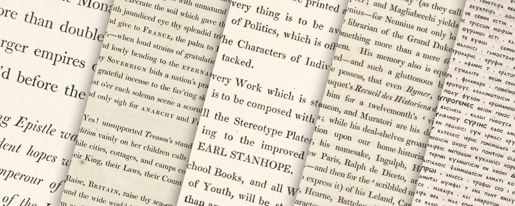
Classification of types by centuries is an arbitrary thing. Typographical style does not, of course, change because imprints are dated 1800 instead of 1799, and many books produced in England early in the new century resembled, in type-forms and manner, those issued during the last years of the old. For instance, a poem in folio titled The Sovereign. Addressed to His Imperial Majesty Paul, Emperour of all the Russias, by Charles Small Pybus, London, Bensley, 1800, is a superb showing of transitional English types just about to become modern face (fig. 328). Dibdin wrote in 1817 that he considered this book the finest piece of printing that Bensley had produced. Tasso’s Jerusalem Delivered, printed by Bensley and brought out in 1803, is a quarto showing the use of old style type, much leaded, which was one of the ways of obtaining the light effects then the mode. Another book by Bensley which is interesting to the student of the transitional types is Macklin’s beautifully printed folio Bible of 1800—an imposing work of great reputation intended to rival Bulmer’s “Boydell Shakspeare.” [vols. 1, 2, 3, 4, 5, 6, 7, 8, 9] Hume’s History of England, in five folio volumes, printed for Robert Bowyer in 1806 by Bensley, was highly praised by the lovers of fine books of that day. Then again, Blair’s Grave, printed by Bensley and published by Ackermann in 1813, with vivid and beautiful illustrations by William Blake, is a book in which the fine types used in the introduction and the poem itself are merely in the direction of what we to-day call modern face. In the same class falls The Press, a Poem. Published as a Specimen of Typography. By John McCreery. Liverpool, Printed by J. McCreery, and sold by Cadell & Davies, London, 1803—a beautiful book in quarto, with wood-engravings by Henry Hole, pupil of Bewick, after designs by Thurston. It is set in a charming great primer character cut by Martin, much leaded, with arguments set in italic, and was printed with a special ink made by McCreery himself.
328. Types used in The Sovereign: Bensley, London, 1800
There were, however, English books published in the earliest years of the nineteenth century which did not show a distinct change in type-forms. For example, in 1801, Bulmer printed for J. Wright of London a quarto edition of a book called Poetry of the Anti-Jacobin, a very charming performance, in which the beautiful types are losing the last vestiges of old style an are running into modern face. This book is a collection of prose, poetry, and drama, and shows very well the effect of these new types in various forms of composition (fig. 329). In Scotland, James Ballantyne of Edinburgh was printing in similar style. A good specimen of his work is a quarto edition of Johnson’s Rasselas, illustrated by Smirke, published in London 1805.

329. Types used in Poetry of the Anti-Jacobin: Bulmer, London, 1801
From HathiTrust (scan)
The Rev. John Anastasius Freylinghausen was author of a somewhat dreary book entitled An Abstract of the Whole Doctrine of the Christian Religion, which he was able to present in two hundred and sixteen pages—quite a feat when one stops to think about it! This excellent work was edited to conform to the doctrines of the Church of England, and, the Preface says,
stood so high in the good opinions of the Greatest Female Personage in this Kingdom, that it was translated into English for the use of her illustrious daughters
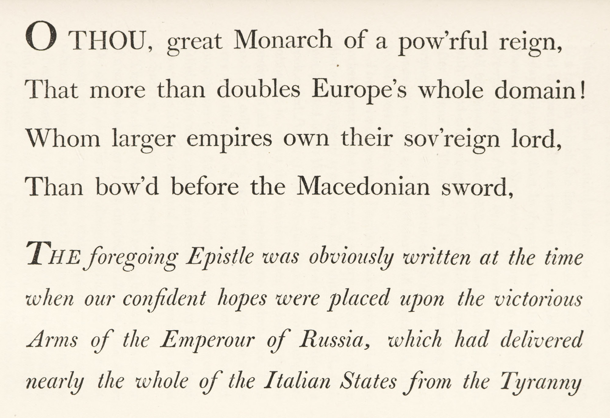
—the “Female Personage” being no other than Queen Charlotte. This book was the first volume stereotyped by Earl Stanhope’s process, and is interesting on that account. The standard rules of the Stereotype Office affixed to this book state that nothing is to be printed against Religion, everything is to be avoided upon the subject of Politics offensive to any Part, that the Characters of Individuals are not to be attacked, and—what concerns us most—that every Work which is stereotyped in this Office is to be composed with beautiful Types. This notice throws a certain light on the innocuous rôle which the Stereotype Office proposed for itself, and also shows that they thought the book printed from good types—it being the first of their publications. These types are not old style at all. They are what we now term modern face, and the book is mentioned because it shows an early use (1804) of this type-form (fig. 330).
330. Types used in Freylinghausen’s Doctrine of the Christian Religion: Stereotype Office, London, 1804
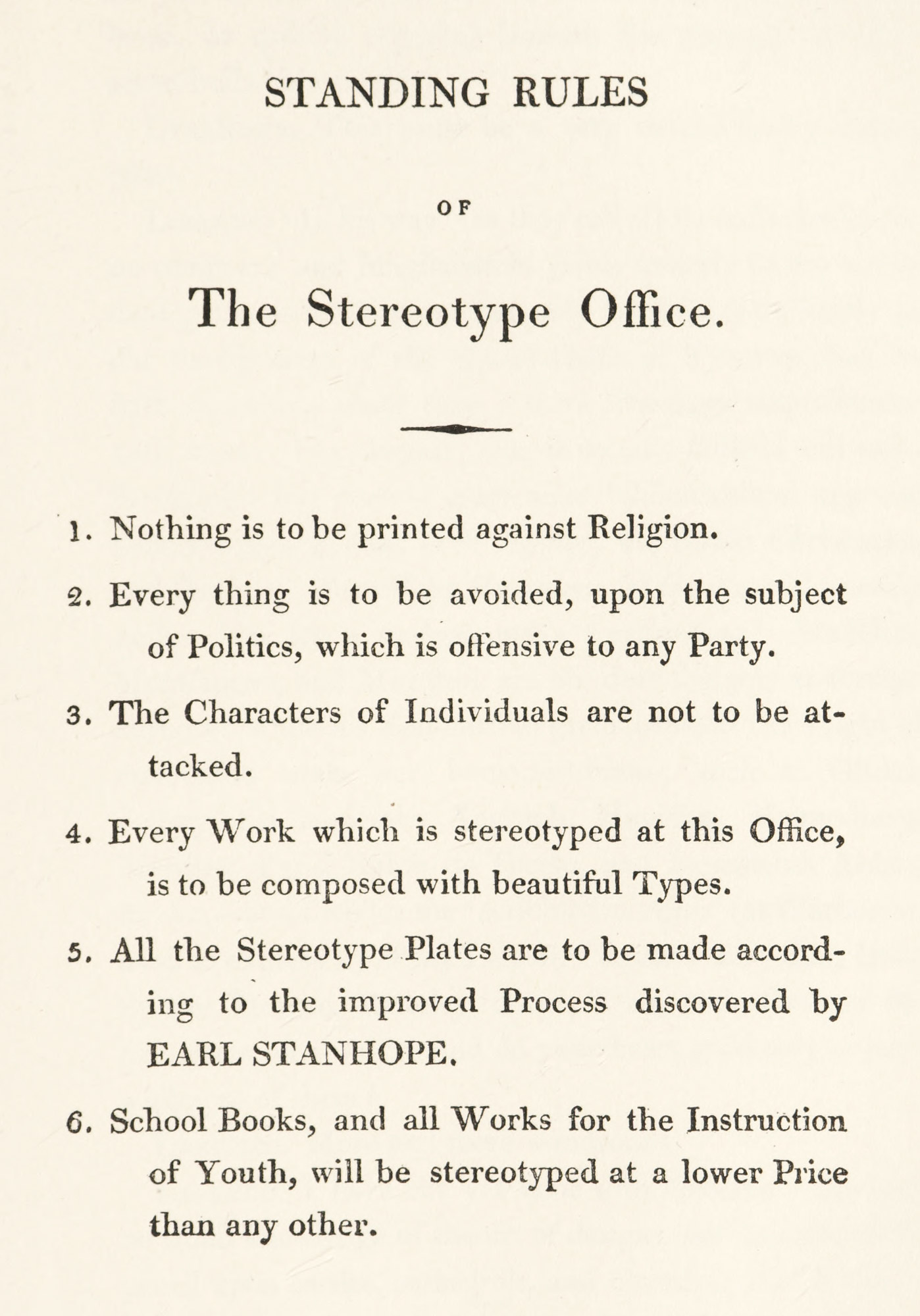
An extremely good specimen of a real modern face roman type was used in Thomas Frognall Dibdin’s Bibliographical Decameron, printed in 1817 by Bulmer in three volumes (fig. 331). This work is one of the most successful typographical achievements of the early nineteenth century. The typography is excellent, the pages splendidly imposed, and the reproductions of old printers’ marks and other illustrations beyond praise. In presswork it is one of the finest of modern volumes. It needed, however, all that the printer could do for it; for its author wrote an affectedly playful style which makes his books among the most tiresome and irritating in the language. Bulmer’s fine edition of Dibdin’s Typographical Antiquities of Great Britain (Volumes II, III, IV) and the Bibliotheca Spenceriana (1814–15) are also worth examining.
331. Page of Bibliographical Decameron: Bulmer, London, 1817
From a copy belonging to Mr. C. E. Lauriat, Jr., Boston (facsimile), Internet Archive (scan)
Other examples of the employment of these modern face types are found in the text of Rudolph Ackermann’s celebrated series of illustrated quartos on Westminster Abbey (1812) and the Universities of Oxford [vols. 1, 2] and Cambridge [vols. 1, 2] (1814–15), and the inimitable Microcosm of London [illustrations] (1808–11), etc., the coloured plates of which are so delightful that they have obscured the merit of their straightforward typography—some of it Bensley’s work. Another edition which shows this kind of type (and also its falling off) is John Murray’s 16mo edition of Lord Byron’s Works, published in five volumes in 1823. Here we begin to see what such types were coming to when less well cut, less well printed, and less well imposed, and also how poor they were in smaller sizes. For printers at that date found the same trouble with delicate modern face types that we do now. In face, Dibdin, in one of the few directly written passages in the Bibliographical Decameron, mentions this difficulty, and (somewhat surprisingly) seems to feel that old style types were better than the modern cut of letter in which his own book had been printed. He says,
In regard to Modern Printing, you ask me whether we are not arrived at the top-most pitch of excellence in the art? I answer, not quite at the topmost pitch: for our types are, in general, too square, or sharp; and the finer parts of the letters are so very fine, that they soon break, and excepting in the very first impressions, you will rarely find the types in a completely perfect state. There is more roundness, or evenness, or, if you will allow the word, more comfortableness of appearance, in the publications of Tonson and Knapton, than in those of modern times.
Now Tonson’s and Knapton’s types were old style.
As in all periods when particular attention was paid by printers to making fine books, the cultivated amateur was not lacking, and one such man, now forgotten, was Julian Hibbert. He was an interesting character who, besides having a hand in the social and political reforms of his day, undertook to reform the Greek fonts then used in printing. In 1827, he brought out at his private press in his house in London, The Book of the Orphic Hymns, “in uncial letters, as a typographical experiment” (fig. 332). Hibbert says of his alphabet that it
was first composed from the inspection of Inscriptions in the Musæums of London and Paris, and thus it is no wonder if it still retains more of a sculptitory than of a scriptitory appearance.
After reading Montfaucon’s Palæographica Græca and examining facsimiles of the Herculanean manuscripts, he altered the forms of many of the letters. He says,
If I had adopted the Alphabet of any one celebrated ms., I should have had less trouble.… As it is, I have taken each letter separately from such mss. as I thought best represented the beau ideal of an uncial type;…yet as placed side by side, they look very different from a ms.
But he calls it
a Greek type, which at the same time that it is calculated for ordinary use, approaches nearer to old mss. than types that have been hitherto used, [and] represents with tolerable accuracy the forms of the letters used by the Greeks themselves, in the brightest days of literature.… I do not mean a type like that used in Bodoni’s Callimachus,…ornamented (or rather disfigured) by the additions of what, I believe, type-founders call syrifs, or cerefs.1
Two books were printed by this forerunner of Robert Proctor, who was indeed vox clamantis! The fonts had considerable charm, but were at the time considered—if they were considered at all—as complete failures; and were afterwards melted.
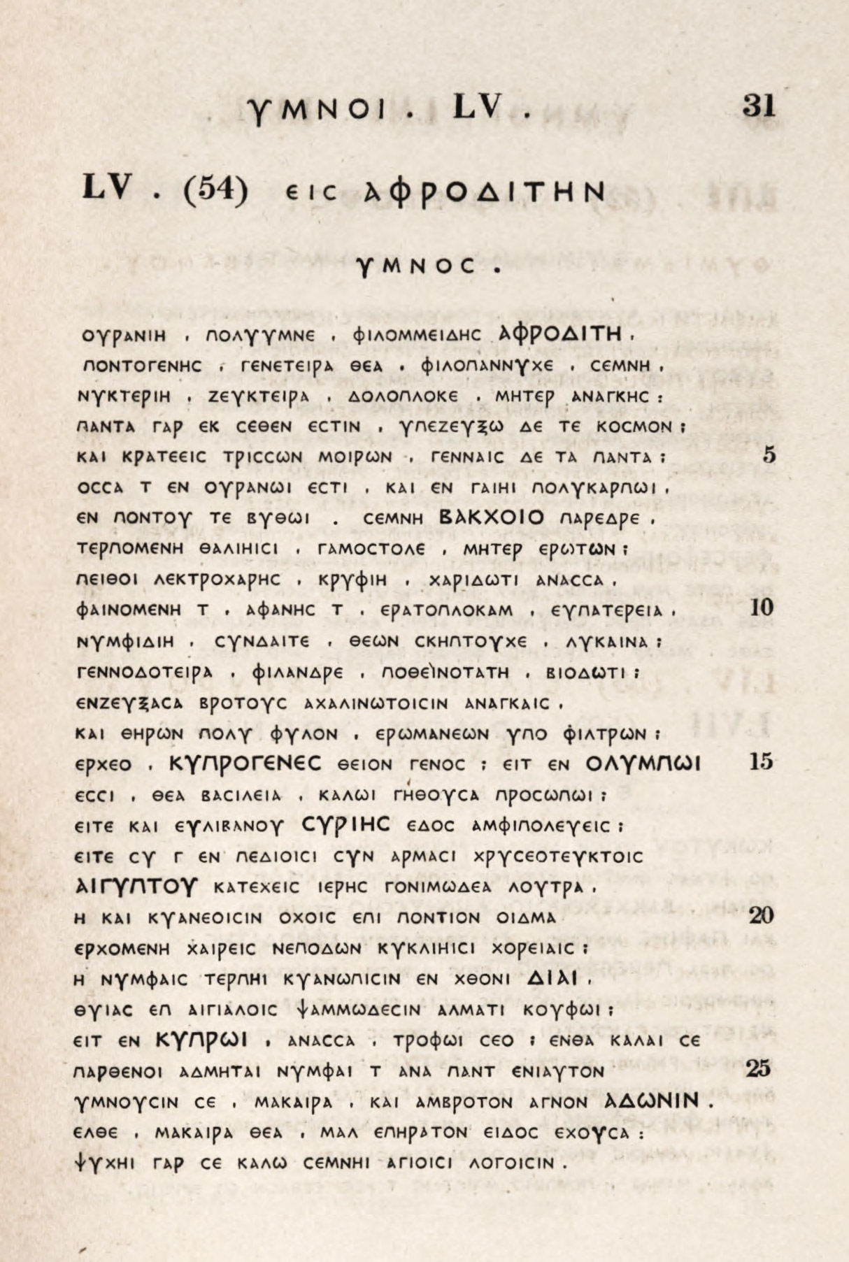
332. Julian Hibbert’s Uncial Greek Types used in Book of the Orphic Hymns, London, 1827
From HathiTrust (scan)
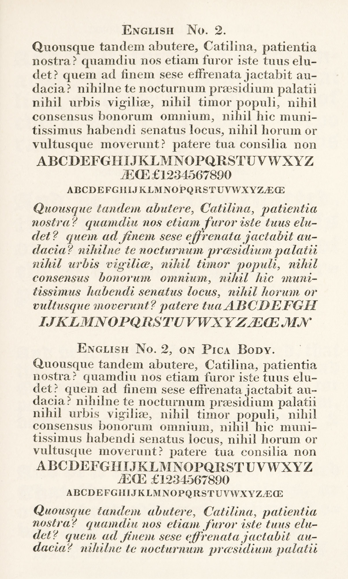
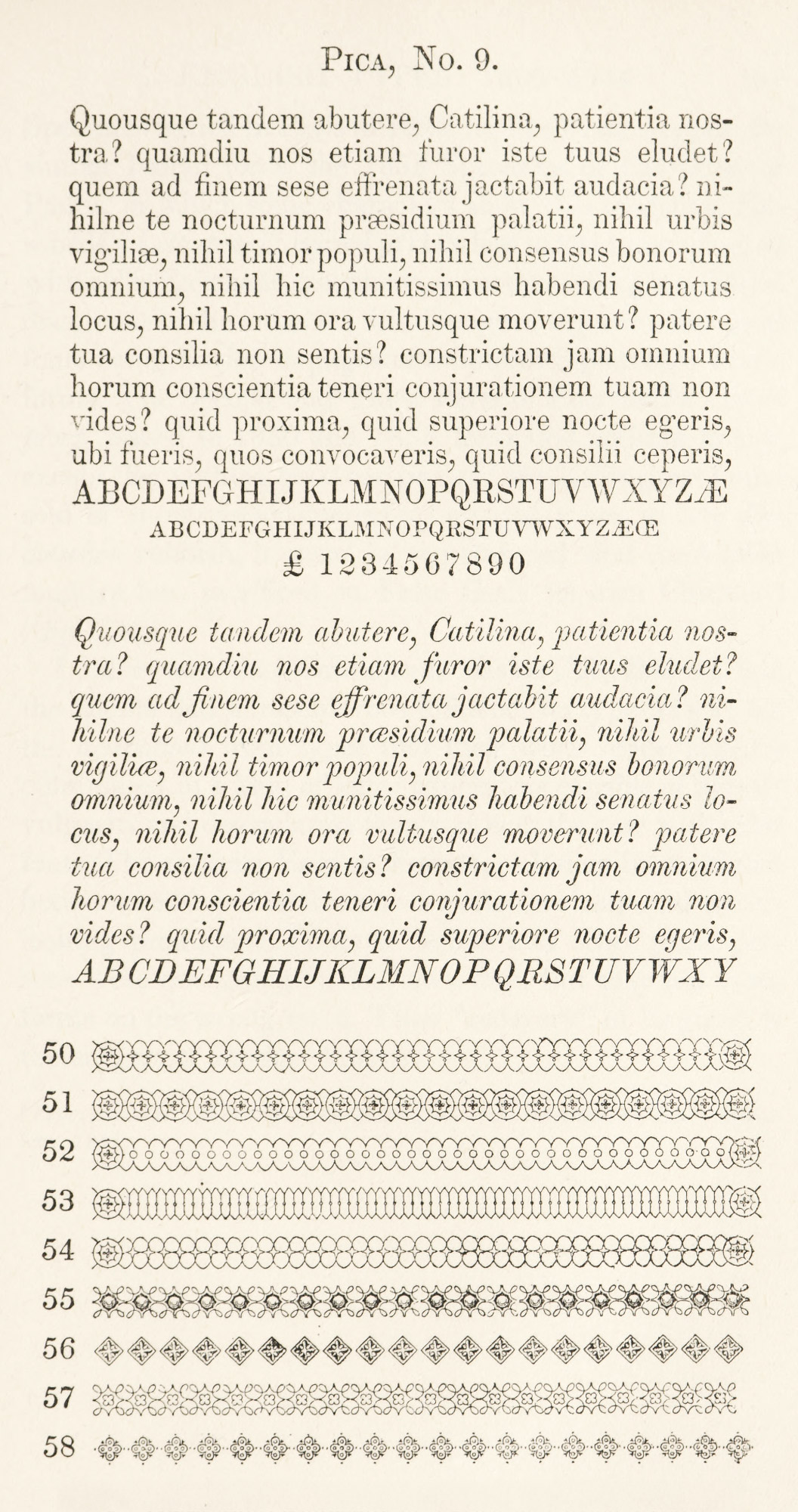
It is to Scotch founder that we must turn for the next step in the development of the modern face type-family. Alexander Wilson, who in the eighteenth century made types for the brothers Foulis, had left a foundry which was still maintaining scholarly traditions. The taste which led to the adoption of lighter type-forms had been followed consistently by his house; and, probably still further influenced by Didot types, the Wilson foundry early in the nineteenth century produced an English version of them—the best English variant of this form of letter that we have. It is sturdier and pleasanter to read than parallel French types, and we are much more at home with it. It is not as good as a type as the Caslon character, but as produced by Wilson it is a very handsome and serviceable letter, and in it we have another English type-family—the Scotch modern face. It is an English equivalent of the fonts shown in the 1819 specimen of the Didots.
The fonts, practically as we have them to-day, are beautifully shown in the Specimen of Modern Printing Types cast at the Letter-Foundry of Alex. Wilson & Son, at Glasgow, 1833. This quarto specimen is in two parts. In an “Address to the printers,” which prefaces the volume, the Wilsons say:
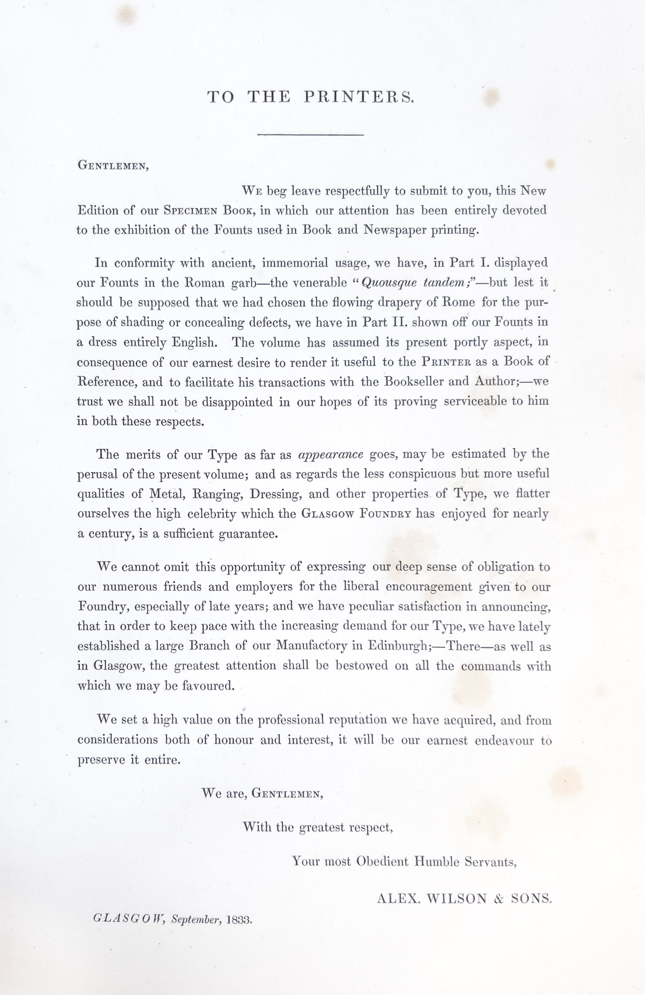
In conformity with ancient, immemorial usage, we have, in Part I. displayed our Founts in the Roman garb—the venerable Quousque tandem; but lest it should be supposed that we have chosen the flowering drapery of Rome for the purpose of shading or concealing defects, we have in Part II. shown off our Founts in a dress entirely English.
Two pages of titling-letters are displayed before we come to the first body type—a spirited and fine cut of great primer. Then follow varieties of roman, from pica to diamond. A page of double pica Greek (used in the Homer printed by the Foulis brothers) is followed by Greek fonts down to “mignon,” and two pages of Hebrew. The roman and italic types are again displayed in Part I, set in English, sometimes in prose, sometimes in poetry, and variously leaded. A broadside specimen of Wilson’s newspaper fonts ends the book.2 Every roman and italic type in it is modern face. We show a pica font (fig. 333). Savage (writing in 1822) says,
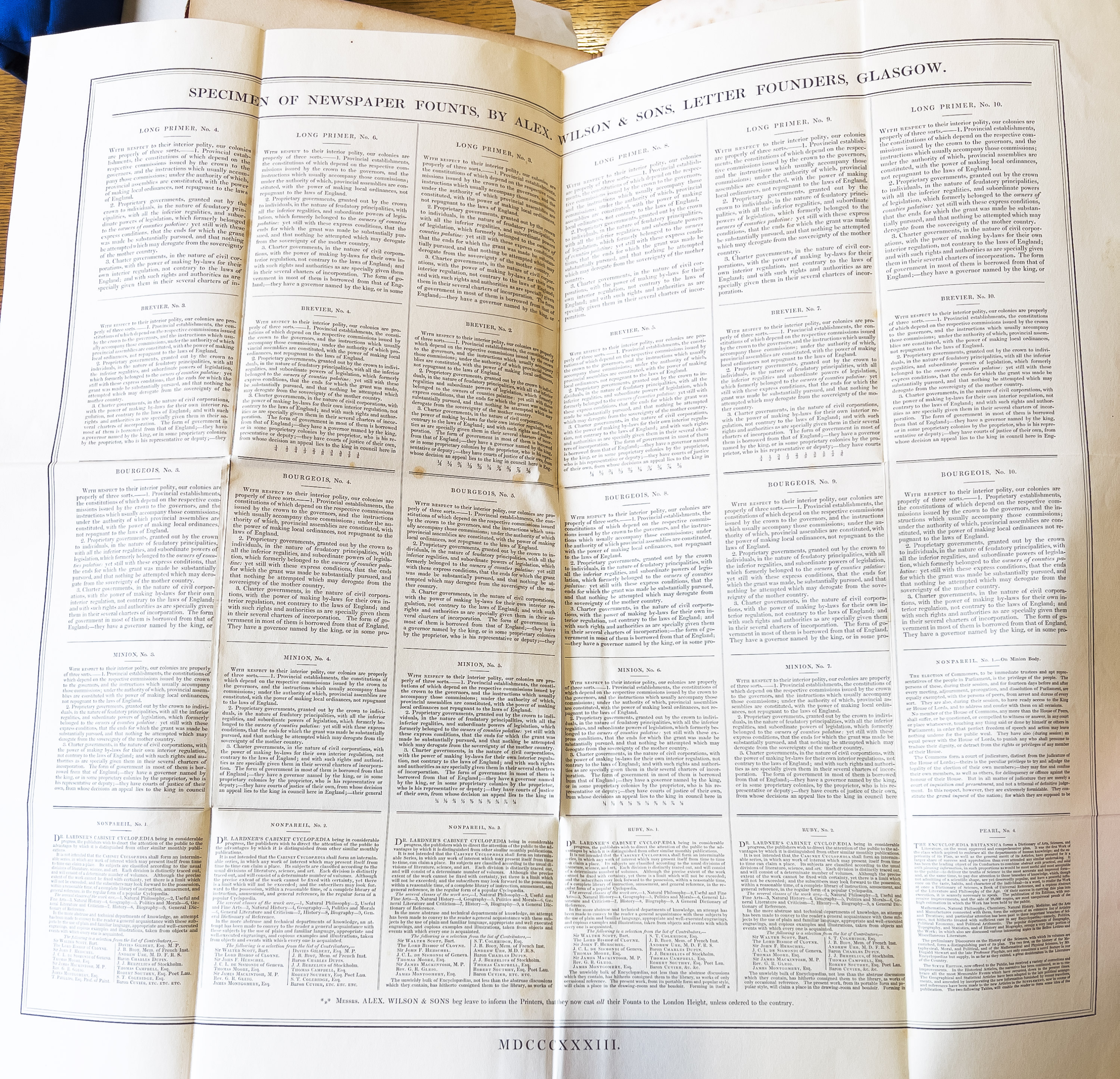
The Foundry of Messrs. Wilson at Glasgow, has been long established, and for many years enjoyed a monopoly of letter founding in Scotland. They have, however, of late experienced a formidable competition from Mr. Miller of Edinburgh, who derived his knowledge of the art from them, and whose types so much resemble theirs as to require a minute and accurate inspection to be distinguished.3
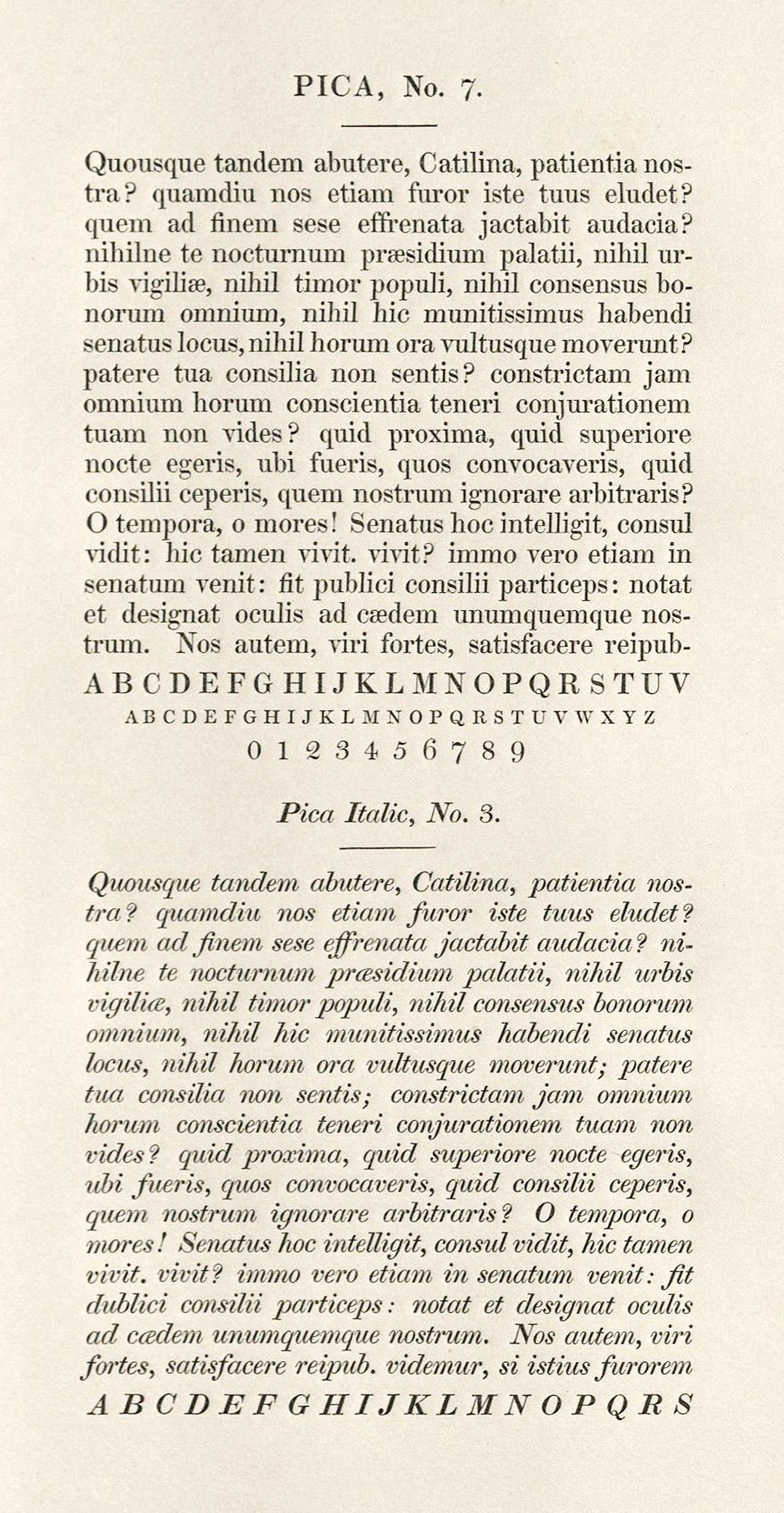
333. Modern Face Types: Alexander Wilson & Son’s Specimen, Glasgow, 1833
From a copy in the Newberry Library
William Blades considered
the year 1820 as a boundary line between the old and new style of punch-cutting. About that time great changes were initiated in the faces of types of all kinds. The thick strokes were made much thicker and the fine strokes much finer, the old ligatures were abolished and a mechanical primness given to the page, which, artistically, could scarcely be called improvement. At the same time, printers began to crowd their racks with fancy founts of all degrees of grotesqueness, many painfully bad to the eve and unprofitable alike to founder and printer.4
Thus taste, which in England had sanctioned very light types, began to change to heavier faces about 1815.5 Exactly as in France, the weight of these new type-faces was at first gained, not by a greater weight of line throughout, but by a disproportionate thickening of heavy strokes of letters, which left their hair-lines much as before. This reaction from fragile to sturdy letters was a change which, if it only had been guided by some one familiar with early type-forms, might have led to better results. But at that time materials for the comparative study of types were not readily assembled.
The further development of these fashions brought about a kind of swollen type-form6 in which all the lines of a letter were of nearly equal strength, and these were the types of which Savage says:
The founders have now introduced another changer in the proportions of letters, and have gone to a barbarous extreme, from their first improvement. The rage is now, which of them can produce a type in the shape of a letter, with the thickest lines, and with the least white in the interior parts.
He adds that the founders said that such types were meant for printing hand-bills, etc., and if they were introduced to book-work, that it was contrary to the original intention. Savage displays sheets in which original Caslon types are shown in contrast to the current Caslon types. If these are bad types, he says, “it may be attributed to the bad taste of others, whom the founders are desirous of obliging”—but this is merely an ancient and poor excuse for not sticking to one’s principles! These hideous fashions for a time drove original Caslon types to the wall. Hansard, writing in 1825 says:
Caslon’s fonts rarely occur in modern use, but they have too frequently been superseded by others which can claim no excellence over them. In fact, the book-printing of the present day is disgraced by a mixture of fat, lean, and heterogeneous types, which to the eye of taste is truly disgusting.7
In London, Robert Thorne, successor to Thomas Cottrell, is responsible for the vilest form of type invented—up to that time. Thorne’s specimen-book of “Improved (!) Types” of 1803 should be looked at as a warning of what fashion can make men do. His “jobbing types” look as their name suggests! His black-letter is perhaps the worst that ever appeared in England. In Vincent Figgins’ specimen of 1815, and in Fry’s specimen of 1816, and naturally in the specimen of William Thorowgood (Thorne’s successor) of 1824, 1832, and 1837, the new styles are triumphant (figs. 334 and 335). Fashions like these, as Hansard says,
have left the specimens of a British letter-founder a heterogeneous compound, made up of fat-faces and lean faces, wide-set and close-set, all at once crying Quousque tandem abutere patientia nostra?
The Caslon specimen of 1844 shows the adoption of some of the worst current fashions in type; and we exhibit a selection of the unattractive ornaments intended to accompany the “fat-face” fonts produced by this famous house (figs. 336 and 337). A tide of bad taste had swept everything before it by 1844—the precise year of the revival of Caslon’s earliest types!
334. Roman and Italic: W. Thorowgood’s Specimen, London, 1824
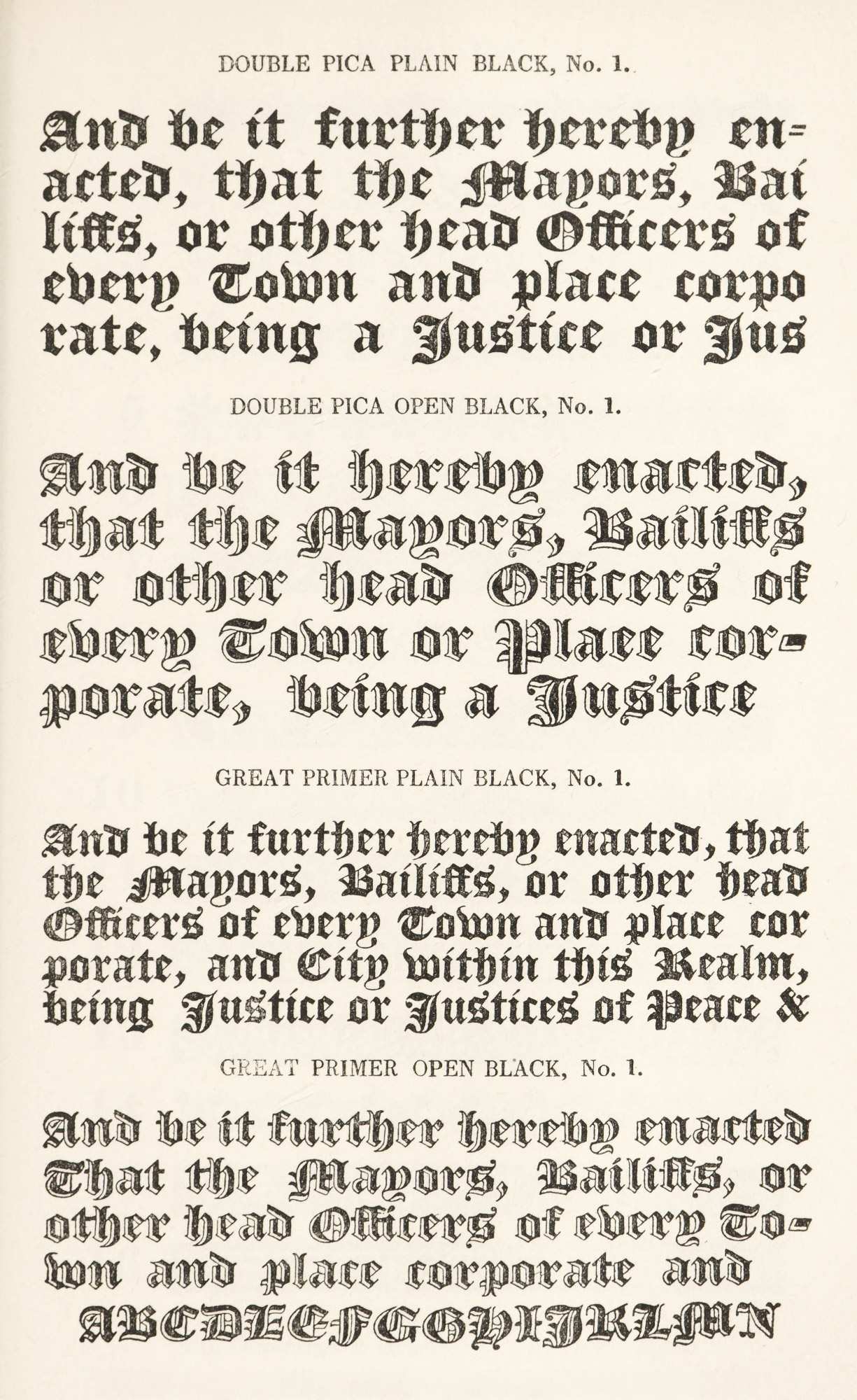
335. Black-letter: W. Thorowgood’s Specimen, London, 1824
336. Ornaments to accompany “Fat-Face” Types: Henry Caslon, London, 1844
337. Ornaments to accompany “Fat-Face” Types: Henry Caslon, London, 1844
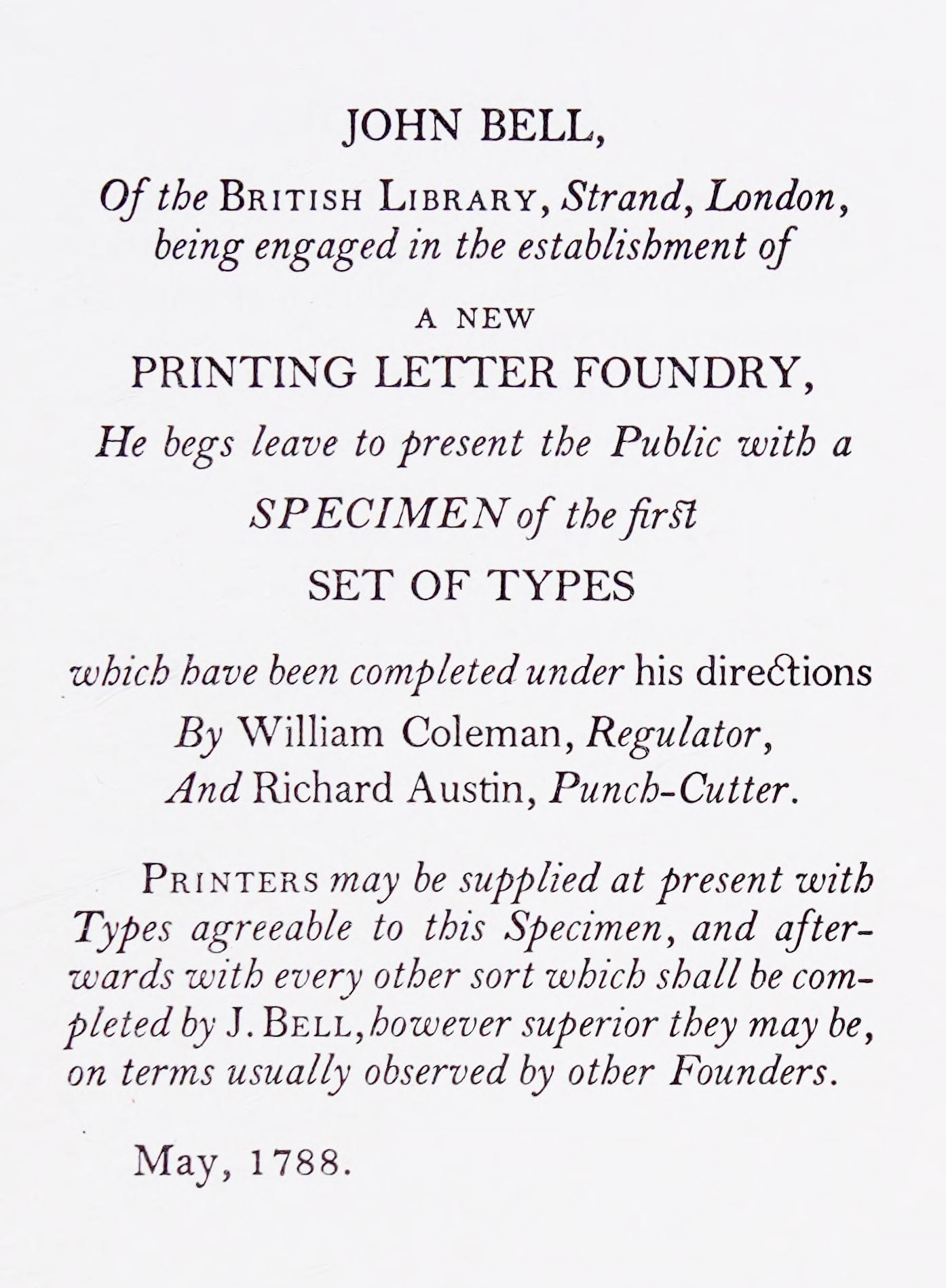
337a. Opening page of John Bell’s first Specimen, London, 1788
From John Bell, 1745–1831: Bookseller, Printer, Publisher, Typefounder, Journalist &c.
Much the same thing was happening on the Continent, and the curious may consult such “documents” as the Supplement to the Specimen of the Spanish founders, J. B. Clement-Sturme y Compañia, published at Valencia in 1833, which is full of types of this kind; the Didot, Legrand et Cie. Specimen issued in Paris in 1828, for like French types; for similar Italian fonts, the 1838 Specimen of Cartallier, for Padua, in which some characters show this tendency. Enschedé’s Letterproef,8 issued at Haarlem in 1841, as compared with older Enschedé specimens, is another telling but dismal document in the annals of this change of style—a few good fonts being buried in pages of uninteresting or ugly letter-forms. The Second and Third Parts of Enschedé’s Letterproef, issued in 1850 and 1855, leave one nothing to say, except that nothing good can be said! But if this great house sold or threw away interesting ancient types to buy Didotschen rubbish, it must be remembered that the Caslon foundry had sacrificed to False Gods its own children! (fig. 338).
338. Types and Ornaments of Period of the Caslon Revival: Caslon Son and Livermore and Henry Caslon Specimens, 1844
I have said that Grandjean, Baskerville, Bodoni, and the Didots had a mischievous influence on type-forms; for the derivations from types that their work made popular culminated in a kind of letter which was capable of greater vulgarity and degradation than was ever the case with older fonts. The ordinary English, French, or Italian book printed between 1830 and 1850 was very often a cheap and mean-looking production. Perhaps Bodoni and other great persons were not wrong in their own day; but they put type-forms on the wrong track. Their “recovery” in England is the subject of another chapter.
- See “Preface addressed by the Printer to Greek Scholars” in The Book of the Orphic Hymns.
- A similar quarto specimen was issued in the same year by the Edinburgh branch house of Wilsons & Sinclair, which may also be consulted.
- Decorative Printing, p. 73.
- Blades’ Early Type Specimen Books of England, Holland, France, Italy, and Germany, London, 1875, pp. 21, 22.
- Blades says 1820, but Vincent Figgins’ specimen of 1815 is full of these dropsical types, and Thorne’s specimen of these letters appeared as early as 1803.
-
These characters were often called in type-specimens and elsewhere “Egyptian” (no doubt in allusion to their “darkness”); and a London jest-book of 1806, under the heading “Fashionable Egyptian Sign-Boards,” says:
An Irishman describing the Egyptian letters which at present deface the Metropolis, declared that the thin strokes were exactly the same size as the thick ones!
- Hansard’s Typographia, London, 1825, p. 355. As early as 1805 the Caslon ceased to show in their specimen the original types cut by the first William Caslon.
- Proeve van Drukletteren. Letter gieterij van Joh. Enschedé en Zonen. Haarlem, 1841.