Chapter XVII
English Types: 1500–1800
I. From Pynson to William Caslon
If the earliest types cast in England were somewhat unattractive in design and rough in execution, it was not because the types were early types, for at that same time in other countries types were better; nor because of any lack of good models, for English black-letter manuscripts were often very beautiful. But in England few early native types had what we should call “feeling.” Type-cutting and type-designing did not, apparently, at first come easily or instinctively to the English. Their best early types were imported.
Most of Caxton’s types were poor in design compared with those chiefly employed on the Continent at the same epoch. In Caxton’s day, gothic letter was in vogue for all English printing. Later, this gothic crystallized into an English pointed black-letter character, similar to some of the black-letter of the Netherlands, from which, tempered perhaps by French influences, it was derived. It was the characteristic type of England, and we find it in the English workrooms of De Worde, who greatly perfected it, at the beginning of the sixteenth century, as well as in use by Pynson and Berthelet. This character was commonly employed throughout the sixteenth century, and until the end of the seventeenth century, and even in the eighteenth century it was still used for law-books, proclamations, licenses, etc. The poet Gray, in a letter to his friend West, who was discouraged about his legal studies, alluded to this when he said,
Had the Gothic character and bulkiness of those volumes…no ill effect upon your eye? Are you sure, if Coke had been printed by Elzevir, and bound in twenty neat pocket volumes, instead of one folio, you should never have taken him up for an hour, as you would a Tully, or drank your tea over him?1
While there were some forms of gros-batarde types (like Mansion’s) used in England in the first thirty-five years of the sixteenth century, this pointed gothic letter drove them out. Types modelled on the old Norman law-hand called “set court,” “bas secretary” (or engrossing), and “running secretary,”—the latter the cursive of the law courts of Queen Elizabeth’s time,—also existed (fig. 254); but (like the civilité in France) they were never much used, and made little impression on English typography.
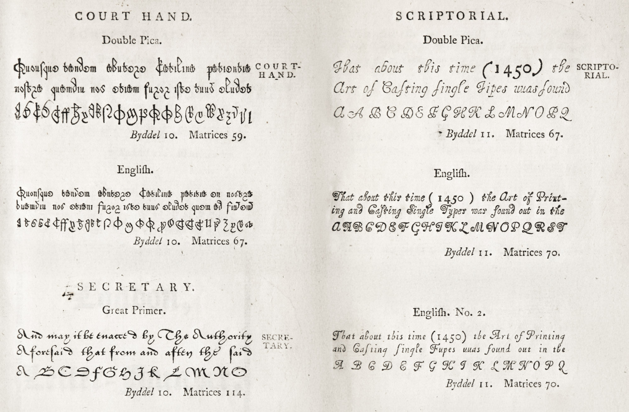
254. Court Hand, Secretary, and Scriptorial Types from Sale Catalogue of the James Foundry, London, 1782
From Updike’s personal copy now in Providence Public Library Special Collections (scans), also from 1961 facsimile
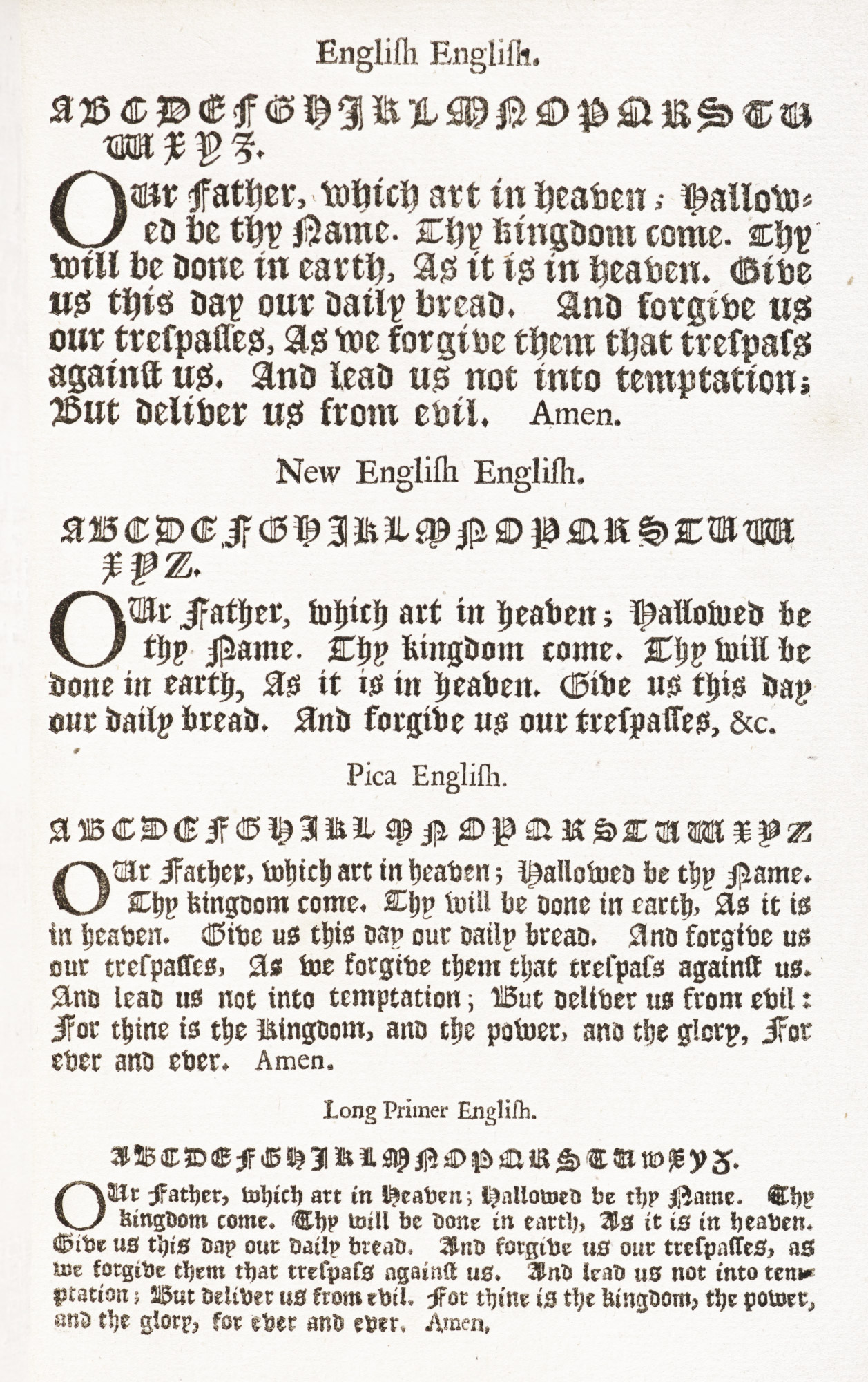
In England, the first roman types were sometimes called Italian letter or “white-letter,” in distinction to the common English black-letter. Pynson’s Sermo fratris Hieronymi de Ferraria appears to have contained the earliest roman letter used in England, but the first English books printed entirely in roman were his two 1518 editions of Oratio of Richard Pace.
In the next year Pynson printed, in two sizes of roman type, a work by Horman, entitled Vulgaria (fig. 255). Since he was of Norman birth and had intimate relations with printers at Rouen and with Froben at Basle, he may have bought these fonts abroad; although he cut some types of his own.2 Pynson succeeded Machlinia as a printer of English law-books—for which his knowledge of Norman French proved a recommendation. De Worde’s first roman type was introduced about 1520. This he used for printing entire books and also for emphasizing special words or quotations in books printed in black-letter. Apparently it was De Worde who first introduced an italic type into England, employing it for marginal notes in Wakefield’s Oratio, published in 1524—the first book printed in England showing Arabic and Hebrew types. De Worde’s skill in producing the best English black-letter forms has already been alluded to. He seems to have been his own type-cutter.
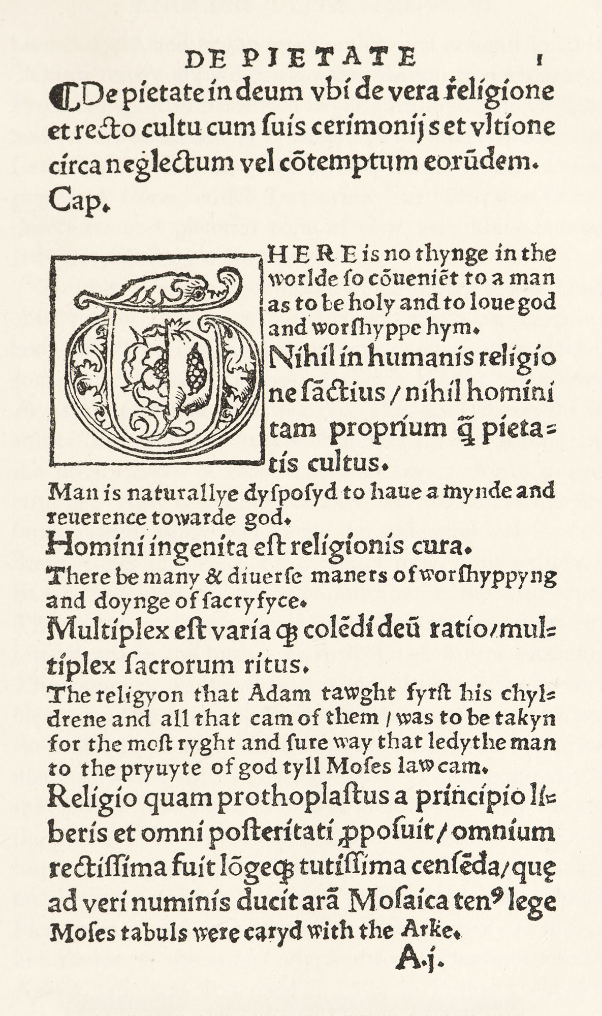
255. Roman Types used in Horman’s Vulgaria: Pynson, London, 1519
From a copy in Harvard College Library
Thomas Berthelet, royal printer and famous for his beautiful bindings, maintained good traditions in printing. So did Richard Grafton, Berthelet’s successor as King’s Printer; remembered for his Bibles and service-books, and especially for the edition of Cranmer’s Bible which he printed in association with Whitchurch in 1539. Thomas Vautrollier was responsible for the printing of what is called one of the handsomest Elizabethan books—though a very tasteless performance in reality—North’s Plutarch, issued in 1579. In types and presswork he excelled most of his craft. But the London printer John Day left the most distinct mark on early sixteenth century English typography. He was born in 1522, and began work on his own account in 1546. Taking refuge abroad during the Marian persecutions of Protestants, he returned and began printing again in 1557, and on the accession of Elizabeth (who merely persecuted Catholics), worked on a larger scale. Cunningham’s Cosmographicall Glasse, which Day printed in 1559, was, from a decorative and pictorial point of view, an ambitious books. It is described on a later page.
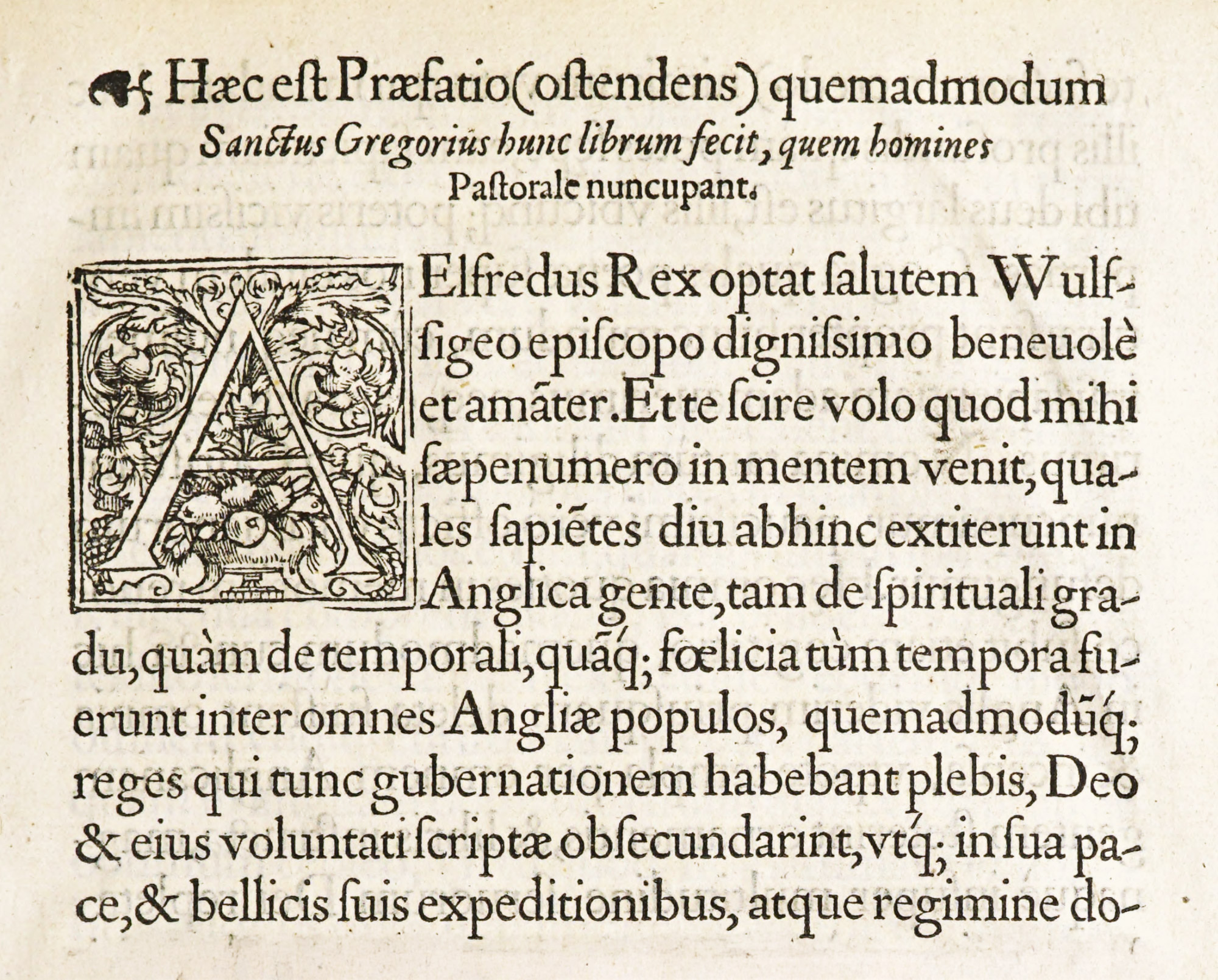
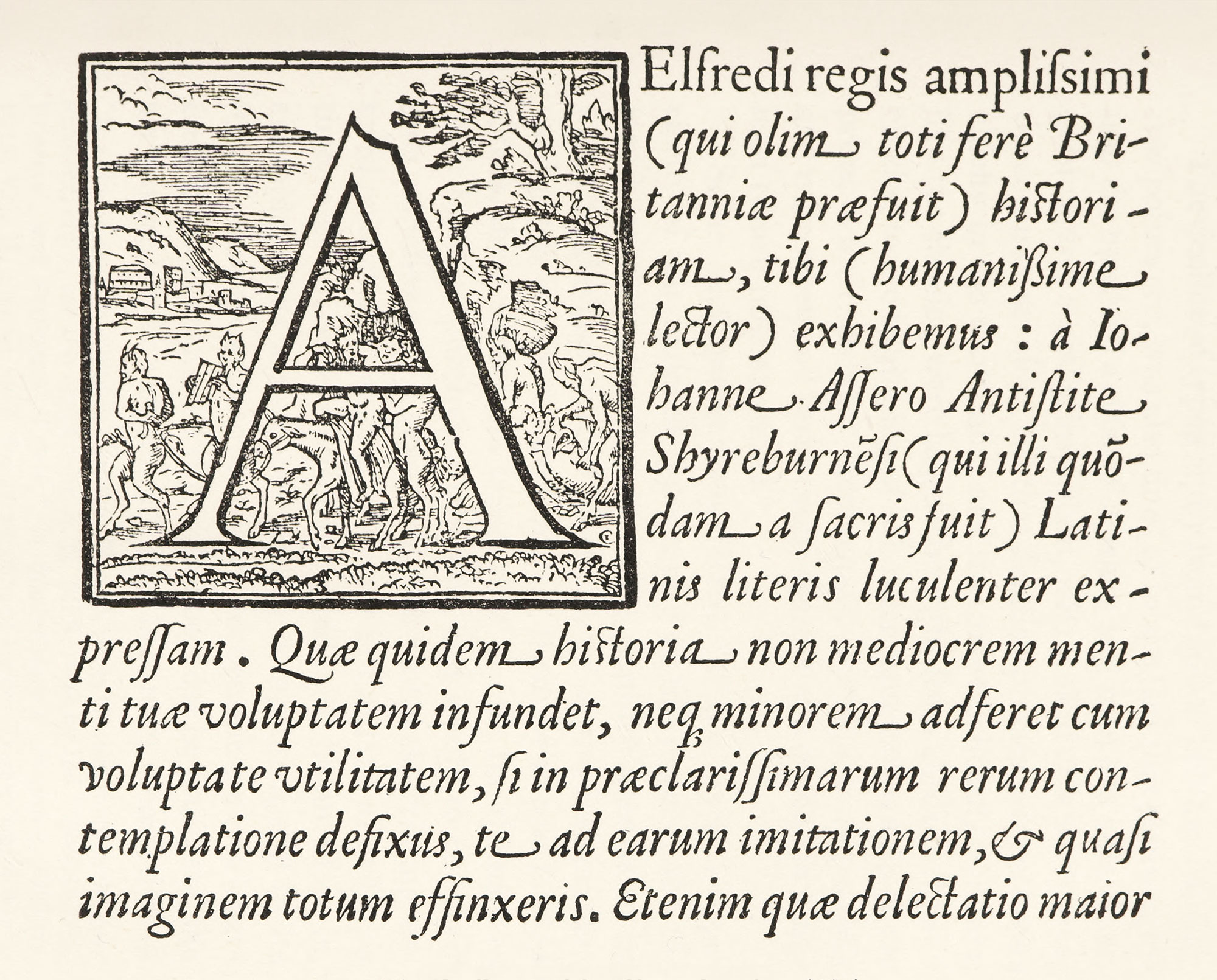
Matthew Parker, Archbishop of Canterbury, was Day’s chief patron. Day cut a font of Saxon which was used in a book edited by the archbishop, issued about 1566, and in some later volumes, notably Parker’s edition of Ælfredi Regis Res Gestæ, printed in 1574. This book shows the result of the best efforts in type-founding up to that time, and the archbishop’s preface alludes to Day’s skilful punch-cutting:
And inasmuch as Day, the printer, is the first (and indeed, as far as I know, the only one) who has cut these letters in metal; what things have been written in Saxon characters will be easily published in the same type.
The roman and italic used in the volume are of extreme importance in the history of English type-founding. The roman, or, as it was called, “Italian letter,” resembles some fine fonts used on the Continent (fig. 256); and the italic (that used in the Cosmographicall Glasse) is no less distinguished (fig. 257).
Reed says:
The typography of the Ælfredi is superior to that of almost any other work of the period. Dibdin considered it one of the rarest and most important volumes which issued from Day’s press. The archbishop’s preface is printed in a bold, flowing Double Pica Italic, and the Latin preface of St. Gregory at the end in a Roman of the same body, worthy of Plantin himself.3
A new italic was first used in 1572 in Parker’s De Antiquitate Britannicæ Ecclesiæ—the first privately printed book brought out in England. Day, by the way, was printer of the English edition in black-letter of that very famous Protestant martyrologium, Foxe’s Book of Martyrs, in 1563; and in 1569 he produced A Book of Christian Prayers,—commonly called “Queen Elizabeth’s Prayer Book,”—a rough, tasteless black-letter volume, clumsily modelled on French Horæ, but which had great popularity. He also cut a fine Greek letter and some attractive musical characters, and mathematical signs, etc., not before cast in type. The use of his roman and italic fonts was probably restricted to the See of Canterbury. Some of them were used a hundred years later by Roycroft in Bishop Walton’s Polyglot Bible. Day was one of the first English printers to cut roman and italic letters on uniform bodies. Before that time, roman and italic types had been considered characters without mechanical interrelation; as examination of books in which they are both employed too plainly shows.
256. Roman Type used in Æfredi Regis Res Gestæ: Day, London, 1574
From a copy in Harvard College Library, Internet Archive (scan)
257. Italic used in Horman’s Vulgaria: Pynson, London, 1519
From a copy in Harvard College Library
Until the middle of the sixteenth century, the roman types used in England were respectable—in a few cases, handsome. By the middle of the century, however, there was a decline, attributable to a variety of reasons. English typography shared the general falling off which began as soon as the restraining traditions of the manuscript volumes had passed away. Then, too, as in other countries, new and more complex problems of book-making were coming into being—changes caused by a demand for cheaper books, by the realization of the possibilities of type, and by problems arising from the difference between the arrangement of a modern book, as we understand it, and the old traditional manuscript volume. Nor was the English printer very skilful or tasteful in the arrangement of types—good or bad; and thus English books did not equal those printed by good presses on the Continent—either in workmanship, beauty, or correctness.
The decline of typography from 1550 to 1650, as McKerrow points out, was also due
- to the fact that printing fell into the hands of a class of masters and men less able, enterprising, and socially important, who looked at it solely from the commercial side;
- that English presses printed books chiefly in the vernacular, and that more scholarly volume, like the classics, were largely brought from abroad;
- and chiefly, to the beginning of a burdensome censorship of the press, which became increasingly restrictive.
Separately and collectively, all these contributed to the decline in England of printing as an art.4
Some explanation of the marked superiority of our national typography at the close of the fifteenth century over that of half a century later, is to be found in the fact that, whereas many of the first printers and types wholly cut and cast for them by expert foreign artists, their successors began first to cast for themselves from hired or purchased matrices, and finally to cut their own punches and justify their own matrices. Printing entered on a gloomy stage of its career in England after Day’s time, and as State restrictions gradually hemmed it in, crushing by its monopolies healthy competition, and by its jealousy foreign succour, every printer became his own letter-founder, not because he would but because he must, and the art suffered in consequence.
The first man recorded as a type-founder was Hubert Dauvillier, who came to England in 1553 and whose shop was in existence in 1594; the first Englishman in the trade being Benjamin Simpson, who worked as a type-founder in 1597.
By the middle of the sixteenth century, the State had so seriously interfered with the liberty of printing, that by 1557 no press could be erected outside London except one each at the Universities of Oxford and Cambridge. In the seventeenth century, the Star Chamber decree of 16375 placed the number of letter-founders at four, vacancies being filled by a commission. From 1640 to 1662 was a period of liberty; but this restriction was revived in 1662 and lasted until the end of the century—or to be exact, 1693. Pollard tells us,
During this period of nearly a century and a half, no printing was permitted, and, with the most insignificant exceptions, no printing was done, except at London, Oxford, and Cambridge. If a school-book or prayer-book, or Bible, or book of any kind were wanted at Falmouth or Berwick-upon-Tweed, it was from London or Oxford or Cambridge that it had to be procured, and procured moreover from a closed ring, more or less able to charge what price it pleased. If a poll-tax of a few pence apiece had been imposed on the people of England the whole country would have been in revolt. But because this piece of oppression, which had no parallel in any other civilized country, had to do with books, this land of liberty bore it, apparently without a murmur.6
The earliest English specimen-sheet was that of Nicholas Nicholls, submitted to Charles II in 1665, with a petition for the post of royal letter-founder—which two years later he obtained. The types were probably cut expressly for the specimen, and besides roman include Greek, Hebrew, Syriac, Samaritan, Ethiopic, and Arabic (fig. 258).
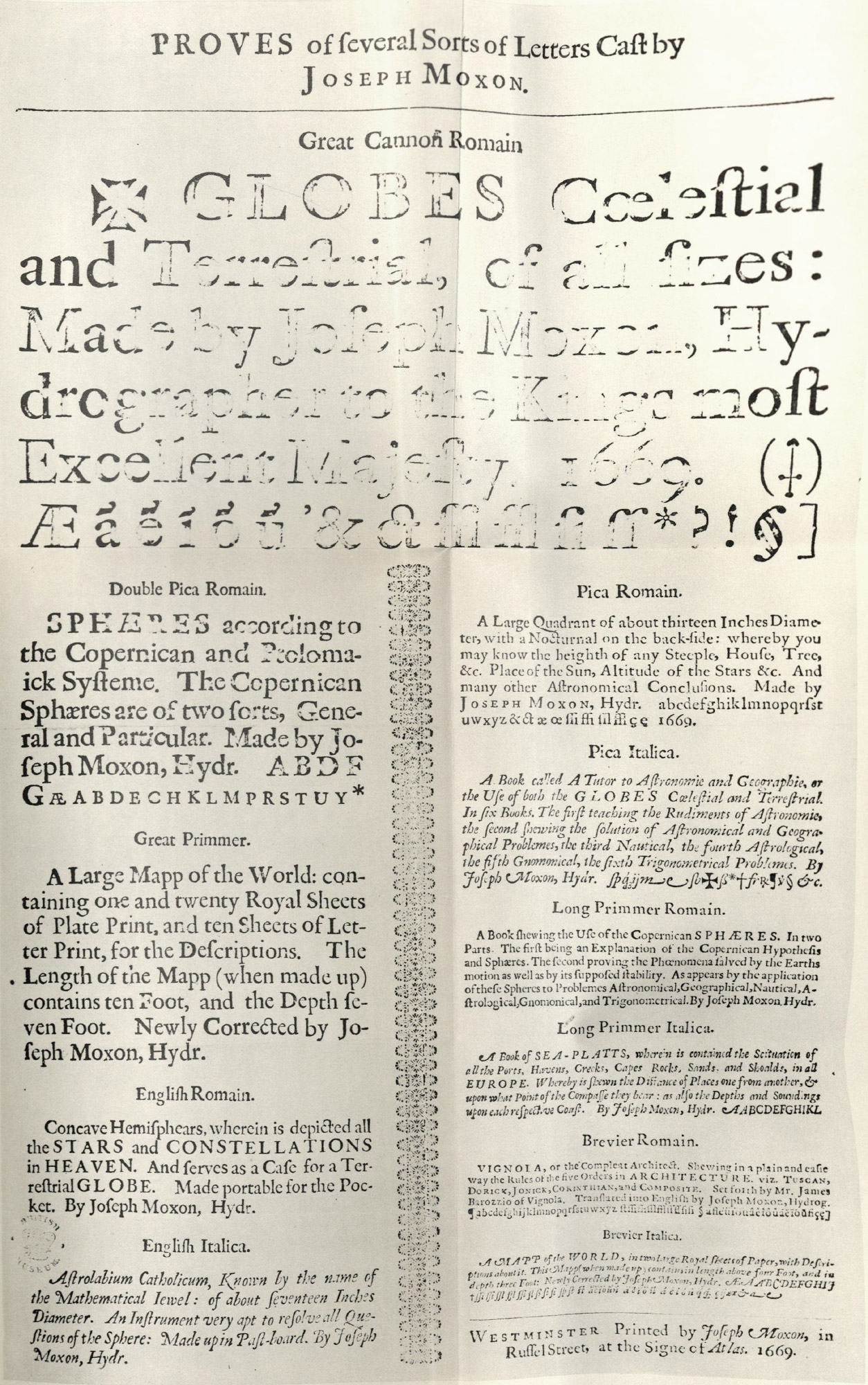
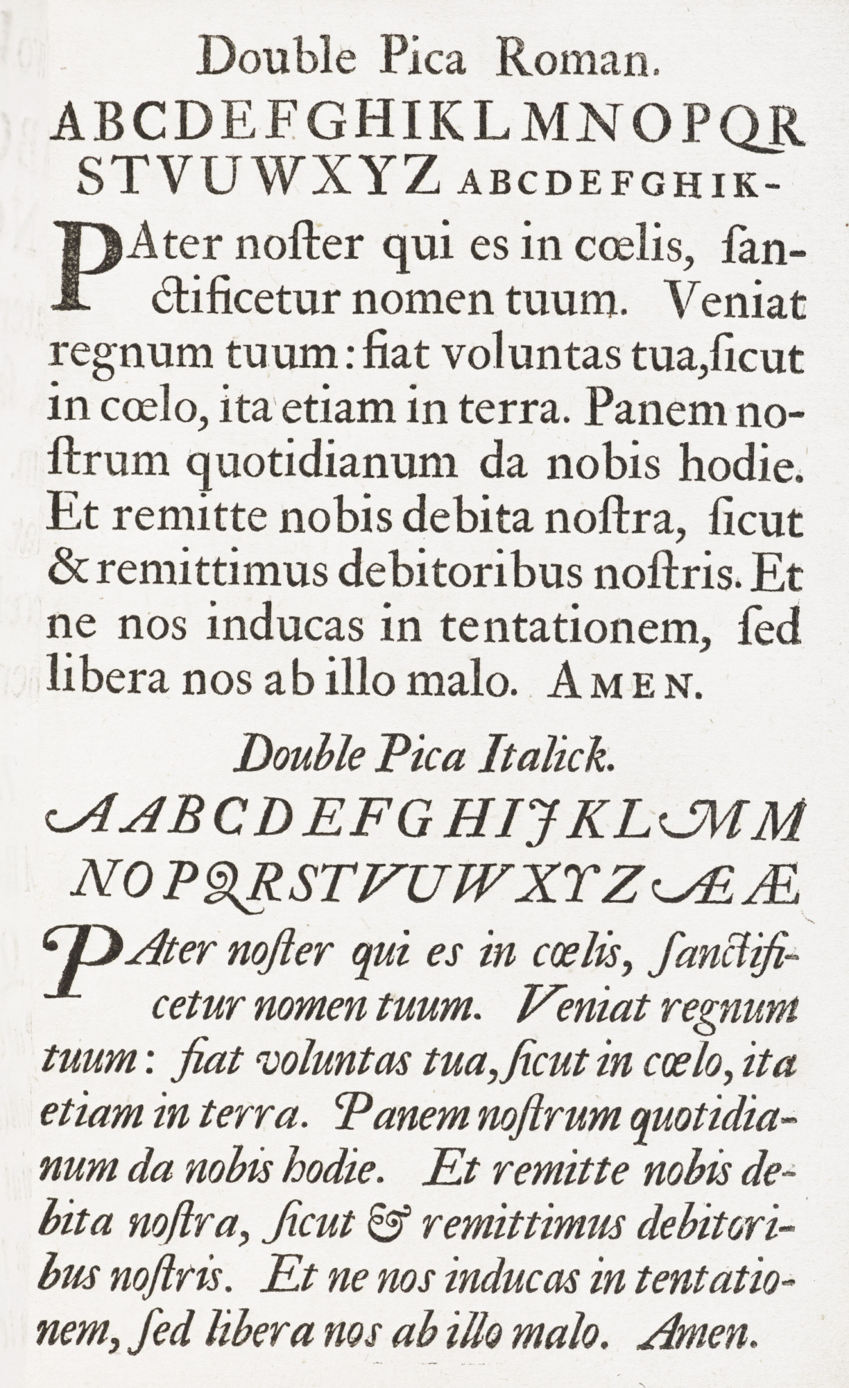
Moxon, author of Mechanick Exercises,7 published a specimen in 1669. A specimen of the Fell and Junius types was issued by the University Press, Oxford, in 1693.
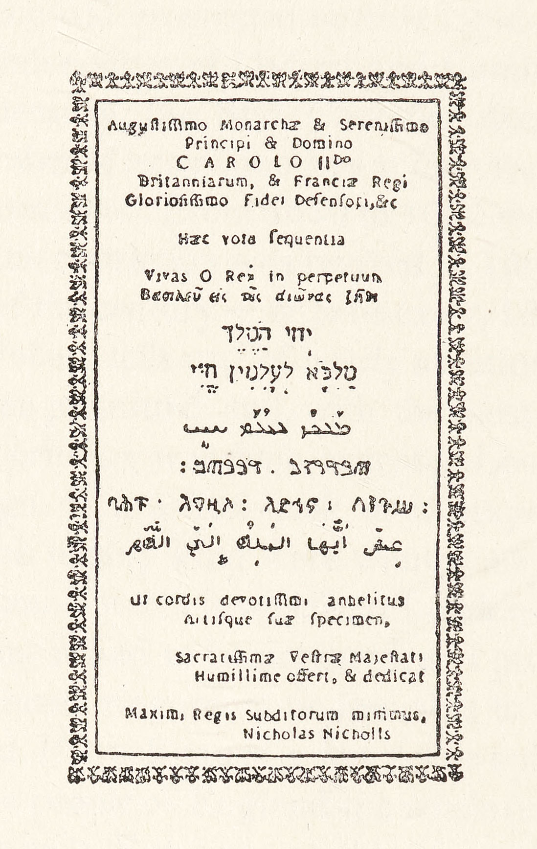
258. Earliest English Specimen-sheet: Nicholas Nicholls, London, 1665
From Reed’s History of Old English Letter Foundries (facsimile)
The Oxford Press began its work in 1585, and has been in continuous activity to our own day. In 1629, Sir Henry Savile8 gave the press some fine Greek types (bought at Frankfort possibly from Wechel’s successors), called the “Silver Letter,” in which the Eton Chrysostom had been printed.9 Later, Archbishop Laud obtained Letters Patent for it (allowing three printers, each to have two presses and two apprentices), and a Charter extending its rights, and he also presented it with some Oriental types. Between 1667 and 1672, the press received some fine types imported from Holland by Dr. John Fell, Dean of Christ Church and later Bishop of Oxford (figs. 259 and 260). A collection of Gothic, Runic, Icelandic, and Saxon characters was given also by a German, Francis Junius the younger, librarian to the Earl of Arundel.10 Rowe Mores says:
About the time of Mr. Junius’s gift to the Univ. the excellent Bp. Fell, most strenuous in the cause of learning, had regulated and advanced the learned press in the manner which had been intended by archb. Laud, and which would by him have been effected had not the iniquity of those anarchical and villainous times prevented. He gave to the Univ. a noble collection of letter, consisting (besides the common founts Rom. and Ital.) of Hebr. Samaritan, Syriac, Arabic (Persic, Turkish and Malayan bought of Dr. Hyde), Armenian, Coptic, Æthiopic, Greek, Runic, Saxon, English, and Sclavonian: Music and Astronomical and Mathematical signs and marks, flowers, &c. together with the punches and matrices from which they were cast, and all other utensils and apparatus necessary for a printing-house belonging to the University.11
Fell employed Marshall, afterwards Dean of Gloucester, to buy some of these types in Holland, and Marshall’s negotiations for their purchase (between 1670 and 1672) were chiefly with Abraham van Dyck, son of Christoffel, the celebrated type-cutter, and Dirk Voskens. A phrase in one of Marshall’s letters is prophetic.
I se in this Printing-designe, we English must learn to use or own hands at last to cut Letters as well as print wth them. For ye Founders here being reasonably furnish wth Matrices from Franckfort, ye old van Dijke, &c. have no regard to cutting & justifying, unles perhaps to supply a Defect, or two. So that some famous Cutters, they say, are gone, to other Countries for want of imployment. And are now not one here to be found.12
Dr. Fell also imported a Dutch letter-cutter, Peter Walpergen, to direct the Oxford foundry. Walpergen was succeeded by his son, and the son in turn by Sylvester Andrews. Dr. Fell also had a hand in the establishment of the Wolvercote paper-mill, now the property of the Oxford University Press. The matrices of the Fell types were the basis of the Oxford Foundry, established in 1667, and at the present day in effective operation.
259. Roman and Italic given by Dr. Fell to the University Press, Oxford
From Oxford University Press Specimen, 1695 (facsimile), A specimen of the several sorts of letter given to the University by Dr. John Fell,: sometime Lord Bishop of Oxford. To which is added the letter given by Mr. F. Junius. (scan)
260. Black-letter given by Dr. Fell to the University Press, Oxford
From Oxford University Press Specimen, 1695, A specimen of the several sorts of letter given to the University by Dr. John Fell,: sometime Lord Bishop of Oxford. To which is added the letter given by Mr. F. Junius. (scan)
The University Press was transferred to the Sheldonian Theatre in 1669 (built by Archbishop Sheldon, it is said at Fell’s suggestion), and during the life of Fell, its constant and efficient friend, it produced some notable books. Its charter was granted in 1682; a little later it obtained a privilege for printing Bibles. In 1688, it was removed from the Theatre—the Learned Press to one locality, the Bible press to another. The receipts from the copyright of Clarendon’s Rebellion chiefly provided the money for the erection in 1713 of the Clarendon Building, designed for the press by Vanbrugh. In 1830, it was removed to its present building, where the Bible Press and Learned Press are united.13
The restrictions which the Government placed on printing have hitherto been alluded to. The separation of printing from letter-founding was a gradual process, but in the reign of Charles I—in 1637—the Star Chamber decree shows that the establishment of type-founding as a distinct business was accomplished. The object of this decree was to restrict the number of persons engaged in letter-founding; and four authorized founders were appointed, namely, Grismand, Wright, Nicholls, and Fifield, who probably had been making types for some time previous. It was the son of Nicholls who produced the first known “specimen” of English type.
These men have generally been known as the Polyglot Founders, because they were later associated in the production of that famous work, Walton’s Polyglot Bible—the fourth Polyglot produced. The first was the Complutensian Polyglot of Cardinal Ximenez, printed at Alcalá in 1517; followed by the Plantin Polyglot of 1572, published at Antwerp, and the Paris Polyglot of 1645, edited by Le Jay. Each succeeding work surpassed its predecessor in the number of languages employed, the London Polyglot containing all that were in the Paris Polyglot and adding Persian and Ethiopic;14 though as a piece of printing it is inferior in beauty to the earlier Polyglots. It was issued between 1654 and 1657 in six folio volumes by the distinguished printer-publisher Thomas Roycroft, who also brought out Castell’s learned Heptaglot Lexicon, which supplemented it. Some roman and italic types employed in the Bible were (as I have said), the types that Day cut for Archbishop Parker. The characters for the nine languages used were all of English make, and some of these became models for later Oriental fonts in the eighteenth century. Roycroft (remembered for his fine editions of the classics printed for Ogilby) was, on the accession of Charles II, made King’s Printer of Oriental languages, and Walton received a mitre!
The three best London foundries—none too good, be it said—of the second half of the seventeenth century were that of Joseph Moxon (author of Mechanick Exercises); that of his successors, Robert and Silvester Andrews, which was very well furnished in roman, italic, and learned fonts, as well as Anglo-Saxon and Irish characters; and that of James and Thomas Grover, who possessed types which came from Day, Wynkyn de Worde, and others, and a remarkable Greek uncial font later owned by the James foundry.
But the types of most seventeenth century English books were probably Dutch. For this there were several reasons. One was the success of the Elzevirs, then the prominent publishers and printers of Europe, whose types were Dutch. Then there was the influence of fashion “for the caprices of the court have always been to some extent responsible for the evolution of taste”; and court taste was to some degree Dutch. Moreover, with the Revolution, English restrictions on the importation of types were removed, and the use of Dutch fonts came about partly because, on account of previous hampering governmental regulations, there were not enough trained letter-cutters left in England to produce good types. That was the most potent reason of all for the general English use of the Dutch letter.
At the beginning of the eighteenth century, the great James foundry,15 which contained material produced by De Worde, Day, the London Polyglot founders, Moxon, and many more, was procuring its types from Holland, and an account of Thomas James’s negotiations there in 1710, when he went to obtain material for his foundry, is given in a series of unconsciously humorous letters in Rowe Mores’ Dissertation.16 His purchases from Dutch letter-founders were from Athias, Voskens, Cpu, and Rolu. Reed calls attention to “the intimate relations which existed at that period between English printers and Dutch founders.” He adds,
There was probably more Dutch type in England between 1700 and 1720 than there was English. The Dutch artists appeared for the first time to have the secret of the true shape of the Roman letter; their punches were more carefully finished, their matrices better justified, and their types of better metal, and better dressed, than any of which our country could boast.17
The rise of William Caslon, the greatest of English letter-founders, stopped the importation of Dutch types; and so changed the history of English type-cutting, that after his appearance the types used in England were most of them cut by Caslon himself, or else fonts modelled on the style which he made popular. An examination of the types displayed in the specimen in Watson’s History of the Art of Printing, issued in Edinburgh in 1713, showed what the Dutch types were (fig. 261); and Caslon’s various specimens will show the English style. These, with Baskerville’s specimens, are the chief sources for the study of eighteenth century English type-forms.
261. Dutch types used in England: Watson Specimen, Edinburgh, 1713
From History of the Art of Printing (scans)
II. William Caslon and the Caslon Foundry
Caslon’s work marks a turning-point in English type-founding, so I shall outline briefly what he stood for in the history of English types.
William Caslon was born in 1692 at Cradley, Worcestershire, near Halesowen in Shropshire, and in the parish register of Halesowen his baptism is entered as “child of George Casselon by Mary his wife.” Tradition has it that the surname was originally Caslona, after an Andalusian town, whence in 1688 William Caslon’s father came to England. Caslon as a lad was apprenticed to an engraver of ornamental gun-locks and barrels in London. In 1716, he set up a shop of his own there, where he did silver-chasing and also cut tools for bookbinders. John Watts (a partner of the second Tonson) was accustomed to employ him to cut lettering for bindings—and sometimes punches for type. About 1720, William Bowyer the elder18 is said to have taken Caslon to the James workshop, to initiate him into letter-founding; and Bowyer, his son-in-law Bettenham, and Watts eventually advanced money to enable Caslon to set up a foundry of his own. The only good foundries then were those of the Oxford Press, of Grover, and of James. In the same year the Society for Promoting Christian Knowledge engaged Caslon to cut a font of Arabic of English size, for a Psalter and New Testament for Oriental use—ultimately printed respectively in 1725 and 1727. This he did, and the story runs that he cut the letters of his own name in pica roman, and printed it at the bottom of a proof of his Arabic. This roman letter was so much admired, that Caslon was persuaded to cut a font of pica roman and italic; and in 1722, with Bowyer’s encouragement, he cut the English fonts of roman, italic, and Hebrew used in Bowyer’s folio 1726 edition [vol. 1, vol. 2, vol. 3] of Selden’s works. These and some Coptic types for Wilkins’ edition of the Pentateuch, published in 1731, were, like the Hebrew, cut under Bowyer’s direction. Caslon’s beautiful pica “black” was cut about 1733. Several other of his “exotic” types appeared before 1734. In accomplishing all this, Caslon had been from the first effectively backed; and he ended with a complete foundry, which by his own labour and some discriminating later purchases became the best in England. His types were bought by printers abroad. He arrived, says Mores,19
to that perfection so that we may, without fear of contradiction, make the assertation that a fairer specimen cannot be found in Europe; that is, Not in the World.
When Caslon’s first specimen appeared, his reputation was made. His subsequent history is largely the record of the different fonts which he cut.
Though Caslon began his foundry about 1720, it was not until 1734 that he issued his specimen-sheet, which exhibited the results of fourteen years of labour (fig. 262). It shows various fonts of type, all cut by Caslon except the Canon roman, which came from Andrews (a “descendant” of the Moxon foundry); the English Syriac, cast from matrices used for the Paris Polyglot Bible of Le Jay, and a pica Samaritan cut by Dummers, a Dutchman. A reprint of this specimen, with a change of imprint, appeared in an edition of Chambers’ Cyclopædia in 1738, and a note accompanying it says:
The above were all cast in the foundry of Mr. W. Caslon, a person who, though not bred to the art of letter-founding, has, by dint of genius, arrived at an excellency in it unknown hitherto in England, and which even surpasses anything of the kind done in Holland or elsewhere.
Caslon was joined in his business by his son, William II, in 1742, and they constantly enlarged their stock of types, both roman and “learned.” It was apropos of this expansion that a rather startling phrase occurs in Ames’ account of their foundry. He says,
The art seems to be carried to its greatest perfection by Mr. William Caslon, and his son, who, besides the type of all manner of living languages now by him, has offered to perform the same for the dead, that can be recovered, to the satisfaction of any gentleman desirous of the same.”
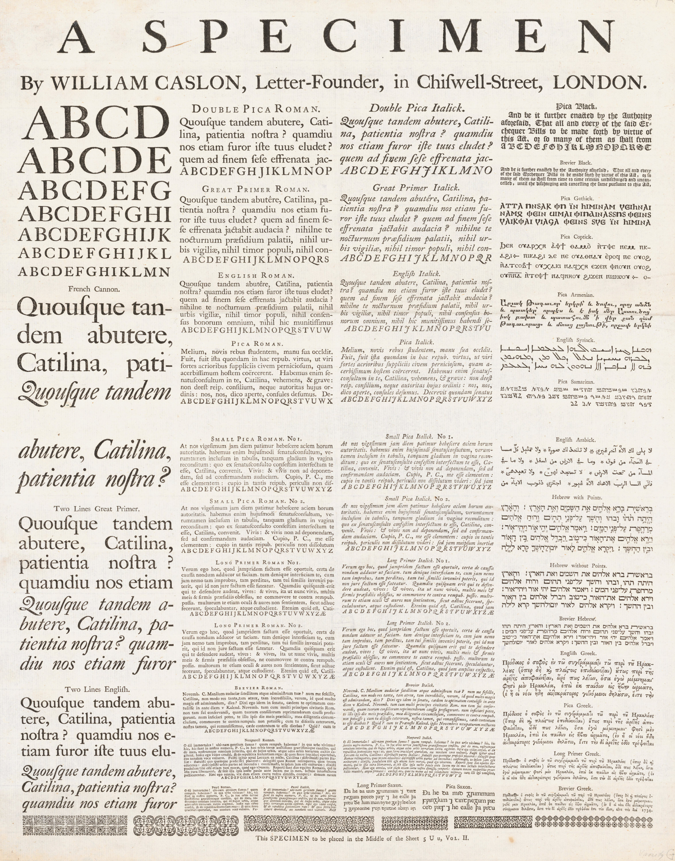
262. First Broadside Specimen issued by William Caslon, 1734
From a copy in the Library of the American Type Founders Company, Jersey City (facsimile), Internet Archive (scan)
Fournier, writing (not too accurately) in 1766, says:
England has few foundries, but they are well equipped with all kinds of types. The principal ones are those of Thomas Cottrell at Oxford, James Watson at Edinburgh, William Caslon & Son at London, and John Baskerville at Birmingham. The last two deserve special attention. The types in Caslon’s foundry have been cut for the most part by his son with much cleverness and neatness. The specimens which were published of them in 1749 contain many different kinds of types.20
A contemporary print of Caslon’s foundry shows four casters at work, a rubber (Joseph Jackson), a dresser (Thomas Cottrell), and some boys breaking off the type-metal jets. Jackson and Cottrell subsequently became eminent type-founders themselves. Caslon seems to have been a “tender master,” and he was a kindly, cultivated man. In his Chiswell Street house he had a concert room, and within it an organ; and there he entertained his friends at monthly concerts of chamber music. I have seen the attractive old rooms where these musical parties were held, in the building in Chiswell Street—since pulled down, to be replaced by a more convenient structure.
William Caslon the elder (who was thrice married) died in London in 1766, at the age of seventy-four. The stock of his foundry about the time of his death may be seen from his Specimen of 1763. This was the first specimen-book issued in England,21 and from it some pages are reproduced (figs. 263 and 264). His son, William Caslon II (1720–1778), succeeded him at his death, and maintained the place the house had won for itself. On the death of William Caslon II, the property was divided between his widow—Elizabeth (Cartlitch) Caslon—and his two sons, William Caslon and Henry Caslon I. William Caslon III (1754–1833),22 who had a son William (1781–1869), disposed of his interest in 1792 to his mother, and to Elizabeth (Rowe) Caslon, the widow of his brother Henry. The latter lady, whose partner was Nathaniel Catherwood, had a son, Henry Caslon (1786–1850). He, in partnership with John James Catherwood, with Martin Livermore, and alone, continued the house, which finally descended to the last of the family, Henry William Caslon (1814–1874). On his death, the business was taken over, under the style of H. W. Caslon & Co., by his manager, T. W. Smith, whose sons ultimately assumed the name of Caslon, and the foundry remains in their hands to-day.23 The developments of Caslon’s output during their long and honourable history are described on later pages.
263. Roman and Italic: William Caslon & Son’s Specimen, London, 1763
From a copy in the Library of the American Antiquarian Society, Worcester
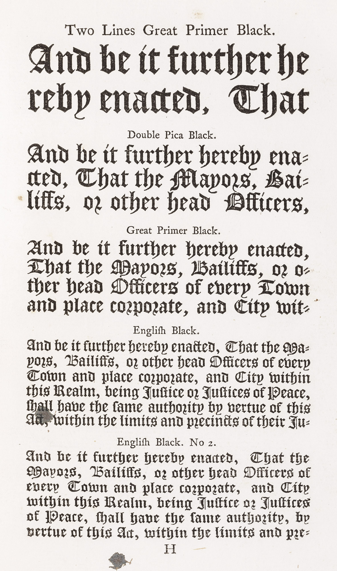
264. Black-letter: William Caslon & Son’s Specimen, London, 1763
From a copy in the Library of the American Antiquarian Society, Worcester
Why are William Caslon’s types so excellent and so famous? To explain this and make it really clear, is difficult. While he modelled his letters on Dutch types, they were much better; for he introduced into his fonts a quality of interest, a variety of design, and a delicacy of modelling, which few Dutch types possessed. Dutch fonts were monotonous, but Caslon’s fonts were not so. His letters when analyzed, especially in smaller sizes, are not perfect individually; but in mass their effect is agreeable. That is, I think their secret—a perfection of the whole, derived from harmonious but not necessarily perfect individual letter-forms. To say precisely how Caslon arrived at his effects is not simple; but he did so because he was an artist. He knew how to make types, if ever a man did, that were (to quote once more Bernard’s phrase) “friendly to the eye,” or “comfortable”—to use Dibdin’s happy term. Furthermore, his types are thoroughly English. There are other letters more elegant; for the Caslon characters do not compare in that respect with the letters of Garamond or Grandjean. But in their defects and qualities they are the result of a taste typically Anglo-Saxon, and represent to us the flowering of a sturdy English tradition in typography. Lacking a “national” form of letter, we in America (who are mainly governed by English printing traditions) have nothing better. Caslon types are, too, so beautiful in mass, and above all so legible and “common-sense,” that they can never be disregarded, and I doubt if they will ever be displaced.
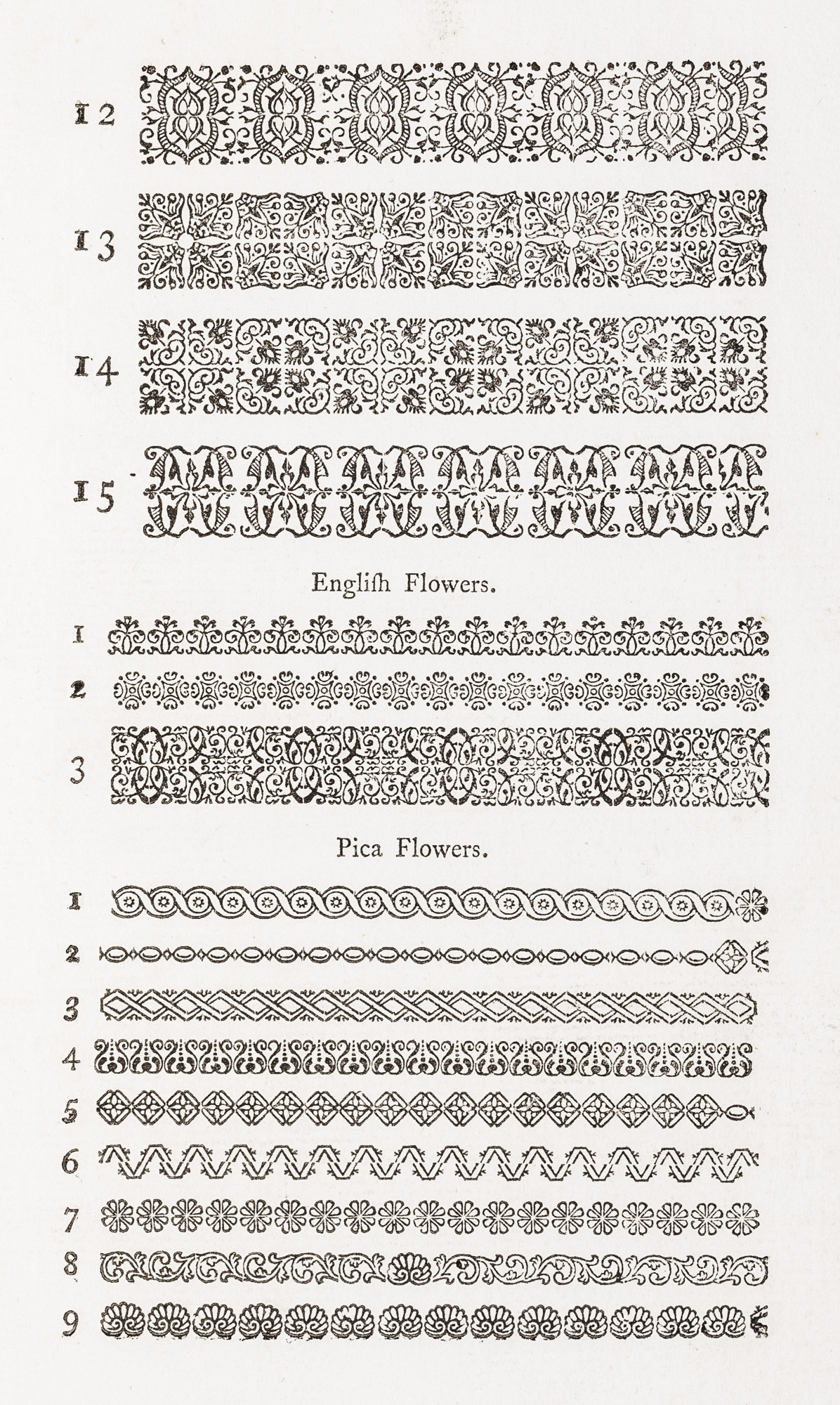
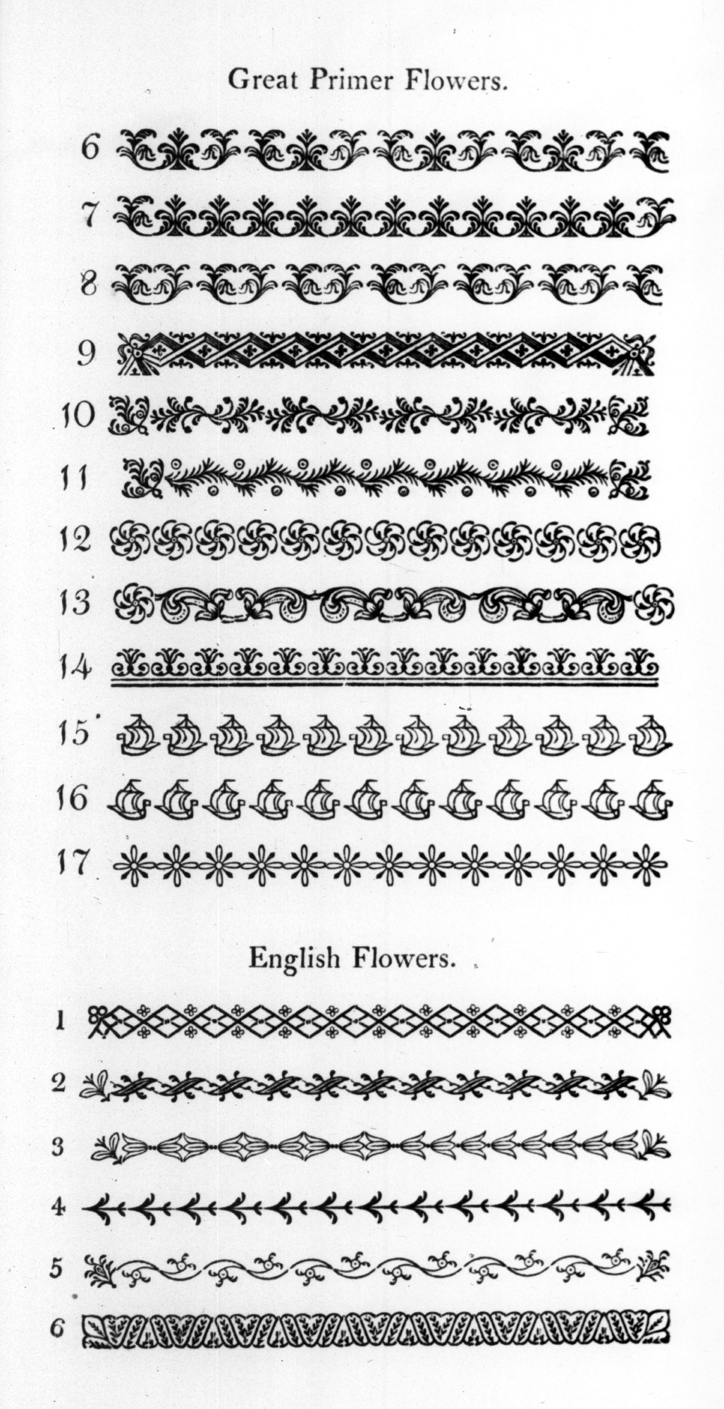
Caslon’s ornaments or flowers deserve in their way as much praise as his types. Mr. W. A. Dwiggins says,
To a designer’s eyes they have taken as individual patterns, an inevitable quality, a finality of right construction that baffles any attempt to change or improve.… Excellent as single spots, the Caslon flowers multiply their beauties when composed in bands or borders as ornamentation for letter-press. They then become a true flowering of the letter forms—as though particular groups of words had been told off for special ornamental duty and had blossomed at command into intricate, but always typographical patterns. This faculty possessed by the Caslon ornaments of keeping an unmistakable type quality through all their graceful evolutions sets them apart from the innumerable offerings of the type founders’ craft as a unique group.… From the point of view of the pressman, as practical working types for impressing ink into paper, they may be claimed to be better, so far as English and American designs are concerned, than any type-flowers made since their period. The proportion of printing surface to open paper…is excellently adapted for the purposes of clean, sharp impression. Certain ones have elements broken by tint-lines into a clear-printing gray, and it will be observed that this tint is not the gray of copper-plate, but has the weight and solidity of a printing surface backed by metal (figs. 265 and 266).
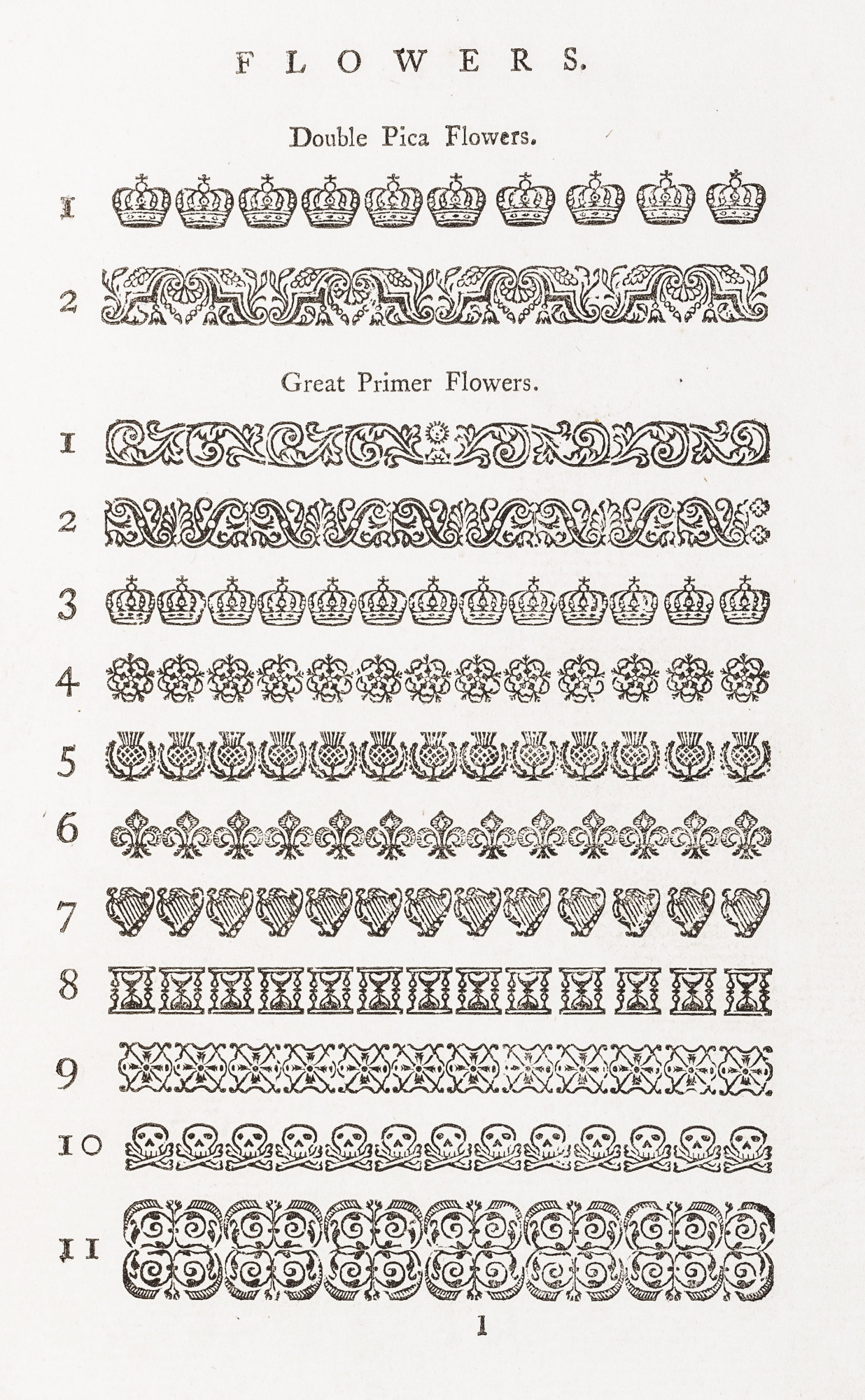
265. Ornaments: William Caslon & Son’s Specimen, London, 1763
From a copy in the Library of the American Antiquarian Society, Worcester
266. Ornaments: William Caslon & Son’s Specimen, London, 1763
From a copy in the Library of the American Antiquarian Society, Worcester
III. John Baskerville
Baskerville is the other great name in eighteenth century English type-founding. Here we have a very different influence emanating from a very different kind of man. His types were not so good as Caslon’s, though to an untrained eye their fonts seem much alike; but the slight touch of over-delicacy which the Baskerville letter possessed was finally to develop a rival which would drive Caslon’s type, for a time, from the field. Baskerville’s characters had this advantage—that they were in line with the tendency toward lighter type-forms which was coming over European printing; and although his fonts never had much vogue in England, they did have an enormous influence on the later development of English type-forms, and on the type-forms of Europe.
John Baskerville was born in 1706. He was first a writing-master at Birmingham, and then turned to the trade of japanning—of trays, snuff-boxes, etc.—in which he made a good deal of money. In 1750, he began to interest himself in typography. Fournier says,
M. Baskerville, a private individual of means, has established at Birmingham, the town where he lives—renowned for its metal manufactures—a paper-mill, printing-office, and type-foundry. He has spared neither pains nor expense to bring these to the highest perfection. His types are cut with much spirit, his italic being the best in any foundry in England, though the roman characters are a little too broad. He has already published some editions printed from these new types, which, for brilliancy, are real masterpieces. Some are upon hot-pressed paper, and although they are a little fatiguing to the eye, one cannot deny that they are the most beautiful things to be seen in this sort of work.24
What Caslon did for types, Baskerville, aided by the novel form of his letters, his black ink, and hot-pressed rag paper, did for eighteenth century presswork. His way of printing was so closely connected with the effects of his fonts that they cannot be considered apart from it.
In printing a book, Baskerville had ready a succession of hot copper plates, and between such plates the wet sheet was inserted as it left the press—something no eighteenth century printer had up to that time attempted. The high finish of these hot-pressed sheets—the “gloss” of his paper—compared with that on modern papers, does not seem to us very noticeable. His contemporaries, however, thought otherwise, and the Abbé de Fontenai, in a notice of Bakerville, describes it as “so glossy and of such a perfect polish that one would suppose the paper made of silk rather than linen.” It is easier to understand his surprise at Baskerville’s restraint in the use of decoration, for at that date most books did not depend for their effect on typography, but chiefly on engravings, or else woodcut ornaments or typographic flowers. This absence of plates in Baskerville’s books struck men of that day very forcibly. De Fontenai says,
Content with the simplicity of typographic art, the English printer has had no need to borrow aid from engraving; nor do we find in the editions that he has so far published—which are admirable—plates, vignettes, tail-pieces, ornamental letters, or, in short, any of those accessories which serve as passports, so to speak, for a worthless lot of French verse which, without this useful precaution, would meet its just desert—oblivion.25
Baskerville spent seven or eight years in experimenting with designs for type before a page of a book was printed, and he made not merely his own types (cut for him by a certain John Handy), but also his ink, and if he did not make his own paper, he superintended its manufacture. His first book, the Latin Virgil, which came out in 1757, established his reputation. And in 1758, Baskerville followed up this success with a Milton in two volumes royal octavo—a somewhat indifferent performance—which is chiefly interesting for the preface (fig. 267) that he wrote for it.
Amongst the several mechanic Arts that have engaged my attention, there is no one which I have pursued with so much steadiness and pleasure, as that of Letter-Founding. Having been an early admirer of the beauty of Letters, I became insensibly desirous of contributing to the perfection of them. I formed to my self Ideas of greater accuracy than had yet appeared, and have endeavoured to produce a Sett of Types according to what I conceived to be their true proportion.
Mr. Caslon is an Artist, to whom the Republic of Learning has great obligations; his ingenuity has left a fairer copy for my emulation, than any other master. In his great variety of Characters I intend not to follow him; the Roman and Italic are all I have hitherto attempted; if in these he has left room for improvement, it is probably more owing to that variety which divided his attention, than to any other cause. I honor his merit, and only wish to derive some small share of Reputation, from an Art which proves accidentally to have been the object of our mutual pursuit.
After having spent many years, and not a little of my fortune in my endeavours to advance this art; I must own it gives me great Satisfaction, to find that my Edition of Virgil has been so favourably received. The improvement in the Manufacture of the Paper, the Colour, and Firmness of Ink were not overlooked; nor did the accuracy of the workmanship in general, pass unregarded. If the judicious found some imperfections in the first attempt, I hope the present work will shew that a proper use has been made of their Criticisms: I am conscious of this at least, that I received them as I ever shall, with that degree of deference which every private man owes to the Opinion of the public.
It is not my desire to print many books; but such only, as are books of Consequence, of intrinsic merit, or established Reputation, and which the public may be pleased to see in an elegant dress, and to purchase at such a price, as will repay the extraordinary care and expense that must necessarily be bestowed upon them. Hence I was desirous of making an Experiment upon some of our best English Authors, among those Milton appeared the most eligible.
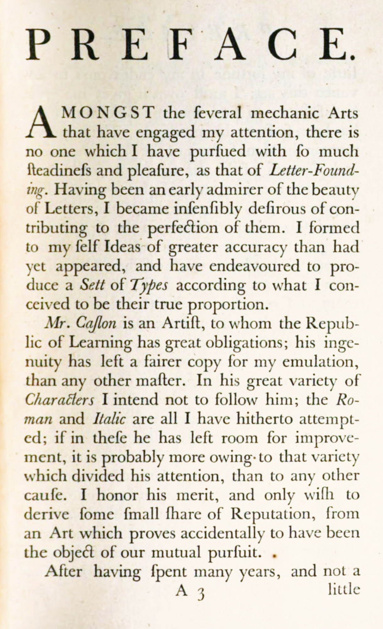
267. Page of Bakerville’s Preface to Milton, Birmingham, 1758
From a copy in the Boston Anthenæum (facsimile), Paradise Lost. A Poem, in Twelve Books
Besides the fine and famous series of classical and English authors that Baskerville continued to print on his own account, he had other irons in the fire. He cut Greek types—and very bad they were—for Oxford. He was appointed printer to the University of Cambridge, and produced editions of the Bible and Prayer Book—some of them most imposing—though his types did not seem “solid” enough for this kind of work. I have chosen one or two typical volumes for description of his types and type-setting. The first one is Virgil, which (in Macaulay’s phrase) “went forth to astonish all the librarians of Europe.”
This book was issued in square quarto. The title-page is set in lines of widely spaced capitals—a very characteristic feature of Baskerville’s work. His rather condensed italic capitals are employed for two lines only (fig. 268). These italic capitals are used for running-titles, and elsewhere—the F, K, J, N, Q, Y, Z being peculiarly, “Baskerville” in design. The book is set in great primer type, leaded. The folios and numbers to lines of the text employ a very calligraphic and rather disagreeable form of arabic figure. The book is printed on hot-pressed smooth paper, in my copy partly wove and partly laid. Very easy to read, the volume nevertheless does not seem to me a particularly agreeable or beautiful book, partly on account of its type, but chiefly because the type-page is too large for its paper, and the headings and running-titles, in restless italic capitals, become too much of a feature (fig. 269). The volume sold at a guinea, and among the subscribers was Benjamin Franklin, who took six copies. Perhaps among them was the copy given by him to the Library of Harvard College, of which he wrote (in April, 1758) that “It is thought to be the most curiously printed of any book hitherto done in the world.” However that may be, it is a very typical example of Baskerville’s merits and defects.
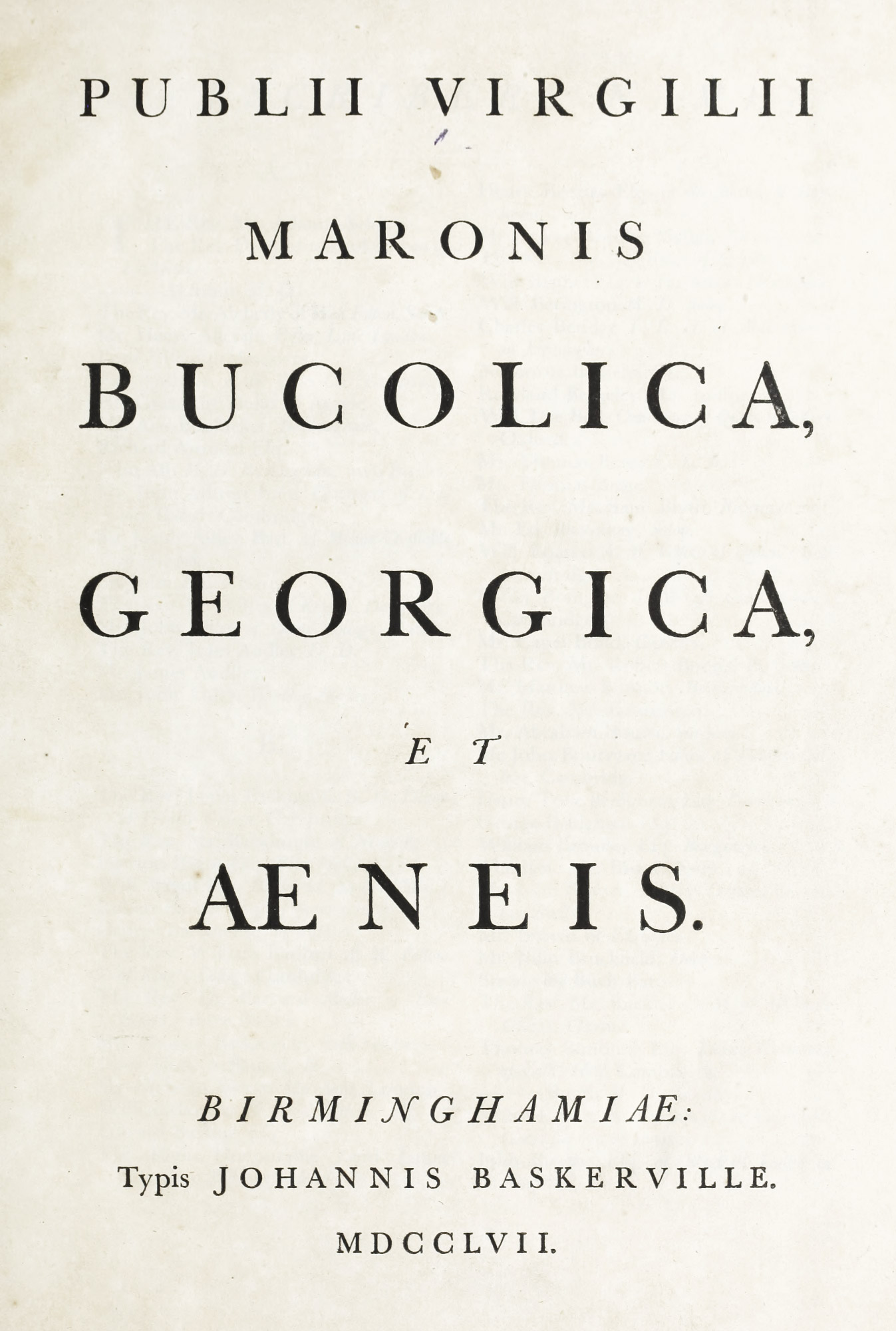
268. Title-page of Baskerville’s Virgil, Birmingham, 1757
From Publii Virgilii Maronis Bucolica, Georgica et Aeneis (scan)
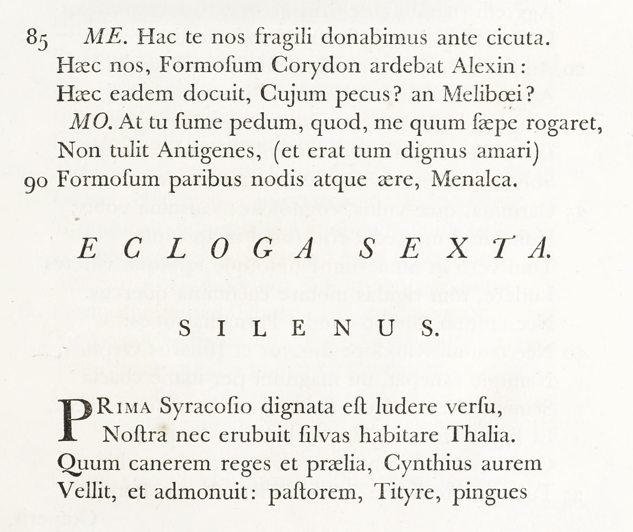
269. Baskerville’s Type used in Virgil, Birmingham, 1757
From Publii Virgilii Maronis Bucolica, Georgica et Aeneis (scan)
In The Works of the Late Right Honorable Joseph Addison, Esq., in four quarto volumes, printed by Baskerville for J. and R. Tonson in 1761, we have a different kind of performance. The third volume I have chosen to discuss because it is devoted to The Spectator, a book so often reprinted that its editions form a sort of conspectus of English typography for a hundred and fifty years. To my mind, Baskerville’s treatment of The Spectator was most unsuccessful. Running head-lines are set in italic capitals, much spaced, so that “The” which precedes the word “Spectator” has to be huddled to one side in upper and lower-case italic. The number of the issue and its date are set between two lines of very light type-ornament, which is trivial and teasing. The text of the work is set in English roman of a monotonous roundness; for the height of the body of the letter calls for more leading and longer ascenders and descenders. On pages 432 and 433, observe the masses of italic—gray in colour, feeble and wiry in line, and annoyingly condensed in shape. The occasional lines of Greek are crabbed and disagreeable—to other Greek fonts what the italic is to “suaver” italics. The volumes may be vastly superior in brilliancy and clearness of effect to other books of the time, but for the text a Caslon, or even “Fell” letter, would have been better if the same attention had been given to presswork.
A much finer book—a really very fine book—is the Latin Juvenal and Persius, printed the same year (1761) in quarto. This is very simply arranged. The argument to each Satire is set in a large size of Baskerville’s italic, and the text in roman is more leaded than in the Virgil and accordingly much improved. Running-titles are set in spaced italic capitals. The imposition is elegant, the margins ample, the type clear. And some of Baskerville’s editions of the classics in 16mo are charming little books.
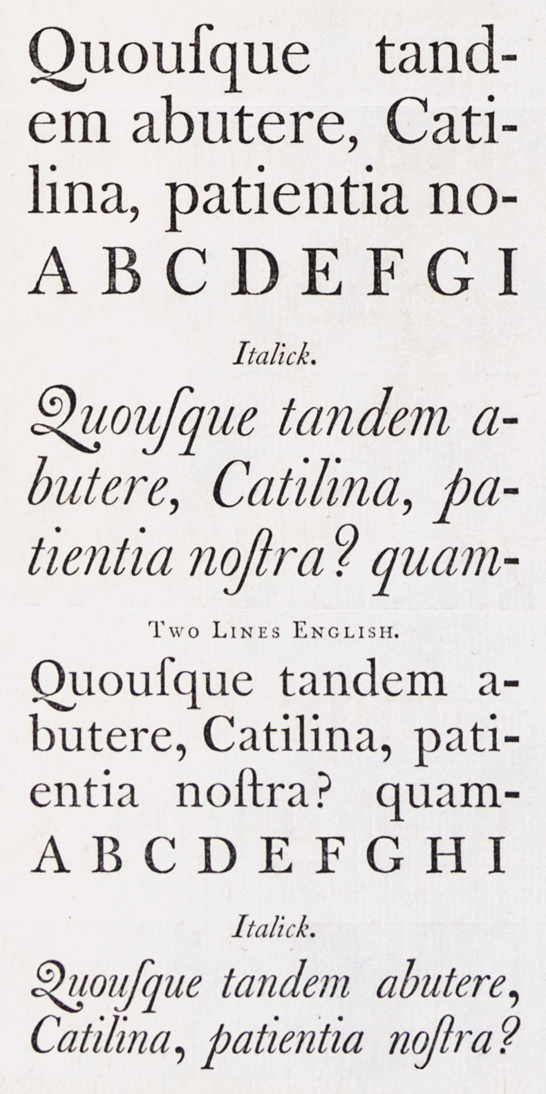
Baskerville’s specimen-sheet of about 1762,26 entitled A Specimen by John Baskerville of Birmingham, Letter-Founder and Printer, shows eight varieties of roman—from double pica to brevier—and six sizes of italic. On this specimen the roman types appear better than the Addison. But as Latin is employed for the paragraph which displays them, this may be due to the many m’s, n’s, and u’s which Latin affords. The italic is better, though it is a very thin, starved sort of character. The italic capital K’s, and capital Q’s and Z’s, both in roman and italic, are interesting (fig. 270). As our illustration of the broadside specimen is reduced, the reader is referred to the reproduction of Baskerville’s double pica roman and italic (a portion of another broadside specimen issued about the same time), which gives a somewhat more accurate idea of his type-design (fig. 271).
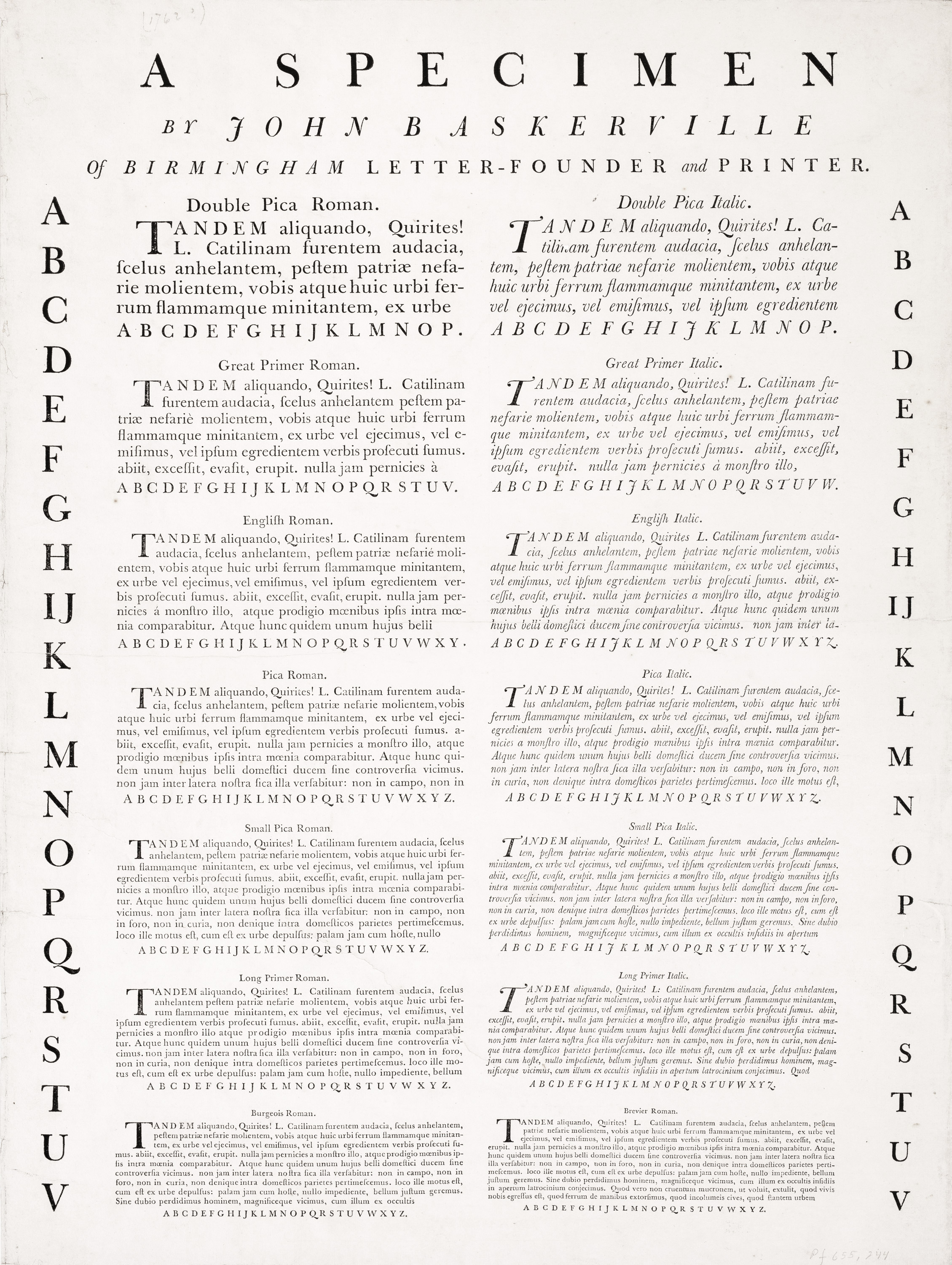
270. Baskerville’s Broadside Specimen (without border), Birmingham, c. 1762
From Providence Public Library Special Collections (scan)
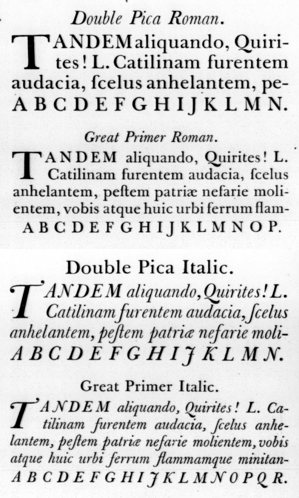
271. Types from Baskerville’s bordered Broadside Specimen, Birmingham, c. 1762
From a copy in the Library of the American Antiquarian Society, Worcester (facsimile), Internet Archive (scan)
Baskerville no doubt was eccentric, vain, and unattractive as a man; but publishers and printers were jealous of him as a printer. They abused his type, they poked fun at his smooth paper, and in spite of his artistic success, financially he found it by no means easy sailing. Franklin, who loved a practical joke, in a letter written to Baskerville in 1760, tells him that hearing a friend say that Baskerville’s types would be “the means of blinding all the Readers in the Nation owing to the thin and narrow strokes of the letters,” he produced a specimen of Caslon’s types with Caslon’s name torn from it, saying it was Baskerville’s, and asking for specific criticism. He was at once favoured with a long discourse on faults so plainly apparent in the type that before the critic had finished, he complained that his eyes were even then suffering from “Baskerville” pains!27
But Baskerville was tenacious, and persisted in printing and publishing, though his books did not pay. Several times during his latter years he tried to sell his types,—to the Imprimerie Royale (through Franklin in 1767), to the Académie des Sciences at Paris, to the Court of Russia, to Denmark, to the English Government,—without success; indeed it is doubtful if he wished to succeed. For a time he placed his establishment in the hands of his foreman, Robert Martin, but later resumed its charge, and continued to print and publish until his death in 1775. After Baskerville’s decease, his types were hawked about; some of them were sold in England, the remainder bought by Beaumarchais for his great edition of Voltaire. The chief part of his equipment, therefore, went to France. In the upheaval consequent to the Revolution of the history of his types becomes obscure. An advertisement of their sale in Paris, certainly after 1789, is reproduced from the only copy known (fig. 272).
Later, Baskervile’s fonts were used to print the Gazette Nationale, ou Le Moniteur Universel, the official journal of the French Republic during “the terrible years.” Wittingham, early in the nineteenth century, used some of them.28 And of late his fonts have turned up in certain French foundries and printing-houses.29 Baskerville’s types and matrices, which should have been preserved to English typography, through indifference were lost to it.
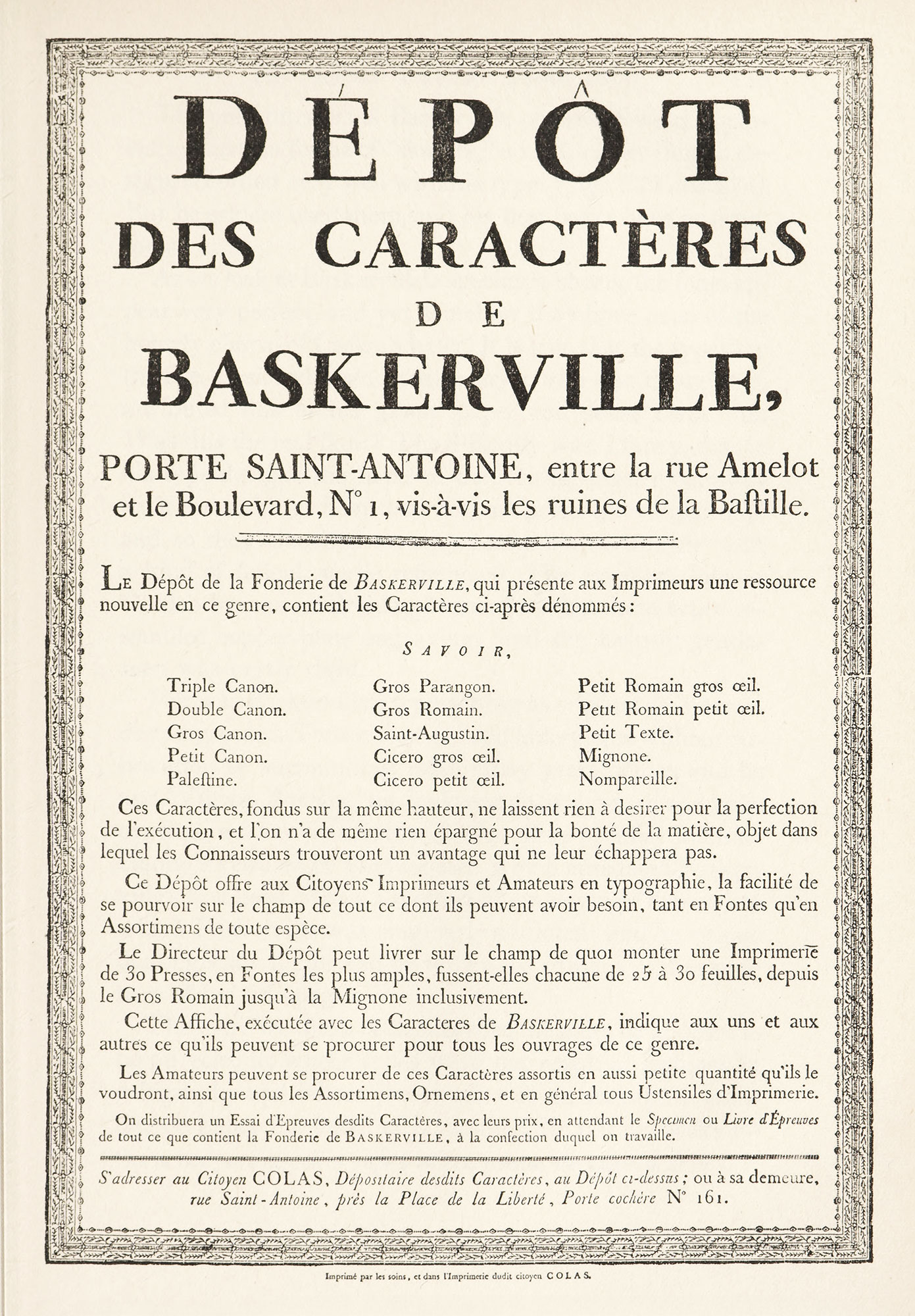
272. Advertisement of Sales of Baskerville’s Types, Paris (after 1789)
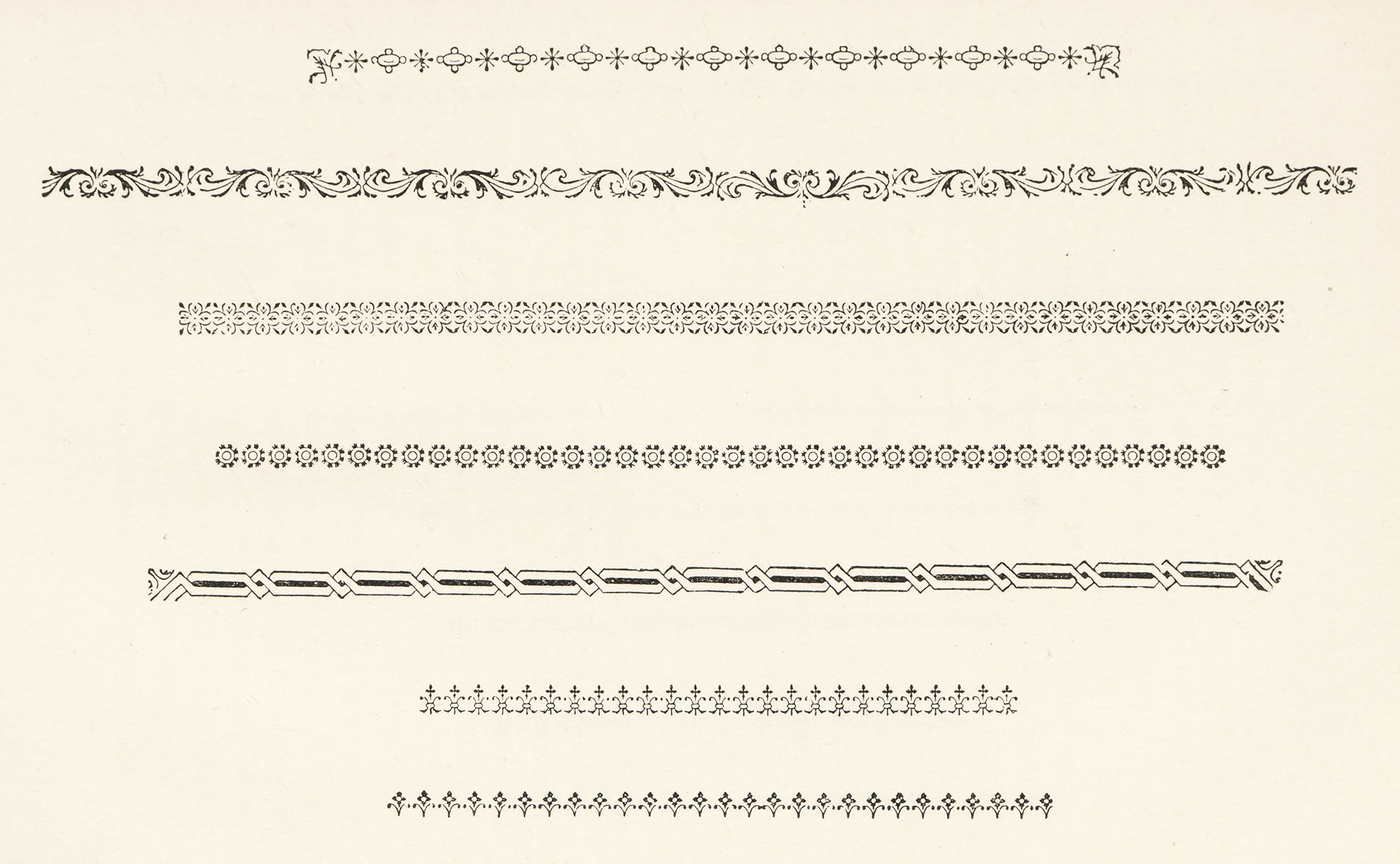
273. Ornaments used by Baskerville
From Straus and Dent’s John Baskerville
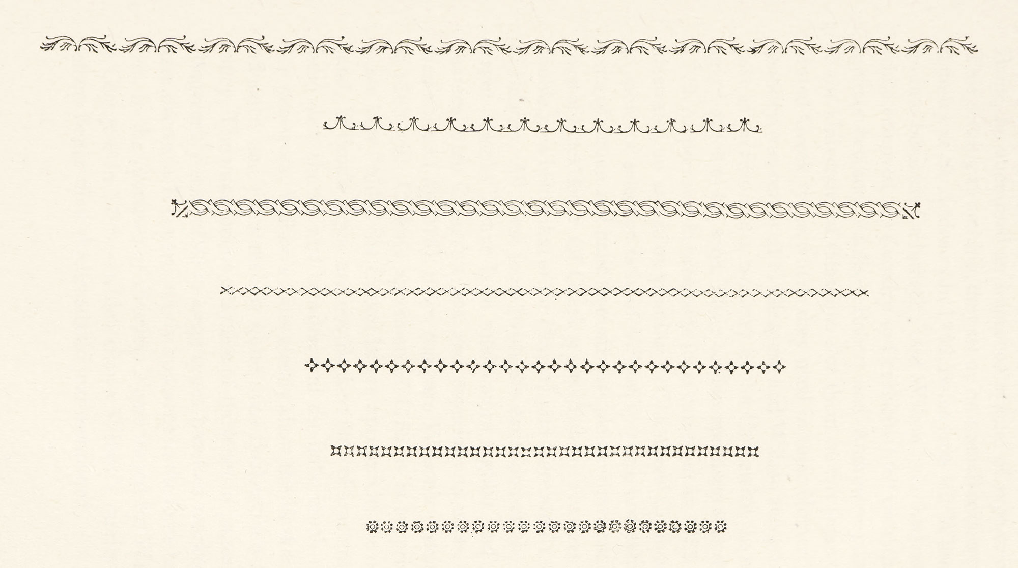
274. Ornaments used by Baskerville
From Straus and Dent’s John Baskerville
As we look at Baskerville’s specimen-sheets, the fonts appear very perfect, and yet somehow they have none of the homely charm of Caslon’s character. It is true that the types try the eye. Baskerville’s contemporaries, who also thought so, attributed this to his glossy paper and dense black ink. Was this the real fault? The difficulty was, I fancy, that in his type-designs the hand of the writing-master betrayed itself, in making them too even, too perfect, too “genteel,” and so they charmed too apparently and artfully—with a kind of financial, sterile refinement. The excellent Johann Gottlob Immanuael Breitkopf remarked that these types resembled copper-plate engraving; and the Leipsic gentleman was partly right.
Nor was Baskerville’s type-setting as original as is nowadays supposed. Tonson had printed title-pages without rubrication or surrounding rules many years before, and he and William Bowyer,30 too, had used spaced roman and italic capitals in what we consider Baskerville’s peculiar manner. Hanmer’s edition of Shakespeare [vols. 1, 2, 3, 4, 5, 6], which antedated Baskerville’s first book, shows a method of employing “flowers” to which Baskerville was singularly addicted; and he was no doubt greatly influenced by the Foulis editions in the openness of his title-pages.
The more we think of Baskerville, the more he appears to be an eclectic, whose types were the result of fashions in calligraphy and whose presswork was an attempt to emulate on paper the finish of japanning. He put his books together ingeniously; but they were in the nature of a pastiche, and not a simple, healthy growth—or so it seems to me. Thus his editions, however ambitious, are not quite the “real thing.” If in most English printing of Baskerville’s day, the presswork had not been strong and masculine, and much of the paper so rough in texture, perhaps the note of delicacy in his work would not have given it the reputation it enjoyed. Nevertheless, Baskerville was a great printer, because he had something individual to say—even though he perhaps “quoted” his more ornamental phrases—and he had the courage to say it, and say it persistently, and so he made himself heard. He was not among the world’s greatest printers, because what he had to say was not in itself great. When we look at his books we think of Baskerville; while to look at the works of Jenson is to think but of its beauty, and almost forget that it was made with hands!
IV. Wilson, Fry, Martin, and Other Founders
There is no denying that Baskerville had great influence on English type-forms. To know how much he had, look at the specimen-sheets of Wilson of Glasgow, of Moore and the Frys of Bristol and London, and indeed of the later Caslons, and see how his types were imitated. Types somewhat like these Baskerville types still exist, a letter transitional between the early Caslon fonts and those of the later period of Wilson; and some of them are better than Baskerville’s and more useful for modern work than the more irregular types of Caslon.
Wilson and Fry are important names in English type-founding. Alexander Wilson, a Scotchman, born in 1714, was educated as a physician. A chance to visit a type-foundry interested him so much that, with a friend named Baine, he attempted an improved system of type-casting. This coming to nothing, they set up a small scale type-foundry at St. Andrews in 1742. Baine later left Wilson to go into business for himself; and Wilson (who had meanwhile removed his foundry to Camlachie) fell in with the famous brothers Foulis—Robert and Andrew—printers to the University of Glasgow. For them he cut some celebrated Greek types which they used in their Homer. The foundry was removed to Glasgow, and Wilson accepting a post as professor of astronomy in the University, its management fell to his sons. Their earliest specimen was dated 1772. A specimen in broadside form came out in 1783 and illustrated an article on printing Chambers’ Cyclopædia. It shows a selection only of Wilson’s types, but exhibits fonts of roman and italic from six-line pica to pearl, and five sizes of black-letter. Of Greek types there are five sizes (the double pica being that of the Homer), and there are six sizes of Hebrew. All these fonts (with the exception of the two larger “blacks”) have been made more regular and mechanical than Caslon’s types, and, especially in mass, lack their colour (fig. 275). If we compare Wilson’s specimen of 1783 with Caslon’s specimen of 1763, it is surprising to see how “rude” the Caslon letters appear. On the other hand, Wilson’s types are not Baskerville’s characters, for these were shorter and broader, and the italic much more like pen-work. Wilson’s fonts clearly show the Baskerville influence, and yet somehow quite miss Baskerville’s brilliancy. The monotonous grayness of the letter in pages, not disagreeably noticeable in large types, becomes marked as sizes decrease. It is particularly apparent in the fonts below pica, in the Specimen of Printing Types issued by Wilson at Glasgow in 1786—which shows Wilson’s merits and defects better than the broadside just mentioned.
275. Portion of Wilson’s Broadside Specimen, Glasgow, 1783
From A Specimen of Printing Types (scan)
Wilson’s types, as I have said, were almost entirely used by the brothers Foulis. Their smaller formats were cheaper, more popular, and better known than their folios, and in them they popularized invertebrate sorts of fonts which were lifeless and dull in effect; and the reputation which they had made through the types of the folios cloaked the sins of the 12mos! Printers who did not use these types printed books that had the same faults—volumes like Dr. Charles Burney’s History of Music, in four quarto volumes (London, 1776–79), or the first edition of White’s Natural History of Selborne, printed by Bensley in 1789 in quarto; and other similarly “drab” performances. For some reason or other such books were often printed on a bluish-white paper, in an ink brown, rather than black. I fear we must count Foulis and Wilson as poor influences on contemporary English printing.
The owners of the Fry type-foundry at Bristol were intelligent, painstaking men, and its output stood very high in its day. Joseph Fry and William Pine, a Bristol printer, started the establishment in 1764, under the style of Fry & Pine. Fry—a typographic Vicar of Bray—was much influenced by other people’s work; and at first, under the direction of Isaac Moore, a type-founder who was made partner, this foundry produced letters modelled on Baskerville’s. The very rare specimen-sheet of Isaac Moore & Co., Bristol, shows their output in 1766 (fig. 276). But there was a prejudice against Baskerville’s types, and, Moore having retired about 1776, the firm—J. Fry & Co.—put aside their imitations of Baskerville and spent some years imitating Caslon. They were able but bare-faced copyists, and openly announced in the advertisement to their specimen of 1785 that they had cut types “which will mix with and be totally unknown from the most approved Founts made by the late ingenious artist, William Caslon”—which vexed the Caslons exceedingly. How much it vexed them may be seen in the Address to the Public prefixed to the Caslon specimen of 1785:
The acknowledged Excellence of this Foundry with its rapid Success, as well as its unexampled Productions, having gained universal Encomiums, on its ingenious Improver and Perfecter, (whose uncommon Genius transferred to the Letter-Foundry Business from Holland to England, which, for above Sixty Years, has received, for its Beauty and Symmetry, the unbounded Praises of the Literati, and the liberal Encouragement of all the Master-printers and Booksellers, not only of this Country, but of all Europe and America,) has excited the Jealousy of the Envious, and the Desires of the Enterprising, to become Partakers of the Reward due to the Descendants of the Improver of this most useful and important Art. They endeavour by every Method to withdraw, from this Foundry, that at which they silently acknowledge is its indisputable Right: Which is conspicuous by their very Address to the Public, wherein they promise (in Order to induce Attention and Encouragement) that they will use their utmost endeavours to imitate the Productions of this Foundry: Which Assertion, on Inspection, will be found to be impracticable, as the Imperfections cannot correspond in Size. The Proprietor of this Foundry, ever desirous of retaining the decisive Superiority in his Favour, and full of the sincerest Gratitude for the distinguished Honour, by every Work of Reputation being printed from the elegant Types of the Chiswell-street Manufactory, hope, by every Improvement, to retain and merit a Continuance of their established Approbation, which, in all Quarters of the Globe, had given it so acknowledged in Ascendency over that of his Opponents.
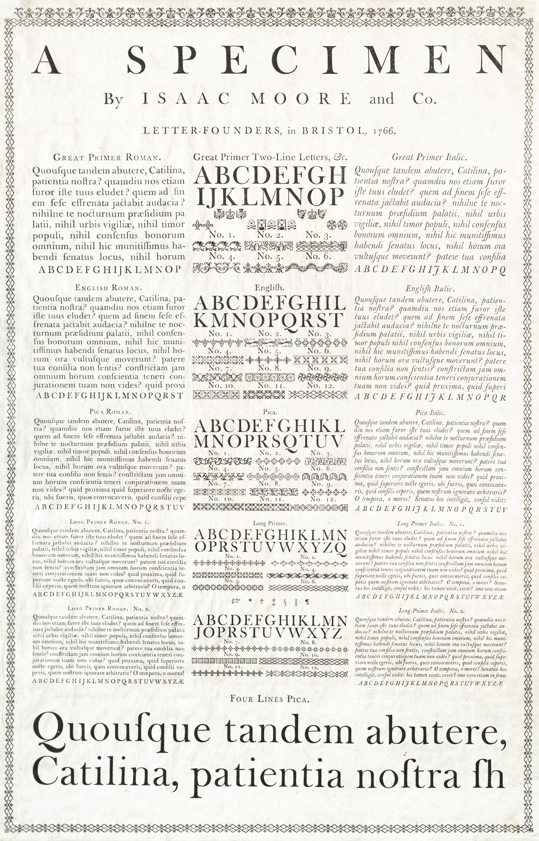
276. Broadside Specimen of Isaac Moore and Co., Bristol, 1766
From Providence Public Library Special Collections (archived scan)
A Specimen of Printing Types, by Edmund Fry and Co., Letter-Founders to the Prince of Wales, appeared in 1787, and was reprinted in Stower’s abridged edition of Smith’s Printer’s Grammar, which was issued in that year. This shows the Fry’s imitations of Caslon’s types, and Stower’s note introductory to the specimen says:
The plan on which they first sat out, was an improvement of the types of the late Mr. Baskerville of Birmingham, eminent for this ingenuity in this line, as also for his curious Printing, many proofs of which are extant, and much admired: But the shape of Mr. Caslon’s Type has since been copied by them with such accuracy as to not be distinguished from those of that celebrated founder. (!)
Some of the Fry’s type certainly closely resembled Caslon’s; but in the main, their types were more open and finished than even Wilson’s—or at least became so. As might be expected from so “learned” a foundry—for the proprietors were learned—they had a large selection of Hebrew types and some interesting forms of Persian, Arabic, Ethiopic, etc., the result of judicious purchases at the sale of the James foundry in 1782—in which year Edmund and Henry Fry were admitted to the business. The “flowers” in this book are of a rather lighter character than those in Caslon’s specimens—lightened to harmonize with the type.
In 1787, Joseph Fry retired. He left the business in the hands of his sons. Edmund fry, a scholarly man, was the author of Pantographia, a book on which he spent some sixteen years of research. It shows more than two hundred alphabets—thirty-nine of Greek alone. In 1794, Dr. Fry took Isaac Steele into partnership. Their specimen of 179531 shows that, in view of the prevailing fashions, types of the Baskerville style were again resuscitated (figs. 277 and 278). A comparison between the broadside specimen of 1785, the specimen-book of 1787, and that of 1795, shows these puzzling see-saws of taste, with the last of which, undoubtedly, Didot and Bodoni abroad, and Bulmer and Martin at home, had something to do. Fry’s Type Street Letter Foundry, as it was called, was ultimately acquired by the proprietors of the Fann Street Foundry, represented in our own day by Stephenson, Blake & Company.
277. Roman and Italic: Fry and Steel’s Specimen, London, 1795
From A Specimen of Printing Types (scan)
278. Ornaments: Fry and Steel’s Specimen, London, 1795
From A Specimen of Printing Types (scan)
279. Transitional Types: Caslon Specimen, London, 1798
From A Specimen of Printing Types (scan)
280. Ornaments: Caslon Specimen, London, 1798
From A Specimen of Printing Types (scan)
Joseph Jackson (1733–1792), who has been mentioned as apprentice to the first Caslon, and who was, later, a rival of William Caslon II, is chiefly remembered for his clever cutting of “peculiar” fonts—such as the “Domesday” character, and his Greek types copying the letter of the Alexandrian Codex. This last character, reproducing an earlier, like font, was magnificently employed by John Nichols in his great folio edition of Woide’s Novum Testamentum Græcum, based on the Codex Alexandrinus, printed in 1786 at the expense of the Trustees of the British Museum. Jackson’s roman letter, which more concerns us, was that of a style that also took a middle course between the old-fashioned Caslon and the more modern Baskerville letter—somewhat like the earlier Wilson fonts. Macklin’s Bible, printed by Bensley in seven ponderous folio volumes, is the best example of a book printed from these new double English roman types. When the Bible was printed as far as Numbers, Jackson died, and his foundry was bought by William Caslon III, with whom Bensley refused to have dealings. So Vincent Figgins I cut a similar font in which the Bible was completed. He was disappointed in succeeding to Jackson’s foundry by Caslon’s purchase of it, and he set up a foundry of his own, which for the period, was one of the best. Figgins’ Bible type was used for Bensley’s fine edition of Thomson’s Seasons, of 1797—a fact recorded on the title-page thereto. He was also responsible for some other fonts, which had a good deal of popularity, and may be described as a sort of modified old style, although not the “modified old style” now in use. His first specimen-book—issued in 1792 1793—was printed for him by Bensley. Figgins’ Greek types cut for the University Press, Oxford, a Persian type for Ouseley the Orientalist, an English Télegú font for the East India Company, and various fonts of Domesday characters attest his talents and reputation. Vincent Figgins I died in 1844.
A founder eminent in the late eighteenth century was Thomas Cottrell, another of Caslon’s old apprentices, whose foundry attained unfortunate prominence in the hands of Robert Thorne, who bought it in 1794; but whose “bold-faced” changes (in more senses than one) in its product were reserved for the early years of the nineteenth century.
To understand the causes of the revival of English printing which marked the last years of the century, we must remember that by 1775 Baskerville was dead; that Andrew Foulis died in the same year, and Rober tin 1776. There seems to have been a temporary lull in English fine printing and the kind of type-founding that contributed to it. The wood-engraving of Thomas Bewick, produced about 1780, called, nevertheless, for more brilliant and delicate letter-press than either Calson’s or Wilson’s type could supply. If Baskerville’s fonts had been available, no doubt they would have served; but some were scattered among English printers and the greater part were in France. So the next experiments in typography were made by a little coterie composed of the Boydells, the Nicols, the Bewicks (Thomas and John), and Bulmer. While the Foulis and Wilson influence had helped a taste for lighter effects in type, this new group sought brilliant effects for their printing. It was natural, therefore, to turn to a type-cutter who worked in the “tradition” of Baskerville.
Such a one was William Martin, who learned his trade, apparently, at Baskerville’s foundry. He was brother to Robert Martin, who was for a long time in Baskerville’s employ. About 1786, he came to London as a punch-cutter to George Nicol (bookseller to George III), the originator of the plan for the “Boydell Shakspeare.” [vols. 1, 2, 3, 4, 5, 6, 7, 8, 9] He was employed by Nicol “to cut sets of types after approved models in imitation of the sharp and fine letter used by the French and Italian printers”—by whom Didot and Bodoni were, I suppose, meant. Now this is just what Martin did—more Anglicé. And when the Shakspeare Press was set up with Bulmer in command, Martin was master of a sort of “private foundry” in connection therewith. His types were used in the “Boydell Shakspeare,” the first part of which appeared in 1791, in the Milton of 1794–97, and in Poems by Goldsmith and Parnell of 1795. These books will be discussed later. Martin’s types, both roman and italic, were cut to imitate Baskerville’s, but with certain fortunate individualities. A more “modern” quality had crept into these fonts, but they were very splendid of their kind.
It has been the fashion to disparage the types of this post-Baskerville movement; but when an authority says that “the revival or re-invention of wood engraving by Bewick about 1780 had no good effect on printing, the new illustrations being too delicate to print well with type,” is this entirely fair? It is not true of books like the Goldsmith and Parnell, illustrated by the Bewicks and printed from Martin’s types. These new illustrations did print well with type, though with type some persons dislike. Whether or not we wholly approve of such types or books, the presswork is often splendid, the types are fine of their kind, the books reflect the taste of their day, and the performance as a whole “hangs together.”
William Martin cut some Greek and Oriental fonts, but he will be best remembered by his wonderful roman and italic—fonts skilfully employed by McCreery in his poem The Press (1803)—and the splendid form of modern face letter used by Bulmer in Dibdin’s bibliographical works. Martin died in the summer of 1815. I am glad to place this sprig of rosemary to the memory of a master of his art, whose work closes a chapter in English letter-founding.33
V. Examples of English Printing
English books between 1500 and 1800 are important to us as the sources from which most of our present-day styles in printing are derived. The sixteenth century is an archaic period typographically in England, and its interest is mainly historical. While in the seventeenth century English books are less archaic, its traditions have but little effect on our printing to-day. But eighteenth century work, especially after the advent of Caslon, has a close connection with nineteenth and twentieth century printing; and the influence of its somewhat dubious taste is shown, in recent years, in American books and especially in ephemeral typography. The books used to illustrate the progression of English type-forms during these three centuries are chosen from the rank and file of volumes of their respective periods—although among them there are some remarkable specimens of book-making.
§1. XVI Century
William Horman’s Vulgaria—a book of common English phrases with their Latin equivalents—was printed by Pynson at London in 1519. The border on its title-page is an adaption of a familiar Italian design. The title within it is set wholly in roman type. The prefatory matter employs the same roman fonts, and the body of the book is set in two sizes of roman. Divisions of subject begin with woodcut initials, or spaces for painted initials. The book is an early example of a volume printed throughout in roman fonts; and in appearance is rather more like Continental work than current English printing (fig. 255).
A second sixteenth century book is Gower’s Confessio Amantis, printed by Berthelet in 1532. The text is set chiefly in two sizes of black-letter midway between batarde and lettre de forme, but the preface employs a purely English lettre de forme. Latin quotations are set in roman—a beautiful font—and running-titles in roman capitals. This mixture of roman and black-letter types is a sign of decadence, and prefigured a period when the rôle of the two types would be reversed, and black-letter would be used for “displayed” lines and such-like. Berthelet was a Frenchman, and this book has a certain workmanlike quality, and indeed elegance, which is somewhat French, and its title-page is ornamented after a design by Tory. The Gower, and books by Sir Thomas Elyot, are considered among Berthelet’s best productions (fig. 281).
281. Types used on Gower’s Confessio Amantis: Berthelet, London, 1532
From a copy in Harvard College Library (facsimile), Google Books (scan)
The year 1532 is also the date of the first collected edition of Chaucer’s Works,34 printed by Thomas Godfrey of London. The text is composed in a French lettre batarde, but an English lettre de forme is used as an ornamental letter, for display on the very handsome bordered title-page, and elsewhere. The Preface is also set in it—and a line of roman letter is used at least once (fig. 282). Ten years later (1542), a second edition appeared, printed by Pynson, also set in black-letter, but entirely of the English variety—a rather solid lettre de forme—a consistently Gothic book and purely English in type-forms and in taste. The poems in both these editions are set in double column (fig. 283).
282. Lettre Batarde used in first complete edition of Chaucer: Godfrey, London, 1532
From a facsimile edition in the Boston Public Library, The Works of Geoffrey Chaucer and Others (scan of 1905 facsimile)
283. Lettre de Forme used in second complete edition of Chaucer: Pynson, London, 1542
From a copy in Harvard College Library (facsimile), The Workes of Geffray Chaucer (scan)
The Cosmographicall Glasse, by William Cunningham, a Norwich physician, was printed by John Day in 1559, and has been called
a real landmark in English book-production. In addition to its fine types, this book is noted for its woodcut diagrams and pictorial capitals, ornamental title-page, large map of Norwich and…a strong and vigorous portrait of the author.35
As a piece of printing, nothing better had hitherto appeared in England. It shows the influence of foreign typography (fig. 284). Day’s device, which appears at the end of the volume, should be noted.
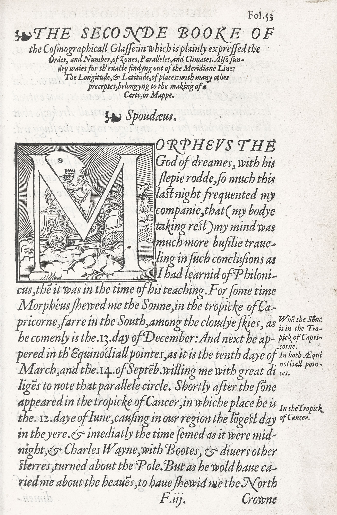
284. Page of Cunningham’s Cosmographicall Glasse: Day, London, 1559
From a copy in the John Carter Brown Library, Providence (facsimile), Library of Congress (scan)
In 1570, John Day printed in folio the Elements of Geometrie of the Most Auncient Philosopher Euclide of Megara, composed in roman and italic fonts. The title is set in small panels within a woodcut border, and is followed by the translator’s address, set in Day’s imposing italic. Then comes a mathematical “Praeface,” set in two sizes of a fairly handsome and evenly cut roman type of early design, and the folding-table or “ground-plat” accompanying it may be studied as a specimen of the various fonts in Day’s office. In the body of the book the “propositions” are arranged in large italic letter, and “demonstrations” in a smaller size of it. Both are good, free, lively, old style italic fonts. The old style roman letter used with them is like that of the Preface. Diagrams are placed within the area of the text pages, but arranged without much sense of style. Beginning with the seventh Book, the type employed is reduced in size, and from this point the work is less interesting. Though some of Day’s types are exceedingly find, and the general effect of the volume is imposing, the presswork is wretchedly uneven, the paper too thin, and when closely examined it is not a really successful piece of work. It lacks the taste and lucidity shown in French books of like nature.
Another book of Day’s, showing his use of black-letter, is the 1571 edition of Roger Ascham’s Scholemaster. Here the title-page is set chiefly in italic type, the Dedicatory Epistle in italic, and the Preface in roman—both rather roughly executed fonts and by no means well printed. Though the text of the book is black-letter, all tabulated matter is set in italic, English poetry in roman, Latin verse in italic, roman is used for proper names, and here and there a very good Greek font is introduced (fig. 285). In short black-letter is being invaded on every hand. The book shows care in execution, and is attractive in spite of its hodge-podge of types.
285. Page of Ascham’s Scholemaster, showing Roman, Italic, and Black-letter: Day, London, 1571
From a copy in Harvard College Library (facsimile), Centre for Renaissance and Reformation Studies (scan)
Thomas Walsingham’s Historia Brevis (covering reigns from Edward I to Henry V) was printed at London by Henry Bynneman. The woodcut border on the carefully arranged title-page is extraordinarily well engraved and beautifully printed. The text is set throughout in roman and italic type. The Preface, which begins with a very elegant woodcut initial, is composed in Day’s noble italic letter. The Chronicle is printed in a small but excellent roman character, very even in cut, and reminiscent of early Continental fonts. Each “reign” begins with a large initial, cut on wood, and lines at the ends of sections are tapered, or arranged in an ornamental fashion recalling Italian printing—indeed, the composition is more like Continental than current English work. It is far ahead of most English books of its time in simplicity of arrangement and excellence of workmanship. Bynneman printed the Historia at Archbishop Parker’s expense in 1574, and it was bound up and published with Walsingham’s Ypodigma Neustriæ and the Ælfredi Regis Res Gestæ, both printed by Day in the same year.
North’s translation of Plutarch’s Lives, printed by Vautrollier in 1579, enjoys the reputation of being one of the finest books issued in Elizabeth’s reign, and for that reason I advise its examination by the student, though it is by no means a beautiful book, judged by present standards.
Our last sixteenth century example is Adam Islip’s folio Chaucer, printed at London in 1598. Its prefatory matter is set in roman and italic, with some black-letter intermingled—and in the large sizes the first two types are respectable fonts. The text, however, is set in black-letter in double-column—roman and italic being employed only for lines to be displayed. In other words, the printer had come to use roman and italic types just as we should now use black-letter—as an “occasional” type for display or ornament. The unity of effect seen in the editions of Chaucer of 1532 and 1542 has disappeared; and black-letter type (which survived for poetry and romances into the next century, for Bibles and prayer books until the end of the seventeenth century,36 and which was still used for legal books in the eighteenth century) is giving way to roman letters. This edition is interesting only for that reason.
The end of the sixteenth and the beginning of the seventeenth century was signalized by the appearance of Shakespeare’s Plays, both separately in quarto and collectively in folio. The first quarto was Venus and Adonis, printed in 1593. The first folio appeared in 1623. The quartos, now the most valuable, but then sold for about six-pence, were printed from rough roman types, with rather heavy title-pages, in which capitals and lower-case letters were used for titles quite indiscriminately. The folios were printed in double column, with the text in roman and the names of the characters in italic; and although the prefatory matter was set in handsome type, the body of the work had from a printer’s standpoint no particular typographical interest. The quartos had no more beauty than one would expect in a cheap edition of a popular play. They are mentioned here solely because of their place in literature; and they have a literature of their own. The first edition of Shakespeare in which much typographical excellence was attempted, was printed at the University Press, Oxford, in the eighteenth century.37
§2. XVII Century
Seventeenth century English books, save legal works, some Bibles and prayer books, and survivals of “vernacular” black-letter in romances and poetry, were almost entirely printed from roman and italic fonts; yet they have an archaic appearance, due in part to crude types, but even more to antique spelling. Title-pages were sometimes decorated with engravings on metal, sometimes with impressions from wood-blocks, and more often merely surrounded with double rules or panels of type ornament.
Our first seventeenth century example is Philemon Holland’s translation of Pliny’s Natural History, printed in two folio volumes, by Adam Islip, in 1601. It is set throughout in roman and italic types of even (and early) cut. The first two or three lines of its title-page are, I think, printed from wood-blocks. The subject of each chapter is displayed in handsome italic, and the chapter itself usually begins with a three-line initial, except when a chapter contains but two lines! Head-lines to pages are set in large old style lower-case roman letters; proems—or Arguments—in italic; marginal notes in tiny roman and italic types. Woodcut head-bands and lines of type “flowers” are employed for ornament. It is a handsome book of its time, though ponderous; and readable to-day—if to-day one wants to read Pliny—or folios!
For a contemporaneous book of poetry (1600), look at Fairfax’s translation of Tasso’s Godfrey of Bulloigne or the Recoverie of Jerusalem, printed in folio by Arnold Hatfield for J. Jaggard and M. Lownes. A simple and well-managed title-page in a generous panel of type-ornament opens the book. Some good italic is employed in the preliminary Address. The poem itself is set in an agreeable old style roman font, very even in design, with Arguments in a lively italic. Each Book begins with a head-band of type-ornament. It is a very readable edition, and good to look at for its clarity of effect and its more modern air (fig. 286).
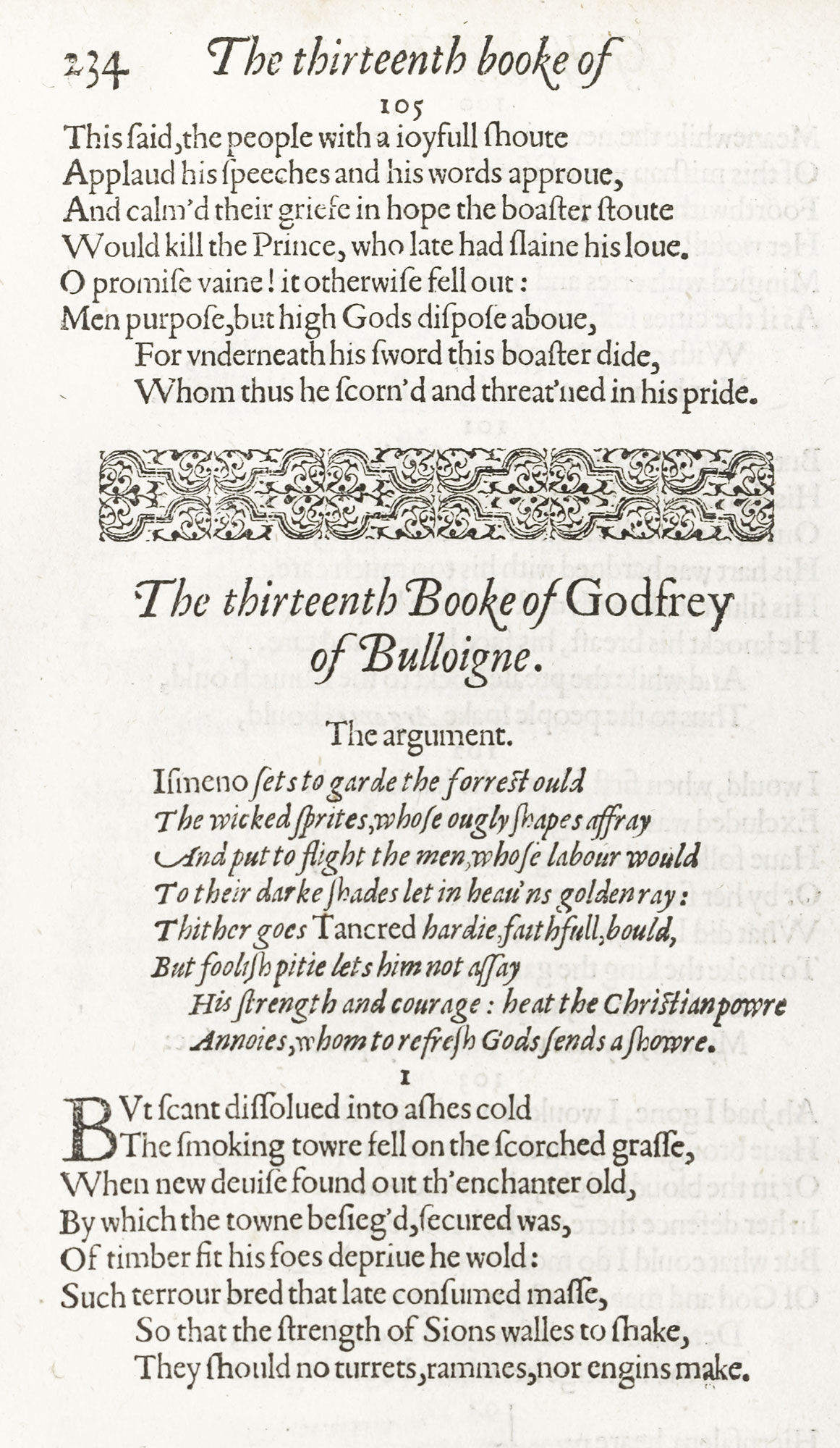
286. Type and Ornaments in Tasso’s Godfrey of Bulloigne: Hatfield, London, 1600
From a copy in the Boston Public Library (facsimile), Internet Archive (scan)
Recreations with the Muses, by William Alexander, Earl of Stirling, brought out at London in 1637 by Thomas Harper, a printer of reputation, is a small folio composed chiefly in a rough roman character. The head-lines are set in a coarse italic, between light rules, which also carry the folio. A handsome border to the title-page, some ungainly initials, and head-bands usually made up of “flowers” are its principal decoration. The type is rough, the presswork is rough, the paper harsh, and the whole book gives the effect of belonging to an ancient period. But no black-letter is used in it.
The first edition of Thomas Fuller’s Holy and Profane State, in folio, was very well printed at Cambridge by Roger Daniel in 1642. An engraved title is followed by a title-page, set in type, very well composed, surrounded by the border of “flowers” within rules. An Address to the Reader follows in a large roman type of considerable distinction and delicacy of cut. The Index to Chapters employs a brilliant italic—very credible for an English book of the time. The arabic figures used are remarkably good in design. The book proper begins with a woodcut head-piece, with the title beneath it in a thin lower-case letter of rather French appearance. The body of the work is arranged in a handsome roman letter, with sentences which begin each new paragraph like a text, in italic. Each page is surrounded by rules, the side-notes being in marginal panels. The type and presswork are vastly clearer in most English books then current.
Walton’s great London Polyglot in six folio volumes, published between 1653 and 1657, does not come within the scope of our discussion. It is not the most beautiful of the Polyglots nor a normal example of book-making, for its remarkable feature is its employment of “learned” types; though some of Day’s fonts are utilized for the prefatory matter in the copies with the “Royal” dedication. Yet it is none the less to be examined as the greatest typographical achievement of the century, printed from types entirely cut by English hands. Its printer was Thomas Roycroft, whose fine editions of the classics,—Virgil, Homer, Æsop, etc.,—translated by John Ogilby, may be consulted for examples of his work. He was appointed Printer in Oriental Languages by Charles II. Roycroft died in 1677, and is buried at St. Bartholomew’s the Great, Smithfield. The name of this great scholar-printer has in our day become familiar in connection with a commercial venture of dubious typographical value.
A famous seventeenth century volume—Izaak Walton’s Lives [vols. 1, 2, 3, 4]—was printed by Newcomb in 1670. In this, head-lines are set in lettre de forme, the text of a rough old style roman type—perhaps Dutch. Where correspondence is introduced, it is printed in italic. Each Life has its own title-page, in which the use of very large spaced capitals for unimportant words is a characteristic touch. In spite of its antiquated appearance, it is a readable volume with a certain agreeable flavour (fig. 287).
287. Page of Walton’s Lives: Newcomb, London, 1670
From a copy in Havard College Library (facsimile), The Lives of Dr John Donne, Sir Henry Wotton, Mr. Richard Hooker, Mr. George Herbert (scan)
Other seventeenth century books of interest are Chiswell’s 1686 edition of Sir Thomas Browne’s Works and the folio edition of Shelton’s translation of Don Quixote, printed in 1675.
Tonson’s folio edition of Dryden’s translation of the works of Virgil was printed in 1697, and we may close the century with this noble book. The title-page in red and black is set chiefly in enormous capital letters, used without much sense of value—“Works,” for instance, being much larger than “Virgil.” This title-page is surrounded with double rules, and the field of this page is again set off into compartments by single rules—a favourite arrangement in the seventeenth and early eighteenth centuries. An odd feature is a list of subscribers to the illustrations—engravings on copper described on the title-pages as “Sculptures,” which cost the donor five guineas each. The actual book begins with the Ecologues. The poetry is set in roman type heavily leaded, and the names of speakers in spaced italic capitals. Arguments are set in the inevitable italic, with proper names in roman. The narrow measure of the type-pages and the enormous margins give an air of great luxury. We begin to see a modern book here.
§3. XVIII Century
The folio edition of Clarendon’s History of the Rebellion, printed in 1702–4, at the Theatre,38 Oxford, in three volumes, is one of the find eighteenth century books from the Oxford Press. The prefaces to each volume employ a large “Fell” italic, very splendid in effect; the History itself being composed in a large roman letter solidly set, perhaps of Dutch cut, or one of the Fell types.
Each division of the History has a displayed half-title; and every new Book is ornamented with an engraved head-piece and initial, and ends with a tail-piece—imposing pieces of decoration. Though the presswork is uneven, the edition is both sumptuous and simple—a combination difficult to effect.
“I know it will be said, what has a woman to do with learning,” wrote Elizabeth Elstob, mistriss of eight languages, in the preface of her translation of An English-Saxon Homily on the Birth-day of Saint Gregory. This particular lady had a good deal to do with it, and she is interesting typographically because her book, printed by the elder William Bowyer in 1709, employed some Anglo-Saxon types—in their day remarkable. The Homily is a good example of a well-made edition, issued by a careful publisher for a distinguished company of subscribers. A crowded and rather seventeenth century title-page is followed by an Address to the Queen composed in a large old style roman letter. The principle in this and other dedications, typographically, was that the larger the type, the greater the patron; and the smaller the name of the writer, the more grovelling was his abasement. The Homily—the two initial letters to which show Saint Gregory and the learned Elizabeth—is set in double column, the original text on the left hand in Saxon types, and on the right hand the English translation in roman types. Notes run the full measure of the page, set in small roman letter with proper names in italic; for in almost all books of this period, proper names were picked out in italic if the text was in roman, in roman if the text was in italic. A Latin version, an appendix, notes, etc., close a good-looking volume. Its feature—from a printer’s standpoint—is that the columns of Saxon and roman vary in width, so that each version ends a page approximately at the same word (fig. 288). This required, for every page, exact calculation in order to know what measure for each version would accomplish it. It is done so well, that it often appears not to have been done at all!39
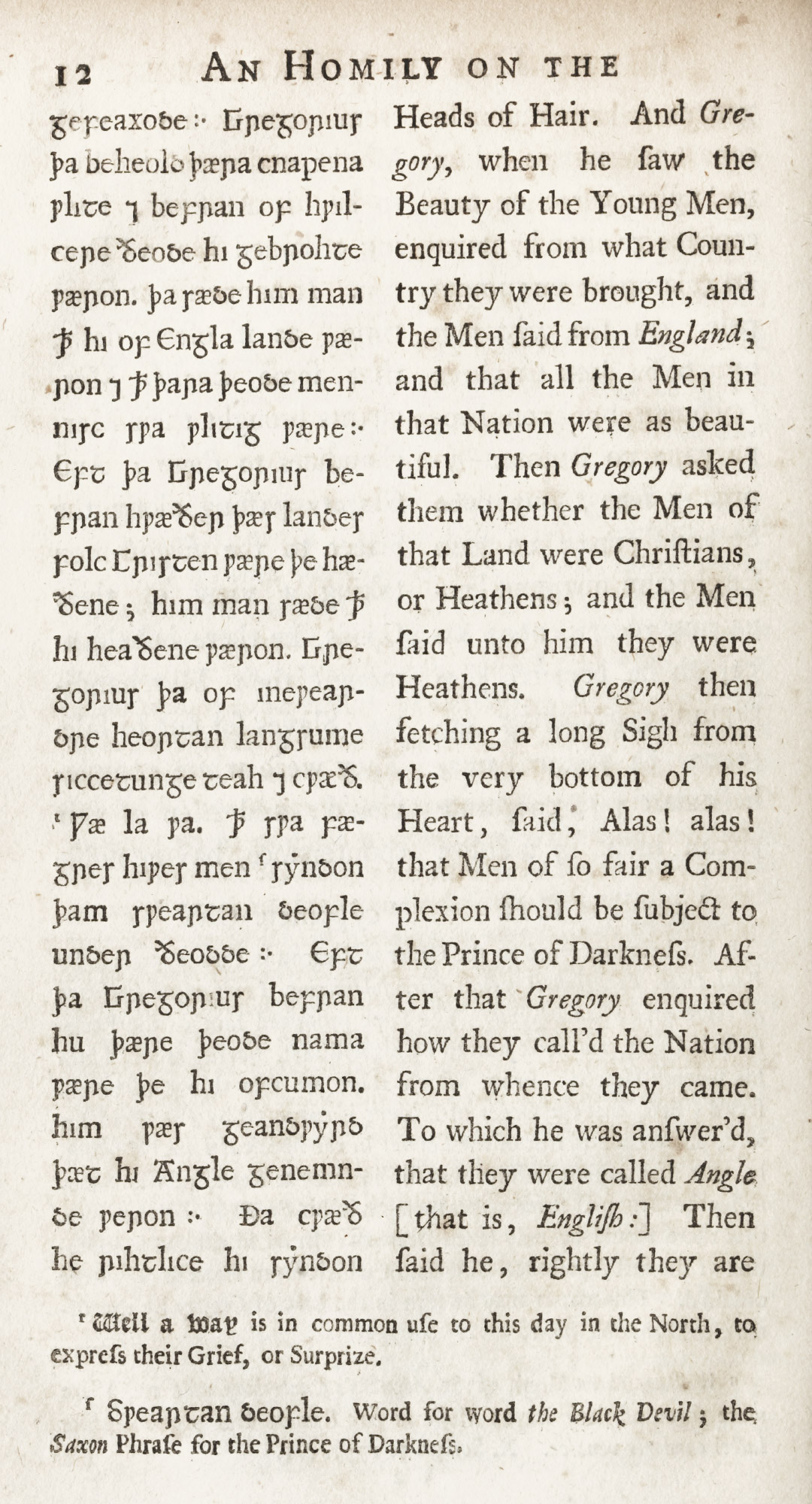
288. Page of English-Saxon Homily: Bowyer, London, 1709
From Internet Archive (scan)
One of the fine folios of the early eighteenth century, published at London by Jacob Tonson in 1712, is a Latin edition of the works of Caesar—C. Julii Cæsaris quæ extant—annotated by Samuel Clarke. The title-page with its spaced capitals, especially the lines of spaced italic capitals,40 and the absence of rubrication and surrounding rules, somewhat prefigures Baskerville’s title-pages. After the preliminary matter, the Commentaries begin, set in fine great primer old style types very generously leaded, notes being set mostly in small italic in the ample margins (fig. 289). It is illustrated with full-page copper-plates, and the magnificent head-pieces, tail-pieces, and initial letters are also engraved. Among other luxuriously printed editions with Tonson imprint were Ovid’s Metamorphoses, 1717, the splendid Prior’s Poems in folio of 1718, Addison’s Works, 1721, a fine quarto Don Quixote in Spanish, 1738, and a folio Pope.
289. Roman used in Latin edition of Caesar: Tonson, London, 1712
From a copy in the Newberry Library
Full-bodied editions such as the Theological Works of the Rev. Mr. Charles Leslie, published by subscription in two volumes folio, by William Bowyer the elder in 1721, show a more modern point of view in book-making—old-fashioned, but not archaic. It is printed in old style types, no doubt Dutch, and the displayed half-titles and headings are interesting pieces of eighteenth century composition. Its head and tail-pieces are splendid examples of printer’s ornaments of that epoch; and the head-bands of type “flowers” are handsome and cleverly managed. Leslie was a non-juror, and for some years Anglican chaplain to the Pretender at Rome, and his works were naturally printed by Bowyer, who was a non-juror himself. Pope’s translation of Homer’s Iliad (London, 1715), printed by Bowyer—for Linto—in three imposing folio volumes, is a good example of another luxurious contemporary edition. The Works of Alexander Pope, also printed by Bowyer (London, 1717), is another instructive piece of type-setting. It is composed throughout in old style roman and italic, of Dutch cut. Its enormously spaced half-titles, the running-titles in spaced italic capitals, and its open composition are all characteristic of early eighteenth century work.
But Bowyer’s greatest achievement was the three volume folio edition of Selden’s Opera [vols. 1, 2, 3], collected by Dr. David Wilkins, which was begun in 1722 and brought out in 1726. This was undertaken for a number of London publishers and issued by subscription. Bowyer printed the first volume in two parts, the succeeding volumes (each in two parts also) being printed by S. Palmer and T. Wood. William Caslon’s English types were first used for the body of this book. To the student who has been looking at earlier English books printed with Dutch fonts, the pages of the Seldon are a relief to the eye—they are so easily read, so clear and beautiful. In Volume I the dedication displays a large size of roman type; the Address to the Reader is composed in flowing italic; the Life of Selden in great primer roman. The various “works,” save for their prefaces, are arranged in double column, each column having a folio of its own. Here Caslon’s English roman is used, and he also cut the Hebrew types for this edition. Arabic, Greek, and black-letter also occur in the text (fig. 290). Here and there rubrication is skilfully introduced, and there is much clever type-setting throughout the entire work. The third volume contains Selden’s English tracts, and here it is interesting to compare the type set in English with its appearance in the Latin volumes. Numerous half-titles, etc., make the whole work a wonderful “style-book” for displayed matter set in old style types—though I do not think the larger types are Caslon’s. Finally, some of the beautiful tail-pieces used in the Leslie are introduced, with others still more elaborate. It is a stupendous piece of work, and shows Bowyer’s sure taste in planning the style of the volumes, and in utilizing Caslon’s skill for their type. Bowyer’s better-known son, William, “the learned printer” (whose mother was the daughter of a printer employed on Walton’s Polyglot Bible), assisted him in correcting and arranging the work. The second and third volumes were probably placed with Palmer and Wood so that all the volumes might appear in 1726.
290. First use of Caslon’s Roman Type, in Selden’s Opera: Bowyer, London, 1726
From a copy in the Boston Athenæum (facsimile), Joannis Seldeni Jurisconsulti Opera Omnia Tam Edita quam Indedita (scan)
In discussing eighteenth century English types, it must be borne in mind that law-books were still usually set in the traditional English black-letter—a survival of the lettre de forme of the Norman law-book. Titles, prefaces, running-titles, and marginal notes in such works were, however, commonly set in roman.
In 1733–37, a book appeared in London which, though not printed from type, had some influence on typography—namely, John Pine’s memorable Latin edition of Horace [vols 1, 2]. Pine, who was an engraver, could not satisfy himself with current letter-press printing. So the text was first set up in type and an impression transferred to copper and then engraved, space being left for the decoration. Thus the whole book—a very exquisite performance—was printed from copper plates. The brilliancy of this engraved roman text struck a new note, and thus Pine’s Horace may have had a good deal to do with the taste for more “finished” types which waxed as the century waned. In that connection it is mentioned here (fig. 291).
291. Engraved Text of Pine’s Horace, London, 1733–37
From a copy in Harvard College Library (facsimile), Quinti Horatii Flacci Opera (scan)
Some volumes of poems brought out by eminent publishers, and in their day considered handsome books, are good examples of later work. for instance, Poems on Several Occasions, by Mrs. Mary Barber—who, it is pleasant to know, “was one of the most extraordinary Woman that either this Age, or perhaps any other, ever produc’d,” and who succumbed to her reputation by dying at the age of twenty-seven! This luxuriously got up quarto has an introduction by Dean Swift,—who, it is said, lost Queen Anne’s favour through the peremptory tone of a letter demanding her patronage for the book,—and was subscribed for by no less than thirty-three dukes and duchesses, and a multitude of less titled persons. The poems are set in an ample old style roman font, widely leaded, and the proper names, or most important words, are usually displayed in capitals and small capitals, instead of italic—though important words in titles to the poems, which are set in large Dutch italic, are “picked out” in roman. The book, overloaded with rather ill-printed head and tail-pieces, is an ambitious performance and a characteristic eighteenth century “Table-book.” It was printed for the London publisher, Rivington, in 1734.
John Armstrong’s The Art of Preserving Health, printed for A. Millar in 1744, was a book meant to be smart and luxurious. In spite of a very eighteenth century title-page, with capitals so spaced as to make one feel cross-eyed, its ornamentation is restricted almost entirely to a few tail-pieces. The volume shows a certain progression, too, because proper names are set in the same letter as the text. The large type used (Caslon, apparently) is much leaded, and the margins are generous. The general effect, though still very old-fashioned, is handsome—a sort of Baskerville book set in Caslon, with “current” presswork. The ornaments used make me think it was printed by Bowyer. Franklin reprinted this volume in Philadelphia in the year of its publication.
Sir Thomas Hanmer’s edition of Shakespeare was the first in which much pains were taken to make a handsome piece of printing. Hanmer, Speaker of the House of Commons, a friend of Bishop Berkeley, and a man of considerable literary achievement, brought out he Works in a six volume edition in 1744, though his name did not appear in it. It was printed “at the Theatre at Oxford,” and was “adorned with sculptures designed and executed by the best hands.” This first edition was bought up in publication, and the price of copies greatly advanced. It produced, therefore, an effect in its day. Italic and roman “Fell” types are used for the two prefaces, but that used for the plays is a lighter old style font, composed in a somewhat modern manner (fig. 292). What strikes us about the edition now is a certain similarity in composition to some of Baskerville’s work; though it was printed thirteen years before Baskerville’s first book (the Virgil) was published. This is to be seen in the arrangement of the title-page, half-titles, etc., with their spaced capitals, the manner of using ornamental bands of “flowers,” etc. (fig. 293).
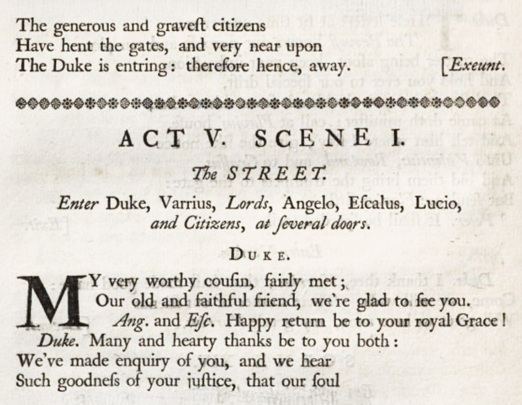
292. Type of Hanmer’s Shakespeare: University Press, Oxford, 1743–44
From a copy in Harvard College Library, Google Books (scan)
293. Bastard Title-page of Hanmer’s Shakespeare: University Press, Oxford, 1743–44
From a copy in Harvard College Library, Google Books (scan)
In 1753, a famous illustrated book appeared—Designs by Mr. R. Bentley for Six Poems by Mr. T. Gray, printed for R. Dodsley, London. It was superintended with great care, and Bentley’s charming decorations are much discussed in Horace Walpole’s letters. To pad out the book, the text is printed only on one side of a leaf: a trick considered modern, but really old. The typography is commonplace—a large Caslon character, much leaded, and not well printed. A book was still appraised, as it had been a hundred years earlier, by the number of its copper-plate illustrations.
Walpole’s press at Strawberry Hill employed old style types for its work—probably Caslon’s—and among its rather indifferent printing, the Strawberry Hill Lucan is worthy of moderate praise.
Samuel Johnson’s Dictionary of the English Language [vols. 1, 2] is mostly remembered nowadays, by the general reader, as the book Becky Sharp flung back at Miss Jemma Pinkerton—not, fortunately, in its original two volume folio form—or because of Johnson’s famous letter to Lord Chesterfield. It was printed by William Strahan in 1755, in a monotonous old style type, in size rather small for the folio double-column pages. The title-page, in its leaded lines of small spaced capitals, shows a modern tendency toward light effects. In the preface, blank lines between paragraphs also exhibit a new detail of composition, much in favour as the century went on. In the Dictionary proper, words are set in capitals, and derivations from these words in capitals and small capitals—e.g., divulge, Divulger. These pages of mild colour and easy air seem old-fashioned to us now, but not antique.
I have already said that editions of the same book printed at different dates, but in the same country, are a lesson in the history of national printing-styles; while books like the Latin classics, common to all countries, show how different nationalities treated the same problem. The same class of book can also be compared in this way: books on astronomy, geometry, botany, architecture—and dictionaries. For instance, the earliest English vocabularies or dictionaries were printed in black-letter, both word and definition. Many seventeenth, and even some eighteenth century English dictionaries printed the words defined in black-letter, with definitions in italic. In Florio’s New World of Words of 1611, italic was used for the definitions, but the words were set in roman. In the mid-eighteenth century, as in Johnson’s Dictionary, words were set in capitals or in capitals and small capitals, with definitions in roman lower-case. Later on, the words defined were almost always set in capitals, and this is continued, in such dictionaries as Webster’s or Worcester’s, to our own day. In the Century Dictionary, printed at the University Press, Oxford, a bold-faced upper and lower-case roman letter has been employed to pick out the “word” from the text. This is, in a way, a return to the black-letter of the earliest period. Dictionaries being popular books, and for that reason employing types familiar and easy for the eye to seize quickly, thus show, if examined chronologically,
- what types were the most familiar at a particular epoch, and
- the date when they became obsolete.
I have not mentioned Baskerville’s work here, because the types he designed fall into a class by themselves, and because two or three of his editions have been already described. But the Baskerville manner was in full swing at the time that Caslon’s old style types had their vogue. “Fashionable” English printing had become very open and light in effect by the last of the century—partly, I dare say, through Baskerville’s influence. Sir Joshua Reynolds’ Discourse at the Opening of the Royal Academy in January 1769, though printed from old style type, by its arrangement has an effect entirely different from the printing of fifty years earlier. A collection of these addresses delivered by Reynolds between 1769 and 1783, some of them the work of Cadell, printer to the Academy, is (like similar Spanish occasional addresses that have been mentioned) illuminating because they were printed for a distinguished body of men, and represent the best taste of the day (fig. 294). The excessively spaced letters of the title-page, the large folios in spaced brackets, the open leading, the blank spaces between paragraphs, and the wide margins, show a style of work which—handsome in quartos like these—became very thin and faded in smaller books which copied them.
294. Page of Sir Joshua Reynolds’ Royal Academy Discourse: Cadell, London, 1782
From a copy in Harvard College Library
Then again, a new influence in typography was that of the Foulis brothers (of whom I have spoken), printers to the University of Glasgow since 1743, who were employing Wilson’s lighter transitional types, and producing books which showed a new feeling in English printing.
Their smaller formats, in which the classics were issued, are more characteristic of their work, or the faults of their work, than the folios.
A “Foulis edition” of the best sort is Andrew Foulis’s Poetical Works of Alexander Pope (1785), in three folio volumes. The effect of the pages of the poems is very noble and most readable, owing to the large size of fine type in which the text is set. The smaller types used for the contents, advertisements, quoted poetry, etc., become, as they descend in size, gray and monotonous, without the colour of Caslon’s or the clearness of Baskerville’s small types. But the effect, as a whole, is exceedingly distinguished (fig. 295). Among the most celebrated Foulis editions in large format are Callimachus of 1755, the Horace of 1756, the monumental Greek Iliad and Odyssey, in four volumes, printed between 1756 and 1758, and a Paradise Lost issued in 1770. For Gray’s Poems (1768) in quarto, Wilson cut a special font of double pica roman. Of the Foulis classics in small format, the 16mo edition of Aeschylus (1746) [vols. 1, 2] or Aristophanes (1755) in Greek and Latin, and the Juvenal of 1750 in 16mo may be cited. The 12mo Latin Horace of 1760 (a fourth edition) is better. It is a very well-bred little book—but, like many other well-bred things, rather colourless. Types such as it is set in had to be cleverly handled to look well—and this is a good example of Foulis’s clever handling. The Letters of Charlotte, printed for Cadell in 1786 (fig. 296), or the 16mo edition of Thomson’s Seasons, printed by Strahan in 1788 for Rivington and others, was the sort of book Foulis made popular—pretty, but “faded.” Such feeble types led to the adoption of the heavy fonts of Thorne early in the next century. Something had to be done, and “fat blacks” were administered to fainting ladies like Charlotte, as a sort of rough-and-ready first aid to the injured.
295. Type of folio Pope: Foulis, Glasgow, 1785
From a copy in Harvard College Library, The Poetical Works of Alexander Pope, Esq. (scan)
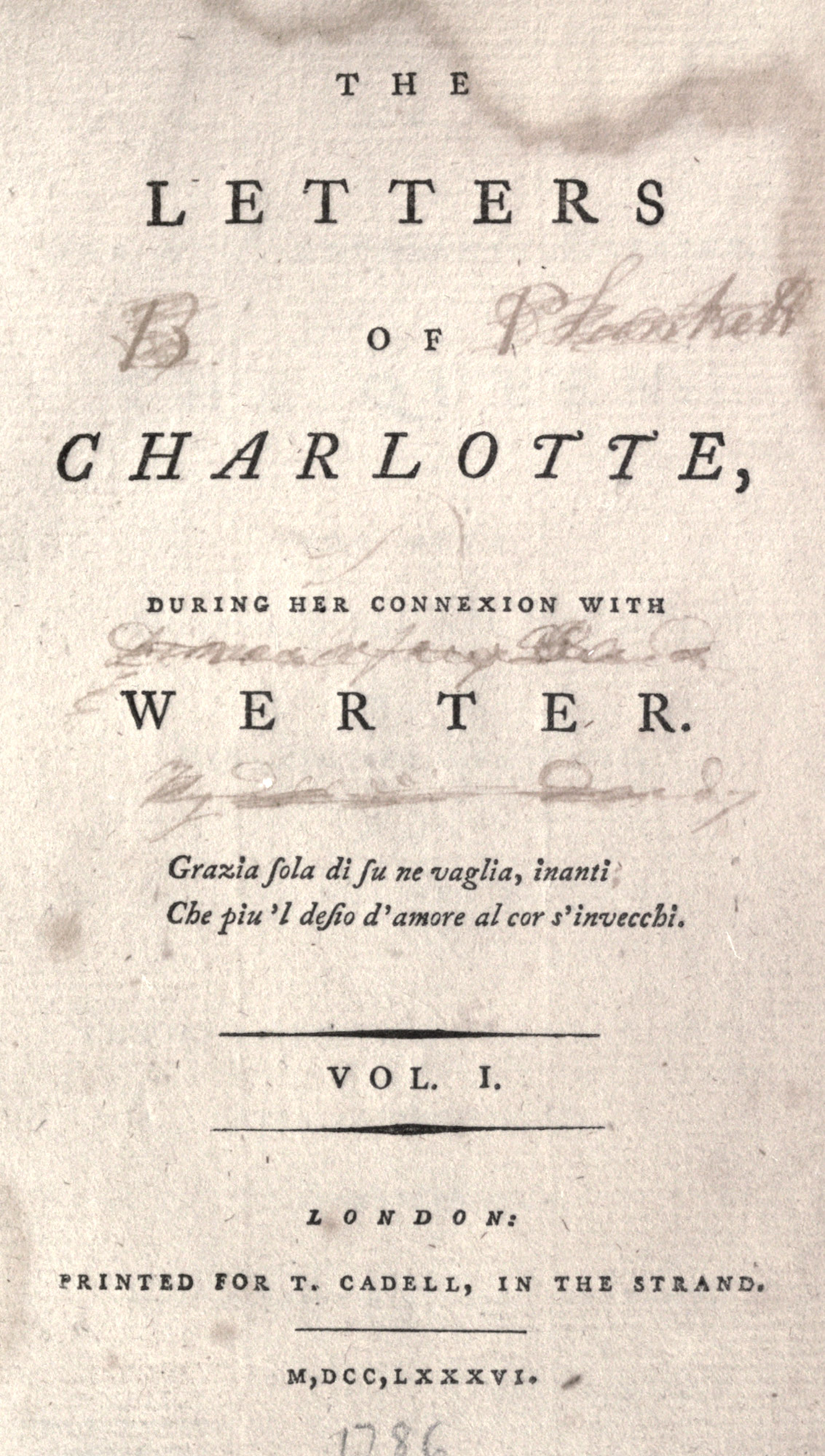
296. Title-page of Letters of Charlotte, London, 1786
From a copy in Harvard College Library, Internet Archive (scan)
The books illustrated by Bewick caused the introduction of more modelled and brilliant type-forms. Bewick’s cuts from the first demanded such types. The demand was not met by those used in his Quadrupeds of 1790 or his British Birds of 1797. These books, printed at Newcastle, are set in a very poor form of letter—either Wilson’s or an old style type much whittled down from its first estate. It was Bulmer who realized the kind of typography that Bewick’s cuts called for; and when he produced his new types, it must have been a revelation to the public of that day; in fact is was! But before describing the Bewick books printed at the Shakspeare Press by Bulmer, there are two of its earlier books which must be mentioned.
The “Boydell Shakspeare,” [vols. 1, 2, 3, 4, 5, 6, 7, 8, 9] which the Shakspeare Press was established to print, is its most famous performance. Its Advertisement, written by Nicol, tells us that
while foreign nations were publishing splendid editions of their favourite authors, we in this country contented ourselves with such editions of our as were merely useful.
This work was meant to be a magnificent national edition, in which splendour of production was to go hand in hand with correctness of text. Nicols says,
With regard to the Typographical part of the work, the state of printing in England, when it was first undertaken [1786], was such that it was found necessary to establish a printing-house on purpose to print the work; a foundry to cast the types; and even a manufactory to make the ink.41 How much of the art of printing has improved since that period the Public can best judge.
This folio edition in nine volumes, with its accompanying plates, was “printed by W. Bulmer and Company for John and Josiah Boydell, George and W. Nicol, from the types of W. Martin,” and was finally published in 1802, though the first volume appeared in 179242 (fig. 297). The folio edition of Milton’s Poetical Works, illustrated by Westall, also printed by Bulmer for the Boydells in 1794–97, is another wonderful production—in simplicity of arrangement, in typography, and in presswork. For pure typography is almost wholly relied on for effect, in both these books, and the reliance is justified. Martin’s roman types are very handsome, very clear—and very modern. His italic is a little too calligraphic; the italic capitals in particular show Baskerville’s influence and distract the eye. But the editions evidently turned out what they were meant to be.; and only a printer knows all that this implies! No description, however, gives any idea of the change of taste in English printing which these books exemplified.
297. William Martin’s Type used in the “Boydell Shakspeare”: Bulmer, London, 1792–1802
From a copy in the Boston Public Library (facsimile), Newberry Library (scan)
The magnificent letter-press of Chamberlaine’s Imitations of Original Drawings by Hans Holbein, being of Illustrious Persons in the Court of Henry VIII, printed by Bulmer in 1792, may be consulted by those tempted to belittle the work of this school. A more intimate and agreeable book is the charming edition of Poems by Goldsmith and Parnell, printed by Bulmer in 1795. This was the first really finely printed book illustrated by the Bewicks. In the interesting Advertisement Bulmer says:
To raise the Art of printing in this country from the neglected state in which it had long been suffered to continue, and to remove the opprobrium which had but too justly been attached to the late productions of the English press, much has been done within the last few years; and the warm emulation which has discovered itself amongst the Printers of the present day, as well in the remote parts of the kingdom as in the metropolis, has been highly patronized by the public in general. The present volume, in addition to the Shakspeare, the Milton, and many other valuable works of elegance, which have already been given to the world, through the medium of the Shakspeare Press, are particularly meant to combined the various beauties of Printing, Type-founding, Engraving, and Paper-making; as well with a view to ascertain the near approach to perfection which those arts have attained in this country, as to invite a fair competition with the best Typographical Productions of other nations. How far the different Artists, who have contributed to their exertions to this great object, have succeeded in the attempt, the Public will now be fully able to judge. Much pains have been bestowed on the present publication, to render it a complete Specimen of the Arts of Type and Block-printing. The whole of the Types, with which this work has been printed, are executed by Mr. William Martin, in the house of my friend Mr. George Nicol, whose unceasing endeavours to improve the Art of Printing, and its relative branches, are too well known to require any thing to be said on the present occasion; he has particularly patronized Mr. Martin, a very ingenious young Artist, who has resided with him seven years, and who is at this time forming a Foundry, by which he will shortly be enabled to offer to the world a Specimen of Types, that will in a very eminent degree unite utility, elegance, and beauty. The ornaments are all engraved on blocks of wood, by two of my earliest acquaintances, Messrs. Bewicks, of Newcastle upon Tyne and London,43 after designs made from them the most interesting passages of the Poems they embellish. They have been executed with great care, and I may venture to say, without being supposed to be influenced by ancient friendship, that they form the most extraordinary effort of the art of engraving upon wood that ever was produced in any age, or any country. Indeed it seems almost impossible that such delicate effects could be obtained from blocks of wood.44 Of the Paper it is only necessary to say, that it comes from the manufactory of Mr. Whatman.
Bulmer’s edition of William Somervile’s Chase (1796), a companion volume “presented to the Patrons of Fine Printing” (for a guinea), is another delightful book in much the same manner. Martin’s types, used in both volumes, are charming transitional roman fonts, both delicate and spirited—and so thoroughly English that Bewick’s engravings seem in a complete harmony with them (figs. 298, 299, and 300). A magnificent work that employs Martin’ types is the two-volume of History of the River Thames, issued in folio by William Bulmer & Company for John and Josiah Boydell in 1796. The title-page bears the words, “from the types of W. Martin.” Its pages of large roman type, beautifully set, make it one of the finest books Bulmer ever printed.
298. William Martin’s Two-line Small Pica Roman and Italic used in Poems by Goldsmith and Parnell: Bulmer, London, 1795
299. William Martin’s Great Primer Roman (Goldsmith and Parnell) and Italic (Somervile’s Chase): Bulmer, London, 1795–96
300. William Martin’s Pica Roman and Italic used in Somervile’s Chase: Bulmer, London, 1796
The printer Bensley also issued books somewhat in this style, which are examples of “the latest fashion” in printing. His edition of Thomsons’s Seasons, with plates by Bartolozzi, issued in 1797, and some luxurious books published by Stockdale, are good specimens of his earlier work. His composition is less successful than Bulmer’s, and his better work, which I shall mention later, appears to have been done after 1800.
Whatever may be the opinion of the light, open types and widely spaced and leaded pages of volumes by the best printers in these last years of the eighteenth century, they seem to me to be very sincere and workmanlike solutions of problems which the printer worked out in the manner of that time. Such books were part of the life about them. They accorded admirably with the cool, sedate interiors in which they were housed. It was printing faithful to the best standards of its day, and because of this I think it will live.45
- Mason’s Life of Gray (second edition), London, 1775, pp. 100, 101.
-
The frequent indications to be met with the transmission of founts from one printer to another, as well as the passing on of worn types from the presses of the metropolis to those of the provinces, are suggestive of the existence (very limited, indeed) of some sort of home trade in type even at that early date. For a considerable time, moreover, after the perfection of the art in England, the trade in foreign types, which dated back as early as the establishment of printing in Westminster and Oxford, continued to flourish. With Normandy, especially, at the beginning of the sixteenth century, a brisk commerce was maintained. Not only were many of the English liturgical and law books printed abroad by Norman artists, but Norman type found its way in considerable quantities into English presses. M. Claudin…states that Rouen, at the beginning of the sixteenth century, was the great typographical market which furnished type not to England only, but to other cities in France and to Switzerland. He observes,
It evidently had special typographical foundries. Richard Pynson, a London printer, was a Norman; Will Faques learned typography from J. le Bourgeois, a printer at Rouen. These two printers had types cast expressly for themselves in Normandy. Wynkyn de Worde must have bought types in Normandy also, and very likely from Peter Olivier and Jean de Lorraine, printers in partnership at Rouen.
And with regard to the first printer of Scotland, M. Claudin has no doubt that Myllar learned his art in Normandy, and that the types with which his earliest work as printed were those of the Rouen printer, Hostingue.
Reed’s History of Old English Letter Foundries, London, 1887, p. 103.
- Reed, p. 96.
- For the state of the sixteenth century English press (its relations to the government, etc.), see the chapter by R. B. McKerrow on the “Booksellers’, Printers’, and Stationers’ Trade,” in Shakespeare’s England, Oxford, 1916, Vol. II, chapter xxiii. For an account of earlier English legislation in reference to printing, publishing, and bookselling, see the Introductions to Mr. E. Gordon Duff’s Century of the English Book Trade, 1457–1557; to McKerrow’s Dictionary of Printers, 1557–1640; and to Plomer’s Dictionary of Booksellers and Printers, 1641–1667.
- It was this decree which caused Milton to write his Areopagitica.
- A. W. Pollard in Transactions of the Bibliographical Society, Vol. XIII, p. 26.
- It was Moxon who cut the symbols used for John Wilkins’ Essay towards Real Character, printed for the Royal Society (of which Moxon was a fellow) in 1668. He also produced the small pica Irish type used in Daniels’ Irish New Testament in 1681, both type and printing being paid for by Robert Boyle—until 1800, the only Irish font in England.
- Savile (1549–1622), Provost of Eton and one of the most learned Englishmen of his time, was for years interested in producing an edition of St. Chrysostom, for which he endeavoured to secure a font of the French “Royal Greek” types. Failing at this, he purchased abroad a special Greek font for the work, the preparation of which cost him the enormous sum (for those days) of £8000. The edition, in eight volumes [vols. 1, 2, 3, 4, 5, 6, 7, 8], was finished in 1613. Savile was a friend of Sir Thomas Bodley, and founded at Oxford the chairs of Geometry and Astronomy, which are still known by his name. An interesting account of his Greek type is given in Robert Proctor’s paper, The French Royal Greek Types, and the Eton Chrysostom (Transactions of the Bibliographical Society, Vol. VII). This “Silver Letter” was subsequently bequeathed by Savile to the University of Oxford, then loaned to the University of Cambridge, and has since been lost.
- Reed, facing p. 140.
-
For the Fell types, see the rare Specimen of the Several Sorts of Letter given to the University by Dr. John Fell, later Lord Bishop of Oxford. To which is added the Letter Given by Mr. F. Junius, Oxford. Printed at the Theatre, a.d. 1693. Other editions followed in 1695, 1706, 1768, 1787, 1794, etc. Some of these specimens are reproduced in Hart’s Notes on a Century of Typography at the University Press, Oxford, 1693–1794. Oxford, 1900.
-
A like benefaction for the University Press, Cambridge, had been attempted in 1626 by Archbishop Ussher, who tried to get matrices of Syriac, Arabic, Ethiopic, and Samartian letters from Leyden, but was forestalled in this by the Elzevirs. Before the advent of Caslon, most of the material of the press was carefully chosen from Dutch foundries. See S. C. Roberts’ excellent History of the Cambridge University Press, 1521–1921. Cambridge, 1921.
- Marshall’s letters are reprinted in Hart’s Notes on a Century of Typography at the University Press, Oxford, pp. 161–172.
- For a brief account of the Press with lists of its most important books, see the admirable brochure, The Oxford University Press. A Brief Account by Falconer Madan. Oxford, 1908. See, also, the same author’s Chart of Oxford Printing, 1904. For an elaborate account of the Fell types, with facsimiles, etc., consult Horace Hart’s Notes on a Century of Typography, already alluded to. The latter book is printed from the Fell types, as is also Some Account of the Oxford University Press, 1468–
19211926. Oxford,19221926. - See Reed, pp. 169, 170, for comparison of the four Polyglot Bibles.
- It was Thomas James who cruelly thwarted William Ged, inventor of stereotyping. In a house which was part of the priory of St. Bartholomew the Great, Smithfield (at one time occupied by James), Benjamin Franklin was employed by Samuel Palmer.
- Rowe Mores’ Dissertation, pp. 51–57.
- Reed, p. 114.
-
William Bowyer the elder (1663–1737) was printer for Thomas Hollas, benefactor of Harvard College. His son, William Bowyer, “the learned printer,” received from the President, Edward Holyoke, and the Fellows, in December, 1767, a vote of thanks for several valuable books sent them, and “particularly his late curious edition of the Greek Testament with learned Notes.” To one of the books Bowyer presented (The Letters of Erasmus) he prefixed a Latin inscription, as he did in the Greek Testament just alluded to. For President Holyoke says in his letter:
We are greatly obliged to you for the favourable sentiments you have been pleased so elegantly to express of our Seminary, in the blank leaf of the New Testament; and we hope it will prove a powerful stimulus to our youth, more and more to deserve so good a character. This Society is as yet but in its infant-state; but we trust, that, by the generosity of the benefactors whom the Divine Providence is raising up to us, and by the smiles of Heaven upon our endeavours to form the youth here to knowledge and virtue, it will every day more effectually answer that important ends of its foundation.
-
Edward Rowe Mores, in the latter part of his life (in 1772), purchased all the older portions of the enormous collection of types, punches, and matrices of the James foundry—an accumulation which dated from the sixteenth century. From his examination of its material he prepared an essay intended to preserve the memory of this foundry, the most ancient in the kingdom, and as an introduction to a specimen-sheet which was to show what his collection possessed. The specimen was not published until after his death. The essay finally appeared four years later to accompany the catalogue of the auction sale of the collection. The title-page reads: A Dissertation upon English Typographical Founders and Founderies. By Edward Rowe Mores. A. M. & A. S. S., mdcclxxviii. This title and the final notes were added by John Nichols, the printer, who bought the whole edition (only eighty copies) at the sale of Mores’ books, in 1778. The Dissertation contains an immense amount of curious information about early types and type-founders in England.
- Manuel Typographique, Vol. II. p. xxxviii.
- Also see Luckombe’s History of Printing, in which a reprint of that part of Caslon’s Specimen of 1763 which contains the types, is shown. The flowers are not the same. In Caslon’s specimens, variants of the same size of type are given, called “No. 1” and “No. 2”—the former a little larger face than the latter, though cast on the same body—as in Luckombe’s reprint. In the Caslon Specimen of 1796, three faces of the same size of type are shown. Thus the name Caslon, says Mr. De Vinne, “as applied to a distinct face of type, is consequently not exactly descriptive; it may be somewhat misleading.”
- This William Caslon III, though selling his interest in the family business, bought Joseph Jackson’s foundry (in operation from 1763 to 1792), which he managed under his own name until 1803—the succeeding styles of the house being Caslon & Son and William Caslon (1807–19).
- The account of the foundry which has been issued by the present owners under the title of Two Centuries of Typefounding should be consulted. It is very fully illustrated by portraits, reproductions of types, ornaments, etc.
- Manuel Typographique, Vol. II. p. xxxix.
- De Fontenai’s Dictionnaire des Artistes, Paris, 1776, Vol. I, p. 156.
- This sheet is a rare one. My copy formerly belonged to A. A. Renouard, the French publisher and bibliophile. There is also an example in the Birmingham Free Libraries. Baskerville issued specimens in 1757, c. 1762 (2, one of which is bordered), and in 1775 (2).
- Franklin’s amusing letter, which has been so often quoted, may be found in Straus and Dent’s John Baskerville, Cambridge, 1907, p. 19.
- In 1827, Pickering published The Treatyse of Fysshynge wyth an Angle (attributed to Dame Juliana Berners), printed with the types of John Baskerville.
- See notice of Baskerville type in Marius Audin’s Le Livre, sa Technique, son Architecture, Lyon, 1921, pp. 42 et seq.
- As in Bowyer’s edition of Pope’s Works, printed for Lintot in 1717.
- A Specimen of Printing Types by Fry and Steele, Letter Founders to the Prince of Wales, Type Street, London. Printed by T. Rickaby, 1795.
- A Specimen of Printing Types by Wm. Caslon, Letter-Founder to the King. London: Printed by C. Wittingham, 1798.
- Martin never issued, I think, a specimen of his foundry, but a selection of his type, as employed by John McCreery of Liverpool, is shown—to no very great advantage—in A Specimen of Improved Types of G. F. Harris, Printer, successor to Mr. John McCreery, Houghton Street, Liverpool (1807). This was the only provincial printing-house owning any of Martin’s fonts. They were cast for its collection by arrangement with Bulmer and Nicol. The “Shakspeare” types are said to be numbered 16, 17, 18, 19, 20, 21, 22, 23, 26, and 27. Martin’s foundry, for a short period after his death, was continued by Bulmer. A portion of its material appears to have been sold to the Caslons in 1817.
- The copy in the British Museum has been skilfully reproduced in facsimile by the Oxford University Press (1905).
- Pollard’s Fine Books, p.
260261. - The first Prayer Book of Edward VI, printed by Whitchurch, appeared in 1549; and the Book of Common Praier, musically “noted” by Merbecke, was printed by Grafton, in 1550. These were black-letter books. Prayer books and liturgies were printed in black-letter until the beginning of the eighteenth century. The first English Bible (printed abroad, probably at Zurich), in 1535, was executed in black-letter. Cranmer’s English Bible of 1539 (Whitchurch) was a black-letter book. The first edition of the King James “Authorized Version” of 1611 was set in English black-letter, with contents of chapters set in roman. Bibles and prayer books are so much in a class by themselves, that I have not usually employed them as examples of printing.
- An interesting comparison may be made between the Shakespeare Folios of 1623 and 1632 (issued in facsimile by Methuen & Co., London, in 1910 and 1909), Hanmer’s edition published in 1744 [vols. 1, 2, 3, 4, 5, 6], Bulmer’s quarto edition of 1791 [vols. 1, 2, 3, 4, 5, 6, 7, 8, 9], and the Vale Press Shakespeare of 1900, the Doves Press Hamlet of 1909, and the Stratford-Town edition of 1904, printed by Mr. A. H. Bullen at the Shakespeare Head Press—the latter the first complete edition printed in the poet’s native place. For the orthography of Shakespeare, especially in relation to printing, see Shakespeare’s England, Vol. II, Chapter xxx, Shakespear’s English, by Henry Bradley (Section Orthography), pp. 546 et seq.
- The Sheldonian Theatre, in which the Oxford Press was then housed.
- A few years after this book was printed, its Anglo-Saxon types were destroyed by fire. New Anglo-Saxon fonts, much more picturesque than those of the Homily, were cut for Miss Elstob’s Anglo-Saxon Grammar, which appeared in 1715. These were subsequently given by Bowyer the younger to the University Press, Oxford, where they still are. The 1743 edition of Junius’s Etymologicum Anglicanum, printed at the Theatre, Oxford—a fine edition—may be looked at for its use of the Junius Anglo-Saxon and other northern types.
- The theory in using these spaced capitals was that capitals spaced dignified the important word of a title, and that such a word should fill the measure of the page. Hence the printer spaced such lines until the letters appeared (as De Vinne says) “dislocated by explosion.”
- The pure black ink was prepared from material supplied to Bulmer by Baskerville’s old foreman, Robert Martin, and was probably made from a recipe similar to that employed by Baskerville.
-
Dibdin tells us how Nicol contrived
to silence some connoisseurs of Printing, who, upon seeing the productions of the Shakspeare Press, were constantly saying, “This is very well, but what is this to the Printing of Bodoni?”… A specimen sheet of a pretended edition of Cicero was set up with the Shakspeare types, of the size of Bodoni’s publications. When this specimen was shewn to the same connoisseurs, they exclaimed, “To what degree of perfection does this man mean to carry the art of Printing! Why this surpasses all his former excellence!” And they were all very anxious for Mr. N. to procure them copies of the work. To this Mr. N. replied, “that Mr. Bodoni had an agent in town; and if they would turn to the bottom of the last page of the specimen they would find his address”—which they found as follows—“W. Bulmer and Co. Shakspeare Press’!”
- Bulmer, a native of Newcastle, was from youth a friend of Thomas Bewick, to whom he is believed to have suggested lowering the surface of his wood-blocks, to give a lighter impression for effects of distance.
- George III could not be convinced that they were so engraved, and insisted on seeing the wood-blocks before he would believe it.
- See list of nearly fifty books printed by Bulmer and some of those printed by Bensley before 1817 in Dibdin’s Bibliographical Decameron (1817), Vol. II, pp. 384 et seq. Aids to the student will be found in the Catalogue of an Exhibition of Books, Broadsides, Proclamations, Portraits, Autographs, etc., Illustrative of the History and Progress of Printing and Bookselling in England, 1477–1800. Held at Stationers’ Hall, Jun 1912, by the International Association of Antiquarian Booksellers. London, 1912; and also in the valuable Catalogue of the Caxton Celebration of 1877, though the latter is more general in scope.