Chapter XVIII
Types Used in the American Colonies, and some Early American Specimens
In connection with English printing of the seventeenth and eighteenth centuries, something must be said about typography in the English Colonies of North America, and about one or two of the earliest specimens put forth by American type-founders and printers.
The first press set up in the Colonies was established at Cambridge, Massachusetts. Its activities extended from 1638 to 1692. Its equipment consisted of a printing-press and type, and with these three pressmen and a printer arrived in the summer of 1638. This proto-typographer of British North America was Stephen Daye, traditionally connected with the famous London printer, John Day. The foundation of this press was the work of Joseph Rev. Jose Glover, Rector of Sutton and Surrey. Glover dying on the voyage out, his wife set up the press at Cambridge, in the latter months of 1638. It was always closely associated with Harvard College; and among its most celebrated books were Eliot’s Indian Bible and the Bay Psalm Book.1
The ordinary type for its use was all procured abroad, probably from England and Holland. its work came to an end in 1692, Samuel Green being its last manager.
In the seventeenth century, typography in Europe was upon the wane, and for English printing the Stuart period, owing to restrictions on the press, was a miserable epoch. To make life beautiful was not the motive which led to the settlement of New England: and the promoters of the Cambridge Press merely desired that spiritual truth should be made more clear through its publications. The typography of its books was as unattractive and crabbed as the matter which it (perhaps fittingly) enshrined. I mention this press, therefore, only because it has a certain historical importance.
Harvard College apparently owned no types after Green’s death until about 1718 1726, when Thomas Hollis made it a present of fonts of long primer Hebrew and Greek characters.
The latter type lay idle until 1761, when it was employed for some Greek verse occurring in a congratulatory address to George III on his accession—Pietas et Gratulatio Collegii Cantabrigiensis apud Novanglos. This was his first, last, and only appearance; for it was destroyed in a fire which consumed the first College Library in 1764.2 But the Hebrew types, being at the time in use in Boston, escaped; whether they still survive, I know not.
In the eighteenth century, typographical material in American printing-houses—at any rate before the Revolution—was almost all foreign. Franklin records in his Autobiography that his brother James secured both his press and types from England, and there are repeated allusions to the necessity of procuring such materials abroad for various Colonial printing-offices. When manager of Keimer’s press in Philadelphia, Franklin writes:
Our printing-house often wanted sorts, and there was no letter-founder in America; I had seen types cast at James’s in London, but without much attention to the manner; however, I now contrived a mould, made use of the letters we had as puncheons, struck the matrices in lead, and thus supply’d in a pretty tolerable way all deficiencies.
The earliest types in such offices as that of Bradford, the first New York printer, were probably Dutch and English; later types were English, and chiefly those of Caslon—although after 1775 (roughly speaking), type was made in North America. Primers and books, newspapers and broadsides, were mostly printed in Caslon old style types in the mid-eighteenth century and up to the Revolution. Indeed, the Declaration of Independence itself was printed in the Caslon letter. It was the face commonly in use until about 1800.
How well Colonial printers used it was another matter. For Franklin, writing from Passy (where he had set up a private press) in October, 1779, to his niece, Mrs. Partridge, says:
I thank you for the Boston Newspapers, tho’ I see nothing so clearly in them as that your printers do indeed want new Letters. They perfectly blind me in endeavouring to read them. If you should ever have any Secrets that you want to be well kept, get them printed in those Papers.
Franklin admired and recommended Caslon’s types, and his own office was equipped with them. The style of composition of most Colonial work was like a provincial copy of London printing—and was, as a good rule, a good many years behind current London fashions.
The first regular American type-foundry was that of Christopher Sauer or Sower II (son of a German printer of the same name), which was started at Germantown, Pennsylvania, in 1772.
Its appliances were imported from Germany, with moulds for three sizes of German type and some English script. Some of its type was cut and cast by Sauer’s assistant, Justus Fox, who bought the foundry in 1784. The next foundry was that of Jacob Bey, assistant to Sauer and Fox, also at Germantown. He cut and cast roman as well as German types. Another foundry was that of John Baine & Grandson in Co., of Philadelphia, which was probably established about 1788. The elder Baine (who had been in partnership with Alexander Wilson of Glasgow) must have come to Philadelphia, whither his grandson had preceded him, between 1787 and 1790, the year of his death. On the title-page of A Specimen of Printing Types, By John Baine & Grandson in Co., Letter-founders, Edinburgh (1787), now in the library of the American Antiquarian Society, Worcester, Isaiah Thomas wrote,
This Foundry was brought to America, by the grandson, about 1771, and established at Philadelphia. John Baine came over not long after his grandson.
But there is a discrepancy between this statement and the generally accepted facts. The specimen contains some Caslon fonts of early form, a few heavy-faced types, and a number of late eighteenth century types. The repertoire of ornaments and their ingenious and tasteful combinations are worth looking at.
In 1791, Adam Mappa, a Dutchman, brought a type-foundry to New York from Holland, chiefly to make Dutch and German types.
“His foundry was very extensive,” says a contemporary, “and his specimens extravagantly showy.” Benjamin Franklin Bache, grandson of Franklin, possessed a small outfit for type-founding, purchased by Franklin when in France, but was little employed. William McCulloch in his Additions to Thomas’s History of Printing in America,3 says,
Dr. Franklin was desirous of establishing his grandson at that business; and with that view Bache wrought some time in the foundry of P. S. Fournier,4 of Paris, in order to acquire some insight preparatory to his commencing in America. Franklin purchased a foundry from this Fournier, which he brought to America, at his (Bache’s) arrival; and Bache began type casting in Franklin Court in Market Street but soon relinquished that business for printing. I have seen, in Binny and Ronaldson’s possession, an history of type founding (in French) of which this Fournier is the author.5 Ronaldson, who was some years since in France in pursuit of antimony, tells me he was in this foundry, now in the possession of Fournier’s grandson,6 and that there is a bust or head of Franklin7 in that laboratory, at which the men looked and pointed with the liveliest enthusiasm, exclaiming: “l’excellent Franklin.”
The four-page specimen-sheet issued by Bache8 is chiefly made up of Caslon characters, although the few types marked by an asterisk were cast in Philadelphia from French matrices. Interesting historically, this sheet contributes nothing to our knowledge of American type-forms—all the matter being foreign. Though undated, it was probably not printed before 1790.
Many of these small equipments finally fell into the hands of two Scotchmen, Archibald Binny and James Ronaldson, whose Philadelphia foundry was begun in 1796. In 1797, they offered for sale the first dollar-marks ever made in the type. These men, in 1806, purchased the appliances for type-founding brought over by Franklin.
The first specimen-book of an American Type Foundry is said to be that of Binny & Ronaldson, which belongs to the nineteenth century—A Specimen of Metal Ornaments cast at the Letter Foundry of Binny & Ronaldson. Philadelphia. Printed by Fry and Kammerer, 1809. It was not a printer’s specimen of types, but a founder’s specimen of ornaments. About one hundred ornamental cuts are shown. In appearance the designs seem largely inspired from French sources. A few of them are like those shown in Pierre’s collection of 1785. The general type of decoration in others is similar to cuts in the Gillé specimen of 1808. A feature of the book is its versions of the arms of the United States. Ill-executed mechanically for the most part, from a decorative point of view the collection is respectable and has considerable style. The prices of these cuts run from twenty-five cents to five dollars, and, for the larger cuts in particular, seem high for what was supplied.
In 1812, a Specimen of Printing Types from the Foundery of Binny & Ronaldson, Philadelphia, appeared, also printed by Fry and Kammerer. It begins with an address “To the Printers of the United States.” The proprietors speak of having, through patronage of printers, been able “to extend and improve their establishment on the grand scale, of which this specimen exhibits a proof.” From our point of view, there seems to have been little grand about the foundry except its pretensions.
The great primer roman was used for the text of the imposing quarto edition of Joel Barlow’s Columbiad, printed at Philadelphia in 1807 (fig. 301), and very finely printed, too, by Fry and Kammerer, whose imprint appears on the specimen we are considering. Notes to The Columbiad are set in the small pica No. 1. This volume is an early instance of an American édition de luxe, and reflects the style of Bulmer’s London editions. The engravings, after paintings by Smirke, were procured through the interest of Robert or Fulton.
301. Binny & Ronaldson’s Type used in The Columbiad, Philadelphia, 1807
From a copy in the Boston Athenæum (facsimile), Internet Archive (scan)
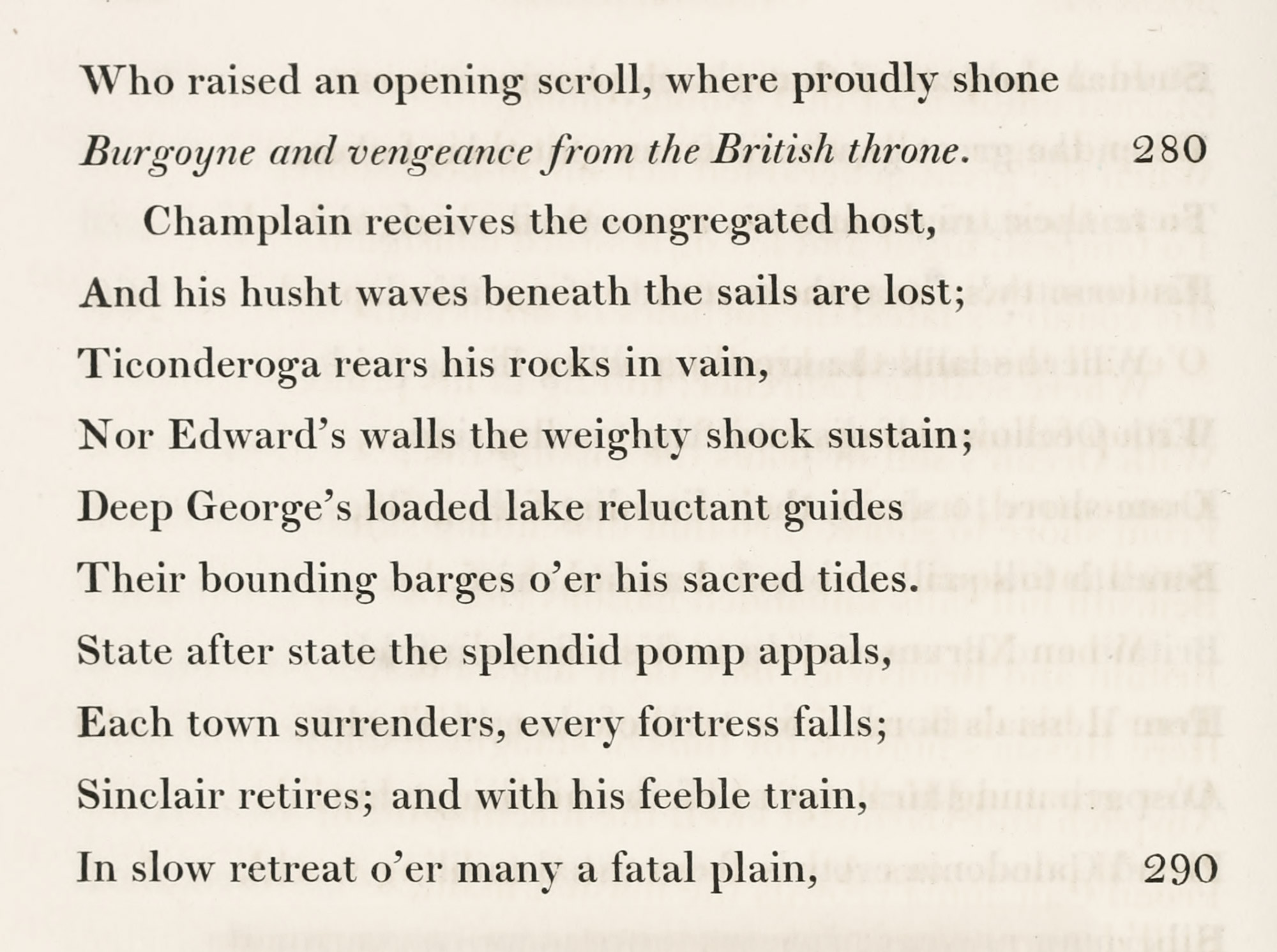
Of the larger sizes of type shown in this specimen, the French Canon roman and its italic is a really handsome letter. The rest of the larger sizes are of the heavy face then fashionable. The transitional forms of smaller roman and italic shown are delightful. I do not know whether these were cut in America or cast from imported matrices, but a passage in the preface of James Ronaldson’s specimen of 1816 makes me belief that they were cut by Archibald Binny. They retain—especially in the italic of certain sizes—a late eighteenth century touch, reminiscent of the work of Martin. The pica was supplied by Binny & Ronaldson for the text of Isaiah Thomas’s History of Printing in America, issued in 1810. Six sizes of black-letter with a disagreeable German twist to it—notice the f’s (fig. 302); four German text types—the double pica being reminiscent of very early German fonts; three sizes of Hebrew, and four of rather crabbed Greek, complete the book—except for three or four pages of ornaments. The “New Flowers” which open the collection are attractive designs in white on black. The American arms (No. 1), the urn (No. 4), the eagle (No. 5), etc., are quite delightful, and really charming when combined, as in the sixth of these borders. The skulls and cross-bones below are less inviting, and the designation “new flowers” perhaps indicates immortelle! (fig. 303). The other ornaments are mostly variants of ancient patterns and are in some cases excellent.
302. Black-letter: Binny & Ronaldson’s Specimen, Philadelphia, 1812
From Internet Archive (scan)
303. Ornaments: Binny & Ronaldson’s Specimen, Philadelphia, 1812
From Internet Archive (scan)
Binny & Ronaldson were succeeded by James Ronaldson, who brought out a specimen in 1816 which, as it is beautifully printed, shows the transitional types mentioned above to much better advantage than Binny & Ronaldson’s specimen of 1812. The selection offered of both types and ornaments is considerably increased and bettered. The interesting Preface alludes to the 1812 specimen as representing the labour of twenty-five years, and adds that the adoption of ranging features and the round s are among the improvements which have been made simultaneously with European foundries. Apologies are offered for the fat-faced types put forth “to imitate the Europeans,” contrary to the founders’ judgment, and proved by experience to be suited only for “works of fancy.” An enlarged edition of this specimen appeared in 1822. James Ronaldson was succeeded by Richard Ronaldson, who apparently issued no specimen. In 1833, the owners of the foundry were Lawrence Johnson and George F. Smith. Later, on Smith’s retirement, Johnson took as partners Thomas MacKellar and John F. and Richard Smith. Upon Johnson’s death in 1850, his three partners added Peter C. Jordon to their company and became the firm of MacKeller, Smiths and Jordan, remembered by older printers. This house was absorbed in 1892 by the American Type Founders Company.
The material that a well-known eighteenth century printer possessed is shown in the specimen of Isaiah Thomas (1749–1831) of Worcester, Massachusetts. Franklin called Thomas the “American Baskerville,” but his printing was not remarkable except in view of the period in which he worked, and the difficulties which lack of good paper, good ink, and good workmen placed in this way. Thomas’s chief work was his folio Bible, published in 1791—the first folio Bible printed in America—for which Franklin, to whom Thomas presented a copy, expressed great admiration. Dr. Charles L. Nichols, the biographer and bibliographer of Thomas, considers Sewall’s Carmina Sacra (1789) the best printed of his books, though Thomas preferred Charlotte Smith’s Elegiac Sonnets (1795), a volume printed on the first wove paper made in this country, by Thomas himself. Thomas also printed music—the Worcester Collection of Sacred Harmony being his work. He was the author of that standard book, The History of Printing in America, published in 1810; and the founder of the American Antiquarian Society of Worcester, of which he was the first president.
The title-page of Thomas’s specimen shows his esteem for William Caslon (fig. 304). He had a complete series of the Caslon fonts, with some large letters cut on wood. In a manuscript note in a copy of his specimen belonging to the American Antiquarian Society, Thomas says:
£2000 sterling and upwards, were added to this Specimen between 1785 and 1784 [sic]. A great addition, and a great Variety of Types were added to the following after 1785. When complete the Printing materials were estimated at Nine Thousand Dollars.
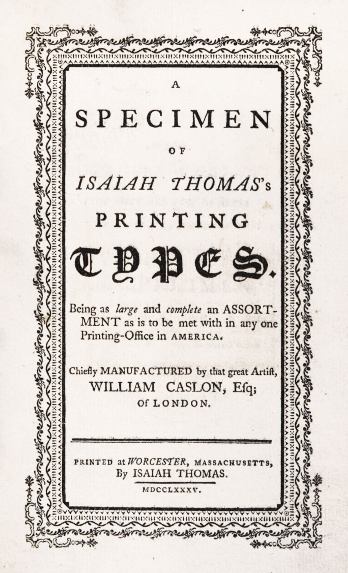
304. Title-page: Isaiah Thomas’s Specimen, Worcester, 1785
From a copy in Harvard College Library (facsimile), Google Books (scan)
His specimen shows a good assortment of mathematical, algebraical, and astronomical characters, a font of Greek, with some very good two-line Greek letters, and a small font of neat Hebrew. There are a number of type ornaments or “flowers,” some of which are very pretty. Of them Thomas says: “These ornamental types may be varied in a thousand different forms, but they are here inserted in the simple manner in which they are cast”; though the compositor has tried his hand at new arrangements with great success. Set in a commonplace script is this concluding advertisement:
I. Thomas, Printer, Worcester, Maſsachusetts, has with the greatest care and attention furnished himself with the best Printing Materials that could be made in Europe, and has purchaſed these articles to a very large amount.—He has every thing required for neat, elegant, or ornamental Printing, be the work small or large, and will be happy to execute every command in the way of his Profefsion, on the most reasonable Terms, and with Diſpatch.
The book is rare, but a copy which Thomas gave to Havard College may be seen in the library of the University.
- For facsimiles of its work and that of other Massachusetts printers, see Littlefield’s Early Massachusetts Press, 1638–1711. Boston, 1907. 2 vols.
-
Thomas’s History of Printing, Worcester, 1810, Vol. I. pp. 251 et seq. In the broadside Account of the Fire at Harvard College, dated January 25,
17941764, among the losses chronicled, this paragraph occurs:A font of Greek types (which, as we had not yet a printing-office, was reposited in the library) presented by our great benefactor the late worthy Thomas Hollas, Esq; of London; whose picture, as large as the life, and institutions for two Professorships and ten Scholarships perished in the flames.
- Proceedings of the American Antiquarian Society, Vol.
3231, Pt. 1 (1921). - Probably Simon Pierre Fournier, son of P. S. (Pierre Simon) Fournier le jeune. The latter died in 1768, and Bache was born in 1769.
- Evidently the Manuel Typographique of his father, Fournier le jeune.
- M. Beaulieu-Fournier (?).
- Possibly the likeness of Franklin alluded to in note [in chapter XIV].
- A Specimen of Printing Types belonging to Benjamin Franklin Bache’s Printing Office, Philadelphia.