Chapter IX
Types and Type-Forms of the Fifteenth Century in England
Printing was introduced in England in 1484 1476 by William Caxton, who owes his fame, however, to more than the fact that he was England’s prototypographer. For he was not the only of the first English printers—he was also “the first in a long line of English publishers who have been men of letters…and was likewise one of the earliest in the succession of English merchants and men of affairs who have found recreation and fame in the production of literature.”1 His services to literature in general, and particularly to English literature, as a translator and publisher, would have made him a commanding figure if he had never printed a single page. In the history of English printing he would be a commanding figure if he had never translated or published a single book. But with him printing was not the sole aim; and this explains in part why his printing was not so remarkable as his reputation might lead us to expect. He was a great Englishman, and among his many activities, was a printer. But he was not, from a technical point of view, a great printer.
For our purpose, a summary of his life which throws into relief his typographical activities is enough. Born about 1421, and apprenticed to a London merchant who afterwards became Lord Mayor, Caxton some time after 1441 went to Burgundy; being abroad, as he tells us in 1469, “for thirty years, for the most part in the countries of Brabant, Flanders, Holland, and Zealand,” and being for some time “Governor to the English Nation” (i.e., English merchants) at Bruges—the seat of the Burgundian court. After holding this post with success, and negotiating some important commercial arrangements in behalf of the English Crown, he retired from active work, and it was then that he began as a pastime, his translation of the Recuyell of the Historyes of Troye—a French book popular at court, written by Raoul Le Fèvre, chaplain to Philip, Duke of Burgundy. Of this he completed but little and laid it aside. In 1469, when attached as secretary to the household of the new Duchess of Burgundy, sister to Edward IV, he happened to mention his English translation, and as the Duchess became interested, he promised her to go on with it. Taking the work with him on a visit to Germany, he finished his task at Cologne in 1471.
The new art of printing was then practised at Cologne, and is supposed that Caxton visited one of its printing-houses and had a hand in the production of an edition of Bartholomew’s De Proprietatibus Rerum. To support this theory, there is the testimony of Wynkyn de Worde, foreman of Caxton’s printing-house and his successor, who says, in his prologue to an English translation De Proprietatibus, which he issued about 1495:
And also of your charyte call to remembraunce
The soule of William Caxton first prynter of this boke
In latin tonge at Coleyn hymself to avaunce2
That every well disposyd man may thereon loke.
On his return to Bruges, Caxton gave his completed translation to the Duchess, and somewhat later set up a press to supply the demand for copies of his Recuyell. In an epilogue to the third part, Caxton says:
Thus ende I this book whyche I have translated after myn Auctor as nyghe as God hath gyuen me connying, to whom be gyuen the laude and preysing. And for as moche as in the wrytyng of the same my penne is worn, myn hande wery & not stefast, myn eyen dīmed with ouermoche lokyng on the whit paper, and my corage not so prone and redy to laboure as hit hath ben, and that age crepeth on me dyly and febleth all the bodye, and also because I have promysid to dyuerce gentilmen and to my frendes to addresse to hem as hastely as I myght this sayd book, Therfore I have practysed & learned at my grete charge and dispense to ordeyne this said book in prynte after the maner & forme as ye may here see, and is not wreton with penne and ynke as other bokes ben, to thende that euery man may have them attones, ffor all the bookes of this storye named the Recule of the Historyes of the Troyes thus empryntid as ye here see were begonne in oon day, and also fynysshid in oone day.
In this production Caxton had associated with himself Colard Mansion, who had previously been a clever calligrapher. Authorities differ as to whether Caxton persuaded Mansion to exchange his old industry for that of printing, or whether Mansion, as seems more likely, had, shortly before his connection with Caxton, set up a press of his own. About 1475, Caxton and Mansion also printed at Bruges The Game and Playe of the Chesse. The type of these books differs from all other fonts used by Caxton. It is of rough, angular, awkward design, which shows clearly its relation to current Flemish handwriting, which was rough, angular, and awkward too (fig. 59). Some authorities have supposed its design based on Mansion’s handwriting, and that the type was cast by him others have thought it came from Veldener of Louvain. Its provenance is not clear. Blades says,
Its general appearance is more free and manuscript-like than would be thought the case from the square-set figure of each individual letter. This is, to a considerable extent, caused by the great variety of letters, there being only five for which there were not more than one matrix, either as single letters or in combination: for, although the differences between the various matrices of the same letter may be but very slight, we have here the fundamental principle of freedom, namely, a recurrence of modified sameness. The execution of the type is good, sharp, and decided, with sufficient differences between the repetitions of the same letter to indicate independence of tracing or mechanical contrivance; hence probably the work of one accustomed to cut letters.
This type was never brought into England, but was employed by Mansion after Caxton’s departure.
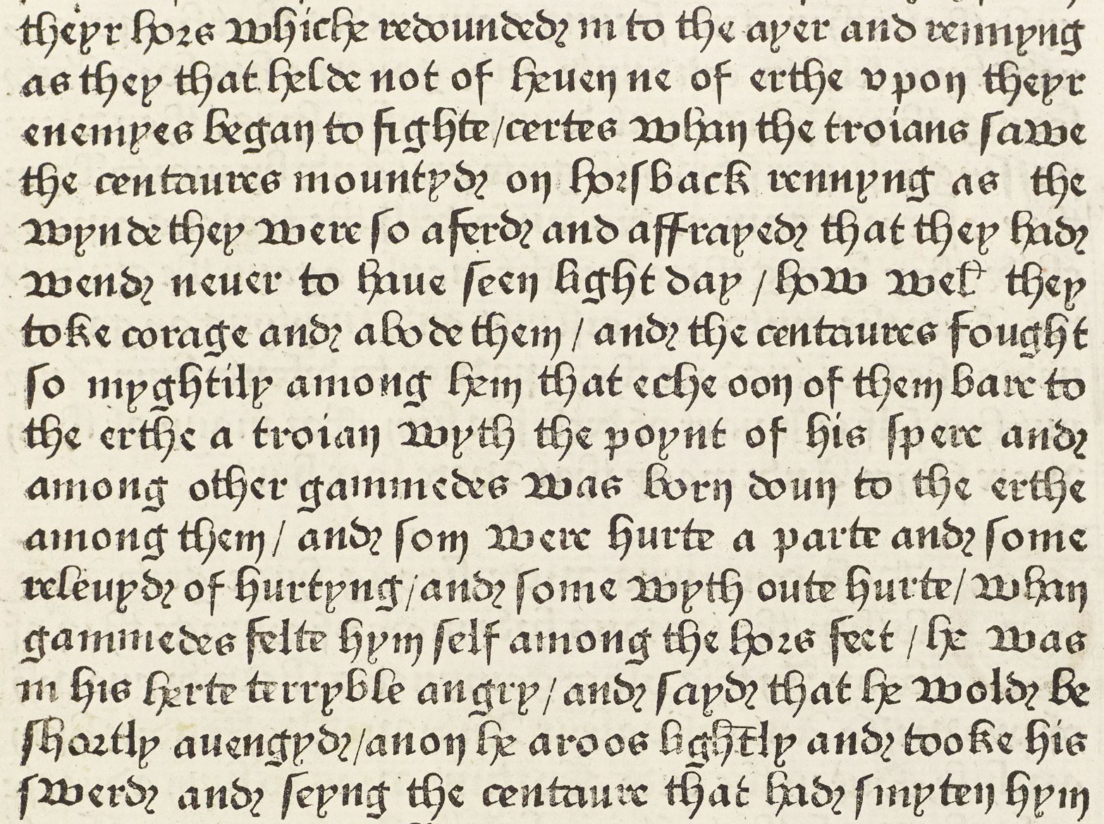
59. Caxton’s Type 1. From The Recuyell of the Historyes of Troye (first book printed in English), Caxton and Mansion, Bruges, c. 1475
From a copy in the Library of Mr. J. Pierpont Morgan, New York (facsimile), University of Manchester (scan, p. 157)
Caxton returned to England in 1476, and set up a press in the Abbey precincts at Westminster—at the Sign of the Red Pale—probably bringing and also brought with him some type and equipment.
The remaining seven fonts of type that Caxton used fall into two classes: batarde types of the Burgundian school; and lettres de forme more on the model of the pointed gothic types of the Mainz school.
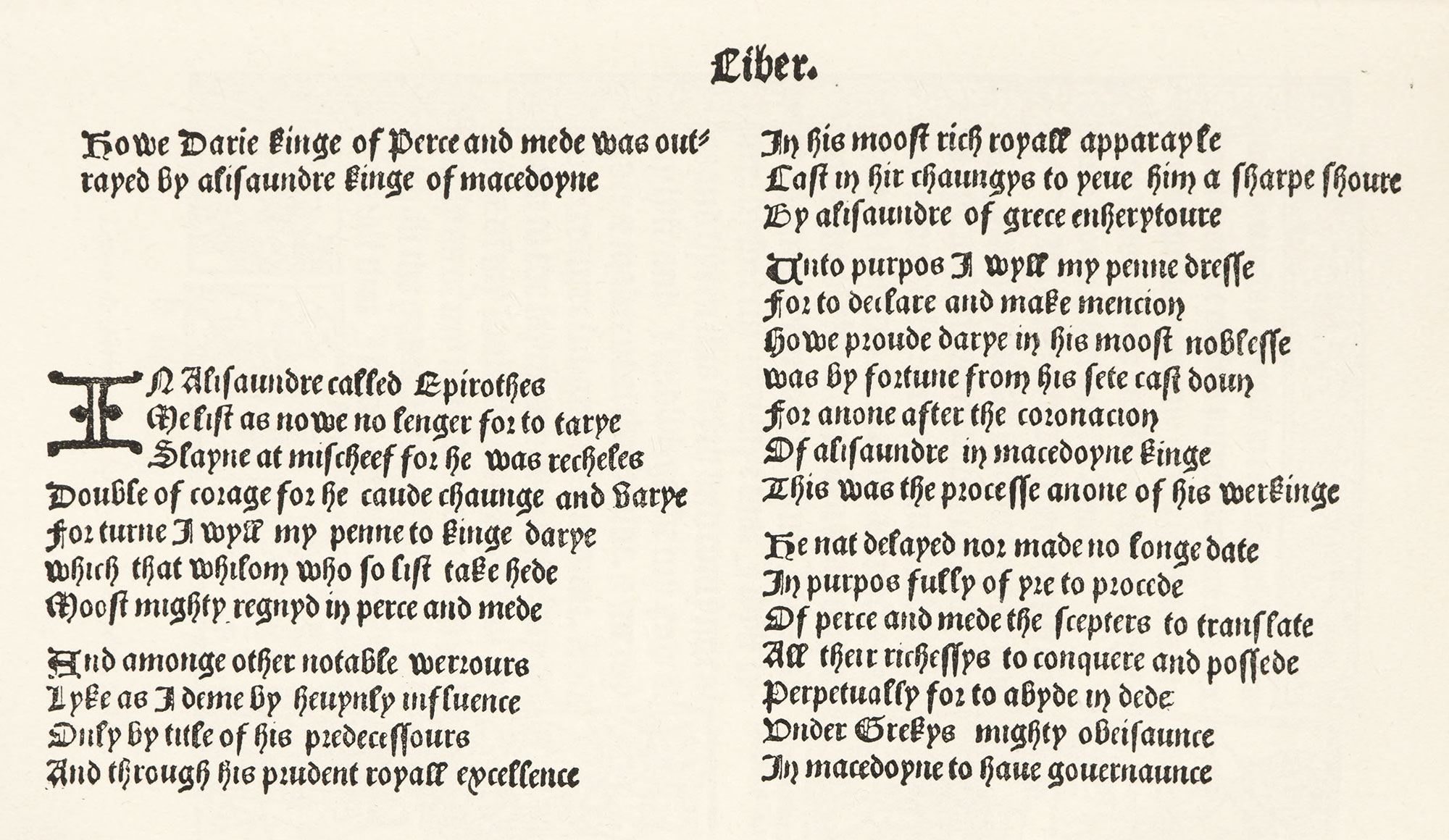
Caxton’s Type 2 and its variant 2*, his Type 4 and its variant 4*, and his Type 6 are all versions of the Flemish batarde character. In his Type 2 he printed at Westminster in 1477 The Dictes or Sayengis of the Philosophres (fig. 60)—the first book printed in England with a date and place of printing.
Blades says,
This type has a more dashing, picturesque, and elaborate character than type No. 1. It is an imitation of the ‘gros-batarde’ type of Colard Mansion, with some variation in the capital letters, which are extremely irregular, not only in size but also in design, some being of the simplest possible construction, whilst others have spurs, lines, and flourishes.
60 (First edition). Caxton’s Type 2. From The Dictes or Sayengis of the Philosophres, Westminster, The Canterbury Tales, 1477
First book printed in England with date and place of printing From The Canterbury Tales
60 (Second edition). Caxton’s Type 2. From The Dictes or Sayengis of the Philosophres, Westminster, 1477
First book printed in England with date and place of printing, from Library of Congress (scan)
Caxton’s Type 3 is particularly interesting to students of English printing, for it is the type that we have come to know, both in face and size, as English. It is a lettre de forme, much finer than his batarde types, and not unlike the ancient Flamand type in the Enchedé collection (fig. 46), though not so massive. It was used by Caxton for three books: an Ordinale seu Pica Sarum, in 1477, and a Psalter and Horæ ad usum Sarum, both printed in 1480. This type is shown in our illustration (fig. 61), which is interesting because it reproduces a copy of Caston’s handbill advertising Pyes of Salisbury Use—probably the earliest advertising leaflet printed in England. The “Pye” was a collection of rules to show how to deal with the concurrence and occurence of festivals; pyes of two and three Commemorations possibly being separate portions of the Ordinale seu Pica Sarum of 1477. The type of the advertisement was that used in the Pyes. After Caxton’s death, Type 3 passed into the hands of Wynkyn de Worde, who employed it frequently. The variant of Caxton’s second type, called Type 2*, appears to have been cast from matrices made from trimmed-up letters of Type 2. Caxton’s Mirrour of the World, printed about 1481, shows the use of this type.3 It has some changes and additions, but is scarecely more attractive than its original.
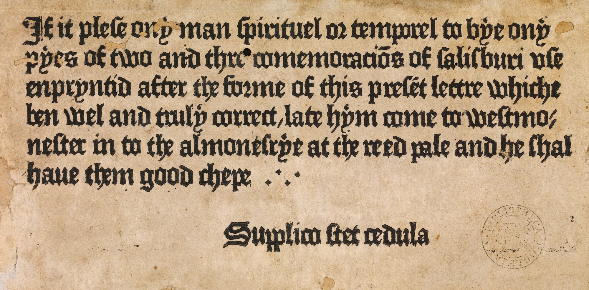
61. Caxton’s Type 3. Used in his Handbill, Westminster, c. 1477
From Burger’s Buchhändleranzeigen es 15. Jahrhunderts (facsimile), Digital Bodleian (scan)
In the Godfrey of Boloyne of 1481 Caxton employed his Type 4, a disagreeable, rough, and more compact letter, resembling some used by Machlinia in his Speculum Christiani about 1486, and that used at St. Albans in 1481. Ugly as it is, it was apparently a favourite of Caxton’s (fig. 62). Its variant—Type 4*—is a recasting on a little larger body,4 and Type 4 and Type 4* may be distinguished by the different form of the lower-case w.
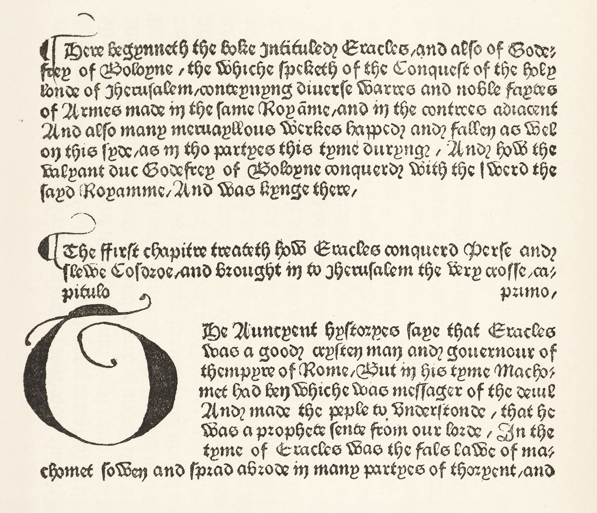
62. Caxton’s Type 4. From Godfrey of Boloyne, Westminster, 1481
From a copy in the Library of Mr. J. Pierpont Morgan, New York
Caxton’s Type 5 is a relief to the eye—a church type of Flamand school, but not so fine as the large “church” letter called Type 3, which is considered above. Blades says,
The large Lombardic capitals used with this font,” says Blades, “have a bold and striking appearance. Unlike any former font of Caxton’s, they are all cast with the largest face the body will bear, and without the least beard. They are used, more or less, in every book printed with this type.… They do not look at all well when used as initials to a word, on account of their size preventing them ranging with the sequent letters.
Caxton printed The Doctrinal of Sapience in Type 5, about 1489. It is a good type as Caxton’s types go—and very English and ecclesiastical in effect, as we understand English “church type” to-day. (fig. 63).
63. Caxton’s Type 5. From The Doctrinal of Sapience, Westminster, c. 1489
From a copy in the Library of Mr. J. Pierpont Morgan, New York, Princeton University Library (p. 85)
Type 6, a variant of Type 2, first used in the Ars Moriendi of 1490, calls for no remark, for it is another of Caxton’s series of gros batarde letters (fig. 64).
64. Caxton’s Types 6 and 8 from Tretyse of Love, Westminster, c. 1493
From a copy in the Library of Mr. J. Pierpont Morgan, New York (facsimile), Internet Archive (scan)
Caxton’s Type 7 was a small size of rough, compact English black-letter, and was discovered by Henry Bradshaw, the learned Cambridge bibliographer. In its delicacy is in somewhat French. It was used in an Indulgence brought out in 1489. Blades does not mention this type in his account of Caxton’s books, for he was never convinced that it was—as certainly seems to have been—used by Caxton (fig. 65).
65. Caxton’s Type 7. Used in Indulgence, Westminster, 1489
From De Ricci’s The Census of Caxtons
Type 8, of French origin, is a lettre de forme of the conventional type. It appears in the first four lines of the opening page of the Ars Moriendi mentioned above, and in the fourth, fifth, sixth, twelfth, and thirteenth lines of the left-hand column in our illustration (fig. 64).
Caxton’s press turned out about a hundred books. Gordon Duff tells us that
from the time Caxton first started printing it is interesting to notice how he gradually introduced various improvements. His earliest books have no head-lines, no numbers to the pages, no catchwords and no signatures; the ends of the lines are not always even,5 and we see in the paper the holes made by the points which kept the paper straight.… In some of these books printing in red is found, not worked off by a separate impression, but pulled at in the same time with the black, a peculiar method of printing used also by Colard Mansion in the books which he printed alone.
Caxton introduced signatures in 1480, and began to use woodcut illustrations in about the same year, and very rough they were. Few ornamental initials are found in his books. “Such improvements as Caxton adopted,” says Gordon Duff, “were only made from necessity, to keep himself abreast of his rivals.”
It was unfortunate for early English typography that Caxton lived so long in the Low Countries, and modelled his printing on the work about him, rather than upon that of France or Italy. But unlike his rivals, he was, says Gordon Duff, “the editor or translator of most of his publications, and, unlearned as he calls himself, his labours have made a lasting mark in the history of the English language.” Thus the historical significance of Caxton’s types, and the interest that attaches to him as a man, must make up for the lack of beauty in his books.6
Caxton’s material at his death, in 1491, passed to Wynkyn de Worde, a native of Wörth in Alsace, who had been his assistant. He at first used only Caxton’s types; the fonts he owned being 3, 4*, 6, 7, and 8. These he employed in five books published from 1491 to 1493; among them the Golden Legend, printed in the latter year.7 The first type of his own that he used, in a Liber Festivalis in 1493,8 has somewhat the appearance of the French lettre de forme of the period. “It was,” says Gordon Duff, “probably formed on a French model, though it retains several characteristics and even a few identical letters of Caxton’s founts.” Of the variant capital I’s, one much resembled that in Caxton’s Type 4*. The black-letter in The Boke of St. Alban’s, printed by De Worde in 1496, was derived from Gotfried van Os of Gouda, from whom, on his departure from Gouda to Copenhagen, Caxton bought types and a supply of the rather awkwardly designed initials to be found in De Worde’s books. This type is the square, Netherlands lettre de forme of the period.9 The lower-case w’s of this type are peculiar in shape, and should be examined.
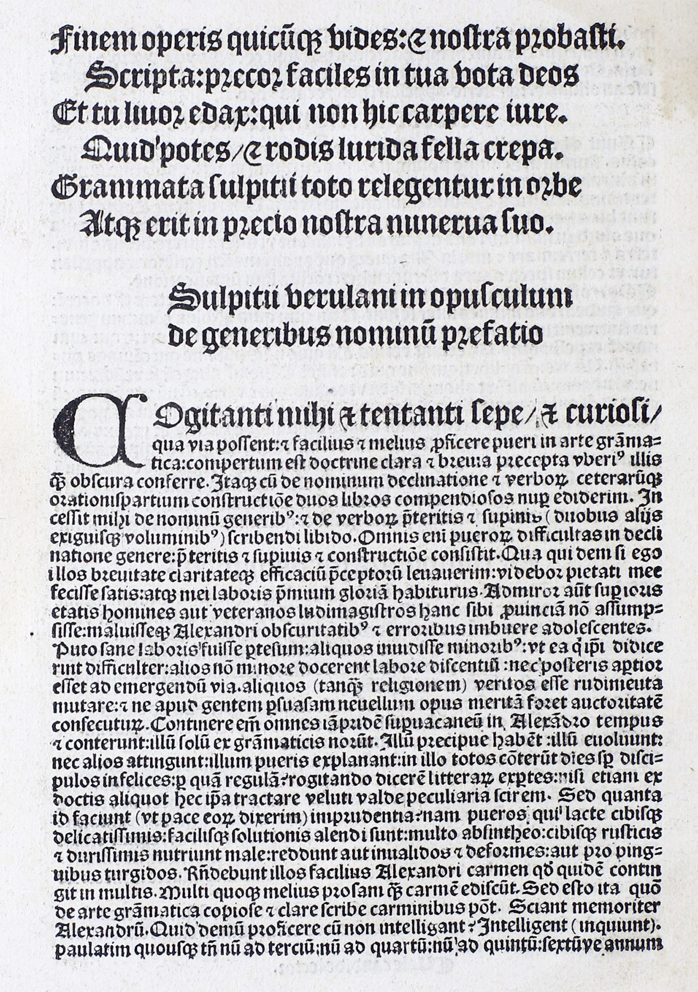
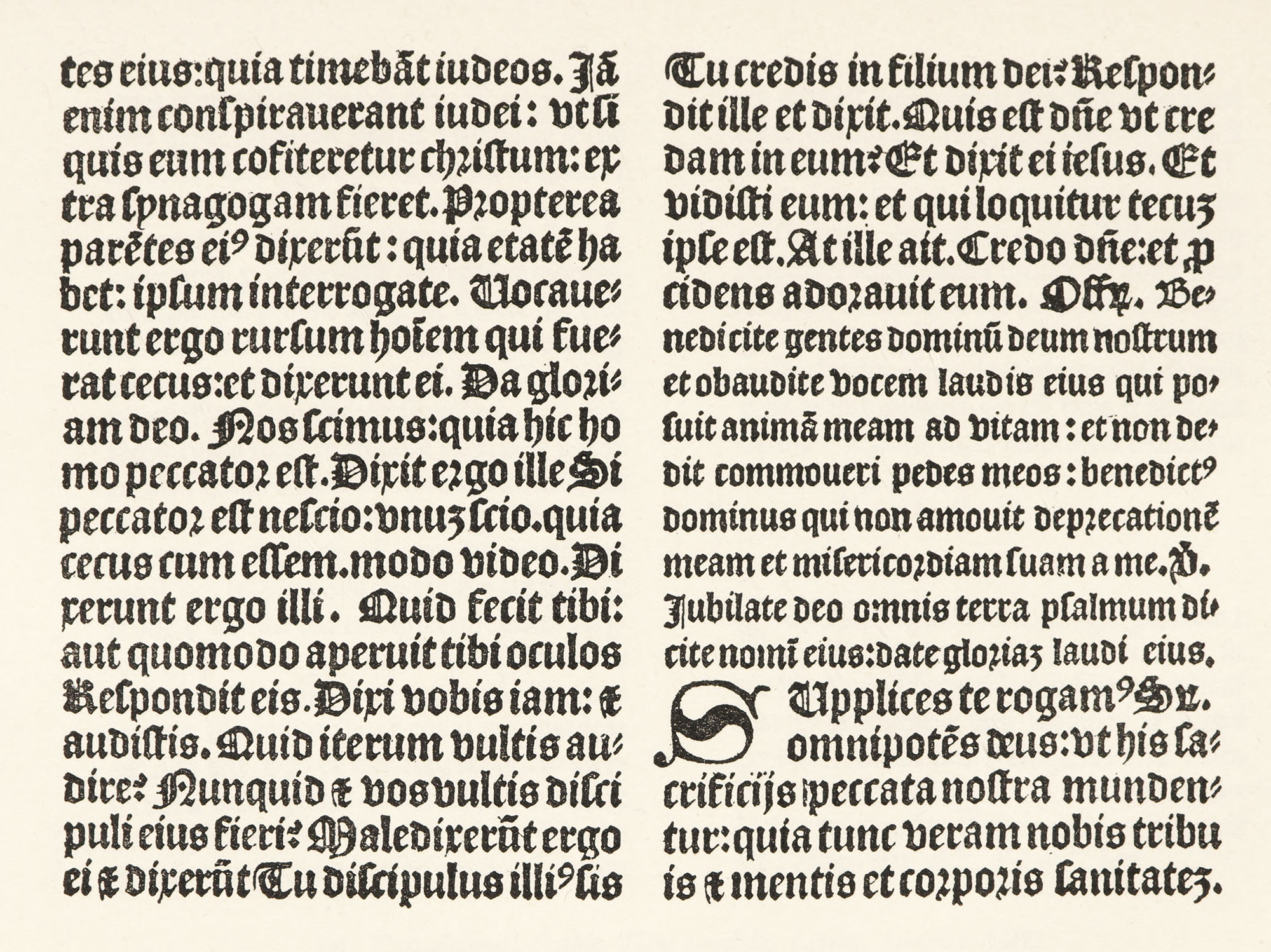
De Worde’s Speculum of 149410 was printed from Caxton’s Type 8, which was a lettre de forme. De Worde had also two other types, both of which he used before the end of the fifteenth century in his Opus Grammaticum of Sulpitius (fig. 66). The larger of the two was a text type, the smaller being employed for notes. The first seems to be French; the smaller has a round quality which is a little like the Italian gothic types of the time. Gordon Duff ways that these characters were imported, and that some French printers possessed almost identical fonts. The small type is a charming character and was the work of a very clever founder. De Worde printed about one hundred books before 1500, and nearly eight hundred in all—if new editions and broadsides are included.
66. Gothic Types used by Wynkyn de Worde, Westminster, 1499
From Gordon Duff’s Early english Printing (facsimile, pl. XII / p. 58), De arte grammatica, sive De octo partibus orationis, et al. (scan)
One of the methods of placing the De Worde books chronologically is curious, i.e., from the condition of the wood-cuts. An engraving on wood of the Crucifixion, which was first used in Caxton’s Fifteen Oes, was employed so much by De Worde, that in 1498 it began to crack. And in 1499, while an edition of the Mirror of Consolation was in process, the block split in two. The progress of time was thus marked by the fissure in the plate.
The types of the printer Julian Notary, who worked in connection with Barbier and another unknown printer, and produced several books for De Worde, are also of the lettre de forme family. His Sarum Missal shows these fine characters admirably composed; for the French elegance in typesetting exhibits itself very clearly in this book, which was printed about 1498 (fig. 67); and also in the Sarum Horæ of 1497. Barbier was of French origin, and probably came to England at De Worde’s invitation.
67. Lettres de Forme used by Notary and Barbier, Westminster, 1498
From Gordon Duff’s Early English Printing (pl. XIV / p. 60)
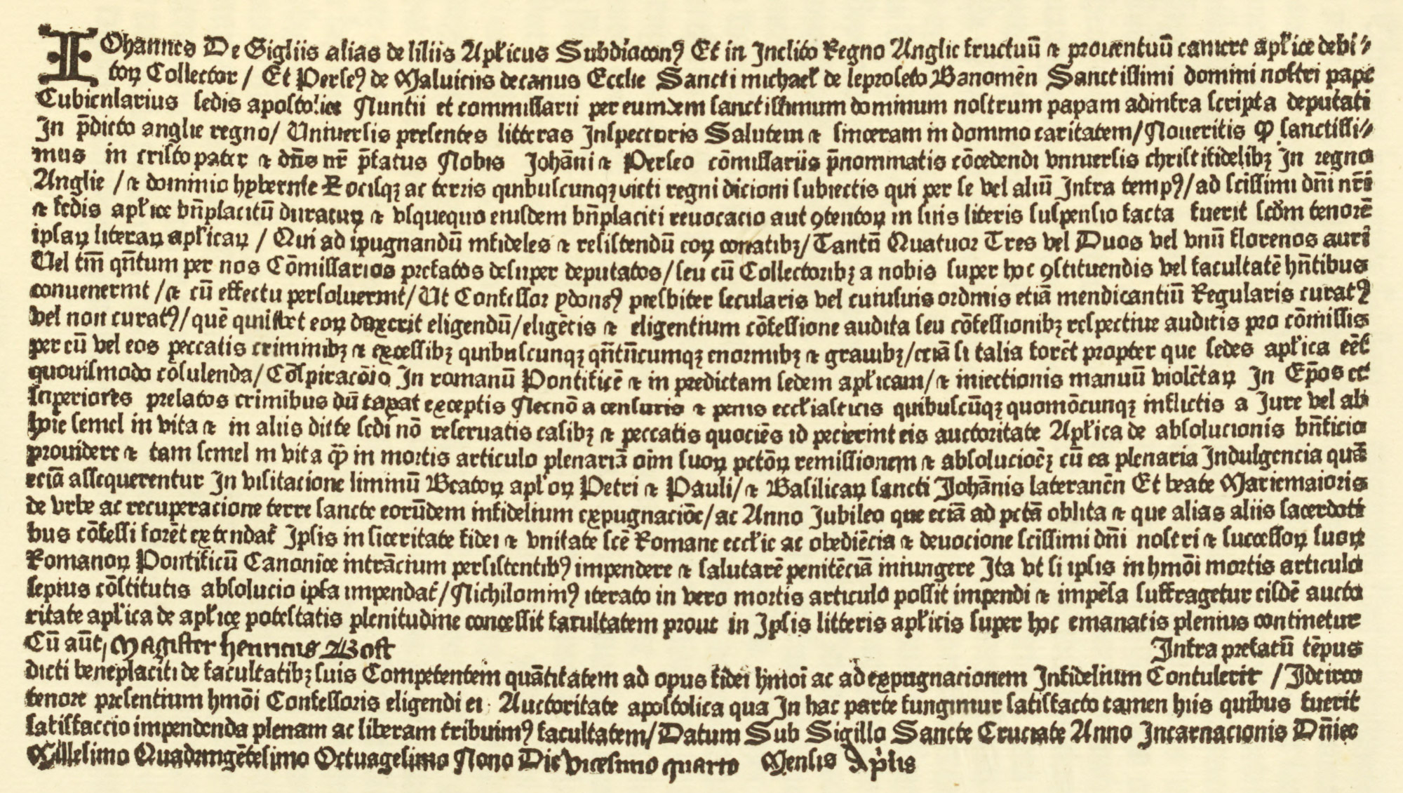
In the work of John Lettou we see this same mastery of composition; but there is a distinct foreign quality in the letter shown in his Quæstiones Antonii Andreæ. This type, in effect, resembles a form employed at Rome (possibly by the same printer) in 1478–79. It looks like the transitional gothic types which showed the influence of Roman letter-forms (fig. 68). This book was the first volume printed in England in which double columns were employed. After its appearance Lettou went into partnership with William de Machlinia, and it was by the jointly that the two types employed in Littleton’s Tenores Novelli were used. One was a Burgundian (or “Caxton”) sort of batarde letter, the other a pure lettre de forme.11 After printing some five books in association with Lettou, Machlinia carried on the business by himself. A square lettre de forme was used by Machlinia in the Revelation of St. Nicholas, and a picturesque condensed gothic type in the De Secretis Naturæ of Albertus Magnus of 1484.12 Machlinia’s two remaining fonts were a heavy square lettre de forme, rather like Caxton’s Type 3, and a coarse lettre batarde flamande, identical with types used by Veldener at Utrecht and Brito at Bruges—another proof of the close connection between Netherlands printers and the English fifteenth century press. These were employed in a Speculum Christiani brought out about 1486.13
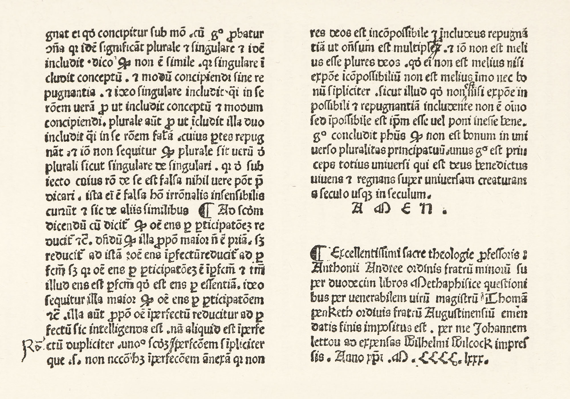
68. Transitional Gothic Type used in Andreæ Antonius, Quæstiones super Duodecim Libros Metaphysicæ Aristotelis: Lettou, London, 1480
From a copy in the Library of Mr. J. Pierpont Morgan, New York
The printer Richard Pynson was a Norman by birth. He had two rough forms of transitional lettre de forme (in which he printed Chaucer’s Canterbury Tales and Dives and Pauper)14 and a more delicate batarde; his remaining types being lettres de forme. The lettre batarde in which The Fall of Princes was printed, about 1494 (fig. 69), is somewhat like the fonts common in France. Pynson’s lettres de forme are shown in the large type of his Sulpitius of 1494—a square Netherlandish letter—and in the very handsome lettre de forme which he used with beautiful effect in an Horæ ad Usum Sarum of 1495 (fig. 70), and in a Sarum Missal of 1500.15 His small black-letter types for notes are rather Italian in feeling. The Sarum Missal of Pynson is a really fine piece of work, which shows taste and ability, though the borders are very rough in execution. Pynson was the most tasteful of the fifteenth century English printers.
69. Lettre Batarde used in The Fall of Princes: Pynson, London, c. 1494
From a copy in the Library of Mr. J. Pierpont Morgan, New York (facsimile), Internet Archive (scan)
70. Lettre de Forme used by Pynson, London, c. 1495
From Gordon Duff’s Early English Printing (pl. XXIII / p. 69)
In addition to the London presses, there were printing establishments at Oxford and St. Albans. Of the seven types employed at Oxford, some narrow, upright gothic types produced striking pieces of typography.16 The other fonts call for little comment here. In the St. Albans press (the third place where printing was done in England) we have three different types, and this press also used Caxton’s Type 3. Other these three fonts, the type used in the Augustinus Dactus is the most interesting.17 Besides the books that were printed in England, a great many volumes were printed abroad for the English market—some at Antwerp, Paris, and Rouen,18 others at Basle, Louvain, and Cologne. These do not concern us in our study of English type-forms, though in passing it may be said that they were more finished than the books printed in England.19
In a final survey of the types used in England in the fifteenth century, they group themselves into three classes of black-letter fonts, for the roman character was not introduced into England until well into the sixteenth century.
The first was a pointed lettre de forme much resembling the French. In this the most attractive books were issued; and certain of them are particularly interesting as giving in type the English national letter-form, based on earlier manuscripts, of which I have spoken more than once. This still survives.
The second group is the lettre batarde, based on the Burgundian batarde. Fonts of this appear in all sizes and varieties, from the rough and ugly characters used by Caxton down to the refined imitation of French batarde types employed by Pynson.
The third group of types is miscellaneous, made up of characters which were imported, and others which may have been copies of importations. None of them are characteristic of purely English typography, though they are sometimes better than native English types.
- Winship’s William Caxton, Doves Press, Hammersmith, 1909.
- i.e., in learning the art.
- Early English Printing, pl. iii.
- Early English Printing, pl. v.
-
This was because Caxton, following the practice of the Dutch school of printing, at first used no composing-rule. As Blades says in his essays on Caxton’s printing-office,
Placing rough types upon rough types admits of very little shifting or adjustment, and to this fact, I imagine, we must attribute the practice of leaving the lines in early books or of uneven length. An attempt to push along the words of a line in order to introduce more space between them, without some plan of easing the friction, would be certain to break up the line altogether, and so the lines were left just as they happened to fall, whether full length or short. Sometimes when a word would come into the line with a little reduction of the space between the last two words, the space was reduced accordingly: but more often a syllable at the end of the line was contracted, such as ‘men’ into ‘mē,’ or ‘vertuous’ into ‘vertuo9.’ Most often the compositor, knowing the practice to be understood by his readers, would finish his line with just so many letters as his measure would take, and accordingly it is common to find words divided thus:—why-∥che th∥at w∥ymen w∥iche m∥an. But when once the ‘setting rule’ was brought into use all that was altered, and the various words of a line could be pushed about, and the spaces between them augmented with ease.
-
In De Ricci’s A Census of Caxtons (Bibliographical Society’s Monographs, No. XV, 1909), Caxton’s eight types are reproduced in facsimile, printed on rough paper, and showing full pages of the types. There are also lists of the books printed at Bruges and Westminster, giving the number of existing copies, untraced copies, and fragments. A list of the books printed at Paris for Caxton and the books printed by Wynkyn de Worde after Caxton’s death, but with Caxton’s types, is followed by a list of Caxton’s books classified by types; finally, a list of Caxton’s books in chronological order, showing the types used in each year, is appended. There is also an index of libraries which contain or have contained Caxtons.
This book is supplementary to Blades’s Life and Typography of William Caxton, London, 1863, 2 vols., which is now made more or less incomplete by later knowledge; but Blades’s volumes, Gordon Duff’s Early English Printing and Life of Caxton (Caxton Club of Chicago), and De Ricci’s Census furnish a fairly complete equipment to the student. Mr. Winship’s delightful paper, William Caxton, should also be consulted.
- Early English Printing, pl. viii.
- Early English Printing, pl. xi (of later editions).
- Early English Printing, pl. x.
- Early English Printing, pl. ix.
- Early English Printing, pl. xvi.
- Early English Printing, pl. xvii.
- Early English Printing, pl. xviii.
- Early English Printing, pls. xx and xxi.
- Early English Printing, pl. xxvi.
- Early English Printing, pl. xxix, Cicero.
- Early English Printing, pl. xxxii.
- Early English Printing, pls. xxxv–xxxviii.
- Excellent facsimiles of the types of Caxton and other early English Printers are appended to Gordon Duff’s Fifteenth Century English Books (Bibliographical Society’s Monographs, No. XIII, 1917).