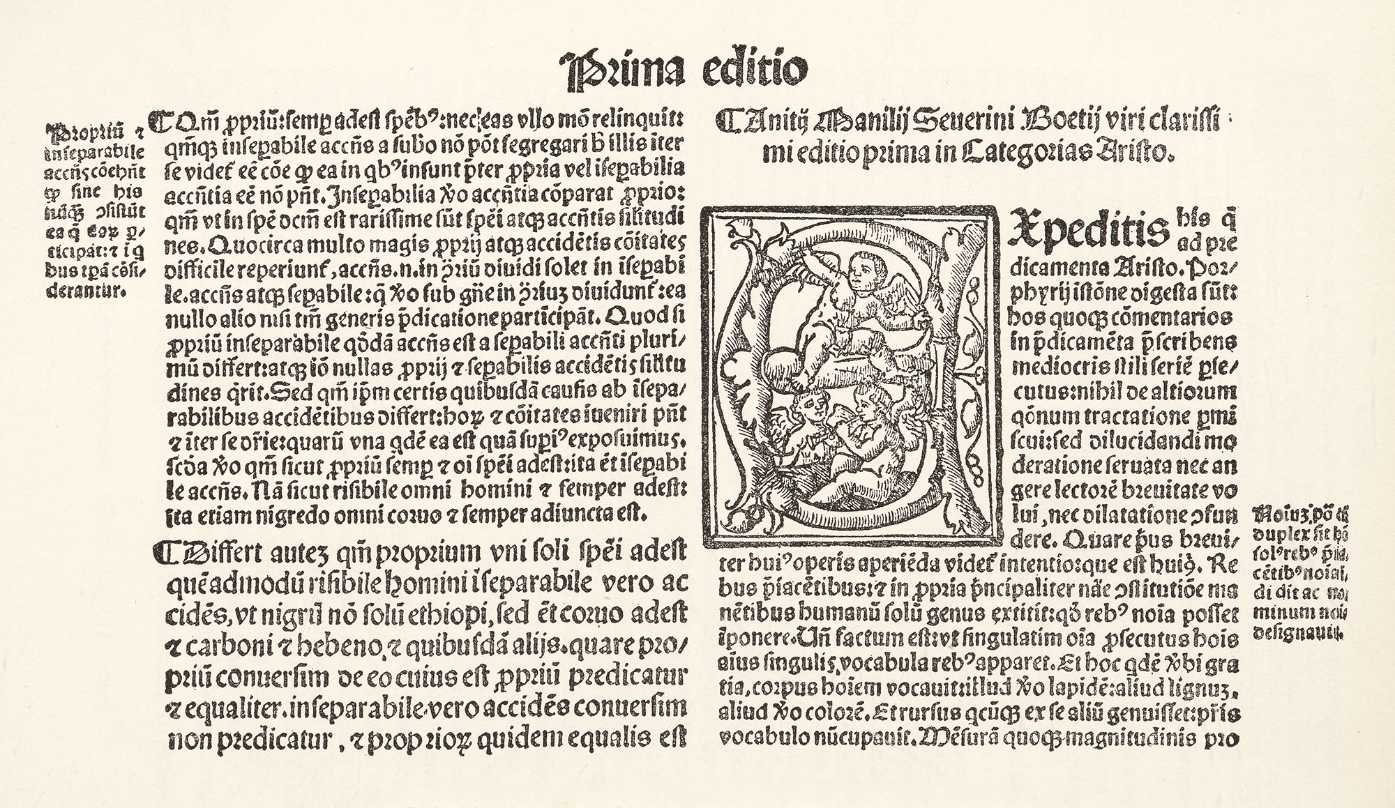
Figure 100
Gothic Type in Opera of Boethius: Giunta, Venice
From a copy in Harvard College Library
1536
Books were still printed in gothic types, and a Venice edition of the Opera of Boethius, printed by Luc Antonio Giunta in 1536, is, in its arrangement and its black-letter type, completely Gothic, and, in its way, very handsome. It is chiefly in two sizes of Italian gothic characters, arranged in double column. The running-titles are in a large size of much the same letter. Marginal notes set in small black-letter and arabic numerals for folios are perhaps not quite in the style; nor is the title-page, which shows signs of “display” lines. Yet the book is a reminder of the persistence of black-letter volumes in the home of the roman letter.