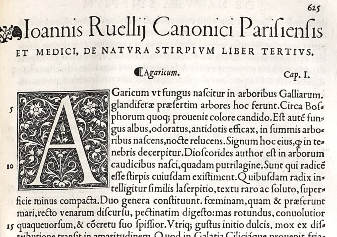
Figure 138
Roman of Ruel’s De Natura Stirpium: De Clines, Paris
From a copy in the Harvard College Library (facsimile), Google Books (scan)
1536
In the King’s Library at the British Museum, Jean Ruel’s De Natura Sitrpium Libri Tres is exhibited as typical of Simon de Colines’s work, and of the style of printing that he made popular in France. A beautiful, mellow, Italianate roman font, in a large size, is used for the table of contents and text. A clear and charming font of the same character serves for the index, in which notice the interesting shapes of arabic numerals. Tory’s fine criblé initials begin the three great divisions of the book. Each chapter, headed by its title in italic and its number in the same line (at the right), also begins with a block-initial, the letter appearing in white on a criblé background. Running-titles are set in spaced capitals, and the exquisite, refined lower-case roman letter, much used by De Colines, appears on the title-page at the beginning of each book.
