Figure 141
Types used by Vascosan, Paris
From a copy in the Harvard College Library, De Rebus Mathematics, hactenus desideratis (scan)
1556
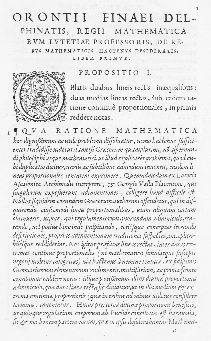
In 1556, Vascosan printed a mathematical book by Oronce Fine, De Rebus Mathematics, hactenus desideratis, in four books. The title-page shows some splendid lower-case letters. An opening address is set in a noble font of roman, followed by verses in a smaller size of the same font,and in a well-cut Greek character. The various propositions are composed in roman, with explanations set in an exquisitely clear italic. The diagrams are a charming feature of the book. They are drawn to the width of the page, and blanks within them often contain fanciful little florets of solid black, or with cross-hatched leaves—probably with the practical aim of saving the diagrams from too heavy impression. The book is a masterpiece of restrained style, through the beauty of its types and the elegance of their arrangement. The readability of its italic comes about through its evenness of line.