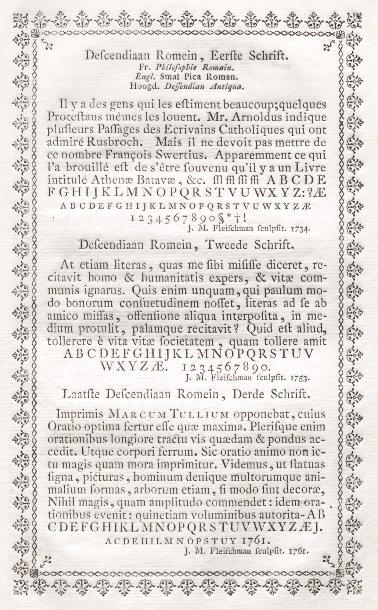
Figure 211
Fleischman’s Roman Types cut in 1734, 1753, and 1761: Enschedé’s Proef van Letteren, Haarlem
From Noord-Hollands Archief (scan)
1768
Many of the types that we come upon which look more “modern” (some of them being as we should now say “condensed”) were cut by Fleischman—whose name appears beneath them. He uniformly extracted all interest from his fonts, partly through lightening the cut, which gave monotony of colour, and partly by his large, round lower-case letters, made more rolling in effect by shortening the descenders in a very modern way.
