Figure 286
Type and Ornaments in Tasso’s Godfrey of Bulloigne: Hatfield, London
From a copy in the Boston Public Library (facsimile), Internet Archive (scan)
1600
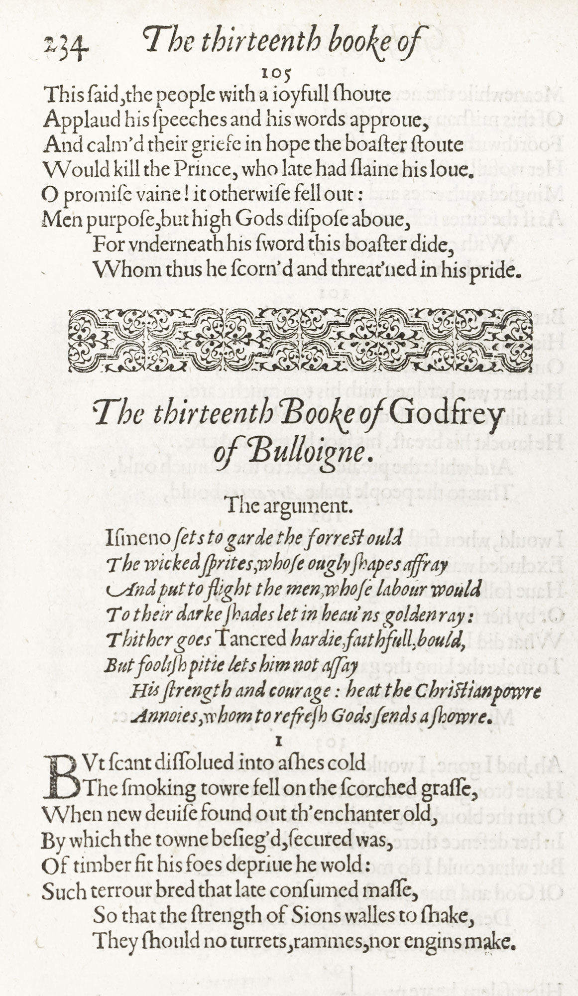
For a contemporaneous book of poetry, look at Fairfax’s translation…printed in folio by Arnold Hatfield for J. Jaggard and M. Lownes. A simple and well-managed title-page in a generous panel of type-ornament opens the book. Some good italic is employed in the preliminary Address. The poem itself is set in an agreeable old style roman font, very even in design, with Arguments in a lively italic. Each Book begins with a head-band of type-ornament. It is a very readable edition, and good to look at for its clarity of effect and its more modern air.