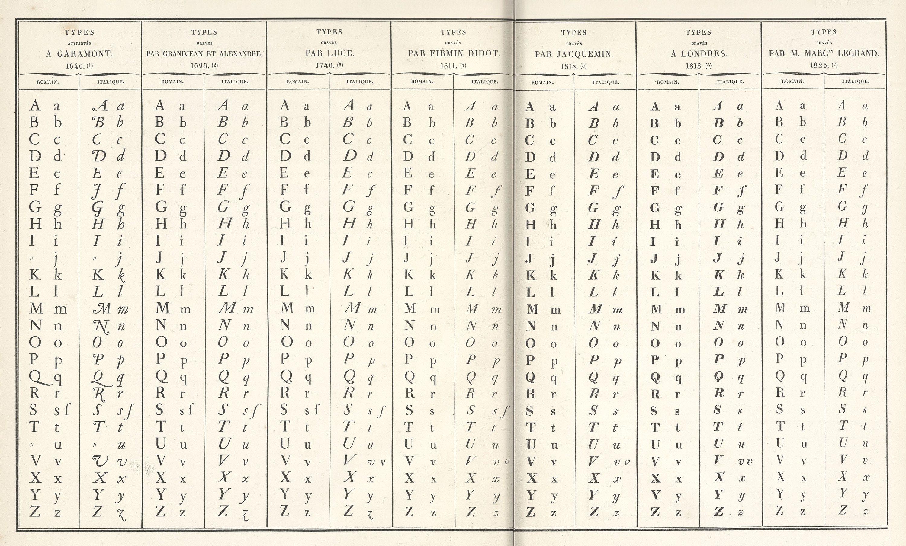
Figure 327
Comparative Table of Types used by the French National Printing House from its foundation to 1825
From Notice sur les Types Étrangers du Spécimen de l’Imprimerie Royale, Paris, 1847 (scan 1, scan 2)
1847
To see how early nineteenth century fonts compare with historical fonts with preceded them, look at the comparative table of roman and italic types employed ty the French National Printing-House from 1640 to 1825.
It is one of the most enlightening documents about French typefaces in existence. The letters of 1640 attributed to Garamond are most irregular, and this is true of the characters cut by Grandjean in 1693 and finished by Alexandre, and those of Luce of 1740—when compared with the greater mechanical perfection of roman letters in Didot’s font of 1811.
