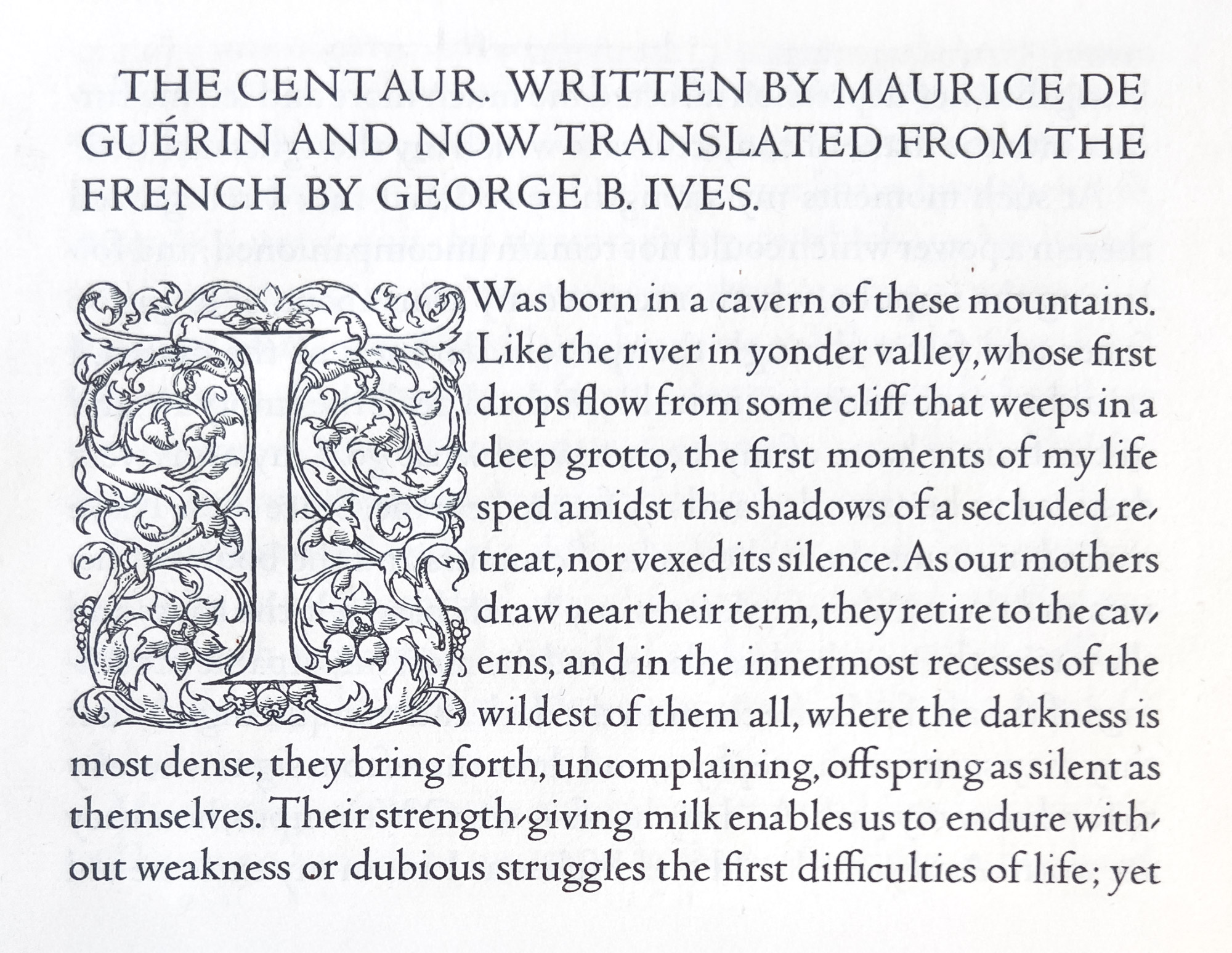
Figure 359
Bruce Rogers’ Centaur Type
From Maurice de Guérin’s Centaur, Montague Press, in the Newberry Library, 1915
1915
Next to English special types, similar American fonts are perhaps the most interesting.… Mr. Rogers has designed another and, to my mind, finer font—the Centaur. The upper-case letters of this font have been, since 1914, in use for the work of the Metropolitan Museum of Art in New York, and in 1916 1915 the complete font in 14-point size was shown in Maurice de Guérin’s Centaur. Mr. Rogers describes the letter as a refinement on his Montaigne type, and though—as is his wont—he sees ways in which this font could be bettered, it appears to me one of the best roman fonts yet designed in America—and of its kind, the best anywhere.