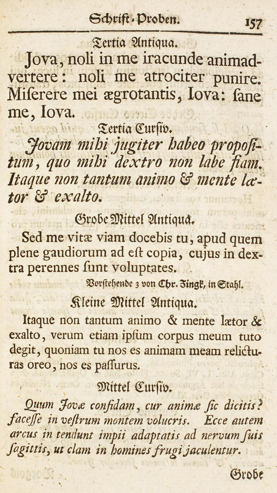
Figure 94
Roman and Italic Types: Breitkopf’s Schrift-Probe, Leipsic
From Gessner’s Buchdruckerkunst und Schriftgiesserery
1739
Of the German eighteenth century type-founders, Brietkopf is easily the most important.… The roman and italic types in this specimen are unattractive, too. The capital letters are very condensed and show excessive contrasts of thick and thin lines, and compare unfavourably with those in Pater’s volume. The lower-case roman in the medium sizes is square and blocky in effect. As the sizes grow smaller, the effect becomes more and more monotonous and “airless.” The italic is somewhat condensed and ungainly in design.
